

Power Your Software Testing with AI Agents and Cloud
The Native AI-Agentic Cloud Platform to Supercharge Quality Engineering. Test Intelligently and Ship Faster.

- TestMu AI (Formerly LambdaTest)
- /
- Learning Hub
- /
- What is GUI Testing? Types, Test Cases & Examples
What is GUI Testing? Types, Test Cases & Examples
GUI testing verifies that an app's buttons, forms, and layouts work and look correct. Learn GUI testing types, locator strategies, and real test case examples.
Last Updated on:
GUI testing is the practice of verifying that an application's graphical interface behaves and renders correctly, so that every button, menu, form, and layout element does what it should, looks the way it was designed to, and gives the user clear feedback. It is a subset of UI testing, which also covers non-graphical interfaces such as command-line and voice.
Overview
GUI testing validates an application's visible graphical elements to ensure they function correctly, look consistent, and give users clear feedback. To catch visual regressions at scale, use visual testing from TestMu AI to automatically compare screenshots against a baseline and flag pixel and layout shifts.
- What GUI testing verifies: Graphical user interfaces - GUI testing checks that visible components like buttons, menus, and forms behave correctly, look consistent, and provide clear feedback.
- How to catch visual regressions at scale: TestMu AI - Visual testing on TestMu AI compares screenshots against a baseline to flag pixel and layout shifts, catching broken stylesheets before users see them.
- Manual or automated: Both - GUI testing runs manually for exploratory passes and aesthetic judgement, and automated for regression, browser and device matrices, and measurable thresholds such as contrast ratio and target size.
- What to prioritize first: High-traffic flows - Prioritizing critical paths like login, checkout, and search ensures that the most vital user interactions do not break during updates.
- Where layout defects hide: Cross-device rendering - Testing the same screen across different viewports reveals hidden layout issues that only appear on specific devices.
- What states to validate: State and feedback elements - Checking disabled buttons, validation messages, and loading states ensures the interface guides users clearly beyond just the happy path.
- Unlike functional testing which verifies if a system produces the correct output, GUI testing specifically checks if a user can navigate the interface and reach that result without confusion.
What is GUI Testing?
GUI testing is the validation of the user interface functions and features that are visible to users and that must meet business requirements. It is a subset of UI testing rather than a synonym for it: every GUI is a user interface, but UI testing also covers interfaces that have no graphics at all.
GUI testing concentrates on verifying the visual components of an application, encompassing essential elements like buttons, menus, icons, text boxes, lists, forms, images, and other interactive elements utilized by users. Each of those elements is checked for both behavior and appearance, because a control that works but renders wrongly still reads as broken to the person using it.
The aim is to find defects within the system related to the interface and its components. For instance, it could be checking whether a button is working correctly when pressed or if a menu item leads to the correct page.
GUI testing also covers the quality of the interaction, not only its outcome. Does a button provide clear feedback when pressed? Are form errors communicated where the user is looking? Are colors and fonts consistent across screens? These details decide whether an application feels reliable to use.
GUI testing is the last check on what the user actually sees before a release ships. It confirms the application is not only functionally correct but also navigable, legible, and visually consistent across the screens people use most.
GUI Testing vs. UI Testing
The two terms are used interchangeably, but they are not the same, and the distinction matters when you scope what to test. UI (user interface) is the broader category: it covers every way a user gives input or receives output, including command-line interfaces (CLI) and voice user interfaces (VUI). GUI (graphical user interface) is strictly the visual, graphical subset of that.
In other words, every GUI is a UI, but not every UI is graphical. GUI testing is therefore a subset of UI testing that focuses only on the visual layer.
| Aspect | UI Testing | GUI Testing |
|---|---|---|
| Scope | All interfaces: graphical, command-line (CLI), and voice (VUI) | Only the graphical interface |
| What it checks | Whether any interface accepts input and returns the right output | Visual elements: layout, colors, fonts, buttons, spacing, alignment |
| Example check | Does a CLI command return the correct exit code? | Is the submit button the right color and aligned to the form? |
| Relationship | The superset | A subset of UI testing |
How Do You Plan a GUI Test?
A GUI test plan answers four questions before anyone writes a script: which screens and flows are in scope, what counts as a defect, which environments the suite must cover, and who acts when it fails. Skipping the plan is what produces suites that run green while users still hit broken screens.
- Agree what is in scope - list the screens and flows the suite covers and, just as importantly, the ones it does not, so nobody assumes coverage that was never written.
- Define what counts as a defect - a misaligned label and a non-functional submit button are not the same severity, and the plan should say which of them blocks a release.
- Fix the environment matrix - decide the browsers, operating systems, and viewport widths in scope from what your analytics actually show, not from what is convenient to run.
- Write the scenarios before the scripts - describe each check as a precondition, an action, and an expected visible result, so the script is a translation rather than an invention.
- Prioritize by risk - order execution so the highest-traffic and highest-damage flows run first and fail fast, rather than running alphabetically.
- Decide the failure workflow - name who triages a red run, how a genuine regression is separated from a flaky locator, and where the defect is logged.
- Review after each cycle - fold what broke, what was missed, and what proved flaky back into the plan, because a GUI suite decays without maintenance.
How Do You Run GUI Tests on Real Browsers and Devices?
There are two ways to run a GUI test, and most teams need both. A live session opens the screen on a chosen browser, operating system, or physical device so a person can explore and reproduce a reported bug by hand. An automated run replays the same scripted checks across that matrix on every build. Neither requires maintaining local browsers or a device drawer.
Reading an Automated GUI Test Run
An automated GUI run is only useful if you can tell why it failed. A cloud run records the full command sequence, the console and network activity behind it, and a video of what the page actually displayed, so a red result points at a specific step rather than at the suite as a whole.
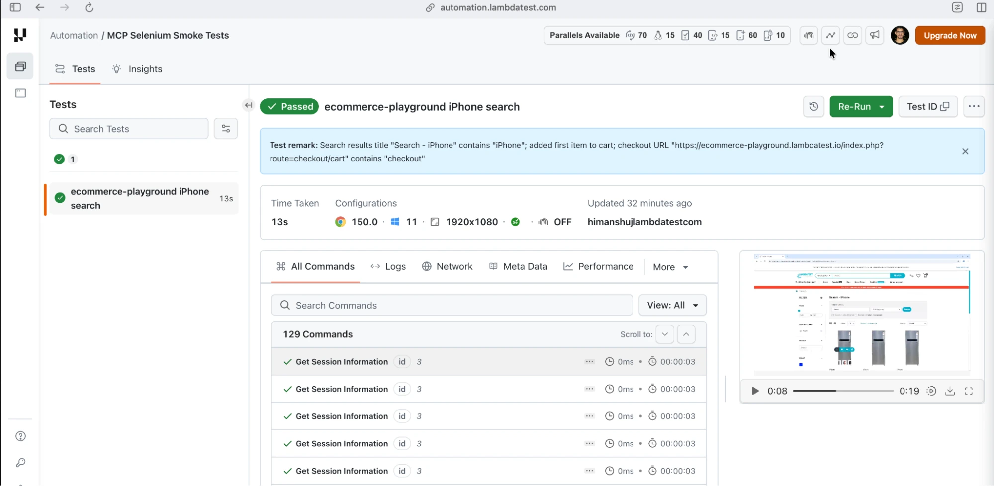
The run above executed a search-and-checkout flow against the Ecommerce Playground on Chrome 150 and Windows 11 at 1920x1080, finishing in 13 seconds across 129 commands. When a GUI test fails, this is the order to read it in: find the failing command, scrub the video to that moment to see what the page looked like, then check the console and network tabs to decide whether the interface broke or the request behind it did.

Note: You need to create a TestMu AI account before you can start testing. Create TestMu AI account Now!
Running on Real Mobile Devices
Emulators miss the defects that only hardware produces: real touch targets, real screen densities, real fonts, and real network behavior. TestMu AI's real device cloud runs sessions on physical Android and iOS handsets, picked by brand, model, and OS version.
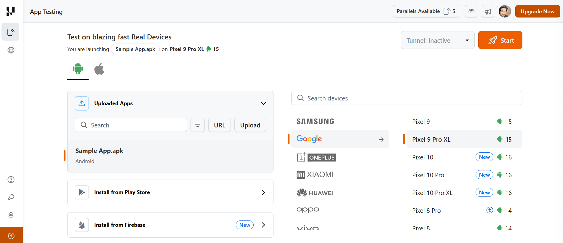
Pick the device the bug was reported on rather than the newest one available. A layout that collapses on a 6.1 inch screen at default font scaling often renders correctly on a larger handset, so testing the reported configuration is what reproduces the defect.
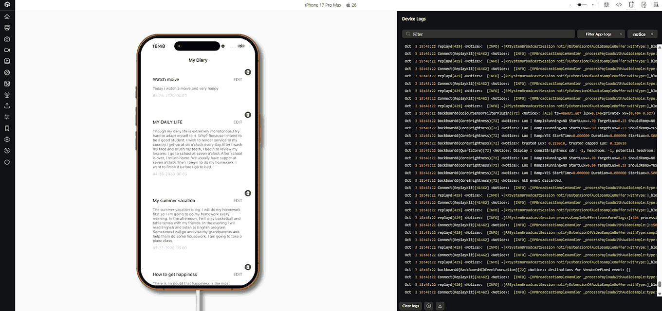
The log stream on the right is the part worth keeping open. A GUI defect on mobile is often the visible end of something lower down, and having the device log beside the screen is what separates a rendering bug from a failed request or a permission the app never received.
What Should a GUI Testing Checklist Cover?
A GUI testing checklist should cover twelve areas: layout, typography, buttons, forms, validation, navigation, tables, overlays, images, element states, responsive behavior, and accessibility. Working area by area catches the defects ad-hoc clicking misses, because interface failures cluster in the states teams skip rather than in the happy path.
| Area | What to verify | Typical failure |
|---|---|---|
| Layout and alignment | Elements sit on their grid at every supported width, with no overlap, clipping, or stray horizontal scrollbar. | A CSS change shifts one container and pushes neighbouring elements off-screen. |
| Typography and text | Font family, size, and weight match the design system; no truncated labels, no text spilling out of its container. | A longer translated string breaks a fixed-width button. |
| Buttons and controls | Every control fires its action once, shows hover, active, focus, and disabled styling, and never double-submits. | A button stays enabled during submit and creates duplicate records. |
| Forms and input fields | Fields accept valid input, reject invalid input, enforce max length, and preserve entered data on a failed submit. | A validation error clears the whole form and the user retypes everything. |
| Validation and error messages | Messages appear next to the field they describe, in plain language, and disappear once the input is corrected. | A generic "something went wrong" banner hides which field failed. |
| Navigation and links | Menus, breadcrumbs, back, and deep links all reach the right screen and preserve state where they should. | Browser back returns to a stale cached view instead of the current one. |
| Tables, lists, and pagination | Sorting, filtering, paging, and empty results all behave, and row actions map to the correct row after a sort. | Sorting reorders rows visually but row action buttons keep the old row bindings. |
| Modals, tooltips, and overlays | Overlays trap focus, close on escape and on the close control, and restore scroll position to the page behind. | A modal closes but leaves the body scroll-locked. |
| Images and media | Images load at the right aspect ratio, carry meaningful alt text, and degrade gracefully when the asset is missing. | A broken asset collapses its container and reflows the surrounding layout. |
| Element states | Empty, loading, error, and disabled states each render deliberately rather than showing a blank region. | A slow response renders an empty list that looks identical to a genuine no-results state. |
| Responsive and viewport | Content reflows at each breakpoint without two-dimensional scrolling, and touch targets stay reachable. | A desktop-first table forces horizontal scrolling on a phone. |
| Accessibility | Controls expose an accessible name, keyboard focus is visible, contrast and target sizes meet WCAG 2.2 AA. | A control implemented as a styled div is unreachable by keyboard and invisible to a screen reader. |
The last three rows are where most checklists stop short, and element states are the ones teams forget to assert on at all.
The accessibility row has published thresholds you can test against rather than judge by eye. WCAG 2.2 Success Criterion 1.4.3 requires a contrast ratio of at least 4.5:1 for text, with 3:1 allowed for large-scale text.
Success Criterion 2.5.8 sets a minimum pointer target of 24 by 24 CSS pixels, which is a measurable check rather than a judgement call.
Success Criterion 1.4.10 requires content to reflow at a width equivalent to 320 CSS pixels without scrolling in two dimensions, which turns the responsive row into a pass or fail check instead of an opinion.
For the accessibility row, MDN defines an accessible name as the text associated with an element that gives assistive-technology users a label for it, and states that all controls should have an accessible name. Every interactive control on the checklist is therefore checkable for one.
Depth on individual areas lives in dedicated guides: search boxes have their own test cases for search functionality, and load behavior under stress belongs in performance testing.

Types of GUI Testing
GUI testing splits into types by what each one checks. Functional testing confirms controls do their job, usability testing judges whether a flow is understandable, compatibility testing covers browsers and devices, accessibility testing measures against published criteria, and regression testing catches what a recent change broke.
- Functional Testing - This kind of testing has one primary goal - to confirm that the application does exactly what it's designed to do. It focuses on examining every interactive feature of the application, such as clickable elements and text entry fields, to guarantee they perform correctly.
- Usability Testing - Stepping into the users' shoes is what usability testing is all about. It's a deep dive into determining whether the software is user-friendly and easy to navigate. Elements like layout structure, color schemes, font sizes, and more are scrutinized during this testing process.
- Compatibility Testing - The goal here is to confirm that the application's GUI performs well on a variety of devices, operating systems, and browsers. A good application should provide a uniform user experience, irrespective of the access point.
- Accessibility Testing - This type of testing checks if the application is usable by individuals with disabilities. It could involve testing the compatibility of the application with assistive technologies like screen readers or evaluating whether the application can be navigated using a keyboard only.
- Regression Testing - Whenever there are modifications to the software, like adding new features or fixing bugs, regression testing is performed. This is to ensure that the changes have not unintentionally disrupted existing functionalities of the GUI.
- Localization Testing - Localization testing assesses whether the application's GUI can adapt to different languages and geographical locations. It verifies if the application can correctly display local date formats, currency, and other region-specific information, and checks for proper translation into different languages.
- Load Testing - This is a subset of performance testing that focuses on how the GUI behaves under significant user or data load. It helps to uncover problems that only become visible when the system is under heavy stress.
- Boundary Testing - This type of testing evaluates the application's response to extreme or outlier input values. An example could be entering a very long string of text into a text box to see how the application manages it.
- Performance Testing - The goal here is to see how the software behaves under heavy loads or stress. It looks at the speed, stability, and responsiveness of the software under different conditions.
Manual vs. Automated GUI Testing: Which Should You Use?
Use manual GUI testing for judgement and exploration, and automated GUI testing for repetition and scale. The split is not a preference, it follows from whether the check has a deterministic expected result. The two techniques are Manual Testing and Automation testing. Both these techniques offer unique benefits and are instrumental in shaping a high-quality, user-friendly software application.
Manual Testing
This is where the human touch comes into play. In manual testing, a tester manually navigates through the application, inspecting the visual elements, and interacting with the software just as a user would. They look out for any visual anomalies, usability issues, or functionality bugs that could mar the user experience.
Manual testing is where subjective judgement belongs, because whether a screen reads clearly is an opinion a person forms and not an assertion a script can make. Its limits are equally practical: it is slow, it is inconsistent between testers, and it does not scale to a browser and device matrix of any size.
Automation Testing
To counter the limitations of manual testing, we have automation testing. Here, testers use specialized software to run a suite of predefined tests on the application. This is akin to a production line inspection, where each product (or software feature) is automatically checked against a set of standard criteria.
Automated testing excels at repetitive tasks and can swiftly execute a large number of tests, making it ideal for regression testing where the same tests need to be run every time a change is made. It also reduces the risk of human error and can run tests in various environments and configurations. However, it cannot fully replace manual testing as it lacks the subjective judgement and creative problem-solving capabilities of a human tester.
| The check | Do it | Why |
|---|---|---|
| Exploring a new or redesigned screen | Manual | There is no baseline to assert against yet, and the goal is to notice what feels wrong rather than to confirm a known result. |
| Regression across every release | Automated | The same steps run on every build, and the expected result is already known and stable. |
| Aesthetic and copy judgement | Manual | Whether a layout reads well or wording makes sense is an opinion, and opinions cannot be encoded as pass or fail. |
| Browser, OS, and viewport matrix | Automated | The combinations multiply beyond what anyone can click through by hand in a release window. |
| Accessibility thresholds | Automated | Contrast ratios and target sizes are published numbers, so they can be measured rather than eyeballed. |
| Reproducing one reported bug | Manual | A live session on the reported configuration is faster than writing a script for a defect you have seen once. |
In practice the split above is what a working suite looks like: automation carries the repeatable checks, and manual time is spent where judgement is required. While manual testing allows testers to empathize with the end user's experience, automated testing ensures speed, accuracy, and efficiency in verifying the software's functionality. Together, they contribute to building a robust and user-friendly software application.
Locator Strategies in GUI Testing
Before an automated test can click a button or type into a field, it has to find that element on the screen. A locator is the address it uses. This is where most GUI test flakiness comes from: pick a fragile locator and the test breaks every time a developer nudges the markup. Frameworks like Selenium, Playwright, and Cypress all support the same core strategies, roughly in order of how stable they are.
- ID - The most reliable when present. An id is meant to be unique on the page, so the lookup is direct and fast. If developers add stable ids for testing, use them first.
- Name - Common on form fields. Reliable when the name attribute is stable, but names are not guaranteed unique, so scope them to a form if needed.
- CSS selectors - Match elements by tag, class, attribute, or hierarchy (for example, button.primary[type="submit"]). Fast and readable, and the usual default when there is no id.
- XPath - The most powerful and the most abused. XPath can traverse the DOM in any direction and match on visible text, which nothing else does, but long absolute XPaths (like /html/body/div[3]/div[2]/...) break the instant the layout changes. Use short, attribute-anchored XPath, never a full path.
- Accessibility attributes - Locating by role, aria-label, or a dedicated data-testid is the most resilient strategy, because these are added deliberately and rarely change for cosmetic reasons. As a bonus, tests that rely on accessibility attributes double as a check that those attributes exist.
The same email field, located five ways on the Ecommerce Playground:
// Most stable at the top, most fragile at the bottom
driver.findElement(By.id("input-email"));                     // by ID
driver.findElement(By.name("email"));                         // by Name
driver.findElement(By.cssSelector("input[name='email']"));    // by CSS selector
driver.findElement(By.xpath("//input[@name='email']"));       // by attribute XPath
driver.findElement(By.cssSelector("[data-testid='email']"));  // by accessibility / test id
Rule of thumb: reach for the top of that list first and only move down when you must. A test suite anchored on ids and accessibility attributes survives redesigns that shatter a suite built on brittle XPath.
How to Write a GUI Test Case (Login Example)
A GUI test case is a small, self-contained check: a precondition, an action, and an expected visible result. The mistake beginners make is testing only the happy path. A login screen has one way to succeed and many ways to fail, and the failures are where the interface usually lets users down.
Take a single scenario, "user logs in", and expand it into positive and negative cases:
| Type | Steps | Expected visible result |
|---|---|---|
| Positive | Enter valid email and password, click Login | User lands on the account dashboard; no error shown |
| Negative | Enter valid email, wrong password, click Login | A clear "invalid credentials" message; user stays on the login page |
| Negative | Leave both fields empty, click Login | Inline validation on both fields; the form does not submit |
| Negative | Enter a malformed email (missing @), click Login | Email-format validation message; no server request made |
| Edge | Paste a very long string into the password field | Field enforces its max length; layout does not break |
Two practices keep a suite like this maintainable as it grows:
- Keep test cases modular - One test verifies one behavior. When "empty fields" and "wrong password" are separate cases, a failure tells you exactly what broke instead of leaving you to debug a giant end-to-end script.
- Separate test data from test logic - The credentials, not the click steps, are what change between cases. Store inputs in a data file or parameter set so you add a new case by adding a row, not by copy-pasting the whole test. This is what makes the five rows above reuse one script.
Execution Mechanics: Record-and-Playback vs. Event Capture
Underneath every automated GUI test is a decision about how the tool actually observes and replays what a user did. There are three mechanisms, and they are not equally robust. Knowing which one a tool uses tells you how brittle its tests will be.
- Mouse-position (coordinate) capture - The oldest and most fragile. The tool records that a click happened at pixel (420, 315) and replays a click at those exact coordinates. It works until anything moves: a different screen resolution, a shifted layout, or a resized window, and the click lands on empty space. Avoid it for anything but fixed-layout legacy apps.
- Event capture - Instead of coordinates, the tool records the interface events themselves ("button X was clicked", "field Y received focus") at the OS or browser level. Because it targets the element rather than a pixel, it survives layout changes that break coordinate capture. This is the foundation most serious GUI automation is built on.
- DOM-based record-and-playback - The modern approach for web apps. The tool watches the Document Object Model, records interactions as element-and-action pairs (using the locator strategies above), and replays them against the live DOM. Because it re-finds the element each run rather than trusting a coordinate, it is the most resilient of the three and is what powers current record-and-playback tooling.
The trajectory is clear: each generation moved the test's anchor further from the screen's geometry and closer to the element's identity. Record-and-playback lowers the barrier to authoring a test, but the tests it produces are only as stable as the locators underneath, which is why the locator discipline above matters even when you never write the code by hand.
Why Do GUI Tests Break So Often?
GUI tests break more than other test types because they are coupled to the layer that changes most. Every redesign moves the markup the tests point at, every new device adds a rendering variation, and asynchronous content makes timing unpredictable. Most flakiness traces back to one of five causes.
| Challenge | Why it happens | What to do about it |
|---|---|---|
| The interface changes faster than the tests | The GUI is the most frequently edited layer of an application, so every redesign invalidates locators that were bound to markup rather than to identity. | Anchor locators on ids or dedicated test attributes, never on absolute XPath, and treat locator churn as a code-review concern. |
| The same markup renders differently everywhere | Rendering engines, OS font stacks, device pixel ratios, and default zoom all differ, so a layout that passes on one machine clips on another. | Run the suite across real browser and OS combinations rather than one local browser, and pin the breakpoints you actually support. |
| Dynamic content creates race conditions | Content that arrives asynchronously means the element exists in the DOM before it is interactable, which produces failures that reproduce only sometimes. | Replace fixed sleeps with explicit waits on a condition, and assert on a settled state rather than on elapsed time. |
| Some checks are genuinely subjective | Whether a screen looks right is a judgement, and judgement cannot be written as an assertion, so aesthetics tend to go untested entirely. | Convert what can be measured into thresholds, such as contrast ratios and target sizes, and hand the rest to visual baseline comparison. |
| Feedback arrives too late to act on | A GUI suite that runs sequentially finishes long after the change that broke it has been merged, so defects surface at the end of the cycle. | Run specs in parallel so results land inside the pull request, and fix defects while the change is still in the author's head. |
The first cause is the one worth automating away. TestMu AI's Auto Healing for Selenium test suites records the DOM path of an element when it is found, and when that element later cannot be located it generates a new locator by merging attributes and context from the earlier run, so an id renamed during a redesign does not stop the suite. SmartWait and AI-native test triage address the timing and diagnosis problems in the same way, by reducing failures rather than only reporting them.
Late feedback is an infrastructure problem rather than a test-design one. HyperExecute runs suites faster than a traditional hub-and-node grid by placing test scripts and execution components in one isolated environment instead of shuttling them between hub and node, which is what moves GUI results back inside the pull request. Defects caught there cost less to fix than the same defects found late in the software development life cycle.
Conclusion
Pick one screen and write its positive, negative, and edge cases using the login table above, then anchor every locator on an id or a dedicated test attribute before you automate a single step. One screen covered properly catches more real defects than a hundred assertions spread thin across an app, because the failures that reach users cluster in the states teams skip rather than in the happy path.
Widen from there by category rather than by depth. Work down the checklist table, then add the four states most GUI suites never assert on: empty, loading, error, and disabled. When the suite is stable enough to run on every commit, move it onto a cloud test automation grid so the same specs run across browsers and viewports in parallel instead of one at a time on a laptop.
If you are still choosing what to run it with, compare the options in our guide to GUI testing tools. To reproduce a reported visual bug by hand on a specific browser and OS before you write the regression test for it, the real time browser testing documentation walks through starting a live session on a specific browser and OS.
Author

Swapnil Biswas
Blogs: 8


Swapnil Biswas is a Product Marketing Manager at TestMu AI, leading product marketing for KaneAI and HyperExecute while orchestrating GTM campaigns and product launches. With 5+ years of experience in product marketing and growth strategy, he specializes in AI, SEO, and content marketing. Certified in Selenium, Cypress, Playwright, Appium, KaneAI, and Automation Testing, Swapnil brings hands-on expertise across web and mobile automation. He has authored 20+ technical blogs and 10+ high-ranking articles on CI/CD, API testing, and defect management, enabling 70K+ testers to improve automation maturity. His work earned him multiple awards, including Top Performer, Value of Agility, and Wall of Fame. Swapnil holds a PG Certificate in Digital Marketing & Growth Strategy from IIM Visakhapatnam and a BBA in Marketing from Amity University.
Reviewer

Salman Khan
Reviewer
Salman is a Test Automation Evangelist and Community Contributor at TestMu AI, with over 6 years of hands-on experience in software testing and automation. He has completed his Master of Technology in Computer Science and Engineering, demonstrating strong technical expertise in software development, testing, AI agents and LLMs. He is certified in KaneAI, Automation Testing, Selenium, Cypress, Playwright, and Appium, with deep experience in CI/CD pipelines, cross-browser testing, AI in testing, and mobile automation. Salman works closely with engineering teams to convert complex testing concepts into actionable, developer-first content. Salman has authored 120+ technical tutorials, guides, and documentation on test automation, web development, and related domains, making him a strong voice in the QA and testing community.


GUI Testing FAQs
Did you find this page helpful?
More Related Learning Hubs
TestMu AI forEnterprise
Get access to solutions built on Enterprise
grade security, privacy, & compliance
- Advanced access controls
- Advanced data retention rules
- Advanced Local Testing
- Premium Support options
- Early access to beta features
- Private Slack Channel
- Unlimited Manual Accessibility DevTools Tests