

Power Your Software Testing with AI Agents and Cloud
The Native AI-Agentic Cloud Platform to Supercharge Quality Engineering. Test Intelligently and Ship Faster.

- TestMu AI (Formerly LambdaTest)
- /
- Blog
- /
- Windows High Contrast Mode: Shortcut, Settings, and CSS
Windows High Contrast Mode: Shortcut, Settings, and CSS Guide
Turn Windows High Contrast Mode on or off with Left Alt + Left Shift + Print Screen, fix a shortcut that will not work, and style sites for forced colors mode.
Last Updated on:
To turn Windows High Contrast Mode on or off, press Left Alt + Left Shift + Print Screen. In Windows 11 the feature is called contrast themes: open Start > Settings > Accessibility > Contrast themes, pick a theme, and select Apply, or pick None to turn it off.
Accessibility is essential to inclusive design and user experience. To ensure everyone, including those with disabilities, can access technology equally, developers must prioritize creating websites that are easy for all to use. This includes support for keyboard navigation, screen reader compatibility, and features like darker color schemes.
A vital but often overlooked tool in this accessibility toolkit is Windows High Contrast Mode (WHCM). According to a WebAIM survey, 51.4% of respondents to its 2018 Low Vision Survey reported using some type of high contrast mode, emphasizing WHCM's importance in promoting digital inclusivity.
WHCM offers a high-visibility interface designed to help users who have difficulty perceiving screen elements clearly, making digital content more accessible for those with visual impairments.
TL;DR
- Windows High Contrast Mode replaces a page's colors with a limited high-contrast palette so people with low vision can distinguish text, borders, and icons.
- The keyboard shortcut Left Alt + Left Shift + Print Screen turns Windows High Contrast Mode on or off using the last-used contrast theme.
- In Windows 11, contrast themes are turned on and chosen under Start > Settings > Accessibility > Contrast themes.
- Chrome DevTools emulates Windows High Contrast Mode when forced-colors is set to active in the Rendering tab.
- Windows applies high contrast styles by element type, so a real button or link keeps its styling while a div given an ARIA role does not.
- The forced-colors CSS media query lets developers adjust styles for Windows High Contrast Mode, and all major current browsers support it.
What Is Windows High Contrast Mode?
Windows High Contrast Mode (WHCM) is an accessibility feature in the Microsoft Windows operating system designed to improve the visibility and usability of the interface for users with visual impairments or those who prefer high-contrast visuals.
When enabled, WHCM adjusts the color scheme by darkening the background and using high-contrast colors for text, borders, and icons, making on-screen elements easier to distinguish. This mode is especially beneficial for users who find standard color schemes hard to perceive.
WHCM significantly enhances the interface by:
- Making text and UI elements more readable and distinguishable.
- Reducing eye strain and fatigue with a clearly defined, high-contrast interface.
- Enabling users to navigate and interact with the system more effectively.
Below are a few examples of WHCM under various effects.
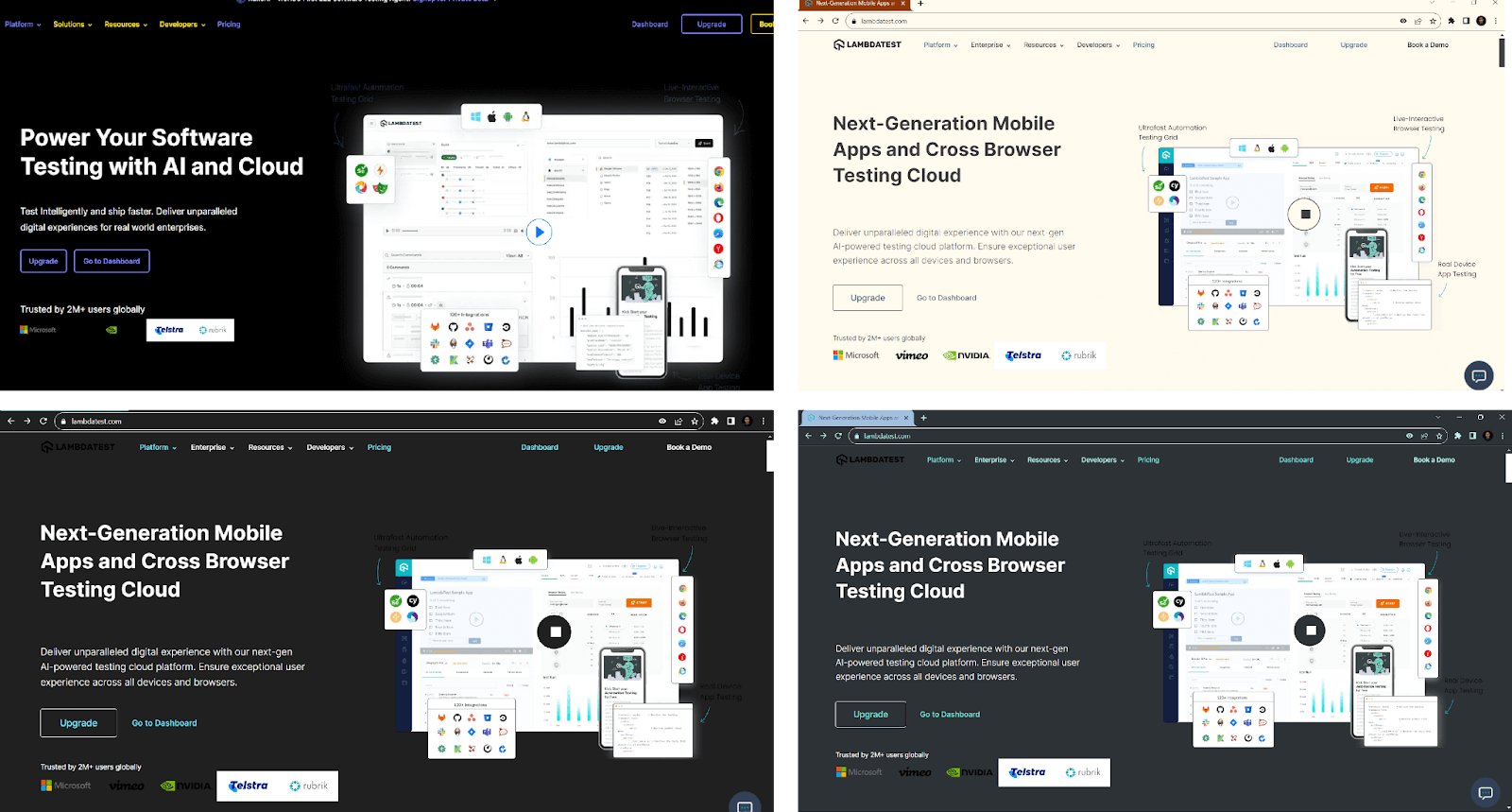
TestMu AI Landing page with WHCM Theme set to Night Sky, Desert, Aquatic, and Dusk.

Note: Check your website's accessibility and responsiveness across 3,000+ browser and OS combinations. Try TestMu AI Today!
How To Turn On/Off Windows High Contrast Mode?
You can choose either one of the three ways mentioned below to activate the High Contrast Mode on Windows:
Enabling High Contrast Mode Manually in Windows
The first way is to manually do it by going to Start > Settings > Accessibility > Contrast themes; you can also choose a theme as per your preference by selecting it from the dropdown menu.
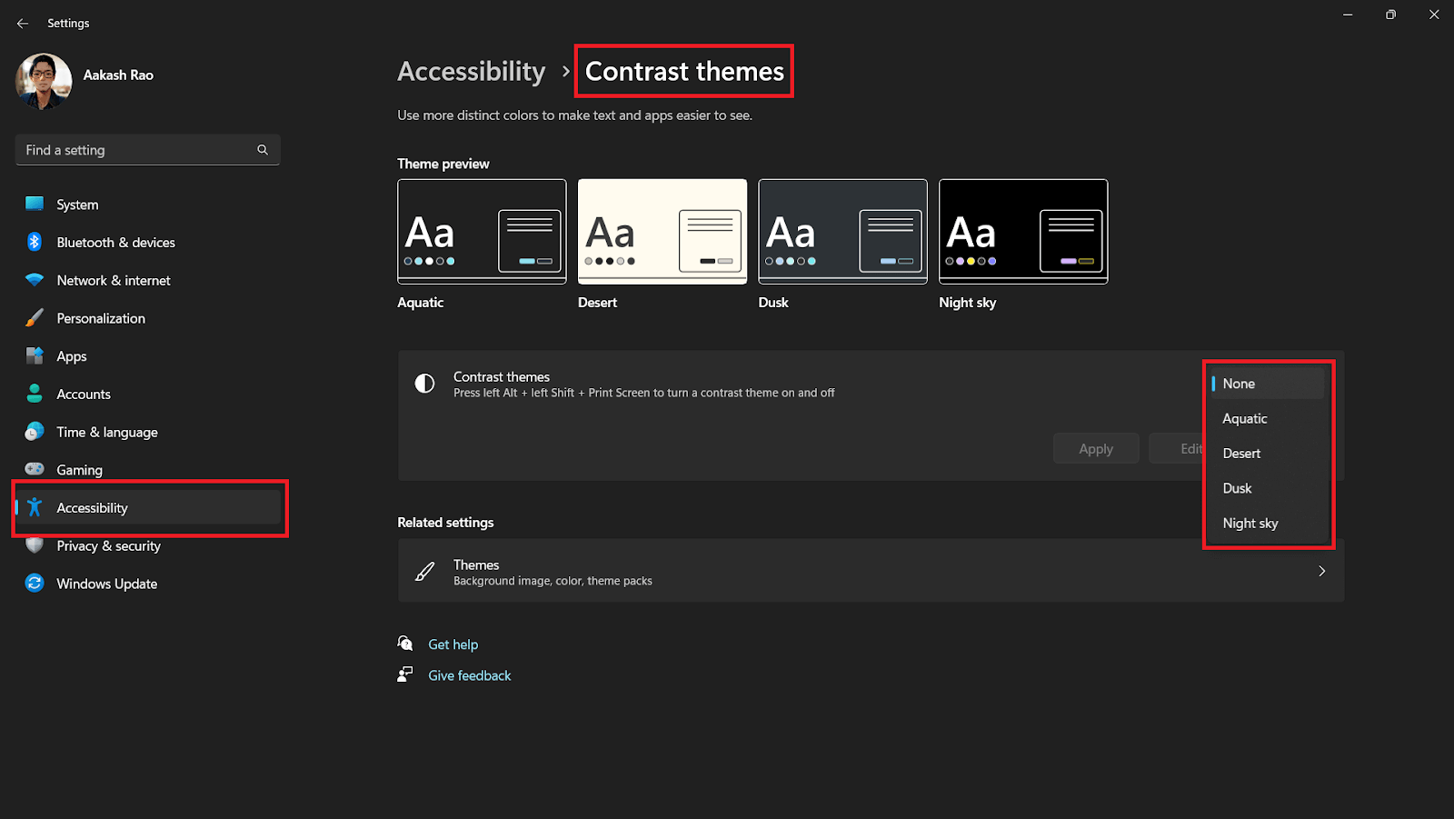
Note: The navigation for turning on/off the Windows High Contrast Mode can vary based on the Windows version.
| Windows version | Settings path | How to turn it off |
|---|---|---|
| Windows 11 | Start > Settings > Accessibility > Contrast themes, choose a theme, then Apply | Choose None, then Apply |
| Windows 10 | Start > Settings > Ease of Access > High contrast, turn on the toggle and choose a theme | Turn off the toggle |
Both paths come from Microsoft's guides to contrast themes in Windows 11 and high contrast mode in Windows 10. The same keyboard shortcut works on both.
Enabling High Contrast Mode Using Keyboard Shortcut
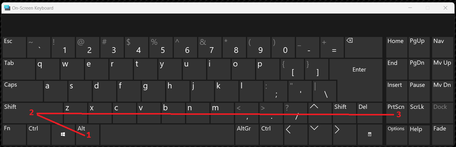
The second way is by using the keyboard shortcut Left Alt + Left Shift + Print Screen. This will activate the last-used contrast theme).
Enabling High Contrast Mode via Chrome DevTools
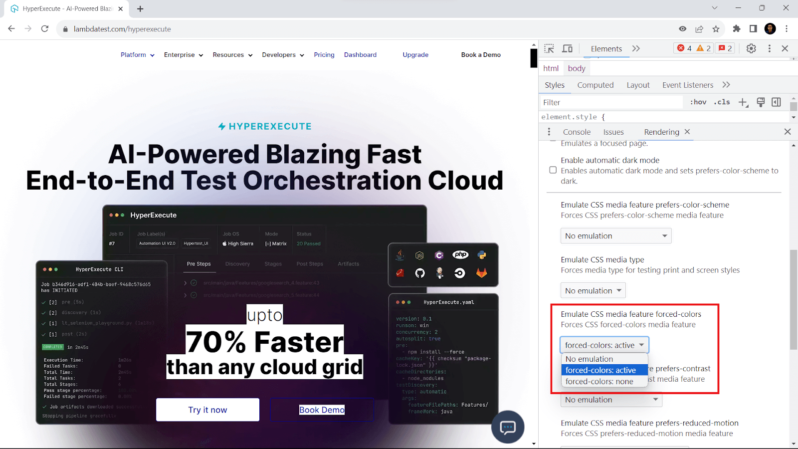
The third way to activate it is from inside the browser using an option (Rendering Tab) inside the DevTools of Chromium. To open the Rendering tab inside Chrome, go to Inspect Element or hit the keyboard shortcut Ctrl + Shift + I; this will open the DevTools.
On the top right inside the DevTools, click on Three Dots (⋮) > More Tools > Rendering. Another easier way to open the same is to simply use the Run Command (Ctrl + Shift + P) and then type the Rendering and hit Enter.
This will open the Rendering tab, where you can change the value of the Emulate CSS media feature for forced-colors from No emulation to forced-colors: active. By using DevTools, you can temporarily activate Forced Colors Mode in the browser, which applies the primary theme of the Windows High Contrast Mode (WHCM) contrast themes.
Another thing to note is that though Windows High Contrast Mode works fine with all browsers now, not all software might be fully compatible. Some third-party apps might not render perfectly in high contrast mode, potentially leading to reduced usability or visual glitches.
What If the High Contrast Shortcut Is Not Working?
If Left Alt + Left Shift + Print Screen does nothing, the Print Screen key is usually being captured before Windows sees it. The fixes suggested on Microsoft Q&A for this problem, in the order worth trying:
- Close tools that grab Print Screen - Screenshot apps such as ShareX and Lightshot, game overlays, and key remappers such as Microsoft PowerToys or AutoHotkey can intercept the key.
- Check the keyboard - On laptops, Print Screen can share a key with another function; try the shortcut on an external USB keyboard to rule out the built-in one.
- Check Group Policy on managed PCs - In gpedit.msc, go to User Configuration > Administrative Templates > Windows Components > Ease of Access and make sure accessibility keyboard shortcuts are not disabled.
- Use Settings instead - Contrast themes can always be applied from Settings, as shown in the table above.
Factors To Consider for User-Friendly Experience in WHCM
Creating a user-friendly experience in Windows High Contrast Mode (WHCM) is essential for ensuring accessibility for users with visual impairments. By focusing on specific design factors, developers can enhance usability and provide an inclusive digital environment for all users.
To ensure your website is functional and user-friendly in WHCM, follow a few key principles. The most important rule to remember is to prioritize usability and user experience above all else. WHCM is designed to improve accessibility, so your main goal should be to make content easy to read without compromising the overall user experience.
How do you make sure that the content is clear and user-friendly in Windows High Contrast Mode?
Here are some of the important points to consider:
Using Semantic HTML
When you talk about web accessibility, one crucial aspect that cannot be overlooked is the use of semantic HTML. This concept is particularly important not only for screen readers but also for Windows High Contrast Mode.
But why is semantic HTML so vital for Windows High Contrast Mode? The answer lies in how Windows applies styles based on the semantic meaning of elements rather than their visual appearance outside of this mode. In Windows High Contrast Mode, a link will receive hyperlink styles, a button will inherit button text styles, and so on.
One example of this is found on the ECI website, which includes a toggle to choose the high-contrast theme.
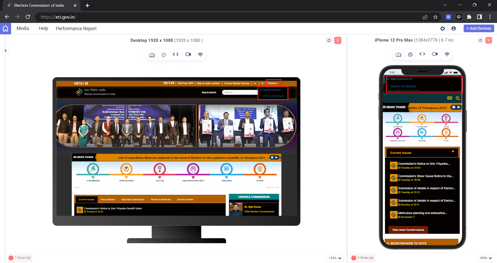
Choosing the correct semantic element is crucial in avoiding confusion for users navigating through the website in this mode. By embracing semantic HTML, you promote accessibility and ensure a seamless experience for all users, regardless of their chosen display settings.
At times, developers are tempted to use ARIA roles on elements like < div > to mimic buttons for assistive technology. However, in Windows High Contrast Mode, ARIA roles do not dictate the styles applied by Windows. Instead, the focus should be on semantic elements to ensure the proper functioning of websites in this mode.
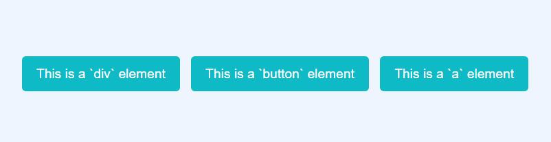
To understand this point, here is how the < div > , < button > , and < a > elements behave in High Contrast Mode when styled similarly.
With Normal Mode:
With Windows High Contrast Mode:
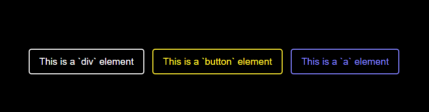
In the above example, the < div > , < button > , and the < a > elements share the same styling properties, ensuring they appear similar in default (normal) mode. However, the choice of semantic elements significantly affects how styles are applied in WHCM. It's crucial to bear in mind that WHCM demands a careful focus on user experience preservation.
Semantic HTML is one of the primary accessibility best practices that must be followed, as it helps screen readers and improves compatibility with modes like WHCM. To understand and apply other best practices, follow this blog on the web accessibility checklist to ensure all key standards are met.
Using Transparent Properties and Custom Focus
Using transparent properties and custom focus, developers often adjust the appearance of buttons and links by removing elements like borders, outlines, and underlining to create a visually pleasing style for most users.
However, when discussing Windows High Contrast Mode (WHCM), it's essential to remember that altering the visual style of buttons and links can lead to some issues.
For example, consider two types of buttons: a main button with a bright background and no border and a secondary button with a clear border but no background fill. While this design choice may look appealing under normal conditions, switching to WHCM can create confusion.
With Normal Mode:

With Windows High Contrast Mode:

In the above example, the primary button, which usually fits the design style in regular views, might end up blending with regular text in WHCM. This is where the clever use of transparent borders comes into play.
By adjusting the button's border property to 2px solid transparent, you create a transformation that gives the primary button the contrast it needs to stand out.
.main {
    /* adding transparent background for WHCM */
    border: 2px solid transparent;
}

This transparent approach isn't limited to buttons. When it comes to links, using the text-decoration-color: transparent property offers a new way of thinking.
In Windows High Contrast Mode, where people can set their colors, using a transparent underline is a guide, offering a subtle visual hint while keeping things accessible.
Let's see this in action with an example.
Normal Mode:

Windows High Contrast Mode:

The last thing that you need to take care of to apply is the :focus property that states for the links or buttons. Typically for this, you can use techniques like changing background colors or text color or use the CSS box-shadow property, which are effective in regular situations, but the problem with this approach is they might not work as expected in WHCM.
This is where transparent values come into play, along with CSS outline property providing a reliable way to highlight focus. This technique is useful where the other usual methods fall short. Let's see this action by adding the :focus property on the navigation links.
/* ...existing styles */


.nav-items > li > a:focus {
    /* Works perfectly on Normal Mode but not on WHCM */
    color: tomato;
    /* To apply Focus state in WHCM */
    outline: 2px solid transparent;
    outline-offset: 0.5rem;
}
Focus on Normal Mode:

Focus on using the outline on WHCM:

A key rule to remember, is that if you are using something other than an outline to highlight focus, you need to always make sure that there should be a fallback with outline-color: transparent to make it work well in WHCM.
I checked what forced colors mode strips by styling a div with role="button", a button, and a link identically (purple background, white text, a 2px box-shadow ring) and reading their computed styles with Playwright on Chrome and Windows 11 on the TestMu AI cloud, with forced colors emulated as active:
- box-shadow - Removed from all three elements, so a focus ring or border drawn with box-shadow disappears.
- background-color - The purple fill was replaced by the system background on all three.
- Text color - The link switched to the system link color, rgb(0, 0, 159), while the div and the button both became plain black text.
With no border set, the button and the div were indistinguishable from body text. Draw focus indicators with outline or a transparent border instead of box-shadow, because forced colors mode keeps those and recolors them.
Using Images With WHCM
When it comes to using images on a website, there are several options available: the < img > tag, the background-image CSS property, working with SVGs (Scalable Vector Graphics), and even creating art with CSS.
The options below behave differently in Windows High Contrast Mode (WHCM).
The < img > tag
The < img > tag is one of the most common methods for including images on a website. It is straightforward and generally behaves consistently in WHCM, displaying images as expected.
Let's look at an example of using the < img > tag in action:
Normal Mode:
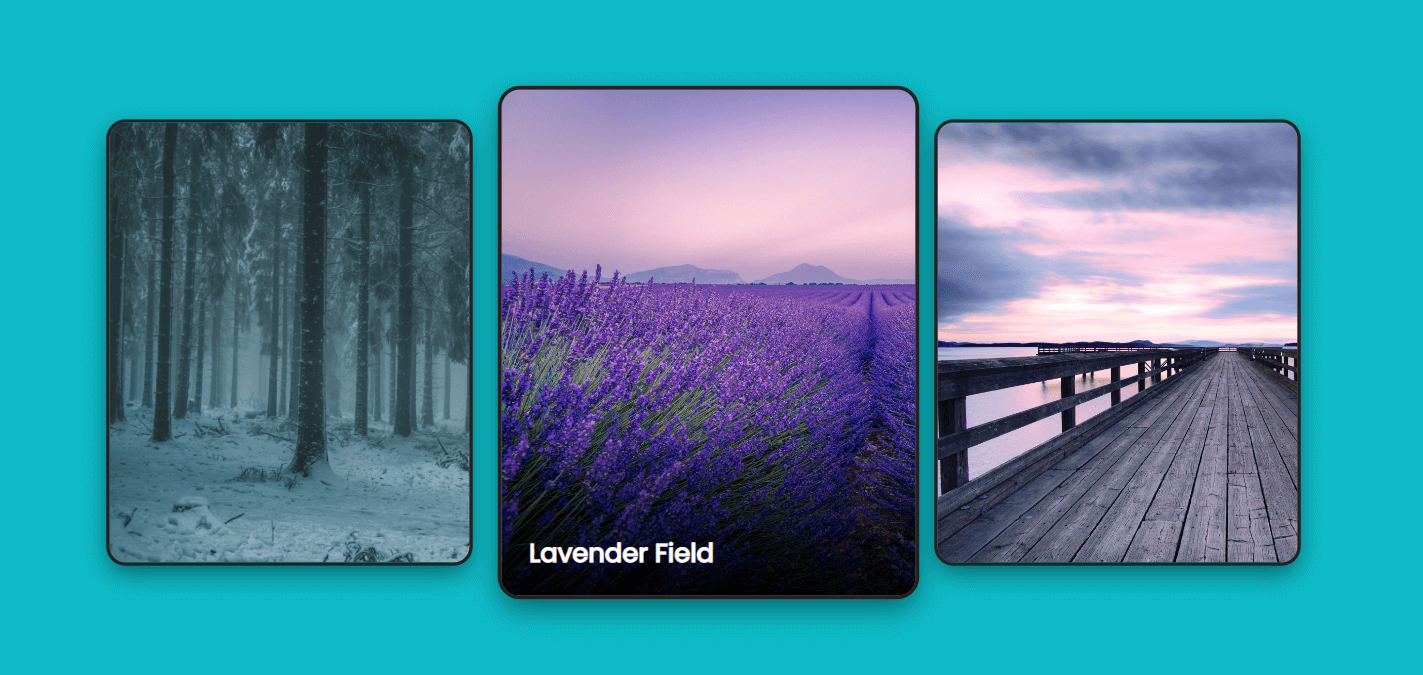
Windows High Contrast Mode:
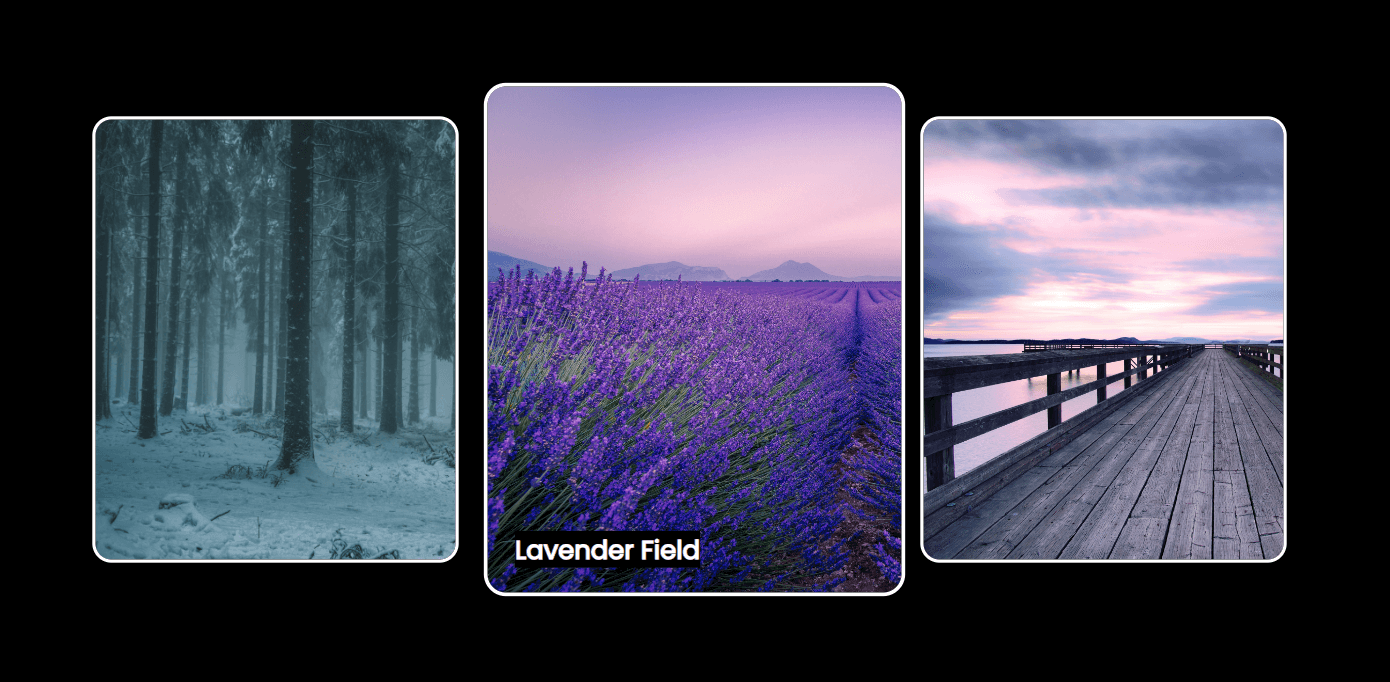
In the above example, the image will retain its appearance in both regular view and WHCM, maintaining its visual integrity and contributing to a user-friendly experience.
The background-image property
The background-image property is commonly used to set images as backgrounds for elements. This technique is effective in WHCM as long as the url() value is used. When we use a URL in the background-image property, Windows High Contrast mode allows the image to be displayed as the background, respecting the specified contrast settings.
However, if we use a gradient created with the CSS radial-gradient or linear-gradient function, the background color set by WHCM takes precedence, and the CSS gradient may not be visible as expected.
Let's take an example to understand this better.
Normal Mode:
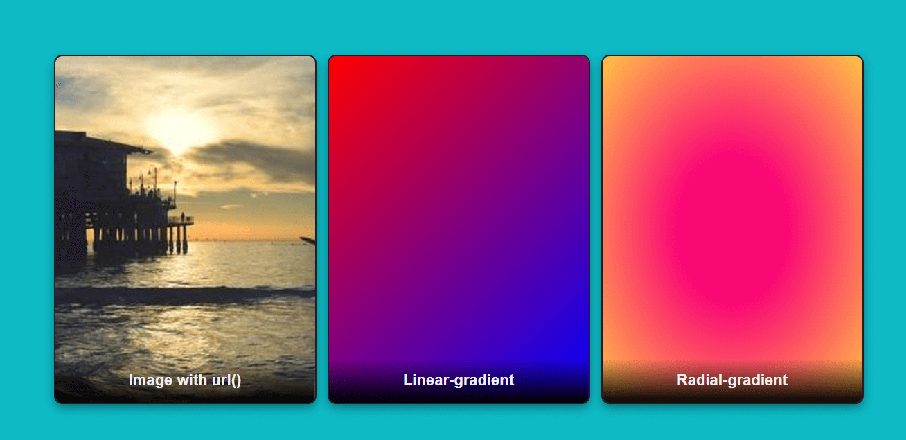
Windows High Contrast Mode:
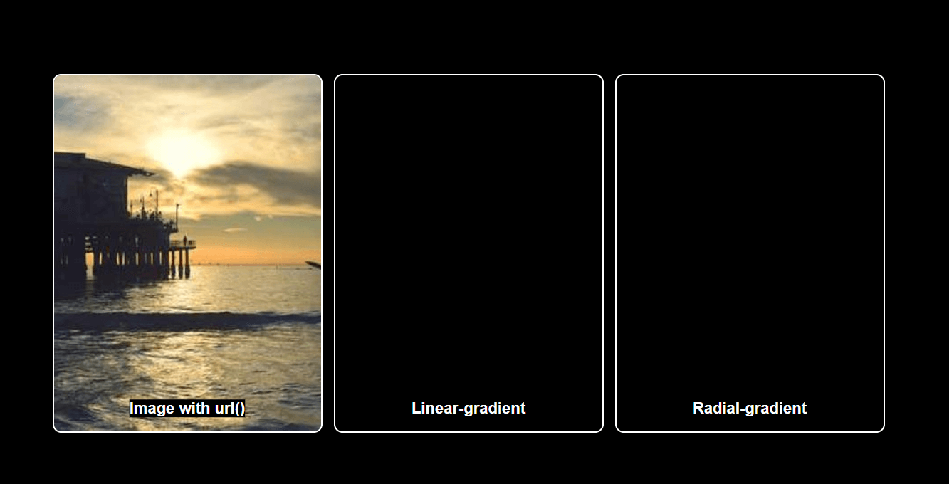
In the above example, you can notice that only the background-image with the url() function is displayed on Windows High Contrast Mode. The linear-gradient() and the radial-gradient() images get ignored, and the background gets dark on WHCM.
The < svg > tag
Similar to other image formats, SVG (Scalable Vector Graphics) generally retains its properties in WHCM, behaving similarly to regular images. However, the fill and stroke properties of SVGs are exceptions to the rule that WHCM overrides all colors.
In WHCM, SVG colors will remain unchanged, which is beneficial if the SVG is used as a logo or a general image. However, this can be less useful if the SVG is intended to are meaningful icon.
Let's understand this with an example.
Normal Mode:

Windows High Contrast Mode:

As you can notice, the fill of the SVG remains the same and doesn't get affected by WHCM, but you want to keep the same color as the link in WHCM. This is where the CSS currentColor keyword comes in. The currentColor is defined as the value for the color or fill property, which will be overridden by high contrast mode.
.icon-arrow {
    /* this will take the color from parent in normal mode and get overridden in WHCM along with the parent text */
    fill: currentColor;
}

Using Scrollbars With WHCM
When it comes to styling scrollbars, usability and accessibility are essential considerations. While applying visual styles to scrollbars is possible, challenges may arise, as WHCM tends to override certain styles to maintain a consistent and accessible user experience.
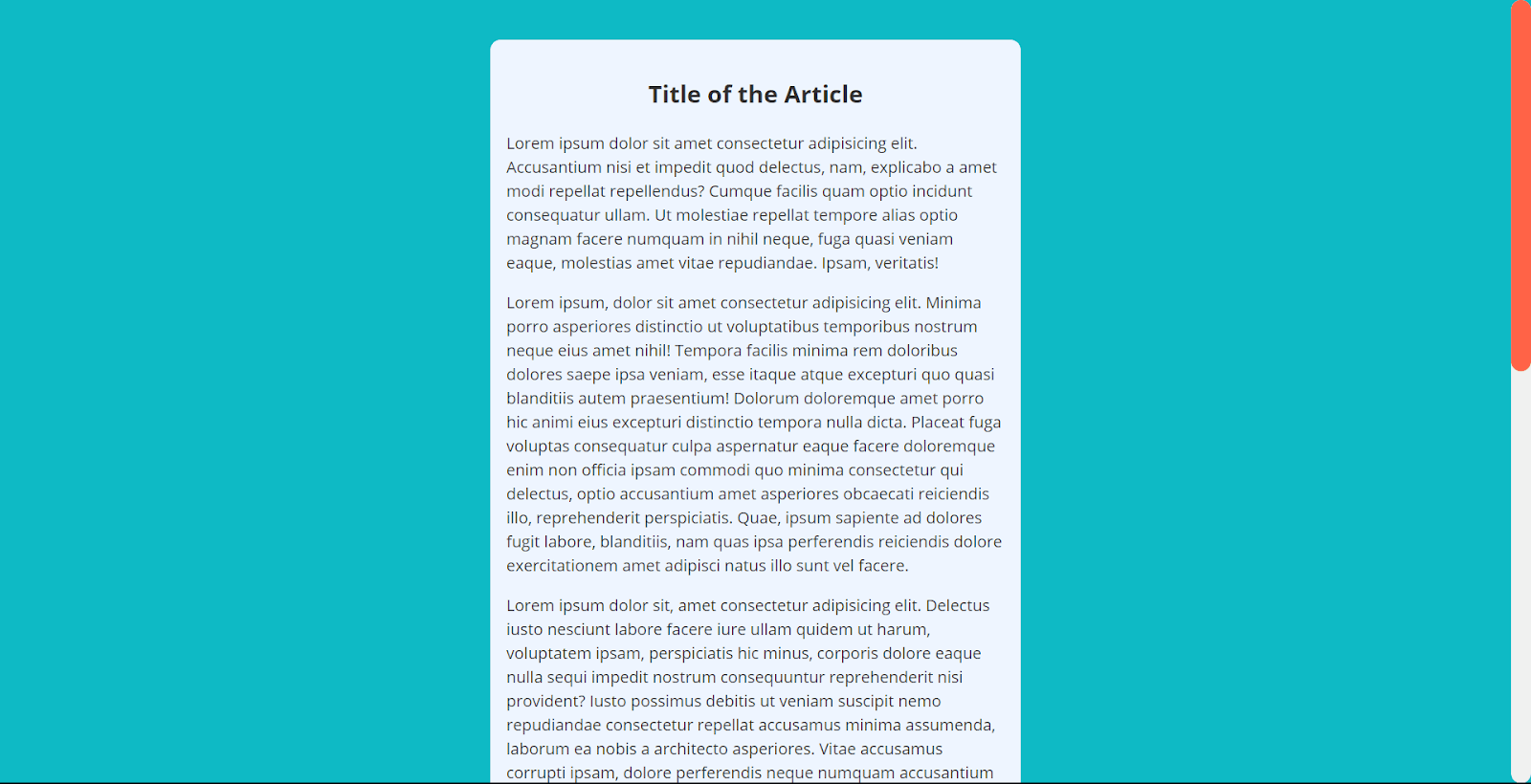
Suppose a website applies custom styles to the scrollbar using CSS. In that case, these styles may be ignored or overridden in High Contrast Mode, resulting in an unexpected appearance, especially when viewed in WHCM. This can cause scrollbars to appear either overly bulky or, in some cases, entirely invisible.
The solution to this problem depends on the chosen styling approach.
Let's consider an example where you have styled the scrollbar thumb with a solid color and explore how to make it work better in WHCM:
::-webkit-scrollbar {
    width: 20px;
}


::-webkit-scrollbar-track {
    background-color: #f0f0f0;
    /* Light gray background */
    border-radius: 10px;
}


::-webkit-scrollbar-thumb {
    border-radius: 10px;
    background-color: tomato;
    /* Tomato Red thumb */
}
Normal Mode:
Windows High Contrast Mode:
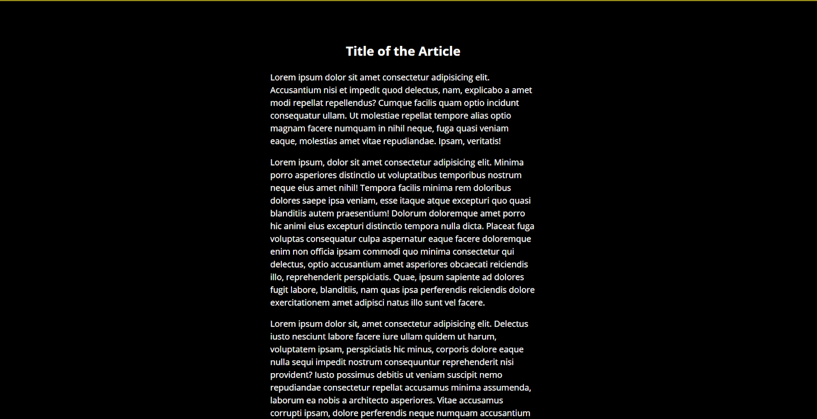
In WHCM, the CSS background-color property of the scrollbar thumb is forcibly replaced, rendering the scrollbar invisible. As we can notice, with our example in normal mode, our scrollbar is perfectly visible, but in WHCM, it becomes invisible,
The solution to this problem is to make use of transparent borders. By applying a transparent border to the scrollbar thumb, we can create the illusion of a solid color, resembling the default behavior of a scrollbar in WHCM:
::-webkit-scrollbar-thumb {
    /* ..existing styles */


    /* Transparent border for visibility in WHCM */
    border: 2px solid transparent;
}
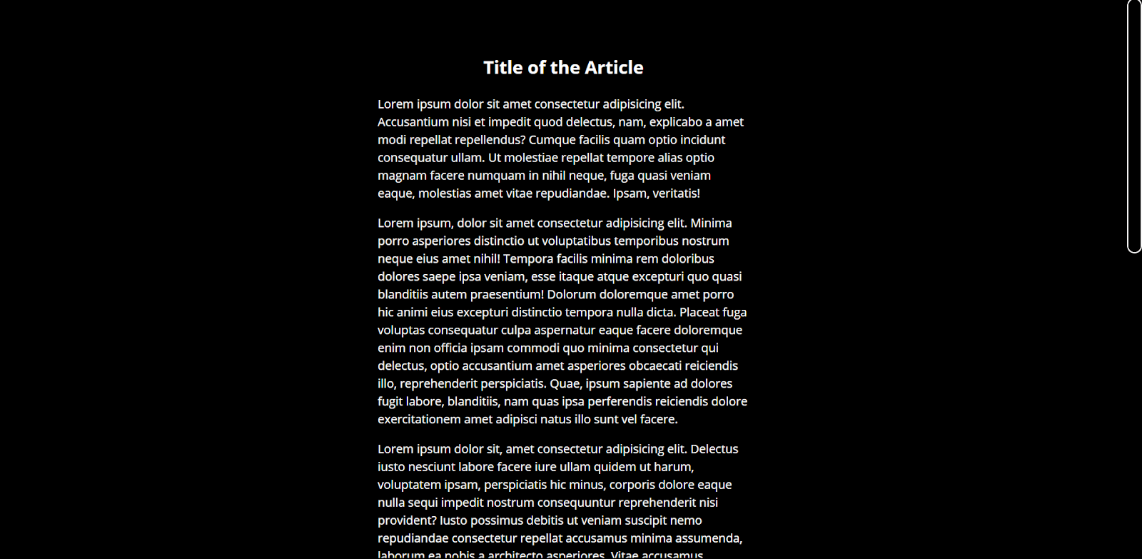
This transparent border technique works effectively in most cases, but caution is necessary if you have styled the scrollbar thumb.
These considerations primarily apply to Chromium-based browsers. Firefox offers a different method for styling scrollbars using the scrollbar-color and scrollbar-width properties. In WHCM, when using Firefox, additional adjustments are generally unnecessary, as the colors will be overridden to match the user's selected text color setting.
What Is Forced Colors Mode?
Forced Colors Mode is an accessibility setting where assistive technology actively adjusts the colors of a website or application to suit the needs of users with low vision. WHCM (Windows High Contrast Mode) is a type of Forced Colors Mode in Windows, with similar features available in other operating systems such as:
- Ubuntu - Offers its high-contrast implementation.
- Android - Includes high-contrast text mode.
- macOS - Provides a subtle contrast-boosting option.
When Forced Colors Mode is active, the browser enforces the user's chosen color palette - whether a default WHCM theme or a custom selection - overrides the native colors of the website to create a highly visible interface.
Key changes include:
- Darker backgrounds - It reduces glare and enhances readability.
- High-contrast text - It improves legibility.
- Simplified icons - It clarifies shapes and details.
- Bold outlines - It emphasizes buttons and text fields.
- Distinct hyperlinks and buttons - It stands out from other elements for easy access.
- High-contrast scroll bars - It facilitates easy navigation.
Styling WHCM Using Forced Colors Mode
When designing websites, ensuring accessibility and user-friendliness is vital, particularly for users employing Windows High Contrast Mode (WHCM). This mode alters the appearance of web elements to improve visibility and readability for individuals with visual impairments. Effectively styling your content to accommodate WHCM can significantly enhance the user experience across various settings.
To support this initiative, Microsoft has put efforts into new standards specifically designed for Forced Colors Mode, aimed at optimizing the functionality of Windows High Contrast Mode.
These standards include three key features that authors can use:
- Forced-Colors Media Query - This media query allows developers to detect when an active forced color mode is in use, enabling custom styling for enhanced accessibility.
- Forced-Color-Adjust Property: This property gives developers control over whether the user agent's system theme color overrides should be applied to a specific element and its descendants, ensuring that design choices remain intact in high-contrast settings.
- System Color Keywords - These keywords enable developers to apply colors that align with the user's color scheme, ensuring consistency and compliance with accessibility standards.
Forced-Colors Media Query
This media query is a feature designed to detect whether a browser or operating system has activated a mode that restricts a website's styles to a user-selected color palette. The primary purpose of the forced-colors media query is to enable web developers to create styles that work well in high-contrast or monochromatic color environments.
Syntax:
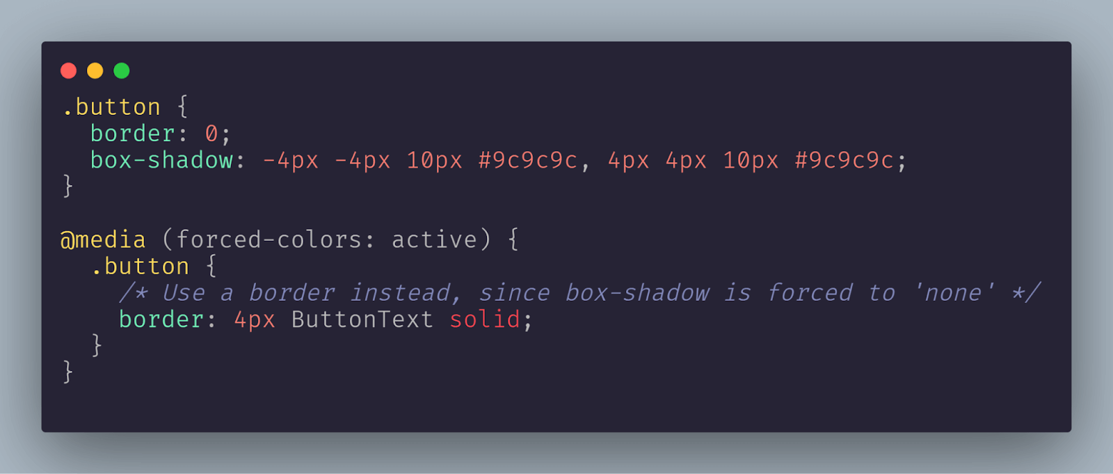
The behavior of this media query differs slightly due to the unique characteristics of Windows High Contrast Mode (WHCM). Certain properties will have limitations on the values they can hold, while some properties won't be modifiable at all. New values for certain properties come into play.
Before diving into creative applications, it's essential to remember that modes like WHCM prioritize usability, a principle that must be respected. Therefore, it's wise to use these properties only when necessary, specifically to enhance usability within this mode.
The media query primarily has two values: "none" and "active." The "none" value detects when forced colors mode is inactive, while the "active" value indicates its activation.
In the forced color mode, several properties are changed to user-defined values:
- SVG fill attribute: Sets the color or pattern used to fill the interior of an SVG shape or graphic.
- SVG stroke attribute: Defines the color or pattern applied to the outline or stroke of an SVG shape.
- text-decoration-color: Specifies the color of text decorations (like underlines, overlines, or line-throughs) applied to text.
- text-emphasis-color: Determines the color of emphasis marks (such as dots or circles) used in certain languages for highlighting text.
- border-color: Sets the color of an element's border, which can be applied to all sides or specific sides of the border.
- outline-color: Specifies the color of an outline, which is a line drawn around elements outside the border edge, usually for accessibility.
- column-rule-color: Defines the color of the line separating columns in a multi-column layout.
- scrollbar-color: Sets the color of the scrollbar's thumb and track on a web page, improving visual accessibility.
- -webkit-tap-highlight-color: Specifies the color of the highlight that appears when a user taps on an element on touch devices.
- background-color: Determines the color applied to the background of an element, affecting its overall appearance and readability.
Also, some properties exhibit specific behavior when faced with forced color mode:
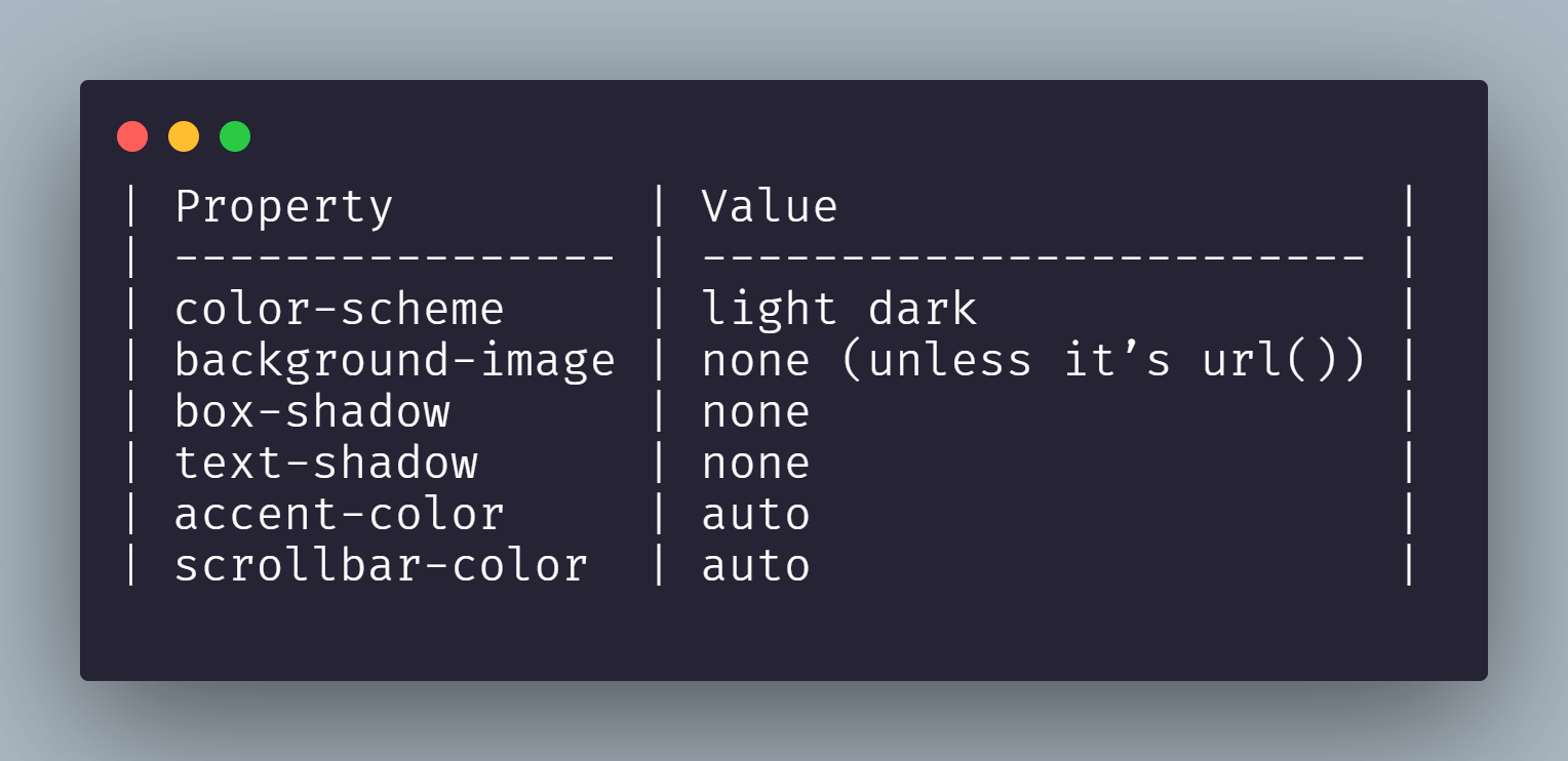
Now that you have a solid understanding of the forced-colors media query feature, let's further understand the other two tools available to enhance the experience in Windows High Contrast Mode (WHCM).
Forced-Colors-Adjust property
This property provides control over how certain colors behave in forced colors mode. It accepts two values: "auto" and "none."
- auto: This value allows the browser to override certain elements with its color choices.
- none: This option instructs the browser not to modify the colors you have selected.
To see this property in action, let's revisit the example of the < button > elements where we added transparent borders for WHCM. Without the forced-color-adjust property, both < button > styles are overridden by WHCM.
By using this property, we can ensure that the background and text color we defined remain consistent, even in forced color mode.
Normal Mode:

Without the forced-color-adjust property on WHCM:

With the forced-color-adjust: none; on WHCM
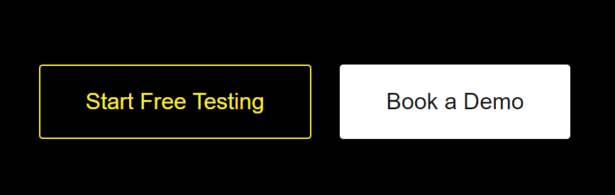
Typically, you must include this rule inside a media query specifically designed for when WHCM is active. However, it's also possible to use this rule without a media query, and it will function in the same manner.
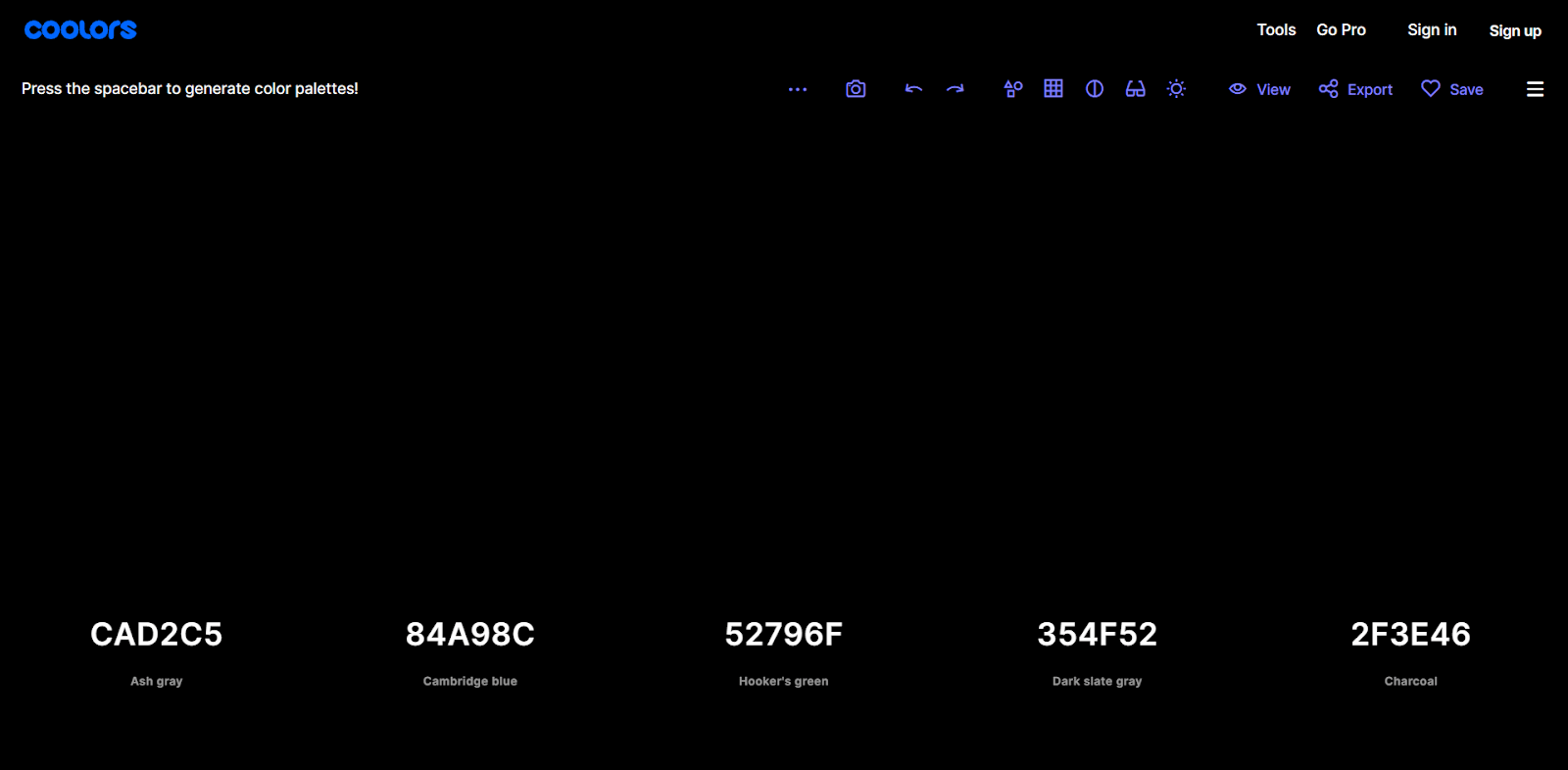
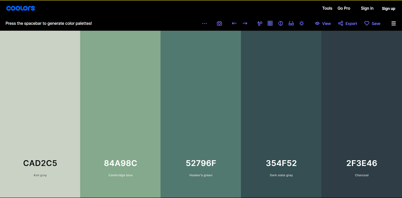
Let's consider a practical example where you can display color palettes on the site. In WHCM, those colors may disappear.
To address this issue, you can apply forced-color-adjust: none to the container. As a result, the colors will reappear, restoring visibility.
Without forced-color-adjust on WHCM
With forced-color-adjust: none; on WHCM
System Colors
Now, let's understand colors and the exciting feature known as "system colors" in Windows High Contrast Mode. Through the forced-colors media query, you gain access to a set of colors that can be used to replace specific elements of the design. To learn more about colors in accessibility, follow this blog on accessibility colors, which helps make web design accessible for all.
For instance, using color: LinkText will style the text to appear as a link.
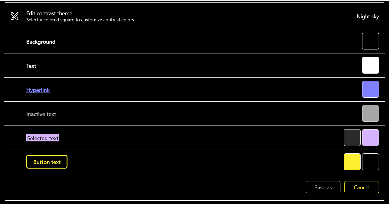
Color Keywords of Night Sky theme of Windows High Contrast Mode
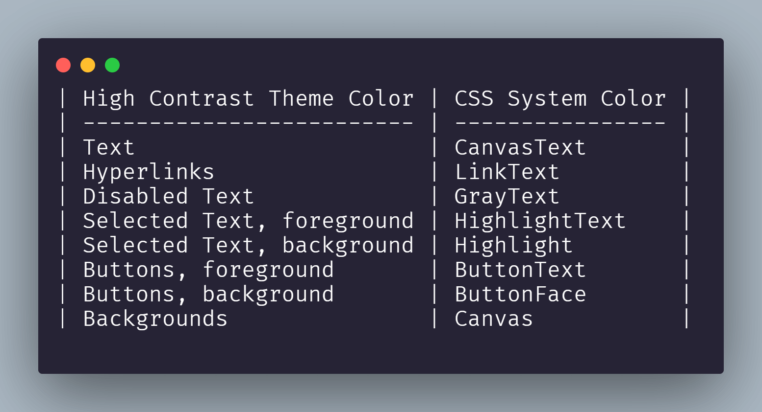
List of all CSS Color Keywords relevant to Windows High Contrast Mode
These system colors are tied to the structure of the webpage. Therefore, it's often more effective to change an element's tag to align with its purpose rather than focusing solely on its appearance in WHCM. However, there are also appropriate instances to use system colors.
Let's examine with an example of a CTA < button > that resides within an < a > element.
Normal Mode:
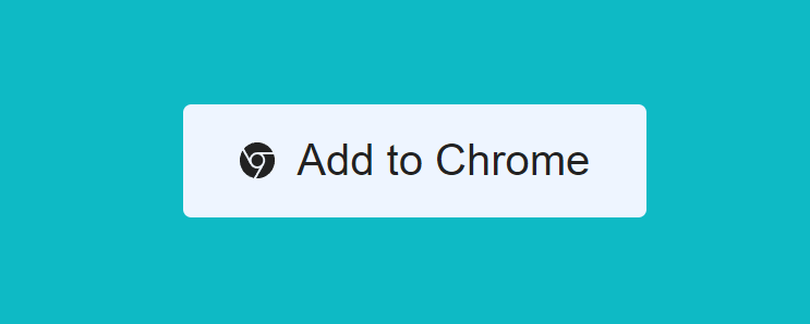
Windows High Contrast Mode:
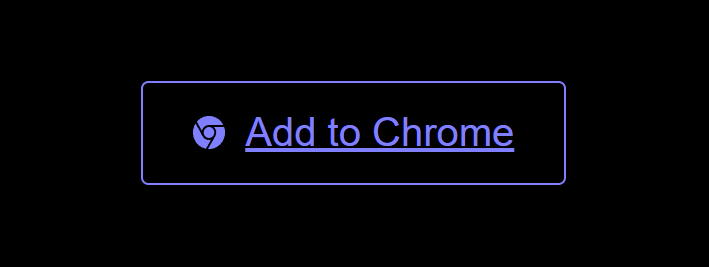
Now, you can use the ways that were discussed earlier to modify the color and background of this button, but this time, you will rely solely on the system colors.
@media screen and (forced-colors: active) {
    .cta-btn {
      outline-color: ButtonText;
      color: ButtonText;
    }

    .cta-btn:focus {
      outline-color: Highlight;
      color: Highlight;
    }
}
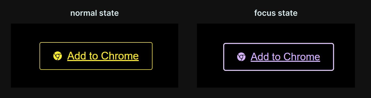
After changing the border and text color of the CTA button using the System Color Keywords
If transparent borders aren't an option, we can use system colors to enhance the appearance of the scrollbar in WHCM.
::-webkit-scrollbar {
    width: 20px;
}


::-webkit-scrollbar-track {
    background-color: #f0f0f0;
    /* Light gray background */
    border-radius: 10px;
}


::-webkit-scrollbar-thumb {
    border-radius: 10px;
    /* Tomato Red thumb */
    background-color: tomato;
    /* Transparent border for visibility in WHCM */
    border: 2px solid transparent;
}


@media screen and (forced-colors: active) {
    ::-webkit-scrollbar-thumb {
        background-color: ButtonText;
    }
}
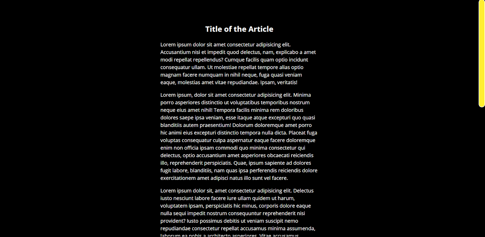
To enhance the effectiveness of these techniques, it's essential to also understand color contrast standards and how they impact accessibility. Follow this blog on Color Contrast Accessibility, which explains the system colors and forced-colors queries that will help you create designs that are not only visually cohesive but also fully accessible to users who rely on modes like WHCM.
Increased Contrast Mode vs Windows High Contrast Mode
When it comes to enhancing accessibility on your website, the CSS media query prefers-contrast: more allows you to meet the Web Content Accessibility Guidelines (WCAG) AAA contrast threshold. This is particularly beneficial for users who have configured their operating systems to increase contrast for better visibility.
However, Windows users do not have an "Increase Contrast" toggle in their system settings; instead, they use Windows High Contrast Mode (WHCM). WHCM applies a pre-designed theme across the operating system, including web content, which significantly alters how elements are displayed.
Increased Contrast Mode is entirely dependent on the designer or developer's implementation.
When using the prefers-contrast media query, you can specify high-contrast styles like this:
@media (prefers-contrast: more) {
/* High contrast styling goes here */
}
This approach requires website owners to create and code specific styles for Increased Contrast Mode. Unfortunately, many may not be aware of this capability or prioritize it in their design process. In contrast, WHCM operates as a Forced Colors Mode, meaning it doesn't rely on the website owner's design choices. Instead, it imposes a selected theme onto the website.
According to Microsoft's Fluent UI Web Components documentation, WHCM uses the forced-colors CSS media feature. When forced-colors is set to active, the user agent applies a limited color palette to the components, ensuring consistent accessibility across all web pages.
To ensure your website is accessible to all users, especially those using high-contrast modes, it's crucial for organizations to adhere to accessibility standards like WCAG.
Accessibility testing can play a vital role in identifying and resolving potential issues early in the design process. By integrating accessibility tools, such as the Accessibility DevTools Chrome extension offered by TestMu AI, you can simplify testing workflows, ensuring that contrast settings and other accessibility factors are considered.
TestMu AI is an AI-powered test execution platform that allows you to run manual and automated accessibility testing using various frameworks like Selenium, Cypress, Playwright and more across 3000+ browsers and OS combinations.

Browser Compatibility of WHCM/Forced Colors Mode Themes
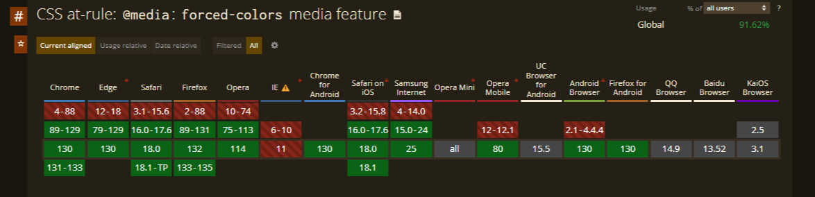
Windows High Contrast Mode (WHCM) offers a well-supported CSS media query that enables developers to apply specific styles when the mode is active:
@media (forced-colors: active) {
    /* WHCM styling goes here */
}
However, unlike Increased Contrast Mode, WHCM restricts styling options to a limited selection of carefully curated properties. The following elements can typically be styled in WHCM:
- Text color.
- Background color.
- Keyboard focus outline color.
While WHCM provides these styling options, browser support varies. Safari added support for the forced-colors: active media query in Safari 16, so all major current browsers now support it, per MDN browser compatibility data.
This makes it important for developers to verify WHCM compatibility across browser versions to ensure consistent user experiences for individuals relying on high-contrast settings.
Can You Test High Contrast Mode Automatically?
Yes. An AI-driven test agent can drive a real Chromium browser through Playwright, switch on Forced Colors Mode with a single method call, and flag WHCM failures without touching a Windows machine.
Playwright's page.emulateMedia() method accepts a forcedColors option, and setting it to active toggles the same forced-colors CSS state that Windows applies during WHCM.
An autonomous test agent, such as one built on Claude Code or a CI bot wired to Playwright's Model Context Protocol server, can call this method directly and take a screenshot.
It then diffs that screenshot against the normal-mode render to catch a missing background-image or an unstyled scrollbar that a plain code review would miss.
The catch is axe-core, the accessibility engine most of these agents call underneath: it checks the page in whatever mode the browser is in, so unless the test switches forced colors on first, the WHCM styles are never evaluated.
A page can then pass every automated accessibility check and still go unreadable once a real user turns on High Contrast Mode.
Even a re-run with forced colors active cannot tell an intentional forced-color-adjust: none override from a genuine bug, so treat the agent's report as a lead to check by eye, not a final verdict.
Conclusion
Turn on a contrast theme with Left Alt + Left Shift + Print Screen, walk your main pages with the keyboard, and fix anything that loses its border, focus ring, or icon. Then add a Playwright test that emulates forced colors, as shown above, and run it on TestMu AI's Automation Cloud across browsers on every build; the Playwright testing documentation covers connecting an existing suite.
Author

Aakash Rao
Blogs: 6


Aakash Rao is a Technical Writer and Developer with over 2 years of experience in front-end development and developer-focused content creation. He has authored 20+ technical blogs, tutorials, and documentation pieces, with hands-on expertise in HTML, CSS, JavaScript, React, Tailwind, Three.js, and tools like Git, Firebase, Figma, and Playwright. On TestMu AI (formerly LambdaTest), he has authored practical guides on CSS and front-end techniques, web accessibility, and visual testing. He applies a test-first mindset, using Jest and Playwright to embed automated testing early in the development cycle.
Reviewer

Rahul Mishra
Reviewer
Rahul Mishra is a Lead Member of Technical Staff at TestMu AI (formerly LambdaTest), leading frontend engineering and accessibility testing across the quality engineering platform. He mentors frontend engineers, runs code reviews and sprint planning, optimizes React.js rendering performance, and makes product features accessible to users with disabilities through WCAG and ADA-compliant accessibility audits. He brings 10+ years of experience across React.js, VueJS, TypeScript, Swift, Objective-C, and AWS, with earlier work as a Technical Lead at VectoScalar Technologies. Rahul holds a B.E. in Information Technology.


Windows High Contrast Mode FAQs
Did you find this page helpful?
More Related Blogs
TestMu AI forEnterprise
Get access to solutions built on Enterprise
grade security, privacy, & compliance
- Advanced access controls
- Advanced data retention rules
- Advanced Local Testing
- Premium Support options
- Early access to beta features
- Private Slack Channel
- Unlimited Manual Accessibility DevTools Tests