
Scan Your Website for WCAG Accessibility Issues
TestMu AI Accessibility Testing Agent Runs Automated WCAG Checks on Real Devices, and Screen Readers, Then Ties Each Fix to the Rule It Fails.

Color Contrast Accessibility: WCAG Ratios, Checks, and Fixes
Color contrast accessibility explained: WCAG 4.5:1 and 3:1 ratios, how to check color pairs, CSS contrast-color(), and a real audit of failing text.
Last Updated on:
Color contrast accessibility means making sure text and interface elements stand out enough from their background for people with low vision or color vision deficiencies to read them. WCAG 2.2 Success Criterion 1.4.3 sets the baseline: 4.5:1 for normal text and 3:1 for large text.
This guide covers the WCAG ratios, how to check a color pair, how to build contrast into a design system and CSS, and how to test a live site as one check within a wider accessibility testing program. It includes a contrast audit I ran on a real page, which found 11 failing text elements, most caused by a single brand color.
TL;DR
- WCAG 1.4.3 requires a contrast ratio of at least 4.5:1 for normal text and 3:1 for large text at Level AA.
- Large text means at least 18 point, or 14 point bold, which is roughly 24px or 18.5px bold in CSS.
- WCAG 1.4.6 raises the bar to 7:1 for normal text and 4.5:1 for large text at Level AAA.
- Buttons, input borders, icons, and focus indicators need at least 3:1 against adjacent colors under WCAG 1.4.11.
- Logos and purely decorative text have no contrast requirement, but text over images still needs to be readable.
- The CSS contrast-color() function returns black or white for any background and has worked in all major browsers since April 2026.
What Are the WCAG Color Contrast Requirements?
WCAG measures contrast as a ratio from 1:1 (no contrast, such as white on white) to 21:1 (black on white). Three success criteria set the minimums:
| Criterion | Applies to | Level AA | Level AAA |
|---|---|---|---|
| 1.4.3 Contrast (Minimum) | Normal text | 4.5:1 | - |
| 1.4.3 Contrast (Minimum) | Large text (18pt, or 14pt bold) | 3:1 | - |
| 1.4.6 Contrast (Enhanced) | Normal text / large text | - | 7:1 / 4.5:1 |
| 1.4.11 Non-text Contrast | UI components and meaningful graphics | 3:1 | - |
The ratio comes from the WCAG 2.2 definition of contrast ratio: (L1 + 0.05) / (L2 + 0.05), where L1 is the relative luminance of the lighter color and L2 that of the darker one. The W3C notes that results range from 1:1 to 21:1. Relative luminance weights green (0.7152) far above red (0.2126) and blue (0.0722), so two colors that look equally bright can score very differently.
The W3C notes that 18pt and 14pt bold are about 24px and 18.5px in CSS. Text in logos and inactive or purely decorative elements is exempt, which is why a disabled button can be lighter than an active one.
Accessible Color Combinations: Tested Contrast Ratios
I calculated these ratios with the WCAG relative luminance formula and truncated them to two decimals, so no pair is shown passing when it does not. The Bootstrap rows use the default theme colors from the Bootstrap 5.3 color documentation, which many sites ship unchanged. To test your own pairs, enter them in the TestMu AI color contrast checker.
| Text on background | Ratio | AA normal text (4.5:1) | AA large text (3:1) | AAA normal text (7:1) |
|---|---|---|---|---|
| #595959 on #FFFFFF | 7.00:1 | Pass | Pass | Pass |
| #767676 on #FFFFFF | 4.54:1 | Pass | Pass | Fail |
| #999999 on #FFFFFF | 2.84:1 | Fail | Fail | Fail |
| #FFFFFF on #0D6EFD (Bootstrap primary) | 4.50:1 | Pass, barely | Pass | Fail |
| #FFFFFF on #198754 (Bootstrap success) | 4.53:1 | Pass | Pass | Fail |
| #FFFFFF on #DC3545 (Bootstrap danger) | 4.52:1 | Pass | Pass | Fail |
| #000000 on #FFC107 (Bootstrap warning) | 12.88:1 | Pass | Pass | Pass |
| #FF0000 on #FFFFFF | 3.99:1 | Fail | Pass | Fail |
| #FF0000 on #008000 | 1.28:1 | Fail | Fail | Fail |
#767676 is the lightest neutral gray that passes AA as body text on white: one step lighter, #777777 measures 4.47:1 and fails. Bootstrap's primary, success, and danger colors with white text sit within 0.03 of the 4.5:1 line, so lightening one of them by even a shade drops white text below AA. Pure red on green fails every level at 1.28:1, before color blindness is even considered.
Color Contrast and Vision Impairment
Web accessibility means building sites that people with disabilities can perceive, operate, and understand. Contrast is one of its most visible parts: according to the World Health Organization, at least 2.2 billion people globally have a near or distance vision impairment, and color vision deficiencies change which color pairs people can tell apart.
Low contrast is also the most common failure on the web. The WebAIM Million 2026 report, which tested one million home pages in February 2026, found text below the WCAG 2 AA thresholds on 83.9% of home pages, with an average of 34 distinct low-contrast instances per page.
Low contrast hurts more than people with disabilities. Text that passes WCAG stays readable on a phone in sunlight, on a dim laptop screen, and on cheap monitors with poor calibration.
Contrast does not cover hue. According to the National Eye Institute, about 1 in 12 men have color vision deficiency; the most common type makes red and green hard to tell apart, and a less common type makes blue and yellow look the same.
WCAG 1.4.1 Use of Color (Level A) requires a second cue whenever color carries meaning, such as an icon and a text message on a red error state, or an underline on links in body text. To check a design, view it in grayscale or run a screenshot through a color blindness simulator. If a chart legend, status badge, or required-field marker becomes ambiguous, it depends on hue alone.

Color Contrast in a Design System
A design system is the shared set of components, tokens, and rules a team builds products from. It is the cheapest place to fix contrast, because a color token used by 50 buttons is fixed once instead of 50 times.
- Check color pairs, not single colors - a token is only accessible in combination, so document which text color is allowed on each background token and its ratio.
- Cover every state - hover, focus, active, visited, and disabled states each change colors and each need their own check.
- Include non-text elements - input borders, icons, and focus indicators fall under WCAG 1.4.11 Non-text Contrast, which asks for 3:1 against adjacent colors.
On a site that is already live, fix contrast inside the existing palette rather than starting a redesign:
- Keep the background - every ratio on the page is measured against it, so changing it means rechecking borders and every color tied to it.
- List the colors in use - collect every text, border, and icon color from the stylesheet or design tokens.
- Measure each pair - calculate each color's ratio against the background it sits on.
- Adjust only the failures - darken or lighten failing colors within the same hue until they pass, and leave passing pairs alone.
- Recheck before release - scan the updated pages, including hover and focus states, before republishing.

Tools for Checking Color Contrast
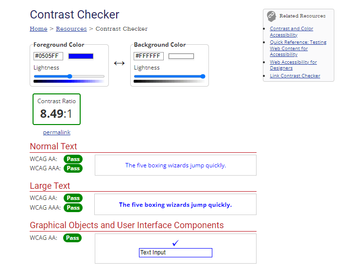
The quickest check is a contrast checker, such as the TestMu AI color contrast checker linked above or the WebAIM Contrast Checker: enter a foreground and background color and it returns the ratio with a pass or fail for normal and large text. A blue foreground (#0505FF) on a gray background (#737373) gives 1.79:1 and fails both; the same blue on white (#FFFFFF) gives 8.49:1 and passes both.
Beyond pair checkers, these tools cover color blindness and colors you can only see on screen:
- TestMu AI color blindness simulator - upload or paste a screenshot to see it under protanopia, deuteranopia, tritanopia, achromatopsia, and their weaker forms, side by side with the original.
- Colour Contrast Analyser from TPGi - a desktop app with an eyedropper that samples any pixel on screen, so you can check a rendered page or a mockup instead of retyping hex values.
Color Contrast Accessibility With Web Elements
Designing accessible web elements in today's world is important for inclusivity in technology. As of now, the web is the de facto source of information distribution on the planet and is accessed by billions of people. Significant number of people who access the web daily are either visually impaired or physically challenged. With that in mind, creating a more inclusive website or application becomes crucial.
Adding Contrast to Elements With Default Styles
Web elements with default styles can be challenging when applying to style. Since these elements are designed to do specific tasks, and as a result, it has default styles attached to them. For example, the button, and input tag are web elements that have their behavior already determined by the browser.
To ensure these elements mentioned are styled properly regarding color contrast, we can completely remove or rewrite the default styles from the user-agent-stylesheet with new styles that improve color contrast.
Here is an example
HTML:
<main>
  <dv>
    <button>a button tag</button>
  </dv>
  <div>
    <a href="">an anchor tag</a>
  </div>
  <div>
    <input type="text" placeholder="an input tag">
  </div>
</main>
CSS:
* {
  padding: 0;
  margin: 0;
  box-sizing: 0;
}

body {
  display: flex;
  justify-content: center;
  align-items: center;
  width: 100vw;
  height: 100vh;

  background-color: rgb(203 213 225);
}
Preview:
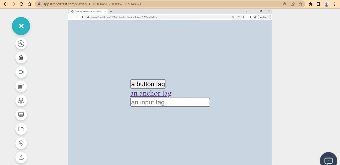
Here, the color contrast could be better and might not be seen properly by people with visual impairment individuals.
The reason for this is that the background-color and element border are similar and do not provide a good contrast. We can improve this by rewriting the element default styles.
Here is a perfect example of good color contrast.
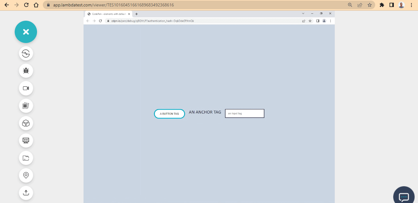
Here, we enhanced the color contrast by creating a new style that superseded the default one through the user-agent stylesheet.
CSS:
main {
  display: flex;
  justify-content: space-between;
  gap: 20px;
  flex-wrap: wrap;
  margin: 1em;
}

button {
  padding: 1em 2em;
  border-radius: 100px;
  border: 4px solid #0ebac5;
  cursor: pointer;
  user-select: none;
  background: white;
  text-transform: uppercase;
}

a {
  text-decoration: none;
  color: #1e183a;
  font-family: calibri;
  font-size: 1.5em;
  text-transform: uppercase;
}

input {
  padding: 1em;
  border: 2px solid #1e183a;
  outline: none;
}
Adding Contrast to Pseudo Class
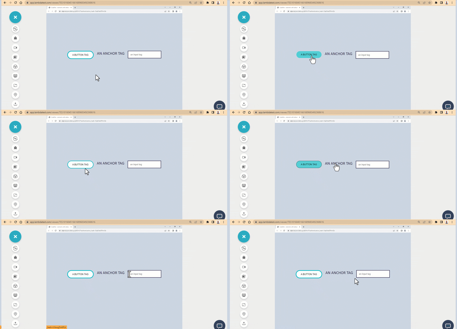
We aim to create effective contrast on webpages by making sure that text and other elements stand out distinctly from their backgrounds. However, it's equally important to take into account how these elements appear when a user engages with them. This is necessary to maintain strong contrast even when the element's state changes.
For example, elements such as hover, active, focus, and visited states need to be considered in terms of their appearance before and after user interaction.
Images Text and Color Contrast Accessibility
Incorporating text onto images can result in insufficient contrast, as the text might become blurred or pixelated if the image's quality deteriorates or if the image is created and saved with an extremely low resolution.
WCAG (Web Content Accessibility Guidelines) provides requirements for making websites, mobile applications and other digital content accessible to people with impairments. It is advisable to separate the images from text, as this will enable the text to render separately by the user-agent-stylesheet, and you can add custom styling to it if need be.
Below is an example of how text is separated from images to ensure better readability and improved color contrast accessibility:
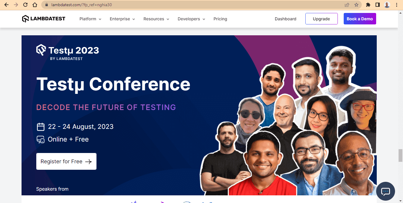
Here, the image on the right is positioned relative, while the text, logo, and icons on the left are positioned absolute of the image. The text is above the image in the render stacking context and is rendered separately from the image because the text is an actual text and is rendered as a text, not an image.
This is a good example of color contrast accessibility, as the image, logos, and icons are visible. Since the text, logos, and icons are separate, accessibility tools like screen readers and text-speech can detect it for visually impaired users.
In the next section of this tutorial on color contrast accessibility, we will build an accessible fast-food restaurant website with a contrast-checked color palette.
Note: Discover the secrets to flawless Mobile UI Testing in latest post! Dive into a comprehensive guide filled with expert insights and best practices.
Building a Fast-Food Restaurant Website for Color Contrast Accessibility
We've discussed color contrast accessibility, design system, color contrast, and tools used to aid a good color contrast.
In this section on color contrast accessibility, we will build a simple case study of what we have learned. This will be about developing a fast-food restaurant website that sells noodles.
Before you get started, here is the complete project on CodePen. The images used in this project are taken from Unsplash.
Now that we've got that out of the way. Let's create a project file called DEMO; inside it, create another folder named img, where all the images reside.
Structuring the HTML document
Create an index.html file and open it in your favorite text editor. In this case, I am using VS Code.
Here is the code structure of what the HTML looks like.
HTML:
<!DOCTYPE html>
<html lang="en">
<head>
	<meta charset="UTF-8">
	<meta http-equiv="X-UA-Compatible" content="IE=edge">
	<meta name="viewport" content="width=device-width, initial-scale=1.0">
</head>
<body>
</body>
Now let's add the body structure.
The body section is divided into three main sections, each of which is a single viewport. Now let's see how to do it.
Here is the code structure for the navbar and the hero section.HTML:
<div class="full_page">
<div class="full_page">
		<!-- Header Section and Logo, Navbar and NavLinks -->
		<header class="front_page">
			<nav class="site_navbar">
				<div class="site_logo">Noodlesly</div>
				<div class="site_nav_links">
					<ul>
						<li>Menu</li>
						<li>Contact</li>
						<li>About Us</li>
					</ul>
				</div>
			</nav>


	<!-- Hero section and aside image -->
	<main class="hero_section">

		<!-- Heading Text -->
		<section class="text_sectioon">
			<section class="heading_text">
				<h1>Eat Noodlesly <br /> Everyday</h1>
				<p>Order today and receive your <br /> package instantly</p>
			</section>

			<section class="buttion_section">
				<button>View Menu</button>
				<button>Place an Order</button>
			</section>

		</section>

		<!-- Aside Image -->
		<aside class="here_noodles">
			<img src="img/noodels.png" alt="images of noodles with two chop sticks">
		</aside>
	</main>
</header>
The above HTML code is about the navbar, heading text, and display image, you see on the front page.
We have a <header> tag with a class of front_page, <nav> tag with a class of site_navbar, and two < div > tags with a class of site_logo and site_nav_links, respectively.
Furthermore, we also have a <main> tag with a class of here_section, which is a wrapper of the heading text, display image, and the front page buttons.
Inside this, the <main> tag is nested with two <section> tags with a class of text_sectionand heading_text, which is responsible for the website heading and paragraph text. Also, we have another <section> tag with a class of button_section for the front-page button and a <aside> tag with a class of here_noodlesfor the display image.
These are the tags we needed to style the front page.
Here is the code structure for the menu section.
HTML:
<!-- VIEWPORT TWO -->
	<main class="food_list">
		<section>
			<div class="our_menu">
				<h1>OUR <span>MENU</span></h1>
				<p>We make the most delicious noodles in town, freshly made, <br /> all kinds of noodles you love, from different cultures. </p>
			</div>

			<div class="our_food_items">
				<div class="italian_noodles">
					<img src="https://placehold.co/600x400.png" alt="Italian Noodles" class="items_img">
					<h2>Italian Noodles</h2>
					<p>At Noodlesly we make the finest Italian Noodles <br />
					Fresh from the kitchen, hot and spicy <br />
				    Place your our or book a place at our restaurant</p>
				</div>

				<div class="french_noodles">
					<img src="https://placehold.co/600x400.png" alt="French Noodles" class="items_img">
					<h2>French Noodles</h2>
					<p>At Noodlesly we make the finest French Noodles <br />
						Fresh from the kitchen, hot and spicy <br />
						Place your our or book a place at our restaurant</p>
				</div>

				<div class="chinese_noodles">
					<img src="https://placehold.co/600x400.png" alt="Chinese Noodles" class="items_img">
					<h2>Chinese Noodles</h2>
					<p>At Noodlesly we make the finest Chinese Noodles <br />
						Fresh from the kitchen, hot and spicy <br />
						Place your our or book a place at our restaurant</p>
				</div>
			</div>
		</section>
	</main>
The above HTML code in the section is about the menu section. We have a simple heading text with three different images of noodles from different cultures. Here is the code structure.
We have a <main> tag with a class of food_list, nested inside this are three <div> tags with a class of italian_noodles, french_noodles, and chinese_noodles, respectively. Also, we have three different <img> tags attached to each of the <div> tags mentioned.
Below is the HTML code structure for the about section.
HTML:
<!-- VIEWPORT THREE -->
<!-- The about section -->
<main class="about_section">
<section>
<aside class="about_us">
<div class="about_heading">
<h2>About Us</h2>
<p>Noodlesly Restaurant</p>
<div class="double_dash"></div>
</div>
<div class="about_text">
<p>The Noodlesly? You know -- Italian, French and Chinese Noodles
<br /> These are the things you eat that you find yourself <br />
running out each week for each day. learn how we make the best noodles
<br /> everybody is about.
</p>
</div>
<div class="read_btn_wrap">
<button class="read_btn">Read More</button>
</div>
</aside>
<aside class="about_us_img">
<img src="img/aside.jpg" alt="spice noodles">
</aside>
</section>
</main>
</div>
<footer>
<div><p>All Right Receive © 2022</p></div>
</footer>
The HTML code in the section is about the about section. Here we have a heading text, a paragraph about the website foods, and an aside hero image.
We have a <main> tag with a class of about_section, nested inside this are two <div> tags with a class of about_heading and about_text. Below this is <button > tag with a class of read_btn and a <aside> tag with a class of about_us_img for the aside hero image.
Lastly, we added a simple <footer> to the webpage.
Now let's run the HTML code and see how it looks on the browser.
Browser Output:
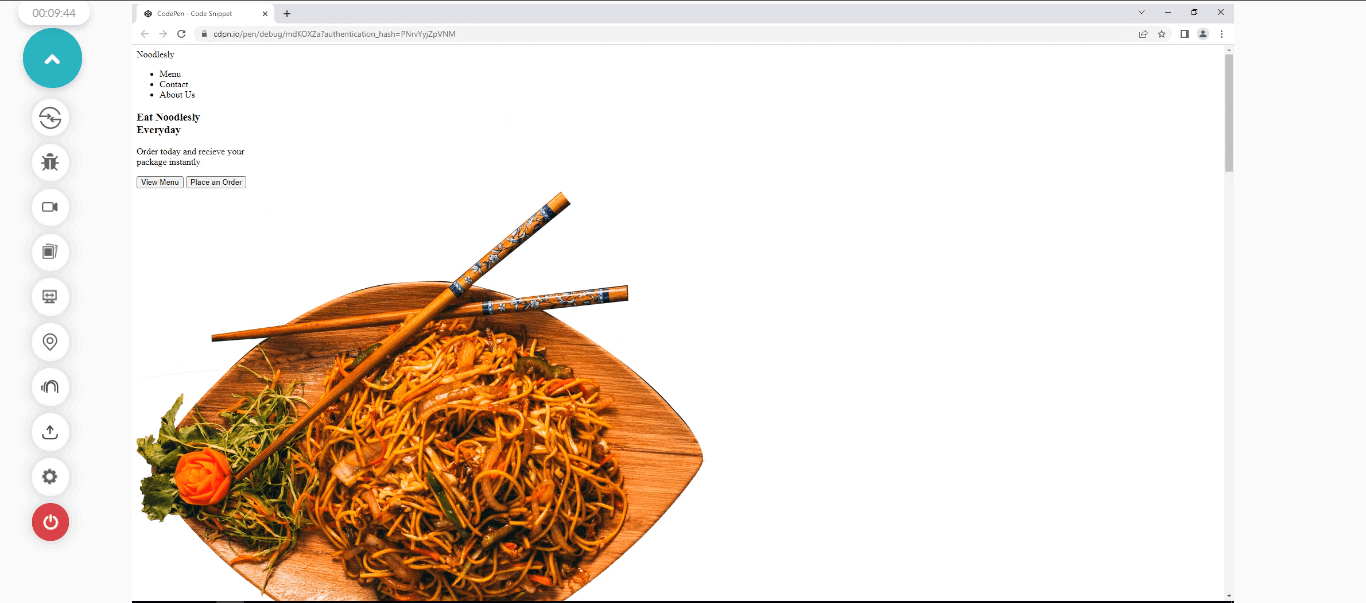
From the browser output, what we can see above is a display of a simple HTML code of the website we are about to build. To make it look nice, we will add some CSS to it.

Styling the HTML with CSS
Now that you have the HTML code structure set up and you've run it on the browser and see how our website looks. Now, let's link a CSS file to the HTML document.
HTML:
<link rel="stylesheet" href="main.css">
Now, let's add some CSS style to the webpage.
CSS:
*, ::after, ::before{
    padding: 0;
    margin: 0;
    box-sizing: border-box;
}
From the above code, we target all the web elements and remove all the white spaces for easy styling.
Browser Output:
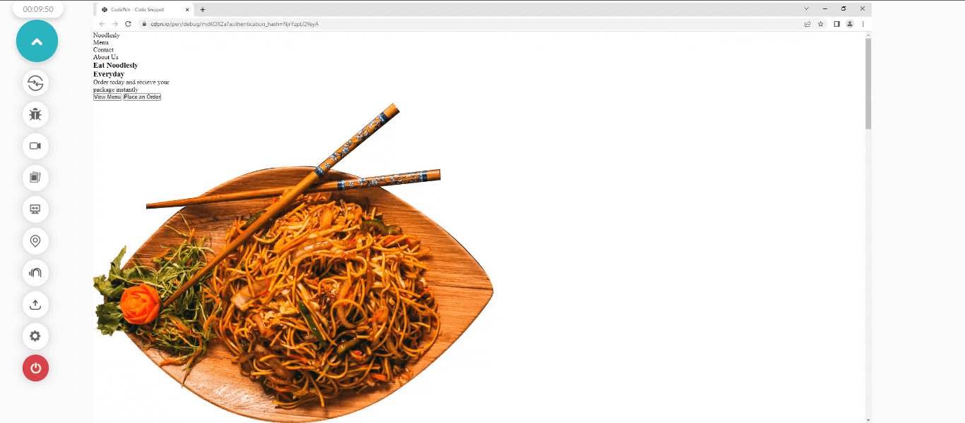
You'll notice all the white space has been removed from the browser preview.
Styling the Header and Navbar
Now it's time to style the header and navbar of the webpage.
CSS:
/* HEADER AND NAVBAR */
.front_page{
    width: 100vw;
    height: 100vh;
}

.site_logo {
    color: blue;
    cursor: pointer;
    font-weight: bolder;
    font-size: larger;
}

.site_navbar {
    display: flex;
    justify-content: space-around;
    font-family: calibri;
    font-size: larger;
    margin: 2rem 0;
}

.site_nav_links ul{
    display: flex;
}

.site_nav_links ul li{
    list-style: none;
    margin: 0 2rem;
    cursor: pointer;
}

.site_nav_links ul li:hover {
    color: blue;
    font-weight: bold;
}
Browser Output:
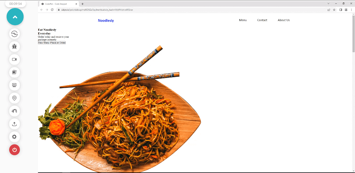
The classes responsible for how the logo and the navbar look are as follows.
- .front_page: This class has a width of 100vw and height of 100vh that make the header tag expand and occupy the entire viewport width and height, pushing other contents below the viewport of the front page.
- .site_logo: This class is assigned a color of blue (because, based on the color contrast test we did, blue has high contrast for a white background). We set the cursor to the pointer, font-weight to bolder, and font-size to larger. This creates an emphasis for the logo on the webpage.
- .site_navbar: We apply a display of flex to convert the <div> elements to flexible items, which also makes them appear line by line, a justify-content of space-around to add an equal space distribution around the elements, a font-family of calibri, font-size of larger, and margin of 2rem 0. The 2em targets the top and bottom, while the 0 targets the left and right.
- .site_nav_links ul: This is a very simple one. You'll notice that the <li> items still appear in a block form, so we set the parent element <ul> to display: flex, which makes the <li> items a flexible item.
- .site_nav_links ul li: On the other hand, we set the list-style to none to remove the bullet at the left-hand side, the margin to 0 for the top and bottom, and 2em for the left and right. A cursor of the pointer is also added.
- .site_nav_links ul li:hover: On hover, we set the color to blue and font weight to bold.
Styling the Hero Section and Image
In this section on color contrast accessibility, we'll focus on styling the hero section and the aside image of the front page. Now let's see how this is done
CSS:
/* Hero__section */
.hero_section{
    display: flex;
    justify-content: space-around;
    width: 67%;
    margin: 0 auto;
}

.heading_text h1{
    font-size: 5rem;
    font-family:'Franklin Gothic Medium', 'Arial Narrow', Arial, sans-serif;
    margin-top: 1em;
}

.heading_text p {
    color: blue;
    font-family: calibri;
    font-size: 1.5em;
    margin: 1em 0;
}

/* buttons section */
.buttion_section button{
    padding: 1em 2em;
    border-radius: 20px;
    cursor: pointer;
    background-color: blue;
    border: none;
    color: white;
    transition: all 100ms linear;
}

.buttion_section button:hover {
    background-color: white;
    color: blue;
    border: solid 2px blue;
}

.buttion_section button:last-child{
    border-radius: 20px;
    background-color: transparent;
    color: blue;
    box-shadow: 2px 2px 4px 2px rgba(0,0,0,0.5);
    margin-left: 1em;
}

.buttion_section button:last-child:hover {
    background-color: blue;
    color: white;
    box-shadow: none;
}

/* Aside image (Hero Section) */
.here_noodles img{
    width: 500px;
}
Browser Output:
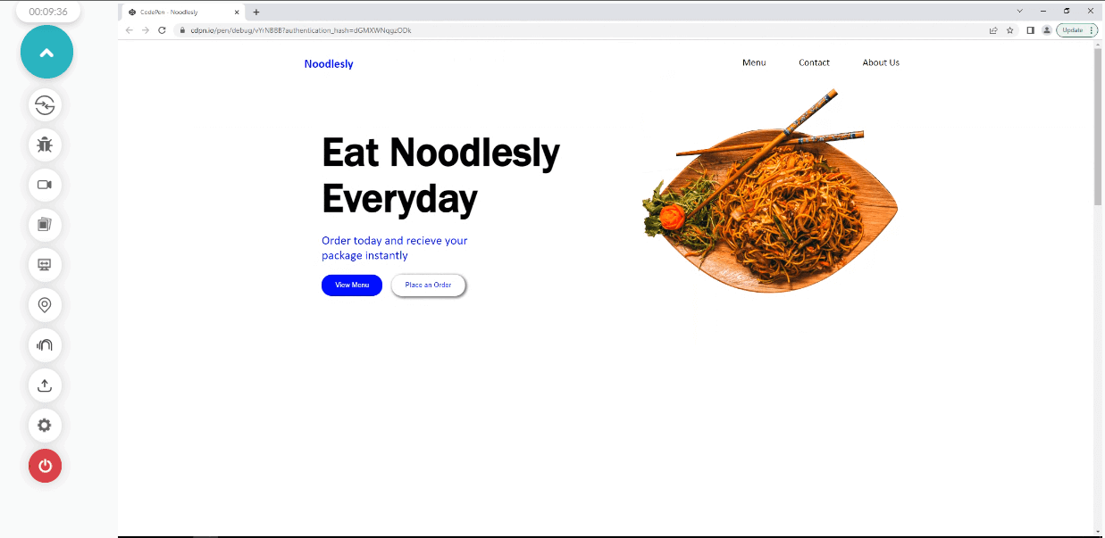
From the browser output, we applied some styling to both the heading text and the aside image.
Here is how it's done.
- .hero_section: The hero section, which happens to be a container for both the heading text and the aside image, is set to a display of flex and justify-content of space-around to split the elements side by side and apply space around both elements.
We also added a width of 67%, a margin of 0 to the top and bottom, and auto to the left and right. The auto value helps to set the element at the center of the page.
- .heading_text h1: The heading text takes a font size of 5em. This helps to increase the bold text for easy reading and the font-family of Franklin Gothic Medium. Notice a single or double quote is needed when adding font-family value with multiple words and spaces between them. We also added a margin-top of 1em to add some white space between the navbar and the heading text.
- .heading_text p: The paragraph text take the color blue, font-family of Calibri, font-size of 1.5em, margin-top of 1em 0,
- .buttion_section button: We apply a padding of 1em 2em, to add space between the text and the border of the buttons, border-radius of 20px for the rounded corner, the cursor of the pointer, background-color of blue, border of none, this helps us to remove the border line we have around the edges of the button. Color of white and a transition of all, 100ms (milliseconds), and a transition effect of linear.
- .buttion_section button:hover: We applied a very basic effect to the hover. A background-color of white, a color of blue, and a border of 2px solid blue.
- .buttion_section button:last-child: To target the second button, we applied the CSS :last-child selector and set the border-radius to 20px, background-color to transparent, color to blue, box-shadow to 2px 2px 4px 2px rgba(0,0,0,0.5) to add a little bit of contrast between the background and the button and a margin-left of 1em.
- .buttion_section button:last-child:hover: On hover, we set the background-color to blue, the color to white, and the box-shadow to none.
- .here_noodles img: The aside image takes a width of 500px. This helps to shrink the image to fit into the image's container.
Styling the Menu Section
Now that we've completed the front page design, let's see how to design the menu section.
CSS:
/* SECOND VIEWPORT */
.food_list {
    width: 100vw;
    height: 100vh;
    background-color: rgb(231, 229, 229);

    display: flex;
    justify-content: center;
}

.our_menu h1{
    font-family: calibri;
    font-weight: bolder;
    font-size: 2em;
    letter-spacing: 0.3em;
    text-align: center;
}

.our_menu span {
   color: blue;
}

.our_menu  {
    font-family: calibri;
    font-size: 1.5em;
    font-style: italic;
    margin: 1em 0;
    text-align: center;
}

.our_food_items {
    display: grid;
    grid-template-columns: repeat(3, 300px);
    gap: 10px;
}

.items_img {
    width: 250px;
    height: 200px;
    border-radius:10px;
    box-shadow: 2px 4px 6px 1px rgba(0,0,0,0.5);

}

.our_food_items h2 {
    text-transform: uppercase;
    font-family: calibri;
    padding: 20px 20px;
    color: blue;
}

.our_food_items p {
    font-family: calibri;
}

.about_section section{
    display: flex;
}
Browser Output:
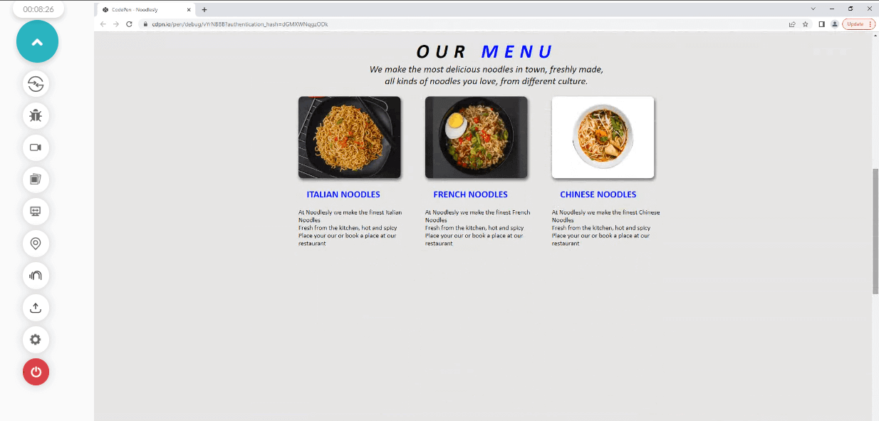
Now let's see how the menu section was styled.
- .food_list: Like the front page, we set the width and height to 100vw and 100vh, respectively, a background-color of rgb(231, 229, 229), (gray), display of flex and justify-content of center.
- .our_menu h1: font-family is set to calibri, font-weight to bolder, font-weight of 2em, letter-spacing of 0.3em (to add space between the letters), and a text-align of center.
- .our_menu span : The menu text is set to the color blue.
- .our_menu: We target the paragraph in the menu section as we set the font-family to calibri, font-size to 1.5em, font-style to italic, margin to 1em 0, and text-align to center.
- .our_food_items: We set the parent container of this class to display a grid and a grid-template-columns of repeat(3, 300px) and a gap 10. This helps to split the grid items into three columns grid and a 10px space separating them.
- .items_img: There are three images assigned with the .items_img class, the class is assigned a width of 250px, height of 200px, border-radius of 10px and box-shadow of 2px 4px 6px 1px rgba(0,0,0,0.5) to add a box shadow effect to the images.
- .our_food_items h2: The direct heading two text, below the image, is set to a text-transform of uppercase, font-family of calibri, padding of 20px 20px, and a color of blue.
- .our_food_items p: The paragraph next to it takes a font-family of calibri.
Styling the About Section and Footer
In this section of the color contrast accessibility tutorial, we've come to the last part where we look at how to style the about section and footer.
}

.about_us {
    background-color: rgb(1, 1, 34);
}


.about_heading h2 {
    text-transform: uppercase;
    font-family: calibri;
    color: white;
    text-align: center;
    padding-top: 2em;
}

.about_heading p {
    font-family: "billion Dreams", "Brush Script MT" "Times New Roman";
    color: white;
    font-size: 3em;
    text-align: center;
    margin: 1em 0 0 0;
}


.about_text p {
    color: white;
    font-family: calibri;
    font-size: 1.2em;
    margin: 2em 0;
    text-align: center;
}

.read_btn_wrap {
    display: flex;
    justify-content: center;
    align-items: center;
}

.read_btn {
    padding: 1em 2em;
    color: white;
    border: 2px solid white;
    background-color: transparent;
    cursor: pointer;
    transition: all 700ms ease-in-out;
}

.read_btn:hover {
    background-color: white;
    color: rgb(1, 1, 34);
}

.about_us_img img {
    width: 30vw;
    height: 100vh;
    /* overflow: hidden; */
}

footer {
    display: flex;
    justify-content: center;
    font-family: calibri;
    font-style: italic;
    background-color: black;
    color: white;
}
Browser Output:
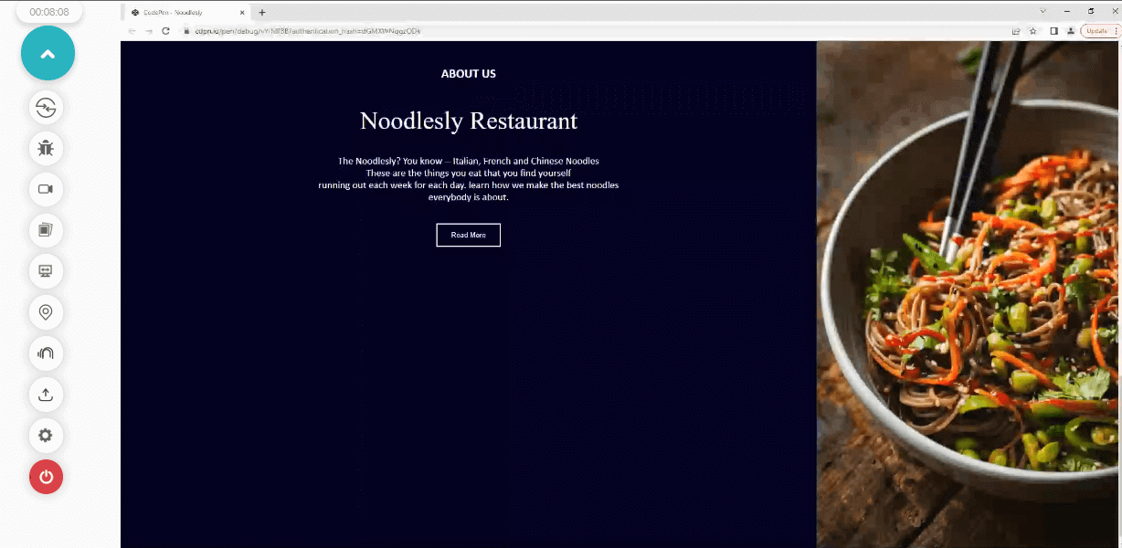
From the browser output, you'll notice the about section is split into two sections, with one having the about content and the other having an aside hero image.
Now let's see how this is done.
- .about_section section: The parent element takes the first styling as we set it to display flex, splitting the direct two siblings into flex items.
- .about_section aside:first-child: The first sibling is targeted with a :first-child selector, and we set the width to 70vw, that is, we want it to take 70 percent of the viewport spacing while the height is set to 100vh. That is, we want it to take 100 percent height of the viewport.
- .about_us: The background color is set to rgb(1, 1, 34); this intense deep blue color with white text gives a high contrast.
- .about_heading h2: We target the topmost text, the heading two text, and we set the text-transform to uppercase, font-family to calibri, the color of white, text-align of center and padding top to 2em.
- .about_heading p: The next text, which is the heading text, is assigned a font-family of billion dreams and another alternative font of Brush Script MT, Times New Roman; this alternative font is used to replace the first font if the user happens not to have the first one installed on their computer. A color of white, font-size of 3em, text-align to center and a margin of 1em 0 0 0.
- .about_text p: On the other hand, the about paragraph takes a color of white, font-family of calibri, font-size of 1.2em, margin of 2em 0 and text-align of center.
- .read_btn_wrap: The <div> element with a class of .read_btn_wrap is a wrapper for the button element, and to center it, we assign a display of flex, justify-content of center, and align-items of center.
- .read_btn: The button element is assigned padding of 1em and 2em, the color of white, border of 2px solid and color of white, background color of transparent, cursor of pointer, and transition of all 700ms ease-in-out.
- .read_btn:hover: A background color of white and color of rgb(1, 1, 34) for the text.
- .about_us_img img: The about section, as seen earlier, is set to a width of 70vw. Therefore we assign a width of 30vw to the aside hero section since the about section already has 70vw of the viewport. We also assigned a height of 100px to the image.
- footer: Lastly, we set the direct child of the footer element to a flex item by assigning the parent to a display of flex, justify-content of center, font-family of calibri, font-style of italic, background-color of black, and color of white.
Choice of Colors
The color aspect is very basic, as we use just a few colors to make the website simple and accessible.
For color contrast we place blue on a white background and a white text on a deep blue background which gives good color contrast. We also make use of black where necessary (e.g The heading text on the front page and the nav links.
Simple fonts were used however one can not know for sure what kinds of fonts are available on the system of their users. When a website is designed with fonts that are not available on the user's system, the fonts on the website usually break and are replaced with any font available on the user's system, which can sometimes render the text on your website unreadable or worse, replaced with strange characters.
For good color contrast accessibility, we can use the @font-face property to specify a url where the font we use can be fetched and loaded into the client browser. We can also use Google font APIs which gives us a collections of Google fonts or better. Still, if you want to make things a little bit safer, you can make use of web-safe-fonts; these are fonts that are very popular and come preinstalled on most client systems; that is majority of users already have them installed on their system and as a result does not require to be loaded from an external source.
Therefore this ensures that the fonts you use will not appear differently and break your website. To mention a few, Calibri, Brush Script MT, Impact, Courier New, Times New Roman are all examples of web-safe fonts. In this CSS project for color contrast accessibility, all fonts are web safe except Billions Dreams, which an alternative web-safe font is provided as a fallback.
The contrast-color() Function
Earlier versions of this guide used an experimental color-contrast() function that compared one color against a list and was only available behind a flag in Safari Technology Preview. The function that browsers now support is contrast-color(), and it is simpler: it takes one color and returns either white or black, whichever has more contrast with it.
.read_btn {
  background-color: var(--brand);
  color: contrast-color(var(--brand));
}
According to MDN, contrast-color() has been Baseline since April 2026, meaning it works in the latest versions of all major browsers. MDN also warns that mid-tone backgrounds often have too little contrast with both black and white, so the function does not guarantee a 4.5:1 result; check the output with a contrast checker. The CSS color contrast guide covers the function in more depth.
Because older browser versions do not support it, set a plain color declaration before the contrast-color() line as a fallback, and verify both on the browsers your users run as part of cross browser compatibility testing.
How to Test Websites for Color Contrast Accessibility?
Test contrast in three places: in the browser while you design, automatically on every build, and visually on real browsers for text over images or gradients that scanners cannot read.
Contrast Audit of a Real Page
On October 5, 2026, I ran a contrast audit of the TestMu AI ecommerce playground home page in Chrome on Windows 11 on the TestMu AI cloud. The script compared each text element's color with its effective background and applied the 4.5:1 and 3:1 thresholds from WCAG 1.4.3. It checked 120 visible text elements and found 11 below the threshold (two more hits were screen-reader-only labels, which are not visible and were excluded).
| Text | Colors | Ratio | Required |
|---|---|---|---|
| Search button, Edit cart button, Featured badge | White on #0EBAC5 (brand cyan) | 2.37:1 | 4.5:1 |
| SHOP NOW link | #0EBAC5 on white | 2.37:1 | 4.5:1 |
| Top categories, Quick Links headings (20px bold) | White on #0EBAC5 | 2.37:1 | 3:1 |
| Latest and Best seller tab labels (20px bold) | #ADB5BD on white | 2.07:1 | 3:1 |
| Demo-site warning banner (14px bold) | White on #F22828 | 4.11:1 | 4.5:1 |
Most of the failures trace to one color: the brand cyan #0EBAC5 measures 2.37:1 against white in either direction. Darkening it to #0A7F87 would raise white text on it to 4.77:1 and clear the 4.5:1 minimum, which is the design-system fix described earlier: change the token once and every button that uses it passes.
Scan Pages While You Build
The TestMu AI Accessibility DevTools Chrome extension runs an axe-core based Full Page or Partial Page scan and lists contrast failures against WCAG 1.4.3 with the failing element and a remediation hint. A Partial Page scan scoped to a component, such as a button set, keeps the result to the element you are changing.
Check Contrast on Every Build
Accessibility Automation adds the same checks to existing Selenium, Playwright, and Cypress tests, so a new low-contrast color fails the build that introduced it rather than surfacing in an audit months later.
Limits of AI Color Contrast Fixes
AI tools find contrast failures and propose replacement values, but they cannot decide whether a color is right. Detection was never the hard part, since a contrast ratio is arithmetic on two luminance values. What AI coding assistants add is the step after detection: reading a scan's violation list, editing the failing CSS custom properties or design tokens, and opening a pull request with the change.
A model can raise a ratio to 4.5:1 and still break the brand palette, flatten a hover state, or create a pairing that clashes with the colors next to it. It also cannot judge the rules that are not numeric, such as whether color is the only carrier of meaning in a chart legend. Treat AI output as a first pass and confirm it against WCAG testing criteria.
Review Text Over Images on Real Browsers
Automated tools skip text placed on background images and gradients, because there is no single background color to measure. Open those pages on real browsers and devices with TestMu AI real-time testing and judge readability by eye, especially on hero banners and image cards.
Conclusion
Run a contrast check on your highest-traffic page today: fix any normal text below 4.5:1 and any large text or UI component below 3:1, starting with shared colors such as brand buttons, since one token change fixes every page that uses it.
TestMu AI Accessibility Testing runs those checks in the browser while you build and in your existing Selenium, Playwright, or Cypress suites in CI; the Accessibility DevTools documentation shows how to run your first scan.
Is your app accessible to everyone? TestMu AI's Accessibility Testing finds WCAG issues across web and mobile before release.

Note: This article was researched and drafted with AI assistance, then reviewed, fact-checked, and published by Alex Anie, Community Contributor at TestMu AI, whose listed expertise includes frontend development and web testing. WCAG requirements are taken from the W3C. Every statistic, link, and product claim was verified against primary sources. Read our editorial process and AI use policy for details.
Author

Alex Anie
Blogs: 17


Alex Anie is a Community Contributor and Frontend Developer with 4 years of experience in crafting high-quality technical content. He specializes in frontend technologies like HTML, CSS, JavaScript, React.js, Vue.js, and Next.js, along with skills in TailwindCSS, Git/GitHub, and web testing. At TestMu AI, he has authored 20+ articles covering CSS, automation testing, cross-browser testing, Cypress, and software testing. Alex also publishes technical blogs on platforms like Hashnode, Dev.to, and Medium.
Reviewer

Rahul Mishra
Reviewer
Rahul Mishra is a Lead Member of Technical Staff at TestMu AI, leading frontend engineering and accessibility testing across the quality engineering platform. He mentors frontend engineers, runs code reviews and sprint planning, optimizes React.js rendering performance, and makes product features accessible to users with disabilities through WCAG and ADA-compliant accessibility audits. He brings 10+ years of experience across React.js, VueJS, TypeScript, Swift, Objective-C, and AWS, with earlier work as a Technical Lead at VectoScalar Technologies. Rahul holds a B.E. in Information Technology.


Color Contrast FAQs
Did you find this page helpful?
More Related Blogs






TestMu AI forEnterprise
Get access to solutions built on Enterprise
grade security, privacy, & compliance
- Advanced access controls
- Advanced data retention rules
- Advanced Local Testing
- Premium Support options
- Early access to beta features
- Private Slack Channel
- Unlimited Manual Accessibility DevTools Tests