

Power Your Software Testing with AI Agents and Cloud
The Native AI-Agentic Cloud Platform to Supercharge Quality Engineering. Test Intelligently and Ship Faster.


- TestMu AI (Formerly LambdaTest)
- /
- Blog
- /
- 9 Key Features Of Responsive Testing
9 Key Features Of Responsive Testing
Responsive testing checks how your site renders across viewports. Learn 9 features covering viewport switching, local site testing, bug marking, and debugging.
Last Updated on:
On This Page
- 1. Switch Monitor Size
- An Additional tip: Using LT Browser for Responsive Testing
- 2. Test Locally Hosted Website
- 3. Switch To Real-Time On The Same Configuration
- 4. Mark Bugs With Single Click
- 5. Enable Smart Scroll
- 6. Basic Authentication For Password Protected Websites?
- 7. Debug Your Website
- 8. How to Create Projects
- 9. How To View The Website On Landscape Mode?
- How Do You Automate Responsive Checks On Every Build?
- Can AI Help You Debug A Broken Responsive Layout?
- Wrapping It Up!
Responsive testing checks that a responsive web design renders and stays usable at every viewport width, and nine features cover most of that work.
According to StatCounter Global Stats, mobile devices drove 50.13% of global website traffic in August 2026 and desktop drove 49.87%, so a broken phone layout costs about half the audience.
This guide covers switching monitor size, testing a locally hosted website, real time sessions, one click bug marking, smart scroll, basic authentication, website debugging, projects, landscape mode, build automation, and AI assisted layout fixes.
Key Takeaways
- Mobile devices accounted for 50.13% of global website traffic in August 2026 and desktop accounted for 49.87%, so a layout that breaks on a phone viewport costs a website about half of the potential audience.
- Container queries size a component from the parent element rather than from the viewport, so the same browser width can produce two different layouts depending on where the component sits.
- An SSH based tunnel connects a locally or privately hosted website to cloud test machines, so responsive testing can run on mobile viewports before the site is made public.
- Marking a UI deviation as a bug during a responsive test attaches an annotated screenshot to a tracker such as Jira, Asana, or Trello without a manual upload.
- Landscape mode exposes two failures that portrait mode hides: elements sized with the vh unit shift as the browser toolbar resizes, and the display cutout clips fixed navigation unless the page respects safe area insets.
- WCAG 2.2 Success Criterion 1.4.10 Reflow asks that content work at 320 CSS pixels wide with no scrolling in two directions, a fixed target for responsive testing that does not depend on a list of phone models.

1. Switch Monitor Size
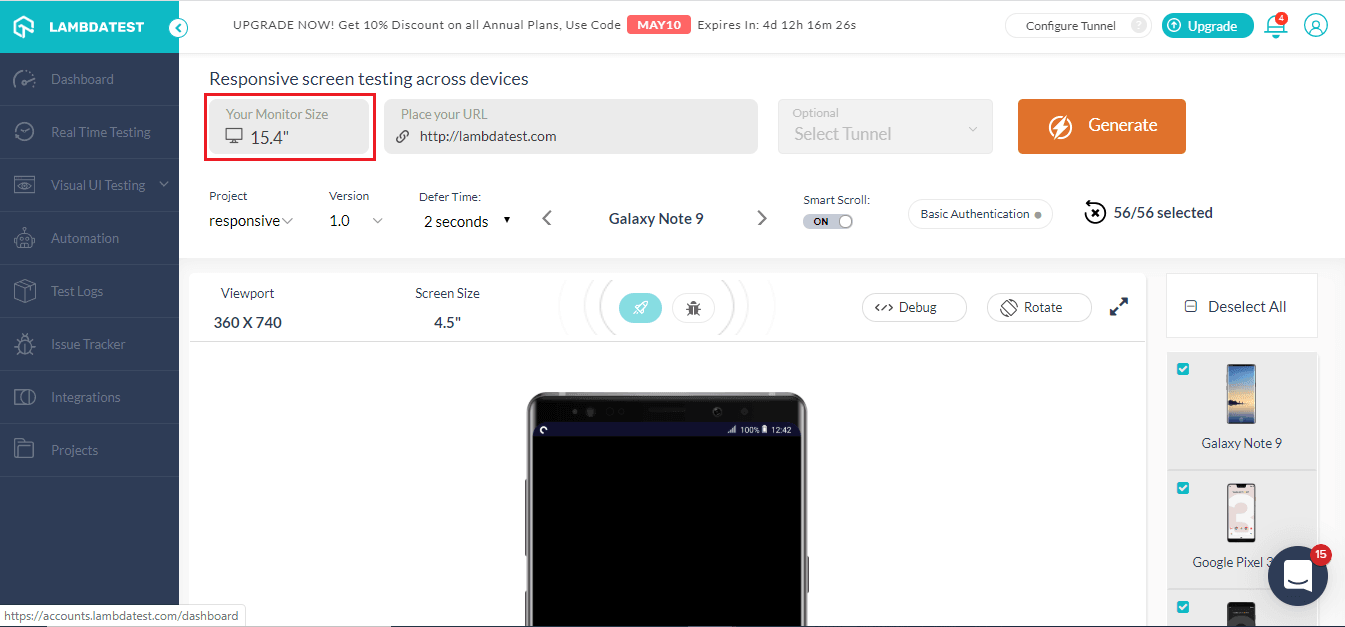
With TestMu AI you can pick your monitor size( diagonal length of your screen). This feature was rolled out in order to make sure that the viewport remains with different screen sizes, and there is no discrepancy in checking responsiveness on different screen sizes.
Screen width alone no longer decides how a page renders. Container queries size a component from its parent element rather than from the viewport, so the same browser width can produce two different layouts depending on where the component sits. Test every breakpoint with real content loaded, because long product names and translated strings are what usually push a row out of alignment.
Key Takeaway: Setting the monitor size before a responsive test keeps the viewport consistent across screen sizes, and testing each breakpoint with real content is what reveals the long product names and translated strings that push a row out of alignment.
An Additional tip: Using LT Browser for Responsive Testing
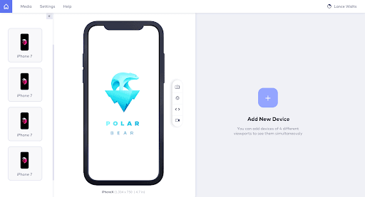
At TestMu AI, we've come with a tool to make website responsive test easier for you. With LT Browser you can check the mobile view of the website on 50+ devices. With different iOS and Android devices to choose from this mobile friendly checker helps you check your website for responsiveness. You can also create custom devices to test on a viewport of your choice, with different device sizes and resolutions to choose from, no device is out of your reach.
Now you can do mobile website test and compare different devices simultaneously, now you can test on android phone and iPad simultaneously with LT Browser. Use Chrome DevTools in LT Browsers to debug on the devices simultaneously as well. The major advantage of using LT Browser is that it is blazing fast in comparison to any cloud-based application.
Apart from these features, the LT Browser also has the option of integrating your favorite bug management tool to collaborate with your team. You can easily take screenshots of your webpage and even record different sections as well.

Key Takeaway: A desktop browser built for responsive testing covers 50+ preset Android and iOS viewports, accepts custom device sizes and resolutions, and shows two devices side by side with a separate Chrome DevTools panel for each.
2. Test Locally Hosted Website
You can now run responsive testing of a locally hosted website before making the website live. With TestMu AI you can test you locally or private hosted website easily by using a tunnel to connect your machines to our cloud servers with a secure shell hosting(SSH) based integration tunnel. Using our tunnels you can easily validate your website with responsive testing across 56+ mobile devices and test on these different mobile devices for responsiveness.
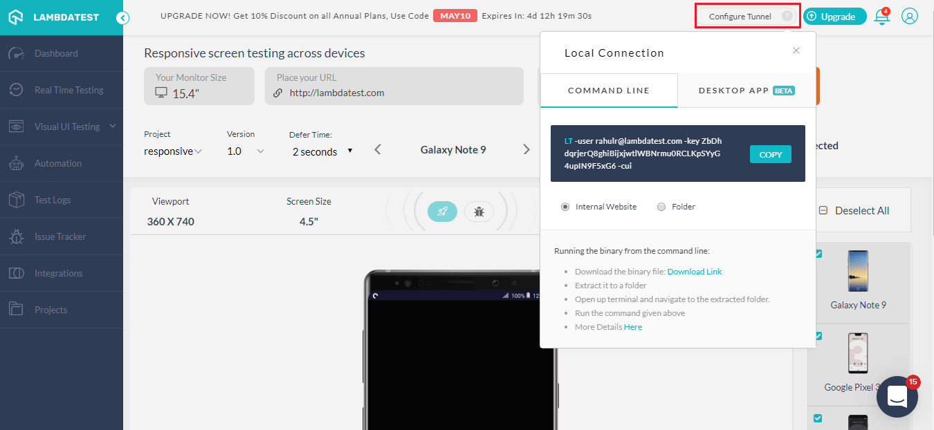
There are two ways to configure TestMu AI Tunnel, you can use the command line or use our Underpass desktop application to bypass command line.
In order to set up the TestMu AI Tunnel with the command line, you'll have to use the following syntax to configure your tunnel:
LT --user {username} --key {access key}
You can also use our Underpass desktop application to configure the tunnel without using the command line. With Underpass you can save that extra effort to connect with the command line and get started with website responsive test with just a click! All you need to do is download the app, install, enter your credentials and you can easily perform local page testing.
Refer to the below tutorial on how to perform responsive testing on TestMu AI.

Key Takeaway: An SSH based tunnel connects a locally or privately hosted website to cloud test machines, so responsive testing can run across 56+ mobile viewports before the site is ever made public.
3. Switch To Real-Time On The Same Configuration
This feature was actually requested by one of our users, and it has actually worked like a charm for a lot of users and helped them save their time while easily switching from responsive testing to real-time cross browser testing. A lot of time users would want to move to live sessions from responsive testing. Earlier this process at times proved to be a hassle as users would have to go again with the process of selecting browsers, OS, and their version. With this simple but effective feature, users can easily switch to live testing sessions on the same configuration
This was one of many times our users have helped us to improve. For us, at TestMu AI our users are really important and any such suggestions are always welcome and we'd love to go the extra mile for you guys.
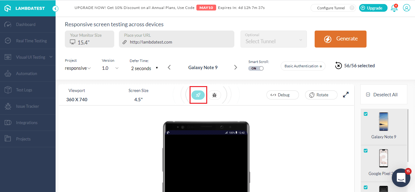
As mentioned above, with the real-time feature, you can easily switch the session and perform live interactive testing of your website on the same configurations.
Key Takeaway: Switching from a responsive test to a live interactive session on the same configuration removes the need to reselect the browser, operating system, and version before reproducing a layout issue.
4. Mark Bugs With Single Click
Now you don't have to worry about taking screenshots of bugs manually and uploading them to your project management tool to share it with your team. TestMu AI saves this effort by making this process much easier.
You can easily mark any bugs on your website with our 'Mark as bug' feature. It allows you to easily capture any UI deviation on your website and share it directly with your team. With our in-built image editor, you can easily highlight any UI deviation by using different shapes, text, and crayons in different colors.
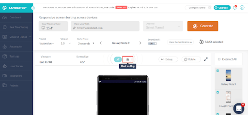
After marking the bug you can easily share it with your team on your favorite project management tool. We offer integrations to various third-party tools such as Asana, Jira, Trello, etc. You can view all the integrations we offer here, in case we're missing out on your tool do reach out to us and we'd make sure that we get it onboard for you.

Key Takeaway: Marking a UI deviation as a bug during a responsive test captures the screenshot, annotates the screenshot in a built in image editor, and sends the screenshot to a tracker such as Jira, Asana, or Trello without a manual upload.
5. Enable Smart Scroll
In certain cases, your pages might have some iframes and they have scrolls. What happens when we perform responsive testing then? Well, in such cases you'd have to scroll through every iframe, and scrolling through each one can prove to be such a hassle. So, how do you fix it? This issue can be easily fixed by turning on the smart scroll. This would ignore any scroll in the iframe and you wouldn't have to spend eternity just scrolling down the page.
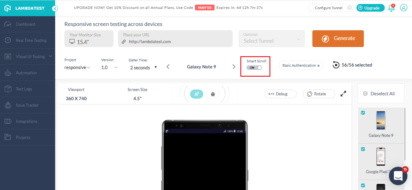
Key Takeaway: Smart scroll ignores the scrollbars inside embedded iframes, so a page full of iframes scrolls once from top to bottom instead of frame by frame.
6. Basic Authentication For Password Protected Websites?
There might be certain pages which are password protected and you need to get through them to test. So what do you do in such situations?
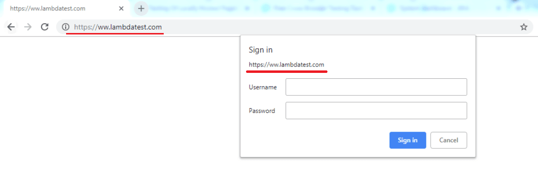
You've got nothing to worry about as TestMu AI has a feature addressing the issue. With our 'Basic Authentication' feature, you can enter your login details, click on save and you're good to go.
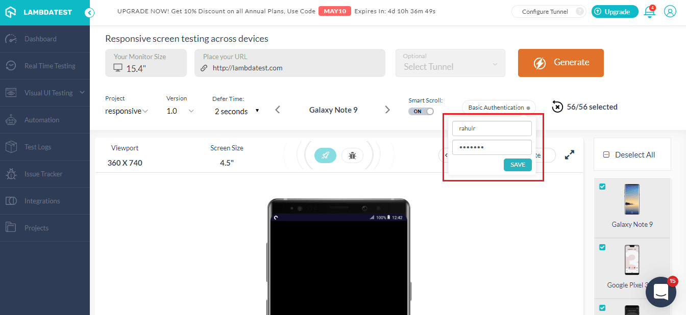
After you've clicked on 'Save', you'd notice that basic authentication is enabled and now you can run website responsive test on your password-protected website or web applications.
With this Responsive testing tutorial for beginners, you will learn how to perform Responsive Testing of your website on the TestMu AI platform.
Key Takeaway: Saving login credentials under basic authentication lets a responsive test reach password protected pages instead of stopping at the browser credential prompt.
7. Debug Your Website
You can now debug your websites with the new add-in functionality of LT Browser. You just need to click on the debug icon and it'll take you to the LT Browser.
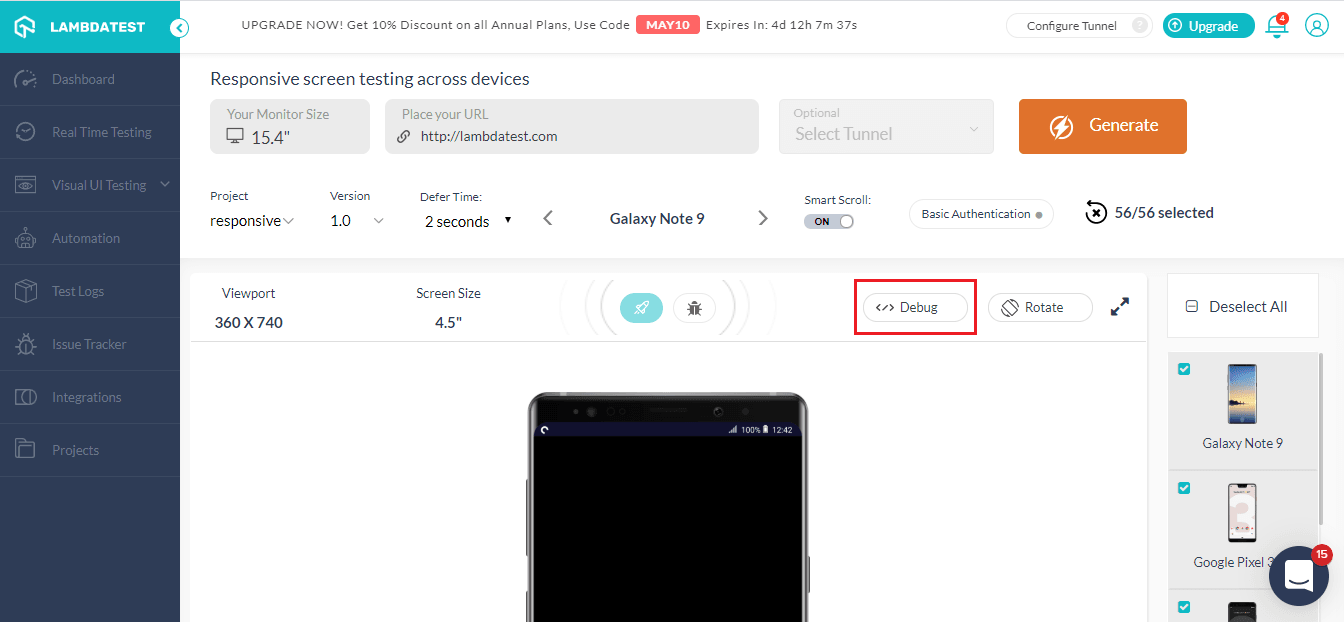
With LT Browser you can easily perform mobile website test and debug with the inbuilt Chrome DevTools. You can test a website on different devices in side by side view and debug using separate dev tools for both the devices simultaneously.
Debug Your Mobile Website On 50+ Mobile Views With LT Browser
Key Takeaway: Opening a failing viewport in a browser with built in Chrome DevTools lets the broken element be inspected on two device views at once, with a separate DevTools panel for each view.
8. How to Create Projects
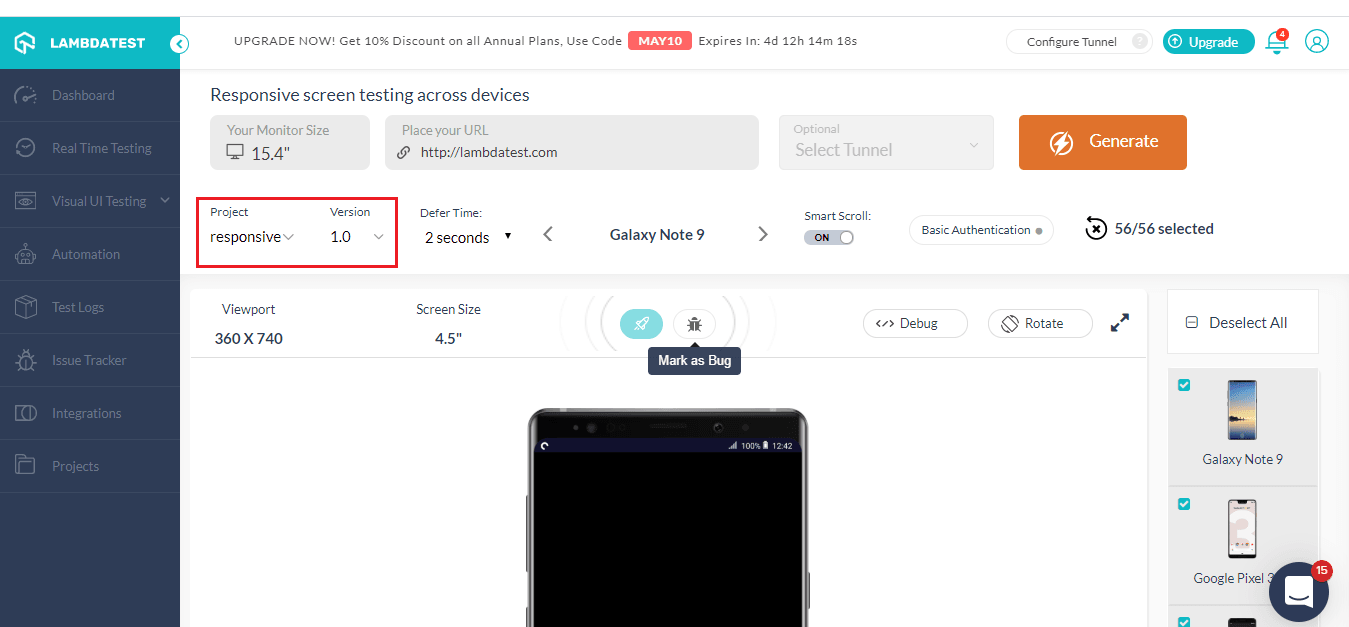
You can now create different Projects and their different versions with TestMu AI. These project can also be viewed in the project tab to keep a tab on your website responsive test
Key Takeaway: Grouping responsive test runs into named projects and versions keeps the results for each website or release in one place instead of scattered across separate sessions.
9. How To View The Website On Landscape Mode?
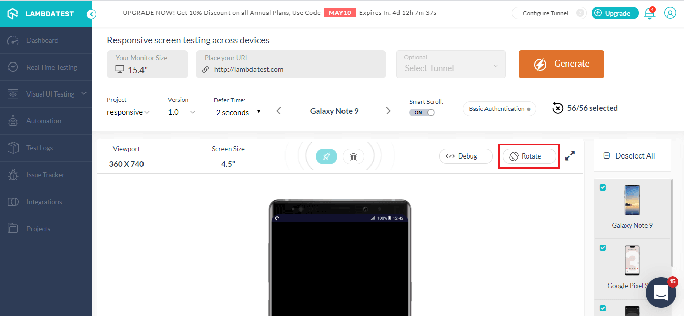
You can also test your website both on landscape and portrait mode. All you have to do is click on the rotate button marked below and you can ensure that your website is also responsive on the landscape mode as well.
There's a lot more than that you can do with responsive testing with TestMu AI. You can also set 'defer time' for the website to load on different devices.
Landscape testing catches two problems that portrait mode hides. The browser toolbar shrinks and grows as the user scrolls, so any element sized with the vh unit shifts mid scroll, which is why the dynamic viewport units svh, lvh, and dvh were added. The display cutout also moves to the side of the screen in landscape, so fixed navigation gets clipped unless the page respects the safe area inset values.
Also Read: 12 Must Try Features Of Automated Screenshot Testing
Key Takeaway: Rotating the viewport to landscape surfaces vh unit drift as the browser toolbar shrinks and grows during scrolling, the exact problem the dynamic viewport units svh, lvh, and dvh were added to solve.
How Do You Automate Responsive Checks On Every Build?
Pin each viewport as a named project in your test runner and run the same specs against all of them on every build. In Playwright, a project entry pairs use with the built-in devices registry, and an explicit viewport value of width and height overrides the device preset. The documentation warns that you must declare viewport after spreading devices, because the device preset already sets one. Name the projects after the common CSS breakpoints your stylesheet actually declares, not after phone models.
A viewport project only proves the page loaded, so you need an assertion to catch layout drift. Playwright's visual comparison API, expect(page).toHaveScreenshot(), writes a reference image on the first run and compares every later run against it. The project name goes into the snapshot filename, so each viewport keeps a separate baseline and a regression at 375px does not hide behind a passing desktop run.
Decide what counts as narrow enough from a standard rather than from a device list. WCAG 2.2 Success Criterion 1.4.10 Reflow, a Level AA requirement, asks that content work at 320 CSS pixels wide for vertically scrolling content and 256 CSS pixels tall for horizontally scrolling content, with no scrolling in two directions. Maps, diagrams, video, games and data tables are excepted.
LLM based tooling now drives the resize step directly. The Playwright MCP server exposes a browser_resize tool that sets the window to a given width and height, and a browser_snapshot tool that returns the page accessibility tree. The project states that it uses Playwright's accessibility tree, not pixel based input, so the assistant reads structured element data instead of inferring layout from an image. That suits triage, because an agent can narrow the viewport and report which controls stopped being reachable. Keep the screenshot baselines as the pass or fail record, since agent output varies between runs.
Key Takeaway: Defining one Playwright project per breakpoint and asserting with expect(page).toHaveScreenshot() gives every viewport a separate baseline image, so a layout regression at 375px cannot hide behind a passing desktop run.
Can AI Help You Debug A Broken Responsive Layout?
Yes, for the diagnosis step. AI now sits inside the browser you already use for responsive testing. Chrome DevTools ships an AI assistance panel that runs on Gemini. You right click an element in the Elements panel, select Ask AI, and the panel takes that element as context, so you can ask why the element overflows at a narrow width.
The documented capability is narrow and specific. Google describes the feature as giving a detailed explanation of an element's styles and help in fixing layout and styling bugs, with sample prompts such as asking it to center an element. The Chrome team walkthrough shows the panel reading the DOM and the computed styles rather than a picture of the page. That distinction matters for responsive work, because the cause of a broken row is usually a computed value such as a fixed width or a flex basis, not the pixels on screen.
The limits are documented too. Google labels the panel experimental and subject to future changes, warns that it may generate inaccurate information, restricts access to users who are at least 18 years old and in a supported location, and notes that an enterprise policy controls whether the data shared with Gemini is logged and used for training. That last point often decides whether the feature can be used at all on an internal build.
Use AI to shorten diagnosis on one viewport, then confirm the fix the usual way. Keep the screenshot baselines described in the previous section as the pass or fail record, because a model explanation is not a regression test and its wording changes between runs.
Key Takeaway: The Gemini powered AI assistance panel in Chrome DevTools reads an element's DOM and computed styles to explain a layout bug, but Google labels it experimental and warns it can be inaccurate, so it speeds up diagnosis without replacing a screenshot baseline.
Wrapping It Up!
Responsive testing is becoming more important every day as the number of mobile users keeps on increasing. You need to ensure that your website renders on all the viewports seamlessly. In this article, I explored different features you can use with TestMu AI to perform responsive testing. These features help you to test your local website, mark bugs, test for a password-protected website. Further, I went through how you could utilize LT Browser for mobile website test.
If there any feature you feel that should be a part of TestMu AI for responsive testing, do let us know in the comment section down below. We're always open to suggestions and would love to add any new features that would help our users along the way. Happy Testing!!!

Author

Rahul Rana
Blogs: 12


Rahul R. is a community contributor with 5+ years of experience across business analysis and product marketing roles in SaaS organizations. He has hands-on experience working with Python, SQL, Excel, and data analysis, and holds certifications in Programming Foundations: Software Testing/QA, Python programming, and data analysis with spreadsheets. Rahul has previously worked with software platforms at TestMu AI and VdoCipher, supporting cross-functional product initiatives.


Responsive Testing FAQs
Did you find this page helpful?
More Related Blogs
TestMu AI forEnterprise
Get access to solutions built on Enterprise
grade security, privacy, & compliance
- Advanced access controls
- Advanced data retention rules
- Advanced Local Testing
- Premium Support options
- Early access to beta features
- Private Slack Channel
- Unlimited Manual Accessibility DevTools Tests