

Power Your Software Testing with AI Agents and Cloud
The Native AI-Agentic Cloud Platform to Supercharge Quality Engineering. Test Intelligently and Ship Faster.


- TestMu AI (Formerly LambdaTest)
- /
- Blog
- /
- How to Test Responsive Design Locally: A Complete Guide
How to Test Responsive Design Locally: A Complete Guide
Learn how to test responsive design locally on a locally hosted website with LT Browser, browser DevTools, and TestMu AI Tunnel across real devices.
Last Updated on:
Responsive testing checks how a web page renders across the many screen sizes, browsers, and operating systems your users bring. According to Statcounter GlobalStats, mobile devices generate the majority of global website traffic, so how your layout behaves on a small screen is no longer an edge case. The challenge is finding an efficient way to validate that behavior before your changes reach production.
But how do you check the mobile view of a website on localhost, before it is exposed to end users? Once you know how to create a responsive website, the next step is testing it locally. This guide walks through three practical methods to test responsive design locally on a locally hosted website, so you catch layout issues while they are still cheap to fix. You can also run a quick responsive test on any live URL to see the idea in action.
Key Takeaways
To test responsive design locally, use browser DevTools for quick simulated checks while coding, and use TestMu AI Tunnel to validate your localhost build on real devices before shipping. This workflow ensures your website renders correctly across different screen sizes and mobile devices before going live.
- Testing responsive design locally protects your mobile traffic, user experience, and mobile-first SEO by catching layout bugs before they reach production.
- A complete responsive test requires validating your site across multiple screen sizes, browsers, operating systems, and network conditions rather than checking just a single mobile screen.
- Best for quick coding checks: Browser DevTools provides a fast, simulated viewport check directly in your browser, though it can miss hardware, touch, rendering, and network issues that only show up on physical phones.
- Best for multi-viewport previews: LT Browser is a desktop application that lets you preview your localhost site across more than 50 device screens with synchronized side-by-side views and custom resolutions.
- Best for production-grade validation: TestMu AI Tunnel securely connects your localhost to a cloud grid of over 3,000 browser and OS combinations and 10,000 real devices to test actual rendering, touch input, and network behavior.
- Use these testing methods as a progressive funnel: catch layout bugs quickly in browser DevTools, expand your viewport coverage in LT Browser, and perform final validation on real devices before shipping.
Why Test Responsive Design Locally
Local testing is one stage of a broader responsive testing workflow. Done on your own machine, it confirms that your content renders correctly for the device and screen size a user is on, before the change ships. Catching layout issues locally is faster and cheaper than fixing them in production. Here is what it buys you.
- Protects mobile traffic: With mobile now the majority of global web traffic, a layout that breaks on a phone loses the largest share of your visitors. Verifying the mobile view locally keeps that traffic from bouncing.
- Catches bugs early: Checking the mobile view on localhost lets you find rendering bugs at the coding stage, aligning with the shift-left testing approach. A bug caught locally costs minutes; the same bug caught after release costs a hotfix and a support ticket.
- Lowers bounce rates: When the layout adapts cleanly to the screen, users stay and read instead of leaving. Local testing is where you confirm that experience before real users judge it.
- Surfaces performance issues: Mobile visitors load your site on 3G, 4G, and 5G while commuting or traveling, and reception varies. Testing responsiveness under real device and network conditions shows you the actual load behavior, not the ideal-desktop version.
- Supports SEO: Google indexes the mobile version of your pages first, so a responsive layout that works on small screens directly affects how you rank. Confirming it locally keeps mobile-first indexing on your side.
Interesting read: Ultimate Guide To Building A Mobile Friendly Website.
Challenges With Responsive Testing For A Locally Hosted Website
Most developers want to test responsive design locally so that the live site matches what users expect. The problem is coverage. There are thousands of viewports and screen-size combinations to account for, and doing mobile device testing by hand across all of them is impractical.
Testing on real devices is the most accurate method, but buying and maintaining a device lab that covers every model is expensive and never complete, because new devices and OS versions ship constantly. So the real challenge is getting real-device accuracy for a locally hosted site without owning the hardware. If you want the full picture first, read about the top responsive web design challenges.

Note: You do not need a device lab to test a locally hosted site accurately. The TestMu AI Tunnel connects your localhost to 10,000+ real Android and iOS devices and 3,000+ browser and OS combinations in the cloud, with 2G to 5G network profiles to reproduce real conditions. Start testing free
How to Test Responsive Design Locally
There are three practical methods to test responsive design on a locally hosted website. Two run entirely on your machine (LT Browser and browser DevTools) and one routes your localhost to real devices in the cloud (the TestMu AI Tunnel). The table below shows what each is best at, then each method is covered in detail.
| Method | Runs on | Coverage | Best for |
|---|---|---|---|
| LT Browser | Your machine (desktop app) | 50+ device screens, side-by-side view, custom resolutions | A focused local preview of localhost across many viewports at once |
| Browser DevTools | Your machine (Chrome/Firefox) | Simulated viewports for common devices | A fast first-pass check while coding |
| TestMu AI Tunnel | Real devices in the cloud | 10,000+ real devices, 3,000+ browser and OS combinations | Production-accurate results before release |
1. LT Browser For Locally Hosted Web Apps
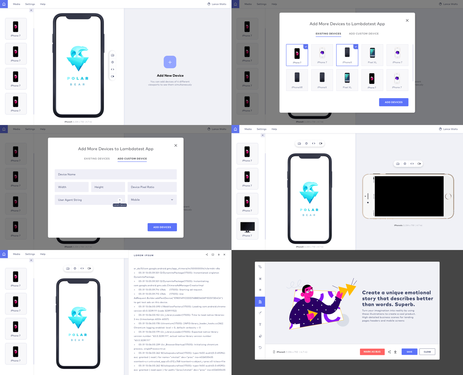
LT Browser is a Chromium-based developer browser built to test the responsiveness of a web app across mobile, tablet, and desktop viewports. It renders the mobile view live and includes a built-in debugger, so you can find and fix responsiveness bugs in one place.
With this browser for developers, you can preview a locally hosted website across 50+ mobile screen resolutions. It also lets you add custom devices for a screen resolution test at any width and height, so you can match the exact viewports your users have.
It renders your site on multiple devices at once in a side-by-side view, and a synchronized-interaction feature replays the actions you perform on one device across the others. The built-in debugging tools let you validate fixes on locally hosted pages as you go, and you can mark bugs during testing and share them with your team through project management tools.
Testing a local site with LT Browser needs no extra utility or framework. The steps are simple:
- Download LT Browser and install it on your system.
- Enter your localhost string as the URL in the LT Browser header to reach your local server.
- For example, if the localhost server is Apache via XAMPP with the site in the htdocs folder, open the localhost URL and add the page or folder you want to test.
That is all it takes to test a locally hosted website. See the LT Browser documentation to go deeper. The walkthrough below shows how to get started.
2. Developer Tools In The Browser
The device toolbar in a browser's developer tools is the most accessible way to check the mobile-friendliness of your locally hosted pages. Open it in Chrome or Firefox by pressing F12. In Chrome it is called the Toggle Device Toolbar; in Firefox it is Responsive Design Mode. The example below uses Firefox.
Press F12 to open the developer tools, select Responsive Design Mode, and the browser renders the mobile version of your page. See Chrome's device mode documentation for the equivalent controls in Chrome.
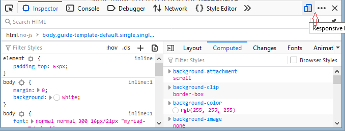
From the top menu, pick a device (iPhone, Samsung Galaxy, iPad, and others) to preview how the page renders on that form factor, or set a custom screen resolution to check specific breakpoints. It gives a quick idea of how the layout will behave once live.
The catch is that DevTools offers a simulation of a device, not the device itself. A simulator mimics the viewport but not the hardware, GPU, touch input, or network radio, so a page can look fine in DevTools and still break on a real phone. To reproduce real hardware behavior along with the viewport, use browser emulators, and confirm the result on real devices before you ship. Treat online browser emulators and the developer tools as a first check, not a release gate.
3. TestMu AI Tunnel For Testing Locally Hosted Websites
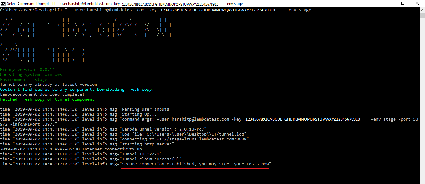
The TestMu AI Tunnel connects your local system to the TestMu AI cloud through an encrypted, SSH-based tunnel, so you can test responsive design locally across a wide range of browsers, operating systems, and real devices. This is the method that gives you real-device accuracy for a locally hosted site without owning any hardware.
The tunnel opens a secure shell connection and can serve PHP, HTML, CSS, Python, and other files stored locally. You do not have to run terminal commands to use it; you can establish the connection between your OS and the TestMu AI grid through the Underpass GUI. It reaches localhost, internal hostnames, and private IPs, so staging environments work too.
Once the tunnel is connected, you can drive that same site interactively from TestMu AI's Real Time cloud browsers across 3,000+ browser and OS combinations and 10,000+ real Android and iOS devices on the TestMu AI real device cloud, which is how the platform handles real-time testing of locally hosted pages without exposing anything publicly. Because these are physical devices, you validate real touch input, real rendering engines, and real network behavior, not a simulation.
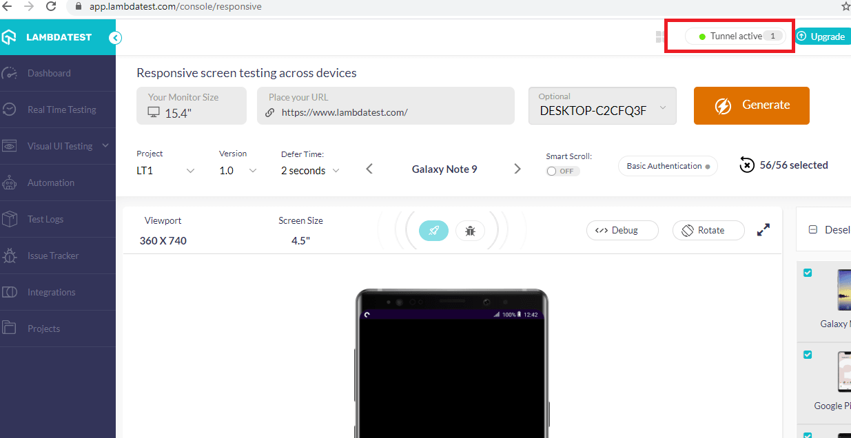
With the TestMu AI Tunnel, you can connect from any OS and test locally:
- Connect with Windows and test locally
- Connect with macOS and test responsive design locally
- Connect with Linux and test locally hosted websites
The tunnel is the right fit when you want to test the responsiveness of a locally hosted website across many operating systems, browsers, and real devices at once. The detailed video below shows responsive testing with the tunnel end to end.

What to Check When Testing Responsive Design Locally
Opening the page in a device view is only half the job. Whichever method you use, run the locally hosted page through this checklist at each major breakpoint (common widths: 360px, 768px, 1024px, 1440px) before you call it responsive.
- Viewport meta tag: confirm the page has
<meta name="viewport" content="width=device-width, initial-scale=1">. Without it, mobile browsers render at desktop width and zoom out, so nothing else in this list will behave. - Breakpoints and media queries: resize across each breakpoint and confirm the layout switches where your CSS media queries say it should, with no dead zone where the layout looks broken between two breakpoints.
- No horizontal scroll: check that no fixed-width element, oversized image, or overflowing container forces a horizontal scrollbar on small screens. This is the most common responsive bug.
- Images and media scale: make sure images resize within their container and are not clipped, stretched, or overflowing. Verify responsive image variants load the right size per screen.
- Readable text: body text should stay legible without pinch-zoom, and headings should not wrap awkwardly or get truncated on narrow screens.
- Tap-target spacing: buttons and links need enough size and spacing to tap without hitting a neighbor. Cramped tap targets are a mobile usability failure DevTools alone will not flag.
- Navigation adapts: confirm the menu collapses to a working hamburger or mobile pattern, and that it opens, closes, and is reachable on touch.
- Orientation: rotate between portrait and landscape and confirm the layout reflows cleanly instead of clipping or leaving large gaps.
DevTools and LT Browser catch the layout items on this list locally. Tap-target feel, orientation behavior, and font rendering are where a simulator and a real device diverge, so confirm those on real hardware before release.
Test Responsive Website Locally with TestMu AI
Start where the feedback is fastest: keep the browser DevTools device toolbar open while you code, use LT Browser for a focused local preview across many viewports, then confirm on real devices before you ship. Testing locally hosted websites for responsiveness prevents user-friendliness issues from reaching production, and doing it early means fewer surprises when the site goes live.
Real devices remain the most accurate way to test responsiveness. If you would rather not build and maintain a device lab, the TestMu AI Tunnel plus the cloud grid do it for you: connect your localhost and test the same build across 3,000+ browser and OS combinations and 10,000+ real devices. For a repeatable pre-release routine, pair this guide with our responsive design testing checklist.
You now have three methods to test responsive design locally, from a quick DevTools check to real-device validation. Pick the one that matches your stage, and test the mobile view before your users do.

Author

Isha Vyas
Blogs: 8

Isha Vyas is a Lead Member of Technical Staff at TestMu AI (formerly LambdaTest), building the frontend of the quality engineering platform. She works across React.js, responsive web design, and jQuery to ship and maintain the platform's user-facing web interfaces. She brings nearly seven years of frontend engineering experience at the company, with earlier work as a Software Developer at Mantra Labs. Isha holds a B.Tech in Computer Science from Swami Keshwanand Institute of Technology, Management and Gramothan, Jaipur.
Reviewer

Shubham Soni
Reviewer
Shubham Soni is a Senior Member of Technical Staff at TestMu AI (formerly LambdaTest), building the Real Device Cloud and real-time testing infrastructure. He optimized the WebRTC services that power live testing to sub-100ms latency with adaptive bitrate streaming, led a frontend migration from Angular to React that cut page load time from 5-6 seconds to 1-1.5 seconds, and contributes to the official Device SDK. He led a team of four to build an accessibility testing product covering manual and automated testing and mentored a team of six on a real-time testing product. He brings over eight years of experience and earlier scaled a cloud code platform to 200K+ monthly users. Shubham holds a B.Tech in Computer Science.


Responsive Testing FAQs
Did you find this page helpful?
More Related Blogs
TestMu AI forEnterprise
Get access to solutions built on Enterprise
grade security, privacy, & compliance
- Advanced access controls
- Advanced data retention rules
- Advanced Local Testing
- Premium Support options
- Early access to beta features
- Private Slack Channel
- Unlimited Manual Accessibility DevTools Tests