

Power Your Software Testing with AI Agents and Cloud
The Native AI-Agentic Cloud Platform to Supercharge Quality Engineering. Test Intelligently and Ship Faster.


- TestMu AI (Formerly LambdaTest)
- /
- Blog
- /
- 19 Typography Tips That Transform Mobile Web Design
19 Typography Tips That Transform Mobile Web Design
Discover expert typography tips to transform your mobile web design. Enhance readability, user experience, and visual appeal for mobile users.
Last Updated on:
On This Page
- Give Some Space
- Bonus Tip: Kerning
- Responsive Web Design
- Appropriate Font Size
- Use Proper Measuring Units
- Scaling Mobile Type With clamp()
- Choose Contrasting Colors
- Ensure Better Readability
- Align The Texts Properly
- Set the Leading
- Finding Your Sweet Spot
- White Space Utilization
- Take The Screen Width Into Account
- Make Your Typography Distinguishable
- Check Scaling And Proportions
- Take Functionality Into Account
- Text-Heavy Pages
- Interaction-Heavy Pages
- Pairing Multiple Fonts
- Font-Weight: Heavy or Light
- Keep The Background In Mind
Typography tips for mobile web design come down to size, spacing and contrast: a 16px minimum body size, a line height near 1.5, 45 to 75 characters per line, and a contrast ratio of at least 4.5:1. Relative units such as em and rem carry those values across screen widths, and cross browser compatibility testing of typography confirms the typeface renders the same on real devices. This guide covers spacing, kerning, responsive type, font size, measuring units, clamp() scaling, contrast, readability, alignment, leading, line length, screen width, hierarchy and font pairing.
Key Takeaways
- Mobile typography controls readability more than any other visual choice on a small screen.
- A 16px minimum body size, a line height near 1.5, and 45 to 75 characters per line form the baseline for mobile web text.
- Relative units such as em, rem and CSS clamp() let mobile type scale with the viewport and with the browser font setting a reader has chosen.
- A contrast ratio of 4.5:1 on normal text keeps mobile copy readable in daylight and meets WCAG accessibility rules.
- Pairing no more than two typefaces limits font downloads and keeps a mobile type hierarchy clear.
- Font rendering differs between mobile browsers and devices, so mobile typography needs testing on real screens rather than in a design file alone.
Give Some Space
Mobile typography is not about arranging letters on the screen, it is about arranging them in a way that will make them readable to the users. Utilize white space properly and give adequate space between the letters, lines, and paragraphs so that the user can read the content properly without the need to zoom in.
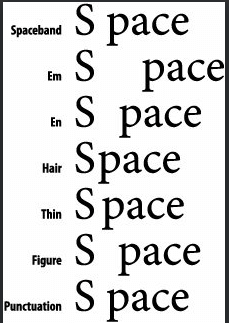
Key Takeaway: Adequate white space between letters, lines and paragraphs lets a mobile reader scan text without zooming in.
Bonus Tip: Kerning
Kerning was not a part of this list until I came to understand how important it could be from a UI design perspective. So we know from the first tip that providing space is necessary, but Kerning takes it up a notch. Kerning is the art of adjusting the space provided between characters to make the content stand out, & easy to read at the same time. There are 3 types of kerning, one can opt to go for.
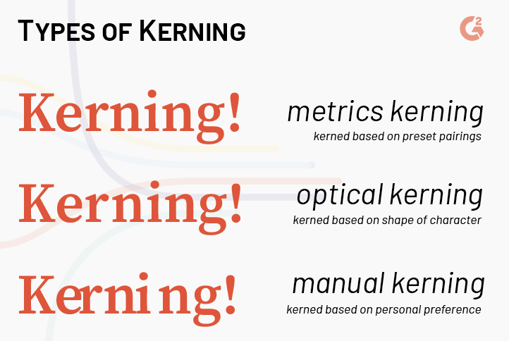
Although visible in the above image, there is a lot more to know about the difference between these various types of kerning. Curious? Read it from this blog, “Kerning: Don’t Cramp Your Style”.

Key Takeaway: Kerning adjusts the gap between individual character pairs, and correct kerning keeps headlines legible at small mobile sizes.
Responsive Web Design
As mentioned earlier, pixels should be avoided during typography of mobile web. They have a fixed dimension standard. Use em or rem instead. They are based on percentage and scalable. When the content is viewed on a mobile device with different resolution, they adjust their size accordingly.
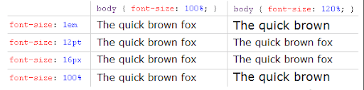
Remember, text content of your responsive web page should be scalable and adjust their size automatically according to screen width. You can use TestMu AI to perform your responsive testing. With a single click, you can check the Responsive Test of your site at over 50 mobile devices with different resolutions. You can utilise LT browser, a responsive design checker to ensure responsiveness of your mobile website.


Key Takeaway: Responsive typography resizes type against the viewport, so one mobile layout stays readable on phones and tablets alike.
Appropriate Font Size
You can keep your desktop fonts at a size of 14px but when the same is done in mobile, it may result in smaller or larger content depending on the resolution of the device. Check the font-size across all resolution and use media queries so that the resultant typography of mobile web is readable across all handheld devices of different resolutions.
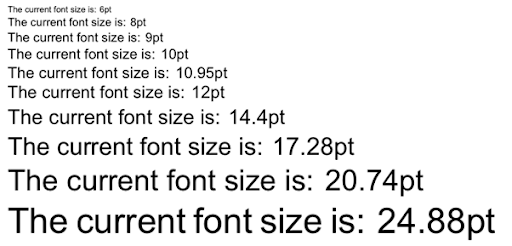
Key Takeaway: A 16px minimum for mobile body text removes the pinch and zoom gestures that smaller sizes force on readers.
Use Proper Measuring Units
For the font-size of the mobile web, typography doesn’t use points (pt). Instead, use ems or rems. This is preferred by most designers since these units make the content scalable since they are based on percentage and not any static size.
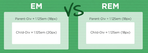
Key Takeaway: Sizing mobile type in em or rem rather than px or pt lets text scale with the browser font setting a reader has chosen.
How Do You Scale Mobile Type With CSS clamp()?
CSS clamp() scales mobile type between a minimum and a maximum size in a single declaration, so font sizes flex with the viewport instead of jumping at each media query breakpoint.
The function takes three values: a minimum, a preferred value, and a maximum. A rule such as font-size: clamp(1rem, 0.75rem + 1.5vw, 1.5rem) never renders body text below 16px on a small phone and never grows past 24px on a tablet.
- rem in the preferred value: A value built only from vw ignores the font size the reader has chosen in the browser, which fails the WCAG resize text requirement.
- 16px zoom threshold: Set the minimum at 1rem or higher for body copy, because mobile browsers stop offering to zoom the text at that size.
- line-height and margins: Apply clamp() to both as well, so leading and spacing grow with the type rather than staying fixed.
- font-display swap: Add it to every @font-face rule so text paints in a fallback face while the web font downloads.
Variable fonts changed the other half of this. One variable font file carries a continuous weight axis, so a page can call font-variation-settings for weights from 300 to 700 while downloading a single file instead of four. Roboto Flex and Inter both ship as variable fonts.
Check the result on real screens. Mobile browsers apply text-size-adjust differently, and a clamp() curve that reads well during a desktop resize can leave headings cramped on a 360px viewport, which is what responsive testing across real devices exposes.
Key Takeaway: CSS clamp() with a rem based preferred value lets mobile font sizes scale with the viewport while still respecting the browser font setting a reader has chosen.
Choose Contrasting Colors
Better contrast ensures better readability. While thinking about the color of mobile web typography think about the comparison between bright and dark. If the background of the page is dark colored, use bright colored fonts. For example white fonts on the black background and vice versa.
WCAG sets the minimum contrast ratio at 4.5:1 for normal text and 3:1 for large text. Checking those ratios is part of accessibility testing, and mobile screens read in daylight need the higher end of that range.
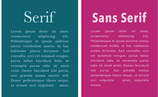
Key Takeaway: Bright type on a dark background, or dark type on a light one, at a ratio of at least 4.5:1 keeps mobile copy readable.
Ensure Better Readability
There are many free and exciting fonts available today, but if you are planning to use them in your content, you should check each and every alphabet to ensure that the font-family and size you are using makes those contents readable. There is no point in using those cool fonts if the reader cannot understand your content.
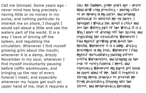
Key Takeaway: Simple sans serif faces render more cleanly than decorative faces at the pixel densities used on mobile screens.
Align The Texts Properly
Alignment is an important factor when it comes to mobile web typography. The human brain likes to read the text in blocks in small screen. Usually, texts are left aligned which means, there is a ragged edge on the right side of the block. Adjust it properly and make sure if you are using ‘justified’ alignment, it does not result in a white space that is not consistent.
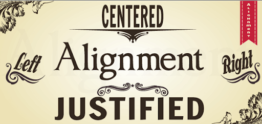
Key Takeaway: Left aligned body text gives a mobile reader a fixed starting edge, while justified text opens uneven word gaps on narrow screens.
Set the Leading
Typography in mobile web demands consistent leading (the space between the lines). When it is too small, in a large content, the end of one line and beginning of next one is difficult to follow. If too large, it results in unnecessary whitespaces. Make sure not to interrupt the smooth flow of a line.
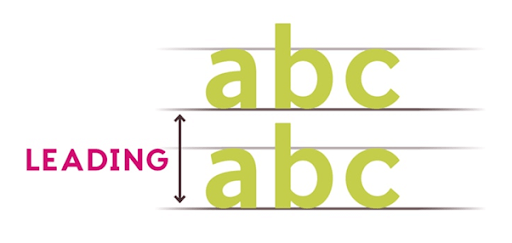
Key Takeaway: Leading of roughly 1.5 times the font size stops lines of mobile text from crowding one another.
Finding Your Sweet Spot
All fonts have a sweet spot. The combination of font-size and leading where they ensure the best readability and less distortion caused by the default anti-aliasing of the browser. Experiment with the typeface you are using and find that sweet spot.
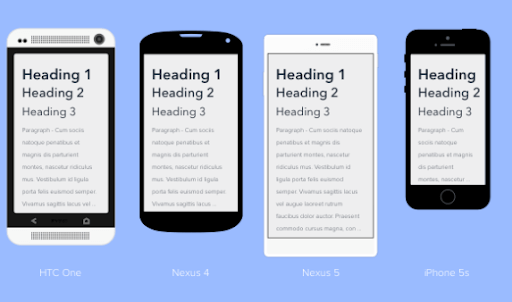
Key Takeaway: A mobile line length of about 45 to 75 characters keeps the reading eye from losing the start of the next line.
White Space Utilization
White spaces are often usable. In case of CTAs or clickable links, use white space so that they can be distinguished and clicked using the index or thumb. Since the user is not using a mouse like in a desktop, the thumb or index is considered to be the cursor, which is about a millimetre in thickness. Think about that and utilize whitespaces effectively.
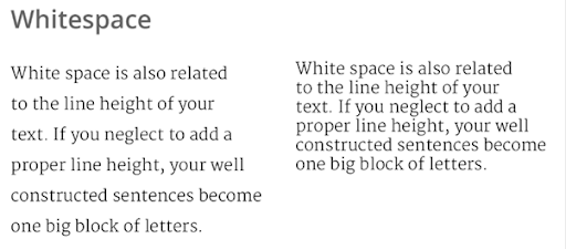
Key Takeaway: White space around a mobile text block separates content groups without adding borders or dividers.
Take The Screen Width Into Account
While designing the typography on the mobile web, you have to think about how people read texts. Usually, there are 2 kinds of width in a mobile device, vertical and horizontal. Hence, while designing the typography, take both the widths into consideration and set the alignment and spacing accordingly.
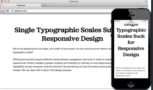
Key Takeaway: Mobile screen width decides how many characters fit on a line, so typography has to be checked at the narrowest supported viewport.
Make Your Typography Distinguishable
Typography of your mobile web page should have a distinct feature, either in appearance or in color or additional effects. Especially, in contents which you want the users to read, carefully choose typefaces for the headings that make them stand out from the rest.
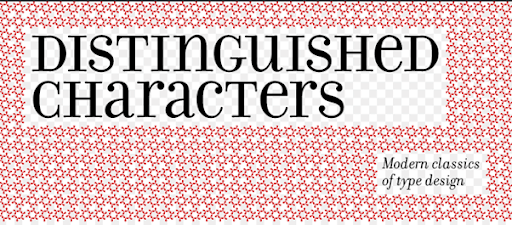
Key Takeaway: A distinct typeface and weight scale lets a mobile visitor tell headings, body copy and captions apart at a glance.
Check Scaling And Proportions
Check the contents in different mobile devices of different resolutions. Also, zoom in and zoom out to ensure that your mobile web typography scales and fits the entire screen width. Responsiveness of your content is a must and you must test it and write media queries in case there is any disruption for any certain resolution.
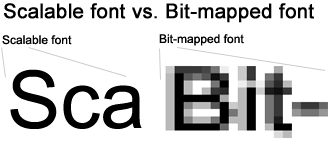
Key Takeaway: Proportional heading sizes, such as an H1 at twice the body size, keep a mobile type hierarchy consistent across breakpoints.
Take Functionality Into Account
There are many text elements in a mobile website that allows the user to perform certain actions, like send a message or make a call. Typography of mobile web should be designed carefully to ensure that users understand that a specific text is actually a CTA or executes a certain functionality.
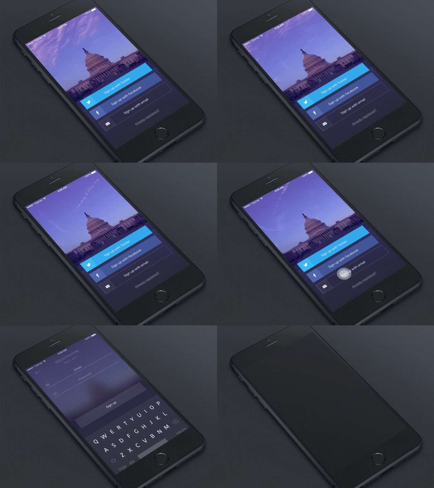
Key Takeaway: Mobile text that doubles as a control must stay readable at the size it is tapped, not only at the size it is designed.
Is the Page Text-Heavy?
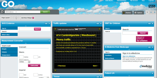
If your page is heavy in terms of text, like a blog or a news article, very little interaction is needed. The primary purpose of the user is to read, ensure that typography of mobile web is designed accordingly.
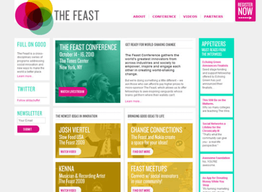
Key Takeaway: A text heavy mobile page needs looser leading and shorter line lengths than a page built mainly around images.
Is The Page Interaction-Heavy?
If your page involves more hover and clicks actions along with typing, editing etc, adjust your texts accordingly. Make sure the font size is no less than 18px so that users can understand that some action is supposed to happen once they click or hover on the text.
Key Takeaway: An interaction heavy mobile page should reserve the boldest type for the labels a user has to act on.
Pairing Multiple Fonts
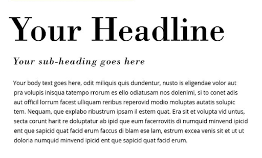
While designing the typography of mobile web, you may combine different fonts for heading and paragraph, labels etc. But make sure that they match each other. Mixing Algerian for heading and comic sans MS for a paragraph is a bad idea.
Key Takeaway: Pairing at most two typefaces on a mobile web page keeps contrast clear and limits the number of font files the page downloads.
Font-Weight: Heavy Or Light?
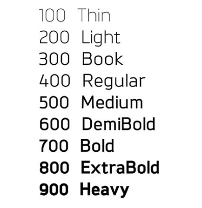
Mobile fonts are relatively smaller when compared to desktops. Care must be taken to make them readable or clickable when they involve their functionality. The key to deciding the font-weight is experimenting. Bold, large typography is common on the mobile web, and you should still use multiple font weights and test the application across different resolutions to ensure there is no disruption anywhere.
Key Takeaway: Testing several font weights across resolutions shows which weight stays legible on a small mobile screen.
Keep The Background In Mind
If the background is static and monochromatic, as mentioned earlier, you can use font-colors of the opposite contrast. But when a background is an image or a video, the ideal choice would be to experiment with different colors and check which one fits properly and makes the content readable.

Typography is a delicate craft. Designers often spend a lifetime in sharpening their typographic skills. With every new typeface bringing in a new challenge, we are sure the above mentioned mobile typography tips will be handy the next time you are designing a new mobile webpage. Also, keep in mind to perform cross-browser compatibility tests to ensure that the typefaces or styles you are using works properly in all browsers. TestMu AI can be used to perform cross-browser compatibility tests on more than 3000+ different browsers and their versions. Ensure that the typeface is supported on all the required browses and present your users the rich user experience they deserve.

Key Takeaway: Text placed over a mobile background image or video needs a tested color or overlay, because one fixed font color fails on varying imagery.
Author

Arnab Roy Chowdhury
Blogs: 69


Arnab Roy Chowdhury is a community contributor with 10+ years of experience working across software development, web UI engineering, and technical content writing. Currently a Senior Consultant at Capgemini, he has hands-on experience in building and maintaining cross-browser compatible web interfaces using HTML5 and modern frontend practices. Arnab has also contributed as a freelance web developer and writer, combining practical development expertise with clear technical documentation. He holds a Bachelor’s degree in Computer Engineering.


Mobile Typography FAQs
Did you find this page helpful?
More Related Blogs
TestMu AI forEnterprise
Get access to solutions built on Enterprise
grade security, privacy, & compliance
- Advanced access controls
- Advanced data retention rules
- Advanced Local Testing
- Premium Support options
- Early access to beta features
- Private Slack Channel
- Unlimited Manual Accessibility DevTools Tests