

Power Your Software Testing with AI Agents and Cloud
The Native AI-Agentic Cloud Platform to Supercharge Quality Engineering. Test Intelligently and Ship Faster.


- TestMu AI (Formerly LambdaTest)
- /
- Blog
- /
- How to Implement The Mobile First CSS Approach
How to Implement The Mobile First CSS Approach
Learn to implement a mobile first CSS approach for optimal mobile UX. Use containers or media queries for breakpoints, ensuring website layouts work on mobile and desktop.
Last Updated on:
The mobile first CSS approach starts every layout at the smallest breakpoint, then widens it with container queries such as @container (min-width: 500px) to rearrange elements like a hamburger menu into a full navigation bar on larger screens. Google's mobile-first indexing rewards this order because Googlebot crawls the mobile version first, making it the practical default for new builds.
Key Takeaways
- To implement the mobile first CSS approach, style the layout for small mobile screens first, then add container queries or min-width media queries as breakpoints for larger screens such as tablets and desktops.
- CSS container queries use the container property and the @container rule to style elements based on their parent container size, while CSS media queries respond to changes in viewport width or height.
- Mobile first CSS uses min-width media queries to add styles as screens get wider, while desktop first CSS uses max-width media queries such as @media (max-width: 800px) to restyle narrower screens.
- According to StatCounter, 59.57% of active users use mobile devices more than desktops, so prioritizing mobile functionality, features, and testing first gives developers the best ROI.
- Mobile first CSS helps SEO under Google's mobile-first indexing, because Googlebot can easily crawl and index well-optimized mobile content, which can lead to higher rankings and better visibility.
- Mobile first CSS and responsive web design work hand in hand, but responsive web design does not favor any approach and simply makes a website fit well on every device.
What Is the Mobile First CSS Approach?
The mobile first CSS approach initially involves designing for mobile devices and then using media queries to adjust the layout for larger screens like tablets, laptops, or desktops. This strategy ensures that the website is optimized for mobile users while providing a good experience on larger screens.
Before mobile devices, websites were designed for desktop computers, following the Desktop First approach. With the rise of mobile phones and the need for sites to be accessible on smaller screens, responsive design was introduced. This approach allows developers to use breakpoints in CSS using media queries.
For example, when accessing a website from a desktop or laptop, the server detects the device type (mobile, tablet, desktop) through the user agent. It then loads the appropriate CSS stylesheets for that device, and CSS breakpoints are used to make the website responsive.
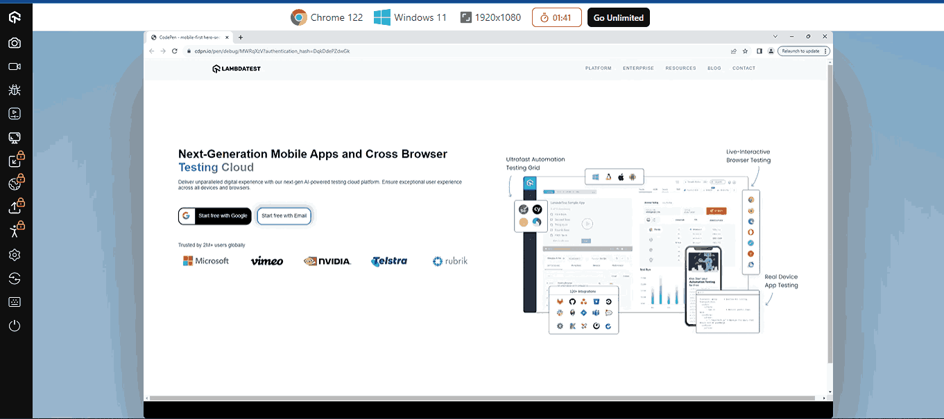
For instance, let’s try to access the TestMu AI website.
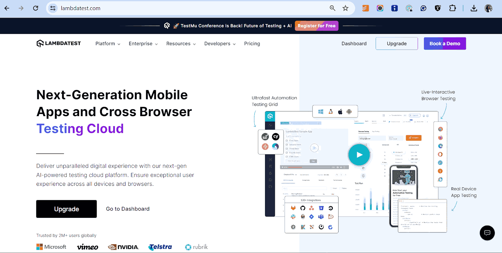
However, if the same website is accessed with a mobile phone, the website will display as shown below.
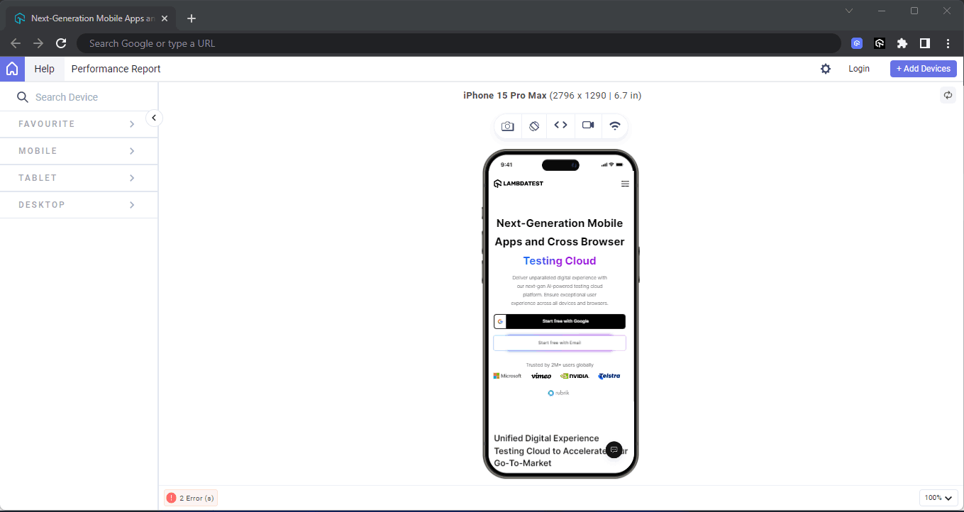
Here, we have used LT Browser, a mobile site tester offered by the TestMu AI platform, to check the performance of the web pages.
LT Browser helps developers and testers with responsive testing and debugging. It lets you experience how websites look on different pre-installed device viewports like mobiles, tablets, desktops, and laptops.
Each device view has its own Chrome DevTools, so you can easily find and debug issues tailored to each device’s layout. This makes testing easier and gives you the confidence to create a seamless mobile website testing experience.
DOWNLOAD LT BROWSER 2.0The mobile version of the TestMu AI website above consists of minimal content display; the fonts, images, and icons have been made smaller with media queries as soon as they reach a specific breakpoint of the mobile device, which has a max-width of 500px.
In this blog on the mobile first CSS approach, we will learn why it is essential to start building your website with a mobile first rather than a desktop first approach.
Why Mobile First CSS Approach?
To truly understand if a mobile first CSS approach is needed, we must understand why the mobile first approach is needed. The mobile phone now plays a significant part in the consumer lifecycle, with most of the online interactivity happening through the mobile phone.
According to the StatCounter report, 59.57% of active users use mobile devices for activities such as visiting websites, online shopping, online payments, and entertainment more than desktops. This data shows that mobile devices have a wider reach than desktops or laptops yearly.
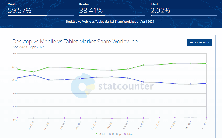
It emphasizes the importance of a mobile first approach. Focusing on mobile usability first ensures that developers prioritize functionality, features, and testing on mobile devices for the best ROI.
The mobile first CSS approach refers to the design and development strategy. It encourages developers to consider mobile devices first when building their website before desktops, which has a huge impact on the success or failure of the website.

Note: Optimize your website with a mobile first CSS approach to ensure it’s built to fit different screen sizes. Try the LT Browser now!
As we have learned the importance of implementing the mobile first approach, we will learn the advantages of the mobile first CSS approach in the below section.
Advantages of the Mobile First CSS Approach
Mobile first CSS approach has many benefits for businesses and any platform looking to drive more traffic to their website. In a world where everyone has a smartphone and is quick to access information online, a mobile first approach becomes necessary.
In this section, we will list some advantages and benefits of implementing a mobile first approach in CSS.
Responsive Design
Responsive design ensures that content is easily accessible and readable on all the different screen sizes. With the mobile first CSS approach, optimizing the content for different device screens becomes easier. As new mobile devices with different screen sizes are introduced, responsive design helps ensure that websites and content remain compatible and accessible.
A mobile-friendly website is easily accessible on various devices, including computers, tablets, and smartphones. Unlike a traditional website that may require extra effort to access content on smaller screens, a mobile-friendly website remains fully functional as its layout adjusts automatically to fit any device’s screen size.
However, you can validate your website’s responsiveness by performing responsive testing on different screen sizes and devices. This helps ensure your website works and looks as expected across varying screen sizes, providing a better user experience.
Website Accessibility
The mobile first CSS approach can benefit people with disabilities or visual impairments. By focusing on mobile first design, developers can consider factors such as color contrast and WAI-ARIA roles, ensuring a well-functioning and accessible website.
To validate the accessibility of your websites across different screen sizes and follow accessibility standards, you can perform accessibility testing. Tools such as Accessibility DevTool by TestMu AI help you maintain accessibility standards and ensure your site is accessible to all.
It is a Chrome extension that helps check functionality and UI based on accessibility testing standards and identify and report accessibility issues.
With this extension, you can conduct Full Page Scans to evaluate entire web pages or Partial Page Scans to target specific accessibility issues. The Accessibility DevTools dashboard provides a detailed summary and breakdown of your website’s performance, helping you identify and address accessibility issues effectively.
If you wish to use this Chrome extension, click the Install Accessibility DevTools button below.

2M+ Devs and QAs Rely on TestMu AI for Web & App Testing Across 3000 Real Devices
 Sign up with google
You can watch this video tutorial to learn the importance of making your website or application accessible to everyone, including people with disabilities.

For a more comprehensive approach, TestMu AI Accessibility Automation offers advanced features for automated accessibility testing. It integrates seamlessly with various automation testing frameworks like Selenium, Cypress and Playwright enabling you to test your website across real devices and browsers. This automation ensures thorough coverage of accessibility issues, providing detailed reports and actionable insights to help you create a truly inclusive web experience.
To get started with automation testing for validating accessibility standards on your website, refer to the support documentation on Accessibility Automation.
SEO Benefits
The mobile first CSS approach benefits Search Engine Optimization (SEO), particularly with Google’s mobile-first indexing. When content is well-optimized for mobile devices, Googlebot and other search engine platforms can easily crawl and index the content. This can lead to higher rankings and better visibility for your website.
Implementing Mobile First CSS Approach in CSS
By now, you should better understand the term Mobile First and its relation to the mobile first CSS approach. We will learn how to implement this approach using container and media queries, which help apply breakpoints to style or render elements differently on larger screens.
Container Queries
In this section, you will learn how to implement the mobile first CSS approach using CSS container queries.
CSS container queries set styles for elements based on the size of the element’s parent or container (width and height), unlike media queries, which detect changes in the viewport width or height. For example, we can adjust the font size of a child element based on changes in the parent container’s size (shrinking or growing).
The container queries use a single property called a container, a shorthand property where we specify the container’s name and type. This property is applied within the parent or root element of the actual element.
After the container property has been specified, we use the @container at rule to apply breakpoints to the target element we want to change.
Result:
Now, let’s see how to implement a mobile first CSS approach by creating a simple landing page using container queries as breakpoints.
To get started, generate a simple HTML template and type the code below.
HTML:
The HTML code above contains a <header> element that serves as the parent container for the entire navbar, and nested inside this <header> element is a <nav> element. The <nav> element has the following elements that serve as component elements for the navbar.
- section class=”logo”: The <section> element with a class of logo acts as the container for the website logo, allowing us to apply styling for its display. Inside this element, there are two nested elements: a <div> and an <img> element
- section class=”menu-bar”: The <section> element, with a class of menu-bar contains all the nav links of the navbar. With this <section> element we can directly apply style targeted at the nav links on the navbar.
- section class=”search-container”: The <section> element with a class of search-container serves as the container for the search bar. With this <section> element, we can style the nav bar’s search bar.
- section class=”hamburger-menu”: The <section> element with a class of hamburger-menu serves as the nav link toggle button on mobile. Nested inside this element is a single icon element <i> tag.
CSS:
From the CSS code above, container queries are used as breakpoints to implement the mobile first CSS approach.
- @container menubar (min-width: 500px): With the @container rule, you can re-declare the styles on the navbar to accommodate the changes in the size of the navbar container.
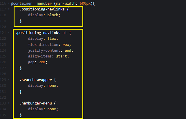
From the highlighted code above, the styles specified within the @container rule are re-declared to re-align target elements as soon as the containing elements change sizes.
Mobile Result:
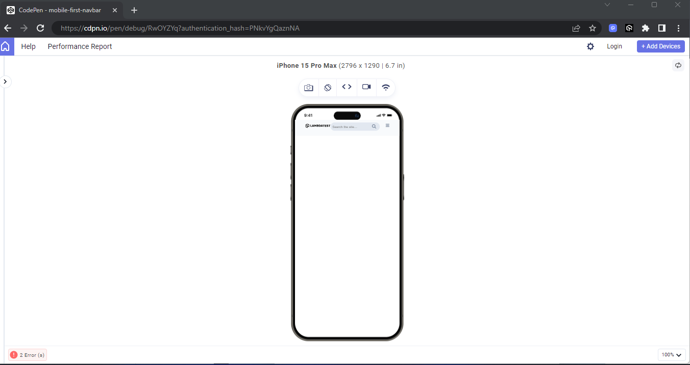
From the mobile view, the navlinks are set to display:none. It will prevent the navbar from having clustered navlink items.
However, the code should look like this on your desktop as soon as you expand your browser.
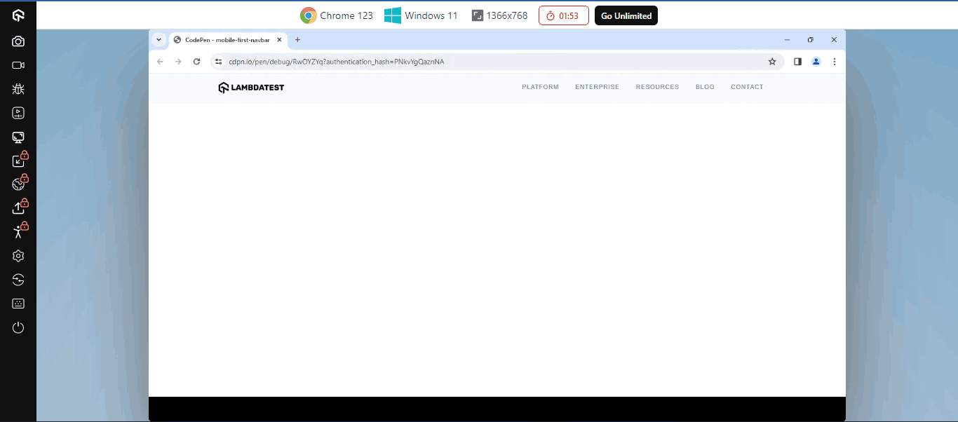
From the desktop view, the search bar and hamburger icon are set to display:none; this will give room for the navlinks on the navbar.
Now that we have completed the navbar, let’s create a hero section and see how to implement a mobile first CSS approach on a landing page.
HTML:
From the HTML code above, we focused on the hero section of the website, and the code is broken down as follows:
- main class=”hero-section-container”: The <main> element with a class of hero-section-container, serves as the container for the entire hero section.
- section class=”hero-section”: This <section> element is the direct child of the <main> element. This element has a class of hero-section and is used as a wrapper to wrap around two elements, the <aside class=”hero-left-content”> and <aside class=”hero-right-content”>, respectively.
- aside class=”hero-left-content”: This <aside> element with a class of hero-left-content serves as a wrapper element for the text content, buttons, logo, and icon elements on the top of the hero section on mobile and on the desktop display version it will be in the left.
- aside class=”hero-right-content”: This <aside> element with a class of hero-right-content serves as the wrapper of the hero image in the hero section. On mobile, it is positioned directly below the hero-left-content element, and on the desktop view, it will be on the right side of the hero section.
CSS:
The CSS code above contains styles for the hero section and is as follows;
- hero-section:Here, the element with a class of hero-section is targeted and converted into a grid container by applying a display: grid style. The grid-template-columns property is set to repeat(1, minmax(0, 1fr)), which means the grid items will repeat once in a column with a minimum width of 0 and a maximum width of 1 fractional unit (1fr), ensuring they take up equal space within the grid container.
To learn more about the repeat() function and how it can be used with various CSS Grid properties such as min-content, max-content, auto, auto-fill, auto-fit, and more, follow this guide on the CSS Grid repeat() function. This guide provides detailed insights on making layouts flexible based on any given content and screen size.
Mobile Result:
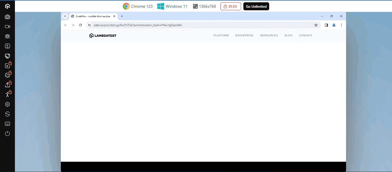
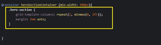
From the highlighted code above the @container heroSectionContainer (min-width: 900px): you specify a container query to apply new styles as soon as the specified element min-width grows above 900px. The grid-template-columns: repeat(2, minmax(0, 1fr)), means that the specified element should split into two column grid side by side.
Desktop Result:
From the display above, we move from a mobile point of view of a one-column view to a column view on a desktop. Mobile first can easily be achieved if we take care of the mobile usability first and then apply breakpoints with CSS container query functions as indicated above.
Media Queries (min-width)
CSS media queries allow developers to control how content is displayed and which content to display based on the viewport width or height of the device loading the content. Essentially, it makes it easy to determine how content should respond to the changes on the device viewport.
✨ Understand CSS Responsiveness in Depth✨
— Adarsh Gupta ✨ (@Adarsh____gupta) February 25, 2024
➥ Media Queries in CSS
➥ Common Device Breakpoints
➥ Adapting your website on different viewports
➥ Examples
Mega Thread 🧵⇩ pic.twitter.com/QYSF9lDKS7
From a mobile first CSS approach, styling is implemented on a small screen (mobile devices). Then, with the help of min-width in media queries, styles are re-declared to determine how content should be displayed on larger screen sizes such as tablets and desktops.
HTML :
From the HTML code above, we focused on the Our Services section of the website, and the code is broken down as follows:
- main class=”our-services”: This <main> element, with a class of our-services, serves as the container element for all elements in the our-services section. Nested inside this element is an <article> element as a direct child.
- articles: This <article> element is used as a container for both the section class=”image-wrapper” and section class=”content” element.
- section class=”image-wrapper”: This <section> element with a class of image-wrapper serves as a wrapper element for the display image in the our-services section. With this element, the image can be sized to take up the parent’s full width.
- section class=”content”: This <section> element, with a class of content, serves as a wrapper element for the content in the our-services section. With this, child elements can easily be positioned within their parent container.
CSS:
Here, we have applied a simple media query @media (min-width: 800px) to the specified element as soon as the browser viewport is greater than 800px, and once this occurs, the specified styles on the media query take effect.
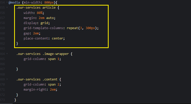
From the highlighted code above media query breakpoint, the our-service article element is set to a three-column grid with 300px.
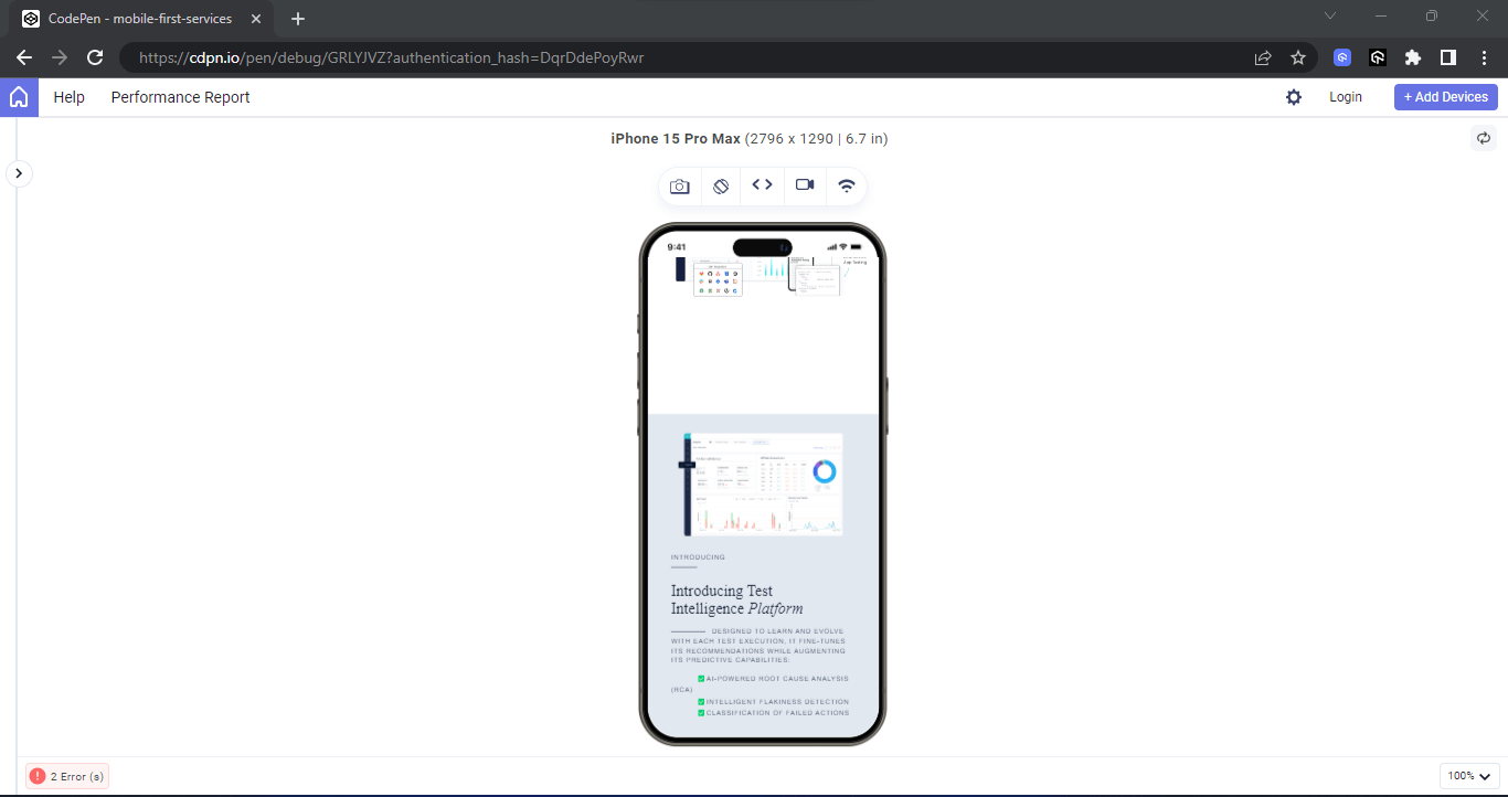
From the mobile preview above, the image-wrapper and the content element are stacked. This helps the content fit well on mobile devices.
Desktop Result:
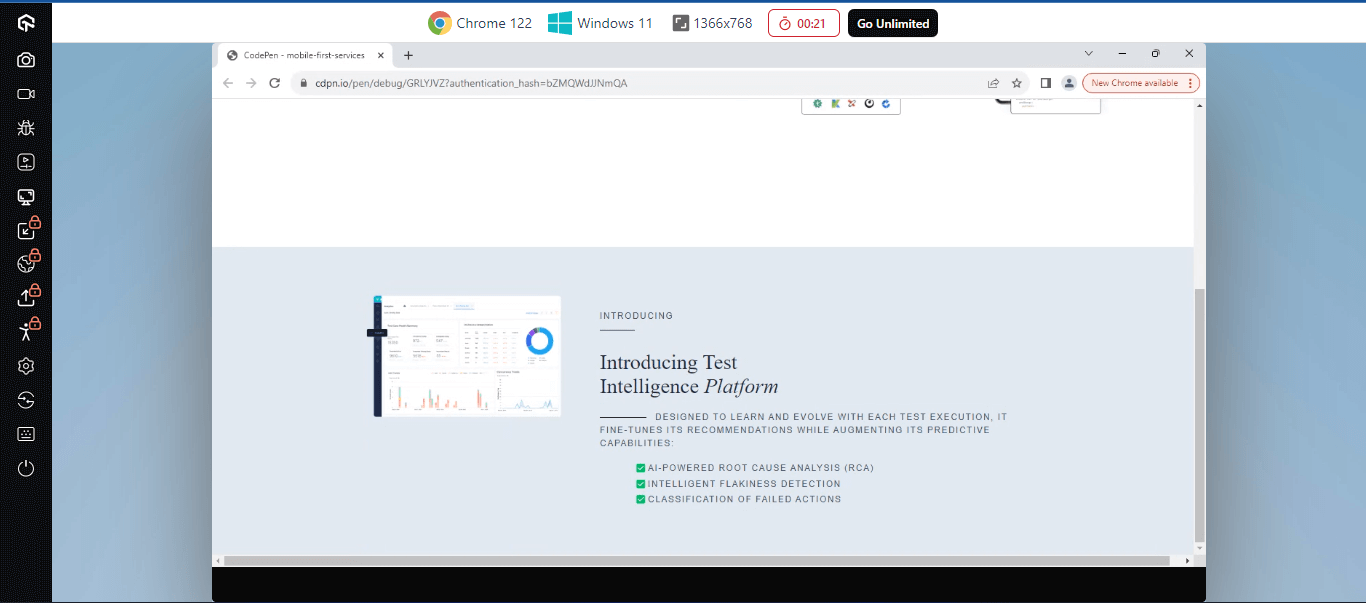
From the result above, the desktop preview is set to display a grid to use the available space on the desktop.
Let’s see more examples of how to use min-width in a media query.
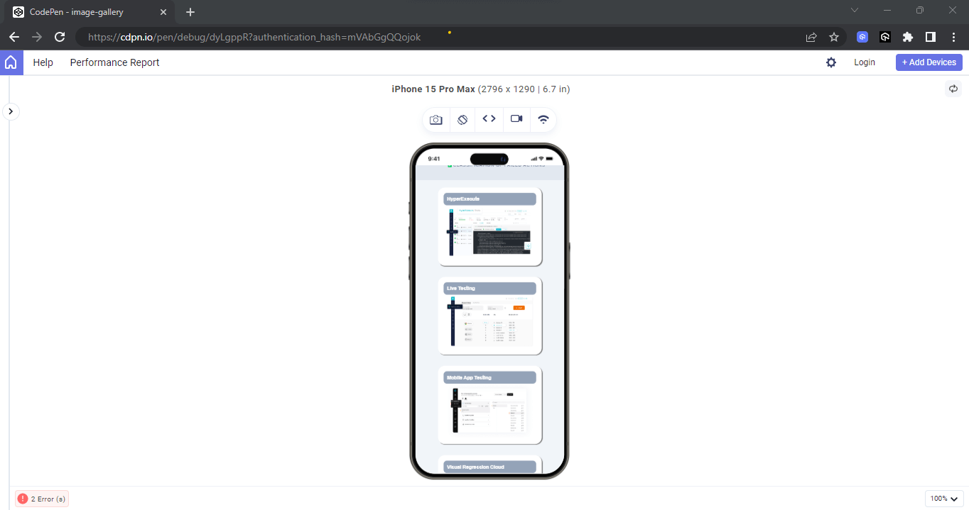
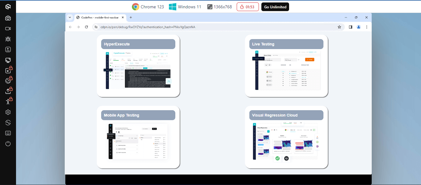
The next example is a simple four-image display, where we apply all images on a single column on mobile and a two-column grid on a desktop.
HTML:
The HTML code above is implemented as follows.
- main class=”gallery-section”: This element with a class of gallery-section serves as the container for all elements in the product list section. Nested within this element is a <section> element.
CSS:
From the CSS code above, media queries are used as breakpoints to implement the mobile first CSS approach, as follows.
Here, we have applied a simple media query @media (min-width: 800px) to the specified element as soon as the browser viewport is greater than 800px, and once this occurs, the specified styles on the media query take effect.
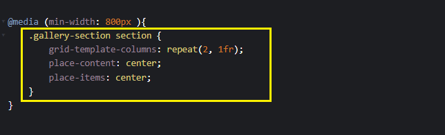
From the highlighted code above for the media query breakpoint, the gallery-section class element is set to a two-column grid as soon as its width exceeds 800px.
Mobile Result:
Desktop Result:
You can do more with min-width in media queries to make the content on the page more mobile first.
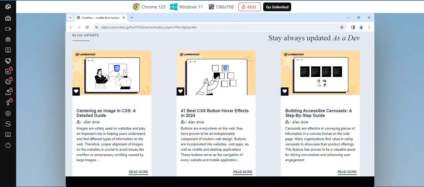
The next example below demonstrates implementing a mobile first CSS approach on a blog element. Here, you ensure each post is on a single column on mobile, two columns on tablet, and three columns on desktop.
HTML:
The HTML code above is implemented as follows.
- main class=”card-section”: The <main> element with a class of card-section serves as the parent container for all elements in the card section.
- article: The <article> element serves as a container element for the <section class=”section-header”> element and the <section class=”card-wrapper”>.
- section class=”section-header”: This element serves as the wrapper element for the heading content on the blog section. Nested within are <h1 class=”utl-uppercased-text”>, <span class=”utl-dash dash”> and <h1 class=”utl-script-text”>.
- section class=”card-wrapper”: This element is the wrapper element for the four card elements in the blog section. With this element, each blog post can be positioned with min-width at a specified breakpoint.
CSS :
The above CSS is implemented as follows:
- card-section: The element with the card-section class is applied a width of 100vw to take the full width of the browser viewport and a background-color of light slate color.
- card-section article: The <article> element takes a width of 80%, the margin of 0 auto will align the <article> element and the content nested inside it to the middle of its parent element and leave an equal amount of space between the left and right side of the element with a of padding: 2em 0.
- card-section section-header: With this element, we applied a display flex to the heading elements, justify-content of start, and flex-direction to column to stack each heading text on top of the other on mobile. A row-gap of 1em to add a space between the headings on the row axis.
- card-section card-wrapper: This element with a class of card-wrapper serves as the wrapper for the blog elements on the page. Here, we applied a display of grid, grid-template-columns of repeat(1, 300px). This will size all blog elements with a width of 300px and align them in a single vertical column. A row-gap of 2em to add white space between the blog elements and a margin of 2em 0;
Mobile Result:
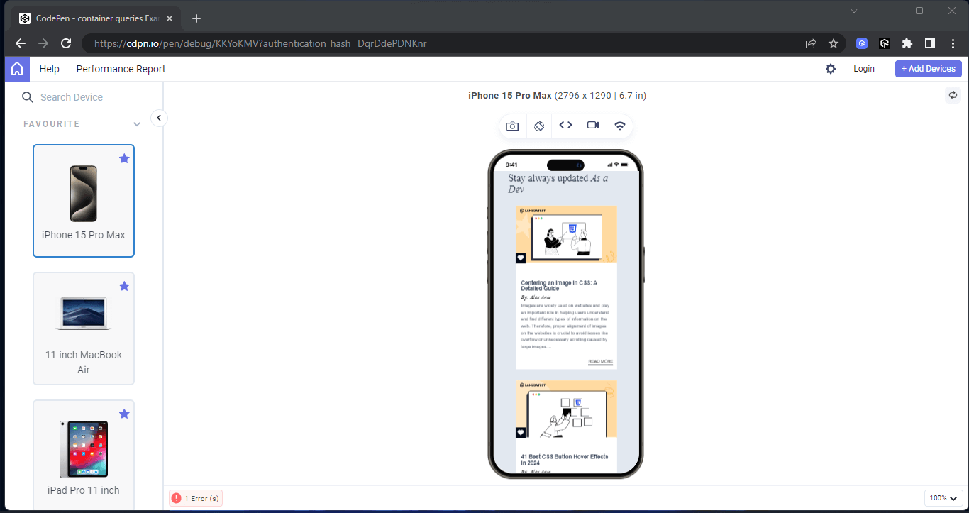
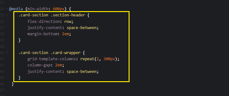
From the highlighted code, the @media (min-width: 600px) rule sets a breakpoint for a minimum width of 600px, which will take effect when the browser viewport size is above 600px. This breakpoint is typically targeted at tablet devices.
Within this breakpoint, the card-section and section-header classes are adjusted. The flex-direction is set to row, which aligns the two heading texts to display side by side horizontally. The justify-content: space-between property is applied to add space between both heading texts, and a margin-bottom of 2em is added to create extra white space outside of the element box.
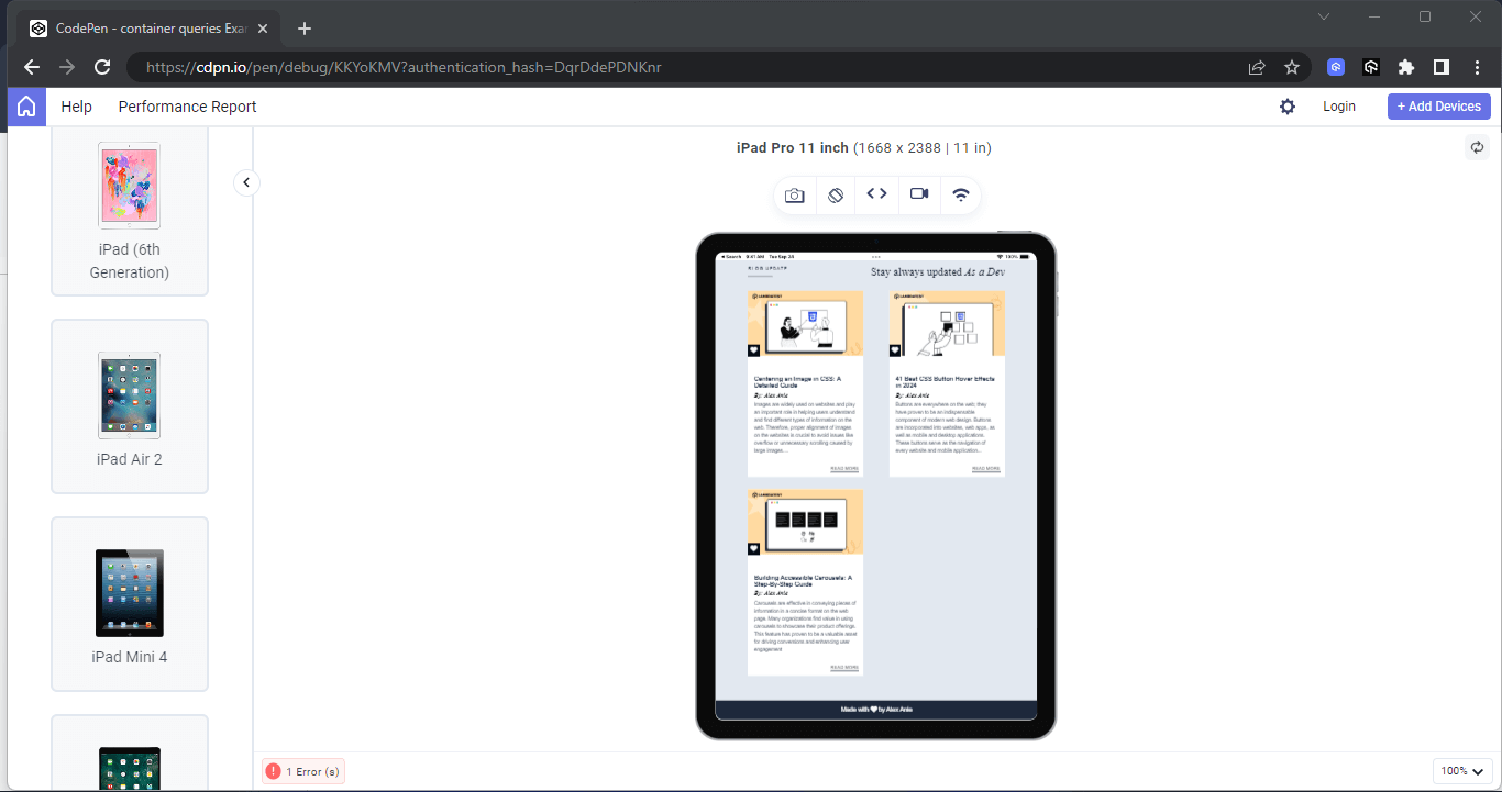
Mobile Result:
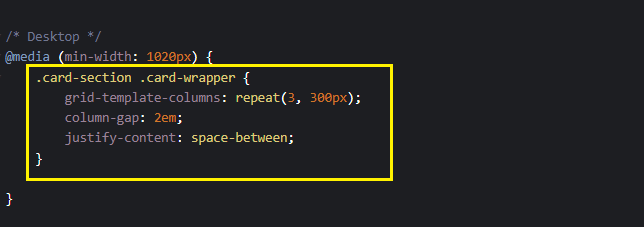
From the highlighted code above, the @media (min-width: 1020px) rule sets a breakpoint for a minimum width of 1020px, which will take effect when the browser viewport size is above 1020px. This breakpoint is specifically targeted at desktop devices.
Within this breakpoint, the grid-template-columns property is adjusted to repeat(3, 300px), which means the grid items will display in three columns on a desktop device, each column with a width of 300px.
Desktop Result:
In the below section, we will learn how to implement the desktop-first CSS approach in detail using media queries (max-width).
Implementing Desktop First CSS Approach in CSS
Now that we better understand how to implement a mobile first approach. In this section, we will learn how to implement a desktop first approach. It will help to distinguish the difference between desktop and mobile first approaches.
Media Queries (max-width)
max-width in media query is used to set the styles when the browser viewport width gets to a maximum unit or lower. It is used to implement styles for the desktop screen. For example, @media (max-width: 800px) instructs the browser to apply a different style when the website is loaded on a device that is exactly 800px wide or narrower.
HTML:
The HTML code above is implemented as follows:
- main class=”container”: This element with a class of container serves as the root element to all elements on the page.
- header class=”header”: This element with a class of header serves as the direct containing element for all the card elements on the page. With this element, we can apply a CSS Grid to align individual cards across the parent container. Nested within this element are six elements that serve as a card component.
CSS:
Here, in the above CSS code, the @media (max-width: 1177px) targets screens with a maximum width of 1177px, such as tablets or smaller desktop screens. It adjusts the layout of the .header class element to have two columns, ensuring that content is displayed optimally and responsively on these devices.
Similarly, the @media (max-width: 800px) targets screens with a maximum width of 800px, typically smaller mobile devices. It adjusts the layout of the .header element to have a single column, allowing for better readability and usability on smaller screens.
Desktop Result:
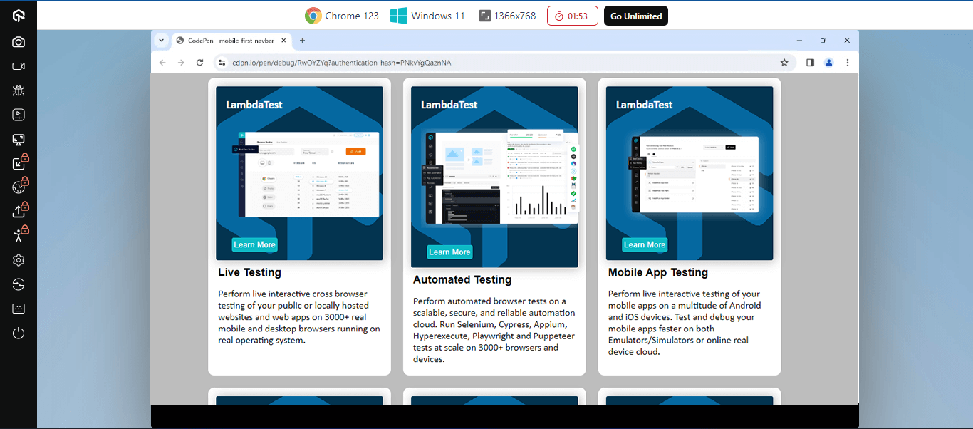
From a desktop point of view, the entire card is split into a three-column grid. This is the default styling for the card element. However, on a smaller screen, the card element will be split into smaller columns.
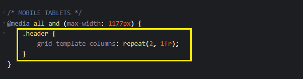
From the highlighted code above, the @media all and (max-width: 1177px); targets a viewport width of up to 1177px. This code specifies that the entire card element should be split into a two-column grid when the viewport width is 1177px or lower.
If you view this on a tablet device, you should see a two-column display grid.
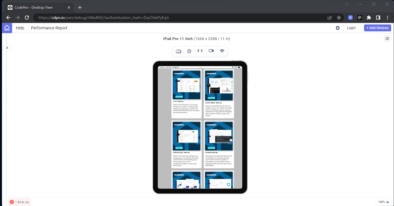
On a tablet device, the card elements are split by a two-column grid to make the content accommodate the device. However, on mobile, we can make this even smaller to make the content fit into a mobile device.
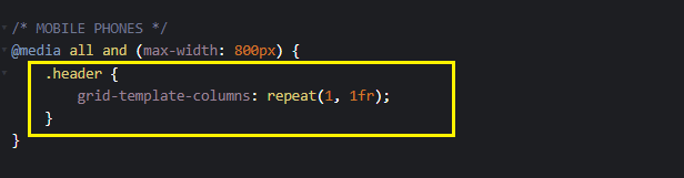
From the above highlighted code, the @media all and (max-width: 800px): targets the device’s max-width at 800px. So when the device viewport width is exactly 800px or lower, that effect will occur.
Here, the card elements are split into a one-column grid, making it ideal for mobile phone display.
Mobile Result:
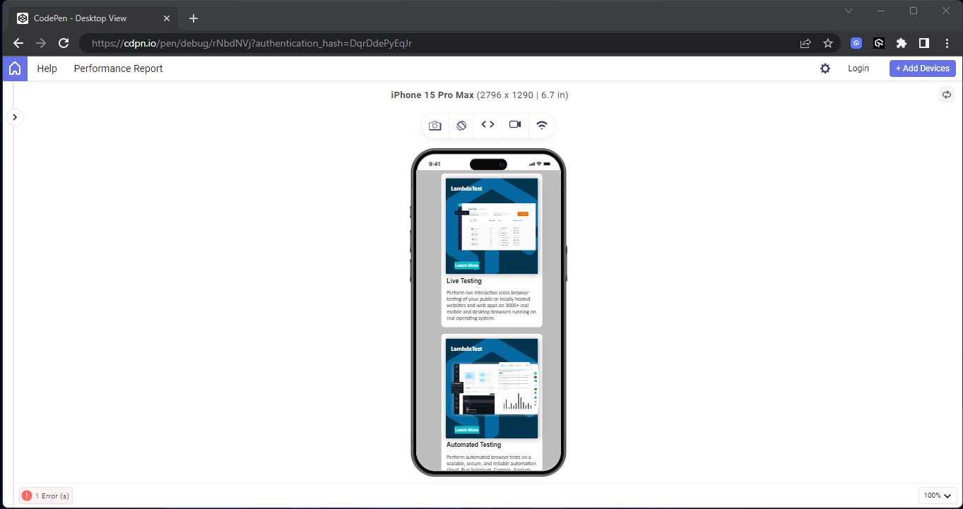
The max-width in media query can be very useful in cases where the desktop first approach is implemented. Then, the media query max-width can re-align the element with the specific breakpoint.
All the example results shown above are via LT Browser, a complementary tool TestMu AI offers. TestMu AI is an AI-powered test orchestration and execution platform that lets you run manual and automated tests at scale with over 10,000+ real devices and 3,000+ browser and OS combinations.
LT Browser provides a comprehensive preview of your website across various devices. With 53+ device viewports, you can compare and synchronize interactions like scrolling and clicking. It is an all-in-one desktop application designed to help you optimize your website for responsive web design across all screens, viewports, and screen resolutions by performing live testing.
If you wish to use the LT Browser to test your website on different screen sizes and for responsiveness, download the LT Browser from the link below.
DOWNLOAD LT BROWSER 2.0 
Watch the video tutorial below to become acquainted with LT Browser’s features and functionalities, including its pre-installed viewports for mobiles, tablets, desktops, and laptops.

Subscribe to the TestMu AI YouTube Channel for the latest automation testing tutorials covering Selenium testing, web device testing, cross-device testing, browser compatibility, mobile website testing, and more.

As we have learned the core advantages of the mobile first CSS approach, in the below section, you will understand the difference between the mobile first CSS approach and responsive design.
Difference Between Mobile First CSS Approach and Responsive Web Design
Most people consider the mobile first CSS approach and responsive web design the same thing. Well, these are two different things, but they work hand-in-hand.
For example, the mobile first approach involves developing the mobile version of a website first and then progressively using breakpoint to re-style the website appearance for larger screens.
However, responsive web design, on the other hand, deals with creating a website that fits well across all mobile, tablet, laptop, and desktop devices, irrespective of the approach taken during development.
Responsive design does not favor any approach; however, it makes sure all websites fit well on any device that the website is loaded on to ensure maximum user experience.
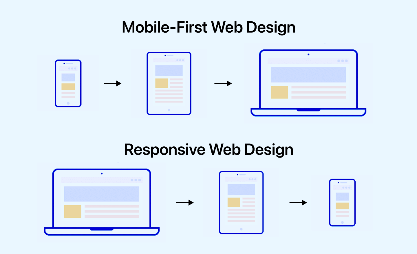
Let us understand the difference in more detail.
| Aspects | Mobile First CSS Approach | Responsive Web Design |
|---|---|---|
| Approach to Design | Proactive: Design starts with mobile devices and adapts to larger screens. | Reactive: Design adapts to different screen sizes. |
| Design Focus | Initially focused on mobile design. | Initially focused on desktop design. |
| Design Considerations | Prioritizes mobile design considerations. | Prioritizes desktop design considerations. |
| User Experience | Generally provides a better mobile experience. | May require additional optimizations for mobile. |
| Planning and Development | Starts with mobile optimization and then adapts to larger screens. | May require more effort to optimize for mobile. |
| Implementation Complexity | Can simplify the design process for larger screens. | Can be complex depending on the design. |
| Performance Optimization | Built-in optimizations for mobile performance. | May require separate optimizations for mobile. |
Conclusion
The mobile first CSS approach prioritizes optimizing the user experience for mobile devices during website development. It involves using CSS container queries or media queries like min-width to set breakpoints for different viewport sections on larger screen sizes.
Implementing a mobile first CSS approach can significantly enhance the overall user experience and drive traffic, considering the high number of website visits from mobile devices. Adhering to the instructions outlined in the blog is crucial for successfully implementing the mobile first CSS approach.
Author

Shubham Suri
Blogs: 10

Shubham Suri is a Lead Member of Technical Staff at TestMu AI (formerly LambdaTest), building the frontend and web interfaces of the quality engineering platform. He works across React.js, HTML5, CSS3, Bootstrap, jQuery, JavaScript, and Angular to create and maintain webpages and web applications. He brings around a decade of experience in web and frontend development, with earlier roles as a Software Engineer at Hard Shell Technologies and an IT Analyst at Cyrus Group. Shubham holds a B.Tech in Computer Science from Uttar Pradesh Technical University.
Reviewer
Isha Vyas
Reviewer
Isha Vyas is a Lead Member of Technical Staff at TestMu AI (formerly LambdaTest), building the frontend of the quality engineering platform. She works across React.js, responsive web design, and jQuery to ship and maintain the platform's user-facing web interfaces. She brings nearly seven years of frontend engineering experience at the company, with earlier work as a Software Developer at Mantra Labs. Isha holds a B.Tech in Computer Science from Swami Keshwanand Institute of Technology, Management and Gramothan, Jaipur.


Frequently asked questions
Did you find this page helpful?
More Related Blogs
TestMu AI forEnterprise
Get access to solutions built on Enterprise
grade security, privacy, & compliance
- Advanced access controls
- Advanced data retention rules
- Advanced Local Testing
- Premium Support options
- Early access to beta features
- Private Slack Channel
- Unlimited Manual Accessibility DevTools Tests