

Power Your Software Testing with AI Agents and Cloud
The Native AI-Agentic Cloud Platform to Supercharge Quality Engineering. Test Intelligently and Ship Faster.


- TestMu AI (Formerly LambdaTest)
- /
- Blog
- /
- CSS Hover Effects: Examples for Buttons, Images, Cards, and Text
On This Page
CSS hover effects are the simplest, highest-impact way to make a web interface feel alive. They give users instant visual feedback, confirming that a button, link, image, or card is interactive before a single click. An element that does not respond on hover looks broken even when it works perfectly, and a page full of static elements feels unfinished.
Beyond polish, CSS hover effects guide attention and signal intent: a color shift shows users where they are, a slight lift suggests something is pressable, an underline marks a link. Built with the :hover pseudo-class selector plus transitions and transforms, they deliver this interactivity with zero JavaScript.
Key Takeaways
To build smooth, high-performance CSS hover effects, apply the :hover pseudo-class to animate GPU-accelerated properties like transform and opacity, then use LT Browser by TestMu AI to preview and verify interactive behaviors across more than 50 mobile, tablet, and desktop viewports.
- Hover effects can fail on touch devices where states get stuck, across browsers due to missing vendor prefixes, on low-end phones due to layout-property jank, and for keyboard users who cannot trigger pointer-based interactions.
- :hover pseudo-class: The :hover selector applies styling changes the moment a pointer rests on an HTML element, allowing developers to alter animatable properties like color, size, shadow, or transform without using JavaScript.
- transform and opacity: Animating these GPU-composited properties prevents performance jank and stutter on lower-end devices because transform and opacity do not trigger a full layout reflow during transitions.
- @keyframes rule: The @keyframes rule defines complex animations using percentage steps, which are then applied inside the :hover selector using animation shorthand properties for duration, timing, and iteration.
- LT Browser: This testing tool by TestMu AI provides over 50 viewports side-by-side to ensure transitions remain smooth, media queries hold, and touch screens do not suffer from stuck hover states.
What Are CSS Hover Effects? How Does :hover Work?
A CSS hover effect is a visual change applied to an HTML element when a user positions their cursor over it. The :hover pseudo-class selector triggers these changes. Browsers respond to mouse pointer interaction by modifying any animatable CSS property: color, size, position, opacity, shadow, or transform.
Unlike standard animations that start when the page loads, hover animations begin only when the user moves their cursor over the element. Before that, the element looks like its base state. The syntax is straightforward:
/* Base state */
.element {
  background-color: #333;
  transition: background-color 0.3s ease; /* always on the base, not :hover */
}

/* Hover state */
.element:hover {
  background-color: #1095c1;
}
The transition property belongs on the base selector, not inside :hover. Putting it on the base element makes the transition play both on mouse-enter and mouse-leave. Putting it only in :hover means the animation plays when hovering in but snaps back instantly when hovering out, a common beginner mistake.
Understanding this behavior is fundamental to creating smooth CSS transitions that work consistently in both directions.
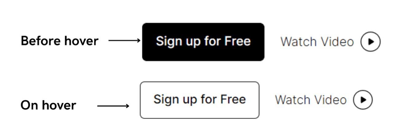
The screenshot above shows CSS hover in action on the TestMu AI website. The four examples below demonstrate different hover behaviors assigned to the same text element: color change, wavy underline, background highlight, and text shadow:
.hover-1:hover {
  color: red;
  font-size: 30px;
  text-decoration: underline;
  text-decoration-style: dotted;
  transition: font-size 0.3s ease-out;
}
.hover-2:hover {
  color: #00ffff;
  text-decoration: underline;
  text-decoration-style: wavy;
  transition: color 0.5s ease-in;
}
.hover-3:hover {
  color: #25316d;
  background-color: #b1b2ff;
  border-radius: 20px;
  transition: all 0.5s ease-in;
}
.hover-4:hover {
  text-shadow: 2px 2px 8px #ff0000;
  border: 2px solid #a5f1e9;
  border-radius: 20px;
  color: #a5f1e9;
  transition: all 0.2s ease-in;
}Key Takeaway: A CSS hover effect is a visual change triggered by the :hover pseudo-class when a pointer rests on an element, and the transition property belongs on the base selector so the animation plays on both mouse-enter and mouse-leave.
Common CSS Hover Effect Challenges (and How to Test Them)
The same hover effect can behave very differently depending on where it runs. Before going deep into examples, it helps to know the four problems that trip up most CSS hover effects in production:
- No cursor on touch devices:
:hovergets simulated on the first tap and stays stuck until the user taps elsewhere, so a menu or card can freeze in its hover state. - Cross-browser rendering: properties like
background-clipandmaskneed-webkit-prefixes and cause CSS browser compatibility issues that render differently across Chrome, Firefox, and Safari. - Performance jank: animating layout properties such as
width,height, ormargininstead oftransformandopacitycauses stutter on low-end phones. - Accessibility gaps: keyboard users never trigger
:hover, so hover-only feedback leaves them with no signal that an element is interactive.
Because these issues only surface on real screen sizes and input types, testing hover behavior across devices early saves rework. LT Browser by TestMu AI(formerly LambdaTest) lets you preview your CSS hover effects across 50+ mobile, tablet, and desktop viewports side by side, catching sticky mobile states and broken breakpoints before they reach production.
Key Takeaway: CSS hover effects break in production for four reasons: touch devices leave :hover stuck after a tap, properties such as background-clip and mask need -webkit- prefixes, layout properties cause jank on low-end phones, and keyboard users cannot trigger hover.
Which CSS Properties Can You Animate on Hover?
You can animate most visual properties on hover, but for smooth 60fps stick to transform and opacity; color, background, shadow, border, and filter are safe; avoid width, height, and margin.
Most visual CSS properties support hover transitions, but not all of them perform at the same cost. Choosing the wrong properties to animate can cause jank on lower-end devices, visible stuttering during the transition that makes a UI feel slow even when it is not.
The properties below are safe for hover animations. For best performance, stick to transform and opacity whenever possible, these are CSS GPU-accelerated properties that run at 60fps without triggering layout repaints. Everything else triggers at least a paint cycle when animated:
transform(scale,rotate,translate,skew): GPU-accelerated. Zero layout impact. The best property to animate for any hover effect involving movement or size change.opacity: GPU-accelerated alongside transform. Use for fade-in overlays, reveal effects, and image hovers.background-colorandcolor: Paint-layer only. No layout reflow. Safe for color-change hover effects.box-shadowandtext-shadow: Paint-layer. Can be expensive with large blur radii, keep blur values reasonable.border-colorandborder-radius: Paint-layer. Safe for border reveal and pill-shape transitions.filter(blur,grayscale,brightness): GPU-accelerated on most modern browsers. Good for image hover effects.
Performance tip: Avoid animating width, height, padding, margin, top, left, or font-size in hover effects. These trigger full layout recalculations on every frame, causing jank on lower-end devices. Use transform: scale() instead of width/height and transform: translate() instead of top/left.
Key Takeaway: For smooth 60fps hover animations, animate transform and opacity, treat color, background, shadow, border, and filter as safe, and avoid width, height, padding, margin, top, left, and font-size because each one forces a layout recalculation.
CSS Button Hover Effects with Examples
Buttons are the most common target for hover effects because they are the primary interactive element on any page. A button with no hover state looks broken, users cannot tell if it registered their cursor. These examples cover the four patterns that handle the majority of button hover use cases.
For the full collection of 41 button hover effects including gradient animations, border revolve, flip effects, and burst animations, explore these advanced CSS button hover effects for more creative interaction patterns.
Glowing Button on Hover
A colored glow using box-shadow with a spread radius creates a neon-like aura that works well for dark-themed UIs, creative portfolios, and game interfaces. The glow color should match or complement the button's background for the most cohesive look.
This neon-style hover state demonstrates how glowing effects in CSS can enhance visual feedback and improve user engagement.
.btn-glow {
  background-color: #1095c1;
  color: #fff;
  padding: 12px 28px;
  border: none;
  border-radius: 6px;
  cursor: pointer;
  font-size: 16px;
  transition: box-shadow 0.3s ease;
}

.btn-glow:hover {
  box-shadow: 0 0 16px 4px rgba(16, 149, 193, 0.6);
}
Key Takeaway: Button hover effects range from a simple background-color transition to a ::before fill slide, a scale and shadow lift, and a box-shadow glow, and a button without any hover state looks broken to users.

Note: Test your CSS hover effects across 10,000+ real browsers and devices. Try TestMu AI Today!
CSS Image Hover Effects with Examples
Image hover effects are essential for galleries, product pages, team sections, and portfolio grids. They communicate that an image is interactive and reveal additional context, a caption, a CTA, or a visual transformation, without requiring a click or a modal. These patterns cover the three most-used image hover scenarios.
Zoom on Hover
A scale transform on the image inside an overflow: hidden container creates a smooth zoom effect without the image escaping its bounds. The container clips the overflow, so the image scales inward, and setting object-fit CSS to cover keeps it filling the frame at any aspect ratio. This is the most widely used image hover effect because it is clean, performant, and works everywhere.
.image-container {
  overflow: hidden;
  border-radius: 8px;
  width: 320px;
  height: 220px;
}

.image-container img {
  width: 100%;
  height: 100%;
  object-fit: cover;
  transition: transform 0.4s ease;
}

.image-container img:hover {
  transform: scale(1.1);
}
Dark Overlay with Caption on Hover
A semi-transparent overlay fades in on hover, revealing a caption or CTA. This is a parent-hover pattern: hovering .card-image changes the nested .overlay. It is standard for portfolio grids, product cards, and team member sections because it keeps the image clean at rest and reveals context on engagement.
.card-image {
  position: relative;
  overflow: hidden;
  border-radius: 8px;
  width: 320px;
  height: 220px;
}

.card-image img {
  width: 100%;
  height: 100%;
  object-fit: cover;
  display: block;
}

.card-image .overlay {
  position: absolute;
  inset: 0;
  background: rgba(0, 0, 0, 0.6);
  display: flex;
  align-items: center;
  justify-content: center;
  opacity: 0;
  transition: opacity 0.35s ease;
}

.card-image:hover .overlay {
  opacity: 1;
}

.card-image .overlay p {
  color: #fff;
  font-size: 18px;
  font-weight: bold;
  text-align: center;
  padding: 0 16px;
}
Grayscale to Color on Hover
Displaying images in grayscale at rest and revealing color on hover creates a striking visual effect for team sections, client logos, and portfolio grids. It draws the eye to the hovered element while keeping the overall layout calm. The filter property handles this entirely in CSS.
.grayscale-img {
  filter: grayscale(100%);
  transition: filter 0.4s ease;
}

.grayscale-img:hover {
  filter: grayscale(0%);
}
Key Takeaway: Image hover effects rely on three patterns: a scale transform inside an overflow: hidden container for zoom, a semi-transparent overlay that fades in a caption, and a filter that switches an image from grayscale to color.
CSS Card Hover Effects with Examples
Card components appear everywhere in modern web design: blog post previews, product listings, feature grids, team profiles. A hover effect on a card signals that the whole card is interactive, not just the title link. These three patterns cover the most commonly requested card hover behaviors.
For best performance, animate only transform and box-shadow on cards. Avoid animating width or height as this triggers full layout recalculations on every frame.
/* Card Lift -- shadow deepens and card lifts slightly */
.card {
  background: #fff;
  border-radius: 12px;
  padding: 24px;
  box-shadow: 0 2px 8px rgba(0, 0, 0, 0.08);
  transition: transform 0.25s ease, box-shadow 0.25s ease;
}

.card:hover {
  transform: translateY(-6px);
  box-shadow: 0 12px 32px rgba(0, 0, 0, 0.15);
}

/* Border Reveal -- border appears on hover */
.card-border {
  background: #fff;
  border-radius: 12px;
  padding: 24px;
  border: 2px solid transparent;
  transition: border-color 0.3s ease, transform 0.3s ease;
}

.card-border:hover {
  border-color: #1095c1;
  transform: translateY(-4px);
}

/* Glassmorphism Card with Glow */
.card-glass {
  background: rgba(255, 255, 255, 0.15);
  backdrop-filter: blur(10px);
  -webkit-backdrop-filter: blur(10px);
  border: 1px solid rgba(255, 255, 255, 0.2);
  border-radius: 16px;
  padding: 24px;
  transition: box-shadow 0.3s ease, border-color 0.3s ease;
}

.card-glass:hover {
  box-shadow: 0 0 24px rgba(16, 149, 193, 0.4);
  border-color: rgba(16, 149, 193, 0.5);
}
Compatibility tip: Add a fallback solid background color for glassmorphism cards, since backdrop-filter is not supported in older browsers. Place .card-glass { background: rgba(255, 255, 255, 0.8); } above the backdrop-filter line.
Browser compatibility is one of the most important considerations when building production-ready CSS glassmorphism interfaces.
Key Takeaway: Card hover effects should animate only transform and box-shadow, and glassmorphism cards need a solid fallback background color because older browsers do not support backdrop-filter.
CSS Text Hover Effects
Text hover effects are the most common starting point because links and headings are the simplest elements to target with :hover. The examples below progress from basic color changes to the gradient background-clip technique demonstrated in the advanced sections below. For simple link hover states and navigation text, these patterns are the most practical.
/* Simple color change */
a.link-hover {
  color: #333;
  text-decoration: none;
  transition: color 0.2s ease;
}
a.link-hover:hover { color: #1095c1; }

/* Underline slide-in from left */
a.link-underline {
  color: #333;
  text-decoration: none;
  background-image: linear-gradient(currentColor, currentColor);
  background-size: 0% 2px;
  background-repeat: no-repeat;
  background-position: left bottom;
  transition: background-size 0.3s ease;
}
a.link-underline:hover { background-size: 100% 2px; }

/* Text shadow glow */
.text-glow {
  color: #1095c1;
  transition: text-shadow 0.3s ease;
}
.text-glow:hover {
  text-shadow: 0 0 12px rgba(16, 149, 193, 0.7);
}
The sliding underline pattern uses background-image to draw the underline rather than text-decoration, which gives you full control over color, thickness, and the animation direction. This is how most modern design systems implement animated link underlines. For gradient text hover effects using background-clip.
Animated underlines, gradient text, and similar effects are among the most practical applications of advanced CSS for modern interfaces advanced CSS.
Key Takeaway: A sliding underline drawn with background-image instead of text-decoration gives full control over the color, thickness, and animation direction of a text hover effect.

CSS Hover Effects with Background-Clip
background-clip is one of the most powerful techniques for advanced text hover animations. It clips a gradient or image to the shape of the text, making the gradient visible only inside the letter forms. Combined with CSS variables and the :hover pseudo-class, it produces color-shifting text effects that are impossible with color alone.
The core technique: set background to a gradient, set color: transparent so the text itself is see-through, then apply background-clip: text and -webkit-background-clip: text. The gradient shows through the transparent text characters.
The background-clip property controls which portion of the background is visible. The four values are:
text: Clips the background to the text characters only, the most commonly used value for gradient text effects.padding-box: Clips to the padding area including the element's padding.border-box: Extends the background to include the border area.content-box: Clips strictly to the content area, excluding padding.
div {
  font-size: 70px;
  background: linear-gradient(
    90deg,
    rgba(212, 2, 249, 1) 28%,
    rgba(250, 251, 61, 1) 53%,
    rgba(0, 212, 255, 1) 100%
  );
  font-family: Arial, Helvetica, sans-serif;
  padding-bottom: 0.1em;
  cursor: pointer;
  color: transparent;
  margin-top: 20px;
  font-weight: bold;
}

.text {
  text-align: center;
  background-clip: text;
  -webkit-background-clip: text;
}Now let's use background-clip with CSS variables to create a dynamic color shift animation on hover. The variable --c controls the CSS radial-gradient position, defaulting to 0% and animating to 100% on hover:
.hover {
  color: #0000;
  background: radial-gradient(
    circle,
    rgba(212,2,249,1) 28%,
    rgba(250,251,61,1) 53%,
    rgba(0,212,255,1) 100%
  );
  -webkit-background-clip: text;
  background-clip: text;
  transition: .4s;
}

.hover:hover {
  --c: 100%;
}
Adding an animated gradient underline alongside the text color shift requires only two extra lines in the background property, a second radial-gradient positioned at the padding-box bottom:
The collection below shows multiple background-clip hover variations using CSS variables for scalable animation control. The flexibility of CSS variables makes it possible to create multiple hover variations without duplicating styles.
Key Takeaway: Gradient text hover effects set a gradient background, make the text color transparent, and apply background-clip: text together with -webkit-background-clip: text so the gradient shows only inside the letters.
CSS Hover Effects with Mask Property
The CSS mask property creates layered image effects by using one image as a masking layer for another. Where the mask is opaque (black), the underlying image shows. Where the mask is transparent, the underlying image is hidden.
This allows for complex reveal animations that cannot be achieved with standard transitions alone, making CSS masking a powerful technique for creating sophisticated image transitions.
The mask property family includes several sub-properties for controlling the effect precisely:
mask-image: Defines the image or gradient used as the masking layer.mask-position: Sets the position of the mask, supports keywords (top, left, center) and numeric values.mask-size: Controls the mask's dimensions, supports cover, contain, auto, and pixel/percent values.mask-repeat: Determines whether the mask tiles, set tono-repeatfor single-instance effects.mask-mode: Controls whether the mask uses the image's alpha channel or luminance values.
/* Using an image as a mask */
.masked-image {
  mask-image: url(mask-shape.png);
  -webkit-mask-image: url(mask-shape.png);
  mask-repeat: no-repeat;
  mask-size: cover;
}
Not just limited to images, linear gradients in CSS work as mask layers, creating dissolving effects where one part of an image fades into the background:
This animated image hover effect uses the mask property to create white translucent diagonal strips that appear when the user hovers. The mask reveals the pattern progressively via a CSS variable that controls the background-size:
/* Diagonal strip reveal on hover */
img {
  -webkit-mask-image:
    linear-gradient(49deg, #000000 25%, rgba(0,0,0,0.2) 25%),
    linear-gradient(-49deg, #000000 25%, rgba(0,0,0,0.2) 25%),
    linear-gradient(49deg, rgba(0,0,0,0.2) 75%, #000000 75%),
    linear-gradient(-49deg, rgba(0,0,0,0.2) 75%, #000000 75%);
  -webkit-mask-size: 30px 10px;
  -webkit-mask-position: 0 0, 0 10px, 10px -10px, -10px 0px;
  transition: all 2s ease-out;
}
The mask property also applies to text. This pattern uses a conic-gradient mask to reveal an ornamental border pattern around text on hover:
Key Takeaway: The CSS mask property reveals or hides parts of an element on hover, using mask-image for the masking layer and mask-position and related sub-properties to control where and how the mask applies.
CSS 3D Hover Effects with transform
The CSS transform property moves CSS hover effects from 2D plane animations into real-world-feeling 3D interactions. It is the most versatile property for hover effects because it covers four distinct operation types, all GPU-accelerated and none of them triggering layout reflow.
All transform operations are safe to animate because they do not affect surrounding elements. The element's space in the layout is preserved even when it visually moves, scales, or rotates. This combination of CSS transforms and transitions is what enables responsive, GPU-accelerated animations that feel smooth even on complex interfaces.
Rotate
Rotates the element around its default center point, which you can reposition with the CSS transform-origin property, or around a specific axis with rotateX() and rotateY(). Without specifying an axis, the element rotates in the 2D plane. Specifying X or Y creates a 3D flip effect.
The same property is also used for CSS rotate text effects, where text elements are rotated to create vertical labels, decorative headings, or animated typography.
.rotate1:hover { transform: rotate(180deg); }
.rotate2:hover { transform: rotateX(180deg); }
.rotate3:hover { transform: rotateY(180deg); }
Scale
Changes the rendered size of the element without affecting layout. Values greater than 1 enlarge, values less than 1 shrink. Without specifying an axis, both X and Y scale together. scaleX() and scaleY() stretch in a single direction, creating distortion effects.
.scale1:hover { transform: scale(1.2); }     /* enlarge */
.scale2:hover { transform: scaleX(1.5); }  /* horizontal stretch */
.scale3:hover { transform: scaleY(1.5); }  /* vertical stretch */
.scale4:hover { transform: scale(0.8); }   /* shrink */
Skew
Tilts the element along the specified axis. Two-value skew (skew(xDeg, yDeg)) applies angles to both axes simultaneously, creating parallelogram-like distortions. Useful for dynamic, energetic hover effects in creative or gaming contexts.
.skew1:hover { transform: skewX(20deg); }
.skew2:hover { transform: skewY(20deg); }
.skew3:hover { transform: skew(10deg, 10deg); }
Translate
Moves the element along the X, Y, or Z axes without affecting surrounding elements. translateY() with a negative value is the standard way to create the "lift" effect on hover. Stacking multiple transform functions, like translate with scale and a deepening box-shadow, creates the most tactile 3D hover effect available in pure CSS.
This 3D text float animation combines skew, scale, and text-shadow to create the effect of text lifting off the page surface:
Key Takeaway: 3D hover effects combine the transform functions rotate, scale, skew, and translate, and a negative translateY() value is the standard way to make an element lift on hover without moving surrounding elements.
CSS Hover Effects on Mobile: Using @media (hover: hover)
Touch devices do not have a cursor, so :hover states behave differently. On mobile, hovering is simulated by the first tap, the element enters its hover state and stays there until the user taps elsewhere. This causes two problems: hover styles appearing unintentionally when scrolling, and interactive elements getting "stuck" in their hover state after a tap.
The correct solution is the @media (hover: hover) media query, which targets only devices that support true hover input (a mouse or similar pointer). Touch-only devices are excluded automatically:
/* Without @media (hover: hover) -- affects ALL devices including touch */
.button:hover {
  background-color: #1095c1;
}

/* With @media (hover: hover) -- mouse-only devices */
@media (hover: hover) {
  .button:hover {
    background-color: #1095c1;
    transform: translateY(-2px);
  }
}

/* Also available: any-hover for devices with ANY hover input */
@media (any-hover: hover) {
  .button:hover {
    background-color: #1095c1;
  }
}
The W3C designed these hover, any-hover, pointer, and any-pointer CSS media features specifically to solve this problem. Use @media (hover: hover) for all hover effects that rely on mouse interaction. On touch devices, rely on :active and :focus states instead for interactive feedback.
Testing these hover states across different screen sizes and input types is where responsive testing tools become essential.
Key Takeaway: Wrap mouse-driven hover styles in the @media (hover: hover) media query so touch-only devices, where a tap leaves :hover stuck, never receive the hover styles.
Accessibility: Using :focus Alongside :hover
Hover effects should never be the only signal of interactivity. Keyboard users navigate with Tab and Enter, they do not move a mouse cursor. If your hover effect indicates a button is active but there is no matching :focus style, keyboard users miss that feedback entirely and the interaction feels broken.
The fix is one line: combine :hover and :focus in the same rule so both states receive the same visual treatment:
/* Apply the same hover effect on focus for keyboard users */
.button:hover,
.button:focus {
  background-color: #1095c1;
  transform: translateY(-2px);
  box-shadow: 0 4px 12px rgba(0, 0, 0, 0.2);
  outline: 2px solid #1095c1; /* visible focus ring for keyboard users */
  outline-offset: 2px;
}

/* Respect reduced motion preferences */
@media (prefers-reduced-motion: reduce) {
  .button {
    transition: none;
  }
  .button:hover,
  .button:focus {
    transform: none; /* disable movement for vestibular disorder users */
  }
}
The @media (prefers-reduced-motion: reduce) query removes or reduces animations for users who have set their system to prefer reduced motion, a critical accommodation for users with vestibular disorders who experience nausea or disorientation from animated UI. The W3C documents this and related guidance under the WCAG animation-from-interactions criterion.
Hover-only cues, missing focus rings, and low color contrast are exactly the issues an automated scan catches at scale. Running automated accessibility testing in your pipeline flags interactive elements that lack a visible :focus state or fail color contrast thresholds before they ship.
Key Takeaway: Pair every :hover rule with :focus in the same selector so keyboard users get the same visual feedback, and use @media (prefers-reduced-motion: reduce) to cut animation for users with vestibular disorders.
How to Create a CSS Hover Effect Animation
To create a hover animation, define a @keyframes rule, then trigger it inside the :hover selector using the animation shorthand for name, duration, timing function, and iteration count.
A CSS hover animation uses the @keyframes rule alongside :hover to create multi-step animation sequences that go beyond simple A-to-B transitions. While a transition interpolates between two states, a CSS keyframe animation defines the full progression at multiple points in time, making it the right choice for looping animations, bounce effects, and complex multi-property sequences.
The steps to create a keyframe hover animation:
- Define the keyframes: Use the
@keyframesrule to name the animation and set property values at each step using percentage markers (0%, 50%, 100%) orfrom/to. - Apply on
:hover: Addanimation-name,animation-duration,animation-timing-function,animation-delay,animation-iteration-count, andanimation-fill-modeinside the:hoverrule. - Use shorthand: Combine all sub-properties into the
animationshorthand:animation: name duration timing-function delay iteration-count direction fill-mode; - Handle mouse-leave: Keyframe animations triggered by
:hoverstop abruptly when the cursor leaves. For smoother mouse-leave behavior, use atransitionon the base state and reserve keyframe animations for effects where the abrupt stop is acceptable.
@keyframes pulse {
  0% { transform: scale(1); box-shadow: 0 0 0 rgba(16, 149, 193, 0); }
  50% { transform: scale(1.05); box-shadow: 0 0 16px rgba(16, 149, 193, 0.5); }
  100% { transform: scale(1); box-shadow: 0 0 0 rgba(16, 149, 193, 0); }
}

.btn-pulse:hover {
  animation: pulse 0.8s ease-in-out infinite;
}
Key Takeaway: A CSS hover animation defines steps in a @keyframes rule and triggers the rule inside :hover with the animation shorthand, but keyframe animations stop abruptly on mouse-leave, so simple state changes are better handled by a transition.
How to Test CSS Hover Effects Across Devices with LT Browser
To test hover effects across devices, preview your page in LT Browser's 50+ mobile, tablet, and desktop viewports side by side to catch sticky hover states, broken breakpoints, and janky transitions.
Responsive web design has made testing hover effects across viewports a non-negotiable step before deployment. As covered in the challenges section above, hover animations that look perfect on a desktop monitor can break visually on tablet sizes, get stuck in hover state on touch screens, or perform poorly on older mobile hardware.
LT Browser is a responsive testing tool provided by TestMu AI with 53+ pre-installed viewports for tablets, laptops, mobiles, and desktops.
It works as a responsive checker for validating CSS hover effects and animations across Android, iOS, Windows, and macOS screen sizes without requiring physical devices. You can verify whether @media (hover: hover) exclusions work correctly, transitions render smoothly at each breakpoint, and mobile touch interactions behave as expected.


Conclusion
Start with the foundation that works for every project: add :hover styles with a matching :focus state, put transition on the base selector rather than inside :hover, and wrap mouse-driven hover effects in @media (hover: hover) to protect mobile users from broken sticky states.
From there, the advanced techniques, background-clip gradient animations, mask reveals, 3D transform combinations, and CSS variable-powered dynamic effects, give you the full creative range of pure CSS hover. Before shipping, test the results with LT Browser across real viewport sizes, and use TestMu AI to validate cross-browser rendering across Chrome, Firefox, Edge, and Safari.
Author

Ayush Thakur
Blogs: 6


Ayush Thakur is a community contributor with 3+ years of experience in developer advocacy, technical writing, and community building. He specializes in creating content around modern web development, frontend technologies, and developer tooling, with hands-on experience using Next.js, GraphQL, and JavaScript ecosystems. Ayush has worked in Developer Relations and Advocacy roles across multiple tech organizations and actively contributes to developer communities as a community manager and technical content creator. He holds a Bachelor’s degree in Information Technology.
Reviewer

Shubham Soni
Reviewer
Shubham Soni is a Senior Member of Technical Staff at TestMu AI (formerly LambdaTest), building the Real Device Cloud and real-time testing infrastructure. He optimized the WebRTC services that power live testing to sub-100ms latency with adaptive bitrate streaming, led a frontend migration from Angular to React that cut page load time from 5-6 seconds to 1-1.5 seconds, and contributes to the official Device SDK. He led a team of four to build an accessibility testing product covering manual and automated testing and mentored a team of six on a real-time testing product. He brings over eight years of experience and earlier scaled a cloud code platform to 200K+ monthly users. Shubham holds a B.Tech in Computer Science.


Frequently asked questions
Did you find this page helpful?
More Related Blogs
TestMu AI forEnterprise
Get access to solutions built on Enterprise
grade security, privacy, & compliance
- Advanced access controls
- Advanced data retention rules
- Advanced Local Testing
- Premium Support options
- Early access to beta features
- Private Slack Channel
- Unlimited Manual Accessibility DevTools Tests