

Power Your Software Testing with AI Agents and Cloud
The Native AI-Agentic Cloud Platform to Supercharge Quality Engineering. Test Intelligently and Ship Faster.


- TestMu AI (Formerly LambdaTest)
- /
- Blog
- /
- An Intuitive Guide To CSS Glassmorphism
An Intuitive Guide To CSS Glassmorphism
In this guide, learn about CSS Glassmorphism, its history, its characteristics, and how to create it, along with examples.
Last Updated on:
Glassmorphism is the newest addition to the web design trends and is getting increasingly popular in the community. Even If you haven’t heard about it, the chances are that you’ve come across it and used it somewhere.
Using Glassmorphism can help create amazing digital experiences. Combined with colorful images and shapes, transparency and blurred backgrounds make Glassmorphism more eye-catching. Adding frost and translucent elements to designs adds depth and dimension and makes the user experience more immersive and engaging. —top tech giants like Apple, Microsoft use Glassmorphism in their products.
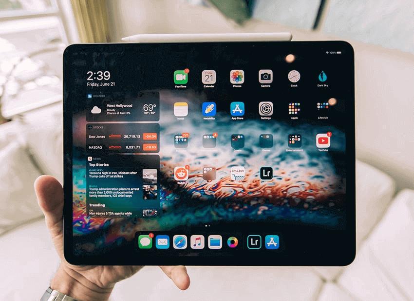
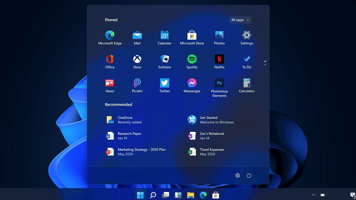
If you have an iPhone or iPad, go to your home screen or open your notifications panel, or if you use a Windows machine, go to the Start menu. Do you notice the frosted glass effect around the menu and widgets? That’s Glassmorphism!
An Example of Glassmorphism on iOS in Apple products.
An Example of Glassmorphism on Windows 11 in Microsoft products.
Glassmorphism is a UI design style that uses transparency and background blur to achieve a glass-like effect in UI. This glass effect is further enhanced by placing the UI elements over highly vivid backgrounds. This effect is often termed the “Frosted Glass Effect”.
Glassmorphism design style got popular in late 2021 when Michal Malewicz, who also introduced the Neumorphism UI design style, wrote an article where he combined all the frosted glass effect styles under one name – “Glassmorphism.”
I created Neumorphism, Glassmorphism, Neubrutalism and a couple others because I'm curious and noticing things around me.
— Michal Malewicz (@michalmalewicz) October 9, 2022
I noticed a shift in the UI styles again and it's time to start digging deeper into it.
.com already purchased 😎
In this guide on CSS Glassmorphism, we will learn about Glassmorphism, a little history behind it, and how we can achieve the effect using CSS.
Key Takeaways
- Glassmorphism is a UI design style that combines transparency and background blur to make cards look like frosted glass floating over vivid, colorful backgrounds.
- Apple uses the frosted glass effect across iOS and macOS, and Microsoft ships the same effect in Windows 11 as the Acrylic component of the Fluent Design System.
- CSS Glassmorphism needs five steps: a vivid background, reduced opacity on the card, a backdrop-filter blur, a light border with border radius, and a box shadow.
- The CSS backdrop-filter blur only becomes visible after the card background is made partly transparent with the opacity property or an rgba() color.
- Glassmorphism should not be applied to interactive elements such as buttons, toggles, and inputs, and should not be overused across a design.
What is Glassmorphism?
Glassmorphism UI contains cards with a frosted glass effect, floating freely on colorful and vivid backgrounds. The main highlight of this design style is the frosted glass texture and depth achieved with the help of layers.
The Glassmorphism effect enables designers to combine layers using the glass effect while still retaining a distinct separation between separate subjects. This design style is commonly seen in dashboards, smartphone UIs, and mobile apps. Popular brands like Apple and Microsoft already use it in their design system.
Let’s see how Microsoft and Apple use Glassmorphism in their Windows 11.
Microsoft uses a frosted glass effect in Windows 11. You can notice the blur effect in the Start menu, Taskbar, Settings menu, Notification boxes, and some Microsoft apps. Microsoft included this blur effect in their fluent design system under the name “Acrylic.”
Acrylic is a fluent design system component that adds physical texture and depth to your app design using the blur effect. Microsoft uses this Acrylic effect in its Windows 11 user interface and some Microsoft applications.
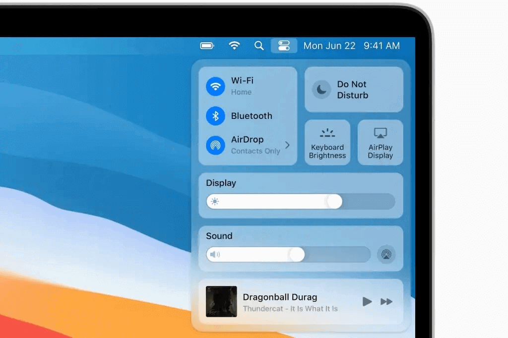
In the case of Apple, iOS, and macOS have been using the glass effect in their UI. Take a look at this control center on macOS Big Sur. The glass effect is clearly visible in the design of the controls. You can notice a similar glass effect in the App Drawer, Notifications, Widgets, etc.
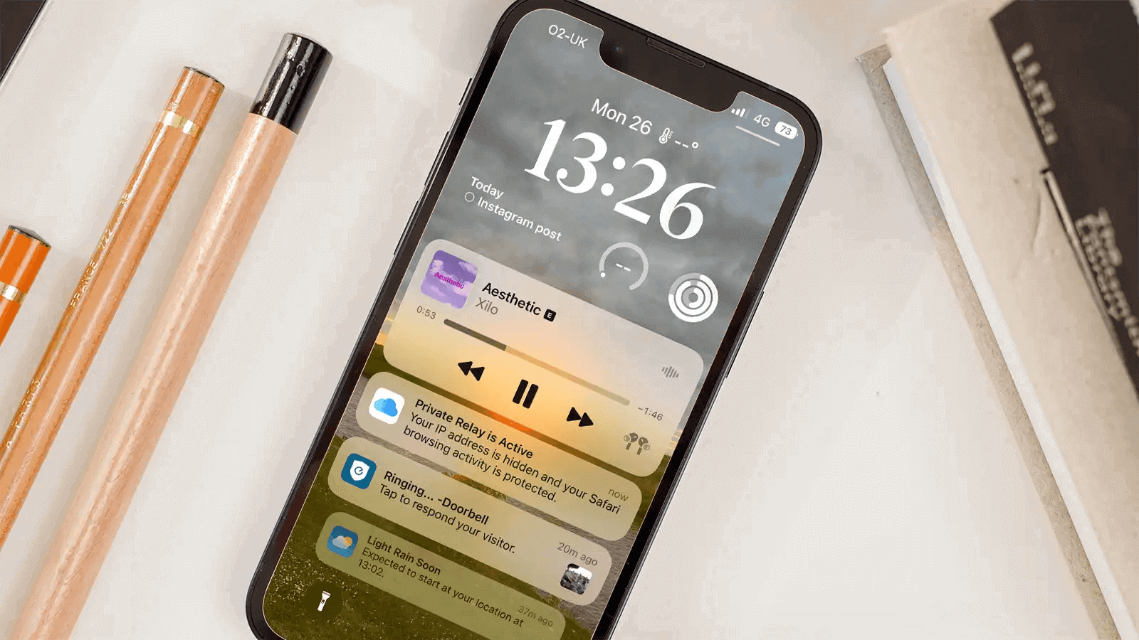
Further, this glass effect is also implemented in iOS. Take a look at this design of notifications on an iPhone lock screen. This design looks aesthetically pleasing and easy for users to interact with.
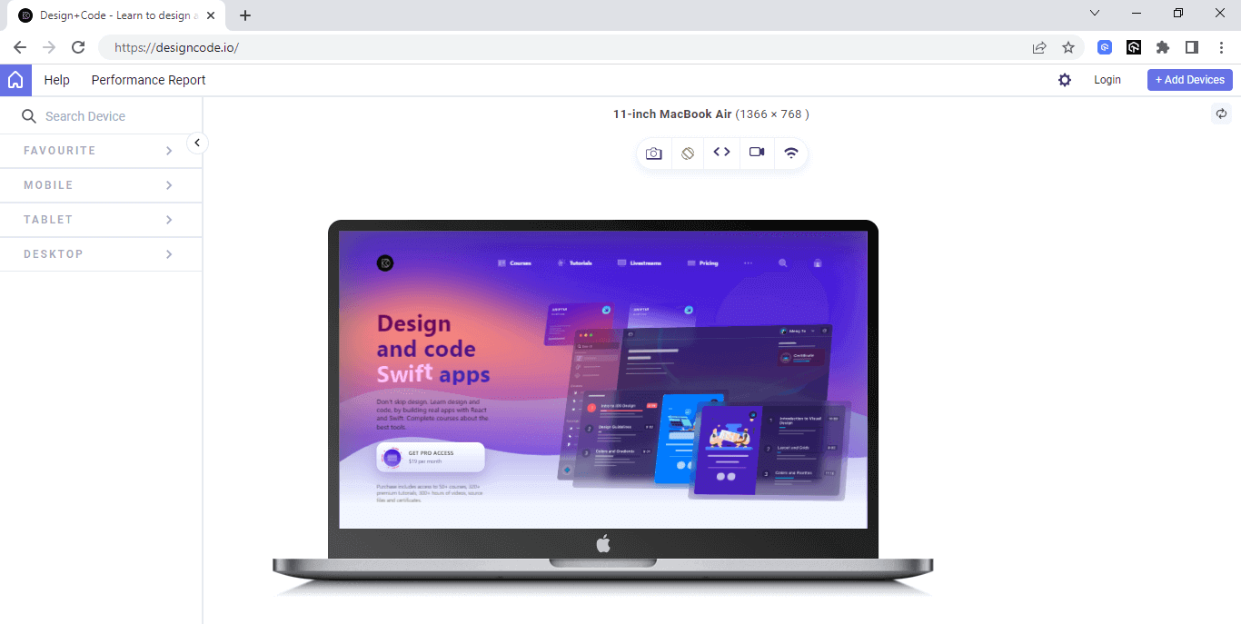
Glassmorphism is quite common in Operating System UIs and Android / iOS applications. But recently, with the increased support for the backdrop-filter property in CSS, many websites are moving to CSS Glassmorphism design.
Here are some popular websites using CSS Glassmorphism.
1. Design + Code
2. Amazon Music
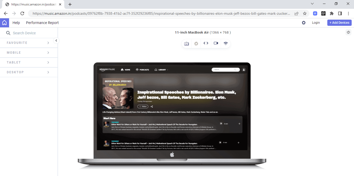
Here, I have used LT Browser 2.0 – a complementary tool by TestMu AI to render the websites.
LT Browser 2.0 is a Chromium-based mobile-friendly tester offered by TestMu AI – a continuous quality cloud testing platform for manual and automation testing for web and mobile. With LT Browser 2.0, you can test your website’s responsiveness on over 50+ device viewports. It supports responsive testing on the mobile, tablet, desktop, and even laptops.

The main strength of CSS Glassmorphism design is the balance of Blur, Transparency, Backgrounds, and borders.
Key Takeaway: Glassmorphism places frosted glass cards over vivid backgrounds to create depth through layers, and wider browser support for the CSS backdrop-filter property is moving the style from operating systems onto websites.
History of Glassmorphism
Surprisingly, the Glassmorphism design trend in UI Design is not new. It first appeared in the year 2013 on iOS 7 and Windows Vista. Remember the transparent Windows menu? Yes, that was the first instance of Glassmorphism.
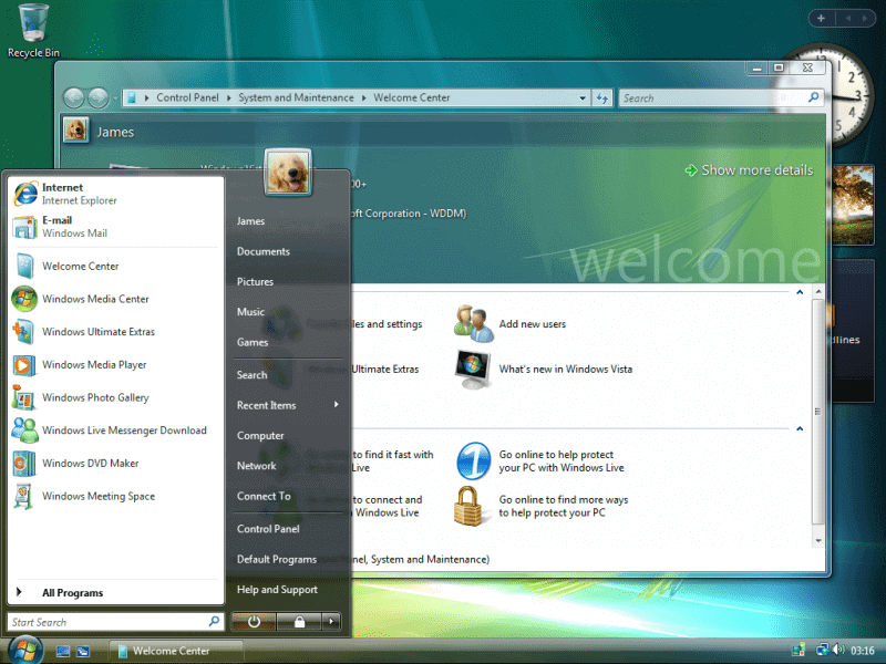
During those days, there were a lot of accessibility and readability issues, so it was slowly removed with the next updates. After almost eight years, in 2021, Apple reintroduced Glassmorhphism with the launch of the Big Sur update for macOS. Microsoft also came up with its Glassmorphism design on Windows 11 update in the same year.
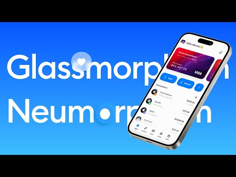
Since then, it has regained popularity and got every designer talking about it. It became one of the most popular modern web design trends, so many products started incorporating it into their design system.
Here are some popular CSS Glassmorphism designs on Dribbble.
- Creative Cloud App Redesign by Mikołaj Gałęziowski.
- Sidebar Menu Design by Anton Olashyn
- Messenger app by Mikołaj Gałęziowski
- Cryptocurrency Website by Azie Melasari
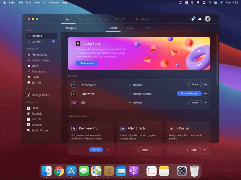
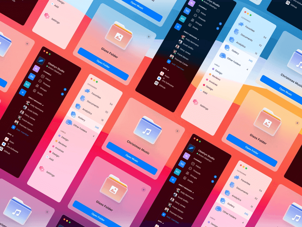
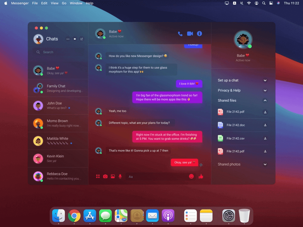
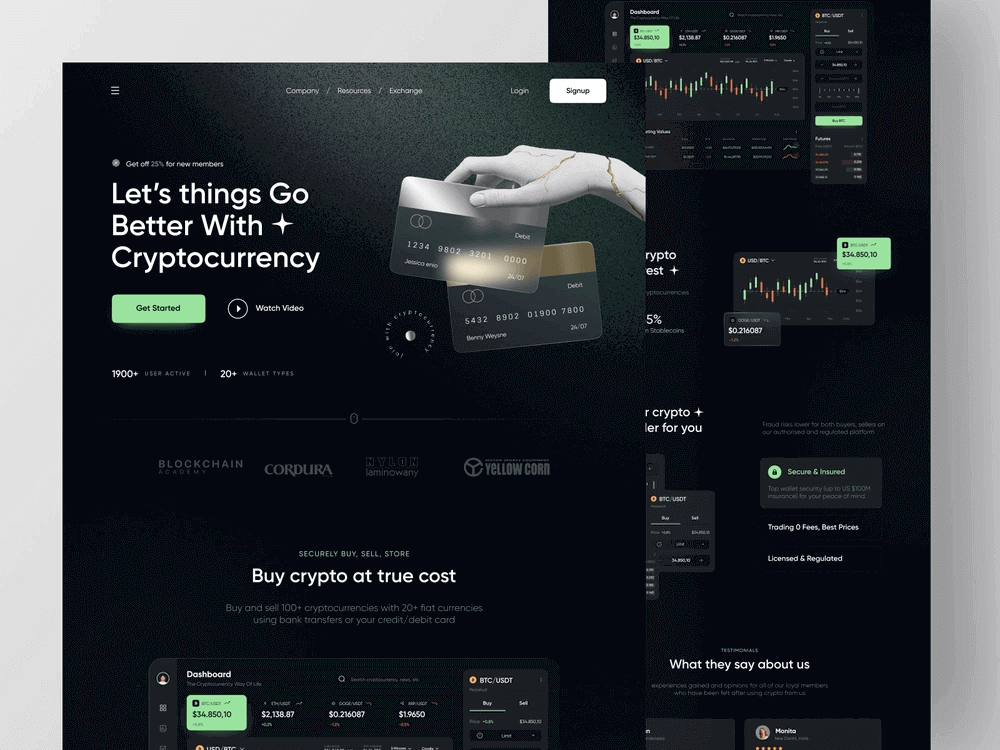
Key Takeaway: Glassmorphism is not a new design trend: early frosted glass interfaces were dropped because of accessibility and readability problems, and the style regained popularity after macOS Big Sur and Windows 11 adopted the frosted glass look.
Characteristics of CSS Glassmorphism
In this section, we will explore the characteristics of CSS Glassmorphism.
- TranslucencyTranslucency or background blur is the essential aspect property of CSS Glassmorphism. This effect makes the background of the Card partly visible, which helps the Card blend in perfectly.
Translucency is achieved by two effects – Opacity and Background Blur. The translucency should be low to make the text on the object readable.
- Vivid backgroundsBackground in Glassmorphism plays an essential role. Choose a Background that is subtle, not too loud to attract attention, or not too dull to go unnoticed. Generally, a Gradient or a design with geometric shapes is preferred. You can also try the Glassmorphism design on Stock images.
- Hierarchy using Shadows and Light BordersHierarchy or Layering establishes a sense of depth in the UI. You can create a Hierarchy using shadows to depict a floating effect. Borders with shining edges are also used to provide a glass-like effect to the object. The color, shadow, and borders depend on the background color of the object.
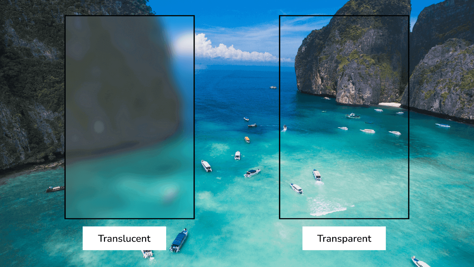
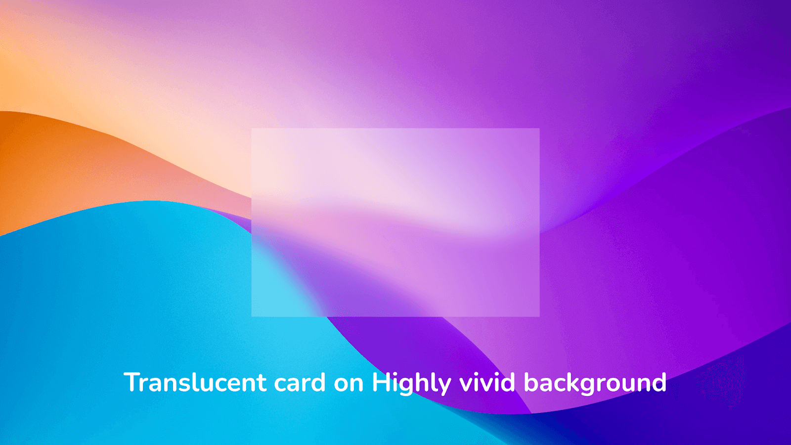
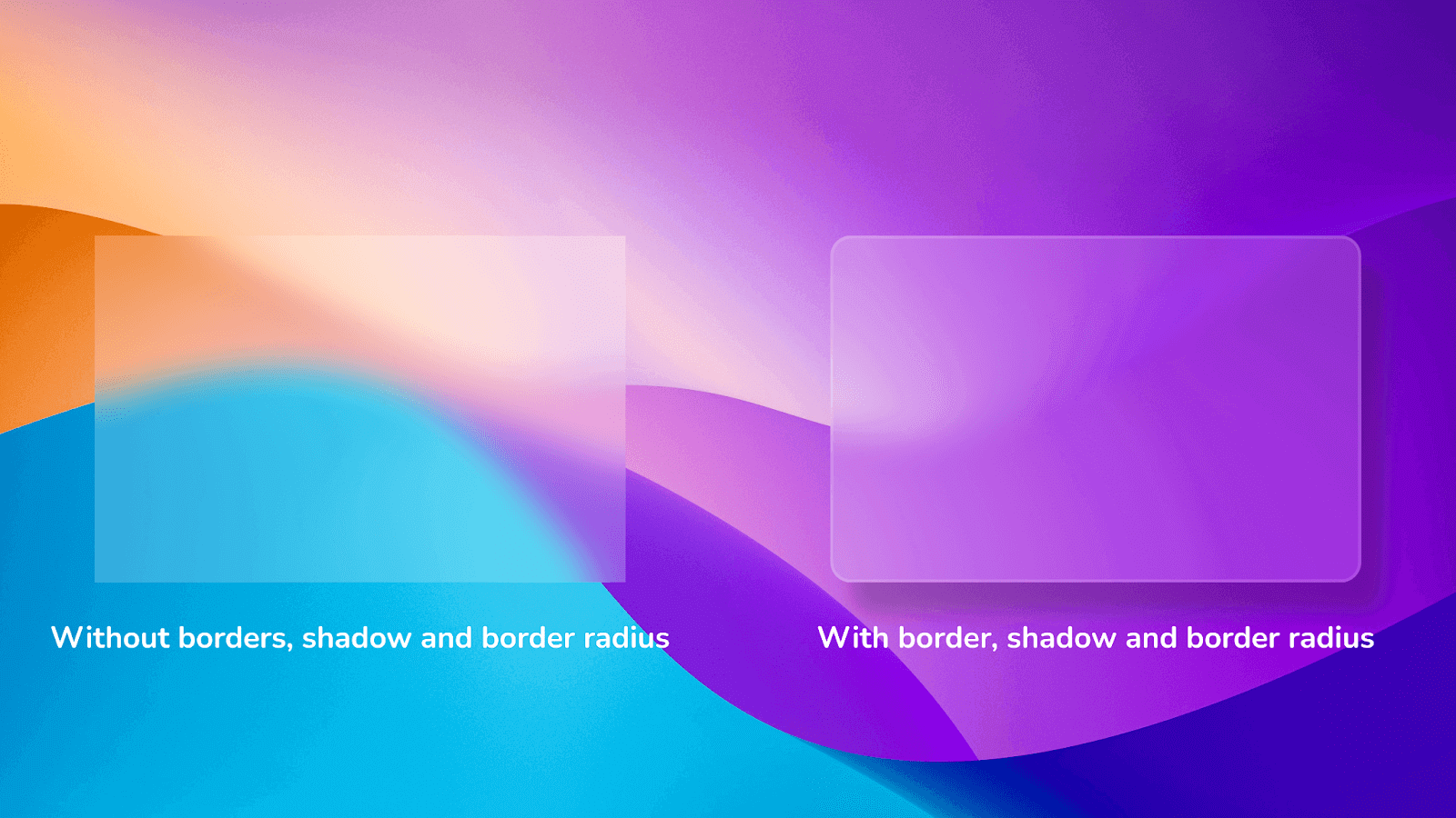
When combined in the right proportion, the above effects create a beautiful and visually appealing Glassmorphism effect that can make any user an instant fan.
Now that we know the characteristics of Glassmorphism, let us look at how to create this effect using CSS.
Key Takeaway: CSS Glassmorphism has three defining characteristics: translucency from low opacity plus background blur, a vivid but subtle background, and a layered hierarchy built with shadows and light borders.
Creating Glassmorphism Using CSS
Glassmorphism is very easy to create using CSS. The main idea behind Glassmorphism is to create Glass panels on a colorful background. This Glass effect is achieved using CSS Opacity and backdrop-filter properties.
Following are the steps to achieve CSS Glassmorphism:
- Add a vivid background to the root element.
- Apply an opacity to the object in focus.
- Add a background blur using the backdrop-filter property.
- Add a light border and border radius.
- Apply shadow using the CSS Box Shadow property.
Using the above steps, let’s create a simple Credit card effect shown below.
We will first create our entire structure using HTML and CSS and then move to the Glassmorphism effect.
HTML:
<!DOCTYPE html>
<html lang="en">


<head>
    <meta charset="UTF-8">
    <meta http-equiv="X-UA-Compatible" content="IE=edge">
    <meta name="viewport" content="width=device-width, initial-scale=1.0">
    <link rel="preconnect" href="https://fonts.gstatic.com" crossorigin>
    <link href="https://fonts.googleapis.com/css2?family=Noto+Sans:ital,wght@0,400;0,700;1,400;1,700&display=swap"
        rel="stylesheet">
    <link rel="stylesheet" href="./style.css">
    <link href="https://cdn.jsdelivr.net/npm/remixicon@2.5.0/fonts/remixicon.css" rel="stylesheet">
</head>


<body>
    <section>
        <div class="circle-1"></div>
        <div class="circle-2"></div>
        <div class="circle-3"></div>
        <div class="card">
            <div>
                <h1>ANURAG GHARAT</h1>
                <p>1892 1232 1242 0099</p>
            </div>
            <p>
                07/27
            </p>
                <i class="ri-visa-line"></i>
        </div>
    </section>
</body>
</html>
CSS:
* {
    box-sizing: border-box;
    padding: 0px;
    margin: 0px;
}
body {
    width: 100%;
    height: 100%;
    background: #fff;
    font-family: 'Noto Sans', sans-serif;
    background: #0f0c29;
    background: -webkit-linear-gradient(to right, #24243e, #302b63, #0f0c29);
    background: linear-gradient(to right, #24243e, #302b63, #0f0c29);
}
section {
    height: 100vh;
    width: 100%;
    display: flex;
    flex-direction: column;
    justify-content: center;
    align-items: center;
    position: relative;
}
.circle-1 {
    position: absolute;
    top: 15%;
    left: 30%;
    background: #4776E6;
    background: -webkit-linear-gradient(to right, #8E54E9, #4776E6);
    background: linear-gradient(to right, #8E54E9, #4776E6);
    height: 350px;
    width: 350px;
    border-radius: 50%;
}
.circle-2{
    position: absolute;
    bottom: 5%;
    right: 35%;
    background: #bc4e9c;
    background: -webkit-linear-gradient(to right, #f80759, #bc4e9c);
    background: linear-gradient(to right, #f80759, #bc4e9c);
    height: 400px;
    width: 400px;
    border-radius: 50%;
}
.circle-3 {
    position: absolute;
    top: 30%;
    right: 35%;
    background-color: #FF3CAC;
    background: #ff9966;
    background: -webkit-linear-gradient(to right, #ff5e62, #ff9966);
    background: linear-gradient(to right, #ff5e62, #ff9966);
    height: 150px;
    width: 150px;
    border-radius: 50%;
}
.card {
    height: 300px;
    width: 500px;
    border-radius: 20px;
    background: rgba(255,255,255);
    z-index: 10;
    display: flex;
    flex-direction: column;
    justify-content: center;
    padding: 40px;
    color: #fff;


}
.card > i {
    position: absolute;
    top: 10%;
    right: 10%;
    font-size: 2.5rem;
}
.card > div > p {
    letter-spacing: 3px;
    word-spacing: 10px;
    margin-top: 10px;
    font-size: 28px;
    font-family: 'Courier New', Courier, monospace;
}


.card > p {
    position: absolute;
    bottom: 10%;
    fill: #fff;
    letter-spacing: 3px;
    word-spacing: 10px;
    margin-top: 10px;
    font-size: 20px;
}


.card>div>h1 {
    font-weight: lighter;
    font-size: 16px;
}
Output:
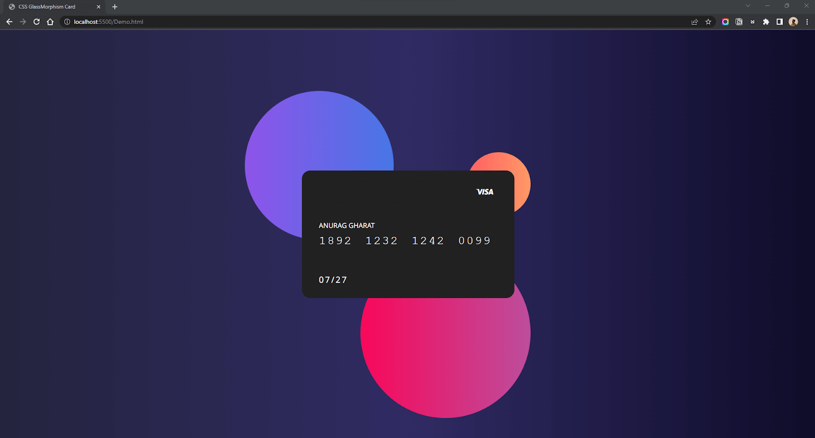
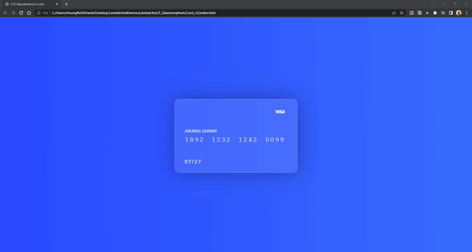
I used a dark gradient background and, upon that, added some colored circles to add depth. I have used the position: absolute property in CSS to position the objects. I have placed the objects exactly behind the card so that when we add the frosted glass effect, these colored objects will be partially visible. I have used an online tool called WebGradients for generating gradient background color.
For styling the card, I aligned the card perfectly at the center using CSS Flexbox and used remix icons for the VISA icon shown on top. Currently, I have added a black background to the card, but we will change it in the next steps.
Regarding the root section’s background, you can go with any primary pastel color or mesh gradient background. Choose one which suits your project requirement and goes well with the frosted glass effect.
The blur effect in CSS is achieved using the backdrop-filter property. This property is used to apply graphical effects such as blurring, color shifting, or inverting the background.
In our case, backdrop-filter: blur(40px) applies a blur to the element’s background. Let’s add this property to the .card element.
.card {
    /* other styles */
    backdrop-filter: blur(40px);
    /* fallback cross browser compatibility */
    -webkit-backdrop-filter: blur(40px);


}
Output:
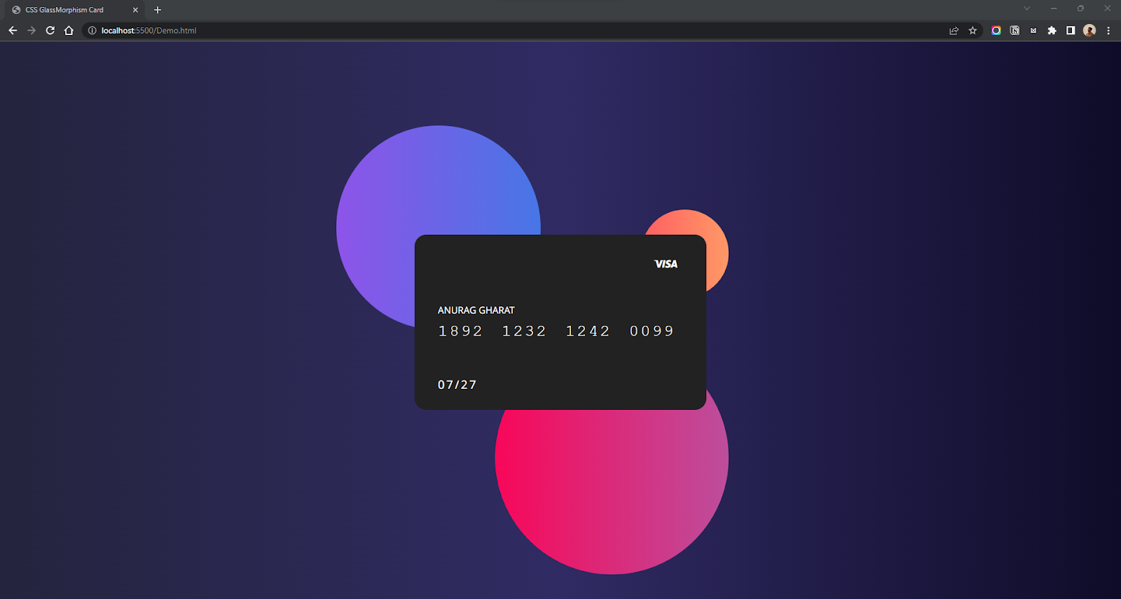
As you can see, there is no change to the card. This is because the card still needs to be transparent. The backdrop-filter property is combined with opacity to provide that partial transparency effect. Let’s decrease the opacity of our card.
To decrease the opacity, you can use the opacity property separately or the rgba() input type for the background property.
.card {
    /* other styles */
    background: rgba(39, 39, 39, 0.1);
    backdrop-filter: blur(60px);
    /* fallback for old browsers */
    -webkit-backdrop-filter: blur(60px);
}
Output:
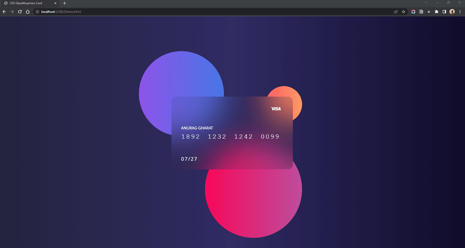
There you have it, a Glass card using just CSS. We are still not done yet. We haven’t added a border and shadow to the card. The border and shadow will create a clear distinction between the card and background objects. Let’s add them.
CSS:
.card {
    border-radius: 20px;
    /* other styles */
    background: rgba(39, 39, 39, 0.1);
    backdrop-filter: blur(60px);
     /* fallback for old browsers */
    -webkit-backdrop-filter: blur(60px);
    border: 2px solid rgba(255, 255, 255, 0.2);
    box-shadow: 0 0 80px rgba(0, 0, 0, 0.3);
}
Output:
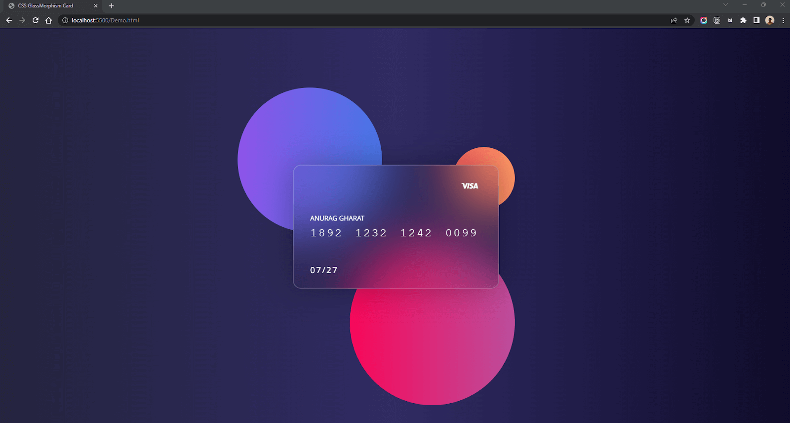
Mission accomplished! That’s our Glassmorphism effect using just CSS. You can also add some animation to the background elements to enhance the effect. I used keyframes to move the objects.
CSS:
.circle-1{
        animation: bounce 4s linear infinite;
}
.circle-2{
    animation: bounce 4s linear infinite 1s;
}
.circle-3 {
    animation: bounce 4s linear infinite 2s;
}
@keyframes bounce {


    0% {
        transform: translateY(0px);
    }


    25% {
        transform: translateY(10px);
    }


    50% {
        transform: translateY(0px);
    }


    75% {
        transform: translateY(-10px);
    }


    100% {
        transform: translateY(0px);
    }

}
Output:
CodePen:
You can make a lot of variations of the CSS Glassmorphism effect using different backgrounds.
Here are some variations of our Credit Card project.
CSS Glassmorphism with Stock Background Image:
HTML:
<!DOCTYPE html>
<html lang="en">


<head>
    <meta charset="UTF-8">
    <meta http-equiv="X-UA-Compatible" content="IE=edge">
    <meta name="viewport" content="width=device-width, initial-scale=1.0">
    <link rel="preconnect" href="https://fonts.gstatic.com" crossorigin>
    <link href="https://fonts.googleapis.com/css2?family=Noto+Sans:ital,wght@0,400;0,700;1,400;1,700&display=swap"
        rel="stylesheet">
    <link rel="stylesheet" href="./style.css">
            <link href="https://cdn.jsdelivr.net/npm/remixicon@2.5.0/fonts/remixicon.css" rel="stylesheet">
</head>


<body>
    <section>
        <div class="card">
            <div>
                <h1>ANURAG GHARAT</h1>
                <p>1892 1232 1242 0099</p>
            </div>
            <p>
                07/27
            </p>
            <i class="ri-visa-line"></i>
        </div>
    </section>
</body>
</html>
CSS:
* {
    box-sizing: border-box;
    padding: 0px;
    margin: 0px;
    scroll-behavior: smooth;
    font-family: 'Noto Sans', sans-serif;
}
body {
    width: 100%;
    height: 100%;
    background: #fff;
    font-family: 'Noto Sans', sans-serif;
    background: url('https://images.pexels.com/photos/807598/pexels-photo-807598.jpeg?auto=compress&cs=tinysrgb&w=1600');
    background-position: center;
    background-repeat: no-repeat;
    background-size: cover;
}
section {
    height: 100vh;
    width: 100%;
    display: flex;
    flex-direction: column;
    justify-content: center;
    align-items: center;
    position: relative;
}
.card {
    height: 300px;
    width: 500px;
    border-radius: 20px;
    background: rgba(0, 0, 0, 0.2);
    backdrop-filter: blur(16px);
    z-index: 10;
 display: flex;
    flex-direction: column;
    justify-content: center;
    padding: 40px;
    color: #fff;
    border: 2px solid rgba(255, 255, 255, 0.1);
    box-shadow: 0 0 80px rgba(0, 0, 0, 0.3);
}
.card>i {
    position: absolute;
    top: 10%;
    right: 10%;
    font-size: 2.5rem;
}
.card>div>p {
    letter-spacing: 3px;
    word-spacing: 10px;
    margin-top: 10px;
    font-size: 28px;
    font-family: 'Courier New', Courier, monospace;
}
.card>p {
    position: absolute;
    bottom: 10%;
    fill: #fff;
    letter-spacing: 3px;
    word-spacing: 10px;
    margin-top: 10px;
    font-size: 20px;
}
.card>div>h1 {
    font-weight: lighter;
    font-size: 16px;
}
Output:
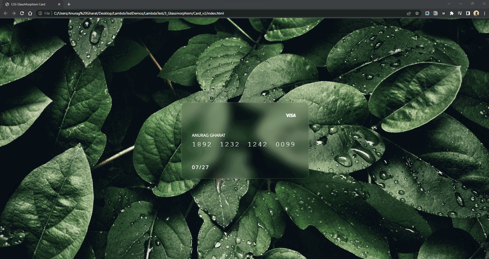
CodePen:
CSS Glassmorphism with Simple Gradients:
HTML:
<!DOCTYPE html>
<html lang="en">


<head>
    <meta charset="UTF-8">
    <meta http-equiv="X-UA-Compatible" content="IE=edge">
    <meta name="viewport" content="width=device-width, initial-scale=1.0">
    <link rel="preconnect" href="https://fonts.gstatic.com" crossorigin>
    <link href="https://fonts.googleapis.com/css2?family=Noto+Sans:ital,wght@0,400;0,700;1,400;1,700&display=swap"
        rel="stylesheet">
    <link rel="stylesheet" href="./style.css">
            <link href="https://cdn.jsdelivr.net/npm/remixicon@2.5.0/fonts/remixicon.css" rel="stylesheet">
</head>


<body>
    <section>
        <div class="card">


            <div>
                <h1>ANURAG GHARAT</h1>
                <p>1892 1232 1242 0099</p>


            </div>
            <p>
                07/27
            </p>
            <i class="ri-visa-line"></i>
        </div>
    </section>
</body>
</html>
CSS:
* {
    box-sizing: border-box;
    padding: 0px;
    margin: 0px;
    scroll-behavior: smooth;
    font-family: 'Noto Sans', sans-serif;
}
body {
    width: 100%;
    height: 100%;
    background: #fff;
    font-family: 'Noto Sans', sans-serif;
    background: #396afc;
    background: -webkit-linear-gradient(to right, #2948ff, #396afc);
    background: linear-gradient(to right, #2948ff, #396afc);
}
section {
    height: 100vh;
    width: 100%;
    display: flex;
    flex-direction: column;
    justify-content: center;
    align-items: center;
    position: relative;
}
.card {
    height: 300px;
    width: 500px;
    border-radius: 20px;
    background: rgba(255, 255, 255, 0.1);
    backdrop-filter: blur(40px);
    z-index: 10;
    display: flex;
    flex-direction: column;
    justify-content: center;
    padding: 40px;
    color: #fff;
    border: 2px solid rgba(255, 255, 255, 0.1);
    box-shadow: 0 0 80px rgba(0, 0, 0, 0.3);
}
.card>i {
    position: absolute;
    top: 10%;
    right: 10%;
    font-size: 2.5rem;
}
.card>div>p {
    letter-spacing: 3px;
    word-spacing: 10px;
    margin-top: 10px;
    font-size: 28px;
    font-family: 'Courier New', Courier, monospace;
}


.card > p {
    position: absolute;
    bottom: 10%;
    fill: #fff;
    letter-spacing: 3px;
    word-spacing: 10px;
    margin-top: 10px;
    font-size: 20px;
}


.card>div>h1 {
    font-weight: lighter;
    font-size: 16px;
}
Output:
CodePen:
Key Takeaway: A glass card in CSS comes from pairing backdrop-filter: blur() with a semi-transparent background, then adding a light border and a box shadow so the card stays distinct from the shapes behind the card.

Note: Test your web designs across 3000+ real devices. Try TestMu AI Now!
Tips to achieve the best CSS Glassmorphism
In the previous section; we discussed how to create Glassmorphism using CSS. Now let’s look at some tips that will help you effectively implement Glassmorphism in your designs.
- Use vivid backgrounds that blend nicely with the glass effect. You can go with CSS Gradients, Mesh gradients, Geometrical Designs, 3D objects, and stock images.
- Add some user animations and interactions, like hover effects, to make the UI playful.
- To add depth to your design, you can include floating assets like circles or objects of any shape.
- Don’t forget the border and shadow for the card.
- Don’t apply this effect to user Interaction elements like buttons, toggles, and inputs.
- Don’t overuse Glassmorphism.
Key Takeaway: The best CSS Glassmorphism designs use gradient, geometric, or stock image backgrounds with floating shapes and hover animations, and always keep the border and shadow on the glass card.

How Do AI Coding Agents Generate CSS Glassmorphism Effects in 2026?
AI coding agents such as GitHub Copilot, Cursor, and Claude Code can write backdrop-filter based glassmorphism CSS from a plain-language prompt, but none of them can see the rendered blur.
- Prompt to CSS: Describe the card effect in plain language and the agent scaffolds the HTML and CSS structure, including opacity, blur, and border values, in seconds.
- Editor suggestions: GitHub Copilot and Cursor suggest backdrop-filter code inline as you type, drawing on patterns close to the credit card example above.
- Terminal generation: Claude Code can generate, edit, and rerun a full glassmorphism demo from a single terminal instruction, without opening a code editor at all.
- The rendering gap: No agent can see the page it just wrote. A blur value that looks correct in the CSS can render flat on a real screen, so it still needs a real browser check, for example with the Playwright MCP server, before it ships.
This gap matters for glassmorphism specifically, because the effect depends entirely on how a browser renders blur and transparency together. Code that passes a lint check can still fail the eye test, so treat an agent's CSS as a first draft, not a final answer.
Key Takeaway: AI coding agents can write backdrop-filter glassmorphism CSS from a plain-language prompt but cannot see the rendered blur, so agent-written glassmorphism code is a first draft that needs a real browser check before release.
Wrapping up
Glassmorphism design makes your UI more modern and minimalist. I feel this new UI style is here to stay, and many products will incorporate it in their design style.
That’s it. I hope you found this guide on CSS Glassmorphism. In this guide, we saw Glassmorphism and understood its history and main characteristics. We later created a Glassmorphism design of a Credit Card using CSS and saw some variations.
If you love the new CSS Glassmorphism trend, try creating some cool projects with it and share them in the comments.
Happy Coding!
Author

Anurag Gharat
Blogs: 7


Anurag Gharat is a community contributor with 2+ years of experience in frontend and full-stack web development, along with technical content writing. He specializes in building web applications using React, Next.js, TypeScript, Redux, and Node.js, and has worked on enterprise systems in the business and finance domain. Alongside his engineering role, Anurag contributes technical blogs focused on web development concepts and modern application architecture. He holds a Bachelor’s degree in Computer Engineering.


Frequently asked questions
Did you find this page helpful?
More Related Blogs
TestMu AI forEnterprise
Get access to solutions built on Enterprise
grade security, privacy, & compliance
- Advanced access controls
- Advanced data retention rules
- Advanced Local Testing
- Premium Support options
- Early access to beta features
- Private Slack Channel
- Unlimited Manual Accessibility DevTools Tests