

Power Your Software Testing with AI Agents and Cloud
The Native AI-Agentic Cloud Platform to Supercharge Quality Engineering. Test Intelligently and Ship Faster.


- TestMu AI (Formerly LambdaTest)
- /
- Blog
- /
- CSS Multiple Transforms: Combine translate, rotate, scale
How to Apply Multiple CSS Transforms to One Element
Learn how combining CSS multiple transform properties can enhance web design, create dynamic animations, and improve user interaction .
Last Updated on:
On This Page
- What Is CSS Transform Property?
- Syntax of CSS Multiple Transform Properties
- Applying Multiple Transformation: Key Principles
- Second Transform Overrides
- translate, rotate, scale
- Implementing CSS Multiple Transform Properties
- Implementing CSS Multiple Transform Properties With Transitions
- Browser Compatibility
- AI Agents and CSS Transforms
Stacking multiple CSS transform functions together, such as translate, rotate, skew, and scale in one declaration, lets a single element move, resize, and reorient at once without shifting anything else in the page's layout. Netflix's own home page uses this technique on hover, proving how far a combined transform can go for polished, functional interfaces.
To apply multiple transforms in CSS, list the transform functions in one transform declaration, separated by spaces. The functions combine from left to right, so their order changes the result:
.card { transform: translate(50px, 20px) rotate(45deg) scale(1.2); }TL;DR
- The CSS transform property applies several transform functions to one element when the functions are listed in a single declaration, separated by spaces.
- Writing translate(), rotate(), and scale() together in one transform value combines their effects on the same element.
- The order of CSS transform functions changes the result, because each function transforms the coordinate space used by the next one.
- The transition property animates a change between two transform values, and @keyframes animates a sequence of transforms over time.
- The CSS transform property works in all major browsers without vendor prefixes, though rendering can still differ between browsers.
What Is CSS Transform Property?
As the name implies, the CSS transform property is used to apply transformations to elements in a 2D or 3D space. It allows you to do four fundamental things: translate, rotate, skew, and scale elements. CSS transform property offers alterations of position, size, and orientation, which enhances the designs of elements without compromising the structural integrity of the webpage.
Here is a valid transform declaration:
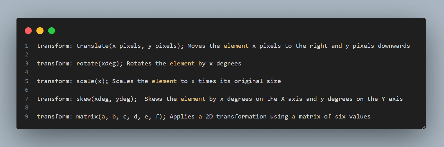
For example, if you translate an element using transform: translate(50px, 50px), it will visually move on the screen without changing its position in the HTML document. Other elements on the page are not affected by this transformation in layout or positioning.
To learn more about CSS transform and its properties with detailed examples, refer to this blog on CSS transforms and transitions properties.
Here is a real-world example of the transform property displayed when you hover on Netflix Home Page.

Applying multiple transform properties in CSS enhances web design's functionality and aesthetics, enabling developers to create complex animations, improve performance, and provide a better user experience.
We have been able to look at the best ways to implement transform properties, but there are a few key benefits to using multiple transform properties:
- Complex Animations: Combining the CSS multiple transform properties like translate, rotate, skew, and scale makes the developer a creator. With these functions, you can step beyond normal animations to create more complex ones.
- Smooth Performance: Not all animations are handled by the GPU (Graphics Processing Unit), which births the most laggy animations on a website. Instead, GPU handles transforms and is compatible with mostly all major browsers, which means they can be executed more smoothly and efficiently than other types of animations in major browsers.
- Enhanced Visual Design: CSS multiple transform properties add depth, perspective, and emphasis to design elements, enhancing their interactivity and visual appeal. For example, rotating and scaling can make interactive elements more engaging, while translating and rotating can create dynamic motion effects.
- Improved User Experience: Well-designed animations provide visual feedback, guide user attention, and make interfaces feel responsive and intuitive. Transitions can indicate changes in interface states, such as menu expansions or content loading, improving overall user experience.
- Space Efficiency: Transformations alter an element's appearance without affecting document layout, allowing elements to overlap or change size . This efficient use of space ensures designs remain stable and visually appealing without causing layout shifts.
- Fallback and Compatibility: Using CSS multiple transform properties can provide graceful fallbacks for older browsers that may not support advanced CSS features like 3D transforms. For instance, relying on 2D transforms ensures a consistent user experience across different browser environments.

Note: Combine CSS multiple transform properties and ensure visual consistency across 3000+ browsers and OS combinations. Try TestMu AI Today!
Syntax of CSS Multiple Transform Properties
When applying multiple transforms, it is important to consider the variety of functions it uses to alter the appearance of an element; this could be in a two-dimensional (2D) or three-dimensional (3D) space.
Here's a list of the most commonly used transform functions. These functions are widely used, and you will most obviously be using them alongside the transform property.
2D Transform Functions
2D transform functions are used to modify the appearance of an element in a two-dimensional plane. These functions allow you to change an element's position, size, and rotation without altering the document's layout.
The modifications made using 2D transform functions are purely visual, meaning the space the element originally occupied in the document flow remains unchanged.
Here's a breakdown of the core concepts behind each of the 2D transform functions:
- translate(x, y): This moves an element in horizontal and vertical directions. The x value shifts the element left or right, while the y value moves it up or down. This function doesn't change the layout space the element occupies.
transform: translate(50px, 100px);
- translateX(x): Moves the element by x horizontally.
transform: translateX(50px);
- translateY(y): Moves the element by y vertically.
transform: translateY(100px);
- scale(sx, sy): Scales the element by sx times in the horizontal direction and sy times in the vertical direction. If sy is not defined, it's assumed to be equal to sx.
transform: scale(2, 3);
- scaleX(sx): Scales the element by sx times in the horizontal direction
transform: scaleX(2);
- scaleY(sy): Scales the element by sy times in the vertical direction.
transform: scaleY(3);
- rotate(angle):Rotates the element clockwise by the specified angle (in degrees or radians).
transform: rotate(45deg);
- skewX(angle): Skews the element along the X-axis by the given angle. skew() transformation distorts elements along the X, Y, or axes. Unlike rotation, which pivots an element around a point, skewing slants an element, altering its shape without changing its area. The skew effect can create a sense of motion or depth, add visual interest, and break up straight lines in a design.
transform: skewX(20deg);
- skewY(angle):Skews the element along the Y-axis by the given angle.
transform: skewY(20deg);
3D Transform Functions
3D transforms manipulate elements in three-dimensional space, allowing for more complex and dynamic web designs. Unlike 2D transforms that work on the x and y axes, 3D transforms add the z-axis into the mix, enabling depth and perspective manipulation.
These transforms require a perspective from the viewer to be fully appreciated, which can be defined using the CSS perspective property on the parent container or the perspective function as part of the transform list.
Here's a breakdown of the core concepts behind each of the 3D transform functions:
- translateZ(z): Moves the element along the Z-axis in 3D space.
transform: translateZ(50px);
- translate3d(x, y, z): Moves the element in 3D space.
- translateZ(z): Moves the element along the Z-axis in 3D space.
transform: translate3d(100px, 100px, 50px);
- scaleZ(sz): Scales the element along the Z-axis in 3D space.
transform: scaleZ(2);
- scale3d(sx, sy, sz): Scales the element in 3D space.
transform: scale3d(2, 2, 3);
- rotateX(angle): Rotates the element around its X-axis.
transform: rotateX(45deg);
- rotateY(angle): Rotates the element around its Y-axis.
transform: rotateY(45deg);
- rotateZ(angle): Rotates the element around its Z-axis, equivalent to using the rotate() function.
- rotate3d(x, y, z, angle): Rotates the element in 3D space around a vector defined by x, y, and z axes.
transform: rotate3d(1, 1, 0, 45deg);
- perspective(length): Applies a perspective view for a 3D-transformed element.
perspective(500px) rotateY(45deg);
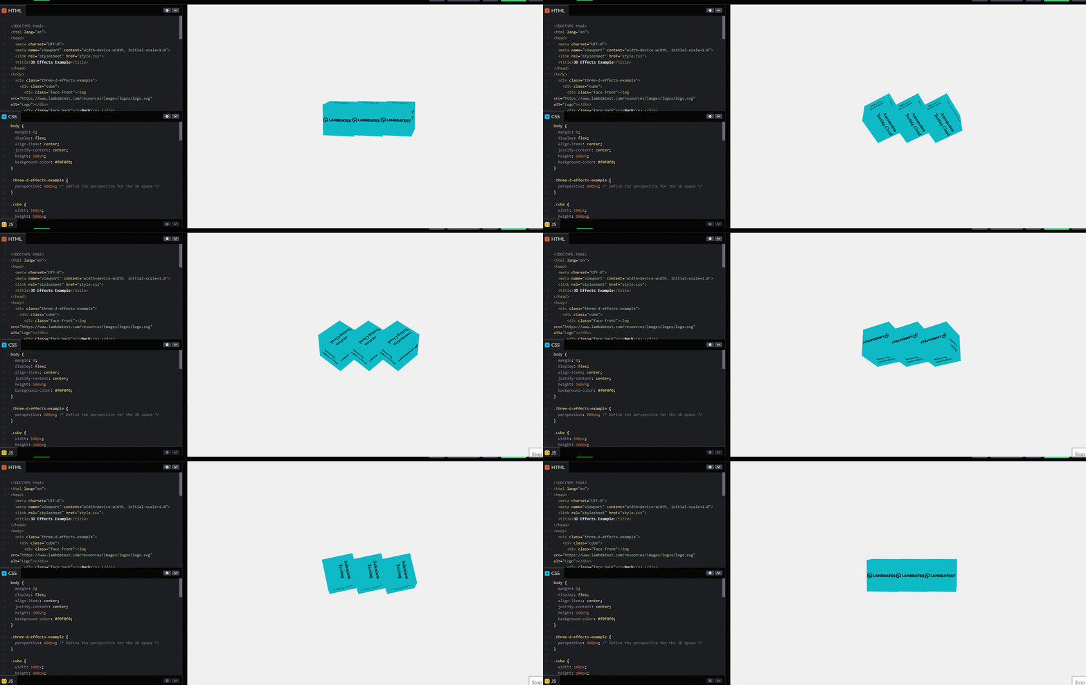
Below is a use case for applying multiple transforms in CSS to create a 3D effect.
Applying Multiple Transformation: Key Principles
Applying the CSS multiple transform properties refers to applying more than one transformation function to an element using the transform property. This approach combines transformations like translate, rotate, scale, skew, and matrix, enabling us to create more lively and interactive elements.
To apply multiple transforms in CSS, you can use multiple values of the CSS transform property separated by spaces. The transformations are applied in the order from right to left. This means the last specified transform is applied first, followed by the transforms to its left, affecting the final visual result. Changing the order of these values can alter the outcome of the transformation.
Here's an example:
transform: translate(50px, 50px) rotate(45deg) scale(1.5);
In this example:
- The element is moved 50px to the right and 50px down.
- Then, it is rotated by 45 degrees.
- Finally, it is scaled to 1.5 times its original size.
You can create complex visual effects and interactions using multiple transforms with a single CSS property.
While applying CSS multiple transforms, the transformation functions are executed in the order specified within the property value; this means the application of the properties will act from the right to the left.
.element{
    transform: translate(50px, 50px) rotate(45deg) scale(1.5) skew(10deg, 20deg);
}
The above syntax will most likely translate the element 50 pixels to the right first and 50 pixels downward. Secondly, it will rotate it by 45 degrees, then scale it to 1.5 times its original size, and lastly, skew it by 10 degrees on the X-axis and 20 degrees on the Y-axis.
Let's understand the key principles that would help you implement CSS multiple transforms in a better way:
- Combining Transformations: Multiple transformation functions can be combined within a single transform property by separating them with spaces. For example: transform: rotate(30deg) scale(1.5);.
- Order of Operations: The order in which transformation functions are listed is crucial because the transformations are applied sequentially. This means that the output of one transformation becomes the input to the next. Let's combine CSS multiple transform functions to understand this concept: Translating and rotating an element. In this scenario, we'll see how applying a translation before a rotation differs from applying a rotation before a translation. This difference is important in achieving precise positioning in web design.
.element-translate-rotate {
  transform: translateX(100px) rotate(30deg);
  transition: transform 2s ease-in-out;
}
.element-rotate-translate {
  transform: rotate(30deg) translateX(100px);
  transition: transform 2s ease-in-out;
}
- Matrix Operations: Behind the scenes, each transformation function (like translate, rotate, scale) is represented by a matrix. When multiple transformations are applied, their corresponding matrices are multiplied in the specified order to obtain a final transformation matrix. This matrix mathematically combines all the transformations into one.
- Transform Origin: The CSS transform-origin property affects how transformations are applied by changing the point around which transformations are performed. This can significantly affect the outcome of a sequence of transformations, especially rotations and scaling.
- 3D Transforms: When applying 3D transformations (like rotateX, rotateY, or translateZ), the order of transformations can dramatically affect the visual result due to the perspective and three-dimensional space.

Austin Siewert
Co-Founder, Steadfast Systems
Discovered @TestMu AI yesterday. Best browser testing tool I've found for my use case. Great pricing model for the limited testing I do 👏
2M+ Devs and QAs rely on TestMu AI
Deliver immersive digital experiences with Next-Generation Mobile Apps and Cross Browser Testing Cloud

Why Does a Second Transform Declaration Override the First?
transform is a single CSS property, so a second transform declaration on the same element replaces the first instead of adding to it. This is the most common reason a rotation disappears when a hover rule adds a scale.
/* Only scale(1.5) applies - the rotation is overwritten */
.card { transform: rotate(45deg); transform: scale(1.5); }

/* Both apply - list the functions in one declaration */
.card { transform: rotate(45deg) scale(1.5); }

/* A hover rule must repeat every function it wants to keep */
.card:hover { transform: rotate(45deg) scale(1.6); }
I checked this on Chrome 153 on Windows 11 on the TestMu AI cloud by reading the computed style of each element. The two-declaration version computed to matrix(1.5, 0, 0, 1.5, 0, 0), a pure scale with no rotation, while the single declaration produced a rotated and scaled box with a 159 x 159 pixel bounding rectangle.
The same run confirmed that order changes the result. translateX(200px) rotate(90deg) placed a 100 x 50 pixel box at x = 325, y = 75, while rotate(90deg) translateX(200px) placed the identical box at x = 125, y = 275, because the rotation turned the x-axis the second translation moved along.
Individual Transform Properties: translate, rotate, and scale
CSS also has separate translate, rotate, and scale properties. According to the MDN reference for the translate property, they work across browsers since August 2022 and always apply in a fixed order: translate first, then rotate, then scale, then any transform functions.
.card { rotate: 45deg; scale: 1.5; }

/* Changing one property keeps the others */
.card:hover { scale: 1.6; }

/* Individual properties and transform combine */
.badge { translate: 50px; transform: rotate(45deg); }
In the same cloud run, rotate: 45deg; scale: 1.5 produced the same 159 x 159 pixel box as transform: rotate(45deg) scale(1.5), and the .badge element kept both its 50px translate and its 45-degree rotation.
Use the individual properties when states change one transform at a time, such as a hover that only scales. Use the transform function list when you need a custom order, such as rotating before translating, or functions with no individual property, such as skew() and matrix().
Implementing CSS Multiple Transform Properties
Here, we will learn how to apply the CSS multiple transform properties using two or more transform properties: translate, rotate, skew, and scale.
Before we start applying multiple transforms in CSS, we will take an example where we will combine, translate, and rotate properties to understand how to use each property one after the other.
Translate and Rotate Functions
Before we start with real-time implementation, let's take an example to understand how to use CSS multiple transform properties together on an element.
- Translate, then Rotate In this example, we'll see how applying a translation before a rotation differs from applying a rotation before a translation. This difference is important in achieving precise positioning and orientation of elements in web design.
CSS
.element-translate-rotate {
  transform: translateX(100px) rotate(30deg);
  transition: transform 2s ease-in-out;
}
- Rotate, then Translate
Now, let's learn how the translate and rotate functions work together in a real-time implementation.
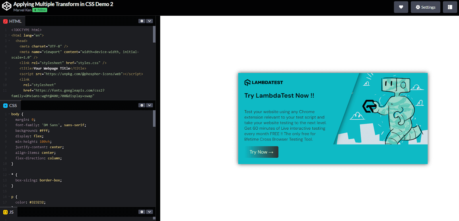
For demonstration, we will create a card called "Try TestMu AI Now!" and apply the CSS multiple transforms using the translate and rotate properties.
The code below creates it; the effect is shown in the CodePen below.
transform: translateY(-50%) rotate(20deg);
The transform property applies two transformation functions:
- translateY(-50%): This moves the pseudo-element by 50% of its height. The purpose of this transformation is to vertically center the pseudo-element relative to its parent container, assuming the top of the pseudo-element is initially placed at the container's vertical center (top: 50%).
- rotate(20deg): This rotates the pseudo-element by 20 degrees clockwise around its origin point (which, by default, is the element's center). The rotation gives the element a skewed appearance, a common technique for creating visually interesting, dynamic layouts.
Result:
Skew Function
To understand the skew function's workings, we will create a mini home page with a list of icons, some text, and a few buttons.
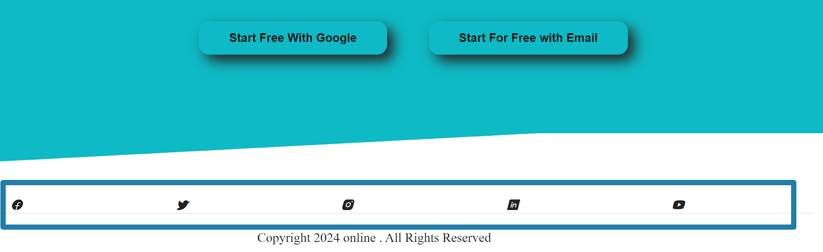
Below is the home page with the skew effect.

Let's learn the process of creating this effect. If you notice above, there is a skew effect right before the icons. The skewY(-3deg); function was used to skew the footer element along the Y-axis.
The -3deg parameter specifies the angle of the skew:
- Negative Angle: A negative angle (-3deg) tilts the element's top edge towards the left, creating a leftward slant. Conversely, a positive angle would tilt it towards the right.
- Y-axis Skew: Skewing along the Y-axis means that the horizontal lines of the element remain straight and parallel to each other while the vertical lines tilt, creating the skew effect.
Below is the code CSS responsible for the skew effect:
.footer::before {
  content: "";
  width: 100%;
  height: 50px;
  background-color: #0ebac5;
  transform: skewY(-3deg);
  position: absolute;
  top: 0;
  left: 0;
  transform-origin: bottom;
  z-index: -1;
}
In the above code example, the transform skewY(-3deg); property is used to apply the skew effect. This distorts the pseudo-element by tilting it along the Y-axis by -3 degrees, creating a diagonal effect on the top edge of the footer.
For the icons, the skew effect is applied to the .icon:hover class, affecting the list of icons at the bottom of the page. When you hover over the .icon elements, the skew() function tilts the elements by -15 degrees along the X-axis. The negative value means the top side is tilted to the left, creating a leftward slant.
Whenever you hover over the icons, they also skew.
Below is the CSS code responsible for the skew effect on hover:
CSS
.icon:hover {
    transform: skew(-15deg);
}
When you hover over any of the .icon elements, the transform: skew(-15deg); rule is applied. This visually distorts the icons, tilting them to create a dynamic, interactive effect.
Scale Function
The CSS scale() property allows you to resize an element on the 2D plane. It takes one or two values representing the scaling factor along the X and Y axes. By correctly using the CSS scaling property, you can enlarge or shrink an element without affecting its position.
We will use the pricing page below to demonstrate the CSS scale property.

The scaling effect provides immediate visual feedback whenever a user hovers over the pricing card.

Below is the CSS code responsible for the hover effect on the pricing card
.pricing-card:hover {
        transform: scale(1.1);
        box-shadow: 0 4px 8px rgba(0, 0, 0, 0.2);
}
The CSS code snippet above uses the transform function scale(1.1)to scale up the .pricing-card by 10% along both the X (horizontal) and Y (vertical) axes when hovered over.
The transformation makes the element appear larger, drawing attention to it. Value: 1.1 indicates that the element should be scaled to 110% of its original size in width and height, making it 10% larger than its normal state.
These transform functions can be combined within a single transform property, allowing for complex visual effects. The order of these functions matters: each function transforms the coordinate space used by the next one, reading left to right, which is equivalent to applying them to the element from right to left, as the MDN reference for transform explains.

Implementing CSS Multiple Transform Properties With Transitions
Suppose you have noticed in all the animations that we have had the transition property with us. In that case, you use the transition property to animate a transform (or any other animatable property) over time.
The transition property in CSS controls how long it takes for a change to happen, like in a color change or movement. It can also set the speed and delay of that change. This a basic implementation of the transition property;
.element {
  /* Setup the transition effect for transformations */
  transition: transform 2s ease-in-out;
}
.element:hover {
  /* Define the transformation on hover */
  transform: rotate(45deg) scale(1.2);
Key Transition Properties
| Transition Properties | Function |
|---|---|
| transition-property | This Identifies the CSS property to animate. |
| transition-duration | Sets the animation duration in seconds (s) or milliseconds (ms). |
| transition-timing-function | This is responsible for the animation's pace across its duration. Other options include ease, linear, ease-in, ease-out, and ease-in-out. |
| transition-delay | This Introduces a delay time before the animation starts, specified in seconds (s) or milliseconds (ms). You can read more here! |
Flip Card
The flip-card effect is particularly seen in profiles, product cards, games, and quizzes, and it offers a great way to reveal hidden information.
The example above showcases the smooth implementation of CSS transitions and transforms.
Here's how the transition and the transform functions work together in this example:
- 3D Perspective: The .container is given a perspective of 800px, establishing a 3D space. This property enhances the depth effect of the flip animation, making the card appear as if it's rotating in a real three-dimensional space.
- Flip Animation: The transform: rotateY(180deg); applied to the .card on hover rotates the card around its Y-axis, revealing the .back side. This rotation creates the flip effect.
- Smooth Transition: The transition: transform 1500ms; the .card specifies that the transformation (the flip effect) should occur over 1500 milliseconds (1.5 seconds). This duration ensures a smooth, controlled rotation that is visually pleasing and easy to follow. The transition effect applies to the transform property, making the rotation animate smoothly from 0 to 180 degrees upon hover.
Keyframe Animation With Multiple Transform Properties
CSS keyframes and the CSS multiple transform properties can be combined to create good animations by defining a sequence of style changes over time. Keyframes allow you to specify the start and end points of an animation, as well as any intermediate steps, while CSS multiple transform properties apply the rotate, scale, translate, and skew to the element. Here's a brief overview of how they work together:
- Keyframes: With @keyframes, you can specify what should happen at specific points during the animation. Each point is defined by percentages, starting from 0% (beginning) to 100% (end), allowing for fine-grained control over the animation's progression.
- Transform: The CSS transform property modifies an element's appearance. You can rotate (rotate()), scale (scale()), move (translate()), and tilt (skew()) an element. These transformations can be applied at different stages within a keyframe animation to achieve dynamic visual effects.
For example, you can create a spinner, combining keyframes with CSS multiple transform functions to achieve this loading effect.
In the example above, the animation name rotateAndScale uses the transform property to rotate and scale the spinner simultaneously.
- At 0% and 100%: The animation starts and ends with the spinner in its original state, with no rotation (rotate(0deg)) and its original size (scale(1)). This ensures a smooth, continuous loop.
- At 25%: The spinner is rotated 90 degrees (rotate(90deg)) and scaled up by 20% (scale(1.2)). This mid-animation increase in size, combined with a quarter rotation, adds visual interest.
- At 50%: The spinner undergoes a 180-degree rotation (rotate(180deg)) and scales up further to 1.5 times its original size (scale(1.5)). This is the peak of the animation's visual impact.
- At 75%: The spinner rotates 270 degrees (rotate(270deg)) and scales down slightly (scale(1.2)), preparing to return to its original scale. This decrease in size begins to transition the animation toward its starting point, maintaining a smooth engagement.
CSS:
@keyframes rotateAndScale {
  0%, 100% {
    transform: rotate(0deg) scale(1);
  }
  25% {
    transform: rotate(90deg) scale(1.2);
  }
  50% {
    transform: rotate(180deg) scale(1.5);
  }
  75% {
    transform: rotate(270deg) scale(1.2);
  }
}
Applying the Animation
The .spinner class applies this animation with:
.spinner {
  animation: rotateAndScale 2s linear infinite;
}
This CSS rule sets the rotateAndScale animation to run infinitely (infinite) with a duration of 2 seconds and a linear timing function (linear), ensuring the animation proceeds at a constant pace throughout.
To learn more about @keyframes animation properties in detail, refer to this guide on CSS keyframes animation and create a website that looks amazing and unique. You can also learn more about it and related tutorials by subscribing to the TestMu AI YouTube Channel.
By combining CSS multiple transform functions within a single @keyframes animation, the loading spinner effect is not just visually nice. Still, it also engages the user until the loading state is over, a great way to improve user experience during wait times.
Browser Compatibility of CSS Transforms
The CSS transform property has good support on major browsers and does not require vendor prefixes. However, CSS might not behave the same way on every browser. Therefore, it's important to ensure browser compatibility of websites with CSS multiple transform properties. For this, you can use cloud-based testing platforms like TestMu AI.
It is an AI-powered test execution platform that lets you run manual and automated cross-browser testing at scale across 3,000+ browser and OS combinations.
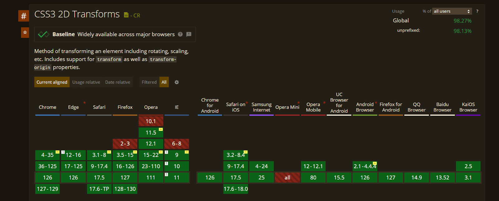
This platform lets you test websites on different browsers to help identify inconsistencies in how your CSS multiple transform properties render across different browsers, ensuring a consistent user experience. It offers various tools like LT Browser to help you view your website's responsiveness across 50+ device viewports and help you maintain consistency.
A transform bug is often a few pixels of drift on one browser, which functional tests do not catch. TestMu AI SmartUI captures screenshots of the same page across browsers and resolutions and compares them against an approved baseline, filtering anti-aliasing noise so a rotated card that shifted in Safari surfaces as a real visual change.
Watch the video tutorial below to become familiar with LT Browser.

Can AI Coding Agents Write CSS Transforms?
In 2026, AI coding agents such as GitHub Copilot, Claude Code, and Cursor can generate a multi-function transform declaration from a plain-language prompt, such as rotate this card and scale it up on hover.
- Copilot autocompletes the value list - GitHub Copilot suggests the full transform value, such as translate() rotate() scale(), as you type inside a CSS or styled-components file, based on the class name and the nearby rules.
- Claude Code checks the rendered result - Run from the terminal, Claude Code can drive a headless browser, capture the element after the transform applies, and compare it against the requested effect before editing the value again.
- Cursor edits the base and hover state together - Cursor's agent mode can update the transform property in the stylesheet and the matching hover rule in the same edit, keeping both in sync.
None of these agents render CSS internally. Without a screenshot or a real browser check in the loop, an agent can still place a rotate() before a translate() by mistake, and as the cloud run above shows, that order change moves the element.
Conclusion
Put every transform function an element needs into one declaration, keep hover and active states listing the same functions, and switch to the individual rotate and scale properties when a state changes only one of them. Then check the result in more than one browser engine, since a transform that renders correctly in Chrome can still shift in Safari or Firefox. The SmartUI getting started guide sets up a visual baseline that flags that drift on every release.
Author

Marvel Ken Anele
Blogs: 1

Marvel Chizaram Ken is a community contributor with 4+ years of experience in technical writing and frontend engineering, with a strong focus on software testing and developer tooling. He specializes in creating content around cross-browser testing, test automation frameworks, cloud-based testing, and frontend testing practices, alongside hands-on development using React, Next.js, and TypeScript. Marvel has authored 30+ technical articles for platforms including TestMu AI, LogRocket, OpenReplay, and Semaphore, translating practical testing workflows and modern web development concepts into actionable guidance for developers.
Reviewer

Salman Khan
Reviewer
Salman is a Test Automation Evangelist and Community Contributor at TestMu AI, with over 6 years of hands-on experience in software testing and automation. He has completed his Master of Technology in Computer Science and Engineering, demonstrating strong technical expertise in software development, testing, AI agents and LLMs. He is certified in KaneAI, Automation Testing, Selenium, Cypress, Playwright, and Appium, with deep experience in CI/CD pipelines, cross-browser testing, AI in testing, and mobile automation. Salman works closely with engineering teams to convert complex testing concepts into actionable, developer-first content. Salman has authored 120+ technical tutorials, guides, and documentation on test automation, web development, and related domains, making him a strong voice in the QA and testing community.


CSS Multiple Transforms FAQs
Did you find this page helpful?
More Related Blogs
TestMu AI forEnterprise
Get access to solutions built on Enterprise
grade security, privacy, & compliance
- Advanced access controls
- Advanced data retention rules
- Advanced Local Testing
- Premium Support options
- Early access to beta features
- Private Slack Channel
- Unlimited Manual Accessibility DevTools Tests