
Power Your Software Testing with AI Agents and Cloud
The Native AI-Agentic Cloud Platform to Supercharge Quality Engineering. Test Intelligently and Ship Faster.

- TestMu AI (Formerly LambdaTest)
- /
- Blog
- /
- 23 Best CSS Frameworks in 2026 (With Code Examples)
23 Best CSS Frameworks in 2026 (With Code Examples)
Compare the 23 best CSS frameworks in 2026, from Tailwind CSS and Bootstrap to Pico CSS, with npm downloads, CSS sizes, release status, and working examples.
Last Updated on:
Tailwind CSS was downloaded about 147.7 million times from npm in the week of September 20-26, 2026, roughly 20 times Bootstrap's 7.4 million, according to the npm registry's download counts.
Download volume does not tell you whether a framework still ships fixes. Eight of the 23 frameworks below have not published a release since 2022 or earlier, and when this article's previous code examples were re-rendered in September 2026, seven of the 24 had failed requests or rendered unstyled.
This list ranks the frameworks by weekly npm downloads. For each one it gives the type, CSS size, latest release, and a working CDN example that was rendered in Chrome before publishing.
Overview
Tailwind CSS is the best CSS framework for most new projects that need a custom design, and Bootstrap is the best choice when you want ready-made components with JavaScript plugins. For plain semantic HTML with no classes, Pico CSS is the strongest option in this list. Every example below was re-tested in September 2026.
Which CSS Framework Should You Pick?
- Best for custom design systems: Tailwind CSS - utility classes with no default look, compiled down to only the classes a project uses. Version 4.3.3 was published in July 2026.
- Best for ready-made components: Bootstrap - styled components plus a JavaScript bundle for modals, dropdowns, and carousels, with a dark color mode built in since version 5.3.
- Best for React applications: Ant Design - a React component library whose styles are generated in JavaScript, so it works as React components rather than a plain stylesheet.
- Best for CSS without JavaScript: Bulma - components and a flexbox grid that need no JavaScript at all, with CSS variables and dark mode added in version 1.0.
- Best for classless pages: Pico CSS - styles plain semantic HTML elements directly and switches to dark mode automatically when the user's system asks for it.
- Best for on-demand atomic CSS: UnoCSS - an engine that generates only the utility classes a page actually uses, configured through presets such as a Tailwind-compatible one.
How Do You Check That a Framework Renders Correctly?
Render the same page in Chrome, Firefox, Safari, and Edge before you commit to a framework, and again after every major upgrade. TestMu AI's SmartUI compares those renders against an approved baseline and flags only the layout changes that matter.
What Is a CSS Framework?
A CSS framework is a prewritten library of CSS rules, and sometimes JavaScript, that gives you a layout grid, typography, and ready-made classes or components. You style a page by adding the framework's classes to your HTML instead of writing every rule yourself.
Frameworks differ in how much they decide for you. Bootstrap ships finished buttons, cards, and modals with a default look. Tailwind CSS ships only small utility classes and leaves the design to you. Pico CSS styles bare HTML elements, so a page can use almost no classes at all.
What Are the Types of CSS Frameworks?
CSS frameworks fall into six types: utility-first, component-based, classless, micro frameworks, design-system CSS, and component libraries that generate CSS in JavaScript.
- Utility-first - small, single-purpose classes that you combine in markup. In Tailwind CSS, for example, the m-10 class applies a 2.5rem margin. Tailwind CSS, UnoCSS, Tachyons, and Basscss work this way.
- Component-based - prebuilt, styled components such as navbars, cards, forms, and modals. Bootstrap, Bulma, Foundation, UIkit, Semantic UI, Fomantic UI, Materialize, Halfmoon, and Blaze UI are in this group.
- Classless - stylesheets that target plain HTML elements, so a page needs few or no classes. Pico CSS, MVP.css, and Sakura take this approach.
- Micro frameworks - a few kilobytes of base styles, a grid, and buttons. Pure CSS, Milligram, Chota, Spectre.css, and Picnic CSS fit here.
- Design-system CSS - a company's own UI system published for anyone to use. Primer is the CSS behind GitHub's interface.
- Component libraries with CSS-in-JS - components ship as JavaScript and generate their styles at runtime, an approach explained in this guide to CSS-in-JS. Ant Design works this way.
Benefits of Using a CSS Framework
A CSS framework gives you a working grid, consistent components, and responsive breakpoints from the first line of HTML, at the cost of extra stylesheet weight and some lock-in to its class names.
- Faster first build - grid, typography, and form styles work before you write any CSS of your own.
- Consistent UI - every page draws on the same spacing scale, colors, and component styles, so screens built by different developers still match.
- Responsive layouts - grids with named breakpoints handle most responsive design work without hand-written media queries.
- Fewer default-style differences - most frameworks include a reset or normalizer that evens out browser default styles, which helps cross browser compatibility but does not replace testing in real browsers.
- Shared vocabulary - a developer who already knows Bootstrap or Tailwind CSS can read your markup without a separate style guide.
The trade-off shows up later. Switching frameworks means rewriting class names across every template, and a large codebase often carries leftover rules from both, which is where CSS refactoring becomes necessary.

CSS Frameworks Compared: Downloads, Size, and Releases
The table lists the npm package for each framework, its downloads for September 20-26, 2026 from the npm download counts API, its latest version on the npm registry, and the size of its main stylesheet as served by jsDelivr, minified and then gzipped.
| # | Framework | Type | npm package | Weekly downloads | Latest release | CSS size (min / gzip) | JavaScript needed |
|---|---|---|---|---|---|---|---|
| 1 | Tailwind CSS | Utility-first | tailwindcss | 147,660,241 | 4.3.3 (Jul 2026) | Generated per project | No (build step) |
| 2 | Bootstrap | Component-based | bootstrap | 7,360,736 | 5.3.8 (Aug 2025) | 226.7 KB / 30.0 KB | Optional, for components |
| 3 | Ant Design | React components (CSS-in-JS) | antd | 4,201,045 | 6.6.5 (Sep 2026) | CSS-in-JS | Yes (React) |
| 4 | UnoCSS | Atomic CSS engine | unocss | 510,100 | 66.10.5 (Sep 2026) | Generated per project | No (build step) |
| 5 | Bulma | Component-based | bulma | 408,102 | 1.0.4 (Apr 2025) | 662.0 KB / 63.5 KB | No |
| 6 | Semantic UI | Component-based | semantic-ui-css | 160,485 | 2.5.0 (Oct 2022) | 550.7 KB / 96.3 KB | jQuery, for modules |
| 7 | Foundation | Component-based | foundation-sites | 125,758 | 6.9.0 (Sep 2024) | 128.2 KB / 17.2 KB | jQuery, for plugins |
| 8 | Tachyons | Utility-first | tachyons | 110,597 | 4.12.0 (Apr 2020) | 72.2 KB / 12.8 KB | No |
| 9 | Primer | Design-system CSS | @primer/css | 74,406 | 22.3.2 (Sep 2026) | 1,036.9 KB / 153.7 KB | No |
| 10 | Pico CSS | Classless | @picocss/pico | 60,807 | 2.1.1 (Mar 2025) | 81.4 KB / 11.4 KB | No |
| 11 | UIkit | Component-based | uikit | 55,338 | 3.25.25 (Sep 2026) | 277.2 KB / 30.3 KB | Yes, for components |
| 12 | Materialize | Component-based | materialize-css (fork: @materializecss/materialize) | 54,118 (fork: 5,277) | 1.0.0 (Sep 2018); fork 2.4.0 (Sep 2026) | 123.0 KB / 19.7 KB (fork) | Yes, for components |
| 13 | Pure CSS | Micro framework | purecss | 34,292 | 3.0.0 (Oct 2022) | 15.4 KB / 3.5 KB | No |
| 14 | Fomantic UI | Component-based | fomantic-ui | 17,500 | 2.9.4 (Feb 2025) | 1,678.9 KB / 177.2 KB | jQuery, for modules |
| 15 | Basscss | Utility-first | basscss | 10,680 | 8.1.0 (May 2019) | 11.1 KB / 2.4 KB | No |
| 16 | Spectre.css | Micro framework | spectre.css | 9,237 | 0.5.9 (Jul 2020) | 45.6 KB / 9.5 KB | No |
| 17 | Milligram | Micro framework | milligram | 2,861 | 1.4.1 (Jun 2020) | 8.8 KB / 2.2 KB | No |
| 18 | MVP.css | Classless | mvp.css | 1,979 | 1.18.0 (Sep 2026) | 10.0 KB / 2.6 KB | No |
| 19 | Chota | Micro framework | chota | 1,137 | 0.9.2 (Mar 2023) | 17.9 KB / 3.5 KB | No |
| 20 | Picnic CSS | Micro framework | picnic | 899 | 7.1.0 (Jan 2022) | 38.6 KB / 7.2 KB | No |
| 21 | Halfmoon | Bootstrap theme | halfmoon | 648 | 2.0.2 (Sep 2024) | 360.5 KB / 43.4 KB | Bootstrap bundle, for components |
| 22 | Sakura | Classless | sakura.css | 363 | 1.5.1 (Jun 2025) | 4.0 KB / 1.3 KB | No |
| 23 | Blaze UI | Component-based | @blaze/css | 273 | 12.2.0 (Sep 2022) | 100.6 KB / 13.6 KB | Optional, for web components |
npm counts only installs from the registry, including CI builds and packages installed as dependencies of other packages. Pages that load a framework straight from a CDN link are not counted, so smaller classless frameworks such as Sakura are used on more pages than their download figures suggest. Tailwind CSS and UnoCSS have no fixed stylesheet size because their build step generates only the classes a project uses.
Re-Testing the Code Examples
Before this update, every code example from the article's previous version was rendered in Chrome 153 with a script that logs failed network requests and console errors. Seven of the 24 examples no longer worked as written:
Previous examples rendered in Chrome 153 (September 2026)

Tailwind CSS          FAIL  image  www.testmuai.com/resources/images/real-time-browsers-index.png
                            redirected, then net::ERR_BLOCKED_BY_ORB
Semantic UI           FAIL  image  www.testmuai.com/resources/images/main/visual-regression-testing.webp
                            redirected, then net::ERR_BLOCKED_BY_ORB
UnoCSS                FAIL  css    unocss.com/unocss.min.css  net::ERR_CONNECTION_TIMED_OUT (+3 images)
Material Design Lite  FAIL  css+js code.getmdl.io/1.3.0/material.indigo-pink.min.css  HTTP 403
Chota                 FAIL  image  icongr.am/feather/file.svg  net::ERR_NAME_NOT_RESOLVED
Halfmoon              FAIL  css    css/halfmoon-variables.min.css  relative path, no stylesheet loaded
Picnic CSS            FAIL  image  www.testmuai.com/resources/images/ (3 images)
                            redirected, then net::ERR_BLOCKED_BY_ORB
17 other examples     PASS  0 failed requests
Material Design Lite, which Google has put into limited support, and Skeleton, whose last release was in December 2014, were removed from the list, and Pico CSS was added. Every example below pins a current version on jsDelivr and rendered with no failed requests and no console errors. The screenshots under each example come from those renders.

Note: Framework CSS breaks where browsers render it differently. Check your pages on 3,000+ browser and OS combinations with TestMu AI. Start testing for free
What Are the Best CSS Frameworks in 2026?
The best CSS frameworks in 2026 by weekly npm downloads are Tailwind CSS, Bootstrap, Ant Design, UnoCSS, and Bulma. The rest of the list covers classless, micro, and design-system options, each with its release status stated plainly.
1. Tailwind CSS
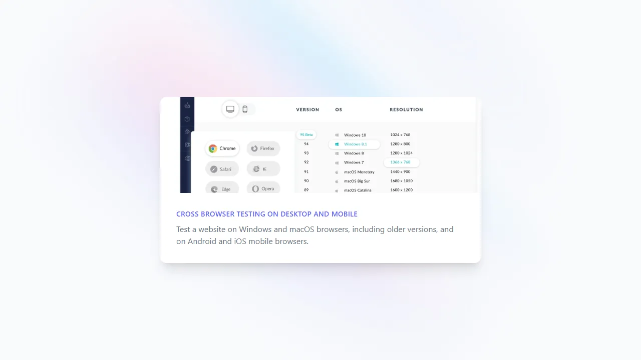
Tailwind CSS is a utility-first framework: instead of finished components, it gives you classes such as flex, p-8, and text-gray-500 that each set one or two properties. Version 4 moved configuration from a JavaScript file into CSS through the @theme directive, and version 4.3.3 was published in July 2026.
Tailwind CSS uses a mobile-first breakpoint system, so an unprefixed class applies to every screen and md: or lg: variants override it on wider ones. This Tailwind CSS tutorial covers installation with the CLI and Vite.
The example uses the browser build, which compiles classes inside the page. Tailwind's documentation positions that build for development and prototyping; production sites should use the CLI or a bundler plugin.
<!DOCTYPE html>
<html lang="en">
<head>
  <meta charset="UTF-8" />
  <meta name="viewport" content="width=device-width, initial-scale=1.0" />
  <title>Tailwind CSS card</title>
  <!-- Tailwind CSS v4 browser build: compiles utility classes in the page at runtime -->
  <script src="https://cdn.jsdelivr.net/npm/@tailwindcss/browser@4"></script>
</head>
<body class="bg-gray-50">
  <div class="relative flex min-h-screen flex-col justify-center overflow-hidden py-6 sm:py-12">
    <img src="https://play.tailwindcss.com/img/beams.jpg" alt="" class="absolute top-1/2 left-1/2 w-full max-w-none -translate-x-1/2 -translate-y-1/2" width="1308" />
    <div class="relative mx-4 overflow-hidden rounded-xl bg-white shadow-xl md:mx-auto md:w-1/2">
      <img class="h-48 w-full object-cover" src="https://assets.testmuai.com/resources/images/real-time-browsers-index.png" alt="Browser testing dashboard" />
      <div class="p-8">
        <div class="text-sm font-semibold tracking-wide text-indigo-500 uppercase">Cross browser testing on desktop and mobile</div>
        <p class="mt-2 text-gray-500">Test a website on Windows and macOS browsers, including older versions, and on Android and iOS mobile browsers.</p>
      </div>
    </div>
  </div>
</body>
</html>
Output:
- Strength - no default look, so the design comes from your own tokens rather than the framework's.
- Strength - responsive, hover, focus, and dark variants work on any utility class.
- Limitation - long class lists in markup can be hard to read; extracting repeated patterns into components is the usual fix.
- Limitation - no prebuilt components, so you build or import your own buttons, modals, and menus.
2. Bootstrap
Bootstrap is a component-based framework created at Twitter and now maintained by an open-source team. It ships styled components, a 12-column grid, and an optional JavaScript bundle for modals, dropdowns, tooltips, and carousels. The current release line is 5.3, with version 5.3.8 published in August 2025.
Its grid switches layouts at six named breakpoints, which match most of the common CSS breakpoints teams already use. Version 5.3 added color modes, so setting data-bs-theme="dark" on an element switches it to a dark palette.
<!DOCTYPE html>
<html lang="en">
<head>
  <meta charset="UTF-8" />
  <meta name="viewport" content="width=device-width, initial-scale=1.0" />
  <title>Bootstrap test report</title>
  <link href="https://cdn.jsdelivr.net/npm/bootstrap@5.3.8/dist/css/bootstrap.min.css" rel="stylesheet" />
</head>
<body class="bg-body-tertiary">
  <section class="container py-5">
    <div class="text-center mx-auto mb-4" style="max-width: 640px">
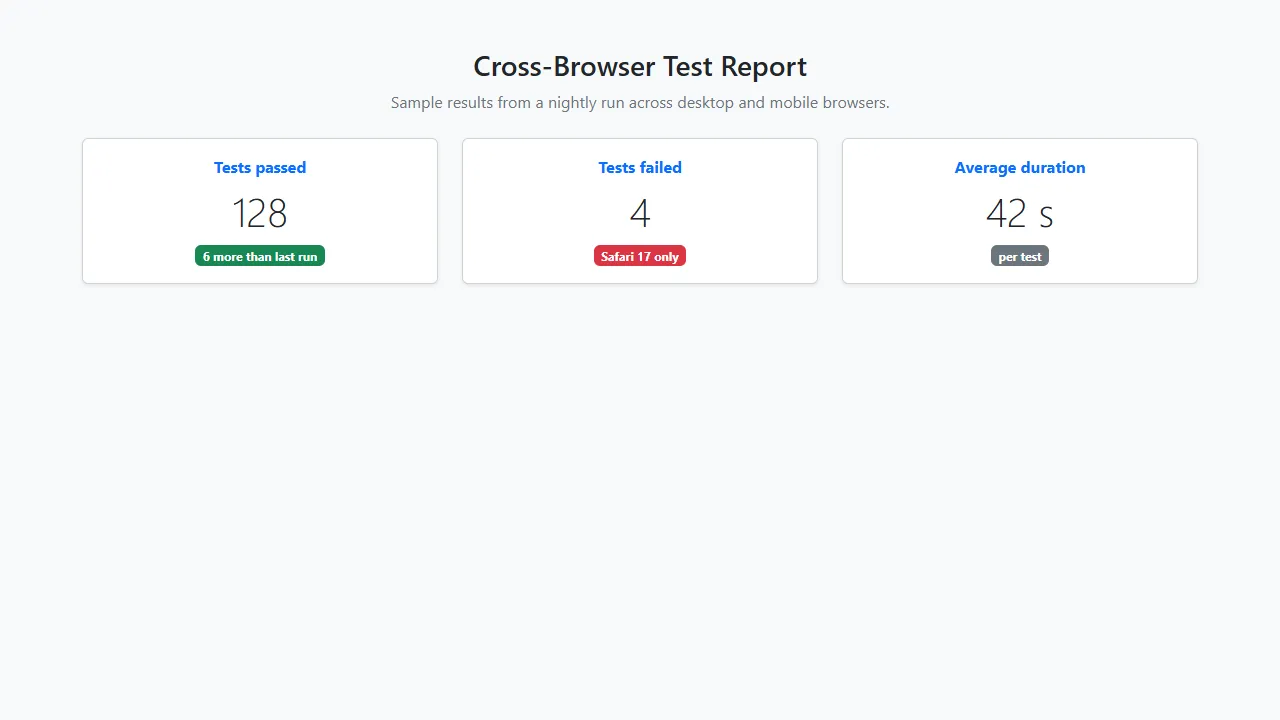
      <h1 class="h3">Cross-Browser Test Report</h1>
      <p class="text-secondary">Sample results from a nightly run across desktop and mobile browsers.</p>
    </div>
    <div class="row g-4 justify-content-center">
      <div class="col-12 col-md-4">
        <div class="card shadow-sm h-100 text-center">
          <div class="card-body">
            <span class="fw-bold text-primary">Tests passed</span>
            <p class="display-6 my-2">128</p>
            <span class="badge text-bg-success">6 more than last run</span>
          </div>
        </div>
      </div>
      <div class="col-12 col-md-4">
        <div class="card shadow-sm h-100 text-center">
          <div class="card-body">
            <span class="fw-bold text-primary">Tests failed</span>
            <p class="display-6 my-2">4</p>
            <span class="badge text-bg-danger">Safari 17 only</span>
          </div>
        </div>
      </div>
      <div class="col-12 col-md-4">
        <div class="card shadow-sm h-100 text-center">
          <div class="card-body">
            <span class="fw-bold text-primary">Average duration</span>
            <p class="display-6 my-2">42 s</p>
            <span class="badge text-bg-secondary">per test</span>
          </div>
        </div>
      </div>
    </div>
  </section>
</body>
</html>
Output:
- Strength - one of the largest component sets in this list, with working JavaScript for interactive components.
- Strength - Sass variables and CSS custom properties let you theme colors, spacing, and radii without overriding selectors.
- Limitation - sites that keep the default theme look alike, so a distinct brand needs real customization.
- Limitation - the full stylesheet ships every component; importing only the Sass parts you use keeps it smaller. For layouts, CSS Grid vs Bootstrap compares the native alternative.
3. Ant Design
Ant Design is a design system and React component library rather than a stylesheet you link. Since version 5, its styles are generated in JavaScript at runtime, and themes are set through design tokens instead of Less variables. Version 6.6.5 was published in September 2026.
Ant Design supports React only; Vue developers use the separate community port, ant-design-vue. If you are choosing specifically for React, this list of the best CSS frameworks for React compares more options.
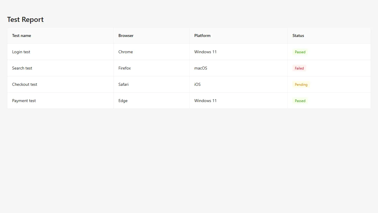
The example loads React and Ant Design as browser scripts so it runs without a build step. In a real project you would install antd with npm and import the components.
<!DOCTYPE html>
<html lang="en">
<head>
  <meta charset="UTF-8" />
  <title>Ant Design test report</title>
  <!-- Ant Design v5+ generates its styles in JavaScript; the UMD build needs React 18 and Day.js globals -->
  <script src="https://cdn.jsdelivr.net/npm/react@18.3.1/umd/react.production.min.js"></script>
  <script src="https://cdn.jsdelivr.net/npm/react-dom@18.3.1/umd/react-dom.production.min.js"></script>
  <script src="https://cdn.jsdelivr.net/npm/dayjs@1.11.13/dayjs.min.js"></script>
  <script src="https://cdn.jsdelivr.net/npm/antd@6.6.5/dist/antd.min.js"></script>
</head>
<body style="margin: 0; padding: 24px; background: #f5f5f5">
  <div id="root"></div>
  <script>
    var h = React.createElement;
    var statusColor = { Passed: "green", Failed: "red", Pending: "gold" };
    var columns = [
      { title: "Test name", dataIndex: "name" },
      { title: "Browser", dataIndex: "browser" },
      { title: "Platform", dataIndex: "platform" },
      { title: "Status", dataIndex: "status", render: function (s) { return h(antd.Tag, { color: statusColor[s] }, s); } }
    ];
    var data = [
      { key: 1, name: "Login test", browser: "Chrome", platform: "Windows 11", status: "Passed" },
      { key: 2, name: "Search test", browser: "Firefox", platform: "macOS", status: "Failed" },
      { key: 3, name: "Checkout test", browser: "Safari", platform: "iOS", status: "Pending" },
      { key: 4, name: "Payment test", browser: "Edge", platform: "Windows 11", status: "Passed" }
    ];
    ReactDOM.createRoot(document.getElementById("root")).render(
      h("div", null,
        h(antd.Typography.Title, { level: 3 }, "Test Report"),
        h(antd.Table, { columns: columns, dataSource: data, bordered: true, pagination: false })
      )
    );
  </script>
</body>
</html>
Output:
- Strength - data-heavy components such as tables with sorting and filtering, forms with validation, and date pickers work out of the box.
- Strength - design tokens change colors, radii, and spacing across every component from one theme object.
- Limitation - React only, and you cannot use it as a plain CSS file in a non-React page.
- Limitation - a distinct visual language that takes deliberate theming to move away from.
4. UnoCSS
UnoCSS is an atomic CSS engine inspired by Windi CSS, Tailwind CSS, and Twind. It has no utilities of its own; presets supply them, including a Tailwind-compatible preset, and you can write custom rules with regular expressions. Version 66.10.5 was published in September 2026.
The example uses the UnoCSS runtime, which scans the page in the browser and generates only the classes it finds. For production, the Vite or PostCSS integration generates the same CSS at build time.
<!DOCTYPE html>
<html lang="en">
<head>
  <meta charset="UTF-8" />
  <title>UnoCSS gallery</title>
  <link rel="stylesheet" href="https://cdn.jsdelivr.net/npm/@unocss/reset/tailwind.min.css" />
  <!-- UnoCSS runtime: generates only the utilities used on this page -->
  <script src="https://cdn.jsdelivr.net/npm/@unocss/runtime"></script>
</head>
<body class="bg-gray-700 p-6">
  <div class="flex flex-wrap gap-8 justify-center items-center">
    <div class="relative overflow-hidden rounded-lg shadow-xl shadow-blue-300 w-full md:w-1/4 bg-white">
      <img src="https://assets.testmuai.com/resources/images/automation_testing_with_all_frameworks.png" alt="Automation frameworks" class="w-full h-auto" />
      <a href="#" class="absolute inset-0 flex items-center justify-center text-white font-bold text-2xl bg-gray-800 opacity-0 hover:opacity-80 transition duration-300">View</a>
    </div>
    <div class="relative overflow-hidden rounded-lg shadow-xl shadow-pink-300 w-full md:w-1/4 bg-white">
      <img src="https://assets.testmuai.com/resources/images/Seamlessly.svg" alt="Integrations" class="w-full h-auto" />
      <a href="#" class="absolute inset-0 flex items-center justify-center text-white font-bold text-2xl bg-gray-800 opacity-0 hover:opacity-80 transition duration-300">View</a>
    </div>
    <div class="relative overflow-hidden rounded-lg shadow-xl shadow-green-300 w-full md:w-1/4 bg-white">
      <img src="https://assets.testmuai.com/resources/images/lambdatest-compliance.png" alt="Compliance badges" class="w-full h-auto" />
      <a href="#" class="absolute inset-0 flex items-center justify-center text-white font-bold text-2xl bg-gray-800 opacity-0 hover:opacity-80 transition duration-300">View</a>
    </div>
  </div>
</body>
</html>
Output:
- Strength - presets let you mix Tailwind-style utilities, icons, and your own shortcuts in one engine.
- Strength - integrations for Vite, webpack, PostCSS, and major frameworks.
- Limitation - no prebuilt components.
- Limitation - choosing and configuring presets takes more setup than linking a single stylesheet.
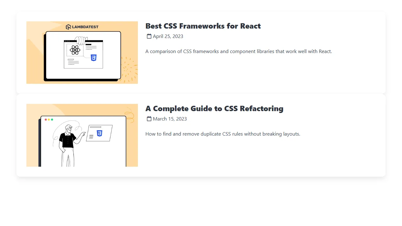
5. Bulma
Bulma is a CSS-only component framework built on flexbox, with readable class names such as columns, is-primary, and is-one-third. Version 1.0, released in March 2024, rebuilt it on CSS custom properties and added dark mode. The latest release is 1.0.4, published in April 2025, and its creator still commits fixes.
This Bulma CSS framework guide walks through its grid, modifiers, and Sass customization in more depth.
<!DOCTYPE html>
<html lang="en">
<head>
  <meta charset="UTF-8" />
  <meta name="viewport" content="width=device-width, initial-scale=1.0" />
  <title>Bulma blog cards</title>
  <link rel="stylesheet" href="https://cdn.jsdelivr.net/npm/bulma@1.0.4/css/bulma.min.css" />
  <link rel="stylesheet" href="https://cdnjs.cloudflare.com/ajax/libs/font-awesome/5.15.3/css/all.min.css" />
</head>
<body>
  <section class="section">
    <div class="container">
      <div class="columns box">
        <div class="column is-one-third">
          <figure class="image is-16by9">
            <img src="https://assets.testmuai.com/resources/uploads/2023/04/2320Best20CSS.png" alt="CSS frameworks for React" />
          </figure>
        </div>
        <div class="column">
          <h2 class="title is-4">Best CSS Frameworks for React</h2>
          <p class="subtitle is-6 mt-2">
            <span class="icon"><i class="far fa-calendar"></i></span><span>April 25, 2023</span>
          </p>
          <p>A comparison of CSS frameworks and component libraries that work well with React.</p>
        </div>
      </div>
      <div class="columns box">
        <div class="column is-one-third">
          <figure class="image is-16by9">
            <img src="https://assets.testmuai.com/resources/uploads/2023/03/unnamed252520-2525202023-03-15T174705.891.png" alt="CSS refactoring" />
          </figure>
        </div>
        <div class="column">
          <h2 class="title is-4">A Complete Guide to CSS Refactoring</h2>
          <p class="subtitle is-6 mt-2">
            <span class="icon"><i class="far fa-calendar"></i></span><span>March 15, 2023</span>
          </p>
          <p>How to find and remove duplicate CSS rules without breaking layouts.</p>
        </div>
      </div>
    </div>
  </section>
</body>
</html>
Output:
- Strength - no JavaScript dependency at all, so it fits any front-end stack.
- Strength - modifier classes such as is-large and is-danger make markup easy to read.
- Limitation - dropdowns, modals, and navbar toggles need your own JavaScript to open and close.
- Limitation - one of the heavier full stylesheets in the comparison table, unless you import only the Sass modules you use.
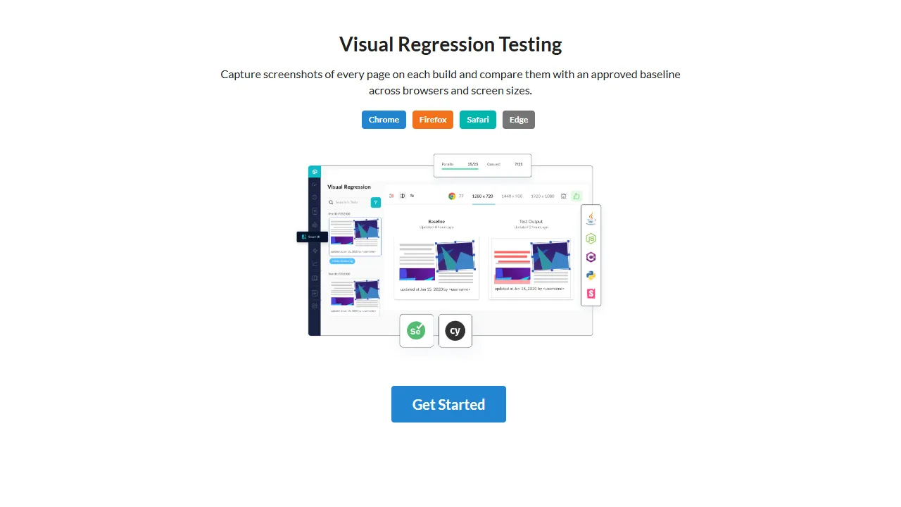
6. Semantic UI
Semantic UI is a component framework known for class names written like sentences, such as "ui huge primary button". Its CSS package is still widely installed, but the project has published one release in the last several years, version 2.5.0 in October 2022.
Treat Semantic UI as a legacy choice for projects that already use it. Fomantic UI, number 14 in this list, is its community fork and is still maintained.
<!DOCTYPE html>
<html lang="en">
<head>
  <meta charset="UTF-8" />
  <meta name="viewport" content="width=device-width, initial-scale=1.0" />
  <title>Semantic UI call to action</title>
  <link rel="stylesheet" href="https://cdn.jsdelivr.net/npm/semantic-ui-css@2.5.0/semantic.min.css" />
</head>
<body>
  <div class="ui text container center aligned" style="margin-top: 3em">
    <h1 class="ui header">Visual Regression Testing</h1>
    <p>Capture screenshots of every page on each build and compare them with an approved baseline across browsers and screen sizes.</p>
    <div class="ui labels">
      <span class="ui blue label">Chrome</span>
      <span class="ui orange label">Firefox</span>
      <span class="ui teal label">Safari</span>
      <span class="ui grey label">Edge</span>
    </div>
    <img class="ui centered rounded large image" style="margin-top: 1.5em" src="https://assets.testmuai.com/resources/images/main/visual-regression-testing.webp" alt="Visual regression testing" />
    <a class="ui huge primary button" style="margin-top: 1.5em" href="#">Get Started</a>
  </div>
</body>
</html>
Output:
- Strength - readable, natural-language class names.
- Strength - a large set of components and themes.
- Limitation - effectively unmaintained since 2022.
- Limitation - interactive modules depend on jQuery, and the full stylesheet is one of the heaviest in the comparison table.
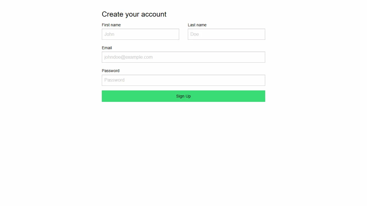
7. Foundation
Foundation for Sites is a component framework with an XY grid, form and navigation components, and JavaScript plugins such as Reveal modals and dropdown menus. It is published on npm as foundation-sites, and version 6.9.0 came out in September 2024.
In September 2026 the maintainers announced that Foundation for Sites is becoming Yeti, a CSS-first successor with no Sass and no required build step. Version 6 stays MIT-licensed and keeps getting bug fixes, 6.9.0 is its final planned feature release, and Yeti ships under the Functional Source License. This beginner's guide to Foundation testing covers testing existing Foundation sites.
<!DOCTYPE html>
<html lang="en">
<head>
  <meta charset="UTF-8" />
  <meta name="viewport" content="width=device-width, initial-scale=1.0" />
  <title>Foundation sign-up form</title>
  <link rel="stylesheet" href="https://cdn.jsdelivr.net/npm/foundation-sites@6.9.0/dist/css/foundation.min.css" />
</head>
<body>
  <div class="grid-container" style="padding-top: 2rem">
    <div class="grid-x grid-padding-x">
      <div class="medium-6 medium-offset-3 cell">
        <h2 class="h4">Create your account</h2>
        <form>
          <div class="grid-x grid-padding-x">
            <div class="medium-6 cell"><label>First name <input type="text" placeholder="John" /></label></div>
            <div class="medium-6 cell"><label>Last name <input type="text" placeholder="Doe" /></label></div>
            <div class="medium-12 cell"><label>Email <input type="email" placeholder="johndoe@example.com" /></label></div>
            <div class="medium-12 cell"><label>Password <input type="password" placeholder="Password" /></label></div>
            <div class="medium-12 cell"><input class="button success expanded" type="submit" value="Sign Up" /></div>
          </div>
        </form>
      </div>
    </div>
  </div>
</body>
</html>
Output:
- Strength - the XY grid handles both flexbox rows and vertical grids.
- Strength - a single Sass settings file controls colors, breakpoints, and spacing.
- Limitation - interactive plugins require jQuery.
- Limitation - version 6 gets bug fixes only, so new projects should weigh the move to Yeti.
8. Tachyons
Tachyons is one of the original functional CSS frameworks: short, single-purpose classes such as pa4, f3, and bg-near-white. Breakpoint suffixes such as -ns, -m, and -l make any class responsive. Its latest release, 4.12.0, was published in April 2020, and the 5.0 beta never shipped.
It still has a large install base, but new utility-first projects are better served by Tailwind CSS or UnoCSS, which are actively developed.
<!DOCTYPE html>
<html lang="en">
<head>
  <meta charset="UTF-8" />
  <title>Tachyons newsletter form</title>
  <link rel="stylesheet" href="https://cdn.jsdelivr.net/npm/tachyons@4.12.0/css/tachyons.min.css" />
</head>
<body class="pa4 sans-serif bg-near-white">
  <div class="center mw6 bg-white br3 pa4 shadow-4">
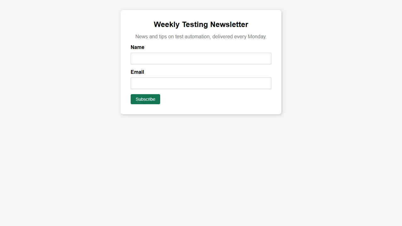
    <h1 class="tc f3 mt0">Weekly Testing Newsletter</h1>
    <p class="tc gray">News and tips on test automation, delivered every Monday.</p>
    <form>
      <label class="db mb2 fw6" for="name">Name</label>
      <input id="name" class="input-reset ba b--black-20 pa2 mb3 db w-100" type="text" required />
      <label class="db mb2 fw6" for="email">Email</label>
      <input id="email" class="input-reset ba b--black-20 pa2 mb3 db w-100" type="email" required />
      <button class="f6 link dim br2 ph3 pv2 dib white bg-dark-green bn pointer" type="submit">Subscribe</button>
    </form>
  </div>
</body>
</html>
Output:
- Strength - small and predictable; each class does exactly one thing.
- Strength - works from a single stylesheet with no build step.
- Limitation - no release since April 2020.
- Limitation - terse class names such as br2 and pv2 take time to learn and can make markup hard to read.
9. Primer
Primer is GitHub's open-source design system, and @primer/css is the CSS that styles GitHub's own interface. It is actively maintained, with version 22.3.2 published in September 2026.
Primer's colors come from CSS variables tied to color modes, so the html element needs data-color-mode and theme attributes, as in the example. It fits internal tools and developer products that want a GitHub-like look.
<!DOCTYPE html>
<html lang="en" data-color-mode="light" data-light-theme="light">
<head>
  <meta charset="utf-8" />
  <meta name="viewport" content="width=device-width, initial-scale=1.0" />
  <title>Primer CSS toast</title>
  <link rel="stylesheet" href="https://cdn.jsdelivr.net/npm/@primer/css@22.3.2/dist/primer.css" />
</head>
<body>
  <div class="p-4">
    <div class="Toast">
      <span class="Toast-icon">
        <svg width="14" height="16" viewBox="0 0 14 16" class="octicon" aria-hidden="true">
          <path fill-rule="evenodd" d="M7 2.3c3.14 0 5.7 2.56 5.7 5.7s-2.56 5.7-5.7 5.7A5.71 5.71 0 0 1 1.3 8c0-3.14 2.56-5.7 5.7-5.7zM7 1C3.14 1 0 4.14 0 8s3.14 7 7 7 7-3.14 7-7-3.14-7-7-7zm1 3H6v5h2V4zm0 6H6v2h2v-2z"></path>
        </svg>
      </span>
      <span class="Toast-content">You have used 90 percent of your monthly API limit.</span>
    </div>
    <div class="Toast Toast--error mt-3">
      <span class="Toast-icon">
        <svg width="12" height="16" viewBox="0 0 12 16" class="octicon" aria-hidden="true">
          <path fill-rule="evenodd" d="M7.48 8l3.75 3.75-1.48 1.48L6 9.48l-3.75 3.75-1.48-1.48L4.52 8 .77 4.25l1.48-1.48L6 6.52l3.75-3.75 1.48 1.48L7.48 8z"></path>
        </svg>
      </span>
      <span class="Toast-content">Build failed: 3 visual checks need review.</span>
    </div>
  </div>
</body>
</html>
Output:

- Strength - light, dark, and high-contrast themes built on functional color variables.
- Strength - frequent releases from a team that uses it in production every day.
- Limitation - the full dist stylesheet is the second largest in the comparison table; import only the bundles you need.
- Limitation - built around GitHub's visual identity.
10. Pico CSS
Pico CSS is a minimal framework that styles semantic HTML elements directly, so forms, buttons, tables, and articles look finished with almost no classes. It also ships a fully classless build. Version 2.1.1 was published in March 2025.
Dark mode follows the user's system setting by default, and setting data-theme on the html element forces light or dark. Pico fits documentation, landing pages, and prototypes where you want clean output from plain HTML.
<!DOCTYPE html>
<html lang="en" data-theme="light">
<head>
  <meta charset="utf-8" />
  <meta name="viewport" content="width=device-width, initial-scale=1" />
  <title>Pico CSS sign-in form</title>
  <link rel="stylesheet" href="https://cdn.jsdelivr.net/npm/@picocss/pico@2.1.1/css/pico.min.css" />
</head>
<body>
  <!-- Pico styles plain HTML elements; the only class here is the container -->
  <main class="container">
    <article>
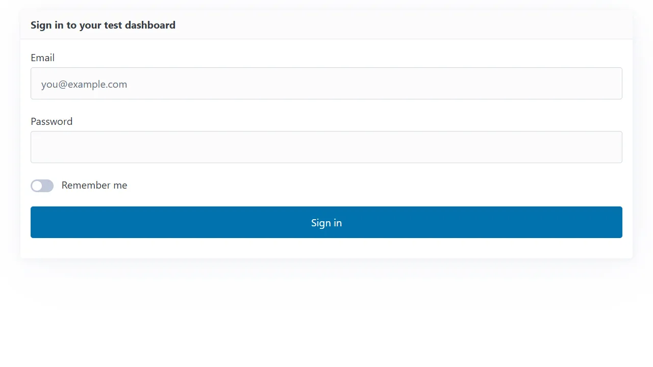
      <header><strong>Sign in to your test dashboard</strong></header>
      <form>
        <label>Email <input type="email" name="email" placeholder="you@example.com" autocomplete="email" required /></label>
        <label>Password <input type="password" name="password" required /></label>
        <fieldset>
          <label><input type="checkbox" name="remember" role="switch" /> Remember me</label>
        </fieldset>
        <button type="submit">Sign in</button>
      </form>
    </article>
  </main>
</body>
</html>
Output:
- Strength - clean, accessible defaults for native elements with almost no markup changes.
- Strength - automatic light and dark themes.
- Limitation - few components and no JavaScript plugins, so complex app UIs need more than Pico provides.
- Limitation - deeper customization beyond CSS variables means rebuilding from its Sass source.
11. UIkit
UIkit is a modular front-end framework with CSS components and JavaScript behaviors such as sliders, lightboxes, sticky navigation, and scroll animations, all driven by uk- attributes. It is actively released, with version 3.25.25 published in September 2026.
UIkit also ships a right-to-left stylesheet for Arabic and Hebrew interfaces, which few frameworks in this list provide out of the box.
<!DOCTYPE html>
<html lang="en">
<head>
  <meta charset="UTF-8" />
  <title>UIkit test dashboard</title>
  <link rel="stylesheet" href="https://cdn.jsdelivr.net/npm/uikit@3.25.25/dist/css/uikit.min.css" />
  <script src="https://cdn.jsdelivr.net/npm/uikit@3.25.25/dist/js/uikit.min.js"></script>
  <script src="https://cdn.jsdelivr.net/npm/uikit@3.25.25/dist/js/uikit-icons.min.js"></script>
</head>
<body>
  <div class="uk-container uk-margin-top">
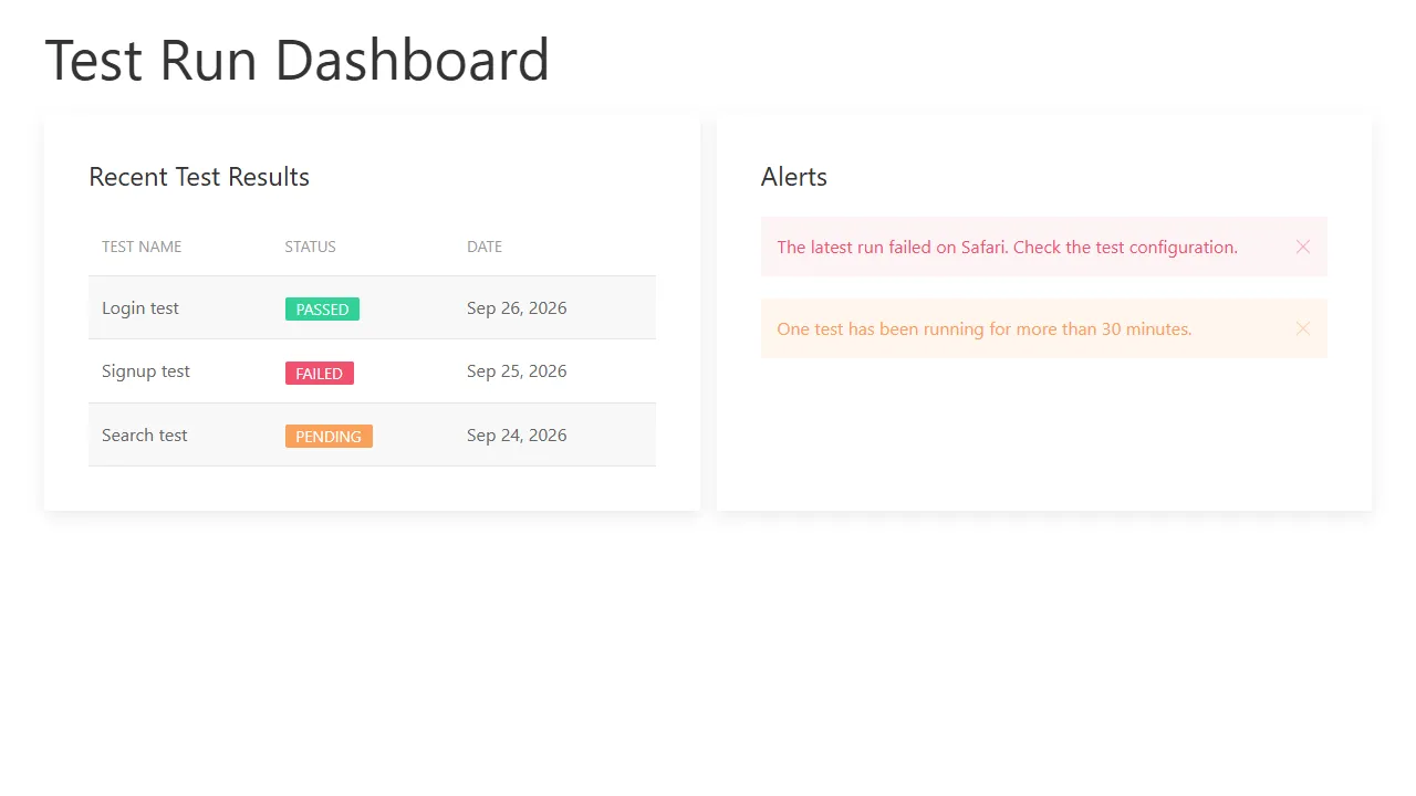
    <h1 class="uk-heading-small">Test Run Dashboard</h1>
    <div class="uk-child-width-1-2@m uk-grid-small uk-grid-match" uk-grid>
      <div>
        <div class="uk-card uk-card-default uk-card-body">
          <h3 class="uk-card-title">Recent Test Results</h3>
          <table class="uk-table uk-table-striped">
            <thead><tr><th>Test name</th><th>Status</th><th>Date</th></tr></thead>
            <tbody>
              <tr><td>Login test</td><td><span class="uk-label uk-label-success">Passed</span></td><td>Sep 26, 2026</td></tr>
              <tr><td>Signup test</td><td><span class="uk-label uk-label-danger">Failed</span></td><td>Sep 25, 2026</td></tr>
              <tr><td>Search test</td><td><span class="uk-label uk-label-warning">Pending</span></td><td>Sep 24, 2026</td></tr>
            </tbody>
          </table>
        </div>
      </div>
      <div>
        <div class="uk-card uk-card-default uk-card-body">
          <h3 class="uk-card-title">Alerts</h3>
          <div class="uk-alert-danger" uk-alert>
            <a href="#" class="uk-alert-close" uk-close></a>
            <p>The latest run failed on Safari. Check the test configuration.</p>
          </div>
          <div class="uk-alert-warning" uk-alert>
            <a href="#" class="uk-alert-close" uk-close></a>
            <p>One test has been running for more than 30 minutes.</p>
          </div>
        </div>
      </div>
    </div>
  </div>
</body>
</html>
Output:
- Strength - a large set of interactive components with no jQuery dependency.
- Strength - a right-to-left build ships with the package.
- Limitation - uk- prefixed classes and attributes are verbose.
- Limitation - a recognizable default style that needs theming to change.
12. Materialize
Materialize is a component framework based on Google's Material Design. The original materialize-css package has not had a release since version 1.0.0 in September 2018, so the example uses the community-maintained Materialize fork, @materializecss/materialize, which published version 2.4.0 in September 2026.
If you maintain a site on the original 1.0.0 release, check the fork's migration notes before upgrading, because version 2 changed parts of the JavaScript API.
<!DOCTYPE html>
<html lang="en">
<head>
  <meta charset="UTF-8" />
  <meta name="viewport" content="width=device-width, initial-scale=1.0" />
  <title>Materialize blog layout</title>
  <!-- Community-maintained Materialize 2.x (@materializecss/materialize) -->
  <link rel="stylesheet" href="https://cdn.jsdelivr.net/npm/@materializecss/materialize@2.4.0/dist/css/materialize.min.css" />
  <script src="https://cdn.jsdelivr.net/npm/@materializecss/materialize@2.4.0/dist/js/materialize.min.js"></script>
</head>
<body>
  <div class="container">
    <div class="row">
      <div class="col s12 m8">
        <div class="card">
          <div class="card-image">
            <img src="https://assets.testmuai.com/resources/uploads/2022/08/How-To-Style-And-Write-CSS-In-Re-1.png" alt="Styling CSS in React" />
          </div>
          <div class="card-content">
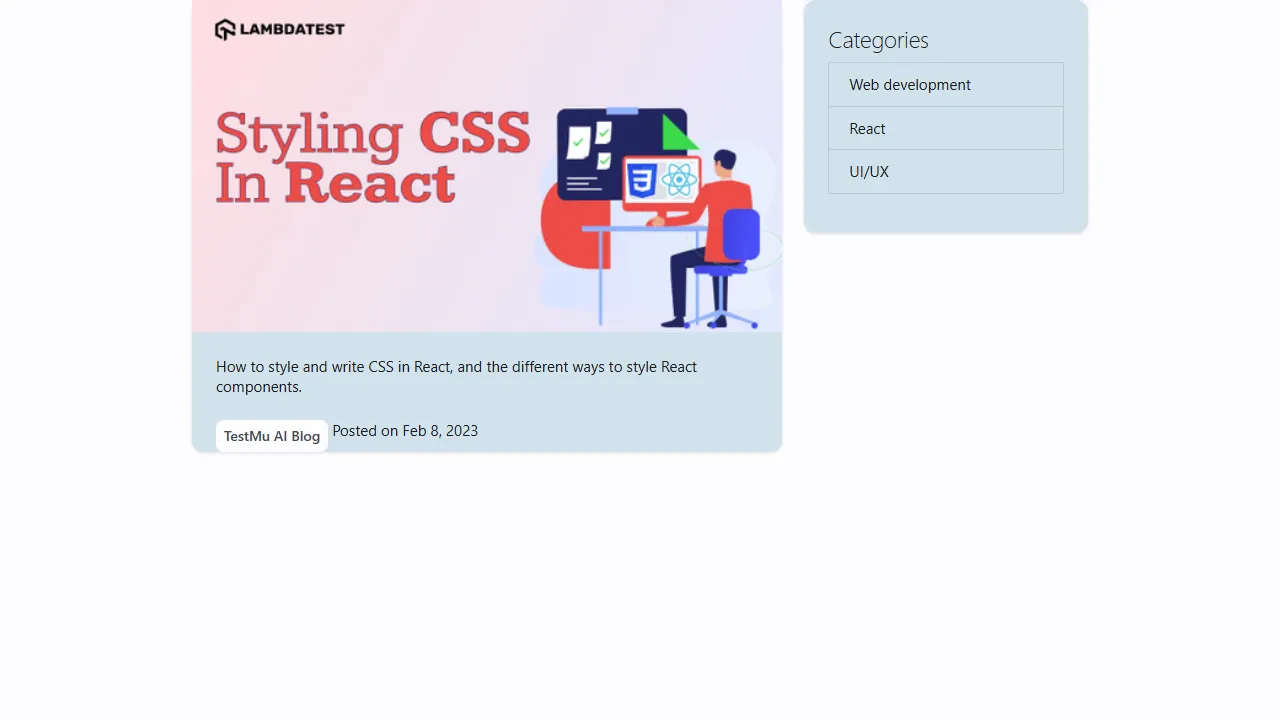
            <p>How to style and write CSS in React, and the different ways to style React components.</p>
          </div>
          <div class="card-action">
            <div class="chip">TestMu AI Blog</div>
            <span>Posted on Feb 8, 2023</span>
          </div>
        </div>
      </div>
      <div class="col s12 m4">
        <div class="card">
          <div class="card-content">
            <span class="card-title">Categories</span>
            <ul class="collection">
              <li class="collection-item">Web development</li>
              <li class="collection-item">React</li>
              <li class="collection-item">UI/UX</li>
            </ul>
          </div>
        </div>
      </div>
    </div>
  </div>
</body>
</html>
Output:
- Strength - Material Design cards, chips, collections, and form fields with matching JavaScript behaviors.
- Strength - the community fork is actively released.
- Limitation - the original package is unmaintained, and many tutorials still point to it.
- Limitation - moving away from the Material look takes significant overrides.
13. Pure CSS
Pure CSS is a set of small CSS modules for base styles, grids, forms, buttons, tables, and menus, originally created at Yahoo. It is published on npm as purecss, and its latest release is 3.0.0 from October 2022.
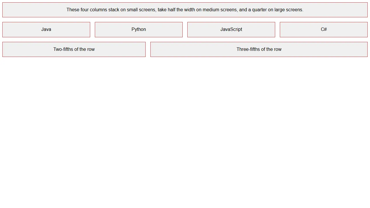
The responsive grid classes, such as pure-u-md-1-2, live in a separate grids-responsive stylesheet. The previous version of this example loaded only the core file, so its responsive columns never switched. Pure's grid is a quick way to build a CSS grid layout without writing one.
<!DOCTYPE html>
<html lang="en">
<head>
  <meta charset="UTF-8" />
  <meta name="viewport" content="width=device-width, initial-scale=1" />
  <title>Pure CSS responsive grid</title>
  <link rel="stylesheet" href="https://cdn.jsdelivr.net/npm/purecss@3.0.0/build/pure-min.css" />
  <!-- Responsive grid classes (pure-u-md-*, pure-u-lg-*) live in a separate file -->
  <link rel="stylesheet" href="https://cdn.jsdelivr.net/npm/purecss@3.0.0/build/grids-responsive-min.css" />
  <style>
    .box { margin: 0.5em; padding: 1em; background: #f0f0f0; border: 1px solid #c33; text-align: center; font-family: sans-serif; }
  </style>
</head>
<body>
  <div class="pure-g">
    <div class="pure-u-1"><div class="box">These four columns stack on small screens, take half the width on medium screens, and a quarter on large screens.</div></div>
    <div class="pure-u-1 pure-u-md-1-2 pure-u-lg-1-4"><div class="box">Java</div></div>
    <div class="pure-u-1 pure-u-md-1-2 pure-u-lg-1-4"><div class="box">Python</div></div>
    <div class="pure-u-1 pure-u-md-1-2 pure-u-lg-1-4"><div class="box">JavaScript</div></div>
    <div class="pure-u-1 pure-u-md-1-2 pure-u-lg-1-4"><div class="box">C#</div></div>
    <div class="pure-u-2-5"><div class="box">Two-fifths of the row</div></div>
    <div class="pure-u-3-5"><div class="box">Three-fifths of the row</div></div>
  </div>
</body>
</html>
Output:
- Strength - one of the smallest stylesheets in the comparison table, split into modules you can load individually.
- Strength - minimal styling that is easy to build on.
- Limitation - no release since October 2022.
- Limitation - few components beyond forms, buttons, tables, and menus.
14. Fomantic UI
Fomantic UI is the community fork of Semantic UI, created to keep the project moving after upstream development stalled. It keeps Semantic UI's class names, so most Semantic UI markup works unchanged. Version 2.9.4 was published in February 2025, and 2.10 beta builds were still being published in September 2026.
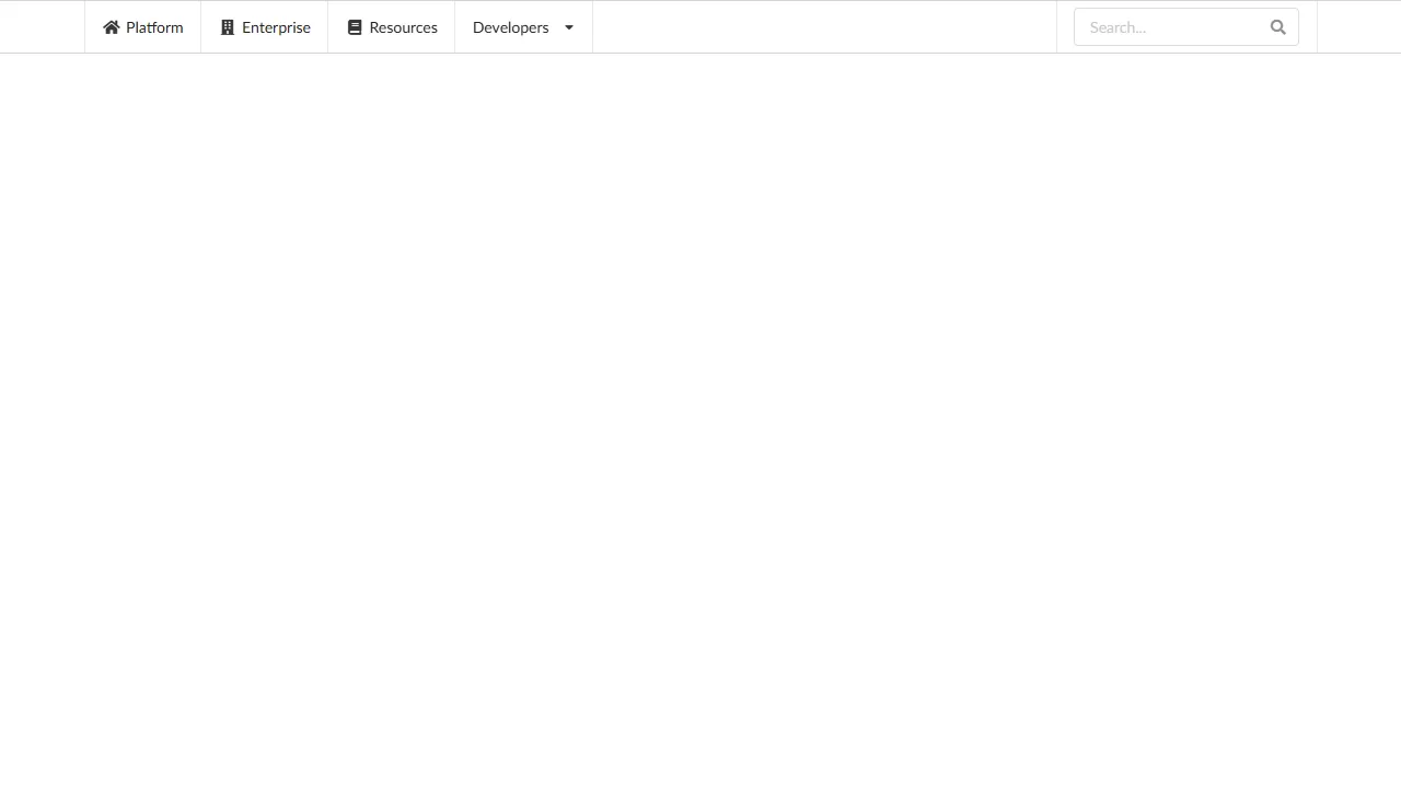
Its JavaScript modules, such as dropdowns, modals, and form validation, require jQuery 3 loaded before the Fomantic script. The simple dropdown in the example opens on hover with CSS alone.
<!DOCTYPE html>
<html lang="en">
<head>
  <meta charset="UTF-8" />
  <meta name="viewport" content="width=device-width, initial-scale=1.0" />
  <title>Fomantic UI menu</title>
  <link rel="stylesheet" href="https://cdn.jsdelivr.net/npm/fomantic-ui@2.9.4/dist/semantic.min.css" />
  <!-- Fomantic UI JavaScript modules need jQuery 3 loaded first -->
  <script src="https://cdn.jsdelivr.net/npm/jquery@3.7.1/dist/jquery.min.js"></script>
  <script src="https://cdn.jsdelivr.net/npm/fomantic-ui@2.9.4/dist/semantic.min.js"></script>
</head>
<body>
  <div class="ui attached stackable menu">
    <div class="ui container">
      <a class="item"><i class="home icon"></i> Platform</a>
      <a class="item"><i class="building icon"></i> Enterprise</a>
      <a class="item"><i class="book icon"></i> Resources</a>
      <div class="ui simple dropdown item">
        Developers <i class="dropdown icon"></i>
        <div class="menu">
          <a class="item"><i class="edit icon"></i> Blog</a>
          <a class="item"><i class="globe icon"></i> Documentation</a>
          <a class="item"><i class="cog icon"></i> API</a>
        </div>
      </div>
      <div class="right item">
        <div class="ui icon input"><input type="text" placeholder="Search..." /><i class="search icon"></i></div>
      </div>
    </div>
  </div>
</body>
</html>
Output:
- Strength - the maintained path for teams already on Semantic UI.
- Strength - a theming system that inherits from site-wide variables down to single components.
- Limitation - jQuery dependency for interactive components.
- Limitation - the full stylesheet is the largest in the comparison table.
15. Basscss
Basscss is a low-level utility library for margins, padding, typography scale, layout, and flexbox. Its latest release, 8.1.0, was published in May 2019, and the project has seen no meaningful development since.
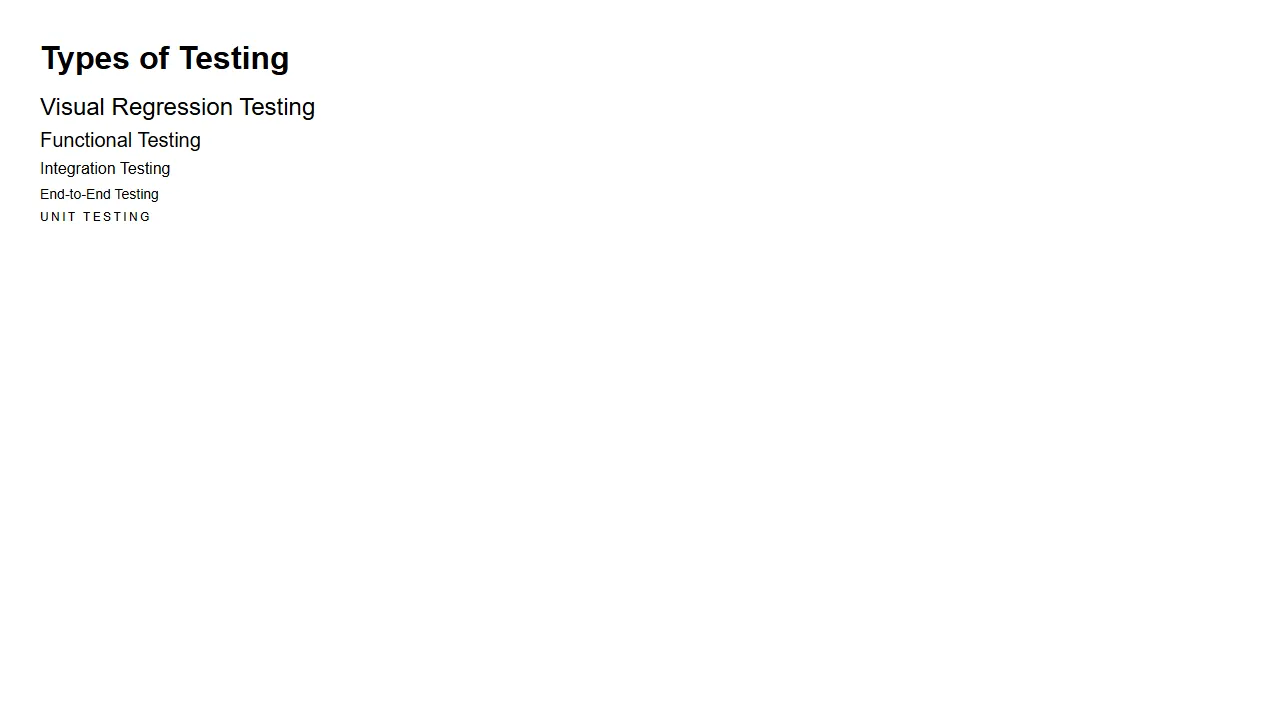
Basscss does not set a base font or reset element styles, which is why the example sets font-family itself. It remains a tiny option for adding spacing and type-scale utilities to an existing stylesheet.
<!DOCTYPE html>
<html lang="en">
<head>
  <meta charset="UTF-8" />
  <title>Basscss typography scale</title>
  <link rel="stylesheet" href="https://cdn.jsdelivr.net/npm/basscss@8.1.0/css/basscss.min.css" />
</head>
<body class="p3" style="font-family: sans-serif">
  <p class="h1 bold m0">Types of Testing</p>
  <p class="h2 mt2 mb1">Visual Regression Testing</p>
  <p class="h3 mt1 mb1">Functional Testing</p>
  <p class="h4 mt1 mb1">Integration Testing</p>
  <p class="h5 mt1 mb1">End-to-End Testing</p>
  <p class="h6 mt1 caps">Unit Testing</p>
</body>
</html>
Output:
- Strength - very small, composable utilities that do not conflict with an existing design.
- Limitation - no release since May 2019.
- Limitation - no components and no base styles.
16. Spectre.css
Spectre.css is a lightweight framework with a flexbox layout system, base typography, and pure CSS components such as modals, tabs, and cards. It never reached version 1.0: the latest release is 0.5.9 from July 2020.
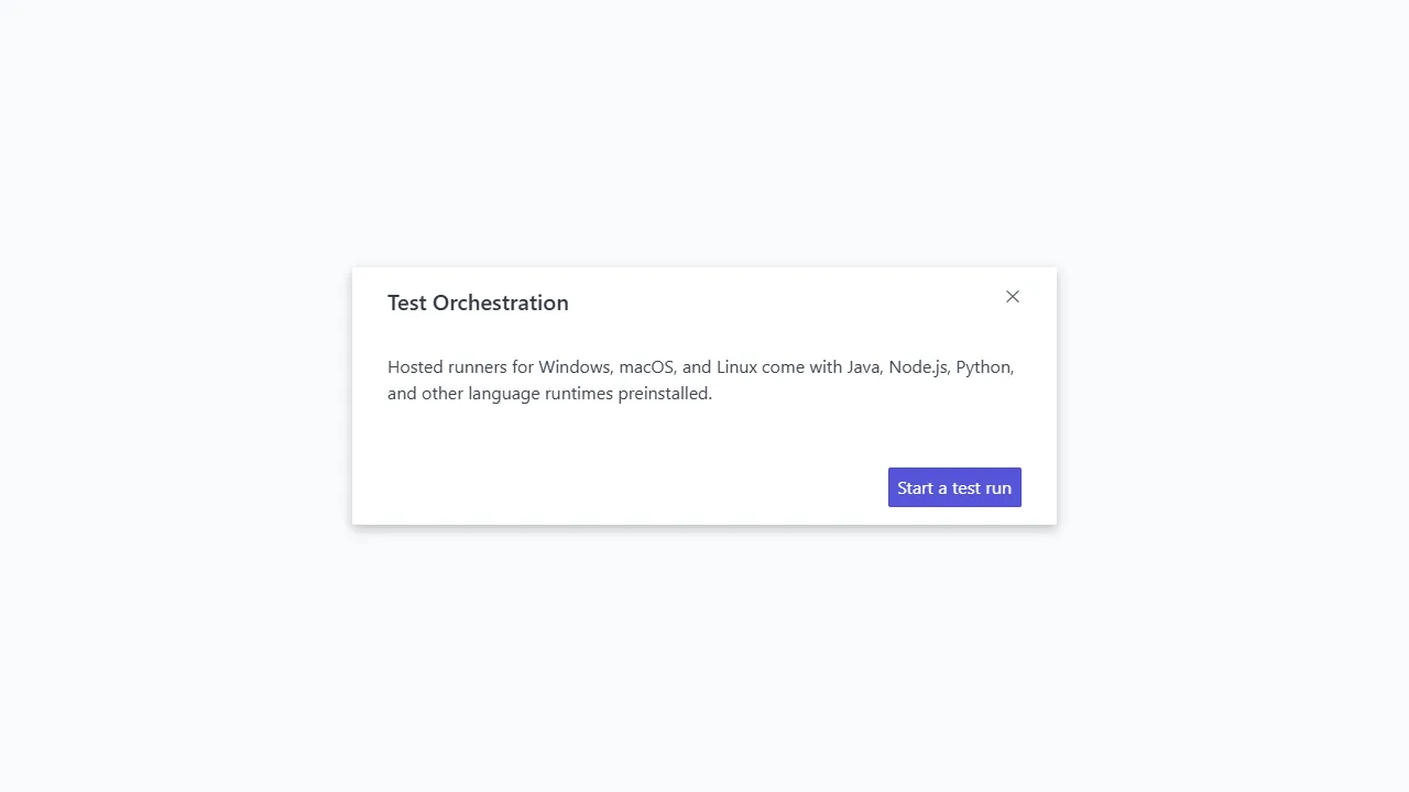
The modal in the example is shown with the active class; opening and closing it on click needs a few lines of your own JavaScript or a :target selector.
<!DOCTYPE html>
<html lang="en">
<head>
  <meta charset="UTF-8" />
  <title>Spectre.css modal</title>
  <link rel="stylesheet" href="https://cdn.jsdelivr.net/npm/spectre.css@0.5.9/dist/spectre.min.css" />
  <link rel="stylesheet" href="https://cdn.jsdelivr.net/npm/spectre.css@0.5.9/dist/spectre-icons.min.css" />
</head>
<body>
  <div class="modal active" id="modal-id">
    <a href="#close" class="modal-overlay" aria-label="Close"></a>
    <div class="modal-container">
      <div class="modal-header">
        <a href="#close" class="btn btn-clear float-right" aria-label="Close"></a>
        <div class="modal-title h5">Test Orchestration</div>
      </div>
      <div class="modal-body">
        <div class="content">
          <p>Hosted runners for Windows, macOS, and Linux come with Java, Node.js, Python, and other language runtimes preinstalled.</p>
        </div>
      </div>
      <div class="modal-footer">
        <button class="btn btn-primary">Start a test run</button>
      </div>
    </div>
  </div>
</body>
</html>
Output:
- Strength - a useful component set in a small stylesheet.
- Limitation - unmaintained since July 2020 and still pre-1.0.
- Limitation - written for modern browsers only.
17. Milligram
Milligram is a minimalist framework that styles typography, forms, buttons, tables, and a flexbox grid in a stylesheet of roughly 2 KB gzipped. Its source is organized as Sass partials, but it ships as one CSS file. The latest release, 1.4.1, was published in June 2020.
<!DOCTYPE html>
<html lang="en">
<head>
  <meta charset="UTF-8" />
  <title>Milligram landing page</title>
  <link rel="stylesheet" href="https://fonts.googleapis.com/css?family=Roboto:300,300italic,700,700italic" />
  <link rel="stylesheet" href="https://cdn.jsdelivr.net/npm/normalize.css@8.0.1/normalize.min.css" />
  <link rel="stylesheet" href="https://cdn.jsdelivr.net/npm/milligram@1.4.1/dist/milligram.min.css" />
</head>
<body>
  <div class="container" style="margin-top: 4rem">
    <div class="row">
      <div class="column column-60 column-offset-20">
        <h1>Run Selenium Tests in Parallel</h1>
        <p>Run your existing Selenium suite on a cloud grid, in parallel, without maintaining browsers or virtual machines.</p>
        <blockquote><p><em>Ship faster by testing every browser in the same build.</em></p></blockquote>
        <a class="button" href="#">Start testing</a>
        <a class="button button-outline" href="#">Read the docs</a>
      </div>
    </div>
  </div>
</body>
</html>
Output:
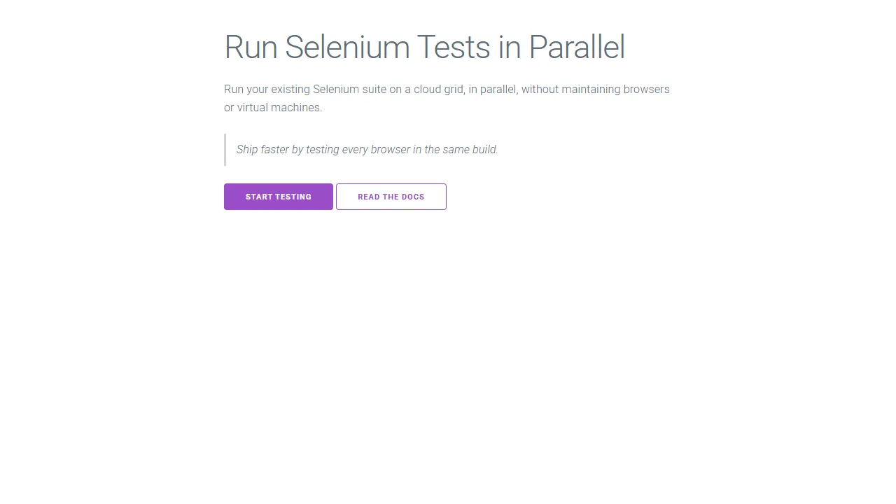
- Strength - clean typography defaults with almost no weight.
- Limitation - no release since June 2020.
- Limitation - few components, so menus, modals, and alerts are up to you.
18. MVP.css
MVP.css is a classless stylesheet: it styles header, nav, section, aside, forms, and tables directly, so a page written in semantic HTML looks finished without any classes. It is actively maintained, with version 1.18.0 published in September 2026.
<!DOCTYPE html>
<html lang="en">
<head>
<meta charset="utf-8" />
<meta name="viewport" content="width=device-width, initial-scale=1.0" />
<title>MVP.css starter</title>
<link rel="stylesheet" href="https://cdn.jsdelivr.net/npm/mvp.css@1.18.0/mvp.css" />
</head>
<body>
<!-- MVP.css is classless: it styles semantic elements directly -->
<header>
<nav>
<ul>
<li>Home</li>
<li><a href="#">Pricing</a></li>
<li><a href="#">Developers</a>
<ul>
<li><a href="#">Documentation</a></li>
<li><a href="#">API Reference</a></li>
</ul>
</li>
</ul>
</nav>
<h1>Test your <i>apps</i> on every browser</h1>
<p>Build a launch page in minutes with plain HTML.</p>
<p><a href="#"><i>Try it now</i></a><a href="#"><b>See features →</b></a></p>
</header>
<main>
<blockquote>Ship without the <mark>last-minute</mark> layout bugs.</blockquote>
</main>
<footer><hr /><p><small>Contact info</small></p></footer>
</body>
</html>Output:
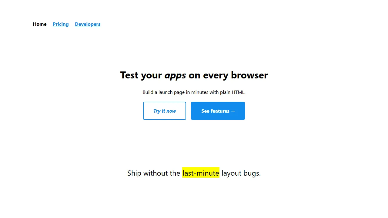
- Strength - zero classes to learn, and a very small stylesheet.
- Strength - colors and spacing are CSS variables you can override in one place.
- Limitation - layout control is limited to what semantic elements provide, so it suits launch pages and prototypes rather than full apps.
19. Chota
Chota is a micro framework with a grid, buttons, forms, cards, and tabs, themed through CSS variables. Its latest release, 0.9.2, was published in March 2023.
The previous version of this example loaded icons from icongr.am, an icon service whose domain no longer resolves, so the updated example drops the icons.
<!DOCTYPE html>
<html lang="en">
<head>
  <meta charset="UTF-8" />
  <meta name="viewport" content="width=device-width, initial-scale=1.0" />
  <title>Chota buttons</title>
  <link rel="stylesheet" href="https://cdn.jsdelivr.net/npm/chota@0.9.2/dist/chota.min.css" />
  <style>body { padding: 2rem; } .button { margin: 0.5rem; }</style>
</head>
<body>
  <a class="button">Default</a>
  <a class="button primary">Primary</a>
  <a class="button secondary">Secondary</a>
  <a class="button dark">Dark</a>
  <a class="button error">Error</a>
  <a class="button success">Success</a>
  <a class="button outline">Outline</a>
  <a class="button outline primary">Primary outline</a>
  <a class="button outline secondary">Secondary outline</a>
  <a class="button outline dark">Dark outline</a>
  <a class="button clear">Clear</a>
</body>
</html>
Output:
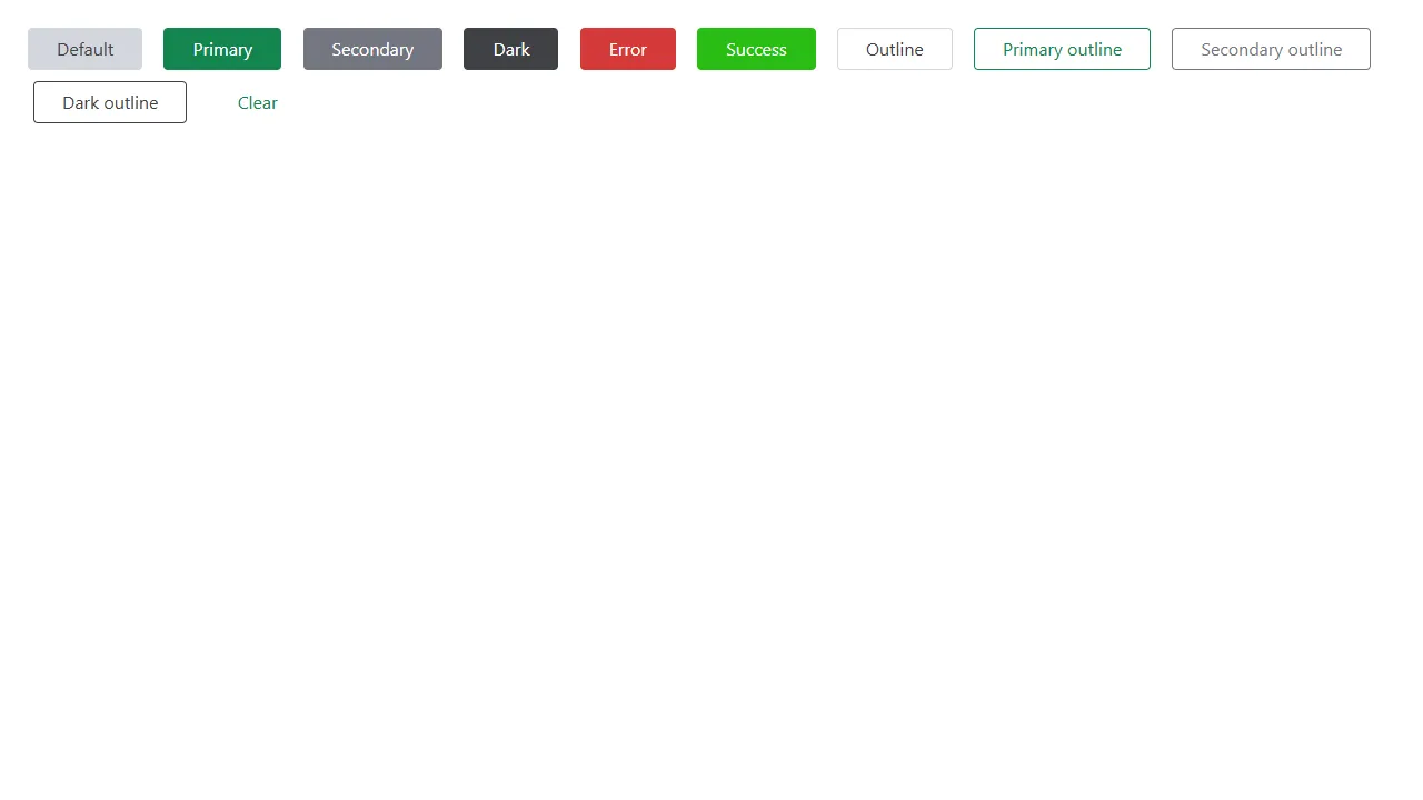
- Strength - small and easy to theme with CSS variables.
- Limitation - no release since March 2023 and a small community.
20. Picnic CSS
Picnic CSS is a lightweight library of buttons, forms, cards, and CSS-only interactive components: the tabs in the example switch panels with radio inputs and no JavaScript. Its latest release, 7.1.0, was published in January 2022.
<!DOCTYPE html>
<html lang="en">
<head>
  <meta charset="utf-8" />
  <meta name="viewport" content="width=device-width, initial-scale=1.0" />
  <title>Picnic CSS tabs</title>
  <link rel="stylesheet" href="https://cdn.jsdelivr.net/npm/picnic@7.1.0/picnic.min.css" />
</head>
<body>
  <!-- CSS-only tabs: radio inputs switch the visible panel -->
  <div class="tabs three">
    <input id="tab-1" type="radio" name="tabgroup" checked />
    <label class="pseudo button toggle" for="tab-1">Online Selenium Grid</label>
    <input id="tab-2" type="radio" name="tabgroup" />
    <label class="pseudo button toggle" for="tab-2">Real Device Cloud</label>
    <input id="tab-3" type="radio" name="tabgroup" />
    <label class="pseudo button toggle" for="tab-3">Cross Browser Testing</label>
    <div class="row">
      <div><img src="https://assets.testmuai.com/resources/images/selenium-parallel-testing-index.png" alt="Selenium grid" /></div>
      <div><img src="https://assets.testmuai.com/resources/images/mobile-app-testing.png" alt="Real device cloud" /></div>
      <div><img src="https://assets.testmuai.com/resources/images/real-time-browsers-index.png" alt="Cross browser testing" /></div>
    </div>
  </div>
</body>
</html>
Output:
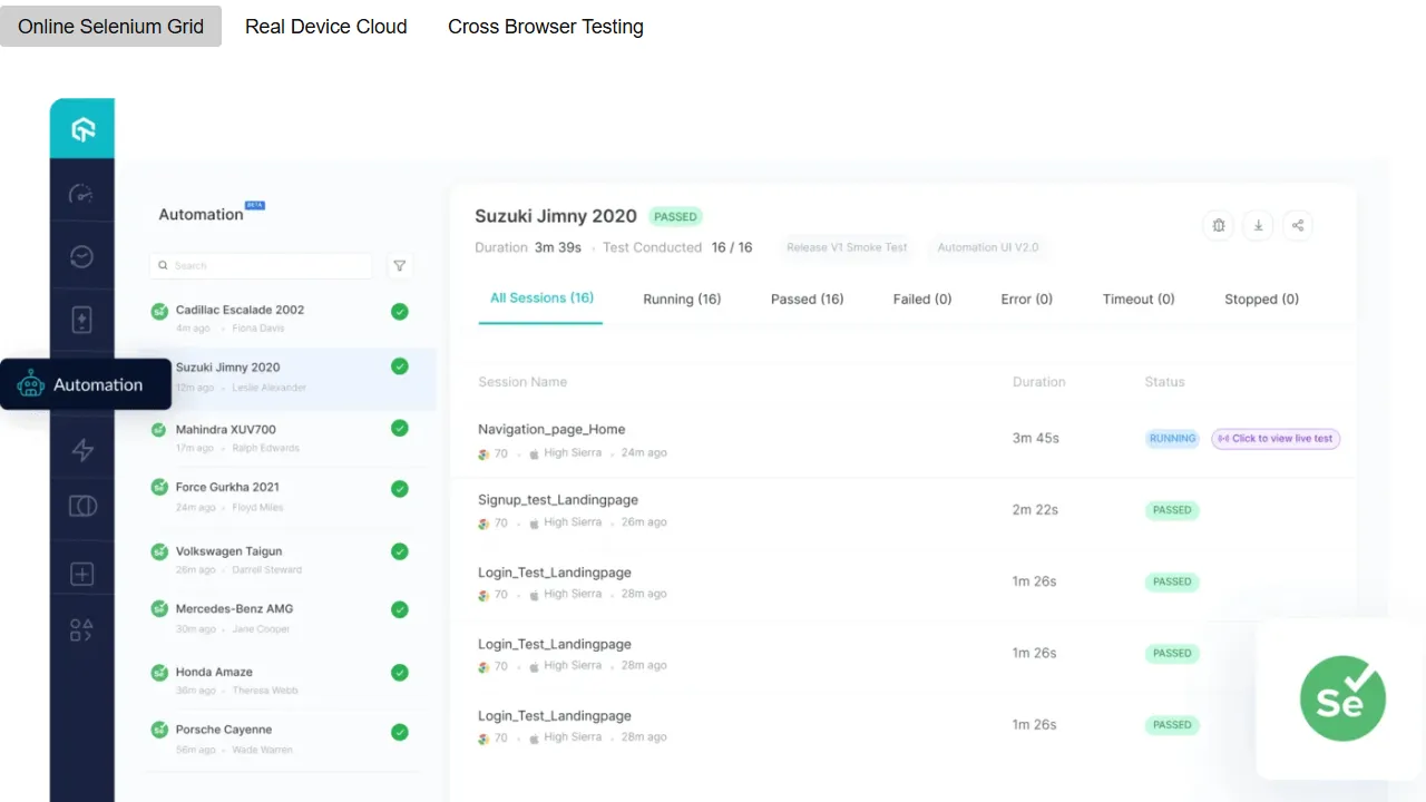
- Strength - tabs, modals, and dropdowns without JavaScript.
- Limitation - no library release since January 2022 and low adoption.
21. Halfmoon
Halfmoon version 2 is a drop-in replacement for Bootstrap's CSS: you swap bootstrap.css for halfmoon.css and keep Bootstrap's class names, components, and JavaScript bundle. It adds three core themes and dark mode for every component, built on CSS variables. The latest release, 2.0.2, was published in September 2024.
Version 2 is a complete rewrite. Code written for Halfmoon 1, such as the halfmoon.toggleDarkMode() call and its own form classes, does not work with it, which is why the previous Halfmoon example here rendered unstyled.
<!DOCTYPE html>
<html lang="en" data-bs-theme="light">
<head>
  <meta charset="utf-8" />
  <meta name="viewport" content="width=device-width, initial-scale=1" />
  <title>Halfmoon form with dark mode</title>
  <!-- Halfmoon 2 replaces bootstrap.css and uses Bootstrap class names -->
  <link rel="stylesheet" href="https://cdn.jsdelivr.net/npm/halfmoon@2.0.2/css/halfmoon.min.css" />
</head>
<body class="p-5">
  <div class="card" style="max-width: 420px">
    <div class="card-body">
      <div class="d-flex justify-content-between align-items-center mb-3">
        <h2 class="h5 mb-0">Request a demo</h2>
        <button id="theme-toggle" type="button" class="btn btn-secondary btn-sm">Toggle dark mode</button>
      </div>
      <form>
        <div class="mb-3"><label for="name" class="form-label">Name</label><input id="name" class="form-control" type="text" placeholder="Your full name" required /></div>
        <div class="mb-3"><label for="email" class="form-label">Email</label><input id="email" class="form-control" type="email" placeholder="Your email" required /></div>
        <div class="mb-3"><label for="company" class="form-label">Company</label><input id="company" class="form-control" type="text" placeholder="Your company" /></div>
        <button type="submit" class="btn btn-primary w-100">Submit</button>
      </form>
    </div>
  </div>
  <script>
    document.getElementById("theme-toggle").addEventListener("click", function () {
      var root = document.documentElement;
      root.setAttribute("data-bs-theme", root.getAttribute("data-bs-theme") === "dark" ? "light" : "dark");
    });
  </script>
  <!-- Halfmoon has no JavaScript of its own; interactive components use Bootstrap's bundle -->
  <script src="https://cdn.jsdelivr.net/npm/bootstrap@5.3.8/dist/js/bootstrap.bundle.min.js"></script>
</body>
</html>
Output:
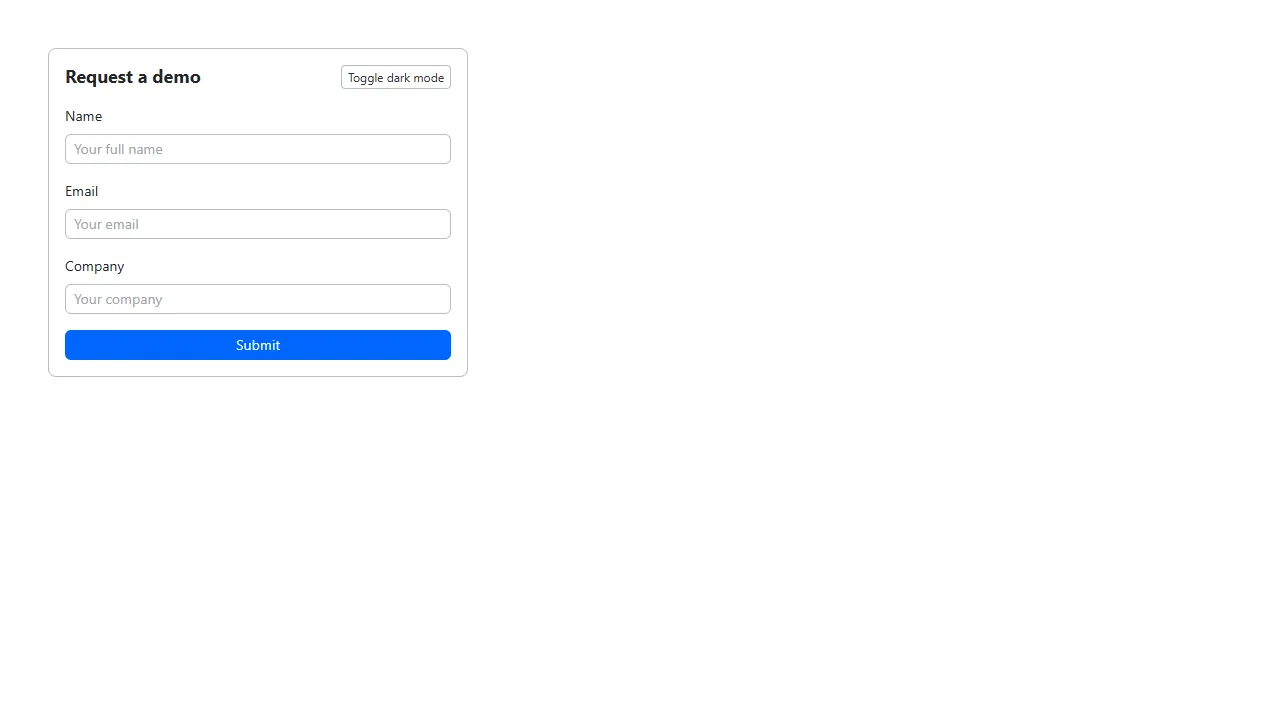
- Strength - Bootstrap markup and components with a different look and dark mode, without a rewrite.
- Limitation - no release since September 2024 and a small user base.
22. Sakura
Sakura is a classless stylesheet of about 1.3 KB gzipped that gives plain HTML readable typography, spacing, and form styles. It ships several color themes as separate files, and its README suggests loading normalize.css before it for more consistent defaults. Version 1.5.1 was published in June 2025.
<!DOCTYPE html>
<html lang="en">
<head>
  <meta charset="utf-8" />
  <meta name="viewport" content="width=device-width, initial-scale=1.0" />
  <title>Sakura classless page</title>
  <link rel="stylesheet" href="https://cdn.jsdelivr.net/npm/sakura.css@1.5.1/css/sakura.css" />
</head>
<body>
  <h1>TestMu AI</h1>
  <p>Sakura styles this page with no classes at all.</p>
  <blockquote>
    TestMu AI (formerly LambdaTest) is a cloud testing platform for manual and automated testing of websites and mobile apps.
  </blockquote>
  <h2>Why test in the cloud?</h2>
  <ul>
    <li>No browsers or devices to maintain</li>
    <li>Parallel runs in CI</li>
    <li>Screenshots and video for every test</li>
  </ul>
  <button>Start testing</button>
</body>
</html>
Output:
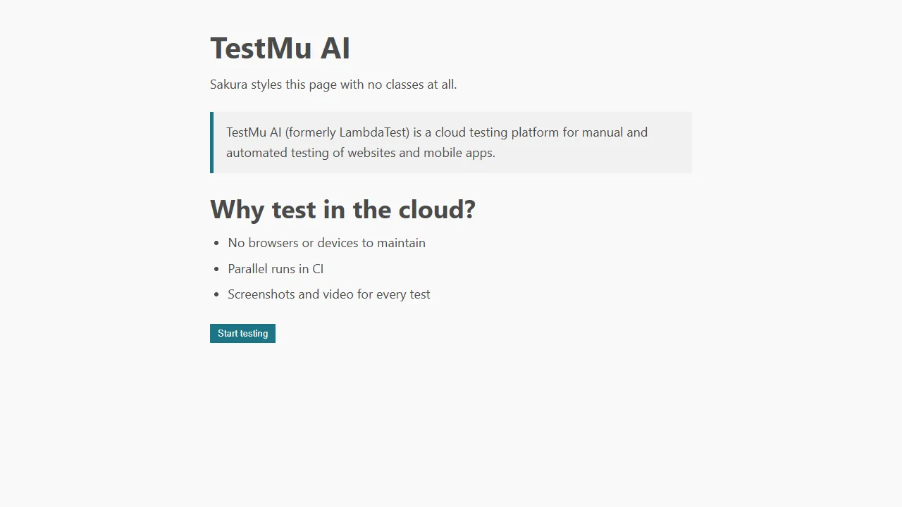
- Strength - the smallest stylesheet in the comparison table, with ready-made color themes.
- Limitation - built for text-first pages such as blogs and docs, not application interfaces.
23. Blaze UI
Blaze UI is a framework-agnostic toolkit made of a CSS package, @blaze/css, and a set of web components. Its class names follow an objects, components, and utilities split with o-, c-, and u- prefixes. The CSS package was last released as version 12.2.0 in September 2022.
Blaze UI's documentation still shows an x.x.x placeholder in its CDN link, so pin a real version, as the example does, before copying it into a project.
<!DOCTYPE html>
<html lang="en">
<head>
  <meta charset="UTF-8" />
  <meta name="viewport" content="width=device-width, initial-scale=1.0" />
  <title>Blaze UI login card</title>
  <link rel="stylesheet" href="https://cdn.jsdelivr.net/npm/@blaze/css@12.2.0/dist/blaze/blaze.css" />
  <style>body { font-family: sans-serif; padding-top: 2rem; }</style>
</head>
<body>
  <form class="o-container o-container--xsmall c-card u-high">
    <header class="c-card__header">
      <h2 class="c-heading">Login <div class="c-heading__sub">Existing users</div></h2>
    </header>
    <div class="c-card__body">
      <div class="o-form-element">
        <label class="c-label" for="email">Email</label>
        <input id="email" class="c-field c-field--label" type="email" placeholder="you@example.com" />
        <div role="tooltip" class="c-hint">The email used to register the account</div>
      </div>
      <div class="o-form-element">
        <label class="c-label" for="password">Password</label>
        <input id="password" class="c-field c-field--label" type="password" />
      </div>
      <label class="c-toggle c-toggle--success">
        Remember me?
        <input type="checkbox" checked />
        <div class="c-toggle__track"><div class="c-toggle__handle"></div></div>
      </label>
    </div>
    <footer class="c-card__footer">
      <button type="button" class="c-button c-button--brand c-button--block">Login</button>
    </footer>
  </form>
</body>
</html>
Output:
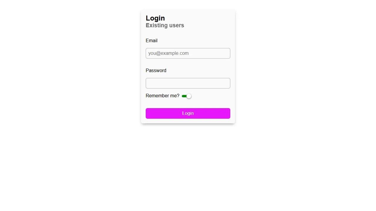
- Strength - prefixed classes that rarely collide with an existing stylesheet.
- Limitation - no release since 2022 and the lowest downloads in this list.
How to Choose the Right CSS Framework
Choose by how your team builds UI first, then rule out frameworks with no recent release or a stylesheet heavier than your pages can afford, and confirm the result renders the same in every browser your users run.
Skipping a framework is a common choice. In the State of CSS 2026 survey, 1,042 of the 3,697 developers who answered the frameworks question said they use no CSS framework, the second most common answer after Tailwind CSS with 1,854.
Before you pick one, check whether you need a framework at all. Native CSS grid, container queries, and cascade layers now cover much of what frameworks used to provide, and this comparison of CSS Grid layout vs CSS frameworks walks through when plain CSS is enough.
Match the Framework Type to Your Team
- Custom design system - Tailwind CSS or UnoCSS, because neither imposes a look.
- Working UI fast, with interactive components - Bootstrap, UIkit, or Foundation for existing version 6 projects.
- No JavaScript in the framework - Bulma, Pure CSS, or Pico CSS.
- React application - Ant Design, or Tailwind CSS classes written directly in JSX.
- Docs, blogs, and prototypes in plain HTML - Pico CSS, MVP.css, or Sakura.
Check Release Activity and Stylesheet Size
A framework with no release in several years will not get fixes for new browser bugs or security issues in its JavaScript. In the comparison table, Tachyons, Basscss, Spectre.css, Milligram, Picnic CSS, Semantic UI, Pure CSS, and Blaze UI all fall into that group, so use them only when their small size or existing code in your project outweighs that risk.
Size matters most on mobile connections. The gzipped column in the table is what users download; if a full component framework is too heavy, these lightweight CSS frameworks are the smaller alternatives.
Test the Rendering Across Browsers
Framework CSS is written once but rendered by different engines, and flexbox gaps, form controls, and font rendering still differ between Chrome, Firefox, and Safari. These CSS browser compatibility issues are where framework layouts break most often.
For manual checks, TestMu AI's Real-Time Testing opens your page on 3,000+ browser and OS combinations with DevTools built into each session. The desktop browser testing guide covers starting your first session.
Framework upgrades are the riskier moment. A change such as Tailwind CSS 3 to 4 or Bulma 0.9 to 1.0 alters rendering across every component at once, which is what visual regression testing is built to catch.
TestMu AI's SmartUI captures screenshots in Chrome, Firefox, Safari, and Edge in one run, compares them with an approved baseline, and uses Smart Ignore to filter anti-aliasing and font-rendering noise, which reduces false positives by up to 95%.
SmartUI's Storybook integration captures every component story, so a change to a shared button shows up once at the component level instead of on dozens of pages.
For breakpoints, responsive testing across phone, tablet, and desktop viewports confirms that the framework's grid collapses the way its documentation says.
Check Accessibility Defaults
Frameworks set focus styles, color contrast, and the markup of interactive components for you, so their defaults become your defaults. Check that buttons and links show a visible focus ring, that the default palette meets WCAG contrast, and that menus and modals work with a keyboard alone.
Automated scans catch contrast and missing labels, while screen readers such as NVDA on Windows and VoiceOver on macOS show how components are announced. This guide to accessibility testing covers both, and the Accessibility DevTools extension runs Axe-core scans on any page in Chrome.

Conclusion
Shortlist two frameworks from the comparison table, build the same page with each using the examples above, and compare the rendered output in Chrome, Firefox, Safari, and Edge before you commit. TestMu AI SmartUI turns that comparison into a repeatable check for every future upgrade, and the SmartUI visual regression docs walk through setting up your first project.
Author

Adarsh M
Blogs: 11


Adarsh Gupta is a Software Engineer at TCS with over 3 years of hands-on experience in full stack web development. He specializes in technologies like React, React Native, Java, and Spring Boot, and holds a B.Tech in Computer Science. Based in India, Adarsh also builds in public and shares practical tech insights with a large online audience including 35K+ followers on Twitter and 14K+ on Medium. His content focuses on frontend development, backend systems, and real-world engineering problems. Initially focused on just getting things to work, Adarsh now prioritizes writing clean, maintainable, and scalable code to deliver long-term value in software projects.
Reviewer

Shubham Suri
Reviewer
Shubham Suri is a Lead Member of Technical Staff at TestMu AI, building the frontend and web interfaces of the quality engineering platform. He works across React.js, HTML5, CSS3, Bootstrap, jQuery, JavaScript, and Angular to create and maintain webpages and web applications. He brings around a decade of experience in web and frontend development, with earlier roles as a Software Engineer at Hard Shell Technologies and an IT Analyst at Cyrus Group. Shubham holds a B.Tech in Computer Science from Uttar Pradesh Technical University.


CSS Frameworks FAQs
Did you find this page helpful?
More Related Blogs

TestMu AI forEnterprise
Get access to solutions built on Enterprise
grade security, privacy, & compliance
- Advanced access controls
- Advanced data retention rules
- Advanced Local Testing
- Premium Support options
- Early access to beta features
- Private Slack Channel
- Unlimited Manual Accessibility DevTools Tests