

Power Your Software Testing with AI Agents and Cloud
The Native AI-Agentic Cloud Platform to Supercharge Quality Engineering. Test Intelligently and Ship Faster.


- TestMu AI (Formerly LambdaTest)
- /
- Blog
- /
- CSS Grid vs. Bootstrap: All You Need To Know
CSS Grid vs. Bootstrap: All You Need To Know
This blog will discuss and compare two major layout patterns/ways to place elements on a page, i.e., CSS Grid vs. Bootstrap.
Last Updated on:
CSS Grid vs. Bootstrap comes down to control versus speed. CSS Grid is a native CSS layout module and Bootstrap's grid is a Flexbox wrapper built from predefined classes.
CSS Grid positions items on rows and columns at the same time and needs no library import. Bootstrap distributes items across a 12-column row, one axis at a time.
This guide covers the base for comparison, the detailed comparison, the similarities, browser support, and what changed since Bootstrap 5.
New to CSS Selectors? Check out this Ultimate CSS Selector cheat sheet to boost your web designing career.
Key Takeaways
- CSS Grid is a native CSS layout module that controls row and column placement at the same time, without any library import.
- The Bootstrap grid is a Flexbox wrapper that spreads items across a 12-column row, giving control along one axis at a time.
- Bootstrap 5.1 added an opt-in CSS Grid mode, switched on with the Sass flag $enable-cssgrid, that replaces .row and .col-* with .grid and .g-col-*.
- Bootstrap ships six responsive grid tiers, from extra small below 576px through to xxl at 1400px and above.
- Container queries size a component from its own container rather than the viewport, which removes a common reason to reach for Bootstrap breakpoint classes.
- Choose CSS Grid for precise two-dimensional placement and Bootstrap when ready-made responsive classes and prebuilt components save more time than they cost.
CSS Grid vs. Bootstrap: The base for comparison
CSS Grid is mostly used where we are more rigid about the layout and want our content to flow on the page as per the desired layout. CSS Grid was inspired by print-based ’id.’ whereas, Bootstrap’s grid system is based on the CSS Flexbox layout system. Bootstrap directly competes with CSS Grid, drawing a strong comparison with the grid layout system of CSS Grid.
In the following sections of this blog, we will try to draw some strong comparisons between CSS Grid and Bootstrap’s wrapper on Flexbox. Any reference to Bootstrap refers to the Grid system used in Bootstrap (which is based on Flexbox).
So as a general rule ‘content out’ is for Bootstrap and ‘layout in’ is for CSS Grid.
If we want to control the layout in either row or column direction, then we should go for Bootstrap’s Flexbox-based grid. On the other hand, you should opt for CSS Grid if you want layout control on both row and column.
Now perform live interactive Bootstrap testing of your websites on the TestMu AI platform.

CSS Grid vs. Bootstrap: Detailed Comparison
Mostly the debate to choose between the Bootstrap and CSS Grid layout starts with discussing the number of axis users can control for the content while working with the layout.
What is a CSS Grid?
CSS Grid is a layout mechanism that ensures the static structure of a website or app remains functional and usable. It comprises rows and columns to create ordered columns and rows consisting of cells. In CSS Grid, the content can be controlled in row and column directions (i.e. in 2D direction).
The CSS Grid Layout module allows developers to create grid-based layouts where items position themselves automatically within the grid container with a flexible sizing algorithm. The auto-placement algorithm distributes items efficiently by utilizing available space, balancing the amount of space consumed by the content, and packing items as tightly as possible. This approach facilitates responsiveness in the website (or web application).
The goal of a responsive website is to provide an optimal viewing experience–easy reading and navigation with a minimum of resizing, panning, and scrolling–across a wide range of devices (from desktops to mobile phones). Now, you can test your websites or web app on Android and iOS screen sizes with this free responsive design checker called LT Browser.
LT Browser comes with a host of features that enhance your testing experience and provide a comfortable environment for responsive design like the developer tools.

If you are new to LT Browser, refer to our LT Browser tutorial to get started with responsive testing.

What is a Bootstrap Grid?
Bootstrap is a free and open-source HTML, CSS, and JavaScript toolkit for developing simple to use web components. The powerful grid system allows any designer/developer to implement a wide range of layouts in a simplified manner.
The Bootstrap Grid system is built on a twelve-column layout that is responsive and super flexible. It can be used to create anything from simple content pages to complex landing pages. In addition, the module system built with Flexbox in mind allows developers to create layouts that respond to different screen sizes.
Now perform live interactive Bootstrap testing of your websites on the TestMu AI platform.
How do CSS Grid and Bootstrap Grid work?
CSS Grid divides the website space into rows and columns, which can be allocated in fixed-width by specifying the pixels or the fraction (using fr) of the available space to be allocated to a designated section. With CSS Grid, you create flexible layouts that work on any screen size.
In Flexbox or the Bootstrap Grid system, the control is in 1 dimension only, i.e., the parent row or the flex line is the direction in which the items can be controlled, and the space distribution happens across the flex line (the row). Here, each new row is a new flex line in the flex container.
1D control in Flexbox
HTML
<div class="wrapper">
   <div>One</div>
   <div>Two</div>
   <div>Three</div>
   <div>Four</div>
   <div>Five</div>
</div>
CSS
.wrapper {
	width: 500px;
	display: flex;
	flex-wrap: wrap;
}

.wrapper>div {
	flex: 1 1 150px;
}
OUTPUT
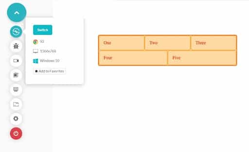
In the above code, the child divs are adjusted on the screen as per the screen size. If we reduce the screen size, the content will flow to the next flex line as we have set the flex-wrap as ‘wrap.’ So, if we want the elements to line up, then we want 2D dimensional control, which CSS Grid gives. Here we can tell how many max elements can be there in a row, and those won’t become less as we squeeze the screen. This can also be controlled by using the auto-flow option in CSS Grid.
2D control in CSS Grid
HTML
CSS
.wrapper {
	display: grid;
	grid-template-columns: repeat(3, 1fr);
}
OUTPUT
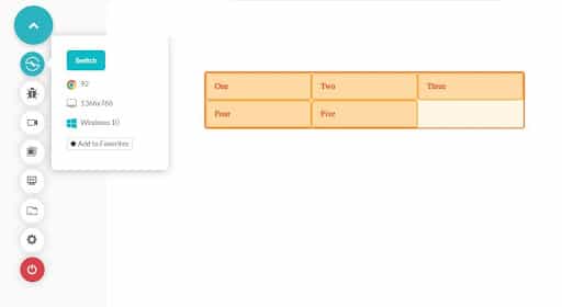
If we want to place the content precisely on a page, then CSS Grid is better, but if we want the flexibility of the layout, then we should go for Bootstrap. In Bootstrap, it is hard to predict the behavior at certain breakpoints or viewports, and the user might end up getting unexpected layout results (maybe that is the tradeoff with the flexibility one gets with Flexbox layout).
CSS Grid also helps in making unusual, asymmetric, and overlapping contents. We can surely use z-index in Bootstrap to place overlapping content. However, it is a bit difficult to control the asymmetry and overlapping of contents using Bootstrap. In CSS Grid, we can control each overlapping content’s start and end column and create specific layout designs.
CSS Grid uses ‘fr’ (fractional unit, one unit of available screen space) to define the space limits each grid row element should take (as shown in the above example). On the other hand, Bootstrap uses the column system in its grid to define the space each column would take in a row.
Bootstrap can accommodate a maximum of 12 columns in a row, and those can be combined too as per viewports to give a finer control to the end-user experience. Finally, we will discuss specific examples to make things clearer about the grid system.
Both CSS Grid and Bootstrap give the user responsive designs. But CSS Grid does not have predefined grid breakpoints, whereas Bootstrap has predefined breakpoints based on the min-width media queries. This means that they apply to that breakpoint and all the ones above it.
- Bootstrap’s responsive breakpoints are as follows:
- Width < 576 px are referred as extra small (xs)
- Width >= 576 px as small (sm)
- Width >= 768 px as medium (md)
- Width >= 992 px as large (lg)
- Width >= 1200 px as extra large (xl)
- Width >= 1400 px as extra extra large (xxl)
- Grid tiers can be updated (the number and the width breakpoints) by changing the values of the properties $grid-breakpoints and $container-max-widths in Bootstrap’s sass files.
- Width < 576 px are referred as extra small (xs)
- Width >= 576 px as small (sm)
- Width >= 768 px as medium (md)
- Width >= 992 px as large (lg)
- Width >= 1200 px as extra large (xl)
- Width >= 1400 px as extra extra large (xxl)
Column system and grid breakpoints in Bootstrap
col-* are used for extra small screens col-sm-* used for small screens col-md-* used for medium screens col-lg-* used for large screens col-xl-* used for extra-large screens col-xxl-* used for extra extra large screens
<div class="row">
   <div class="col-12 col-md-8">.col-12 .col-md-8</div>
   <div class="col-6 col-md-4">.col-6 .col-md-4</div>
</div>
<div class="row">
   <div class="col-6 col-md-4">.col-6 .col-md-4</div>
   <div class="col-6 col-md-4">.col-6 .col-md-4</div>
   <div class="col-6 col-md-4">.col-6 .col-md-4</div>
</div>
<div class="row">
   <div class="col-6">.col-6</div>
   <div class="col-6">.col-6</div>
</div>
Output in medium screen

Output in small screen
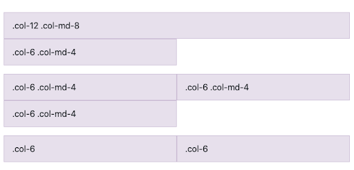
In Bootstrap, the column width is always specified in percentage relative to the flex container. Whereas in CSS Grid, either the content is allowed to use up space as per its requirement, or the use of ‘fr’ (fractional unit) is done to control the number of min-max columns placed in a row.
CSS Grid is generally used when the maths for placing the items on the page is too much in Flexbox or Bootstrap. It can be applied in scenarios where we end up using calc() for controlling the width or height of the elements in our Bootstrap grid’s items. In that case, we should always consider using CSS Grid, mainly because CSS Grid gives us more control. Secondly, we are giving away the flexibility of flexboxes if we are fine controlling the placement of elements. CSS Grid gives us finer control over the elements by using functions like minmax() and fractional units. Algorithmic layouts are mostly achieved using CSS Grid.
Bootstrap is a framework for frontend design, whereas CSS Grid is a native module of CSS, so no additional module import is required for them. This saves the project build time and minimizes the bundle size. So the use of CSS Grid might also show gains in the speed and response time of the website.
For achieving the same goal or layout, we might end up writing more markup in the case of Bootstrap as compared to CSS Grid. To make the design responsive and tailor-made for different viewports, we have to explicitly take care of the different grid sizes. In the case of CSS Grid, we can control this behavior by using algorithmic layouts, which requires a lot less code or markup.
CSS Grid vs. Bootstrap: Similarities
Apart from all the differences between the CSS Grid layout and Bootstrap’s flexbox-based layout system, there are some similarities too between them.
- Both the system allows us to order the grid items explicitly, and the source order of the grid items does not matter.
- We can use keywords for justify-item/self-*, align-item/self-* to control the alignment of grid items in a row and the column cell (column inside the gridline).
CSS Grid vs. Bootstrap: Browser Support and Compatibility
The greatest barrier that the CSS Grid faced in gaining widespread popularity was poor cross browser compatibility. Until 2017, CSS Grid was only supported by Google Chrome and Firefox, while Internet Explorer, Microsoft Edge, Opera, and even Safari did not provide browser support for the CSS Grid.
That gap has closed. CSS Grid and Flexbox both work in current Chrome, Edge, Firefox, Safari, and Opera on desktop and mobile, so browser support is no longer a reason to choose one layout system over the other.
The browser support tables for css grid browser compatibility and css grid browser compatibility carry the per-version detail. Test the finished layout across those engines the way you would test any browser compatible website.

What Has Changed in CSS Grid and Bootstrap Since Bootstrap 5?
Bootstrap now ships its own CSS Grid mode, and CSS Grid itself has gained subgrid and container queries across every major browser engine. Five changes matter for this comparison.
- Opt-in CSS Grid in Bootstrap: setting $enable-cssgrid: true and $enable-grid-classes: false swaps .row and .col-* for .grid and .g-col-*, which compile to real CSS Grid. Bootstrap 5.1 added the mode.
- --bs-columns and --bs-gap: that grid mode reads its track count and gutter from CSS variables, defaulting to 12 columns and a 1.5rem gap, so one section can use a different column count without a Sass rebuild.
- The xxl breakpoint: Bootstrap 5 added a sixth grid tier at 1400px, so col-xxl-* now sits above xs, sm, md, lg, and xl.
- Subgrid: a nested grid set to grid-template-columns: subgrid inherits its parent tracks, so card contents align across the outer grid instead of only inside each card.
- Container queries: the @container rule sizes a component from its container width rather than the viewport, which changes common layout ideas for web pages that previously keyed off breakpoints alone.
The practical effect is that CSS Grid vs. Bootstrap is no longer native CSS against one of the best CSS frameworks. Bootstrap can compile its own grid to CSS Grid, so the decision turns on the components, utilities, and defaults you want alongside the layout.
Conclusion
The choice for the grid layout for your webpage depends on the way we want our content or layout to be prioritized. We can surely choose one of them for our implementations, but having said that, the combination of both CSS Grid and Bootstrap can also help the user create some awesome-looking layouts. You can test the applicability and look and feel of your web page’s layout by analyzing and testing the web pages on cross browser testing tools like TestMu AI.
Please let us know in the comments if you have any questions or want to discuss any concept in detail.
Author

Antariksh Goyal
Blogs: 1

Antariksh Goyal is a community contributor with 9+ years of experience in building and scaling backend systems and enterprise services. Currently an Engineering Manager at Nykaa, he leads teams responsible for inventory, warehouse allocation, and delivery estimation platforms, overseeing end-to-end delivery from requirements to production. Antariksh has previously contributed as a technical blogger, sharing insights on data systems and engineering practices, and holds a Bachelor’s degree in Computer Science.


CSS Grid vs. Bootstrap FAQs
Did you find this page helpful?
More Related Blogs
TestMu AI forEnterprise
Get access to solutions built on Enterprise
grade security, privacy, & compliance
- Advanced access controls
- Advanced data retention rules
- Advanced Local Testing
- Premium Support options
- Early access to beta features
- Private Slack Channel
- Unlimited Manual Accessibility DevTools Tests