

Power Your Software Testing with AI Agents and Cloud
The Native AI-Agentic Cloud Platform to Supercharge Quality Engineering. Test Intelligently and Ship Faster.


- TestMu AI (Formerly LambdaTest)
- /
- Blog
- /
- A Beginner's Guide To Foundation Testing
A Beginner’s Guide To Foundation Testing
In this guide, explore the Foundation framework, building responsive websites using it, and how to perform Foundation testing of websites.
Last Updated on:
On This Page
- What is the Foundation Framework?
- Why do you need Foundation Framework?
- Bootstrap vs. Foundation
- Foundation Changes Since Version 6
- How to develop a web application in Foundation?
- How to develop an email in Foundation?
- Introduction to Foundation Testing
- Unleashing the power of Foundation Testing with TestMu AI
Foundation testing checks that sites and emails built with the Foundation framework keep their responsive design, grids and components working across browsers, devices and email clients. Its XY grid, UI components and Inky email templates can each break in a different browser, screen size or inbox.
This guide covers what Foundation is, why teams use it, how it compares with Bootstrap, what has changed since version 6, how to build a web page and an email with it, and how to test both.
Key Takeaways
- Foundation is an open-source, responsive front-end framework for building mobile-first websites and HTML emails.
- The Foundation XY grid uses the grid-x class for rows and the cell class for columns, so the grid axis stays explicit in the markup.
- Foundation for Emails uses the Inky templating language, which converts short tags such as row and columns into the nested table markup that email clients need.
- Foundation 6 continues on its own v6 branch, while the main Foundation repository now builds Yeti, a CSS-first, zero-build framework at version 7.0.0-beta.
- The Foundation framework test suite uses Mocha, Chai and Sinon for JavaScript unit tests and True for Sass unit tests.
- Foundation emails need rendering and spam-folder checks across email clients, while Foundation web apps need visual regression and cross browser testing.
What is the Foundation Framework?
The Foundation framework is an open-source responsive front-end framework that helps developers build beautiful user interfaces with the help of standard styling web technologies like CSS.
Like any other front-end framework, the Foundation framework relies on delivery components constructed beforehand and ready to be directly used on the web page. For example, this simple line of code can put down a red colored button on the web page without any additional work:
<button type="button" class="alert button">Alert!!</button>
While this is something that a developer would expect from a front-end framework, the Foundation framework presents a unique proposition in the email department.
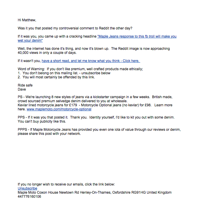
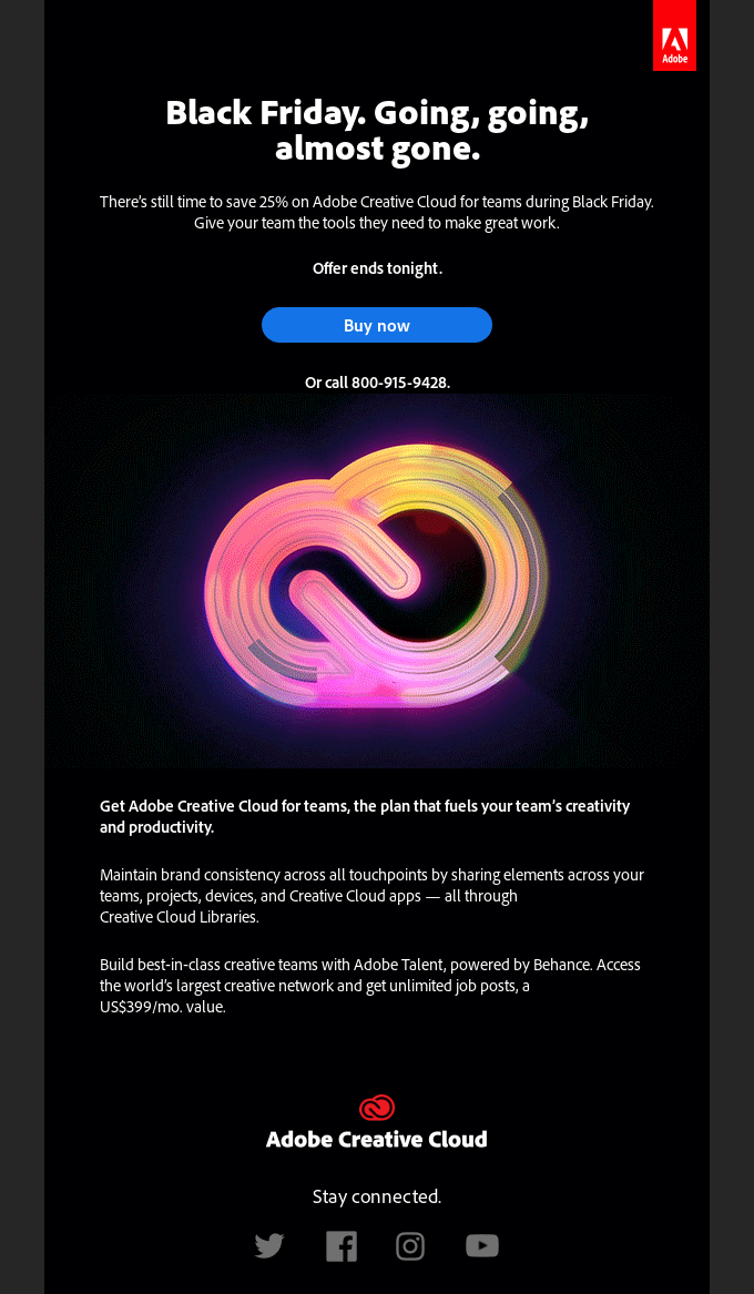
Emails are getting exciting day by day, presenting newer elements and a lot more comfort than before. Today, emails may contain all the information we had to navigate to multiple web pages. Not only in functionality, but emails have also gotten prettier this time.
Consider these two email templates:
The older one:
The newer one:
The best thing about using the Foundation framework for emails is that all the powerful concepts of a web page, such as CSS Grids, standard stylings, and buttons, can be used along with the emails.
The Foundation framework also provides building blocks and open-source templates to get you ready in a few seconds. This is tempting and invites us to try the Foundation framework once. However, one question may pop up here – do we need to know about another front-end framework that may at first resemble Bootstrap? The answer is yes. While Bootstrap has its own place in web dev, we need to know about the Foundation framework to compare the two and make the best choice for the project. The next section of this Foundation testing explores this area.

Why do you need Foundation Framework?
When using the Foundation framework for web development, we opt for the following benefits:
- The framework is responsive, so the developers do not need to worry about the presentation of web applications on multiple devices.
- Foundation provides a do-it-yourself design by which each developer may need to customize the CSS elements on the page. Through this, any two developers may create a vastly different web page even if they use the same elements with few customizations.
- The Foundation framework focuses a lot on grids, which are an essential part of a web page. The developer gets the flexibility of use with Foundation grids, such as with the “collapse” class to collapse the grid with a single line of code.
- If you use Foundation, you are promoting the mobile first design – a strategy on which the development will automatically take place in this.
- The Foundation framework comes with ready-made widgets that can directly be extended to the page easily.
- A few common interactive elements can be developed without using JavaScript.
- The Foundation framework comes in-built with optimization features for elements such as animations and transitions that take heavy bandwidth and increase the load time.
- The framework comes with various tools that help the developers code faster than other frameworks. This includes a command-line approach for working on Foundation projects.
- Foundation provides multilingual support for websites written in languages other than English, including “right-to-left” languages.
- Since an organization developed the Foundation framework, there is a dedicated team to help the developers. This is not possible with open-source tools.
- Major organizations like Disney and Cisco use a Foundation framework that makes it reliable and scalable.

Note: Test your Foundation CSS websites on a real device cloud. Try TestMu AI Now!
Bootstrap vs. Foundation
Bootstrap is one of the most popular front-end web development framework choices because of its wide adoption and open-source nature. The first thing that may come to your mind when you hear a new framework is how does Foundation stand with Bootstrap?
The following table helps in the same comparison:
| Parameter | Bootstrap | Foundation |
|---|---|---|
| Customization | Bootstrap gives more ready-to-use components. | Foundation provides more flat elements that can be highly customized. |
| Learning curve | Since elements can be directly picked up, the learning curve is smooth. | Foundation can be a bit on the higher side of learning as it demands more input from developers. |
| CSS used | Reboot CSS. | Normalize CSS. |
| Documentation | Bootstrap has great and much more detailed documentation than Foundation. | Foundation does not impress much on its documentation. |
| Community | Bootstrap has a reasonably large support and community. | The Foundation framework community is not as large as Bootstrap. |
| Preprocessor used | Less as well as Sass. | Only Sass is used. |
| Customization | Bootstrap gives more ready-to-use components. | Foundation provides more flat elements that can be highly customized. |
| Learning curve | Since elements can be directly picked up, the learning curve is smooth. Foundation | Foundation provides more flat elements that can be highly customized. Foundation can be a bit on the higher side of learning as it demands more input from developers. |
| Grid system | Bootstrap grid system is not flexible and customizable as Foundation. | Foundation is trendy for its grid system and ability to implement it in many ways. |
| Lightweight comparison | Heavier than Foundation | Foundation is much more lightweight than Bootstrap. |
The table highlights that both frameworks have their presence and come with their features. Declaring one as superior to the other is not possible with such contrasting elements. With this theoretical knowledge, we need to shift our focus to development now and compare this process with the development process of other frameworks.
What Has Changed in Foundation Since Version 6?
The Foundation repository now builds Yeti, a CSS-first, zero-build framework at version 7.0.0-beta, while Foundation 6 continues on a separate v6 branch. Check which version a site uses before you plan its tests.
- Yeti 7.0.0-beta: The Yeti repository on GitHub describes Yeti as a CSS-first, native, zero-build layout and styling framework for web designers.
- Foundation 6 on npm: Version 6 continues on the v6 branch, and the foundation-sites package on npm keeps publishing 6.x releases from that branch.
- Zero-build setup: Yeti needs no Sass, no Node and no bundler, so a Yeti page can link the unbuilt source directly and has no compile step to test.
- Baseline 2025 target: Yeti targets Baseline 2025, so run cross browser tests on the browser versions your users actually have, not only the latest releases.
- Foundation 6 test plan: A Foundation 6 site loads jQuery and the Foundation JavaScript plugins, so JavaScript unit tests, Sass unit tests and visual regression tests still apply.
- Beta version pinning: Yeti is still a beta, so pin the exact version in a project and re-run visual regression tests after every upgrade.
The steps in this guide use Foundation 6, which the foundation-sites npm package still publishes.
How to develop a web application in Foundation?
While this blog focuses on the Foundation testing of websites, as a tester, it is important to know the elements involved in the development. Unless we are familiar with associated elements, we may not be able to explore unique scenarios about the Foundation framework.
- To start the development, first, install the Foundation framework.
- Click the Download Foundation 6 button to download the CSS as a compressed file.
- Extract the compressed CSS file to reveal the contents.
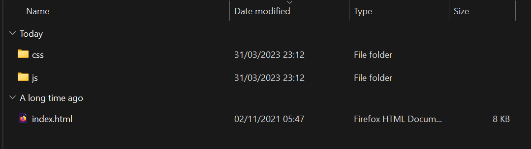
The compressed file has three components:
- CSS – The CSS folder contains the CSS part of the Foundation framework, including the app.css file, which the developer can alter according to the requirement. Including it, this folder contains three files:
- app.css
- foundation.css
- foundation.min.css
- JS – The JavaScript part of the framework is provided in the js folder. This folder has the following files:
- app.js
- foundation.js
- foundation.min.js
- what-input.js
- jquery.js
- index.html – This is the ready-made web page provided by Foundation. Since they focus a lot on the grids and their ability to offer a flexible grid system, this page will show off their strengths that can be altered and played around by beginners.
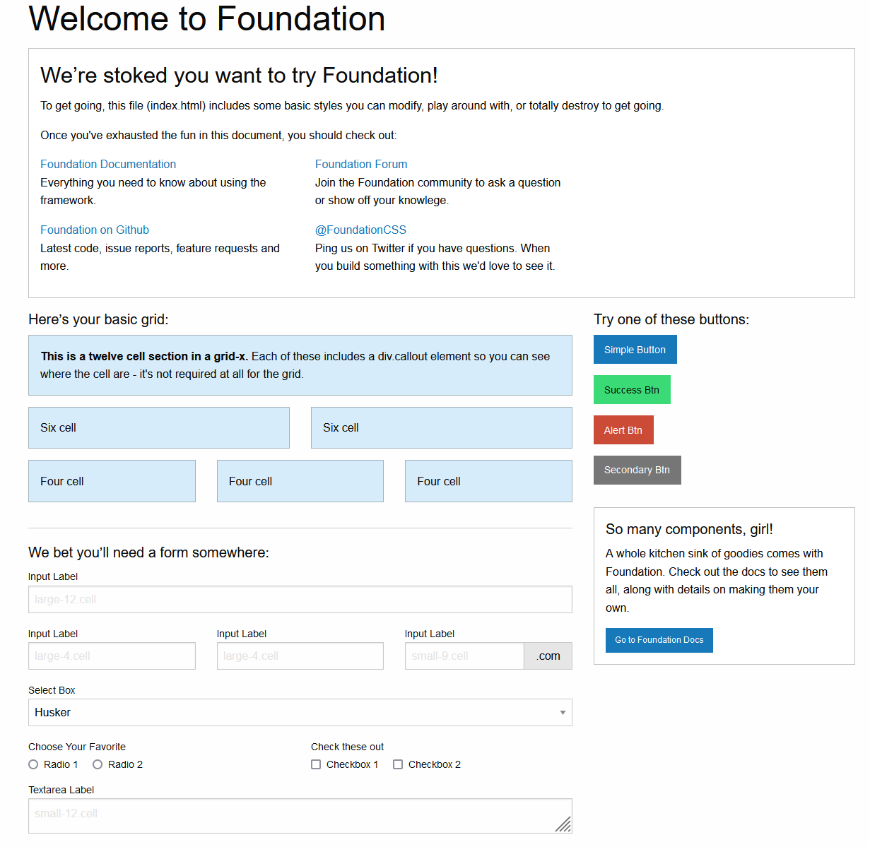
As a developer and tester, it’s recommended to download the compressed file and understand all the grids used in index.html. It will come in handy when test cases are required for testing.
Now, we have the Foundation framework installed on our local system. Let’s put down some light code to understand the Foundation framework a bit deeper.
How to code a Foundation web page?
Let’s create our new file index.html (a standard name for the home or landing page). Then, edit the code as follows:
<!doctype html>
<html class="no-js" lang="en" dir="ltr">
  <head>
    <meta charset="utf-8">
    <meta http-equiv="x-ua-compatible" content="ie=edge">
    <meta name="viewport" content="width=device-width, initial-scale=1.0">
    <link rel="stylesheet" href="css/foundation.css">
    <link rel="stylesheet" href="css/app.css">
  </head>
<body>
In this code, we link the stylesheets to the web page through the < link > tag.
Now, we create a container using the grid-container class which resembles the “container” class used in Bootstrap for the same purpose.
<div class="grid-container">
This container will require some nested code that will eventually be seen on the web page. Let’s put down a grid system here to use the Foundation’s strength:
<div class="grid-x grid-padding-x">
This looks a lot different from normal CSS grids used in Bootstrap. The problem with conventional grids is understanding the axis of the grid and the normal flow of element addition. If the grid is “row,” then the meaning of columns and row is different than when the grid is “column.” This is somewhat confusing for code readers and developers.
The Foundation framework has addressed this problem by providing classes that mention the axis of the grid. In the above code, “grid-x” is used, which means the grid is along the x-axis. Another class, “grid-padding-x” is used to provide padding between the gutters along the x-axis. Both these classes solve the conventional grid problem.
When we use the grid-x and grid-y system instead of normal “row” and “column,” we need to mention the column as “cells.” So no matter what axis is defined, the cells are adjusted and contain a consistent meaning which helps in development.
<div class="large-8 medium-8 cell">
    <div class="grid-x grid-padding-x">
      <div class="large-12 cell">
        <div class="primary callout">
          <p><strong>This grid expands to 12 sections.</strong></p>
        </div>
      </div>
    </div>
    <div class="grid-x grid-padding-x">
      <div class="large-6 medium-6 cell">
        <div class="primary callout">
          <p>This is a half length grid i.e six cell</p>
        </div>
      </div>
      <div class="large-6 medium-6 cell">
        <div class="primary callout">
          <p>This is a half length grid i.e six cell</p>
        </div>
      </div>
    </div>
  </div>
The above code brings the output as follows:
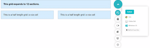
In the remaining space of the grid, we can add all the types of buttons offered by Foundation:
<div class="large-4 medium-4 cell">
    <h5>Let's explore buttons:</h5>
    <p><a href="#" class="button">Simple Button</a><br/>
      <a href="#" class="success button">Success Button</a><br/>
      <a href="#" class="alert button">Alert Button</a><br/>
      <a href="#" class="secondary button">Secondary Button</a></p>
  </div>
Add the JavaScript libraries at the end so that JS and DOM load in perfect sync according to the web elements:
<script src="js/vendor/jquery.js"></script>
<script src="js/vendor/what-input.js"></script>
<script src="js/vendor/foundation.js"></script>
<script src="js/app.js"></script>
Combine all the code and we get the following output: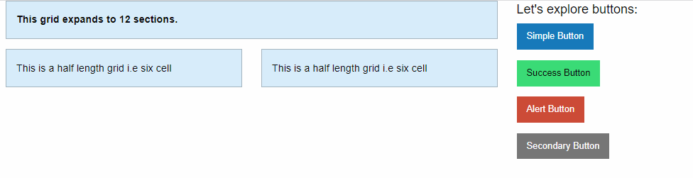
With this, we have crafted an extremely simple web page and added grids on it. The classes we used show us how the Foundation framework helps encourage development phenomena that easily cover the anomalies of other popular front-end frameworks.
How to develop an email in Foundation?
At the start of this blog on Foundation testing, we mentioned the primary difference between Foundation and any other front-end framework is its ability to make email designing faster, easier, and much more efficient. The major problem with an email is that it is hard to make it responsive. As a result, sometimes you may receive an email that will look like this:
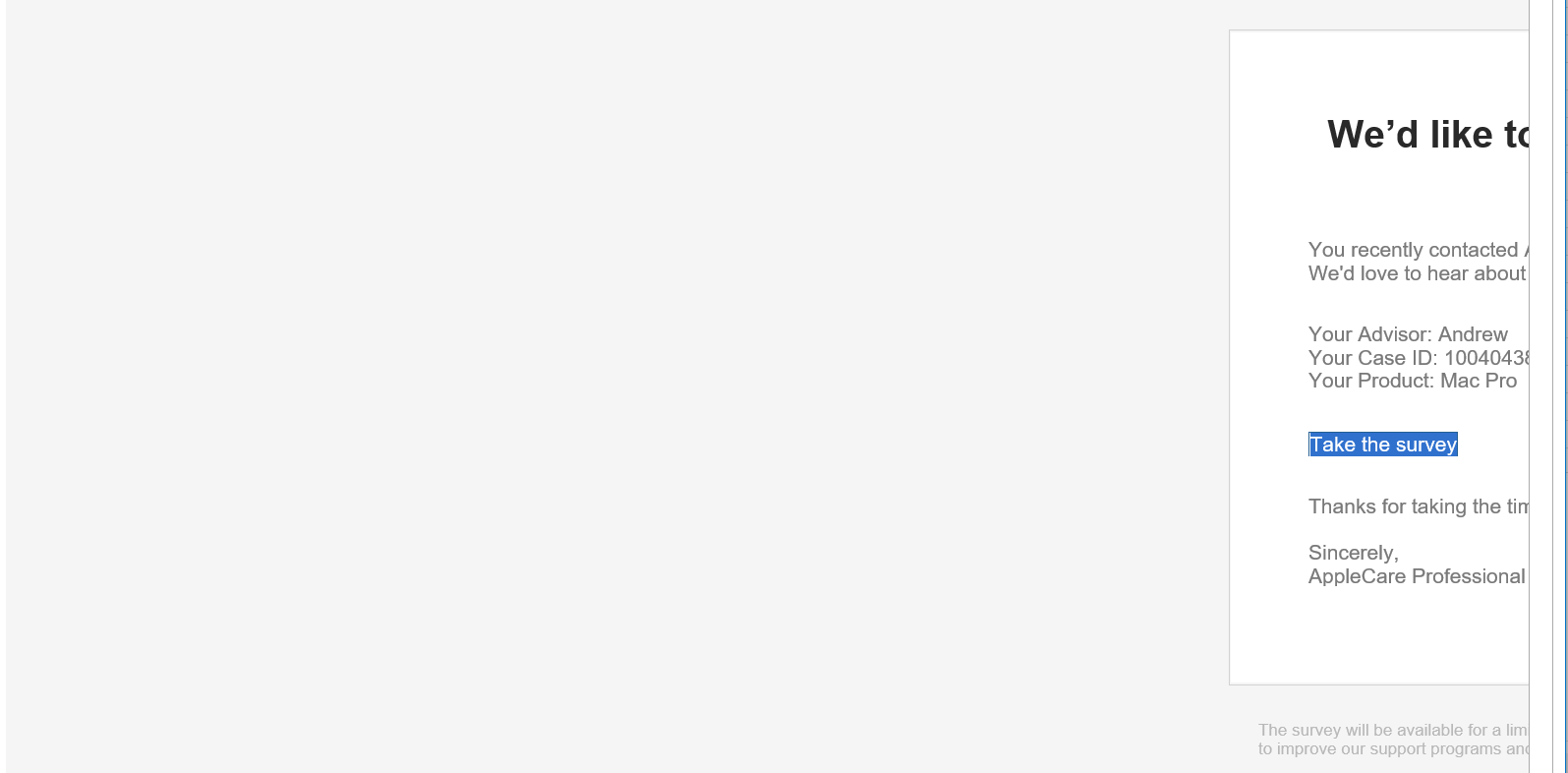
Emails are hard to design, and if you are using conventional HTML to do so, you might be using a lot of < table > and < tr > tags to design it. This makes a complex nested component hard to write, debug and read. The Foundation framework tries to address these problems through its offerings. Before designing the email, we need to set things up on our system as we did in the previous section while developing a web app.
For this, download the CSS Version Starter Kit from the official Foundation for Emails website.
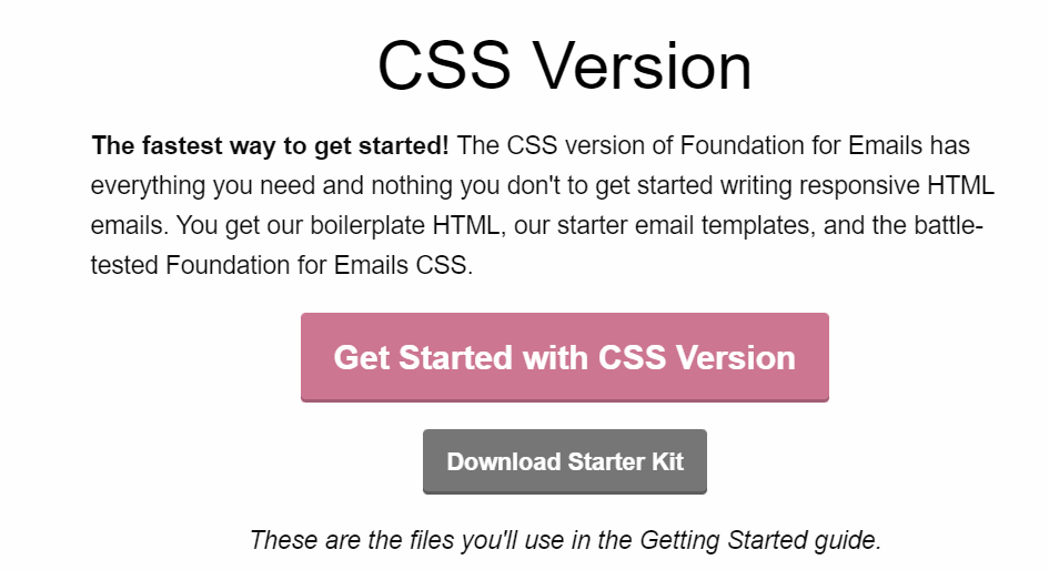
The compressed file will contain two components:
- foundation-emails.css
- index.html
They will play the same role as they did in web app development. The developers can use the same basics here and build the email. At this point, developers can freely develop the email design using conventional methods of < table > and “row” classes and other grid structures. However, if you wish to skip that, we need to learn about Inky.
Inky Template – Foundation Framework Originals
Readers open emails on phones, tablets and desktop clients, so an email built with Foundation has to render correctly on any device the user is using. Inky tries to solve this problem by providing clean syntax.
Inky does not let you get trapped in the complex net of < table > tags which sometimes expand to even twenty nested blocks. Instead, you can just use the syntax as:
<row>
    <columns>This is a column.</columns>
 </row>
This will be converted to six table tags behind the scenes, but as a developer, you just need to keep it simple at your end and let Inky do the rest of the job. As a result, the final code will be much shorter, and the developers can focus more on design.
However, by learning web development and email design, our work is not done yet. Web pages developed need to be tested for their quality and may undergo further improvements if required. The next section of this Foundation testing guide focuses on the same practice.
Introduction to Foundation Testing
The last section of this tutorial revolves around the testing part of a Foundation-built web application. A method or a process through which we ensure that the application will not break further into the future, which means if there are any glitches, they need to be rectified before release.
Foundation Testing of Emails
Firstly, the easier part is testing the emails written using Foundation. Emails are simple in design and may not require complex testing as done in the web application department. This eliminates the need for automation testing and cross browser testing right away from the table. The only part we need to test before sending the email is whether the template gets delivered as we intend it to and in the correct folder. This can be achieved through Litmus.
Litmus comes as a complete solution for emails, including marketing. Litmus testing helps developers and testers view their email in hundreds of email customers and verify their design using tools just a click away.
If you use Litmus for testing Foundation emails, you get the following benefits:
- Preview feature – Litmus lets you preview the email on more than a hundred customers, including dark mode. It will also provide recommendations in the email.
- Spam filtering – Litmus lets you verify whether your email will land in the spam (or junk) folder or regular primary inbox without sending a single email. This is extremely important as people generally do not open or take note of spam emails.
- Automated tests – Litmus will run a series of automated tests on the email template that will automatically test the essential features of the email. These include the links, images, etc.
- Integrations – Litmus also provides support for integrations that help extend testing to other dimensions from within a single spot.
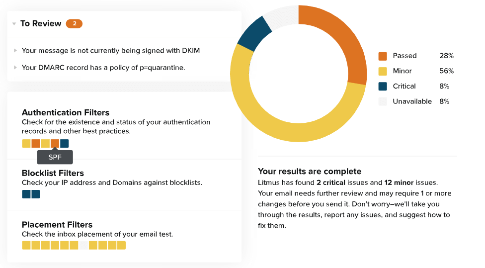
With the combination of Foundation email development and expertise in Litmus, a tester has all the tools for efficient Foundation testing of emails.
Foundation Testing of Web Apps
The web applications developed using Foundation will need a different tactic for testing than that from Litmus.
For this part, we focus on four major components:
- JavaScript unit testing
- Sass unit testing
- Visual regression testing
- Cross browser testing
JavaScript Unit Testing
JavaScript unit testing aims at identifying the issues in the JavaScript part of the application. The test cases should reside inside the test/javascript folder. For this part, Foundation uses Mocha to run tests, Chai for assertions, and Sinon for test spies and stubs.
Sass Unit Testing
Foundation styling is written in Sass, which is flat and raw and provides more room for the developer’s imagination. While JavaScript unit tests focus on the functionality part, Sass unit testing aims at testing the styling part. Foundation uses Mocha for logging the output, and the test cases reside inside the test/sass folder. These are written in True.
Visual Regression Testing
Visual regression testing identifies visual regression tests and is stored inside the test/visual folder. This needs to be created and verified manually using HTML files and reproducing the bug thereupon. All these three testing facilities will be provided along with the other files downloaded for web app development in Foundation.
Cross Browser Testing
The final testing part we need to conduct on the web app is cross browser testing. While the above three types focus on functionality, design, and visual appearance, they do not consider the possibility of an error when the type of system changes. For instance, you might not see an alignment issue in Google Chrome on Windows 11, but see it in Safari on macOS or in an older Chrome version.
Cross browser testing is important but hectic considering the fragmented device world today. Manually, it is quite impossible to achieve this task; therefore, as a tester, it is best to opt for cloud-based testing solutions. The next section explores this possibility with TestMu AI.
Unleashing the power of Foundation Testing with TestMu AI
JavaScript testing, Sass testing, visual regression testing, and cross browser testing is the core of Foundation testing methods. They are important, but they don’t need to be performed manually.
Manual testing takes time, and if everything is taken to the manual level, costs increase significantly. The best way to choose is a combination of automation and manual testing so that the perfect balance tests the application most efficiently. But the problem is that every time we do that, we need a physical local system to park all our resources for testing on it. Considering how fragmented the device market is out there, testing on even ten devices makes things a bit harder. So, it’s recommended to move everything to the cloud.
Cloud-based solutions have gained momentum in this decade. With so many options popping up daily, choosing the one that will suit everyone’s needs is challenging. However, TestMu AI makes our job a bit easier on this side.
TestMu AI is a cloud-based digital experience testing platform that enables devs and testers to perform manual and automated Foundation testing across 3000+ browsers, devices, and OS combinations to test on. From real-time testing to automated testing, TestMu AI offers a complete solution you may need for your next Foundation project.
Let’s look at how to perform manual (real-time) Foundation testing on TestMu AI.
- Sign up for free or login to your TestMu AI account
- Click on Real Time Testing > Browser Testing from the left sidebar menu.
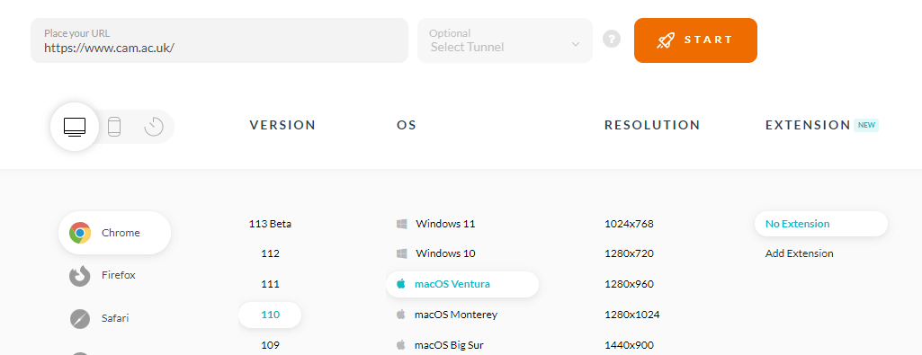
- Enter the test URL, and select the browser, browser version, OS, and resolution. Click START to launch the test.
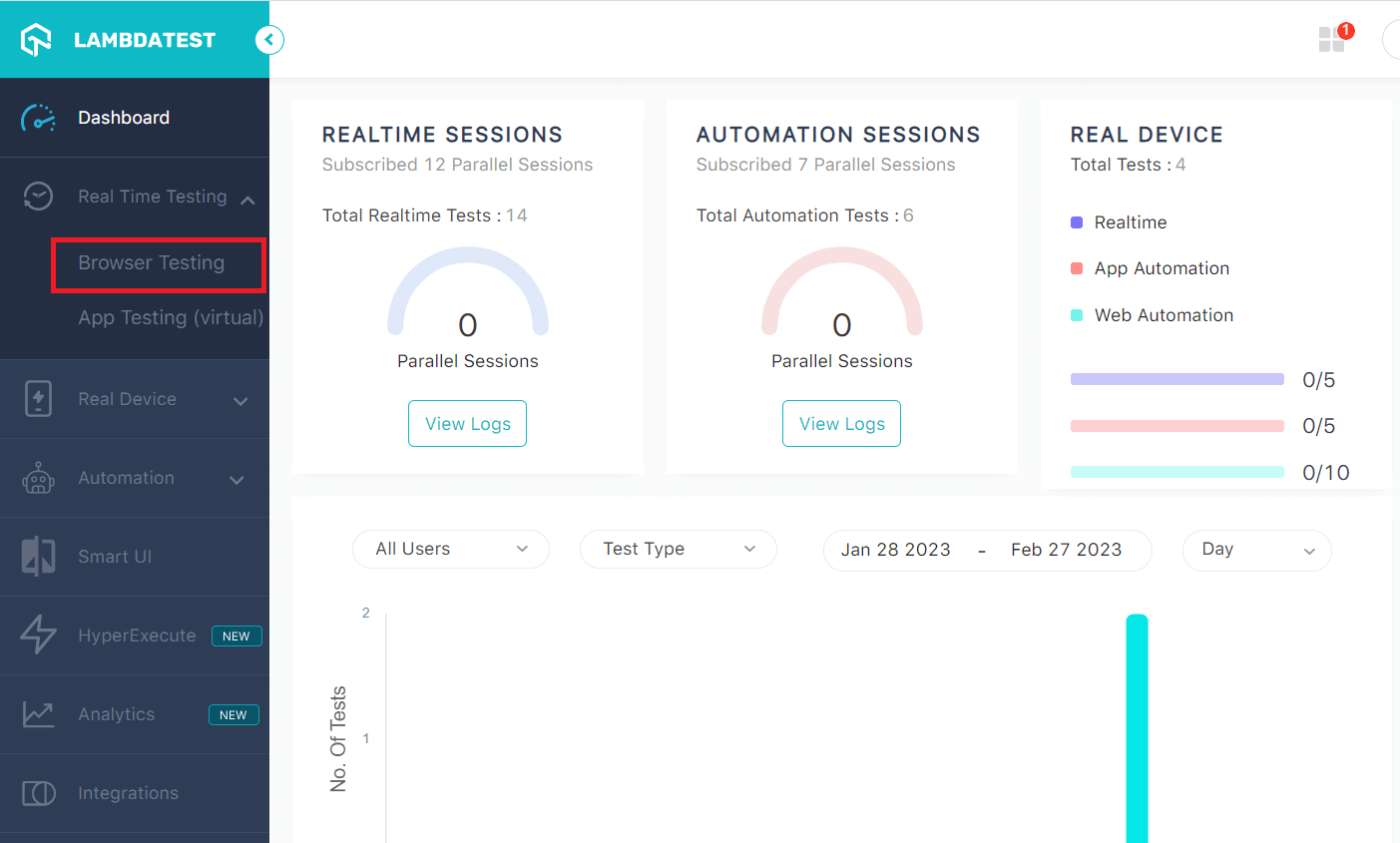
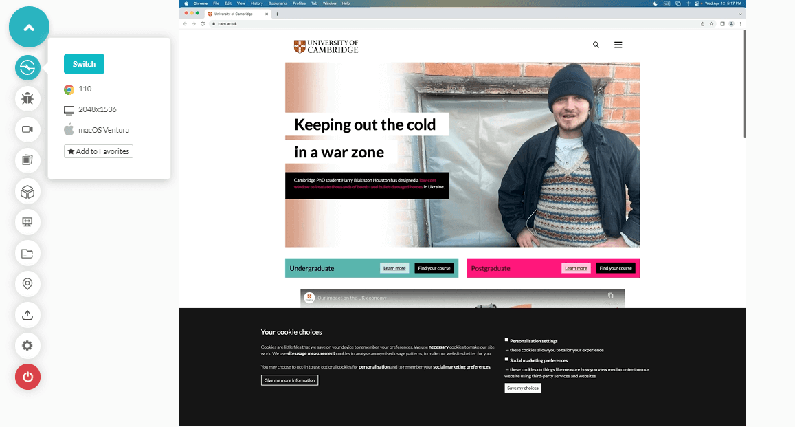
A cloud-based real operating system will fire up where you can test a Foundation-based web app for filing bugs.
TestMu AI also provides a real device cloud for mobile browser and native app testing. If we consider Foundation-based applications, we need Mocha, Chai, and other frameworks (mentioned in the previous sections) to successfully penetrate the application inside out as intended by Foundation. To cater to such situations, TestMu AI comes equipped with more than a hundred integrations with test runners that can be used to extend testing functionalities according to requirements.
The following tutorial can help you get started with real device testing on TestMu AI.

To stay up-to-date on tutorials related to Selenium testing, Cypress testing, and more, subscribe to the TestMu AI YouTube Channel.
Conclusion
If the back end is the blood of an application, the front end is its face. Today, users are highly concerned about the application’s visual appearance, and developers try hard to keep it up to the current standards. When so many elements are repeated on every page and every website across the world, a standard framework needs to be established. Front-end frameworks help us in that by providing pre-built optimized elements that can be just picked and placed on the page with a single line of code.
Foundation is one such front-end framework that brings balance between front-end elements and flexibility to the developers. For this, Foundation provides flat elements with the maximum scope of customizability and freedom for experiments using Sass. Serving as the strength of the framework, grids are modified, flexible, and extremely easy to code in Foundation.
However, this is just one part of many elements that a developer may find easy to use. This guide focused on these elements, their usage, demonstration, and testing on web applications as well as email templates. While at the start, it might have looked like yet another front-end framework, by the end, it tried to prove its worth in this crowded arena. We hope this Foundation testing tutorial will help you in your next web development project.

Author

Harish Rajora
Blogs: 100


Harish Rajora is a software developer at TestMu AI with over 6 years of hands-on experience in Python and cross-platform application development across Windows, macOS, and Linux. He has authored 800+ technical articles and worked on large-scale projects, including GenAI applications and core engineering features used by millions. Harish has led DevOps initiatives building CI/CD pipelines with Jenkins, AWS, GitLab, and GitHub, and holds an M.Tech in Software Engineering from IIIT Allahabad.


Foundation Testing FAQs
Did you find this page helpful?
More Related Blogs
TestMu AI forEnterprise
Get access to solutions built on Enterprise
grade security, privacy, & compliance
- Advanced access controls
- Advanced data retention rules
- Advanced Local Testing
- Premium Support options
- Early access to beta features
- Private Slack Channel
- Unlimited Manual Accessibility DevTools Tests