

Power Your Software Testing with AI Agents and Cloud
The Native AI-Agentic Cloud Platform to Supercharge Quality Engineering. Test Intelligently and Ship Faster.


- TestMu AI (Formerly LambdaTest)
- /
- Blog
- /
- 15 Best Lightweight CSS Frameworks for Responsive Websites
15 Best Lightweight CSS Frameworks for Responsive Websites
Compare 15 lightweight CSS frameworks for 2026, from Tailwind and Bulma to Pure.css and Simple.css, with measured gzipped sizes and maintenance status.
Last Updated on:
A lightweight CSS framework gives you a responsive grid and sensible default styles without the weight of a full UI kit, so pages load faster on mobile connections. The catch is that many small frameworks stop being maintained: Pico CSS, one of the most popular, archived its repository on October 4, 2026. This list covers 15 frameworks worth using in 2026, with gzipped sizes we measured from each package's latest npm build and maintenance status from GitHub, both checked on October 5, 2026.
TL;DR
- Tailwind CSS is the most used CSS framework, and its build step ships only the classes your pages use.
- Milligram, MVP.css, Simple.css, Skeleton, Chota, Pure.css, and Water.css are each under 4 KB gzipped in our measurements.
- Classless frameworks such as Simple.css, MVP.css, and Water.css style plain semantic HTML with no classes at all.
- Pico CSS was archived on October 4, 2026, and v2.1.1 is its final release, so new projects should pick another framework.
- Use the Materialize community fork, because the original Materialize project has had no commits since 2020.
- Test the chosen framework's breakpoints on real browsers and devices, since grids can break at widths you never checked.
What Is a Lightweight CSS Framework?
A lightweight CSS framework is a small stylesheet, usually under about 15 KB gzipped, that provides a responsive grid, typography, and basic styles for forms and buttons. Heavier frameworks such as Bootstrap add many components and JavaScript plugins. Lightweight ones trade those extras for less code to download, parse, and override.
They come in three main types. Classic micro frameworks such as Milligram and Chota give you a grid and a few components. Classless frameworks such as Simple.css style plain HTML elements with no classes. Utility-first frameworks such as Tailwind CSS and Tachyons give you small single-purpose classes to compose your own design. For a wider view that includes heavier options, see our guide to the best CSS frameworks.
Lightweight CSS Frameworks Compared
Sizes are the gzipped size of each framework's main minified stylesheet from its latest npm release, fetched from jsDelivr and compressed at gzip level 9 on October 5, 2026. Release dates come from npm, and stars from GitHub on the same day.
| Framework | Gzipped CSS | Latest release | GitHub stars |
|---|---|---|---|
| Tailwind CSS | Generated per project | v4.3.3, July 2026 | 97.8K |
| Bulma | 63.5 KB (full build) | v1.0.4, April 2025 | 50.1K |
| UIkit | 30.3 KB CSS (plus JS) | v3.25.25, September 2026 | 18.5K |
| Pure.css | 3.5 KB | v3.1.0, September 2026 | 23.7K |
| Milligram | 2.2 KB | v1.4.1, June 2020 (repo active 2026) | 10.2K |
| Open Props | 7.5 KB | v1.7.23, January 2026 | 5.5K |
| Simple.css | 2.7 KB | v2.3.7, May 2025 | 5.0K |
| MVP.css | 2.6 KB | v1.18.0, September 2026 | 5.1K |
| Chota | 3.5 KB | v0.9.2, March 2023 | 1.5K |
| Tachyons | 12.8 KB | v4.12.0, April 2020 (repo active 2026) | 11.7K |
| Materialize (community fork) | 19.7 KB CSS (plus JS) | v2.4.0, September 2026 | 1K |
| Vanilla Framework | Built from Sass | v4.59.0, August 2026 | 1K |
| Water.css | 3.5 KB | v2.1.1, August 2021 | 8.7K |
| Skeleton | 2.6 KB | v2.0.4, 2014 (unmaintained) | 19.4K |
| Spectre.css | 9.5 KB | v0.5.9, July 2020 (unmaintained) | 11.3K |
15 Best Lightweight CSS Frameworks
1. Tailwind CSS
Tailwind CSS is a utility-first framework: you style elements with small single-purpose classes such as flex, pt-4, and md:grid-cols-3 directly in the markup. It has no prebuilt components. Its build step scans your files and generates only the classes you use, so the shipped CSS stays small even though the full class set is huge. In the State of CSS 2025 survey, 2,041 of 3,977 respondents who answered the frameworks question had used it, more than any other framework.
- Responsive prefixes - sm:, md:, lg:, and xl: apply any utility at a breakpoint.
- CSS-first config - Version 4 defines theme tokens in CSS with @theme instead of a JavaScript config file.
- Only what you use - Unused classes never reach production.
Best for - Teams that want full design control and a component library they build themselves.
2. Bulma
Bulma is a Flexbox-based framework with ready-made components such as cards, navbars, modals, and forms, written in pure CSS with no JavaScript. Version 1 rebuilt it on CSS custom properties, so themes and dark mode can change at runtime. The full build is not small, but Bulma is modular in Sass, so you can import only the parts you need.
- Simple column system - Add columns and they share the row equally, or size them with classes such as is-half.
- No JavaScript - Pair it with any JS framework.
- CSS variables - Theme and dark mode without recompiling.
Best for - Readable class names and ready components without JavaScript.
3. UIkit
UIkit is a modular front-end framework with a large set of CSS and JavaScript components, including accordions, sliders, modals, sticky navigation, and animations. It is written in Less and Sass, ships a right-to-left stylesheet, and is released often.
- Large component set - Interactive components work without jQuery.
- Modular - Include only the components you use.
- RTL support - A separate stylesheet for right-to-left languages.
Best for - Interactive sites that need components and behavior from one library.
4. Pure.css
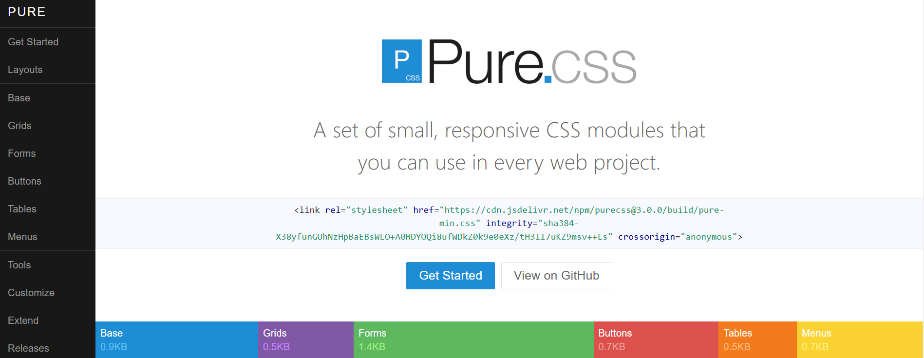
Pure.css is a set of small CSS modules for grids, forms, buttons, tables, and menus, originally created at Yahoo. It is built on Normalize.css and adds little styling of its own, so it is easy to override. Each module can be used on its own.
- Responsive grid - Mobile-first grid units with breakpoint classes.
- Separate modules - Load only the grid or only the forms.
- Minimal styling - Easy to restyle with your own CSS.
Best for - A tiny, unopinionated base for your own design.
5. Milligram
Milligram is a minimal starting point that styles typography, forms, buttons, tables, and a Flexbox grid in about 2 KB gzipped. It relies on Normalize.css and keeps the number of properties low so there is less to override.
- Tiny - The smallest framework in this list with a grid.
- Flexbox grid - Simple rows and columns.
- Clean defaults - Good typography out of the box.
Best for - Small sites and prototypes that need a clean base fast.
6. Open Props
Open Props is a set of design tokens delivered as CSS custom properties for sizes, colors, shadows, gradients, easings, and animations. It is not a component framework: you write your own CSS and use variables such as var(--size-3) and var(--shadow-2) for consistent values.
- Design tokens - Consistent spacing, color, and motion values.
- Import what you need - Each token group is a separate file.
- Works with anything - Plain CSS, preprocessors, or other frameworks.
Best for - Teams that write their own CSS but want a consistent design system.
7. Simple.css
Simple.css is a classless framework: link the stylesheet, write plain semantic HTML, and the page looks clean with no classes at all. It switches to a dark theme automatically when the visitor's system uses dark mode.
- Classless - Styles headings, forms, tables, and more by element.
- Automatic dark mode - Follows the system setting.
- Responsive - Readable on phones without extra work.
Best for - Blogs, docs, and simple sites written in semantic HTML.
8. MVP.css
MVP.css is another classless stylesheet, aimed at quickly building a minimum viable product. Semantic elements such as header, nav, section, aside, and figure get sensible layouts, and CSS variables control the colors.
- Classless - Semantic HTML gets styled automatically.
- Section layouts - Cards and feature grids from plain elements.
- CSS variables - Change colors and widths in one place.
Best for - Landing pages and prototypes built in an afternoon.
9. Chota
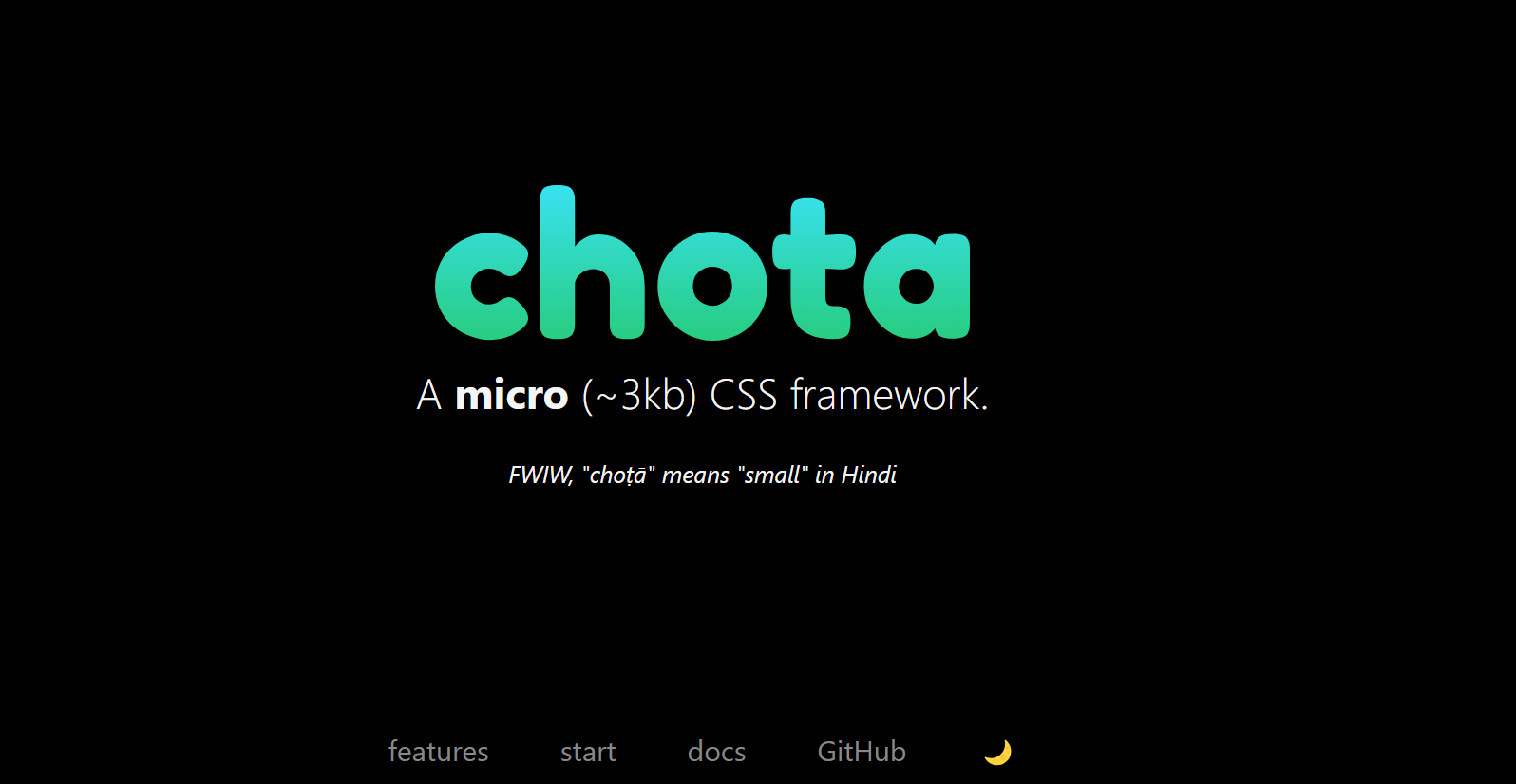
Chota is a micro framework with a 12-column grid, buttons, forms, navigation, tabs, cards, and utility classes in about 3.5 KB gzipped. It uses CSS variables for theming and includes a dark mode, and it needs no build step.
- 12-column grid - Responsive columns with breakpoint classes.
- CSS variables - Theme by overriding a few variables.
- Dark mode - Built in.
Best for - A small framework that still has a grid and components.
10. Tachyons
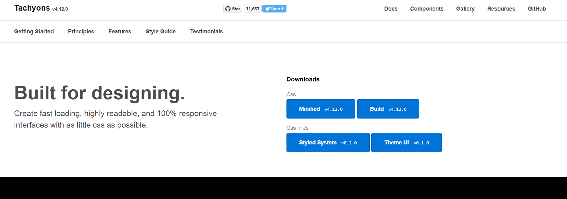
Tachyons is a functional CSS toolkit of small, single-purpose classes, similar in idea to Tailwind but shipped as a plain stylesheet with no build step. It still gets about 106,000 npm downloads a week.
- Single-purpose classes - Compose styles in the markup.
- Responsive suffixes - -ns, -m, and -l apply classes at breakpoints.
- No build step - Link one file and start.
Best for - Utility-first styling without a build tool.
11. Materialize (community fork)
Materialize implements Google's Material Design with components such as cards, chips, modals, and date pickers. The original project has had no commits since 2020, so use the maintained community fork, @materializecss/materialize, which released version 2.4.0 in September 2026.
- Material Design - Components follow Google's design language.
- 12-column grid - Responsive layout classes.
- JavaScript components - Modals, dropdowns, and pickers included.
Best for - Projects that want a Material Design look without React.
12. Vanilla Framework
Vanilla Framework is the Sass framework Canonical uses for Ubuntu websites. It provides a responsive grid, base HTML styles, patterns such as navigation, cards, and forms, and utility classes, and it is updated often.
- Sass based - Include only the patterns you use.
- Documented patterns - Clear examples for each component.
- Actively maintained - Frequent releases.
Best for - Content-heavy sites that need a maintained, documented system.
13. Water.css
Water.css is a classless stylesheet that makes plain HTML look clean, with light and dark themes that can follow the system setting. It has not had a code change since 2021, but it is small and stable and still works as a drop-in.
- Classless - No classes needed.
- Light and dark themes - Automatic or fixed.
- Drop-in - One link tag.
Best for - Quick demos and internal tools.
14. Skeleton
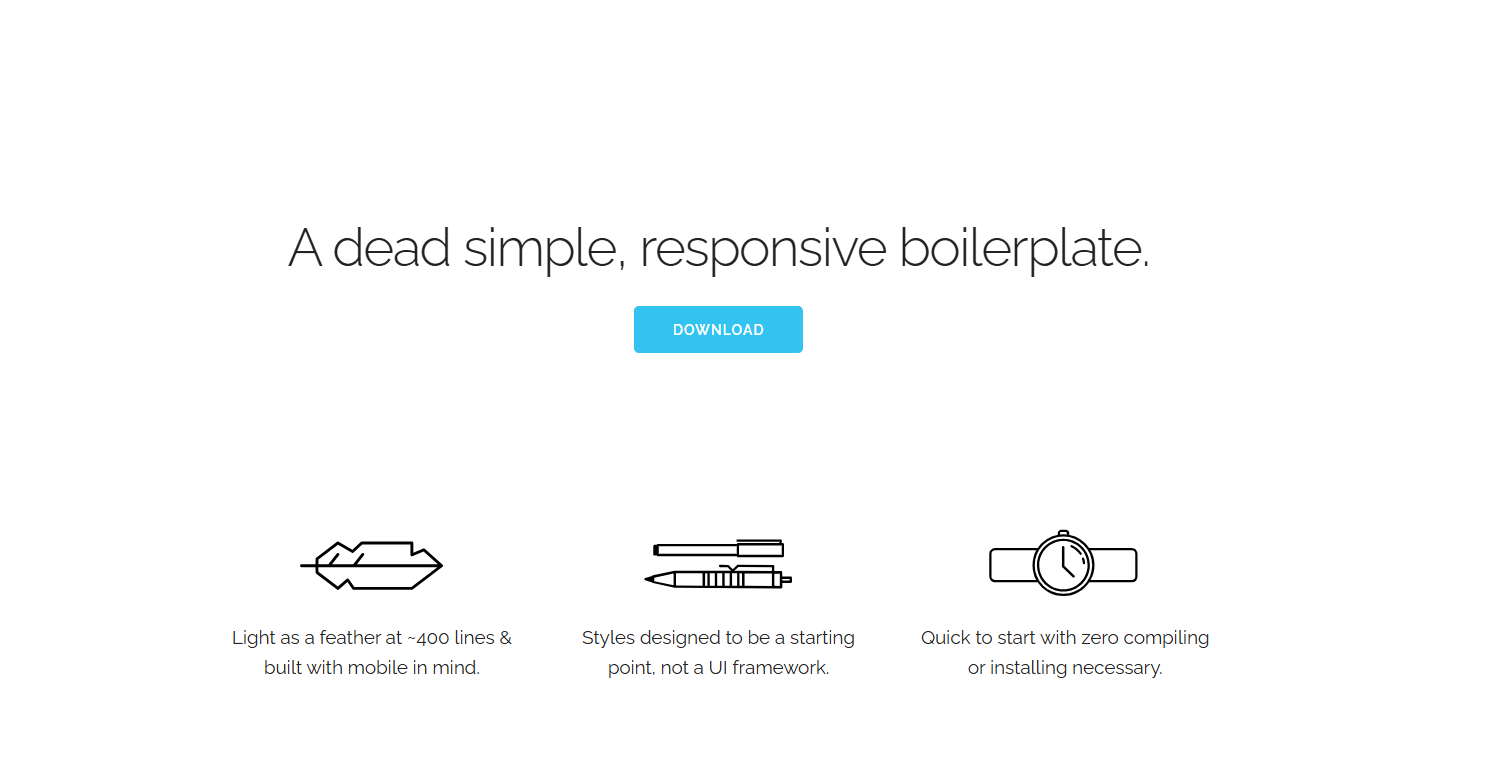
Skeleton is a boilerplate of about 400 lines with a 12-column fluid grid, typography, buttons, and forms. Its last code commit was in December 2014, so it uses floats rather than Flexbox or Grid. It is still useful for learning and very small pages.
- Very small - Easy to read in one sitting.
- Fluid grid - 12 columns that stack on small screens.
- No dependencies - Plain CSS.
Best for - Learning how a CSS framework works.
15. Spectre.css
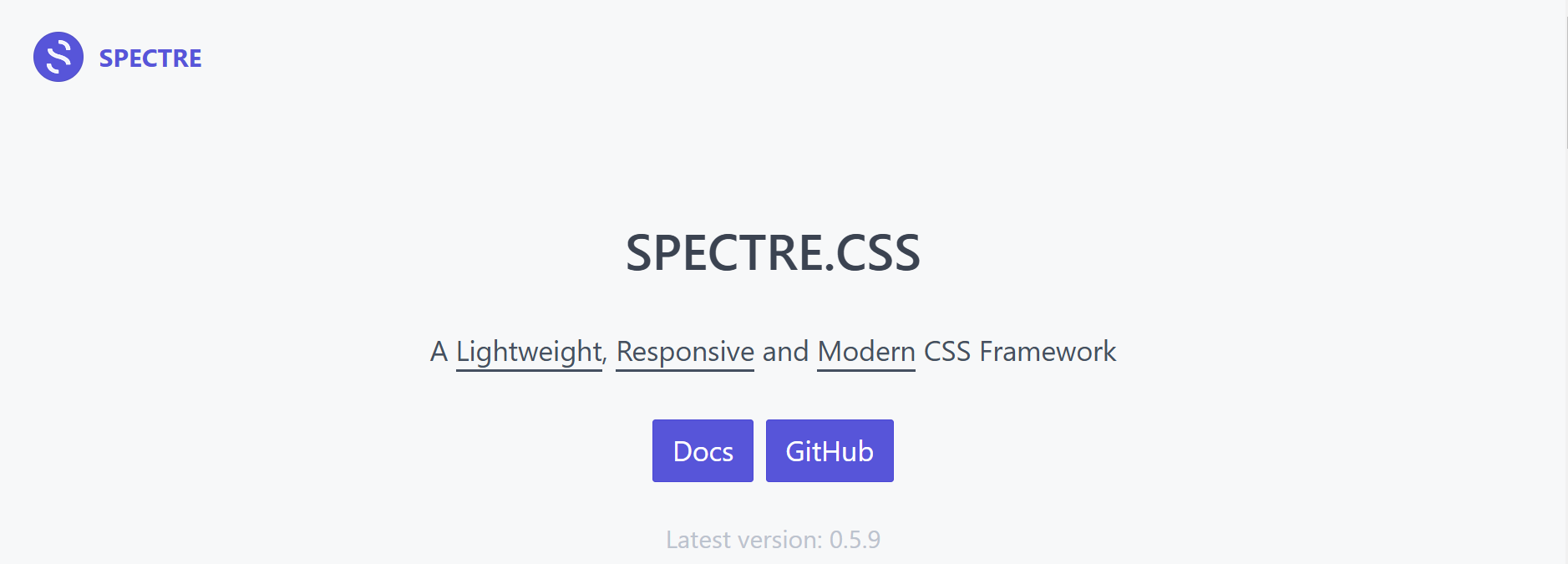
Spectre.css is a Flexbox-based framework with typography, a grid, and components such as cards, tabs, modals, and toasts in about 9.5 KB gzipped. Its last code commit was in July 2020, but it still has about 6,600 weekly npm downloads.
- Flexbox grid - Responsive columns.
- Many components - More than most frameworks this size.
- Sass source - Customize variables and rebuild.
Best for - Existing projects that already use it.

Frameworks Removed From This List
Earlier versions of this article included frameworks that are no longer a safe choice for new projects.
- Pico CSS - Archived on October 4, 2026. Its README says v2.1.1 is the final release and that npm, the CDN, and the website stay online, so existing sites keep working.
- Mini.css - The GitHub repository is archived, and the last npm release was in 2018.
- InvisCSS, Wing, Fluidity, Turretcss, and Typebase.css - No code changes since between 2016 and 2021, and InvisCSS is archived.
- Avalanche - The GitHub repository no longer exists.
- Fictoan - The repository was archived in 2025.
- HiQ, Spark, Vital, and Beauter - Removed for low adoption, with no npm package or only a few hundred weekly downloads.
How to Choose a Lightweight CSS Framework
- Match the type to the project - Pick classless for content sites, a micro framework for small apps, and utility-first for custom designs.
- Check maintenance - Look at the last release and commit. An unmaintained framework will not get fixes for new browser behavior.
- Measure the real size - Compare the gzipped CSS you will actually ship, not the marketing number.
- Check the grid - Flexbox or Grid layouts are easier to adapt than older float-based grids. See CSS Grid layout vs CSS frameworks for when you need a framework at all.
- Plan for customization - CSS variables make theming and dark mode far easier than editing compiled CSS.
How to Test a Responsive CSS Framework
A framework's grid only proves itself on real screens, which is the core of responsive design testing. Check your layouts at common breakpoints, such as 375px, 768px, and 1440px, and in each browser your users have, because Safari, Chrome, and Firefox can render the same CSS differently.
TestMu AI's LT Browser shows your page side by side in multiple device viewports with synchronized scrolling, and a responsive test checks a URL across screen sizes in the cloud. To catch layout changes after a framework upgrade, SmartUI compares screenshots of each page against an approved baseline and highlights what moved.
Coding agents can help too. An agent driving a browser through the Playwright MCP server can step through breakpoints and flag overlapping or overflowing columns. Agents check layout, not intent, so a person still needs to confirm the design matches the brand.
Conclusion
There is no single best lightweight CSS framework. Tailwind CSS suits custom designs, Pure.css and Milligram suit small sites that need a grid, and classless options such as Simple.css suit content pages. Whichever you choose, check that it is still maintained, measure what you ship, and test the layout on real browsers and devices before release. To start, create a free TestMu AI account and open your site in LT Browser.
Author

Nimritee
Blogs: 5


Nimritee Sirsalewala is a community contributor with 5+ years of experience across data engineering, machine learning, and technical writing. She specializes in building data-driven and AI-powered systems, with hands-on experience in Python, Java, SQL, machine learning workflows, and cloud-based data pipelines. Nimritee has contributed technical content around programming, UI/UX, and software testing as a freelance writer for TestMu AI and ACCELQ, and currently works as a Data Engineer at TOMRA, applying AI to sustainability-focused systems. She holds a Master’s degree in Web and Data Science.
Reviewer

Rahul Mishra
Reviewer
Rahul Mishra is a Lead Member of Technical Staff at TestMu AI (formerly LambdaTest), leading frontend engineering and accessibility testing across the quality engineering platform. He mentors frontend engineers, runs code reviews and sprint planning, optimizes React.js rendering performance, and makes product features accessible to users with disabilities through WCAG and ADA-compliant accessibility audits. He brings 10+ years of experience across React.js, VueJS, TypeScript, Swift, Objective-C, and AWS, with earlier work as a Technical Lead at VectoScalar Technologies. Rahul holds a B.E. in Information Technology.


Lightweight CSS Frameworks FAQs
Did you find this page helpful?
More Related Blogs
TestMu AI forEnterprise
Get access to solutions built on Enterprise
grade security, privacy, & compliance
- Advanced access controls
- Advanced data retention rules
- Advanced Local Testing
- Premium Support options
- Early access to beta features
- Private Slack Channel
- Unlimited Manual Accessibility DevTools Tests