

Power Your Software Testing with AI Agents and Cloud
The Native AI-Agentic Cloud Platform to Supercharge Quality Engineering. Test Intelligently and Ship Faster.


- TestMu AI (Formerly LambdaTest)
- /
- Blog
- /
- How to Craft Browser Specific CSS Code
How to Craft Browser Specific CSS Code
This article will explain how to write browser-specific CSS code to eliminate cross browser compatibility issues in websites and web apps.
Last Updated on:
On This Page
- Why Browser Specific CSS?
- Google Chrome Browser Specific CSS code
- Safari Browser Specific CSS code
- Mozilla Firefox Browser Specific CSS code
- Microsoft Edge Browser Specific CSS code
- Opera Browser Specific CSS code
- Internet Explorer Browser Specific CSS code
- How to validate your Browser Specific CSS code?
- AI Agents for CSS Testing
- What’s your hack for Browser Specific CSS?
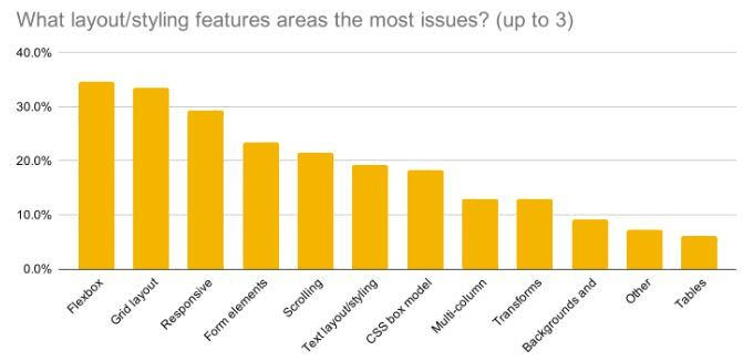
Browser-specific CSS exists because browser engines convert the same stylesheet differently, so Opera Mini, for instance, ignores the CSS text-orientation property entirely and falls back to its default rendering. An MDN developer survey confirms these engine-level gaps are still common, which is why writing separate rules per browser remains the practical fix for layout and rendering mismatches.
New to CSS Selectors? Check out this Ultimate CSS Selector cheat sheet to boost your web designing career.
This article look at how to create browser-specific CSS code to eliminate cross browser compatibility issues in websites and web apps.
TL;DR
- Browser-specific CSS applies a rule to one browser engine, usually to work around a rendering difference.
- The @supports feature query is the standards-based approach: test for a feature rather than sniff the browser.
- Vendor prefixes such as -webkit- and -moz- target engines directly, and most are now unnecessary.
- Safari-only rules commonly use a media query on -webkit-min-device-pixel-ratio, and Firefox uses @-moz-document.
- Browser hacks break when engines change, so reach for them only after a feature query cannot solve the problem.
Why Browser Specific CSS?
A universal code is developed as per standards, yet popular syntaxes do not operate on all browsers. Such code might result in CSS inconsistencies and, in extreme instances, the absence of elements on the web page.
This key issue is highlighted in an MDN study, which polled developers from all over the world. The image below depicts the most common cross-browser issues.
Also Read - 10 Ways To Avoid Cross-Browser Compatibility Issues
For example, let’s take “Responsiveness”. Due to the sheer penetration of mobile device usage, responsive web design has become a standard for releasing online apps. However, it is difficult to execute this design across all screen sizes, browsers, versions, and resolutions.
A legacy browser version may not render a CSS style, or property introduced later by the CSS community. Sometimes, a browser requests a different syntax, while the browser only supports a partial implementation.
This is true for many browser-specific CSS properties. As a result, designing a web application with a consistent user experience can be challenging if you are unaware of browser-specific CSS properties.
Google Chrome Browser Specific CSS code
Writing a Google Chrome specific CSS code is not as easy as writing conditional statements. For each property you write the CSS code, you should know the target CSS code for specific Chrome versions. There are no universal statements.
With that being said, Google Chrome also supports various browser-specific CSS properties from its prior versions, and therefore you might not feel the need to add extra code for this browser. In addition, many Chrome users also use the latest versions, which relieves us of overthinking unsupported browser-specific CSS properties in earlier versions.
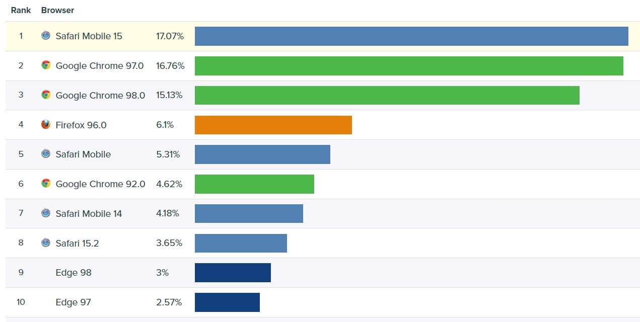
To write browser-specific CSS code in Google Chrome, you can follow these browser-specific CSS properties:
- To target the support of browser-specific CSS properties on the Webkit browsers (including Safari) for all Chrome versions:
.selector:not(*:root) { property:value; } - To target the support of properties on Chrome versions >= 29:
@supports (-webkit-appearance:none) {} - To target the support of properties on Chrome versions < 29:
.selector { (;property: value;); } .selector { [;property: value;]; } - To target media queries on Chrome versions from 22 to 28:
@media \\0 screen {} - To target media queries on Chrome versions above 28:
@media all and (-webkit-min-device-pixel-ratio:0) and (min-resolution: .001dpcm) { .selector {} }
These are the most popularly used browser-specific CSS properties in Google Chrome and will probably work for a majority of web applications.
Safari Browser Specific CSS code
Safari is another webkit-based browser that allows developers to reuse the same webkit targeting functionality that we built in Chrome. As a result, the three browser-specific CSS properties listed below for Google Chrome will also work on Safari.
.selector:not(*:root) { property:value; }@supports (-webkit-appearance:none) {}.selector { (;property: value;); } .selector { [;property: value;]; }
Besides that, there are a few other browser-specific CSS properties you can use to target Safari for your CSS code. For example, if your CSS code includes a few media queries, you’ll need to include the following snippet to target specific Safari browsers:
- For Safari 4:
@media screen and (min-width:0\0) {} - For Safari >=6:
@media screen { @media (min-width: 0px) {} }If your CSS code contains selector code (to select a few elements from the web page), the following snippet is required to target Safari browsers:
- For Safari 2:
html:first-child .selector {} - For Safari 2 and Safari 3:
html[xmlns*=""] body:last-child .selector {} html[xmlns*=""]:root .selector {} - For Safari 2 and Safari 3.1:
*|html[xmlns*=""] .selector {} - For Safari 5.1 and Safari 6:
_::-moz-svg-foreign-content, :root .selector {}If your CSS code contains a few media queries, the following snippet will help you target specific Safari browsers:
- For Safari >= 7:
@media \\0 screen {}
Also Read - Remote Debugging Webpages In iOS Safari
Now run your browser testing on iPad simulator!!!
Mozilla Firefox Browser Specific CSS code
Mozilla Firefox is a challenging browser to deal with. However, it has always isolated itself from Internet Explorer and has been open about it. Furthermore, unlike Chrome and Safari, it is not built on the webkit engine. As a result, developers can use the browser-specific CSS codes for Mozilla Firefox shown below.
If your CSS code aims at selecting the elements, the following Firefox browser-specific CSS properties will help:
- For Firefox 1.5 and Firefox 2:
body:empty .selector {} - For Firefox version greater than 2:
body:last-child .selector, x:-moz-any-link {} - For Firefox versions greater than 3:
body:last-child .selector, x:-moz-any-link, x:default {} - For Firefox versions greater than 3.5:
body:not(:-moz-handler-blocked) .selector {} - For Firefox versions greater than 6:
_::-moz-progress-bar, body:last-child .selector {} - For Firefox versions greater than 21:
_::-moz-range-track, body:last-child .selector {} - For all the Firefox versions:
_:-moz-tree-row(hover), .selector {}
In the above codes, the selectors are different for different purposes. Please go through their implementations before applying them to your web page.
Read More - The Ultimate CSS Selectors Cheat Sheet You Must Know
If your CSS code is targeting media queries in other browsers, the following additions will create Firefox-specific media query code:
- For Firefox versions <= 3:
@media \0 all {} - For Firefox >= 3.6:
@media screen and (-moz-images-in-menus:0) {} - For Firefox >= 4:
@media screen and (min--moz-device-pixel-ratio:0) {} - For Firefox >= 8:
@media all and (min--moz-device-pixel-ratio:0) and (min-resolution: .001dpcm) {} @media all and (-moz-images-in-menus:0) and (min-resolution: .001dpcm) {} - For Firefox >= 11:
@media all and (min--moz-device-pixel-ratio:0) { @media (min-width: 0px) {} } @media all and (-moz-images-in-menus:0) { @media (min-width: 0px) {} } - For Firefox >= 29:
@media all and (min--moz-device-pixel-ratio:0) and (min-resolution: 3e1dpcm) {}
Microsoft Edge Browser Specific CSS code
Microsoft Edge is the reason why Microsoft no longer cares about Internet Explorer. Edge is more robust, keeps up with current trends, is built on Chromium, and is faster. It was released in 2015 and is now the world’s third most popular browser.
Because of its ubiquity and ease of use, this browser is one of the top priorities for web developers. The code snippets below can help in creating Microsoft Edge-specific CSS code:
@supports (-ms-ime-align:auto) { selector { property: value; } }
Except for the above, everything functions properly in Microsoft Edge as it was only developed in 2015. By then, many of the standards had been established, and there had been no significant change in the properties. Other browsers were released in the early 2000s, and as a result, they demand special attention since over 60 versions have been released.
Read More - Are You Testing Your Website On Microsoft Edge?

Opera Browser Specific CSS code
Opera is one of the market’s oldest browsers, active for over 30 years. Earlier, Opera used Presto’s engine but eventually switched to WebKit. This offers us the advantage that the previously described WebKit CSS codes will also work properly on Opera.
To summarize, the following browser-specific CSS properties are WebKit based for CSS:
.selector:not(*:root) { property:value; }@supports (-webkit-appearance:none) {}.selector { (;property: value;); }.selector { [;property: value;]; }@media all and (-webkit-min-device-pixel-ratio:0) and (min-resolution: .001dpcm) { .selector {} }
Apart from these, you can use one more CSS selector code for Opera versions greater than 9.5:
_:-o-prefocus, body:last-child .selector {}
The main issue we confront while designing a web application is managing the elements across multiple browsers and engines. However, applying these browser-specific CSS does not ensure that our code will function properly. Therefore, we need to be certain about our code after it has been validated.
Read - Top 5 Browser Compatibility Issues in CSS For Developers
Internet Explorer Browser Specific CSS code
The first browser we look at is Internet Explorer. Microsoft retired Internet Explorer 11 on June 15, 2022, and it no longer ships or receives updates on any supported version of Windows. Even when support and development were available, they did not act the same way as W3C standards. Fortunately, Microsoft added conditional expressions to its browser to target browser-specific code. As a developer, you should be quite familiar with condition statements.
Conditional Statements in Internet Explorer
The concept of conditional statements in Internet Explorer was released by Microsoft due to the partial working of the code. As the name suggests, conditional statements provide a condition to the Internet Explorer, and if the condition is satisfied, the statements inside the conditions are interpreted.
The conditional statements in the Internet Explorer are written similar to comments as follows:
<!--Condition>
Code
< !-->
The condition part here offers a variety of statements. The primary objective here is to detect the browser version and then move ahead. So, if I’m targeting IE7 and I’m not sure if my single line of code will function, I can include a special code within the statement.
CSS code
<!--[if IE7 ]>
Specialised CSS Code for IE 7
< ![endif]-->
In this way, if the browser detects the Internet Explorer version to be 7, it can apply the special code. However, you should know what works and what does not on Internet Explorer.
One advantage of this syntax is that it is similar to HTML comment syntax, which is as follows:
<! –
Comments
<!-->
As a result, if browsers other than Internet Explorer render the conditional statement part, they ignore it, perceiving it as a comment.
Apart from writing “IE 7” directly, you can use other features of conditional statements also that are described as follows:
| Conditional Statement | Description |
|---|---|
| lt | Less than operator. |
| lte | Less than or equal to operator. |
| gt | Greater than operator. |
| gte | Greater than or equal to operator. |
| ! | The NOT operator. |
| () | The subexpression operator. |
| & | The AND operator. |
| | | The OR operator. |
| true | The true value. |
| false | The false value. |
To demonstrate with one of the operators given in the above table, you can use them as follows:
<!--[if gte IE 5 ]>
  <h2>This code is for IE greater than or equal to version 5</h2>
<![endif]-->
Once you are aware of the conditional statements in Internet Explorer, you can use them to link your CSS files according to the browser version as follows:
<link href="my_normal.css" rel="stylesheet" type="text/css">
<!--[if gte IE 5]>
<link href="ie5-7.css" rel="stylesheet" type="text/css">
<![endif]-->
In this code, if the browser version is found to be above version 5, the CSS file “ie5-7.css” will also get loaded that will contain browser-specific CSS code for this browser.
Read - Death Of IE; Its Aftermath On Cross Browser Compatibility
How to validate your Browser Specific CSS code?
To validate the code and ensure that it works as intended on each of the major browsers, the following methods would help.
Using a validator
A validator is a software or a tool that validates code against best practices and defined standards. Since web languages are parsed and not compiled, they will be rendered onto the screen even if they have multiple errors. A validator will highlight these errors while coding or when you apply them to the code explicitly. Almost all web development languages have validators published in the market.
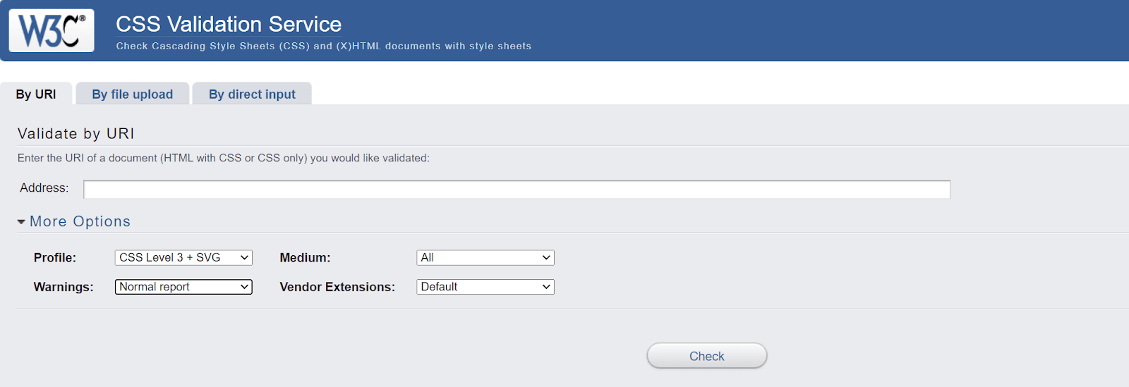
There are many options available for validating CSS-specific code. Code editors, for example, include validator plugins that can scan your code in runtime and create mistakes. You can also find published websites, like W3C, that will validate your CSS code using raw CSS code, published websites, or CSS files. Whatever you do as part of your testing step.
Use CSS oriented frameworks
Although a framework is a personal option for the developer, I have always found excellent support with CSS-oriented frameworks in my experience. Best CSS frameworks like Bootstrap come with predefined libraries for the most common things you want to build. These may include forms, buttons or a simple label tag.
A code sample is given below:
<button class="btn btn-secondary dropdown-toggle" type="button">
To build them on our own and apply CSS on them is time-consuming and error-prone. With CSS frameworks, you don’t have to use a CSS validator as it keeps in check all the standards and responsiveness for you.
Read More - 23 Responsive And Lightweight CSS Frameworks
Test for Cross Browser Compatibility
The final phase of your website or web app ends with cross browser testing. Once you create browser-specific CSS codes and CSS validation, it is good to render the website on multiple browsers and devices to confirm cross browser compatibility of your result. Cross browser testing platforms provide great infrastructure, features and integrations that are just made for this purpose. They help you view websites on desktop and mobile screens. It also helps in keeping in check your responsive web design.
Read - 20 Elements of Modern Web Design That You Need to Know
To eliminate the hassle of in-house device labs, it is preferred to choose a cloud testing platform like TestMu AI. It allows you to perform cross browser testing across 3,000+ real browsers and operating systems online to test your browser-specific CSS codes. You can also test browser-specific CSS on TestMu AI real device cloud to ensure it renders correctly in real-user conditions.

TestMu AI also comes with a responsive checker tool - LT Browser to test responsiveness of websites across different viewports like mobiles, tablets, desktops and laptops. You can refer to our blog on why developers should use LT Browser to look deeper into its features and give it a spin for free.

Intrigued to know more about LT Browser, check out the video tutorial below.
You can follow the TestMu AI YouTube channel for mode videos around responsive testing, automated browser screenshot testing, automation testing, CI/CD, and more.
Once you are done testing your web application on multiple browsers, you can rest assured and publish it to the world. Now you can perform online cross browser testing on Brave Browsers to make sure your websites and web apps are compatible with all versions.

Can AI Agents Check Browser-Specific CSS Across Real Engines?
Partly, and only for structural differences. Microsoft's Playwright MCP server, an open source Model Context Protocol server, lets an AI coding agent drive Chromium, Firefox, and WebKit through one interface instead of a person opening each browser by hand to check a CSS fix.
The agent calls tools such as browser_navigate and browser_snapshot to load the same page in each engine and compare the accessibility tree each one returns. If a Chrome-only property such as -webkit-appearance leaves an element with a different role or state in Firefox, the agent can flag the mismatch without a developer opening three browser windows side by side.
This does not replace the browser-specific CSS covered in this article. Playwright MCP compares the accessibility tree, not rendered pixels, so a WebKit-only mask, a vendor-prefixed gradient, or a shadow that renders differently but leaves the DOM unchanged will not show up.
The agent also needs each browser engine installed locally through Playwright's own setup step, so it cannot check a browser it does not have. It never writes the fix either. A developer still has to add the correct vendor-prefixed rule once the agent reports where the engines disagree.
What’s your hack for Browser Specific CSS?
There are various browsers available today, and if you use them, they all are different in their way. Since they come with many features, you might never know what your end-user is using to open your web application. The most we can do is be prepared for all the target browsers. This is not an easy task, though. Knowing browser-specific issues to implement browser-specific CSS code needs careful analysis and work.
This post highlighted the same methods to let you make websites that can be rendered flawlessly on every latest and legacy browser and operating system. With this, I hope you might have found your own hacks and specific codes to work on as a web developer.
Let us know them in the comment section, and we will try to update the most used ones in this post.
Author

Harish Rajora
Blogs: 102


Harish Rajora is a Software Developer 2 at Oracle India with over 6 years of hands-on experience in Python and cross-platform application development across Windows, macOS, and Linux. He has authored 800 + technical articles published across reputed platforms. He has also worked on several large-scale projects, including GenAI applications, and contributed to core engineering teams responsible for designing and implementing features used by millions. Harish has worked extensively with Django, shell scripting, and has led DevOps initiatives, building CI/CD pipelines using Jenkins, AWS, GitLab, and GitHub. He has completed his post-graduation with an M.Tech in Software Engineering from the Indian Institute of Information Technology (IIIT) Allahabad. Over the years, he has emphasized the importance of planning, documentation, ER diagrams, and system design to write clean, scalable, and maintainable code beyond just implementation.
Reviewer

Sparsh Kesari
Reviewer
Sparsh Kesari is a community contributor with 3+ years of experience in developer relations, open-source engineering, and automation-focused tooling. At TestMu AI, he works as a Senior Developer Relations Engineer, supporting developer communities and contributing to initiatives around cross-browser testing, KaneAI, and HyperExecute. Sparsh has hands-on experience building and maintaining automation scripts, open-source projects, and developer platforms, with a strong background in JavaScript, Node.js, Docker, and cloud-native workflows. He holds a Bachelor’s degree in Computer Science.


Did you find this page helpful?
More Related Blogs
TestMu AI forEnterprise
Get access to solutions built on Enterprise
grade security, privacy, & compliance
- Advanced access controls
- Advanced data retention rules
- Advanced Local Testing
- Premium Support options
- Early access to beta features
- Private Slack Channel
- Unlimited Manual Accessibility DevTools Tests