

Power Your Software Testing with AI Agents and Cloud
The Native AI-Agentic Cloud Platform to Supercharge Quality Engineering. Test Intelligently and Ship Faster.


- TestMu AI (Formerly LambdaTest)
- /
- Blog
- /
- Importance of Responsive Web Design: Benefits and Testing
Importance of Responsive Web Design: Benefits and Testing
Learn why responsive web design matters, the benefits it brings, when a business can skip it, and how to test a site across mobile and desktop viewports.
Last Updated on:
Responsive web design is important because one website has to render correctly on every screen a visitor uses, from a small phone to a wide desktop monitor.
Google has crawled and indexed every site with the smartphone Googlebot only since July 5, 2024, so a page a phone cannot render is a page Google cannot index.
This guide covers what responsive web design is, its importance and benefits, whether every business needs a responsive site, the alternatives, how to test for responsiveness, and how AI coding agents help.
Key Takeaways
- Responsive web design renders one website according to the size of the viewport, so the layout and experience stay consistent from a small phone screen to a desktop monitor.
- Statcounter has recorded mobile ahead of desktop in global page views every year since 2016, so designing a website for a single device size is no longer workable.
- Google crawls and indexes every site with the smartphone Googlebot only since July 5, 2024, so a page a phone cannot render is a page Google cannot index.
- A single responsive website costs less than a separate mobile site, because one website serves every new device and only one website has to be maintained.
- A business with a limited audience and fixed requirements, such as an internal IT portal restricted to one browser, can skip responsive web design without any loss.
- Testing a website for responsiveness means checking readable font size, horizontal scroll, element spacing, and tap target size across many device viewports, not just resizing a browser window.
What Is Responsive Web Design?
Responsive web design, also known as RWD, is a web-design strategy to automatically render the website according to the screen size (or the viewport size). Thus, the look and feel of the website (i.e. design, layout, and experience) should remain uniform, irrespective of the device being used for accessing the website.
Shown below is the demonstration of a responsiveness test that we performed on the TestMu AI website. From the below responsive design example, it is evident that the website is responsive across various desktop and mobile viewports.

Intrigued to know how we test the website for responsiveness? We used a mobile friendly checker tool called LT Browser to test the website across multiple device viewports for mobiles, tablets, desktops and laptops. In the above responsive design example, we have used a mobile viewport - Samsung Galaxy Note 9 and a desktop viewport - 15 inch MacBook Pro to perform responsiveness tests of the website.
As seen in the below responsive design example, we can see that the website is not responsive. This is not the ideal experience you would want to give to your customers!

In reality, responsive web design is all about expanding and shrinking the web page according to the screen size (or viewport) on which the website is being viewed. Responsive web design is extremely important in today's times!
The tools for responsive CSS design have moved past media queries. CSS container queries let a component react to the width of its own container instead of the viewport, and every major browser has supported them since Firefox 110 shipped in February 2023. The dynamic viewport unit variants dvh, svh, and lvh fix the old problem of a 100vh section hiding under a mobile address bar, because dvh tracks the visible area as the browser chrome shows and hides. A layout that uses both needs fewer breakpoints than one written with viewport media queries alone.
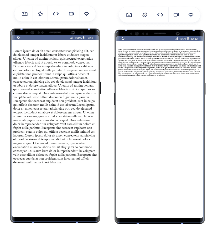
Responsive web design depends on the user who is visiting your website. For example, if I use a 12px font on the bigger screen size and shrink it to mobile, it might come down to 8px which is illegible. In contrast, the font size needs to be bigger on a small screen, the recommended font size is 16 px. For mobile devices, the recommended font sizes are 16px and 8px.
Another good responsive design example is the image being presented to the user. In my earlier blog on how to make responsive images with CSS, HTML, WordPress and more, I have listed a number of methods that help you achieve the same. The major issue with images is that focus is lost when they are shrunk too much. Here is a responsive design example that demonstrates the same:

Practically, the image should be as shown below:
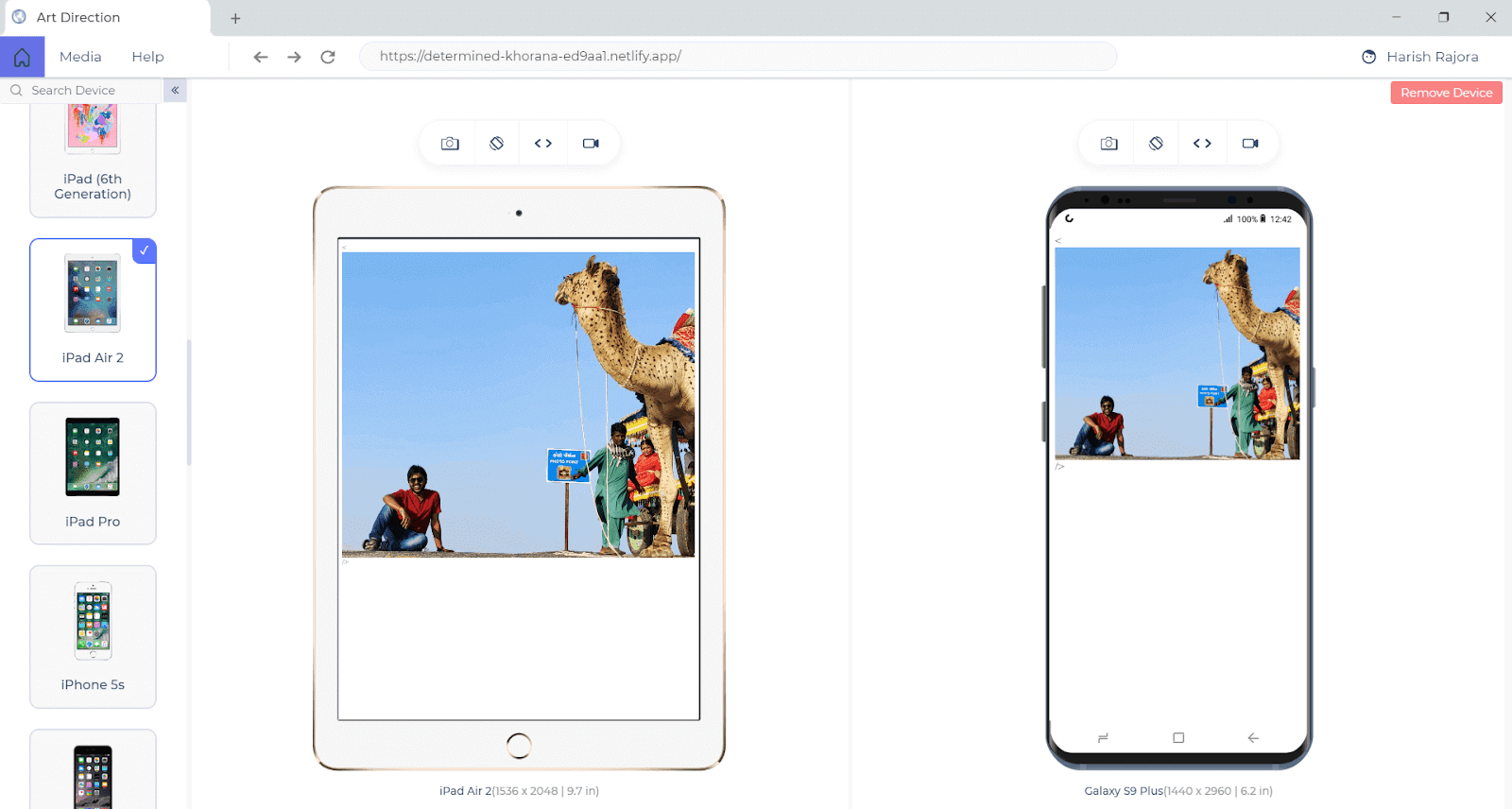
Which is better as a user experience? Well, the struggle does not end here. There are a number of things that need to be adhered to for making the website more responsive, and they sit alongside the rest of a website design checklist. Here are the questions that have to be catered to when testing a website on the responsiveness quotient:
- Is the font size readable?
- Am I getting any horizontal scroll on the web page?
- Does adequate space separate my elements?
- Do my users have to pinch for zooming into the content?
That's not all, there are many more questions...
With this Responsive testing tutorial for beginners, you will learn how to perform Responsive Testing of your website on the TestMu AI platform.
Key Takeaway: Responsive web design expands and shrinks a single web page to fit the viewport it is opened on, and CSS container queries with the dvh, svh, and lvh units do that with fewer breakpoints than viewport media queries alone.
Importance Of Responsive Web Design
If you're a newbie to web design, you might be wondering why responsive design is important. The answer is quite simple. It is no longer feasible to create web designs for a single device. Statcounter has recorded mobile ahead of desktop in global page views every year since 2016.
That traffic split alone shows why responsive web design is vital. It is more important due to the plethora of devices (especially mobile/hand-held) available in the market. To get started with mobile web development, check out this ultimate guide to build a mobile friendly website.
Here are some of the major pointers to highlight the importance of responsive web design:
Explosive Mobile Growth
Mobile devices are part and parcel of our lives. Most of your visitors will reach your website on a small screen. Phone screens also vary far more than desktop screens, from compact 5 inch handsets to foldables that change aspect ratio mid session.
Smart penetration is not uniform across the globe which essentially means that the website should be tailor-made as per the targeted market. Increased global mobile penetration is an important factor that should be kept in mind when designing for the mobile-first audience.
Need For High Speed
Picture this, there are more than one billion websites in the world! As a business owner, there is a high probability that the uniqueness of your idea is already exploited by some other business.
Hence, as a business owner, it is important to convey the web developers to tailor-make the website as per the target audience and target market. A user leaves a website within 2 seconds which makes page load time also extremely important.
Read - How To Measure Page Load Time With Selenium
User's patience has decreased significantly due to the availability of high-speed internet. As business owners, we have just two to four seconds to impress our users as a website's responsiveness is instantly visible to the end-user. Therefore, a responsive web page can help in sustaining a user and consequently increasing the business revenue.
Better Search Indexing
On April 21, 2015, Google rolled out the mobile-friendly update that stressed upon the importance of having mobile-friendly pages for ranking better on the search engine. Web pages that follow best practices like high readability of text without taps (or zooms), improved spacing of tap targets, etc. have a better chance of ranking than their corresponding counterparts.
We all know how important it is to rank high on search engines! This point alone makes responsive design one of the most important parts of the web development process. Google updated (named Mobilegeddon) stressed upon the following points:
- Mobile Searches: Mobilegeddon works only for mobile searches. For the searches through laptops and desktops, there are no priority issues for non-mobile-friendly websites.
- Global update: Factors like country of origin, location of website server, website language, etc. do not matter since the update is rolled out globally.
- Page Based Mobile Friendliness: The algorithm focuses on a single web page that appears in the search results. If the page is not mobile-friendly, it might appear in the latter pages of the search results.
Google has moved well past that 2015 update. From July 5, 2024, Google crawls and indexes every site with the smartphone Googlebot only, so a page a phone cannot render is a page Google cannot index. Google also retired the Mobile Usability report and the Mobile-Friendly Test tool in December 2023, so mobile problems now surface through the Core Web Vitals report instead. Interaction to Next Paint replaced First Input Delay as a Core Web Vital on March 12, 2024, and mid-range phones fail it first.
We can conclude that a responsive website is equivalent to a mobile-friendly website, which in turn helps in boosting the rankings on search engines like Google.
Key Takeaway: Responsive web design matters because mobile page views passed desktop in 2016, visitors abandon a slow page within seconds, and Google has indexed with the smartphone Googlebot only since July 5, 2024.
Benefits Of Responsive Web Design
From the earlier section, it is evident that responsive web design is important for any website and non-adherence could lead to financial losses (due to the fall in the organic traffic to the website).
Here are some of the major benefits of responsive web design:
Improved User Experience
In simple terms, responsive web design provides a smoother user experience. You can check for yourself which design in the below screens provides a better user experience:

A good mobile experience is one of the most fundamental things that should be kept in mind when designing a website following responsive web design principles.
Read - An Ultimate Mobile Experience Drives 73% Of E-Commerce Sales
Cost-Effective
Before responsive web design and its corresponding came into existence, businesses relied on designing separate websites to cater to different mobile viewports. Here a custom home-page was presented to the user based on the device from which the request was made.
This is not a scalable approach since it would involve modifications in the implementation each time a new device is introduced in the market. This concept was used before the mobile revolution gained momentum! Creating a responsive website that caters to different viewports, browsers, and operating systems is no longer an option but a compulsion for businesses to thrive in this hyper-competitive environment.
Bounce Rates and Session Timing
Apart from the website's development costs, responsive web design helps save money and provide user stickiness. This in turn helps in increasing the session time and reducing the bounce rates. Both of these factors influence search engine rankings.
As far as search engine bots are considered, they are not humans that can read and judge the content. But, they rely on humans for that. A website with a consistently high bounce rate and lower session timings is an indicator that people do not particularly like the website. This leads to lower rankings, less in-bound traffic, and reduced revenue.
Reduced Maintenance Efforts
Responsive websites are easier to maintain as there is only a single website on which changes are made for catering to newer devices. Marketing and managing the business for online presence become extremely easy since you have a single website.
Read More: Mobile Website Testing: Explore 5 Techniques
Key Takeaway: The benefits of responsive web design are a smoother experience on every screen size, one website instead of separate device-specific sites, lower maintenance effort, and longer sessions with fewer bounces that support search rankings.
Should Every Business Opt For A Responsive Website?
So far, we looked at the importance of responsive web design for online businesses. Sure, many things depend on responsive web design but is it this important for every type of business? Actually, No! It is dependent on the project at hand.
In 2017, I developed an in-house portal for raising IT tickets during my stint with a large Indian enterprise. The portal was only accessible via Internet Explorer. With these requirements, there is no point in doing extra work for responsiveness.
When we have a limited audience and specific requirements, responsive web design can become an expensive task. You do it, or you don't; it wouldn't matter. In such cases, refrain from responsive test and cross browser testing. These are some rare cases that ideally occur when you are developing an in-house website.

Key Takeaway: Responsive web design is not mandatory for every project, and a website built for a limited internal audience on one fixed browser can skip responsive and cross browser testing.
Alternatives To Responsive Web Design
Responsive design development is straightforward. In some cases, you may want to consider alternatives to responsive web design. A particular case is when working with lightning web components, you might use separate templates.
In this section, we will explore two popular alternatives to responsive web design:
Dynamic Rendering
Dynamic rendering is a technique in website development in which we render different templates according to the screen size. CSS media queries are used to determine the screen size whereas lightning web components are used for rendering different templates. A complete guide on Dynamic rendering in HTML and CSS can be a good resource to get started with dynamic rendering of websites.
Separate Mobile Website
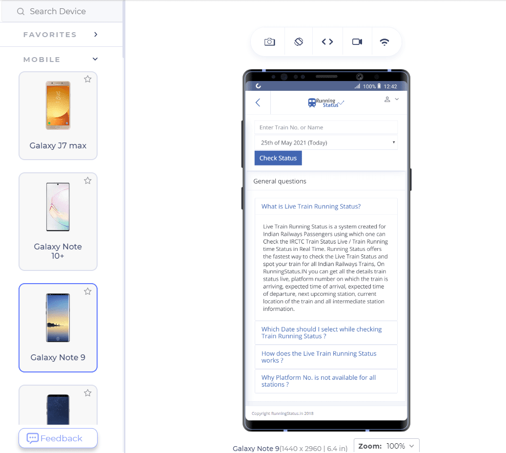
One alternative to responsive design is to develop a separate mobile website. This approach might look like moving back in time:) With the introduction of responsive web design, one single website has been the main focus of most businesses.
Below is the responsive design example where separate mobile websites are in use. However, it is operational but not functional anymore.
Test website responsiveness for FREE!!!
Key Takeaway: The two alternatives to responsive web design are dynamic rendering, which serves a different template for each screen size, and a separate mobile website, an approach most businesses have moved away from.
How To Test Websites For Responsiveness?
It is needless to mention that responsive web design is super important in today's times. Here are the following ways to test website for responsiveness:
Refer to the below tutorial on how to perform responsive testing on TestMu AI.

Browser Developer Tools
To ensure that the website we are developing is responsive, the browser comes equipped with developer tools to fix issues encountered on different viewport sizes. The following steps will help analyze your website in Google Chrome with Chrome DevTools for cross browser testing. In fact, you can use any of the popular browsers since all of them are equipped with the in-built tools.
To test on mobile devices for responsiveness, right-click and select Inspect (Shortcut: Ctrl + Shift + J in Windows). It will open the developer tools panel.
In the below responsive design example, resize the window size by expanding and shrinking with this icon.
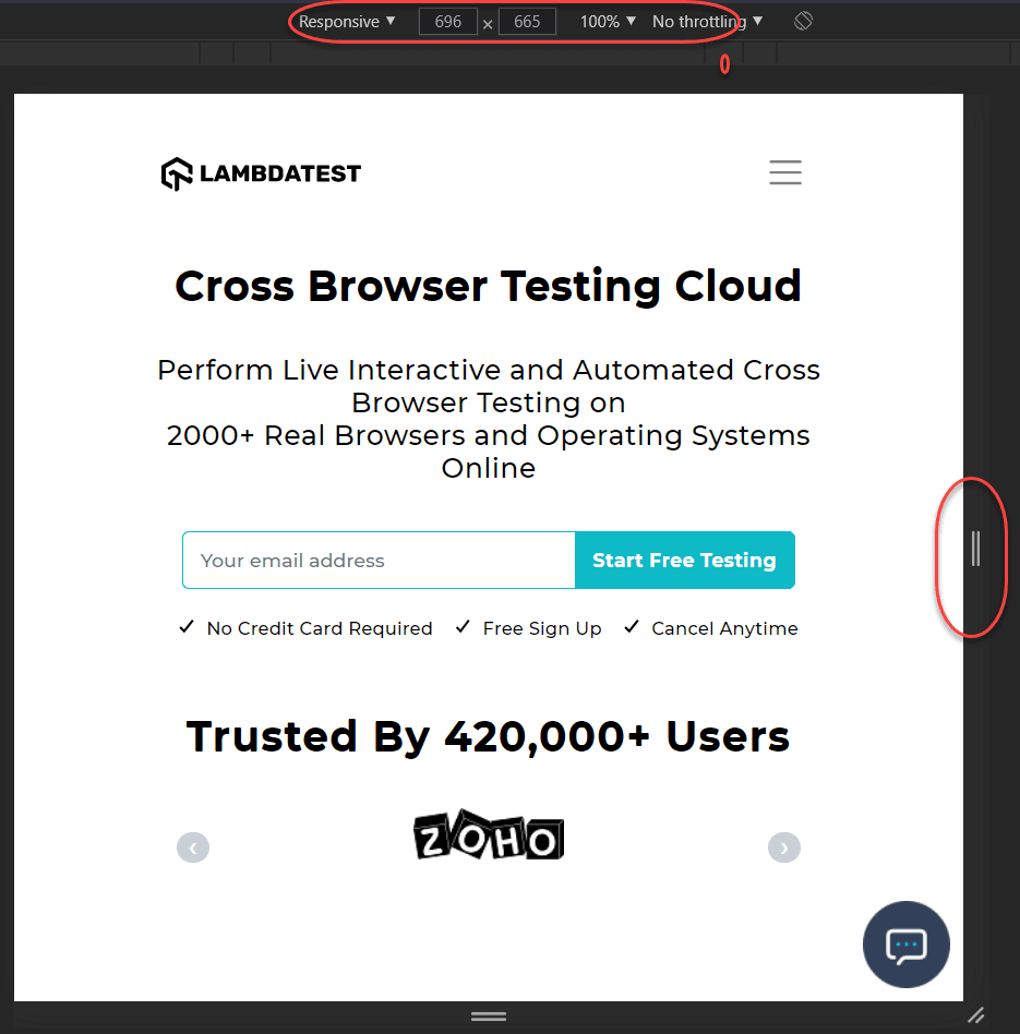
The top panel will display the screen size as you rescale the size. It can be used to identify the responsive design.
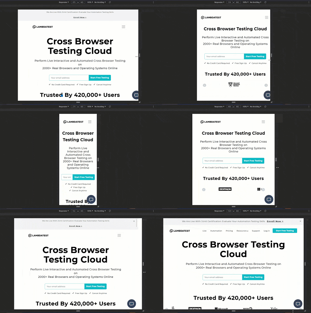
As mentioned earlier, responsiveness is much more than rescaling. What if the buttons shrink to the extent that you cannot invoke the click event. Since there are a plethora of devices available in the market, it is recommended to use an expert tool to judge the responsiveness of the website.
LT Browser
LT Browser, a mobile friendly checker tool lets you test website for responsiveness across 50+ device viewports (including mobiles, tablets, desktops, and laptops). You can also test your website on custom viewports using LT Browser.
Web developers, testers, and avid users of LT Browser; we are here with some super exciting news!📰💥
— LambdaTest (@testmuai) June 24, 2021
All the essential features of LT Browser are now 'Free for LifeTime'💯🚀
✅Download Now- https://t.co/j1YM8RjGzt#LTBrowser #FreeForever #developers pic.twitter.com/I2mxeFFjJS
LT Browser comes with out-of-box features like developer tools, Google Lighthouse performance reports, hot reloading, and network throttling features to get an accurate idea about the website's capabilities.
You can also check how your website performs under throttling network conditions with the LT Browser. Read how to test website on different network conditions to know more about it.

In the below responsive design example, we will use LT Browser to test website for responsiveness.
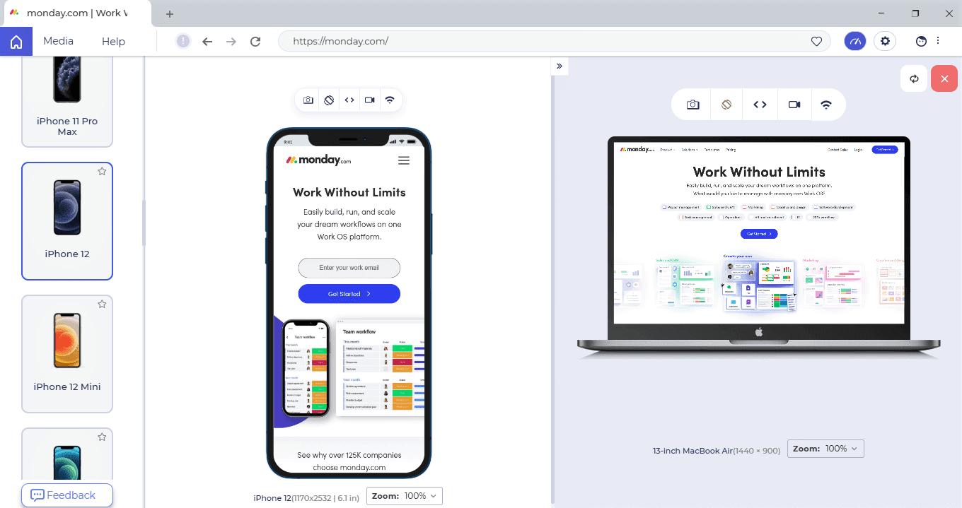
Also Read: 11 Reasons Why Developers Should Use LT Browser
To get started with the LT Browser, check out the LT Browser tutorial.
Key Takeaway: Browser developer tools show how a page reflows as the window is resized, but a website needs checks across many device viewports to catch problems like a button that has shrunk too small to tap.
How Do AI Coding Agents Help With Responsive Design?
AI coding agents can drive a real browser at a viewport you name, resize it, and capture the result, so the repetitive part of responsive checking runs without a human at the keyboard. Google published Chrome DevTools MCP on September 23, 2025. It connects a coding assistant to a live Chrome instance, and its tool reference lists resize_page, which resizes the page window to a dimension you specify, alongside take_screenshot and performance trace tools. Microsoft's Playwright MCP exposes a browser_resize tool that takes a width and a height. An agent can open your page at a phone width, record what it sees, then repeat at tablet and laptop widths.
Read the limits before you trust the output. Playwright MCP sends the model Playwright's accessibility tree rather than pixels, so the agent reads page structure and not appearance. A horizontal scrollbar, a button that has shrunk below a usable tap size, and text that overlaps an image are visual failures that a structural snapshot does not describe. Those are the same questions listed earlier in this post, so a screenshot step or a human look still has to close the loop.
Chrome DevTools also ships an AI assistance panel powered by Gemini. Google documents it as a way to get an explanation of an element's styles and help fixing layout and styling bugs from inside the Elements panel, and labels the feature experimental, noting that it may generate inaccurate information. It is useful when you want to ask why a flex item stops wrapping at one breakpoint. It does not tell you which viewports to check, and it does not know which devices your own analytics report, so the test matrix stays your decision.
Key Takeaway: AI coding agents can resize a real browser and capture each viewport with Chrome DevTools MCP or Playwright MCP, but Playwright MCP reports page structure rather than pixels, so a screenshot step or a human look is still needed to catch visual breakage.
Conclusion
Responsiveness is not an option in modern web design but is a crucial component of it. Without responsiveness, the business is just placing a blind bet in the market. In this post, we went through some key insights of responsiveness and how its priority has shot up in the website development market in recent years.
Responsive design can be judged through different methods discussed in this post. With them, the process will be faster and much easier. However, I am sure that you must have your own experience with responsiveness as well. If so! Share your thoughts in the comments section. I hope this post helps you with your next web dev project!

Austin Siewert
Co-Founder, Steadfast Systems
Discovered @TestMu AI yesterday. Best browser testing tool I've found for my use case. Great pricing model for the limited testing I do 👏
2M+ Devs and QAs rely on TestMu AI
Deliver immersive digital experiences with Next-Generation Mobile Apps and Cross Browser Testing Cloud

Author

Harish Rajora
Blogs: 102


Harish Rajora is a software developer at TestMu AI with over 6 years of hands-on experience in Python and cross-platform application development across Windows, macOS, and Linux. He has authored 800+ technical articles and worked on large-scale projects, including GenAI applications and core engineering features used by millions. Harish has led DevOps initiatives building CI/CD pipelines with Jenkins, AWS, GitLab, and GitHub, and holds an M.Tech in Software Engineering from IIIT Allahabad.


Responsive Web Design FAQs
Did you find this page helpful?
More Related Blogs
TestMu AI forEnterprise
Get access to solutions built on Enterprise
grade security, privacy, & compliance
- Advanced access controls
- Advanced data retention rules
- Advanced Local Testing
- Premium Support options
- Early access to beta features
- Private Slack Channel
- Unlimited Manual Accessibility DevTools Tests