

Power Your Software Testing with AI Agents and Cloud
The Native AI-Agentic Cloud Platform to Supercharge Quality Engineering. Test Intelligently and Ship Faster.

- TestMu AI (Formerly LambdaTest)
- /
- Blog
- /
- 15 Most Common Web Accessibility Issues [2026]
15 Most Common Web Accessibility Issues [2026]
The 15 most common web accessibility issues, from missing alt text and low contrast to unlabeled forms, with how to detect each one and fix it for WCAG 2.2.
Last Updated on:
On This Page
- What Are Accessibility Issues?
- 15 Common Web Accessibility Issues and Solutions
- Issue 1: Inappropriate Navigation Links
- Issue 2: Inadequate Marked-Up Data Table for Screen Reader
- Issue 3: Low Color Contrast
- Issue 4: Inaccessible Forms
- Issue 5: Absence of Alternative Text for Images
- Issue 6: Lack of Structured Focus Order Among Interactive Components
- Issue 7: Heading Hierarchy
- Issue 8: Lack of Keyboard Accessibility
- Issue 9: Inaccessible Document
- Issue 10: No Subtitles and Captions to Videos
- Issue 11: Missing WAI-ARIA Attributes
- Issue 12: Ambiguous Link Text
- Issue 13: Failure to Identify and Fix Errors
- Issue 14: Text With the Incorrect Font and Size
- Issue 15: Same Descriptive Text for Different Resources
- How to Detect Issues
Web accessibility ensures that websites and web apps are usable by everyone, including people with impairments. Therefore, it's important to ensure your digital content is usable for everyone and free from accessibility issues.
The WebAIM Million 2026 report, which tested the top one million home pages in February 2026, detected 56,114,377 distinct accessibility errors, and just six error types accounted for 96% of them: low contrast text, missing alternative text, missing form input labels, empty links, empty buttons, and missing document language.
To successfully build websites and web applications, developers and testers must address the accessibility issues that may create barriers for impaired users to consume content.
TL;DR
- Accessibility issues are barriers that stop people with disabilities from reading, navigating, or interacting with website content.
- Missing image alt text, low color contrast, unlabeled forms, and lack of keyboard access are among the most common web accessibility issues.
- Screen reader users are blocked by ambiguous link text, skipped heading levels, poorly marked-up data tables, and missing WAI-ARIA attributes.
- Videos without captions and PDFs or Word documents without accessible structure exclude deaf and blind users from non-HTML content.
- Clear error messages and a logical focus order help users with cognitive and motor disabilities complete forms.
- Web accessibility issues are found by combining automated scans against WCAG with screen reader and keyboard-only testing.
What Are Accessibility Issues?
Accessibility issues are barriers that prevent people with disabilities from accessing, navigating, or interacting with website content effectively.
Accessibility issues are the barriers or challenges that hinder individuals with disabilities from accessing, navigating, or interacting with content on a website. Some of the barriers can be issues with navigation, poor color contrast, content presentation, etc.
For example, a user with visual impairment will depend on a screen reader to access the content on the web. However, suppose the website's code is not designed to be accessible. If that happens, the screen reader may not understand the information on the user interface accurately, thus preventing the user from accessing the required content.
Accessibility isn't a feature, it's a necessity. Watch this video to learn how we can make the web more inclusive for all.
Thus, accessibility issues can have an unpleasant impact on end-user experience. Therefore, developers must benefit everyone by creating inclusive experiences through adherence to web accessibility guidelines by focusing on common web accessibility issues.

Note: Find and fix accessibility issues on your pages across 3,000+ browser and OS combinations. Try TestMu AI Today!
What Are the 15 Common Web Accessibility Issues and Solutions?
Common issues include poor navigation links, inadequate data tables, low color contrast, inaccessible forms, missing alt text, and lack of keyboard accessibility.
Here are some of the common web accessibility issues:
Issue 2: Inadequate Marked-Up Data Table for Screen Reader
Another accessibility issue involves data tables not being adequately marked for screen readers. Screen readers cannot access data tables with multiple levels of row or column headers, as they require users to associate information in each data cell with the relevant headers.
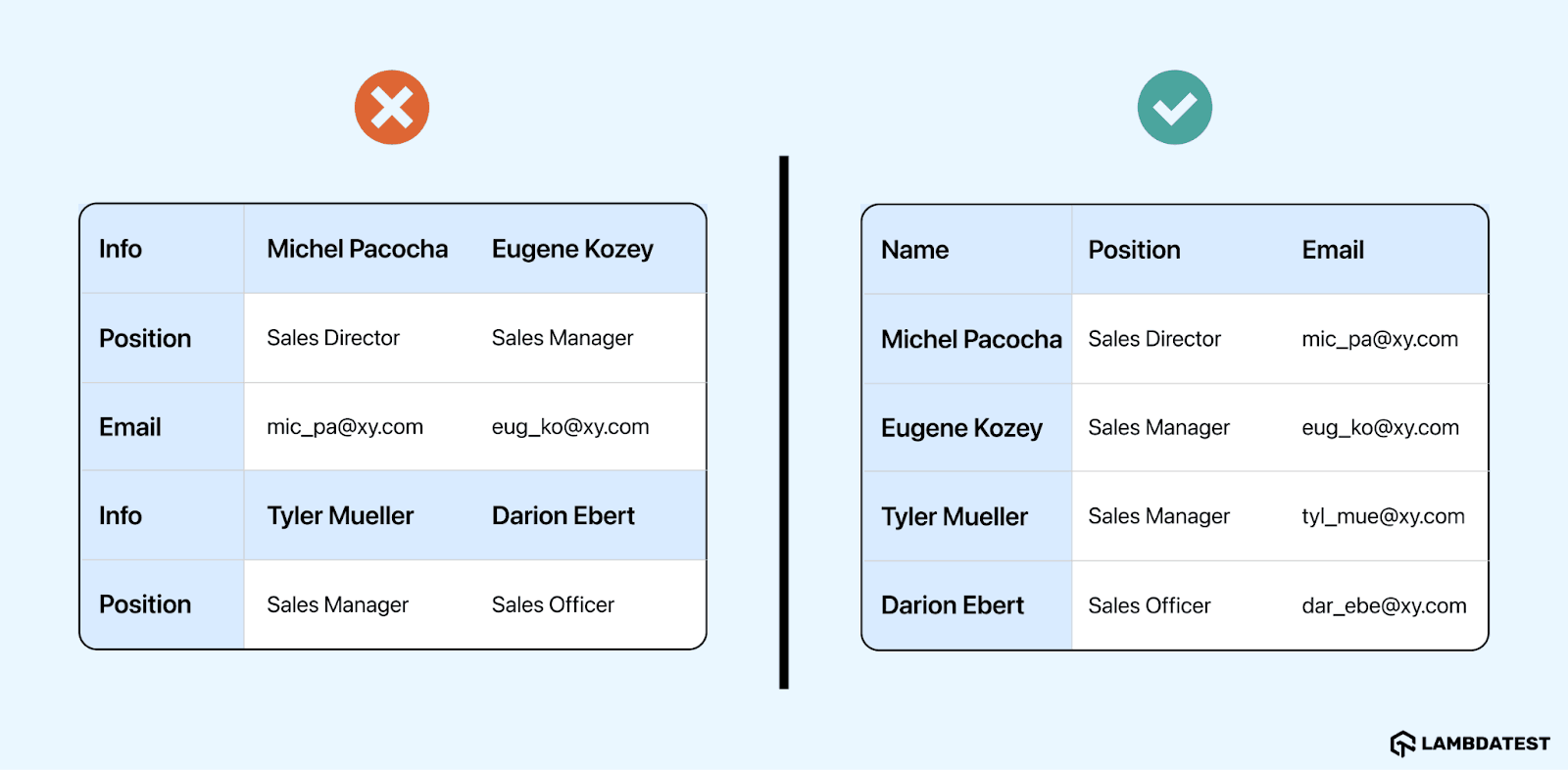
Solution: The solution to this issue lies in using simple data tables, which consist of one level of row or column headings appropriately marked up for screen reader accessibility. These tables use the <th> element for headers and the <td> element for data cells.
While complex data tables can be made accessible to screen readers using id, headers, and/or scope attributes, most users find them challenging to navigate due to multiple header levels. Therefore, prioritizing the use of simple data tables enhances accessibility for all users.
Issue 3: Low Color Contrast
Low color contrast of web pages is a challenge for users with vision impairments. This is because they cannot access the content due to a lack of difference between the text's color and background. For example, users with color blindness won't be able to differentiate the same type of colors on the web page, which makes it hard to read and understand.
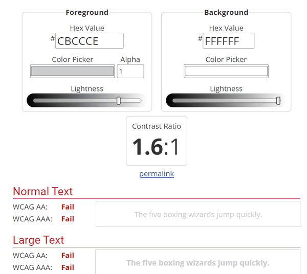
Solution: Make sure to use a color contrast checker, which can be found online, to confirm the text and background colors have sufficient contrast. Normally, paragraph text should have a contrast ratio of at least 4.5:1 between the foreground and background content, while large text, defined as at least 18 point or 14 point bold, needs a ratio of at least 3:1, per WCAG success criterion 1.4.3. This ensures that there is enough of a difference in color to make the text easily visible against the background, with links being distinct from the rest of the text.
Also, we recommend you check this blog to learn how to incorporate color contrast accessibility.
Issue 4: Inaccessible Forms
As users navigate a website, they encounter various form fields. However, numerous online forms lack proper or empty form labels, hindering screen readers from conveying crucial control information. This challenges visually impaired users depending on assistive technologies to navigate and complete forms. In the WebAIM Million 2026 analysis, 51% of home pages had missing form input labels.
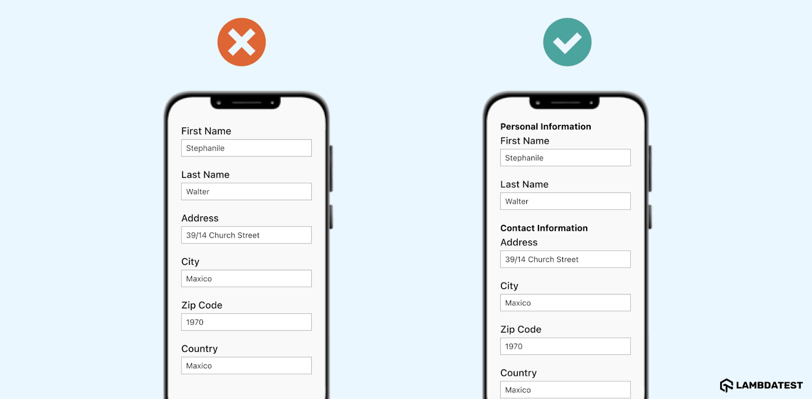
Solution: Enhance the user-friendliness and accessibility of all input fields or contact forms on your website by ensuring they contain explicit labels. You can use the <label> element in each field code, as it will enable screen readers to accurately convey required field information to users.
Additionally, you can provide clear text alternatives for buttons and CAPTCHA to guide users on post-form completion actions.
Issue 5: Absence of Alternative Text for Images
Users can access not only the written content or information on the website but also need to understand the visual content. Users who depend on screen readers to comprehend web page content require accessible alt text for images. Without alt text, users are unaware of the image and its significance to the written content. The same WebAIM analysis found missing alternative text on 53.1% of home pages.
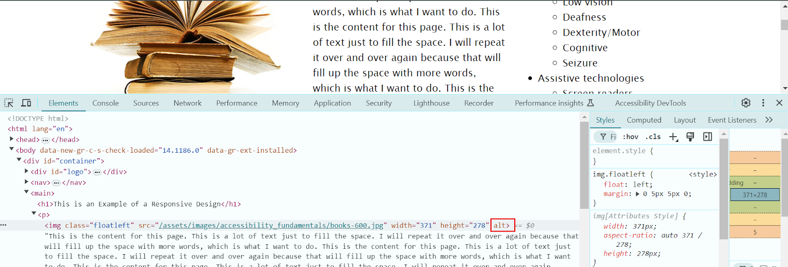
Solution: For each image, you should have written alt text that is not too short or long. It should concisely describe the image's context. In simple terms, you have to write the description of the image that best explains it, and the screen reader can understand and describe it to the user. Try to avoid the use of jargon and terms that are too technical.
For images lacking contextual significance, null alt text should be used. Leaving the alt attribute empty (alt="") or including null signals to the screen reader that the image lacks descriptive text is essential for preventing the reading of the image file name.
Issue 6: Lack of Structured Focus Order Among Interactive Components
Individuals with disabilities often face the issue of being confused and disoriented while navigating through web pages in case there isn't a clear, structured sequence for interactive elements. This challenge is particularly significant for users with visual impairments or motor disabilities who rely on specific navigation tools like joysticks. Users who solely navigate through keyboards need a coherent understanding of the focused element and the sequence in which interactive components are accessed.
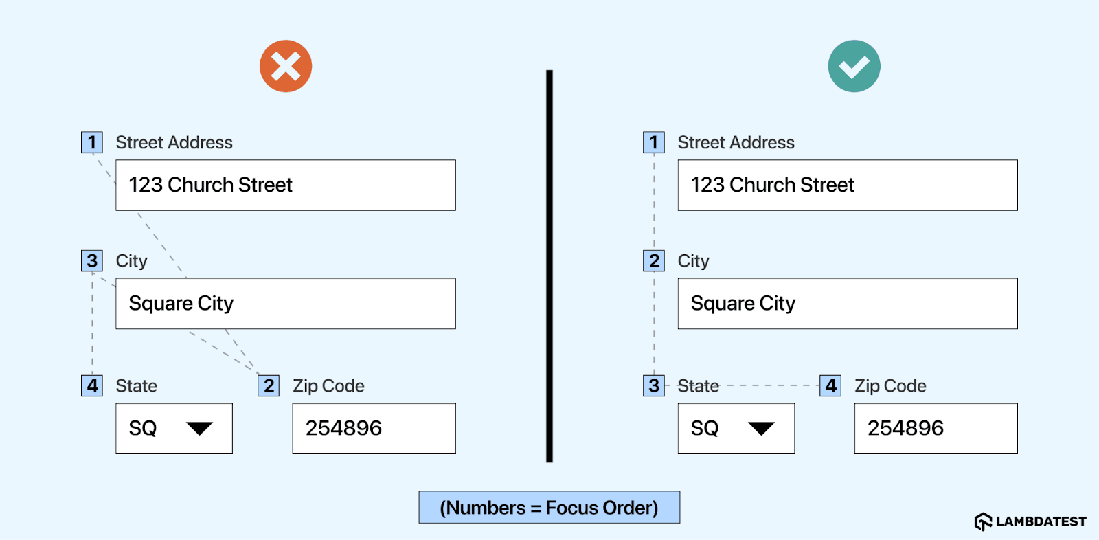
Solution: The logical focus order typically follows the visual flow of the page from left to right and top to bottom. For this, the tab sequence of interactive elements within the page must align with a logical progression based on the page's functional logic. This sequence mimics the arrangement of elements in the HTML code.
Elements such as <header>, <nav>, <main>, <footer>, <section>, and <article> provide structure and context, helping screen readers and other assistive technologies understand the page layout better. You have to ensure that the tabindex element is used correctly. For example, use tabindex="0″ to add an element to the natural tab order and use tabindex="-1″ to make an element focusable programmatically but not via the keyboard.
Issue 7: Heading Hierarchy
Another web accessibility issue is the improper use of headings in the content of web applications. Users with disabilities are less likely to read the entire web page. They mainly depend on assistive technologies to navigate the content. Such users depend on headings to move around a website.
However, pages with substantial content lack heading elements that help screen reader users comprehend the content's structure and navigate the page easily. This is called an empty heading because it is without text that provides no information, can cause confusion, and is often created inadvertently while adding content to the site.
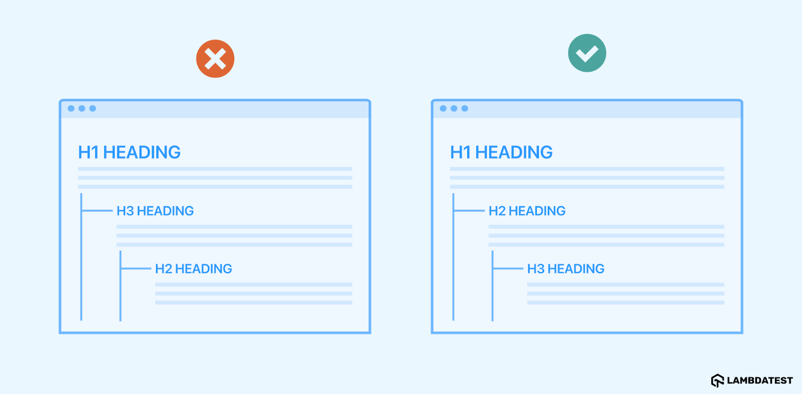
Solution: It is suggested that informative content be included in headings that describe the subsequent content. Ensure that the heading hierarchy is logical (H1>H6) to facilitate easy navigation for users. Follow the correct heading structure and separate the presentation from the structure using Cascading Style Sheets (CSS).
Proper use of headings includes:
- Use <h1> for the page's title, and avoid using <h1> for anything other than the title of specific pages.
- Use headings to define and organize your content structure.
- Do not skip heading levels (e.g., from <h1> to <h3>), as this can confuse screen reader users who might think content is missing.
- Headings should not be skipped because many users rely on them for navigation. Additionally, each page should only have one H1 heading.
Issue 8: Lack of Keyboard Accessibility
Lack of keyboard accessibility is one of the major web accessibility issues because most of the disabled people, particularly those with motor disability and vision impairments, depend on keyboards for navigation. They often find using a mouse challenging or even impossible. Instead, they rely only on a keyboard to navigate the website using keyboard commands like the Tab key and shortcuts.
Solution: For keyboard navigation, ensure that a keyboard can easily access or trigger all interactive website elements. This involves having well-structured content with appropriate heading hierarchies. Additionally, hyperlinks, forms, links, and media controls should be easily accessible via the keyboard.
There should also be a visible keyboard focus indicator that highlights different page elements. Although the appearance of this indicator varies by browser, it usually appears as a border or highlight (outline) around the focused element. These outlines can be hidden using CSS properties like outline:0 or outline:none. Furthermore, the website should be coded for keyboard navigation, ensuring that focus indicators follow a logical reading order.
Issue 9: Inaccessible Document
Even non-HTML content on your websites, such as PDFs, Word documents, and PowerPoint presentations, can pose accessibility challenges. Such documents are not accessible to users with disabilities because they do not have certain features, like text descriptions for images or navigable structures, that could allow screen readers or other tools to access them. This limits their ability to access information and complete any crucial online activity.
Solution: You can use the accessibility testing tool in documents such as PPTs and Word. It allows us to evaluate the content of the documents and detect any accessibility issues if present.
It is best to avoid using tables and instead opt for a different presentation method, like paragraphs with headings and banners. You can use the designated title and subtitle styles for the document. Next, design banners with a colored background block that spans the document's width and emphasizes the text in the banner. Also, make sure the text in your document is legible when viewed in high-contrast mode.
Issue 10: No Subtitles and Captions to Videos
Another web accessibility issue is the lack of subtitles and captions for the video content. This makes it difficult for deaf and visually impaired users to access the video content. Generally, the subtitles and captions transcribe the audio of the video and present it in the form of text. Screen readers can access this for visually impaired users or read it directly by deaf users. When such an accessibility feature is lacking, it restricts users from understanding and engaging with the video content.
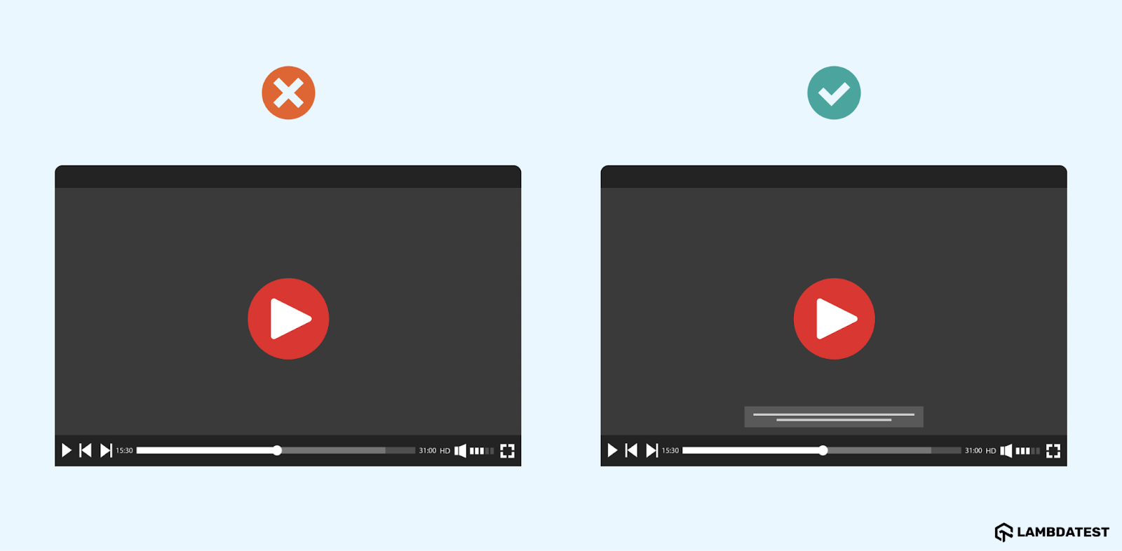
Solution: To address the above accessibility issue, you can use voice recognition software that helps automatically generate subtitles and captions for the video content. Some known platforms, like YouTube, have built-in caption tools and other services that create audio subtitles.
You can also use the API given by the captioning services. This helps the developers to share the video file for automatic captioning. Try to use caption file formats like Web Video Text Tracks (WebVTT) or SubRip (SRT) and provide a separate caption file that describes visual information (known as audio description, video description, or described video).
Issue 11: Missing WAI-ARIA Attributes
Developers use the Web Accessibility Initiative-Accessible Rich Internet Applications (WAI-ARIA) to create accessible interactive content like sliders, accordions, and drag-and-drops. However, if these elements are not implemented correctly, they can interfere with users who depend on speech instructions or screen readers for navigation.
Dynamic content suddenly appearing on the screen, such as confirmation, error, status, loading, and warning messages, can cause issues for blind and visually impaired users. These messages appear without any screen reader announcement, leading to accessibility problems.
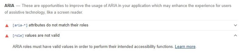
Solution: Depending on the importance and context of the dynamic on-screen content, you can insert ARIA attributes into your HTML code to appropriately indicate the information. ARIA content alerts assistive technologies to changes and helps them understand the content type for better navigation.
However, because the severity and impact of these errors depend on the technology used, you need to test the site on various operating systems, devices, and browsers. For this, cloud testing platforms like TestMu AI can help perform accessibility testing across various desktop and mobile environments.
This ensures that the automatic focus does not interfere with the announcement of newly opened modal windows, loading screens, or popups.
Issue 12: Ambiguous Link Text
Links may be necessary for web navigation, but only if properly used. Missing or ambiguous link text can lead to multiple accessibility issues. For instance, missing link text can be a significant obstacle for visually impaired users. A common example of missing alt text is the absence of text on links, including buttons, icons, logos, or any other images. Without text, screen readers cannot identify the image's function as a link. WebAIM found empty links on 46.3% of home pages and empty buttons on 30.6%.

Solution: Avoid this issue by ensuring that the image alt text conveys the image's purpose or action rather than merely describing the image. You can fix and resolve this issue using informative text that provides minimal but clear details about the link's purpose or function. It is also recommended not to provide unclear link text like "Read More" or "Click Here." Rather, you can provide explanatory link text, which can ease the understanding of the users.
Issue 13: Failure to Identify and Fix Errors
Unclear error messages often lead to poor web accessibility. Issues such as missing visual cues, vague instructions, and errors that appear at inconvenient times or places make it difficult for users, especially those with disabilities, to identify and fix issues.
Solution: Websites can enhance error detection and correction by using precise, transparent language to explain issues and provide solutions, including detailing appropriate formats. Visual cues and ARIA live regions improve accessibility by drawing attention to and verbalizing errors.
Giving clear instructions and illustrations assists users in fixing errors, while live validation and retaining user input help avoid frustration. Users can quickly recognize and resolve issues by positioning error messages close to related fields and providing a consolidated summary at the top of lengthy forms. These methods improve accessibility by simplifying the process of identifying and resolving errors.
Issue 14: Text With the Incorrect Font and Size
While screen readers can assist visually impaired individuals in understanding content, they may not always be entirely precise. Choosing the right font can enhance screen reader efficiency and improve website accessibility. In addition, the small font size of the content can also create a challenge for the disabled person to read it accurately and without any difficulty.
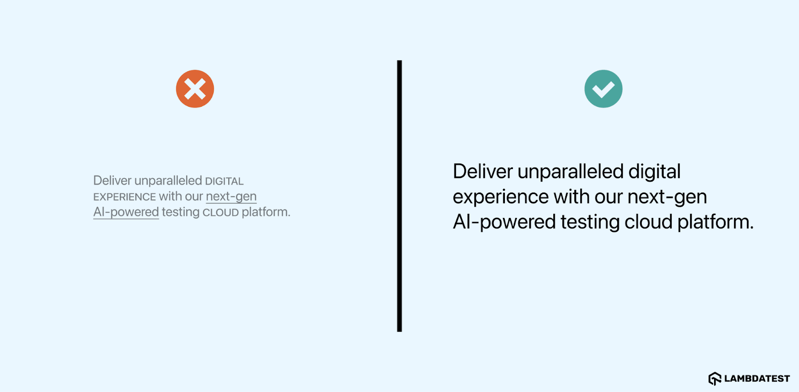
Solution: Choose a basic font to ensure proper display on various devices. Some samples are Arial, Lucida Sans, and Helvetica. Also, consider using fonts explicitly made for people with dyslexia or other visual cognitive challenges. It is also suggested that the font size of the text be increased, where the minimum font size has to be 12 pixels to 18 pixels.
Issue 15: Same Descriptive Text for Different Resources
The same descriptive text for different resources is another crucial challenge that causes web accessibility issues for users. This indicates when a web page uses the same alt-text description for different images, links, and differences, it fails to give correct context and information on each resource, leading to confusion and an inability to understand the content.
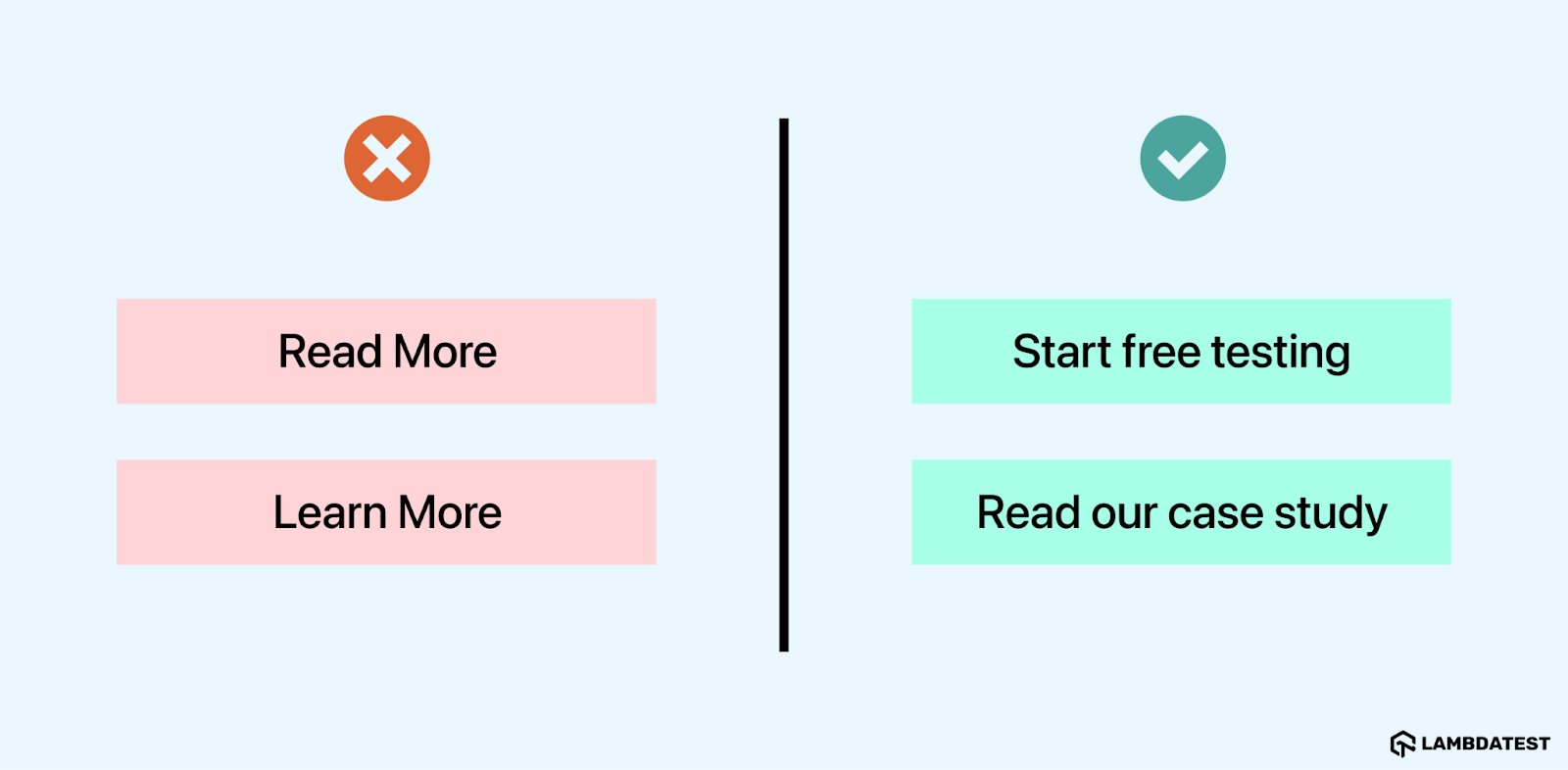
Solution: Always use different alt-text descriptions for your digital assets, such as images and links. This will convey the right information on each digital asset- an image or a link.
How to Detect Accessibility Issues on a Website
Detect accessibility issues in two passes: an automated detector for the rule-based problems, then keyboard and screen reader testing for the rest, as part of wider accessibility testing. Accessibility testing tools such as axe-core, Lighthouse, and the TestMu AI Accessibility DevTools extension check the page against WCAG rules and report each failing element.
To see how much of this list a detector covers, I ran axe-core 4.13.0 on a product category page of the TestMu AI ecommerce playground, on Chrome and Windows 11 on the TestMu AI cloud, with WCAG 2.0, 2.1, and 2.2 A and AA rules:
| axe-core result | Elements | Issue in this list |
|---|---|---|
| color-contrast (violation) | 10 | Issue 3: Low Color Contrast |
| link-name (violation) | 2 | Issue 12: Ambiguous Link Text |
| color-contrast (needs review) | 28 | Issue 3, where axe could not compute the background, such as text over an image |
| Rules passed | 33 rules | Includes checks for alt attributes, form labels, and ARIA validity |
The detector confirmed 2 of the 15 issues outright and passed 28 contrast checks back to a person. Issues such as a confusing focus order, unclear error messages, inaccurate captions, and the same alt text reused for different images cannot be decided by a rule, so they need a keyboard-only pass and a screen reader test.
TestMu AI's accessibility testing suite runs the detector part at three levels: the Accessibility DevTools Chrome extension for the page you are building, WCAG checks inside Selenium, Cypress, and Playwright runs, and accessibility scheduling to rescan live pages on a timetable. Each violation is grouped by severity with the affected element and a fix, as the issue summary dashboard documentation shows. For the manual pass, the guide to screen reader testing with TestMu AI covers NVDA with Speech Viewer on Windows.
Our Accessibility Testing Suite was launched in April 2025 and recognized as the #1 Product of the Day on Product Hunt.

Austin Siewert
Co-Founder, Steadfast Systems
Discovered @TestMu AI yesterday. Best browser testing tool I've found for my use case. Great pricing model for the limited testing I do 👏
2M+ Devs and QAs rely on TestMu AI
Deliver immersive digital experiences with Next-Generation Mobile Apps and Cross Browser Testing Cloud

Conclusion
Run an automated scan on your five most-visited pages today and fix the contrast, alt text, form label, and link text failures first, since those rule-based issues make up most detected errors. Then tab through the same pages with only a keyboard and listen to them with a screen reader to catch the focus order, heading, and error message issues a detector cannot decide.
Author

Nazneen Ahmad
Blogs: 39


Nazneen Ahmad is a freelance Technical Content SEO Writer with over 6 years of experience in crafting high ranking content on software testing, web development, and medical case studies. She has written 60+ technical blogs, including 50+ top-ranking articles focused on software testing and web development. Certified in Automation Basic and Advanced Training - XO 10, she blends subject knowledge with SEO strategies to create user focused, authoritative content. Over time, she has shifted from quick, keyword-heavy drafts to producing content that prioritizes user intent, readability, and topical authority to deliver lasting value.
Reviewer

Rahul Mishra
Reviewer
Rahul Mishra is a Lead Member of Technical Staff at TestMu AI (formerly LambdaTest), leading frontend engineering and accessibility testing across the quality engineering platform. He mentors frontend engineers, runs code reviews and sprint planning, optimizes React.js rendering performance, and makes product features accessible to users with disabilities through WCAG and ADA-compliant accessibility audits. He brings 10+ years of experience across React.js, VueJS, TypeScript, Swift, Objective-C, and AWS, with earlier work as a Technical Lead at VectoScalar Technologies. Rahul holds a B.E. in Information Technology.


Web Accessibility Issues FAQs
Did you find this page helpful?
More Related Blogs
TestMu AI forEnterprise
Get access to solutions built on Enterprise
grade security, privacy, & compliance
- Advanced access controls
- Advanced data retention rules
- Advanced Local Testing
- Premium Support options
- Early access to beta features
- Private Slack Channel
- Unlimited Manual Accessibility DevTools Tests