

Power Your Software Testing with AI Agents and Cloud
The Native AI-Agentic Cloud Platform to Supercharge Quality Engineering. Test Intelligently and Ship Faster.


- TestMu AI (Formerly LambdaTest)
- /
- Blog
- /
- Getting Started With Bootstrap Buttons and Bootstrap Badges [Bootstrap Tutorial: Part II]
Getting Started With Bootstrap Buttons and Bootstrap Badges [Bootstrap Tutorial: Part II]
Explore Bootstrap buttons and Bootstrap badges in this Bootstrap tutorial II. Learn to create visually alluring websites.
Last Updated on:
On This Page
Bootstrap buttons and badges are utility-class components: add the btn class to an element to render a styled call to action, and the badge class to render a small status label. Bootstrap 5 dropped the old badge-primary and badge-pill classes, so badge color now comes from the bg or text-bg utilities and the pill shape from rounded-pill.
This guide covers an overview of Bootstrap buttons and badges, why buttons and badges matter in web development, the components of Bootstrap buttons, what Bootstrap badges are, Bootstrap button toolbars, and debugging common issues.
Key Takeaways
- Bootstrap turns an element into a button through the btn class, which supplies a transparent background, a border, and padding before a variant class adds color.
- Bootstrap button variant classes such as btn-primary and btn-danger carry semantic meaning, and btn-outline-primary renders the same meaning with a transparent fill.
- The classes btn-lg and btn-sm set Bootstrap button size, and the --bs-btn CSS variables added in Bootstrap 5.2 allow custom sizing without overriding the stylesheet.
- Bootstrap 5 removed the badge-primary and badge-pill classes, so badge color now comes from the bg or text-bg utilities and the pill shape from rounded-pill.
- A Bootstrap badge scales to its parent element because the badge class sizes its font in em units instead of a fixed pixel value.
- Wrapping Bootstrap button groups in btn-toolbar collects related actions into one toolbar and removes the need for manual spacing between each button.
Overview of Bootstrap Buttons and Badges
Let’s look at Bootstrap buttons and Bootstrap badges from an outside-the-box perspective before diving deeper into their inner workings.
Bootstrap Badges
You can use Bootstrap badges as tags, labels, or status indicators. The size of the badges primarily depends on the size of their parent wrapper.
Some real-life examples of websites demonstrate how buttons and badges can be used in modern web design. These examples encompass two categories:
- Websites that use Bootstrap: Bootstrap provides pre-designed components, including buttons and badges, to make it easier for developers to create consistent and visually appealing web interfaces.
- Websites not using Bootstrap: This category includes websites built without relying on the Bootstrap framework. These websites also demonstrate different ways of utilizing buttons and badges in web design, but they may have custom-designed elements or use other front-end frameworks or techniques.

Note: Test your Bootstrap buttons and badges on real devices. Try TestMu AI Today!
Importance of Buttons and Badges in Web Development
Button components are some of the most common ones found on websites, thanks to their many uses. Badges have become more prevalent in web development, though not as common. The points below explore the importance of buttons and badges in web development.
Website Buttons: How important are they?
In this section, we delve into the multifaceted roles of buttons on websites and their practical applications.
Responsive Web Design
Buttons help us make responsive web designs for smaller screen devices like mobile phones, especially with navigation menus. It is usually a toggle, as a hamburger icon in a button element. It gives users access to navigation options on smaller screens and maintains a harmonious visual appearance and user experience.
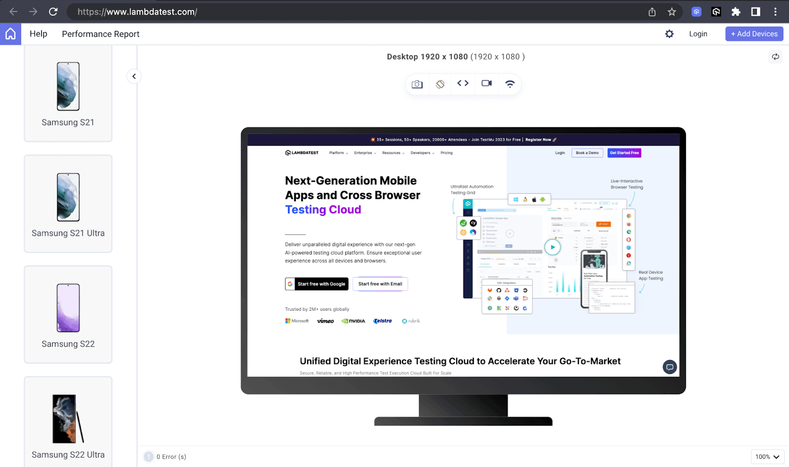
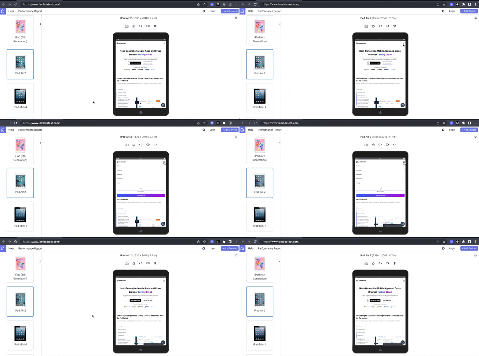
The example below illustrates how TestMu AI uses a toggle button on smaller screen devices to offer the same user experience to website visitors regardless of the device’s screen size.
Desktop preview:
Tablet preview:
Mobile preview:
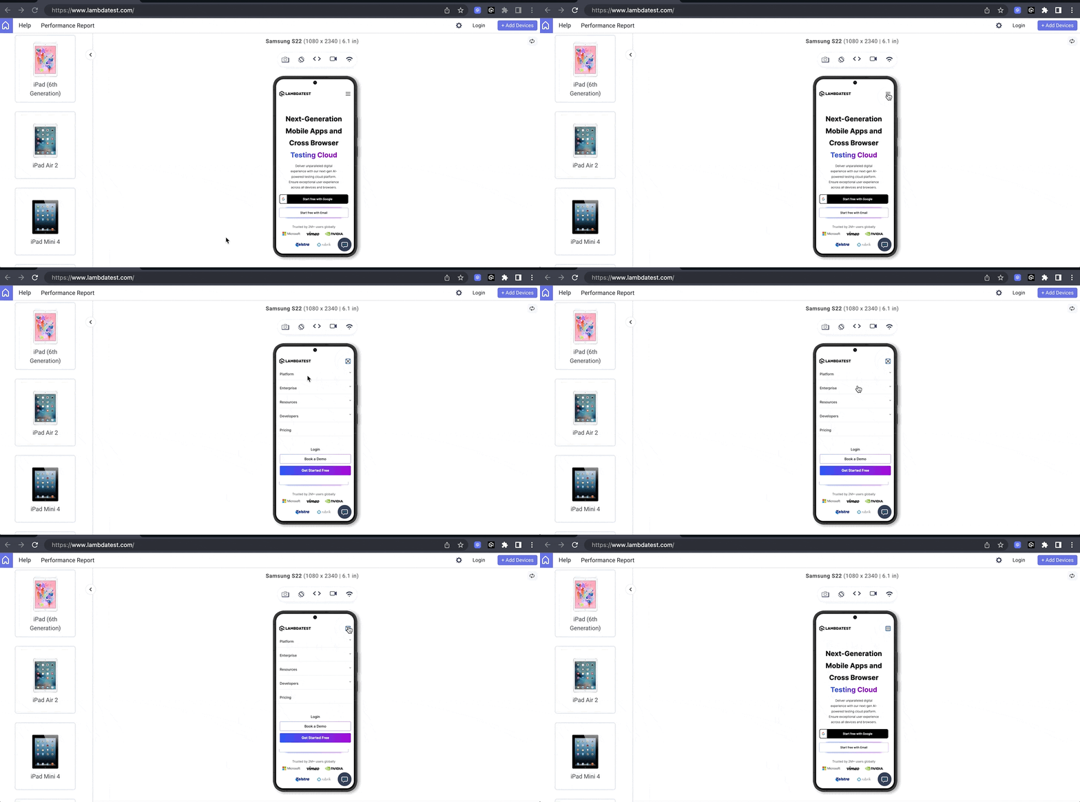
In the above previews, I have used LT Browser. It is a dev-friendly mobile next-gen browser built by TestMu AI. LT Browser allows you to perform responsive testing for your website and web apps on 53+ prebuilt device viewports, including mobiles, tablets, desktops, and laptops.
Check the documentation – Getting Started With LT Browser to test your web designs for responsiveness.
And wait! We also have a dedicated video tutorial on LT Browser to help you get started.

Ensure you’re up-to-date with the latest tutorials on mobile app testing, automation testing, and more —Subscribe to the TestMu AI YouTube Channel.
In the above example rendered on LT Browser, you can notice how the menu style changes to a hamburger menu as we gradually switch to smaller-screen devices like the Samsung S22. As it does, the overall layout changes to accommodate it, making it more responsive.
In the above example rendered on LT Browser, you can notice how the menu style changes to a hamburger menu as we gradually switch to smaller-screen devices like the Samsung S22. As it does, the overall layout changes to accommodate it, making it more responsive.
Navigation
Buttons are used in navigation menus to enable users to move to and between different website sections. Hence, buttons act as navigation elements on a website. The example below shows how TestMu AI uses a button to navigate from one section to another, saving the user the time of scrolling or waiting for a link to open another page.
Samsung uses buttons to offer a smooth way for users to navigate through the various products it displays in the hero section. It also uses a Go to Top button to enable users to go back to the top much quicker.
Call-To-Action
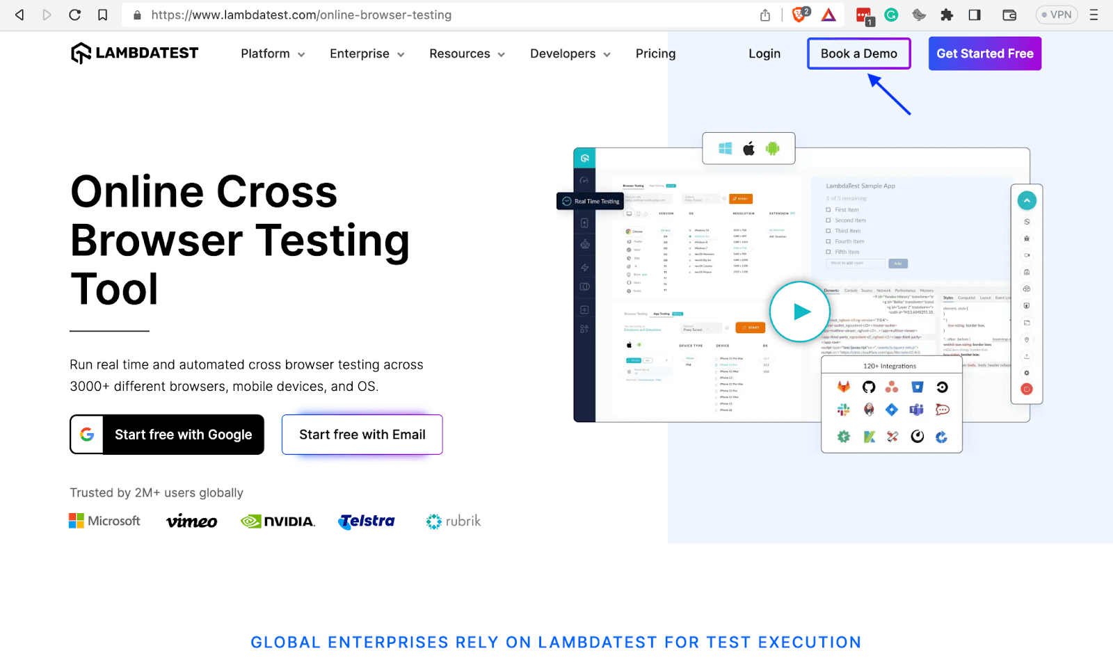
Developers usually use buttons as CTAs (Call-To-Action) to prompt users to do or take a desired action, such as purchasing a product, downloading a document, or subscribing to a newsletter. Thus, buttons help websites to achieve their goals.
TestMu AI uses the Book a Demo button as a CTA to induce users to book a demo for various types of testing it offers.
Forms
After a user fills out a form, the information needs to be submitted. It is the next step of submitting, where Bootstrap buttons play a crucial role. Buttons enable users to submit the information they fill in forms, while websites enable them to collect the submitted forms’ data at a desired collection point like a server.
Additional buttons, such as the reset option, empower users to erase form field content or undo any undesired changes effectively.
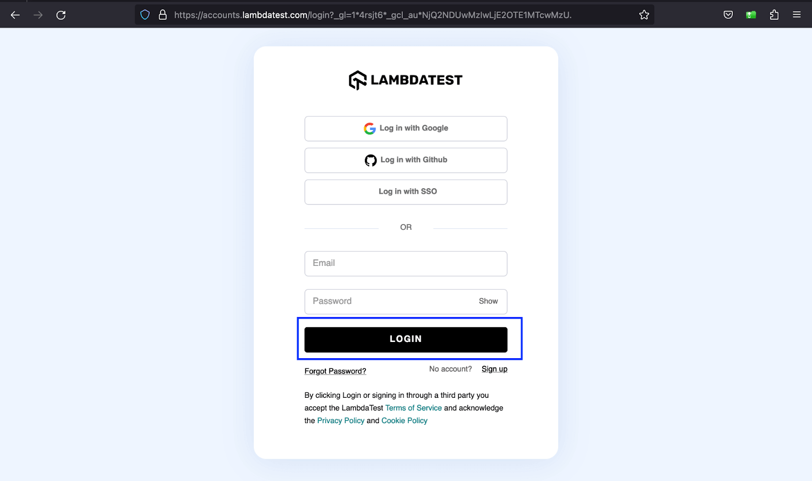
The example above shows the LOGIN button on TestMu AI’s sign-up form that submits the user’s credentials.
Modals and Pop-ups
Modals are overlay components that appear on top of the main content, focusing on a specific task, usually centered on the screen, and dimming the background content to visually emphasize the modal’s information. Modal interactions typically include precise actions like submitting a form, confirming information, or making a choice.
The above example shows how TestMu AI uses the Book a Demo button to provide users with a form in the aspect of a modal to complete the task at hand.
Impact of Badges in Web Development
Let’s look at some areas where badges are prevalent in web development.
Notifications
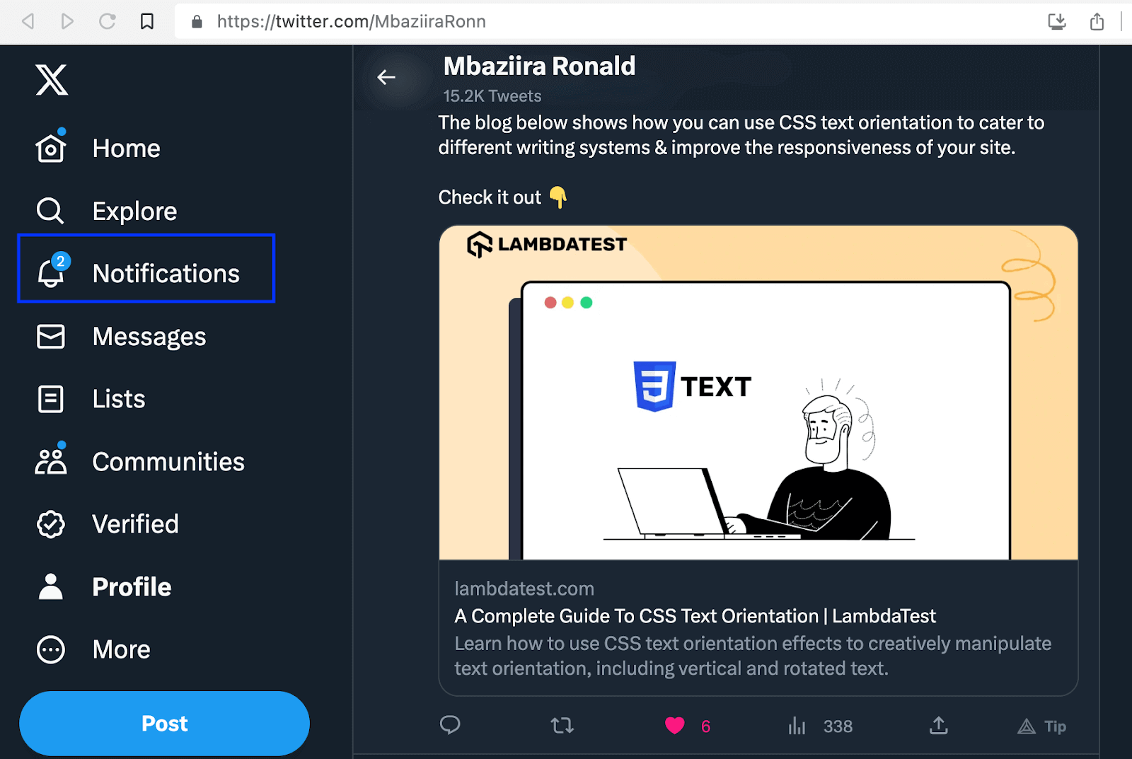
One of the major areas where badges have found widespread use is notifications. Badges usually show the number of unread messages, missed calls, or todos you have in a specific application.
The image below shows how X (formerly Twitter) uses a badge to indicate the number of notifications in the upper right corner of the bell icon.
Status Indicators
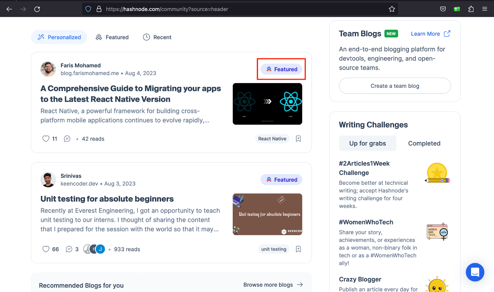
Have you ever seen a blog article card on a website’s blog page with the badge Featured or Trending? It is now a web development trend to label blog cards to distinguish them from the rest to attract the viewer’s attention.
In the below example, Hashnode uses a badge to show you articles it is featuring on the platform.
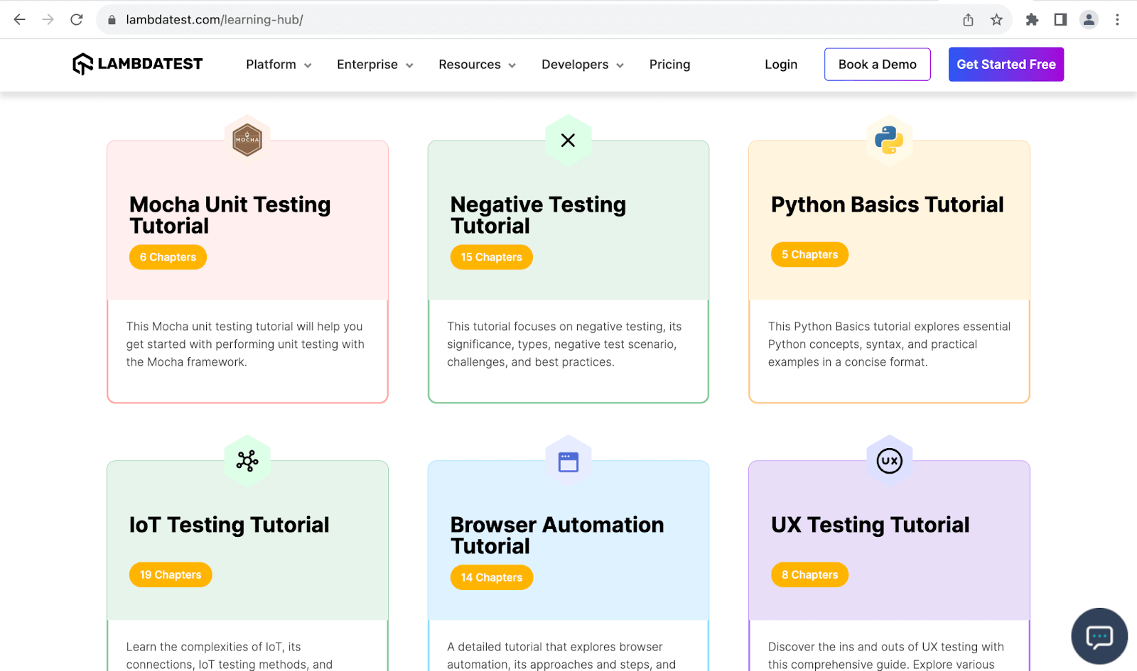
As you can see below, TestMu AI enhances user awareness by incorporating badges onto the blog cards, effectively informing readers about the specific number of chapters contained within each blog article.
Components of Bootstrap Buttons
Bootstrap has several utility classes to work with buttons, from styling and sizing the buttons to grouping and deactivating their functionality. Below are some of the classes for Bootstrap button:
| Variants | Grouping | Size |
|---|---|---|
| btn-primary | btn-group | btn-lg |
| btn-success | btn-toolbar | btn-sm |
| btn-warning |
You can use other HTML elements as buttons in Bootstrap, such as the < a > and < input > elements.
<a class="btn btn-light border" href="#" role="button">Book a Testing Demo</a>
<input class="btn btn-primary" type="button" value="More on LT Browser">
The btn Class
The btn class defines the basic styling for an element you want to use as a button in Bootstrap. It defines padding, content alignment, transparent border, and background for that element.
Code:
<!DOCTYPE html>
<html lang="en">
 <head>
   <meta charset="UTF-8" />
   <meta http-equiv="X-UA-Compatible" content="IE=edge" />
   <meta name="viewport" content="width=device-width, initial-scale=1.0" />
   <link
     rel="stylesheet"
     href="./node_modules/bootstrap/dist/css/bootstrap.min.css"
   />
 </head>
 <body class="py-5 bg-light">
   <div class="container">
     <button class="btn">Explore Selenium testing</button>
     <button class="btn">Explore Cypress testing</button>
     <button class="btn">Explore Playwright testing</button>
   </div>


   <script src="./node_modules/bootstrap/dist/js/bootstrap.bundle.min.js"></script>
 </body>
</html>
Browser output:

From the preview above, the btn class has set a transparent background, border color, and padding for our button elements.
Button Variants
Button variants refer to the predefined styles you can apply to buttons to change color. These variants provide contextual meaning. They include:
| Button Variant | Description |
|---|---|
| btn-primary | Indicates primary actions such as Sign Up and Submit on a website. It has a background of #0d6efd. |
| btn-secondary | Indicates secondary actions on a website. It has a background of #6c757d. |
| btn-success | Indicates positive or successful actions on a website such as Save and Complete. It has a background of #198754. |
| btn-warning | It indicates cautionary messages or actions to the user on a website. It has a background of #ffc107. |
| btn-danger | It indicates irreversible actions. It has a background of #dc3545. |
| btn-info | It usually indicates messages that provide additional information. It has a background of #0dcaf0. |
The button variants are not limited to conveying contextual importance only. You can also use them to create aesthetically pleasing UI interfaces.
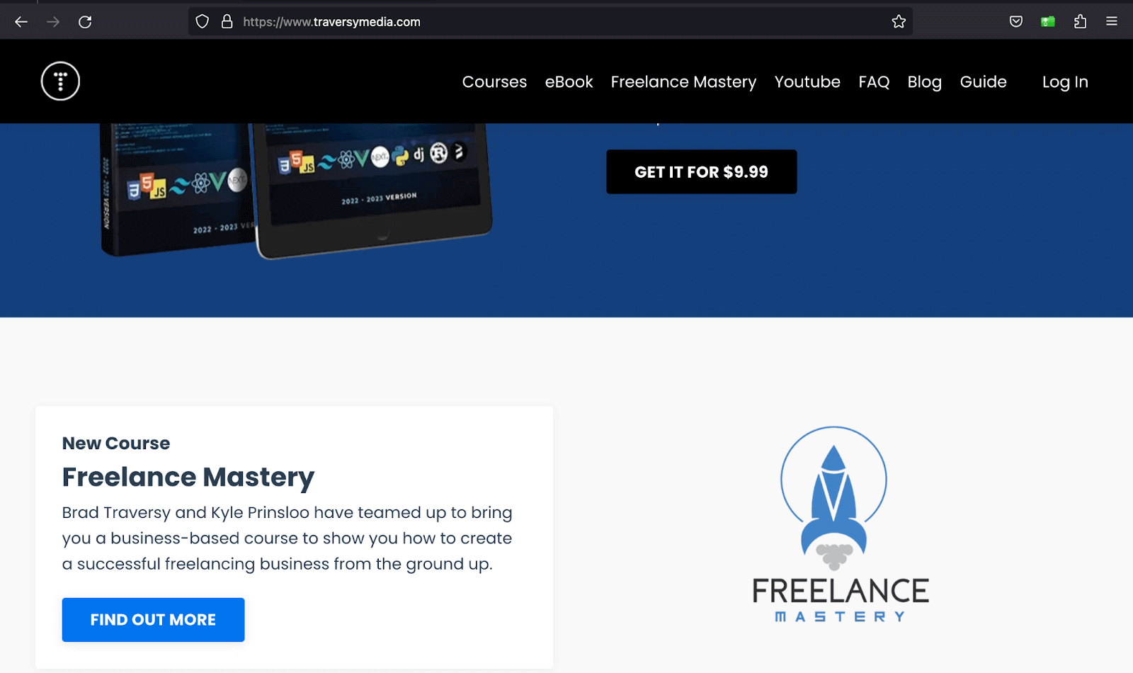
The image below shows how Traversy Media uses different button variants based on the section background to make the buttons stand out. Furthermore, the button variants provide design versatility. This helps you match the button variants to your website branding and color scheme, creating a visually appealing and cohesive design.
Code:
<!DOCTYPE html>
<html>
  <head>
    <link rel="stylesheet" href="./node_modules/bootstrap/dist/css/bootstrap.min.css">
    <style>
      body::before {
        display: block;
        content: '';
        height: 90px;
      }
    </style>
  </head>
  <body>
    <nav class="navbar navbar-expand-lg bg-white py-4 fixed-top">
      <div id="logo" class="container ms-auto">
        <a class="navbar-brand" href="#">
          <img src="https://assets.testmuai.com/resources/images/logos/logo.svg" alt="LambdaTest Logo" />
        </a>

        <button class="navbar-toggler" type="button" data-bs-toggle="collapse" data-bs-target="#navbar-menu">
          <span class="navbar-toggler-icon"></span>
        </button>

        <div class="collapse navbar-collapse" id="navbar-menu">
          <ul class="navbar-nav ms-auto">
            <li class="nav-item"><a href="#" class="nav-link">Platform</a></li>
            <li class="nav-item"><a href="#" class="nav-link">Enterprise</a></li>
            <li class="nav-item"><a href="#" class="nav-link">Resources</a></li>
            <li class="nav-item"><a href="#" class="nav-link">Developers</a></li>
            <li class="nav-item"><a href="#" class="nav-link">Pricing</a></li>
            <li class="d-flex gap-3 ms-lg-4 ms-md-0 ms-sm-0">
              <a href="" class="nav-link">Login</a>
              <button class="btn btn-outline-dark" data-bs-toggle="modal" data-bs-target="#bookdemo" type="button">
                Book a Demo
              </button>
              <a class="btn btn-dark" href="#" role="button">Sign Up</a>
            </li>
          </ul>
        </div>
      </div>
    </nav>
    <!-- Hero section -->
    <section class="bg-primary-subtle text-center pt-5">
      <div class="container">
        <h1 class="fs-1">LambdaTest for Community </h1>
        <p class="text-secondary text-center font-normal mx-auto lh-base fs-5 mt-4 pb-5">
          LambdaTest's community is the heart of the company, with more than 100k members. <br> With our platform, testers and developers can orchestrate and execute tests <br> seamlessly, resulting in faster releases.
        </p>
      </div>
    </section>
    <!-- Sections -->
    <section class="p-5">
      <div class="text-center">
        <h2>LambdaTest Programs</h2>
        <p class="text-secondary">Join LambdaTest community and explore our program</p>
      </div>
      <div class="container py-5">
        <!-- section 1 -->
        <div class="d-flex align-items-center justify-content-start gap-5">
          <div class="d-flex flex-column gap-3 p-5">
            <h2 class="fs-3 lh-base">Voices of Community</h2>
            <p class="text-secondary fs-6">
              Join us for Voices of Community, our monthly talk show where Manoj Kumar, VP - Developer Relations, LambdaTest, hosts testing, and quality assurance experts.
            </p>
            <button class="btn btn-info d-flex justify-content-around py-2">
              Join Voices of Community
              <img src="https://www.lambdatest.com/resources/images/community/arrow-right.svg" alt="">
            </button>
          </div>
          <div class="d-none d-sm-none d-md-none d-lg-block">
            <img src="https://www.lambdatest.com/resources/images/community/voices_of_community.svg" alt="">
          </div>
        </div>
        <!-- section 2 -->
        <div class="d-flex align-items-center justify-content-start gap-5">
          <div class="d-none d-sm-none d-md-none d-lg-block">
            <img src="https://www.lambdatest.com/resources/images/community/discord_community.svg" alt="">
          </div>
          <div class="d-flex flex-column gap-3 p-5">
            <h2 class="fs-3 lh-base">LambdaTest Community on Discord</h2>
            <p class="text-secondary fs-6">
              Become a part of a global network of testers and developers from over 130 contries and take part in challenges, discover exciting new opportunities, network with peers, and win prizes.
            </p>
            <button class="btn btn-primary d-flex justify-content-around py-2">
              Coming soon
            </button>
          </div>
        </div>
        <!-- section 3 -->
        <div class="d-flex align-items-center justify-content-start gap-5">
          <div class="d-flex flex-column gap-3 p-5">
            <h2 class="fs-3 lh-base">LambdaTest For Open Source</h2>
            <p class="text-secondary fs-6">
              LambdaTest is a strong advocate of open-source and wants to spur innovation in the community.
            </p>
            <button class="btn btn-dark d-flex justify-content-around py-2">
              Explore open source program
              <img src="https://www.lambdatest.com/resources/images/community/arrow-right.svg" alt="">
            </button>
          </div>
          <div class="d-none d-sm-none d-md-none d-lg-block">
            <img src="https://www.lambdatest.com/resources/images/community/open_source_program.svg" alt="">
          </div>
        </div>
        <!-- section 4 -->
        <div class="d-flex align-items-center justify-content-start gap-5">
          <div class="d-none d-sm-none d-md-none d-lg-block">
            <img src="https://www.lambdatest.com/resources/images/community/community_learn.svg" alt="">
          </div>
          <div class="d-flex flex-column gap-3 p-5">
            <h2 class="fs-3 lh-base">Learn with Lambdatest</h2>
            <p class="text-secondary fs-6">
              Learn everything about the testing process through informative videos. Take advantage of the expertise of industry thought leaders. Get the latest product updates from LambdaTest. Explore in-depth about LambdaTest.
            </p>
            <button class="btn btn-light d-flex justify-content-around py-2">
              Watch videos
              <img src="https://www.lambdatest.com/resources/images/community/arrow-right.svg" alt="">
            </button>
          </div>
        </div>
        <!-- section 5 -->
        <div class="d-flex align-items-center justify-content-start gap-5">
          <div class="d-none d-sm-none d-md-none d-lg-block order-1">
            <img src="https://www.lambdatest.com/resources/images/community/community_certifications.svg" alt="">
          </div>
          <div class="d-flex flex-column gap-3 p-5">
            <h2 class="fs-3 lh-base">LambdaTest Certifications</h2>
            <p class="text-secondary fs-6">
              Earn resume-worthy certifications that help you land a top job. Prove your expertise by adding top automation testing certification and globally recognized badges to your profile.
            </p>
            <button class="btn btn-warning d-flex justify-content-around py-2">
              Get certified
              <img src="https://www.lambdatest.com/resources/images/community/arrow-right.svg" alt="">
            </button>
          </div>
        </div>
      </div>
    </section>

    <script src="./node_modules/bootstrap/dist/js/bootstrap.bundle.min.js"></script>
  </body>
</html>
Browser output:
In the browser output above, we have used different button variants for TestMu AI’s Community programs’ CTAs, creating a captivating and eye-catching web design.
Button tagsYou can use any of the three HTML elements as buttons in Bootstrap:
- < button >
- < input >
- < a >
It is advisable to supply the < input > and < a > with the ARIA attribute role, to communicate their intent to assistive technologies such as screen readers.ARIA attributes, such as the “role” attribute, contribute to a more inclusive web experience by enabling impaired individuals to interact with and comprehend web content effectively.
Code:
<!DOCTYPE html>
<html>
  <head>
    <link rel="stylesheet" href="./node_modules/bootstrap/dist/css/bootstrap.min.css">
    <style>
      body::before {
        display: block;
        content: '';
        height: 90px;
      }
    </style>
  </head>
  <body class="pb-4">
    <nav class="navbar navbar-expand-lg bg-white py-4 fixed-top">
      <div id="logo" class="container ms-auto">
        <a class="navbar-brand" href="#">
          <img src="https://assets.testmuai.com/resources/images/logos/logo.svg" alt="LambdaTest Logo" />
        </a>

        <button class="navbar-toggler" type="button" data-bs-toggle="collapse" data-bs-target="#navbar-menu">
          <span class="navbar-toggler-icon"></span>
        </button>

        <div class="collapse navbar-collapse" id="navbar-menu">
          <ul class="navbar-nav ms-auto">
            <li class="nav-item"><a href="#" class="nav-link">Platform</a></li>
            <li class="nav-item"><a href="#" class="nav-link">Enterprise</a></li>
            <li class="nav-item"><a href="#" class="nav-link">Resources</a></li>
            <li class="nav-item"><a href="#" class="nav-link">Developers</a></li>
            <li class="nav-item"><a href="#" class="nav-link">Pricing</a></li>
            <li class="d-flex gap-3 ms-lg-4 ms-md-0 ms-sm-0">
              <a href="" class="nav-link">Login</a>
              <button class="btn btn-outline-dark" data-bs-toggle="modal" data-bs-target="#bookdemo" type="button">
                Book a Demo
              </button>
              <a class="btn btn-dark" href="#" role="button">Sign Up</a>
            </li>
          </ul>
        </div>
      </div>
    </nav>
    <!-- section 1 -->
    <section class="py-5 bg-primary-subtle">
      <div class="container">
        <div class="d-flex flex-column text-center gap-4">
          <div>
            <h2 class="fw-bold fs-1">Ready to Get Started?</h2>
            <p>Signup to use LambdaTest, it's completely free to get started with.</p>
          </div>
          <div class="d-flex align-items-center flex-column gap-4">
            <input class="w-50 form-control" placeholder="Your email address" type="text">
            <button class="btn btn-dark px-3">Start Free Testing</button>
          </div>
        </div>
      </div>
    </section>
    <!-- section 2 -->
    <section class="bg-light py-5">
      <div class="container">
        <div class="d-flex gap-3">
          <div class="d-flex flex-column gap-5 pe-5 justify-content-center">
            <div>
              <h2>Try LambdaTest Now !!</h2>
              <p>
                Get 100 minutes of automation test minutes FREE!! Run Selenium automation tests in parallel on the fastest online Selenium Grid.
              </p>
            </div>
            <div>
              <div class="d-flex gap-4">
                <input class="w-50 form-control" placeholder="Your email address" type="text">
                <button class="btn btn-dark px-3">Start Free Testing</button>
              </div>
            </div>
          </div>
          <div>
            <img src="https://www.lambdatest.com/resources/images/auto_robot.png" alt="">
          </div>
        </div>
      </div>
    </section>
    <!-- section 3 -->
    <section class="py-5">
      <div class="container">
        <div class="d-flex gap-5 align-items-center">
          <div>
            <h2 class="fw-bold fs-1">
              <span>Elevate Your </span>
              <span class="text-primary">Selenium Testing</span>
              <span class="text-primary-emphasis">Experience</span>
            </h2>
          </div>
          <div>
            <p class="fw-light">
              Experience firsthand how our platform can empower you to reach your Selenium browser testing objectives and bring innovation in your testing procedures. Try LambdaTest today.
            </p>
            <div class="d-inline-flex gap-4">
              <a class="btn btn-dark px-4" href="" role="button">Get Started</a>
              <a class="btn btn-outline-dark d-inline-flex gap-2 px-4" href="#" role="button">
                <img src="https://www.lambdatest.com/resources/images/ep_vector.svg" alt="">
                <span>Talk to us</span>
              </a>
            </div>
          </div>
        </div>
      </div>
    </section>

    <script src="./node_modules/bootstrap/dist/js/bootstrap.bundle.min.js"></script>
  </body>
</html>
Browser output:
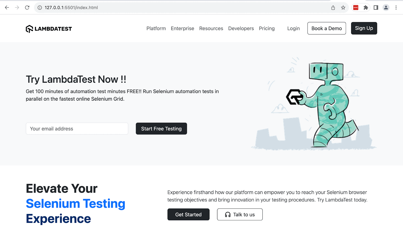
In the above output, we have used the < button > and < a > tags to create the buttons.
Outline Buttons
You can create outline buttons like button variants using the format btn-outline-{variant}. The outline button resembles its background variant counterpart when you hover over it, thanks to CSS hover effects. All the outline button variants convey the same meaning as their background variants.
Below are some of the classes:
- btn-outline-primary
- btn-outline-secondary
- btn-outline-success
- btn-outline-danger
- btn-outline-info
Before we dive into different classes of outline button variants Bootstrap provides, let’s look at the relevance of outline buttons in web development.
Subtle CTAs: Outline buttons are optimal for secondary and less vital CTAs. They provide a less assertive way to encourage user interaction. For example, you can use them on Read More actions, as they don’t demand action but are still accessible for users who need them.
Accessibility: Outline buttons have a high contrast between the button border and the background, making them accessible to users with visual impairments. It ensures that they are perceivable and usable by all users.
Reduced Cognitive Load: Outline buttons distinguish between primary and secondary actions, lessening cognitive load for users. Users can quickly identify more critical buttons from less critical ones.
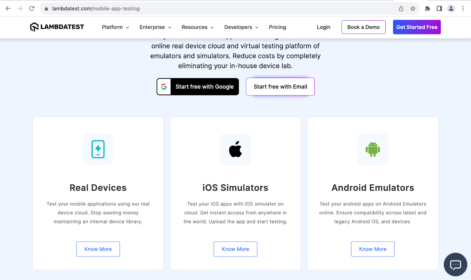
TestMu AI uses outline buttons on the Know More CTAs on the cards in the image above. They command user interaction in a less bold way than the primary actions like Get Started Free while still being accessible to all users.
Code:
<!DOCTYPE html>
<html>
  <head>
    <link rel="stylesheet" href="./node_modules/bootstrap/dist/css/bootstrap.min.css">
    <style>
      body::before {
        display: block;
        content: '';
        height: 90px;
      }

      .conf {
        background-image: url(https://www.lambdatest.com/_next/static/media/testmuBg.ac036cf3.png);
        background-repeat: no-repeat;
        background-size: cover;
      }
    </style>
  </head>
  <body class="">
    <nav class="navbar navbar-expand-lg bg-white py-4 fixed-top">
      <div id="logo" class="container ms-auto">
        <a class="navbar-brand" href="#">
          <img src="https://assets.testmuai.com/resources/images/logos/logo.svg" alt="LambdaTest Logo" />
        </a>

        <button class="navbar-toggler" type="button" data-bs-toggle="collapse" data-bs-target="#navbar-menu">
          <span class="navbar-toggler-icon"></span>
        </button>

        <div class="collapse navbar-collapse" id="navbar-menu">
          <ul class="navbar-nav ms-auto">
            <li class="nav-item"><a href="#" class="nav-link">Platform</a></li>
            <li class="nav-item"><a href="#" class="nav-link">Enterprise</a></li>
            <li class="nav-item"><a href="#" class="nav-link">Resources</a></li>
            <li class="nav-item"><a href="#" class="nav-link">Developers</a></li>
            <li class="nav-item"><a href="#" class="nav-link">Pricing</a></li>
            <li class="d-flex gap-3 ms-lg-4 ms-md-0 ms-sm-0">
              <a href="" class="nav-link">Login</a>
              <button class="btn btn-outline-dark" data-bs-toggle="modal" data-bs-target="#bookdemo" type="button">
                Book a Demo
              </button>
              <a class="btn btn-dark" href="#" role="button">Sign Up</a>
            </li>
          </ul>
        </div>
      </div>
    </nav>
    <!-- Conference -->
    <section class="py-5 bg-primary-subtle">
      <div class="container">
        <div class="conf d-flex justify-content-between text-white ps-5">
          <div class="d-flex flex-column justify-content-around">
            <div class="d-flex flex-column align-items-start">
              <img class="img-fluid mb-4" src="https://www.lambdatest.com/resources/images/tmByLT.svg" alt="" style="height: 50px;">
              <div>
                <h2 class="fw-bolder pb-2" style="font-size: 3.1rem;">Testμ Conference</h2>
                <p class="fs-5">DECODE THE FUTURE OF TESTING</p>
              </div>
              <p class="d-flex align-items-center gap-2">
                <img class="img-fluid" src="https://www.lambdatest.com/resources/images/main/calendar.svg" alt="">
                22 - 24 August, 2023
              </p>
            </div>
            <div>
              <button class="btn btn-outline-light" href="#">
                Register For Free
              </button>
            </div>
          </div>
          <div>
            <img class="img-fluid" src="https://www.lambdatest.com/resources/images/testMubanner.png" alt="">
          </div>
        </div>
      </div>
    </section>
    <!-- LambdaTest -->
    <section class="py-5 bg-light">
      <div class="container">
        <div class="d-flex">
          <div class="">
            <img class="py-2" src="https://www.lambdatest.com/resources/images/footer_lambdatest_logo.svg" alt="">
            <p class="w-75 py-2">
              Deliver unparalleled digital experience with our Next-Gen, AI-powered testing cloud platform. Ensure exceptional user experience across all devices and browsers.
            </p>
            <div class="d-flex gap-4">
              <a class="btn btn-dark d-inline-flex align-items-center gap-3 py-2 px-3" href="#">
                <img src="https://www.lambdatest.com/resources/images/google_favicon.svg" alt="" width="15" height="15">
                Start free with Google
              </a>
              <a class="btn btn-outline-dark py-2 px-3" href="#" role="button">Start free with Email</a>
            </div>
          </div>
          <div class="d-flex flex-column gap-3">
            <div class="row gap-3">
              <img class="col-2" src="https://www.lambdatest.com/resources/images/ltbrowser/G2-2023.png" alt="">
              <img class="col-2" src="https://www.lambdatest.com/resources/images/ltbrowser/Getapp.png" alt="">
              <img class="col-2" src="https://www.lambdatest.com/resources/images/ltbrowser/leader.png" alt="">
              <img class="col-2" src="https://www.lambdatest.com/resources/images/ltbrowser/softwareadvice.png" alt="">
              <img class="col-2" src="https://www.lambdatest.com/resources/images/ltbrowser/crozdesk-2.png" alt="">
            </div>
            <p>LambdaTest is #1 choice for SMBs and Enterprises across the globe.</p>
          </div>
        </div>
    </section>

    <script src="./node_modules/bootstrap/dist/js/bootstrap.bundle.min.js"></script>
  </body>
</html>
Browser output: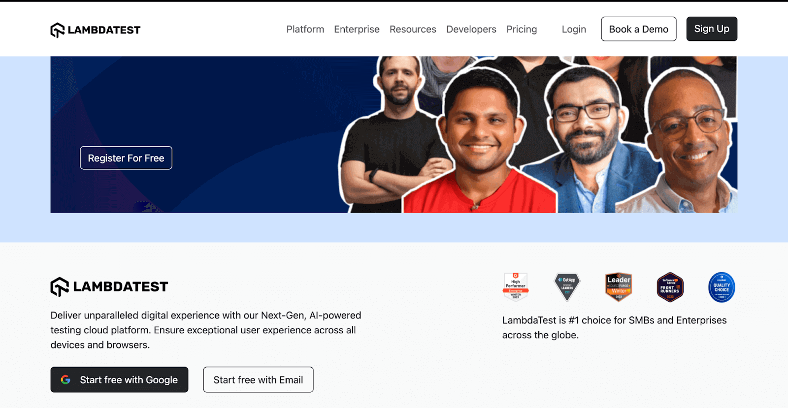
We have used the btn-outline-dark and btn-outline-light classes to create outline buttons that contrast well based on their section background. Also, since Start free with Google is the primary action, we have used the btn-outline-light for the secondary option of Start free with Email.
Button Sizes
Bootstrap provides two utility classes to define the button sizes, btn-lg and btn-sm.
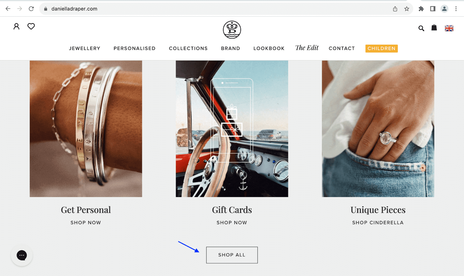
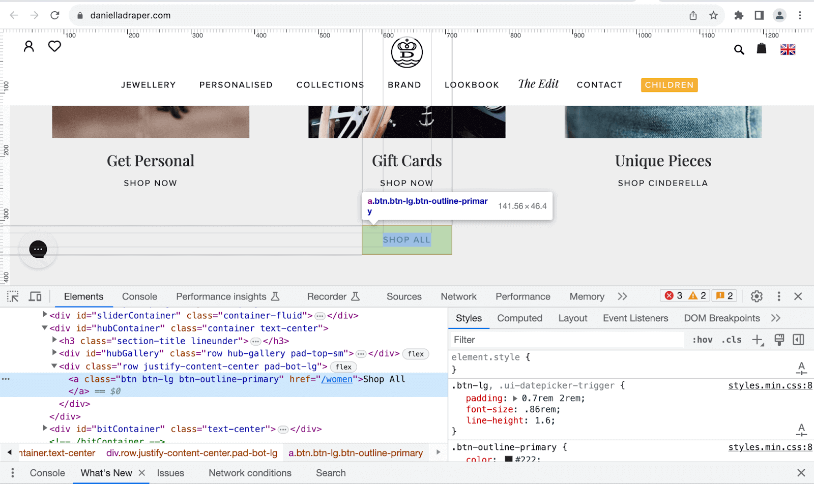
The image below shows how Daniella Draper uses the btn-lg to create a larger CTA button at the end of the products section. The class gives the button larger dimensions, making it easier to notice and interact with.
Code:
<!DOCTYPE html>
<html>
  <head>
    <link rel="stylesheet" href="./node_modules/bootstrap/dist/css/bootstrap.min.css">
    <style>
      body::before {
        display: block;
        content: '';
        height: 90px;
      }

      .conf {
        background-image: url(https://www.lambdatest.com/_next/static/media/testmuBg.ac036cf3.png);
        background-repeat: no-repeat;
        background-size: cover;
      }

      .heading {
        background: linear-gradient(90deg, #59fecd, #37abff, #f104e8);
        -webkit-background-clip: text;
        -webkit-text-fill-color: transparent;
      }
    </style>
  </head>
  <body>
    <nav class="navbar navbar-expand-lg bg-white py-4 fixed-top">
      <div id="logo" class="container ms-auto">
        <a class="navbar-brand" href="#">
          <img src="https://assets.testmuai.com/resources/images/logos/logo.svg" alt="LambdaTest Logo" />
        </a>

        <button class="navbar-toggler" type="button" data-bs-toggle="collapse" data-bs-target="#navbar-menu">
          <span class="navbar-toggler-icon"></span>
        </button>

        <div class="collapse navbar-collapse" id="navbar-menu">
          <ul class="navbar-nav ms-auto">
            <li class="nav-item"><a href="#" class="nav-link">Platform</a></li>
            <li class="nav-item"><a href="#" class="nav-link">Enterprise</a></li>
            <li class="nav-item"><a href="#" class="nav-link">Resources</a></li>
            <li class="nav-item"><a href="#" class="nav-link">Developers</a></li>
            <li class="nav-item"><a href="#" class="nav-link">Pricing</a></li>
            <li class="d-flex gap-3 ms-lg-4 ms-md-0 ms-sm-0">
              <a href="" class="nav-link">Login</a>
              <button class="btn btn-outline-dark" data-bs-toggle="modal" data-bs-target="#bookdemo" type="button">
                Book a Demo
              </button>
              <a class="btn btn-dark" href="#" role="button">Sign Up</a>
            </li>
          </ul>
        </div>
      </div>
    </nav>
    <!-- Button sizes -->
    <section class="bg-dark">
      <div class="container">
        <div class="d-flex flex-column justify-content-center align-items-center py-5 gap-5" style="height: 88vh;">
          <h1 class="heading text-white" style="font-size: 3.1rem;">Ready to Try HyperExecute?</h1>
          <div class="row row-cols-2 px-2 py-3 bg-dark border border-secondary border-3 rounded">
            <div class="d-flex flex-column justify-content-center gap-3">
              <p class="text-white fs-4">
                Connect with our experts and learn how to save hours every day by executing your tests at HyperExecute speeds.
              </p>
              <div class="d-flex gap-3">
                <button class="btn btn-info btn-sm d-flex align-items-center gap-3 px-3">
                  Try it Now
                  <img src="https://www.lambdatest.com/resources/images/hyperexecute/arrow.svg" alt="" width="20px" height="20px">
                </button>
                <button class="btn btn-info d-flex align-items-center gap-3">
                  Book a demo
                  <img src="https://www.lambdatest.com/resources/images/hyperexecute/arrow.svg" alt="" width="20px" height="20px">
                </button>
                <button class="btn btn-info btn-lg d-flex align-items-center gap-3">
                  View Docs
                  <img src="https://www.lambdatest.com/resources/images/hyperexecute/arrow.svg" alt="" width="20px" height="20px">
                </button>
              </div>
            </div>
            <div>
              <img class="w-50" src="https://www.lambdatest.com/resources/images/hyperexecute/ready_hyperexecute.png" alt="">
            </div>
          </div>
        </div>
      </div>
    </section>

    <script src="./node_modules/bootstrap/dist/js/bootstrap.bundle.min.js"></script>
  </body>
</html>
Browser output:
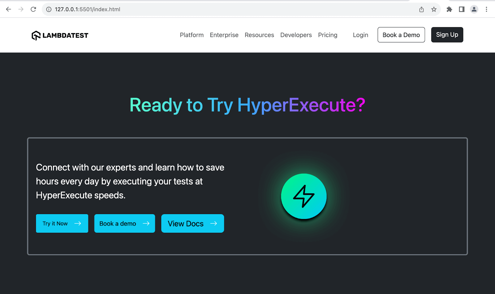
The image above shows the third significant button with the btn-lg class and the first small button with the btn-sm class.
You can also use CSS variables to create Bootstrap buttons with custom sizes. The CSS variables are the btn variables used in Bootstrap’s CSS file, bootstrap.min.css.
Code:
<!DOCTYPE html>
<html lang="en">
 <head>
   <meta charset="UTF-8" />
   <meta http-equiv="X-UA-Compatible" content="IE=edge" />
   <meta name="viewport" content="width=device-width, initial-scale=1.0" />
   <link rel="stylesheet" href="./node_modules/bootstrap/dist/css/bootstrap.min.css"/>
 </head>
 <body class="py-4 bg-dark">
   <div class="container">
     <div class="text-white">
       <h1>Bootstrap CSS Buttons</h1>
       <p class="fs-4">Sizing buttons using CSS variables</p>
     </div>
     <div class="mt-5">
       <!-- Row 1 -->
       <div class="mb-5">
         <button type="button" class="btn btn-primary" style="--bs-btn-padding-y: .9rem; --bs-btn-padding-x: 1rem; --bs-btn-font-size: 1.07rem;">
           Custom button
         </button>
       </div>
       <!-- Row 2 -->
       <div class="mb-5">
         <button type="button" class="btn btn-danger" style="--bs-btn-padding-y: .9rem; --bs-btn-padding-x: 1rem; --bs-btn-font-size: .6rem;">
           Delete account
         </button>
         <button type="button" class="btn btn-danger" style="--bs-btn-padding-y: .9rem; --bs-btn-padding-x: 1rem; --bs-btn-font-size: .6rem;">
           Clear errors
         </button>
         <button type="button" class="btn btn-danger" style="--bs-btn-padding-y: .9rem; --bs-btn-padding-x: 1rem; --bs-btn-font-size: .6rem;">
           Unfollow @handle
         </button>
       </div>
       <!-- Row 3 -->
       <div class="mb-5">
         <button type="button" class="btn btn-outline-info" style="--bs-btn-padding-y: .9rem; --bs-btn-padding-x: 1rem; --bs-btn-font-size: 1.3rem;">
           Forward process
         </button>
         <button type="button" class="btn btn-outline-info" style="--bs-btn-padding-y: .9rem; --bs-btn-padding-x: 1rem; --bs-btn-font-size: 1.3rem;">
           Reset
         </button>
         <button type="button" class="btn btn-outline-info" style="--bs-btn-padding-y: .9rem; --bs-btn-padding-x: 1rem; --bs-btn-font-size: 1.3rem;">
           Undo action
         </button>
       </div>
       <!-- Row 4 -->
       <div class="mb-5">
         <button type="button" class="btn btn-info" style="--bs-btn-padding-y: .9rem; --bs-btn-padding-x: 1rem; --bs-btn-font-size: .9rem;">
           More info
         </button>
         <button type="button" class="btn btn-info" style="--bs-btn-padding-y: .9rem; --bs-btn-padding-x: 1rem; --bs-btn-font-size: .9rem;">
           View details
         </button>
         <button type="button" class="btn btn-info" style="--bs-btn-padding-y: .9rem; --bs-btn-padding-x: 1rem; --bs-btn-font-size: .9rem;">
           Learn more
         </button>
       </div>
       <!-- Row 5 -->
       <div class="mb-5">
         <button type="button" class="btn btn-success" style="--bs-btn-padding-y: .9rem; --bs-btn-padding-x: 1rem; --bs-btn-font-size: 1.5rem;">
           Customize
       </button>
         <button type="button" class="btn btn-success" style="--bs-btn-padding-y: .9rem; --bs-btn-padding-x: 1rem; --bs-btn-font-size: 1.5rem;">
           Create
       </button>
         <button type="button" class="btn btn-success" style="--bs-btn-padding-y: .9rem; --bs-btn-padding-x: 1rem; --bs-btn-font-size: 1.5rem;">
           Deploy
       </button>
       </div>
     </div>
   </div>


   <script src="./node_modules/bootstrap/dist/js/bootstrap.bundle.min.js"></script>
 </body>
</html>
Browser output:
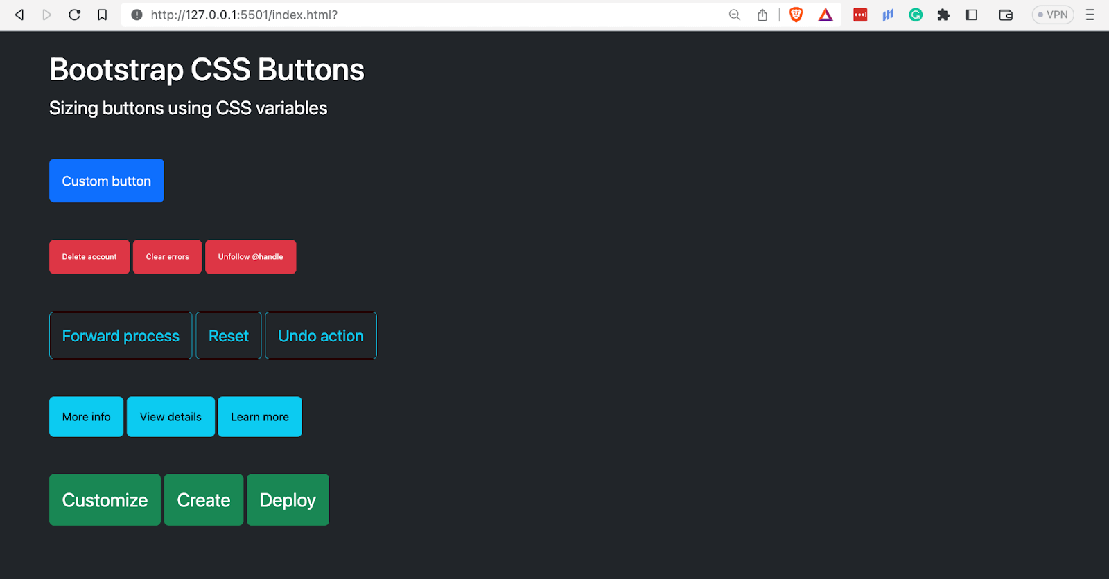
The image above shows buttons of different sizes defined using CSS variables. It specifies the font size and vertical and horizontal padding.
Disabled Buttons
To create disabled or inactive Bootstrap buttons, you supply them with the attribute disabled. The attribute deactivates the hover and active states of the button. Only the < button > element currently supports it.
To deactivate Bootstrap buttons with the < a > element, specify the class disabled on them. These buttons should not have the href attribute on them.
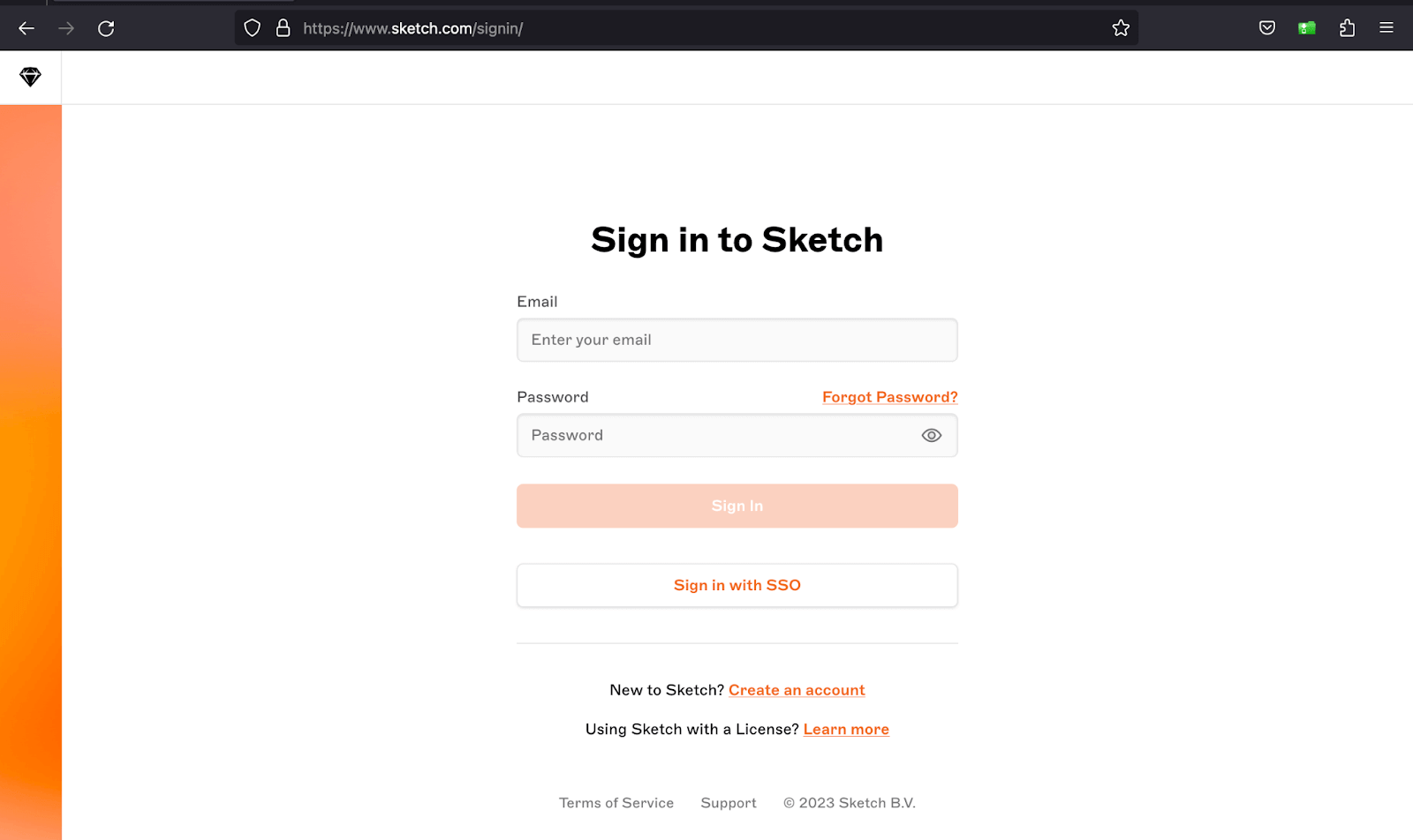
Sketch deactivates its Sign In button until the user fills the required fields and enables it again once they are filled.
Code:
<!DOCTYPE html>
<html>
  <head>
    <link rel="stylesheet" href="./node_modules/bootstrap/dist/css/bootstrap.min.css">
    <style>
      body::before {
        display: block;
        content: '';
        height: 90px;
      }
    </style>
  </head>
  <body>
    <nav class="navbar navbar-expand-lg bg-white py-4 fixed-top">
      <div id="logo" class="container ms-auto">
        <a class="navbar-brand" href="#">
          <img src="https://assets.testmuai.com/resources/images/logos/logo.svg" alt="LambdaTest Logo" />
        </a>

        <button class="navbar-toggler" type="button" data-bs-toggle="collapse" data-bs-target="#navbar-menu">
          <span class="navbar-toggler-icon"></span>
        </button>

        <div class="collapse navbar-collapse" id="navbar-menu">
          <ul class="navbar-nav ms-auto">
            <li class="nav-item"><a href="#" class="nav-link">Platform</a></li>
            <li class="nav-item"><a href="#" class="nav-link">Enterprise</a></li>
            <li class="nav-item"><a href="#" class="nav-link">Resources</a></li>
            <li class="nav-item"><a href="#" class="nav-link">Developers</a></li>
            <li class="nav-item"><a href="#" class="nav-link">Pricing</a></li>
            <li class="d-flex gap-3 ms-lg-4 ms-md-0 ms-sm-0">
              <a href="" class="nav-link">Login</a>
              <button class="btn btn-outline-dark" data-bs-toggle="modal" data-bs-target="#bookdemo" type="button">
                Book a Demo
              </button>
              <a class="btn btn-dark" href="#" role="button">Sign Up</a>
            </li>
          </ul>
        </div>
      </div>
    </nav>
    <!-- Hero section -->
    <section class="d-flex align-items-center" style="height: 88vh; background: #000">
      <div class="container">
        <div class="d-flex ps-5 pt-5 pe-3 pb-5 rounded align-items-center" style="height: 60vh; background: linear-gradient(94.27deg,#4238bb -3.04%,#070333 103.36%);">
          <div class="d-flex flex-column pb-5">
            <h2 class="text-light fs-1">Ready to try LambdaTest AI-Powered Test Analytics?</h2>
            <p class="fs-5" style="color: #ccc;">
              Assess and share all your test analytics from a single dashboard with LambdaTest Analytics!
            </p>
            <div class="d-flex gap-3 align-items-center pt-4">
              <a type="button" class="btn bg-light text-black disabled border-0" href="https://lambdatest.com" target="_blank" disabled>Try for Free ﹥_</a>
              <a class="link-light link-offset-2 link-underline-opacity-25 link-underline-opacity-100-hover" href="#">Book a Demo</a>
            </div>
          </div>
          <div>
            <div></div>
            <img src="https://www.lambdatest.com/resources/images/try_analytics.svg" alt="" height="310px">
          </div>
        </div>
      </div>
    </section>

    <script src="./node_modules/bootstrap/dist/js/bootstrap.bundle.min.js"></script>
  </body>
</html>
Browser output:
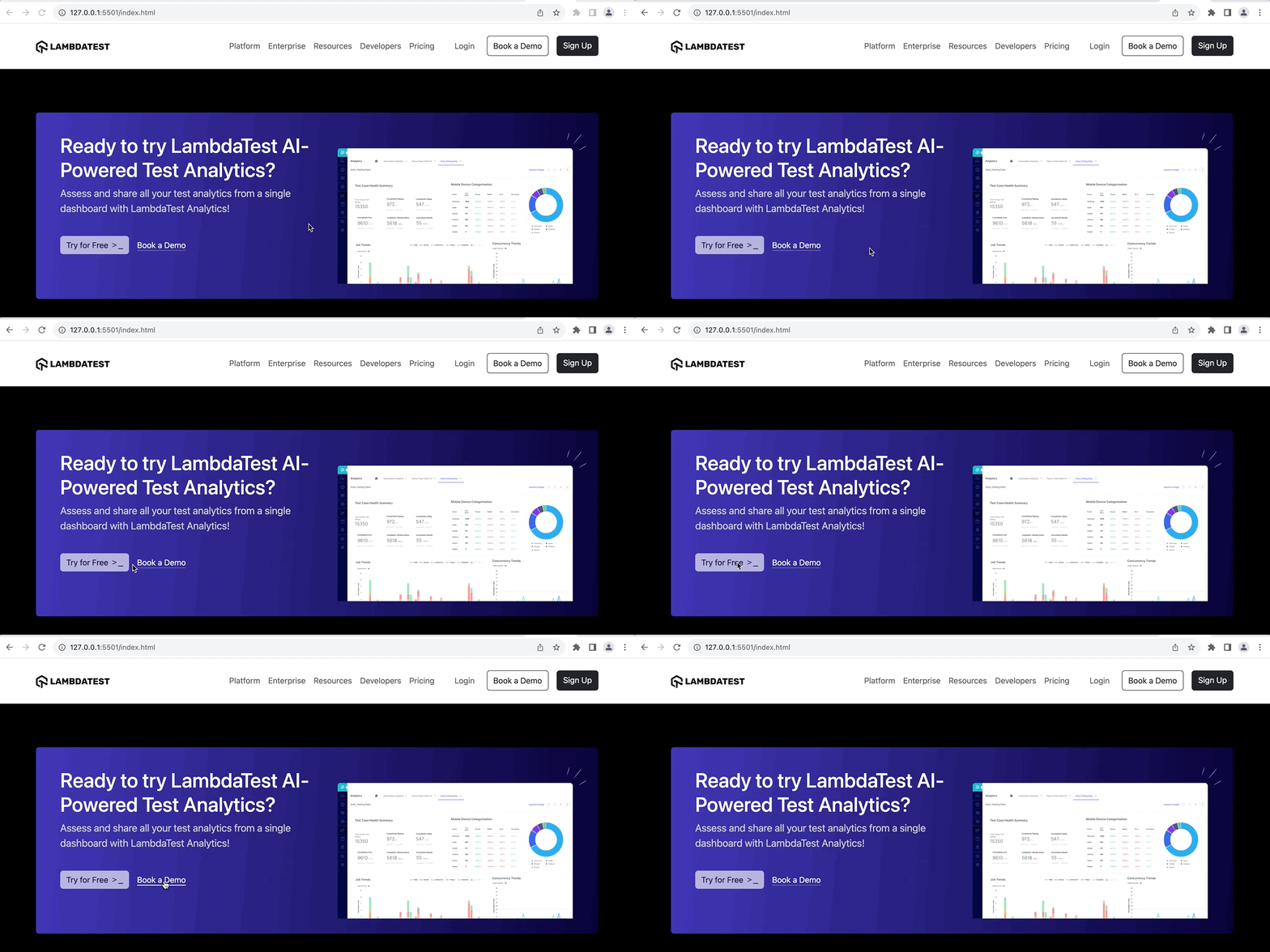
We have inactivated the Try for Free CTA using the disabled attribute in the above browser output.
Block Buttons
Buttons are inline elements by nature, meaning they do not start on a new line, and the content in them defines their width. We can, however, create block buttons in Bootstrap using the grid system and CSS Flexbox.
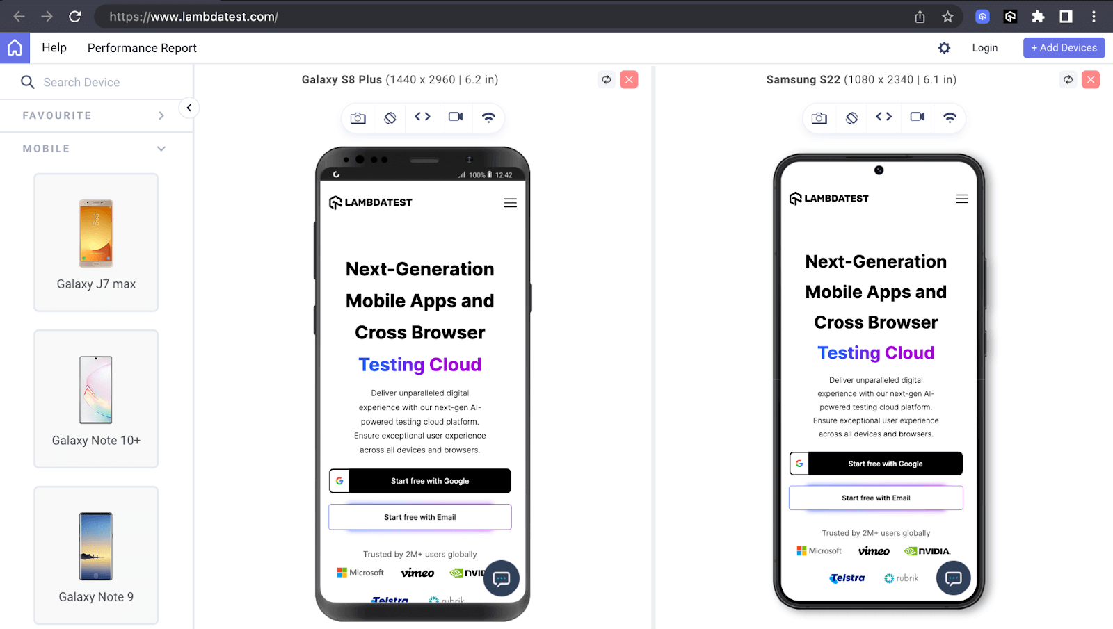
TestMu AI uses block buttons on small screen devices like mobile phones to increase the click surface area and improve the visual appearance by making the buttons stand out.
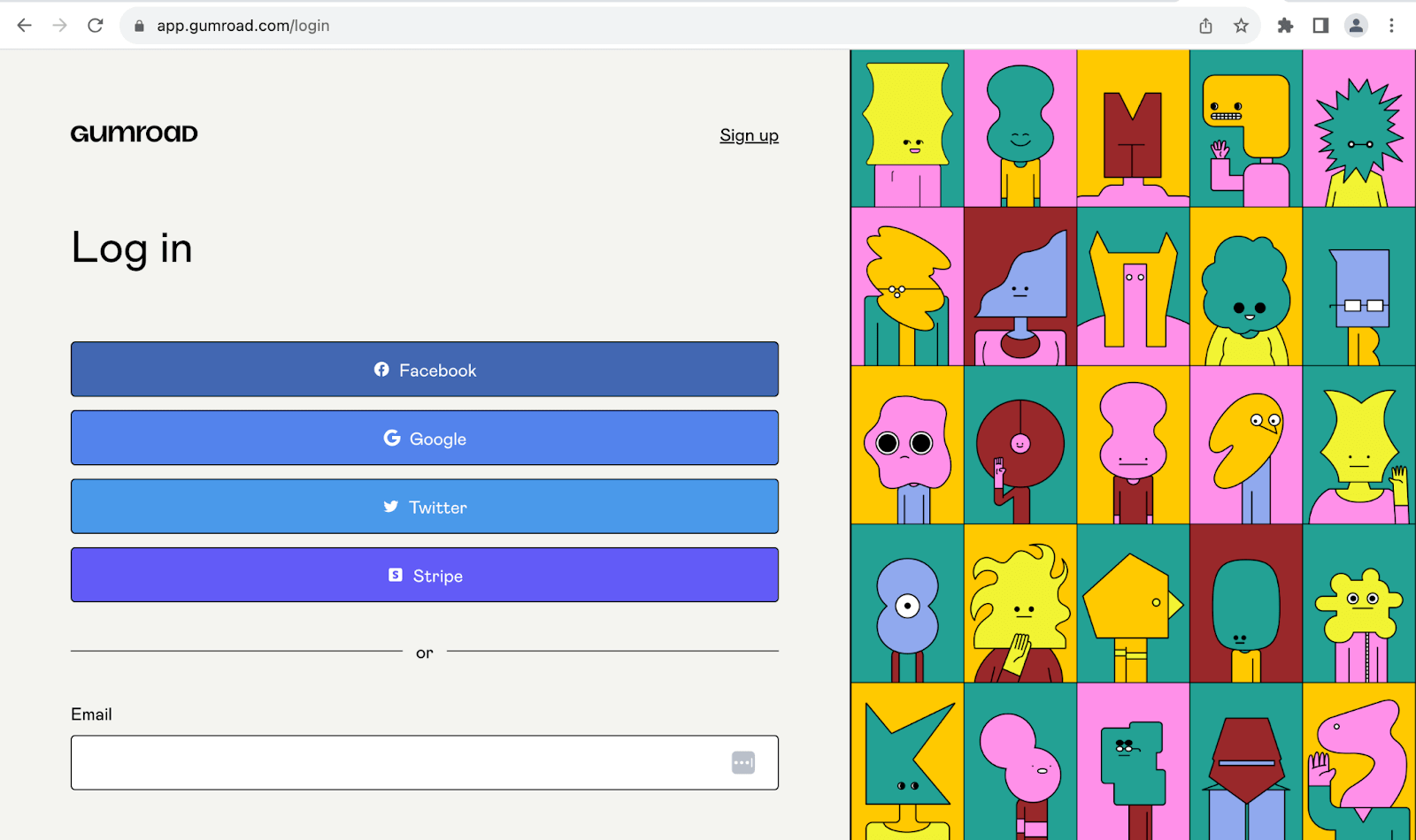
Similarly, Gumaroad uses the same style as shown in the image below.
Code:
<!DOCTYPE html>
<html>
  <head>
    <link rel="stylesheet" href="./node_modules/bootstrap/dist/css/bootstrap.min.css">
    <style>
      body::before {
        display: block;
        content: '';
        height: 90px;
      }
    </style>
  </head>
  <body>
    <nav class="navbar navbar-expand-lg bg-white py-4 fixed-top">
      <div id="logo" class="container ms-auto">
        <a class="navbar-brand" href="#">
          <img src="https://assets.testmuai.com/resources/images/logos/logo.svg" alt="LambdaTest Logo" />
        </a>

        <button class="navbar-toggler" type="button" data-bs-toggle="collapse" data-bs-target="#navbar-menu">
          <span class="navbar-toggler-icon"></span>
        </button>

        <div class="collapse navbar-collapse" id="navbar-menu">
          <ul class="navbar-nav ms-auto">
            <li class="nav-item"><a href="#" class="nav-link">Platform</a></li>
            <li class="nav-item"><a href="#" class="nav-link">Enterprise</a></li>
            <li class="nav-item"><a href="#" class="nav-link">Resources</a></li>
            <li class="nav-item"><a href="#" class="nav-link">Developers</a></li>
            <li class="nav-item"><a href="#" class="nav-link">Pricing</a></li>
            <li class="d-flex gap-3 ms-lg-4 ms-md-0 ms-sm-0">
              <a href="" class="nav-link">Login</a>
              <button class="btn btn-outline-dark" data-bs-toggle="modal" data-bs-target="#bookdemo" type="button">
                Book a Demo
              </button>
              <a class="btn btn-dark" href="#" role="button">Sign Up</a>
            </li>
          </ul>
        </div>
      </div>
    </nav>
    <!-- Sign Up Form -->
    <section class="py-5" style="background: #eef5ff;">
      <div class="container">
        <div class="row justify-content-center align-items-center" style="min-height: 78vh;">
          <div class="row row-cols-1 bg-white justify-content-center pt-3 pb-5 px-5 rounded-5" style="width: 30rem;">
            <!-- Logo -->
            <div class="d-flex justify-content-center">
              <img src="https://accounts.lambdatest.com/static/media/logo.8f59178b8ab958ca1a348570ac078636.svg" alt="" width="200px" height="90px">
            </div>
            <!-- Social login -->
            <div class="d-grid gap-3">
              <a class="btn border border-2 text-secondary d-flex justify-content-center gap-2 align-items-center" href="">
                <img class="img-fluid" src="https://accounts.lambdatest.com/icons/google.svg" alt="">
                Log in with Google
              </a>
              <a class="btn border border-2 text-secondary d-flex justify-content-center gap-2 align-items-center" href="">
                <img class="img-fluid" src="https://accounts.lambdatest.com/icons/github.svg" alt="">
                Log in with Github
              </a>
              <a class="btn border border-2 text-secondary" href="">
                Log in with SSO
              </a>
            </div>
            <!-- Email/social-login divider -->
            <div class="d-flex align-items-center">
              <hr class="w-100">
              <span class="p-4">OR</span>
              <hr class="w-100">
            </div>
            <!-- Form -->
            <form action="">
              <div class="d-flex flex-column gap-3">
                <div class="d-flex flex-column gap-2">
                  <label for="email">Email</label>
                  <input class="form-control" type="email">
                </div>
                <div class="d-flex flex-column">
                  <label for="email">Password</label>
                  <input class="form-control" type="password">
                </div>
                <div class="d-grid">
                  <button class="btn bg-dark text-light" type="submit">LOGIN</button>
                </div>
                <div class="d-flex justify-content-between pt-2">
                  <a class="link-dark" href="#">Forgot Password?</a>
                  <div>
                    <span>No account?</span>
                    <a class="link-dark" href="#">Sign up</a>
                  </div>
                </div>
              </div>
            </form>
          </div>
        </div>
      </div>
    </section>

    <script src="./node_modules/bootstrap/dist/js/bootstrap.bundle.min.js"></script>
  </body>
</html>
Browser output: 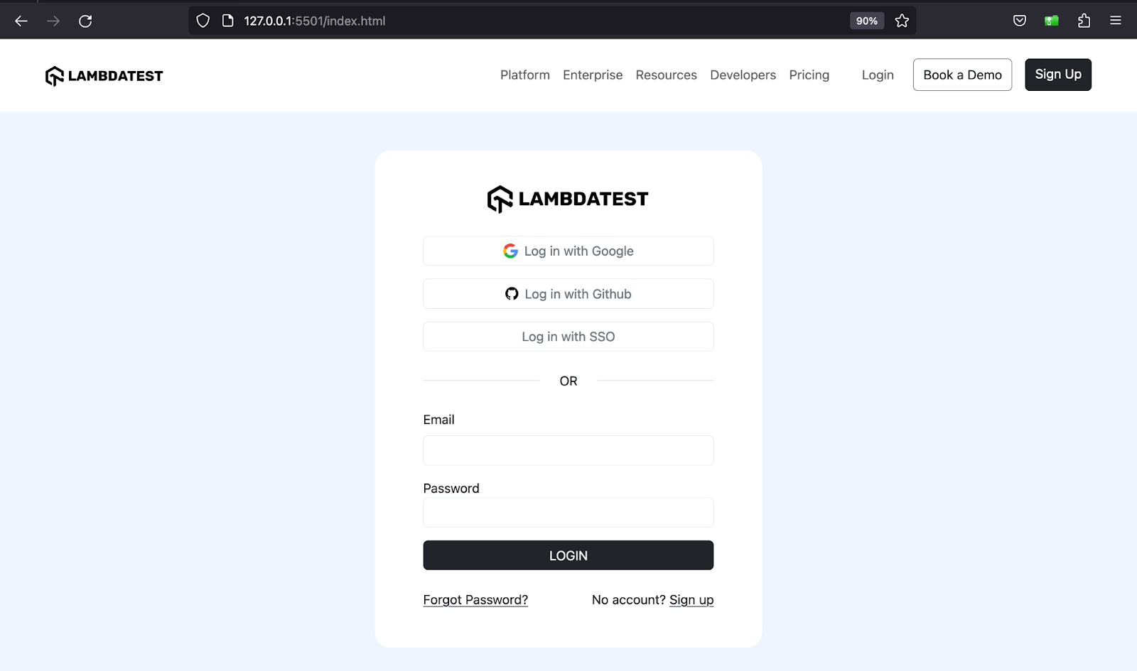
The above browser output shows block buttons that take up their full width in the login form developed using Bootstrap’s grid system and Flexbox.
Button Groups
You can group a series or sequence of buttons with the btn class on a single line by wrapping them in a container with the btn-group class. These buttons will form what is called a button group and will look visually attached.
You can use button groups for the following scenarios:
- Toggle buttons
- Pagination
- Rating and Feedback
- Toolbar actions
Code:
<!DOCTYPE html>
<html lang="en">
 <head>
   <meta charset="UTF-8" />
   <meta http-equiv="X-UA-Compatible" content="IE=edge" />
   <meta name="viewport" content="width=device-width, initial-scale=1.0" />
   <link
     rel="stylesheet"
     href="./node_modules/bootstrap/dist/css/bootstrap.min.css"
   />
 </head>
 <body class="py-5 bg-light">
   <div class="container">
     <h1 class="fs-3">Bootstrap CSS Buttons - Button groups</h1>
     <!-- Buttons   -->
     <div class="mt-3">
       <p class="fs-5">Buttons</p>
       <div class="btn-group mb-4" role="group" aria-label="Button group example">
         <button class="btn btn-primary">Apply now</button>
         <button class="btn btn-dark">Close</button>
         <button class="btn btn-info">Pledge support 💛</button>
         <button class="btn btn-success">Create</button>
       </div>
       <br />
       <div class="btn-group" role="group" aria-label="Button group example">
         <button class="btn btn-outline-primary">Apply now</button>
         <button class="btn btn-outline-dark">Close</button>
         <button class="btn btn-outline-info">Pledge support 💙</button>
         <button class="btn btn-outline-success">Create</button>
       </div>
     </div>
     <!-- Links   -->
     <div class="mt-3">
       <p class="fs-5">Links</p>
       <div class="btn-group" role="group" aria-label="Button group example">
         <a class="btn btn-danger">Delete account</a>
         <a class="btn btn-dark">Sign in</a>
         <a class="btn btn-info">Login</a>
         <a class="btn btn-success">Activate</a>
       </div>
     </div>
   </div>


   <script src="./node_modules/bootstrap/dist/js/bootstrap.bundle.min.js"></script>
 </body>
</html>
Browser output:
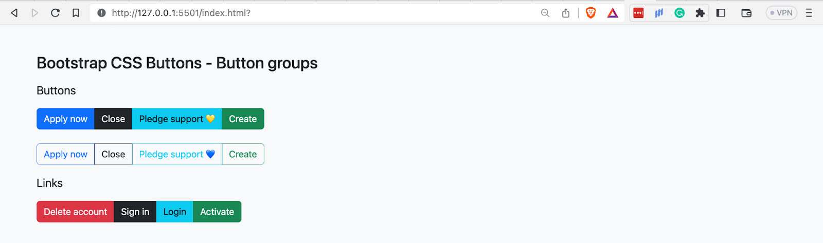
The above example shows how you can form button groups for the < button > and < a > elements.
Button Toolbar
In the previous section of this tutorial, you saw that we could group a series of buttons to form button groups. Similarly, we can group sets or bundles of button groups to create button toolbars.
The commonest use cases for toolbars include:
- Pagination
- Displaying social media sharing icons
- Dashboard widgets
- Responsive web layouts
Code:
<!DOCTYPE html>
<html lang="en">
 <head>
   <meta charset="UTF-8" />
   <meta http-equiv="X-UA-Compatible" content="IE=edge" />
   <meta name="viewport" content="width=device-width, initial-scale=1.0" />
   <link
     rel="stylesheet"
     href="./node_modules/bootstrap/dist/css/bootstrap.min.css"
   />
 </head>
 <body class="py-5 bg-light">
   <div class="container">
     <h1 class="fs-3">Bootstrap CSS Button groups</h1>
     <p class="fs-4">Button toolbars</p>
     <div class="btn-tooblar mb-5">
       <div class="btn-group me-3">
         <button class="btn btn-outline-dark"><<</button>
       </div>
       <!-- Button group 1 -->
       <div class="btn-group me-3">
         <button class="btn btn-dark">1</button>
         <button class="btn btn-dark">2</button>
         <button class="btn btn-dark">3</button>
         <button class="btn btn-dark">4</button>
       </div>
       <!-- Button group 2 -->
       <div class="btn-group me-3">
         <button class="btn btn-dark">5</button>
         <button class="btn btn-dark">6</button>
         <button class="btn btn-dark">7</button>
         <button class="btn btn-dark">8</button>
       </div>
       <!-- Button group 3 -->
       <div class="btn-group me-3">
         <button class="btn btn-dark">9</button>
         <button class="btn btn-dark">10</button>
         <button class="btn btn-dark">11</button>
         <button class="btn btn-dark">12</button>
       </div>
       <div class="btn-group">
         <button class="btn btn-outline-dark">>></button>
       </div>
     </div>
     <div class="btn-tooblar mb-5">
       <a class="me-3" href="#">Previous</a>
       <!-- Button group 1 -->
       <div class="btn-group me-3">
         <button class="btn btn-outline-primary">1</button>
         <button class="btn btn-outline-primary">2</button>
         <button class="btn btn-outline-primary">3</button>
         <button class="btn btn-outline-primary">4</button>
       </div>
       <!-- Button group 2 -->
       <div class="btn-group me-3">
         <button class="btn btn-outline-primary">5</button>
         <button class="btn btn-primary">6</button>
         <button class="btn btn-outline-primary">7</button>
         <button class="btn btn-outline-primary">8</button>
       </div>
       <!-- Button group 3 -->
       <div class="btn-group me-3">
         <button class="btn btn-outline-primary">9</button>
         <button class="btn btn-outline-primary">10</button>
         <button class="btn btn-outline-primary">11</button>
         <button class="btn btn-outline-primary">12</button>
       </div>
         <a href="#">Next</a>
     </div>
     <div class="btn-tooblar">
       <!-- Button group 1 -->
       <div class="btn-group me-3">
         <button class="btn btn-primary">1</button>
         <button class="btn btn-dark">2</button>
         <button class="btn btn-warning">3</button>
         <button class="btn btn-danger">4</button>
       </div>
       <!-- Button group 2 -->
       <div class="btn-group me-3">
         <button class="btn btn-info">5</button>
         <button class="btn btn-warning">6</button>
         <button class="btn btn-secondary">7</button>
         <button class="btn btn-primary">8</button>
       </div>
       <!-- Button group 3 -->
       <div class="btn-group me-3">
         <button class="btn btn-secondary">9</button>
         <button class="btn btn-dark">10</button>
         <button class="btn btn-danger">11</button>
         <button class="btn btn-primary">12</button>
       </div>
     </div>
   </div>


   <script src="./node_modules/bootstrap/dist/js/bootstrap.bundle.min.js"></script>
 </body>
</html>
Browser output:
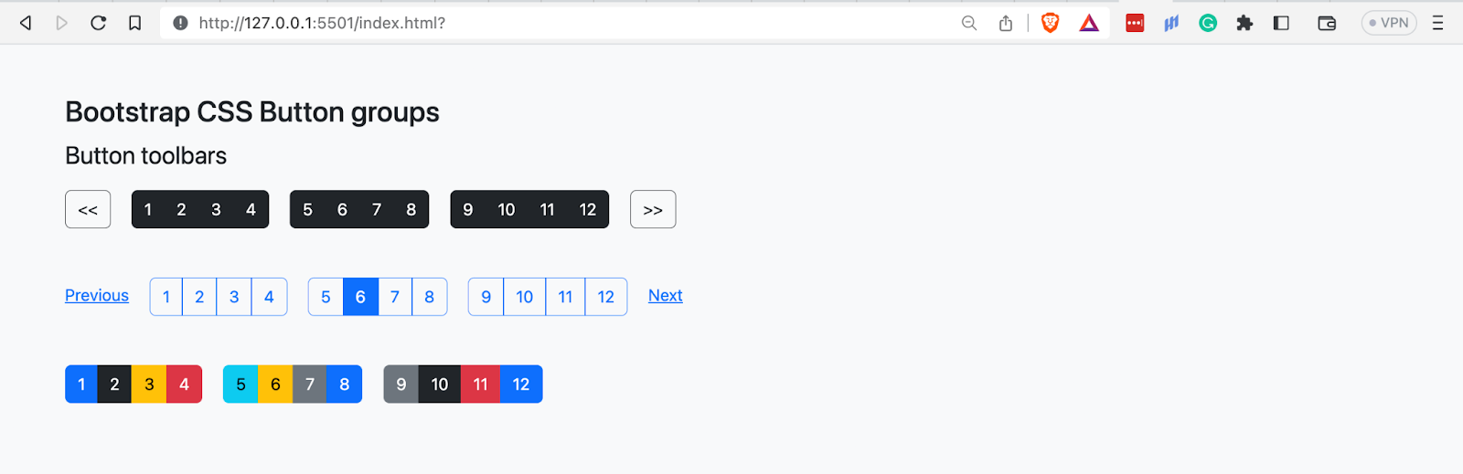
In the above image, we have grouped sets of button groups into toolbars to create pagination components.
Button Groups Sizing
Bootstrap CSS provides two classes for sizing button groups instead of taking the tedious path of sizing each button in the button group. The classes are btn-group-lg and btn-group-sm.
The example below illustrates creating larger or smaller button groups using these classes.
Code:
<!DOCTYPE html>
<html lang="en">
 <head>
   <meta charset="UTF-8" />
   <meta http-equiv="X-UA-Compatible" content="IE=edge" />
   <meta name="viewport" content="width=device-width, initial-scale=1.0" />
   <link
     rel="stylesheet"
     href="./node_modules/bootstrap/dist/css/bootstrap.min.css"
   />
 </head>
 <body class="py-5 bg-light">
   <div class="container">
     <h1 class="fs-3">Bootstrap CSS Button groups</h1>
     <p class="fs-4">Button groups sizing</p>
     <!-- Button groups -->
     <div>
       <div>
         <p>Button group large - <i>btn-group-lg</i> </p>
         <div class="btn-group btn-group-lg mb-3">
           <button class="btn btn-dark">1</button>
           <button class="btn btn-dark">2</button>
           <button class="btn btn-dark">3</button>
           <button class="btn btn-dark">4</button>
         </div>
       </div>
       <br>
       <div>
         <p>Normal button group size - <i>btn-group</i> </p>
         <div class="btn-group mb-3">
           <button class="btn btn-outline-primary">1</button>
           <button class="btn btn-outline-primary">2</button>
           <button class="btn btn-outline-primary">3</button>
           <button class="btn btn-outline-primary">4</button>
         </div>
       </div>
       <br>
       <div>
         <p>Button group small - <i>btn-group-sm</i> </p>
         <div class="btn-group btn-group-sm">
           <button class="btn btn-primary">1</button>
           <button class="btn btn-dark">2</button>
           <button class="btn btn-warning">3</button>
           <button class="btn btn-danger">4</button>
         </div>
       </div>
     </div>
   </div>


   <script src="./node_modules/bootstrap/dist/js/bootstrap.bundle.min.js"></script>
 </body>
</html>
Browser output:
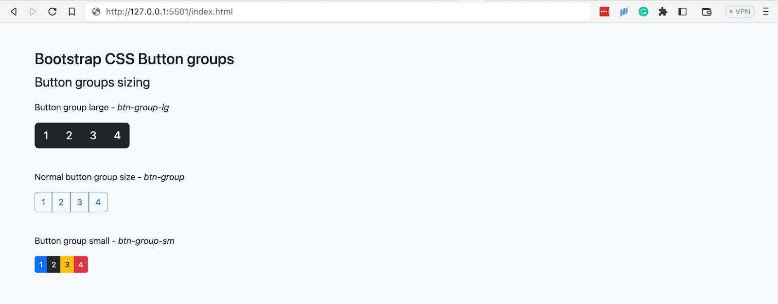
The browser output shows the large button group created using the btn-group-lg class, the regular button group with only the btn-group class, and the small button group with the btn-group-sm.
Nesting Button Groups
Bootstrap CSS allows the nesting of button groups, where you can even include dropdowns. Below are scenarios in which you can nest button groups:
- Tabbed interfaces
- Dropdown menus
- Admin panels
Code:
<!DOCTYPE html>
<html lang="en">
 <head>
   <meta charset="UTF-8" />
   <meta http-equiv="X-UA-Compatible" content="IE=edge" />
   <meta name="viewport" content="width=device-width, initial-scale=1.0" />
   <link
     rel="stylesheet"
     href="./node_modules/bootstrap/dist/css/bootstrap.min.css"
   />
 </head>
 <body class="py-5 bg-light">
   <div class="container">
     <h1 class="fs-3">Bootstrap CSS Button groups</h1>
     <p class="fs-4">Nesting button groups</p>
     <!-- Nested group 1 -->
     <div>
       <p>Nested group 1</p>
       <div class="btn-group mb-3">
         <button class="btn btn-info">1</button>
         <button class="btn btn-info">2</button>
         <button class="btn btn-info">3</button>
         <div class="btn-group">
           <button class="btn btn-dark">4</button>
           <button class="btn btn-dark">5</button>
         </div>
       </div>
     </div>
     <br>
     <!-- Nested group 2 -->
     <div>
       <p>Nested group 2</p>
       <div class="btn-group mb-3">
         <button class="btn btn-info">1</button>
         <button class="btn btn-info">2</button>
         <div class="btn-group">
           <button class="btn btn-warning dropdown-toggle" data-bs-toggle="dropdown" aria-expanded="false"></button>
           <div class="dropdown-menu">
             <li><a class="dropdown-item" href="#">Selenium</a></li>
             <li><a class="dropdown-item" href="#">On-Premise Selenium Grid</a></li>
             <li><a class="dropdown-item" href="#">Real Devices Cloud</a></li>
           </div>
         </div>
         <button class="btn btn-info">4</button>
         <button class="btn btn-info">5</button>
         <div class="btn-group">
           <button class="btn btn-warning dropdown-toggle" data-bs-toggle="dropdown" aria-expanded="false"></button>
           <div class="dropdown-menu">
             <li><a class="dropdown-item" href="#">Cypress</a></li>
             <li><a class="dropdown-item" href="#">Playwright</a></li>
             <li><a class="dropdown-item" href="#">HyperExecute</a></li>
           </div>
         </div>
         <button class="btn btn-info">6</button>
         <button class="btn btn-info">7</button>
       </div>
     </div>
     <br>
     <!-- Nested group 3 -->
     <div>
       <p>Nested group 3</p>
       <div class="btn-group">
         <button class="btn btn-info">1</button>
         <button class="btn btn-info">2</button>
         <div class="btn-group">
           <button class="btn btn-warning dropdown-toggle" data-bs-toggle="dropdown" aria-expanded="false">Test</button>
           <div class="dropdown-menu">
             <li><a class="dropdown-item" href="#">Selenium</a></li>
             <li><a class="dropdown-item" href="#">On-Premise Selenium Grid</a></li>
             <li><a class="dropdown-item" href="#">Real Devices Cloud</a></li>
           </div>
         </div>
         <button class="btn btn-info">4</button>
         <button class="btn btn-info">5</button>
         <div class="btn-group">
           <button class="btn btn-warning dropdown-toggle" data-bs-toggle="dropdown" aria-expanded="false">Test-on Browsers</button>
           <div class="dropdown-menu">
             <li><a class="dropdown-item" href="#">Brave</a></li>
             <li><a class="dropdown-item" href="#">Chrome</a></li>
             <li><a class="dropdown-item" href="#">Safari</a></li>
           </div>
         </div>
         <button class="btn btn-info">6</button>
         <button class="btn btn-info">7</button>
       </div>
     </div>
   </div>


   <script src="./node_modules/bootstrap/dist/js/bootstrap.bundle.min.js"></script>
 </body>
</html>
Browser output:
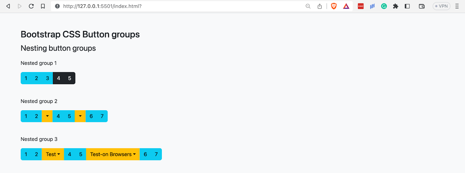
What are Bootstrap Badges
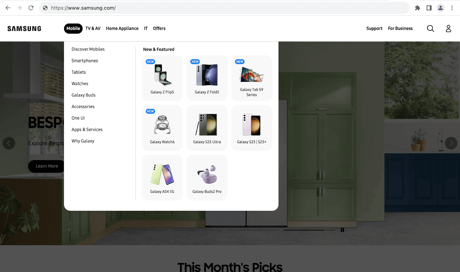
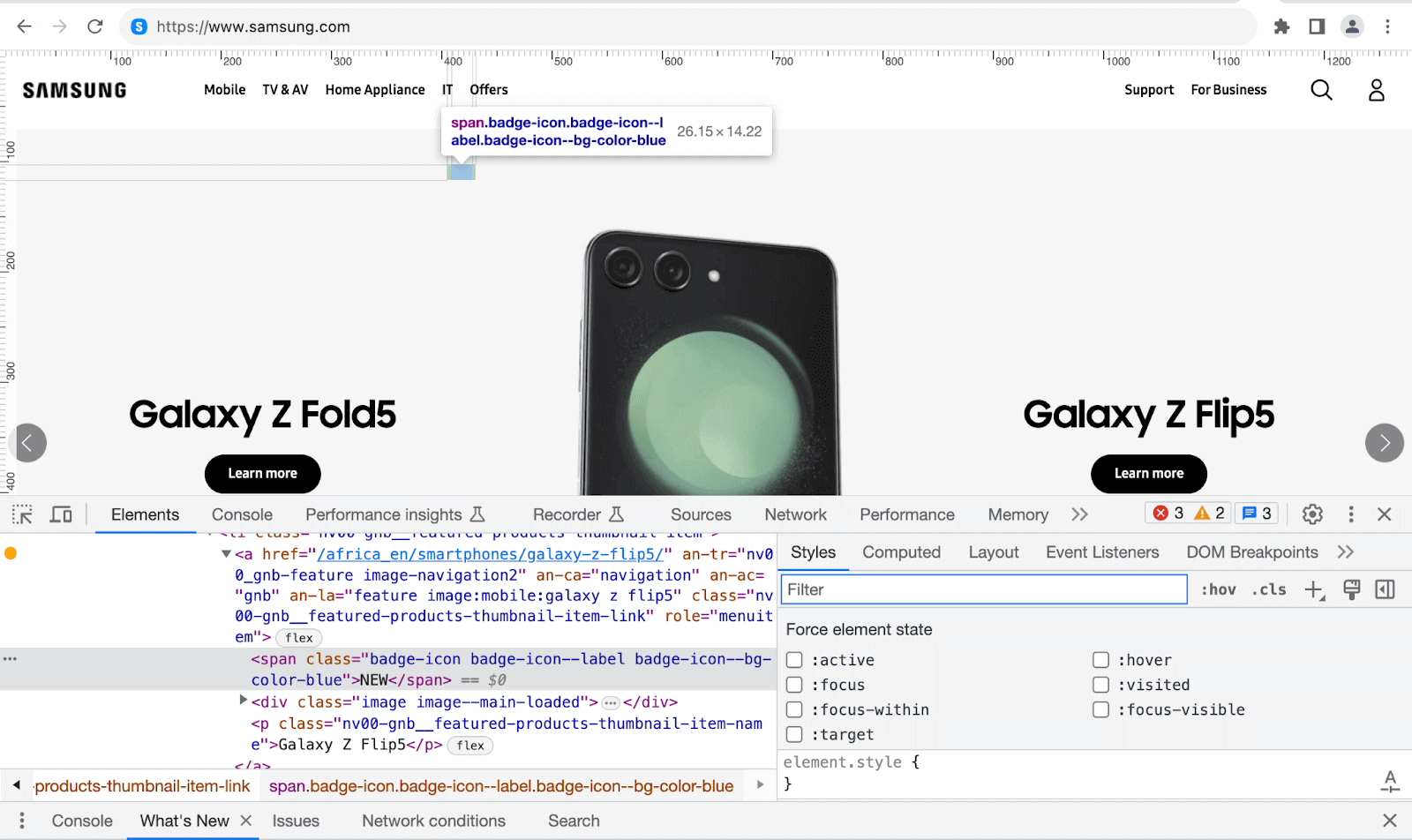
Bootstrap badges are visual indicators that display information, status, or context on the progress or development of an activity or application. Bootstrap badges have several uses, such as notifications and labels.
The example below shows how Samsung uses the NEW badge to indicate the latest products in the New Featured menu dropdown section.
The example below shows how YouTube uses a LIVE badge to indicate the channels airing live at that time.
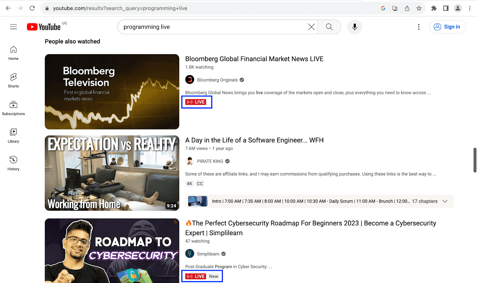
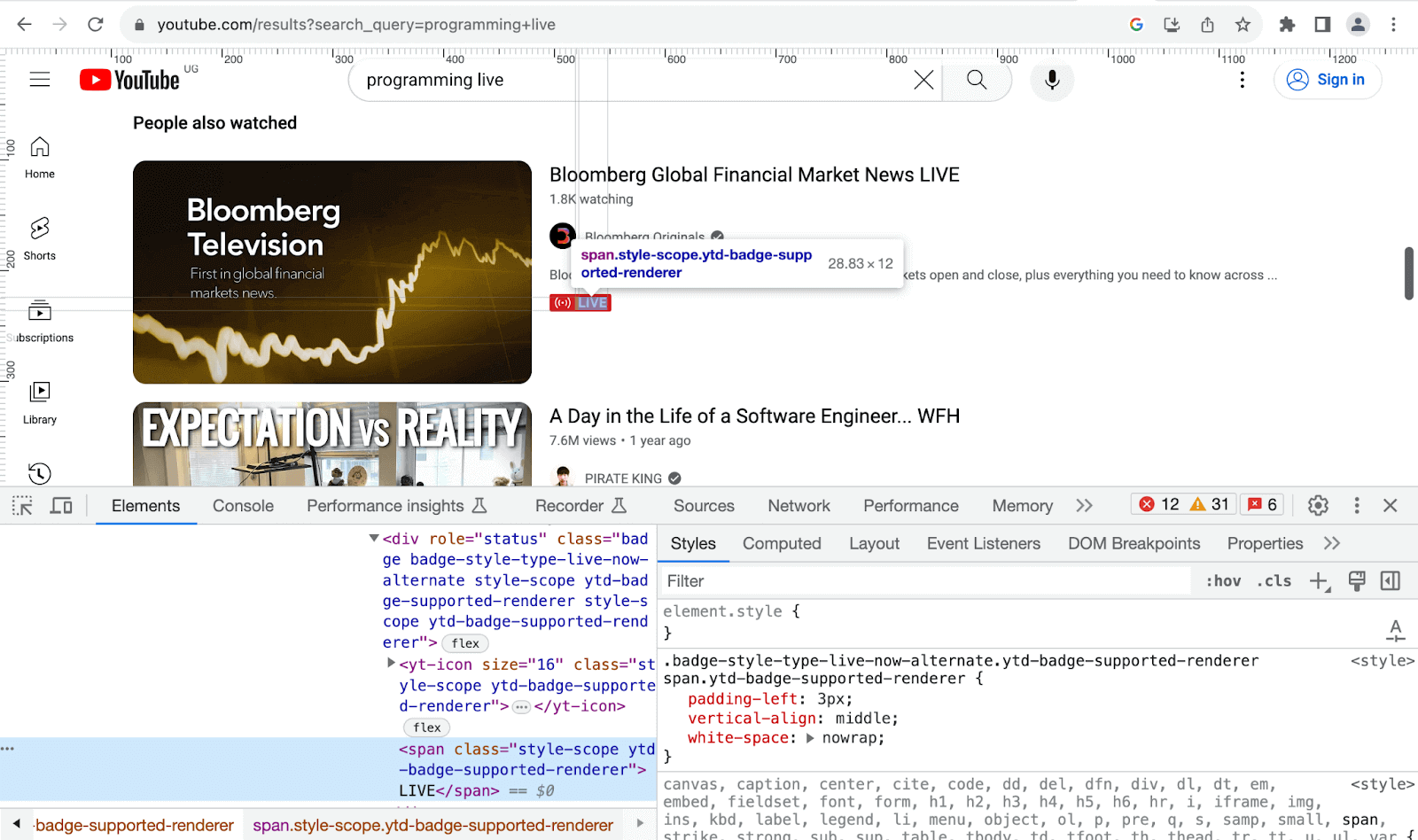
To create a Bootstrap badge, you can use the class badge, followed by a contextual background color to convey its meaning well. Badge sizes match their immediate parent’s size using relative font sizing and em units.
Creating a Bootstrap Badge
One of the primary ways of making Bootstrap badges is using HTML headings, which are hierarchical with varying font sizes.
Let’s see how you can create Bootstrap badges based on headings as their parents.
Code:
<!DOCTYPE html>
<html lang="en">
 <head>
   <meta charset="UTF-8" />
   <meta http-equiv="X-UA-Compatible" content="IE=edge" />
   <meta name="viewport" content="width=device-width, initial-scale=1.0" />
   <link
     rel="stylesheet"
     href="./node_modules/bootstrap/dist/css/bootstrap.min.css"
   />
 </head>
 <body class="py-5 bg-light">
   <div class="container">
     <div class="mb-3">
       <p class="fw-medium fs-3">Badges based on headings</p>
       <span class="text-secondary">
         Badges inheriting the sizes of headings
       </span>
     </div>
     <h1>
       Heading 1
       <span class="badge bg-primary">1</span>
     </h1>
     <h2>
       Heading 2
       <span class="badge bg-warning">2</span>
     </h2>
     <h3>
       Heading 3
       <span class="badge bg-danger">3</span>
     </h3>
     <h4>
       Heading 4
       <span class="badge bg-success">4</span>
     </h4>
     <h5>
       Heading 5
       <span class="badge bg-secondary">5</span>
     </h5>
     <h6>
       Heading 6
       <span class="badge bg-info">6</span>
     </h6>
   </div>


   <script src="./node_modules/bootstrap/dist/js/bootstrap.bundle.min.js"></script>
 </body>
</html>
Browser output:
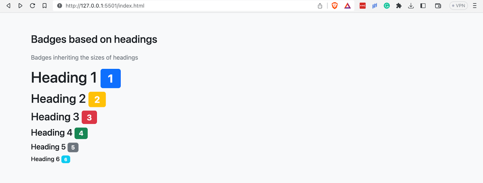
In the browser output above, we can see that the size of each badge is based on the font size of its parent, in this case, the headings.
Pill Badges
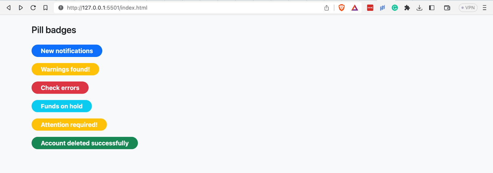
Pill badges resemble pills due to their shape, hence the name pill badges. You can create pill badges by adding the class rounded-pill to any badge.
GitHub uses pill badges as tags to indicate which repositories are public and private.
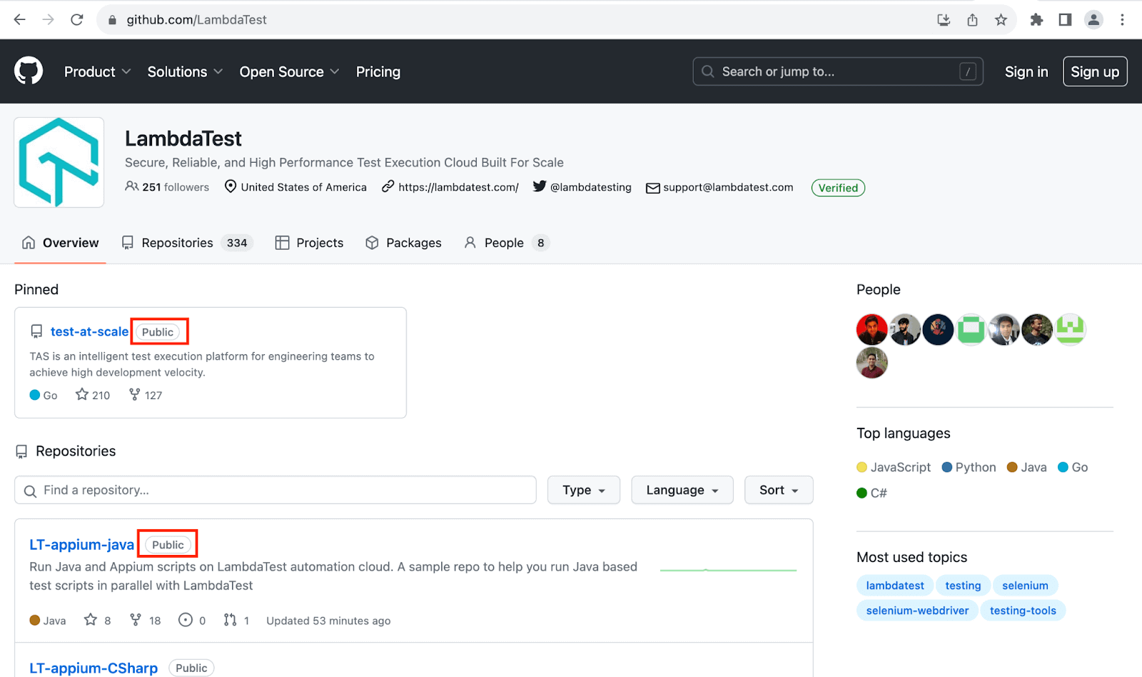
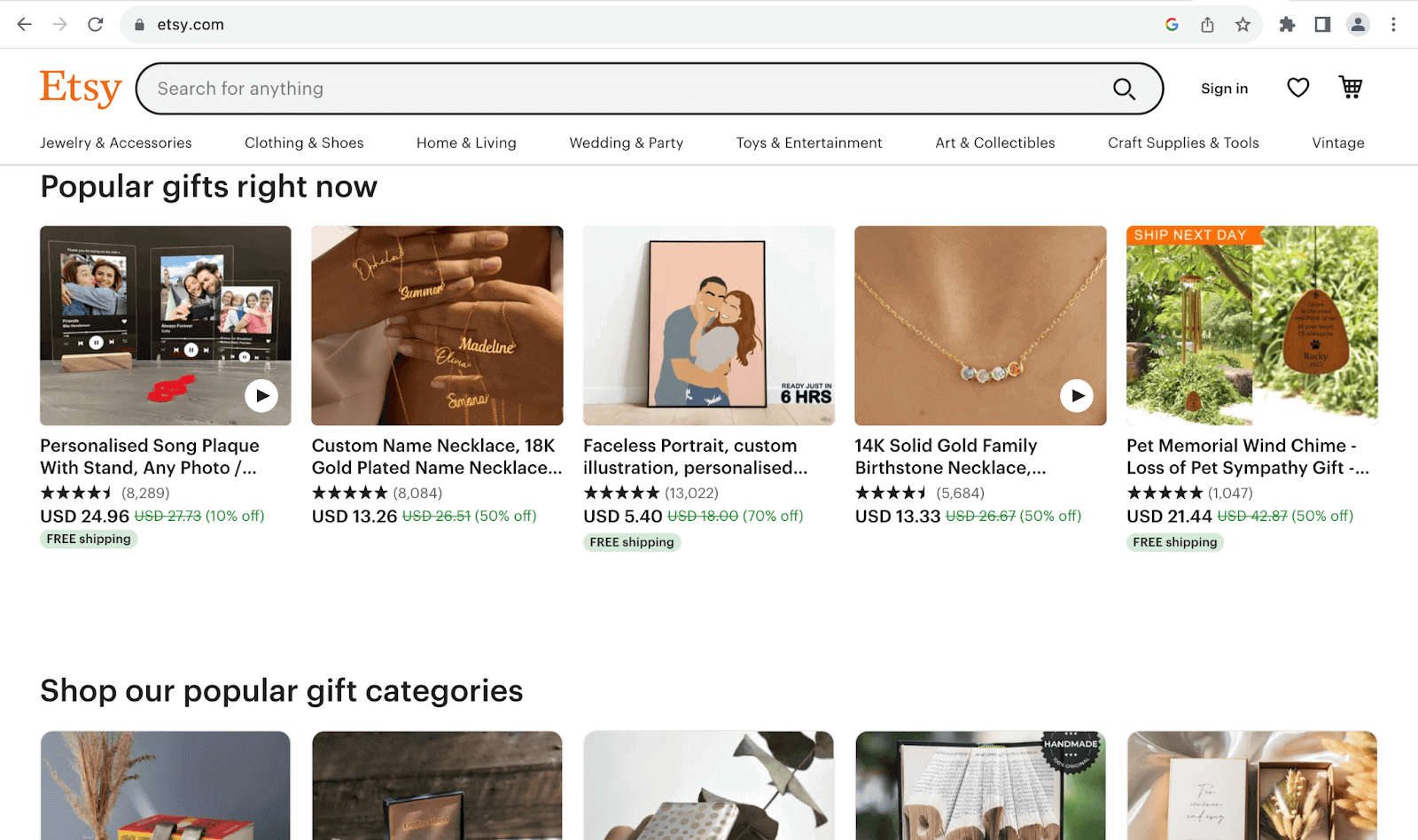
Etsy uses pill badges as indicators of products with free shipping in its store. Bootstrap pill badges are a specific type of badge used in web development to provide visual cues and notifications.
Code:
<!DOCTYPE html>
<html lang="en">
 <head>
   <meta charset="UTF-8" />
   <meta http-equiv="X-UA-Compatible" content="IE=edge" />
   <meta name="viewport" content="width=device-width, initial-scale=1.0" />
   <link
     rel="stylesheet"
     href="./node_modules/bootstrap/dist/css/bootstrap.min.css"
   />
 </head>
 <body class="py-4 bg-light">
   <div class="container">
     <h1 class="fw-medium fs-4">Pill badges</h1>
     <!-- Pill badges -->
     <div class="mt-4">
       <span class="badge rounded-pill bg-primary px-4 py-2 fs-6 mb-3">New notifications</span>
       <br>
       <span class="badge rounded-pill bg-warning px-4 py-2 fs-6 mb-3">Warnings found!</span>
       <br>
       <span class="badge rounded-pill bg-danger px-4 py-2 fs-6 mb-3">Check errors</span>
       <br>
       <span class="badge rounded-pill bg-info px-4 py-2 fs-6 mb-3">Funds on hold</span>
       <br>
       <span class="badge rounded-pill bg-warning px-4 py-2 fs-6 mb-3">Attention required!</span>
       <br>
       <span class="badge rounded-pill bg-success px-4 py-2 fs-6">Account deleted successfully</span>
     </div>
   </div>


   <script src="./node_modules/bootstrap/dist/js/bootstrap.bundle.min.js"></script>
 </body>
</html>
Browser output:
Positioning Badges
In several real-world applications, badges are usually in the corners of their parent containers. There are multiple reasons for this, including:
- Visibility: Placing badges in the corners makes them highly visible and quickly noticeable to users. Corners draw the eye’s attention, ensuring users are likelier to use the badge.
- Minimal intrusion: Putting badges in the corners of their containers is less likely to interfere with the container’s content. If placed in the center, on the other hand, they could block vital content or visuals if placed in the center.
- Consistency: Corner placement is a common design pattern, making it familiar and consistent for users across websites and mobile applications. Thus, users easily recognize the importance of a badge in the corner.
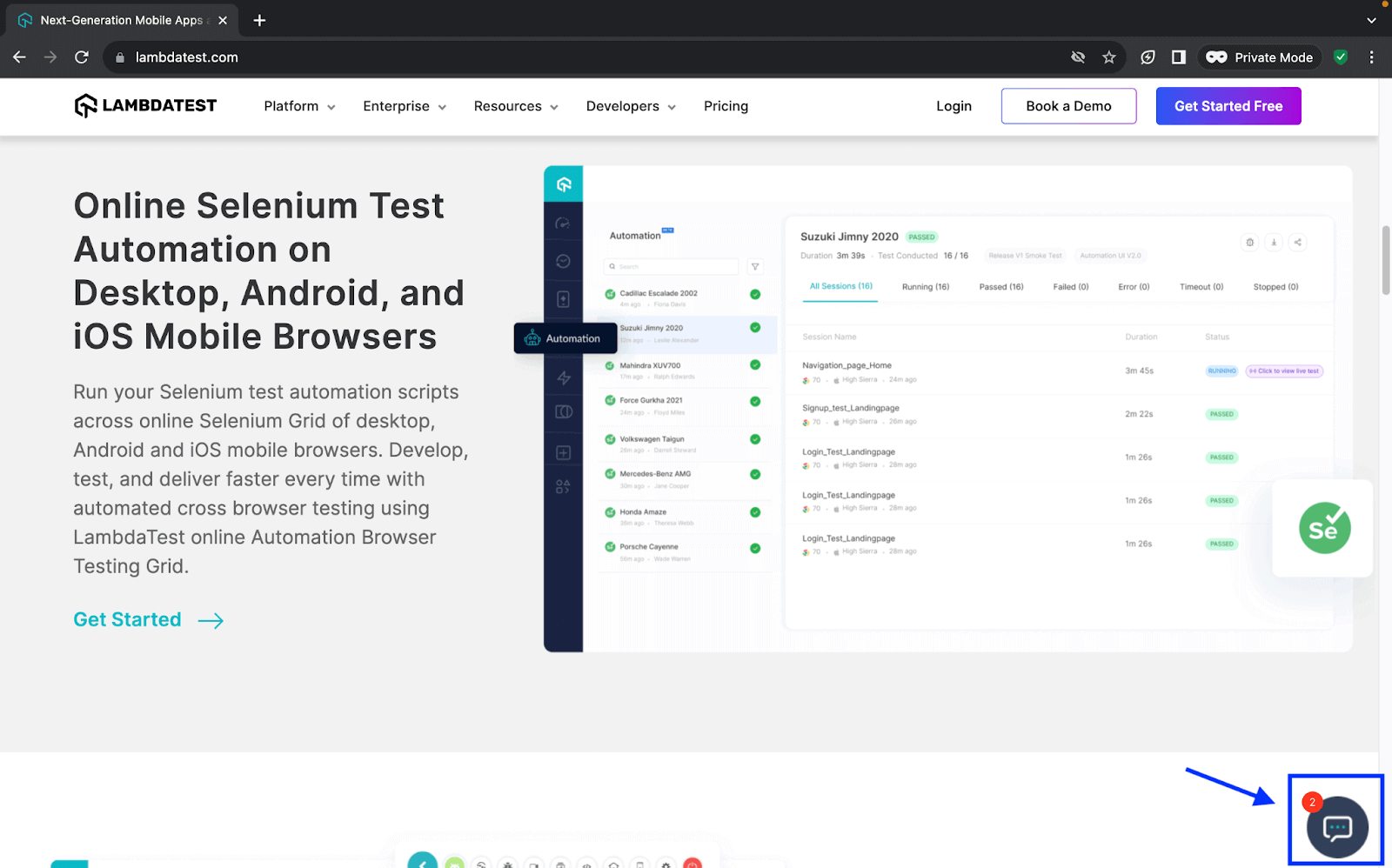
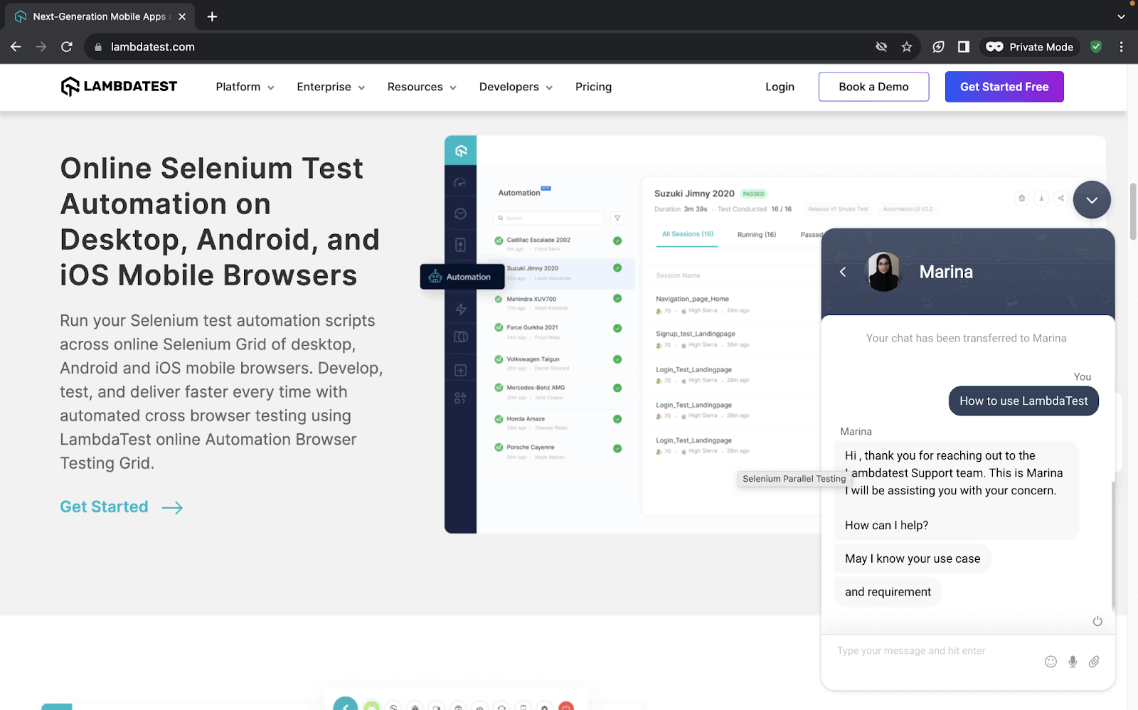
The example below shows how TestMu AI Customer Support uses the badge in the corner of the chat icon to start or respond to an ongoing conversation and also easily notify the user of new messages due to its noticeability.
Code:
<!DOCTYPE html>
<html lang="en">
 <head>
   <meta charset="UTF-8" />
   <meta http-equiv="X-UA-Compatible" content="IE=edge" />
   <meta name="viewport" content="width=device-width, initial-scale=1.0" />
   <link
     rel="stylesheet"
     href="./node_modules/bootstrap/dist/css/bootstrap.min.css"
   />
 </head>
 <body class="py-4 bg-light">
   <div class="container">
     <h1 class="fw-medium fs-4">Positioning badges</h1>
     <!-- Buttons with badges -->
     <div class="mt-5">
       <button class="btn rounded-pill position-relative bg-primary text-white px-4 py-2 fs-5 mb-4">
         Notifications <span class="badge bg-secondary top-0 start-100 position-absolute translate-middle">+20</span>
       </button>
       <br>
       <button class="btn position-relative bg-success text-white px-4 py-2 fs-5 mb-4">
         Transactions completed <span class="badge bg-warning top-0 start-100 position-absolute translate-middle">7</span>
       </button>
       <br>
       <button type="button" class="btn btn-primary position-relative">
         Online <span class="position-absolute top-0 start-100 translate-middle badge border border-light rounded-circle bg-success p-2"><span></span></span>
       </button>
     </div>
   </div>


   <script src="./node_modules/bootstrap/dist/js/bootstrap.bundle.min.js"></script>
 </body>
</html>
Browser output:
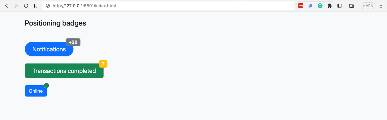
In the above browser output, all the Bootstrap badges are positioned in the corners of their parents’ buttons using Bootstrap’s position utility.
The Bootstrap buttons are given a position relative, and the badges are absolute. The badges are then pushed 100px from the left to the right and 0px from the top, thus forcing them into the upper right corner of the buttons.
Advanced Feature: Bootstrap Button Toolbars
In this section, we will look at Button toolbars, one of the advanced features you can create with Bootstrap buttons.
Button toolbars, as seen earlier, are groups of sets of button groups. Button toolbars enable you to group and present related elements or actions together. For this example, we will create a page with a button toolbar consisting of TestMu AI’s Webinars.
Code:
<!DOCTYPE html>
<html>
  <head>
    <link rel="stylesheet" href="./node_modules/bootstrap/dist/css/bootstrap.min.css">
    <style>
      body::before {
        display: block;
        content: '';
        height: 90px;
      }

      .card-img {
        width: 350px;
        height: auto;
      }
    </style>
  </head>
  <body>
    <nav class="navbar navbar-expand-lg bg-white py-4 fixed-top">
      <div id="logo" class="container ms-auto">
        <a class="navbar-brand" href="#">
          <img src="https://assets.testmuai.com/resources/images/logos/logo.svg" alt="LambdaTest Logo" />
        </a>

        <button class="navbar-toggler" type="button" data-bs-toggle="collapse" data-bs-target="#navbar-menu">
          <span class="navbar-toggler-icon"></span>
        </button>

        <div class="collapse navbar-collapse" id="navbar-menu">
          <ul class="navbar-nav ms-auto">
            <li class="nav-item"><a href="#" class="nav-link">Platform</a></li>
            <li class="nav-item"><a href="#" class="nav-link">Enterprise</a></li>
            <li class="nav-item"><a href="#" class="nav-link">Resources</a></li>
            <li class="nav-item"><a href="#" class="nav-link">Developers</a></li>
            <li class="nav-item"><a href="#" class="nav-link">Pricing</a></li>
            <li class="d-flex gap-3 ms-lg-4 ms-md-0 ms-sm-0">
              <a href="" class="nav-link">Login</a>
              <button class="btn btn-outline-dark" data-bs-toggle="modal" data-bs-target="#bookdemo" type="button">
                Book a Demo
              </button>
              <a class="btn btn-dark" href="#" role="button">Sign Up</a>
            </li>
          </ul>
        </div>
      </div>
    </nav>
    <!-- Page heading and description -->
    <section class="bg-primary-subtle text-center pt-5 pb-4">
      <div class="container">
        <h2>LAMBDATEST WEBINARS</h2>
        <p class="text-secondary">Learn more on how you can leverage LambdaTest for your manual and automation testing needs.</p>
      </div>
    </section>
    <!-- Webinars -->
    <section class="bg-white py-5">
      <div class="container">
        <!-- Cards container -->
        <div class="row row-cols-1 gap-5">
          <!-- card 1 -->
          <div class="bg-light rounded-4 px-3">
            <div class="d-flex py-5 px-4 align-items-center gap-5">
              <div class="d-none d-sm-none d-md-none d-xl-inline-flex d-xxl-inline-flex">
                <a href="https://www.lambdatest.com/webinar/my-favorite-cypress-plugins">
                  <img src="https://www.lambdatest.com/resources/images/webinar/my-favorite-cypress-plugins-meta2.png" alt="my-favorite-cypress-plugins" class="card-img">
                </a>
              </div>
              <div class="align-self-start">
                <div>
                  <a class="fs-4 fw-semibold link-dark link-underline link-underline-opacity-0 link-underline-opacity-75-hover">My Favorite Cypress Plugins</a>
                  <p class="text-secondary">In this webinar, Dr. Gleb Bahmutov delves deep into the fascinating realm of Cypress plugins.</p>
                </div>
                <div class="d-flex gap-3 text-secondary">
                  <p>21 JUNE 2023</p>
                  <p class="">65 mins</p>
                </div>
              </div>
            </div>
          </div>
          <!-- Card 2 -->
          <div class="bg-light rounded-4 px-3">
            <div class="d-flex py-5 px-4 align-items-center gap-5">
              <div class="d-none d-sm-none d-md-none d-xl-inline-flex d-xxl-inline-flex">
                <a href="https://www.lambdatest.com/webinar/my-favorite-cypress-plugins">
                  <img src="https://www.lambdatest.com/resources/images/webinar/digital-accessibility-testing-meta2.png" alt="my-favorite-cypress-plugins" class="card-img">
                </a>
              </div>
              <div class="align-self-start">
                <div>
                  <a class="fs-4 fw-semibold link-dark link-underline link-underline-opacity-0 link-underline-opacity-75-hover">Digital Accessibility Testing: How To Get It Right</a>
                  <p class="text-secondary">
                    In this webinar, Tamar Schapira delves into the world of 'Digital Accessibility
                    <!-- </br> --> Testing' and reveal the secrets to ensure a seamless user experience for all.
                  </p>
                </div>
                <div class="d-flex gap-3 text-secondary">
                  <p>31 MAY 2023</p>
                  <p class="">62 mins</p>
                </div>
              </div>
            </div>
          </div>
          <!-- Card 3 -->
          <div class="bg-light rounded-4 px-3">
            <div class="d-flex py-5 px-4 align-items-center gap-5">
              <div class="d-none d-sm-none d-md-none d-xl-inline-flex d-xxl-inline-flex">
                <a href="https://www.lambdatest.com/webinar/my-favorite-cypress-plugins">
                  <img src="https://www.lambdatest.com/resources/images/webinar/playwright-meta.png" alt="my-favorite-cypress-plugins" class="card-img">
                </a>
              </div>
              <div class="align-self-start">
                <div>
                  <a class="fs-4 fw-semibold link-dark link-underline link-underline-opacity-0 link-underline-opacity-75-hover">The 'New Tool On The Block' Playwright'</a>
                  <p class="text-secondary">
                    In this webinar, Butch Mayhew shared his learning journey in building automated tests with Playwright.
                  </p>
                </div>
                <div class="d-flex gap-3 text-secondary">
                  <p>26 APRIL 2023</p>
                  <p class="">63 mins</p>
                </div>
              </div>
            </div>
          </div>
          <!-- Card 4 -->
          <div class="bg-light rounded-4 px-3">
            <div class="d-flex py-5 px-4 align-items-center gap-5">
              <div class="d-none d-sm-none d-md-none d-xl-inline-flex d-xxl-inline-flex">
                <a href="https://www.lambdatest.com/webinar/my-favorite-cypress-plugins">
                  <img src="https://www.lambdatest.com/resources/images/webinar/cleancoding2.png" alt="my-favorite-cypress-plugins" class="card-img">
                </a>
              </div>
              <div class="align-self-start">
                <div>
                  <a class="fs-4 fw-semibold link-dark link-underline link-underline-opacity-0 link-underline-opacity-75-hover">Clean Coding Practices for Test Automation: Part 2</a>
                  <br class="text-secondary">
                  In this webinar, we learned about the clean coding practices with real-world scenarios and showcased the implementation of various design patterns.
                  </p>
                </div>
                <div class="d-flex gap-3 text-secondary">
                  <p>23 MARCH 2023</p>
                  <p class="">94 mins</p>
                </div>
              </div>
            </div>
          </div>

        </div>
      </div>
    </section>
    <!-- Toolbars -->
    <section class="text-center">
      <div class="btn-tooblar mb-5">
        <a class="me-3 link-info" href="#">Previous</a>
        <!-- Button group 1 -->
        <div class="btn-group me-3 d-none d-sm-inline-flex d-md-inline-flex d-xl-inline-flex d-xxl-inline-flex">
          <button class="btn btn-outline-info">1</button>
          <button class="btn btn-outline-info">2</button>
          <button class="btn btn-outline-info">3</button>
          <button class="btn btn-outline-info">4</button>
        </div>
        <!-- Button group 2 -->
        <div class="btn-group me-3">
          <button class="btn btn-outline-info">5</button>
          <button class="btn btn-info">6</button>
          <button class="btn btn-outline-info">7</button>
          <button class="btn btn-outline-info">8</button>
        </div>
        <!-- Button group 3 -->
        <div class="btn-group me-3 d-none d-sm-none d-md-inline-flex d-xl-inline-flex d-xxl-inline-flex">
          <button class="btn btn-outline-info">9</button>
          <button class="btn btn-outline-info">10</button>
          <button class="btn btn-outline-info">11</button>
          <button class="btn btn-outline-info">12</button>
        </div>
        <a href="#" class="link-info">Next</a>
      </div>
    </section>

    <script src="./node_modules/bootstrap/dist/js/bootstrap.bundle.min.js"></script>
  </body>
</html>
Browser output:
Debugging Common Issues With Bootstrap Buttons and Badges
Browsers and devices have made significant strides in improving their compatibility with CSS properties and standards. However, despite these advancements, there are still some irregular discrepancies due to the evolving nature of CSS and the diversity of browsers and devices.
We will look at some common issues and how you can fix them.
- Accessibility: Creating accessible buttons is a paramount concern in web development to ensure that all users, regardless of their abilities, can engage seamlessly with digital content.
You can make your website’s buttons accessible first by using semantic HTML, and WAI-ARIA attributes like role. Additionally, you can carry out accessibility testing to ensure that your site is accessible across different operating systems and browsers.
The code below demonstrates how to use the ARIA role to indicate a link functioning as a button.
<a class="btn btn-primary disabled" role="button" href="#">Read more on Accessibility testing</a>
Ensuring the responsiveness of your website is vital. It becomes even more critical when it comes to buttons and badges due to the crucial role they play. On smaller screens like mobile phones, non-responsive buttons could lead to missed clicks, misclicks, or an inability to interact with essential CTAs such as making purchases or submitting a form.
To counter this, you can carry out responsive testing using tools like LT Browser on 50+ screen resolutions to know the behavior of the buttons on different devices viewports. Also, you can use the Bootstrap classes btn-lg and btn-sm to increase or decrease the size of the buttons.
You can ensure the responsiveness of your website by carrying out responsive testing. It helps you know how your buttons, badges, and website behave on different devices and browsers.
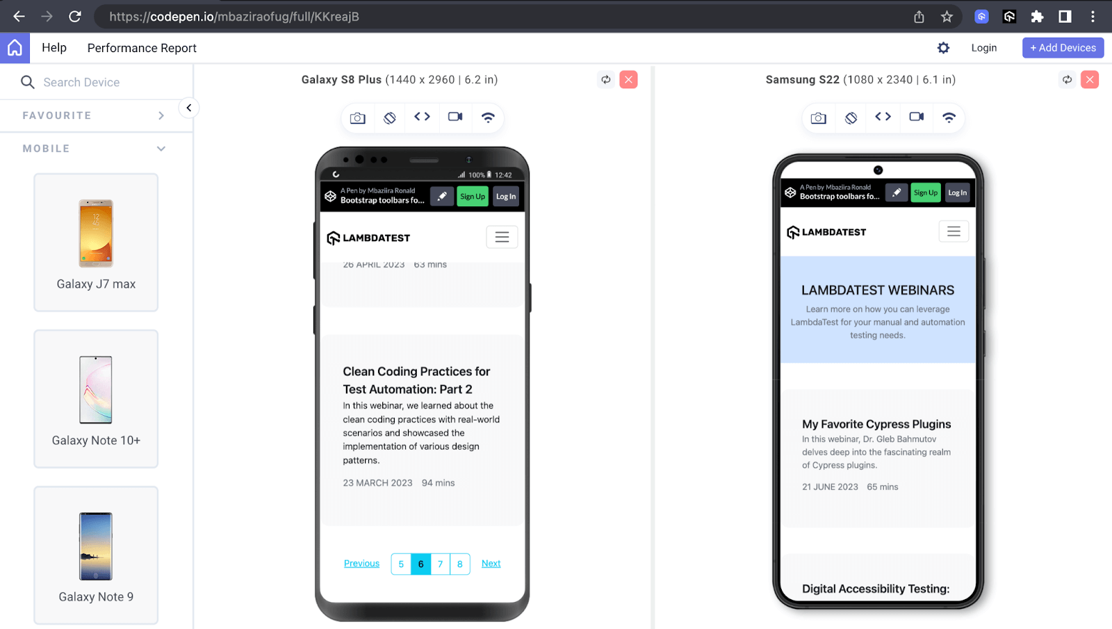
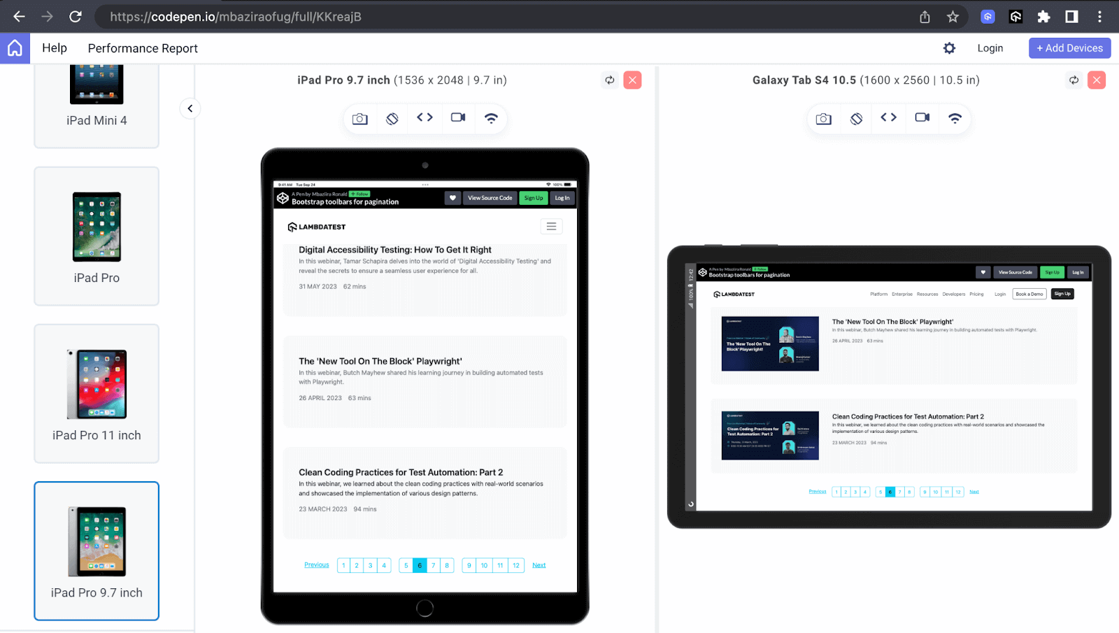
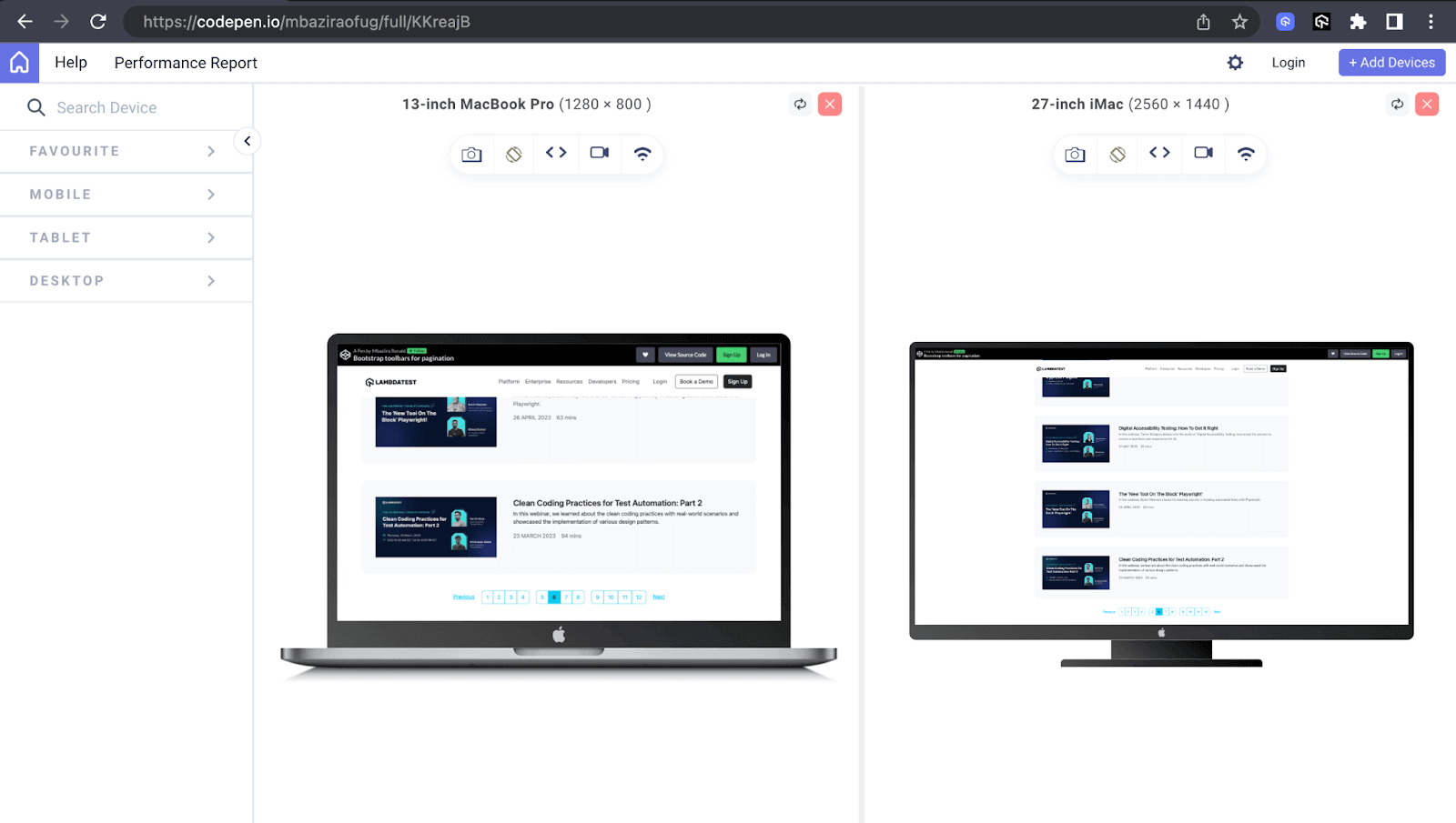
We’ll evaluate the responsiveness of the button toolbar of TestMu AI’s webinar page on LT Browser, which we’ve designed on CodePen. We will test it on mobile, tablet, and desktop viewports.
Mobile Preview:
Tablet Preview:
Desktop Preview:
- Browser compatibility: As users utilize different devices, such as desktop and mobile devices, to access websites, ensuring the compatibility of your website features across these browsers and devices becomes of the utmost importance.
You can ensure browser compatibility by carrying out browser testing both manually and automatically using cloud-based testing platforms like TestMu AI.
TestMu AI is an AI-powered test orchestration and execution platform that lets you perform manual and automated tests at scale on over 3000+ real browsers, devices, and platforms. It will help you know which Bootstrap features are suitable for your users’ browsers so that you can quickly respond accordingly.
You can test browser compatibility of your Bootstrap features (in this case, Bootstrap buttons and Bootstrap badges) on the latest and legacy web browsers like Chrome, Firefox, and Edge. You can even test on Safari on current and older macOS releases.
Note: Perform browser testing on real Windows & macOS. Try TestMu AI Today!
Why Do AI Coding Assistants Write Outdated Bootstrap Button Classes?
AI coding assistants write outdated Bootstrap button classes because most Bootstrap markup in their training data predates Bootstrap 5, which renamed or removed several button and badge classes. A generated snippet looks correct and still renders the wrong component.
The four cases below account for most of the broken output when a tool such as GitHub Copilot, Cursor or Claude Code produces Bootstrap markup.
- Training-data skew: Bootstrap 4 shipped in 2018 and dominated tutorials for years, so a generated snippet drops version 4 class names into a version 5 project.
- badge-primary: Bootstrap 5.0.0 dropped every badge-* color class. Use bg-primary, or text-bg-primary in Bootstrap 5.3 for a contrasting foreground color.
- badge-pill: Bootstrap 5.0.0 replaced badge-pill with the rounded-pill utility, which applies to any element and not only a badge.
- btn-block: Bootstrap 5.0.0 removed btn-block. Wrap the buttons in a d-grid container and add a gap utility to space them.
The code below shows the generated Bootstrap 4 markup and the Bootstrap 5 version that produces the intended button and badge.
<!-- Bootstrap 4 markup an assistant may still generate -->
<span class="badge badge-primary badge-pill">New</span>
<button class="btn btn-primary btn-block">Sign up</button>

<!-- Bootstrap 5 equivalent -->
<span class="badge text-bg-primary rounded-pill">New</span>
<div class="d-grid">
  <button class="btn btn-primary">Sign up</button>
</div>
The failure is silent. A removed class name is not an error in HTML or CSS, so the browser renders the badge without its color and the button without its full width. Check the Bootstrap version in your project before you accept generated markup, then run the result through the same browser testing you use for handwritten markup.
Conclusion
We have journeyed through the various aspects of Bootstrap buttons and badges. We have explored their multiple uses and responsive design capabilities and their integral part in web development.
However, the journey doesn’t end here. The innovation potential is limitless. Thus, I urge you to explore new possibilities continuously.
Thank you for taking the time to read this Bootstrap tutorial II and reaching this far. See you in the next one!
Author

Mbaziira Ronald
Blogs: 8


Mbaziira Ronald is a community contributor with nearly 3 years of experience as a software developer and technical content writer. He specializes in creating clear, user-focused technical blogs and documentation for software testing and modern web technologies. Ronald has contributed written content for platforms such as TestMu AI, Semaphore, OpenReplay, and freeCodeCamp, translating complex technical concepts into accessible insights for developers and testers worldwide.


Bootstrap Buttons and Badges FAQs
Did you find this page helpful?
More Related Blogs
TestMu AI forEnterprise
Get access to solutions built on Enterprise
grade security, privacy, & compliance
- Advanced access controls
- Advanced data retention rules
- Advanced Local Testing
- Premium Support options
- Early access to beta features
- Private Slack Channel
- Unlimited Manual Accessibility DevTools Tests