

Power Your Software Testing with AI Agents and Cloud
The Native AI-Agentic Cloud Platform to Supercharge Quality Engineering. Test Intelligently and Ship Faster.


- TestMu AI (Formerly LambdaTest)
- /
- Learning Hub
- /
- What Is Mobile Optimization and Why Is It Important
What Is Mobile Optimization and Why Is It Important
Discover what mobile optimization is and why it matters. Learn how to enhance website speed, UX, and SEO to improve performance on mobile devices.
Last Updated on:
Mobile optimization is the work of making a website load fast, read clearly, and respond to touch on a small screen. Google ranks the mobile version of a page, and a mobile page passes Core Web Vitals when real-user data at the 75th percentile shows Largest Contentful Paint of 2.5 seconds or less. This guide covers what mobile optimization is, why it is important, the key elements, how to optimize websites for mobile devices, and how AI assistants help debug mobile layout and speed issues.
Key Takeaways
- Mobile optimization is the work of making a website load fast, read clearly, and respond to touch on a small screen, rather than shrinking a desktop layout to fit.
- StatCounter recorded mobile at 50.13% of worldwide web traffic in August 2026 and desktop at 49.87%, so a website has to serve both halves of its audience equally well.
- Google crawls, indexes, and ranks the mobile version of a page, so any content missing from the mobile rendering is content a search engine never sees.
- The key elements of mobile optimization are responsive design, fast load speed, readable font sizes and line spacing, and touch targets sized for fingers and thumbs.
- A mobile page passes Google Core Web Vitals when real-user data at the 75th percentile shows Largest Contentful Paint of 2.5 seconds or less, Interaction to Next Paint of 200 milliseconds or less, and Cumulative Layout Shift of 0.1 or less.
- Google has retired the Mobile-Friendly Test and the Search Console Mobile Usability report, so a mobile audit now runs through Lighthouse and Core Web Vitals instead of a single pass or fail verdict.
What Is Mobile Optimization?
Mobile optimization refers to the technique of tailoring a web app to work flawlessly on mobile devices. It involves ensuring quick load times, touch-friendly navigation, and the ability to cater to a variety of screen sizes for an optimum user experience.
Since web apps are typically developed on large screens like desktops and laptops, their design elements are often fixed to those dimensions. The mobile optimization process follows specific methods to make sure that the web app serves its desktop and mobile users equally.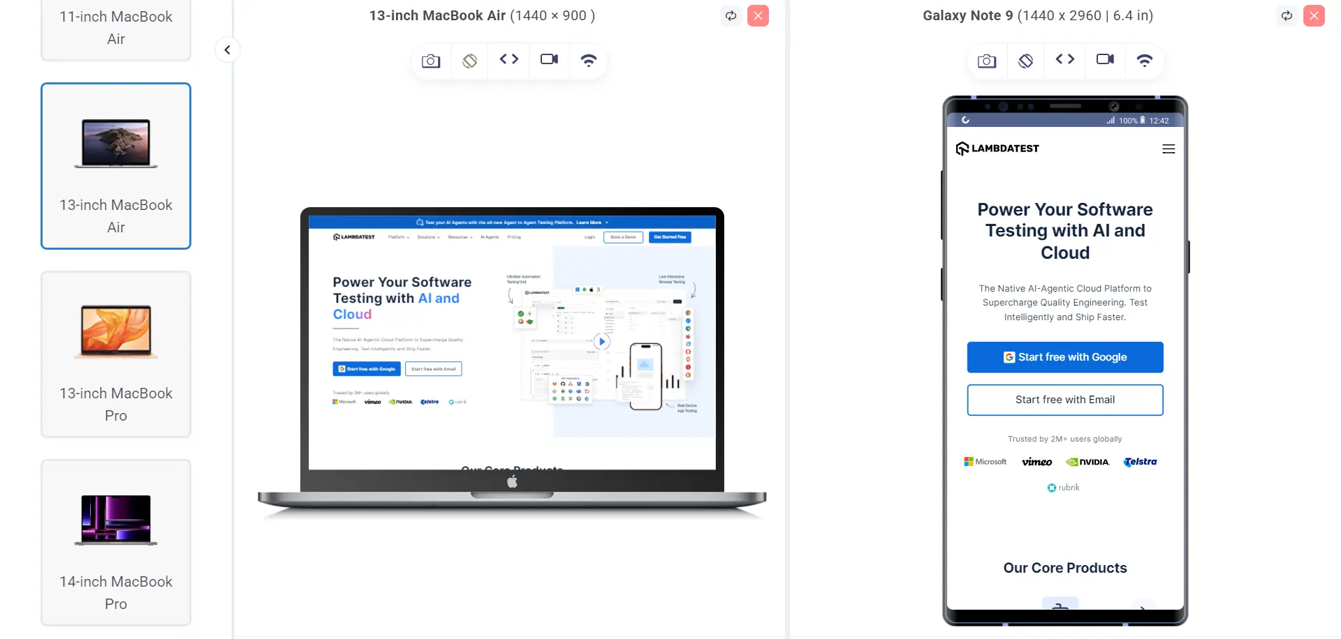
Key Takeaway: Mobile optimization adapts a web app whose design was fixed to desktop dimensions so that it loads quickly, navigates by touch, and fits every screen size a visitor uses.
Why Is Mobile Optimization Important?
Mobile optimization is essential for delivering seamless user experiences, improving mobile search visibility, and driving conversions, as most users engage with websites and discover brands through their phones.
Mobile and desktop traffic are now close to even. StatCounter recorded mobile at 50.13% of worldwide web traffic in August 2026 and desktop at 49.87%, counting tablets separately. Mobile optimization is therefore not a side project for a minority of visitors, and it is not a reason to let the desktop layout degrade. The same page has to serve both halves of the audience.
When it comes to mobile web, there are numerous reasons why every business should consider mobile optimization.
- User Experience: As per UXCam, 88% of users are less likely to return after a bad user experience. Repeat traffic therefore depends on the mobile experience, not only the desktop one. Users stay on a website that responds like a native app even though it runs in a browser.
- Mobile Search Trends: Most search sessions now start on a phone, and Google crawls, indexes, and ranks the mobile version of a page rather than the desktop one. If your mobile rendering drops content that the desktop version shows, Google does not index that content at all. Mobile optimization therefore decides what a search engine sees, not only what a visitor sees.
- Marketing and Social Media Impact: If your business believes in gaining attention through marketing and advertisements, mobile optimization becomes a critical factor in achieving its goals.
Social media carries most paid campaigns, and people open those apps on a phone. Every ad click therefore lands on your website inside a mobile browser or an in-app webview. A landing page that loads slowly or renders badly on that screen wastes the ad spend that brought the visitor there.
Key Takeaway: Google crawls, indexes, and ranks the mobile version of a page, so content that a site drops from its mobile rendering is content a search engine never indexes at all.

Note: Test mobile websites and apps on real Android and iOS devices. Try TestMu AI free!
What Are the Key Elements of Mobile Optimization?
Key elements of mobile optimization include responsive design, fast loading speed, intuitive navigation, touch-friendly layouts, optimized visuals, and seamless performance across all devices.
These key elements are as follows:
- Responsive Design: A responsive design is a technique in which the website adapts to the device automatically. A few of them are rescaling the viewport, fetching elements specific to the device, enhancing fonts, turning on a few settings on some devices, etc. A responsive web app enhances user experience, helping increase engagement.
- Faster Load Speed: The load speed of a web page is a critical factor in determining user satisfaction and viewership. Each second of delay can bring down the page traffic and take a toll on conversions as well. Teams can use different tools during the mobile optimization process, such as PageSpeed Insights, to measure their timings.
- Enhanced Readability: A user's viewpoint on mobile and desktop while reading some content is slightly different. Since mobile devices are typically viewed up close, small fonts can strain the eyes, and tight line spacing can make the text feel cluttered.
- Touch-Friendly Design: Mobiles are operated with fingers and thumbs. These are not small and highly accurate, like a mouse on a desktop screen. The most impact a user may feel from a bad touch-friendly design on a mobile website is when clicking the button and navigating through elements. A good, touch-friendly design with well-sized elements and an appropriate gap between them will result in a better user experience.
Such issues may not persist on larger devices, and therefore, readability becomes a key element to be considered for mobile optimization.
Key Takeaway: The four key elements of mobile optimization are responsive design that adapts to the device, fast load speed, font sizes and line spacing that stay readable up close, and touch targets spaced for fingers and thumbs.
How to Optimize Websites for Mobile Devices?
To optimize for mobile: ensure responsive design, use mobile-friendly layouts, compress images, improve load speed, limit ads, simplify code, adopt PWAs, analyze user behavior, and test continuously.
The following are some of the ways you should keep in mind to make your website mobile responsive:
Prioritize Responsiveness
The foremost step of mobile optimization is to ensure the website is responsive, and if not, then work on it as a priority. Responsiveness, by its definition, is the rescaling of elements on smaller screens. However, it is much more than that.
For instance, a conventional navigation bar puts down the options on the header part of the webpage side by side. Presenting them as it is on a mobile device will clutter them due to space issues, create touch-based issues, and confuse the user.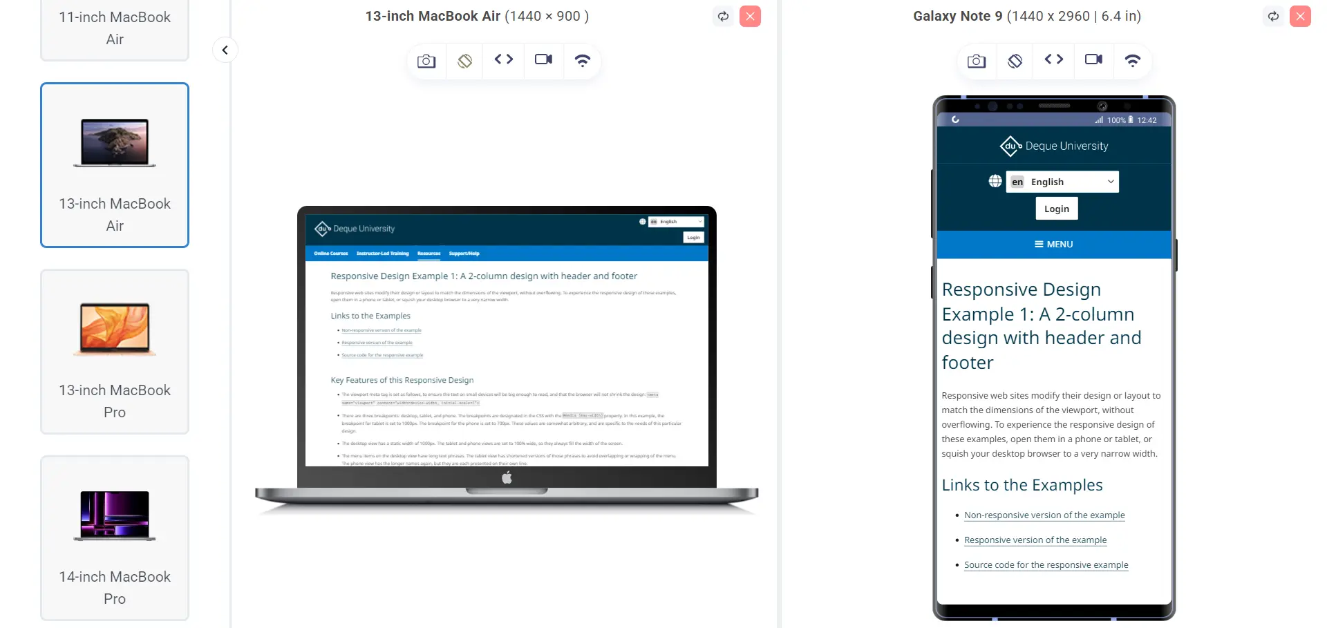
A responsive design, however, converts these options to a rolled-back hamburger menu, listing them vertically and giving enough space to the mobile user. Therefore, testing responsive websites is also a crucial step. It has to be done on all the target devices for assurance. It is a hectic task and costly if the team decides to procure (and keep procuring in the future) these devices.
It is always better to choose a tool built just for responsive testing as it gives the testers more control, features, and flexibility, which is essential when so much is at risk. LT Browser is one such tool.
LT Browser is a responsive testing tool provided by TestMu AI along with its online cloud-based infrastructure. The browser provides pre-installed device viewports (small and big screens), requiring you to just enter the web address and get started with your testing journey.
Beyond simple viewport previews, LT Browser allows you to test your website across a wide range of real device resolutions and orientations side by side. You can debug mobile and tablet layouts, inspect elements, and sync scrolls between devices to compare responsiveness in real time.
It also supports network throttling, so you can simulate various internet speeds to see how your site performs under different conditions.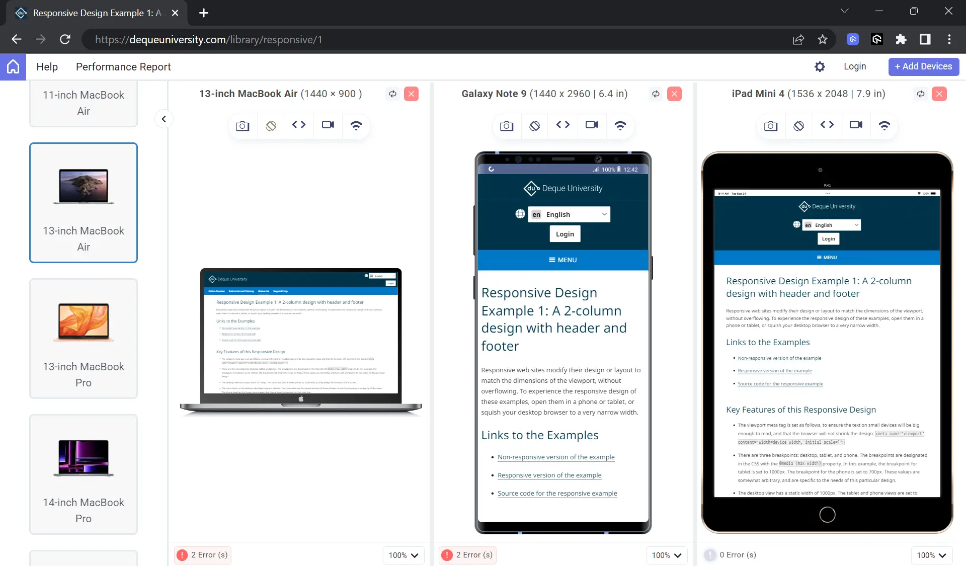
To get started, check out this LT Browser guide.

Implement Mobile-Friendly Elements
Once the responsive part is completed, you should make changes to the website specific to a mobile device. For instance, mobile devices are operated from a closer distance than desktops and have smaller screens. A clear advantage of these two facts is that the server need not serve a high-resolution image to mobile as the user won't be able to make any distinction between 2160p and 640p images.
Hence, the server should send a lower-resolution image to a mobile, a rerouting logic that is part of a mobile-friendly design. As another option, the server can also compress the image instead of storing multiple ones on the cloud. In addition to these advantages, serving a low-resolution image also helps boost page load time, which, as seen earlier, is a critical key element of mobile optimization.
Forms and overlays need the same treatment. Set the input type on every field so the phone opens the right keyboard, because a visitor typing an email address on a general keyboard gives up faster than one who gets the at sign in reach. Cut pop-ups back as well, since an overlay that covers a quarter of a desktop window can cover an entire phone viewport and hide the content the visitor came for. Then size what remains: the Lighthouse tap targets audit never fails an element that measures 48 px by 48 px, and it treats 8 px as a starting point for the gap between two adjacent targets.
Optimize Page Load Speed
Optimizing images and reducing their size on mobile solves many page-load speed-related scenarios. There are a few common issues that must be checked before:
- Excessive Cache Misses: Avoid unnecessary server requests by caching static assets like logos. It prevents repeated fetches each time a page loads.
- Unnecessary Server Requests: Minimize requests to only essential elements that impact user experience or business goals. Too many requests slow down the load time.
- Heavy Ad Load: Ads generate multiple third-party server calls, increasing load time. Limit the number of ads, especially on mobile, for better performance.
- Bulky CMS Themes: CMS themes often come with many modules. Retain only the necessary components to reduce server load and eliminate unused code.
- Inefficient Client-Side Code: Poorly written client-side scripts can degrade performance. Regular peer reviews help detect and resolve these issues early.
- Mobile Load Speed: A fast-loading mobile site is critical. Aim for a load time under 2 seconds to retain user attention and ensure a smooth experience.
Google grades the mobile page experience through Core Web Vitals, so use those three metrics as the pass mark. A page passes when the 75th percentile of real visits records a Largest Contentful Paint of 2.5 seconds or less, an Interaction to Next Paint of 200 milliseconds or less, and a Cumulative Layout Shift of 0.1 or less.
Interaction to Next Paint replaced First Input Delay as the responsiveness metric, so a mobile checklist that still tracks First Input Delay measures something Google no longer reports. Read the field data from real users rather than a single lab score, because a lab run misses the slow networks and mid-range Android devices that pull the 75th percentile down.
Convert Websites to PWAs
Progressive Web Apps (PWAs) are web applications that are modified in their look and feel to be presented similarly to a mobile app while still working with the same APIs, requests, servers, and databases. The whole idea behind PWAs is to give a native app-like experience so that the user experience can be enhanced and the team doesn't need to work on two separate entities with dedicated resources.
PWAs are installable on a mobile device, although that is not the actual installation process; it is a shortcut to the PWA (which is the reason that its size is always in KBs). They are a great mobile optimization option when the website is complex and converting to mobile-friendliness is just not enough.
Analyze Website Behavior
Behavior analysis helps draw out a map of metrics from different angles, giving deeper insights into how our end-users like to work the website. It is essential in mobile optimization as it helps get the same response on a mobile device that the user gets on a desktop application.
For instance, heatmaps can help identify areas where a user clicks or touches the most on each web page. Through this information, the team can point out the most impactful areas and place prioritized elements, such as CTAs, on them to get the most visibility and, hence, the most conversions.
Perform Testing
Mobile optimization includes a lot of development efforts. However, just like any other functionality or module, mobile optimization-related code also needs to pass the tests and get a green flag from the testers. Here, you need to make sure the web app synchronizes with the mobile audience and their point of view and provides an enhanced user experience.
Another angle to testing an optimized website is to measure its performance with mobile app standards and the threshold expectations of the user. Use the metrics after production release to understand the direction your web app is taking, monitor all the parameters, and most importantly, keep optimizing as a continuous process to get the maximum results.
To get accurate results, always test on real devices. Platforms such as TestMu AI offer a real device cloud on which you can test mobile websites and apps on real Android and iOS devices at scale.
Key Takeaway: Optimizing a website for mobile means making the layout responsive, serving compressed lower-resolution images, cutting cache misses, server requests, and ads to reach a load time under two seconds, and confirming the result on real devices.
How Do AI Assistants Help Debug Mobile Layout and Speed Issues?
AI assistants now sit inside the browser and explain mobile layout and speed defects instead of only reporting them. Chrome DevTools embeds Gemini in the panels where those defects surface.
Google documents AI assistance in four DevTools panels: Elements, Network, Sources, and Performance. In Elements it explains the computed styles of a selected node and helps fix layout and styling bugs, which is where most small-screen defects live, such as a fixed-width container, an overflowing grid, or a tap target pushed past the viewport edge. In Performance it reads a recorded trace and proposes fixes for a poor Largest Contentful Paint score. The work shifts from reading a metric to reading the cause behind it.
Two limits decide how far the output can be trusted. Google labels the feature experimental and warns that it can generate inaccurate information, so treat every suggestion as a hypothesis and prove it with a second trace. The larger limit is the viewport the assistant runs in. The Chrome documentation calls device mode a first-order approximation of how a page looks and feels on a mobile device, and notes that a mobile CPU cannot be simulated. An explanation generated inside an emulated viewport carries that same gap, so confirm the fix on a real handset over a real network.
The tooling around the checklist has moved as well. Google has retired both the Mobile-Friendly Test and the Mobile Usability report in Search Console, and the help page for that report now redirects to the Lighthouse documentation. A mobile audit that still opens with a mobile-friendly pass or fail verdict is measuring against a tool that no longer runs. Lighthouse replaces that single verdict with Core Web Vitals, accessibility, and SEO audits in one report.
Key Takeaway: Chrome DevTools embeds Gemini in the Elements, Network, Sources, and Performance panels to explain mobile layout and speed defects, but Google labels that assistance experimental, so each suggestion needs confirming on a real handset.
Conclusion
Mobile optimization is the process of optimizing a website for mobile users. It focuses on visual elements such as UI and website responsiveness, along with non-visual elements such as page load speed, bounce rates, and session timings. It enhances the overall user experience, reducing the need for a native app or switching to a desktop for better functionality. Advancements in this area have led to higher user satisfaction and increased revenue, both essential for a business's success.
Sources and References Used
- Performance Testing and Optimization Strategies for Mobile Applications: https://www.researchgate.net/publication/372683916
Author

Harish Rajora
Blogs: 100


Harish Rajora is a software developer at TestMu AI with over 6 years of hands-on experience in Python and cross-platform application development across Windows, macOS, and Linux. He has authored 800+ technical articles and worked on large-scale projects, including GenAI applications and core engineering features used by millions. Harish has led DevOps initiatives building CI/CD pipelines with Jenkins, AWS, GitLab, and GitHub, and holds an M.Tech in Software Engineering from IIIT Allahabad.


Mobile Optimization FAQs
Did you find this page helpful?
More Related Learning Hubs
TestMu AI forEnterprise
Get access to solutions built on Enterprise
grade security, privacy, & compliance
- Advanced access controls
- Advanced data retention rules
- Advanced Local Testing
- Premium Support options
- Early access to beta features
- Private Slack Channel
- Unlimited Manual Accessibility DevTools Tests