

Power Your Software Testing with AI Agents and Cloud
The Native AI-Agentic Cloud Platform to Supercharge Quality Engineering. Test Intelligently and Ship Faster.


- TestMu AI (Formerly LambdaTest)
- /
- Blog
- /
- What Is Mobile Web: Definition and Checklist
What Is Mobile Web: Definition and Checklist
Learn about mobile web, web apps, and mobile apps, their differences, and how to optimize mobile web performance for a seamless user experience.
Last Updated on:
The mobile web refers to websites and applications designed specifically for smartphones and tablets. Unlike traditional websites built for desktops, mobile web content is optimized for smaller screens, touch interfaces, and slower network speeds. This ensures a responsive and seamless browsing experience for users, regardless of their device.
With mobile usage surpassing desktop traffic globally, understanding the mobile web is essential for businesses, developers, and users alike. This includes grasping its functionality and the tools and practices needed to optimize it for better performance and user experience.
Key Takeaways
- The mobile web is the use of websites and Internet-based services on smartphones and tablets through mobile browsers that adapt to smaller screens, touch interfaces, and varying network conditions.
- A mobile web performance checklist includes compressing images and videos, minifying code, using a CDN to minimize TTFB, enabling browser caching, lazy loading media, and reducing HTTP requests.
- Responsive Web Design adjusts a website layout to the device screen size, for example showing a full navigation bar on desktop and a hamburger menu on mobile.
- Mobile websites are platform-independent, low cost to develop, and update immediately on the server, while mobile apps need installation and app store updates but can work offline for static content.
- Bootstrap offers a 12-column responsive grid for mobile-first websites, while Flutter, React Native, Ionic, Xamarin, and NativeScript build cross-platform apps from a shared codebase.
- Manual responsiveness testing across many devices is time-consuming, so responsive checker tools like LT Browser by TestMu AI let testers interact with up to six devices simultaneously.
What Is Mobile Web?
The mobile web refers to the use of Internet-based services and websites on mobile devices such as smartphones and tablets. Users access the web through mobile browsers designed to adapt to smaller screens, touch interfaces, and varying network conditions. Mobile web content is often optimized for responsive design, ensuring layouts automatically adjust to different screen sizes and lighter designs for faster loading speeds.
Mobile web design involves creating responsive layouts specifically designed for smaller screens and touch inputs. Websites optimized for the mobile web prioritize performance, ease of navigation, and efficient content delivery to ensure a seamless user experience. Businesses leverage the mobile web to effectively engage users and provide services customized to the unique constraints of mobile platforms, including screen size, connectivity, and processing power.

Note: Test your mobile web apps across 10,000+ real devices. Try TestMu AI Today!
How Does Mobile Web Work?
Mobile browsers power the mobile web, allowing users to access websites on smartphones, tablets, and other mobile devices. These browsers are optimized to handle the limitations and unique features of mobile devices, such as small screens, touch navigation, and varying network speeds.
The process behind how mobile web works involves several steps and techniques to ensure a seamless experience for users:
- Request and Response Cycle: When a user types in a website URL or clicks a link, the mobile browser sends an HTTP request to the server hosting the requested content. The server responds by sending back a combination of HTML, CSS, JavaScript, and other multimedia files that make up the webpage. The mobile browser then processes this data and displays it appropriately on the screen, optimizing it for smaller, touch-enabled displays.
- Responsive Design and Adaptive Content: A key element of the mobile web is Responsive Web Design (RWD). Websites using RWD adjust their layout based on the device’s screen size. For instance, a website may display a full navigation bar on a large desktop screen but use a hamburger menu on a smaller mobile screen, ensuring easy navigation.
- Caching and Compression: To improve performance, particularly in environments with less reliable network connectivity, mobile websites use caching and compression techniques:
- Caching stores temporary website data on the mobile device after the first visit, allowing faster access to frequently visited pages. This avoids re-downloading resources like images or CSS files each time the user revisits the site.
- Compression reduces the size of content, such as images, CSS, and JavaScript files, before they are sent over the network. Smaller file sizes mean faster loading times, which is crucial for users with slower data connections or mobile networks.
- JavaScript and Mobile Frameworks
JavaScript frameworks such as React, Angular, and Vue.js are commonly used on mobile websites to provide dynamic functionality. These frameworks allow developers to build interactive user interfaces, such as live updates, real-time data fetching, and more. JavaScript is essential for making web pages interactive.
It enables the page to respond to user actions like clicks, swipes, and gestures. JavaScript can update the page’s content without reloading, create animations, validate forms, and more. On mobile devices, JavaScript is optimized for touch events, gestures, and other tasks that ensure a smooth user experience.
The mobile browser may resize images or adjust text sizes to fit the screen, ensuring the content is readable and usable. Optimizing this process is crucial for performance, especially since many mobile users are on the go or using cellular data.
Another characteristic of mobile-friendly sites is adaptive content delivery. This ensures that appropriate images, videos, and other resources are loaded according to the user’s device. This helps speed up page loading and prevents excessive data consumption, especially when mobile users have slower connectivity or data limitations.
These practices ensure that mobile websites are responsive and quick to load, improving user satisfaction, especially on mobile networks with lower bandwidth.
Some websites also use device detection to serve mobile-specific content. For example, if the website detects it is being accessed from a smartphone or tablet, it may automatically adjust the content or layout for optimal viewing. This adaptability is necessary to provide an efficient mobile web experience.
Mobile Web vs Web App vs Mobile App
Understanding the distinctions between the mobile web, web apps, and mobile apps is crucial for making informed decisions about development and user experience. The mobile web delivers content through mobile-optimized browsers, ensuring accessibility across devices. Web apps, on the other hand, provide enhanced interactivity, resembling native apps but running in browsers. Finally, mobile apps offer a rich, tailored experience, leveraging device-specific features and offline capabilities.
This section breaks down the major differences between these platforms to help you choose the right approach for your needs, whether it’s accessibility, performance, or advanced functionality. When considering the types of mobile apps, it’s essential to evaluate factors like installation, device features, performance, and user experience to select the best platform for your business.
| Feature | Mobile Web | Web App | Mobile App |
|---|---|---|---|
| Definition | Websites optimized for mobile devices accessible via browsers | Applications built for the web that run on a browser and can be accessed on any device. | Software applications designed for specific mobile platforms (e.g., iOS, Android). |
| Internet Dependency | Requires constant Internet connectivity | Typically requires Internet | Can function offline (for static content) |
| Platform Dependency | Platform-independent | Platform-independent | Platform-specific (iOS, Android) |
| Development Cost | Low | Moderate | High (due to platform-specific builds) |
| Performance | Limited by browser and Internet speed | Dependent on browser and connection speed | Superior use device hardware efficiently |
| Installation | No installation required | No installation required | Requires download and installation |
| Access to Device Features | Limited (via APIs like geolocation) | Limited (browser-based APIs) | Extensive (camera, GPS, sensors) |
| User Experience | Standardized and responsive design | Similar to websites but with dynamic features | Optimized for specific platforms |
| Push Notifications | Not supported | Limited (via browser notifications) | Fully supported |
| Update Process | Immediate, server-side | Immediate, server-side | Requires user updates via app stores |
| Market Reach | Accessible on all devices with a browser | Wide, browser-based | Limited to users who install the app |
To learn more in detail about the differences between web apps, mobile apps, and mobile web, and how each slightly differs from the others, check out the following blogs: web app vs mobile app and mobile app vs mobile web. This will help you make more informed decisions based on your project’s goals and target audience.
Now that you have an understanding of what the mobile web is, how it works, and the differences between the mobile web, web apps, and mobile apps, let’s explore the various tools and frameworks that can help you build a mobile-friendly web app.
Key Takeaway: A native mobile app earns its higher build cost only when offline use or full device features matter; otherwise a mobile website or web app reaches users in any browser with no installation.
Frameworks to Build Mobile Web Apps
Developers have several options to choose the right framework that meets the requirements for creating mobile websites and web applications.
Below are some well-known mobile web frameworks designed to optimize mobile websites and web application development.
Bootstrap
Bootstrap is an open-source front-end framework for designing and developing responsive, mobile-first websites and web applications. It was originally developed by Twitter and is the most widely used framework. Bootstrap streamlines the process of creating visually appealing and functional designs that adapt seamlessly to various screen sizes and devices.
Key features of Bootstrap:
- Responsive Grid System: Bootstrap provides a 12-column grid system that allows developers to build responsive layouts easily. The grid is customizable for different screen sizes (small, medium, and large devices).
- Pre-Built Components: It offers a library of pre-designed UI components, such as navigation bars, buttons, forms, modals, and carousels, which can be customized for mobile interfaces.
- Mobile-First Approach: Bootstrap prioritizes mobile responsiveness by default, optimizing websites for smaller screens first and scaling up for larger devices, improving usability and performance.
- Customizable Themes: Developers can modify the default Bootstrap themes using built-in Sass variables or by overriding CSS styles, ensuring design alignment with branding.
Flutter
Flutter is an open-source software development kit (SDK) developed by Google for creating cross-platform applications with a single codebase. It’s great for building natively compiled applications for mobile, web, and desktop, offering creative and flexible user interfaces. Developers can quickly see changes in real time with a hot reload.
Key features of Flutter:
- Single Codebase: Flutter allows developers to write one codebase that works across mobile devices, web browsers, and desktop platforms, reducing development time and effort.
- Rich Widget Library: The framework provides a comprehensive library of pre-designed and customizable widgets to ensure consistent design and functionality across platforms.
- Hot Reload: Developers can instantly see code changes reflected in the application without restarting, making debugging and UI iteration faster and more efficient.
- High Performance: Flutter compiles Dart ahead of time to native machine code for release builds, which keeps animations smooth.
- Web Support: Flutter extends its capabilities to build web applications with the same performance and functionality as its mobile counterparts.
React Native
React Native, developed by Facebook, allows developers to build mobile applications using JavaScript and React. By employing native components, React Native delivers an authentic user experience while enabling cross-platform development, widely adopted for its robust performance and extensive community support.
Key features of React Native:
- Cross-Platform Development: React Native enables developers to write one codebase that works across Android and iOS, reducing development time and effort. Native components are used for rendering, ensuring a seamless user experience.
- Native-Like Performance: React Native bridges the gap between native code and JavaScript, allowing near-native performance and direct communication with native APIs for efficient performance.
- Hot Reloading: The hot reloading feature allows developers to instantly see the effects of code changes without recompiling the entire app, speeding up development and testing.
- Rich Ecosystem of Libraries and Components: React Native offers a wide range of third-party libraries, components, and pre-built modules for additional functionalities like navigation, animations, and camera access.
- Native Modules Support: React Native allows integration of native code (Java, Swift, Objective-C) for more complex or platform-specific functionality, enhancing the app’s capabilities.
Ionic
Ionic is an open-source, comprehensive SDK for hybrid mobile app development using web technologies like HTML, CSS, and JavaScript. It helps build high-quality, consistent experiences across platforms from a single codebase. Ionic integrates with popular frameworks such as Angular, React, and Vue.
Key features of Ionic:
- Cross-Platform Compatibility: Ionic enables the development of a single application that works seamlessly across Android, iOS, and the web.
- Web-Based Development: As a hybrid framework, Ionic leverages web technologies, allowing developers to use familiar tools and skills.
- Pre-Built UI Components: Ionic provides a library of pre-styled UI components like buttons, cards, and modals, optimized for mobile devices.
- Capacitor Integration: Ionic uses Capacitor to access native device features like camera, geolocation, and push notifications.
- Progressive Web App (PWA) Support: Ionic apps can be deployed as PWAs, offering flexibility and broader reach without requiring app store distribution.
Xamarin
Xamarin, from Microsoft, used C# and .NET to develop cross-platform mobile applications for iOS, Android, and Windows. It offers direct access to native APIs, enabling code sharing across platforms to enhance development efficiency. Microsoft ended Xamarin support on May 1, 2024, so new projects should use .NET for Android and iOS or .NET MAUI.
Key features of Xamarin:
- Native UI and Performance: Xamarin provides access to native APIs and libraries, ensuring a true native-like experience for mobile apps.
- Shared Codebase: Developers can write shared business logic in C# while maintaining platform-specific UI for Android and iOS.
- Access to Native Features: Xamarin gives direct access to platform-specific functionalities like GPS, camera, and biometrics.
- Integration with Visual Studio: Integration with Visual Studio IDE provides robust debugging and development tools.
NativeScript
NativeScript allows developers to create native mobile applications using JavaScript, TypeScript, or Angular. It provides direct access to native APIs, ensuring native performance and user experience while eliminating additional abstraction layers for performance-critical applications.
Key features of NativeScript:
- True Native Performance: NativeScript ensures that apps interact directly with native platform APIs, offering the same performance and experience as native apps.
- Cross-Platform Development: Using a single codebase, developers can create applications for both Android and iOS devices, with full access to native device features.
- Framework Flexibility: NativeScript supports multiple frameworks, including Angular, Vue.js, and plain JavaScript/TypeScript, allowing developers to choose the best fit for their expertise and project.
- Native UI Components: NativeScript renders truly native UI components for both Android and iOS, providing a smooth and authentic native feel.
Checklist to Improve Mobile Web Performance
Making your mobile website seamless and fast requires the best practice techniques and performance optimization methods. An optimized mobile website improves customer satisfaction, engagement, and conversion rates.
This checklist highlights key areas in page speed, responsive design, and content optimization to help make your site faster, more responsive, and user-friendly.
- Optimize Images and Videos: Ensure all images and videos are resized and compressed to decrease load times. Use newer formats such as WebP and tools like ImageOptim to compress file sizes without sacrificing quality.
- Responsive Design: Make sure your site is mobile-friendly and responsive, ensuring it looks and functions well on any device. This involves flexible grids, layouts, responsive images, and CSS media queries.
- Minify and Compress Code: Minify CSS, JavaScript, and HTML files to reduce file sizes and improve load times. Tools like UglifyJS and CSSNano can help streamline your code for faster processing.
- Implement a Content Delivery Network (CDN): Use a CDN to minimize TTFB and enhance content delivery speeds. A CDN caches content in multiple locations worldwide, bringing it closer to users.
- Prioritize Above-the-Fold Content: Serve the most important content first to improve perceived performance, ensuring that critical content loads instantly, even if the rest of the page takes longer.
- Enable Browser Caching: Use browser caching to make frequently accessed resources available on users’ devices, preventing repeated downloads of the same files.
- Minimize Server Response Time: Optimize server settings to use the most efficient web server. Regularly check server performance and reduce bottlenecks to keep response times as low as possible.
- Lazy Load Images and Videos: Implement lazy loading, where images and videos load only when they come into view. This minimizes first-load times and saves bandwidth.
- Optimize Web Fonts: Use strategies to prevent font render-blocking, such as font-display, and reduce font variants to minimize the negative impact on performance.
- Reduce HTTP Requests: Minimize the number of HTTP requests by merging files and using sprites. Fewer requests lead to faster load times.
- Implement Accelerated Mobile Pages (AMP): Use AMP to create lightweight pages that load faster on mobile, delivering a smooth user experience.
- Mobile-friendliness Test: Test your website using tools or platforms like TestMu AI and Google Mobile Friendly Test. To monitor its performance, use PageSpeed Insights to diagnose and improve its mobile-friendliness.
Several of these checklist items still get verified by hand, one device and one breakpoint at a time. An agentic testing tool such as KaneAI from TestMu AI lets you describe those checks in plain English, then it plans and authors them as repeatable tests. Those tests run on the TestMu AI cloud grid across 10,000+ real devices and 3,000+ browser and OS combinations, and smart element detection re-anchors steps when your layout shifts.
How to Test the Responsiveness of Mobile Web Apps?
Testing the responsiveness of your mobile website and mobile web applications is essential for delivering an optimal user experience across different devices and screen sizes. Responsive design ensures that your content is displayed correctly, whether it’s viewed on a smartphone, tablet, or desktop, offering users a consistent and engaging experience.
To conduct responsive testing, you can manually check how your website or app looks on various screen sizes by adjusting the browser window or using real devices. However, manually testing across multiple devices can be time-consuming and impractical, especially when considering the wide variety of screen sizes and resolutions available today.
To enhance the responsive testing process, you can make use of responsive checker tools like the LT Browser offered by TestMu AI. This enables users to test the responsiveness of their website across more than 53+ device viewports, including mobiles, tablets, desktops, and laptops.
Here’s how LT Browser can assist you in running comprehensive responsiveness tests:
- Simultaneously interact with and test up to six devices, accelerating the responsive development process.
- Dedicated DevTools and hot reloading support simplify debugging with real-time updates. The built-in network simulation feature enables testing under diverse conditions for accurate performance analysis.
- Leverage the Chromium engine for improved performance, along with Chrome settings, APIs, and extension support.
- Track and analyze website behavior with multiple test recording options for comprehensive insights.
- Generate performance reports powered by Google Lighthouse to get web performance metrics.
Subscribe to the TestMu AI YouTube Channel for more videos on mobile website testing and other related topics.
For example, following the different versions of the LinkedIn website on tablet, mobile, and laptop.
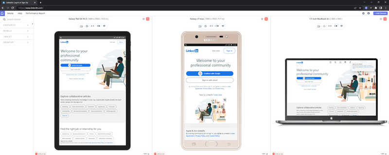
To begin testing your responsive design with LT Browser, check out the support documentation: Getting Started with LT Browser.

Conclusion
A fast, responsive mobile site starts with one decision: whether a mobile website, a web app, or a native app fits the features your users need.
After that choice, put effort where mobile users feel it first:
- Media and code weight - Compress images and minify files before tuning anything else.
- Caching and lazy loading - Cut repeat downloads and defer offscreen content.
- Real viewports - Check layouts at the breakpoints your analytics show, then on real phones.
Rerun Lighthouse after each release, since a new script or image can undo earlier gains.
Citations
- Mobile Web: https://www.researchgate.net/publication/333568368_Mobile_Web
- The next generation mobile web: https://developers.google.com/web/shows/google-io/2015/mobile-web
Author

Isha Vyas
Blogs: 8

Isha Vyas is a Lead Member of Technical Staff at TestMu AI (formerly LambdaTest), building the frontend of the quality engineering platform. She works across React.js, responsive web design, and jQuery to ship and maintain the platform's user-facing web interfaces. She brings nearly seven years of frontend engineering experience at the company, with earlier work as a Software Developer at Mantra Labs. Isha holds a B.Tech in Computer Science from Swami Keshwanand Institute of Technology, Management and Gramothan, Jaipur.
Reviewer

Rahul Mishra
Reviewer
Rahul Mishra is a Lead Member of Technical Staff at TestMu AI (formerly LambdaTest), leading frontend engineering and accessibility testing across the quality engineering platform. He mentors frontend engineers, runs code reviews and sprint planning, optimizes React.js rendering performance, and makes product features accessible to users with disabilities through WCAG and ADA-compliant accessibility audits. He brings 10+ years of experience across React.js, VueJS, TypeScript, Swift, Objective-C, and AWS, with earlier work as a Technical Lead at VectoScalar Technologies. Rahul holds a B.E. in Information Technology.


Mobile Web FAQs
Did you find this page helpful?
More Related Blogs
TestMu AI forEnterprise
Get access to solutions built on Enterprise
grade security, privacy, & compliance
- Advanced access controls
- Advanced data retention rules
- Advanced Local Testing
- Premium Support options
- Early access to beta features
- Private Slack Channel
- Unlimited Manual Accessibility DevTools Tests