

Power Your Software Testing with AI Agents and Cloud
The Native AI-Agentic Cloud Platform to Supercharge Quality Engineering. Test Intelligently and Ship Faster.


- TestMu AI (Formerly LambdaTest)
- /
- Blog
- /
- Understanding How Dynamic Rendering Works Using HTML And CSS
How Dynamic Rendering Works Using HTML And CSS?
Explore dynamic rendering with HTML and CSS for seamless user experience on mobile and desktop in this informative blog post.
Last Updated on:
Dynamic rendering using HTML and CSS serves one template to mobile screens and another to desktop screens from the same source file.
Lightning Web Components pick the template inside the render() method, using window.screen.width to decide, so one codebase and one server serve both layouts. This guide covers what dynamic rendering is, Lightning Web Components, template rendering with connectedCallback, browser support, AI crawler limits, and responsiveness testing.
Key Takeaways
- Dynamic rendering using HTML and CSS serves a mobile template and a desktop template from the same source file and the same server.
- Lightning Web Components choose a template inside the render() method, which returns the mobile template or the web template based on window.screen.width.
- connectedCallback is the Lightning Web Components lifecycle hook that fires when a component enters the Document Object Model, and it fires from parent to child.
- Google's search documentation describes dynamic rendering as a workaround and recommends server-side rendering, static rendering or hydration instead.
- Custom elements, the browser API behind the Lightning Web Components lifecycle, has been available across browsers since January 2020 according to MDN.
- GPTBot, ClaudeBot and PerplexityBot read the initial HTML response only, so a template picked by JavaScript in the browser is invisible to those crawlers.
What is Dynamic Rendering and How it Works
Dynamic rendering is a method used to optimize web pages for both users and search engines. It involves serving different versions of your web content based on the user agent, delivering pre-rendered content to search engine bots while presenting dynamic content to human users. This seamless fusion of static and dynamic content ensures blazing-fast loading speeds and enhanced user experiences.
Dynamic rendering is a helpful technique that can be used to optimize the delivery of content. In the dynamic rendering approach, the content can either be served from the UCD service or your web server. The advantage of using a web server to deliver content is that it will tend to be more reliable as redundant routing provides higher availability.
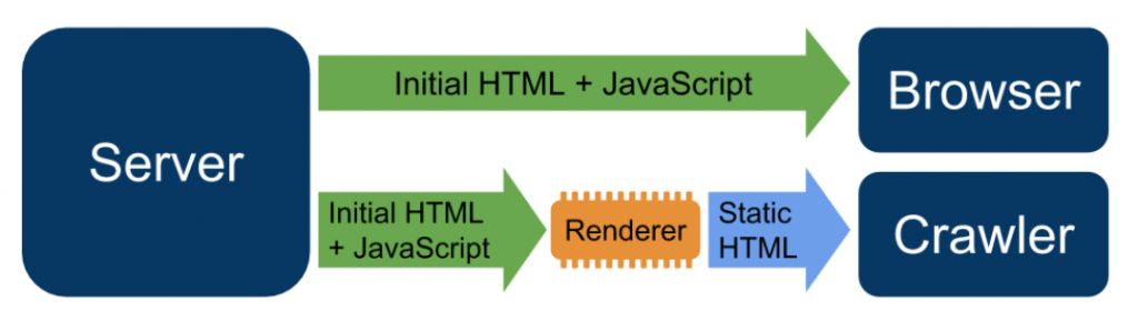
In the above image, requests are routed to Renderer from crawlers, whereas user requests are normally served. However, when required, the content version is served by the dynamic renderer that suits the crawler, for example, serving a static version of the HTML. You can enable dynamic renderer for all pages by enabling it for each page.
Google has since withdrawn the recommendation. Its search documentation now states that dynamic rendering was a workaround and not a long-term solution for problems with JavaScript-generated content in search engines, and it names server-side rendering, static rendering and hydration as the replacements. Treat the technique below as a template-switching pattern for devices, not as a search indexing fix.
What are Lightning Web Components?
The lightning web components (LWC) is a web framework that leverages the power of web components and makes them really fast (hence the word lightning!). LWC is lightweight and provides no responsiveness issues since it offers all the code that is run natively in the browser. Native code also helps a lot in increasing execution speed since the code is built into the browser and is optimized with the best possible algorithm. Fortunately, the LWC takes advantage of that.
LWC has built-in libraries and methods that will help us render dynamic HTML and CSS on desktop and mobile. These methods will work as the core of our overall algorithm when we deal with dynamic pages. In addition to these methods, LWC also offers decorators for quick implementations, such as @api. If you have worked with Django, decorators might be very familiar to you. Lastly and most importantly, you do not need to learn any new language while working with the lightning web components. These components work with the most standard, popular, and easy web languages, like HTML, CSS, and JavaScript.
Although we can talk on and on about LWC as it is a very deep topic, we would get off-road into the jungle with no final destination. If you are keen to understand more about it, the best documentation is available on Salesforce Diaries about Lightning Web Components. To implement dynamic pages, the above information will suffice.
connectedCallback() – Hook To Rely On
The connectedCallback method is a special method inside the LWC, fired when an element enters the Document Object Model. This method comes under the lifecycle hook, which means the method is triggered at a specific phase of a component instance’s lifecycle.
For the below-given code, the connectedCallback method changes the timer value to true and initiates a timer of 3 seconds. The code can be implemented accordingly.
connectedCallback() {
       setTimeout(() => {
           this.ready = true;
       }, 3000);
   }
The connectedCallback method will help us identify what type of screen we are rendering our website on. After the identification, the only step is to render the HTML template according to the device detected through connectedCallback.
Note: The connectedCallback method flow is directed from parent to the child, i.e., a parent’s connectedCallback is fired first, and then the child connectedCallback is fired.
Dynamic Rendering of Templates with connectedCallback and LWC
Now that we know a bit about LWC and the connectedCallback method, we need to write a JS file that will provide the logic to the LWC.
First, we need to have two templates. Both of these templates will be for two different devices; mobile and desktop. They can be entirely different from each other, and if you are targeting more than two devices, you need to have that many templates ready with you.
Creating the Template
A template is a normal HTML web page that takes CSS files as input and constructs a web page. You can put that code under the template tag:
<template>
	//HTML code
</template>
Or you can also create multiple HTML files if the code is too big. If you are using the latter method, remember to import these files into the code as follows:
import { LightningElement } from 'lwc';
import MobileTemplate from './MobileTemplate.html';
import WebTemplate from './WebTemplate.html';
The above import works after Salesforce Extension Pack has been downloaded and added into your IDE. Make sure you do that to have all the libraries by your side.
With templates being designed, we just need to code a JavaScript file to make it understand which template to render on which device.
Export the Class
The class name has to be the same as the app name while using the LWC. Refer to the official documentation to understand more about that.
export default class DynamicRendering extends LightningElement
Implement the “render” function, which returns the template to render on the screen.
render() {
        return window.screen.width < 640 ? MobileTemplate : WebTemplate;
    }
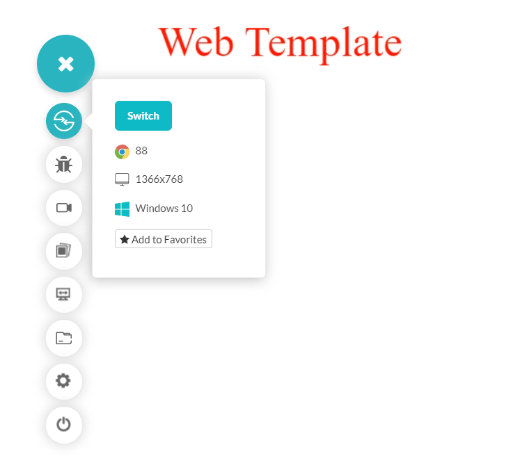
The ternary operator used above will return the “MobileTemplate.html” when the screen size is less than 640 width or else “WebTemplate.html” is returned. This phenomenon can be seen in the below image:
While on the mobile screen, a different template is rendered:
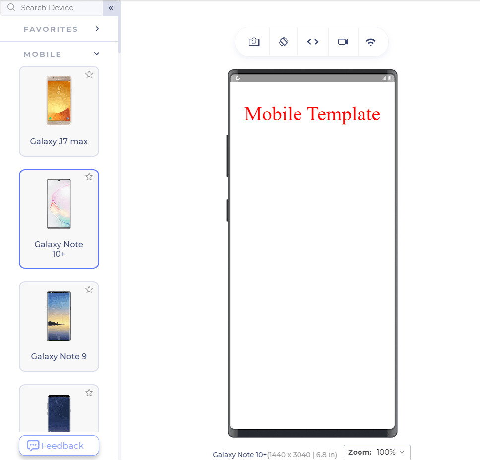
Through this method, we can easily implement dynamic rendering on our web application, a website that makes desktop users and mobile users happy. But just implementing the code is not enough! The next logical step is to test the website for mobile devices and responsiveness to be assured that the website will not break on different mobile devices.

Browser Support For Dynamic Rendering
Lightning web components work through a library developed by Salesforce. The library uses JavaScript functionalities and implements its own functions on top of that. Therefore, browser support is excellent and works on all mobile and desktop browsers.
The lifecycle that the framework builds on is the custom elements API. MDN records customElements as Baseline Widely available, with support across browsers since January 2020.
There is no need to ponder over cross browser compatibility issues while working with the dynamic CSS rendering.
Can AI Crawlers Read JavaScript Rendered Templates?
No. AI crawlers read the initial HTML response and do not run the script that picks a template. Vercel's study of crawler traffic reports that none of the major AI crawlers currently render JavaScript, naming OpenAI's GPTBot and OAI-SearchBot, Anthropic's ClaudeBot and PerplexityBot.
- Initial HTML only: these crawlers index what the server returns, so markup created after page load is missing from the copy they store.
- render() runs too late: the ternary on window.screen.width executes in the browser, so a crawler that skips JavaScript reads neither the mobile template nor the web template.
- Fetched but not executed: Vercel found the ChatGPT and Claude crawlers request JavaScript files and then never execute them, so a 200 response on a bundle proves nothing about what was indexed.
- Server-side rendering: the three replacements Google names, server-side rendering, static rendering and hydration, each put the finished markup in the first response a crawler reads.
- Single responsive template: a responsive design driven by CSS media queries ships one HTML document, so screen width never decides what a crawler can read.
Keep the template switch for signed-in application screens, where crawler visibility does not matter. For pages that need to be found and quoted, put the content in the server response and let CSS handle the layout difference.
Testing the Website for Responsiveness
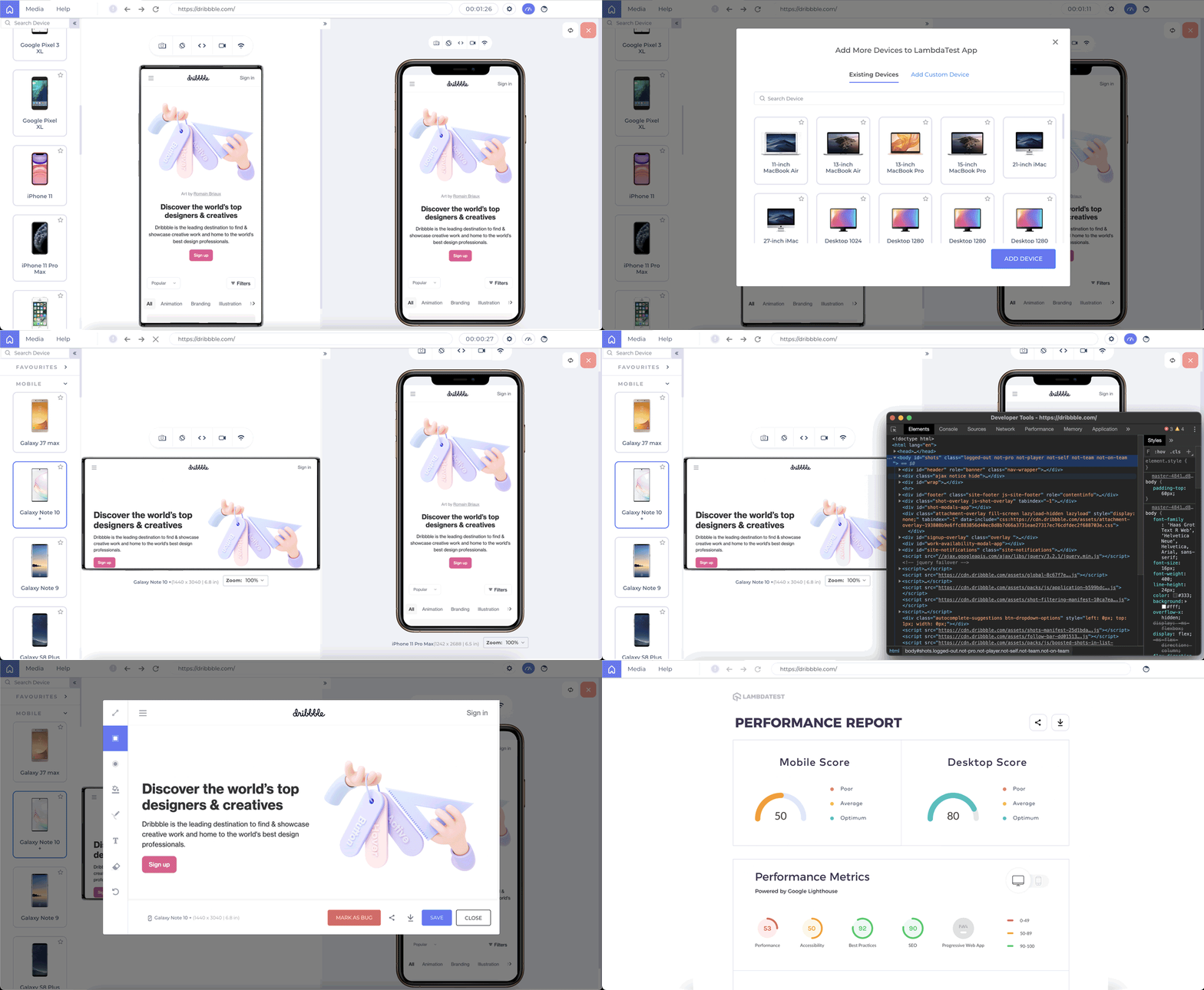
LT Browser is an excellent tool with 50+ screens that can not only render your website to check for responsiveness but provides multiple additional tools, which would have been hard to test otherwise.
For example, the network throttling feature of the LT browser can help you test websites for responsiveness on various network bandwidth, defining bottleneck numbers. In addition, smart scroll can scroll the website on two devices simultaneously for better understanding rather than going back and forth on them. Take screenshots, record a video, mark bugs and do much more with the LT browser in just a few clicks. It has helped me in responsive testing, and I hope it will help you too!

Conclusion
For all my friends who understand the importance of mobile users and the data generated from them today, the LWC is an added positive skill to acquire. Although the only goal is to achieve responsiveness, there are many other methods that are tested and proven efficient in developing a responsive website. Implement an LWC code when there are different templates that you want to render for a mobile user and a desktop user.
Since it contains extra configuration and learning bumps, it is better to be sure before starting. If you do, rest assured, your website will be lightning-fast, help you implement dynamic logic through JavaScript, and provide additional methods and functionalities that are great to use. We would love to hear from you about how you leveraged LWC and implemented a logic that helped you inject different data at different data. Till then, have a development-filled day ahead!!
For those looking to dive deeper, resources like the “Top 90+ HTML Interview Questions and Answers ” can be invaluable.

Austin Siewert
Co-Founder, Steadfast Systems
Discovered @TestMu AI yesterday. Best browser testing tool I've found for my use case. Great pricing model for the limited testing I do 👏
2M+ Devs and QAs rely on TestMu AI
Deliver immersive digital experiences with Next-Generation Mobile Apps and Cross Browser Testing Cloud

Author

Harish Rajora
Blogs: 102


Harish Rajora is a Software Developer 2 at Oracle India with over 6 years of hands-on experience in Python and cross-platform application development across Windows, macOS, and Linux. He has authored 800 + technical articles published across reputed platforms. He has also worked on several large-scale projects, including GenAI applications, and contributed to core engineering teams responsible for designing and implementing features used by millions. Harish has worked extensively with Django, shell scripting, and has led DevOps initiatives, building CI/CD pipelines using Jenkins, AWS, GitLab, and GitHub. He has completed his post-graduation with an M.Tech in Software Engineering from the Indian Institute of Information Technology (IIIT) Allahabad. Over the years, he has emphasized the importance of planning, documentation, ER diagrams, and system design to write clean, scalable, and maintainable code beyond just implementation.


Dynamic Rendering FAQs
Did you find this page helpful?
More Related Blogs
TestMu AI forEnterprise
Get access to solutions built on Enterprise
grade security, privacy, & compliance
- Advanced access controls
- Advanced data retention rules
- Advanced Local Testing
- Premium Support options
- Early access to beta features
- Private Slack Channel
- Unlimited Manual Accessibility DevTools Tests