

Power Your Software Testing with AI Agents and Cloud
The Native AI-Agentic Cloud Platform to Supercharge Quality Engineering. Test Intelligently and Ship Faster.


- TestMu AI (Formerly LambdaTest)
- /
- Blog
- /
- 35 Latest Bootstrap Carousel Examples for 2026
35 Best Bootstrap Carousel Examples for 2026
35 ready-to-use Bootstrap carousel examples for 2026: responsive sliders, fades, and swipes, each with code you can paste straight into your project.
Last Updated on:
Organizing web content can be overwhelming, especially when dealing with text, images, and videos. For example, an online store with vertically stacked products can make it difficult to find what you're looking for, leading to a frustrating user experience. A carousel design allows users to navigate related items easily, but implementing one from scratch requires extensive cross-browser testing and ensuring compatibility across different screen sizes. Bootstrap carousels simplify this process.
Overview
Bootstrap carousels are highly responsive slideshow components used to display images, products, or reviews efficiently. For eCommerce sites, background carousels are ideal for showcasing promotions, while TestMu AI provides the cloud-based platform needed to test these components across 3,000+ browser/OS combinations.
Key Benefits of Bootstrap Carousels
- Responsive Layout: Bootstrap carousels automatically adjust to different screen sizes, ensuring a seamless user experience across desktops, tablets, and mobile phones.
- Customization: Bootstrap carousels allow developers to easily customize slideshows with buttons, images, text, and videos to meet specific design needs.
- User Interaction: Bootstrap carousels allow users to manually scroll through content or enable automatic rotation to boost overall engagement.
- Cross-Browser Compatibility: Bootstrap carousels are designed to work smoothly across major web browsers, ensuring consistent performance for all users.
- Flexibility: Bootstrap carousels let developers customize transition speed, animation effects, and the number of slides displayed to fit their project.
Best Bootstrap Carousel Examples
- Best for background slideshows: Background Carousel - runs automatically as background-image sliders, allowing other elements to be positioned around them on eCommerce and movie websites.
- Best for advertisements: Banner Sliders - display promotions directly below the navbar, commonly used on eCommerce websites like Amazon and Walmart.
- Best for product details: Product Review Carousel - displays customer reviews or multiple snapshots of an item from different angles.
- Best for transition effects: Flicker Image Carousel - adds quick fade-in and fade-out transition effects between images as users click navigation controls.
- Best for team showcases: Team Profile Carousels - display team members' names, roles, and social handles in dark or light mode layouts.
- Best for grouped items: Multi-Column Carousels - group similar items, such as products or team members, into sections that swipe together.
- Best for customer trust: Side Nav Testimonial Carousel - displays user testimonials alongside product captions to build trust with new users.
- Best for professional bios: About Me Carousel - uses card features to let creative professionals display short descriptive bios on their websites.
Why Are Bootstrap Carousels Important to Test?
- Cross-Browser Compatibility: Testing ensures that Bootstrap carousels function properly across different web browsers like Chrome, Firefox, and Safari.
- Responsiveness: Testing verifies that the Bootstrap carousel layout adapts correctly across various screen resolutions and mobile devices.
- Touch and Swipe Support: Testing confirms that mobile users can easily navigate Bootstrap carousels using touch and swipe gestures.
- Best for automated testing: TestMu AI - provides a cloud-based platform to test cross-browser compatibility, accessibility, and responsiveness across 3,000+ browser/OS combinations.
What are Bootstrap Carousels?
Bootstrap carousels are ways web developers and designers can create beautiful and eye-catching carousel components using the Bootstrap CSS framework. With the integration of AI-powered testing, these carousels can now be optimized for performance, accessibility, and cross-browser compatibility without the need for manual intervention.
They provide out-of-the-box functionality such as auto-rotating slides, slider controls, picker controls, CSS breakpoints, random transition effects, animations, and responsive layouts on different screen resolutions. They can be highly customizable with other Bootstrap template components such as accordions, alerts, badges, breadcrumbs, cards, buttons, navbars, pagination, and models.
Keys Areas to Consider Before Designing Bootstrap Carousels
Bootstrap comes with advanced carousel features that can improve how users interact with carousels on the web page. From beautiful fancy animations and transition effects to responsive components and browser-compatible properties, the list of what we can do is endless. However, there are important things to consider before designing a Bootstrap carousel, which are:
- Auto-rotation: This will enable carousel sliders to repeat their sequence after completion continuously.
- Manual-rotation: This is when the carousel control buttons are used as a way to navigate the slides.
- Draggable sliders: This feature lets each slider element function as a draggable control for navigating the carousel elements left and right.
- Breakpoints: By default, Bootstrap components are responsive. However, at every breakpoint (different screen sizes), we can determine or realign components of the carousel for better responsiveness.
- Single or multiple carousel view: Carousels can either be single view (only one element showing at a time) or multiple view (more than one element showing at a time).
- AI-Powered Carousel Testing: Use AI to automate the testing of carousel components across browsers and devices, ensuring that each carousel performs optimally. AI tools can help you identify issues in real-time, speeding up your testing and reducing human error.
- Mobile-First Carousel Design: As mobile traffic continues to increase, make sure that your carousel is optimized for mobile-first design. Use responsive design techniques to ensure that the carousel adapts to various screen sizes, including phones, tablets, and desktops.
- Web Accessibility Compliance: Ensure your carousels are fully accessible by incorporating features like keyboard navigation and screen reader compatibility. Accessibility should be a priority to ensure that your carousels meet WCAG guidelines.
- Performance Optimization for Carousels: Implement performance-enhancing techniques like lazy loading and image compression to ensure that your carousel loads quickly without affecting the overall performance of your site.
These are some key areas you can consider before designing a carousel, as this can improve performance and user experience. In the section below, we will discuss the best Bootstrap carousel examples.

Best Bootstrap Carousels Examples
We've seen some key areas that need to be considered before designing a carousel. However, some Bootstrap carousel examples are worth noting due to their high usage across multiple websites and mobile applications.
Let's look at the best Bootstrap carousel examples!
Background Carousel
Background carousel sliders are one of the popular Bootstrap carousel examples designed to run automatically as background-image sliders. This enables other elements to be positioned around it while the sliders navigate smoothly on the background as a slideshow. The background carousel sliders can be found majorly on eCommerce and movie listing websites such as Amazon and Netflix.
HTML:
<html lang="en">
  <head>
    <!-- Required meta tags -->
    <meta charset="utf-8">
    <meta name="viewport" content="width=device-width, initial-scale=1">

    <!-- Bootstrap CSS -->
    <link href="https://cdn.jsdelivr.net/npm/Bootstrap@5.0.2/dist/css/Bootstrap.min.css" rel="stylesheet" integrity="sha384-EVSTQN3/azprG1Anm3QDgpJLIm9Nao0Yz1ztcQTwFspd3yD65VohhpuuCOmLASjC" crossorigin="anonymous">

  </head>
<body>
<main class="carousel-container">
    <div id="carouselExampleControls" class="carousel slide" data-bs-ride="carousel">
        <div class="carousel-inner">
          <!-- Image One -->
          <div class="carousel-item active">
            <img src="https://user-images.githubusercontent.com/78242022/282570803-1407fdb3-1799-4f77-9690-10939e41aca7.jpg" class="d-block w-100" alt="...">
          </div>

          <!-- Image Two -->
          <div class="carousel-item">
            <img src="https://user-images.githubusercontent.com/78242022/282570839-ceb5e58a-692e-4bb0-a619-90cca31fe2ba.jpg" class="d-block w-100" alt="...">
          </div>

          <!-- Image Three -->
          <div class="carousel-item">
            <img src="https://user-images.githubusercontent.com/78242022/282570850-e5f2d5eb-789c-433d-8698-e9f87d4722ce.jpg" class="d-block w-100" alt="...">
          </div>
        </div>

        <!-- Carousel Control Previous -->
        <div class="button-wrapper">
            <button class="carousel-control-prev" type="button" data-bs-target="#carouselExampleControls" data-bs-slide="prev">
                <span class="carousel-control-prev-icon" aria-hidden="true"></span>
                <span class="visually-hidden">Previous</span>
            </button>

            <!-- Carousel Control Next -->
            <button class="carousel-control-next" type="button" data-bs-target="#carouselExampleControls" data-bs-slide="next">
                <span class="carousel-control-next-icon" aria-hidden="true"></span>
                <span class="visually-hidden">Next</span>
            </button>
      </div>
    </div>
</main> <!--[End of Carousel controls]-->

<main class="card-container container">
    <section class="card-wrapper">
        <!-- [First Group] -->
        <div class="row gap-3">
        <!-- Card One -->
        <div class="card col-12 col-lg-3 col-md-4 p-2">
          <img src="https://user-images.githubusercontent.com/78242022/275325801-46647930-1af3-404b-83e0-17d9cc6d25ee.png" class="card-img-top" alt="...">
          <div class="card-body">
          <h5 class="card-title">Apple TV 4K</h5>

            <p class="card-text">
              From $999 or $41.62/mo.per month for 24 mo.months Footnote.</p>
            <a href="#" class="btn btn-primary">Shop Now</a>
          </div>
        </div>


        <!-- Card Two -->
        <div class="card col-12 col-lg-3 col-md-4 p-2">
          <img src="https://user-images.githubusercontent.com/78242022/275325804-b50e03a8-20f9-46d1-a437-ff661fbcc22f.png" alt="...">
          <div class="card-body">
          <h5 class="card-title">Apple iPad</h5>

            <p class="card-text">
              From $799or $66.58/mo.per month for 12 mo.monthsFootnote</p>
            <a href="#" class="btn btn-primary">Shop Now</a>
          </div>
        </div>

        <!-- Card Three -->
        <div class="card col-12 col-lg-3 col-md-4 p-2">
          <img src="https://user-images.githubusercontent.com/78242022/275325807-1c855f6a-cb67-41e5-95bc-d08f2a259535.png" class="card-img-top" alt="...">
          <div class="card-body">
            <h5 class="card-title">iPhone </h5>
            <p class="card-text">
              From $799or $33.29/mo.per month for 24 mo.monthsFootnote*
              Buy</p>
            <a href="#" class="btn btn-primary">Shop Now</a>
          </div>
        </div>

           <!-- Card Four -->
        <div class="card col-12 col-lg-3 col-md-4 p-2">
          <img src="https://user-images.githubusercontent.com/78242022/275325809-96a5012a-34e6-45a4-9952-2cd66e32866f.png" class="card-img-top" alt="...">
          <div class="card-body">
          <h5 class="card-title">Apple Watch Ultra 2</h5>
            <p class="card-text">From $799or $66.58/mo. per month for 12 mo.monthsFootnote*</p>
            <a href="#" class="btn btn-primary">Shop Now</a>
          </div>
        </div>

        <!-- Card Five -->
        <div class="card col-12 col-lg-3 col-md-4 p-2" >
          <img src="https://user-images.githubusercontent.com/78242022/275325810-01d95b79-2cd6-4319-88a3-c9a565800956.png" class="card-img-top" alt="...">
          <div class="card-body">
          <h5 class="card-title">Mac</h5>
            <p class="card-text">
              From $249or $20.75/mo. per month for 12 mo. months Footnote</p>
            <a href="#" class="btn btn-primary">Shop Now</a>
          </div>
        </div>

        <!-- Card Six -->
          <div class="card col-12 col-lg-3 col-md-4 p-2">
            <img src="https://user-images.githubusercontent.com/78242022/275325803-3133f022-23fd-4f6b-97a9-6e82365b2b74.png" class="card-img-top" alt="...">
            <div class="card-body">
            <h5 class="card-title">HomePod Access</h5>
              <p class="card-text">
                From $999 or $41.62/mo.per month for 24 mo.months Footnote.</p>
              <a href="#" class="btn btn-primary">Shop Now</a>
            </div>
          </div>
        </div>
        </div>
    </section>
</main>

    <!-- Option 2: Separate Popper and Bootstrap JS -->
    <script src="https://cdn.jsdelivr.net/npm/@popperjs/core@2.9.2/dist/umd/popper.min.js" integrity="sha384-IQsoLXl5PILFhosVNubq5LC7Qb9DXgDA9i+tQ8Zj3iwWAwPtgFTxbJ8NT4GN1R8p" crossorigin="anonymous">

    </script>
    <script src="https://cdn.jsdelivr.net/npm/Bootstrap@5.0.2/dist/js/Bootstrap.min.js" integrity="sha384-cVKIPhGWiC2Al4u+LWgxfKTRIcfu0JTxR+EQDz/bgldoEyl4H0zUF0QKbrJ0EcQF" crossorigin="anonymous"></script>
  </body>
</html>
CSS:
html {
        overflow-x: hidden;
      }
        body {
          position: relative;
        }

        .carousel-item {
          width: 100vw;
          height: 100vh;
        }

        .carousel-item img {
          width: 100vw;
          object-fit: cover;
        }

     .card-container {
        position: absolute;
        top: 200px;
        left: 10%;
     }

     .card {
      width: 15rem;
     }

     .card img {
        width: 100%;
     }


     @media (max-width: 576px) {
        .carousel-item img {
          width: 100vw;
        }

        .card {
          width: 12em;
        }

        .carousel-control-prev,
        .carousel-control-next {
          position: absolute;
          top: -300px;
        }

      .card-container {
        position: absolute;
        top: 200px;
        left: 20%;
      }
    }

    @media (max-width: 500px) {
      .card-container {
        position: absolute;
        left: 1ch;
      }
    }


    @media (max-width: 360px) {
        .carousel-item img {
          width: 100vw;
        }

        .card {
          width: 10em;
        }

        .carousel-control-prev,
        .carousel-control-next {
          position: absolute;
          top: -500px;
        }

      .card-container {
        position: absolute;
        top: 100px;
        left: 18%;
  }
}
Product Review Carousel
Product review carousel is one of the best Bootstrap carousel examples that can be used to review different sections, angles, use cases of a particular item. Depending on the item or items being reviewed, a product review carousel can be implemented across multiple websites for different reasons.
For example, an eCommerce website will display a mobile phone for review with other snapshots of the same products. This allows users to click through every image to see the phone from a different angle.
HTML:
<html lang="en">
  <head>
    <!-- Required meta tags -->
    <meta charset="utf-8">
    <meta name="viewport" content="width=device-width, initial-scale=1">

    <!-- Bootstrap CSS -->
    <link href="https://cdn.jsdelivr.net/npm/Bootstrap@5.0.2/dist/css/Bootstrap.min.css" rel="stylesheet" integrity="sha384-EVSTQN3/azprG1Anm3QDgpJLIm9Nao0Yz1ztcQTwFspd3yD65VohhpuuCOmLASjC" crossorigin="anonymous">

  </head>
<body>
<main class="carousel-container">
    <section class="carousel-wrapper">

        <aside class="buttons">

          <div class="carousel-btn btn1 bg-primary shadow-sm rounded">
            <button type="button" data-bs-target="#carouselExampleIndicators" data-bs-slide-to="0" class="active" aria-current="true" aria-label="Slide 1">
              <img src="https://user-images.githubusercontent.com/78242022/282707979-d7fe3128-58fc-47b9-bcf7-9150b311a403.png" class="d-block w-100" alt="...">
            </button>
          </div>

          <div class="carousel-btn btn2 bg-primary shadow-sm rounded">
            <button type="button" data-bs-target="#carouselExampleIndicators" data-bs-slide-to="1" aria-label="Slide 2" class="">
              <img src="https://user-images.githubusercontent.com/78242022/282707987-d7bf8524-eb9c-441d-85e6-e53df7b4fa89.png" class="d-block w-100" alt="...">
            </button>
          </div>

          <div class="carousel-btn btn3 bg-primary shadow-sm rounded">
            <button type="button" data-bs-target="#carouselExampleIndicators" data-bs-slide-to="2" aria-label="Slide 3">
              <img src="https://user-images.githubusercontent.com/78242022/282707992-e7980555-a6b1-48f5-9416-079f9a7ca8fe.png" class="d-block" alt="...">
            </button>
          </div>

          <div class="carousel-btn btn4 bg-primary shadow-sm rounded">
            <button type="button" data-bs-target="#carouselExampleIndicators" data-bs-slide-to="3" aria-label="Slide 4">
              <img src="https://user-images.githubusercontent.com/78242022/282707999-8d9ee011-b0da-4512-9d46-42f5e774cf5d.png" class="d-block" alt="...">
            </button>
          </div>
        </aside>

        <!-- Carousel -->
        <aside class="carousel" id="carouselExampleIndicators" class="carousel slide carousel-wrapper d-flex flex-row" data-bs-ride="carousel">
            <section class="carousel-inner">

            <div class="carousel-box box1 carousel-item active bg-primary shadow-sm rounded">
              <img src="https://user-images.githubusercontent.com/78242022/282707979-d7fe3128-58fc-47b9-bcf7-9150b311a403.png" class="d-block w-100" alt="...">
            </div>

            <div class="carousel-box box2 carousel-item bg-primary shadow-sm rounded">
              <img src="https://user-images.githubusercontent.com/78242022/282707987-d7bf8524-eb9c-441d-85e6-e53df7b4fa89.png" class="d-block w-100" alt="...">
            </div>

            <div class="carousel-box box3 carousel-item bg-primary shadow-sm rounded">
              <img src="https://user-images.githubusercontent.com/78242022/282707992-e7980555-a6b1-48f5-9416-079f9a7ca8fe.png" class="d-block" alt="...">
            </div>

            <div class="carousel-box box4 carousel-item bg-primary shadow-sm rounded">
              <img src="https://user-images.githubusercontent.com/78242022/282707999-8d9ee011-b0da-4512-9d46-42f5e774cf5d.png" class="d-block" alt="...">
            </div>
          </section>
        </aside>
    </section>
</main>
    <!-- Option 2: Separate Popper and Bootstrap JS -->
    <script src="https://cdn.jsdelivr.net/npm/@popperjs/core@2.9.2/dist/umd/popper.min.js" integrity="sha384-IQsoLXl5PILFhosVNubq5LC7Qb9DXgDA9i+tQ8Zj3iwWAwPtgFTxbJ8NT4GN1R8p" crossorigin="anonymous">

    </script>
    <script src="https://cdn.jsdelivr.net/npm/Bootstrap@5.0.2/dist/js/Bootstrap.min.js" integrity="sha384-cVKIPhGWiC2Al4u+LWgxfKTRIcfu0JTxR+EQDz/bgldoEyl4H0zUF0QKbrJ0EcQF" crossorigin="anonymous"></script>
  </body>
</html>
CSS:
*,*::after,*::before {
        box-sizing: border-box;
        padding: 0;
        margin: 0;
      }
      main {
        display: flex;
        flex-direction: row;
        justify-content: center;
        align-items: center;
        height: 100vh;
      }

        .carousel-btn {
          width: 40px;
          height: 40px;
          margin: 5px;
          cursor: pointer;
        }

        button {
          background: none;
          border: none;
        }

        button img {
          width: 100%;
          object-fit: contain;
          padding:0;
        }

        .carousel-box {
          width: 400px;
          height: 400px;
          margin: 5px;
        }

        .carousel-wrapper {
          display: flex;
        }

        .carousel {
          display: flex;
        }

        .carousel-box img {
          width: 100%;
          object-fit: contain;
        }

        @media screen and (max-width: 499px) {
          .carousel-box {
            width: 180px;
            height: 180px;
            margin: 5px;
        }
        }
Flicker Image Carousel
Flicker image carousel is a type of carousel that adds quick fade in and fade out transition effects between two images as the user clicks through the carousel control buttons. This is very useful in cases where a series of images is made as a post, forming a carousel. The flicker effects can trigger smooth transitions as users navigate between image sliders.
HTML:
<html lang="en">
  <head>
    <meta charset="utf-8">
    <meta name="viewport" content="width=device-width, initial-scale=1">
    <link href="https://cdn.jsdelivr.net/npm/Bootstrap@5.3.2/dist/css/Bootstrap.min.css" rel="stylesheet" integrity="sha384-T3c6CoIi6uLrA9TneNEoa7RxnatzjcDSCmG1MXxSR1GAsXEV/Dwwykc2MPK8M2HN" crossorigin="anonymous">
    <link rel="stylesheet" href="https://cdnjs.cloudflare.com/ajax/libs/font-awesome/6.4.2/css/all.min.css" integrity="sha512-z3gLpd7yknf1YoNbCzqRKc4qyor8gaKU1qmn+CShxbuBusANI9QpRohGBreCFkKxLhei6S9CQXFEbbKuqLg0DA==" crossorigin="anonymous" referrerpolicy="no-referrer" />
  </head>
  <body>
   <main>
        <div id="carouselExampleFade" class="carousel slide carousel-fade">

            <div class="carousel-inner">
              <div class="carousel-item active">
                <img src="https://user-images.githubusercontent.com/78242022/284473812-eda73791-83d8-47db-bb4f-21de64621094.jpg" class="d-block w-100" alt="...">
              </div>
              <div class="carousel-item">
                <img src="https://user-images.githubusercontent.com/78242022/284473830-babc90af-7e73-4ee8-813b-7d87c4fae908.jpg" class="d-block w-100" alt="...">
              </div>
              <div class="carousel-item">
                <img src="https://user-images.githubusercontent.com/78242022/284473823-1d713ee7-af6a-4913-b4e4-01d2d78c7e2d.jpg" class="d-block w-100" alt="...">
              </div>
            </div>

            <button class="carousel-control-prev" type="button" data-bs-target="#carouselExampleFade" data-bs-slide="prev">
                <i class="fa-solid fa-arrow-left"></i>
              <span class="carousel-control-prev-icon visually-hidden" aria-hidden="true"></span>
              <span class="visually-hidden">Previous</span>
            </button>
            <button class="carousel-control-next" type="button" data-bs-target="#carouselExampleFade" data-bs-slide="next">
             <i class="fa-solid fa-arrow-right"></i>
              <span class="carousel-control-next-icon visually-hidden" aria-hidden="true"></span>
              <span class="visually-hidden">Next</span>
            </button>
          </div>
  </main>
    <script src="https://cdn.jsdelivr.net/npm/@popperjs/core@2.11.8/dist/umd/popper.min.js" integrity="sha384-I7E8VVD/ismYTF4hNIPjVp/Zjvgyol6VFvRkX/vR+Vc4jQkC+hVqc2pM8ODewa9r" crossorigin="anonymous"></script>
<script src="https://cdn.jsdelivr.net/npm/Bootstrap@5.3.2/dist/js/Bootstrap.min.js" integrity="sha384-BBtl+eGJRgqQAUMxJ7pMwbEyER4l1g+O15P+16Ep7Q9Q+zqX6gSbd85u4mG4QzX+" crossorigin="anonymous"></script>
  </body>
</html>
CSS:
.carousel-inner {
        width: 100vw;
        height: 100vh;
    }

    .carousel-inner .carousel-item {
        width: 100%;
        height: 100%;
    }

    .carousel-inner .carousel-item img {
        width: 100%;
        height: 100%;
        object-fit: cover;
    }

    i {
        background-color: black;
        padding: 30px;
        border-radius: 100px;
    }
Team Profile Dark Mode Carousel
Team profile carousels is yet another best Bootstrap carousel example that enables organizations to display the names, roles and sometimes social handles of their teams. This makes it easy for users or potential employees to know who to contact when seeking assistance in an organization.
Team profiles showcase the name and title of each team member, making them a great way to interact with other team members in the same role.
HTML:
<!doctype html>
<html lang="en">
  <head>
    <meta charset="utf-8">
    <meta name="viewport" content="width=device-width, initial-scale=1">
    <link href="https://cdn.jsdelivr.net/npm/Bootstrap@5.3.2/dist/css/Bootstrap.min.css" rel="stylesheet" integrity="sha384-T3c6CoIi6uLrA9TneNEoa7RxnatzjcDSCmG1MXxSR1GAsXEV/Dwwykc2MPK8M2HN" crossorigin="anonymous">
    <link rel="stylesheet" href="https://cdnjs.cloudflare.com/ajax/libs/font-awesome/6.4.2/css/all.min.css" integrity="sha512-z3gLpd7yknf1YoNbCzqRKc4qyor8gaKU1qmn+CShxbuBusANI9QpRohGBreCFkKxLhei6S9CQXFEbbKuqLg0DA==" crossorigin="anonymous" referrerpolicy="no-referrer" />
  </head>
<body class="text-bg-dark">
    <main>
      <section>

        <div id="carouselExampleCaptions" class="carousel slide">
          <section>
            <p>The Team</p>
        </section>
            <div class="carousel-indicators">
              <button type="button" data-bs-target="#carouselExampleCaptions" data-bs-slide-to="0" class="active" aria-current="true" aria-label="Slide 1"></button>
              <button type="button" data-bs-target="#carouselExampleCaptions" data-bs-slide-to="1" aria-label="Slide 2"></button>
              <button type="button" data-bs-target="#carouselExampleCaptions" data-bs-slide-to="2" aria-label="Slide 3"></button>
              <button type="button" data-bs-target="#carouselExampleCaptions" data-bs-slide-to="3" aria-label="Slide 4"></button>
            </div>

            <div class="carousel-inner"><!--The Carousel Container-->

              <div class="carousel-item active"><!--The Carousel Slider-->
                <aside class="card team1 text-bg-dark">
                    <img src="https://user-images.githubusercontent.com/78242022/283794686-a8370c0c-e16a-49d0-8461-35ec129ebcb3.jpg" alt="">
                    <h2 class="name">Tim Spence</h2>
                    <p class="role">Head of Marketing</p>
                    <p class="work-at">Markson Inc</p>
                </aside>
              </div>

              <div class="carousel-item">
                <aside class="card team1 text-bg-dark">
                    <img src="https://user-images.githubusercontent.com/78242022/283794635-76fb11ee-73d7-4d46-a3f0-d80f0a2c9a9b.jpg" alt="">
                    <h2 class="name">Alan Shin</h2>
                    <p class="role">Co-Founder</p>
                    <p class="work-at">Duper Duper</p>
                </aside>
              </div>

              <div class="carousel-item">
                <aside class="card team1 text-bg-dark">
                  <img src="https://user-images.githubusercontent.com/78242022/283794566-f2111e6a-b8be-47c0-a12f-d4db30793ebf.jpg" alt="">
                  <h2 class="name">Daniel Peng</h2>
                  <p class="role">Head of Corporate</p>
                  <p class="work-at">Development, MCX</p>
              </aside>
              </div>

              <div class="carousel-item">
                <aside class="card team1 text-bg-dark">
                  <img src="https://user-images.githubusercontent.com/78242022/283794629-41fd9ca3-2483-4bb1-a040-d9b1b03434eb.jpg" alt="">
                  <h2 class="name">Brandy Ahn</h2>
                  <p class="role">Overseas Sales</p>
                  <p class="work-at">Newness Golf</p>
                </aside>
              </div>

            </div>
            <button class="carousel-control-prev" type="button" data-bs-target="#carouselExampleCaptions" data-bs-slide="prev">
              <span class="carousel-control-prev-icon" aria-hidden="true"></span>
              <span class="visually-hidden">Previous</span>
            </button>
            <button class="carousel-control-next" type="button" data-bs-target="#carouselExampleCaptions" data-bs-slide="next">
              <span class="carousel-control-next-icon" aria-hidden="true"></span>
              <span class="visually-hidden">Next</span>
            </button>
          </div>
    </section>

  </main>
    <script src="https://cdn.jsdelivr.net/npm/@popperjs/core@2.11.8/dist/umd/popper.min.js" integrity="sha384-I7E8VVD/ismYTF4hNIPjVp/Zjvgyol6VFvRkX/vR+Vc4jQkC+hVqc2pM8ODewa9r" crossorigin="anonymous"></script>
<script src="https://cdn.jsdelivr.net/npm/Bootstrap@5.3.2/dist/js/Bootstrap.min.js" integrity="sha384-BBtl+eGJRgqQAUMxJ7pMwbEyER4l1g+O15P+16Ep7Q9Q+zqX6gSbd85u4mG4QzX+" crossorigin="anonymous"></script>
  </body>
</html>
CSS:
*,*::after, *::before {
            box-sizing: border-box;
            margin: 0;
            padding: 0;
        }

        main {
          width: 100vw;
          height: 100vh;
          flex-direction: row;
          display: flex;
          justify-content: center;
          align-items: center;
        }

        #carouselExampleCaptions {
          width: 40vw;
          height: 100%;

          display: flex;
          flex-direction: column;
          justify-content: center;
          align-items: center;
        }

        #carouselExampleCaptions::before {
          width: 100%;
          height: 100%;
          content: "";
          position: absolute;
          inset: 0;
          background: linear-gradient(90deg, #fff 30%, black 100%);
          z-index: 1;
          mix-blend-mode: multiply;
        }

        #carouselExampleCaptions::after {
          width: 100%;
          height: 100%;
          content: "";
          position: absolute;
          inset: 0;
          background: linear-gradient(-90deg, #fff 30%, black 100%);
          z-index: -1;
          mix-blend-mode: multiply;
        }

        .carousel-inner {
          width: 60%;
        }

        .card {
            width: 80%;
            height: 400px;
            border-radius: 10px;
            border: none;
            transition: filter 0.5s ease;
        }

        .card img {
            filter: grayscale(100%);
            width: 100%;
            height: 16em;
            object-fit: cover;
            object-position: 0% 20%;
            border-radius: inherit;
        }

        .card:hover img {
          filter: grayscale(0);
        }

        .card .name {
            font-size: 1.5em;
            font-weight: 900;
            text-transform: uppercase;
            margin: 0;
            text-align: center;
        }

        .card .role {
            font-size: 1.2em;
            margin: 0;
            text-align: center;
        }

        .card .work-at {
            font-size: 1em;
            text-align: center;
        }

      @media screen and (max-width: 900px){
        #carouselExampleCaptions {
          width: 70vw;
          height: 70vw;
        }

        #carouselExampleCaptions::before {
          background: linear-gradient(90deg, #fff 60%, black 100%);
        }

        #carouselExampleCaptions::after {
          background: linear-gradient(-90deg, #fff 60%, black 100%);
        }

        .card img {
            width: 100%;
            height: 10em;
        }

        .card .name {
          margin-top: 1em;
            font-size: 1em;
            font-weight: 700;
        }

        .card .role {
            font-size: 0.8em;
        }

        .card .work-at {
            font-size: 0.6em;
        }
     }
Team Profile Light Mode Carousel
Another latest Bootstrap carousel example is light mode carousel. For making a simplistic UI, this can be very useful in cases where we need to offer an alternative design outlook to dark mode.
HTML:
<html lang="en">
  <head>
    <meta charset="utf-8">
    <meta name="viewport" content="width=device-width, initial-scale=1">
  </head>
<body>
    <main>
      <section>
        <div id="carouselExampleCaptions" class="carousel slide">
          <section>
            <p>The Team</p>
        </section>
            <div class="carousel-indicators">
              <button type="button" data-bs-target="#carouselExampleCaptions" data-bs-slide-to="0" class="active" aria-current="true" aria-label="Slide 1"></button>
              <button type="button" data-bs-target="#carouselExampleCaptions" data-bs-slide-to="1" aria-label="Slide 2"></button>
              <button type="button" data-bs-target="#carouselExampleCaptions" data-bs-slide-to="2" aria-label="Slide 3"></button>
              <button type="button" data-bs-target="#carouselExampleCaptions" data-bs-slide-to="3" aria-label="Slide 4"></button>
              <button type="button" data-bs-target="#carouselExampleCaptions" data-bs-slide-to="4" aria-label="Slide 5"></button>
              <button type="button" data-bs-target="#carouselExampleCaptions" data-bs-slide-to="5" aria-label="Slide 6"></button>
            </div>

            <div class="carousel-inner"><!--The Carousel Container-->

              <div class="carousel-item active"><!--The Carousel Slider-->
                <aside class="card team1">
                    <img src="https://user-images.githubusercontent.com/78242022/283794558-047ca72b-9fe0-42f7-8d8e-09c77d48d3c0.jpg" alt="">
                    <h2 class="name">Tim Spence</h2>
                    <p class="role">Head of Marketing</p>
                    <p class="work-at">Markson Inc</p>
                </aside>
              </div>

              <div class="carousel-item">
                <aside class="card team1">
                    <img src="https://user-images.githubusercontent.com/78242022/283794539-fc01d463-7bad-4887-a02a-2b9c3eed891f.jpg" alt="">
                    <h2 class="name">Alan Shin</h2>
                    <p class="role">Co-Founder</p>
                    <p class="work-at">Duper Duper</p>
                </aside>
              </div>

              <div class="carousel-item">
                <aside class="card team1">
                  <img src="https://user-images.githubusercontent.com/78242022/283794643-4cea087e-3214-4331-84f8-fde21a8f22db.jpg" alt="">
                  <h2 class="name">Laurel Peng</h2>
                  <p class="role">Head of Corporate</p>
                  <p class="work-at">Development, MCX</p>
              </aside>
              </div>

              <div class="carousel-item">
                <aside class="card team1">
                  <img src="https://user-images.githubusercontent.com/78242022/283794585-346ab892-20b2-45b5-9c70-5e99e149e65a.jpg" alt="">
                  <h2 class="name">Brandy Ahn</h2>
                  <p class="role">Overseas Sales</p>
                  <p class="work-at">Newness Golf</p>
                </aside>
              </div>

              <div class="carousel-item">
                <aside class="card team1">
                  <img src="https://user-images.githubusercontent.com/78242022/283794595-9f1358ea-5af5-4b69-8295-bde8961fed84.jpg" alt="">
                  <h2 class="name">JoJo Kinis</h2>
                  <p class="role">DevOps Engineer</p>
                  <p class="work-at">Ylyeer</p>
                </aside>
              </div>

              <div class="carousel-item">
                <aside class="card team1">
                  <img src="https://user-images.githubusercontent.com/78242022/242978218-d0e4eba2-62f7-4464-b2fb-c89835b6e592.jpg" alt="">
                  <h2 class="name">Alex Anie</h2>
                  <p class="role">Fronted Developer</p>
                  <p class="work-at">Freelancer</p>
                </aside>
              </div>

            </div>
            <button class="carousel-control-prev" type="button" data-bs-target="#carouselExampleCaptions" data-bs-slide="prev">
              <i class="fa-solid fa-arrow-left"></i>
              <span class="carousel-control-prev-icon visually-hidden" aria-hidden="true"></span>
              <span class="visually-hidden">Previous</span>
            </button>
            <button class="carousel-control-next" type="button" data-bs-target="#carouselExampleCaptions" data-bs-slide="next">
              <i class="fa-solid fa-arrow-right"></i>
              <span class="carousel-control-next-icon visually-hidden" aria-hidden="true"></span>
              <span class="visually-hidden">Next</span>
            </button>
          </div>
    </section>
  </main>
  </body>
</html>
CSS:
*,*::after, *::before {
            box-sizing: border-box;
            margin: 0;
            padding: 0;
        }

        body {
          background-color: rgb(241 245 249);
        }

        main {
          width: 100vw;
          height: 100vh;
          flex-direction: row;
          display: flex;
          justify-content: center;
          align-items: center;
        }

        #carouselExampleCaptions {
          width: 40vw;
          height: 100%;

          display: flex;
          flex-direction: column;
          justify-content: center;
          align-items: center;
        }

        .carousel-inner {
            width: 60%;
        }

        .card {
            width: 100%;
            height: 400px;
            border-radius: 10px;
            border: none;
            transition: filter 0.5s ease;
            box-shadow: 0 25px 50px -12px rgb(0 0 0 / 0.25);
        }

        .card img {
            filter: grayscale(100%);
            width: 100%;
            height: 16em;
            object-fit: cover;
            object-position: 0% 20%;
            border-radius: inherit;
        }

        .card:hover img {
          filter: grayscale(0);
        }

        .card .name {
            font-size: 1.5em;
            font-weight: 900;
            text-transform: uppercase;
            margin: 0;
            text-align: center;
        }

        .card .role {
            font-size: 1.2em;
            margin: 0;
            text-align: center;
        }

        .card .work-at {
            font-size: 1em;
            text-align: center;
        }

        i.fa-arrow-right,
       i.fa-arrow-left {
          background: orangered;
          padding: 10px;
          border-radius: 100%;
        }

        .carousel-indicators [data-bs-target] {
          background-color: orangered;
          width: 10px;
          height: 10px;
          border-radius: 100%;
          transition: opacity, width .6s ease;
        }

        .carousel-indicators .active {
            opacity: 1;
            width: 20px;
        }

      @media screen and (max-width: 900px){
        #carouselExampleCaptions {
          width: 70vw;
          height: 70vh;
        }

        #carouselExampleCaptions::before {
          background: linear-gradient(90deg, #fff 60%, black 100%);
        }

        #carouselExampleCaptions::after {
          background: linear-gradient(-90deg, #fff 60%, black 100%);
        }

        .card img {
            width: 100%;
            height: 10em;
        }

        .card .name {
          margin-top: 1em;
            font-size: 1em;
            font-weight: 700;
        }

        .card .role {
            font-size: 0.8em;
        }

        .card .work-at {

            font-size: 0.6em;
        }
      }
Bootstrap Multi-Columns Carousel Products
At times, we might require carousels to be grouped into sections to help display similar projects, images, products, or members of a similar role in a single group. For this, we have another popular Bootstrap carousel example - a multi-column carousel.
This will help distinguish carousel sliders from other sliders, as each group will be in the same section and swipe together.
Here, we create a Bootstrap multi-column carousel slider. The first slider is a group of shoes, the second slider is a group of iPhone products, and the third section is a group of headsets. This makes it easy for users to navigate based on interest to decide what to buy from a website.

HTML:
<html lang="en">
<head>
<meta charset="utf-8">
<meta name="viewport" content="width=device-width, initial-scale=1">
</head>
<body>
<main>
<section>
<div id="carouselExampleCaptions" class="carousel slide">
<section>
<p>Select from the product Catalogue</p>
</section>
<div class="carousel-indicators">
<button type="button" data-bs-target="#carouselExampleCaptions" data-bs-slide-to="0" class="active" aria-current="true" aria-label="Slide 1"></button>
<button type="button" data-bs-target="#carouselExampleCaptions" data-bs-slide-to="1" aria-label="Slide 2"></button>
<button type="button" data-bs-target="#carouselExampleCaptions" data-bs-slide-to="2" aria-label="Slide 3"></button>
</div>
<div class="carousel-inner"><!--The Carousel Container-->
<div class="carousel-item carousel-item-1 active"><!--The Carousel item 1-->
<div class="row row-cols-1 row-cols-sm-2 row-cols-md-3 g-3">
<div class="col">
<div class="card shadow-sm mx-8 my-5">
<small class="text-bg-warning px-5 rounded text-bg-light new">new</small>
<svg class="bd-placeholder-img card-img-top" width="100%" height="225" xmlns="http://www.w3.org/2000/svg" role="img" aria-label="Placeholder: Thumbnail" preserveAspectRatio="xMidYMid slice" focusable="false">
<image href="https://source.unsplash.com/unpaired-red-nike-sneaker-164_6wVEHfI" height="100%" width="100%" />
</svg>
<div class="card-body">
<i class="fa-solid fa-star text-warning"></i>
<i class="fa-solid fa-star text-warning"></i>
<i class="fa-solid fa-star text-warning"></i>
<i class="fa-solid fa-star text-warning"></i>
<i class="fa-regular fa-star text-warning"></i>
<p class="card-text">Nike</p>
<div class="d-flex justify-content-between align-items-center">
<div class="btn-group">
<button type="button" class="btn btn-sm btn-outline-warning">View</button>
<button type="button" class="btn btn-sm btn-outline-warning"><i class="fa-solid fa-cart-shopping"></i></button>
</div>
<small class="text-bg-warning px-2 rounded">$800.00</small>
</div>
</div>
</div><!--[end of card]-->
</div>
<div class="col">
<div class="card shadow-sm mx-8 my-5">
<small class="text-bg-warning px-5 rounded text-bg-light new">new</small>
<svg class="bd-placeholder-img card-img-top" width="100%" height="225" xmlns="http://www.w3.org/2000/svg" role="img" aria-label="Placeholder: Thumbnail" preserveAspectRatio="xMidYMid slice" focusable="false">
<image href="https://source.unsplash.com/white-adidas-low-top-sneakers-JM-qKEd1GMI" height="100%" width="100%" />
</svg>
<div class="card-body">
<i class="fa-solid fa-star text-warning"></i>
<i class="fa-solid fa-star text-warning"></i>
<i class="fa-solid fa-star text-warning"></i>
<i class="fa-regular fa-star text-warning"></i>
<i class="fa-regular fa-star text-warning"></i>
<p class="card-text">Adidas</p>
<div class="d-flex justify-content-between align-items-center">
<div class="btn-group">
<button type="button" class="btn btn-sm btn-outline-warning">View</button>
<button type="button" class="btn btn-sm btn-outline-warning"><i class="fa-solid fa-cart-shopping"></i></button>
</div>
<small class="text-bg-warning px-2 rounded">$600.00</small>
</div>
</div>
</div><!--[end of card]-->
</div>
<div class="col">
<div class="card shadow-sm mx-8 my-5">
<small class="text-bg-warning px-5 rounded text-bg-light new">new</small>
<svg class="bd-placeholder-img card-img-top" width="100%" height="225" xmlns="http://www.w3.org/2000/svg" role="img" aria-label="Placeholder: Thumbnail" preserveAspectRatio="xMidYMid slice" focusable="false">
<image href="https://source.unsplash.com/white-and-black-nike-air-force-1-low-XZ3EmAIWuz0" height="100%" width="100%" />
</svg>
<div class="card-body">
<i class="fa-solid fa-star text-warning"></i>
<i class="fa-regular fa-star text-warning"></i>
<i class="fa-regular fa-star text-warning"></i>
<i class="fa-regular fa-star text-warning"></i>
<i class="fa-regular fa-star text-warning"></i>
<p class="card-text">Slat Sole Show</p>
<div class="d-flex justify-content-between align-items-center">
<div class="btn-group">
<button type="button" class="btn btn-sm btn-outline-warning">View</button>
<button type="button" class="btn btn-sm btn-outline-warning"><i class="fa-solid fa-cart-shopping"></i></button>
</div>
<small class="text-bg-warning px-2 rounded">$500.00</small>
</div>
</div>
</div><!--[end of card]-->
</div>
</div><!--[End of Carousel Item 1]-->
</div>
<!-- Carousel Item 2 -->
<div class="carousel-item carousel-item-2">
<div class="row row-cols-1 row-cols-sm-2 row-cols-md-3 g-3">
<div class="col">
<div class="card shadow-sm mx-8 my-5">
<small class="text-bg-warning px-5 rounded text-bg-light new">new</small>
<svg class="bd-placeholder-img card-img-top" width="100%" height="225" xmlns="http://www.w3.org/2000/svg" role="img" aria-label="Placeholder: Thumbnail" preserveAspectRatio="xMidYMid slice" focusable="false">
<image href="https://source.unsplash.com/flatlay-photography-of-wireless-headphones-PDX_a_82obo" height="100%" width="100%" />
</svg>
<div class="card-body">
<i class="fa-solid fa-star text-warning"></i>
<i class="fa-solid fa-star text-warning"></i>
<i class="fa-regular fa-star text-warning"></i>
<i class="fa-regular fa-star text-warning"></i>
<i class="fa-regular fa-star text-warning"></i>
<p class="card-text">Black Glass Headset</p>
<div class="d-flex justify-content-between align-items-center">
<div class="btn-group">
<button type="button" class="btn btn-sm btn-outline-warning">View</button>
<button type="button" class="btn btn-sm btn-outline-warning"><i class="fa-solid fa-cart-shopping"></i></button>
</div>
<small class="text-bg-warning px-2 rounded">$200.00</small>
</div>
</div>
</div><!--[end of card]-->
</div>
<div class="col">
<div class="card shadow-sm mx-8 my-5">
<small class="text-bg-warning px-5 rounded text-bg-light new">new</small>
<svg class="bd-placeholder-img card-img-top" width="100%" height="225" xmlns="http://www.w3.org/2000/svg" role="img" aria-label="Placeholder: Thumbnail" preserveAspectRatio="xMidYMid slice" focusable="false">
<image href="https://source.unsplash.com/gray-and-brown-corded-headphones-GI6L2pkiZgQ" height="100%" width="100%" />
</svg>
<div class="card-body">
<i class="fa-regular fa-star text-warning"></i>
<i class="fa-regular fa-star text-warning"></i>
<i class="fa-regular fa-star text-warning"></i>
<i class="fa-regular fa-star text-warning"></i>
<i class="fa-regular fa-star text-warning"></i>
<p class="card-text">Nano Stripe Headset</p>
<div class="d-flex justify-content-between align-items-center">
<div class="btn-group">
<button type="button" class="btn btn-sm btn-outline-warning">View</button>
<button type="button" class="btn btn-sm btn-outline-warning"><i class="fa-solid fa-cart-shopping"></i></button>
</div>
<small class="text-bg-warning px-2 rounded">$300.00</small>
</div>
</div>
</div><!--[end of card]-->
</div>
<div class="col">
<div class="card shadow-sm mx-8 my-5">
<small class="text-bg-warning px-5 rounded text-bg-light new">new</small>
<svg class="bd-placeholder-img card-img-top" width="100%" height="225" xmlns="http://www.w3.org/2000/svg" role="img" aria-label="Placeholder: Thumbnail" preserveAspectRatio="xMidYMid slice" focusable="false">
<image href="https://source.unsplash.com/black-and-silver-sony-headphones-aiWjNA46Urc" height="100%" width="100%" />
</svg>
<div class="card-body">
<i class="fa-solid fa-star text-warning"></i>
<i class="fa-solid fa-star text-warning"></i>
<i class="fa-solid fa-star text-warning"></i>
<i class="fa-regular fa-star text-warning"></i>
<i class="fa-regular fa-star text-warning"></i>
<p class="card-text">Steelseries</p>
<div class="d-flex justify-content-between align-items-center">
<div class="btn-group">
<button type="button" class="btn btn-sm btn-outline-warning">View</button>
<button type="button" class="btn btn-sm btn-outline-warning"><i class="fa-solid fa-cart-shopping"></i></button>
</div>
<small class="text-bg-warning px-2 rounded">$500.00</small>
</div>
</div>
</div><!--[end of card]-->
</div>
</div>
</div> <!--[carousel-item-2]-->
<!-- Carousel Item 3 -->
<div class="carousel-item carousel-item-2">
<div class="row row-cols-1 row-cols-sm-2 row-cols-md-3 g-3">
<div class="col">
<div class="card shadow-sm mx-8 my-5">
<small class="text-bg-warning px-5 rounded text-bg-light new">new</small>
<svg class="bd-placeholder-img card-img-top" width="100%" height="225" xmlns="http://www.w3.org/2000/svg" role="img" aria-label="Placeholder: Thumbnail" preserveAspectRatio="xMidYMid slice" focusable="false">
<image href="https://source.unsplash.com/space-gray-iphone-x-with-box-K1MxhTd6SKo" height="100%" width="100%" />
</svg>
<div class="card-body">
<i class="fa-solid fa-star text-warning"></i>
<i class="fa-solid fa-star text-warning"></i>
<i class="fa-solid fa-star text-warning"></i>
<i class="fa-solid fa-star text-warning"></i>
<i class="fa-solid fa-star text-warning"></i>
<p class="card-text">iPhone 15</p>
<div class="d-flex justify-content-between align-items-center">
<div class="btn-group">
<button type="button" class="btn btn-sm btn-outline-warning">View</button>
<button type="button" class="btn btn-sm btn-outline-warning"><i class="fa-solid fa-cart-shopping"></i></button>
</div>
<small class="text-bg-warning px-2 rounded">$2000.00</small>
</div>
</div>
</div><!--[end of card]-->
</div>
<div class="col">
<div class="card shadow-sm mx-8 my-5">
<small class="text-bg-warning px-5 rounded text-bg-light new">new</small>
<svg class="bd-placeholder-img card-img-top" width="100%" height="225" xmlns="http://www.w3.org/2000/svg" role="img" aria-label="Placeholder: Thumbnail" preserveAspectRatio="xMidYMid slice" focusable="false">
<image href="https://source.unsplash.com/silver-iphone-6-on-silver-macbook-gQ6NlDvRngU" height="100%" width="100%" />
</svg>
<div class="card-body">
<i class="fa-solid fa-star text-warning"></i>
<i class="fa-solid fa-star text-warning"></i>
<i class="fa-regular fa-star text-warning"></i>
<i class="fa-regular fa-star text-warning"></i>
<i class="fa-regular fa-star text-warning"></i>
<p class="card-text">iPhone 14 Pro Max</p>
<div class="d-flex justify-content-between align-items-center">
<div class="btn-group">
<button type="button" class="btn btn-sm btn-outline-warning">View</button>
<button type="button" class="btn btn-sm btn-outline-warning"><i class="fa-solid fa-cart-shopping"></i></button>
</div>
<small class="text-bg-warning px-2 rounded">$1500.00</small>
</div>
</div>
</div><!--[end of card]-->
</div>
<div class="col">
<div class="card shadow-sm mx-8 my-5">
<small class="text-bg-warning px-5 rounded text-bg-light new">new</small>
<svg class="bd-placeholder-img card-img-top" width="100%" height="225" xmlns="http://www.w3.org/2000/svg" role="img" aria-label="Placeholder: Thumbnail" preserveAspectRatio="xMidYMid slice" focusable="false">
<image href="https://source.unsplash.com/black-iphone-7-with-white-and-black-dice-YLNMXzXk8zs" height="100%" width="100%" />
</svg>
<div class="card-body">
<i class="fa-solid fa-star text-warning"></i>
<i class="fa-solid fa-star text-warning"></i>
<i class="fa-solid fa-star text-warning"></i>
<i class="fa-regular fa-star text-warning"></i>
<i class="fa-regular fa-star text-warning"></i>
<p class="card-text">iPhone 14</p>
<div class="d-flex justify-content-between align-items-center">
<div class="btn-group">
<button type="button" class="btn btn-sm btn-outline-warning">View</button>
<button type="button" class="btn btn-sm btn-outline-warning"><i class="fa-solid fa-cart-shopping"></i></button>
</div>
<small class="text-bg-warning px-2 rounded">$1200.00</small>
</div>
</div>
</div><!--[end of card]-->
</div>
</div>
</div> <!--[carousel-item-3]-->
</div><!--[End of Container]-->
<div class="control-btn">
<button class="carousel-control-next" type="button" data-bs-target="#carouselExampleCaptions" data-bs-slide="next">
<i class="fa-solid fa-arrow-right"></i>
<span class="carousel-control-next-icon visually-hidden" aria-hidden="true"></span>
<span class="visually-hidden">Next</span>
</button>
<button class="carousel-control-prev" type="button" data-bs-target="#carouselExampleCaptions" data-bs-slide="prev">
<span class="carousel-control-prev-icon visually-hidden" aria-hidden="true"></span>
<i class="fa-solid fa-arrow-left"></i>
<span class="visually-hidden">Previous</span>
</button>
</div>
</section>
</main>
</body>
</html>
CSS:
*,*::after, *::before {
            box-sizing: border-box;
            margin: 0;
            padding: 0;
        }

        body {
          background-color: rgb(241 245 249);
        }

        main {
          width: 100vw;
          height: 100vh;
          flex-direction: row;
          display: flex;
          justify-content: center;
          align-items: center;
          position: relative;
        }

        #carouselExampleCaptions {
          width: 80vw;
          height: 100%;

          display: flex;
          flex-direction: column;
          justify-content: center;
          align-items: center;
        }

        .carousel-inner {
            width: 100%;
        }

        .new {
            position: absolute;
            top: 10px;
            right: 10px;
            display: inline;
        }

        /* Controls */
        i.fa-arrow-right,
        i.fa-arrow-left {
          background: none;
          border: 2px solid #ffc107;
          color: black;
          padding: 10px;
          border-radius: 100%;
          transition: background .6s ease;
        }

        .control-btn  {
            position: absolute;
            top: -1em;
            right: 5em;
        }

        .carousel-item .card {
            height: 20em;
            height: fit-content;
        }

        .control-btn i.fa-arrow-left {
            position: absolute;
            right: 6em;
        }

        i.fa-arrow-right:hover,
       i.fa-arrow-left:hover {
          background: #ffc107;
          color: black;
        }

        .carousel-control-next {
            margin: 0 3em;
        }

        /* Indicators */

        .carousel-indicators [data-bs-target] {
          width: 10px;
          height: 10px;
          border-radius: 100%;
          border: 2px solid #ffc107;
        }

        .carousel-indicators .active {
            opacity: 1;
            background-color:  #ffc107;
        }

      @media screen and (max-width: 900px){
        #carouselExampleCaptions {
          width: 70vw;
          height: 70vw;
        }

        .card img {
            width: 100%;
        }

        .card .name {
          margin-top: 1em;
            font-size: 1em;
            font-weight: 700;
        }

        .card .role {
            font-size: 0.8em;
        }

        .card .work-at {
            font-size: 0.6em;
        }
        }

      @media screen and (max-width: 576px) {
        #carouselExampleCaptions {
          width: 70vw;
          height: 70vh;
        }

    .carousel-item .card .card-body {
       position: absolute;
       bottom: 20px;
       left: 10px;
       background-color: rgba(255, 255, 255, 0.9);
       border-radius: 10px;
     }

 }
Bootstrap Multi-Columns Team Carousel
Multi-columns carousel is not only limited to product items. We can also separate team members based on their roles. This makes it easy for other team members to know who they share similar roles with.
Here, we create a Bootstrap multi-columns carousel that group team members based on their roles.
HTML:
<html lang="en">
  <head>
    <meta charset="utf-8">
    <meta name="viewport" content="width=device-width, initial-scale=1">
  </head>
<body class="">
    <main>
      <section>
        <div id="carouselExampleCaptions" class="carousel slide">
          <section>
            <p>MEET OUR TEAM</p>
        </section>
            <div class="carousel-indicators">
              <button type="button" data-bs-target="#carouselExampleCaptions" data-bs-slide-to="0" class="active" aria-current="true" aria-label="Slide 1"></button>
              <button type="button" data-bs-target="#carouselExampleCaptions" data-bs-slide-to="1" aria-label="Slide 2"></button>

            </div>

            <div class="carousel-inner"><!--The Carousel Container-->

              <div class="carousel-item carousel-item-1 active"><!--The Carousel Slider-->
                <div class="row row-cols-1 row-cols-sm-2 row-cols-md-3 g-3">
                    <div class="col">
                    <aside class="card team1">
                        <img src="https://user-images.githubusercontent.com/78242022/283794670-008f009c-7a9c-41a0-a9bc-38826bfbe9f1.jpg" alt="">
                       <div class="caption">
                        <h2 class="name">Tim Spence</h2>
                        <p class="role">Head of Marketing</p>
                        <p class="work-at">Markson Inc</p>
                       </div>
                    </aside>
                    </div>

                    <div class="col">
                    <aside class="card team2">
                        <img src="https://user-images.githubusercontent.com/78242022/283794663-5447181d-8621-4a1d-8b4f-15a10917be12.jpg" alt="">
                        <div class="caption">
                          <h2 class="name">Alan Shin</h2>
                        <p class="role">Co-Founder</p>
                        <p class="work-at">Duper Duper</p>
                        </div>

                    </aside>
                    </div>

                    <div class="col">
                    <aside class="col card team3 ">
                        <img src="https://user-images.githubusercontent.com/78242022/283794643-4cea087e-3214-4331-84f8-fde21a8f22db.jpg" alt="">
                        <div class="caption">
                        <h2 class="name">Laurel Peng</h2>
                        <p class="role">Head of Corporate</p>
                        <p class="work-at">Development, MCX</p>
                        </div>
                    </aside>
                    </div>
                </div>
              </div>


              <div class="carousel-item carousel-item-2">
                <div class="row row-cols-1 row-cols-sm-2 row-cols-md-3 g-3">
                    <div class="col">
                    <aside class="card team4">
                        <img src="https://user-images.githubusercontent.com/78242022/283794606-8b10b1c2-16e0-431d-88ca-3d6c9fca4839.jpg" alt="">
                        <div class="caption">
                          <h2 class="name">Alex Kovosksky</h2>
                          <p class="role">Overseas Sales</p>
                          <p class="work-at">Newness Golf</p>
                        </div>
                      </aside>
                    </div>

                    <div class="col">
                      <aside class="card team5">
                          <img src="https://user-images.githubusercontent.com/78242022/283794595-9f1358ea-5af5-4b69-8295-bde8961fed84.jpg" alt="">
                          <div class="caption">
                            <h2 class="name">JoJo Kinis</h2>
                            <p class="role">DevOps Engineer</p>
                            <p class="work-at">Ylyeer</p>
                          </div>
                        </aside>
                    </div>

                    <div class="col">
                        <aside class="card team6">
                          <img src="https://user-images.githubusercontent.com/78242022/283794700-f2f6cadc-0652-4f82-a77a-5bd8286fec42.jpg" alt="">
                          <div class="caption">
                            <h2 class="name">Violet Dynk</h2>
                            <p class="role">Content Writer</p>
                            <p class="work-at">GreenShock</p>
                          </div>
                        </aside>
                </div>
              </div>
            </div>
          </div>

          <div class="control-btn">
            <button class="carousel-control-next" type="button" data-bs-target="#carouselExampleCaptions" data-bs-slide="next">
              <i class="fa-solid fa-arrow-right"></i>

              <span class="carousel-control-next-icon visually-hidden" aria-hidden="true"></span>
              <span class="visually-hidden">Next</span>
            </button>

            <button class="carousel-control-prev" type="button" data-bs-target="#carouselExampleCaptions" data-bs-slide="prev">
              <span class="carousel-control-prev-icon visually-hidden" aria-hidden="true"></span>
              <i class="fa-solid fa-arrow-left"></i>
              <span class="visually-hidden">Previous</span>
            </button>
        </div>

      </section>

  </main>
    <script src="https://cdn.jsdelivr.net/npm/@popperjs/core@2.11.8/dist/umd/popper.min.js" integrity="sha384-I7E8VVD/ismYTF4hNIPjVp/Zjvgyol6VFvRkX/vR+Vc4jQkC+hVqc2pM8ODewa9r" crossorigin="anonymous"></script>
<script src="https://cdn.jsdelivr.net/npm/bootstrap@5.3.8/dist/js/bootstrap.min.js" integrity="sha384-G/EV+4j2dNv+tEPo3++6LCgdCROaejBqfUeNjuKAiuXbjrxilcCdDz6ZAVfHWe1Y" crossorigin="anonymous"></script>
  </body>
</html>
CSS:
*,*::after, *::before {
            box-sizing: border-box;
            margin: 0;
            padding: 0;
        }

        body {
          background-color: rgb(241 245 249);
        }

        main {
          width: 100vw;
          height: 100vh;
          flex-direction: row;
          display: flex;
          justify-content: center;
          align-items: center;
          position: relative;
        }

        #carouselExampleCaptions {
          width: 80vw;
          height: 100%;

          display: flex;
          flex-direction: column;
          justify-content: center;
          align-items: center;
        }

        .carousel-inner {
            width: 100%;
        }

        .card {
            width: 100%;
            height: 400px;
            border-radius: 10px;
            border: none;
            transition: filter 0.5s ease;
            background: none;
        }

        .card img {
            width: 100%;
            height: 16em;
            object-fit: cover;
            object-position: 0% 20%;
            border-radius: inherit;
        }

        .card .name {
            font-size: 1.5em;
            font-weight: 500;
            text-transform: uppercase;
            margin-top: 10px;
        }

        .card .role {
            font-size: 1.2em;
            margin: 0;
        }

        .card .work-at {
            font-size: 1em;
        }

        /* Controls */

        i.fa-arrow-right,
       i.fa-arrow-left {
          background: none;
          border: 2px solid rgb(110, 6, 110);
          color: rgb(110, 6, 110);
          padding: 10px;
          border-radius: 100%;
          transition: background .6s ease;
        }

        i.fa-arrow-right:hover,
       i.fa-arrow-left:hover {
          background: rgb(110, 6, 110);
          color: white;
        }

        .carousel-control-next {
            margin: 0 3em;
        }

        .control-btn {
            position: absolute;
            top: -1em;
            right: 5em;
        }

        .control-btn i.fa-arrow-left {
            position: absolute;
            right: 6em;
        }


        /* Indicators */

        .carousel-indicators [data-bs-target] {
          width: 10px;
          height: 10px;
          border-radius: 100%;
          border: 2px solid  rgb(110, 6, 110);
        }

        .carousel-indicators .active {
            opacity: 1;
            background-color: rgb(110, 6, 110)
        }

      @media screen and (max-width: 900px){
        #carouselExampleCaptions {
          width: 70vw;
          height: 70vw;
        }

        .card img {
            width: 100%;
            height: 10em;
        }

        .card .name {
          margin-top: 1em;
            font-size: 1em;
            font-weight: 700;
        }

        .card .role {
            font-size: 0.8em;
        }

        .card .work-at {
            font-size: 0.6em;
        }
        }

        @media screen and (max-width: 576px) {
        .carousel-item .card .caption {
              position: absolute;
              top: 20px;
              left: 10px;
              background-color: rgba(255, 255, 255, 0.9);
              border-radius: 10px;
              padding: 10px;
        }
      }
About Me Carousel
Creative platforms such as Dribble, Behance, and LinkedIn have a card feature of carousel that lets creative professionals write short descriptive bio about what they do to potential customers. You can create a similar experience on your website using the Bootstrap carousel example- About Me.
This will enable visitors to know what you offer when they visit your site. Here, we created a minimal about me card carousel with Bootstrap to display the bio of creative professionals to help attract new customers.
HTML:
<html lang="en">
  <head>
    <meta charset="utf-8">
    <meta name="viewport" content="width=device-width, initial-scale=1">
  </head>
<body class="">
    <main>
      <section>

        <div id="carouselExampleCaptions" class="carousel slide">
            <div class="carousel-indicators">
              <button type="button" data-bs-target="#carouselExampleCaptions" data-bs-slide-to="0" class="active" aria-current="true" aria-label="Slide 1"></button>
              <button type="button" data-bs-target="#carouselExampleCaptions" data-bs-slide-to="1" aria-label="Slide 2"></button>
              <button type="button" data-bs-target="#carouselExampleCaptions" data-bs-slide-to="2" aria-label="Slide 3"></button>
              <button type="button" data-bs-target="#carouselExampleCaptions" data-bs-slide-to="3" aria-label="Slide 4"></button>
            </div>

            <div class="carousel-inner"><!--The Carousel Container-->
              <div class="card shadow-sm carousel-item carousel-item-1 active"><!--The Carousel item 1-->
                <div class="row row-cols-1 row-cols-sm-2 g-3">
                    <div class="col">
                        <div class="">
                            <div class="card-body d-none d-sm-block">
                                <small class="px-2 py-2 rounded-pill d-inline-block mt-5 role">UI/UX Designer</small>
                                <h1 class="mt-4">Amy Smith</h1>
                              <p class="card-text t1 mt-2">Amy Smith, a luminary in the realm of UI/UX design, embodies a rare fusion of innovation and empathy. Her creative flair transcends conventional boundaries, breathing life into digital landscapes with an unparalleled vision.</p>

                            <div class="d-flex justify-content-between align-items-center mt-2">
                                <div class="btn-group">
                                  <button type="button" class="btn btn-sm"><i class="fa-brands fa-dribbble"></i></button>
                                  <button type="button" class="btn btn-sm"><i class="fa-brands fa-figma"></i></button>
                                  <button type="button" class="btn btn-sm"><i class="fa-brands fa-linkedin"></i></button>
                                  <button type="button" class="btn btn-sm"><i class="fa-brands fa-x-twitter"></i></button>
                                </div>
                                <small class="px-2 rounded d-none d-sm-block"><p>amysmith@gmail.com</p></small>
                              </div>
                            </div>
                          </div>
                    </div><!--[end of col]-->

                    <div class="col">
                        <div class="shadow-sm rounded-2 w-100 h-100">
                                <img src="https://user-images.githubusercontent.com/78242022/283794613-9a465af6-5635-4a85-badd-42c94a2c4bda.jpg" class="rounded-2 w-100 h-100" style="aspect-ratio: 1/1; object-fit: cover;" />
                          </div>
                    </div><!--[end of card]-->
                </div>
              </div><!--[End of Carousel Item 1]-->

              <div class="card shadow-sm carousel-item carousel-item-2 active"><!-- The Carousel item 2-->
                <div class="row row-cols-1 row-cols-sm-2 g-3">
                    <div class="col">
                        <div class="">
                            <div class="card-body d-none d-sm-block">
                                <small class="px-2 py-2 rounded-pill d-inline-block mt-5 role">Product Manager</small>
                                <h1 class="mt-4">Darius Duma</h1>
                              <p class="card-text t1 mt-2">As a Product Manager, Darius Duma epitomizes strategic prowess and visionary leadership. His command over product lifecycles is a symphony of market intuition, technical acumen, and a profound understanding of customer needs.</p>

                            <div class="d-flex justify-content-between align-items-center mt-2">
                                <div class="btn-group">
                                  <button type="button" class="btn btn-sm"><i class="fa-brands fa-dribbble"></i></button>
                                  <button type="button" class="btn btn-sm"><i class="fa-brands fa-figma"></i></button>
                                  <button type="button" class="btn btn-sm"><i class="fa-brands fa-linkedin"></i></button>
                                  <button type="button" class="btn btn-sm"><i class="fa-brands fa-x-twitter"></i></button>
                                </div>
                                <small class="px-2 rounded d-none d-sm-block"><p>dariusduma@gmail.com</p></small>
                              </div>
                            </div>
                          </div>
                    </div><!--[end of col]-->

                    <div class="col">
                        <div class="shadow-sm rounded-2 w-100 h-100">
                                <img src="https://user-images.githubusercontent.com/78242022/283794558-047ca72b-9fe0-42f7-8d8e-09c77d48d3c0.jpg" class="rounded-2 w-100 h-100" style="aspect-ratio: 1/1; object-fit: cover;" />
                          </div>
                    </div><!--[end of card]-->
                </div>
              </div><!--[End of Carousel Item 2]-->

              <div class="card shadow-sm carousel-item carousel-item-1 active"><!--The Carousel item 3-->
                <div class="row row-cols-1 row-cols-sm-2 g-3">
                    <div class="col">
                        <div class="">
                            <div class="card-body d-none d-sm-block">
                                <small class="px-2 py-2 rounded-pill d-inline-block mt-5 role">Co-Founder / CEO</small>
                                <h1 class="mt-4">Boiler Plate</h1>
                              <p class="card-text t1 mt-2">Boiler Plate, as the Co-founder and CEO of a groundbreaking software company, epitomizes the visionary leader of the digital age. His journey is a testament to audacity and innovation, laying the foundation for a tech empire that thrives on the cutting edge.</p>

                            <div class="d-flex justify-content-between align-items-center mt-2">
                                <div class="btn-group">
                                  <button type="button" class="btn btn-sm"><i class="fa-brands fa-dribbble"></i></button>
                                  <button type="button" class="btn btn-sm"><i class="fa-brands fa-figma"></i></button>
                                  <button type="button" class="btn btn-sm"><i class="fa-brands fa-linkedin"></i></button>
                                  <button type="button" class="btn btn-sm"><i class="fa-brands fa-x-twitter"></i></button>
                                </div>
                                <small class="px-2 rounded d-none d-sm-block"><p>boilerplate@gmail.com</p></small>
                              </div>
                            </div>
                          </div>
                    </div><!--[end of col]-->

                    <div class="col">
                        <div class="shadow-sm rounded-2 w-100 h-100">
                                <img src="https://user-images.githubusercontent.com/78242022/284019372-1cb372a1-fbe4-4cff-88e5-f4f7cb94881b.jpg" class="rounded-2 w-100 h-100" style="aspect-ratio: 1/1; object-fit: cover;" />
                          </div>
                    </div><!--[end of card]-->
                </div>
              </div><!--[End of Carousel Item 3]-->

              <div class="card shadow-sm carousel-item carousel-item-1 active"><!--The Carousel item 4-->
                <div class="row row-cols-1 row-cols-sm-2 g-3">
                    <div class="col">
                        <div class="">
                            <div class="card-body d-none d-sm-block">
                                <small class="px-2 py-2 rounded-pill d-inline-block mt-5 role">Technical Writer</small>
                                <h1 class="mt-4">Maria Curry</h1>
                              <p class="card-text t1 mt-2">Maria Curry, as the Technical Writer of a leading software company, embodies the essence of clear communication and technical finesse. Her expertise lies not only in her mastery of complex technical concepts but also in her ability to translate intricate information into accessible, engaging content.  </p>

                            <div class="d-flex justify-content-between align-items-center mt-2">
                                <div class="btn-group">
                                  <button type="button" class="btn btn-sm"><i class="fa-brands fa-dribbble"></i></button>
                                  <button type="button" class="btn btn-sm"><i class="fa-brands fa-figma"></i></button>
                                  <button type="button" class="btn btn-sm"><i class="fa-brands fa-linkedin"></i></button>
                                  <button type="button" class="btn btn-sm"><i class="fa-brands fa-x-twitter"></i></button>
                                </div>
                                <small class="px-2 rounded d-none d-sm-block"><p>mariacurry@gmail.com</p></small>
                              </div>
                            </div>
                          </div>
                    </div><!--[end of col]-->

                    <div class="col">
                        <div class="shadow-sm rounded-2 w-100 h-100">
                                <img src="https://user-images.githubusercontent.com/78242022/284019394-6dff08ee-6d87-4de7-8543-66838ea440ee.jpg" class="rounded-2 w-100 h-100" style="aspect-ratio: 1/1; object-fit: cover;" />
                          </div>
                    </div><!--[end of card]-->
                </div>
              </div><!--[End of Carousel Item 4]-->
          </div><!--[End of Container inner]-->
    </section>
    <div class="control-btn">
        <button class="carousel-control-prev" type="button" data-bs-target="#carouselExampleCaptions" data-bs-slide="prev">
            <i class="fa-solid fa-arrow-left"></i>
          <span class="carousel-control-prev-icon visually-hidden" aria-hidden="true"></span>
          <span class="visually-hidden">Previous</span>
        </button>
        <button class="carousel-control-next" type="button" data-bs-target="#carouselExampleCaptions" data-bs-slide="next">
          <i class="fa-solid fa-arrow-right"></i>
          <span class="carousel-control-next-icon visually-hidden" aria-hidden="true"></span>
          <span class="visually-hidden">Next</span>
        </button>
    </div>
  </main>
  </body>
</html>
CSS:
*,*::after, *::before {
            box-sizing: border-box;
            margin: 0;
            padding: 0;
        }

        body {
            background-color: rgb(8 51 68);
        }

        main {
          width: 100vw;
          height: 100vh;
          flex-direction: row;
          display: flex;
          justify-content: center;
          align-items: center;
          position: relative;
        }

        .carousel {
            width: 60vw;
            height: 40vh;
            display: flex;
            justify-content: center;
            align-items: center;
            flex-direction: row;
        }

        h1, p, i.fa-brands {
            color: rgb(8 51 68);
        }

        small.role {
            background-color: rgb(8 51 68);
            color: rgb(103 232 249);

        }
        /* Controls */

        i.fa-arrow-right,
       i.fa-arrow-left {
          background: none;
          border: 2px solid rgb(103 232 249);
          color: rgb(103 232 249);
          padding: 10px;
          border-radius: 100%;
          transition: background .6s ease;
        }

        i.fa-arrow-right:hover,
       i.fa-arrow-left:hover {
          background: rgb(103 232 249);
          color: black;
        }

        /* Indicators */
        .carousel-indicators [data-bs-target] {
          width: 10px;
          height: 10px;
          border-radius: 100%;
          border: 2px solid rgb(8 51 68);
        }

        .carousel-indicators .active {
            opacity: 1;
            background-color:  rgb(103 232 249);
        }
Bootstrap Image Gallery Carousel
Social media platforms get lots of posts, most especially images in the form of carousels. Users interact with these images on their feed and swipe left to right. This is very useful for social media or image gallery applications.
HTML:
<html lang="en">
  <head>
    <meta charset="utf-8">
    <meta name="viewport" content="width=device-width, initial-scale=1">
  </head>
<body class="" style="background-color: rgb(3 7 18);">
    <main class="vw-100 vh-100">
        <div id="carouselExampleIndicators" class="carousel slide w-100 h-100 d-flex flex-row justify-content-center align-items-center">
            <div class="carousel-indicators">
                <button type="button" data-bs-target="#carouselExampleIndicators" data-bs-slide-to="0" class="active" aria-current="true" aria-label="Slide 1">
                  <div class="carousel-btn btn3 bg-primary shadow-sm rounded" style="background-image: url(https://user-images.githubusercontent.com/78242022/289357015-3d3af4dd-9590-4b1d-8a9e-13145ce677f7.jpg);"></div>
                </button>

                <button type="button" data-bs-target="#carouselExampleIndicators" data-bs-slide-to="1" aria-label="Slide 2" class="" >
                  <div class="carousel-btn btn3 bg-primary shadow-sm rounded" style="background-image: url(https://user-images.githubusercontent.com/78242022/289357018-d998f7a0-4a6c-4840-aaa7-fdda93b6f2cc.jpg);"></div>
                </button>

                <button type="button" data-bs-target="#carouselExampleIndicators" data-bs-slide-to="2" aria-label="Slide 3" class="" >
                  <div class="carousel-btn btn3 bg-primary shadow-sm rounded" style="background-image: url(https://user-images.githubusercontent.com/78242022/289357020-1071933d-3774-45e9-bbba-951532acccfc.jpg);"></div>
                </button>

                <button type="button" data-bs-target="#carouselExampleIndicators" data-bs-slide-to="3" aria-label="Slide 4" class="">
                  <div class="carousel-btn btn3 bg-primary shadow-sm rounded" style="background-image: url(https://user-images.githubusercontent.com/78242022/289357025-7b7ce1d8-8c2b-4eba-a268-a81069503fa9.jpg);"></div>
                </button>

                <button type="button" data-bs-target="#carouselExampleIndicators" data-bs-slide-to="4" aria-label="Slide 5" class="">
                  <div class="carousel-btn btn3 bg-primary shadow-sm rounded" style="background-image: url(https://user-images.githubusercontent.com/78242022/289357028-480c6589-ef17-4f9b-886f-3c37b9a82be4.jpg);"></div>
                </button>

                <button type="button" data-bs-target="#carouselExampleIndicators" data-bs-slide-to="5" aria-label="Slide 6" class="">
                  <div class="carousel-btn btn3 bg-primary shadow-sm rounded" style="background-image: url(https://user-images.githubusercontent.com/78242022/289357034-f69736e5-fbc5-49d4-bee5-eae54f0e468e.jpg);"></div>
              </button>


                <button type="button" data-bs-target="#carouselExampleIndicators" data-bs-slide-to="6" aria-label="Slide 7">
                  <div class="carousel-btn btn3 bg-primary shadow-sm rounded" style="background-image: url(https://user-images.githubusercontent.com/78242022/289357038-fdee7a73-739c-4251-8e32-b7533b4ae63a.jpg);"></div>
              </button>
            </div>

            <div class="container my-5  w-100 h-100">
                <div class="position-relative p-5 text-center text-muted bg-body rounded-5 w-100 h-100" style="background-color: rgb(3 7 18)!important;">
                <div class="carousel-inner w-100 h-100">

                <div class="carousel-item active w-100 h-100">
                    <img src="https://user-images.githubusercontent.com/78242022/289357015-3d3af4dd-9590-4b1d-8a9e-13145ce677f7.jpg" alt="">

                </div><!--End of Carousel-Item-->

                <div class="carousel-item w-100 h-100">
                    <img src="https://user-images.githubusercontent.com/78242022/289357018-d998f7a0-4a6c-4840-aaa7-fdda93b6f2cc.jpg" alt="">
                </div><!--End of Carousel-Item-->

                <div class="carousel-item w-100 h-100">
                    <img src="https://user-images.githubusercontent.com/78242022/289357020-1071933d-3774-45e9-bbba-951532acccfc.jpg" alt="">
                </div><!--End of Carousel-Item-->

                <div class="carousel-item w-100 h-100">
                  <img src="https://user-images.githubusercontent.com/78242022/289357025-7b7ce1d8-8c2b-4eba-a268-a81069503fa9.jpg" alt="">
                </div><!--End of Carousel-Item-->

                <div class="carousel-item w-100 h-100">
                    <img src="https://user-images.githubusercontent.com/78242022/289357028-480c6589-ef17-4f9b-886f-3c37b9a82be4.jpg" alt="">
                </div><!--End of Carousel-Item-->

                <div class="carousel-item w-100 h-100">
                    <img src="https://user-images.githubusercontent.com/78242022/289357034-f69736e5-fbc5-49d4-bee5-eae54f0e468e.jpg" alt="">
                </div><!--End of Carousel-Item-->

                <div class="carousel-item w-100 h-100">
                    <img src="https://user-images.githubusercontent.com/78242022/289357038-fdee7a73-739c-4251-8e32-b7533b4ae63a.jpg" alt="">
                </div><!--End of Carousel-Item-->
                </div>
                </div>
              </div>

            <button class="carousel-control-prev" type="button" data-bs-target="#carouselExampleIndicators" data-bs-slide="prev">
                <i class="fa-solid fa-chevron-left text-bg-primary text-light py-2 px-2 rounded"></i>
              <span class="carousel-control-prev-icon visually-hidden" aria-hidden="true"></span>
              <span class="visually-hidden">Previous</span>
            </button>
            <button class="carousel-control-next" type="button" data-bs-target="#carouselExampleIndicators" data-bs-slide="next">
                <i class="fa-solid fa-chevron-right text-bg-primary text-light py-2 px-2 rounded"></i>
              <span class="carousel-control-next-icon visually-hidden" aria-hidden="true"></span>
              <span class="visually-hidden">Next</span>
            </button>
          </div>
        </div>
    </main>
  </body>
</html>
CSS:
*{
      padding: 0;
      margin: 0;
      box-sizing: border-box;
    }
    .carousel-indicators {
        background-color: rgba(0, 0, 0, 0.473);
        border-radius: 10px;
        box-sizing: border-box;
        justify-content: space-around;
    }

    .carousel-indicators [data-bs-target] {
      width: 50px;
      height: 50px;
      background-color:transparent;
      transition: all 0.5s ease;
      margin: 0;
      padding: 0;
    }

    .carousel-btn {
        width: 40px;
        height: 40px;
        margin: 5px;
        cursor: pointer;

        background-repeat: no-repeat;
        background-position: center center;
        background-size: cover;
    }

    .carousel-btn button img {
      width: 100%;
      object-fit: contain;
    }

    .carousel-indicators button.active {
        border: 2px solid #0d6efd;
        border-radius: 10px;
        transform: translateY(2px);
    }

    /* Main Gallery Image */
    .carousel-item img {
      width: auto;
      height: 100%;

    }

@media screen and (max-width:1050px) {
  .carousel-item img {
    width: 100%;
    object-fit: contain;
  }
}

@media screen and (max-width:500px) {
  .carousel-item img {
    width: 100%;
    object-fit: contain;
  }
}
Draggable Carousel
Draggable carousel enables the user to swipe the slider items with mouse or touch events. This is very useful as it makes the carousel more interactive and easy for users to navigate.
Platforms like eCommerce, and social media implement draggable carousels to make navigation easier for users across multiple devices. Draggable carousels function very well on both desktop and mobile.
HTML:
<div class="container px-4 py-5" id="custom-cards">
        <h2 class="pb-2 border-bottom">Sport Kits</h2>

    <div class="row row-cols-1 row-cols-lg-3 align-items-stretch g-4 py-5">
        <div class="owl-carousel owl-theme">
          <div class="col item">
            <div class="card card-cover h-100 overflow-hidden text-bg-dark rounded-4 shadow-lg" style="background-image: url('https://user-images.githubusercontent.com/78242022/284072603-43c507e0-b3c2-4ae8-b3a0-7d3413b1b31b.jpg');">
              <div class="d-flex flex-column h-100 p-5 pb-3 text-white text-shadow-1">
                <h3 class="pt-5 mt-5 mb-4 display-6 lh-1 fw-bold">Football Socks</h3>
                <ul class="d-flex list-unstyled mt-auto">
                  <li class="me-auto text-bg-light rounded-4">
                    <img src="https://user-images.githubusercontent.com/78242022/284074565-d3a0c370-2125-46f9-bf2f-ac6310af4e1e.png" alt="Amazon Logo" width="32" height="32" class="rounded-circle border border-white">
                  </li>
                  <li class="d-flex align-items-center me-3">
                    <i class="fa-solid fa-cart-shopping"></i>
                    <small>Shop</small>
                  </li>
                  <li class="d-flex align-items-center">
                    <i class="fa-solid fa-tag"></i>
                    <small>Tag</small>
                  </li>
                </ul>
              </div>
            </div>
          </div>

          <div class="col item">
            <div class="card card-cover h-100 overflow-hidden text-bg-dark rounded-4 shadow-lg" style="background-image: url('https://user-images.githubusercontent.com/78242022/284072602-8af9540a-7387-4ca9-9165-001a1daf344d.jpg');">
              <div class="d-flex flex-column h-100 p-5 pb-3 text-white text-shadow-1">
                <h3 class="pt-5 mt-5 mb-4 display-6 lh-1 fw-bold">Jersey</h3>
                <ul class="d-flex list-unstyled mt-auto">
                    <li class="me-auto text-bg-light rounded-4">
                        <img src="https://user-images.githubusercontent.com/78242022/284074565-d3a0c370-2125-46f9-bf2f-ac6310af4e1e.png" alt="Amazon Logo" width="32" height="32" class="rounded-circle border border-white">
                      </li>
                      <li class="d-flex align-items-center me-3">
                        <i class="fa-solid fa-cart-shopping"></i>
                        <small>Shop</small>
                      </li>
                      <li class="d-flex align-items-center">
                        <i class="fa-solid fa-tag"></i>
                        <small>Tag</small>
                      </li>
                </ul>
              </div>
            </div>
          </div>

          <div class="col item">
            <div class="card card-cover h-100 overflow-hidden text-bg-dark rounded-4 shadow-lg" style="background-image: url('https://user-images.githubusercontent.com/78242022/284072601-937be6d7-f641-4a0e-b9f5-2a1c2d7f681f.jpg');">
              <div class="d-flex flex-column h-100 p-5 pb-3 text-shadow-1">
                <h3 class="pt-5 mt-5 mb-4 display-6 lh-1 fw-bold">Water Bottle</h3>
                <ul class="d-flex list-unstyled mt-auto">
                    <li class="me-auto text-bg-light rounded-4">
                        <img src="https://user-images.githubusercontent.com/78242022/284074565-d3a0c370-2125-46f9-bf2f-ac6310af4e1e.png" alt="Amazon Logo" width="32" height="32" class="rounded-circle border border-white">
                      </li>
                      <li class="d-flex align-items-center me-3">
                        <i class="fa-solid fa-cart-shopping"></i>
                        <small>Shop</small>
                      </li>
                      <li class="d-flex align-items-center">
                        <i class="fa-solid fa-tag"></i>
                        <small>Tag</small>
                      </li>
                </ul>
              </div>
            </div>
          </div>

          <div class="col item">
            <div class="card card-cover h-100 overflow-hidden text-bg-dark rounded-4 shadow-lg" style="background-image: url('https://user-images.githubusercontent.com/78242022/284072605-ef78a2e2-b8b6-46c0-bf1a-9b6b7488a5b6.jpg');">
              <div class="d-flex flex-column h-100 p-5 pb-3 text-shadow-1">
                <h3 class="pt-5 mt-5 mb-4 display-6 lh-1 fw-bold">Goalkeeper Gloves</h3>
                <ul class="d-flex list-unstyled mt-auto">
                    <li class="me-auto text-bg-light rounded-4">
                        <img src="https://user-images.githubusercontent.com/78242022/284074565-d3a0c370-2125-46f9-bf2f-ac6310af4e1e.png" alt="Amazon Logo" width="32" height="32" class="rounded-circle border border-white">
                      </li>
                      <li class="d-flex align-items-center me-3">
                        <i class="fa-solid fa-cart-shopping"></i>
                        <small>Shop</small>
                      </li>
                      <li class="d-flex align-items-center">
                        <i class="fa-solid fa-tag"></i>
                        <small>Tag</small>
                      </li>
                </ul>
              </div>
            </div>
          </div>

          <div class="col item">
            <div class="card card-cover h-100 overflow-hidden text-bg-dark rounded-4 shadow-lg" style="background-image: url('https://user-images.githubusercontent.com/78242022/284072596-b8a7b9a3-e028-4524-9e5f-a2f3ba320885.jpg');">
              <div class="d-flex flex-column h-100 p-5 pb-3 text-shadow-1">
                <h3 class="pt-5 mt-5 mb-4 display-6 lh-1 fw-bold">Football Boot</h3>
                <ul class="d-flex list-unstyled mt-auto">
                    <li class="me-auto text-bg-light rounded-4">
                        <img src="https://user-images.githubusercontent.com/78242022/284074565-d3a0c370-2125-46f9-bf2f-ac6310af4e1e.png" alt="Amazon Logo" width="32" height="32" class="rounded-circle border border-white">
                      </li>
                      <li class="d-flex align-items-center me-3">
                        <i class="fa-solid fa-cart-shopping"></i>
                        <small>Shop</small>
                      </li>
                      <li class="d-flex align-items-center">
                        <i class="fa-solid fa-tag"></i>
                        <small>Tag</small>
                      </li>
                </ul>
              </div>
            </div>
          </div>

          <div class="col item">
            <div class="card card-cover h-100 overflow-hidden text-bg-dark rounded-4 shadow-lg" style="background-image: url('https://user-images.githubusercontent.com/78242022/284072590-b08dad29-87d7-4916-a944-4d48f14c80eb.jpg');">
              <div class="d-flex flex-column h-100 p-5 pb-3 text-shadow-1">
                <h3 class="pt-5 mt-5 mb-4 display-6 lh-1 fw-bold">Football</h3>
                <ul class="d-flex list-unstyled mt-auto">
                    <li class="me-auto text-bg-light rounded-4">
                        <img src="https://user-images.githubusercontent.com/78242022/284074565-d3a0c370-2125-46f9-bf2f-ac6310af4e1e.png" alt="Amazon Logo" width="32" height="32" class="rounded-circle border border-white">
                      </li>
                      <li class="d-flex align-items-center me-3">
                        <i class="fa-solid fa-cart-shopping"></i>
                        <small>Shop</small>
                      </li>
                      <li class="d-flex align-items-center">
                        <i class="fa-solid fa-tag"></i>
                        <small>Tag</small>
                      </li>
                </ul>
              </div>
            </div>
          </div>

          <div class="col item">
            <div class="card card-cover h-100 overflow-hidden text-bg-dark rounded-4 shadow-lg" style="background-image: url('https://user-images.githubusercontent.com/78242022/289368066-9fa3ca51-f923-4c1e-9d52-6d64a31312fd.jpg');">
              <div class="d-flex flex-column h-100 p-5 pb-3 text-shadow-1">
                <h3 class="pt-5 mt-5 mb-4 display-6 lh-1 fw-bold">Basket Ball Net</h3>
                <ul class="d-flex list-unstyled mt-auto">
                    <li class="me-auto text-bg-light rounded-4">
                        <img src="https://user-images.githubusercontent.com/78242022/284074565-d3a0c370-2125-46f9-bf2f-ac6310af4e1e.png" alt="Amazon Logo" width="32" height="32" class="rounded-circle border border-white">
                      </li>
                      <li class="d-flex align-items-center me-3">
                        <i class="fa-solid fa-cart-shopping"></i>
                        <small>Shop</small>
                      </li>
                      <li class="d-flex align-items-center">
                        <i class="fa-solid fa-tag"></i>
                        <small>Tag</small>
                      </li>
                </ul>
              </div>
            </div>
          </div>

          <div class="col item">
            <div class="card card-cover h-100 overflow-hidden text-bg-dark rounded-4 shadow-lg" style="background-image: url('https://user-images.githubusercontent.com/78242022/289368074-7ba61969-2e21-4581-a732-57e618c692b7.jpg');">
              <div class="d-flex flex-column h-100 p-5 pb-3 text-shadow-1">
                <h3 class="pt-5 mt-5 mb-4 display-6 lh-1 fw-bold">Basketball</h3>
                <ul class="d-flex list-unstyled mt-auto">
                    <li class="me-auto text-bg-light rounded-4">
                        <img src="https://user-images.githubusercontent.com/78242022/284074565-d3a0c370-2125-46f9-bf2f-ac6310af4e1e.png" alt="Amazon Logo" width="32" height="32" class="rounded-circle border border-white">
                      </li>
                      <li class="d-flex align-items-center me-3">
                        <i class="fa-solid fa-cart-shopping"></i>
                        <small>Shop</small>
                      </li>
                      <li class="d-flex align-items-center">
                        <i class="fa-solid fa-tag"></i>
                        <small>Tag</small>
                      </li>
                </ul>
              </div>
            </div>
          </div>

          <div class="col item">
            <div class="card card-cover h-100 overflow-hidden text-bg-dark rounded-4 shadow-lg" style="background-image: url('https://user-images.githubusercontent.com/78242022/289368076-02e2ce75-42b5-4424-9ab4-6bdfd74dd81d.jpg');">
              <div class="d-flex flex-column h-100 p-5 pb-3 text-shadow-1">
                <h3 class="pt-5 mt-5 mb-4 display-6 lh-1 fw-bold">Basketball court</h3>
                <ul class="d-flex list-unstyled mt-auto">
                    <li class="me-auto text-bg-light rounded-4">
                        <img src="https://user-images.githubusercontent.com/78242022/284074565-d3a0c370-2125-46f9-bf2f-ac6310af4e1e.png" alt="Amazon Logo" width="32" height="32" class="rounded-circle border border-white">
                      </li>
                      <li class="d-flex align-items-center me-3">
                        <i class="fa-solid fa-cart-shopping"></i>
                        <small>Shop</small>
                      </li>
                      <li class="d-flex align-items-center">
                        <i class="fa-solid fa-tag"></i>
                        <small>Tag</small>
                      </li>
                </ul>
              </div>
            </div>
          </div><!--End of Six Col-->
        </div><!--[Owl theme]-->
        </div>
      </div>
CSS:
.card {
            height: 300px;
            background-position: center center;
            background-repeat: no-repeat;
            background-size: cover;
  }
JavaScript:
$('.owl-carousel').owlCarousel({
    loop:false,
    margin:10,
    nav:true,
    responsive:{
        0:{
            items:1
        },
        600:{
            items:2
        },
        1000:{
            items:3
        }
    }
})
Endless Scrolling Testimonial Carousel
Endless scrolling testimonial carousel is a way to add a functionality that mimics the behavior of endless scrolling. Users can swipe the carousel sliders left to right or right to left without reaching the end. The last item usually repeats as the first item, making it repeat continuously in an endless manner.
HTML:
<html lang="en">
  <head>
    <meta charset="utf-8">
    <meta name="viewport" content="width=device-width, initial-scale=1">

  </head>
  <body>

    <div class="container px-4 py-5" id="custom-cards">
        <h2 class="pb-2 border-bottom">Continues Testimonial</h2>

        <div class="owl-carousel owl-theme">
            <div class="item item1">
                <div class="card">
                    <img src="https://user-images.githubusercontent.com/78242022/268242274-808a779e-7026-487b-ae56-d2a0e9b5b192.png" alt="" class="card-logo">
                   <div class="card-body">
                    <p class="card-text text-center text-secondary">Cannot recommend this plugin highly enough. Get the Pro version. Use the Slider and all your website dreams will come true.</p>
                    <div class="card-img-wrapper">
                        <img src="https://user-images.githubusercontent.com/78242022/266013762-54201d6a-0923-4969-948c-790dec804253.png" alt="">
                    </div>
                    <h4 class="card-name text-uppercase text-center fs-5">Bliak Monk</h4>
                    <p class="card-role text-center text-secondary">React.JS Developer</p>
                   </div>
                </div>
            </div><!--[End of Item one]-->

            <div class="item item2">
                <div class="card">
                    <img src="https://user-images.githubusercontent.com/78242022/276232511-ddbe6533-a5b5-4d9d-9e25-b17b352ea942.svg" alt="" class="card-logo">
                   <div class="card-body">
                    <p class="card-text text-center text-secondary">I've been searching for a good free slider plugin for a long time. This is definitely the one! For a free plugin it does a lot of things!</p>
                    <div class="card-img-wrapper">
                        <img src="https://user-images.githubusercontent.com/78242022/272654594-c037ce6e-6fdc-42f9-a4f6-07419089b689.png" alt="">
                    </div>
                    <h4 class="card-name text-uppercase text-center fs-5">ZACK SALOMON</h4>
                    <p class="card-role text-center text-secondary">Software Engineer</p>
                   </div>
                </div>
            </div><!--[End of Item two]-->

            <div class="item item3">
                <div class="card">
                    <img src="https://user-images.githubusercontent.com/78242022/276231607-f0cc956d-6206-4ad9-9dec-7d66dd1cffc0.svg" alt="" class="card-logo">
                   <div class="card-body">
                    <p class="card-text text-center text-secondary">The backend of the plugin is beautifully designed and fairly intuitive - although there are so many options, it's almost daunting.</p>
                    <div class="card-img-wrapper">
                        <img src="https://user-images.githubusercontent.com/78242022/272654627-1536d3df-c0f2-414c-b631-0bd1159db223.png" alt="">
                    </div>
                    <h4 class="card-name text-uppercase text-center fs-5">DIANA MILLER</h4>
                    <p class="card-role text-center text-secondary">Technical Writer</p>
                   </div>
                </div>
            </div><!--[End of Item three]-->

            <div class="item item4">
                <div class="card">
                    <img src="https://user-images.githubusercontent.com/78242022/272654612-e199a3ec-4c22-4004-b812-9d9ad777bd44.png" alt="" class="card-logo">
                   <div class="card-body">
                    <p class="card-text text-center text-secondary">Cannot recommend this plugin highly enough. Get the Pro version. Use the Slider and all your website dreams will come true.</p>
                    <div class="card-img-wrapper">
                        <img src="https://user-images.githubusercontent.com/78242022/272654620-63e1f090-6c6b-411b-9c0c-24b1c669ad3a.png" alt="">
                    </div>
                    <h4 class="card-name text-uppercase text-center fs-5">RYAN VIDAL</h4>
                    <p class="card-role text-center text-secondary">UI/UX Designer</p>
                   </div>
                </div>
            </div><!--[End of Item four]-->

            <div class="item item5">
                <div class="card">
                    <img src="https://user-images.githubusercontent.com/78242022/272654608-d291d9df-439c-4a79-83b1-2f2d71cd25b5.png" alt="" class="card-logo">
                   <div class="card-body">
                    <p class="card-text text-center text-secondary">The backend of the plugin is beautifully designed and fairly intuitive - although there are so many options, it's almost daunting.</p>
                    <div class="card-img-wrapper">
                        <img src="https://user-images.githubusercontent.com/78242022/266013732-785b0223-9774-4918-964f-ce75f11138f2.png" alt="">
                    </div>
                    <h4 class="card-name text-uppercase text-center fs-5">JANE LINN</h4>
                    <p class="card-role text-center text-secondary">Content Researcher / CEO Expert</p>
                   </div>
                </div>
            </div><!--[End of Item five]-->

            <div class="item item6">
                <div class="card">
                    <img src="https://user-images.githubusercontent.com/78242022/272654612-e199a3ec-4c22-4004-b812-9d9ad777bd44.png" alt="" class="card-logo">
                   <div class="card-body">
                    <p class="card-text text-center text-secondary">The backend of the plugin is beautifully designed and fairly intuitive - although there are so many options, it's almost daunting..</p>
                    <div class="card-img-wrapper">
                        <img src="https://user-images.githubusercontent.com/78242022/266013745-c09f21ff-cb29-49df-9110-d5e90810b5b9.png" alt="">
                    </div>
                    <h4 class="card-name text-uppercase text-center fs-5">Dabie Stone</h4>
                    <p class="card-role text-center text-secondary">DevOps Engineer</p>
                   </div>
                </div>
            </div><!--[End of Item six]-->

            <div class="item item7">
                <div class="card">
                    <img src="https://user-images.githubusercontent.com/78242022/272654608-d291d9df-439c-4a79-83b1-2f2d71cd25b5.png" alt="" class="card-logo">
                   <div class="card-body">
                    <p class="card-text text-center text-secondary">The backend of the plugin is beautifully designed and fairly intuitive - although there are so many options, it's almost daunting.</p>
                    <div class="card-img-wrapper">
                        <img src="https://user-images.githubusercontent.com/78242022/266013762-54201d6a-0923-4969-948c-790dec804253.png" alt="">
                    </div>
                    <h4 class="card-name text-uppercase text-center fs-5">ZIZI Samuel</h4>
                    <p class="card-role text-center text-secondary">Open Source Evangelist</p>
                   </div>
                </div>
            </div><!--[End of Item seven]-->
        </div>
    </div>
  </body>
</html>
CSS:
<strong>CSS:</strong>
<pre>

.card .card-logo {
       width: 80px;
       height: 80px;
       object-fit: contain;
  }

  .card-img-wrapper img{
       display: block;
       width: 50px;
       height: 50px;
       object-fit: contain;
       border-radius: 100%;
}
JavaScript:
$('.owl-carousel').owlCarousel({
    loop:true,
    margin:10,

    nav:true,
    responsive:{
        0:{
            items:2
        },
        600:{
            items:3
        },
        1000:{
            items:4
        }
    }
});
YouTube Carousel
Embedding YouTube videos on websites is a common practice among content creators. In cases of embedding multiple videos, implementing a carousel feature that enables seamless navigation between embedded YouTube videos can improve the overall UI of your website.
HTML:
<html lang="en">
  <head>
    <meta charset="utf-8">
    <meta name="viewport" content="width=device-width, initial-scale=1">
  </head>
<body>
    <div class="container px-4 py-5 w-100 h-auto" id="custom-cards">
        <h2 class="pb-2 border-bottom">YouTube Carousel</h2>

        <div class="owl-carousel owl-theme w-100 h-100">
            <div class="item-video w-100 h-100" data-merge="3">
                <a class="owl-video" href="https://www.youtube.com/watch?v=WYbyLfLM2-E"></a>
            </div>
            <div class="item-video" data-merge="1">
                <a class="owl-video" href="https://www.youtube.com/watch?v=5UQ2XKkSwRM"></a>
            </div>
            <div class="item-video" data-merge="2">
                <a class="owl-video" href="https://www.youtube.com/watch?v=gxxNAXANHq0"></a>
            </div>
            <div class="item-video" data-merge="1">
                <a class="owl-video" href="https://www.youtube.com/watch?v=iTbCI1nJjfw"></a>
            </div>
            <div class="item-video" data-merge="2">
                <a class="owl-video" href="https://www.youtube.com/watch?v=aR3JIXKBzAE"></a>
            </div>
            <div class="item-video" data-merge="3">
                <a class="owl-video" href="https://www.youtube.com/watch?v=Mmp_FiNIYtQ"></a>
            </div>
            <div class="item-video" data-merge="1">
                <a class="owl-video" href="https://www.youtube.com/watch?v=CCcGPLaaU10"></a>
            </div>
            <div class="item-video" data-merge="2"><a class="owl-video" href="https://www.youtube.com/watch?v=up1piYv9Rqk"></a>
            </div>
        </div>
    </div>
  </body>
</html>
CSS:
div {
        width: 30vh;
        height: 400px;
  }
JavaScript:
$('.owl-carousel').owlCarousel({
        items:1,
        merge:true,
        loop:false,
        videoWidth:false,
        videoHeight:false,
        margin:10,
        video:true,
        lazyLoad:true,
        center:true,
        responsive:{
            480:{
                items:2
            },
            600:{
                items:4
            }
        }
    })
News Carousel
News carousels can improve how visitors interact with content on your website. With a single-view carousel, multiple news card components can be implemented as carousels, making it easy for users to interact with multiple content on a single view.
HTML:
<html lang="en">
  <head>
    <meta charset="utf-8">
    <meta name="viewport" content="width=device-width, initial-scale=1">
  </head>

<body class="">
    <main class="vw-100 vh-100">
        <div id="carouselExampleIndicators" class="carousel slide w-100 h-100 d-flex flex-row justify-content-center align-items-center">
            <div class="carousel-indicators">
                <div class="py-1 px-1 rounded-5" style="background-color: rgba(0, 0, 0, 0.473) ;">
                    <button type="button" data-bs-target="#carouselExampleIndicators" data-bs-slide-to="0" class="active" aria-current="true" aria-label="Slide 1" >
                    </button>

                    <button type="button" data-bs-target="#carouselExampleIndicators" data-bs-slide-to="1" aria-label="Slide 2" class="">
                    </button>

                    <button type="button" data-bs-target="#carouselExampleIndicators" data-bs-slide-to="2" aria-label="Slide 3" class="">
                    </button>

                    <button type="button" data-bs-target="#carouselExampleIndicators" data-bs-slide-to="3" aria-label="Slide 4" class="">
                    </button>

                    <button type="button" data-bs-target="#carouselExampleIndicators" data-bs-slide-to="4" aria-label="Slide 5" class="">
                  </button>
                  </div>
                </div>

            <div class="container my-5  w-100 h-100">
                <div class="position-relative p-5 text-center bg-body rounded-5 w-100 h-100">
                <div class="carousel-inner w-100 h-100">

                <div class="carousel-item active w-100 h-100">
                    <div  class="w-auto h-100 text-light news card d-flex flex-row justify-content-center align-items-end" style="background-image: url('https://user-images.githubusercontent.com/78242022/284228206-d0ccce71-e05d-44e8-9e68-6c06502b9098.png');">
                    <div class="card-body">
                        <p>
                            <img src="https://user-images.githubusercontent.com/78242022/284223694-117eedda-887b-4e4e-b962-972a23bbe885.jpeg" alt="">
                            <span>The Mainichi</span>
                        </p>
                        <h1 class="headlines">
                            <a href="https://www.msn.com/en-xl/lifestyle/shopping/mushroom-shaped-earbuds-based-on-popular-japanese-kinoko-no-yama-snacks-to-go-on-sale/ar-AA1k8r98?ocid=msedgdhp&pc=U531&cvid=029498f338fe4366b71cea0c21a3a9a2&ei=219">Mushroom-shaped earbuds based on popular Japanese 'Kinoko no Yama' snacks to go on sale</a>
                        </h1>
                        <div class="icons">
                            <span class="icon"><i class="fa-solid fa-thumbs-up"></i>12</span>
                            <span class="icon"><i class="fa-solid fa-thumbs-down"></i>5</span>
                            <span class="icon"><i class="fa-regular fa-comments"></i>37</span>
                            <span class="icon"><i class="fa-solid fa-share-nodes"></i></i>Share</span>
                        </div>
                    </div>
                    </div>
                </div><!--End of Carousel-Item 1-->

                <div class="carousel-item w-100 h-100">
                    <div  class="w-auto h-100 text-light news card d-flex flex-row justify-content-center align-items-end" style="background-image: url('https://user-images.githubusercontent.com/78242022/284245454-93d67ebf-f4d9-4e09-9b64-024fba27fcbd.jpeg');">
                    <div class="card-body">

                        <p>
                            <img src="https://user-images.githubusercontent.com/78242022/284245690-bf6d358c-f383-44ad-b2a6-b0cbe02af22d.jpeg" alt="">
                            <span>Business Insider</span>
                        </p>
                        <h1 class="headlines">
                            <a href="https://www.msn.com/en-us/news/technology/elon-musk-says-the-risk-of-advanced-ai-is-so-high-that-the-public-needs-to-know-why-openai-fired-sam-altman/ar-AA1kbZpi?cvid=dd06d8fb2f5144179d660d2744a74f5b&ocid=winp2fptaskbar&ei=3">Elon Musk says the risk of advanced AI is so high that the public needs to know why OpenAI fired Sam Altman</a>
                        </h1>
                        <div class="icons">
                            <span class="icon"><i class="fa-solid fa-thumbs-up"></i>49</span>
                            <span class="icon"><i class="fa-solid fa-thumbs-down"></i>15</span>
                            <span class="icon"><i class="fa-regular fa-comments"></i>105</span>
                            <span class="icon"><i class="fa-solid fa-share-nodes"></i></i>Share</span>
                        </div>
                    </div>
                    </div>
                </div><!--End of Carousel-Item 2-->

                <div class="carousel-item w-100 h-100">
                    <div  class="w-auto h-100 text-light news card d-flex flex-row justify-content-center align-items-end" style="background-image: url('https://user-images.githubusercontent.com/78242022/284249242-d493c3c0-1861-4bf5-b84e-0bacecdf440f.jpg');">
                    <div class="card-body">

                        <p>
                            <img src="https://user-images.githubusercontent.com/78242022/284248279-04cb6fc4-f662-4c1b-a65d-8937cf081838.jpeg" alt="">
                            <span>Forbes</span>
                        </p>
                        <h1 class="headlines">
                            <a href="https://www.msn.com/en-us/news/world/a-60-year-old-russian-tank-apparently-tried-attacking-the-ukrainian-marines-dnipro-bridgehead-the-tank-didn-t-survive/ar-AA1kcrpI?ocid=winp2fptaskbar&cvid=852c058a60854cd59f21ce6fcac3ec49&ei=372">A 60-Year-Old Russian Tank Apparently Tried Attacking The Ukrainian Marines' Dnipro Bridgehead. The Tank Didn't Survive.</a>
                        </h1>
                        <div class="icons">
                            <span class="icon"><i class="fa-solid fa-thumbs-up"></i>102</span>
                            <span class="icon"><i class="fa-solid fa-thumbs-down"></i>4</span>
                            <span class="icon"><i class="fa-regular fa-comments"></i>7</span>
                            <span class="icon"><i class="fa-solid fa-share-nodes"></i></i>Share</span>
                        </div>
                    </div>
                    </div>
                </div><!--End of Carousel-Item 3-->

                <div class="carousel-item w-100 h-100">
                    <div  class="w-auto h-100 text-light news card d-flex flex-row justify-content-center align-items-end" style="background-image: url('https://user-images.githubusercontent.com/78242022/284251874-d733bb33-8bd4-455a-9069-16ab6c3c183a.jpeg');">
                    <div class="card-body">

                        <p>
                            <img src="https://user-images.githubusercontent.com/78242022/284251174-0ad480dc-e65e-4db7-af2d-956acb345e4c.jpeg" alt="">
                            <span>ESPN</span>
                        </p>
                        <h1 class="headlines">
                            <a href="https://www.msn.com/en-us/sports/fifa-world-cup/latest-brazil-argentina-encounter-presents-a-chance-to-change-history/ar-AA1kcbIy?ocid=winp2fptaskbar&cvid=852c058a60854cd59f21ce6fcac3ec49&ei=378">Latest Brazil-Argentina encounter presents a chance to change history</a>
                        </h1>
                        <div class="icons">
                            <span class="icon"><i class="fa-solid fa-thumbs-up"></i>200</span>
                            <span class="icon"><i class="fa-solid fa-thumbs-down"></i>15</span>
                            <span class="icon"><i class="fa-regular fa-comments"></i>100</span>
                            <span class="icon"><i class="fa-solid fa-share-nodes"></i></i>Share</span>
                        </div>
                    </div>
                    </div>
                </div><!--End of Carousel-Item 4-->

                <div class="carousel-item w-100 h-100">
                    <div  class="w-auto h-100 text-light news card d-flex flex-row justify-content-center align-items-end" style="background-image: url('https://user-images.githubusercontent.com/78242022/284253709-9105d331-f47c-4d01-a5fb-e605206b3610.jpg');">
                    <div class="card-body">

                        <p>
                            <img src="https://user-images.githubusercontent.com/78242022/284254048-729225f8-0056-4f53-9a02-e8c8f7e8e468.jpeg" alt="">
                            <span>Newsweek</span>
                        </p>
                        <h1 class="headlines">
                            <a href="https://www.msn.com/en-us/weather/topstories/wildfire-from-interstate-crash-spreads-rapidly-over-mountains/ar-AA1kb42t?ocid=winp2fptaskbar&cvid=852c058a60854cd59f21ce6fcac3ec49&ei=379">Mushroom-shaped earbuds based on popular Japanese 'Kinoko no Yama' snacks to go on sale</a>
                        </h1>
                        <div class="icons">
                            <span class="icon"><i class="fa-solid fa-thumbs-up"></i>12</span>
                            <span class="icon"><i class="fa-solid fa-thumbs-down"></i>5</span>
                            <span class="icon"><i class="fa-regular fa-comments"></i>37</span>
                            <span class="icon"><i class="fa-solid fa-share-nodes"></i></i>Share</span>
                        </div>
                    </div>
                    </div>
                </div><!--End of Carousel-Item 5-->
                </div>
                </div>
              </div>

            <button class="carousel-control-prev" type="button" data-bs-target="#carouselExampleIndicators" data-bs-slide="prev">
                <i class="fa-solid fa-chevron-left text-bg-dark text-light py-2 px-2 rounded"></i>
              <span class="carousel-control-prev-icon visually-hidden" aria-hidden="true"></span>
              <span class="visually-hidden">Previous</span>
            </button>
            <button class="carousel-control-next" type="button" data-bs-target="#carouselExampleIndicators" data-bs-slide="next">
                <i class="fa-solid fa-chevron-right text-bg-dark text-light py-2 px-2 rounded"></i>
              <span class="carousel-control-next-icon visually-hidden" aria-hidden="true"></span>
              <span class="visually-hidden">Next</span>
            </button>
          </div>
        </div>
    </main>
  </body>
</html>
CSS:
.carousel-indicators [data-bs-target] {
        width: 30px;
        height: 10px;
        background-color: #fff;
        transition: all 0.5s ease;
        border-radius: 15px;
    }

    .carousel-indicators button.active {
        width: 60px;
        border-radius: 10px;
    }

    .card {
        background-position: center center;
        background-size: cover;
        background-repeat: no-repeat;
        border: none;
        position: relative;
    }

    .card::before {
    width: 100%;
    height: 100%;
    content: "";
    position: absolute;
    inset: 0;
    background: linear-gradient(180deg, #fff 0%, black 100%);
    z-index: 1;
    mix-blend-mode: multiply;
    }

    .card-body {
        position: absolute;
        z-index: 3;
    }

    .headlines a {
        text-decoration: none;
        color: #fff;
        transition: all 0.5s ease;
    }

    .headlines a:hover {
        text-decoration: underline;
    }

    .icons{
        display: flex;
        justify-content: center;
        gap: 1.5em;
    }

    .icons .icon {
        display: flex;
        gap: 0.3em;
    }
Logo Carousel
Logo carousel allows organizations or creative professionals to use logos they are affiliated with or that have used their product/services. Logo carousels are a great way to instill trust to potential users or clients about your product/services.
Here, we create a logo carousel with Bootstrap 5. The logo is set to animate right to the left, while on hover, the animation-play-state is set to paused.
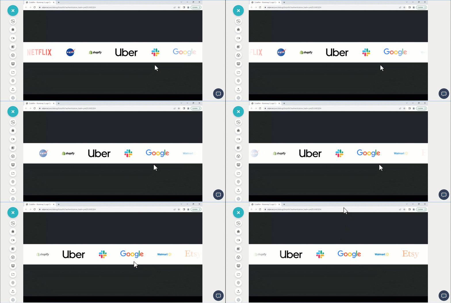
HTML:
<html lang="en">
  <head>
    <meta charset="utf-8">
    <meta name="viewport" content="width=device-width, initial-scale=1">
  </head>
<body class="bg-dark">
    <main class="vw-100 vh-100 d-flex flex-row justify-content-center align-items-center">
      <div class="logos overflow-hidden py-5 px-0 position-relative" style="background-color: #fff; white-space: nowrap;">
        <div class="logos-slide d-inline-block">

            <img src="https://user-images.githubusercontent.com/78242022/284359520-3a125798-774e-423b-b738-5f5e495d276d.png" alt=""><!--Etsy-->

            <img src="https://user-images.githubusercontent.com/78242022/284359525-2779538f-35e0-4727-89fa-04e523624630.png" alt=""><!--Airbnb-->

            <img src="https://user-images.githubusercontent.com/78242022/284359530-00ed0fa5-9752-46df-bc07-4ab5dfe3dded.png" alt=""><!--amazon-->

            <img src="https://user-images.githubusercontent.com/78242022/284359550-db8cbcba-e2ed-48e1-81dc-c396c35893eb.png" alt=""><!--Target-->

            <img src="https://user-images.githubusercontent.com/78242022/284359532-4f2a2b1b-8eb7-4aaa-bda9-7d31df0d5cff.png" alt=""><!--Netflix-->

            <img src="https://user-images.githubusercontent.com/78242022/284359536-909db7c6-660e-495d-9568-c63bdf1fab5d.png" alt=""><!--Nasa-->

            <img src="https://user-images.githubusercontent.com/78242022/284359540-ba6f0359-617b-4e69-9b02-5137a6063738.png" alt=""><!--Shopify-->

            <img src="https://user-images.githubusercontent.com/78242022/284359552-631b683f-859c-44e5-991f-23ff98110083.png" alt=""><!--Uber-->

            <img src="https://user-images.githubusercontent.com/78242022/284359544-ccf33abb-f245-4c29-8f79-997e3eb206ee.png" alt=""><!--Slack-->

            <img src="https://user-images.githubusercontent.com/78242022/284363043-89f1bbc4-b919-4231-8b62-679785a2f20c.png" alt=""><!--Google-->

            <img src="https://user-images.githubusercontent.com/78242022/284359560-9b7336a9-0dff-41c0-8f94-0a3ef06b679d.png" alt=""><!--Walmark-->
        </div>
    </div>
  </main>
  </body>
</html>
CSS:
* {
            margin: 0;
            padding: 0;
            box-sizing: border-box;
        }

        .logos::before,
        .logos::after {
            content: '';
            width: 300px;
            height: 100%;
            position: absolute;
            top: 0;
            z-index: 2;
        }

        .logos::before {
            left: 0;
            background: linear-gradient(to left, rgba(255, 255, 255, 0), #fff);
        }

        .logos::after {
            right: 0;
            background: linear-gradient(to right, rgba(255, 255, 255, 0), #fff);
        }

        .logos-slide {
            animation: 20s slide infinite linear;
        }

        .logos:hover .logos-slide {
            animation-play-state: paused;
        }

        .logos-slide img {
            height: 60px;
            margin: 0 50px;
        }

        @keyframes slide {
            from{
                transform: translateX(0);
            }

            to {
                transform: translateX(-100%);
            }
        }
JavaScript:
const cloneEl = document.querySelector(".logos-slide").cloneNode(true)
  const logos = document.querySelector('.logos').appendChild(cloneEl);
Landing Page Carousel
A landing page can have an animated carousel slider that enables users to swipe the background image. This can help create a visually appealing UI and improve website user interaction.
These types of landing pages are good for business websites, portfolio websites, and OTT websites.
HTML:
<html lang="en">
  <head>
    <meta charset="utf-8">
    <meta name="viewport" content="width=device-width, initial-scale=1">
  </head>
  <body>
    <main>
    <nav class="navbar navbar-expand-lg bg-body-tertiary">
      <div class="container-fluid">
        <a class="navbar-brand" href="#">The Builder</a>
        <button class="navbar-toggler" type="button" data-bs-toggle="collapse" data-bs-target="#navbarScroll" aria-controls="navbarScroll" aria-expanded="false" aria-label="Toggle navigation">
          <span class="navbar-toggler-icon"></span>
        </button>
        <div class="collapse navbar-collapse" id="navbarScroll">
          <ul class="navbar-nav me-auto my-2 my-lg-0 navbar-nav-scroll" style="--bs-scroll-height: 100px;">
            <li class="nav-item">
              <a class="nav-link active" aria-current="page" href="#">Home</a>
            </li>
            <li class="nav-item">
              <a class="nav-link" href="#">Link</a>
            </li>
            <li class="nav-item dropdown">
              <a class="nav-link dropdown-toggle" href="#" role="button" data-bs-toggle="dropdown" aria-expanded="false">
                Link
              </a>
              <ul class="dropdown-menu">
                <li><a class="dropdown-item" href="#">Action</a></li>
                <li><a class="dropdown-item" href="#">Another action</a></li>
                <li><hr class="dropdown-divider"></li>
                <li><a class="dropdown-item" href="#">Something else here</a></li>
              </ul>
            </li>
          </ul>
          <form class="d-flex" role="search">
            <input class="form-control me-2" type="search" placeholder="Search" aria-label="Search">
            <button class="btn btn-outline-warning" type="submit">Search</button>
          </form>
        </div>
      </div>
    </nav>
    <!--End of navbar-->

    <!-- Start of Carousel -->
    <div id="carouselExampleCaptions" class="carousel slide">
      <div class="carousel-indicators">
        <button type="button" data-bs-target="#carouselExampleCaptions" data-bs-slide-to="0" class="active" aria-current="true" aria-label="Slide 1"></button>
        <button type="button" data-bs-target="#carouselExampleCaptions" data-bs-slide-to="1" aria-label="Slide 2"></button>
        <button type="button" data-bs-target="#carouselExampleCaptions" data-bs-slide-to="2" aria-label="Slide 3"></button>
      </div>
      <div class="carousel-inner">

        <div class="carousel-item active">
          <img src="https://user-images.githubusercontent.com/78242022/265773528-e35beb5e-3137-47ed-8e84-84a54d061cfb.jpg" class="d-block w-100" alt="...">
          <div class="carousel-caption">
            <h5>The Builder</h5>
            <p>The Builder Group helps organization connect with small businesses.</p>

            <div class="cta">
              <button type="button" class="btn btn-warning">create an account</button>
            </div>
          </div>
        </div>

        <div class="carousel-item">
          <img src="https://user-images.githubusercontent.com/78242022/265773573-a8ab85fe-900d-4d05-82da-6ecf179f1d5c.jpg" class="d-block w-100" alt="...">
          <div class="carousel-caption d-none-block">
            <h5 class="text-xxl">The Builder</h5>
            <p>With over 2 decade of connecting small and medium size company together</p>

            <div class="cta">
              <button type="button" class="btn btn-warning">create an account</button>
            </div>
          </div>
        </div>

        <div class="carousel-item">
          <img src="https://user-images.githubusercontent.com/78242022/265773310-08f6a512-a7b3-43a8-99e1-754ffa80b5a9.jpg" class="d-block w-100" alt="...">
          <div class="carousel-caption d-md-block">
            <h5>The Builder</h5>
            <p>Become and insider</p>

            <div class="cta">
              <button type="button" class="btn btn-warning">create an account</button>
            </div>
          </div>
        </div>
      </div>

      <div class="carousel-control">
        <button class="carousel-control-prev" type="button" data-bs-target="#carouselExampleCaptions" data-bs-slide="prev">
          <span class="carousel-control-prev-icon" aria-hidden="true"></span>
          <span class="visually-hidden">Previous</span>
        </button>
        <button class="carousel-control-next" type="button" data-bs-target="#carouselExampleCaptions" data-bs-slide="next">
          <span class="carousel-control-next-icon" aria-hidden="true"></span>
          <span class="visually-hidden">Next</span>
        </button>
      </div>
    </div>

  </main>
  </body>
</html>
CSS:
.navbar {
  width: 100%;
  position: fixed;
  top: 0;
  left: 0;
  z-index: 10;
}

h5{
  font-size: 4em;
  font-weight: bolder;
  color: orange;
}

.carousel-inner {
  width: 100vw;
  height: 100vh;
}

.carousel-inner .carousel-item {
  width: 100%;
  height: 100%;
}

.carousel-inner .carousel-item img {
  width: 100%;
  height: 100%;
  object-fit: cover;
}

.carousel-item::before {
    width: 100%;
    height: 100%;
    content: "";
    position: absolute;
    inset: 0;
    background: linear-gradient(180deg, #fff 0%, black 100%);
    z-index: 1;
    mix-blend-mode: multiply;
    }

 .carousel-caption {
      position: absolute;
      top: 30%;
      left: 20%;
      z-index: 2;
 }
Landing Page With Text Carousel
With most landing pages having image carousels, we can also implement text carousels on the landing page of a website. This can reduce the amount of text review at a given time.
Users can swipe the text using the control buttons to learn more. This provides a more interactive way for users to interact with the website.
In this Bootstrap carousel example, we have built a simple Bootstrap text carousel on the landing page. Here, each slider text is swiped by the control buttons.

HTML:
<html>
  <head>
    <meta charset="utf-8">
    <meta name="viewport" content="width=device-width, initial-scale=1">
  </head>

  <body>
    <main>
      <header data-bs-theme="dark" class="navbar-header">
        <div class="collapse text-bg-dark" id="navbarHeader">
          <div class="container">
            <div class="row">
              <div class="col-sm-8 col-md-7 py-4">
                <i class="fa-solid fa-group-arrows-rotate"></i>
                <h4 style="display: inline-block;">Boomer Agency</h4>
                <p class="text-body-secondary">At Boomer Agency, we're not just about building websites; we're architects of digital experiences. With a seasoned team that blends innovative creativity with years of industry expertise, we bring your brand's story to life in the digital sphere</p>
              </div>
              <div class="col-sm-4 offset-md-1 py-4">
                <h4>Contact</h4>
                <ul class="list-unstyled social-icon">
                  <li><a href="#" class="text-white">
                    <i class="fa-brands fa-x-twitter"></i> Twitter</a>
                  </li>
                  <li><a href="#" class="text-white">
                    <i class="fa-brands fa-linkedin"></i> Linkedin</a></li>
                  <li><a href="#" class="text-white"><i class="fa-solid fa-square-envelope"></i> Email</a></li>
                </ul>
              </div>
            </div>
          </div>
        </div>
        <div class="navbar navbar-dark bg-dark shadow-sm">
          <div class="container">
            <a href="#" class="navbar-brand d-flex align-items-center">
              <i class="fa-solid fa-group-arrows-rotate"></i>
              <strong>Boomer Agency</strong>
            </a>
            <button class="navbar-toggler" type="button" data-bs-toggle="collapse" data-bs-target="#navbarHeader" aria-controls="navbarHeader" aria-expanded="false" aria-label="Toggle navigation">
              <span class="navbar-toggler-icon"></span>
            </button>
          </div>
        </div>
      </header>


        <div id="carouselExampleFade" class="carousel slide carousel-fade">

            <div class="carousel-inner">

              <div class="carousel-item active">
                <h2 class="company-motto">Where Digital Vision Meets <br /> Timeless Design</h2>
                <p class="cta-text">At Boomer Agency, we're not just about building websites; we're architects of digital experiences. With a seasoned team that blends innovative creativity with years of industry expertise, we bring your brand's story to life in the digital sphere.</p>

                <button class="cta-btn cta-btn-1">
                    <a href="">
                      Get Started <i class="fa-solid fa-angle-right"></i>
                    </a>
                    <a href="">
                      Learn More <i class="fa-solid fa-arrow-up-right-from-square"></i>
                    </a>
                </button>
              </div>

              <div class="carousel-item">
                <h2 class="company-motto">Where Digital Vision <br /> Meets Timeless Design</h2>
                <p class="cta-text">Our ethos? Timeless design coupled with cutting-edge technology. We craft websites that stand the test of time, ensuring your online presence remains impactful and relevant amidst ever-evolving trends.</p>

                <button class="cta-btn cta-btn-2">
                  <a href="">
                    Get Started <i class="fa-solid fa-angle-right"></i>
                  </a>
                  <a href="">
                    Learn More <i class="fa-solid fa-arrow-up-right-from-square"></i>
                  </a>
              </button>

              </div>

              <div class="carousel-item">
                <h2 class="company-motto cm-">Where Digital Vision <br /> Meets Timeless Design</h2>
                <p class="cta-text">From sleek and user-friendly interfaces to seamless e-commerce solutions and captivating visual identities, we're dedicated to elevating your online footprint.</p>
                <p class="cta-text ct2">Boomer Agency: Igniting Your Digital Journey, Crafting Timeless Connections."</p>

                <button class="cta-btn cta-btn-3">
                  <a href="">
                    Get Started <i class="fa-solid fa-angle-right"></i>
                  </a>
                  <a href="">
                    Learn More <i class="fa-solid fa-arrow-up-right-from-square"></i>
                  </a>
              </button>
              </div>

            </div>

            <button class="carousel-control-prev" type="button" data-bs-target="#carouselExampleFade" data-bs-slide="prev">
                <i class="fa-solid fa-arrow-left"></i>
              <span class="carousel-control-prev-icon visually-hidden" aria-hidden="true"></span>
              <span class="visually-hidden">Previous</span>
            </button>
            <button class="carousel-control-next" type="button" data-bs-target="#carouselExampleFade" data-bs-slide="next">
              <i class="fa-solid fa-arrow-right"></i>
              <span class="carousel-control-next-icon visually-hidden" aria-hidden="true"></span>
              <span class="visually-hidden">Next</span>

            </button>

          </div>
  </main>
  </body>
</html>
CSS:
body {
      overflow-x: hidden;
    }

    .navbar-header {
      position: fixed;
      width: 100%;
      top: 0;
      left: 0;
      z-index: 10;
    }

    .carousel-inner {
      width: 100vw;
      height: 100vh;
      background-image: url('https://user-images.githubusercontent.com/78242022/283553047-290084e2-12ad-4876-862d-a7cee3dc0c0d.jpg');
      background-repeat: no-repeat;
      background-size: cover;
      background-position: center center;
    }

    .carousel-inner .carousel-item {
        width: 100%;
        height: 100%;

        display: flex;
        justify-content: center;
        align-items: center;
        flex-direction: column;
    }

    .carousel-inner .carousel-item .company-motto {
        font-size: 2em;
        text-align: center;
        font-weight: 700;
        color: white;
    }

    a {
      text-decoration: none;
    }

    .social-icon a {
      transform: opacity 0.5s ease;
    }

    .social-icon a:hover {
      opacity: 0.5;
    }

    .cta-text {
        width: 60%;
        font-size: 1em;
        text-align: center;
        color: white;
    }

    /* Styling the CTA Buttons */
    .cta-btn {
      border: none;
      outline: none;
      background: none;
      border: 2px solid transparent;
      display: block;
      margin-top: 10px;
    }

    .cta-btn a {
      background-color: aquamarine;
      padding: 0.7em 1.2em;
      margin: 10px;
      border-radius: 100px;
      color: black;
      transition: all 700ms ease;
    }

    .cta-btn a:hover {
      background-color: black;
      color: aquamarine;
    }

    .cta-btn a i {
      transition: all 700ms ease;
    }
    .cta-btn a:hover i {
      transform: translateX(5px);
    }

    /* FONT-AWESOME STYLING */
    .fa-arrow-right, .fa-arrow-left {
        background-color: rgb(5, 34, 24);
        padding: 30px;
        border-radius: 100px;
    }

    .fa-group-arrows-rotate {
      display: inline-block;
      padding-right: 0.4em;
      color: aquamarine;
    }

    .social-icon i {
        color: aquamarine;
    }
Animated Testimonial Carousel
Animated testimonial carousel is a type of carousel that requires all testimonial card items to be positioned side by side horizontally then animated infinitely. This makes the carousel play continuously; it is mostly used to display users feedback on a product or service.
The animated testimonial carousel has a play and pause state, and it's usually set to pause when a user hovers over it.
HTML:
<html lang="en">
  <head>
    <meta charset="utf-8">
    <meta name="viewport" content="width=device-width, initial-scale=1">
  </head>
<body class="">
    <main class="vw-100 vh-100 d-flex flex-row justify-content-center align-items-center">
    <div class="logos overflow-hidden position-relative d-flex">
        <div class="logos-slide d-flex" style="white-space:nowrap;">
            <section class="card c1 text-bg-warning py-2 px-2 rounded-3 d-flex justify-content-center align-items-center flex-column" >
                    <p class="text" role="paragraph" aria-label="testimonial">
                        Awesome job you did there <em>@testmuai</em> with the LT Browser. It's doing a fantastic job at responsive testing 🔥 see more >
                    </p>
                    <div class="d-flex mt-5">
                        <span class="s1">
                            <img src="https://user-images.githubusercontent.com/78242022/272654602-6b6c4303-587d-48ae-957a-3b88496f1fcc.png" alt="">
                        </span>
                        <span class="s2">
                            <h4 role="heading" aria-label="4">Mbaziira Ronald</h4>
                            <p class="at">@MbaziiraRonn</p>
                        </span>
                    </div>
                </section>

                <!-- Card Two -->
                <section class="card c1 text-bg-warning py-2 px-2  rounded-3 d-flex justify-content-center align-items-center flex-column">
                    <p class="text" role="paragraph" aria-label="testimonial">Amazing Test software. I am very satisfied, I think it is excellent software and as the years go by it continues to offer the best service I have ever tried....see more ></p>
                    <div class="d-flex mt-5">
                        <span class="s1">
                            <img src="https://user-images.githubusercontent.com/78242022/272654585-d0774fd3-5d90-42f0-bc53-7141f7735825.png" alt="">
                        </span>
                        <span class="s2">
                            <h4 role="heading" aria-label="4">Elias M.</h4>
                        </span>
                    </div>
                </section>

                <!-- Card Three -->
                <section class="card c1 text-bg-warning py-2 px-2  rounded-3 d-flex justify-content-center align-items-center flex-column">
                    <p class="text" role="paragraph" aria-label="testimonial">Anyone who needs to test their code on different platforms try <em>@testmuai</em> Great service from this company!</p>
                    <div class="d-flex mt-5">
                        <span class="s1">
                            <img src="https://user-images.githubusercontent.com/78242022/266013776-40ac50f1-31f8-4250-acb2-05f16d683baa.png" alt="">
                        </span>
                        <span class="s2">
                            <h4 role="heading" aria-label="4">Stephan Smuts</h4>
                            <p class="at">spsmuts</p>
                        </span>
                    </div>
                </section>

                <!-- Card Four -->
                <section class="card c1 text-bg-warning py-2 px-2  rounded-3 d-flex justify-content-center align-items-center flex-column">
                    <p class="text" role="paragraph" aria-label="testimonial">See how  <em>@testmuai</em> is #Futureready to enable blazing-fast test orchestration seamlessly integrated with organizations' existing CI/CD platforms, using #Microsoft Azure.</p>
                    <div class="d-flex mt-5">
                        <span class="s1">
                            <img src="https://user-images.githubusercontent.com/78242022/272654608-d291d9df-439c-4a79-83b1-2f2d71cd25b5.png" alt="">
                        </span>
                        <span class="s2">
                            <h4 role="heading" aria-label="4">Microsoft India</h4>
                            <p class="at">@MicrosoftIndia</p>
                        </span>
                    </div>
                </section>

                <!-- Card Five -->
                <section class="card c1 text-bg-warning py-2 px-2  rounded-3 d-flex justify-content-center align-items-center flex-column">
                    <p class="text" role="paragraph" aria-label="testimonial">Amazing Experience. That reduces a large amount of cost as well as manhours which can be used for other better things. In our team we have integrated lambdatest with our automation CI/CD pipeline, this shows how we trust <em>@testmuai</em>...see more >.</p>
                    <div class="d-flex mt-5">
                        <span class="s1">
                            <img src="https://user-images.githubusercontent.com/78242022/272654585-d0774fd3-5d90-42f0-bc53-7141f7735825.png" alt="">
                        </span>
                        <span class="s2">
                            <h4 role="heading" aria-label="4">Padma kumar M.</h4>
                        </span>
                    </div>
                </section>

                 <!-- Card Six -->
                <section class="card c1 text-bg-warning py-2 px-2  rounded-3 d-flex justify-content-center align-items-center flex-column">
                    <p class="text" role="paragraph" aria-label="testimonial"><em>@testmuai</em> Efficient and User-Friendly Cross-Browser Testing with LambdaTest...see more ></p>
                    <div class="d-flex mt-5">
                        <span class="s1">
                            <img src="https://user-images.githubusercontent.com/78242022/266013732-785b0223-9774-4918-964f-ce75f11138f2.png" alt="">
                        </span>
                        <span class="s2">
                            <h4 role="heading" aria-label="4">Ravi Kanth G.</h4>
                        </span>
                    </div>
                </section>
        </div>
    </div>
  </main>
    <script src="" integrity="sha384-I7E8VVD/ismYTF4hNIPjVp/Zjvgyol6VFvRkX/vR+Vc4jQkC+hVqc2pM8ODewa9r" crossorigin="anonymous"></script>
<script src="" integrity="sha384-BBtl+eGJRgqQAUMxJ7pMwbEyER4l1g+O15P+16Ep7Q9Q+zqX6gSbd85u4mG4QzX+" crossorigin="anonymous"></script>

<script>

</script>
  </body>
</html>
CSS:
* {
            margin: 0;
            padding: 0;
            box-sizing: border-box;
        }

        .logos-slide {
            white-space: nowrap;
            animation: 20s slide infinite linear;
        }

        .logos:hover .logos-slide {
            animation-play-state: paused;
        }

        .logos-slide img {
            height: 60px;
            margin: 0 50px;
        }

    .card {
       white-space: wrap;
       min-width: 400px;
       margin: 0 10px;
     }

    @keyframes slide {
         from{
             transform: translateX(0);
         }

       to {
           transform: translateX(-100%);
      }
 }
Logo With Control State Carousel
Control buttons are implemented on carousels to enable users to navigate between different slides. The logo carousel or any other animated carousel typically has a control button for playing and pausing the animation. This button is useful as it lets users play and pause the animation.
As you can see in the below Bootstrap carousel example, a play/pause control button exists to trigger the animation-play-state, to play and pause the animation for the user to read the content of the animated element.
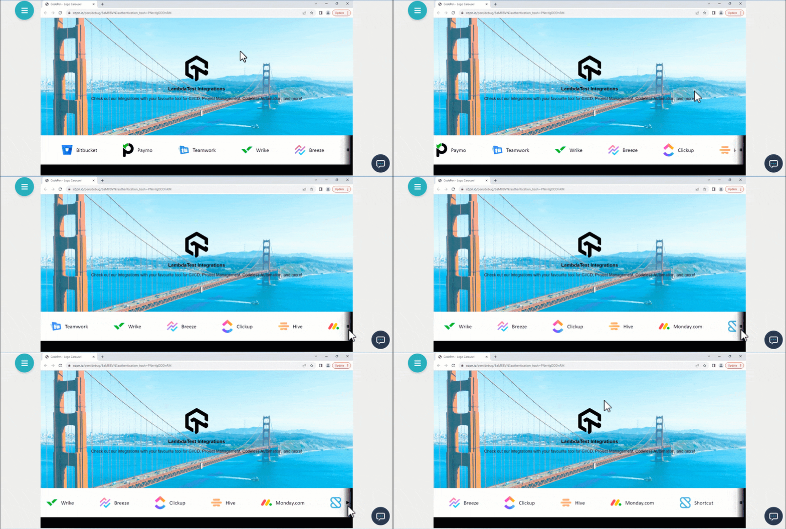
HTML:
<head>
    <meta charset="UTF-8">
    <meta name="viewport" content="width=device-width, initial-scale=1.0">
    <link rel="stylesheet" href="https://cdnjs.cloudflare.com/ajax/libs/font-awesome/6.4.2/css/all.min.css" integrity="sha512-z3gLpd7yknf1YoNbCzqRKc4qyor8gaKU1qmn+CShxbuBusANI9QpRohGBreCFkKxLhei6S9CQXFEbbKuqLg0DA==" crossorigin="anonymous" referrerpolicy="no-referrer" />
</head>
<body>
    <main>
        <section role="main" aria-label="Carousel">
            <!-- Hero Display Text -->
            <section class="hero display-text">
                <div role="contentinfo" aria-label="display text">
                    <img src="https://user-images.githubusercontent.com/78242022/241950860-1877b5b7-47f6-4c22-883b-81b19790469f.png" alt="LambdaTest Logo" role="img" aria-label="LambdaTest Logo" class="lambda-test-logo">

                    <h1 role="heading" aria-label="1">LambdaTest Integrations</h1>
                    <p role="paragraph" aria-label="text">Check out our integrations with your favorite tool for CI/CD, Project Management, Codeless Automation, and more!</p>
                </div>
            </section>

            <!-- Logo Display -->
            <section role="img" aria-label="logo Carousel" class="logos">
                <div class="scroll-container d-inline-block">
                    <!-- Jira -->
                    <figure role="img" aria-label="jira logo">
                            <img src="https://user-images.githubusercontent.com/78242022/276231607-f0cc956d-6206-4ad9-9dec-7d66dd1cffc0.svg" alt="jira logo">
                            <figcaption class="logo-name jira">Jira</figcaption>
                    </figure>

                    <!-- Slack -->
                    <figure role="img" aria-label="slack logo">
                            <img src="https://user-images.githubusercontent.com/78242022/276232511-ddbe6533-a5b5-4d9d-9e25-b17b352ea942.svg" alt="slack logo">
                            <figcaption class="logo-name slack">Slack</figcaption>
                    </figure>

                    <!-- CircleCI -->
                    <figure role="img" aria-label="CircleCI logo">
                            <img src="https://user-images.githubusercontent.com/78242022/276232989-293ab6cd-31f3-498e-b4e7-1c6f5950186a.svg" alt="CircleCI logo">
                            <figcaption class="logo-name circle-ci">CircleCI</figcaption>
                    </figure>

                    <!-- GitHub -->
                    <figure role="img" aria-label="GitHub logo">
                            <img src="https://user-images.githubusercontent.com/78242022/276234682-c8264c45-2016-446e-bed2-f291850bf925.svg" alt="GitHub logo">
                            <figcaption class="logo-name github">GitHub</figcaption>
                    </figure>

                    <!-- Gitlab -->
                    <figure role="img" aria-label="Gitlab logo">
                            <img src="https://user-images.githubusercontent.com/78242022/276235567-b10172e5-032f-4645-ad0b-336994673549.svg" alt="Gitlab logo">
                            <figcaption class="logo-name gitlab">Gitlab</figcaption>
                    </figure>


                    <!-- Asana -->
                    <figure role="img" aria-label="Asana logo">
                            <img src="https://user-images.githubusercontent.com/78242022/276237825-966a1da7-7c86-4a13-8cbd-5fc29a2a1ad9.svg" alt="Asana logo">
                            <figcaption class="logo-name asana">Asana</figcaption>
                    </figure>

                    <!-- Azure DevOps -->
                    <figure role="img" aria-label="Azure-DevOps logo">
                            <img src="https://user-images.githubusercontent.com/78242022/276237831-6baa7ab1-d9ab-48f3-9719-23b771656d08.svg" alt="Azure DevOps logo">
                            <figcaption class="logo-name Azure-DevOps">Azure DevOps</figcaption>
                    </figure>

                    <!-- Bitbucket -->
                    <figure role="img" aria-label="Bitbucket logo">
                            <img src="https://user-images.githubusercontent.com/78242022/276237835-49bc3de0-b329-4021-85c5-12ff6df0a11b.svg" alt="Bitbucket logo">
                            <figcaption class="logo-name Bitbucket">Bitbucket</figcaption>
                    </figure>

                    <!-- Paymo -->
                    <figure role="img" aria-label="Paymo logo">
                            <img src="https://user-images.githubusercontent.com/78242022/276237839-4f52fa83-a32c-4fcb-9509-17e0e35361b3.svg" alt="Paymo logo">
                            <figcaption class="logo-name paymo">Paymo</figcaption>
                    </figure>

                    <!-- Teamwork -->
                    <figure role="img" aria-label="Teamwork logo">
                            <img src="https://user-images.githubusercontent.com/78242022/276237844-591fbdea-e367-47c9-8791-99430e0b61cf.svg" alt="Teamwork logo">
                            <figcaption class="logo-name paymo">Teamwork</figcaption>
                    </figure>

                    <!-- Wrike -->
                    <figure role="img" aria-label="Wrike logo">
                            <img src="https://user-images.githubusercontent.com/78242022/276237847-8439dc65-8f9c-423d-a00e-7808734a9d94.svg" alt="Wrike logo">
                            <figcaption class="logo-name wrike">Wrike</figcaption>
                    </figure>

                    <!-- Breeze -->
                    <figure role="img" aria-label="Breeze logo">
                            <img src="https://user-images.githubusercontent.com/78242022/276243572-f9a6ebef-c9a2-486e-aabb-1beb21d32635.svg" alt="Breeze logo">
                            <figcaption class="logo-name breeze">Breeze</figcaption>
                    </figure>

                    <!-- Clickup -->
                    <figure role="img" aria-label="Clickup logo">
                            <img src="https://user-images.githubusercontent.com/78242022/276243581-093bed70-ae94-403e-ae9e-b7d231487569.svg" alt="Clickup logo">
                            <figcaption class="logo-name clickup">Clickup</figcaption>
                    </figure>

                    <!-- Hive -->
                    <figure role="img" aria-label="Hive logo">
                            <img src="https://user-images.githubusercontent.com/78242022/276243589-9f18656a-f43f-4e0b-8239-94148a228726.svg" alt="Hive logo">
                            <figcaption class="logo-name hive">Hive</figcaption>
                    </figure>

                    <!-- Monday.com -->
                    <figure role="img" aria-label="Monday.com logo">
                            <img src="https://user-images.githubusercontent.com/78242022/276243596-806012ee-c5e4-45d7-b9bb-4b09a546a8ef.svg" alt="Monday.com logo">
                            <figcaption class="logo-name monday">Monday.com</figcaption>
                    </figure>

                    <!-- Shortcut -->
                    <figure role="img" aria-label="Shortcut logo">
                            <img src="https://user-images.githubusercontent.com/78242022/276243601-1ad3cfdc-d914-415c-a5b2-fe2a79b9322f.svg" alt="Shortcut logo">
                            <figcaption class="logo-name shortcut">Shortcut</figcaption>
                    </figure>

                    <!-- Trello -->
                    <figure role="img" aria-label="Trello logo">
                            <img src="https://user-images.githubusercontent.com/78242022/276243606-87275e81-75e1-430a-b2f1-97efc8d5c0c6.svg" alt="Trello logo">
                            <figcaption class="logo-name trello">Trello</figcaption>
                    </figure>

                    <!-- Airtable -->
                    <figure role="img" aria-label="Airtable logo">
                            <img src="https://user-images.githubusercontent.com/78242022/276256499-845d4b8b-44f5-4675-8f43-d812e5033e14.png" alt="Airtable logo">
                            <figcaption class="logo-name airtable">Airtable</figcaption>
                    </figure>

                    <!-- Bugherd -->
                    <figure role="img" aria-label="Bugherd logo">
                            <img src="https://user-images.githubusercontent.com/78242022/276256509-f8b5a671-9afe-4d19-8d1a-04b9ef9da6a0.svg" alt="Bugherd logo">
                            <figcaption class="logo-name bugherd">Bugherd</figcaption>
                    </figure>

                    <!-- Mantis -->
                    <figure role="img" aria-label="Mantis logo">
                            <img src="https://user-images.githubusercontent.com/78242022/276256516-9f1e3540-c592-47c3-8969-c110af8efb27.svg" alt="Mantis logo">
                            <figcaption class="logo-name mantis">Mantis</figcaption>
                    </figure>

                    <!-- ZipBoard -->
                    <figure role="img" aria-label="ZipBoard logo">
                            <img src="https://user-images.githubusercontent.com/78242022/276256549-e1661255-f432-4212-8ab2-e598ba4b1a22.svg" alt="ZipBoard logo">
                            <figcaption class="logo-name zip-board">ZipBoard</figcaption>
                    </figure>

                    <!-- Pivotal Tracker -->
                    <figure role="img" aria-label="pivotal-tracker logo">
                            <img src="https://user-images.githubusercontent.com/78242022/276256523-71809652-b51b-4472-9ab3-486807fd8922.svg" alt="Pivotal Tracker logo">
                            <figcaption class="logo-name pivotal-tracker">Pivotal Tracker</figcaption>
                    </figure>

                    <!-- PractiTest -->
                    <figure role="img" aria-label="PractiTest logo">
                            <img src="https://user-images.githubusercontent.com/78242022/276256536-59a3a05a-a16f-4d04-b93f-103b1c15f0b0.svg" alt="PractiTest Tracker logo">
                            <figcaption class="logo-name practi-test">PractiTest</figcaption>
                    </figure>

                    <!-- Redmine -->
                    <figure role="img" aria-label="Redmine logo">
                            <img src="https://user-images.githubusercontent.com/78242022/276264164-a47d17d2-41b2-4447-b38c-0a8b501a7de6.png" alt="Redmine logo">
                            <figcaption class="logo-name redmine">Redmine</figcaption>
                    </figure>

                    <!-- Miro -->
                    <figure role="img" aria-label="Miro logo">
                            <img src="https://user-images.githubusercontent.com/78242022/276264177-43f19f44-a195-4f5a-9215-0e57101dc9f3.svg" alt="Miro logo">
                            <figcaption class="logo-name miro">Miro</figcaption>
                    </figure>

                    <!-- Favro -->
                    <figure role="img" aria-label="Favro logo">
                            <img src="https://user-images.githubusercontent.com/78242022/276264172-479c5941-18cb-4d46-a096-3a85aa2045bd.png" alt="Favro logo">
                            <figcaption class="logo-name favro">Favro</figcaption>
                    </figure>
                </div>

                <!-- player control button -->
                <div role="img" aria-label="player control" class="control-buttons">
                        <!-- Play -->
                        <button role="img" aria-label="play button" data-play="play" class="ctrl-buttons" id="playButton">
                            <i class="fa-solid fa-pause"></i>
                        </button>
                </div>
            </section>
        </section>
  </main>
  </body>
CSS:
*,*::after, *::before {
        margin: 0;
        padding: 0;
        box-sizing: border-box;
    }

    main {
        width: 100vw;
        height: 100vh;
    }


    .lambda-test-logo {
        width: 100px;
        text-align: center;
    }

    section[aria-label="Carousel"]{
        width: 100%;
        height: 100%;
        background: url('https://user-images.githubusercontent.com/78242022/265640505-bcce3fc8-793f-4cec-94b2-ff0366e8cc7f.jpg');
        background-color: rgb(1, 114, 114);
        background-position: center center;
        background-size: cover;
        background-repeat: no-repeat;
        background-blend-mode: screen;
        position: relative;
    }

    .display-text {
        font: 18px Arial;
        width: 100%;
        display: flex;
        justify-content: center;
        position: absolute;
        top: 20%;
        padding: 2em;
        text-align: center;
    }

    .display-text h1 {
        margin: 1em 0;
    }

    div[role="contentinfo"]{
        display: flex;
        justify-content: center;
        flex-direction: column;
        align-items: center;
    }

    .scroll-container {
        width: 100%;
        height: 8em;
        display: flex;
        justify-content: start;
        row-gap: 5em;
        position: absolute;
        bottom: 0;
        background-color: white;
        padding: 1em;
        overflow-x: scroll;
    }

    .scroll-container::-webkit-scrollbar {
        overflow-x: hidden;
    }

    .scroll-container img {
        width: 5em;
        display: inline-block;
        padding: 1em;
        cursor: pointer;
        filter: grayscale(0);
        transition: filter 0.5s ease;
    }

    .scroll-container img:hover {
        filter: grayscale(100);
    }

    .scroll-container .logo-name {
        display: inline-block;
        font-size: 1.5em;
        font-family: calibri;
        cursor: pointer;
    }

    .control-buttons {
        display: flex;
        align-items: center;
        background: linear-gradient(90deg, white, black);
        position: absolute;
        bottom: 0;
        right: 0;
        height: 8em;
        padding: 0 1em;
        box-shadow: 0 4px 40px -1px rgb(0 0 0 / 0.1), 0 2px 30px -2px rgb(0 0 0 / 0.1);
    }

    .ctrl-buttons {
        background: none;
        outline: none;
        border: none;
    }

    .control-buttons svg {
        width: 50px;
        height: 50px;
        stroke: white;
        transition: opacity, 0.5s ease;
        cursor: pointer;
    }

    .control-buttons svg:hover {
        opacity: 0.7;
    }

    .scroll-container figure {
        width: 100%;
        height: 100%;
        display: flex;
        justify-content: center;
        align-items: center;
        padding: 3em;

        transform: translate(5300px);
        animation-name: move;
        animation-duration: 20s;
        animation-iteration-count: infinite;
        animation-timing-function: linear;
        animation-play-state: running;
    }

    @keyframes move {
        0% {
            transform: translateX(0);
        }
        100% {
            transform: translateX(-5300px);
        }
    }
Minimal Landing Page Carousel
You can create minimal designs such as a carousel using Material Design for Bootstrap; It includes customs transitions and animation in CSS that brings life to the webpage.
HTML:
<html lang="en">
  <head>
    <meta charset="utf-8">
    <meta name="viewport" content="width=device-width, initial-scale=1">
  </head>
<body>
    <nav class="navbar navbar-expand-lg bg-body-tertiary fixed-top">
        <div class="container">
          <a class="navbar-brand" href="#">SystemICO</a>
          <button class="navbar-toggler" type="button" data-bs-toggle="collapse" data-bs-target="#navbarSupportedContent" aria-controls="navbarSupportedContent" aria-expanded="false" aria-label="Toggle navigation">
            <span class="navbar-toggler-icon"></span>
          </button>
          <div class="collapse navbar-collapse" id="navbarSupportedContent">
            <ul class="navbar-nav ms-auto mb-2 mb-lg-0">
              <li class="nav-item">
                <a class="nav-link" href="#">Home</a>
              </li>
              <li class="nav-item">
                <a class="nav-link" href="#">About</a>
              </li>
              <li class="nav-item">
                <a class="nav-link" href="#">Portfolio</a>
              </li>
              <li class="nav-item">
                <a class="nav-link" href="#">Services</a>
              </li>
              <li class="nav-item">
                <a class="nav-link" href="#">Contact</a>
              </li>
            </ul>
          </div>
        </div>
      </nav>

      <div id="carouselExampleCaptions" class="carousel slide">
        <div class="carousel-indicators">
          <button type="button" data-bs-target="#carouselExampleCaptions" data-bs-slide-to="0" class="active" aria-current="true" aria-label="Slide 1"></button>
          <button type="button" data-bs-target="#carouselExampleCaptions" data-bs-slide-to="1" aria-label="Slide 2"></button>
          <button type="button" data-bs-target="#carouselExampleCaptions" data-bs-slide-to="2" aria-label="Slide 3"></button>
        </div>
        <div class="carousel-inner">
          <div class="carousel-item active">
            <img src="https://user-images.githubusercontent.com/78242022/284007689-57bf4df4-9ca5-4b52-b681-456474fa5fae.jpg" class="d-block w-100" alt="...">
            <div class="carousel-caption">
              <h5 class="animated bounceInRight" style="animation-delay: 1s;"  data-mdb-toggle="animation"
              data-mdb-animation-reset="true"
              data-mdb-animation="slide-right"
              data-mdb-animation-start="onScroll"
              data-mdb-animation-offset="200">UI/UX Design Agency</h5>
              <p class="animated bounceInLeft d-none d-md-block" style="animation-delay: 2s;"> Pioneering Innovation in Digital Infrastructure. With a commitment to revolutionizing the technological landscape, SystemICO leads the charge in crafting cutting-edge solutions for a connected world. </p>
              <p class="animated bounceInLeft" style="animation-delay: 3s;"><a href="#">Get Started <i class="fa-solid fa-angle-right"></i></a></p>
            </div>
          </div>
          <div class="carousel-item">
            <img src="https://user-images.githubusercontent.com/78242022/284473823-1d713ee7-af6a-4913-b4e4-01d2d78c7e2d.jpg" class="d-block w-100" alt="...">
            <div class="carousel-caption">
              <h5 class="animated bounceInRight" style="animation-delay: 1s;"  data-mdb-toggle="animation"
              data-mdb-animation-reset="true"
              data-mdb-animation="slide-right"
              data-mdb-animation-start="onScroll"
              data-mdb-animation-offset="200">UI/UX Design Agency</h5>
              <p class="animated bounceInLeft d-none d-md-block" style="animation-delay: 2s;">At SystemICO, Innovation is our DNA. Powered by a team of trailblazing minds, we craft bespoke strategies that harness the full potential of emerging technologies. </p>
              <p class="animated bounceInLeft" style="animation-delay: 3s;"><a href="#">Get Started <i class="fa-solid fa-angle-right"></i></a></p>
            </div>
          </div>
          <div class="carousel-item">
            <img src="https://user-images.githubusercontent.com/78242022/284473812-eda73791-83d8-47db-bb4f-21de64621094.jpg" class="d-block w-100" alt="...">
            <div class="carousel-caption">
              <h5 class="animated bounceInRight" style="animation-delay: 1s;"  data-mdb-toggle="animation"
              data-mdb-animation-reset="true"
              data-mdb-animation="slide-right"
              data-mdb-animation-start="onScroll"
              data-mdb-animation-offset="200"
              >UI/UX Design Agency</h5>
              <p class="animated bounceInLeft d-none d-md-block" style="animation-delay: 2s;">Empowering Progress, Redefining Possibilities. SystemICO stands at the forefront of progress, empowering enterprises to unlock new opportunities and redefine their digital potential </p>
              <p class="animated bounceInLeft" style="animation-delay: 3s;"><a href="#">Get Started <i class="fa-solid fa-angle-right"></i></a></p>
            </div>
          </div>
        </div>
        <button class="carousel-control-prev" type="button" data-bs-target="#carouselExampleCaptions" data-bs-slide="prev">
          <span class="carousel-control-prev-icon" aria-hidden="true"></span>
          <span class="visually-hidden">Previous</span>
        </button>
        <button class="carousel-control-next" type="button" data-bs-target="#carouselExampleCaptions" data-bs-slide="next">
          <span class="carousel-control-next-icon" aria-hidden="true"></span>
          <span class="visually-hidden">Next</span>
        </button>
      </div>
  </body>
</html>
CSS:
*,*::after, *::before {
            box-sizing: border-box;
            margin: 0;
            padding: 0;
        }

      .carousel-item {
        height: 100vh;
        min-height: 18.75em;
        position: relative;
      }

      .carousel-item::before {
        content: '';
        width: 100%;
        height: 100%;
        inset: 0;
        position: absolute;
        background: linear-gradient(to bottom, rgba(255, 255, 255, 0), black);

      }

      .carousel-item img {
        width: 100%;
        object-fit:cover;
      }

      .carousel-caption {
        bottom: 13.75em;
      }

      .carousel-caption h5 {
        font-size: 2.9em;
        text-transform: uppercase;
        letter-spacing: 2px;
        margin-top: 25px;
      }

      .carousel-caption p {
        width: 60%;
        margin: auto;
        font-size: 1.3em;
        line-height: 1.9;
      }

      .carousel-caption a {
        text-transform: uppercase;
        text-decoration: none;
        background-color: rgb(56 189 248);
        padding: 10px 30px;
        display: inline-block;
        color: #ffffff;
        border-radius: 10px;
        margin-top: 1em;
      }

      .carousel-caption a i{
        transition: .3s;
      }
      .carousel-caption a:hover i {
        transform: translateX(2px);
      }


      .navbar-light .navbar-brand {
        color: #fff;
        font-size: 25px;
        text-transform: uppercase;
        font-weight: bold;
        letter-spacing: 2px;
      }

      .navbar-light .navbar-brand:focus,
      .navbar-light .navbar-brand:hover {
        color: #fff;
      }

      .navbar-light .navbar-nav .nav-link {
        color: #fff;
      }

      .navbar-light .navbar-nav .nav-link:focus,
      .navbar-light .navbar-nav .nav-link:hover {
        color: #fff;
      }

      .w-100 {
        height: 100vh;
      }

      @media only screen and (max-width: 767px){
        .navbar-nav {
          text-align: center;
        }
        .carousel-caption {
          bottom: 10.3125em;
        }

        .carousel-caption h5 {
          font-size: 2.5em;
          transform: translateY(-40px);
        }

        .carousel-caption a {
          padding: 10px 15px;
          font-size: 0.7em;
        }
      }
Animated Carousel
Custom animations contribute to a more polished and professional look for various websites such as portfolios, studio projects, or landing pages. With good use of animations and transitions, web pages can have a lasting impression on visitors.
The animation can get the user's attention.
HTML:
<html lang="en">
  <head>
    <meta charset="utf-8">
    <meta name="viewport" content="width=device-width, initial-scale=1">
  </head>
<body>
    <section class="home main">
        <div id="carouselExampleIndicators" class="carousel slide">
            <div class="carousel-controls">

            <div class="carousel-indicators">
              <button type="button" data-bs-target="#carouselExampleIndicators" data-bs-slide-to="0" class="active" aria-current="true" aria-label="Slide 1" style="background-image: url('https://user-images.githubusercontent.com/78242022/284521122-c721f2b2-9ba1-49f9-8dc3-65fc142539f9.jpg');"></button>
              <button type="button" data-bs-target="#carouselExampleIndicators" data-bs-slide-to="1" aria-label="Slide 2" style="background-image: url('https://user-images.githubusercontent.com/78242022/284521137-4e4c6ed9-1a9a-4ac6-9c12-4b76136e939e.jpg');"></button>
              <button type="button" data-bs-target="#carouselExampleIndicators" data-bs-slide-to="2" aria-label="Slide 3" style="background-image: url('https://user-images.githubusercontent.com/78242022/284521170-9dbfb006-ba8a-4250-9a7c-dfd376291999.jpg');"></button>
            </div>

            <!-- carousel-controls -->
            <button class="carousel-control-prev" type="button" data-bs-target="#carouselExampleIndicators" data-bs-slide="prev">
                <span class="carousel-control-prev-icon" aria-hidden="true"></span>
                <span class="visually-hidden">Previous</span>
                </button>
                <button class="carousel-control-next" type="button" data-bs-target="#carouselExampleIndicators" data-bs-slide="next">
                <span class="carousel-control-next-icon" aria-hidden="true"></span>
                <span class="visually-hidden">Next</span>
            </button>
            </div>

            <div class="carousel-inner">
              <div class="carousel-item active" style="background-image: url('https://user-images.githubusercontent.com/78242022/284521122-c721f2b2-9ba1-49f9-8dc3-65fc142539f9.jpg');">
                <div class="container">
                    <div class="name">
                    <h2>Ijeoma Okafor</h2>
                    <p>Dancer<em>@IJ-dance</em></p>
                    <div class="icons">
                        <i class="fa-brands fa-x-twitter"></i>
                        <i class="fa-brands fa-instagram"></i>
                        <i class="fa-brands fa-linkedin-in"></i>
                    </div>
                    </div>
                </div>
            </div>
            <div class="carousel-item" style="background-image: url('https://user-images.githubusercontent.com/78242022/284521137-4e4c6ed9-1a9a-4ac6-9c12-4b76136e939e.jpg');">
                <div class="container">
                    <div class="name">
                    <h2>Lois French</h2>
                    <p>Tourist<em>@LoisFrenchGuides</em></p>
                    <div class="icons">
                        <i class="fa-brands fa-x-twitter"></i>
                        <i class="fa-brands fa-instagram"></i>
                        <i class="fa-brands fa-linkedin-in"></i>
                    </div>
                    </div>
                </div>
            </div>

            <div class="carousel-item" style="background-image: url('https://user-images.githubusercontent.com/78242022/284521170-9dbfb006-ba8a-4250-9a7c-dfd376291999.jpg');">
                <div class="container">
                    <div class="name">
                    <h2>Alex Beckham</h2>
                    <p>Fashion Designer/CEO <em>@BeckhamStudio</em></p>
                    <div class="icons">
                        <i class="fa-brands fa-x-twitter"></i>
                       <i class="fa-brands fa-instagram"></i>
                        <i class="fa-brands fa-linkedin-in"></i>
                    </div>
                    </div>
                </div>
            </div>
            </div>
        </div>
    </section>
  </body>
</html>
CSS:
*,*::after, *::before {
            box-sizing: border-box;
            margin: 0;
            padding: 0;
        }

        .carousel-item{
            min-height: 100vh;
            background-position: cover;
            background-size: cover;
            background-repeat: no-repeat;
        }

        .carousel-item::before{
          content: '';
          position: absolute;
          inset: 0;
          width: 100%;
          height: 100%;
          background-color: rgba(0, 0, 0, 0.4);
          z-index: -1;
        }

        .carousel-item .container{
           position: absolute;
           left: 50%;
           top: 50%;
           transform: translate(-50%, -50%);
           text-align: center;
        }

        .carousel-item h2 {
            font-size: 80px;
            color: #ffffff;
            margin: 0 10px;
            opacity: 0;
        }

        .carousel-item p {
            color: #a09f9f;
            margin: 0;
            opacity: 0;
        }

        .name h2 {
            font-size: 4em;
            white-space: nowrap;
        }

        .name p {
            color: #ffffff;
            font-size: 2em;
            margin: 0;
            opacity: 0;
        }

        .name i {
            width: 30px;
            line-height: 30px;
            color: white;
            margin: 2px;
            font-size: 1.3em;
            display: inline-block;
            border-radius: 50%;
            box-shadow: 0px 0px 2px 2px #fff;
            border: 2px solid transparent;
        }

        em {
            font-style: normal;
            font-size: 0.7em;
            color: #ccc;
        }

        .carousel-item.active h2 {
            animation: fadeInLeft 0.5s ease forwards;
        }

        .carousel-item.active p {
            animation: fadeInRight 0.5s ease forwards;
        }

        .carousel-controls {
            position: absolute;
            left: 50%;
            bottom: 40px;
            z-index: 10;
            transform: translateX(-50%);
        }

        .carousel-indicators {
            position: relative;
            margin: 0;
        }

        .main .carousel-indicators button {
            width: 60px;
            height: 60px;
            margin: 0 5px;
            border-radius: 50%;
            background-position: center;
            background-size: cover;
            background-repeat: no-repeat;
            border: 2px solid transparent;
            transition: all 0.3s linear;
        }

        .carousel-indicators button.active {
            box-shadow: 0 0 10px #ffffff;
            transform: scale(1.2);
        }

        .carousel-control-prev,
        .carousel-control-next {
            height: 60px;
            width: 60px;
            background-color: rgba(0, 0, 0, 0.521);
            opacity: 1;
            z-index: 3;
            top: 50%;
            transform: translateY(-50%);
            border-radius: 50%;
        }

        .carousel-control-prev {
            left: -80%;
        }

        .carousel-control-next {
            right: -80%;
        }

        @keyframes fadeInLeft {
            0% {
                opacity: 0;
                transform: translateX(-30px);
            }
            100% {
                opacity: 1;
                transform: translateX(0px);
            }
        }

        @keyframes fadeInRight {
            0% {
                opacity: 0;
                transform: translateX(30px);
            }
            100% {
                opacity: 1;
                transform: translateX(0px);
            }
        }

        @media (max-width: 767px) {
            .carousel-control-next,
            .carousel-control-prev {
                display: none;
            }
            .carousel-indicators button {
                height: 60px;
                width: 60px;
            }

            .carousel-item h2 {
                font-size: 45px;
            }

            .carousel-item p {
                font-size: 22px;
            }
        }
Single Page Carousel
Single page carousel can be implemented in situations where we only want to display items of the same categories or style. This makes navigating easy for users as all items are placed in a single page view.
HTML:
<html lang="en">
  <head>
    <meta charset="utf-8">
    <meta name="viewport" content="width=device-width, initial-scale=1">
  </head>
<body>
    <main>
      <div id="carouselExampleIndicators" class="carousel slide vh-100 vw-100 position-relative d-flex justify-content-center align-items-center flex-column">
        <div class="carousel-indicators position-absoulute" style="bottom: 5em; left: 2%; z-index: 3;">
          <button type="button" data-bs-target="#carouselExampleIndicators" data-bs-slide-to="0" class="active" aria-current="true" aria-label="Slide 1"></button>
          <button type="button" data-bs-target="#carouselExampleIndicators" data-bs-slide-to="1" aria-label="Slide 2"></button>
          <button type="button" data-bs-target="#carouselExampleIndicators" data-bs-slide-to="2" aria-label="Slide 3"></button>
          <button type="button" data-bs-target="#carouselExampleIndicators" data-bs-slide-to="3" aria-label="Slide 4"></button>
        </div>
        <div class="carousel-inner" style="width: 400px; height: 500px;">
          <div class="carousel-item active h-100 w-100">
            <img src="https://user-images.githubusercontent.com/78242022/283794681-4ef25f40-67d6-4cd1-87d4-d584895f09e5.jpg" class="d-block h-100 w-100" alt="..." style="isolation: isolate;">
            <div class="name">
              <h2>Kyoto</h2>
              <p>
                Kyoto, once the capital of Japan, is a city on the island of Honshu. It's famous for its numerous classical Buddhist temples, as well as gardens, imperial palaces, Shinto shrines and traditional wooden houses.
              </p>

            </div>
          </div>
          <div class="carousel-item h-100 w-100">
            <img src="https://user-images.githubusercontent.com/78242022/283794710-dc582f6d-d26c-4eea-8b0c-f8b0e579e20c.jpg" class="d-block h-100 w-100" alt="...">
            <div class="name">
              <h2>New York</h2>
              <p>
                New York City comprises 5 boroughs sitting where the Hudson River meets the Atlantic Ocean. At its core is Manhattan, a densely populated borough that's among the world's major commercial, financial and cultural centers
              </p>
          </div>
        </div>
          <div class="carousel-item">
            <img src="https://user-images.githubusercontent.com/78242022/283794732-086e3912-bdf6-44f4-a4f9-6a69110910c5.jpg" class="d-block h-100 w-100" alt="...">
            <div class="name">
              <h2>Tokyo</h2>
              <p>
                Tokyo, Japan's busy capital, mixes the ultramodern and the traditional, from neon-lit skyscrapers to historic temples. The opulent Meiji Shinto Shrine is known for its towering gate and surrounding woods.
              </p>
          </div>
          </div>
          <div class="carousel-item">
            <img src="https://user-images.githubusercontent.com/78242022/283794676-ca297e75-3acf-4364-8e07-27f2e2fd3f11.jpg" class="d-block h-100 w-100" alt="...">
            <div class="name">
              <h2>Las Vegas</h2>
              <p>
                Las Vegas, often known simply as Vegas, is the 25th-most populous city in the United States, the most populous city in the state of Nevada, and the county seat of Clark County. The Las Vegas Valley metropolitan area is the largest within the greater Mojave Desert, and 2nd-largest in the Southwestern United States.
              </p>
          </div>
          </div>
        </div>
      </div>
    </main>
    <script src="" integrity="sha384-I7E8VVD/ismYTF4hNIPjVp/Zjvgyol6VFvRkX/vR+Vc4jQkC+hVqc2pM8ODewa9r" crossorigin="anonymous"></script>
<script src="" integrity="sha384-BBtl+eGJRgqQAUMxJ7pMwbEyER4l1g+O15P+16Ep7Q9Q+zqX6gSbd85u4mG4QzX+" crossorigin="anonymous"></script>
</body>
</html>
CSS:
.carousel-item img {
      width: 100%;
      height: 100%;
      object-fit: cover;
    }

    .carousel-item::before {
      content: '';
      background: linear-gradient(to bottom, rgba(255,255,255,0.5), black);
      width: 50%;
      height: 100%;
      top: 0;
      right: 0;
      position: absolute;
      z-index: 1;
    }

    .name {
      width: 50%;
      height: 100%;
      top: 0;
      right: 0;
      position: absolute;
      color: #fff;
      padding: 10px;
      z-index: 2;
    }

    .name h2 {
      font-size: 2.5em;
      font-weight: lighter;
      background-color: whitesmoke;
      color:black;
      border-radius: 10px;
      text-align: center;
      width: fit-content;
      padding: 3px 5px;
      margin: 10px 0;
      white-space: nowrap;
    }

    .name p {
      font-weight: lighter;
      padding: 5px;
      margin: 10px 0;
    }
Food List Carousel
Food list carousels are types of carousels found majorly in restaurant websites. They help categorize food types into carousel displays.
HTML:
<html lang="en">
  <head>
    <meta charset="utf-8">
    <meta name="viewport" content="width=device-width, initial-scale=1">
  </head>
<body style="background-color: rgb(212, 214, 213);">
    <div class="container px-4 py-5" id="custom-cards">
        <h2 class="pb-2 border-bottom">Popular Dishes</h2>
        <div class="owl-carousel owl-theme">
            <div class="item item1">
                <div class="card shadow-sm">
                    <img src="https://user-images.githubusercontent.com/78242022/284877820-9ebd970d-422f-4f51-bf2c-dac1694bbdae.jpg" width="100%" height="225px" />

                    <div class="card-body">
                        <h2>Hamburger</h2>
                        <i class="fa-solid fa-star"></i>
                        <i class="fa-solid fa-star"></i>
                        <i class="fa-solid fa-star"></i>
                        <i class="fa-regular fa-star"></i>
                        <i class="fa-regular fa-star"></i>
                      <p class="card-text">Succulent, juicy, and utterly satisfying, this hamburger is a taste of pure delight.</p>
                      <div class="d-flex justify-content-between align-items-center">
                        <div class="btn-group">
                          <button type="button" class="btn btn-sm btn-outline-secondary"><i class="fa-solid fa-cart-shopping"></i></button>
                          <button type="button" class="btn btn-sm btn-outline-secondary"><i class="fa-solid fa-money-bill"></i></button>
                        </div>
                        <small class="text-body-secondary">$200</small>
                      </div>
                    </div>
                  </div>
            </div><!--[End of Item one]-->

            <div class="item item2">
                <div class="card shadow-sm">
                    <img src="https://user-images.githubusercontent.com/78242022/284889834-1fd6c291-3239-47de-aafd-9cbb2dfae86a.jpg" width="100%" height="225px" />

                    <div class="card-body">
                        <h2>Sausages</h2>
                        <i class="fa-solid fa-star"></i>
                        <i class="fa-solid fa-star"></i>
                        <i class="fa-solid fa-star"></i>
                        <i class="fa-solid fa-star"></i>
                        <i class="fa-regular fa-star"></i>
                      <p class="card-text">Savory, hearty, and absolutely delicious - a must-try sausage that's bursting with flavor</p>
                      <div class="d-flex justify-content-between align-items-center">
                        <div class="btn-group">
                          <button type="button" class="btn btn-sm btn-outline-secondary"><i class="fa-solid fa-cart-shopping"></i></button>
                          <button type="button" class="btn btn-sm btn-outline-secondary"><i class="fa-solid fa-money-bill"></i></button>
                        </div>
                        <small class="text-body-secondary">$50</small>
                      </div>
                    </div>
                  </div>
            </div><!--[End of Item two]-->

            <div class="item item3">
                <div class="card shadow-sm">
                    <img src="https://user-images.githubusercontent.com/78242022/284897764-d7c21194-a220-403f-915b-aab2485a371f.jpg" width="100%" height="225px" />

                    <div class="card-body">
                        <h2>French Fries</h2>
                        <i class="fa-solid fa-star"></i>
                        <i class="fa-solid fa-star"></i>
                        <i class="fa-solid fa-star"></i>
                        <i class="fa-regular fa-star"></i>
                        <i class="fa-regular fa-star"></i>
                      <p class="card-text">Perfectly crispy on the outside, fluffy on the inside--these French fries are simply addictive</p>
                      <div class="d-flex justify-content-between align-items-center">
                        <div class="btn-group">
                          <button type="button" class="btn btn-sm btn-outline-secondary"><i class="fa-solid fa-cart-shopping"></i></button>
                          <button type="button" class="btn btn-sm btn-outline-secondary"><i class="fa-solid fa-money-bill"></i></button>
                        </div>
                        <small class="text-body-secondary">$100</small>
                      </div>
                    </div>
                  </div>
            </div><!--[End of Item three]-->

            <div class="item item4">
                <div class="card shadow-sm">
                    <img src="https://user-images.githubusercontent.com/78242022/284900586-66d38187-c3bd-4bf8-938d-166837f15607.jpg" width="100%" height="225px" />

                    <div class="card-body">
                        <h2>Fried Chicken</h2>
                        <i class="fa-solid fa-star"></i>
                        <i class="fa-solid fa-star"></i>
                        <i class="fa-solid fa-star"></i>
                        <i class="fa-regular fa-star"></i>
                        <i class="fa-regular fa-star"></i>
                      <p class="card-text">Crunchy, flavorful, and oh-so-juicy--this fried chicken hits all the right notes.</p>
                      <div class="d-flex justify-content-between align-items-center">
                        <div class="btn-group">
                          <button type="button" class="btn btn-sm btn-outline-secondary"><i class="fa-solid fa-cart-shopping"></i></button>
                          <button type="button" class="btn btn-sm btn-outline-secondary"><i class="fa-solid fa-money-bill"></i></button>
                        </div>
                        <small class="text-body-secondary">$150</small>
                      </div>
                    </div>
                  </div>
            </div><!--[End of Item four]-->

            <div class="item item5">
                <div class="card shadow-sm">
                    <img src="https://user-images.githubusercontent.com/78242022/284902669-49233d9c-71c1-41ad-932d-421873bada98.jpg" width="100%" height="225px" />

                    <div class="card-body">
                        <h2>Vegetable Salad</h2>
                        <i class="fa-solid fa-star"></i>
                        <i class="fa-solid fa-star"></i>
                        <i class="fa-solid fa-star"></i>
                        <i class="fa-regular fa-star"></i>
                        <i class="fa-regular fa-star"></i>
                      <p class="card-text">Fresh, vibrant, and bursting with flavors--this vegetable salad is a healthy and delicious choice!</p>
                      <div class="d-flex justify-content-between align-items-center">
                        <div class="btn-group">
                          <button type="button" class="btn btn-sm btn-outline-secondary"><i class="fa-solid fa-cart-shopping"></i></button>
                          <button type="button" class="btn btn-sm btn-outline-secondary"><i class="fa-solid fa-money-bill"></i></button>
                        </div>
                        <small class="text-body-secondary">$70</small>
                      </div>
                    </div>
                  </div>
            </div><!--[End of Item five]-->

            <div class="item item6">
                <div class="card shadow-sm">
                    <img src="https://user-images.githubusercontent.com/78242022/284904850-4b2d98b8-ffce-4007-9bca-ddac599f0f26.jpg" width="100%" height="225px" />
                    <div class="card-body">
                        <h2>Beans</h2>
                        <i class="fa-solid fa-star"></i>
                        <i class="fa-solid fa-star"></i>
                        <i class="fa-solid fa-star"></i>
                        <i class="fa-regular fa-star"></i>
                        <i class="fa-regular fa-star"></i>
                      <p class="card-text">Nutritious, hearty, and packed with flavor--these beans are a delicious and satisfying choice.</p>
                      <div class="d-flex justify-content-between align-items-center">
                        <div class="btn-group">
                          <button type="button" class="btn btn-sm btn-outline-secondary"><i class="fa-solid fa-cart-shopping"></i></button>
                          <button type="button" class="btn btn-sm btn-outline-secondary"><i class="fa-solid fa-money-bill"></i></button>
                        </div>
                        <small class="text-body-secondary">$120</small>
                      </div>
                    </div>
                  </div>
            </div><!--[End of Item six]-->

            <div class="item item7">
                <div class="card shadow-sm">
                    <img src="https://user-images.githubusercontent.com/78242022/284908212-e58cf567-8ab4-4bd2-995b-b74f687933f3.jpg" width="100%" height="225px" />

                    <div class="card-body">
                        <h2>sandwich</h2>
                        <i class="fa-solid fa-star"></i>
                        <i class="fa-solid fa-star"></i>
                        <i class="fa-solid fa-star"></i>
                        <i class="fa-regular fa-star"></i>
                        <i class="fa-regular fa-star"></i>
                      <p class="card-text">Simple yet scrumptious, this sandwich hits the spot every time.</p>
                      <div class="d-flex justify-content-between align-items-center">
                        <div class="btn-group">
                          <button type="button" class="btn btn-sm btn-outline-secondary"><i class="fa-solid fa-cart-shopping"></i></button>
                          <button type="button" class="btn btn-sm btn-outline-secondary"><i class="fa-solid fa-money-bill"></i></button>
                        </div>
                        <small class="text-body-secondary">$30</small>
                      </div>
                    </div>
                  </div>
            </div><!--[End of Item seven]-->
        </div>
    </div>
  </body>
</html>
CSS:
.card {
          width: 100%;
          border-radius: 10px;
        }

        .card img {
            border-radius: 10px 10px 0 0;
            object-fit: cover;
        }

        i.fa-star {
          color: orangered;
        }

        .btn-group i {
            color: orangered;
        }

        .btn-group button:hover {
            background-color: orange;
        }

        .btn-group button:hover i.fa-solid {
            color: black;
        }

        .card-body h2 {
            font-size: 1.2em;
            text-transform: capitalize;
        }

        /* Indicators */
        .owl-theme .owl-dots .owl-dot.active span,
        .owl-theme .owl-dots .owl-dot:hover span {
            background:  orange;
            width: 30px;
        }

        .owl-theme .owl-dots .owl-dot span {
        width: 15px;
        height: 15px;
        background: orangered;
        transition: all .2s ease;
    }

    /* Controls */
    /* button element */
    .owl-carousel .owl-nav button.owl-next,
    .owl-carousel .owl-nav button.owl-prev {
        position: relative;
        background-color: rgba(255, 166, 0, 0.3);
        width: 30px;
        padding: 5px;
    }

    .owl-carousel .owl-nav button.owl-next:hover,
    .owl-carousel .owl-nav button.owl-prev:hover {
        background-color: orange;
    }

    .owl-carousel .owl-nav button.owl-next::before,
    .owl-carousel .owl-nav button.owl-prev::before {
        width: 100%;
        height: 100%;
        color: orangered;
        /* inset: 0;
        position: absolute; */
    }

    .owl-carousel .owl-nav button.owl-next::before {
        content:'061'; /*unicode for arrow-right*/
        font-family: 'Font Awesome 5 Free'; /* Font family for Font Awesome */
        font-weight: 900; /* Font weight for the solid style (fas) */
        margin-right: 5px;
    }

    .owl-carousel .owl-nav button.owl-prev::before {
        content:'060'; /*unicode for arrow-left*/
        font-family: 'Font Awesome 5 Free'; /* Font family for Font Awesome */
        font-weight: 900; /* Font weight for the solid style (fas) */
        margin-right: 5px;
    }

.owl-carousel .owl-nav .owl-next [aria-label="Next"],
.owl-carousel .owl-nav .owl-prev [aria-label="Previous"]{
    visibility:hidden /*The Span element*/
}
Active State Carousel
With an active state carousel, the slider with current active class can be set to take a different look. This will enable the users to know which class is currently active. This is a handy method to make multi-column carousels more interactive.
HTML:
<html lang="en">
  <head>
    <meta charset="utf-8">
    <meta name="viewport" content="width=device-width, initial-scale=1">
  </head>
<body>
    <div class="container px-4 py-5 position-relative" id="custom-cards" >
        <h2 class="pb-2 border-bottom">Books to Read</h2>
        <div class="owl-carousel owl-theme">
            <div class="item item1">
                <div class="card shadow-sm">
                    <img src="https://user-images.githubusercontent.com/78242022/285021205-96fd5356-c0a2-498b-9824-8fce86ee4f5d.jpg" width="100%" height="225px" />

                    <div class="card-body">
                            <div>
                                <img src="https://user-images.githubusercontent.com/78242022/285021219-856eeae2-4823-4e33-bdff-d26bac9a03ff.svg" alt="USA Flags">
                                <h2>US Store</h2>
                            </div>
                        <p class="card-text">Psychology of Attraction: Learn the psychological secrets of attraction, a positive ...</p>
                    </div>
                  </div>
            </div><!--[End of Item one]-->

            <div class="item item2">
                <div class="card shadow-sm">
                    <img src="https://user-images.githubusercontent.com/78242022/285021210-d0c372e1-a350-4088-ae7a-99c20a7a47d0.jpg" width="100%" height="225px" />

                    <div class="card-body">
                        <div>
                            <img src="https://user-images.githubusercontent.com/78242022/285021219-856eeae2-4823-4e33-bdff-d26bac9a03ff.svg" alt="USA Flags">
                            <h2>US Store</h2>
                        </div>
                      <p class="card-text">Dark Psychology Secrets: Learn The Art of Reading People and Psychological Triggers ...</p>

                    </div>
                  </div>
            </div><!--[End of Item two]-->

            <div class="item item3">
                <div class="card shadow-sm">
                    <img src="https://user-images.githubusercontent.com/78242022/285021200-36ff2e67-507e-4fb2-81f5-41f409157d4f.jpg" width="100%" height="225px" />
                        <div class="card-body">
                            <div>
                                <img src="https://user-images.githubusercontent.com/78242022/285021219-856eeae2-4823-4e33-bdff-d26bac9a03ff.svg" alt="USA Flags">
                                <h2>US Store</h2>
                            </div>
                        <p class="card-text">Law Of Attraction- Get Your Ex Back & Manifesting True Love : Manifestation ...</p>
                </div>
            </div>
            </div><!--[End of Item three]-->

            <div class="item item4">
                <div class="card shadow-sm">
                    <img src="https://user-images.githubusercontent.com/78242022/285021207-bd5f4d1a-7ec3-4d65-89f5-bb205a80281b.jpg" />
                        <div class="card-body">
                            <div>
                                <img src="https://user-images.githubusercontent.com/78242022/285021219-856eeae2-4823-4e33-bdff-d26bac9a03ff.svg" alt="USA Flags">
                                <h2>US Store</h2>
                            </div>
                          <p class="card-text">The Mindset Revolution : Mastering the 9 Pillars of Psychology to Conquer ...</p>
                    </div>
                  </div>
            </div><!--[End of Item four]-->

            <div class="item item5">
                <div class="card shadow-sm">
                    <img src="https://user-images.githubusercontent.com/78242022/285021213-d028050c-c912-45e3-afa4-1082bea6f8f6.jpg" width="100%" height="225px" />
                    <div class="card-body">
                            <div>
                                <img src="https://user-images.githubusercontent.com/78242022/285021219-856eeae2-4823-4e33-bdff-d26bac9a03ff.svg" alt="USA Flags">
                                <h2>US Store</h2>
                            </div>
                        <p class="card-text">Dark Psychology Secrets : Your Ultimate Guide To Learn How To Stop Being ...</p>
                    </div>
                  </div>
            </div><!--[End of Item five]-->

            <div class="item item6">
                <div class="card shadow-sm">
                    <img src="https://user-images.githubusercontent.com/78242022/285021215-30e161d5-b680-4642-8332-f497c7791f3d.jpg">
                        <div class="card-body">
                            <div>
                                <img src="https://user-images.githubusercontent.com/78242022/285021219-856eeae2-4823-4e33-bdff-d26bac9a03ff.svg" alt="USA Flags">
                                <h2>US Store</h2>
                            </div>
                        <p class="card-text">The Psychology of Attraction Explained  Understand what attracts</p>
                    </div>
                  </div>
            </div><!--[End of Item six]-->
        </div>
    </div>
  </body>
</html>
CSS:
.card {
          width: 100%;
        }

        .card img {
            margin: 10px 0;
            width: 2.5em;
            border-radius: 10px 10px 0 0;
            object-fit: cover;
        }
        .card-body div {
            display: flex;
        }

        .card-body div img {
            max-width: 16.5px;
            height: 12px;
            border-radius: 0%;
            margin:0 5px;
        }

        .card-body div h2 {
            font-size: 12px;
            margin:0 10px;
        }

        .card-text {
            text-align: start;
            font-size: 0.9em;
            margin: 10px 0;
        }

        /* Indicators */
        .owl-theme .owl-dots .owl-dot.active span,
        .owl-theme .owl-dots .owl-dot:hover span {
            background: rgb(37 99 235);
            width: 30px;
        }

        .owl-theme .owl-dots .owl-dot span {
            width: 15px;
            height: 15px;
            transition: all .2s ease;
            border: 3px solid rgb(191 219 254);
        }

    /* Controls */
    /* button element */
    .owl-carousel .owl-nav button.owl-next,
    .owl-carousel .owl-nav button.owl-prev {
        position: relative;
        background-color: rgba(255, 255, 255);
        width: 60px;
        line-height: 60px;
        border-radius: 100%;
        box-shadow: 0 20px 25px -5px rgb(0 0 0 / 0.1), 0 8px 10px -6px rgb(0 0 0 / 0.1);
        position: absolute;
        top: 10em;
    }

    .owl-carousel .owl-nav button.owl-prev {
        left: 2em;
    }
    .owl-carousel .owl-nav button.owl-next {
        right: 2em;
    }

    .owl-carousel .owl-nav button.owl-next:hover,
    .owl-carousel .owl-nav button.owl-prev:hover {
        background-color: rgb(191 219 254);
    }

    .owl-carousel .owl-nav button.owl-next::before,
    .owl-carousel .owl-nav button.owl-prev::before {
        width: 100%;
        height: 100%;
        color: rgb(37 99 235);
        inset: 0;
        position: absolute;
        display: inline-block;

    }

    .owl-carousel .owl-nav button.owl-next::before {
        content:'054'; /*unicode for chevron-right*/
        font-family: 'Font Awesome 5 Free'; /* Font family for Font Awesome */
        font-weight: 900; /* Font weight for the solid style (fas) */
        margin-right: 5px;
    }

    .owl-carousel .owl-nav button.owl-prev::before {
        content:'053'; /* unicode for chevron-left */
        font-family: 'Font Awesome 5 Free'; /* Font family for Font Awesome */
        font-weight: 900; /* Font weight for the solid style (fas) */
        margin-right: 5px;
    }

.owl-carousel .owl-nav .owl-next [aria-label="Next"],
.owl-carousel .owl-nav .owl-prev [aria-label="Previous"]{
    visibility: hidden /*The Span element*/
}

/* 3D Spinner */
  .owl-carousel .item {
      text-align: center;
      padding: 50px;
	margin-bottom:10px;
      opacity: .2;
      -webkit-transform: rotate(20deg);
      transform: rotate(20deg);
      -webkit-transition: all 0.3s ease;
      -moz-transition: all 0.3s ease;
      transition: all 0.3s ease;
}
  .owl-carousel .owl-item.active.center .item {
      opacity: 1;
	-webkit-transform: rotate(0deg);
     transform: rotate(0deg);
 }
JavaScript:
$('.owl-carousel').owlCarousel({
        loop: false,
        center: true,
        items: 3,
        margin: 0,
        nav:true,
        autoplay: false,
        dots:true,
        autoplayTimeout: 1000,
        smartSpeed: 450,
        responsive: {
            0: {
                items: 1
                },
                768: {
                items: 2
                },
                1170: {
                items: 3
            }
        }
});
Animated Showcase Carousel
This type of carousel showcases a list of speakers for an event or list of activities performed from an event. You can include this in a section on your website landing page.
HTML:
<html lang="en">
  <head>
    <meta charset="utf-8">
    <meta name="viewport" content="width=device-width, initial-scale=1">
  </head>
<body class="bg-dark">
    <main class="vw-100 vh-100 d-flex flex-row justify-content-center align-items-center">
      <div class="logos overflow-hidden py-5 px-0 position-relative" style="white-space: nowrap;">
        <div class="hero-text">
            <img src="https://user-images.githubusercontent.com/78242022/285059508-68acfaca-f775-48a3-bafc-d54d4ae7b65d.png" alt="">
            <h2> Meet our Speakers </h2>
            <p> Join a community of millions and discover what it takes to be a developer in today's job market</p>
        </div>

    <div class="logos-slide d-inline-block">
        <img src="https://user-images.githubusercontent.com/78242022/285054142-ed1d9e5f-3ef6-43da-b67b-e49ab9320201.jpg" alt=""><!--one-->

        <img src="https://user-images.githubusercontent.com/78242022/285054159-b81070b0-480b-4e9d-8e0d-58472f7cc0c4.jpg" alt=""><!--two-->

        <img src="https://user-images.githubusercontent.com/78242022/285054161-ec676d07-7496-4885-bbb1-9ec4ed4d8d6f.jpg" alt=""><!--three-->

        <img src="https://user-images.githubusercontent.com/78242022/285054165-d35b2d00-cd5c-4688-9014-e2c550f96ed4.jpg" alt=""><!--four-->

        <img src="https://user-images.githubusercontent.com/78242022/285054167-fcbb0c7a-2a1f-4ce9-8462-d45aaff0242d.jpg" alt=""><!--five-->

        <img src="https://user-images.githubusercontent.com/78242022/285054171-22d3e31b-0128-4314-a1ed-4771f8a76dae.jpg" alt=""><!--six-->

        <img src="https://user-images.githubusercontent.com/78242022/285054175-c1759dbe-0b44-44c0-a60d-05a377125458.jpg" alt=""><!--seven-->

        <img src="https://user-images.githubusercontent.com/78242022/285054185-38a62c32-4e43-4de1-bf9d-88ea94db3e49.jpg" alt=""><!--eight-->

        <img src="https://user-images.githubusercontent.com/78242022/285054188-0c24a155-5717-463a-a54a-d11e36eb6bfd.jpg" alt=""><!--nine-->

        <img src="https://user-images.githubusercontent.com/78242022/285054195-431d23fe-7361-40a9-ac48-ac5c8e502dc5.jpg" alt=""><!--ten-->

        <img src="https://user-images.githubusercontent.com/78242022/285054203-60f3b327-be12-4e84-94c7-5108237376d3.jpg" alt=""><!--eleven-->

        </div>
    </div>
</main>
  </body>
</html>
CSS:
* {
            margin: 0;
            padding: 0;
            box-sizing: border-box;
        }

        .logos-slide {
            animation: 40s slide infinite linear;
        }

        .logos-slide img {
            width: 400px;
            margin: 0 50px;
            border-radius: 20px;
            transform: skewX(15deg);
            transition: all 0.5s ease;
            cursor: pointer;
            position: relative;
        }

        .logos-slide img:hover {
            transform: skewX(0);
            transform: scale(1.1);
        }

        .logos-slide img::before {
            content: attr(data-name);
            width: 100%;
            height: 100%;
            position: absolute;
            inset: 0;
        }

        .hero-text {
            display: flex;
            flex-direction: column;
            justify-content: center;
            align-items: center;
        }

        .hero-text img {
            width: 100px;
            margin-bottom: 1em;
        }

        .hero-text h2 {
            font-family: 3em;
            font-weight: lighter;
            text-align: center;
            color: white;
        }

        .hero-text p {
            font-family: 1.2em;
            font-weight: lighter;
            text-align: center;
            color: white;
        }

        @keyframes slide {
            from{
                transform: translateX(0);
            }

            to {
                transform: translateX(-100%);
            }
        }
JavaScript:
const cloneEl = document.querySelector(".logos-slide").cloneNode(true);
 const logos = document.querySelector('.logos').appendChild(cloneEl);
Auto-Rotate Carousel
Auto-rotate carousels are types of carousels that are set to auto-rotate as soon as the page loads. These types of carousels are mostly found on eCommerce, restaurant, and sports websites. The latest or most recent information is usually displayed automatically to get users' attention so they can click the slide that interests them.
HTML:
<html lang="en">
  <head>
    <meta charset="utf-8">
    <meta name="viewport" content="width=device-width, initial-scale=1">
    <link href="https://cdn.jsdelivr.net/npm/Bootstrap@5.3.2/dist/css/Bootstrap.min.css" rel="stylesheet" integrity="sha384-T3c6CoIi6uLrA9TneNEoa7RxnatzjcDSCmG1MXxSR1GAsXEV/Dwwykc2MPK8M2HN" crossorigin="anonymous">
    <!-- External Owl Carousel CSS CDN Links -->
    <link rel="stylesheet" href="https://cdnjs.cloudflare.com/ajax/libs/OwlCarousel2/2.3.4/assets/owl.carousel.min.css" integrity="sha512-tS3S5qG0BlhnQROyJXvNjeEM4UpMXHrQfTGmbQ1gKmelCxlSEBUaxhRBj/EFTzpbP4RVSrpEikbmdJobCvhE3g==" crossorigin="anonymous" referrerpolicy="no-referrer" />
    <link rel="stylesheet" href="https://cdnjs.cloudflare.com/ajax/libs/OwlCarousel2/2.3.4/assets/owl.theme.default.min.css" integrity="sha512-sMXtMNL1zRzolHYKEujM2AqCLUR9F2C4/05cdbxjjLSRvMQIciEPCQZo++nk7go3BtSuK9kfa/s+a4f4i5pLkw==" crossorigin="anonymous" referrerpolicy="no-referrer" />
    <!-- Font-Awesome -->
    <link rel="stylesheet" href="https://cdnjs.cloudflare.com/ajax/libs/font-awesome/6.4.2/css/all.min.css" integrity="sha512-z3gLpd7yknf1YoNbCzqRKc4qyor8gaKU1qmn+CShxbuBusANI9QpRohGBreCFkKxLhei6S9CQXFEbbKuqLg0DA==" crossorigin="anonymous" referrerpolicy="no-referrer" />
  </head>
<body style="background-color: rgb(212, 214, 213);">
    <div class="container px-4 py-5" id="custom-cards">
        <h2 class="pb-2 border-bottom">Popular Dishes</h2>
        <div class="owl-carousel owl-theme">
            <div class="item item1">
                <div class="card shadow-sm">
                    <img src="https://user-images.githubusercontent.com/78242022/286496832-bedb72ad-abea-413f-b04c-88f3fb038e3d.jpg" width="100%" height="225px" />

                    <div class="card-body">
                        <h2>Orange juice</h2>
                        <i class="fa-solid fa-star"></i>
                        <i class="fa-solid fa-star"></i>
                        <i class="fa-solid fa-star"></i>
                        <i class="fa-regular fa-star"></i>
                        <i class="fa-regular fa-star"></i>
                      <p class="card-text">Oranges are renowned for their high vitamin C content, which supports the immune system, helps in collagen production, and acts as an antioxidant.</p>
                      <div class="d-flex justify-content-between align-items-center">
                        <div class="btn-group">
                          <button type="button" class="btn btn-sm btn-outline-secondary"><i class="fa-solid fa-cart-shopping"></i></button>
                          <button type="button" class="btn btn-sm btn-outline-secondary"><i class="fa-solid fa-money-bill"></i></button>
                        </div>
                        <small class="text-body-secondary">$200</small>
                      </div>
                    </div>
                  </div>
            </div><!--[End of Item one]-->

            <div class="item item2">
                <div class="card shadow-sm">
                    <img src="https://user-images.githubusercontent.com/78242022/286496854-53dd4358-5d54-4afd-97dc-2bc90da731bd.jpg" width="100%" height="225px" />

                    <div class="card-body">
                        <h2>Chocolate drinks</h2>
                        <i class="fa-solid fa-star"></i>
                        <i class="fa-solid fa-star"></i>
                        <i class="fa-solid fa-star"></i>
                        <i class="fa-solid fa-star"></i>
                        <i class="fa-regular fa-star"></i>
                      <p class="card-text">Dark chocolate and cocoa are rich in flavonoids and antioxidants, such as polyphenols, which can help protect cells from damage caused by free radicals.</p>
                      <div class="d-flex justify-content-between align-items-center">
                        <div class="btn-group">
                          <button type="button" class="btn btn-sm btn-outline-secondary"><i class="fa-solid fa-cart-shopping"></i></button>
                          <button type="button" class="btn btn-sm btn-outline-secondary"><i class="fa-solid fa-money-bill"></i></button>
                        </div>
                        <small class="text-body-secondary">$50</small>
                      </div>
                    </div>
                  </div>
            </div><!--[End of Item two]-->

            <div class="item item3">
                <div class="card shadow-sm">
                    <img src="https://user-images.githubusercontent.com/78242022/286496859-d4bcd5e5-8512-47e8-9615-3db9eb7044eb.jpg" width="100%" height="225px" />

                    <div class="card-body">
                        <h2>Lemon Drinks</h2>
                        <i class="fa-solid fa-star"></i>
                        <i class="fa-solid fa-star"></i>
                        <i class="fa-solid fa-star"></i>
                        <i class="fa-regular fa-star"></i>
                        <i class="fa-regular fa-star"></i>
                      <p class="card-text">Lemons are rich in vitamin C, an antioxidant that supports the immune system, helps in collagen synthesis, and aids in iron absorption.</p>
                      <div class="d-flex justify-content-between align-items-center">
                        <div class="btn-group">
                          <button type="button" class="btn btn-sm btn-outline-secondary"><i class="fa-solid fa-cart-shopping"></i></button>
                          <button type="button" class="btn btn-sm btn-outline-secondary"><i class="fa-solid fa-money-bill"></i></button>
                        </div>
                        <small class="text-body-secondary">$100</small>
                      </div>
                    </div>
                  </div>
            </div><!--[End of Item three]-->

            <div class="item item4">
                <div class="card shadow-sm">
                    <img src="https://user-images.githubusercontent.com/78242022/286496870-9421385a-c900-4aac-842f-8568747fa31c.jpg" width="100%" height="225px" />

                    <div class="card-body">
                        <h2>Ice-Cold drinks</h2>
                        <i class="fa-solid fa-star"></i>
                        <i class="fa-solid fa-star"></i>
                        <i class="fa-solid fa-star"></i>
                        <i class="fa-regular fa-star"></i>
                        <i class="fa-regular fa-star"></i>
                      <p class="card-text"> Cold drinks, particularly cold water, can be more palatable and refreshing, encouraging increased water intake. Staying hydrated is crucial for various bodily functions, including temperature regulation, digestion, and overall health.</p>
                      <div class="d-flex justify-content-between align-items-center">
                        <div class="btn-group">
                          <button type="button" class="btn btn-sm btn-outline-secondary"><i class="fa-solid fa-cart-shopping"></i></button>
                          <button type="button" class="btn btn-sm btn-outline-secondary"><i class="fa-solid fa-money-bill"></i></button>
                        </div>
                        <small class="text-body-secondary">$150</small>
                      </div>
                    </div>
                  </div>
            </div><!--[End of Item four]-->

            <div class="item item5">
                <div class="card shadow-sm">
                    <img src="https://user-images.githubusercontent.com/78242022/286496879-decb05ee-2575-453a-b5a3-39cdf40d0e50.jpg" width="100%" height="225px" />
                    <div class="card-body">
                        <h2>Milk Choco drinks</h2>
                        <i class="fa-solid fa-star"></i>
                        <i class="fa-solid fa-star"></i>
                        <i class="fa-solid fa-star"></i>
                        <i class="fa-regular fa-star"></i>
                        <i class="fa-regular fa-star"></i>
                      <p class="card-text">Milk chocolate contains nutrients found in milk, such as calcium, vitamin D, and protein. These nutrients are essential for bone health, immune function, and muscle repair.</p>
                      <div class="d-flex justify-content-between align-items-center">
                        <div class="btn-group">
                        <button type="button" class="btn btn-sm btn-outline-secondary"><i class="fa-solid fa-cart-shopping"></i></button>
                        <button type="button" class="btn btn-sm btn-outline-secondary"><i class="fa-solid fa-money-bill"></i></button>
                        </div>
                        <small class="text-body-secondary">$70</small>
                      </div>
                    </div>
                  </div>
            </div><!--[End of Item five]-->

            <div class="item item6">
                <div class="card shadow-sm">
                    <img src="https://user-images.githubusercontent.com/78242022/286496889-7c1d093d-afb6-4fef-958f-07dfb240ffcd.jpg" width="100%" height="225px" />
                    <div class="card-body">
                        <h2>Campotorbian Wine</h2>
                        <i class="fa-solid fa-star"></i>
                        <i class="fa-solid fa-star"></i>
                        <i class="fa-solid fa-star"></i>
                        <i class="fa-regular fa-star"></i>
                        <i class="fa-regular fa-star"></i>
                      <p class="card-text">Red wine contains antioxidants such as resveratrol and flavonoids, which may help combat free radicals in the body, potentially reducing oxidative stress and inflammation</p>
                      <div class="d-flex justify-content-between align-items-center">
                        <div class="btn-group">
                          <button type="button" class="btn btn-sm btn-outline-secondary"><i class="fa-solid fa-cart-shopping"></i></button>
                          <button type="button" class="btn btn-sm btn-outline-secondary"><i class="fa-solid fa-money-bill"></i></button>
                        </div>
                        <small class="text-body-secondary">$120</small>
                      </div>
                    </div>
                  </div>
            </div><!--[End of Item six]-->

            <div class="item item7">
                <div class="card shadow-sm">
                    <img src="https://user-images.githubusercontent.com/78242022/286496899-4fc3c03d-eab6-4089-ae31-5e850ad015fd.jpg" width="100%" height="225px" />

                    <div class="card-body">
                        <h2>Lime Juice</h2>
                        <i class="fa-solid fa-star"></i>
                        <i class="fa-solid fa-star"></i>
                        <i class="fa-solid fa-star"></i>
                        <i class="fa-regular fa-star"></i>
                        <i class="fa-regular fa-star"></i>
                      <p class="card-text">Limes are a rich source of vitamin C, an essential nutrient that supports the immune system, aids in collagen production for healthy skin, and acts as an antioxidant, protecting cells from damage..</p>
                      <div class="d-flex justify-content-between align-items-center">
                        <div class="btn-group">
                          <button type="button" class="btn btn-sm btn-outline-secondary"><i class="fa-solid fa-cart-shopping"></i></button>
                          <button type="button" class="btn btn-sm btn-outline-secondary"><i class="fa-solid fa-money-bill"></i></button>
                        </div>
                        <small class="text-body-secondary">$30</small>
                      </div>
                    </div>
                  </div>
            </div><!--[End of Item seven]-->
        </div>
    </div>
  </body>
</html>
CSS:
.card {
          width: 100%;
          border-radius: 10px;
        }

        .card img {
            border-radius: 10px 10px 0 0;
            object-fit: cover;
        }

        i.fa-star {
            color: orangered;
        }

        .btn-group i {
            color: orangered;
        }

        .btn-group button:hover {
            background-color: orange;
        }

        .btn-group button:hover i.fa-solid {
            color: black;
        }

        .card-body h2 {
            font-size: 1.2em;
            text-transform: capitalize;
        }

        /* Indicators */
        .owl-theme .owl-dots .owl-dot.active span,
        .owl-theme .owl-dots .owl-dot:hover span {
            background: orange;
            width: 30px;
        }

        .owl-theme .owl-dots .owl-dot span {
        width: 15px;
        height: 15px;
        background: orangered;
        transition: all .2s ease;
    }

    /* Controls */
    /* button element */
    .owl-carousel .owl-nav button.owl-next,
    .owl-carousel .owl-nav button.owl-prev {
        position: relative;
        background-color: rgba(255, 166, 0, 0.3);
        width: 30px;
        padding: 5px;
    }

    .owl-carousel .owl-nav button.owl-next:hover,
    .owl-carousel .owl-nav button.owl-prev:hover {
        background-color: orange;
    }

    .owl-carousel .owl-nav button.owl-next::before,
    .owl-carousel .owl-nav button.owl-prev::before {
        width: 100%;
        height: 100%;
        color: orangered;
    }

    .owl-carousel .owl-nav button.owl-next::before {
        content:'061'; /*unicode for arrow-right*/
        font-family: 'Font Awesome 5 Free'; /* Font family for Font Awesome */
        font-weight: 900; /* Font weight for the solid style (fas) */
        margin-right: 5px;
    }

    .owl-carousel .owl-nav button.owl-prev::before {
        content:'060'; /*unicode for arrow-left*/
        font-family: 'Font Awesome 5 Free'; /* Font family for Font Awesome */
        font-weight: 900; /* Font weight for the solid style (fas) */
        margin-right: 5px;
    }

.owl-carousel .owl-nav .owl-next [aria-label="Next"],
.owl-carousel .owl-nav .owl-prev [aria-label="Previous"]{
    visibility:hidden /*The Span element*/
}

/* 3D Spinner */
        .owl-carousel .item {
		    text-align: center;
		    padding: 50px;
		    margin-bottom:10px;
		    opacity: .2;
		    -webkit-transform: scale3d(0.8, 0.8, 1);
		    transform: scale3d(0.8, 0.8, 1);
		    -webkit-transition: all 0.3s ease-in-out;
		    -moz-transition: all 0.3s ease-in-out;
		    transition: all 0.3s ease-in-out;
		}
		.owl-carousel .owl-item.active.center .item {
		    opacity: 1;
		    -webkit-transform: scale3d(1.0, 1.0, 1);
		    transform: scale3d(1.0, 1.0, 1);
}
Grow Carousel
Grow carousel is mainly to add a growing effect on hover when a user hover on the carousel slider. It can also be used to hide content and review them on hover. The growing width effects help create a virtually engaging experience for the user.
It also highlights the carousel in focus and helps to draw attention to the carousel being hovered compared to others. This helps the user focus on the content on the carousel and highlight important messages within the carousel.
HTML:
<html lang="en">
  <head>
    <meta charset="utf-8">
    <meta name="viewport" content="width=device-width, initial-scale=1">
  </head>
<body style="background-color: rgb(212, 214, 213);">
    <div class="container px-4 py-5" id="custom-cards">
        <div class="owl-carousel owl-theme">
            <div class="item item1 cus-carousel-item" style="background-image:url(https://user-images.githubusercontent.com/78242022/283794539-fc01d463-7bad-4887-a02a-2b9c3eed891f.jpg);">
                <!-- <div class="cus-carousel-item" > -->
                    <div class="details">
                        <h1>Sam Iyke</h1>
                        <p>UI/UX Designer</p>
                    </div>
                  <!-- </div> -->
                  <!--[Carousel-item-1]-->
            </div><!--[End of Item one]-->

            <div class="item item2 cus-carousel-item" style="background-image: url(https://user-images.githubusercontent.com/78242022/283794566-f2111e6a-b8be-47c0-a12f-d4db30793ebf.jpg);">
                <!-- <div class="cus-carousel-item" > -->
                    <div class="details">
                        <h1>Samk Ike</h1>
                        <p>Flutter Developer</p>
                    </div>
                <!-- </div> -->
                <!--[Carousel-item-2]-->
            </div><!--[End of Item two]-->

            <div class="item item3 cus-carousel-item" style="background-image:url('https://user-images.githubusercontent.com/78242022/284521160-c15935bb-4068-4160-a68a-b339d6f4b389.jpg');">
                <!-- <div class="cus-carousel-item" > -->
                    <div class="details">
                        <h1>JiJi Caski</h1>
                        <p>Writer</p>
                    </div>
                <!-- </div> -->
                <!--[Carousel-item-3]-->
            </div><!--[End of Item three]-->

            <div class="item item4 cus-carousel-item" style="background-image:url('https://user-images.githubusercontent.com/78242022/284521137-4e4c6ed9-1a9a-4ac6-9c12-4b76136e939e.jpg');">
                <!-- <div class="cus-carousel-item" > -->
                    <div class="details">
                        <h1>Pink Tylor</h1>
                        <p>CEO/Founder</p>
                    </div>
                  <!-- </div> -->
                  <!--[Carousel-item-4]-->
            </div><!--[End of Item four]-->
        </div>
    </div>
    <script>

    </script>
  </body>
</html>
CSS:
.cus-carousel-item {
        display: flex;
        justify-content: flex-end;
        align-items: center;
        padding: 0 10px;
        color: #fff;
        width: 40%;
        min-width: 10%;
        height: 300px;
        border: 5px solid rgb(172, 173, 172);
        background-position: center center;
        background-repeat: no-repeat;
        background-size: 200px;
        border-radius: 20px;
        transition: all 0.5s ease;
        cursor: pointer;
        position: relative;
      }

      .cus-carousel-item::before {
        content: '';
        inset: 0;
        width: 100%;
        height: 100%;
        position: absolute;
        inset: 0;
        background:linear-gradient(to bottom, #fff, #000);
        border-radius: inherit;
        mix-blend-mode: multiply;
        transition: all 0.7s ease;
      }

      .cus-carousel-item:hover::before {
        mix-blend-mode: soft-light;
      }

      .cus-carousel-item:hover {
        width: 100%;
        background-size: 500px;
      }

      h1 {
        font-size: 1.2em;
        text-transform: uppercase;
        writing-mode:vertical-rl;
        transition: all 0.5s ease;
      }

      p {
        opacity: 0;
        transition: all 0.5s ease;
        padding: 2px 10px;
        border-radius: 10px;
      }

      .cus-carousel-item:hover p {
          background-color: yellow;
          color: #000;
          opacity: 1;
      }

      .cus-carousel-item:hover h1 {
        writing-mode:initial;
      }

      .carousel-control button {
        background-color: black;
        width: 60px;
        height: 60px;
        border-radius: 100%;
      }

        /* ****************** */
        /* Indicators */
        .owl-theme .owl-dots .owl-dot.active span,
        .owl-theme .owl-dots .owl-dot:hover span {
            background:  orange;
            width: 30px;
        }

        .owl-theme .owl-dots .owl-dot span {
            width: 15px;
            height: 15px;
            background: orangered;
            transition: all .2s ease;
        }

        /* Controls */
        /* button element */
        .owl-carousel .owl-nav button.owl-next,
        .owl-carousel .owl-nav button.owl-prev {
            position: relative;
            background-color: rgba(255, 166, 0, 0.3);
            width: 30px;
            padding: 5px;
        }

        .owl-carousel .owl-nav button.owl-next:hover,
        .owl-carousel .owl-nav button.owl-prev:hover {
            background-color: orange;
        }

        .owl-carousel .owl-nav button.owl-next::before,
        .owl-carousel .owl-nav button.owl-prev::before {
            width: 100%;
            height: 100%;
            color: orangered;
        }

        .owl-carousel .owl-nav button.owl-next::before {
            content:'061'; /*unicode for arrow-right*/
            font-family: 'Font Awesome 5 Free'; /* Font family for Font Awesome */
            font-weight: 900; /* Font weight for the solid style (fas) */
            margin-right: 5px;
        }

        .owl-carousel .owl-nav button.owl-prev::before {
            content:'060'; /*unicode for arrow-left*/
            font-family: 'Font Awesome 5 Free'; /* Font family for Font Awesome */
            font-weight: 900; /* Font weight for the solid style (fas) */
            margin-right: 5px;
        }

        .owl-carousel .owl-nav .owl-next [aria-label="Next"],
        .owl-carousel .owl-nav .owl-prev [aria-label="Previous"]{
            visibility:hidden ; /*The Span element*/
        }
JavaScript:
$('.owl-carousel').owlCarousel({
    loop:true,
    margin:10,
    nav:true,
    responsive:{
        0:{
            items:1
        },
        600:{
            items:2
        },
        1000:{
            items:3
        }
    }
});
Quote Carousel
Quote carousels are types of carousels for displaying quotes. Implementing quotes carousels is a way to capture visitors' attention with motivational content that boosts site engagement. Relevant quotes can set the tone that resonates with individuals, creating a good user experience and engagement.
HTML:
<html lang="en">
  <head>
    <meta charset="utf-8">
    <meta name="viewport" content="width=device-width, initial-scale=1">
  </head>
   <body>
    <div class="container px-4 py-5 position-relative" id="custom-cards" >
        <div class="owl-carousel owl-theme">
            <div class="item item1">
                <div class="person">
                  <span>
                    <img src="https://user-images.githubusercontent.com/78242022/285303639-26efe6ad-f7eb-470c-90ca-474a4746eaa3.jpg" alt="">
                  </span>
                  <h1>Nelson Mandela</h1>
                </div>

                <div class="content">
                  <p>The greatest glory in living lies not in never falling, but in rising every time we fall</p>
                </div>
            </div><!--[End of Item one]-->

            <div class="item item2">
              <div class="person">
                <span>
                  <img src="https://user-images.githubusercontent.com/78242022/285303651-590482c3-5a3c-4d67-a93f-6c01a310e7c3.jpeg" alt="">
                </span>
                <h1>Walt Disney</h1>
              </div>

              <div class="content">
                <p>The way to get started is to quit talking and begin doing</p>
              </div>
          </div><!--[End of Item two]-->

          <div class="item item3">
            <div class="person">
             <span>
              <img src="https://user-images.githubusercontent.com/78242022/285303645-8a3c2fae-95f6-4dc2-b77f-8afa5cf2d17a.jpeg" alt="">
             </span>
              <h1>Steve Jobs</h1>
            </div>

            <div class="content">
              <p>Your time is limited, so don't waste it living someone else's life. Don't be trapped by dogma - which is living with the results of other people's thinking</p>
            </div>
        </div><!--[End of Item two]-->

        <div class="item item4">
          <div class="person">
            <span>
              <img src="https://user-images.githubusercontent.com/78242022/285303644-d40b284e-f800-4287-b368-bf09699670e6.jpeg" alt="">
            </span>
            <h1>Eleanor Roosevelt</h1>
          </div>

          <div class="content">
            <p>The future belongs to those who believe in the beauty of their dreams</p>
          </div>
        </div><!--[End of Item two]-->
      </div>
    </div>
  </body>
</html>
CSS:
body {
       background-image: linear-gradient(180deg, rgb(191 219 254) 0%, rgb(37 99 235) 100%);
        background-repeat: no-repeat;
        justify-content: center;
        align-items: center;
        display: flex;
        height: 100vh;
      }

        /* Image Container */
        .item span {
          width: 60px;
          height: 60px;
        }

        /* Image */
        .item div img {
            width: 100px;
            object-fit: cover;
            border-radius: 100%;
        }

        /* Name */
        .person h1 {
          font-size: 1em;
          margin: 12px 0;
          white-space: nowrap;
        }

        /* Content */
        .content p {
          width: wrap;
          margin-top: 1em;
        }

        .owl-carousel {
          margin-top: 1em;
        }

        /* Indicators */
        .owl-theme .owl-dots .owl-dot.active span,
        .owl-theme .owl-dots .owl-dot:hover span {
            background: rgb(37 99 235);
            width: 30px;
        }

        .owl-theme .owl-dots .owl-dot span {
        width: 15px;
        height: 15px;
        transition: all .2s ease;
        border: 3px solid rgb(191 219 254);
    }

/* 3D Spinner */
  .owl-carousel .item {
    width: 100%;
    height: 100%;
    margin-bottom: 10px;
    background-color: rgb(191 219 254);
    border-radius: 10px;
    padding: 10px 30px;
    margin-top: 10px;
		-webkit-transform:  scale(0);
    transform: scale(0);
		-webkit-transition: all 0.3s ease;
		-moz-transition: all 0.3s ease;
		transition: all 0.3s ease;
		}

		.owl-carousel .owl-item.active.center .item {
      background-color: white;
      transform: scale(1.1);
      -webkit-transform: scale(1.1);
    }
JavaScript:
$('.owl-carousel').owlCarousel({
        loop: true,
        center: true,
        items: 3,
        margin: 0,
        autoplay: true,
        dots:true,
        autoplayTimeout: 1000,
        smartSpeed: 450,
        responsive: {
            0: {
                items: 1
                },
                768: {
                items: 2
                },
                1170: {
                items: 3
            }
        }
});
Transform Text Carousel
The transform property can be used to transform text and add effects to carousel text; this is very useful and can make web pages more interactive. With transitions, you can improve the flow of how each carousel slides, as each carousel transitions sequentially without lagging. This can improve the overall user experience and create a smooth flow of slides within the carousel container.
HTML:
<html lang="en">
  <head>
    <meta charset="utf-8">
    <meta name="viewport" content="width=device-width, initial-scale=1">
   </head>
<body>
    <div class="container px-4 py-5" id="custom-cards">
        <div class="owl-carousel owl-theme position-relative">
            <div class="item item1">
                <h2 class="fw-lighter text-center">Safer Street</h2>
                <p class="font-monospace fs-5 text-dark text-center">94% of US crashes are caused by human error. Removing these mistakes will save thousands of lives.</p>
            </div><!--[End of Item one]-->

            <div class="item item2" >
              <h2 class="fw-lighter text-center">Enjoy the journey</h2>
              <p class="font-monospace fs-5 text-dark text-center">No driving means no worries-and more time to do the things you want to do.</p>
            </div><!--[End of Item two]-->

            <div class="item item3">
                <h2 class="fw-lighter text-center">Built from the ground up</h2>
                <p class="font-monospace fs-5 text-dark text-center">Isn't an updated car-it's a whole new form of transportation. Designed for AI to drive, and humans to enjoy. </p>
            </div><!--[End of Item three]-->

            <div class="item item4">
              <h2 class="fw-lighter text-center">Less congestion, less pollution</h2>
              <p class="font-monospace fs-5 text-dark text-center">Our fleet of all-electric robotaxis will reduce congestion and pollution in our cities. </p>
          </div><!--[End of Item three]-->
        </div>

        <button class="btn d-flex flex-row justify-content-center w-100">
          <a href="#" class="text-light py-2 px-3 rounded-4 bg-success text-uppercase fs-6 text-decoration-none">More about us</a>
      </button>
    </div>
  </body>
</html>
CSS:
/* Text Transitions */
      .owl-carousel h2 {
        opacity: 0.2;
		    -webkit-transform: translateY(130px);
		    transform: translateY(130px);
		    -webkit-transition: all 0.3s linear 0.2s;
		    -moz-transition: all 0.3s linear 0.2s;
		    transition: all 0.3s linear 0.2s;
		}

		.owl-carousel .owl-item.active h2 {
      opacity: 1;
		  -webkit-transform: translateY(0px);
		  transform: translateY(0px);
    }

    .owl-carousel p {
        opacity: 0.2;
		    -webkit-transform: translateY(130px);
		    transform: translateY(130px);
		    -webkit-transition: all 0.3s linear 0.5s;
		    -moz-transition: all 0.3s linear 0.5s;
		    transition: all 0.3s linear 0.5s;
		}

		.owl-carousel .owl-item.active p {
      opacity: 1;
		  -webkit-transform: translateY(0px);
		  transform: translateY(0px);
    }
JavaScript:
$('.owl-carousel').owlCarousel({
    loop:true,
    margin:10,
    nav:true,
    responsive:{
        0:{
            items:1
        },
        600:{
            items:1
        },
        1000:{
            items:1
        }
    }
});
Gallery Carousel
Gallery carousels is yet another one of the latest Bootstrap carousel examples and are widely used. It is common to visit a website and see groups of images in a carousel about the company or organization of the website. Gallery carousels can serve a good purpose here for displaying key information or activities about an organization.
This is very useful as it helps visitors learn more about events and activities associated with the organization. For example, you can have a series of meetups or webinars about ongoing industry challenges. Each story can be implemented as a carousel slider on your website for visitors to learn more about the webinars or meetups.
HTML:
<html lang="en">
  <head>
    <meta charset="utf-8">
    <meta name="viewport" content="width=device-width, initial-scale=1">
  </head>
<body>
    <div class="container px-4 py-5 position-relative" id="custom-cards">
        <div class="">
            <ul class="d-flex gap-4 list-unstyled rounded-pill bg-light shadow-lg py-4 px-5 position-fixed" style="top: 20px; left: 30%; z-index: 10; ">
              <li><a href="#" class="text-dark text-decoration-none d-none d-sm-block">Home</a></li>
              <li><a href="#" class="text-dark text-decoration-none d-none d-sm-block">Services</a></li>
              <li class="fs-5 text-info">SOOX</li>
              <li><a href="#" class="text-dark text-decoration-none d-none d-sm-block">Career</a></li>
              <li><i class="fa-solid fa-bars d-inline-block px-4"></i></li>
            </ul>
        </div>

        <div class="owl-carousel owl-theme position-relative">
            <div class="item item1 vw-100 vh-100" style="background-image:url('https://user-images.githubusercontent.com/78242022/285054171-22d3e31b-0128-4314-a1ed-4771f8a76dae.jpg');">

            </div><!--[End of Item one]-->

            <div class="item item2  vw-100 vh-100" style="background-image:url('https://user-images.githubusercontent.com/78242022/285054177-a2d06ce9-245a-4e8e-ac26-4af64fc06975.jpg');">

            </div><!--[End of Item two]-->

            <div class="item item3 vw-100 vh-100" style="background-image:url('https://user-images.githubusercontent.com/78242022/285054161-ec676d07-7496-4885-bbb1-9ec4ed4d8d6f.jpg');">

            </div><!--[End of Item three]-->

            <div class="item item4 vw-100 vh-100" style="background-image:url('https://user-images.githubusercontent.com/78242022/285054165-d35b2d00-cd5c-4688-9014-e2c550f96ed4.jpg');">

          </div><!--[End of Item three]-->
        </div>

        <button class="btn d-flex flex-row justify-content-center w-100">
          <a href="#" class="text-light py-2 px-3 rounded-4 bg-success text-uppercase fs-6 text-decoration-none">More about us</a>
      </button>
    </div>
  </body>
</html>
CSS:
/* Text Transitions */
      .owl-carousel h2 {
        opacity: 0.2;
		    -webkit-transform: translateY(130px);
		    transform: translateY(130px);
		    -webkit-transition: all 0.3s linear 0.2s;
		    -moz-transition: all 0.3s linear 0.2s;
		    transition: all 0.3s linear 0.2s;
		}

		.owl-carousel .owl-item.active h2 {
      opacity: 1;
		  -webkit-transform: translateY(0px);
		  transform: translateY(0px);
    }

    .owl-carousel p {
        opacity: 0.2;
		    -webkit-transform: translateY(130px);
		    transform: translateY(130px);
		    -webkit-transition: all 0.3s linear 0.5s;
		    -moz-transition: all 0.3s linear 0.5s;
		    transition: all 0.3s linear 0.5s;
		}

		.owl-carousel .owl-item.active p {
      opacity: 1;
		  -webkit-transform: translateY(0px);
		  transform: translateY(0px);
    }

    .item {
      background-color: red;
      background-repeat: no-repeat;
      background-position: center center;
      background-size: cover;
    }
JavaScript
Transition Gallery Carousel
Continuing from the above Bootstrap carousel example for the gallery, we can add transitions to the active slides to improve the user's experience.
The active slide or carousel is a result of the active class present in the carousel; with this class, we can specify what should happen when a particular carousel comes into focus, in this case active.
This will help create a visual separation between the active carousel and other carousel items within the container.
HTML:
<html lang="en">
  <head>
    <meta charset="utf-8">
    <meta name="viewport" content="width=device-width, initial-scale=1">
  </head>
<body style="background-color: black;">
    <div class="container px-4 py-5" id="custom-cards">
        <div class="owl-carousel owl-theme position-relative">
            <div class="item item1">
              <img src="https://user-images.githubusercontent.com/78242022/285054171-22d3e31b-0128-4314-a1ed-4771f8a76dae.jpg" alt="">
            </div><!--[End of Item one]-->

            <div class="item item2" >
              <img src="https://user-images.githubusercontent.com/78242022/285054177-a2d06ce9-245a-4e8e-ac26-4af64fc06975.jpg" alt="">
            </div><!--[End of Item two]-->

            <div class="item item3">

              <img src="https://user-images.githubusercontent.com/78242022/285054161-ec676d07-7496-4885-bbb1-9ec4ed4d8d6f.jpg" alt="">

            </div><!--[End of Item three]-->

            <div class="item item4">
              <img src="https://user-images.githubusercontent.com/78242022/285054165-d35b2d00-cd5c-4688-9014-e2c550f96ed4.jpg" alt="">
        </div>
    </div>
  </body>
</html>
CSS:
/* Text Transitions */
      .owl-carousel .item {
        width: 100px;
        height: 100px;
		    -webkit-transform: translateY(130px);
		    transform: translateY(130px);
		    -webkit-transition: all 0.3s linear 0.5s;
		    -moz-transition: all 0.3s linear 0.5s;
		    transition: all 0.3s linear 0.5s;
		}

		.owl-carousel .owl-item.active .item {
      width: 400px;
      height: 300px;
		  -webkit-transform: translateY(0px);
		  transform: translateY(0px);
    }

    img {
      width: 100%;
      height: 100%;
    }
JavaScript:
$('.owl-carousel').owlCarousel({
        loop: true,
        center: true,
        autoplay: true,
        dots:true,
        autoplayTimeout: 2000,
        smartSpeed: 450,
        responsive:{
        0:{
            items:1
        },
        600:{
            items:1
        },
        1000:{
            items:2
        }
    }
});
Click to Fill Carousel
Click to fill is a popular Bootstrap carousel example that you can implement on your website; most especially the hero section.
This carousel type can contribute to a more balanced web design, especially when the carousel sliders function as card components with background images, transitional text, and buttons.
This can be very helpful and improve users' experience on the web page.
HTML:
<html lang="en">
  <head>
    <meta charset="utf-8">
    <meta name="viewport" content="width=device-width, initial-scale=1">
  </head>
<body>
  <div class="container">
    <div class="slide">
      <div class="item" style="background-image: url(https://user-images.githubusercontent.com/78242022/285640893-8fbd71e5-9b2c-43f4-b6ba-aec52f3d51ee.jpg);"><!--Long View Interior Designer dark-->
        <div class="content">
          <div class="title">Interior</div>
          <div class="info">With an elevated seating position and low dash, the driver has a commanding view of the road ahead. The interior of Model Y is simple and clean, with a 15-inch touch screen, immersive sound system and an expansive all-glass roof that creates extra headroom and provides a seamless view of the sky. Compare Models</div>
          <button class="hero-btn">Order Now <i class="fa-solid fa-cart-shopping"></i></button>
        </div>

      </div><!--item 1-->

      <div class="item" style="background-image: url(https://user-images.githubusercontent.com/78242022/285640912-53f76203-5bfb-4e5d-a453-eee0f2bb6caa.jpg);"><!--Full black Tesla Car-->
        <div class="content">
          <div class="title">Model Y - Matte gray</div>
          <p class="info price">Lease starting at $399/mo*</p>
          <div class="info">Model Y is fully electric, so you never need to visit a gas station again. If you charge overnight at home, you can wake up to a full battery every morning.</div>
          <button class="hero-btn">Order Now <i class="fa-solid fa-cart-shopping"></i></button>
        </div>
      </div><!--item 2-->

      <div class="item" style="background-image: url(https://user-images.githubusercontent.com/78242022/285640919-a5144239-7062-44d9-8f6c-c733bce53a7d.jpg);"><!--Touch Screen Navigator-->
        <div class="content">
          <div class="title">Touch Screen</div>
        <div class="info">A 15-inch touch screen, immersive sound system and an expansive all-glass roof that creates extra headroom and provides a seamless view of the sky. Compare Models</div>
        <button class="hero-btn">Order Now <i class="fa-solid fa-cart-shopping"></i></button>
        </div>
      </div><!--item 3-->

      <div class="item" style="background-image:url(https://user-images.githubusercontent.com/78242022/285640904-36f68f6b-0a69-41cf-b881-27b0130b5f32.jpg);"><!--Self Driving Monitor View-->
        <div class="content">
          <div class="title">Panoramic Views</div>
          <div class="info">Our all-glass roof makes the cabin feel open and airy, complete with extra headroom and unobstructed views of land and sky. Layers of acoustic glass provide a quiet ride as well as protection from glare, heat and UV rays--even on hot days.</div>
          <button class="hero-btn">Order Now <i class="fa-solid fa-cart-shopping"></i></button>
        </div>
      </div><!--item 4-->

      <div class="item" style="background-image:url(https://user-images.githubusercontent.com/78242022/285645398-c1c1eec5-4e16-4a68-9216-b555264e7c10.jpg);"><!--Light Out door View-->
        <div class="content">
          <div class="title">Go Anywhere</div>
          <div class="info">When you're on the road, it's easy to plug in along the way--at any public station or with the Tesla charging network. We currently have over 50,000 Superchargers worldwide, with six new locations opening every week.</div>
          <button class="hero-btn">Order Now <i class="fa-solid fa-cart-shopping"></i></button>
        </div>
      </div><!--item 5 -->

      <div class="item" style="background-image: url(https://user-images.githubusercontent.com/78242022/285640916-492ccb0b-0bbc-4ff1-a24a-ef7c54fa8c0a.jpg);"><!--Steering Wheel View-->
        <div class="content">
          <div class="title">Driver Wheel</div>
          <div class="info">Autopilot's advanced safety and convenience features are designed to assist you with the most burdensome parts of driving. Tesla Vision detects nearby cars, helps prevent potential collisions and assists with parking</div>
          <button class="hero-btn">Order Now <i class="fa-solid fa-cart-shopping"></i></button>
        </div>
      </div><!--item 6-->
    </div>

    <div class="btn-wrapper">
      <button class="prev"><i class="fa-solid fa-angle-left"></i></button>
      <button class="next"><i class="fa-solid fa-angle-right"></i></button>
    </div>
  </div>
  </body>
</html>
CSS:
*, *::before, ::after{
        margin: 0;
        padding: 0;
        box-sizing: border-box;
      }

      :root {
        --amber1:rgb(255 251 235);
        --amber4:rgb(251 191 36);
        --amber10:rgb(69 26 3);

      }

      body {
        background: #eee;
        overflow: hidden;
      }

      .container {
        position: absolute;
        top: 50%;
        left: 50%;
        transform: translate(-50%, -50%);
        width: 1000px;
        height: 600px;
        box-shadow: 0 33px 44px var(--amber1);
      }

      .container .slide .item {
          width: 200px;
          height: 300px;
          position: absolute;
          top: 50%;
          transform: translate(0, -50%);
          border-radius: 20px;
          box-shadow: 0 3px 44px rgb(214 211 209);
          background-position: 50% 50%;
          background-size: cover;
          display: inline-block;
          transition: 0.5s;
      }

      .slide .item:nth-child(1),
      .slide .item:nth-child(2) {
        top: 0;
        left: 0;
        transform: translate(0, 0);
        border-radius: 0;
        width: 100%;
        height: 100%;
      }

      .slide .item:nth-child(3){
        left: 50%;
      }

      .slide .item:nth-child(4){
        left: calc(50% + 220px);
      }

      .slide .item:nth-child(5){
        left: calc(50% + 440px);
      }

      .slide .item:nth-child(n+6){
        left: calc(50% + 660px);
        opacity: 0;
      }

      .item .content {
        position: absolute;
        top: 50%;
        left: 100px;
        width: 300px;
        text-align: left;
        color: #eee;
        transform: translate(0, -50%);
        font-family: 'calibri';
        display: none;
      }

      .slide .item:nth-child(2) .content {
        display: block;
      }

      .content .title {
        font-size: 40px;
        text-transform: uppercase;
        font-weight: bold;
        opacity: 0;
        animation: fades 1s ease-in-out 1 forwards;
      }

      .price {
        color: var(--amber4);
        background-color: var(--amber10);
        width: fit-content;
        padding: 5px;
        border-radius: 10px;
      }

      .content .info {
        margin-top: 10px;
        margin-bottom: 20px;
        opacity: 0;
        animation: fades 1s ease-in-out 0.3s 1 forwards;
      }

      div.info {
        border-left: 2px solid var(--amber4);
        padding: 0 10px;
      }

      .hero-btn {
        padding: 10px 20px;
        border: none;
        cursor: pointer;
        opacity: 0;
        animation: fades 1s ease-in-out 0.6s 1 forwards;
        border-radius: 10px;
        background-color: var(--amber4);
        transition: 0.3s;
      }

      .hero-btn:hover {
        background-color: var(--amber1);
      }


      @keyframes fades {
        from {
          opacity: 0;
          transform: translate(0, 100px);
          filter: blur(30px);
        }
        to {
          opacity: 1;
          transform: translate(0);
          filter: blur(0);
        }
      }

      .btn-wrapper {
        width: 100%;
        text-align: center;
        position: absolute;
        bottom: 20px;
      }

      .btn-wrapper button {
        background-color: var(--amber4);
        border: 0;
        width: 40px;
        height: 35px;
        border-radius: 8px;
        cursor: pointer;
        margin: 0 5px;
        transition: 0.3s;
      }

      .btn-wrapper button:hover {
        background-color: var(--amber1);
      }

      @media (max-width: 576px) {
        .item .content {
        left: 280px;
        width: 200px;
      }

      .content .title {
        font-size: 25px;
      }
      }
JavaScript:
const next = document.querySelector('.next')
    const prev = document.querySelector('.prev')

    next.addEventListener('click', function(){
      let items = document.querySelectorAll('.item')
      document.querySelector('.slide').appendChild(items[0])
    })

    prev.addEventListener('click', function(){
      let items = document.querySelectorAll('.item')
      document.querySelector('.slide').prepend(items[items.length - 1])
    })
One Side View Carousel
One side view carousel is a type of carousel mainly used for hardware product reviews. You can simply position the carousel to one side of the page or container while the other side of the container is used to position the description or details of what the carousel is about.
HTML:
<html lang="en">
  <head>
    <meta charset="utf-8">
    <meta name="viewport" content="width=device-width, initial-scale=1">
</head>
<body>
  <main>
    <div id="carouselExample" class="carousel slide">
      <!-- As a link -->
      <nav class="navbar bg-body-tertiary">
        <div class="container-fluid">
          <a class="navbar-brand" href="#">
            TESLA
          </a>
        </div>
      </nav>

      <div class="carousel-landmark">
        <!-- Car content section -->
        <aside class="car-content">
          <div class="carousel-inner">
            <div class="carousel-item active">
              <img src="https://user-images.githubusercontent.com/78242022/285640912-53f76203-5bfb-4e5d-a453-eee0f2bb6caa.jpg" class="d-block w-100" alt="...">
            </div>
            <div class="carousel-item">
              <img src="https://user-images.githubusercontent.com/78242022/285640891-ee9bfa3f-8571-45df-afa6-3fee416c6a02.jpg" class="d-block w-100" alt="...">
            </div>
            <div class="carousel-item">
              <img src="https://user-images.githubusercontent.com/78242022/285640893-8fbd71e5-9b2c-43f4-b6ba-aec52f3d51ee.jpg" class="d-block w-100" alt="...">
            </div>
            <div class="carousel-item">
              <img src="https://user-images.githubusercontent.com/78242022/285640911-3b065530-a9ca-4c41-8c8a-092b7e3620b3.jpg" class="d-block w-100" alt="...">
            </div>
          </div>

          <!-- BTN -->
          <div class="control-buttons">
            <button class="carousel-control-prev" type="button" data-bs-target="#carouselExample" data-bs-slide="prev">
              <i class="fa-solid fa-angle-left"></i>
              <span class="carousel-control-prev-icon visually-hidden" aria-hidden="true"></span>
              <span class="visually-hidden">Previous</span>
            </button>
            <button class="carousel-control-next" type="button" data-bs-target="#carouselExample" data-bs-slide="next">
              <i class="fa-solid fa-angle-right"></i>
              <span class="carousel-control-next-icon visually-hidden" aria-hidden="true"></span>
              <span class="visually-hidden">Next</span>
            </button>
          </div>
        </aside>

        <!-- Text Heading Section -->
        <aside class="text-content">
          <section>
            <div>
              <div class="blue-box">
                <h3 class="blue-box-heading">$7,500 Federal Tax Credit</h3>
                <p class="blue-box-paragraph">All new Model Y vehicles currently qualify for a federal tax credit for eligible buyers. Take delivery by Dec 31 for full $7,500 tax credit.</p>
                <a class="blue-box-archor" href="#">see details</a>
                <h class="blue-box-heading"3>6 Months Free Supercharging</h3>
                <a class="blue-box-archor" href="#">see details</a>
                <p class="blue-box-paragraph">Receive 6 months of free Supercharging by taking delivery of Model Y or Model 3 by Dec 31.</p>
                <a class="blue-box-archor" href="#">see details</a>
              </div>
              <div class="white-box">
                <h3 class="white-box-heading">Model Y</h3>
                <p class="white-box-paragraph">Model Y Rear-Wheel Drive</p>

                <article class="speed-ranges">
                  <div class="speed one">
                    <span>
                      <small class="numbers">260</small><em>mi</em>
                    </span>
                    <span class="rate"> Range (EPA est.)</span>
                  </div>

                  <div class="speed two">
                    <span>
                      <small class="numbers">135</small><em>mph</em>
                    </span>
                    <span class="rate">Top Speed</span>
                  </div>

                  <div class="speed three">
                    <span>
                      <small class="numbers">6.6</small><em>sec</em>
                    </span>
                    <span class="rate">0-60 mph</span>
                  </div>

                </article>
              </div>
              </div>
            </div>
          </section>
        </aside>
    </div>
    </div>
  </main>
  </body>
</html>
CSS:
.carousel-landmark {
          display: grid;
          grid-template-columns: repeat(4, 1fr);
          gap: 20px;
        }

        .car-content  {
          grid-column: span 3;
          position: relative;
        }
        .text-content {
          grid-column: span -1;
          margin-right: 1.5em;
        }

        .carousel-inner {
          width: 100%;
          height: 100%;
        }

        .carousel-item {
          width: 100%;
          height: 100%;
        }

        .carousel-item img {
          width: 100%;
          object-fit: cover;
        }

        .text-content .blue-box {
          background: radial-gradient(ellipse at 50% -50%,#6c94ff 0,#000 100%);
          border-radius: 10px;
          padding: 20px;
        }

        .text-content .blue-box .blue-box-heading {
          font-size: 0.875em;
          color: #fff;
          font-weight: bolder;
        }

        .text-content .blue-box .blue-box-paragraph {
          font-size: 0.75em;
          color: #fff;
        }

        .blue-box-archor {
          display: block;
          font-size: 0.875em;
          color: #fff;
          text-decoration: underline;
        }

        .text-content .white-box .white-box-heading {
            font-size: 2em;
            text-align: center;
            margin-top: 10px;
        }

        .text-content .white-box .white-box-paragraph {
            font-size: 0.875em;
            font-weight: bold;
            text-align: center;
        }

        .speed-ranges {
          display: grid;
          grid-template-columns: repeat(3, 1fr);
        }

        .speed-ranges .speed {
          display: flex;
          flex-direction: column;
          align-items: center;
        }

        .speed-ranges span small {
          font-size: 2em;
        }

        .speed-ranges span em {
          font-weight: bold;
          font-style: normal;
        }

        .speed-ranges .rate {
          color: #7c7b7b;
        }

        .control-buttons .fa-solid {
          background-color: #000;
          padding: 10px;
          border-radius: 6px;
        }

        @media (max-width: 576px) {
          .car-content  {
          grid-column: span 4;
        }
        .text-content {
          grid-column: span 4;
          margin: 0 1.5em;
        }
      }
Some other examples may also include:
- AI-Powered Product Carousel: This carousel leverages AI to provide personalized recommendations based on user interactions. It adapts in real-time, offering a customized experience for each visitor. Ideal for e-commerce websites where product suggestions can drive sales.
- Interactive Content Carousel: These carousels can integrate with APIs, updating content in real-time. This can be particularly useful for portfolios or media sites that want to display the latest content dynamically without needing to reload the page.

Which of These Carousels Move on Their Own?
Carousels that move automatically need a way to stop them. WCAG 2.2 Success Criterion 2.2.2 (Level A) requires a pause, stop, or hide mechanism for moving content that starts on its own and lasts more than five seconds. On September 30, 2026, I checked the code of all 35 examples in this guide:
| What the code does | Examples | Count |
|---|---|---|
| Bootstrap auto-rotation (data-bs-ride="carousel") | Background, Bootstrap 5 Banner Sliders, Product Review | 3 |
| JavaScript autoplay option | Active State, Quote, Transition Gallery | 3 |
| Infinite CSS animation | Logo, Animated Testimonial, Logo With Control State, Animated Showcase | 4 |
| Pause or stop button | None | 0 |
| prefers-reduced-motion support | None | 0 |
10 of the 35 examples move on their own, and none has a button to stop them. Bootstrap pauses its carousel while the mouse is over it, and two of the CSS examples pause on hover, but hover does nothing for keyboard or touch users. The Product Review carousel also has no previous or next controls.
The fix for Bootstrap carousels is a button that calls the carousel's pause() and cycle() methods, and for CSS animations a prefers-reduced-motion rule. I tested the button below against Bootstrap 5.3.8 in Chrome 154 on the TestMu AI cloud: the slides stopped after a keyboard Enter on the button and started again on the next press.
<button type="button" class="btn btn-sm btn-dark" id="carouselToggle" aria-pressed="false">Pause</button>

<script>
  const el = document.querySelector("#carouselExampleControls");
  const carousel = bootstrap.Carousel.getOrCreateInstance(el);
  document.querySelector("#carouselToggle").addEventListener("click", (e) => {
    const paused = e.currentTarget.getAttribute("aria-pressed") === "true";
    paused ? carousel.cycle() : carousel.pause();
    e.currentTarget.setAttribute("aria-pressed", String(!paused));
    e.currentTarget.textContent = paused ? "Pause" : "Play";
  });
</script>

<style>
  /* Stop CSS marquee-style carousels for users who ask for less motion */
  @media (prefers-reduced-motion: reduce) {
    .carousel-track { animation: none; }
  }
</style>
Replace .carousel-track with the class your animated example uses, and see the guide to accessible carousels for the full W3C carousel pattern.
Why Are Testing Bootstrap Carousels Important?
While creating Bootstrap carousels, it's important to ensure a seamless user experience across diverse devices and browsers. This requires testing the browser compatibility and accessibility of Bootstrap carousels.
At the same time, testing the carousel for responsiveness is essential to ensure consistent functionality and visual appeal. By developing a responsive design, you can ensure that the carousel adapts to various screen sizes, providing optimal usability on desktops, tablets, and smartphones. Additionally, it is important to test touch and swipe support to ensure that mobile users can effortlessly navigate through the carousel using touch gestures.
To test all these aspects (compatibility, accessibility, responsiveness) in one go could be daunting and expensive. However, to eliminate the hassle of investing in setting up an in-house infrastructure, a cost-effective solution is to opt for cloud-based testing platforms like TestMu AI.
TestMu AI lets you test cross browser compatibility of your carousels on 3,000+ real browser and OS combinations, and run accessibility testing with axe-core based WCAG scans on the same browsers.
When it comes to responsive testing, TestMu AI offers LT Browser - a Chromium-based desktop application to test your Bootstrap carousels across 53+ pre-installed device viewports for mobile, tablet, desktop, and laptops.
Check out this all-in-one TestMu AI tutorial to start your Bootstrap testing journey.

Integrating AI with Your Bootstrap Carousel
In 2026, incorporating AI into your carousel can take user interaction to the next level. By integrating AI-powered solutions, you can optimize how content is displayed based on user preferences, ensuring that visitors are shown the most relevant content. Additionally, AI can help automate testing for performance, accessibility, and cross-browser compatibility, making the carousel implementation process more efficient and error-free.

Conclusion
We listed 35 Bootstrap carousel examples for 2026 that you can implement on your website.
Using the Bootstrap template, you can create beautiful and visually appealing websites that are very responsive and interactive, giving users the ability to navigate through multiple content from a single carousel component.
Each listed carousel component is highly customizable, which allows you to add or remove elements that are not required for your web project.
Furthermore, you can elevate your web development skills with our Bootstrap tutorial series, wherein you can learn how to interact with elements using Bootstrap buttons and badges, master responsive design in Bootstrap display and visibility, and discover the versatility of Bootstrap dropdowns and collapse.
Author

Alex Anie
Blogs: 17


Alex Anie is a Community Contributor and Frontend Developer with 4 years of experience in crafting high-quality technical content. He specializes in frontend technologies like HTML, CSS, JavaScript, React.js, Vue.js, and Next.js, along with skills in TailwindCSS, Git/GitHub, and web testing. At TestMu AI, he has authored 20+ articles covering CSS, automation testing, cross-browser testing, Cypress, and software testing. Alex also publishes technical blogs on platforms like Hashnode, Dev.to, and Medium.
Reviewer

Rahul Mishra
Reviewer
Rahul Mishra is a Lead Member of Technical Staff at TestMu AI (formerly LambdaTest), leading frontend engineering and accessibility testing across the quality engineering platform. He mentors frontend engineers, runs code reviews and sprint planning, optimizes React.js rendering performance, and makes product features accessible to users with disabilities through WCAG and ADA-compliant accessibility audits. He brings 10+ years of experience across React.js, VueJS, TypeScript, Swift, Objective-C, and AWS, with earlier work as a Technical Lead at VectoScalar Technologies. Rahul holds a B.E. in Information Technology.


Bootstrap Carousel FAQs
Did you find this page helpful?
More Related Blogs
TestMu AI forEnterprise
Get access to solutions built on Enterprise
grade security, privacy, & compliance
- Advanced access controls
- Advanced data retention rules
- Advanced Local Testing
- Premium Support options
- Early access to beta features
- Private Slack Channel
- Unlimited Manual Accessibility DevTools Tests