

Power Your Software Testing with AI Agents and Cloud
The Native AI-Agentic Cloud Platform to Supercharge Quality Engineering. Test Intelligently and Ship Faster.


- TestMu AI (Formerly LambdaTest)
- /
- Blog
- /
- Accessible Carousels: How to Build and Test Them
Accessible Carousels: How to Build and Test Them
Build accessible carousels with the W3C pattern: ARIA roles, labeled controls, a pause button, and keyboard support, with demos audited against WCAG 2.2.
Last Updated on:
On This Page
- What are Carousels?
- Components of Carousels
- Why Are Accessible Carousels Needed?
- Are Carousels Good for Accessibility?
- Role of WAI-ARIA in Creating Accessible Carousels
- Techniques to Build Accessible Carousels
- CSS Carousels and Accessibility
- Demonstration: Building Accessible Carousels
- How to Test the Accessibility of Carousels?
- Best Practices for Accessible Carousels
Accessible carousels are slide-based components that every user can operate with a keyboard, a screen reader, or a pointer.
Each slide needs a labeled region, visible focus, working previous and next controls, and a pause control for any content that moves on its own.
This guide covers what carousels are, their components, why accessible carousels are needed, the role of WAI-ARIA, build techniques, CSS carousels, a full demonstration, testing, and best practices.
TL;DR
- A carousel is a set of slides that share one container and show one slide at a time.
- An accessible carousel needs keyboard operable previous, next, and slide picker controls with a visible focus indicator.
- WAI-ARIA roles, states, and properties tell a screen reader which element is the carousel region, which control moves the slides, and which slide is active.
- A carousel that rotates on its own must offer a pause control so a user can stop the movement and read the slide.
- Alternative text on every slide image gives screen reader users the information a sighted user takes from the picture.
- Testing an accessible carousel means running a real screen reader against each control and each slide, not only reviewing the markup.
What are Carousels?
A carousel is a group of individual elements, where each element is called a slide, and each slide is set to overflow horizontally across its containing element.
For example, the Airbnb website below contains four elements with header images. Each image within the header is a slide.
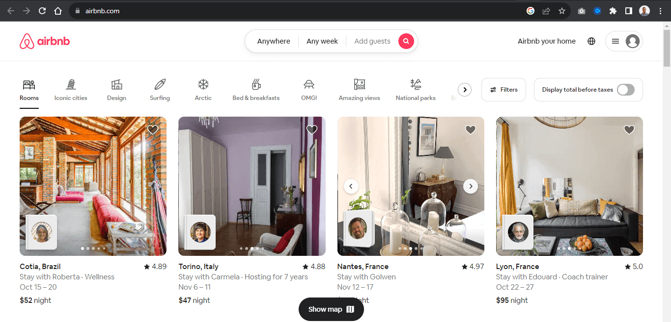
A slide in a carousel moves horizontally in sequential order; each slide rotates one at a time and hides to provide space for the next slide.
Once again, from the Airbnb website, each slide moves horizontally when the slider control is clicked on, revealing the next slide.
Users can directly interact with each slide by using the carousel controls. These controls enable the user to move the slides back and forth. Some carousels enable the keyboard or drag to scroll to move each slide within its slide container.
The carousel typically displays once the page loads, while the "slide picker controls" indicate which slide is displayed.
We can also see the same method replicated on the Motorola website, where each slide showcases the organization's products as an ad. These types of carousels are banner carousels.
Components of Carousels
Before discussing why accessibility matters, here are the parts of a carousel. Carousel slides are content in the form of a slide. Each slide displays different content and loops one after the other.
To ensure a good user experience, carousels typically have controls that enable users to navigate around the carousel content, known as slides. The controls also indicate which side (content) is currently on display.
The following examples are controls or slide controls that can be implemented when creating a carousel element.
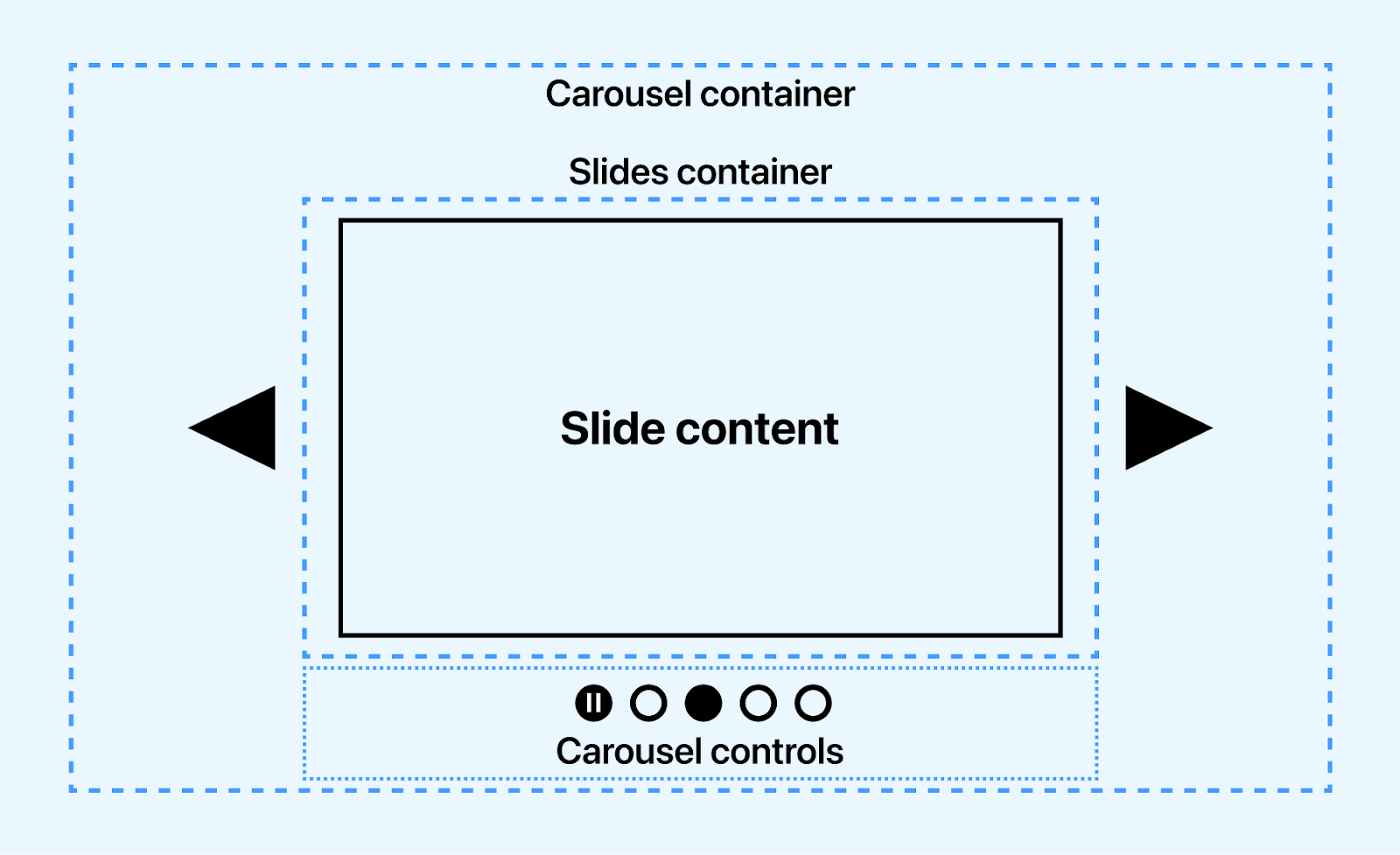
- Previous slide controls - This is a button element with a left arrow icon for navigating the slides back in sequence.
- Next slide controls - This is a button element with a right arrow icon for navigating the slides forward in sequence.
- Slide picker controls - These are small groups of button elements, usually at the base of the carousel. These buttons mainly do two things, one of which is to indicate which slides are currently on display and to navigate to a specific slide without using the slide controls.
- Pause/play controls - This control button controls the play and pause state of the carousel slides. This is mainly seen in the carousel displayed when the page loads.
- Slide - A slide is the individual items that displays in sequence. However, a slide is not a control but can be implemented as a control for drag events, where users can drag a slide to review the next slide.
The Toyota landing page shows how to trigger the animation play state using the play and pause button.
To improve user interaction, keyboards such as spacebars, taps, and arrow keys can be a good control source.

Note: Test carousels for accessibility across 3,000+ browser and OS combinations. Try TestMu AI Now!
Why are Accessible Carousels Needed?
Accessible carousels are very much needed to provide instructions to visually impaired users to enable them to navigate carousel elements on the web page. According to WHO, at least 2.2 billion people have a near or distance vision impairment.
Accessible carousels are needed for multiple reasons:
- They enable visually impaired users to identify components/controls that make up the carousel.
- Assistive technology tools such as screen readers, text-to-speech, and refreshable braille display software reads aria Roles, States, and Properties as audible text to visually impaired users. This helps visually impaired users understand how the carousel works and how to use it.
- Accessible carousels are also necessary for compliance with accessibility standards such as WCAG 2.2 and Section 508.
- With accessible carousels, visually impaired users can navigate carousel components using voice input software and keyboard navigation with the help of accessibility.
- Carousel content can be paused with carousel control by users distracted by frequent movement of the content to enable them to listen to carousel content.
- Visual-impaired users can determine the state of the carousel if it's pressed, disabled, checked, or hidden.
Accessible carousels generally provide good semantics in the form of audio/speech for visually impaired users. This helps to determine the landmark area the carousel occupies and its role, its content, and how to navigate it on the web page.
Are Carousels Good for Accessibility?
Despite being implemented across multiple sites by web developers, Carousels have numerous associated issues, which we will split into two parts.
Interactivity
A carousel shows one slide at a time, so later slides are easy to miss, and every slide has to be reachable without waiting for the rotation.
Put the most important content on the first slide, and make sure users can reach the rest with the controls.
However, to increase the chance of interactivity,
- Consider reducing the number of slides to a maximum of four.
- Captivating headline titles and images can significantly impact click-through rates.
- Content should contain a single idea as it helps users understand what each slide presents.
Keep each slide focused on one message so users understand it quickly.
Accessibility
Accessible carousels involve ensuring all users can access the content on each slide and navigate each slide via the slider controls.
However, for visually impaired users, screen-readers, and text-to-speech software (assistive technology tools) are relied upon to report the right content or information to the users. For instance, animated slides with pause/play control can display multiple shows within a slide without proper use of WAI-ARIA Roles, States, and Properties. The screen reader can report this as multiple slides instead of showing within a slide or as a plain HTML tag.
Let's take the Toyota homepage as an example.
From the Toyota homepage, the first slide has two shows that display before the next slide is displayed. At the bottom left corner is a pause /play control for pausing or playing each show within the slide. Without proper WAI-ARIA for labeling, this might not get the right accessible result from screen readers.
Accessibility plays an excellent role for visually impaired users, and assistive technology tools help convey digital content on the web to visually impaired users by speech synthesis (Text-to-Speech) TTS. For example, when a user clicks or interacts with web elements, the screen readers extract the content and report it as an audible speech.
For assistive technology tools to be effective or detect content, several factors have to be implemented, such as the following.
- Alternative text - Mainly referred to as alt text, alternative text is HTML attributes used to write descriptive text to describe the image or content provided within the HTML tag. This attribute is used for content such as images, videos, audio, logos, and web icons. They are helpful for Google search engines and assistive technology tools like screen readers.
<img src="https://www.example.com/images/sky" alt="Blue Sky" />
<h1>This is a top level 1 heading</h1>
<p>This is a paragraph text</p>
<button>Click here </button>
- Captions - The <figcaption> element gives an image a visible description that every user can read. It is different from media captions, which make the audio of a video available to deaf and hard of hearing users.
<figure>
  		<img src="https://www.example.com/images/sky" alt="Blue Sky" />
  		<figcaption>A beautify picture of blue sky</figcaption>
</figure>
In the next section, we will see the role of WAI-ARIA in building accessible carousels.
Role of WAI-ARIA in Creating Accessible Carousels
The WAI-ARIA, which stands for Web Accessibility Initiative - Accessible Rich Internet Applications, is a specification developed by W3C to provide semantic meaning to assistive technology tools such as screen readers for ensuring content on the web are interpreted the way they function and appear on the web.
For example, visually impaired users cannot see the carousel on the web or interact with the carousel directly, so the WAI-ARIA Roles, States, and Properties are used by developers to provide additional text based information on the HTML tags that describe what the carousel actually means or how the carousel controls functions.
This enables screen readers to read WAI-ARIA Roles, States, and Properties as audible speech back to visually impaired users as it enables them to navigate and use the website the way it was intended by the developer.
When the HTML document is loaded on the DOM by the User Agent, it creates a parallel structure called an accessibility tree, which is made up of accessibility objects. The accessible objects provide information on the HTML markup based on the Roles, States, and Properties of WAI-ARIA.
Following are the WAI-ARIA Roles, States, and Properties that can be implemented to create accessible carousels:
- Roles - The role defines what an element is. The W3C carousel pattern uses a region or group with aria-roledescription="carousel" and an aria-label for the container, and role="group" with aria-roledescription="slide" and a label such as "2 of 3" for each slide. Do not use role="main" on a carousel: a page has one main landmark, and it belongs to the primary content.
- States - The State defines the current condition of the element. For example, we can add a aria-disabled to a disabled button to inform the screen reader to read it as a disabled button.
- Properties - The Properties provide more descriptive information about the element or content on the web page for screen readers. For example, the aria-describedby can be used to describe the content of the carousel slides for screen readers.
Remember that the Roles, States, and Properties are meant to be read as audible speech and do not have or add any functionality to the carousel or web elements.
Techniques to Build Accessible Carousels
Several crucial steps are important when building an accessible carousel. This step ensures that all carousel components are accessible, making it easy for visually impaired users to navigate.
How a carousel is structured, or functions should not prevent it from being accessible. The following techniques illustrate how to create accessible carousels.
Auto-Rotation
Auto-rotation carousels are very common in websites today. This type of carousel can also be called a banner carousel, mainly used to display ads that run as soon as the page loads and continues to auto-rotate.
To improve and make the auto-rotating carousel accessible, a few important steps must be taken.
Auto-rotation can distract people with attention and cognitive disabilities and moves content before some users finish reading it. WCAG 2.2 Success Criterion 2.2.2 Pause, Stop, Hide (Level A) requires a way to pause, stop, or hide any moving content that starts automatically, lasts more than five seconds, and appears alongside other content.
- WAI-ARIA Roles, States, and Properties - These should be implemented to indicate to screen readers that the carousel has an auto-rotation state.
- Rotation control - Add a button labeled "Stop slide rotation" that changes to "Start slide rotation" when pressed, and make it the first control in the carousel's tab order.
- Stop on hover and focus - The W3C carousel pattern stops rotation while the pointer is over the carousel and when keyboard focus enters it, and does not restart after focus unless the user presses the rotation control.
- Live region - Set aria-live="off" on the slide container while it rotates and aria-live="polite" when it does not, so screen readers do not announce every automatic change.
Visibility
For visually impaired users, visibility means the carousel components are well labeled with the appropriate WAI-ARIA Roles, States, and Properties. This helps to improve the accessibility nature of the carousels.
Here are other aspects that should be considered:
- Hidden elements should have a WAI-ARIA state to indicate the element is hidden or disabled.
- Carousel components should be labeled according to their functions. This makes it easily accessible.
- Buttons with SVGs as content should be labeled and assigned an accessible role to make it accessible to visually impaired users.
- Overflow content should be hidden to make it easy to navigate the carousels.
- All carousel components should be responsive and easy to navigate on mobile, tablet, and desktop.
- Buttons, slides, slider picker controls, play/pause state buttons, and other carousel components should be implemented and labeled accordingly to make them accessible.
Structure, Semantic, and Labeling
Websites require good structure and semantic tags to make websites responsive, SEO friendly, and easy to navigate. This is because browsers can quickly load and render well-structured and semantic websites on the screen.
However, visually impaired users rely heavily on the accessibility of the WAI-ARIA Roles, States, and Properties to determine the structure and semantics of the websites.
In this case, good use of WAI-ARIA should be implemented on semantic tags to let users know which element holds the carousel and which elements are its controls.
<section aria-roledescription="carousel" aria-label="Featured products">
        <button aria-label="Previous slide"></button>

        <div class="slides" aria-live="polite">
            <!-- Slides -->
        </div>
        <button aria-label="Next slide"></button>
</section>
Landmarks should be implemented to make sections or groups of elements on the page accessible. For example, the main, aside, form, section, article, and div elements can be assigned relevant landmarks that explicitly state their role in the element.
The WAI-ARIA role attribute adds a landmark or widget role where no native HTML element fits.
Now, let's see a hands-on demonstration of building accessible carousels.
What Do CSS Carousels Change for Accessibility?
CSS carousels move the slide markers and the arrow buttons out of JavaScript and into CSS, so the browser generates those controls and their focus order. The CSS Overflow Module Level 5 features shipped in Chrome 135.
- Scroll markers - ::scroll-marker generates one marker per slide, so slide picker controls come from the scroller itself instead of hand-written buttons.
- Scroll buttons - ::scroll-button generates the previous and next controls and disables each one when the scroller reaches that end.
- Scroll snapping - scroll-snap-type: inline mandatory on the scroller, with scroll-snap-align: center on each slide, keeps one slide in view at a time.
- interactivity: inert: removes off-screen slides and the links inside them from the focus order, which is the defect most hand-built carousels ship with.
- Scroll-state queries - a scroll-state container query styles the slide that is currently snapped, so the active state no longer needs a JavaScript class toggle.
Screen reader support is still catching up. Chrome 140 added counter support in alt text, fixed a disabled ::scroll-button state that screen readers did not announce, and fixed a bug that reported every ::scroll-marker as selected. Automatic roles for a scroll-marker-group have not shipped, so you still declare the WAI-ARIA roles yourself.
MDN lists ::scroll-marker as limited availability, which means the feature is not Baseline and does not work in every widely used browser. Keep the WAI-ARIA carousel described above as the base and treat the CSS version as progressive enhancement.
Demonstration: Building Accessible Carousels
In this blog section on accessible carousels, we will look at various kinds of carousels and how to implement them in your software projects regarding accessibility as specified in the previous examples. To demonstrate the creation of accessible carousels, we will take three popular carousel examples.
Product Carousels
Product carousels are one of the most common carousels and can be seen on major e-commerce platforms such as Amazon, eBay, Walmart, Best Buy, and Apple Store. They are beneficial in cases where collections or groups of products are to be displayed on the website for easy navigation by the users.
Here is a simple use case from the Apple Store. Each product is grouped based on the product's items.
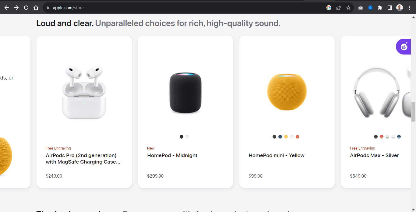
A simple example below shows how to implement a group of product items as carousels.
Example:
From the example above, the carousel contains nine images, each image split into three groups called view. Each view contains similar products.
For example, the first view is a display of Apple HomePod, the next is a display of Apple AirPods, and the last is the Apple 15 display.
This example is most useful when we want to display the same kinds of products or items simultaneously and enable users to navigate around different items from similar types in a roll.
HTML:
<div class="group">
<section class="carousel" aria-roledescription="carousel" aria-label="Featured accessories">

    <button type="button" id="backward" class="btn disabled" aria-label="Previous slide">
        <svg xmlns="http://www.w3.org/2000/svg" viewBox="0 0 24 24" width="30" height="30" class="main-grid-item-icon" fill="none"      stroke="currentColor" stroke-linecap="round" stroke-linejoin="round" stroke-width="2">
        <polyline points="15 18 9 12 15 6" />
        </svg>
    </button>

    <section class="carousel-sub" tabindex="0" aria-label="Product slides">
    <!-- View 1 -->
    <section class="img-wrapper" id="view1" role="group" aria-roledescription="slide" aria-label="1 of 3">
        <span role="img" aria-label="HomePod, AirPods, or select Beats product">
            <img src="https://user-images.githubusercontent.com/78242022/274978352-f0fc35e2-652b-428d-927f-09bf61805dbf.jpeg" alt="HomePod, AirPods, or select Beats product">
        </span>
        <span role="img" aria-label="HomePod - Midnight">
            <img src="https://user-images.githubusercontent.com/78242022/274980258-9f84204f-197f-4e0b-8c0e-5a9511f1db53.jpeg" alt="HomePod - Midnight">
        </span>
        <span role="img" aria-label="HomePod mini - Yellow">
            <img src="https://user-images.githubusercontent.com/78242022/274982370-6c49ff19-7f72-43f0-9592-1861a506fec2.jpeg" alt="HomePod mini - Yellow">
        </span>
    </section>


    <!-- View 2 -->
    <section class="img-wrapper" id="view2" role="group" aria-roledescription="slide" aria-label="2 of 3">
        <span role="img" aria-label="AirPods Max - Silver">
            <img src="https://user-images.githubusercontent.com/78242022/274973852-afb2d3d0-2748-4612-a07a-b0f583c9d9b7.jpeg" alt="AirPods Max - Silver">
        </span>

        <span role="img" aria-label="AirPods (3rd generation) with Lightning Charging Case">
            <img src="https://user-images.githubusercontent.com/78242022/274973882-7cef7964-66fd-470f-8d5b-e8b3837ffcc9.jpeg" alt=" AirPods (3rd generation) with Lightning Charging Case">
        </span>

        <span role="img" aria-label="Beats Studio Buds + True Wireless Noise Cancelling Earphones">
            <img src="https://user-images.githubusercontent.com/78242022/274973892-a5bdc3c6-ea67-46e2-b8cc-57f9a4f068a2.jpeg" alt="Beats Studio Buds + True Wireless Noise Cancelling Earphones in Transparent, with Beats logo, above convenient charging case.
TransparentBlack / GoldIvoryCosmic SilverCosmic Pink">
        </span>
    </section>


    <!-- view 3 -->
    <section class="img-wrapper" id="view3" role="group" aria-roledescription="slide" aria-label="3 of 3">
        <span role="img" aria-label="iPhone 15 Pro FineWoven Case with MagSafe - Taupe">
            <img src="https://user-images.githubusercontent.com/78242022/274990709-1e3c4882-778f-49bd-9814-b940648ea4eb.jpeg" alt="iPhone 15 Pro FineWoven Case with MagSafe - Taupe">
        </span>
        <span role="img" aria-label="iPhone FineWoven Wallet with MagSafe - Black">
            <img src="https://user-images.githubusercontent.com/78242022/274990706-ecafd3a0-4a95-4c50-a6f5-69386c548be2.jpeg" alt="iPhone FineWoven Wallet with MagSafe - Black">
        </span>
        <span role="img" aria-label="iPhone 15 FineWoven Case with MagSafe - Pacific Blue">
            <img src="https://user-images.githubusercontent.com/78242022/274990700-6d29a925-9e2a-487f-96c9-7decc3f4fb37.jpeg" alt="iPhone 15 FineWoven Case with MagSafe - Pacific Blue">
        </span>
    </section>
</section>

    <button type="button" id="forward" class="btn" aria-label="Next slide">
    <svg xmlns="http://www.w3.org/2000/svg" viewBox="0 0 24 24" width="30" height="30" class="main-grid-item-icon" fill="none" stroke="currentColor" stroke-linecap="round" stroke-linejoin="round" stroke-width="2">
    <polyline points="9 18 15 12 9 6" />
    </svg>
</button>
</section>

<!-- Buttons -->
<div class="picker-wrapper">
    <a href="#view1" class="picker-control active" role="link" aria-label="slide picker control"></a>
    <a href="#view2" class="picker-control" role="link" aria-label="slide picker control"></a>
    <a href="#view3" class="picker-control" role="link" aria-label="slide picker control"></a>
</div>

</div>
From the code above, the entire code is wrapped inside a single div tag of group.
The carousel is split between elements:
- Buttons - The previous and next buttons contain only SVG icons, so each one gets an aria-label ("Previous slide" and "Next slide") that gives it an accessible name. A native <button> already has the button role, so role="button" is not needed.
- Section - The < section > element is a wrapper for each "view" of the carousel items. This makes it easy to style and position each view one at a time
- < a > - The < a > element, which is implemented as picker-control , is placed at the bottom of the carousel for easy navigation of each carousel view within its container.
Here are the changes to make the carousel more accessible:
- Button - The < buttons > elements take a role and aria-label attributes. This is useful in cases where the content of the button element is an SVG icon and not an actual text. Providing a role="button" of aria-label="backward" makes the buttons more accessible for screen readers.
- Carousel container - The outer <section> takes aria-roledescription="carousel" and aria-label="Featured accessories", following the W3C carousel pattern. The label names the content and does not repeat the word carousel, because the role description already announces it.
- Slides - Each img-wrapper section takes role="group", aria-roledescription="slide", and a position label such as "1 of 3". The scrolling container takes tabindex="0" so keyboard users can scroll it, and every image keeps descriptive alt text.
- aria-describedby - This attribute takes the ID of another element, not the description text itself. Putting text inside it, as an earlier version of this demo did, gives the image no accessible description at all.
Together, these attributes let screen readers announce the carousel, the current slide, and the purpose of each control.
CSS:
*, *::before, *::after {
        margin: 0;
        padding: 0;
        box-sizing: border-box;
    }

    :root {
        --bg-color: rgb(229 231 235);
        --font: calibri;
        --shadow: 0 4px 6px -1px rgb(0 0 0 / 0.1), 0 2px 4px -2px rgb(0 0 0 / 0.1);
    }

    body {
        background-color: var(--bg-color);
        width: 100vw;
        height: 100vh;
        display: flex;
        justify-content: center;
        align-items: center;
    }

    .carousel {
        width: 100%;
        margin: 0 auto;
        display: flex;
        justify-content: center;
        align-items: center;
    }

.carousel-sub {
   width: 70%;
   display: flex;
   overflow-x: scroll;
   scroll-behavior: smooth;
 }

 .img-wrapper {
    transition: all 0.5s ease;
 }

 .carousel .img-wrapper {
     display: flex;
     gap: 20px;
     padding: 10px;
     flex: 0 0 100%;
 }

    .carousel .img-wrapper img {
        width: 100%;
        height: 100%;
        aspect-ratio: 1 /1;
        filter: grayscale(100%);
        transition:transform 0.5s;
        border-radius: 10px;
        box-shadow: var(--shadow);
    }

    .carousel-sub::-webkit-scrollbar {
        display: none;
    }

    .btn {
        display: flex;
        justify-content: center;
        align-items: center;
        border:none;
        width: 50px;
        height: 50px;
        background-color: rgba(0,0,0,.23);
        border-radius: 100%;
        cursor: pointer;
        transition: background 0.5s ease;
    }

    .btn:hover {
        background-color: rgba(0,0,0,.5);
    }

    svg{
        display: block;
    }

    .btn svg {
        stroke: #fff;
    }

    .carousel .img-wrapper img:hover {
        filter: grayscale(0);
        cursor: pointer;
        transform: scale(1.1);
    }

    /* picker-wrapper */
    .picker-wrapper {
        display: flex;
        justify-content: center;
        gap: 1em;
    }

    /* Slide Picker Control */
    .picker-control {
        display: inline-block;
        width: 20px;
        height: 20px;
        background-color: rgba(0,0,0,.23);
        border-radius: 100%;
        transition: all 0.5s ease;
    }

    .picker-control:hover {
        background-color: rgba(0,0,0,.5);
    }

    .active {
        background-color: rgba(0, 0, 0, 0.7);
    }

    .disabled {
        transform: scale(0);
        transition: transform 0.5s ease;
    }
JavaScript:
const carousel = document.querySelector(".carousel-sub"),
            backwardBtn = document.querySelector("#backward"),
            forwardBtn = document.querySelector("#forward");

        const carouselViews = document.querySelectorAll('.img-wrapper')
        const pickerControls = document.querySelectorAll('.picker-control');

        backwardBtn.addEventListener("click", function(e){
            const size = document.querySelector('.carousel-sub').clientWidth;
            carousel.scrollLeft -= `${size}`;

            let i = 0;
            let arr = [...pickerControls];
            let lastIndex = arr.length -1;

            if(carousel.scrollLeft === 0) {
                backwardBtn.classList.add('disabled');
                forwardBtn.classList.remove('disabled')

                arr[i].classList.add('active')
                arr[1].classList.remove('active')
            }

            else if(carousel.scrollLeft >= 0){
                arr[1].classList.add('active')
                arr[lastIndex].classList.remove('active')

                forwardBtn.classList.remove('disabled')
                backwardBtn.classList.remove('disabled')
            }
        })

        // The forward button for navigating backward
        forwardBtn.addEventListener("click", function(e){
            const size = document.querySelector('.carousel-sub').clientWidth;
            carousel.scrollLeft += `${size}`;

            let i = 0;
            let arr = [...pickerControls];
            let lastIndex = arr.length -1;

            if(carousel.scrollLeft === 0){
                arr[i].classList.remove('active')
                arr[1].classList.add('active')
                backwardBtn.classList.remove('disabled')

            }

            else if(carousel.scrollLeft >= 0){
                arr[1].classList.remove('active')
                arr[lastIndex].classList.add('active')
                forwardBtn.classList.add('disabled')
            }
        })

        // Carousel Element
        carousel.addEventListener("wheel", function(){
            e.preventDefault();
            carousel.scrollLeft += e.deltaY;
            carousel.style.scrollBehavior = "auto";
        })

        // add active class to picker control

        function eventHandler(index) {
            carouselViews.forEach((view, i)=>{
                pickerControls[i].classList.remove('active')
            })
            pickerControls[index].classList.add('active')
        }

        carouselViews.forEach((view, i)=>{
            pickerControls[i].addEventListener('click', ()=>{
                eventHandler(i)
            })
        })
From the code example above, the code snippet performs the following functions;
- The carousel variable is attached to an addEventListener method that listens for the mouse scroll wheel. This enables the carousel to scroll when a user scrolls the mouse wheel.
- The forwardBtn variable is attached to an addEventListener method that listens for a click and takes a callback function with a preventDefault() method and scrollLeft property that scrolls the carousel to 900px width when the user clicks the button.
- The backwardBtn variable behaves the same way as the forwardBtn variable, but the scrollLeft property is set to minus 900px. This moves the carousel slides backward.
- The eventHandler methods remove and add active classes.
- The carouselViews is attached to a forEach method that loops through each element (view) of the carouselViews. Then each element of the pickerControls takes an addEventListener of click that returns a callback function of eventHandler.
This enables the slider to add an active class to the pickerControl element to indicate the active element based on the user's click.
Banner Carousels
Banner carousels are types of carousels found primarily on e-commerce platforms. It helps businesses showcase their product in the form of ads.
Unlike other carousels, banner carousels do not require users to navigate through them as they are set to rotate on page load.
The banner carousel sits typically on top of the page and rotates continuously, one slide at a time. For example, a simple banner carousel from eBay sits on top of the site and displays different types of ads in a slideshow manner.
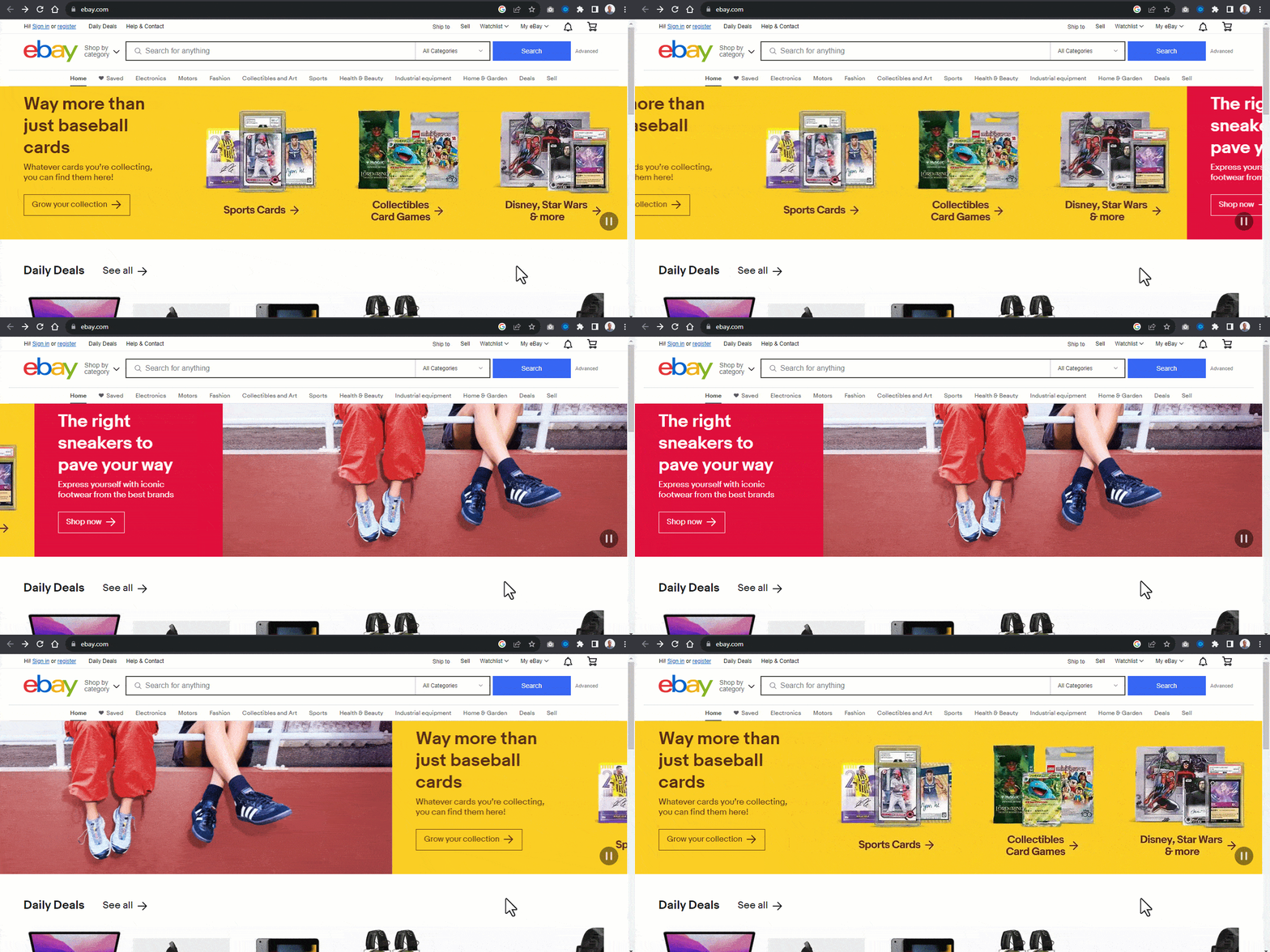
Here, we can see how products are categorized and displayed as ads.
Now, let's see how to implement a banner carousel. The below example shows how this is done.
From the code sample above, we have three image carousels, each occupying the browser viewport.
Beside these carousel image slides are the Previous Slide Control and Next Slide Control buttons for navigating the image slides back and forth.
Below the image slide are the Slide Picker Controls for navigating to a specific part of the page. Each picker control is set to a background-color of gold for determining which slide is currently active.
HTML:
<!DOCTYPE html>
<html lang="en">
<head>
    <meta charset="UTF-8">
    <meta name="viewport" content="width=device-width, initial-scale=1.0">
    <title>Banner Carousel</title>
    <link rel="stylesheet" href="main.css">
</head>
<body>
    <main>
        <article>
            <button id="rotationBtn" class="rotation-Btn">Stop slide rotation</button>
            <!-- Image Slides -->
            <section aria-roledescription="carousel" aria-label="Promotions">
                <div class="image-slides" id="groupImages" tabindex="0" aria-live="off">
                    <div id="imageOne" class="image I-one" role="img" aria-label="A14 Bionic rockets past other smartphone chip iPhone 12 pro">
               <img src="https://user-images.githubusercontent.com/78242022/273443252-b034e050-3d70-48ef-9f0f-2d77ef9b2604.jpg" alt="">
                    </div>

                    <div id="imageTwo" class="image I-two" role="img" aria-label="Calling people easier than ever. Microsoft smartwatch">
                        <img src="https://user-images.githubusercontent.com/78242022/273443248-130249b5-87b7-423d-9281-48d810bcd30d.jpg" alt="">
                    </div>

                    <div id="imageThree" class="image I-three" role="img" aria-label="Re-Imagine Optical Excellence with canon DSLR camera">
                        <img src="https://user-images.githubusercontent.com/78242022/273443251-9c210d6f-35ba-4861-885e-9b2e684ab339.jpg" alt="">
                    </div>
                </div>
            </section>

             <!-- Slider control buttons -->
            <aside>
                <div class="slider-controls">
                    <button id="rightBtn" class="right-Btn icon-btn" aria-label="Next slide"></button>
                    <button id="leftBtn" class="left-Btn icon-btn" aria-label="Previous slide"></button>
                </div>
            </aside>

            <!-- Slide Picker Controls -->
            <aside>
                <div class="picker-controls">
                    <a href="#imageOne" class="picker active" aria-label="Show slide 1"></a>
                    <a href="#imageTwo" class="picker" aria-label="Show slide 2"></a>
                    <a href="#imageThree" class="picker" aria-label="Show slide 3"></a>
                </div>
            </aside>
        </article>
    </main>
<script src="main.js"></script>
</body>
</html>
The code above includes semantic HTML elements, Roles, and ARIA attributes to provide structure and information for assistive technologies.
The lang attribute and page <title> tell screen readers which language to use and what the page is, and the ARIA attributes describe the carousel and its controls.
- Carousel region - The slides sit in a <section> with aria-roledescription="carousel" and aria-label="Promotions". The earlier version used role="banner", which is reserved for the site header landmark.
- Image Slides - Each <div> with class image has role="img" and an aria-label that describes the slide, so screen readers announce it as one image with a name.
For example, the first slide is announced as "A14 Bionic rockets past other smartphone chip iPhone 12 pro."
- Rotation and slider buttons - The first button in the carousel stops and starts rotation, and its text changes between "Stop slide rotation" and "Start slide rotation". The icon-only previous and next buttons get aria-label names.
- Slide Picker Controls - Each picker link gets an aria-label such as "Show slide 2", because an empty link has no accessible name. The class active marks the current slide.
Rotation behavior: The JavaScript rotates the slides every 5 seconds instead of every second, stops while the pointer is over the carousel, stops when keyboard focus enters it, and restarts only when the user presses the rotation button. It also switches the slide container between aria-live="off" while rotating and aria-live="polite" when stopped, as the W3C carousel pattern recommends.
CSS:
*, *::after, *::before {
    padding: 0;
    margin: 0;
    box-sizing: 0;
}

*,*::before, *::after {
    padding: 0;
    margin: 0;
    box-sizing: border-box;
}

main {
    display: grid;
    align-items: center;
    width: 100vw;
    height: 100vh;
}

.image-slides {
    width: 100vw;
    height: 50%;
    display: flex;
    overflow-x: auto;
    scroll-behavior: smooth;
}

.image {
    flex: 0 0 100vw;
    height: 100%;
    background-repeat: no-repeat;
    background-position: center center;
    background-size: cover;
    box-shadow: 0 20px 25px -5px rgb(0 0 0 / 0.1), 0 8px 10px -6px rgb(0 0 0 / 0.1);
    overflow: hidden;
}

.image > img{
    width: 100%;
    height: 100%;
    object-fit: cover;
}

.slider-controls {
    display: flex;
}

.right-Btn, .left-Btn {
    background: none;
    border: none;
    width: 3em;
    height: 6em;
    padding: 2em 10px;
    display: block;
    cursor: pointer;
    background-position: center center;
    background-repeat: no-repeat;
    background-size: 3em;
    position: absolute;
    bottom: 45%;
    z-index: 6;
}


.right-Btn {
    background-image:url("data:image/svg+xml,%3csvg xmlns='http://www.w3.org/2000/svg' fill='%23fff' viewBox='0 0 8 8'%3e%3cpath d='M2.75 0l-1.5 1.5 2.5 2.5-2.5 2.5 1.5 1.5 4-4-4-4z'/%3e%3c/svg%3e");
    right: 3em;
}

.left-Btn {
    background-image:url("data:image/svg+xml,%3csvg xmlns='http://www.w3.org/2000/svg' fill='%23fff' viewBox='0 0 8 8'%3e%3cpath d='M5.25 0l-4 4 4 4 1.5-1.5-2.5-2.5 2.5-2.5-1.5-1.5z'/%3e%3c/svg%3e");
    left: 3em;
}

.right-Btn::after, .left-Btn::before {
    content: "";
    width: 100%;
    height: 100%;
    border-radius: 10px;
    background-color: rgba(255, 166, 0, 0.397);
    position: absolute;
    inset: 0;
    transition: background 0.5s linear;
    z-index: 1;
}

.image-slides::-webkit-scrollbar {
        display: none;
    }

.right-Btn:hover::after, .left-Btn:hover::before {
    background-color: rgba(255, 166, 0, 0.568);
}

.picker-controls {
    display: flex;
    justify-content: center;
    gap: 1em;
    transform: translateY(-30px);
}

a {
    text-decoration: none;
    width: 2.5em;
    height: 0.5em;
    background-color: white;
    opacity: 0.5;
    transition: opacity 0.5s ease;
}

a:hover {
    opacity: 1;
}

.active {
    background-color: gold;
    opacity: 1;
}
JavaScript:
const rightBtn = document.querySelector("#rightBtn");
const leftBtn = document.querySelector("#leftBtn");
const imageSlides = document.querySelector(".image-slides");
const images = document.querySelectorAll(".image");

const imageSize = document.querySelector(".image").clientWidth;

const pickerControls = document.querySelectorAll(".picker");

// Control Picker Element
const pickerOne = document.querySelector('[href="#imageOne"]');
const pickerTwo = document.querySelector('[href="#imageTwo"]');
const pickerThree = document.querySelector('[href="#imageThree"]');

rightBtn.addEventListener("click", moveForward);
leftBtn.addEventListener("click", moveBackward);

function moveForward(e) {
  imageSlides.scrollLeft += `${imageSize}`;

  if (imageSlides === 0) {
    pickerTwo.classList.add("active");
    pickerOne.classList.remove("active");
  }

  else if (imageSlides.scrollLeft === 1366) {
    pickerThree.classList.add("active");
    pickerTwo.classList.remove("active");
  }

  else if (imageSlides.scrollLeft === 2732) {
    imageSlides.scrollLeft = 0;
    pickerOne.classList.add("active");
    pickerThree.classList.remove("active");
    console.log(imageSlides.scrollLeft);
  }
}

function moveBackward() {
  imageSlides.scrollLeft -= imageSize;
}

// Rotate every 5 seconds, stop on hover and focus, and let users stop or start rotation
const rotationBtn = document.querySelector("#rotationBtn");
const carouselArea = document.querySelector("article");
let timer = null;
let userStopped = false;

function startRotation() {
  if (!timer && !userStopped) {
    timer = setInterval(moveForward, 5000);
    imageSlides.setAttribute("aria-live", "off");
  }
}
function stopRotation() {
  clearInterval(timer);
  timer = null;
  imageSlides.setAttribute("aria-live", "polite");
}

rotationBtn.addEventListener("click", () => {
  userStopped = !userStopped;
  rotationBtn.textContent = userStopped ? "Start slide rotation" : "Stop slide rotation";
  userStopped ? stopRotation() : startRotation();
});
carouselArea.addEventListener("mouseenter", stopRotation);
carouselArea.addEventListener("mouseleave", startRotation);
// Keyboard focus stops rotation until the user presses the rotation button
carouselArea.addEventListener("focusin", (event) => {
  if (!event.target.matches(":focus-visible")) return;
  userStopped = true;
  rotationBtn.textContent = "Start slide rotation";
  stopRotation();
});

startRotation();

// activating Active Links on Control Picker
function returnActiveLink(index) {
  images.forEach((image, i) => {
    pickerControls[i].classList.remove("active");
  });
  pickerControls[index].classList.add("active");
}

images.forEach((image, i) => {
  pickerControls[i].addEventListener("click", () => {
    returnActiveLink(i);
  });
});
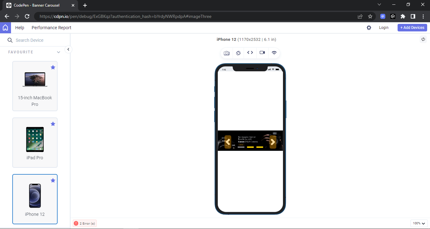
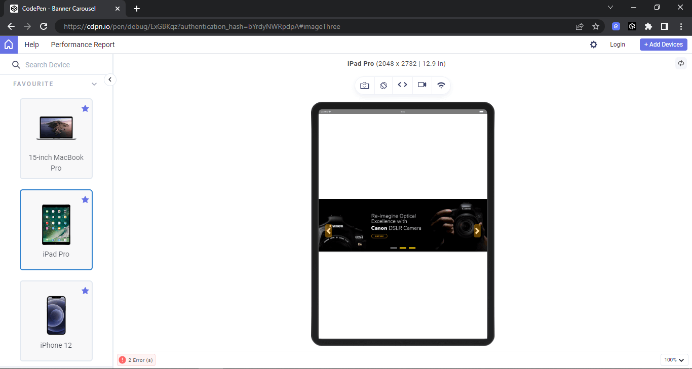
From the browser output above, the carousel is set to 100 viewport width on the desktop and positioned to the middle of the page. Shown below is the output on LT Browser on different screen sizes. This will help to check how banner carousels perform in terms of responsiveness on different device viewports like desktops, mobiles, and tablets.
LT Browser is a free, Chromium-based browser for web developers to help them build, test, and debug their websites and web applications across various pre-installed device viewports. It's a desktop application that offers a variety of features to make responsive testing easier and more efficient.
Here are some of the key features of LT Browser:
- 50+ pre-installed device viewports - You can test your website on a variety of popular devices, including smartphones, tablets, laptops, and desktops, without having to manually configure each one.
- Live interactive testing - You can interact with your website in real-time as you test it on different devices, making it easy to identify and fix any issues.
- Network throttling - You can simulate different network conditions, such as slow 4G or offline, to see how your website performs under different circumstances.
- Screenshot and bug reporting - You can easily take screenshots of your website on different devices and report bugs directly to your project management tool.
- Integrations with popular tools - LT Browser integrates with various tools, such as Jira, Asana, Trello, GitHub, ClickUp, Slack, and Microsoft Teams.
Desktop Preview:
Mobile Preview:
Tablet Preview:
Testimonial Carousels
Adding testimonials to your web page is a great way to instill confidence in a user about your product. This can quickly be done by creating a simple HTML mockup and CSS styling that displays the testimonials on the page.
However, there are cases where there are many testimonials to display. In this case, the testimonials can be implemented as a carousel that displays several testimonials from a single view. For example, Hashnode uses sample slide animation testimonials to display to the users on the home page.
Similar examples can also be seen on CodeSandbox.
Now, let's see how to implement the above cases on a web page.
Example:
The example above shows how multiple elements can be implemented as a carousel that animates horizontally across the page.
The element animation-iteration-count is set to infinite to enable the animation sequence to keep repeating itself. In contrast, the animation-play-state is set to run to keep the animation going.
However, each animation is set to pause on hover to stop it from running. This is very useful as it lets users pause the animation and read the testimonials.
HTML:
<!DOCTYPE html>
<html lang="en">
<head>
    <meta charset="UTF-8">
    <meta name="viewport" content="width=device-width, initial-scale=1.0">
    <title>Testimonial Carousel</title>
    <link rel="stylesheet" href="main.css">
</head>
<body>
        <button id="motionBtn" aria-pressed="false">Pause testimonials</button>
    <main class="main">
        <aside class="card-group g1" role="region" aria-roledescription="carousel" aria-label="Customer testimonials, row 1">
            <!-- Card One -->
            <section class="card c1">
                <p class="text">
                    Awesome job you did there <em>@testmuai</em> with the LT Browser. It's doing a fantastic job at responsive testing 🔥 see more >
                </p>
                <div>
                    <span class="s1">
                        <img src="https://user-images.githubusercontent.com/78242022/272654602-6b6c4303-587d-48ae-957a-3b88496f1fcc.png" alt="">
                    </span>
                    <span class="s2">
                        <h4>Mbaziira Ronald</h4>
                        <p class="at">@MbaziiraRonn</p>
                    </span>
                </div>
            </section>

            <!-- Card Two -->
            <section class="card c1">
                <p class="text">Amazing Test software. I am very satisfied, I think it is excellent software and as the years go by it continues to offer the best service I have ever tried....see more ></p>
                <div>
                    <span class="s1">
                        <img src="https://user-images.githubusercontent.com/78242022/272654585-d0774fd3-5d90-42f0-bc53-7141f7735825.png" alt="">
                    </span>
                    <span class="s2">
                        <h4>Elias M.</h4>
                    </span>
                </div>
            </section>

            <!-- Card Three -->
            <section class="card c1">
                <p class="text">Anyone who needs to test their code on different platforms try <em>@testmuai</em> Great service from this company!</p>
                <div>
                    <span class="s1">
                        <img src="https://user-images.githubusercontent.com/78242022/266013776-40ac50f1-31f8-4250-acb2-05f16d683baa.png" alt="">
                    </span>
                    <span class="s2">
                        <h4>Stephan Smuts</h4>
                        <p class="at">spsmuts</p>
                    </span>
                </div>
            </section>

            <!-- Card Four -->
            <section class="card c1">
                <p class="text">See how <em>@testmuai</em> is #Futureready to enable blazing-fast test orchestration seamlessly integrated with organizations' existing CI/CD platforms, using #Microsoft Azure.</p>
                <div>
                    <span class="s1">
                        <img src="https://user-images.githubusercontent.com/78242022/272654608-d291d9df-439c-4a79-83b1-2f2d71cd25b5.png" alt="">
                    </span>
                    <span class="s2">
                        <h4>Microsoft India</h4>
                        <p class="at">@MicrosoftIndia</p>
                    </span>
                </div>
            </section>

            <!-- Card Five -->
            <section class="card c1">
                <p class="text">Amazing Experience. That reduces a large amount of cost as well as manhours which can be used for other better things. In our team we have integrated lambdatest with our automation CI/CD pipeline, this shows how we trust <em>@testmuai</em>...see more >.</p>
                <div>
                    <span class="s1">
                        <img src="https://user-images.githubusercontent.com/78242022/272654585-d0774fd3-5d90-42f0-bc53-7141f7735825.png" alt="">
                    </span>
                    <span class="s2">
                        <h4>Padma kumar M.</h4>
                    </span>
                </div>
            </section>

             <!-- Card Six -->
            <section class="card c1">
                <p class="text"><em>@testmuai</em> Efficient and User-Friendly Cross-Browser Testing with LambdaTest...see more ></p>
                <div>
                    <span class="s1">
                        <img src="https://user-images.githubusercontent.com/78242022/266013732-785b0223-9774-4918-964f-ce75f11138f2.png" alt="">
                    </span>
                    <span class="s2">
                        <h4>Ravi Kanth G.</h4>
                    </span>
                </div>
            </section>
        </aside>

        <!-- Group 2 -->
        <aside class="card-group g2" role="region" aria-roledescription="carousel" aria-label="Customer testimonials, row 2">
            <!-- Card One -->
            <section class="card c1">
                <p class="text">Thank you <em>@testmuai</em> for providing free open source license to run the web and mobile tests of our open source projects for free on Lambdatest platform.</p>
                <div>
                    <span class="s1">
                        <img src="https://user-images.githubusercontent.com/78242022/266013783-757ea2d1-e396-4d56-ade8-8b641f78ce71.png" alt="">
                    </span>
                    <span class="s2">
                        <h4>Mohammad Faisal Khatri</h4>
                        <p class="at">@faisalkhatri</p>
                    </span>
                </div>
            </section>

            <!-- Card Two -->
            <section class="card c1">
                <p class="text">Super top notch customer support from <em> @testmuai</em> - just throwing it out there if you're looking for a decent browser testing platform, they get my full double thumbs up. Thumbs upThumbs up :-) </p>
                <div>
                    <span class="s1">
                        <img src="https://user-images.githubusercontent.com/78242022/266013790-4d674d96-a311-47c3-9b7c-03feaa36c948.png" alt="">
                    </span>
                    <span class="s2">
                        <h4>Ben Pritchard</h4>
                        <p class="at">@yesiamben</p>
                    </span>
                </div>
            </section>

             <!-- Card Three -->
            <section class="card c1">
                <p class="text"><em> @testmuai</em> is fantastic. Cross browser and device testingtesting frustration is minimized. You can't get rid of clients that need ie11 nor can you own every device but lambda test bridge that gap.</p>
                <div>
                    <span class="s1">
                        <img src="https://user-images.githubusercontent.com/78242022/266013776-40ac50f1-31f8-4250-acb2-05f16d683baa.png" alt="">
                    </span>
                    <span class="s2">
                        <h4>Mat Gargano</h4>
                        <p class="at"> @matgargano</p>
                    </span>
                </div>
            </section>

            <!-- Card Four -->
            <section class="card c1">
                <p class="text">second-day using <em> @testmuai</em> and it's already proven itself a lot faster than Cross Browser Testing and BrowserStack, at half the price! bargain</p>
                <div>
                    <span class="s1">
                        <img src="https://user-images.githubusercontent.com/78242022/266013762-54201d6a-0923-4969-948c-790dec804253.png" alt="">
                    </span>
                    <span class="s2">
                        <h4>Matthew Bryson</h4>
                        <p class="at"> @mbrysonuk</p>
                    </span>
                </div>
            </section>

            <!-- Card Five -->
            <section class="card c1">
                <p class="text">Really superb customer service from Arpit <em>@testmuai</em> tricky Automation problem using Selenium in Python and they talked me through it and got me up-and-running. Awesome.</p>
                <div>
                    <span class="s1">
                        <img src="https://user-images.githubusercontent.com/78242022/266013745-c09f21ff-cb29-49df-9110-d5e90810b5b9.png" alt="">
                    </span>
                    <span class="s2">
                        <h4>Michael (Mike) Horne</h4>
                        <p class="at">@recantha</p>
                    </span>
                </div>
            </section>

            <!-- Card Six -->
            <section class="card c1">
                <p class="text"><em>@testmuai</em> can I just say, your support team are first class. I had the pleasure of talking with Prateek Singh. He went the extra mile and nothing was too much trouble. Clearly your support is also very technically adept, something which I really value. Thank you!</p>
                <div>
                    <span class="s1">
                        <img src="https://user-images.githubusercontent.com/78242022/266013732-785b0223-9774-4918-964f-ce75f11138f2.png" alt="">
                    </span>
                    <span class="s2">
                        <h4>Timothy Wintle</h4>
                        <p class="at"> @timwintle1979</p>
                    </span>
                </div>
            </section>
        </aside>

        <!-- Group 3 -->
         <aside class="card-group g3" role="region" aria-roledescription="carousel" aria-label="Customer testimonials, row 3">
            <!-- Card One -->
            <section class="card c1">
                <p class="text">Also I recommend using <em> @testmuai</em> for testing out in all the devices. I am personally using it for my MERN project testing as well.</p>
                <div>
                    <span class="s1">
                        <img src="https://user-images.githubusercontent.com/78242022/272654599-4bc5d6e9-da64-47fd-83ae-4cbf109fed16.png" alt="">
                    </span>
                    <span class="s2">
                        <h4>Masroor Ejaz</h4>
                        <p class="at">@MasroorEjaz</p>
                    </span>
                </div>
            </section>

            <!-- Card Two -->
            <section class="card c1">
                <p class="text">Checkout LambdaTest -<em>@testmuai</em> Perform manual or automated cross browser testing on 3000+ browsers online. Deploy and scale faster with the most powerful cross browser test... see more ></p>
                <div>
                    <span class="s1">
                        <img src="https://user-images.githubusercontent.com/78242022/272654591-2bc192b0-9c97-4fbf-a55c-e60791acc4c6.png" alt="">
                    </span>
                    <span class="s2">
                        <h4>Dev Tools</h4>
                        <p class="at">@finddevtools</p>
                    </span>
                </div>
            </section>

            <!-- Card Three -->
            <section class="card c1">
                <p class="text">Browser for Designers & UI Developers Need to Test your App on Multiple Devices ? 🤔 Meet LT Browser by <em>@testmuai</em> See more ></p>
                <div>
                    <span class="s1">
                        <img src="https://user-images.githubusercontent.com/78242022/272654594-c037ce6e-6fdc-42f9-a4f6-07419089b689.png" alt="">
                    </span>
                    <span class="s2">
                        <h4>Satyam Anand</h4>
                        <p class="at">@IncodeSatx</p>
                    </span>
                </div>
            </section>

            <!-- Card Four -->
            <section class="card c1">
                <p class="text">Quick way to test IE and MAC OS specific issues. Ability to spawn an instance within seconds and start working instantly....see more ></p>
                <div>
                    <span class="s1">
                        <img src="https://user-images.githubusercontent.com/78242022/272654625-985aaf83-2f72-4a57-9eb3-10fbe52d8413.png" alt="">
                    </span>
                    <span class="s2">
                        <h4>Syed Haroon P.</h4>
                    </span>
                </div>
            </section>

            <!-- Card Five -->
            <section class="card c1">
                <p class="text">Really superb customer service from Arpit <em>@testmuai</em> </em> tricky Automation problem using Selenium in Python and they talked me through it and got me up-and-running. Awesome.</p>
                <div>
                    <span class="s1">
                        <img src="https://user-images.githubusercontent.com/78242022/266013745-c09f21ff-cb29-49df-9110-d5e90810b5b9.png" alt="">
                    </span>
                    <span class="s2">
                        <h4>Michael (Mike) Horne</h4>
                        <p class="at">@recantha</p>
                    </span>
                </div>
            </section>

            <!-- Card Six -->
            <section class="card c1">
                <p class="text"><em>@testmuai</em> #TestMuConf 2023 has been interesting so far with lots of quality sessions with industry experts sharing from their wealth of knowledge and experience... Thank you LambdaTest for hosting this conference... see more ></p>
                <div>
                    <span class="s1">
                        <img src="https://user-images.githubusercontent.com/78242022/272654627-1536d3df-c0f2-414c-b631-0bd1159db223.png" alt="">
                    </span>
                    <span class="s2">
                      <h4>WALIU ANUOLUWAPO SANNI</h4>
                        <p class="at">@WALIUANUOLUWAPOSANNI</p>
                    </span>
                </div>
            </section>
        </aside><!-- End of Group 3 -->
    </main>
<script>
    const motionBtn = document.querySelector("#motionBtn");
    motionBtn.addEventListener("click", () => {
        const paused = document.body.classList.toggle("paused");
        motionBtn.setAttribute("aria-pressed", String(paused));
        motionBtn.textContent = paused ? "Play testimonials" : "Pause testimonials";
    });
</script>
</body>
</html>
From the code sample above, the element is broken down into six cards, and each six cards is divided into three groups.
- Cards - Each testimonial is a plain paragraph with the person's name in an <h4>. The earlier version set aria-label="4" on each heading, which made screen readers announce every name as "4", and put aria-label on paragraphs, where ARIA does not allow it.
- Rows and motion - The cards are split into three rows, each a labeled region with aria-roledescription="carousel". A Pause testimonials button with aria-pressed stops the scrolling animation for keyboard and mouse users, and a prefers-reduced-motion media query turns the animation off for users who ask their system to reduce motion.
CSS:
*, *::after, *::before {
    padding: 0;
    margin: 0;
    box-sizing: 0;
}

body{
    background-color: #EEF5FF;
    overflow-x: hidden;
}

.main {
    width: 100vw;
    height: 100vh;
    display: grid;
    place-items: center;
}

.card-group{
   display: flex;
   gap: 1em;
}

.card {
    width: 445px;
    height: fit-content;
    padding: 15px 30px;
    box-shadow: 0 1px 3px 0 rgba(0,0,0,.1), 0 1px 2px 0 rgba(0,0,0,.06);
    -webkit-user-select: none;

    user-select: none;
    cursor: pointer;
    border-radius: 10px;
    border: 1px solid #aaaaaa;

    transform: translate(-1800px);

        animation-name: moveforward;
        animation-iteration-count: infinite;
        animation-timing-function: linear;
        animation-duration: 10s;
        animation-play-state: running;
}

.g1 .card, .g3 .card {
    transform: translate(1800px);
    animation-duration: 20s;
    animation-name: movebackword;
}

.g1:hover .card {
    animation-play-state: paused;
}

.g2:hover .card {
    animation-play-state: paused;
}

.g3:hover .card {
    animation-play-state: paused;
}
.paused .card {
    animation-play-state: paused;
}
@media (prefers-reduced-motion: reduce) {
    .card { animation: none; transform: none; }
}


.card .text {
    font: 14px Arial;
    color: #4a4a4a;
    line-height: 21px;
}

.card h4 {
    font: 16px Arial;
    font-weight: 600;
    color: black;
}

.card .at {
    font: 16px Arial;
    font-weight: 400;
    color: #0056b3;
    margin-top: 4px;
}

.card img {
    width: 50px;
    height: 50px;
    border-radius: 50px;
}

.card div {
    display: flex;
    margin: 10px 0 0;
    gap: 10px;
}
em {
    font-style: normal;
    color: #0056b3;
}

@keyframes moveforward {
    0%{
        transform: translateX(0);
    }
    100%{
        transform: translateX(-1800);
    }
}

@keyframes movebackword {
    0%{
        transform: translateX(0);
    }
    100%{
        transform: translateX(1800);
    }
}
In the next section of this article, we will look at how to ensure accessible carousels by performing accessibility testing.

How to Test the Accessibility of Carousels?
Ensuring accessible carousels requires screen readers to test different page sections. This is very useful when a carousel element with WAI-ARIA is implemented on each component, such as buttons, slides, slider picker controls, containers, etc.
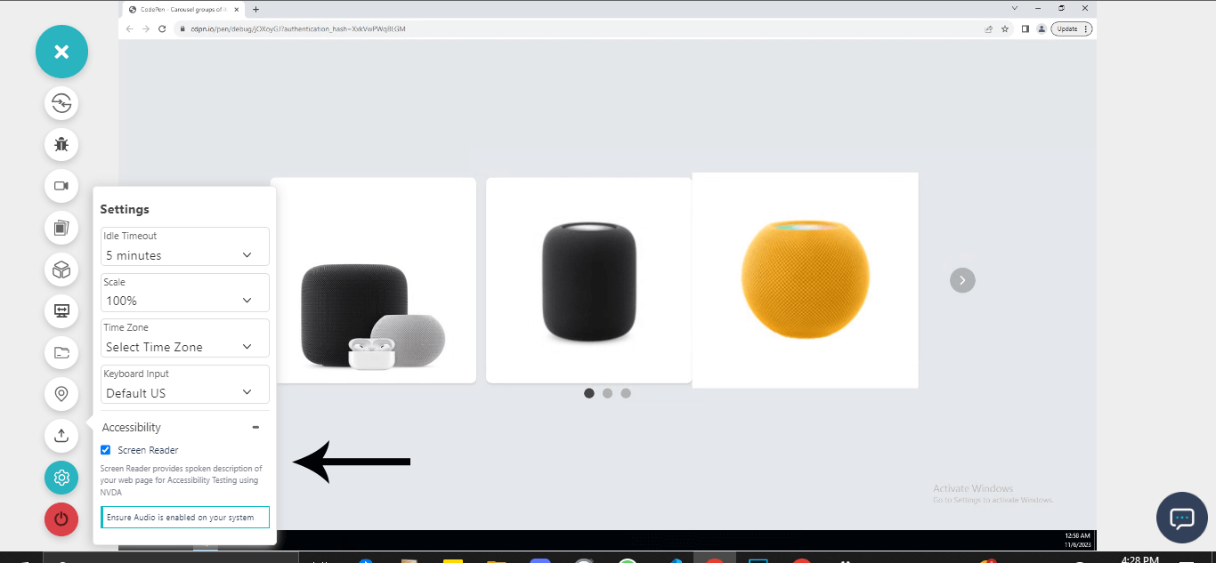
To test how screen readers read the specified WAI-ARIA Roles, States, and Properties defined on the carousel elements, you can leverage cloud-based accessibility testing platforms to ensure accessible carousels on different combinations of browsers and operating systems.
AI-powered test orchestration and execution platforms like TestMu AI offer accessibility testing of websites and web apps on over 3000+ real browsers and OSes.
We use the TestMu AI screen reader feature on Real Time Browser Testing to run accessibility checks. This will read the WAI-ARIA Roles, States, and Properties specified on the element as audible text, giving the same user experience as a visually impaired user.
Check out the tutorial below that explains how to test websites in Real Time on the TestMu AI platform.

Subscribe to the TestMu AI YouTube Channel to catch up with the latest videos on Selenium testing, automation testing, and more.
To make sure the carousels are accessible to all users, there are a few best practices that must be followed. Let's look at some of the best practices to create accessible carousels.
Audit of the demos in this guide - On September 30, 2026, I extracted the three demos above into standalone pages and ran axe-core against the WCAG 2.0, 2.1, and 2.2 Level A and AA rules in Chrome on the TestMu AI cloud, plus keyboard and motion checks that automated rules cannot make. The earlier versions of these demos failed:
| Demo | Failures in the earlier version | Fix now in the code above |
|---|---|---|
| Product carousel | Image role with no accessible name (aria-describedby held text, not an ID); scrollable region not keyboard focusable | aria-label on the image, tabindex="0" on the scroller, slide groups, container label |
| Banner carousel | Rotated every 1 second with no way to stop it (SC 2.2.2); 2 buttons and 3 links with no accessible name; 3 images with no name; no lang or title; scroller not focusable | 5-second rotation with a stop and start button, stop on hover and keyboard focus, names on every control, lang and title |
| Testimonial carousel | 26 text elements at 3.62:1 contrast (#007bff on #EEF5FF, below 4.5:1); infinite animation with no keyboard pause; headings announced as "4"; two main landmarks; no lang or title | #0056b3 text, Pause testimonials button, reduced-motion support, plain headings, labeled regions, lang and title |
After the fixes, axe-core reported no WCAG A or AA violations on any of the three demos, only best-practice notes that a standalone demo page has no h1. In the banner, a mouse click and a keyboard Tab to the rotation button both stopped rotation, and Enter restarted it. Automated scans cannot judge whether the labels make sense when read aloud, so still check each carousel with a screen reader.
Best Practices for Accessible Carousels
To ensure carousels are well implemented, we can consider the following best practices.
- Easy navigation - Ensure that the carousel slides are easily navigated by implementing navigation controls and control pickers.
- Image quality and bold text - Quality images with bold text should be implemented to encourage users to click through the slides.
- Reduce the number of slides - Avoid multiple carousel slides to maximize engagement.
- Design consistency - Ensure all elements, slides, and navigation controls, maintain consistent style in appearance such as height, width, colors, fonts, etc.
- Avoid autoplay sounds - Ensure sounds are disabled to prevent unpleasant sounds. Users should be given the option to enable sounds for a better experience.
- Semantics - To ensure that carousels are compatible across multiple browsers, developers should write well-semantic mockups and use the appropriate WAI-ARIA Roles, States, and Properties when implementing accessible features on mockups.
- Performance tracking and analytics - Track the performance of the carousel to understand how users interact with each carousel component.
- Fallback options via vendor prefixes - Vendor prefixes such as -webkit-, -moz-, and -ms- just to mention a few, should be used on properties that require vendor prefixes to work well. This will help create a good fallback for legacy browser versions.
Adequate testing should be implemented to ensure the carousel components, such as previous slide control, next slide control, slide picker controls, and pause/play control, are rendered correctly on different browsers for a better user experience.
Conclusion
Build carousels on the W3C carousel pattern: a labeled region with aria-roledescription, labeled slide groups, named controls, and a rotation button that users can reach first, then test with automated rules, the keyboard, and a screen reader. The demos in this guide failed WCAG checks until those fixes went in. TestMu AI Accessibility Testing runs axe-core based WCAG scans with element-level fix guidance and lets you check pages with a screen reader on real browsers, and the accessibility testing documentation covers setup.
Note: AI assistance was used in researching and drafting this article. Rahul Mishra (Lead Member of Technical Staff at TestMu AI, expertise in accessibility testing and WCAG compliance) verified every statistic, link, and standards reference against primary sources before publication, and Shubham Soni reviewed it for accessibility and WCAG accuracy. Standards cited are from the W3C (WCAG 2.2 and the WAI-ARIA Authoring Practices), and the demo audit results come from a real axe-core run. Read our editorial process and AI use policy for details.
Author

Rahul Mishra
Blogs: 17

Rahul Mishra is a Lead Member of Technical Staff at TestMu AI (formerly LambdaTest), leading frontend engineering and accessibility testing across the quality engineering platform. He mentors frontend engineers, runs code reviews and sprint planning, optimizes React.js rendering performance, and makes product features accessible to users with disabilities through WCAG and ADA-compliant accessibility audits. He brings 10+ years of experience across React.js, VueJS, TypeScript, Swift, Objective-C, and AWS, with earlier work as a Technical Lead at VectoScalar Technologies. Rahul holds a B.E. in Information Technology.
Reviewer

Shubham Soni
Reviewer
Shubham Soni is a Senior Member of Technical Staff at TestMu AI (formerly LambdaTest), building the Real Device Cloud and real-time testing infrastructure. He optimized the WebRTC services that power live testing to sub-100ms latency with adaptive bitrate streaming, led a frontend migration from Angular to React that cut page load time from 5-6 seconds to 1-1.5 seconds, and contributes to the official Device SDK. He led a team of four to build an accessibility testing product covering manual and automated testing and mentored a team of six on a real-time testing product. He brings over eight years of experience and earlier scaled a cloud code platform to 200K+ monthly users. Shubham holds a B.Tech in Computer Science.


Accessible Carousels FAQs
Did you find this page helpful?
More Related Blogs
TestMu AI forEnterprise
Get access to solutions built on Enterprise
grade security, privacy, & compliance
- Advanced access controls
- Advanced data retention rules
- Advanced Local Testing
- Premium Support options
- Early access to beta features
- Private Slack Channel
- Unlimited Manual Accessibility DevTools Tests