
Test Your Website on Real Desktop and Mobile Browsers
Run live and automated cross browser tests on Chrome, Safari, Firefox, and Edge across 3,000+ browser-OS combinations. No setup, no device lab.

CSS Grid Best Practices + 5 Copy-Paste Templates [2026]
CSS Grid best practices from minmax(0, 1fr) to subgrid and source order, tested in Chrome, Firefox and WebKit, plus 5 copy-paste templates with phone fallbacks.
Last Updated on:
A holy grail layout with two 12rem sidebars looks fine on a laptop. On a 375px phone screen, the same CSS squeezed the main column to 70px and made the page about 486px wide in Chrome, Firefox and WebKit, while a check at 1280px showed nothing wrong.
The HTTP Archive Web Almanac 2022 CSS chapter found CSS Grid on 12% of pages in 2022, up from 2% in 2019.
Each practice below pairs the CSS with its measured result in three browser engines, and where a pattern broke, the fix sits next to the numbers. The copy-paste CSS Grid templates at the end already include those fixes.
Key Takeaways
The most important CSS Grid best practices are sizing tracks with fr and minmax(), giving long content a minmax(0, 1fr) column, and using subgrid to align nested items. Choose explicit or implicit grids on purpose, keep the visual order identical to the HTML order for keyboard users, and test each layout at phone and desktop widths.
- Responsive columns: repeat(auto-fill, minmax(200px, 1fr)) changes the column count with the container width, giving 1, 3 and 6 columns at 375, 768 and 1280px in Chrome, Firefox and WebKit. Media queries needed: no.
- Long content in fr columns: A bare 1fr track never shrinks below its content, so a 98-character code line split a 768px grid into 862px and 52px columns; minmax(0, 1fr) kept both columns at 376px.
- Explicit grids: grid-template-columns defines a fixed structure for components with a known shape, such as pricing cards, and a min() track minimum stops a 300px card from overflowing a 375px phone screen.
- Implicit grids: grid-auto-rows sizes the rows the browser adds for dynamic content; with minmax(300px, auto), a tall product card grew its row to 478px while the next row stayed at 300px.
- Named grid areas: grid-template-areas makes page layouts readable, and grid-template-rows: auto 1fr auto keeps the header and footer at content height inside a full-height container.
- Source order and keyboard focus: Keyboard Tab navigation follows the HTML order, not the visual grid order, in Chrome, Firefox and WebKit; reading-flow: grid-rows changes that in Chrome only.
- Nested grids: Any grid item can become a grid container with display: grid, and the nested grid sizes its tracks independently of the parent grid.
- Subgrid: grid-template-rows: subgrid makes nested cards share the parent grid row tracks, so titles, text and buttons line up. Supported in Chrome, Firefox and Safari: yes, since September 2023.
- Container queries: A component grid that responds to its container showed 1 column in a 288px sidebar and 3 columns in a 960px main area of the same page.
- Grid with Flexbox: Grid sets the rows and columns of a card layout, and Flexbox inside each card puts every Read more link on the same line within a row.
- Cross-browser layout testing: CSS Grid layouts can break at a single width, such as 375px; TestMu AI SmartUI layout comparison flags shifted or collapsed columns between builds while ignoring text and color changes.
- Copy-paste templates: Five layouts (auto-fit cards, holy grail, 12-column, sidebar and dense gallery) ship with phone fallbacks. Media queries needed: no for the card grid and gallery, yes for the other three.
What Are CSS Grid Best Practices?
CSS Grid best practices are habits that keep a grid flexible on every screen, readable in the stylesheet and usable with a keyboard or screen reader. They cover how you size tracks, structure and place items, keep source order intact, nest grids, combine Grid with Flexbox and test the result in more than one browser.
If you are new to the syntax, start with the CSS Grid guide; the practices below assume you know display: grid and grid-template-columns.
Every measurement below comes from rendering the printed CSS on TestMu AI's automation cloud at viewport widths of 375, 768 and 1280px. The browsers were Chrome 154 and Firefox 151 on Windows 11 and Playwright's WebKit 26.5 build, the engine behind Safari, on macOS Sequoia (builds 108342041 and 108342171). Unless a sentence says otherwise, all three engines returned the same values.
Use Flexible Units for Grid Track Sizes
Fixed pixel tracks keep their width on every screen, so they overflow narrow viewports and leave gaps on wide ones. The fr unit shares the free space between tracks, minmax() sets a lower and an upper bound for each track, and repeat() with auto-fill creates as many tracks as fit the container.
.cards-container {
  display: grid;
  grid-template-columns: repeat(auto-fill, minmax(200px, 1fr));
  gap: 1rem;
}
With eight cards, this rule gave 1 column at 375px, 3 columns of 245.33px at 768px and 6 columns of 200px at 1280px.
auto-fill and auto-fit only behave differently when there are not enough items to fill a row. With two cards at 1280px, auto-fill kept six 200px tracks and left four of them empty, while auto-fit collapsed the empty tracks and stretched each card to 632px. The CSS Grid repeat() function guide covers both keywords in depth.
Give Long Content a minmax(0, 1fr) Track
A bare 1fr carries a hidden minimum. The CSS Grid Layout Module Level 1 specification says an fr value outside minmax() implies an automatic minimum, minmax(auto, 1fr), so the track never shrinks below its widest unbreakable content.
In a 768px viewport, a 98-character line inside a pre element stretched the first 1fr column to 862px in Chrome and Firefox and 944px in WebKit, and squeezed the second column to 52px. The page scrolled sideways in all three. A 0 minimum fixes it:
/* Before: 1fr means minmax(auto, 1fr), so a long line widens it */
.post {
  display: grid;
  grid-template-columns: 1fr 1fr;
  gap: 1rem;
}

/* After: a 0 minimum lets each column shrink to its share */
.post {
  grid-template-columns: minmax(0, 1fr) minmax(0, 1fr);
}
.post pre {
  overflow-x: auto;
}
With minmax(0, 1fr), both columns measured 376px, and the long line scrolled inside its own box. Use it for any column that can hold code, URLs, tables or long words.
Choose Between Explicit and Implicit Grids
An explicit grid is the set of tracks you define with grid-template-columns and grid-template-rows. An implicit grid is the set of tracks the browser adds when items land outside them, sized by grid-auto-rows and grid-auto-columns.
Explicit Grid
Use an explicit grid for components whose shape you know in advance, such as a row of pricing cards:
.pricing-container {
  display: grid;
  /* min() stops a 300px track from overflowing narrow screens */
  grid-template-columns: repeat(auto-fit, minmax(min(300px, 100%), 1fr));
  gap: 25px;
  margin: 50px;
}
A common version of this pattern uses a plain minmax(300px, 1fr) with justify-content: center. On a 375px screen the 50px margins leave 275px, so the 300px track overflowed its container by 25px, which justify-content split into 12.5px on each side. Wrapping the minimum in min() capped the track at the container width, 275px, with no overflow.
The justify-content: center line did nothing at 768px or 1280px, where the first card sat at the 50px margin, because fr tracks absorb all the free space. It only centers fixed-size tracks: with repeat(auto-fit, 300px), the same three cards started at 165px at 1280px.
Implicit Grid
Use an implicit grid when content arrives at run time and the number of rows is unknown. In the Green Market demo below by Tahera Alam, the Add Product button appends items to the list.
.product-list {
  display: grid;
  grid-template-columns: repeat(auto-fill, minmax(250px, 1fr));
  grid-auto-rows: minmax(300px, auto);
  gap: 1rem;
}
grid-template-columns defines the explicit columns, and grid-auto-rows: minmax(300px, auto) sizes every row the browser adds: at least 300px, and taller when a card needs it. With six products at 1280px (four columns), the row holding one long description grew to 478px and the second row stayed at 300px.
Place Items With Named Areas or Line Numbers
grid-template-areas names the regions of a layout as strings, which keeps page-level layouts readable at a glance. Each element then claims its region with grid-area:
.container {
  display: grid;
  grid-template-areas:
    "header header header"
    "nav    main   sidebar"
    "footer footer footer";
  grid-template-columns: 1fr 3fr 1fr;
  grid-template-rows: auto 1fr auto;
  min-height: 100vh;
}
header { grid-area: header; }
nav    { grid-area: nav; }
main   { grid-area: main; }
aside  { grid-area: sidebar; }
footer { grid-area: footer; }
The grid-template-rows line keeps the header and footer at their content height. Without it, a full-height container split its height evenly between the three auto rows, and the header and footer each grew to a third of an 800px-tall viewport, 266.67px; with auto 1fr auto, both stayed at 42px and main took the rest.
grid-template-columns: 1fr 3fr 1fr sets the proportions explicitly. Without it, the three auto columns followed their content and measured 362px, 566px and 352px at 1280px.
For two or three regions, line-based placement with grid-template-columns is shorter and gives exact control over each track:
.hero {
  display: grid;
  grid-template-columns: 1fr 2fr;
  align-items: center;
  gap: 20px;
  padding: 0 60px;
  min-height: 100vh;
}
At 1280px the columns measured 380px and 760px, the second twice the first after the 60px side padding and the 20px gap. At 375px they shrink to 78px and 157px, so pair a layout like this with a single-column media query for phones.
Keep Visual Order Matching Source Order
Grid placement changes where boxes appear on screen while the document order stays the same. The CSS Grid Layout specification states that authors must use order and the grid-placement properties only for visual, not logical, reordering of content, because keyboard focus and screen readers follow the HTML.
To see the effect, I placed three form fields in reverse with grid-area:
.signup {
  display: grid;
  grid-template-columns: repeat(3, 1fr);
  gap: 1rem;
}
/* DOM order: name, email, phone. Visual order: phone, email, name */
.signup .name  { grid-area: 1 / 3; }
.signup .email { grid-area: 1 / 2; }
.signup .phone { grid-area: 1 / 1; }
The screen showed Phone, Email, Name from left to right, but pressing Tab moved through Name, Email, Phone in all three engines, so keyboard focus traveled right to left, against the reading direction.
The newer reading-flow property changes the reading order of grid items so that focus can follow the visual layout, and MDN lists it as limited availability.
In my runs only Chrome 154 supported it: with the rule below added, Tab went Phone, Email, Name in Chrome, while Firefox 151 and WebKit 26.5 kept the HTML order.
.signup {
  reading-flow: grid-rows;
}
Until it works everywhere, change the HTML order to match the layout instead of rearranging items with grid placement, and treat reading-flow as an extra for Chrome users. The same caution applies to grid-auto-flow: dense, covered with the gallery template below.

Austin Siewert
Co-Founder, Steadfast Systems
Discovered @TestMu AI yesterday. Best browser testing tool I've found for my use case. Great pricing model for the limited testing I do 👏
3M+ Devs and QAs rely on TestMu AI
Deliver immersive digital experiences with Next-Generation Mobile Apps and Cross Browser Testing Cloud

Nest Grids When a Component Needs Its Own Tracks
Nesting grids is fine: any grid item can become a grid container with display: grid. The nested grid sizes its own tracks and knows nothing about the parent grid's columns.
.outer-grid {
  display: grid;
  grid-template-columns: repeat(3, 1fr);
  gap: 20px;
  max-width: 800px;
  margin: 20px auto;
}
.inner-grid {
  display: grid;
  grid-template-columns: repeat(2, 1fr);
  gap: 10px;
}
At 1280px the outer grid's three tracks measured 253.33px each, and the inner grid split one of them into two 121.67px tracks. When nested items must line up with the parent's rows or columns, use subgrid instead.
Use Subgrid to Align Nested Content
Cards in a row rarely have titles of equal length, so their text and buttons start at different heights. Subgrid lets each card adopt the parent grid's row tracks, so the tallest title in a row sets the title row for every card:
.cards {
  display: grid;
  grid-template-columns: repeat(3, 1fr);
  gap: 1rem;
}
.card {
  grid-row: span 3; /* title, text, button */
  display: grid;
  grid-template-rows: subgrid;
}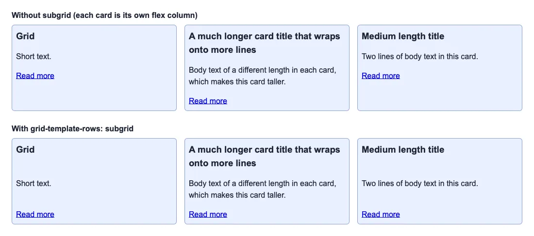
Without subgrid, the long title pushed its card's text 28px below the other cards at 1280px, and 56px below at 768px, where the title wrapped onto three lines. With grid-template-rows: subgrid, the text and link rows matched across all three cards.
MDN's subgrid guide lists the feature as widely available across browsers since September 2023, and notes that a subgrid inherits the parent's gap and line names.
For a longer walkthrough, read what CSS subgrid is and why you need it, and check per-version support in the CSS subgrid browser support guide.
Use Multiple Grids on One Page
A page does not need one master grid. Give the page shell its own grid and each component an independent grid, so a change to one section leaves the others alone. Nikki Pantony's demo below splits a one-page layout into sections, each with its own grid.
Container queries let a component grid respond to the space it gets rather than to the viewport:
.page {
  display: grid;
  grid-template-columns: 18rem 1fr;
  gap: 2rem;
}
.product-panel {
  container-type: inline-size;
}
.product-panel .grid {
  display: grid;
  gap: 1rem;
}
@container (min-width: 600px) {
  .product-panel .grid { grid-template-columns: repeat(3, 1fr); }
}
At 1280px, the same product panel showed one column in the 288px sidebar and three columns in the 960px main area. The CSS container queries guide covers the syntax, and a 12-column CSS grid works well as the page shell.
Combine Grid With Flexbox
Grid handles two dimensions, rows and columns at once; Flexbox handles one. A common split is Grid for the card layout and Flexbox inside each card. This grid starts at one column and switches to two at 500px and four at 850px:
.grid-container {
  width: 90%;
  max-width: 1240px;
  margin: 0 auto;
  display: grid;
  grid-template-columns: 1fr;
  gap: 20px;
}
@media (min-width: 500px) {
  .grid-container { grid-template-columns: repeat(2, 1fr); }
}
@media (min-width: 850px) {
  .grid-container { grid-template-columns: repeat(4, 1fr); }
}
Each card is a flex column, and its article element fills the leftover height with flex: 1, so justify-content: space-between pushes the last element, a Read more link, to the bottom:
.card {
  display: flex;
  flex-direction: column;
}
.card article {
  display: flex;
  flex: 1;
  flex-direction: column;
  justify-content: space-between;
  padding: 20px;
}
The grid produced 1, 2 and 4 columns at 375, 768 and 1280px, and in every row the Read more links shared one baseline even though the text above them differed in length. For when to reach for each tool, see CSS Grid vs Flexbox.
Test CSS Grids Across Browsers and Viewports
Most grid bugs in this guide appeared at one width only. The holy grail and 12-column templates looked identical at 768px and 1280px and broke at 375px, so a single desktop check would have passed both.
The three engines agreed on almost every track size. These are the places where they did not:
| Check | Chrome 154, Windows 11 | Firefox 151, Windows 11 | WebKit 26.5, macOS Sequoia |
|---|---|---|---|
| 1fr 1fr with a 98-character pre line, 768px | 862px and 52px columns | 862px and 52px columns | 944px and 52px columns |
| Dense gallery tracks, 375px | 176px (15px went to the scrollbar) | 183.5px | 183.5px |
| reading-flow: grid-rows | Supported, Tab follows the grid | Not supported | Not supported |
| display: grid-lanes (native masonry) | Not supported | Not supported | Supported |
The scrollbar row matters near breakpoints: on a tall page, Chrome on Windows reserved 15px for a classic scrollbar, so its content box was 360px wide while Firefox and WebKit kept 375px. An auto-fill grid whose column count sits on the edge can show one column fewer in one browser for that reason alone.
For quick checks while you build, LT Browser, TestMu AI's free desktop browser, previews a page on 50+ device screens side by side, with Chrome DevTools and hot reloading.

To catch layout regressions on every build, TestMu AI's SmartUI visual testing has a layout comparison mode that checks element positions and sizes, grid and flexbox arrangement, and responsive behavior at the breakpoints you define, while ignoring text, colors and image content. A column that shifts or collapses then shows up as a layout difference even when the copy and colors are unchanged.
For per-version support of each grid feature, see CSS Grid compatibility, features and known issues.
Copy-Paste CSS Grid Templates
Each template applies the practices above and includes a phone fallback where the measurements showed one was needed. The table lists what each template produced at three viewport widths, the same in Chrome 154, Firefox 151 and WebKit 26.5.
| Template | 375px | 768px | 1280px | Media query needed |
|---|---|---|---|---|
| Auto-fit card grid | 1 column | 3 columns | 4 columns | No |
| Holy grail | 1 column, stacked | 3 columns, main 352px | 3 columns, main 864px | Yes, at 640px and below |
| 12-column grid | Every span full width | col-4 245px, col-8 507px | col-4 416px, col-8 848px | Yes, at 640px and below |
| Sidebar + content | 1 column | 1 column | 312px sidebar, 936px content | Yes, at 768px and below |
| Dense image gallery | 2 columns | 4 columns | 7 columns | No |
Without their phone fallbacks, the holy grail squeezed main to 70px on a page about 486px wide, and the 12-column grid made a col-4 card 114px wide from 16.58px tracks. If you would rather draw a layout visually, these CSS Grid layout generators export similar CSS.
1. Responsive Auto-Fit Card Grid
Columns wrap with no media query, and min() keeps one card from overflowing a container narrower than 240px. Use it for product cards, blog feeds and image grids.
.card-grid {
  display: grid;
  grid-template-columns: repeat(auto-fit, minmax(min(240px, 100%), 1fr));
  gap: 1.5rem;
}2. Holy Grail Layout
A full-page shell with a header, footer, main content and two sidebars in named areas. At 640px and below it stacks into one column, and main takes the spare height.
.holy-grail {
  display: grid;
  grid-template:
    "header header header" auto
    "nav    main   aside"  1fr
    "footer footer footer" auto / 12rem 1fr 12rem;
  min-height: 100vh;
  gap: 1rem;
}
.holy-grail > header { grid-area: header; }
.holy-grail > nav    { grid-area: nav; }
.holy-grail > main   { grid-area: main; }
.holy-grail > aside  { grid-area: aside; }
.holy-grail > footer { grid-area: footer; }
@media (max-width: 640px) {
  .holy-grail { grid-template:
    "header" "nav" "main" 1fr "aside" "footer"; }
}3. 12-Column Grid
A reusable 12-column system. The minmax(0, 1fr) tracks stop long content from widening a column, and every span stacks to full width at 640px and below.
.grid-12 {
  display: grid;
  grid-template-columns: repeat(12, minmax(0, 1fr));
  gap: 1rem;
}
.col-4 { grid-column: span 4; }
.col-6 { grid-column: span 6; }
.col-8 { grid-column: span 8; }
@media (max-width: 640px) {
  .grid-12 > * { grid-column: 1 / -1; }
}5. Dense Image Gallery
A packed, masonry-style gallery: grid-auto-flow: dense backfills the gaps that wide and tall cells leave behind.
.gallery {
  display: grid;
  grid-template-columns: repeat(auto-fill, minmax(160px, 1fr));
  grid-auto-rows: 160px;
  grid-auto-flow: dense;
  gap: 0.5rem;
}
.gallery .wide { grid-column: span 2; }
.gallery .tall { grid-row: span 2; }Dense packing reorders items on screen. In a test with wide first and third items at 768px, the fourth item moved up into the first row, so the screen read 1, 2, 4, 3 while the DOM order, which Tab and screen readers follow, stayed 1, 2, 3, 4. Keep it to galleries where order carries no meaning.
WebKit 26.5 also reported support for display: grid-lanes, the native masonry layout, while Chrome 154 and Firefox 151 did not. Check the CSS Grid Lanes browser support guide before relying on it.

Note: Open any of these templates in a live session on 3,000+ browser and OS combinations with TestMu AI real-time testing, including Safari on macOS. Try TestMu AI
Conclusion
Paste the auto-fit card grid or the holy grail template into a page you already ship and load it at 375, 768 and 1280px before changing anything else, because 375px is where the holy grail and 12-column patterns broke in these tests. To stop the layout from regressing after that, add a SmartUI snapshot with the layout comparison option, as the SmartUI layout testing docs show for JavaScript, Java, Python, C# and Ruby.
Did your last release break the UI? TestMu AI's SmartUI catches visual regressions by comparing every screen to its baseline.
Author

Shubham Suri
Blogs: 10

Shubham Suri is a Lead Member of Technical Staff at TestMu AI, building the frontend and web interfaces of the quality engineering platform. He works across React.js, HTML5, CSS3, Bootstrap, jQuery, JavaScript, and Angular to create and maintain webpages and web applications. He brings around a decade of experience in web and frontend development, with earlier roles as a Software Engineer at Hard Shell Technologies and an IT Analyst at Cyrus Group. Shubham holds a B.Tech in Computer Science from Uttar Pradesh Technical University.
Reviewer

Isha Vyas
Reviewer
Isha Vyas is a Lead Member of Technical Staff at TestMu AI, building the frontend of the quality engineering platform. She works across React.js, responsive web design, and jQuery to ship and maintain the platform's user-facing web interfaces. She brings nearly seven years of frontend engineering experience at the company, with earlier work as a Software Developer at Mantra Labs. Isha holds a B.Tech in Computer Science from Swami Keshwanand Institute of Technology, Management and Gramothan, Jaipur.


CSS Grid FAQs
Did you find this page helpful?
More Related Blogs





TestMu AI forEnterprise
Get access to solutions built on Enterprise
grade security, privacy, & compliance
- Advanced access controls
- Advanced data retention rules
- Advanced Local Testing
- Premium Support options
- Early access to beta features
- Private Slack Channel
- Unlimited Manual Accessibility DevTools Tests