

Power Your Software Testing with AI Agents and Cloud
The Native AI-Agentic Cloud Platform to Supercharge Quality Engineering. Test Intelligently and Ship Faster.


- TestMu AI (Formerly LambdaTest)
- /
- Blog
- /
- Top 38 CSS Toggle Switches to Try in 2026
Top 38 CSS Toggle Switches to Try in 2026
Explore 38 creative CSS toggle switches to elevate your UI design in 2026. Fully customizable, responsive, and JS-free designs for modern web interfaces.
Last Updated on:
On This Page
- What are CSS Toggle Switches
- Best CSS Toggle Switch Examples
- The Checkbox Toggle Switch
- Cat CSS Toggle Switch
- Physical Button Type CSS Toggle Switch
- Rolling Ball CSS Toggle Switch
- Gender Symbols CSS Toggle Switch
- Accept Cookies CSS Toggle Switch
- Tick-Cross CSS Toggle Switch
- Subscribe With Image And Text CSS Toggle
- Pentagon CSS Toggle Switch
- Slider CSS Toggle Switch
- Ice and Fire CSS Toggle Switch
- Tick-Cross Buttons CSS Toggle Switch
- Overlapping Circles CSS Toggle Switch
- Simple Subscribe Toggle Switch
- Indicator CSS Toggle Switch
- Single Yes-No Toggle
- Folding CSS Toggle Switch
- Sliding Bar CSS Toggle
- Pancake Toggle
- Fireball Toggle
- BB-8 (Beebee-Ate) Toggle
- Sun-Moon Toggle
- Background Switcher Toggle
- Liquid CSS Toggle Button
- Eye Toggle
- Star Wars Toggle
- Totoro Toggle
- Three-State CSS Toggle Switch
- Joystick Toggle Switch
- Bear Toggle Switch
- Smiling Emoji Toggle
- 3D Button Toggle Switch
- On/Off Toggle Switch
- Rolling Ball CSS Toggle Button
- Restless Toggle
- Rocker Switch Toggle
- Glass Switch Toggle
- Emoji-Based CSS Toggle Button
- How to Create a Basic CSS Toggle Switch
- Performing Responsiveness Tests on CSS Toggle Switches
CSS toggle switches are custom-designed toggles created with CSS to replace standard checkboxes. They offer smooth animations and stylish designs, making interactions easier to use and more visually appealing, while boosting user engagement and improving the overall UI/UX.
Key Takeaways
- A CSS toggle switch is an HTML checkbox restyled with CSS to look and act like an on/off switch, used for settings such as dark mode, notifications, and yes or no choices.
- Toggle switches follow checkbox rules, which makes them a fit for binary choices such as Buy or Sell, Yes or No, and Day or Night rather than multi-option selections.
- Building a basic toggle takes three moves: hide the checkbox input with zero width, zero height, and hidden visibility, style the label as the track, then draw the knob with the label::after pseudo-element.
- The sliding animation comes from the input:checked + label:after rule, which moves the knob to the opposite end using left, transform, and a transition duration.
- All 38 toggle designs collected here, from the plain checkbox switch through the BB-8, Totoro, and emoji toggles, run on CSS alone and need no JavaScript.
- A three-state CSS toggle switch cycles through three options using distinct colors, icons, or labels, which takes the pattern past a single on and off pair.
- LT Browser checks toggle switches across 50+ pre-installed device viewports and adds custom resolutions, network throttling, hot reloading, and built-in Google Lighthouse performance reports.
What Are CSS Toggle Switches?
CSS toggle switches are HTML and CSS components that function like on/off switches, styled as modern toggle buttons for controlling settings like dark mode or notifications.
CSS toggle switches are visual components built using HTML and CSS that act like on/off switches. They function like a checkbox but are styled to look like modern toggle buttons. You can use them to control things like dark mode, notifications, or yes/no choices.
Unlike regular checkboxes, toggle switches can be fully customized in terms of size, color, and animation to match your website’s style. There are no strict rules on how they should look or behave, so they’re flexible and can be used in both simple and complex web interfaces.
What Are the Best CSS Toggle Switch Examples?
The best CSS toggle switch examples include checkbox toggles, cat toggles, rolling ball switches, sun-moon toggles, liquid toggles, and themed designs like BB-8 and Star Wars.
Here are some CSS Toggle Switch examples you can explore and even use directly in your own projects.
1. The Checkbox Toggle Switch
A checkbox toggle switch looks like a sliding switch but behaves like a checkbox. It has two states: checked and unchecked, which usually mean on and off. Visually, it gives a modern feel, but underneath, it functions the same as a standard checkbox.
2. Cat Toggle Switch
A cat CSS toggle switch changes its look to show a cat that reflects either a daytime or nighttime theme. This CSS toggle switch uses animations and styling to make the on/off change visually interesting.
4. Rolling Ball Toggle Switch
A rolling ball CSS toggle switch is a type of switch where a small ball or circle slides back and forth to show on and off states. When you toggle it, the ball rolls smoothly from one side to the other, giving a clear visual cue about the switch’s position.
5. Gender Symbol Toggle Switch
A gender symbol CSS toggle switch represents two states, typically for gender selection. Instead of using plain text or shapes, it shows the respective symbols on each side of the switch. When the switch is toggled, it slides from one symbol to the other, indicating the selected option.
7. Tick-Cross Toggle Switch
A tick-cross CSS toggle switch uses a checkmark and a cross to show the two states of the switch. When it’s active, you see a tick; when it’s inactive, you see a cross. This makes it clear whether something is accepted or rejected, enabled or disabled.
8. Subscribe With Image And Text Toggle Switch
A subscribe with image and text CSS toggle shows subscription status. One side might display an image like a bell or envelope with the word “Subscribe,” while the other side changes to something like “Unsubscribed” with a different icon. When toggled, the switch slides or fades between the two states.
9. Pentagon CSS Toggle Switch
A pentagon CSS toggle switch uses a pentagon shape instead of the usual round or rectangular shapes. The switch can change color, rotate, or shift position when toggled to show the on and off states.
10. Slider CSS Toggle Switch
A slider CSS toggle switch is a common switch style where the toggle knob slides horizontally between two positions. One side usually represents “on” and the other “off.” When the user clicks it, the knob smoothly moves from one end to the other, showing a clear change in state.

11. Ice and Fire CSS Toggle Switch
An ice and fire CSS toggle switch uses visual themes to represent two opposite states, cold and hot. One side shows icy colors like blue or white with snowflake icons, while the other side uses warm colors like red or orange with fire symbols.
When toggled, the switch transitions between these two themes using animations and color changes.
13. Overlapping Circles CSS Toggle Switch
An overlapping circles CSS toggle switch uses two circular shapes that partially overlap each other to show two states. When toggled, the active circle comes to the front or shifts position to indicate the selected state.
14. Simple Subscribe Toggle Switch
A simple subscribe toggle switch lets users turn the subscription on or off. It usually looks like a small slider or button that moves between two states, often labeled “Subscribe” and “Unsubscribe” or just “On” and “Off”.
15. Indicator CSS Toggle Switch
An indicator CSS toggle switch shows the current state using a small marker or highlight that moves between two positions. Instead of changing the whole switch, just the indicator moves to show if it’s on or off.
16. Single Yes-No Toggle
A single yes-no toggle is a switch that lets users choose between two clear options: yes or no. It usually has two labels or sides, one saying “Yes” and the other “No,” and a slider or button moves to show which is selected.
17. Folding CSS Toggle Switch
A folding CSS toggle switch uses a folding animation to change between on and off states. When toggled, part of the switch appears to fold or flip, revealing the new state on the other side.
18. Sliding Bar CSS Toggle
A sliding bar CSS toggle switch features a horizontal bar with a knob that slides from one side to the other to indicate on or off. When toggled, the knob moves smoothly along the bar, often accompanied by a color change to show the active state.
19. Pancake Toggle
A pancake toggle is a type of CSS toggle switch that looks like stacked, rounded layers, similar to a stack of pancakes. When toggled, one layer slides or shifts to show the on or off state.
20. Fireball Toggle
A fireball toggle is a CSS toggle switch where the moving part is styled like a fireball. When toggled, the fireball slides from one side to the other, often leaving behind a glowing trail or a burst effect.
21. BB-8 (Beebee-Ate) Toggle
A BB-8 toggle switch is styled after the Star Wars droid BB-8, turning a simple toggle into a themed interaction. The ball-shaped body of BB-8 moves or rolls across the track when the toggle is switched, creating a playful, character-based animation.
22. Sun-Moon Toggle
A sun-moon toggle switch uses symbols of the sun and moon to represent two states for light and dark modes. When toggled, the icon shifts from a sun to a moon or vice versa, often with background color changes to match the theme.
Once you build one, it is worth learning how to test dark mode across browsers, since the toggle and theme can render differently on each engine.
23. Background Switcher Toggle
A background switcher toggle is used to change the background of a page or component between two different styles or themes. When the toggle is activated, the background might shift in color, pattern, or image.
25. Eye Toggle Switch
An eye toggle is a switch to show or hide content, typically passwords or sensitive text. The toggle uses an eye icon that changes appearance when clicked, open for visible, closed or crossed-out for hidden.
26. Star Wars Toggle Switch
A Star Wars toggle is a CSS switch that takes inspiration from the Star Wars universe. It can feature lightsabers, starships, or character icons that move or change when toggled.
27. Totoro Toggle Switch
A Totoro toggle is a CSS switch inspired by the popular figure from Studio Ghibli. The toggle often features Totoro’s face or shape as the moving part, which shifts from one side to another when activated.
28. Three-State CSS Toggle Switch
A three-state CSS toggle switch allows you to cycle through three different options instead of just two. Each state is different, often using different colors, icons, or labels to show what’s currently selected. When the user clicks or taps the toggle, it shifts to the next state in the sequence.
29. Joystick Toggle Switch
A joystick toggle switch mimics the look and movement of a joystick. The switch handle stands upright and can be tilted or nudged to one side to activate a different state. When toggled, the handle shifts position, and the base changes color or lights up to reflect the selected state.
30. Bear Toggle Switch
A bear toggle switch features a bear-themed design where the toggle knob or icon looks like a bear or bear face. When toggled, the bear element moves from one side to the other, often changing expression or color to indicate on and off states.
31. Smiling Emoji Toggle
A smiling emoji toggle uses a smiling face emoji as the toggle indicator to show different states, such as on and off. When toggled, the emoji may change expressions slightly, move across the track, or switch between smiling and neutral faces.
32. 3D Button Toggle Switch
A 3D button toggle switch uses shading, shadows, and highlights to create a three-dimensional look on the toggle button. When toggled, the button appears to press down or pop out, giving a sense of depth and physical interaction.

33. On/Off Toggle Switch
An on/off toggle switch is the basic form of a toggle used to represent two opposite states, usually labeled clearly as “On” and “Off.” The toggle knob slides or snaps between the two ends, and color changes often help indicate which state is active.
35. Restless Toggle Switch
A restless toggle switch is designed to look like it’s always in slight motion, even when not being interacted with. The switch element might wiggle, pulse, or shift subtly to draw attention. When toggled, it snaps to the new state with a more defined movement.
36. Rocker Switch Toggle Switch
A rocker switch toggle mimics the design of physical rocker switches found on hardware devices. It has a pivoting switch body that rocks from one end to the other when toggled, pressing down one side while lifting the other. The change in state is often paired with a color shift or label to show what’s active.
37. Glass Switch Toggle Switch
A glass switch toggle features a design that mimics the look of glass, with translucent surfaces, soft reflections, and subtle highlights. When toggled, the switch can light up or shift in opacity to show its state, often paired with a glowing effect to enhance the glass-like appearance.
Key Takeaway: The 38 examples span three broad intents. Plain binary controls such as the checkbox, slider, sliding bar, and on/off switches handle ordinary settings. Themed designs such as the cat, ice and fire, sun-moon, BB-8, Star Wars, Totoro, and emoji toggles carry personality or signal a mode. Functional variants such as the eye toggle for password visibility, the accept-cookies toggle for consent, and the three-state switch for cycling options extend the pattern past a single on and off pair, and every one of them is built from a checkbox and CSS with no JavaScript.
How To Create A Basic CSS Toggle Switch?
Create a CSS toggle switch by hiding a checkbox input, styling its label as the switch container, and using CSS pseudo-elements with transitions for the sliding knob animation.
Knowing the key elements of web design that go into making a CSS toggle switch and how to combine them is essential to building one effectively.At its core, a toggle switch is simply a checkbox element given a stylish makeover.
Following the rules of a checkbox, toggle switches are ideal for binary choices like “Buy or Sell,” “Yes or No,” “Left or Right,” “Day or Night,” and similar options.
Below is the source code for constructing a checkbox:
<input id="toggle_switch" name="toggle_switch" type="checkbox" />
<label for="toggle_switch"></label>
You must hide the checkbox from the display because people don’t need to see it on the front-end, even though you still need to track its current state for toggling.
<style>
        input[type="checkbox"] {
          width: 0;
          height: 0;
          visibility: hidden;
        }
        </style>
Now, you have an empty web page displayed and a checkbox in the code. Next, you need to design the toggle switch and link it to your checkbox.
The following code will help you get a head start:
label {
        display: block;
        width: 450px;
        height: 150px;
        background-color: #551759;
        border-radius: 100px;
        position: relative;
        cursor: pointer;
        transition: 0.5s;
        box-shadow: 0 0 50px #477a85;
The output of the code looks as follows:
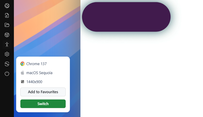
You can design this label in any shape and color you want. Now that you have the toggle boundaries set on your webpage, you’ll want to add a beautiful button that moves from one end to the other.
To create this movable element, you need to understand pseudo-elements. If you want to refresh your knowledge about pseudo-elements and how they work, check out resources like CSS selectors cheat sheets.
The following CSS creates a colored shape inside the label:
label::after {
        content: "";
        width: 120px;
        height: 120px;
        background-color: #cca5cf;
        position: absolute;
        border-radius: 70px;
        top: 15px;
        left: 15px;
        transition: 0.5s;
}
The output would look as follows:
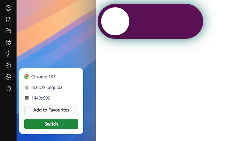
You can mix CSS animation to let the browser know we intend to move this smaller element inside to the other end.
input:checked + label:after {
        left: calc(100% - 15px);
        transform: translateX(-100%);
    }
How to Perform Responsiveness Tests on CSS Toggle Switches?
Test CSS toggle switches across multiple screen sizes using tools like LT Browser, which offers 50+ device viewports, network throttling, and Google Lighthouse performance reports.
Developers can select and use CSS toggle switches that fit their website's design and functionality needs. However, when developing these switches, it's important to ensure they work as expected across various screen sizes, including smartphones, tablets, desktops, and laptops. To achieve a responsive design with toggle switches, running mobile-friendly tests is essential.
To perform responsive testing, you can use tools like LT Browser. It offers a streamlined way to test and debug your CSS toggle switches across 50+ pre-installed device viewports.
It also supports features like custom resolutions, network throttling, hot reloading, built-in Google Lighthouse performance reports, and more.

Subscribe to the TestMu AI YouTube channel for videos on responsive testing.
Conclusion
The above examples demonstrate how adaptable, helpful, and creative toggle switches can be. A CSS toggle switch can make an excellent first impression while also providing users with a useful feature. Leaving aside the styling part, the skeleton is quite simple and is explained in the first section of this post.
After going through these 38 toggle buttons using CSS, they seem simple and easy to construct without involving any JS. If you share similar interests and would like to contribute to this list, please let us know through the comments or on Codepen.
Author

Shubham Soni
Blogs: 9

Shubham Soni is a Senior Member of Technical Staff at TestMu AI (formerly LambdaTest), building the Real Device Cloud and real-time testing infrastructure. He optimized the WebRTC services that power live testing to sub-100ms latency with adaptive bitrate streaming, led a frontend migration from Angular to React that cut page load time from 5-6 seconds to 1-1.5 seconds, and contributes to the official Device SDK. He led a team of four to build an accessibility testing product covering manual and automated testing and mentored a team of six on a real-time testing product. He brings over eight years of experience and earlier scaled a cloud code platform to 200K+ monthly users. Shubham holds a B.Tech in Computer Science.
Reviewer

Isha Vyas
Reviewer
Isha Vyas is a Lead Member of Technical Staff at TestMu AI (formerly LambdaTest), building the frontend of the quality engineering platform. She works across React.js, responsive web design, and jQuery to ship and maintain the platform's user-facing web interfaces. She brings nearly seven years of frontend engineering experience at the company, with earlier work as a Software Developer at Mantra Labs. Isha holds a B.Tech in Computer Science from Swami Keshwanand Institute of Technology, Management and Gramothan, Jaipur.


CSS Toggle Switches FAQs
Did you find this page helpful?
More Related Blogs
TestMu AI forEnterprise
Get access to solutions built on Enterprise
grade security, privacy, & compliance
- Advanced access controls
- Advanced data retention rules
- Advanced Local Testing
- Premium Support options
- Early access to beta features
- Private Slack Channel
- Unlimited Manual Accessibility DevTools Tests