

Power Your Software Testing with AI Agents and Cloud
The Native AI-Agentic Cloud Platform to Supercharge Quality Engineering. Test Intelligently and Ship Faster.


- TestMu AI (Formerly LambdaTest)
- /
- Blog
- /
- CSS fr Unit: A Complete Guide to Fractional Grid Units
CSS fr Unit: A Complete Guide to Fractional Grid Units
Learn how the CSS fr unit divides leftover grid space, how it differs from pixels and percentages, and how minmax controls fractional track sizes.
Last Updated on:
The CSS fr unit divides the leftover space inside a grid container into proportional shares.
A browser subtracts gaps and fixed tracks first, so 250px 1fr 2fr with 20px gaps in a 1000px container sizes both fr tracks from 710px of leftover space.
This guide explains what an fr unit is, how a browser decides the space 1fr gets, why to use fr units, browser compatibility, benefits, the different ways to use them, and how AI tools debug fr layouts.
Key Takeaways
- The CSS fr unit divides the space left inside a grid container into proportional shares, so grid-template-columns: 1fr 2fr 1fr gives the middle column twice the width of each side column.
- A browser subtracts gaps and fixed tracks before dividing what remains among the fr tracks, so a 250px 1fr 2fr layout with 20px gaps in a 1000px container sizes its fr tracks from 710px of leftover space.
- A bare 1fr resolves as minmax(auto, 1fr) and can overflow the grid when content is too wide, while minmax(0, 1fr) removes that automatic minimum and keeps the track at its intended proportion.
- Percentage tracks resolve against the full container instead of the space left after gaps, so repeat(4, 25%) with a 10px gap overflows while repeat(4, 1fr) fits.
- The fr unit is valid only where a grid track is sized, which means grid-template-columns, grid-template-rows, and the grid shorthand accept it while width, flex-basis, and gap do not.
- The CSS fr unit has worked in Chrome, Edge, Firefox, and Safari since October 2017, and MDN records grid-template-columns as Baseline widely available.
What is a CSS fr Unit?
CSS grid layout introduces a unit of measurement known as the fr unit, which adds flexibility to how we handle layout structures. CSS fr units divide the available space into fractions, so you can create layouts responsive to different screen sizes without having to set fixed breakpoints.
The fr unit, short for fraction, distributes available space among elements proportionally. It allows you to divide the available space based on specified fractions, giving each element a share of the total space.
When using the fr unit in the CSS grid layout, you can easily add or remove rows and columns without adjusting their sizes. With the help of CSS fr units, rows, and columns adapt themselves automatically when you add gaps to them.
When you specify a width of 1fr for a grid column or a child element, you establish a proportional relationship within the available space. You can add as many child elements as needed, and the browser automatically handles space distribution.
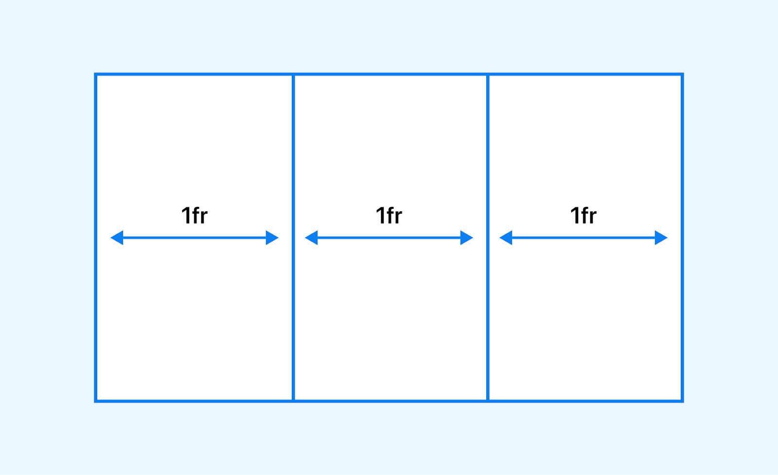
Unlike traditional methods, where you need to calculate and redistribute space for every additional element, CSS fr units simplifies the process.
For instance, if you have a container with a grid template column of 1fr 2fr 1fr, the available horizontal space within the container is divided into four parts.
.grid-container {
  display: grid;
  grid-template-columns: 1fr 2fr 1fr;
}
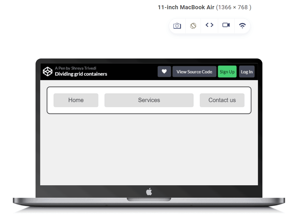
In this example, the grid is divided into three columns. The first and third columns each take up one fractional unit (1fr), and the second column takes up two fractional units (2fr). This means the second column will take up twice as much space as the other columns within the available space.
For a 1200px grid, columns one and three each occupy 300px (1/4th), while the center column takes the remaining 600px (1/2).
A bare 1fr track carries an automatic minimum. CSS treats 1fr written outside a minmax() notation as minmax(auto, 1fr), so the track never shrinks below the largest minimum size of the items inside it. A long unbroken string, a wide table, or an image without a max-width pushes that column past its share and makes the whole grid overflow its container.
Write the track as minmax(0, 1fr) when you need it to shrink below its content. The explicit zero minimum replaces the automatic one, so the column keeps its proportion and the oversized child clips or scrolls instead of stretching the grid. Note that fr is valid only where a grid track is sized, so grid-template-columns, grid-template-rows, and the grid shorthand accept it while width, flex-basis, and gap do not.

Note: Test your CSS grid layouts on the latest desktop and mobile browsers. Try TestMu AI Today!
Key Takeaway: The CSS fr unit is a CSS Grid track size that represents one fraction of the space available inside the grid container, so grid-template-columns: 1fr 2fr 1fr splits a 1200px grid into 300px, 600px, and 300px columns.
How Does a Browser Decide How Much Space 1fr Gets?
The browser subtracts every inflexible part of the track list first, then shares out whatever is left. Gaps and fixed tracks are settled before a single fr track receives space. MDN defines a flex-sized track as one that "takes a share of the remaining space in proportion to its flex factor", and the MDN grid layout guide states that space used by gaps is accounted for before space is assigned to the flexible fr tracks.
Work through grid-template-columns: 250px 1fr 2fr with a gap of 20px inside a 1000px container. Three columns leave two gaps, so 40px goes to the gutters and 250px goes to the fixed column. That leaves 710px of remaining space. The flex factors add up to three, so the 1fr track resolves to roughly 236px and the 2fr track to roughly 473px. Widen the container and only those last two figures change, because the gutter and the fixed column keep their sizes.
That order of operations is the practical reason fr replaced percentages for grid tracks. As CSS-Tricks points out, a percentage resolves against the container rather than against the space that survives the gutters, so four columns written as repeat(4, 25%) alongside a 10px column gap add up to more than the container width and push the row into overflow. The same layout written as repeat(4, 1fr) fits, because the gap is removed from the pool before the fractions are worked out.
It also explains why fr behaves unlike any length you already use. MDN classifies it as the <flex> data type, "a flexible length within a grid container", written as a number followed by the unit, so 2.5fr is as valid as 2fr. Because it is a flex factor and not a measurement, CSS-Tricks notes it cannot be combined with ordinary units inside calc().
The same order of operations drives the responsive pattern that removes most breakpoints. The repeat() function writes a recurring track list in short form and accepts the keywords auto-fill and auto-fit in place of a repeat count. Written as repeat(auto-fit, minmax(200px, 1fr)), the browser fits as many 200px columns into the remaining space as it can and then lets the 1fr maximum stretch them to fill the row. MDN records fr as accepted only for the maximum inside minmax() and invalid as the minimum, so minmax(200px, 1fr) is correct and minmax(1fr, 200px) is not.
Key Takeaway: A browser settles the gaps and the fixed tracks first and then divides only the remaining space among the fr tracks, in proportion to each track flex factor.
Why Use CSS fr Units?
Fractional units in CSS provide a flexible and responsive approach to web design. Using CSS fr units, you can create layouts that adapt smoothly to different screen sizes and resolutions, ensuring a consistent and optimal user experience across various devices.
Here is why the CSS fr unit is important to use in your web designs:
Responsive Design
It is one of the crucial aspects of today's business. Responsive design is essential for a solid web presence. Therefore, your website must adapt to flexible grids, fluid layouts, and different font sizes across mobile screen sizes.
Let's explore how CSS enables responsiveness and enhances the usability of websites 🔥
— Shreya Trivedi (@_Shreya_Trivedi) May 24, 2023
👇 pic.twitter.com/w8Dx8Gx73J
CSS fr units allow elements to scale proportionally based on the available space. As the viewport size changes, the elements automatically adjust their sizes to maintain the desired proportions.
This flexibility ensures your design looks great on devices with different screen dimensions, from small smartphones to large desktop monitors.
Let us take an example to understand this:
HTML:
<!DOCTYPE html>
<html>
<body>
  <h1>Features Of LambdaTest Cypress Cloud</h1>
  <p>LambdaTest fits perfectly in your CI/CD pipelines. Test early, debug accurately, and release faster with LambdaTest</p>
  </br> </br>
  <div class="container">
    <div>
<img src="https://www.lambdatest.com/resources/images/automation/park   .svg">
      <p>End-to-end Test Execution Logs</p>
      Debug each test run with end-to-end test execution logs. Get complete Cypress console logs, video logs, command logs, and much more.
    </div>
    <div>
<imgsrc="https://www.lambdatest.com/resources/images/automation/TunnelandLocalTesting1.svg">
      <p> Enterprise-ready LambdaTest Tunnel
      <p>Test your locally hosted or privately hosted web apps and webpages through our enterprise-ready LambdaTest tunnel feature.</p>
    </div>
    <div>
<imgsrc="https://www.lambdatest.com/resources/images/automation/user.svg">
      <p>Easy NPM Packages to Install and Run</p>
      Easily install and run Cypress-based tests on LambdaTest with a dedicated LambdaTest-Cypress CLI npm package.
    </div>
  </div>
</body>
</html>
CSS:
.container {
  display: grid;
  grid-template-columns: 1fr 1fr 1fr;
  grid-template-rows: auto; /* Remove fixed height to adjust based on
                               content */
  grid-gap: 10px;
}


.container div {

  padding: 1em;
  text-align: center;
}


.container img {
  display: block; /* Add display block to adjust positioning */
  margin: 0 auto; /* Center the images horizontally */
}


h1 {
  text-align: center;

}


p {
  text-align: center;
}
Output:
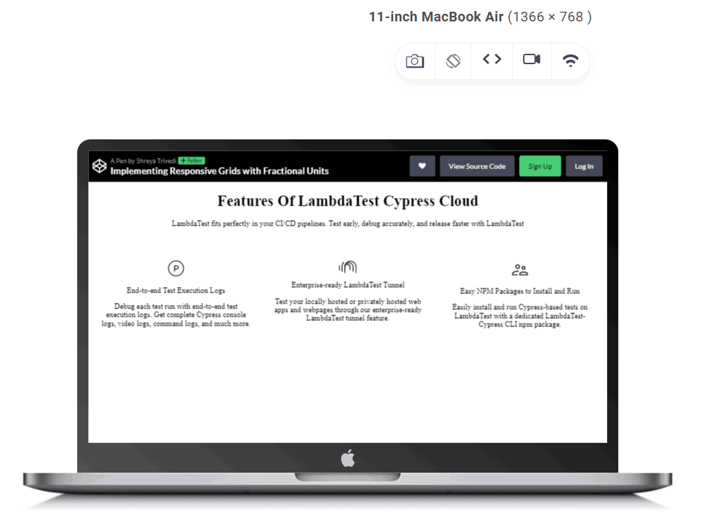
In the above-given example, the grid-template-columns property is set to 1fr 1fr 1fr, meaning each column will occupy an equal fraction of the available space within the grid container. This allows the columns to dynamically adjust their widths based on the size of the container.
Fluid Grid Systems
CSS fr units are particularly useful for creating fluid grid layouts.
A fluid grid layout is a web design approach that defines the dimensions of elements within a grid using relative rather than fixed units. This allows the layout to adapt and respond dynamically to different screen sizes and devices, providing a consistent user experience across various resolutions.
In a fluid grid layout, the widths and heights of elements are defined proportionally, typically in relation to the dimensions of their parent container or the viewport. This means that as the viewport size changes, the layout adjusts accordingly, with elements expanding or contracting to fill the available space while maintaining their relative positioning within the grid.
By assigning fractions of available space to grid columns or rows, you can achieve a responsive grid system that adapts to the content and the screen size.
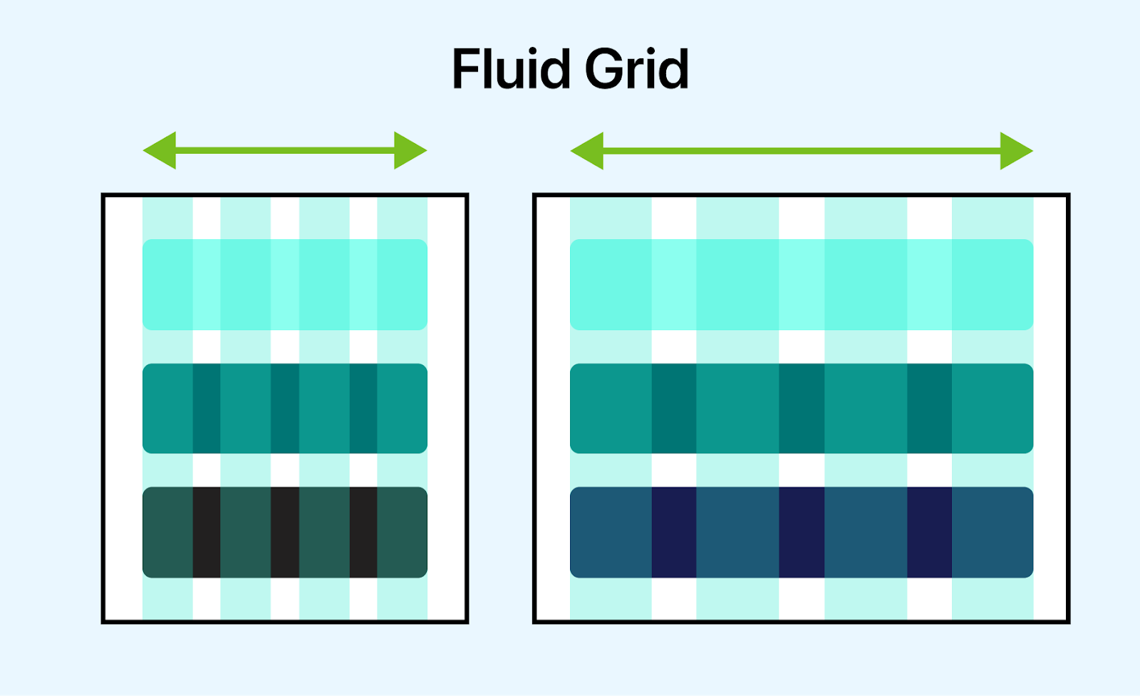
To illustrate this, let's take an example of the McKinsey website that uses CSS fr units to create a responsive grid layout. The grid layout ensures the website's content is always visually appealing, regardless of the screen size or device.
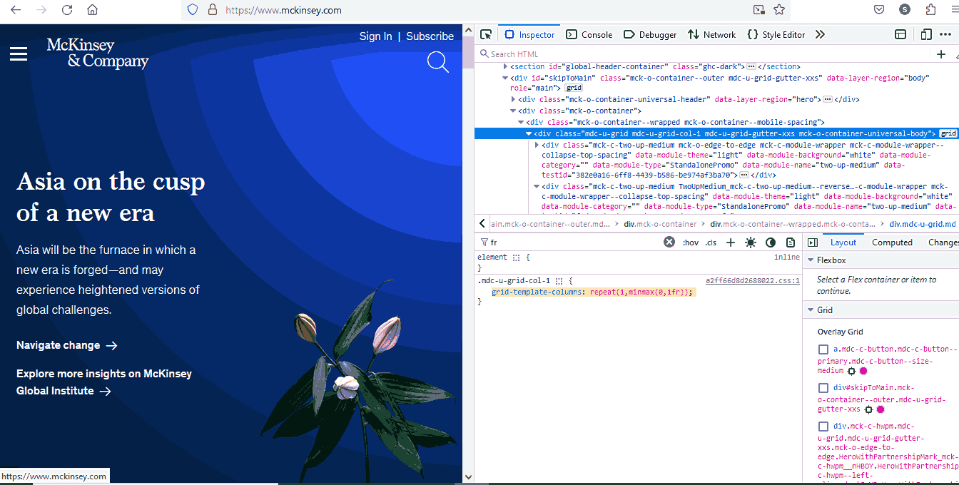
The choice to use 1fr within a minmax function is particularly noteworthy. By allowing the columns to shrink to a minimum size of 0, content within these columns can adapt and scale efficiently. This approach prevents content from becoming overly compressed or overflowing the grid when the viewport size is reduced, ensuring optimal readability and user experience across various devices.
Similarly, GitHub uses CSS fr units to create a responsive grid layout.
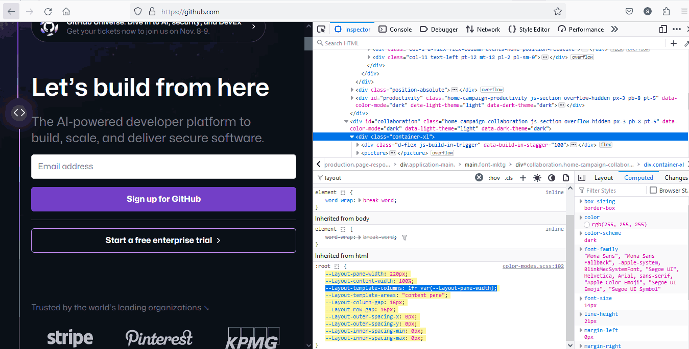
The 1fr value tells the browser to give the first column every pixel of horizontal space left after the second column has taken its fixed width. The var(--Layout-pane-width) value is a custom property that specifies the width of the second column, and the guide to CSS variables with examples covers how to declare and reuse one.
This code ensures that the second column is always the same width as the sidebar, regardless of screen size or device. This is important because it ensures the website's main content area is always visible, even on small screens.
Simplified Layout Calculations
If you want to achieve equal spacing using pixel units and the layout becomes more complicated, the calculations can become more challenging, too. Let's consider a simple example: You want to create a layout with three columns, each with equal spacing between them.
.container {
    display: grid;
    grid-template-columns: 100px 100px 100px;
  }
In this example, each column has a width of 100 pixels, and you want equal spacing between them. To calculate the spacing, you need to subtract the total width of the columns from the total available width and divide the remaining space equally among the gaps.
Let's consider you have a container with a total width of 400 pixels; the calculation formula for spacing would be:
Total Available Width = 400px
Total Column Width = 100px + 100px + 100px = 300px
Total Spacing = Total Available Width - Total Column Width
= 400px - 300px
= 100px
Number of Gaps = Number of Columns - 1 = 3 - 1 = 2
Spacing Between Columns = Total Spacing / Number of Gaps
= 100px / 2
= 50px
So, add a 50px spacing between each column to achieve equal spacing.
That's a lot of calculation to do!!! Using CSS fr units can simplify the process of designing responsive layouts. Instead of performing complex calculations or relying on media queries, CSS fr units allow you to directly define proportions and relationships between elements.
This makes the code more intuitive and easier to manage, improving efficiency and reducing development time.
Key Takeaway: CSS fr units keep grid columns proportional as the viewport changes and remove the manual pixel arithmetic needed to space fixed-width columns evenly.
Browser Compatibility of CSS Fractional Units
Browser compatibility is crucial in ensuring a consistent user experience across different platforms in web design. With CSS fractional units, layout creation has become a flexible approach that adapts to varying screen sizes.
However, the effectiveness of these CSS fr units relies heavily on their consistent interpretation across different web browsers.
The support question is now settled. MDN records grid-template-columns as Baseline widely available, and the fr unit has worked in Chrome, Edge, Firefox, and Safari since October 2017. The open risk today is not whether a browser understands fr, but how your content behaves inside those tracks at different viewport widths.
However, if you use CSS fractional units, it's important to test websites in different browsers to ensure they work as intended. To do this, you can harness cloud-based testing platforms like TestMu AI. It is an AI-powered test orchestration and execution platform that allows you to test websites for cross browser compatibility on an online browser farm of real browsers, devices, and operating systems. You can test from various Windows, macOS, Android, and iOS versions running the latest and legacy browsers.
Using TestMu AI's Real Time Browser Testing feature, you can perform cross browser testing of your CSS fr units across different browser and OS combinations.

Join the TestMu AI YouTube Channel for tutorials on automation testing, mobile app testing, and more!
Key Takeaway: CSS fr unit support has been settled since October 2017 in Chrome, Edge, Firefox, and Safari, so the open question is how content behaves inside fr tracks at different viewport widths rather than whether a browser understands fr.
Benefits of CSS Fractional Units
Using fractional units in CSS helps you create flexible layouts that adapt to any screen size. Here are some of its benefits and how they can elevate your design process:
- Effortless Responsiveness: Fractional units represent a portion of the available space, so your elements will resize automatically for specific devices.
- Precise Control: Fractional units give you the power to make minute adjustments without relying on rigid pixel values.
- Sustainable Code: CSS fr units promote cleaner, more maintainable code. Your layouts will scale effortlessly as your project grows, saving you time down the road.
- Focus on Accessibility: Fractional units play a crucial role in inclusive design. By ensuring layouts adapt to various screen sizes, you create a user-friendly experience for everyone.
- Modern Design Approach: CSS fr units represent a forward-thinking approach, keeping your projects adaptable and relevant.
- Beyond Responsiveness: The benefits extend beyond responsiveness! You can use fractional units for precise typography control, iterative design refinement, and even optimizing rendering performance for a smoother user experience.

Key Takeaway: Fractional units resize grid elements automatically for each screen size, keep layout code cleaner as a project grows, and support accessible designs that adapt to any viewport.
Different Ways of Using CSS fr Units
CSS offers a powerful way to create flexible layouts: fractional units. But how do we leverage them in real-world situations? Let's explore some common scenarios where fractional units shine.
Proportional Image Sizing Space
When using the fr unit in a CSS grid, space is distributed proportionally among the elements defined with fr values. For instance, if two elements have 1fr each, they will share the available space equally, creating a balanced layout.
Moreover, the CSS fr unit enables responsiveness, adjusting dynamically based on the container's size. Thus, it is ideal for designing fluid and adaptive web layouts.
Let's look at an example to understand it in detail.
HTML:
<img src = https://assets.testmuai.com/resources/images/logos/logo.svg>
<div class="container">

<header class="header">Digital Experience Testing Cloud Built For <span> Enterprises </span></header>


<main class="main-content">Our Unified Testing Cloud enables you to deliver <br> world class digital experience with quality releases <br> and help accelerate your release velocity.</main>


</div>
CSS:
.container {
    display: grid;
    grid-template-columns: 1fr;
    grid-template-rows: auto 1fr auto;
    min-height: 100vh;
    font-family: Inter,Arial,sans-serif;
  }
  span {
    background: linear-gradient(91.42deg,#2b56f3 18.38%,#a505d8 62.2%);
    -webkit-background-clip: text;
    -webkit-text-fill-color: transparent;
  }
  .header {
    padding: 20px;
    font-size: 36px;
    font-weight: 800;
    box-sizing: border-box;
    border: 0 solid #fafafa;
  }

  .main-content {

    padding: 20px;
    font-family: Inter,Arial,sans-serif;
    color: #4a4a4a;
    font-weight: 300;
    font-size: 18px;
    display: block;
    margin-block-start: 1em;
    margin-block-end: 1em;
    margin-inline-start: 0px;
    margin-inline-end: 0px;
    --text-opacity: 1;
  }
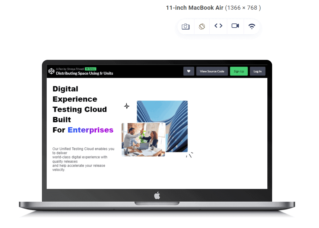
In the above code snippet, the grid-template-rows property is set to auto 1fr auto, meaning:
- The first-row height is determined by its content (auto), allowing it to adjust based on the height of the header.
- The second-row takes up one fraction of the available vertical space (1fr), which means it occupies the remaining space after allocating the heights for other rows. This ensures that the main content area expands to fill the remaining vertical space within the container.
- The third-row height is also determined by its content (auto), allowing it to adjust based on its content, such as footer content if present.
Balanced Content Distribution
The fr unit in CSS grid layouts lets you achieve balanced content distribution due to their inherent flexibility and responsiveness. By assigning fractional values to grid tracks, you can specify how space is allocated within the layout. This allows for precise control over content distribution, ensuring each element receives its fair screen share.
Additionally, CSS fr units promote efficient use of space by dynamically adjusting the size of grid tracks based on their fractional values. This results in optimized content presentation across various devices and screen resolutions.
HTML:
<div class="container">
  <div class="sidebar">

    <h1> Online Selenium Test </br>  Automation on </br> Desktop, Android, </br> and iOS Mobile Browsers </h1>
    <p>
      Run your Selenium test automation scripts </br>  across online Selenium Grid of desktop, </br> Android and iOS mobile browsers. </br>  Develop, test, and deliver faster every </br>  time with automated cross browser </br> testing using LambdaTest online </br> Automation Browser Testing Grid.
    </p>


  </div>
  <div class="main-content">
    <img src ="https://www.lambdatest.com/resources/images/selenium-parallel-testing-index.png">
  </div>
</div>
CSS:
.container {
    display: grid;
    grid-template-columns: 1fr 1fr;
    grid-gap: 20px;
    padding: 20px;
    max-width: 100%;
    box-sizing: border-box;
  }


  .sidebar {
    border-radius: 5px;

    padding: 20px;
  }


  .sidebar h1 {
    font-size: 2rem;
    color: #333;
    margin-bottom: 20px;
  }


  .main-content {
    padding: 20px;
    background-color: #ffffff;
    border-radius: 5px;
  }


  img {
    max-width: 100%;
    height: auto;
    width: 100%;
    border-radius: 5px;
  }


  h1 {
    font-size: 2rem;
    font-weight: 600;
    font-family: Inter, Arial, sans-serif;
    line-height: 1.25;
  }


  p {
    font-size: 1rem;
    font-weight: 400;
    font-family: Inter, Arial, sans-serif;
    line-height: 1.5;
  }
The .container class utilizes a grid layout with grid-template-columns: 1fr 1fr;.
Here, the 1fr represents a fractional unit, indicating that each column should take up an equal share of the available horizontal space within the grid.
In this case, the grid is divided into two columns of equal width, and the content is distributed proportionally.
In the given example, the grid-template-columns property is set to 1fr 1fr, meaning each column will occupy an equal fraction of the available horizontal space within the grid container. This allows the sidebar and main content areas to dynamically adjust their widths based on the container's size. Using CSS fr units helps create a responsive layout where both areas expand or contract proportionally as the viewport size changes.
Simplified Media Queries
CSS media queries are helpful for creating responsive web designs, but they can also be complex and challenging to maintain. CSS fractional units can help simplify media queries by allowing you to develop layouts responsive to different screen sizes without setting fixed breakpoints.
By implementing responsive design best practices, you can create a website that looks great, functions seamlessly, and delivers an optimal user experience across all devices.
Responsive testing tools like LT Browser by TestMu AI can help developers and testers build, test, and debug their websites for responsiveness.
LT Browser is a Chromium-based mobile-friendly browser that allows you to perform responsive testing of your web designs across 50+ pre-installed device viewports, including mobile, tablet, desktop, and laptop.
➂ Media Queries
— Aakash Rao (@Aakash_codes) April 3, 2023
▧ With media queries, we can define completely different styles for different browser sizes.
It can be used to check many things, such as:
⤷ width & height of the viewport
⤷ width & height of the device
⤷ orientation
⤷ resolution pic.twitter.com/bRq89aIxY3
Let's say you want to create a layout with two columns that are each 50% wide on a desktop screen but resize proportionally on smaller screens. Using fractional units, you can easily create smooth layouts without tricky calculations.
HTML:
<div class="pricing-container">
  <div class="pricing-card">
    <div class="price">$29</div>
    <div class="plan">Basic Plan</div>
    <div class="features">
      <ul>
        <li>Feature 1</li>
        <li>Feature 2</li>
        <li>Feature 3</li>


      </ul>
    </div>
    <button class="btn">Get Started</button>
  </div>

  <div class="pricing-card">
    <div class="price">$49</div>
    <div class="plan">Pro Plan</div>
    <div class="features">
      <ul>
        <li>Feature 1</li>
        <li>Feature 2</li>
        <li>Feature 3</li>
        <li>Feature 4</li>
      </ul>
    </div>
    <button class="btn">Get Started</button>
  </div>
</div>

<div class="pricing-container">
  <div class="pricing-card">
    <div class="price">$29</div>
    <div class="plan">Basic Plan</div>
    <div class="features">
      <ul>
        <li>Feature 1</li>
        <li>Feature 2</li>
        <li>Feature 3</li>
      </ul>
    </div>
    <button class="btn">Get Started</button>
  </div>

  <div class="pricing-card">
    <div class="price">$49</div>
    <div class="plan">Pro Plan</div>
    <div class="features">
      <ul>
        <li>Feature 1</li>
        <li>Feature 2</li>
        <li>Feature 3</li>
        <li>Feature 4</li>
      </ul>
    </div>
    <button class="btn">Get Started</button>
  </div>
</div>
CSS:
body {
  margin: 0;
  height: 100vh;
  display: grid;
  place-items: center;
  background-color: #f9f9f9; /* Background color for the entire page */
}


.pricing-container {
  display: grid;
  grid-template-columns: 1fr 1fr;
  gap: 15vw;/* Adjust the gap between pricing cards using viewport units*/
  padding: 2vw; /* Adjust padding using viewport units */
}


.pricing-card {
  width: 100%;
  background-color: #f2f2f2;
  border-radius: 8px;
  padding: 3vw; /* Adjust padding using viewport units */
  box-shadow: 0 4px 8px rgba(0, 0, 0, 0.1);
  display: grid;
  grid-template-rows: auto 1fr auto;/*Adjusts rows for header, features,          and button */
  justify-items: center; /* Centers the content horizontally within the card */
  align-items: center; /* Centers the content vertically within the card */
}


.price {
  color: #007bff;
  font-size: 2vw; /* Adjust font size using viewport units */
  font-weight: bold;
  margin-bottom: 1.5vw; /* Adjust margin using viewport units */
}


.plan {
  color: #000000;
  font-size: 1.5vw; /* Adjust font size using viewport units */
  font-weight: bold;
  margin-bottom: 1.5vw; /* Adjust margin using viewport units */
}


.features ul {
  list-style: none;
  padding: 0;
}


.features li {
  margin-bottom: 1vw; /* Adjust margin using viewport units */
  font-size: 1.5vw; /* Adjust font size using viewport units */
}


.btn {
  background-color: #007bff;
  color: #ffffff;
  border: none;
  padding: 1.5vw 3vw; /* Adjust padding using viewport units */
  border-radius: 4px;
  cursor: pointer;
}


.btn:hover {
  background-color: #0056b3;
}
The .pricing-container CSS class employs fractional units to create a flexible and responsive grid layout. The grid-template-columns: 1fr 1fr; declaration assigns each column an equal share of available horizontal space, making them responsive to different screen widths.
The use of 1fr as a fractional unit ensures that both columns adapt dynamically, so if the viewport is wider, each column will expand. If it's narrower, they will shrink accordingly. This responsive design ensures that the pricing container effectively utilizes available space, making it ideal for presenting pricing options that adjust seamlessly to various screen sizes while maintaining a balanced appearance.
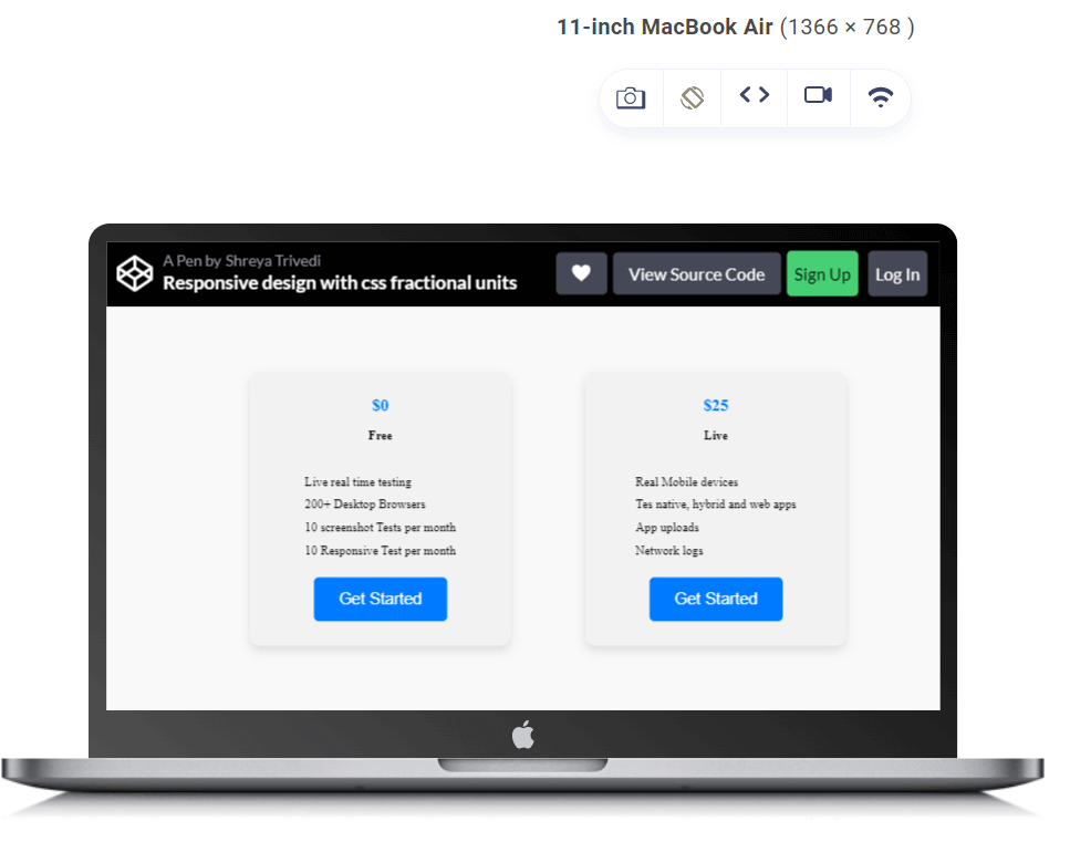
In the above-given example, the grid-template-columns property is set to 1fr 1fr, meaning each pricing card will occupy an equal fraction of the available horizontal space within the pricing container. This ensures that the pricing cards are evenly distributed across the container, regardless of the viewport size. The use of CSS fr units helps create a responsive layout where both pricing cards expand or contract proportionally as the viewport size changes.
Flexible Sidebar
Using CSS fr units allows you to allocate space proportionally, ensuring that the sidebar's width adapts seamlessly to the available space. This proportional sizing is vital for creating a visually balanced sidebar with the main content area.
As the screen size varies, whether on different devices or by resizing the browser window, the CSS fr unit dynamically adapts the width of the sidebar. This adaptability ensures the sidebar remains functional across various viewport devices and screen dimensions. You can easily define the sidebar width without resorting to fixed or complicated calculations.
Let us understand it with the help of an example:
HTML:
<!DOCTYPE html>
<html lang="en">
<head>
<meta charset="UTF-8">
<meta name="viewport" content="width=device-width, initial-scale=1.0">
<link rel="stylesheet" href="styles.css">
</head>
<body>
<!-- Header -->
<header>
<h1>Selenium Automation Testing on Cloud</h1>
</header>
<!-- Sidebar -->
<aside>
<ul>
<li><a href="#">Selenium Testing</a></li>
<li><a href="#">Cypress Testing </a></li>
<li><a href="#">Playwright Testing</a></li>
<li><a href="#">Puppeteer Testing</a></li>
<li><a href="#">Appium App Testing</a></li>
<li><a href="#">HyperExecute</a></li>
</ul>
</aside>
<!-- Main Content Area -->
<main>
<h1>Debug in Real-Time with LambdaTest Test Analytics</h1>
<p>Get rid of the dependency on external reporting. Access rich artifacts and get a detailed report on failure reasons to find out exactly what went wrong and get step-by-step drill-downs for fast resolution. You can also easily share your detailed reports with your team saving a lot of time and effort.</p>
<!-- Add more realistic content as needed -->
</main>
<!-- Right Bar -->
<div class="right-bar">
<h2>BROWSER AND DEVICE COVERAGE</h2>
<p>
Run Selenium Scripts on 3000+ Desktop and Mobile Devices</p>
</div>
<!-- Footer -->
<footer>
<p>Cross Browser Testing Cloud Built With <span style="font-size:150%;color:red;">♥</span>
For Testers</p>
</footer>
</body>
</html>
CSS:
body {
  margin: 0;
  display: grid;
  grid-template-columns: 1fr 3fr 1fr; /* Sidebar takes 1 part, Content takes 3 parts, Right Bar takes 1 part */
  grid-template-rows: auto 1fr auto; /* Header takes auto height, Main Content takes 1 part, Footer takes auto height */
  min-height: 100vh; /* Ensure the layout covers the full height of the viewport */
 font-family: system-ui,-apple-system,BlinkMacSystemFont,SegoeUI,Roboto,Helvetica Neue,Arial,Noto Sans,sans-serif,Apple Color Emoji,Segoe UI Emoji,Segoe UI Symbol,Noto Color Emoji;


 line-height: 1.5;
}


header, footer {
  grid-column: span 3; /* Span the full width of the layout */
  background-color: #3498db;
  color: #ecf0f1;
  text-align: center;
  padding: 10px;
}


/* Style for the sidebar */
aside {
  background-color: #2c3e50;
  color: #ecf0f1;
  padding: 20px;
  box-shadow: 3px 0 5px rgba(0, 0, 0, 0.1);
  transition: background-color 0.3s ease;
}


aside h2 {
  font-size: 1.8rem;
  margin-bottom: 15px;
}


aside ul {
  list-style: none;
  padding: 0;
  margin: 0;
}


aside li {
  margin-bottom: 10px;
  display: flex;
  align-items: center;
}


aside a {
  text-decoration: none;
  color: #ecf0f1;
  font-weight: 700;
  font-size: 1.2rem;
  display: flex;
  align-items: center;
  transition: color 0.3s ease;
}


aside a:hover {
  color: #3498db;
}


/* Style for the main content area */
main {
  padding: 40px;
}


main h1 {
  color: #2c3e50;
  font-size: 3rem;
  margin-bottom: 20px;
}


main p {
  color: #555;
  font-size: 1.2rem;
  line-height: 1.6;
}


/* Style for the right bar */
.right-bar {
  background-color: #2c3e50;
  color: #ecf0f1;
  padding: 20px;
  box-shadow: -3px 0 5px rgba(0, 0, 0, 0.1);
}


.right-bar h2 {
  font-size: 1.8rem;
  margin-bottom: 15px;
}


/* Style for the footer */
footer {
  grid-column: span 3; /* Span the full width of the layout */
  background-color: #3498db;
  color: #ecf0f1;
  text-align: center;
  padding: 10px;
}


/* Responsive Media Queries */


@media screen and (max-width: 768px) {
  body {
    grid-template-columns: 1fr; /* Full-width layout for smaller screens */
  }


  aside {
    grid-row: 2; /* Place the sidebar in the second row */
    box-shadow: 0 3px 5px rgba(0, 0, 0, 0.1); /* Adjust shadow for better visibility */
  }


  .right-bar {
    display: none; /* Hide the right bar on smaller screens */
  }

  /* Adjust styles for better readability on small screens */
  aside h2 {
    font-size: 1.5rem;
  }


  aside i {
    font-size: 1rem;
    margin-right: 8px;
  }


  aside a {
    font-size: 1rem;
  }


  main h1 {
    font-size: 2rem;
  }


  main p {
    font-size: 1rem;
  }


  .right-bar h2 {
    font-size: 1.5rem;
  }
}
The grid-template-columns: 1fr 3fr 1fr property defines the columns of the grid layout. It splits the available horizontal space into three columns. The 1fr and 3fr parts indicate how much of that space each column should take.
The first column (for the sidebar) is set to 1fr, meaning it takes up one part of the total available space. The second column (for the main content) is set to 3fr, indicating it takes up three parts. The third column (for the right bar) is again set to 1fr, taking up one part.
The use of fr ensures that each column's width is flexible and adapts proportionally to the available space. So, if the total width of the screen changes, the sidebar, main content, and right bar adjust their widths accordingly.
The grid-template-rows: auto 1fr auto property defines the rows of the grid layout. It specifies the height of each row.
The first row (for the header) is set to auto, meaning it adjusts its height based on the content. The second row (for the main content) is set to 1fr, indicating it takes one part of the available vertical space. The third row (for the footer) is also set to auto, adjusting its height based on the content.
In the above code, fr values are also adjusted at different breakpoints to create flexible layouts that adapt to various viewports.

Key Takeaway: Common CSS fr unit patterns include auto 1fr auto rows for a full-height page, 1fr 1fr columns for balanced side-by-side content, and 1fr 3fr 1fr for a sidebar, main area, and right rail.
How Do AI Tools Help You Write and Debug CSS fr Layouts?
AI tools now draft grid track lists and explain why one is misbehaving, but they do not replace a look at the rendered layout. Chrome DevTools is the clearest example. Chrome 149 added code completion for CSS with Gemini in the Styles tab, which Google describes as a way to build out grid and flex layouts that rely on several related properties at once. The switch sits under Settings, then AI innovations, then Code suggestions.
The same panel offers AI assistance for styling, where you select an element in the DOM tree and ask why it renders the way it does. Google labels that feature experimental and states that it may generate inaccurate information, so treat the answer as a lead rather than a verdict.
The limits matter more than the features when the unit is fr. A model that produces CSS text cannot see the box that CSS produces, so both failures described earlier in this article survive a generated draft unchanged. A generated 1fr 1fr 1fr still carries the automatic minmax(auto, 1fr) minimum, and the column still overflows the moment a long unbroken string or a wide table lands inside it. A generated minmax(1fr, 200px) still reads as plausible CSS and is still invalid, because MDN documents fr as legal only for the maximum argument of minmax().
Treat generated CSS as a draft. Open the layout at a narrow viewport, switch on the grid overlay in the Elements panel, and check that every track holds the share the track list claims.
Key Takeaway: Chrome DevTools can complete CSS grid declarations with Gemini and explain a styling bug on a selected element, but an AI tool cannot see the rendered box, so a generated fr track list still needs a check for the automatic minmax(auto, 1fr) minimum at a narrow viewport.
Conclusion
CSS fr units have simplified the approach to layout design, making it more flexible and responsive. It helps you create designs that quickly adapt to different screen sizes and resolutions. This simplifies the development process and improves user experience across various device viewports.
By allowing you to specify sizes in fractions of available space, CSS fractional units provide a more intuitive and fluid way to handle spacing. This eliminates the need for fixed pixel values, making designs more adaptable. The responsiveness achieved through fractional units ensures that websites and web applications look and function well on everything from large desktop monitors to small mobile screens.
By leveraging fractional units, you can minimize the need for media queries and breakpoints, streamlining the development process and reducing the overall complexity. This also leads to more scalable and maintainable code.
Adopting CSS fractional units offers an elegant and effective solution to challenges related to layout adaptability, code complexity, and maintenance efforts.
Author

Shreya Trivedi
Blogs: 3


Shreya Trivedi is a community contributor with over three years of experience as a frontend developer and technical content writer, specializing in modern CSS, responsive web design, and web development. She creates in-depth technical blogs, tutorials, and knowledge-base articles that simplify CSS layouts, responsive design techniques, and developer tools for diverse audiences. With a Computer Science engineering background, Shreya brings strong technical accuracy to her writing and aligns her content with SEO best practices and modern web development standards.


CSS fr Unit FAQs
Did you find this page helpful?
More Related Blogs
TestMu AI forEnterprise
Get access to solutions built on Enterprise
grade security, privacy, & compliance
- Advanced access controls
- Advanced data retention rules
- Advanced Local Testing
- Premium Support options
- Early access to beta features
- Private Slack Channel
- Unlimited Manual Accessibility DevTools Tests