

Power Your Software Testing with AI Agents and Cloud
The Native AI-Agentic Cloud Platform to Supercharge Quality Engineering. Test Intelligently and Ship Faster.

- TestMu AI (Formerly LambdaTest)
- /
- Learning Hub
- /
- 17 Agile Metrics and KPIs to Boost Testing Efficiency
17 Agile Metrics and KPIs to Boost Testing Efficiency
Explore key Agile metrics and KPIs designed to enhance testing efficiency, streamline workflows, and drive measurable improvements in software quality.
Last Updated on:
On This Page
- What Are Agile Metrics?
- What Are the Types of Agile Metrics?
- Agile Metrics vs Agile KPIs: What is the Difference?
- What Are the Key Agile Testing Metrics to Track?
- What Are Leading vs Lagging Indicators in Agile Testing?
- Which Agile Vanity Metrics Should You Avoid?
- How Is AI-Generated Code Reshaping Agile QA Metrics?
- Why Are Agile Metrics Important?
- How Do You Choose the Right Agile Metrics?
- Which Agile Metrics Should Your Team Track First?
- What Sources Does This Agile Metrics Guide Cite?
In Agile testing, success isn’t solely measured by how quickly software is shipped; it’s about delivering high-quality software efficiently. This is where Agile metrics and KPIs play a critical role. Without the right metrics, teams risk releasing untested features, overlooking defects, or slowing down delivery cycles. Even highly skilled Agile teams can lose visibility if QA activities are not continuously measured and optimized, highlighting the need for structured metrics and ongoing improvement.
Overview
To boost testing efficiency, Agile teams should track quality metrics like defect density to identify code weaknesses and flow metrics like cycle time to resolve workflow bottlenecks. These indicators provide actionable insights that improve software quality, predictability, and delivery performance across sprints.
What Are the Different Types of Agile Metrics?
- Quality Metrics: Quality metrics track a software's ability to meet functional and non-functional requirements through measurements like defect density, escaped defects, code coverage, and technical debt.
- Predictability Metrics: Predictability metrics evaluate a team's ability to meet sprint commitments by tracking estimation accuracy, sprint goal success, and burndown trends.
- Team Health Metrics: Team health metrics assess morale, engagement, collaboration effectiveness, and learning progress to show how well team members communicate and maintain engagement.
- Flow Metrics: Flow metrics evaluate how efficiently work moves through development and testing using cumulative flow diagrams, work-in-progress limits, and flow efficiency to reveal bottlenecks.
- Delivery Metrics: Delivery metrics track release frequency, lead time, and defect resolution time to ensure predictable software delivery aligned with project and business goals.
What Are Key Agile Testing Metrics?
- Velocity: Velocity measures the total work completed in a sprint, including story points, executed test cases, and automation scripts, to help with sprint planning.
- Sprint Burndown: A sprint burndown chart monitors remaining sprint work, such as pending manual or automated tests and unresolved defects, to show progress toward sprint completion.
- Release Burndown: A release burndown tracks remaining test cases, features, and defects across multiple sprints to monitor progress toward a long-term release milestone.
- Lead Time: Lead time measures the total duration from requirement creation to final delivery, reflecting the time needed to design, execute, and validate tests.
- Cycle Time: Cycle time captures the active duration of tasks from start to finish, helping QA teams evaluate testing efficiency and identify bottlenecks.
- Cumulative Flow Diagram (CFD): A cumulative flow diagram visualizes work stages to highlight bottlenecks, enabling QA teams to optimize flow efficiency by analyzing work-in-progress.
- Defect Density: Defect density measures bugs per unit of code, where low density signals strong quality and high density highlights modules needing deeper testing.
- Escaped Defects: Escaped defects track bugs found in production, where low numbers indicate robust QA processes and high numbers reveal gaps in test coverage.
- Team Satisfaction: Team satisfaction measures team morale, engagement, and collaboration to support consistent delivery and mitigate risks like burnout.
- Customer Satisfaction: Customer satisfaction uses surveys, Net Promoter Scores (NPS), and feedback to assess whether delivered features meet expectations and provide value.
What Are Agile Metrics?
Agile metrics are measurable indicators used to monitor the effectiveness and performance of Agile teams. These help find bottlenecks and make wise choices at every stage of the development.
These metrics help answer three critical questions.
- Are we delivering consistent values?
- What are our bottlenecks?
- How satisfied are our customers?
Agile metrics focus on results, rather than output. This means that effective Agile metrics are transparent, easily understood by all team members, and directly tied to business value.
According to a report by Cornell University, Agile teams attained higher performance when they followed best practices and metrics. Agile development methodologies offer an effective framework for software delivery, and leveraging metrics enables teams to excel and achieve outstanding results.
What Are the Types of Agile Metrics?
Agile metrics are grouped based on their focus. They provide insights into quality, predictability, team health, workflow, and delivery. Each type drives specific improvements.
- Quality Metrics: These measure how well software meets functional and non-functional requirements. Key testing metrics include defect density, escaped defects, code coverage, and technical debt. They reveal whether testing is thorough and highlight weak areas in code.
Learn more about QA metrics to understand how these indicators drive software quality.
- Predictability Metrics: These assess the team’s ability to forecast and meet sprint commitments. Metrics such as sprint goal success rate, estimation accuracy, and burndown chart trends help QA teams evaluate whether planned testing aligns with actual delivery.
- Team Health Metrics: These track human factors impacting software quality. Metrics like team satisfaction, collaboration effectiveness, and learning progress show how well testers communicate and share knowledge.
- Flow Metrics: Flow metrics evaluate how efficiently work moves through development and testing. Cumulative flow diagrams, work-in-progress limits, and flow efficiency measurements identify bottlenecks and test queue delays. They help QA optimize throughput without compromising quality.
- Delivery Metrics: Delivery metrics focus on the team’s ability to produce working, tested software predictably. Examples include release frequency, lead time, and defect resolution time. These metrics ensure QA processes support consistent, reliable delivery aligned with sprint and business goals.
Scrum Metrics vs Kanban Metrics
Metrics also split along the framework you run, because Scrum and Kanban optimise for different things. Scrum works in fixed-length sprints, so its metrics answer "will we finish what we committed to by Friday?" Kanban runs continuous flow with no sprint boundary, so its metrics answer "how fast and how smoothly does work move through the system?"
| Parameters | Scrum metrics | Kanban metrics |
|---|---|---|
| Core metrics | Velocity, Sprint Burndown, Release Burndown | WIP, Lead Time, Cycle Time, Cumulative Flow Diagram, Throughput |
| Question it answers | Will we deliver the sprint commitment? | How quickly and predictably does work flow? |
| Unit of time | The sprint, a fixed boundary | Continuous, no boundary |
| Measured in | Story points per sprint | Days or hours per item |
| Optimises for | Predictable delivery of a committed scope | Flow efficiency and reduced bottlenecks |
| Main trap | Velocity treated as a productivity target | WIP limits ignored, so everything is in progress and nothing is done |
The distinction matters when teams borrow across frameworks without thinking. Velocity is meaningless in Kanban because there is no sprint to divide by, and a Scrum team that never looks at cycle time can hit its commitment every sprint while individual tickets quietly take three weeks each. Most mature teams track flow metrics regardless of framework, since lead time and cycle time describe reality better than story points do.
Agile Metrics vs Agile KPIs: What is the Difference?
The two words get used interchangeably in stand-ups and they are not the same thing. The difference is not academic: it decides whether your dashboard is telling you the team is busy or telling you the business is winning.
An Agile metric measures an activity or a process flow. Velocity, cycle time, and test count are all metrics: they describe what the team did, and they are outputs. An Agile KPI (Key Performance Indicator) measures progress toward a strategic business outcome. Customer satisfaction, Net Promoter Score (NPS), and time to market are KPIs: they describe whether the work mattered, and they are outcomes.
Put simply: every KPI is a metric, but very few metrics deserve to be KPIs. The word "key" is doing real work in that acronym, and a dashboard with 30 KPIs has none.
| Parameters | Agile metric | Agile KPI |
|---|---|---|
| What it measures | Team activity and process flow | Progress toward a business outcome |
| Type | Output: what we did | Outcome: whether it mattered |
| Examples | Velocity, cycle time, test count, code coverage | Customer satisfaction, NPS, time to market, revenue impact |
| Audience | The team, for self-correction | Leadership, for strategic decisions |
| How many you need | Several, they are diagnostic | A handful, they are directional |
| Risk | Becomes a vanity metric if untethered | Too abstract to act on without metrics beneath it |
Velocity shows the failure mode best. On its own it is the classic vanity metric: it can be inflated at will by padding estimates, and a team can double its velocity in two sprints without shipping a single additional thing a customer noticed. Nothing about that is dishonest, it is just what happens when a number becomes a target.
Tie it to a KPI and it becomes useful again. Velocity rising while customer satisfaction and NPS hold or improve means the team is genuinely delivering more value. Velocity rising while NPS falls means you are shipping more of something nobody wanted, faster. The metric did not change; what changed is that it now has an outcome to answer to.
The practical rule: for every metric on your dashboard, be able to name the KPI it serves. If you cannot, you are measuring activity for its own sake.
What Are the Key Agile Testing Metrics to Track?
Here are 17 Agile KPI metrics for testing that every team should measure to boost their productivity and delivery in the Agile development process.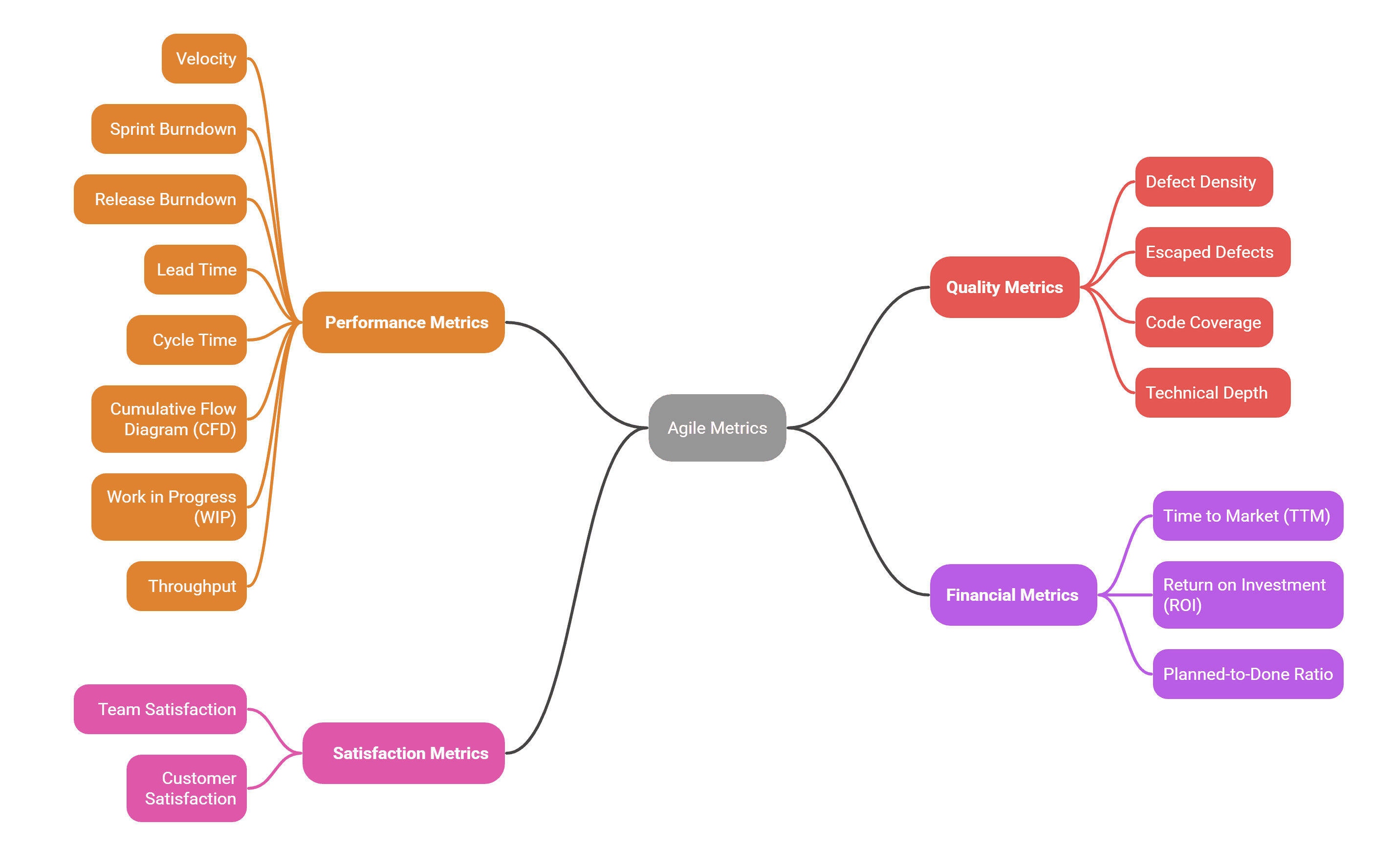
1. Velocity
Velocity measures the amount of work a team completes during a sprint. It is expressed in terms of story sprints or hours. In Agile testing, velocity isn’t just about story points; it also includes the number of test cases executed, automation scripts developed, and defects validated.
A consistent velocity indicates a stable testing capacity, while sudden spikes or drops may signal issues such as flaky tests, insufficient automation, or unexpected defect loads. This helps to provide insight into a team's capacity and helps with sprint planning and release forecasting.
How to Measure:
You sum up all the story points or hours of all completed story points in a sprint, do this over time and provide a baseline for the team. Every Agile team has a different velocity, so don’t use one team's velocity as a base for another.
Formula:
Velocity = ∑ (Completed Story Points + Executed Test Cases)

Note: Run automated tests across 3000+ environments. Try TestMu AI Now!
2. Sprint Burndown
It helps track work left in a sprint. It shows whether a team is on track to complete their sprint and helps identify potential issues early. This provides real-time visibility into team progress and helps them approach if they are falling behind.
In Agile testing, a sprint burndown chart shows how much testing work remains during a sprint. For QA teams, this may include manual test cases pending, automated scripts under development, and unresolved defects.
How to Measure:
Plot work (in story points or hours) against time throughout the sprint. The ideal line shows steady progress toward zero remaining work.
Formula:
Remaining Work (Day N) = Planned Work - Completed Work up to Day N
Where, Day N is the N-th day in the sprint (whatever day you’re evaluating progress on)
3. Release Burndown
Release burndown extends the concept of sprint burndown, i.e, it tracks the remaining work in a release cycle. Its major difference between a sprint burndown and a release burndown is: a sprint burndown tracks work in a single point. While a release burndown tracks progress toward a release goal (a large project or product release), which spans different sprints.
In Agile testing, release burndown focuses on longer-term testing readiness across multiple sprints. It reflects how many test cases, features, or defects remain before a release milestone.
How to Measure:
Track the sum of remaining story points or features across all sprints leading to a release milestone.
Formula:
Release Progress = (Total Planned Test Cases - Remaining Test Cases) / Total Planned Test Cases * 100
Or
Release Progress = (Completed Test Cases Up to Day N / Total Planned Test Cases) * 100
Tracking these indicators helps teams measure progress and identify bottlenecks effectively. Explore software testing metrics for a complete view of test performance.
4. Lead Time
Lead time is the amount of time it takes from when a customer asks for something or an idea is generated until the job is given to them. This number tells you how well your delivery pipeline is working.
In testing, it indicates the time from when a test requirement is logged (e.g., test case design, automation request) until the feature is validated and shipped.
A shorter lead time means that the organization is flexible and quick to deliver, and it can readily adjust to changes in the market.
How to Measure:
Find out how long it takes for a feature request to be written down and then released to production.
Formula:
Lead Time = Release Date - Request Logged Date
5. Cycle Time
Cycle time refers to the duration it takes to accomplish a task, from the moment it begins to the moment it ends. In testing, it measures from when testing begins until it is completed.
If your team had an idea to work on a project on September 1, 2025, but didn’t start till September 10th, 2025 and finished the task on September 20, 2025, the cycle time is 9 days, while the lead time is 19 days, because the idea was documented on September 1. Cycle time calculates the active period of a development or testing process.
How to Measure:
Track the time from when development starts on an item or a task until it's completed and ready for delivery.
Formula:
Cycle Time = Task Completed Date - Task Start Date
6. Cumulative Flow Diagram (CFD)
CFD visualizes the flow of work through all stages in the software development process. It shows the work in progress, the bottleneck and efficiency.
In testing, A CFD visualizes the flow of testing work across different stages (e.g., “To Do,” “In Progress,” “In Review,” “Tested,” “Done”). It helps QA teams quickly identify bottlenecks in test execution.
How to Measure:
Calculate time spent on active testing compared to the total elapsed time. It is calculated by dividing the Active Testing Time by the Total Elapsed Time and multiplying the result by 100.
Formula:
Flow Efficiency = (Active Testing Time / Total Elapsed Time) * 100
Related: Control Chart
A Control Chart plots the cycle time of every completed issue over time, one dot per item, with a rolling average through the middle. Where a CFD shows you work in aggregate, a Control Chart shows you the individual items and, crucially, the spread between them.
That spread is the point. A team whose cycle time averages four days but ranges from one to twenty is not predictable, and no amount of averaging will reveal that. The scatter is the signal: tight clustering means you can forecast reliably, while wide scatter means every estimate is a guess regardless of what the mean says.
In testing, a Control Chart quickly exposes the outliers worth investigating. The ticket that sat at 19 days usually has a story behind it, such as an environment that was unavailable, a dependency that was not ready, or a defect that bounced between teams three times. Those are process problems, and they are invisible in a velocity number.
How to Measure:
Plot each completed issue by its completion date against its cycle time, then overlay a rolling average. Most tools, including Jira, generate this natively. Read it for three things: the trend of the rolling average, the density of the scatter around it, and the outliers sitting well above the band. To split delivery time from QA time on the same chart, you need test cycles linked to those issues, which is what Jira test management adds.
Formula:
Cycle Time = Completion Date - Work Start Date
7. Defect Density
It measures the number of defects (bugs) per unit of code found in a software. It helps teams understand how error-prone a piece of software is. A lower defect density number means good code quality.
How to Measure:
Divide the total number of defects by the size of the software (lines of code, story points, or function points).
Formula:
Defect Density = Total Defects / Size of Software (LOC, Story Points, or Function Points)
8. Escaped Defects
These are bugs that make it to production without being caught during development or testing phases. This demonstrates the effectiveness of quality assurance processes. So, a low number suggests robust quality assurance.
How to Measure:
Count the number of production defects discovered after release, often categorized by severity.
Formula:
Escaped Defects Ratio = (Defects Found in Production / Total Defects) * 100
9. Team Satisfaction
It measures how happy and satisfied team members are in the working environment. It also reflects how happy QA engineers and testers feel with their workload, tools, and collaboration. Happy teams tend to be more productive and innovative.
Unlike productivity-focused metrics, which track output and delivery speed, team satisfaction provides insight into the human side of Agile, the motivation, collaboration, and sustainability of the team’s work. A satisfied team is more likely to deliver consistently, innovate, and maintain high-quality standards, while low satisfaction often signals risks such as poor collaboration and burnout.
How to Measure:
Use regular surveys with a rating scale (e.g., 1-5 or 1-10) and mood tracking to gauge team satisfaction levels.
10. Customer Satisfaction
It measures how well the delivered product meets customer expectations. Since Agile emphasizes delivering value early and continuously, customer satisfaction becomes one of the most critical indicators of success. It reflects whether the increments released at the end of each sprint are not only functional but also meaningful and valuable to the customer.
How to Measure:
Use customer surveys, Net Promoter Score (NPS), and user feedback.
11. Work in Progress (WIP)
It measures the number of active tasks currently in testing, development, or review. High WIP suggests overcommitment and bottlenecks.
How to Measure:
Count the number of active work items in development, testing, or review stages at any given time.
Formula:
WIP: ∑ (Number of Items in Progress Across Workflow Stages)
12. Throughput
It measures the number of work items completed in a given period. In testing, it measures how many testing items (test cases, automated scripts, or defects closed) are completed in a specific period. This reflects team productivity and helps forecast future performance.
How to Measure:
Count the number of user stories, features, or tasks completed per sprint or time period.
Formula:
Throughput = Completed Test Items / Time Period
13. Code Coverage
It measures the percentage of code executed by automated tests (such as unit, integration, or functional tests). This helps teams understand how thoroughly the codebase is tested and whether there are parts of the application that remain unverified.
How to Measure:
Use code coverage tools such as Istanbul/nyc, Jest (Built-in), c8, and Blanket.js to analyze what percentage of your codebase is executed during automated testing.
Formula:
Code Coverage = (Lines of Code Executed by Tests / Total Lines of Code) * 100
See more details in this guide on test automation metrics for optimizing your test strategy.
14. Time to Market (TTM)
It measures how quickly the team can deliver new features or products from conception to customer availability. Time to Market is not just about speed; it’s about delivering the right product at the right time. A shorter Time to Market is valuable only if what reaches customers actually solves their problems and adds business value.
How to Measure:
Calculate the time from initial feature conception or market opportunity identification to product release.
Formula:
Time to Market = Release Date - Feature Idea Date
15. Return on Investment (ROI)
It measures the financial return generated by the product compared to the cost of building. This evaluates whether the features, products, or projects being delivered are generating sufficient business value compared to the resources spent on developing them.
How to Measure:
Compare the financial benefits (revenue increase, cost savings) to the cost of development over a specific time period.
Formula:
ROI = ((Net Gain from Investment - Cost of Investment) / Cost of Investment) * 100
16. Planned-to-Done Ratio
It compares the amount of work or tests a team committed to complete in a sprint against what they actually completed. It's expressed as a percentage and indicates how well a team can estimate and plan its sprint capacity.
How to Measure:
It compares the amount of work or tests a team committed to complete in a sprint against what they actually completed. Expressed as a percentage, it indicates how accurately a team can estimate and plan its sprint capacity.
Formula:
Plan to Done Ratio = (Completed Work / Planned Work) * 100
17. Technical Depth
This is the extra labor or cost that will be needed in the future due to shortcuts, quick fixes, or poor design decisions made today to offer functionality sooner. In testing, it is the extra work caused by shortcuts in test automation, incomplete test coverage, or postponed defect fixes.
How to Measure:
Track time spent on bug fixes, refactoring activities, or use static analysis tools to identify code quality issues.
Formula:
Technical Debt Ratio = (Remediation Cost / Development Cost) * 100
What Are Leading vs Lagging Indicators in Agile Testing?
Leading indicators in Agile testing, such as test coverage and build stability, predict quality, while lagging indicators, such as escaped defects, report it after release.
Every metric above answers one of two questions: what is about to happen, or what already did. That distinction is the difference between steering and reporting, and most teams are unknowingly weighted almost entirely toward the second.
Leading indicators are predictive. They move before the outcome does, which means you can still act on them. Work in progress climbing past your WIP limit, code coverage dropping on a new module, a sprint burndown that has been flat for three days: none of these is a failure yet, and all of them are telling you one is coming.
Lagging indicators are confirmatory. They measure the outcome after it has landed. Escaped defects, MTTR, and customer satisfaction are all true and all historical: by the time they move, the release has shipped and the customer has already had the experience.
| Parameters | Leading indicators | Lagging indicators |
|---|---|---|
| Tells you | What is likely to happen | What already happened |
| Timing | Before the outcome | After the outcome |
| Examples | WIP, code coverage, active sprint burndown, flaky test ratio | Escaped defects, MTTR, customer satisfaction, NPS |
| Can you still act? | Yes, that is the point | No, only learn for next time |
| Reliability | Predictive, so sometimes wrong | Factual, but too late |
| Management style it drives | Proactive steering | Reactive firefighting |
You need both, and the reason is that each covers the other's weakness. Leading indicators let you intervene but can be wrong, since rising WIP does not guarantee a missed sprint. Lagging indicators are reliable but arrive too late to change anything. Track only lagging ones and you will manage permanently in hindsight, running a competent post-mortem on every avoidable problem.
The practical test: look at your dashboard and ask which numbers you could act on today. If every one of them describes something already finished, you are reporting rather than steering, and no amount of additional reporting will fix that.
Which Agile Vanity Metrics Should You Avoid?
Avoid Agile vanity metrics such as raw test case counts, lines of code, and velocity compared across teams, because they rise without proving the product improved.
A vanity metric is one that reliably goes up, feels like progress, and tells you nothing about whether the product got better. They are dangerous precisely because they are not wrong, they are just unconnected to any outcome, and they survive because nobody wants to remove the chart that always looks good.
The mechanism behind all of them is the same, and it has a name. Goodhart's law: when a measure becomes a target, it stops being a good measure. None of the traps below requires anyone to act in bad faith. They happen because people optimise for what is counted.
Test count as a measure of progress
"We have 4,000 automated tests" sounds like maturity. It is a measure of volume, not of coverage or of risk. A suite can grow indefinitely while testing the same happy path in slightly different ways, and adding tests is trivially easy, which is exactly why the number always rises. Ask instead what those tests actually catch, because 200 well-targeted tests around real risk beat 4,000 that assert the login page still loads.
Velocity without quality context
Velocity is the most gamed metric in Agile, and it barely requires effort: estimate generously and it rises. Once it is treated as a productivity target rather than a planning aid, that is precisely what happens, and the inflation is usually unconscious. Worse, a team can raise velocity for several sprints by cutting refactoring and skipping tests, which shows up as a win right up until the technical debt arrives. Never read velocity without escaped defects beside it.
Arbitrary code coverage targets
Mandate 80% coverage and you will get 80% coverage. You will not necessarily get better tests, because coverage measures which lines executed, not whether anything was verified. A test that calls a function and asserts nothing raises coverage exactly as much as one that checks every edge case. Teams under a coverage mandate reliably drift toward testing trivial getters, since that is the cheapest way to move the number, while the complex logic that actually breaks stays under-tested. Coverage is a useful signal of what is untested and a terrible target.
The defence is the same in every case: pair the metric with an outcome it cannot fake. Velocity with escaped defects. Coverage with defect density. Test count with the flaky test ratio. A number that can only move by genuinely improving something is very hard to game.
How Is AI-Generated Code Reshaping Agile QA Metrics?
AI coding assistants such as GitHub Copilot have changed the shape of the problem these metrics were designed for. Code volume and commit velocity are up sharply, and none of that additional code arrives pre-verified. The bottleneck has moved: writing code is no longer the constraint, and reviewing and testing it is.
This quietly breaks some familiar metrics. Velocity rising now tells you even less than it used to, since some of that lift is generation speed rather than delivered value. Defect density per KLOC gets distorted too, because AI-generated code tends to be more verbose, so the denominator inflates and density falls without quality improving at all.
Three metrics matter more than they did:
- Flaky test ratio: The share of tests that pass and fail without any code change. AI-generated tests are produced fast and frequently bind to incidental details, so suites grow flakier as they grow bigger. This one deserves a hard ceiling, because a suite nobody trusts is worse than a smaller one they do.
- Behavioral drift: Whether the system still does what it did before, in ways nobody asserted. AI-suggested code often works while quietly changing an edge case, a default, or an ordering that no test covered because no human decided it mattered. Detecting drift means comparing observed behaviour across versions rather than only checking the assertions you wrote.
- Test maintenance effort: The time spent fixing tests versus writing new ones. It is the honest measure of whether your suite is an asset or a liability, and it is the first number to move when generated tests accumulate faster than anyone can curate them.
The underlying shift is that volume metrics have lost most of their meaning. When a developer can generate 500 lines or 50 tests in a minute, counting either measures the tool rather than the team. What is scarce now is confidence: whether the code does what was intended, whether the suite would catch it if it did not, and whether anyone still trusts the result. Those are the things worth measuring.
Why Are Agile Metrics Important?
In testing, Agile metrics provide objective, actionable data to track quality, progress, and risks, enabling faster, evidence-based decision-making.
Benefits:
- Foster Accountability and Transparency: Test metrics like defect resolution time and test coverage make team contributions visible, promoting trust, responsibility, and collaboration.
- Track Progress Effectively: Metrics such as automated test pass rates, executed test cases, and cycle time show testing progress against sprint commitments.
- Improve Decision-Making: Testing metrics like defect density, severity distribution, and throughput guide resource allocation, prioritization, and planning for focused improvements.
- Quality Assessment: Measuring escaped defects, failed test cases, and code coverage reveals whether software meets functional, performance, and user expectations consistently.
- Risk Management: Sudden spikes in defect trends, regression failures, or prolonged test cycles help identify testing risks early, avoiding late project surprises.
- Alignment With Business Objectives: Metrics like time-to-release, test efficiency, and requirement coverage ensure testing aligns with delivery goals and stakeholder expectations.
How Do You Choose the Right Agile Metrics?
Choose Agile metrics that map to one team goal, such as faster releases or fewer escaped defects, and that the team can act on within a sprint.
Selecting the right Agile metrics in QA provides visibility into test effectiveness, defect trends, coverage, and release readiness, enabling informed decisions and continuous improvement throughout the development lifecycle.
- Define Test Objectives: Identify primary QA goals such as defect containment, regression coverage, test automation ROI, release readiness, or performance benchmarks, ensuring all chosen metrics reflect measurable test deliverables.
- Align Metrics with QA Goals: Select metrics like defect density, escaped defects, code coverage, test pass/fail rate, defect leakage, or code coverage. Ensure all metrics map directly to sprint and release objectives.
- Involve QA Team: Include testers in selecting metrics. Metrics should reflect test case execution, bug lifecycle management, CI/CD pipeline feedback, regression cycles, and QA workload to improve accountability and adoption.
- Keep Metrics Lean: Limit KPIs to core indicators such as critical defect counts, test execution velocity, regression cycle time, MTTD, MTTR, and automation coverage to avoid metric overload and reduce noise.
- Ensure Actionability: Every metric must trigger corrective actions. Failed tests prompt root-cause analysis, defect spikes trigger regression review, and bottlenecks inform test environment tuning or workload rebalancing.
- Continuous Review: Regularly audit metrics against sprint goals, defect trends, release quality, and testing capacity. Retire metrics causing false positives, misaligned QA behavior, or low-value reporting.
In Agile testing, choosing the right environment for executing your tests is equally important. Cloud testing platforms like TestMu AI offer the flexibility to run tests on a remote test lab of multiple browsers, operating systems, and devices, which means the metrics you track will represent real-world coverage.
When you combine TestMu AI’s environment diversity with a metric framework guided by your testers, you can not only measure the efficiency and effectiveness of QA processes but also identify bottlenecks, prevent regressions, and optimize test cycles. This approach ensures adoption is natural because testers see both the relevance and the practical benefit of the metrics, rather than perceiving them as arbitrary management oversight.
Which Agile Metrics Should Your Team Track First?
Start with four Agile metrics: cycle time, defect escape rate, test coverage, and sprint burndown, then add more only when a question the team asks needs new data.
Agile metrics guides teams toward more effective testing, faster feedback loops, and higher-quality software delivery. Understanding what metrics to track and why they matter ensures your team focuses on outcomes that truly impact product quality and process efficiency.
By exploring the different types of Agile metrics and thoughtfully choosing the ones most relevant to your context, you create a framework that drives accountability, informs decision-making, and continuously improves your Agile practice. When metrics are selected with purpose and clarity, they transform from abstract measures into actionable insights that empower both testers and stakeholders to align on goals, optimize workflows, and deliver value consistently.
What Sources Does This Agile Metrics Guide Cite?
This Agile metrics guide cites the research paper Real Time Agile Metrics for Measuring Team Performance, linked below.
- Real Time Agile Metrics for Measuring Team Performance : https://www.researchgate.net/publication/331157722
Author

Onwuemene Joshua
Blogs: 1


Onwuemene Joshua is a Documentation Writer with expertise in API and product documentation. He holds a Bachelor's degree in Engineering (BEng) and actively contributes as a freelancer and open-source documentation writer. He has 3+ years of hands-on experience using tools such as Docusaurus, Markdown, Swagger, and Git. His work includes leading and authoring end-to-end developer documentation for APIs, onboarding guides, and open-source projects. Joshua led a three member team during phase one of the Technical Writing Mentorship Program (TWMP) documentation migration from Hugo to Docusaurus. In this role, he reviewed pull requests and provided constructive feedback to contributors.
Reviewer

Saurabh Prakash
Reviewer
Saurabh Prakash is an Engineering Manager at TestMu AI (formerly LambdaTest), where he leads engineering on agentic AI development and scalable system architecture for the quality engineering platform. He has also contributed to Test at Scale, the company's open-source test intelligence platform. He brings over 9 years of experience across Node.js, Java, Spring, MVC, data structures, algorithms, and scalable system design, with earlier roles as SDE 2 at Zomato, Senior Software Engineer at LogicHub, and Software Development Engineer at Directi. Saurabh holds a B.Tech in Computer Science and Engineering from Delhi Technological University.


Agile Metrics FAQs
Did you find this page helpful?
More Related Learning Hubs
TestMu AI forEnterprise
Get access to solutions built on Enterprise
grade security, privacy, & compliance
- Advanced access controls
- Advanced data retention rules
- Advanced Local Testing
- Premium Support options
- Early access to beta features
- Private Slack Channel
- Unlimited Manual Accessibility DevTools Tests