

Power Your Software Testing with AI Agents and Cloud
The Native AI-Agentic Cloud Platform to Supercharge Quality Engineering. Test Intelligently and Ship Faster.

- TestMu AI (Formerly LambdaTest)
- /
- Blog
- /
- Information Architecture in UX: Principles and Best Practices
Information Architecture in UX: Principles and Best Practices
Information architecture in UX organizes content so people can find it. Learn the core principles, structure patterns, common myths, and how to validate yours.
Last Updated on:
On This Page
- Clearing The Fog Between Information Architecture From Technical Architecture
- Principles Of Information Architecture
- Pointers To An Effective Information Architecture For UX
- Value Of Information Architecture
- Breaking The Myths Of Information Architecture In UX Process
- What Are The Navigation And Search Systems In Information Architecture?
- How Does AI Search Change Information Architecture Work?
- Keys To An Efficient Information Architecture In UX Process
Information architecture in UX is necessary because it structures content so visitors can find and understand what they need. An information architecture is built from four systems: organization, labeling, navigation and search, and card sorting and tree testing check the structure against real users. This guide covers how information architecture differs from technical architecture, its principles, pointers for effective structure, its value, common myths, navigation and search systems, how AI search changes the work, and keys to an efficient process.
Key Takeaways
- Information architecture is the practice of structuring and organizing a website's content before design and development start, so that visitors can find and understand what they need.
- Information architecture is not the same as user experience design: information architecture defines content structure, sitemaps and navigation, while user experience design shapes how the product feels to use.
- An information architecture is built from four systems: organization systems, labeling systems, navigation systems and search systems.
- Dan Brown's eight principles of information architecture, from the principle of choices to the principle of growth, give an information architect a working checklist for structuring a site.
- A site should be organized around the mental model of its users rather than around strict logic, in the way a grocery store shelves pumpkins with the vegetables.
- Card sorting shows how users expect content to be grouped and tree testing measures whether users can reach it, so run a card sort first and tree test the structure it produces.
Clearing The Fog Between Information Architecture From Technical Architecture
Although, an information architect may have outstanding technical expertise, the reverse is not always true. A technical team is not the right choice of designing the information architecture from UX point of view on a website. They will require the guidance of an experienced information architect.
This is because the design of a website is based on how a user thinks, not how the technical team thinks. The information architect will have a clear understanding of a users way of thinking via reviews, scenarios, user interviews and thereby, he will decide on how the website will be designed.
An information architect, sometimes, will need the help of a technical architect when it comes to figuring out the answer to some backend or functionality related queries. When information architecture of website and technical architecture work hand in hand, the result is a web application that satisfies all the needs of a user.
Key Takeaway: A website's information architecture should be designed around how a user thinks rather than how the technical team thinks, which is why a technical team cannot replace an experienced information architect.
Principles Of Information Architecture
The architect should have good clarity of the functionality and a complete guide of the contents meant to be displayed. Dan Brown, an information architect for UX has stated 8 principles required to design a great website.
- Principle of Objects: Contents are like a living organism. They have their unique behavior, lifecycle, and attributes.
- Principle of Choices: Number of choices should be kept as minimum as possible. More causes confusion. However, this concept is hypothetical and depends on the complexity of the site. If the content of the site is too large, you will definitely require multiple choices.
- Principle of Disclosure: Users should be given a preview of the information they are about to explore once they dig deeper into the website. The information can be given in the form of metadata for text content or some snapshots or meta description for images and video content.
- Principle of Exemplars: While describing the contents mentioned in the category, examples are also needed. You can use an efficiently designed navigation system to arrange the examples of specific contents or labels.
- Principle of Front doors: It should be assumed that 50% of users are going to use a different entry point other than the home page. The site should be structured in a way that no matter what page the user opens, they can smoothly navigate across the entire site.
- Principle of Multiple Classifications: The content of the site should be classified to increase the sense of clarity of the user regarding the site's content. For example, if the site you are going to design is a blog and you have different types of contents, you will need to create multiple child pages of different categories instead of clustering all the blog posts in a single page.
- Principle of Focused Navigation: Navigation of the site should be kept simple and it is a bad idea to mix different things. Navigation should be kept in a way that the user gets clarity about the menu item just by reading the name.
- Principle of Growth: It is crucial to design a scalable website for ensuring that layout doesn't get hassled with respect to content expansion. This will ensure that the layout will not get impacted when the content grows.

Key Takeaway: Dan Brown's eight principles of information architecture cover objects, choices, disclosure, exemplars, front doors, multiple classifications, focused navigation and growth, and together they form a checklist for designing a site structure.
Pointers To An Effective Information Architecture For UX
Information architecture for website is considered to be the foundation step. Creating a document results in the best foundation. Keep in mind the below-mentioned pointers while planning the information architecture of a website.
- Define Goals of the Company: Before starting the plan, decide what you want to do with your website and how do you want to achieve your goals. Set up a meeting with the stakeholders and find out the answers.
- Figure Out User's Goals: First of all, you will need to figure out the target audience who will visit your website. Create scenarios, discuss with probable users and find out how the users are going to use your website and for what purpose.
- Study Your Competitors: Study websites that are similar to yours and find out how they planned the information architecture from UX point of view. Find out whether the website of your competitor is easier to navigate, how do they display key information and the things that make it attractive. It is important to keep in mind the trending web designs. Here are the 33 best web design trends to follow in 2026.
- Draw a Site Map: Once the plan and content are ready, it's time to figure out how users are going to access these contents. Properly plan out navigation that is not too complex and will help the users to browse through your site easily. Divide your content into groups and draw them accordingly while planning the sitemap.
- Cross Browser Testing: Your Information Architecture behaviour may vary from one browser to another with respect to cross browser compatibility testing. It would be very disappointing to work so hard for managing information architecture of a website, only to watch it go south due to browser differences.
 With thousands of browser available on the internet, it becomes very challenging to perform an extensive cross browser testing. TestMu AI is a cloud based cross browser testing tool that runs detailed manual and automated cross browser testing of your web application on real browsers and operating systems, so a rendering difference does not undo the structure you planned.
 - Usability Testing: End users are the perfect testers who will ensure that your site is perfect in every order. Setup a testing or staging environment and hire external users, and watch for the reasons a staging environment is failing for your organization before you trust the feedback. Let them go through your website uninterrupted and listen to whatever opinions they share. End users always provide valuable insight which when taken care of, can dramatically increase your site's quality.
Key Takeaway: Planning an information architecture starts with the company's goals and the users' goals, then competitor research and a site map, and ends with cross browser testing and usability testing of the result.
Value Of Information Architecture
Search engines demote pages with thin, low-value content, and social platforms limit how far such pages spread. It is important to design the website in such a manner that the contents are found valuable by the users. However, sometimes even after all the right content, a website fails to deliver it properly to end users. Reason behind is improper planning of Information architecture from UX perspective. It is important to keep the below in mind for a valuable Information Architecture.
- Value for User
According to research, information architecture for website must address the following needs of a user.
- The content of the site should be something that the user needs.
- Content should inspire the user since sometimes users don't exactly know what they want.
- Search results should be massive because users want to see as much information as possible.
- Users want to find items they search before.
Strategic Value
A successful information architecture for website creates an alignment across many concerns related to business. Business owners usually think about the bigger picture. They are more concerned about profit margin, expenses, customer base, and other factors. An information architect who is technically sound over his job creates a workflow that addresses all the concerns of the owners and stakeholders and also brings a certain level of clarity to the goal of the design, gradually contributing to the overall product strategy.
Value for Business
If customers, as well as end users, are not satisfied with the website, it means loss of business. Let's see the facts that play a crucial role in the value of the business.
- If the internal content of a website has bad information architecture, employees spend a lot of time to obtain information. This reduces productivity.
- If customers don't find the product that they desire easily, sales of a website may go down, resulting in bad profit and loss in business.
- The signup pages should be designed carefully. If the UX is bad, users or customers will think twice before signing up. Information Architecture from UX perspective plays an important role in acquiring new members.
- Information architecture for website also plays a vital role in search engine optimization. Contents having less value, or duplicated content will reduce the site ranking.
Value of Technology
Everything that happens on the web is the result of the magical act of information technology. The work of an information architect is similar to abstract art, the value of which is realized only when developers implement the workflow in a particular product. As an information architect, you have to ensure that the developer or designer gets a sense of clarity once they go through your workflow.
- Modeling the concept and semantics.
- Communicating with the team who is going to implement your design.
- Care towards database designers. They should clearly understand the model that you designed before implementing it.
Value of Design
The job of an information architect of a website is only to create the sitemap and the page flow. The next phase is handled by the designer who creates a realistic prototype of what the site should actually look like before beginning the coding phase. Your workflow should address certain issues to make sure that designers don't face any problem while creating the prototype.
- Make sense to the designer. It must be easier to understand how the site will behave.
- Designers should understand how a user is going to go through the site. The elements, their placements, flow from one page to another should be to the point and concise.
Key Takeaway: Information architecture creates value for users, business strategy, revenue, technology and design, because content that people cannot find costs a website sales, employee productivity and search rankings.
Breaking The Myths Of Information Architecture In UX Process
Here are some common myths that I often hear involving with Information architecture for website. I would also address the actual fact to help clear the fog around the topic.
Information Architecture Is Same As User Experience
Well, not at all. Information architecture for website is a process of designing a website in a way, that it satisfies the user requirements in all manner. While user experience is how a person feels while he or she uses an application or a product.
Be it the design of a single page portfolio or a web application with a complex navigation system, the main job of information architects is to go through complex information and create a content structure in a way that the user finds easy to understand or navigate. They do this by executing usability tests, using design methods that are completely user-centered and by researching a user's persona.
UX designers not only think about navigation and how easy it is to understand the application's content but also how the site keeps the user engaged. The main job of UX designers is to use user-centered design and create a product that the target audience finds attractive and stays engaged for a long time without getting bored or impatient.
The basic difference is that, once a user navigates through a website and exists, he may say 2 things
- It was quite easy
- It was totally awesome
The information architect's job does not require him to consider whether the site offers an everlasting experience on the user's mind, in short, they are not required to consider the user experience. But UX designers need to consider both UX as well as information architecture.
Here is an example. Two restaurant booking apps can list the same restaurants, use the same categories and take the same number of steps to reach a table. Their information architecture is equally sound. One of them still feels better to use, because of its typography, spacing, motion and feedback. Information architecture decides whether people can find the content. User experience decides how the visit feels.
Not only that, but there is also a difference in the workflow between the two. Information architects have to research the requirement of the users, their goals and conduct a type of competitive analysis. After which they create page flow, sitemap, and a wireframe. Some usability testing may be executed and it is passed off to the next stage, where the designers do their job.
UX designers, on the other hand, go through the wireframe and sitemap created by information architects and works on the feelings and emotional requirements of the end users. Rather than layout and structure, they work more on interaction models. In layman's term, it can be said that if you think about a building, information architecture forms the base, pillars and structural framework while UX creates the walls, roofs, painting and rest of the building.
Users Should Reach Their Target Content In A Few Clicks
Another misconception that started long ago when people were using dial up connections and used to get frustrated by the slow speed. Websites had the target to guide the user to his destination in as few clicks as possible.
However, the user experience is not about how fast a person gets to his destination, it's about whether he enjoys the journey or not. You may keep as many clicks as you want, but you would have to keep the content between each click very exciting and engaging for the end user.
Sites Should Be Logically Structured
People have this misconception that a site should be designed logically. Being an information architect, I often design sites in a way that I feel right, and sometimes that even gets me a scolding from my supervisor. However, they forget the fact that human beings don't work in a logical manner. We make decisions, either good or bad not based on logic, but based on our feelings.
When visiting a grocery store around Halloween, you may have not realized the pumpkins being placed in the vegetable rack. Although, technically pumpkins are fruits not vegetables. This is because people have the concept of pumpkin being a vegetable.

That said, exact same thing is also true for Information architecture from UX perspective. The design and workflow of a site should be based on the mental model of the end user, not on any predefined logic.
Be Near 7 When Providing Options!
Another common myth is that you should have no more than a specified number of options in the navigation. This myth originated when George Miller wrote a psychology paper stating that an average human being can remember maximum 7 items in their memory for a short term. Another research states that the number is 4, which is why serial numbers for software activation as well as credit and debit card numbers are grouped into sets of 4.
Secondly, you are not required to memorize options when it comes to a website. You can see it directly on the screen. These rules have been made to avoid time-consuming phases and the common mistakes during usability testing. However, your page will only satisfy the user when it has the required number of items in the navigation menu.
To Not Prioritize, May Lead To Doom
People have a tendency to satisfy everyone which often ends up in satisfying no one. Earlier, prioritizing the contents in a website was a strict no-no. You can see many online shopping applications categorizing their products in alphabetical order, which resulted in customers spending a lot of time to search for what they need.

However, the trend is changing. If you see sites like Amazon or even Netflix and YouTube, you will find that the contents are arranged not alphabetically, but rather categorically based on your browsing history. Which makes it easier to find not what you are looking for, but what you really need.
It is rightly said that little knowledge can be risky. Instead of blindly believing the theories and rules, it is better to research and find out whether the theory will work before applying it practically.

Austin Siewert
Co-Founder, Steadfast Systems
Discovered @TestMu AI yesterday. Best browser testing tool I've found for my use case. Great pricing model for the limited testing I do 👏
2M+ Devs and QAs rely on TestMu AI
Deliver immersive digital experiences with Next-Generation Mobile Apps and Cross Browser Testing Cloud

Key Takeaway: Information architecture is not user experience design, a low click count does not guarantee a good experience, and a site should follow the mental model of its users rather than strict logic or a fixed limit of seven menu options.
How Does AI Search Change Information Architecture Work?
AI search changes what reads your structure, not what a good structure is. Google states in its documentation on AI features in Search that there are no additional requirements to appear in AI Overviews or AI Mode, and that you do not need to create new machine readable files, AI text files or special schema.org markup for them. The eligibility rule is the ordinary one: a page must be indexed and eligible to be shown in Google Search with a snippet. What it does recommend reads like an information architecture checklist. Make content findable through internal links. Keep important content in text rather than locked inside an image. Match your structured data to what the reader actually sees on the page.
The newer proposals are not standards yet. llms.txt, published by Jeremy Howard in September 2024, asks a site to place a markdown index at /llms.txt whose only required section is an H1 with the site name, so an agent can read that one file and follow its links. The proposal is open for community input rather than ratified, and Google's guidance above says you do not need an AI text file to appear in its AI features. Treat it as a second sitemap that you maintain by hand, not as a replacement for the structure underneath it.
Crawler control is a separate decision from ranking. Google-Extended is a standalone product token that manages whether the content Google crawls from your site may be used to train future Gemini models and for grounding. Google states that Google-Extended does not impact a site's inclusion in Google Search and is not used as a ranking signal, so decide it on licensing grounds, not out of a fear of losing rankings.
Key Takeaway: Google states that no extra files or markup are required for AI Overviews and AI Mode, so the work that helps an AI reader is the same information architecture work: internal links that make content findable, important content kept in text, and structured data that matches the visible page.
Keys To An Efficient Information Architecture In UX Process
Like all other technologies, information architecture also has certain best practices, following which will lead to a flawlessly designed wireframe. Let's discuss in details.
- Research: Needless to say, this is someone on which you should invest quite a lot of time. While working on the information architecture of a site, I always take time to study the user's requirement, analyze sites of similar types to find out what is good in them and what is bad and most importantly if possible, discuss with a friend or a fellow teammate regarding what they would like to have on the new site.
- Wireframing: This is one of the most important phases of Information architecture from UX perspective. Often people do it using pen and paper, but it only leads to confusion when the workflow is delivered to the designer. It is better to choose a popular wireframing tool that allows you to create dynamic wireframes and prototypes. Here are top-rated, free open source web UI mockup tools.
- Inventory of Contents: Before designing the layout, you need to consider what elements your website will include. Create the list of components which you will include in the project. The elements may include document files, writer information, meta tags, description and keywords, images as well as media elements like audio and video. Having an inventory will help the designers to design the page structure in a way that the content appropriately fits in. They can also connect the elements in order to make the site look integral.
- Data Modelling Pattern:There are certain data model patterns that would help you with an effective information architecture.
- Single Page: Appropriate for websites with a limited amount of information. Sites like personal information and a single product advertisement can be designed using the single page model.

- Flat Structure: More appropriate for sites with few more pages other than home page, each having equal importance. A portfolio or a small blog site with 4 or 5 categories can be designed using this model.

- Indexing: The most common pattern seen in large sites. The home page serves as the main page with a navigation menu using which, users can access the other pages. Treats every subpage in an unbiased way, with equal priority. An e-commerce application can be designed using this model.
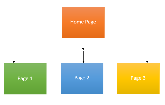
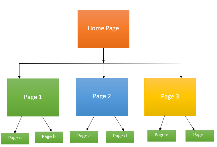
- Strict Hierarchy Pattern: This is used when the subpages have their own subpages or child elements. For complex sites this model is appropriate. A common example is an organization's official portal for its employees, using which the employees can navigate to the sites required by them like leave management, finances, payroll, etc.
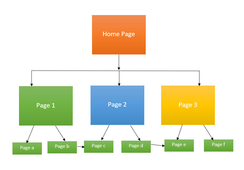
- Co-existing Hierarchy: This is for sites where the child pages can be accessed from multiple parent pages or higher level pages. If your site has a lot of information which may overlap one another, this model is appropriate.
- Single Page: Appropriate for websites with a limited amount of information. Sites like personal information and a single product advertisement can be designed using the single page model.
- Labeling System: Labeling is the art of representing a huge amount of data in a few words. Often I have seen a huge amount of data designed in a clustered page that is sufficient to make a user confused. However, those data can be compressed into labels to make the page look simpler and easier to process by the end-user. For example, let's suppose a page that you are creating has huge contact information like phone, email-id, address, etc. Instead of keeping all this information in the home page, create a "Contact" button, clicking which the user will get all the required information. The button that you created acted as a label.
- Taxonomy: The practice of taxonomy refers to the grouping of information that makes a website look well categorized and ease to the eye of the end-user. For example, if you are designing a shopping application, the product page will look clustered if you keep all the products together. Instead, make small labels like Clothing, Electronics, Household items, etc. and arrange the products categorically in each of the labels.
- Eliminating Cognitive Overhead: Cognitive load can be defined as the amount of load that can be processed by a normal human brain. While working on the website redesign, I often came across lengthy forms that require too much data to be filled by the user in a single page. Such amount of actions can stress out a user. Cognitive overhead can be avoided in this case by using a linear flow that divides the entire form into multiple smaller sections, a section is displayed only when the previous section is correctly filled. Curious for more? Read our blog on What is Cognitive Overhead in Design and How to Reduce it?
- Audit: Your website is a collection of content which is developed using a well defined Information Architecture for website. However, if you do not have any knowledge of what information bundle you have, planning a well-designed architecture gets difficult whether you are designing a site from scratch or working on a redesign. Before you start assessing the information architecture, conduct an audit session with your team and sort out the content based on what you need and what you don't.
Those five patterns map onto the three organization structures that information architecture references usually name. A hierarchical structure is the tree of parent and child pages that sits behind indexing, strict hierarchy and co-existing hierarchy. A sequential structure walks the user along one ordered path, which is how a checkout, an onboarding flow or a single page site behaves. A matrix structure lets the user choose their own route through the same content by attribute, such as sorting a catalog by price, size or color. Most real sites combine all three: a hierarchy for the catalog, a sequence for checkout and a matrix inside a filtered listing.
Validate the structure before design starts. Card sorting and tree testing answer two different questions. Card sorting asks participants to group your content and name the groups, so it shows how users expect the site to be divided. Tree testing gives participants a task and a text-only version of your hierarchy, then records whether they reach the right branch and how many wrong turns they take. Nielsen Norman Group classes card sorting as a generative method and tree testing as an evaluative one, so run the card sort first and tree test the structure it produces.
Consistent navigation is an accessibility requirement, not a preference. WCAG 2.2 success criterion 3.2.3, Consistent Navigation, is a Level AA rule: navigation mechanisms that repeat across a set of pages must appear in the same relative order every time, unless the user changes it. Screen reader users, users with low vision and users with cognitive disabilities rely on that predictability to move through a site. Fix the order of your global navigation while you are still drawing the sitemap, because reordering menus section by section breaks conformance and is costly to undo later.
User experience is as important as functionality that determines the future of your website. Just like concrete sets up the foundation of a building, Information Architecture does the same job. Carefully planning of Information architecture for website, with well structured and easy to navigate contents will not only be a treat for the end-user but would also be lucrative from an SEO point of view.

Key Takeaway: An efficient information architecture comes from research, wireframing, a content inventory, a fitting data model, clear labeling and taxonomy, and validation by card sorting and tree testing before design begins.
Author

Arnab Roy Chowdhury
Blogs: 69


Arnab Roy Chowdhury is a community contributor with 10+ years of experience working across software development, web UI engineering, and technical content writing. Currently a Senior Consultant at Capgemini, he has hands-on experience in building and maintaining cross-browser compatible web interfaces using HTML5 and modern frontend practices. Arnab has also contributed as a freelance web developer and writer, combining practical development expertise with clear technical documentation. He holds a Bachelor’s degree in Computer Engineering.


Information Architecture FAQs
Did you find this page helpful?
More Related Blogs
TestMu AI forEnterprise
Get access to solutions built on Enterprise
grade security, privacy, & compliance
- Advanced access controls
- Advanced data retention rules
- Advanced Local Testing
- Premium Support options
- Early access to beta features
- Private Slack Channel
- Unlimited Manual Accessibility DevTools Tests