

Power Your Software Testing with AI Agents and Cloud
The Native AI-Agentic Cloud Platform to Supercharge Quality Engineering. Test Intelligently and Ship Faster.


- TestMu AI (Formerly LambdaTest)
- /
- Blog
- /
- How To Style HTML Dialog Element [CSS Tutorial]
How To Style HTML Dialog Element [CSS Tutorial]
The dialog, also known as a modal dialog, is a popup box that appears on a web page as the page loads or when any buttons are clicked. A modal dialog is an

Last Updated on:
On This Page
- General structure of a Dialog Box
- Dialog Element in HTML
- HTML Dialog Element APIs
- dialog.show() vs dialog.showModal()
- How to handle user input through HTML Dialog Element?
- How to disable closing the HTML Dialog Element on Esc press?
- How to change Dialog’s backdrop?
- How to customize the HTML Dialog Element?
- Dialog Element Accessibility
- How to perform cross browser testing for HTML Dialog Element?
- How to test HTML Dialog Element with LT Browser?
The HTML5 dialog element lets developers build modal and non-modal popups with just a few lines of HTML, CSS, and JavaScript, replacing heavier libraries like react-modal or Bootstrap's modal classes that bloat page size. Its structure includes a header, body, footer, and backdrop, and major browsers, including Safari, now support it fully, so testers can verify rendering across each one.
As a freelancer, there often comes time to add a dialog to the websites. One of my clients had assigned a project where I was required to create a dialog on the payments page. In that case, I implemented the dialog using the HTML dialog element instead of other third-party libraries since it was much easier to implement with a few lines of HTML, CSS, and JavaScript. Who wants to hamper the end-user experience at the cost of heavy libraries :). Since many clients prefer using HTML5, in this blog on styling the HTML dialog element, we will be using HTML5.
By the end of this CSS tutorial on the HTML dialog element, you will be in a position to create and style the dialog using an HTML element called dialog. The best part about this selection is that you do not require additional packages.
Key Takeaways
- The HTML dialog element creates modal and non-modal popups with plain HTML, CSS, and JavaScript, so a website does not need a modal library such as react-modal or Bootstrap modal classes.
- dialog.show() opens a non-modal dialog that leaves the page interactive, while dialog.showModal() opens a modal dialog with a backdrop that blocks interaction with the page.
- A form placed inside an HTML dialog element with method set to dialog closes the dialog on submit and returns the input value, which suits login and sign-up popups.
- The ::backdrop pseudo-element styles the cover behind a modal dialog, and the backdrop-filter property can blur the page behind the dialog.
- The HTML dialog element is supported in the latest versions of all major browsers, including Safari, but not in some older browser versions.
So, let’s get started…
General structure of a Dialog Box
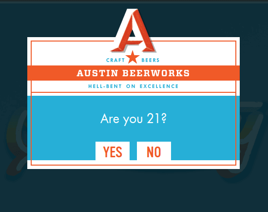
The above picture is a dialog modal used by Austin BeerWorks company to grant access to website users with a minimum age of 21. If a user selects no, they cannot visit the website since it is a beer company website. Many websites use similar dialog for various purposes like displaying important information, user confirmation, etc.
The picture below shows the general structure of the dialog.
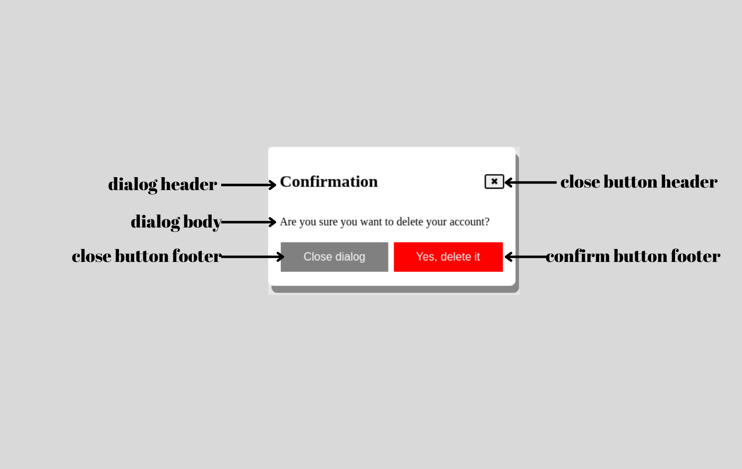
Usually, the dialog consists of a header, body, footer, and backdrop. The header includes the title, which should be clear and concise since it is the first thing users notice when a dialog appears on the page.
The body includes the description, and the footer links to necessary placeholders (e.g., About Us, Team, Contact Us, etc.) on the website. The backdrop cover is low opacity black, but you can add any color based on your needs.
Key Takeaway: A dialog box has four parts: a header with a clear and concise title, a body with the description, a footer with links or actions, and a backdrop that covers the page in low opacity black by default.

Dialog Element in HTML
HTML has introduced the new dialog element to create modal dialogs on websites. It is extremely easy to create dialogs using the dialog element. Content to be shown in the dialog box must be kept in between < dialog > and < /dialog > tags.
Previously, it was not supported by Safari, but now even Safari supports it.
The basic markup for the dialog element is shown in this CodePen.
In the above CodePen, we have used the dialog element containing a paragraph, but it’s not visible. The dialog element adds some CSS by default if we see the browser console. By default, dialogs are hidden. We need to add an extra attribute to make it visible, which we will discuss below.
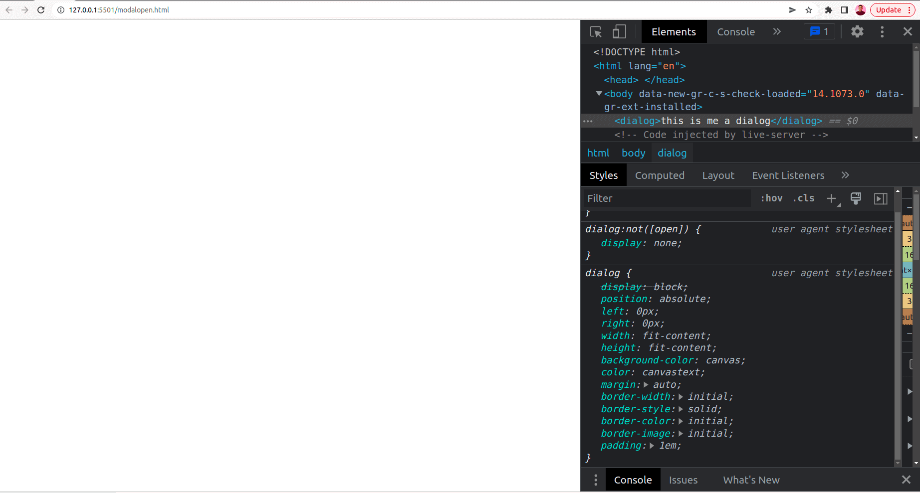
As we can see, it has added the display: none property to the existing CSS.
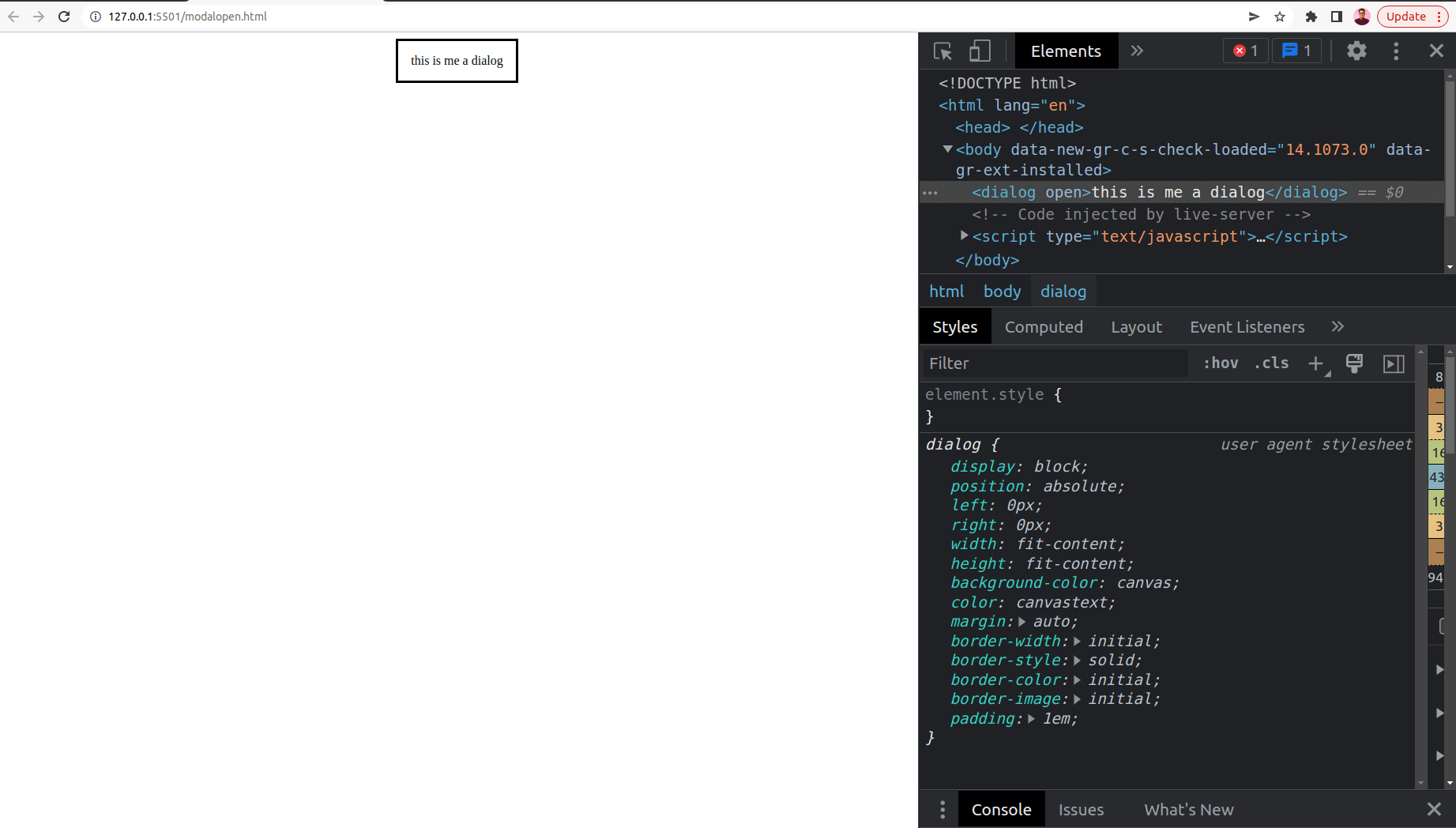
To make the dialog box appear on the webpage, we need to add the open attribute shown in this CodePen.
The dialog element uses an open attribute, which is of boolean type. Open attribute sets the dialog element as active and allows users to interact with it. If we do not specify the open attribute, we will need to add JavaScript that lets us open and close the dialog.
Adding JavaScript is the better approach since interactive dialogs can be created with it. The show() or showModal() methods in JavaScript help display a dialog we will discuss later in this blog on the HTML dialog element.
This is how the HTML dialog element looks in the browser after we add the open attribute. Also, now we can see those dialog properties are activated in the CSS.
Key Takeaway: Content placed between the opening and closing dialog tags stays hidden until the open attribute is added, and the HTML dialog element now works in every major browser including Safari.

Note: Test HTML Dialog Element for browser compatibility. Try TestMu AI Now!
HTML Dialog Element APIs
There are JavaScript APIs that can be used with the HTML dialog element to show and hide the dialog.
- dialog.show()The show method of the HTML dialog element is used to display the dialog on the webpage. Here, dialog references the HTML element named dialog, so it could be anything based on the id and class you use on the dialog element.
- dialog.close()
The close method of the HTML dialog element is used to close the dialog. Usually, the user closes the dialog if they do not want to proceed further with the dialog action and continue to interact with the website.
The examples for the above two methods can be found here in this CodePen.
The dialog element supports global attributes, attributes that can be used with all HTML elements (e.g., class, id, style, title, hidden, etc.), event attributes, and attributes that let you perform several events (e.g., onchange, onsubmit, onclick, onfocus). The example has been shown in this CodePen.
The above example used the onClick event attribute to open and close the HTML dialog element.
Key Takeaway: The HTML dialog element is controlled with JavaScript methods: dialog.show() displays the dialog and dialog.close() hides the dialog, and both can be wired to buttons through the onClick event attribute.
dialog.show() vs dialog.showModal()
Depending on different use cases, we can create two different types of dialog. One way of displaying it is by only showing the dialog and hiding the website content; the next is showing dialog alongside the website content.
We will go through these two different HTML dialog elements:
dialog.show()
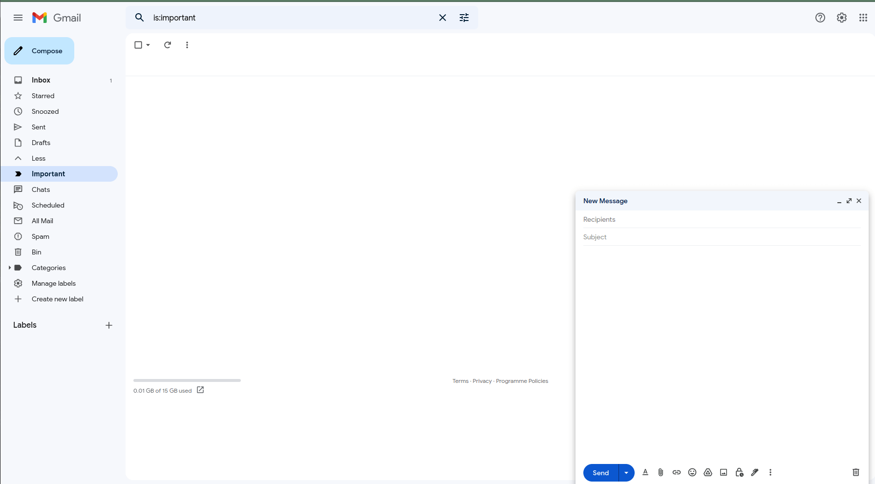
This method displays the dialog and allows users to interact with the website content. Usually, the dialog created using this method is called non-modal dialog. For example, Gmail uses a non-modal dialog for composing new email messages, as shown below.
While the compose new message dialog is open, users can still view other features like navigating to Inbox, Visiting spam messages, and so on. We have covered an example demonstrating the usage of dialog.show() earlier in the blog on HTML dialog elements.
dialog.showModal()
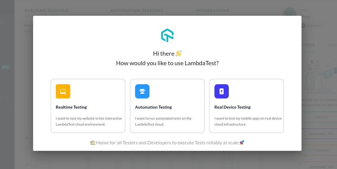
This method is used to display the dialog by adding a backdrop cover so that users cannot interact with the website.
A website’s content will only be visible to the users after interacting with the dialog. For example, TestMu AI uses a dialog with a backdrop cover on the start page.
You can find the example for dialog.showModal() method in this CodePen.
Key Takeaway: Choose dialog.show() for a non-modal dialog that users can ignore while using the page, as Gmail does for composing email, and choose dialog.showModal() when users must respond before returning to the page.
How to handle user input through HTML Dialog Element?
If you have experience working with HTML, you might have heard about the form tag. Usually, we use the form tag to pass user information to a specified URL using either the GET or POST method.
But, we can also use the form element inside the HTML dialog element with its method as a dialog that causes the form submission to close. And this will return the value of form input to the submit button that generates the dialog.
This feature is handy when we want to get user information through the dialog, like displaying the dialog for login or sign-up form.
Here is a CodePen that shows how the form element can be used inside the HTML dialog element to get the user input.
Let’s understand the codebase from the above CodePen now.
We use the form element inside the HTML dialog element with its method set to dialog. Inside the form element, there is an input field. The dialog opens by clicking the Submit user dialog button. The form is displayed here as a dialog. When a user submits the form by clicking the confirm button, the input value gets displayed on the webpage. The dialog can be closed by clicking the close button.
Key Takeaway: Setting a form inside the HTML dialog element to method dialog makes form submission close the dialog and hand the entered value back to the page, without sending a GET or POST request to a URL.
How to disable closing the HTML Dialog Element on Esc press?
By default, you can close the dialog by pressing the ESC key. But, if you want to disable this feature, you can do it by just adding a few lines of JavaScript code, as shown below.
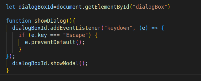
Here, we are using the getElementById() method to return the element with dialogBox id. Inside the showDialog() function, we use the addEventListener() method to attach an event handler to dialogBoxId, which uses the keydown event. And the condition e.key === “Escape” prevents the default behavior of closing the dialog by pressing the ESC key.
You can find the demo in this CodePen.
Key Takeaway: A modal HTML dialog element closes on the Esc key by default, and a keydown event listener attached to the dialog can disable closing on Esc.
How to change Dialog’s backdrop?
As discussed above, the dialog.showModal() method displays the backdrop cover with a default color of low opacity black color. You can easily modify the CSS for the dialog backdrop using the ::backdrop CSS property. This default ::backdrop CSS property blocks users from interacting with the rest of the content on the website, which means the other website content except the dialog modal cannot be selected, clicked, or focused.
By default, it occupies the entire webpage content. You can add different animations for the backdrop cover based on your necessities. You can also use the backdrop-filter property to blur the background.
Have a look at this CodePen to see how it works.
Key Takeaway: The backdrop of a modal dialog covers the entire page in low opacity black by default and can be restyled with the ::backdrop pseudo-element, including custom colors, animations, and a backdrop-filter blur.
How to customize the HTML Dialog Element?
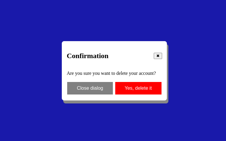
We will now see how we can customize the dialog by using HTML, CSS, and JavaScript. The result will look like this:
You can find the complete code in this CodePen:
Now, let’s understand the above codebase. Here, we have four different HTML Dialog elements.
< header >: The header element has two parts. One is the title, and the next is the close sign, which when clicked uses the closeDialog() method to close the dialog.< section >: The section element has text with some additional descriptive message.< footer >: The footer element has two buttons. The first one is the close dialog button, which upon click invokes the closeDialog() method to close the dialog.< button >: We have used the button element inside the section element responsible for opening the dialog modal. And it fires the showDialog() method on clicking it.
For JavaScript, we have used the document method, getElementById, to return an element object with the id of dialogBox. Here, we added two different functions that show and close the modal by clicking the appropriate buttons.
For styling, we have done the following:
- Added some CSS for two buttons in the footer.
- Added display: flex property for the header and close sign for dialog.
- Styled the dialog modal using box-shadow, border-radius, and border property.
- Modified look of the dialog backdrop cover using background-color and backdrop-filter properties to the ::backdrop pseudo-element.
Key Takeaway: An HTML dialog element can be fully customized with CSS and JavaScript, including the dialog box styling, the open and close behavior, and the color and blur of the ::backdrop cover.
Is the HTML Dialog Element Accessible by Default?
The dialog element handles part of the accessibility work on its own when opened with showModal(), but a developer still has to add a label and check focus behavior for screen reader users. MDN documents the exact behavior below.
- Automatic focus trap: showModal() moves keyboard focus inside the dialog and makes the rest of the page inert, so keyboard and screen reader users cannot reach background content while it is open.
- Focus returns on close: Closing the dialog sends focus back to the element that opened it, so a keyboard user does not lose their place on the page.
- Implicit dialog role: The dialog element carries an implicit ARIA role of dialog, so assistive technology announces it without an extra role attribute.
- Accessible name is not automatic: The browser does not label the dialog for you. Add aria-labelledby pointing to the header text so screen readers announce its purpose.
- No trap with show(): A non-modal dialog opened with show(), like the Gmail compose example above, gets no automatic focus trap or inert background, so any custom keyboard behavior has to be added by hand.
Key Takeaway: A dialog opened with showModal() traps keyboard focus, makes the page behind inert, returns focus on close, and carries an implicit dialog role, but the developer must still add aria-labelledby, and a dialog opened with show() gets no focus trap.
How to perform cross browser testing for HTML Dialog Element?
Cross browser testing is the process of making sure that every website or web application we create runs smoothly on numerous browsers. Different users use different web browsers with various versions. So, it is the job of a web developer to make sure the website or web app we create runs properly on different browsers with different versions.
HTML dialog element is supported on all the latest major web browser versions. But, it is not supported on some older versions of many browsers.
In the below screenshots, we will be using the code from the above CodePen over the Netlify platform and trying to access it on various browsers provided by TestMu AI.
- Login to the TestMu AI platform. If you haven’t registered yet, sign up for free.
- Go to Real Time Testing, select Browser Testing, and optimize your desired configurations.
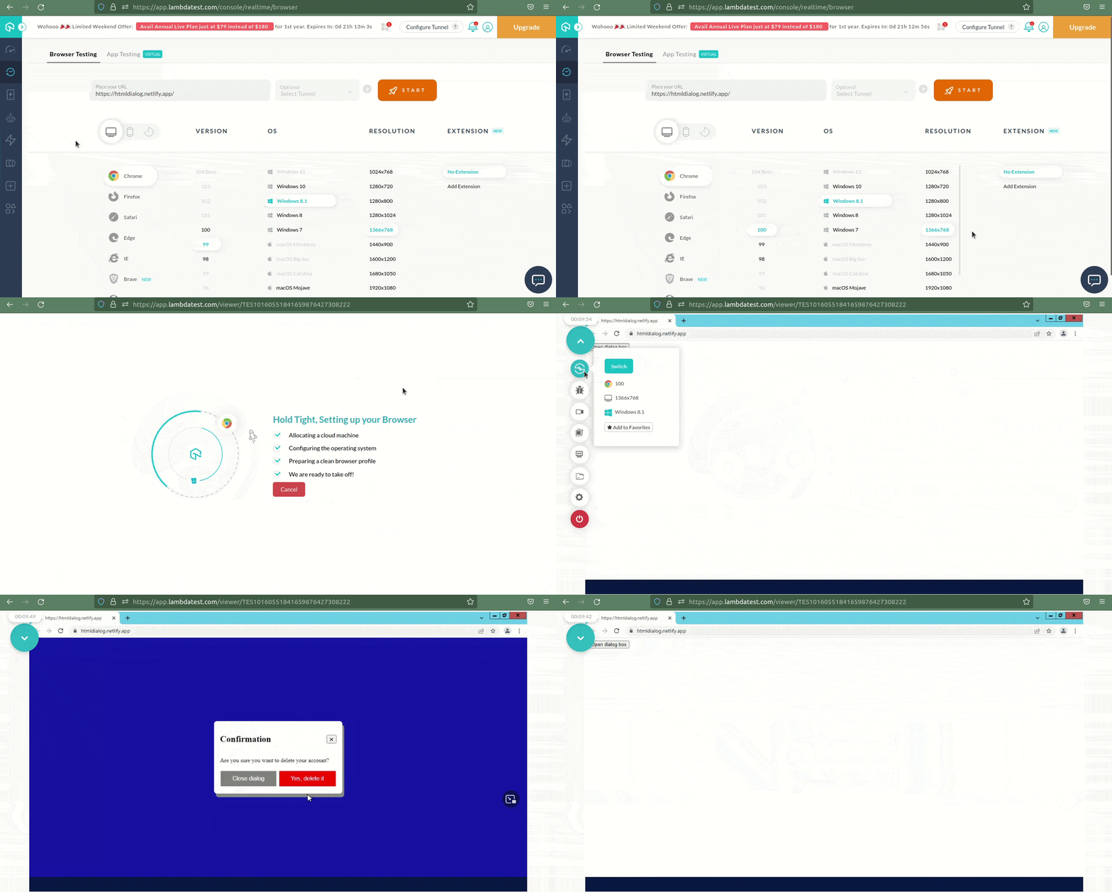
With the help of the Real Time Testing feature available on the TestMu AI platform, this is how we perform cross-browser testing for the dialog element. Using this platform, we can do more than just cross-browser testing of the dialog element.
Key Takeaway: The HTML dialog element is unsupported in some older browser versions, so dialogs should be cross browser tested on the browsers and versions that real users run.
How to test HTML Dialog Element with LT Browser?
We can conduct web testing on an online browser farm of more than 3000 real browsers, operating systems, and devices, including smartphones, tablets, and desktops, thanks to cross browser testing solutions like TestMu AI. This enables us to test a website’s responsiveness across many operating systems and browsers.
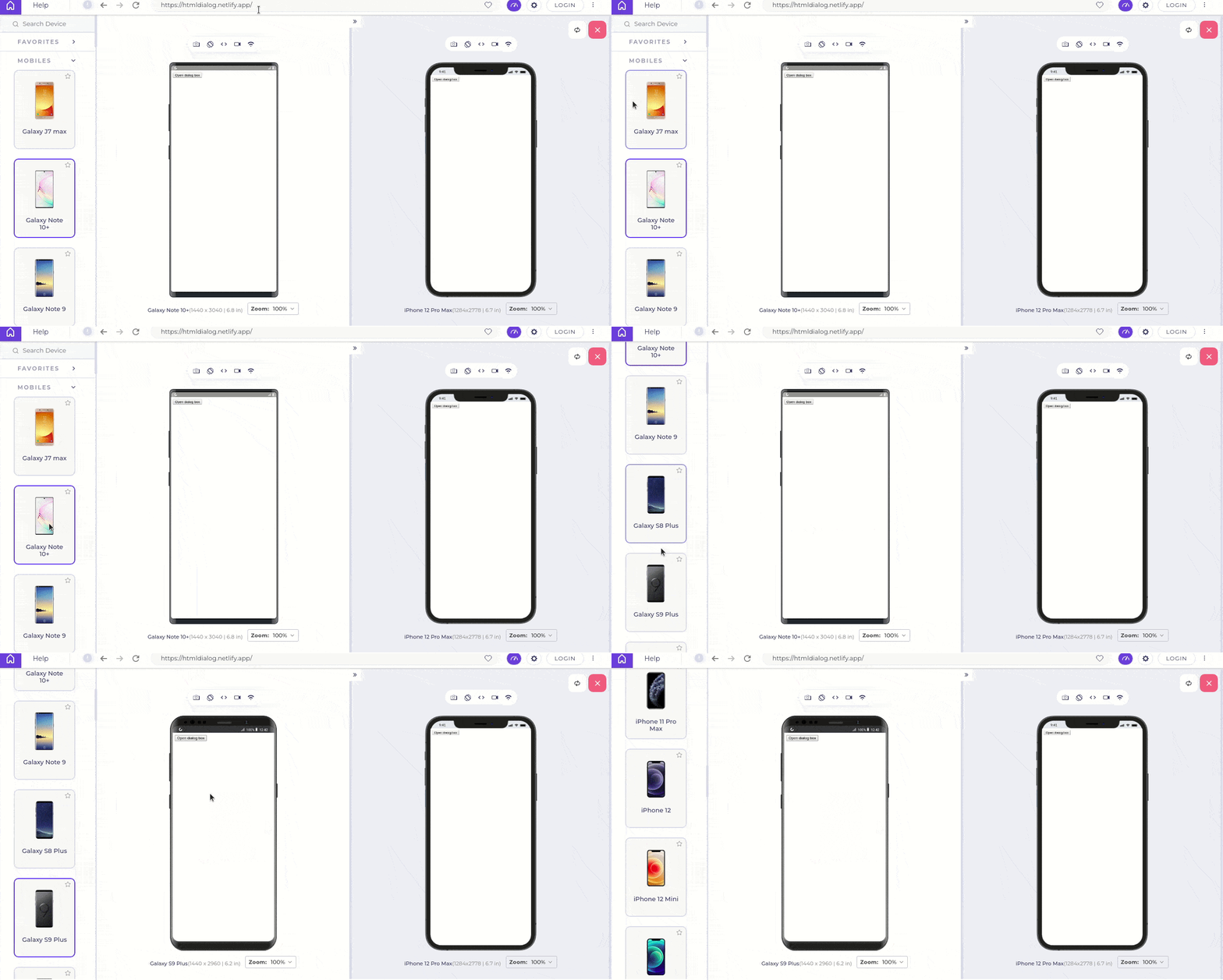
TestMu AI makes it easy and affordable to test your site across multiple mobile devices through its mobile-friendly testing tool – LT Browser, a tool featuring 50+ pre-installed viewports (including mobile, tablets, desktops, and laptops), lets you quickly check how your website responds under thousands of screen resolutions.
This is how the responsiveness testing looks on the LT Browser.
You can also go through this video to get a glimpse of LT Browser from TestMu AI:
You can Subscribe to the TestMu AI YouTube Channel and stay updated with the latest tutorials around Playwright tutorial, Selenium automation, Cypress automation, CI/CD, and more.
Conclusion
In this blog post about the native HTML dialog element, we saw how we could create a dialog modal using the HTML dialog element. We discussed a few differences between showModal() and show() dialog methods. Also, we went through customizing the dialog and getting user input through the form in a dialog.
If you are looking for a simple solution to create a dialog modal without using any third-party libraries, then the HTML dialog element will come in handy.
Now that you have seen how to implement the dialog using HTML, CSS, and JavaScript, you should be able to work with it effectively. For those looking to dive deeper, resources like the “Top 90+ HTML Interview Questions and Answers ” can be invaluable. I hope you enjoyed reading this article and learned about the overall concept of the dialog element.

Austin Siewert
Co-Founder, Steadfast Systems
Discovered @TestMu AI yesterday. Best browser testing tool I've found for my use case. Great pricing model for the limited testing I do 👏
2M+ Devs and QAs rely on TestMu AI
Deliver immersive digital experiences with Next-Generation Mobile Apps and Cross Browser Testing Cloud





Frequently asked questions
Did you find this page helpful?
More Related Blogs
TestMu AI forEnterprise
Get access to solutions built on Enterprise
grade security, privacy, & compliance
- Advanced access controls
- Advanced data retention rules
- Advanced Local Testing
- Premium Support options
- Early access to beta features
- Private Slack Channel
- Unlimited Manual Accessibility DevTools Tests