

Power Your Software Testing with AI Agents and Cloud
The Native AI-Agentic Cloud Platform to Supercharge Quality Engineering. Test Intelligently and Ship Faster.


- TestMu AI (Formerly LambdaTest)
- /
- Blog
- /
- Common Screen Sizes and Resolutions in 2026
Common Screen Sizes and Resolutions in 2026
See the most common screen sizes and screen resolutions for 2026 across desktop, mobile, and tablet, with real usage share and how to test your site on each.
Last Updated on:
Applications are accessed across a huge range of devices globally, a challenge known as device fragmentation. Most users in a given region still cluster around certain screen size ranges, so these common screen sizes are key to prioritizing test coverage and optimizing app performance.
To further refine your screen size testing, it's essential to consider screen resolution, as it directly impacts how your app will appear on different devices. Pixel count is only half of it, and the difference between DPI and screen resolution explains why two screens with identical resolutions can still render very differently.
According to Statcounter, tracking these screen resolutions helps identify the most commonly used configurations, ensuring your app delivers an optimal user experience across popular devices.
The most common screen sizes in 2026 are 1920×1080 on desktop, 414×896 and 360×800 on mobile, and 768×1024 on tablets (Statcounter). The full breakdown by device, with usage share and example devices, is in the table below.
Why Should Testers Focus on Common Screen Sizes?
Testers must aim to consider all users, regardless of device size, for an operation. While this approach might seem ideal in theory, it often leads to excessive resource expenditure with limited returns.
Small and medium enterprises can't afford such costs, so the focus shifts to the screen sizes most commonly used by their users.
Some of the reasons why testers should focus on common screen sizes are mentioned below:
- Better User Experience - Focusing on common screen sizes ensures the application works well for the majority of users, improving overall user satisfaction.
- Helps in Responsiveness - A responsive application adapts to different screen sizes, resolutions, and operating systems. Knowing the common screen sizes helps ensure the app renders and behaves consistently across devices.
- Understand User Needs - Analyzing common screen sizes allows testers to design the application for the devices most used by their audience, improving the app's relevance.
- Shift Towards Market Trends - Regular analysis of common screen sizes helps track market shifts and adapt before user preferences change significantly.
- Optimization of Application - Knowing the common screen sizes allows testers to focus on optimizing media elements (images, videos) and other screen-size-dependent features, enhancing the user experience.
By prioritizing common screen sizes, testers can ensure the application is optimized for the majority of users, reducing the risk of negative feedback.
Finding Common Screen Sizes Being Used
To find the common screen sizes, you should incorporate the following methods into the testing cycles:
- Analytics - Analytics reports provide insights into user behavior and usage patterns, including the screen sizes users are using and their respective percentages. This is the most reliable method for identifying common screen sizes.
- Purchase Trends - Analytics only shows past data. To predict future trends, monitor device purchase trends, available through device manufacturers' official websites. This helps anticipate which devices will become popular.
- Future Device Plans - Keep an eye on manufacturers' plans for releasing new devices with different screen sizes. This helps ensure the team is prepared for any changes before devices are launched.
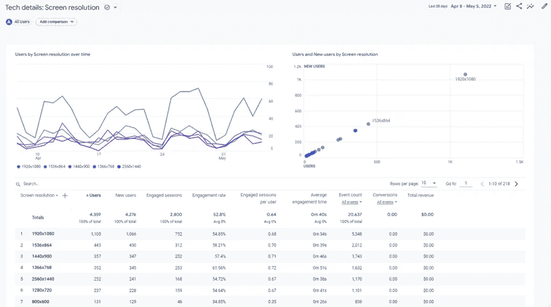
By analyzing these three factors, testers can prepare for both current and future scenarios without relying on AI algorithms, which are currently not fully accurate. To spot-check how a layout renders at a specific resolution, you can also use a free screen resolution test.
Common Screen Sizes for Testing
Understanding common screen sizes is crucial to avoid creating an overly broad range that includes devices with vastly different screen sizes, such as mobile devices with screens up to 7 inches and laptops with screens as large as 17 inches. This makes it important to segregate the common screen sizes into categories before beginning testing.
Common screen sizes can be divided into four categories:
- Mobile Devices - Devices up to 7 inches, including features like SIM card support and call functionality.
- Tablet Devices - Larger than mobile devices with screens ranging from 7 to 13 inches, used mainly for productivity but lacking mobile features like call support.
- Large Screen Devices - Desktops and laptops with screens ranging from 13 to 17 inches.
- Extra Large Screen Devices - Monitors and televisions, which have screens larger than 17 inches.
Screen size is the physical diagonal measurement of a display in inches. Screen resolution is the number of pixels that display renders, written as width by height, such as 1920x1080. Two devices can share a screen size and still differ in resolution, which is why a layout can look sharp on one and cramped on the other.
A given screen size can therefore run at several resolutions, and it is the resolution that decides how much fits on screen and how sharp it looks.
The table below lists the most common resolutions by device category, with current worldwide usage share (Statcounter, June 2026) and an example device for each. Widths and heights are in CSS pixels, which is what browsers and responsive layouts actually respond to:
| Device category | Resolution (W×H) | Usage share | Example device |
|---|---|---|---|
| Desktop | 1920×1080 | 20.2% | Full HD laptops and monitors |
| Desktop | 1536×864 | 6.94% | 1080p laptop scaled to 125% |
| Desktop | 1280×720 | 6.01% | HD monitors |
| Desktop | 1366×768 | 5.71% | Budget and older laptops |
| Mobile | 414×896 | 12.09% | iPhone XR and iPhone 11 |
| Mobile | 360×800 | 9.21% | Samsung Galaxy A series |
| Mobile | 390×844 | 6.31% | iPhone 12 through 14 |
| Mobile | 375×812 | 5.99% | iPhone X, 11 Pro, and 13 mini |
| Tablet | 768×1024 | 9.81% | iPad 10.2 inch |
| Tablet | 800×1280 | 6.59% | Samsung Galaxy Tab A |
| Tablet | 820×1180 | 6.02% | iPad Air 10.9 inch |
| Tablet | 810×1080 | 5.99% | iPad 9th generation |
These resolutions also map to your responsive design breakpoints: the mobile widths (360 to 414 px) drive your small breakpoint, tablets (768 to 820 px) the medium one, and desktops (1280 px and up) the large one.
Because browsers respond to the CSS viewport width rather than the physical screen, test each breakpoint at these pixel widths. For how to set them, see the guide on responsive design.
Most Common Mobile Screen Sizes
Four mobile resolutions carry most of the traffic in the table above: 414x896, 360x800, 390x844, and 375x812. Together they account for roughly a third of all screens Statcounter measures worldwide, which makes them the shortest useful mobile test list.
Mobile differs from desktop in ways that matter once you turn those numbers into tests:
- The widths barely move, the heights do - every common mobile width sits between 360 and 414 pixels, so a single small breakpoint covers all four. The heights range from 800 to 896, and that gap is what decides how much of your page sits below the fold.
- These are CSS pixels, not hardware pixels - a modern phone advertises a far higher hardware pixel count than the width it reports to the browser, because the browser works in CSS pixels. Test against the reported width, which is what your media queries actually read.
- Landscape halves the height - rotating 360x800 gives you 800x360, and 360 pixels of height is where sticky headers, chat widgets, and consent banners do the most damage.
Testers should treat screen sizes as separate lists, focusing on each individually. This approach helps identify device-specific bugs and ensures responsiveness across relevant screen sizes.
Segregating screen sizes allows testers to concentrate on the most important ones for all user types rather than creating a general list.

Note: Perform web and mobile application testing over a wide range of screen sizes and resolutions. Try TestMu AI Today!
How Will Your App Work on Different Screen Sizes?
You cannot tell from the resolution numbers alone. A layout that looks correct at 1920x1080 can still break at 360x800, because what renders is decided by your CSS breakpoints and the length of your own content, not by the screen. The only reliable answer comes from loading the app at each width and looking at it.
These are the failures that appear when the viewport changes, roughly in the order they are worth checking:
- Layout reflow - columns collapse in an unintended order, or a sidebar lands on top of the main content instead of beneath it.
- Touch targets - controls sized for a mouse pointer end up too small and too closely spaced once the same layout loads on a phone.
- Text wrapping - a heading that fits one line on desktop wraps to three on mobile and pushes the primary action below the fold.
- Fixed elements - sticky headers, chat widgets, and consent banners occupy a fixed height, which costs proportionally far more on an 800 pixel tall screen than a 1080 pixel one.
- Media and art direction - a wide hero image cropped to a narrow viewport frequently loses its subject entirely.
- Orientation - landscape roughly halves the available height, and that is where most layouts fail first.
The fastest way to find out for your own app is to open it in a live browser session and step through the widths in the table above, rather than dragging your own browser window narrower. Resizing your window only ever tells you how your own machine, at your own pixel ratio and font settings, renders the page.
Testing on Common Screen Sizes
With the common screen sizes identified, the next step is the actual responsive and cross-device testing.
This takes place in two steps:
- Ensuring Prerequisites are Complete
- Choosing the Testing Method
Ensuring Prerequisites are Complete
Before starting the testing process, ensure the prerequisites are in place. This includes:
- Attaching an analytics and monitoring tool to the application.
- Collecting and analyzing data to identify common screen sizes.
- Considering parameters like geographical locations for more targeted testing.
- Gathering manufacturer details and extracting screen size data for future planning.
Choosing the Testing Method
Once the prerequisites are in place, selecting the right testing method is crucial.
Here are some effective options to choose from:
| Method | Strengths | Limits | Best used for |
|---|---|---|---|
| Physical devices | Authentic hardware behaviour, accurate touch and sensor response, true performance figures. | Expensive to buy and maintain, limited model coverage, needs physical storage and charging. | Final validation and devices with hardware quirks worth checking by hand. |
| Emulators and simulators | Fast to launch, no hardware cost, easy to sweep many screen sizes in one sitting. | Miss real-world factors such as network latency, battery state, and true touch timing. | Early development checks and quick layout sweeps inside a CI pipeline. |
| Real device cloud | Wide model range on demand, remote access, no maintenance, scales across a team. | Needs a network connection, and heavy use runs on a subscription. | Cross-device coverage across many OS versions without owning the hardware. |
Real device cloud like TestMu AI offers an AI-powered platform ideal for scaling your web and mobile application testing.
With TestMu AI, you can perform emulator/simulator and real device testing across 10,000+ real devices and 3,000+ browser and OS combinations.

Testing Common Screen Sizes on a Real Device Cloud
Real device cloud like TestMu AI allows you to perform mobile automation testing using frameworks like Appium, Espresso and XCUITest.
This platform enables efficient testing of both web and mobile applications without the need to maintain physical devices, making it a cost-effective and scalable solution for your testing needs.
Testing the application using real devices on TestMu AI is a fairly easy path to follow.
- Create an account on the TestMu AI platform.
- From the Dashboard, go to Real Device.
- Choose App Testing (or Browser Testing if needed). For mobile app testing, select App Testing.
- Select the device type, either Android or iOS and upload your apk or ipa file.
- Choose the browsers you want to test on, along with the specific device operating system.
- Click Start to begin testing.
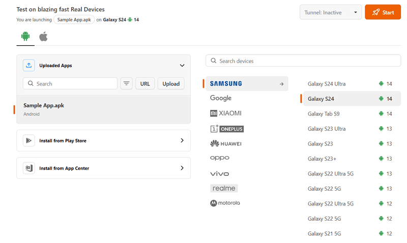
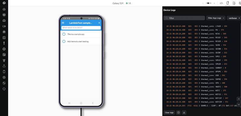
The screen is divided into three sections:
- Left Section - Contains specialized testing tools, including geolocation testing, visual testing, screenshot testing, video recording, and more.
- Middle Section - Displays the selected device with the application installed, allowing the tester to operate it just like a physical device.
- Right Section - Shows logs generated during the processes running on the device.
Together, these panels create an efficient testing environment for common screen sizes with minimal effort.

Subscribe to the TestMu AI YouTube Channel for more videos on mobile testing concepts.
Best Practices for Testing Common Screen Sizes
Testing common screen sizes is a specific part of application testing, focusing on certain screen sizes rather than covering all possible ones.
Here are some best practices to help make this process smooth and effective:
- Consider Aspect Ratios - Screen size testing is more than one resolution. Test different aspect ratios per size, especially for split-screen multitasking or when the app is resized, to keep the layout smooth.
- Use Analytics Regularly - Analytics provides a list of common screen sizes for your app, but these sizes change as user preferences shift. Keeping analytics updated in every testing cycle, even for frequent releases, is a good practice.
- Monitor User Behavior - Monitoring tools give insights into how users interact with your app on different screens. They reveal patterns, like which buttons users click the most on a particular screen size, helping to optimize layouts for a better user experience.
- Test in Both Portrait and Landscape - Testing on a screen size like 360×800 means checking it both in portrait (360×800) and landscape (800×360) orientations.
- Stay Updated on Trends - Monitoring mobile app development trends, device sales, and user surveys helps anticipate changes in popular screen sizes, enabling the team to adapt quickly as new sizes emerge.
- Use Real Devices - Emulators and simulators miss real-world factors like network latency. Real devices give accurate metrics and true reliability, and cloud tools such as TestMu AI make them easy to access.
- Include Accessibility Testing - Accessibility testing gives users with visual, auditory, or motor impairments an equal experience, and it is a legal requirement for many businesses. Tools like the Accessibility DevTools Chrome extension help verify it.
- Focus on Performance - Performance testing ensures the app meets user expectations. A poor experience can harm the app's reputation, even if the issue is due to the user's network or device. Regular performance checks should be part of every release.
Following these general practices helps in testing devices with common screen sizes. Other practices may apply depending on the project, business, or users, so consider these as well for the best results.
Conclusion
Start by pulling your own analytics to see which screen sizes your users actually run, then match them against the current top resolutions per category in the table above.
Testing that short list across real devices catches the layout and responsiveness bugs that reach the most users, without spreading effort across sizes nobody uses.
To run those checks without maintaining a device lab, open a live session on TestMu AI's live testing across desktop, mobile, and tablet resolutions, and follow the desktop browser real-time testing docs to get set up.
Author

Harish Rajora
Blogs: 100


Harish Rajora is a software developer at TestMu AI with over 6 years of hands-on experience in Python and cross-platform application development across Windows, macOS, and Linux. He has authored 800+ technical articles and worked on large-scale projects, including GenAI applications and core engineering features used by millions. Harish has led DevOps initiatives building CI/CD pipelines with Jenkins, AWS, GitLab, and GitHub, and holds an M.Tech in Software Engineering from IIIT Allahabad.
Reviewer

Shivam Singh
Reviewer
Shivam Singh is a Lead Member of Technical Staff at TestMu AI (formerly LambdaTest), architecting the Real Device Cloud that runs automated app and web tests on real Android and iOS devices. He designed the architecture for real-device app and web automation and wrote the microservices from scratch in Golang, including the XCUITest and Espresso execution layers for iOS and Android. His platform reached peak parallel concurrency of 150+ for app automation while handling roughly 500,000 tests a month, and he leads the team that keeps the automation grid running. He brings over eight years of engineering experience and holds a B.Tech in Computer Science.


Screen Sizes FAQs
Did you find this page helpful?
More Related Blogs
TestMu AI forEnterprise
Get access to solutions built on Enterprise
grade security, privacy, & compliance
- Advanced access controls
- Advanced data retention rules
- Advanced Local Testing
- Premium Support options
- Early access to beta features
- Private Slack Channel
- Unlimited Manual Accessibility DevTools Tests