

Power Your Software Testing with AI Agents and Cloud
The Native AI-Agentic Cloud Platform to Supercharge Quality Engineering. Test Intelligently and Ship Faster.


- TestMu AI (Formerly LambdaTest)
- /
- Blog
- /
- Intuitive Mobile UX Design: Key Elements and Best Practices
Intuitive Mobile UX Design: Key Elements and Best Practices
Learn the key elements of an intuitive mobile UX: page speed and Core Web Vitals, findability, thumb-zone reachability, responsive design, and PWAs.
Last Updated on:
On This Page
An intuitive mobile UX comes from a page that loads fast, keeps controls inside the thumb zone, and asks for the least input.
Google's Core Web Vitals set the mobile pass mark at a Largest Contentful Paint of 2.5 seconds, an Interaction to Next Paint of 200 milliseconds, and a Cumulative Layout Shift of 0.1.
This guide covers what makes a good mobile experience, findability, page speed, visual appeal, the thumb zone, mobile forms and input fields, navigation, bonus tips, and how AI is changing mobile UX work.
Key Takeaways
- Google's Core Web Vitals set the mobile speed pass mark at a Largest Contentful Paint of 2.5 seconds or less, an Interaction to Next Paint of 200 milliseconds or less, and a Cumulative Layout Shift of 0.1 or less.
- A mobile user journey should reach its goal in the fewest possible taps, so each feature interaction is best split into a small user story and tested on its own.
- Close to 49% of smartphone users operate their phone with their thumbs alone, so the main mobile controls and calls to action belong inside the thumb zone.
- Responsive web design is required on mobile because screen size, resolution, viewport, and operating system differences make the same page render differently on a phone than on a desktop.
- The inputmode attribute raises the matching virtual keyboard on a mobile form, and autocomplete tokens let the browser fill a saved value in a single tap.
- Tinder's Progressive Web App was 90 percent smaller than its native app and cut load time from 11.91 seconds to 4.69 seconds, which makes a Progressive Web App a strong alternative to an app-only strategy.
What Makes A Good Mobile Experience?
Mobiles have become such an integral part of our lives that users expect every business to offer a tailored & personalized user experience. From smooth scrolling, responsive images, contrasting CTAs to page load speed, browser compatibility, accessibility, etc., there are lots of boxes to tick from your responsive web design checklist.
The question that follows is simple. What makes a winning mobile UX?
- Speed
- Navigation
- Reachability
- Usability
- Responsiveness
- Visual Appeal
- Personalization
- Progressive Web Apps (PWA)

Key Takeaway: A good mobile experience is built from eight elements: speed, navigation, reachability, usability, responsiveness, visual appeal, personalization, and Progressive Web Apps.
Findability Precedes Usability
The user journey must be as seamless and as effortless as it can be! It is recommended that your website should have a minimum number of taps for any user journey.
Divide your website's feature interactions into smaller & meaningful user stories. Test usability for each interaction and minimize the steps wherever possible.
Key Takeaway: Findability improves when every feature interaction on a mobile site is split into a small user story, tested for usability, and reduced to the fewest possible taps.
Need for Speed!
How quickly your website loads directly affects how many visitors stay long enough to convert. Every extra second on a mobile connection gives the user another reason to leave. A content delivery network, compressed images, and deferred JavaScript are usually the three changes that move the number the most.
Mobile speed now has a published pass mark. Google measures it through Core Web Vitals, and on March 12, 2024 it replaced First Input Delay with Interaction to Next Paint, so responsiveness is judged across every interaction on the page rather than only the first one. A page rates as good when Largest Contentful Paint stays at or under 2.5 seconds, Interaction to Next Paint at or under 200 milliseconds, and Cumulative Layout Shift at or under 0.1.
Today's users expect a fast and stable mobile experience. Measure all three metrics on a throttled connection, because that is where a mid-range phone fails first.
Intrigued to know how your website would load on slower mobile networks? With LT Browser, you can do network throttling to check your website's performance under different network conditions.
Key Takeaway: Mobile page speed improves most from a content delivery network, compressed images, and deferred JavaScript, and Core Web Vitals should be measured on a throttled connection because that is where a mid-range phone fails first.
Visual Appeal akin to WYSIWYG
What you see is what sells. A visually appealing UI helps lower bounce rate, drives better engagement, and increases your website's stickiness quotient. It goes without saying that selling something that doesn't look appealing will be an arduous task.
Here are the elements that help in creating an eye-catching visual experience for the mobile web.
Responsive Web Design
The way your website is rendered on a desktop device is entirely different from how it appears on a mobile device (Check how to test on mobile devices?). The screen size, resolution, viewports, and operating systems might lead to a UI anomaly.
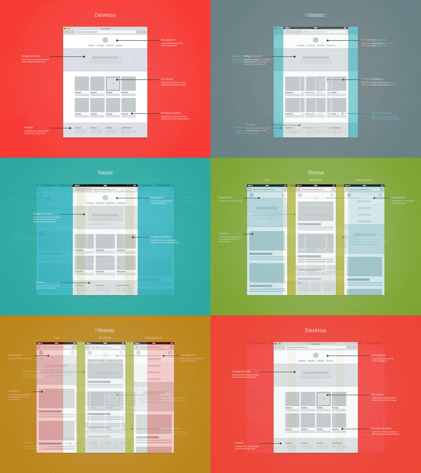
The one-size-fits-all approach is not applicable, as the nuances of engagement, context, and intention vary from one device to another.
It is essential to have a responsive web design to make the mobile experience worthwhile for your mobile users.
Less Is More
You have a narrow window to convey what your product does. Use it by embracing minimalism in design and content, and by relaying only the things that matter most.
Inclusion of too many elements on the web page can lead to cognitive overload, which can be a damper to the user experience. The idea is to embrace minimalism for delivering a delightful experience to the audience. Using white spaces removes unnecessary complications and unnecessary hurdles in the user journey.
The catch about whitespaces is they need not be white in color. The design team can experiment with different color palettes, grid layouts, and typography to make the design more catchy without sacrificing the core principles of minimalism in mobile UX design.
Here is how Nike is bossing it!
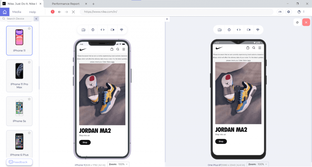
Hat Tip: To clear out the clutter, take the Squint Test. If you squint your eyes while looking at your site, the most important things should stand out first, and the least important things should stand out last.
Key Takeaway: Visual appeal on mobile comes from a responsive layout that adapts to each screen size and from minimalist design that uses whitespace to avoid cognitive overload.
Mind The Thumb Zone
On mobile UX, you don't get a mouse pointer; instead, you work with your fingers and mostly the thumb, which covers a lot of real estate. As per Steven Hoober's 2013 research, close to 49% of smartphone users rely exclusively on their thumbs to do things on their phones.
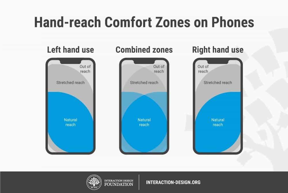
Your design team may need to re-evaluate the size of buttons on mobile UX.
There is now a published floor for that size. WCAG 2.2 Success Criterion 2.5.8, Target Size (Minimum), requires pointer targets to be at least 24 by 24 CSS pixels at Level AA, with exceptions for inline targets and for targets that already carry enough spacing around them. Treat 24 pixels as the accessibility floor rather than the design target, because a thumb held at an angle needs more room than a mouse pointer.
Key Takeaway: WCAG 2.2 Success Criterion 2.5.8 sets a Level AA minimum pointer target of 24 by 24 CSS pixels, and a mobile button should be bigger than that floor because a thumb at an angle needs more room than a mouse pointer.
How Should You Design Mobile Forms and Input Fields?
Mobile forms work when the phone does the typing. Set the correct input type, declare each field's purpose with autocomplete tokens, and never block paste. A form is where an intuitive mobile UX usually breaks, because every field costs the user effort on a small on-screen keyboard.
Start with the keyboard. The inputmode attribute tells the browser which virtual keyboard to raise, and it accepts none, text, decimal, numeric, tel, search, email and url. A postal code field with inputmode set to numeric gives the user a digit pad instead of a full QWERTY layout. The attribute changes only the keyboard and enforces no validation, so keep the matching input type as well.
Next, declare what each field holds. The autocomplete attribute carries fixed tokens such as given-name, email, street-address, postal-code, one-time-code and current-password, and the browser uses them to fill saved values in a single tap. Valid tokens also satisfy WCAG 2.2 Success Criterion 1.3.5, Identify Input Purpose, at Level AA.
Sign-in and checkout need the same care. WCAG 2.2 Success Criterion 3.3.8, Accessible Authentication (Minimum), is Level AA and rules out a cognitive function test such as recalling a password unless the step also offers an alternative. A login screen that blocks paste or switches autofill off fails it.
These attributes now serve a second reader. Browser agents built on Playwright MCP operate on Playwright's accessibility tree rather than pixel-based input, so an agent locates a checkout field by its programmatic name and role. A field with no programmatic label is hard for that path to identify, however clear it looks on screen.
Key Takeaway: A mobile form should set inputmode for the right keyboard and autocomplete tokens for each field, and it must allow paste at sign-in because WCAG 2.2 Success Criterion 3.3.8 fails a login screen that blocks paste or turns autofill off.
Go Easy With The Navigation

Steve Jobs
Your users are looking out for a potential solution on your website; it is for you to ensure that they get the answers as quickly as possible, and the website's navigation plays a crucial role in shortening the route to their destination.
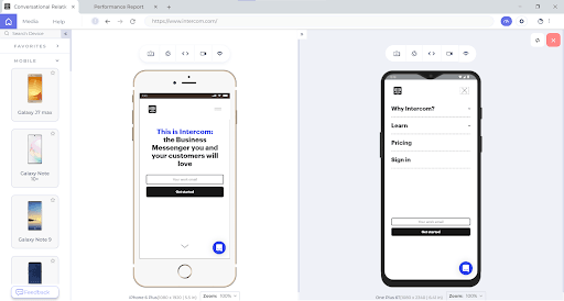
An intuitive mobile UX makes use of a hamburger menu and relatable home icons. Intuitiveness simplifies the user journey, thereby enabling them to perform subsequent actions in the shortest possible time.
Placement of elements like the navigation bar, search bar, hamburger menus, etc., lays the foundation of the user journey. Focus on breezy onboarding and ease of navigation so that the user finds the relevant information in the least possible clicks!
Let us take a look at how Intercom does it.
Deliver A Cross Browser Compatible Mobile Experience!
Website Navigation is working in Safari but not in Chrome https://t.co/K0HC77yAAy #css #nav #html pic.twitter.com/HFDPlAR9L0
— Meme Overflow (@overflow_meme) February 22, 2021
Even though your website renders seamless across various mobile resolutions, screen sizes, operating systems, it doesn't guarantee its browser compatibility!
You can leverage TestMu AI to validate your website across 3000+ desktop and mobile browsers on cloud, for live and automated browser testing.

Key Takeaway: Mobile navigation should lead a user to the answer in the fewest clicks through familiar patterns such as a hamburger menu and a home icon, and that navigation still has to be checked in every mobile browser.
Who's Up For Some Bonus Tips?
Prim up your mobile website's UX, but why stop there? Here are some bonus tips for a head-to-toe inspiration to help you maximize retention from mobile-first customers.
Personalization Goes a Long Way
Personalization can be considered as the cornerstone of providing an awesome customer experience. As per Gartner, though personalization holds greater relevance when it comes to B2C businesses, personalization in B2B businesses is also gaining pace.
B2B businesses can close deals faster by connecting with users at different stages of the buyer journey, predicting their actions and delivering them ultra-relevant offers.
Hyper-personalization can help you build brand loyalty, decrease customer churn and increase the LTV(Lifetime Value).
Also Read: Mobile UI Testing Tutorial: A Comprehensive Guide With Best Practices
Accelerate User Engagement with PWAs
App-only strategy has been a debatable topic since the time it was implemented by a few online enterprises. It wouldn't be fair to assume that a mobile app is the only way you could serve your customers. Installed apps also shed a large share of their users within weeks of download, so an install is not the same as a retained customer.
A significant chunk of your customers might be browsing your website on a mobile browser, you are sure to lose this traffic by going the 'app-only route'. It is no brainer that Mobile app-only approach is causing 10% loss in sales and your business can go downhill by deploying this strategy.
Instead, it's better to build a mobile-optimized website or, better yet, a Progressive Web App (PWA).
Progressive Web Apps are all set to lead the app-less revolution.
As per Applify:
- Ride-hailing giant Uber reaped immense benefits from PWA as its PWA could load in 3 seconds flat on 2G connectivity.
- Online dating giant Tinder created a PWA that was 90 percent smaller in size than its native equivalent. This resulted in a decrease in the load time from 11.91 seconds to 4.69 seconds. Increased user-engagement was a given with Tinder's PWA strategy!
With PWA, OTA Trivago's click-out rate increased by 97%, along with a rise in user engagement by 150 percent.
Long story short, if you wish to increase user engagement and decrease user churn, PWA is the way to go!
Key Takeaway: Personalization and Progressive Web Apps both raise mobile retention, and Trivago's Progressive Web App increased its click-out rate by 97% and user engagement by 150%.
How Is AI Changing Mobile UX Work In 2026?
AI has moved into the tools a mobile UX team already opens every day, and the gain is faster diagnosis rather than automated design. It shortens the distance between a reported defect and its cause. It does not decide what a screen should say.
Chrome DevTools now ships an AI assistance panel backed by Gemini. Google documents four uses for it: explaining an element's styles and helping fix a layout bug, reading request and response headers to explain why a request failed, explaining what an unfamiliar script does, and finding the root cause of a sluggish page, including work on Core Web Vitals.
The same documentation records the limits. The panel is disabled by default, needs the latest Chrome and a signed-in user who is at least 18 years old and in a supported location, is labeled experimental, and can return inaccurate information. Treat a generated answer as a lead to confirm on a real handset, not as a result.
The second shift is who reads the interface. An agent driving a checkout through the accessibility tree depends on the same programmatic names and autocomplete tokens that a screen reader needs, so the field labeling described earlier now serves two readers instead of one.
What none of this settles is whether a control falls inside the thumb zone of a one-handed user, or whether a label reads clearly to someone on a moving train. Those answers still come from a real device and a real person.
Key Takeaway: Chrome DevTools AI assistance explains styles, failing requests, unfamiliar scripts and Core Web Vitals bottlenecks, but Google labels it experimental and off by default, so confirm every generated answer on a real handset.
Wrapping Up!
Blogpost in a tweet:
— shawn swyx wang (@swyx) February 21, 2021
1. Mobile was the first real "Internet of Things"
2. The rise of "front of frontend" & "back of frontend" devs is result of insatiable demand for better UX and the need to scale distributed apps
3. Startups specializing in serving them can beat incumbents.
It's essential to understand the critical elements of an excellent mobile UX before you can provide your users with relevant and frictionless mobile experience.
Finally, you are at the last mile to tick all the items in the responsive web design checklist! Consistency across the plethora of mobile devices will help you transit from a good user-experience to a WOWsome user experience.
Take the first step to build a mobile friendly experience for your users with the LT Browser, a browser for developers to build, test & debug mobile websites.

Happy testing!

Austin Siewert
Co-Founder, Steadfast Systems
Discovered @TestMu AI yesterday. Best browser testing tool I've found for my use case. Great pricing model for the limited testing I do 👏
2M+ Devs and QAs rely on TestMu AI
Deliver immersive digital experiences with Next-Generation Mobile Apps and Cross Browser Testing Cloud

Author

Kritika Murari
Blogs: 32


Kritika Murari is a Community Contributor with experience in creating technical content around software testing, automation, and emerging technologies. A former Content Manager at TestMu AI, she has authored blogs, guides, and resources that simplify complex testing concepts for developers and QA professionals. Kritika actively contributes to the testing community through insightful content and knowledge-sharing.


Mobile UX FAQs
Did you find this page helpful?
More Related Blogs
TestMu AI forEnterprise
Get access to solutions built on Enterprise
grade security, privacy, & compliance
- Advanced access controls
- Advanced data retention rules
- Advanced Local Testing
- Premium Support options
- Early access to beta features
- Private Slack Channel
- Unlimited Manual Accessibility DevTools Tests