

Power Your Software Testing with AI Agents and Cloud
The Native AI-Agentic Cloud Platform to Supercharge Quality Engineering. Test Intelligently and Ship Faster.

- TestMu AI (Formerly LambdaTest)
- /
- Blog
- /
- Testing Claude Dashboards and Motion: Visual, A11y, and States
Testing Claude Dashboards and Motion: Visual, A11y, and States
Claude now generates live dashboards and animations. How to test them for visual regression, accessibility and interaction states, with Kane CLI examples.
Published on:
On October 8, 2026, Anthropic launched Claude Dashboards and Claude Motion in beta. Claude now builds live dashboards from a plain-language question and turns reports into animated explainers. Both are generated UI: charts, layouts, states and motion that no designer drew and no engineer reviewed line by line. That creates three testing surfaces most teams don't cover yet: visual regression (did the picture change when it shouldn't have?), accessibility (can everyone read it, navigate it, and sit through it?) and interaction states (does every hover, filter, loading, empty and error state actually work?).
What Shipped
| Claude Dashboards | Claude Motion | |
|---|---|---|
| What it does | Turns a plain-language question into a live dashboard that stays current as data changes | Turns reports, charts and product walkthroughs into short animated explainers |
| Under the hood | A SQL query per chart against Redshift, BigQuery, ClickHouse, Databricks, Snowflake or apps like Salesforce; each chart shows its last refresh time | Claude writes editable code for text, shapes, images, charts and timing. No video-generation model, so no generated footage or people |
| Output | An interactive, private-by-default artifact; handoffs to Hex, Sigma, Grafana, PostHog and others | Editable in Claude, downloadable as MP4 |
| Who gets it | Pro, Max, Team, Enterprise (beta) | Team and Enterprise (beta) |
Sources: Anthropic[1], Claude Dashboards help[2], Claude Motion help[3].
Why This Is a Testing Story, Not Solely a Product Story
A dashboard used to be a project. Someone specified it, a developer built it, QA clicked through it, and it changed maybe once a quarter. Now anyone with a Pro plan can produce one in a minute, refine it in chat ("make it weekly", "add a region filter") and embed it into decisions. Three things change at once:
- Volume. The number of dashboards and animated explainers in a company is about to multiply, with no QA headcount behind them.
- Regeneration. A conversational-language edit can rewrite more than the one thing you asked about. "Add a filter" can also move the legend, change a color scale or drop a label.
- Live data. A chart that rendered fine yesterday can break today because the data changed shape: a new category, a null, a negative number, a week with zero rows.
None of this is a criticism of Claude. It's what happens whenever UI becomes cheap to generate. The same thing happened with GPT-6's Intelligent UI. When building is free, verifying becomes the bottleneck.
Who this is for: data, analytics and product teams adopting Claude Dashboards or Motion, and the QA and platform engineers who will be asked "can we trust this?" the first time a generated chart is wrong in a board meeting.
Surface 1: Visual Regression Testing for Generated Dashboards and Charts
Visual regression testing on a live, generated dashboard has a built-in contradiction. The picture is supposed to change every time the data refreshes, so a naive screenshot diff fails on every run. The fix is to separate what must never change (structure, encoding, legibility) from what should change (the numbers), and test each with the right tool.
What Breaks Visually in Generated Dashboards
- Encoding drift. A regenerated chart quietly swaps a bar chart for a stacked bar, a linear axis for a log axis, or a zero-based axis for one that starts at 40%. Every number is still correct, but the chart now tells a different story.
- Color drift. "North America" is blue on one chart and orange on the next. A category reorder reassigns the palette.
- Overflow and collision. A new, longer category name truncates the legend, overlaps axis labels or pushes a tile off-screen at laptop width.
- Data-shape breakage. A null renders as a zero, a negative breaks a stacked area, a new 13th category falls off a 12-color palette, or an empty week renders a blank card with no message.
- Theme breakage. Light-mode colors carried into dark mode leave low-contrast text and invisible gridlines.
- Animation end-states. In Motion, the last frame should land exactly where the static chart would. Off-by-one timing leaves a bar at 92% of its height or a label mid-fade in the exported MP4.
How to Test It Without Drowning in False Positives
- Pin the data for visual tests. Run snapshot comparisons against a fixture dataset or a frozen query, not live production numbers. Live data belongs in outcome checks (surface 3), not pixel diffs.
- Mask what is meant to move. Refresh timestamps, "last updated" badges and live counters get masked or excluded from the comparison.
- Freeze motion before you capture. For browser snapshots, disable or settle animations first. Playwright's toHaveScreenshot
({ animations: "disabled", mask: [...] })does both. For Motion exports, compare specific frames (first, key beats, last) rather than whole videos. - Snapshot the matrix, not one screen. Light and dark, plus at least desktop, laptop and mobile widths. Generated layouts fail at the breakpoints nobody looked at.
- Diff with tolerance, review with humans. Use a visual-diff tool with anti-aliasing and layout-shift tolerance (TestMu AI's SmartUI is built for this). Route real diffs to a person; a model shouldn't approve its own chart.
- Assert structure in the DOM as well as pixels. Many visual regressions are cheaper to catch structurally: the chart has 12 bars, the legend lists 4 series, the y-axis starts at 0, the refresh timestamp is present. That's where Kane CLI fits (section 6).
The principle: pixels for layout, structure for meaning, humans for judgment.
Surface 2: Accessibility Testing for Generated Dashboards and Animations
Charts and animation are where accessibility goes to die, and generation makes it worse: every new dashboard is a fresh chance to ship a color-only legend, an unlabeled SVG or an autoplaying loop. Test generated UI against WCAG 2.2 the same way you would hand-built UI. A model writing the markup doesn't exempt it.
The WCAG Criteria Generated Dashboards Fail Most
| WCAG 2.2 criterion | What it means for a generated dashboard | How to check |
|---|---|---|
| 1.1.1 Non-text content | Every chart needs a text alternative that states the takeaway, not just "chart" | Automated scan for missing names, plus a human read of the alt text |
| 1.3.1 Info and relationships | The data behind a chart should be reachable as a real table or structured list | Check for a data-table view or accessible data summary |
| 1.4.1 Use of color | Series can't be distinguished by color alone; needs labels, patterns or direct labelling | Grayscale screenshot review |
| 1.4.3 Contrast (minimum) | Text and labels at least 4.5:1 against their background | Automated contrast scan in light and dark themes |
| 1.4.11 Non-text contrast | Bars, lines, focus rings and gridlines that carry meaning at least 3:1 | Automated scan plus spot checks on chart marks |
| 1.4.10 Reflow | Usable at 320 CSS px wide without two-way scrolling | Render at mobile width |
| 2.1.1 Keyboard | Filters, tabs, drill-downs and tooltips reachable without a mouse | Keyboard-only walkthrough |
| 2.4.7 Focus visible | You can see where keyboard focus is on every control | Tab through and look |
| 4.1.2 Name, role, value | Custom controls (dropdown filters, toggles) expose their state to assistive tech | Accessibility tree inspection |
The Animation-Specific Criteria
Claude Motion and animated dashboard transitions add a second set of obligations:
- 2.2.2 Pause, stop, hide. Anything that moves, blinks or scrolls automatically for more than five seconds, alongside other content, needs a way to pause it.
- 2.3.1 Three flashes. Nothing flashes more than three times in any one second. Fast count-up numbers and strobing highlights are the usual culprits.
- 2.3.3 Animation from interactions (AAA). Motion triggered by interaction can be turned off. In practice, respect the prefers-reduced-motion media query and test with it on.
- 1.2.1 Prerecorded audio-only and video-only, and the captions criteria. An exported MP4 that carries information needs a text alternative. If it has narration, it needs captions. A Motion explainer pasted into a slide deck or email loses everything the original version page could have provided, so ship the transcript with it.
How to Test It
- Automate the floor. Run an automated accessibility scan (an axe-based scanner or TestMu AI's accessibility testing) on every generated dashboard, in both themes. That catches missing names, contrast failures and broken ARIA. It won't catch the problems that need judgment, like a meaningless alt text or a confusing focus order.
- Test with the OS settings real users have. Reduced motion on, 200% zoom, forced colors or high contrast, mobile width.
- Walk it with a keyboard. Tab order, focus visibility, every filter operable, no keyboard traps in tooltips or modals.
- Spot-check with a screen reader. Does the chart announce a takeaway or just "graphic"? Does a filter change announce anything?
- Re-run on every regeneration. An accessible dashboard can become inaccessible after one "make it prettier" prompt.

Note: TestMu AI covers both scans for a generated dashboard: SmartUI compares screenshots while filtering anti-aliasing and dynamic-content noise, and the accessibility suite runs axe-core checks against WCAG 2.2. Create a free account to run them on your next dashboard.
Surface 3: Interaction-State Testing for Live, Generated UI
Interaction-state testing asks whether every state a user can reach actually works, not just whether the default screen looks right. Generated dashboards get the default screen right most of the time. They fail in the states nobody prompted for: no data, failed query, expired connector, a filter that updates three charts out of four.
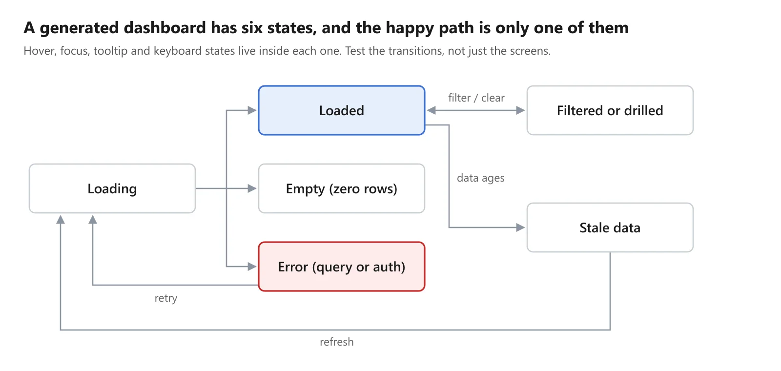
Dashboard interaction states · 6 states, 7 transitions
The States to Cover
| State | What to verify | Typical generated-UI failure |
|---|---|---|
| Loading | A visible loading indicator; no layout jump when data lands | Blank card, then everything shifts down 200px |
| Loaded | Values match the source query; refresh time shown | Correct chart, wrong aggregation (sum vs average) |
| Empty | A clear "no data for this period" message, not a broken chart | Empty axes, NaN labels, or a chart that silently shows last week |
| Error | A readable error and a way to retry or reconnect | Spinner forever, or a raw stack trace in the tile |
| Filtered or drilled | Every chart that should respond does; the filter state is visible | Three of four charts update; the KPI tile doesn't |
| Stale | The age of the data is obvious when refresh fails | A confident chart showing yesterday's numbers as today's |
| Hover and tooltip | The tooltip shows the right series, value and units, and stays on-screen | Tooltip clipped at the screen edge, wrong units, or stuck open |
| Keyboard focus | Every control reachable and visibly focused | Filters that only work with a mouse |
| Reduced motion | Transitions shorten or stop with prefers-reduced-motion | The same 2-second animated count-up for everyone |
| Permissioned views | Different users see only their rows | Row-level security that holds in the BI tool but not in an exported view |
For Claude Motion, the states are temporal: first frame, each key beat, final frame, and the editable version after a one-word change. Anthropic says you can change a word, number or timing while the rest stays the same.[3] That promise is exactly what a regression test should hold it to.
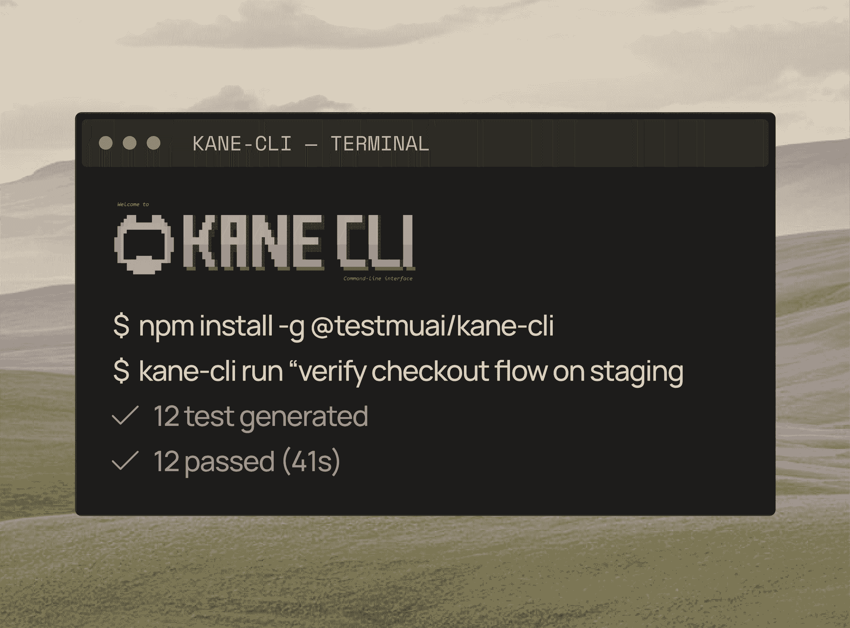
How to Test Generated Dashboards with Kane CLI
Generated UI breaks the old testing model, because you can't write a selector for a chart that didn't exist an hour ago. It will be regenerated tomorrow anyway. Kane CLI tests the outcome instead. You state in plain English what must be true about the dashboard, Kane drives a real browser to check it, and the run returns pass or fail with evidence.
The model works out how to reach and check that outcome once (author). After that, the check replays deterministically in seconds with no LLM in the loop, which is what runs in CI. The model comes back only to heal when the dashboard has actually changed. Healing can change the route to your outcome, never the outcome itself. So when someone asks Claude to "add a region filter" and the regenerated layout also drops the KPI tile, the test doesn't adapt to the new layout. It fails.
Setup
npm install -g @testmuai/kane-cli
npx @testmuai/kane-cli-skill        # lets Claude Code, Codex or Gemini CLI call Kane
kane-cli login --username "$LT_USERNAME" --access-key "$LT_ACCESS_KEY"
1. Loaded State: The Numbers Mean What They Say
kane-cli run "Open the Q3 revenue dashboard. Confirm it shows revenue by region for exactly \
  4 regions, displays a last-refreshed time, and that the Total Revenue tile equals \
  the sum of the four regions" \
  --url "$DASHBOARD_URL" --agent --headless --final-validation on
This catches the failure no screenshot diff can see: a correct-looking chart with the wrong aggregation.
2. Filter Propagation: Every Chart Responds
kane-cli run "Set the region filter to EMEA. Confirm every chart and the Total Revenue \
  tile now show EMEA only, and the active filter is visible on the page" \
  --url "$DASHBOARD_URL" --agent --headless
3. Empty State: No Data Is a State, Not a Crash
kane-cli run "Set the date range to a week with no orders. Confirm the dashboard shows \
  a clear no-data message and no chart shows NaN, empty axes or last week's numbers" \
  --url "$DASHBOARD_URL" --agent --headless
4. Error and Stale States
Point the same outcome at a staging dashboard whose connector credentials have been revoked:
kane-cli run "Open the dashboard. Confirm each chart that cannot load shows a readable \
  error with a way to retry, and no chart presents old data as current" \
  --url "$STAGING_DASHBOARD_URL" --agent --headless
5. Look Beyond the Stated Path
kane-cli run "Review the Q3 revenue dashboard as a finance user would" \
  --url "$DASHBOARD_URL" --agent --headless --bug-detection continue
Issues Kane notices along the way, like a truncated legend, a broken tile or a console error, are reported separately with a category and a confidence signal. They don't silently widen what the test checks.
6. Make It a Suite That Gates Every Regeneration
Save the outcomes as markdown test files in the repo, so a change to what "correct" means is reviewed in a PR:
kane-cli testrun run --tags dashboards --parallel 4 --on-failure fail-fastExit codes are 0 pass, 1 fail, 2 setup error and 3 timeout, so CI can block a dashboard from being shared until it passes.
7. Hand the Board Meeting an Answer, Not a Promise
Every run writes a sha256-hashed .evidence pack with every step, screenshot, DOM snapshot, console line and network call. Open it at evidence.lambdatest.com. When someone asks "was this chart checked before we used it?", you can show exactly what was checked and what the browser showed.
Where Kane CLI Sits Next to the Other Tools
- Kane CLI - interaction states, data meaning and structural checks, as plain-English outcomes, replayed on every change.
- Visual diffing (SmartUI or Playwright toHaveScreenshot) - pixel-level layout, color and theme regressions against fixture data.
- Accessibility scanning - automated WCAG checks on every generated view, plus human review.
- Frame comparisons - for Claude Motion MP4 exports, compare first, key and final frames. Kane CLI tests web and native mobile apps; it doesn't inspect video files.
The Coverage Matrix for Generated Dashboards and Animations
No single tool covers all three surfaces. Use this matrix to see which check catches which failure, and where Kane CLI does the heavy lifting.
| Failure | Visual diff (fixture data) | Accessibility scan | Kane CLI outcome test | Human review |
|---|---|---|---|---|
| Layout shift, overflow, theme breakage | Primary | Supporting (bug detection) | Approve diffs | |
| Chart type or axis silently changed | Primary | Structural check ("y-axis starts at 0") | ||
| Wrong aggregation or wrong number | Primary | |||
| Filter doesn't propagate to every chart | Primary | |||
| Empty, error or stale state broken | Snapshot each state | Primary | ||
| Missing text alternatives, low contrast | Primary | Judge alt text quality | ||
| Keyboard traps, invisible focus | Partial | Supporting | Primary | |
| Autoplay without pause, flashing | Partial | Primary | ||
| Regenerated layout dropped a required element | Catches the picture | Primary: the outcome still requires it | ||
| Motion MP4 lands on the wrong final frame | Frame comparison | Primary | ||
| "Was this checked before the meeting?" | Primary: .evidence pack |
Honest Limits
- Private dashboards need access. Claude Dashboards start private. To test one in CI, test it where it's shared or handed off (Hex, Sigma, Grafana and others), or wherever your team publishes it, with test credentials.
- Kane CLI doesn't inspect video. It tests web and native mobile apps in a real browser or emulator. For Motion MP4s, compare frames, and test the interactive version in the browser before export.
- Kane CLI is not a pixel-diff tool or a WCAG scanner. It checks outcomes and structure, and its evidence pack captures screenshots for review. Pair it with a visual-diff tool and an accessibility scanner. Don't ask one tool to do three jobs.
- Semantic drift is harder than moved elements. If a regenerated chart keeps its title but now plots a different metric, a structural check catches it only if your outcome names the metric. Write outcomes that say what the chart means, not just what it's called.
- Live data makes visual baselines meaningless. Pixel-compare against fixture data. Check live dashboards with outcome assertions that tolerate the numbers changing but not their meaning.
Note: Kane CLI is free to install, and local runs are free on a TestMu AI account. Start with the Kane CLI docs and claim 10,000 free Kane CLI credits for your first month.
Sources
- [1] Build live dashboards and animate explainers with Claude, Anthropic, October 8, 2026
- [2] Get started with Claude Dashboards, Claude Help Center
- [3] Get started with Claude Motion, Claude Help Center
- [4] Web Content Accessibility Guidelines (WCAG) 2.2, W3C Recommendation, December 12, 2024
- [5] Kane CLI, TestMu AI
Author
Shantanu Wali
Blogs: 9

Shantanu Wali is Vice President of Product Management at TestMu AI (formerly LambdaTest), where he owns several product lines across the testing platform, including the Real Device Cloud and the Digital Experience Testing Cloud. He has also contributed significantly to the development and scaling of KaneAI, TestMu AI's flagship GenAI-native testing agent that uses natural language to make software testing faster and more reliable in this AI era. He brings 7+ years of experience across software development and product management, starting as a backend developer at Infosys building solutions for Fortune 500 clients. Shantanu holds an MBA from IIM Calcutta and a B.Tech in Mechanical Engineering.
Reviewer

Mayank Bhola
Reviewer
Mayank Bhola is Co-Founder and Head of Products at TestMu AI (formerly LambdaTest), where he leads the entire product portfolio across KaneAI, Kane CLI, HyperExecute, SmartUI, the Real Device Cloud, Accessibility, and other software testing product lines. As an early Lead Architect he designed and built the company's flagship Tunnel technology from scratch, created the React-based automation platform, and architected the data-intensive pipelines and FAAS services that scale it. He brings more than 10 years of experience in software development and product engineering, with earlier roles as Head of Technology at Juggernaut Books and Senior Software Engineer at PressPlay TV and Zomato. Mayank holds a B.Tech in Computer Engineering from JIIT Noida.


Claude Dashboards and Motion FAQs
Did you find this page helpful?
More Related Blogs
TestMu AI forEnterprise
Get access to solutions built on Enterprise
grade security, privacy, & compliance
- Advanced access controls
- Advanced data retention rules
- Advanced Local Testing
- Premium Support options
- Early access to beta features
- Private Slack Channel
- Unlimited Manual Accessibility DevTools Tests