

Power Your Software Testing with AI Agents and Cloud
The Native AI-Agentic Cloud Platform to Supercharge Quality Engineering. Test Intelligently and Ship Faster.


- TestMu AI (Formerly LambdaTest)
- /
- Blog
- /
- Redefining Element Positioning With CSS Inset Property
Redefining Element Positioning With CSS Inset Property
Say goodbye to awkward layouts and bring creative vision to life. Master the art of positioning with our guide on CSS inset property to create stunning designs.
Last Updated on:
The CSS inset property is a shorthand for the top, right, bottom, and left offset properties, and it only takes effect on an element whose position is relative, absolute, fixed, or sticky. Values flow clockwise from the top, exactly like margin, so inset: 0 pins a positioned element to all four edges of its containing block. This guide covers the CSS position property, what inset is, when to use it, physical offsets, inset logical properties, anchor positioning, and browser compatibility.
TL;DR
- The CSS inset property writes the top, right, bottom, and left offset properties in a single declaration.
- The CSS inset property has no effect on a static element, so the element needs relative, absolute, fixed, or sticky positioning first.
- The CSS inset property accepts one to four values that flow clockwise from the top, matching the value order used by margin and padding.
- Setting inset: 0 on an absolutely positioned element stretches that element to every edge of its containing block.
- The logical properties inset-block and inset-inline follow the writing mode and text direction of the document instead of fixed physical edges.
- The CSS inset property is Baseline widely available and has worked across Chrome, Edge, Firefox, and Safari since April 2021.
What is the CSS Position Property?
CSS position property defines the way an element is positioned within a document. This property is used to determine the final position of an element on a page.
CSS position property, along with the left/right, top/bottom, z-index, etc., determines the position of an element in a document.
The position property has five different values. Each value affects how an element is displayed relative to its normal position in a document. For example, static position, relative position, absolute position, fixed position, and sticky position are all possible values.
- static: This is the default position of elements. That is, elements remain in the normal order in the DOM tree. When an element is static, the CSS position property’s top, right, bottom, and left properties do not take effect.
- relative: This is positioned relative to the document’s normal flow. The top, right, bottom, and left properties can be used to set an offset position about the element position.
- absolute: This is positioned relative to its nearest ancestor and then removed from the document flow. If the given element has no positioned ancestor, the element’s position is set relative to the body. The top, right, bottom, and left properties can be used to set an offset position about the element position.
- fixed: This is positioned relative to the viewport in a fixed manner. When the page is scrolled, the element remains in the same place. We can use the top, right, bottom, and left properties to set an offset position about the element position.
- sticky: This is positioned based on the user’s scroll position.
Developers can use the position property to create complex layout and design effects.
What is CSS Inset Property?
The CSS Inset property is a shorthand property of the CSS position offset properties of the top, right, bottom, and left, respectively. The CSS Inset property gives us access to declare the four properties top, right, bottom, and left in one declaration. Some examples of the CSS Inset property are inset: 2px 2px 2px 2px is equivalent to top: 2px; right: 2px; bottom: 2px; left: 2px.
For the CSS Inset property to take effect, the specified element has to have the CSS position property set. However, if the defined element is set to static, the CSS Inset property will not take effect.
The CSS Inset property, like margin and padding, mostly takes three values. These values can either be the length, keyword, or global values.
Syntax:
inset: length| percentage| auto| inherit| initial


/* <length> values */

/*applicable to: top, right, bottom, left */
inset: 1em;

/* applicable to: top/bottom, left/right */
inset: 1.9rem 2.5rem;

/* applicable to: top, left/right, bottom */
inset: 10px 15px 20px;

/*applicable to: top, right, bottom, left */
inset: 10px 15px 20px 30px;

/* percentage values: top/bottom, left/right */
Inset: 20% 30%;

/* Keyword value */
inset: auto;

/* Global values */
inset: inherit;
inset: initial;
inset: revert;
inset: revert-layer;
inset: unset;
Length
One of the CSS Inset property values is length, specified in different ways. Let’s consider those ways by taking an example of each.
- Inset: 1em: This is applied to the four edges of the element, i.e., top, right, bottom, and left, respectively.
- Inset: 1.9rem 2.5rem: This is applied to the four edges of the element where 1.9rem affects the top and bottom while 2.5rem affects the left and right.
- Inset: 10px 15px 20px: This is applied to the four edges of the element where 10px affects the top, 15px affects the right and left, and 20px affects the bottom.
- Inset: 10px 15px 20px 30px: This is applied to the four edges of the element where 10px affects the top, 15px affects the right, 20px affects the bottom, and 30px affects the left.
One another way can be representing the values in percentage(%), considering the example below.
- Inset: 20% 30%: This is applied to the four edges of the element where 20% is set to the top and bottom, and 30% is set to the left and right.
Keyword
Another CSS Inset property value is the keyword, which is specified with auto set the element’s position to auto. Let’s look at the way of representing the value.
- Inset:auto: This is applied to the four edges of the element, i.e., top, right, bottom, and left, respectively.
Global
The CSS Inset property can also take in global values. Consider the following global values below.
- Inset: inherit: Inherit property from its parent element.
- Inset: initial: set property to its default value.
Let’s consider an example code for better understanding.
HTML:
<div class="parent">
   <div class="child"></div>
</div>
CSS:
.parent {
        position: relative;
        width: 400px;
        height: 400px;
        background-color: aqua;
    }

    .child {
        position: absolute;
        width: 200px;
        height: 200px;
        background-color: rgb(4, 51, 51);

        inset: 4em;
    }
Browser Output:
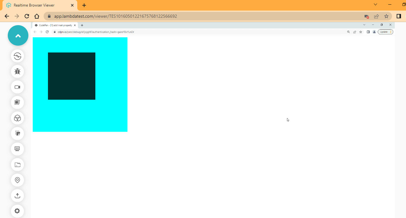
CodePen:
When to use CSS Inset Property?
The CSS Inset property is a shorthand property of the CSS position sub-properties of the top, right, bottom, and left. CSS Inset property can be used when you need to add a specific amount of space between a given element and its containing parent element.
For example, if you have < p > or < img > tag within a containing parent < div >, you can use the CSS Inset property to add the amount of space needed. This can be on the top, the right, bottom, or left edge of the element, or you can apply it to the four edges at once in one declaration.
Inset and Position Offset Physical Property
CSS Inset property and position offset are physical properties that refer to the positioning of an object or element relative to its container. CSS Inset property determines how much space exists between the edges of an object and its container. At the same time, position offset defines the distance between the object and a reference point, typically its parent element.
These properties are commonly used in web design to create layouts and position elements on a page. This section’ll discuss how the CSS Inset property can be used to replace the position offset properties.
Using CSS position properties
The CSS position properties top, right, bottom, and left are handy when we need to set a vertical or horizontal offset to a particular element.
How the element is positioned on its container or viewport based on the position property value determines its offset from the position properties.
HTML:
<body>
    <main>
        <section>
        <h1>LambdaTest</h1>
        <p>CSS | Position Property</p>

        <div class="parent">
            <div class="firstChild"></div>
            <div class="secondChild"></div>
            <div class="thirdChild"></div>
            <div class="fourthChild"></div>
            <div class="fifthChild"></div>
        </div>
        </section>
    </main>
</body>
CSS:
body {
        margin: 0;
        padding: 0;
        box-sizing: border-box;
    }

    main {
        display: flex;
        height: 100vh;
        justify-content: center;
        align-items: center;
    }

    h1 {
        font-family: Georgia, 'Times New Roman', Times, serif;
        font-size: 3em;
        color: #0ebac5;
        margin: 0;
    }

    p {
        font-family: Cambria, Cochin, Georgia, Times;
        text-align: center;
        font-size: 1.5em;
        font-weight: lighter;
    }

    .parent {
        width: 300px;
        height: 300px;
        position: relative;
        background-color: rebeccapurple;
        box-shadow: 2px 2px 8px 2px rgba(2,2,2, 0.5)

    }

    .firstChild {
        width: 10%;
        height: 10%;
        position: absolute;
        background-color: seagreen;

        bottom: 4rem;
        right: 4rem;
    }

     .secondChild {
        width: 20%;
        height: 20%;
        position: absolute;
        background-color: indianred;

        top: 8rem;
        left: 8rem;
    }

      .thirdChild {
        width: 10%;
        height: 10%;
        position: absolute;
        background-color: palegoldenrod;

        top: 4rem;
        left: 4rem;
    }

    .fourthChild {
        width: 10%;
        height: 10%;
        position: absolute;
        background-color: palegoldenrod;

        top: 4rem;
        right: 4rem;
    }

    .fifthChild {
        width: 10%;
        height: 10%;
        position: absolute;
        background-color: seagreen;

        bottom: 4rem;
        left: 4rem;
    }
Browser Output:
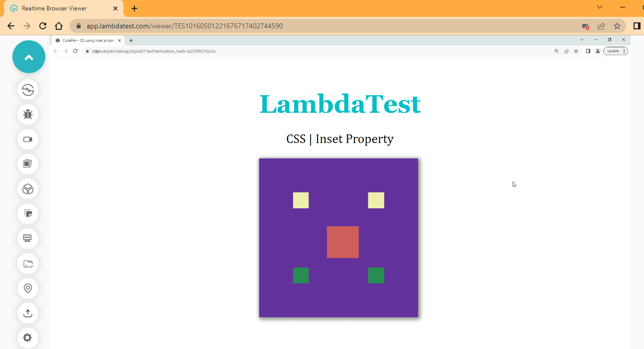
CodePen:
From the code example above, we make use of CSS position properties top, right, bottom and left to position each box item around the parent element.
Now let’s see how we can use the CSS Inset property to achieve the same result.
Using CSS Inset property
We have seen the effect of using the CSS position properties on a specified element. Let’s see how the CSS Inset property can achieve the same result.
HTML:
<main>
        <section>
        <h1>LambdaTest</h1>
        <p>CSS | Inset Property</p>

        <div class="parent">
            <div class="firstChild"></div>
            <div class="secondChild"></div>
            <div class="thirdChild"></div>
            <div class="fourthChild"></div>
            <div class="fifthChild"></div>
        </div>
        </section>
    </main>
CSS:
body {
        margin: 0;
        padding: 0;
        box-sizing: border-box;
    }

    main {
        display: flex;
        height: 100vh;
        justify-content: center;
        align-items: center;
    }

    h1 {
        font-family: Georgia, 'Times New Roman', Times, serif;
        font-size: 3em;
        color: #0ebac5;
        margin: 0;
    }

    p {
        font-family: Cambria, Cochin, Georgia, Times;
        text-align: center;
        font-size: 1.5em;
        font-weight: lighter;
    }

    .parent {
        width: 300px;
        height: 300px;
        position: relative;
        background-color: rebeccapurple;
        box-shadow: 2px 2px 8px 2px rgba(2,2,2, 0.5)
    }

    .firstChild {
        width: 10%;
        height: 10%;
        position: absolute;
        background-color: seagreen;

        inset: 206px 4rem 4rem 206px ;
        /* bottom: 4rem;
        right: 4rem; */
    }

     .secondChild {
        width: 20%;
        height: 20%;
        position: absolute;
        background-color: indianred;

        inset: 8rem 7rem 7rem 8rem;
        /* top: 8rem;
        left: 8rem; */
    }

      .thirdChild {
        width: 10%;
        height: 10%;
        position: absolute;
        background-color: palegoldenrod;

        inset: 4rem 206px 206px 4rem;
        /* top: 4rem;
        left: 4rem; */
    }

    .fourthChild {
        width: 10%;
        height: 10%;
        position: absolute;
        background-color: palegoldenrod;

        inset:4rem 4rem 206px 206px;
        /* top: 4rem;
        right: 4rem; */
    }

    .fifthChild {
        width: 10%;
        height: 10%;
        position: absolute;
        background-color: seagreen;

        inset: 206px 206px 4rem 4rem;
        /* bottom: 4rem;
        left: 4rem; */
    }
From the code example above, we used the CSS Inset property to replace the position properties as you can see, we have some values with px units while some are set as rem units.
For example, take the firstChild element where the values with rem units are the values we specify initially to the element while the values with px are the computed values. Compare the commented code with the new CSS Inset property values.
The following section will explain how these computed values are generated in the CSS Inset property.
Browser Output:
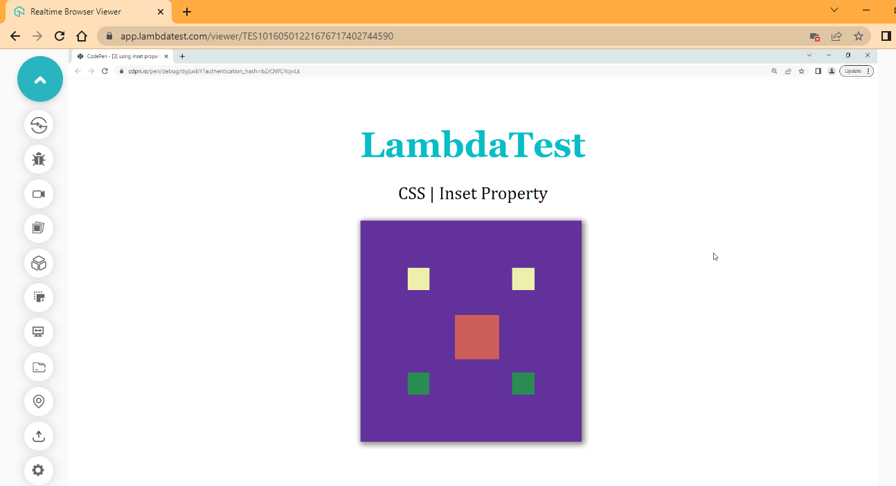
CodePen:
From the browser output, we have the same output as the previous one when we use the CSS Inset property.
Computed Values
The computed values in the CSS Inset property are transferred from parent to child(ren) during inheritance when we set a fixed value to a particular element position. For example, the firshChild element takes in a value of bottom 4rem and right of 4rem while a computed value of 206px is generated for the top and left positions.
Now let’s see how these computed values of the CSS Inset property are generated.
- Right-click on your browser.
- Next, click on inspect (This will open up your DevTools).
- Next, select the element section.
- Next, click on the first element tag on your DevTools.
- Next, select computed.
The box model shows us the computed values generated as you can see, we have 206 at the top, 64 on the right side, 64 at the bottom, and 206 on the left.
The computed values are calculated in pixels (px), and 16 pixels (16px) is equal to 1rem unit, so if you divide 64 by 16, you should get 4 (64/16 = 4). So the 4 is the 4rem we set initially while the 206 are generated values.
So to find out how the 206 is the computed values, let’s see the examples as follows:
- Parent element width/height is 300px
- Child element width/height is 30px (10% is 30px of 300px)
- Inset bottom is 64px
- The inset top computed as 300px - (64px + 30px) = 206px
Hence, the computed values for the inset top is 206px. So to get the inset top not defined from our CSS file, the browser has to add the child values and subtract them from the parent element value. The final remainder is the computed values.
DevTools:
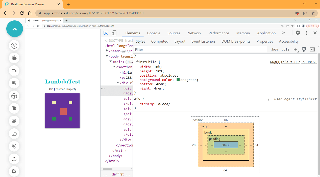
The browser output above displays the computed values from the box model.
Using Inset with CSS position values
So far, we have discussed the usage of position properties such as top, right, bottom, and left. However, the values we assign to the position property also affect how it will behave.
For example, the CSS Inset property will not affect the static value of the position property, as this is treated just like a normal document without a position. While other values have different ways they affect the element.
HTML:
<main>
        <section>
            <div class="nav">
                <h1>LambdaTest</h1>
            </div>

            <div class="textOne">
                <p>Support for filtering the dashboards by a particular time and date selection. This will help you get more precise
                results at the required timestamp.</p>
            </div>

            <div class="textTwo">
                <p>Ability to edit the Dashboard Layout that helps you arrange your widgets according to the alignment of your choice.</p>
            </div>

            <div class="textThree">
                <p>New feature to copy or clone the existing dashboard with all the widgets and configurations, the same as the source
                dashboard, to explore more detailed insights by adding more widgets or filters without disturbing your current
                dashboard.</p>
            </div>

            <div class="btn">
                <a href="#">Learn More</a>
            </div>
        </section>
    </main>
CSS:
*, *::after, *::before{
        padding: 0;
        margin: 0;
        box-sizing: border-box;
        scroll-behavior: smooth;
    }

main {
        height: 100vh;
        display: flex;
        justify-content: center;
        align-items: center;
    }

section {
        position: relative;
        background-color: hsl(0, 0%, 91%);
        width: 50%;
        height: 300px;
        overflow-y: scroll;
    }

.nav {
        position: sticky;
        inset: 0px;
        width: 100%;
        background-color:orangered;
        color: hsl(0, 0%, 100%);
        padding: 0.5em;
        text-align: center;
        box-shadow: 2px 6px 8px 0.5px rgba(0, 0, 0, .4);
        font-family: Georgia, 'Times New Roman';
    }

    p {
        color: #504f4f;
        font-size: 20px;
        font-family: 'Lucida Sans', 'Lucida Sans Regular';
    }

    .textOne, .textTwo, .textThree  {
        background-color: hsl(0, 0%, 100%);
        margin: 2em;
        box-shadow: 6px 6px 6px 0px rgba(0, 0, 0, .4);
        padding: 1em;
        border-radius: 4px;
    }

.btn {
        display: flex;
        justify-content: center;

        position: sticky;
        inset: 0px;
        margin: 1em;
    }

.btn a {
        padding: 1em 2em;
        text-decoration: none;
        background-color: orangered;
        color: hsl(0, 0%, 100%);
        font-family: calibri;
        font-weight: bold;
        margin-bottom: 2em;
        border-radius: 5px;
    }

.btn a:hover {
        background-color: hsl(16, 98%, 59%);
}
Browser Output:
CodePen:
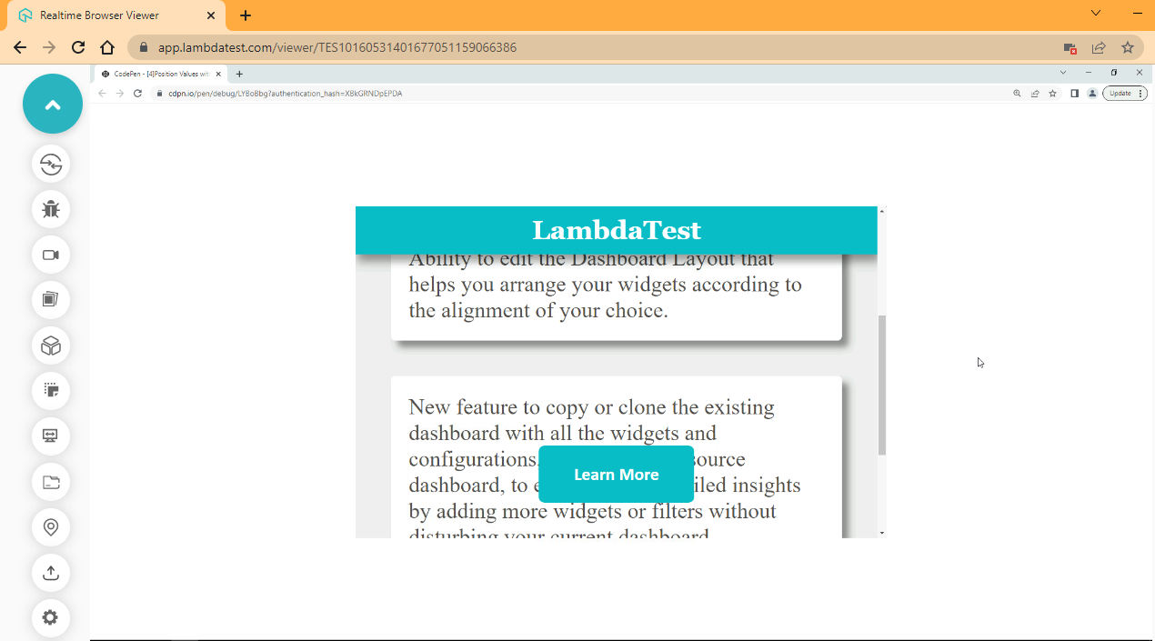
From the browser output, we created a simple page to display how an element can be staked above other elements using the CSS position sticky value of the position property.
When you use the scrollbar and scroll up, observe how the display button below flows with the rest of the page as you scroll up.

CSS Inset Logical Properties
We have seen how the CSS Inset property works with the help of examples. Now let’s look into the inset sub-properties. CSS Inset property includes;
- inset-block
- inset-block-end
- Inset-block-start
- inset-inline
- inset-inline-end
- Inset-inline-start
The CSS Inset properties and sub-properties are part of the CSS logical properties and values specification. Sub-properties of the CSS Inset property define the logical offset based on the writing mode set on the document. To fully understand how the CSS Inset sub-properties work, we must know what writing-mode is. Let’s take a look at it.
Writing-mode property
CSS comes with a writing-mode property used to set the block or inline direction of a document, which can be horizontal or vertical. For example, elements are stacked by default from top to bottom, left to right in the DOM, but we can use the writing-mode to change the stacking order to vertical right to left or horizontal left to right.
Syntax:
/* Keyword values */
writing-mode: vertical-rl;
writing-mode: vertical-lr;
writing-mode: horizontal-tb;
For better understanding, see the illustration below:
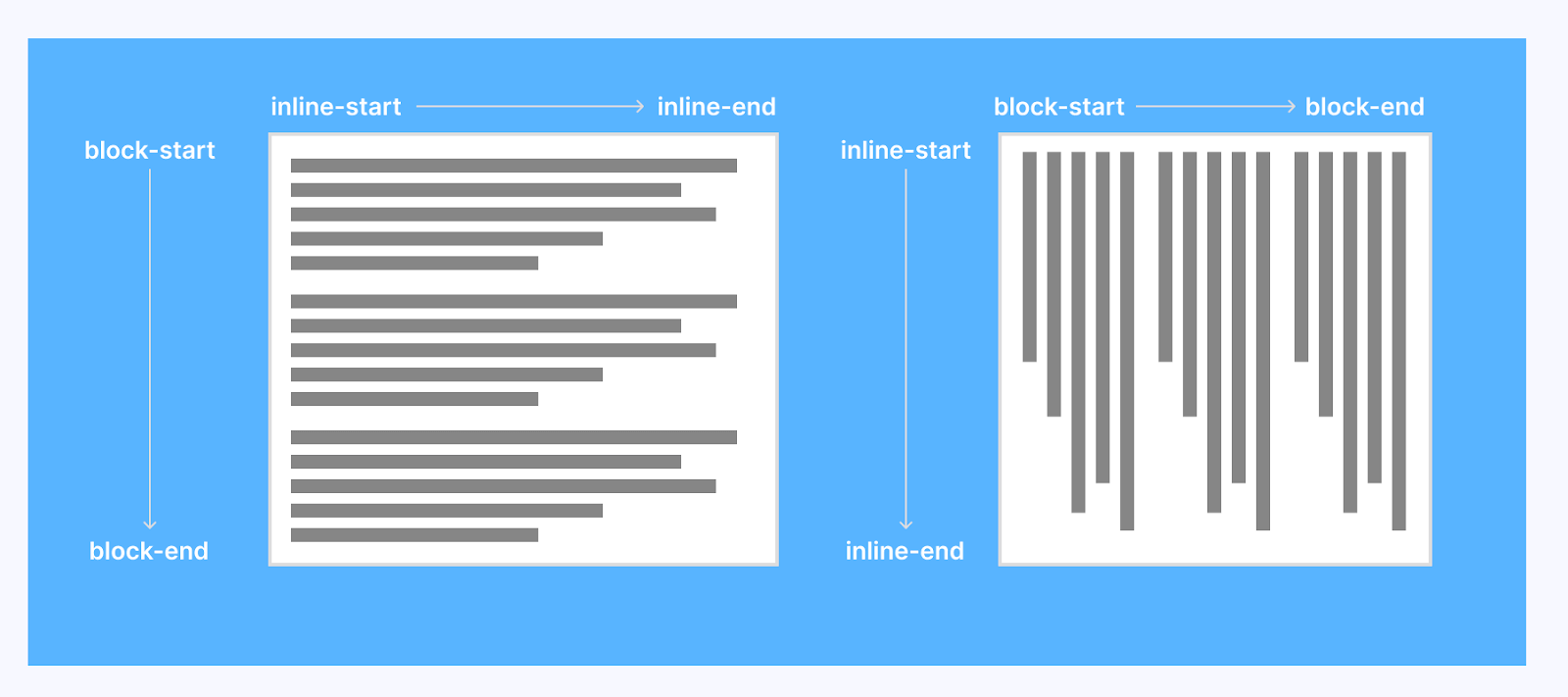
We might do this for different reasons; for example, words are written right to left in Arabic. In this case, we can set the document to flow horizontally from right to left to accommodate the Arabic writing style. In English, where words are written left to right, we might do this for aesthetics.
HTML:
<main>
        <section>
            <header>
                <div>
                    <h1>frontend development stack</h1>
                    <p>Front End Development deals with the development of client side of a website or web application
                    </p>
                    <p>Below are list of front Technology to choose from</p>
                </div>
            </header>

            <section>
                <!-- HTML -->
                <div class="HTML stack">
                    <div class="first">
                        <p class="one">HTML</p>
                        <p class="two">00</p>
                    </div>

                    <div class="second writing-mode">
                        <ul>
                            <h2>Use of HTML</h2>
                            <li>HTML stands for HyperText Markup Language</li>
                            <li>Structuring web pages</li>
                            <li>Embedding images and videos</li>
                            <li>Web document Creation</li>
                            <li>Displaying contents</li>
                        </ul>
                    </div>
                </div><!--End of HTML-->

                <button id="htmlButton" class="btn">Toggle Writing Mode</button>
            </section>
        </section>
    </main>
CSS:
@import url('https://fonts.googleapis.com/css2?family=Jost:ital,wght@0,500;1,200&display=swap');
    *,
    *::after,
    *::before {
        padding: 0;
        margin: 0;
        box-sizing: border-box;
        scroll-behavior: smooth;
    }

    :root {
        /* Color Utility */
        --black-color: hsl(0, 0%, 0%);
        --white-color: hsl(0, 0%, 100%);
        --gray-Scale-100: hsl(0, 0%, 91%);
        --gray-Scale-200: hsl(0, 1%, 74%);
        --gray-Scale-300: hsl(0, 0%, 59%);
        --gray-Scale-100: hsl(0, 1%, 44%);

        /* Font Utility */
        --font-family: 'Jost', sans-serif;

        --size-01: 1em;
        --size-02: 2em;
        --size-03: 2.5em;
        --size-04: 5em;
    }

    body {
        background-color: rgb(196, 197, 197);
        font-family: var(--font-family);
    }

    main {
        width: 40%;
        margin: var(--size-03) auto;
        background-color: var(--white-color);
        padding: var(--size-03) var(--size-03);

        box-shadow: 2px 2px 8px rgba(0, 0, 0, 0.4);

    }

    header {
        display: flex;
        justify-content: center;
        text-align: center;
    }

    header h1 {
        font-weight: 600;
    }

    header h1 p {
        color: hsl(0, 84%, 43%);
    }

    .stack {
        display: flex;
        justify-content: space-between;

        margin-top: calc(var(--size-02) * 2);
    }

    .stack .first,
    .stack .second {
        border: 1px solid var(--gray-Scale-300);
        padding: var(--size-02);
        box-shadow: 2px 2px 8px rgba(0, 0, 0, 0.4);
    }

    .stack .one {
        font-weight: bolder;
        color: var(--gray-Scale-300);
    }

    .stack .two {
        font-family: Impact, Haettenschweiler, 'Arial Narrow Bold', sans-serif;
        font-size: calc(var(--size-03) * 2);
    }

    .btn {
        background-color: var(--gray-Scale-300);
        color: var(--white-color);
        padding: var(--size-01) var(--size-02);
        margin-top: var(--size-02);
        width: 100%;
        cursor: pointer;
    }

    .btn:hover{
        background-color: var(--gray-Scale-100);
    }

    /* JAVASCRIPT TOGGLE CLASS */
    .writing-mode-html {
        writing-mode: vertical-lr;
        position: relative;
    }
JavaScript:
const htmlButton = document.querySelector('#htmlButton');
    const htmlCard = document.querySelector('.second');

    htmlButton.addEventListener('click', ()=>{
        htmlCard.classList.toggle('writing-mode-html')
    })
Browser Output:
CodePen:
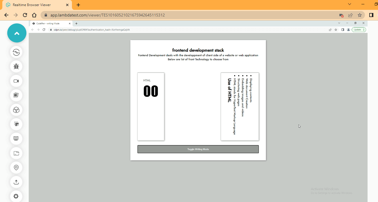
From the browser output, we set the second card on the right to flow vertically and then start from left to right. As you can see, we have the heading from left to right. Click on the toggle button to switch the writing mode.
Inset-block
Inset-block comes under the category of logical properties in CSS Inset property, which is used to set an element’s start and end distance based on the writing-mode set on the element, i.e., done in a block direction. The inset-block also serves as a shorthand property of inset-block-start and inset-block-end.
Syntax:
inset-block: 2em 4em;
Now, with the below code, you can realize how the CSS Inset property behaves. Just type and run the code.
HTML:
 <main>
        <section>
            <header>
                <div>
                    <h1>frontend development stack</h1>
                    <p>Front End Development deals with the development of client side of a website or web application
                    </p>
                    <p>Below are list of front Technology to choose from</p>
                </div>
            </header>

            <section>
                <!-- HTML -->
                <div class="HTML stack">
                    <div class="first">
                        <p class="one">HTML</p>
                        <p class="two">00</p>
                    </div>

                    <div class="second writing-mode">
                        <ul>
                            <h2>Use of HTML</h2>
                            <li>HTML stands for HyperText Markup Language</li>
                            <li>Structuring web pages</li>
                            <li>Embedding images and videos</li>
                            <li>Web document Creation</li>
                            <li>Displaying contents</li>
                        </ul>
                    </div>
                </div><!--End of HTML-->

                <button id="htmlButton" class="btn">Toggle Writing Mode</button>
            </section>
        </section>
    </main>
CSS:
@import url('https://fonts.googleapis.com/css2?family=Jost:ital,wght@0,500;1,200&display=swap');

    *,
    *::after,
    *::before {
        padding: 0;
        margin: 0;
        box-sizing: border-box;
        scroll-behavior: smooth;
    }

    :root {
        /* Color Utility */
        --black-color: hsl(0, 0%, 0%);
        --white-color: hsl(0, 0%, 100%);
        --gray-Scale-100: hsl(0, 0%, 91%);
        --gray-Scale-200: hsl(0, 1%, 74%);
        --gray-Scale-300: hsl(0, 0%, 59%);
        --gray-Scale-100: hsl(0, 1%, 44%);

        /* Font Utility */
        --font-family: 'Jost', sans-serif;

        --size-01: 1em;
        --size-02: 2em;
        --size-03: 2.5em;
        --size-04: 5em;
    }

    body {
        /* width: 100vw; */
        background-color: rgb(196, 197, 197);
        font-family: var(--font-family);
    }

    main {
        width: 40%;
        margin: var(--size-03) auto;
        background-color: var(--white-color);
        padding: var(--size-03) var(--size-03);

        box-shadow: 2px 2px 8px rgba(0, 0, 0, 0.4);

    }

    header {
        display: flex;
        justify-content: center;
        text-align: center;
    }

    header h1 {
        font-weight: 600;
    }

    header h1 p {
        color: hsl(0, 84%, 43%);
    }

    .stack {
        display: flex;
        justify-content: space-between;

        margin-top: calc(var(--size-02) * 2);
    }

    .stack .first,
    .stack .second {
        border: 1px solid var(--gray-Scale-300);
        padding: var(--size-02);
        box-shadow: 2px 2px 8px rgba(0, 0, 0, 0.4);

        /* margin-left: 1em; */
    }

    .stack .one {
        font-weight: bolder;
        color: var(--gray-Scale-300);
    }

    .stack .two {
        font-family: Impact, Haettenschweiler, 'Arial Narrow Bold', sans-serif;
        font-size: calc(var(--size-03) * 2);
    }

    .btn {
        background-color: var(--gray-Scale-300);
        color: var(--white-color);
        padding: var(--size-01) var(--size-02);
        margin-top: var(--size-02);
        width: 100%;
        cursor: pointer;
    }

    .btn:hover{
        background-color: var(--gray-Scale-100);
    }

    /* JAVASCRIPT TOGGLE CLASS */
    .writing-mode-html {
        writing-mode: vertical-lr;
        position: relative;
        inset-block: 2.3em 0;
    }
JavaScript:
const htmlButton = document.querySelector('#htmlButton');
    const htmlCard = document.querySelector('.second');

    htmlButton.addEventListener('click', ()=>{
        htmlCard.classList.toggle('writing-mode-html')
 })
Browser Output:
CodePen:
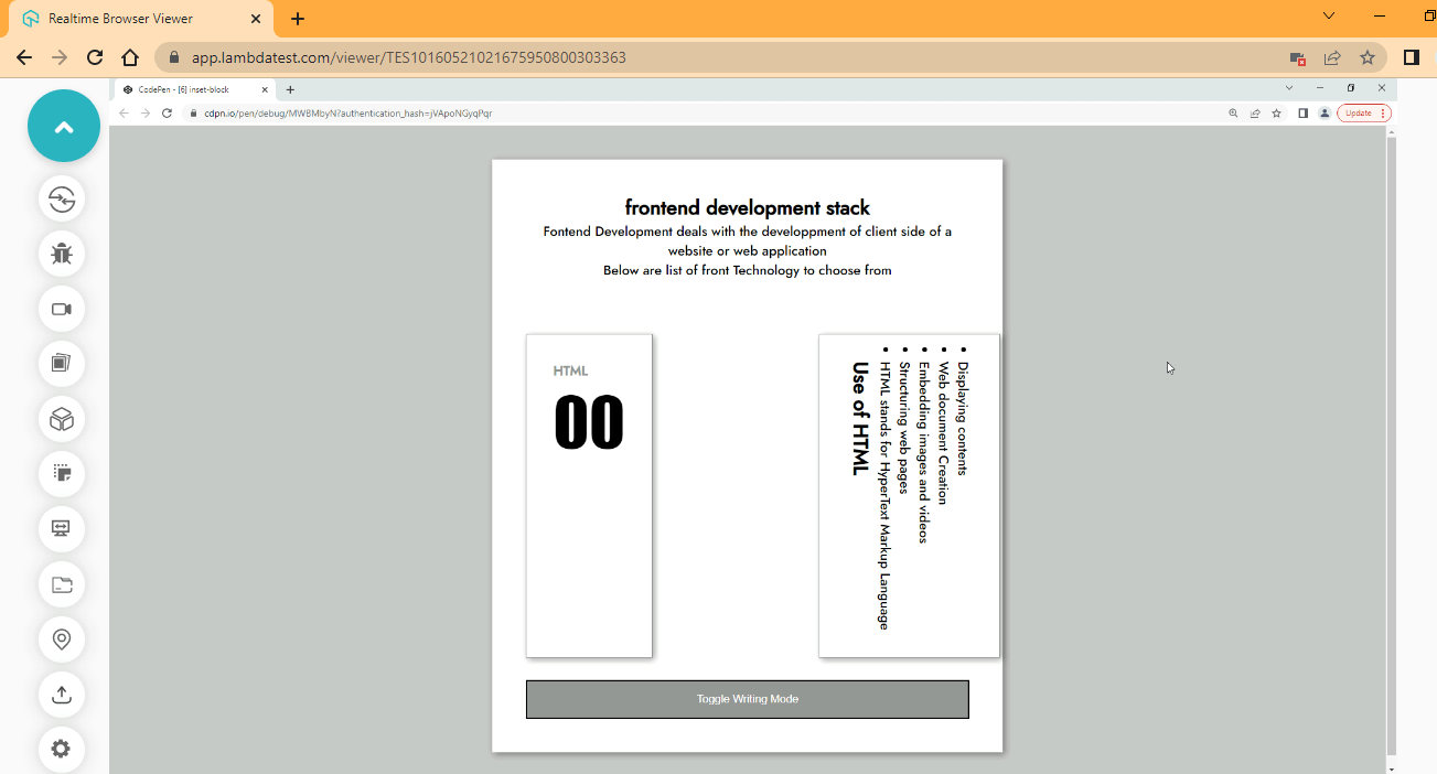
From the browser output, we set the second card on the right to flow vertically and then start from left to right.
Inset-block-end
Inset-block-end comes under the category of logical properties in the CSS Inset property, which is used to set the end distance of an element based on the writing-mode set on the element.
Syntax:
inset-block-end: 2em 4em;
Now, with the below code, you can realize how the CSS Inset property behaves. Just type and run the code.
HTML:
<main>
        <section>
            <header>
                <div>
                    <h1>frontend development stack</h1>
                    <p>Fontend Development deals with the development of client side of a website or web application
                    </p>
                    <p>Below are list of front Technology to choose from</p>
                </div>
            </header>

            <section>
                <!-- HTML -->
                <div class="HTML stack">
                    <div class="first">
                        <p class="one">HTML</p>
                        <p class="two">00</p>
                    </div>

                    <div class="second writing-mode">
                        <ul>
                            <h2>Use of HTML</h2>
                            <li>HTML stands for HyperText Markup Language</li>
                            <li>Structuring web pages</li>
                            <li>Embedding images and videos</li>
                            <li>Web document Creation</li>
                            <li>Displaying contents</li>
                        </ul>
                    </div>
                </div><!--End of HTML-->

                <button id="htmlButton" class="btn">Toggle Writing Mode</button>
            </section>
        </section>
    </main>
CSS:
@import url('https://fonts.googleapis.com/css2?family=Jost:ital,wght@0,500;1,200&display=swap');

    *,
    *::after,
    *::before {
        padding: 0;
        margin: 0;
        box-sizing: border-box;
        scroll-behavior: smooth;
    }

    :root {
        /* Color Utility */
        --black-color: hsl(0, 0%, 0%);
        --white-color: hsl(0, 0%, 100%);
        --gray-Scale-100: hsl(0, 0%, 91%);
        --gray-Scale-200: hsl(0, 1%, 74%);
        --gray-Scale-300: hsl(0, 0%, 59%);
        --gray-Scale-100: hsl(0, 1%, 44%);

        /* Font Utility */
        --font-family: 'Jost', sans-serif;

        --size-01: 1em;
        --size-02: 2em;
        --size-03: 2.5em;
        --size-04: 5em;
    }

    body {
        /* width: 100vw; */
        background-color: rgb(196, 197, 197);
        font-family: var(--font-family);
    }

    main {
        width: 40%;
        margin: var(--size-03) auto;
        background-color: var(--white-color);
        padding: var(--size-03) var(--size-03);

        box-shadow: 2px 2px 8px rgba(0, 0, 0, 0.4);

    }

    header {
        display: flex;
        justify-content: center;
        text-align: center;
    }

    header h1 {
        font-weight: 600;
    }

    header h1 p {
        color: hsl(0, 84%, 43%);
    }

    .stack {
        display: flex;
        justify-content: space-between;

        margin-top: calc(var(--size-02) * 2);
    }

    .stack .first,
    .stack .second {
        border: 1px solid var(--gray-Scale-300);
        padding: var(--size-02);
        box-shadow: 2px 2px 8px rgba(0, 0, 0, 0.4);

        /* margin-left: 1em; */
    }

    .stack .one {
        font-weight: bolder;
        color: var(--gray-Scale-300);
    }

    .stack .two {
        font-family: Impact, Haettenschweiler, 'Arial Narrow Bold', sans-serif;
        font-size: calc(var(--size-03) * 2);
    }

    .btn {
        background-color: var(--gray-Scale-300);
        color: var(--white-color);
        padding: var(--size-01) var(--size-02);
        margin-top: var(--size-02);
        width: 100%;
        cursor: pointer;
    }

    .btn:hover{
        background-color: var(--gray-Scale-100);
    }

    /* JAVASCRIPT TOGGLE CLASS */
    .writing-mode-html {
        writing-mode: vertical-lr;
        position: relative;
        inset-block-end: 1em 2px;
    }
JavaScript:
const htmlButton = document.querySelector('#htmlButton');
    const htmlCard = document.querySelector('.second');

    htmlButton.addEventListener('click', ()=>{
    htmlCard.classList.toggle('writing-mode-html')
});
Browser Output:
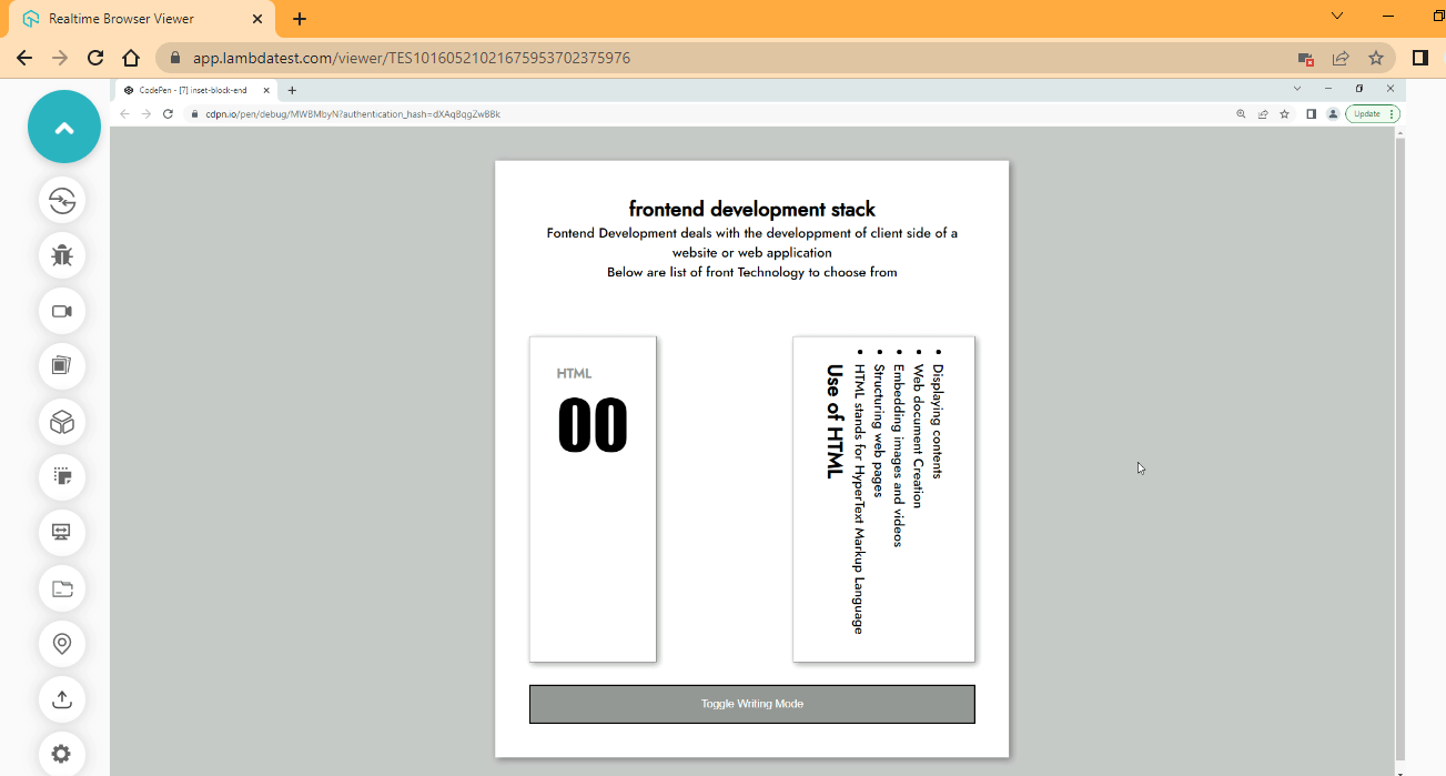
CodePen:
Have it in mind that the distance set by the inset block properties takes effect outside the margin.
Inset-block-start
Inset-block-start comes under the category of logical properties in the CSS Inset property, which is used to set the start distance of an element based on the writing-mode set on the element.
Syntax:
inset-block-start: 2em 4em;
Now, with the below code, you can realize how the CSS Inset property behaves. Just type and run the code.
HTML:
<main>
        <section>
            <header>
                <div>
                    <h1>frontend development stack</h1>
                    <p>Front End Development deals with the development of client side of a website or web application
                    </p>
                    <p>Below are list of front Technology to choose from</p>
                </div>
            </header>

            <section>
                <!-- HTML -->
                <div class="HTML stack">
                    <div class="first">
                        <p class="one">HTML</p>
                        <p class="two">00</p>
                    </div>

                    <div class="second writing-mode">
                        <ul>
                            <h2>Use of HTML</h2>
                            <li>HTML stands for HyperText Markup Language</li>
                            <li>Structuring web pages</li>
                            <li>Embedding images and videos</li>
                            <li>Web document Creation</li>
                            <li>Displaying contents</li>
                        </ul>
                    </div>
                </div><!--End of HTML-->

                <button id="htmlButton" class="btn">Toggle Writing Mode</button>
            </section>
        </section>
    </main>
CSS:
@import url('https://fonts.googleapis.com/css2?family=Jost:ital,wght@0,500;1,200&display=swap');

    *,
    *::after,
    *::before {
        padding: 0;
        margin: 0;
        box-sizing: border-box;
        scroll-behavior: smooth;
    }

    :root {
        /* Color Utility */
        --black-color: hsl(0, 0%, 0%);
        --white-color: hsl(0, 0%, 100%);
        --gray-Scale-100: hsl(0, 0%, 91%);
        --gray-Scale-200: hsl(0, 1%, 74%);
        --gray-Scale-300: hsl(0, 0%, 59%);
        --gray-Scale-100: hsl(0, 1%, 44%);

        /* Font Utility */
        --font-family: 'Jost', sans-serif;

        --size-01: 1em;
        --size-02: 2em;
        --size-03: 2.5em;
        --size-04: 5em;
    }

    body {
        /* width: 100vw; */
        background-color: rgb(196, 197, 197);
        font-family: var(--font-family);
    }

    main {
        width: 40%;
        margin: var(--size-03) auto;
        background-color: var(--white-color);
        padding: var(--size-03) var(--size-03);

        box-shadow: 2px 2px 8px rgba(0, 0, 0, 0.4);

    }

    header {
        display: flex;
        justify-content: center;
        text-align: center;
    }

    header h1 {
        font-weight: 600;
    }

    header h1 p {
        color: hsl(0, 84%, 43%);
    }

    .stack {
        display: flex;
        justify-content: space-between;

        margin-top: calc(var(--size-02) * 2);
    }

    .stack .first,
    .stack .second {
        border: 1px solid var(--gray-scale-300);
        padding: var(--size-02);
        box-shadow: 2px 2px 8px rgba(0, 0, 0, 0.4);

        /* margin-left: 1em; */
    }

    .stack .one {
        font-weight: bolder;
        color: var(--gray-scale-300);
    }

    .stack .two {
        font-family: Impact, Haettenschweiler, 'Arial Narrow Bold', sans-serif;
        font-size: calc(var(--size-03) * 2);
    }

    .btn {
        background-color: var(--gray-scale-300);
        color: var(--white-color);
        padding: var(--size-01) var(--size-02);
        margin-top: var(--size-03);
        width: 100%;
        cursor: pointer;
    }

    .btn:hover{
        background-color: var(--gray-scale-100);
    }

    /* JAVASCRIPT TOGGLE CLASS */
    .writing-mode-html {
        writing-mode: horizontal-tb;
        position: relative;
        inset-block-start: 2em;
   }
Browser Output:
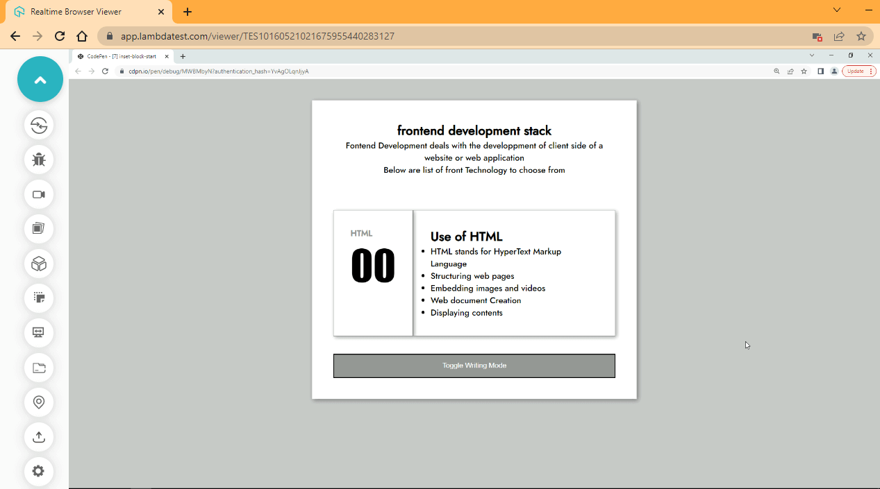
CodePen:
From the browser output, click on the bottom to see the effect in action.
Inset-inline
Inset-inline comes under the category of logical properties in the CSS Inset property, which is used to set an element’s start and end distance based on the writing-mode set on the element, i.e., done in an inline direction. The inset-inline also serves as a shorthand property of inset-inline-start and inset-inline-end.
Syntax:
inset-inline: 2em 4em;
Now, with the below code, you can realize how the CSS Inset property behaves. Just type and run the code.
HTML:
<main>
        <section>
            <header>
                <div>
                    <h1>frontend development stack</h1>
                    <p>Frontend Development deals with the development of client side of a website or web application
                    </p>
                    <p>Below are list of front Technology to choose from</p>
                </div>
            </header>

            <section>
                <!-- HTML -->
                <div class="HTML stack">
                    <div class="first">
                        <p class="one">HTML</p>
                        <p class="two">00</p>
                    </div>

                    <div class="second writing-mode">
                        <ul>
                            <h2>Use of HTML</h2>
                            <li>HTML stands for HyperText Markup Language</li>
                            <li>Structuring web pages</li>
                            <li>Embedding images and videos</li>
                            <li>Web document Creation</li>
                            <li>Displaying contents</li>
                        </ul>
                    </div>
                </div><!--End of HTML-->

                <button id="htmlButton" class="btn">Toggle Writing Mode</button>
            </section>
        </section>
    </main>
CSS:
@import url('https://fonts.googleapis.com/css2?family=Jost:ital,wght@0,500;1,200&display=swap');

    *,
    *::after,
    *::before {
        padding: 0;
        margin: 0;
        box-sizing: border-box;
        scroll-behavior: smooth;
    }

    :root {
        /* Color Utility */
        --black-color: hsl(0, 0%, 0%);
        --white-color: hsl(0, 0%, 100%);
        --gray-Scale-100: hsl(0, 0%, 91%);
        --gray-Scale-200: hsl(0, 1%, 74%);
        --gray-Scale-300: hsl(0, 0%, 59%);
        --gray-Scale-100: hsl(0, 1%, 44%);

        /* Font Utility */
        --font-family: 'Jost', sans-serif;

        --size-01: 1em;
        --size-02: 2em;
        --size-03: 2.5em;
        --size-04: 5em;
    }

    body {
        /* width: 100vw; */
        background-color: rgb(196, 197, 197);
        font-family: var(--font-family);
    }

    main {
        width: 40%;
        margin: var(--size-03) auto;
        background-color: var(--white-color);
        padding: var(--size-03) var(--size-03);

        box-shadow: 2px 2px 8px rgba(0, 0, 0, 0.4);

    }

    header {
        display: flex;
        justify-content: center;
        text-align: center;
    }

    header h1 {
        font-weight: 600;
    }

    header h1 p {
        color: hsl(0, 84%, 43%);
    }

    .stack {
        display: flex;
        justify-content: space-between;

        margin-top: calc(var(--size-02) * 2);
    }

    .stack .first,
    .stack .second {
        border: 1px solid var(--gray-Scale-300);
        padding: var(--size-02);
        box-shadow: 2px 2px 8px rgba(0, 0, 0, 0.4);

        /* margin-left: 1em; */
    }

    .stack .one {
        font-weight: bolder;
        color: var(--gray-Scale-300);
    }

    .stack .two {
        font-family: Impact, Haettenschweiler, 'Arial Narrow Bold', sans-serif;
        font-size: calc(var(--size-03) * 2);
    }

    .btn {
        background-color: var(--gray-Scale-300);
        color: var(--white-color);
        padding: var(--size-01) var(--size-02);
        margin-top: var(--size-03);
        width: 100%;
        cursor: pointer;
    }

    .btn:hover{
        background-color: var(--gray-Scale-100);
    }

    /* JAVASCRIPT TOGGLE CLASS */
    .writing-mode-html {
        writing-mode: horizontal-tb;
        position: relative;
        inset-inline: 2em 3em;
    }
JavaScript:
const htmlButton = document.querySelector('#htmlButton');
    const htmlCard = document.querySelector('.second');

    htmlButton.addEventListener('click', ()=>{
    htmlCard.classList.toggle('writing-mode-html')
});
Browser Output:
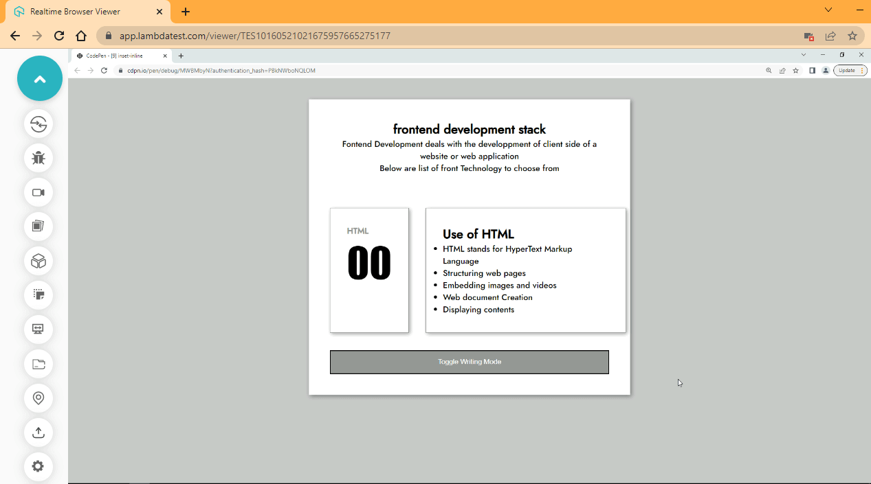
From the browser output, the distance is added left and right of the element. Click on the toggle button to switch the effect.
Inset-inline-end
Inset-inline-end comes under the category of logical properties in the CSS Inset property, which is used to set a specific amount of space between the end distance of an element and its containing element based on the writing-mode set on the element, i.e., done in an inline direction.
Syntax:
inset-inline-end: 2em 4em;
Now, with the below code, you can realize how the CSS Inset property behaves. Just type and run the code.
HTML:
 <main>
        <section>
            <header>
                <div>
                    <h1>frontend development stack</h1>
                    <p>Frontend Development deals with the development of client side of a website or web application
                    </p>
                    <p>Below are list of front Technology to choose from</p>
                </div>
            </header>

            <section>
                <!-- HTML -->
                <div class="HTML stack">
                    <div class="first">
                        <p class="one">HTML</p>
                        <p class="two">00</p>
                    </div>

                    <div class="second writing-mode">
                        <ul>
                            <h2>Use of HTML</h2>
                            <li>HTML stands for HyperText Markup Language</li>
                            <li>Structuring web pages</li>
                            <li>Embedding images and videos</li>
                            <li>Web document Creation</li>
                            <li>Displaying contents</li>
                        </ul>
                    </div>
                </div><!--End of HTML-->

                <button id="htmlButton" class="btn">Toggle Writing Mode</button>
            </section>
        </section>
    </main>
CSS:
@import url('https://fonts.googleapis.com/css2?family=Jost:ital,wght@0,500;1,200&display=swap');

    *,
    *::after,
    *::before {
        padding: 0;
        margin: 0;
        box-sizing: border-box;
        scroll-behavior: smooth;
    }

    :root {
        /* Color Utility */
        --black-color: hsl(0, 0%, 0%);
        --white-color: hsl(0, 0%, 100%);
        --gray-Scale-100: hsl(0, 0%, 91%);
        --gray-Scale-200: hsl(0, 1%, 74%);
        --gray-Scale-300: hsl(0, 0%, 59%);
        --gray-Scale-100: hsl(0, 1%, 44%);

        /* Font Utility */
        --font-family: 'Jost', sans-serif;

        --size-01: 1em;
        --size-02: 2em;
        --size-03: 2.5em;
        --size-04: 5em;
    }

    body {
        /* width: 100vw; */
        background-color: rgb(196, 197, 197);
        font-family: var(--font-family);
    }

    main {
        width: 40%;
        margin: var(--size-03) auto;
        background-color: var(--white-color);
        padding: var(--size-03) var(--size-03);

        box-shadow: 2px 2px 8px rgba(0, 0, 0, 0.4);

    }

    header {
        display: flex;
        justify-content: center;
        text-align: center;
    }

    header h1 {
        font-weight: 600;
    }

    header h1 p {
        color: hsl(0, 84%, 43%);
    }

    .stack {
        display: flex;
        justify-content: space-between;

        margin-top: calc(var(--size-02) * 2);
    }

    .stack .first,
    .stack .second {
        border: 1px solid var(--gray-Scale-300);
        padding: var(--size-02);
        box-shadow: 2px 2px 8px rgba(0, 0, 0, 0.4);

        /* margin-left: 1em; */
    }

    .stack .one {
        font-weight: bolder;
        color: var(--gray-Scale-300);
    }

    .stack .two {
        font-family: Impact, Haettenschweiler, 'Arial Narrow Bold', sans-serif;
        font-size: calc(var(--size-03) * 2);
    }

    .btn {
        background-color: var(--gray-Scale-300);
        color: var(--white-color);
        padding: var(--size-01) var(--size-02);
        margin-top: var(--size-03);
        width: 100%;
        cursor: pointer;
    }

    .btn:hover{
        background-color: var(--gray-Scale-100);
    }

    /* JAVASCRIPT TOGGLE CLASS */
    .writing-mode-html {
        writing-mode: horizontal-tb;
        position: relative;
        inset-inline-end:2em;
        /* margin-left: 2em; */
    }
JavaScript:
const htmlButton = document.querySelector('#htmlButton');
    const htmlCard = document.querySelector('.second');

    htmlButton.addEventListener('click', ()=>{
    htmlCard.classList.toggle('writing-mode-html')
});
Browser Output:
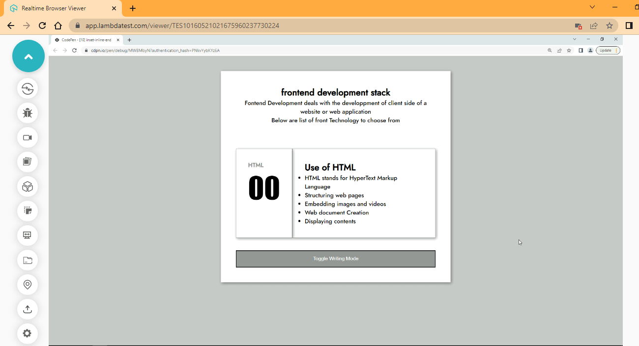
CodePen:
From the browser output, an offset of 2em is added to the end of the element. Click on the button to toggle.
Inset-inline-start
Inset-inline-start comes under the category of logical properties in the CSS Inset property, which is used to set a specific amount of space between the start of an element and its containing element based on the writing-mode set on the element, i.e., done in an inline direction.
Syntax:
inset-inline-start: 2em;
Now, with the below code, you can realize how the CSS Inset property behaves. Just type and run the code.
HTML:
CSS:
@import url('https://fonts.googleapis.com/css2?family=Jost:ital,wght@0,500;1,200&display=swap');

    *,
    *::after,
    *::before {
        padding: 0;
        margin: 0;
        box-sizing: border-box;
        scroll-behavior: smooth;
    }

    :root {
        /* Color Utility */
        --black-color: hsl(0, 0%, 0%);
        --white-color: hsl(0, 0%, 100%);
        --gray-Scale-100: hsl(0, 0%, 91%);
        --gray-Scale-200: hsl(0, 1%, 74%);
        --gray-Scale-300: hsl(0, 0%, 59%);
        --gray-Scale-100: hsl(0, 1%, 44%);

        /* Font Utility */
        --font-family: 'Jost', sans-serif;

        --size-01: 1em;
        --size-02: 2em;
        --size-03: 2.5em;
        --size-04: 5em;
    }

    body {
        /* width: 100vw; */
        background-color: rgb(196, 197, 197);
        font-family: var(--font-family);
    }

    main {
        width: 40%;
        margin: var(--size-03) auto;
        background-color: var(--white-color);
        padding: var(--size-03) var(--size-03);

        box-shadow: 2px 2px 8px rgba(0, 0, 0, 0.4);

    }

    header {
        display: flex;
        justify-content: center;
        text-align: center;
    }

    header h1 {
        font-weight: 600;
    }

    header h1 p {
        color: hsl(0, 84%, 43%);
    }

    .stack {
        display: flex;
        justify-content: space-between;

        margin-top: calc(var(--size-02) * 2);
    }

    .stack .first,
    .stack .second {
        border: 1px solid var(--gray-Scale-300);
        padding: var(--size-02);
        box-shadow: 2px 2px 8px rgba(0, 0, 0, 0.4);

    }

    .stack .one {
        font-weight: bolder;
        color: var(--gray-Scale-300);
    }

    .stack .two {
        font-family: Impact, Haettenschweiler, 'Arial Narrow Bold', sans-serif;
        font-size: calc(var(--size-03) * 2);
    }

    .btn {
        background-color: var(--gray-Scale-300);
        color: var(--white-color);
        padding: var(--size-01) var(--size-02);
        margin-top: var(--size-03);
        width: 100%;
        cursor: pointer;
    }

    .btn:hover{
        background-color: var(--gray-Scale-100);
    }

    /* JAVASCRIPT TOGGLE CLASS */
    .writing-mode-html {
        writing-mode: horizontal-tb;
        position: relative;
        inset-inline-start:2em;
    }
JavaScript:
const htmlButton = document.querySelector('#htmlButton');
    const htmlCard = document.querySelector('.second');

    htmlButton.addEventListener('click', ()=>{
    htmlCard.classList.toggle('writing-mode-html')
});
Browser Output:
CodePen:
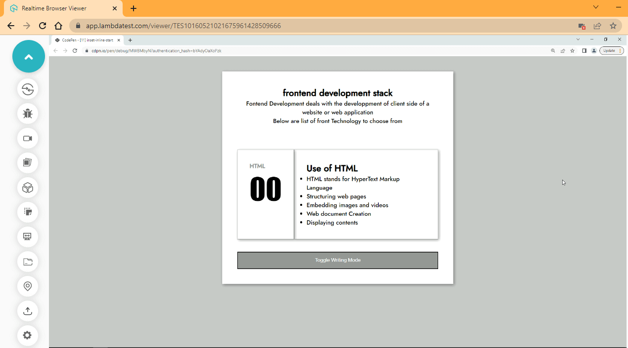
From the browser output, click on the toggle bottom to see the effect.
How Do Inset Properties Work With CSS Anchor Positioning?
CSS anchor positioning lets an inset property take an anchor() value instead of a fixed length, so a positioned element measures its offset from another element rather than from its containing block. The anchor() function is valid in every inset property.
- anchor() as an inset value: The function returns a length measured to an edge of the anchor element, and it is accepted by top, right, bottom, left, inset, inset-block, and inset-inline.
- position-anchor: The positioned element names the element it should measure against, which is what gives anchor() something to resolve.
- position-area: One keyword pair places the element on a grid around the anchor, replacing a hand-written set of inset offsets.
- Fallback length: anchor() takes a second value that the browser uses when no anchor is associated with the element, so the layout does not collapse.
- Baseline newly available: The anchor() function has worked across the latest Chrome, Edge, Firefox, and Safari versions since January 2026, so a feature query is still worth keeping.
Plain lengths and percentages remain the right choice for an element positioned inside its own container. Reach for anchor() only when the offset has to track a separate element, such as a tooltip or a popover.
Browser Compatibility
The CSS Inset property is Baseline widely available. It has worked across Chrome, Edge, Firefox, and Safari since April 2021, so there is no need to fall back to separate top, right, bottom, and left declarations.
Using the CSS Inset property, developers can position elements inside containers by defining how far away from the edges they should be.
Internet Explorer never supported the CSS Inset property, and Microsoft retired Internet Explorer 11 in June 2022. No browser still in support needs the longhand alternative.
Layout can still vary across browsers for reasons unrelated to inset support, such as differing default styles, font metrics, and scrollbar widths. Developers should test their web pages across multiple browsers before releasing them.
To ensure this TestMu AI, a unified digital experience testing platform, enables developers and testers to test their websites or mobile applications for cross browser compatibility over more than 3,000+ browsers and OS combinations.

To get familiar with this, watch the below tutorial to learn how to perform live-interactive testing of your websites using the TestMu AI platform.

You can also subscribe to our TestMu AI YouTube Channel to learn about automation tools like Selenium, Playwright, Appium, and many more tutorials around testing.
Conclusion
The blog post on the CSS Inset property has ended. I hope you had fun and picked up some new information. Now, the developers have a robust tool for positioning elements inside containers in the CSS Inset property. It is a well-liked option for developing responsive and flexible layouts because it enables precise control over the distance between an element and the edges of its parent container.
However, compatibility issues might occur using the CSS Inset property, particularly with older browsers, just like with any other CSS property. To ensure consistent behavior, developers must extensively test all modern browsers and their iterations with TestMu AI. Please feel free to post any additional queries in the comments section; I’ll be happy to respond.
Author

Alex Anie
Blogs: 17


Alex Anie is a Community Contributor and Frontend Developer with 4 years of experience in crafting high-quality technical content. He specializes in frontend technologies like HTML, CSS, JavaScript, React.js, Vue.js, and Next.js, along with skills in TailwindCSS, Git/GitHub, and web testing. At TestMu AI, he has authored 20+ articles covering CSS, automation testing, cross-browser testing, Cypress, and software testing. Alex also publishes technical blogs on platforms like Hashnode, Dev.to, and Medium.
Reviewer

Sparsh Kesari
Reviewer
Sparsh Kesari is a community contributor with 3+ years of experience in developer relations, open-source engineering, and automation-focused tooling. At TestMu AI, he works as a Senior Developer Relations Engineer, supporting developer communities and contributing to initiatives around cross-browser testing, KaneAI, and HyperExecute. Sparsh has hands-on experience building and maintaining automation scripts, open-source projects, and developer platforms, with a strong background in JavaScript, Node.js, Docker, and cloud-native workflows. He holds a Bachelor’s degree in Computer Science.


CSS Inset Property FAQs
Did you find this page helpful?
More Related Blogs
TestMu AI forEnterprise
Get access to solutions built on Enterprise
grade security, privacy, & compliance
- Advanced access controls
- Advanced data retention rules
- Advanced Local Testing
- Premium Support options
- Early access to beta features
- Private Slack Channel
- Unlimited Manual Accessibility DevTools Tests