

Power Your Software Testing with AI Agents and Cloud
The Native AI-Agentic Cloud Platform to Supercharge Quality Engineering. Test Intelligently and Ship Faster.


- TestMu AI (Formerly LambdaTest)
- /
- Blog
- /
- Accessible Colors: WCAG Contrast Ratios and Examples
Accessible Colors: WCAG Contrast Ratios, Tested Pairs, and Tips
Accessible colors meet WCAG contrast ratios: 4.5:1 for text, 3:1 for large text. See tested color pairs, Bootstrap defaults, and color blindness design tips.
Last Updated on:
On This Page
- Accessibility Colors Explained
- Why Accessibility Colors Matter
- Crux of Color Accessibility - Color Contrast
- Accessibility Colors Guidelines
- Tested Color Pairs
- Color Blindness
- Choosing Accessible Colors
- Fixing Colors on a Live Site
- Tools to Use for Accessibility Testing of Colors
- AI Tools for Accessibility Colors
- Best Practices to Follow for Accessibility Colors
Accessibility colors are color pairings whose contrast ratio is high enough for people with low vision or color blindness to read an interface.
WCAG Level AA sets that floor at 4.5:1 for normal text and 3:1 for large text and icons, and low contrast text remains the most common accessibility defect on the web.
This guide covers what accessibility colors are, why they matter, color contrast, WCAG guidelines, how to choose accessible colors, how to fix a live website, testing tools, AI tooling and best practices.
TL;DR
- Accessibility colors are color pairings whose contrast ratio is high enough for users with low vision or color blindness to read the text and identify the interface.
- WCAG Level AA requires a contrast ratio of at least 4.5:1 for normal text and 3:1 for large text, and Level AAA raises normal text to 7:1.
- Contrast ratios run from 1:1, where two colors are identical, to 21:1 for pure black on pure white.
- Low contrast text is the most common accessibility defect on the web, present on 83.9% of the top 1 million home pages in the WebAIM Million analysis.
- Color must never be the only signal, so pair every color cue with text, an icon, an underline or a pattern.
- Contrast checkers such as WebAIM Contrast Checker and Adobe Color Contrast Checker catch ratio failures before a design reaches production.
What Are Accessibility Colors?
Accessibility colors are crucial for ensuring everyone, including people with visual impairments or color blindness, to easily read and interact with content on a website. These colors contrast enough to make text and icons clear against their background.
So, what makes a color accessible? It's contrast. People who are colorblind need high contrast to see different colors clearly. The Web Content Accessibility Guidelines set the standards for this, helping developers create web pages that are easy to read and inclusive for everyone.
Key Takeaway: An accessible color is defined by its contrast against the color behind it, not by the color itself.
Why Are Accessibility Colors Important?
According to a report by WebAIM, 95.9% of the top 1 million home pages fail at least one WCAG 2 success criterion, and 83.9% of them carry low contrast text. Color contrast is the most common accessibility failure on the web.
Following are the reasons why accessibility colors are important:
- Enhanced user experience - Accessibility does not always mean "for people with disabilities". An accessible website should also give each user a better experience in various conditions.
- Broader audience - The first reason that comes to everybody's mind is covering the missing audience of the visually impaired who face extreme challenges in navigating through the website. The World Health Organization reports that at least 2.2 billion people worldwide have a near or distance vision impairment.
- Ethical - Owning a website with accessibility colors is less about gaining an audience and more about web ethics and inclusivity. Once we have published a website, we become part of the web that facilitates inclusivity.
- Profitable - While ethics take priority before publishing the website, it is often the monetary motivation that drives the business psychologically and literally. A business requires money to pay engineers, rent systems, purchase technologies, etc.
- Legal - Web accessibility is a legal right in countries like the United States under the Americans with Disabilities Act (ADA). This means if your website is inaccessible, anyone is eligible to sue your business under this law.
For example, if a user is viewing a website in a high-ambient-light environment, such as outdoors in direct sunlight, they should be comfortable with viewing the colors and navigating through the website.
An additional effort is required when your website represents a domain that should never be restricted to a specific part of the audience.
There are no eligibility criteria for opening a website. It is meant for all! Hence, it is only ethical and a matter of responsibility that we consider each individual before designing and developing a website.
It is not rocket science to join the dots between the number of people who view the website and the revenue generated. They are directly proportional, and when we make the website color accessible, we know we are increasing one factor by many percentage points.
Since having a minimum AA grade (explained later) falls under web accessibility criteria, accessibility color also becomes a part of this act.
Key Takeaway: Accessible colors widen the reachable audience, and in the United States the Americans with Disabilities Act makes web accessibility a legal obligation.

Note: Check color contrast and other WCAG rules across 3,000+ browser and OS combinations. Try TestMu AI Now!
Crux of Color Accessibility - Color Contrast
The crux of having color accessibility, i.e., using colors accessible to everyone, is just to take care of one element - the color contrast ratio.
In simple terms, color contrast refers to the difference or comparison between two colors. It is not a singular property but is used collectively when a bigger picture is taken.
For example, the following web page does not have a color contrast:

But as soon as we add a text element to it, here is how the web page looks like:
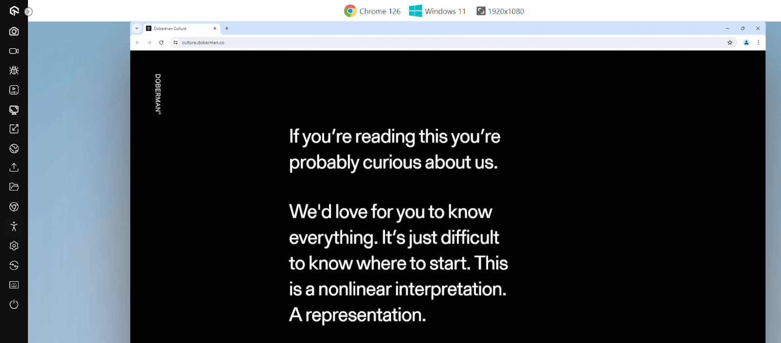
We can talk about their comparison in terms of a ratio number. This ratio depends on the relative luminance of both colors.
Let's consider the relative luminance of the brighter color as L1 and the darker color as L2. Then, the contrast ratio can be calculated as:
(L1 + 0.05) / (L2 + 0.05)
If we again take the first image (the black one) to consider its contrast with itself, we need to consider the same color for both variables. Hence, L1 = L2, and the result is 1:1.
Therefore, a contrast ratio value of 1:1 means there is no contrast at all, and a contrast ratio of 21:1 is the maximum one can achieve.
Note: Luminosity is the intensity of emitted light from a surface per unit area in a particular direction.
Does that mean we always aim for a 21:1 contrast ratio? That is not true (in most cases), and therefore, the main goal of a designer and a developer should be to achieve an "acceptable" contrast rather than a "maximum".
So, how do we know whether the colors we have picked are accessible, i.e., do they contain good contrast? Here, calculating the luminosity is not feasible. Therefore, developers are recommended to use various online resources such as websites in such cases that can quickly calculate the contrast ratio by color name, HSLA value, or RGB values.
Going back to our black background with white text image, the recommended website seigemedia gives the following values:

The contrast ratio value is 21 (21:1), the maximum value one can adopt. The website also provides relative luminance, less important to us in development and testing.
Now that color contrast can be calculated, how do we know our contrast ratio value suits all? This is where accessibility guidelines help in grading colors with color contrast, the subject of color contrast accessibility.
Key Takeaway: A contrast ratio of 1:1 means two colors are identical, and 21:1 is the maximum, achieved only by pure black against pure white.
Accessibility Colors Guidelines
Like everything else in the web development world, the color contrast guidelines are also determined by WCAG 2.1 documents. In this case, the guidelines divide the contrast ratio into two levels.
- Level AA (Minimum) - According to WCAG guidelines, the web page should have minimum accessibility support under level AA. At this level, the text and the images of text (text as part of the image done generally to provide a visual effect) have to be in a contrast ratio of 4.5:1. There are three exceptions here.
- Large texts and images of large-scale text should have a minimum contrast ratio of 3:1.
- Insignificant texts and images of texts have no contrast requirement. These may include those used purely for decoration or those that do not have any UI component.
- Text that is part of a logo may not have any contrast requirement.
- Level AAA (Enhanced) - The enhanced level is the highest level of color accessibility one can achieve. It is the recommended method and should be aimed at by the developers each time they pick colors. The AAA level advises to have a contrast ratio of at least 7:1. However, there are three exceptions:
- Large text and images of large text should have a minimum contrast ratio of 4.5:1.
- Insignificant texts and images of texts have no contrast requirement. These may include those used purely for decoration or those that do not have any UI component.
- Text that is part of a logo may not have any contrast requirement.
Developers may face a hard time providing their web page with AAA levels. However, testers ensure the website implies minimum AA levels for better reachability amongst visually impaired audiences.
Key Takeaway: WCAG Level AA sets 4.5:1 as the minimum contrast ratio for normal text, and Level AAA raises the same requirement to 7:1.
Accessible Color Combinations: Tested Contrast Ratios
I calculated these ratios with the WCAG relative luminance formula, rounding down so no pair is shown passing when it does not. The Bootstrap 5 rows use the default color values from Bootstrap's _variables.scss, which many sites ship unchanged.
| Text on background | Ratio | AA normal text (4.5:1) | AA large text (3:1) | AAA normal text (7:1) |
|---|---|---|---|---|
| #595959 on #FFFFFF | 7.00:1 | Pass | Pass | Pass |
| #767676 on #FFFFFF | 4.54:1 | Pass | Pass | Fail |
| #999999 on #FFFFFF | 2.84:1 | Fail | Fail | Fail |
| #FFFFFF on #0D6EFD (Bootstrap primary) | 4.50:1 | Pass, barely | Pass | Fail |
| #FFFFFF on #198754 (Bootstrap success) | 4.53:1 | Pass | Pass | Fail |
| #FFFFFF on #DC3545 (Bootstrap danger) | 4.52:1 | Pass | Pass | Fail |
| #000000 on #FFC107 (Bootstrap warning) | 12.88:1 | Pass | Pass | Pass |
| #FF0000 on #FFFFFF | 3.99:1 | Fail | Pass | Fail |
| #FF0000 on #008000 | 1.28:1 | Fail | Fail | Fail |
#767676 is roughly the lightest gray that still passes AA as body text on white, so a gray any lighter, such as #999999, fails. And Bootstrap's primary, success, and danger colors with white text sit within 0.03 of the 4.5:1 line, so darkening a brand color by even a shade can push white text below AA.
Designing Accessible Colors for Color Blindness
Contrast is only half of accessible color. According to the National Eye Institute, about 1 in 12 men have color vision deficiency, and the most common type makes red and green hard to tell apart; another type makes blue and yellow look the same.
- Never use color alone - WCAG 1.4.1 Use of Color (Level A) requires another cue, so pair a red error state with an icon and a text message, and underline links in body text.
- Avoid red and green as the only pair - The #FF0000 on #008000 pair in the table above is 1.28:1, unreadable even before color blindness is considered.
- Run a grayscale test - View the design in grayscale; if a chart legend, status badge, or required-field marker becomes ambiguous, it depends on hue alone.
How to Choose Accessible Colors?
The above-defined calculation for color contrast will help find colors that are accessible and improve the overall accessibility of the page. However, for that to work, we need to have two colors with us beforehand.
Clearly, the designers need to have a method or at least a reference point where, if they think about one color, they should be able to approximate the second color they will use. These methods become helpful in such cases.
Knowledge of Color Palette
No matter how many tools pop up on the Internet that can just run the algorithm and produce a color output, nothing can beat the knowledge of color palette. This is because:
- We are developing websites for humans and know what humans will find appealing.
- We expand the knowledge base over time, which includes learning about exceptional cases. The algorithms, on the other hand, remain constant.
- We take feedback and understand why some things don't work in a few cases. For instance, black and white may have the maximum contrast and look good in many cases. But, there are a few cases where this combination will also struggle. Such experience can only come by learning from the feedback over time.
For instance, the following landing page has good contrast (21:1) but will not connect with the user as much.

This design could be improved with other colors even though the contrast value will be reduced.
The knowledge of color palettes focuses on CSS color functions and spaces that define how different colors are divided between the three-dimensional space and the choices we have to make. For reference, we will consider two methods of choosing accessible colors:
- Complementary colors - Complementary colors are opposite in characteristics (and with their properties). Sometimes referred to as "opposite colors", they cancel out each other and produce grayscale colors (based on white and black) when mixed or combined.
- Color wheel - Another method to choose accessibility colors is to turn towards color wheels. A color wheel is a circle filled with all the colors.
The good thing about complementary colors is that their contrast ratio value is high (as they are opposite); hence, the designers can get a reference point for the shades they can pick. This will also stand true when one of the colors is already chosen, and the designer is looking for the best accessible color according to it.
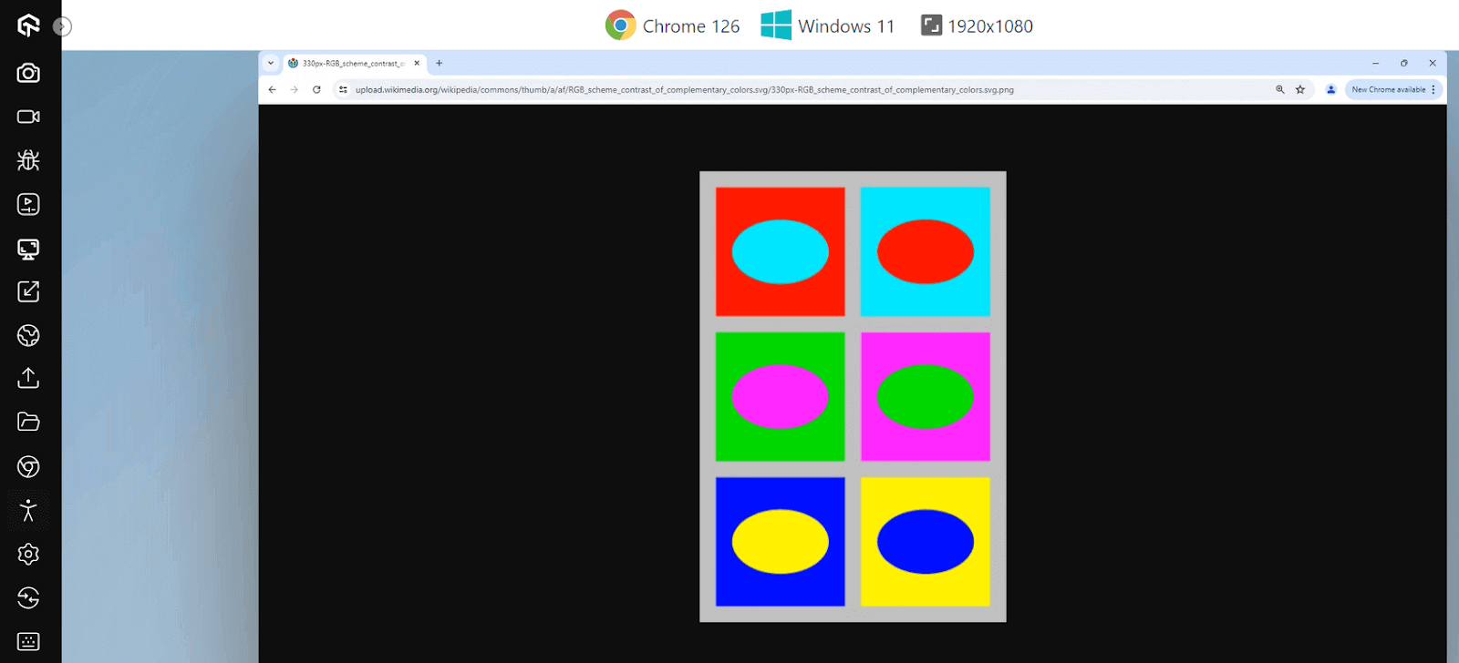
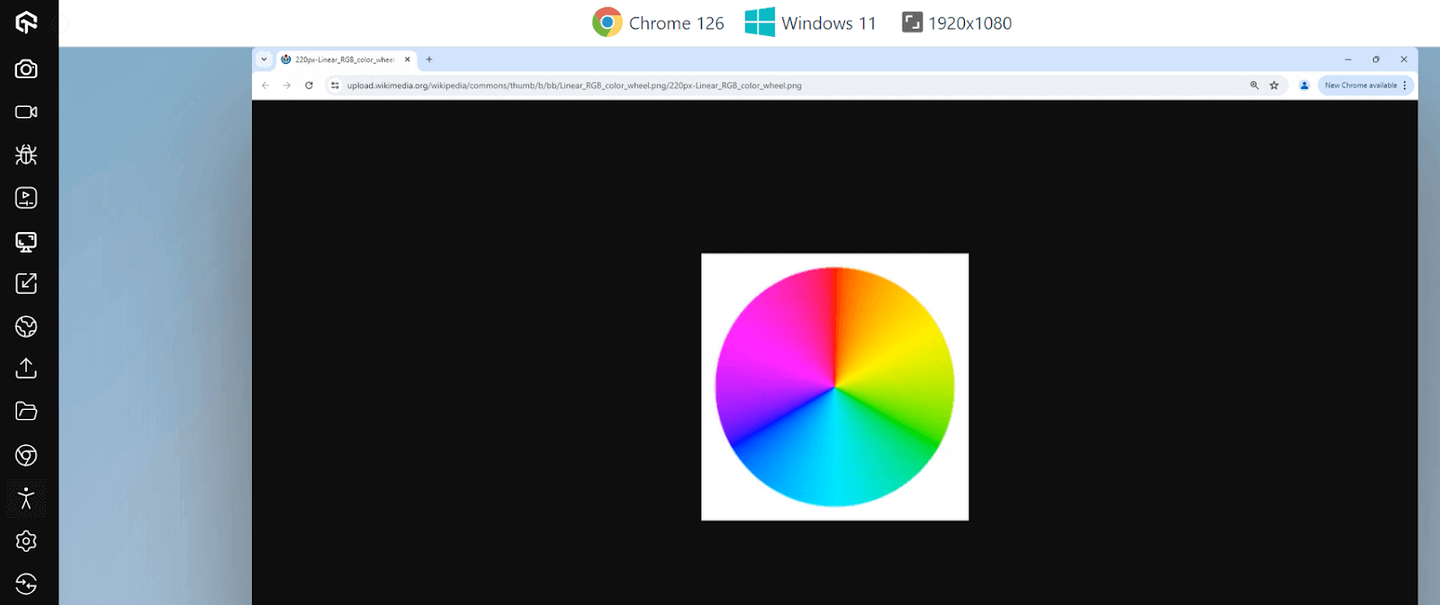
Over time, color wheels have taken many forms according to the needs of time. In 1907, it was observed that the human eye pays special attention to colors that are complementary to each other. Hence, the color wheel was simplified and published to work with this concept in various fields.
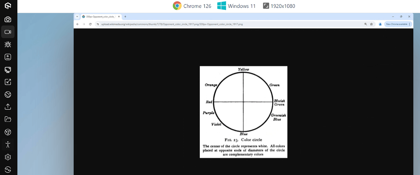
Today, this same concept is modified, complex, and made per web designs and designers that carefully pick each web page color. There are a lot of color wheels available with varying complexity.
Some will contain hundreds of colors, while some will contain only a few. It depends on the requirements and how much refinement in each shade the designer is looking for. For reference, the following color wheel provides various shades of primary colors used in paintings.
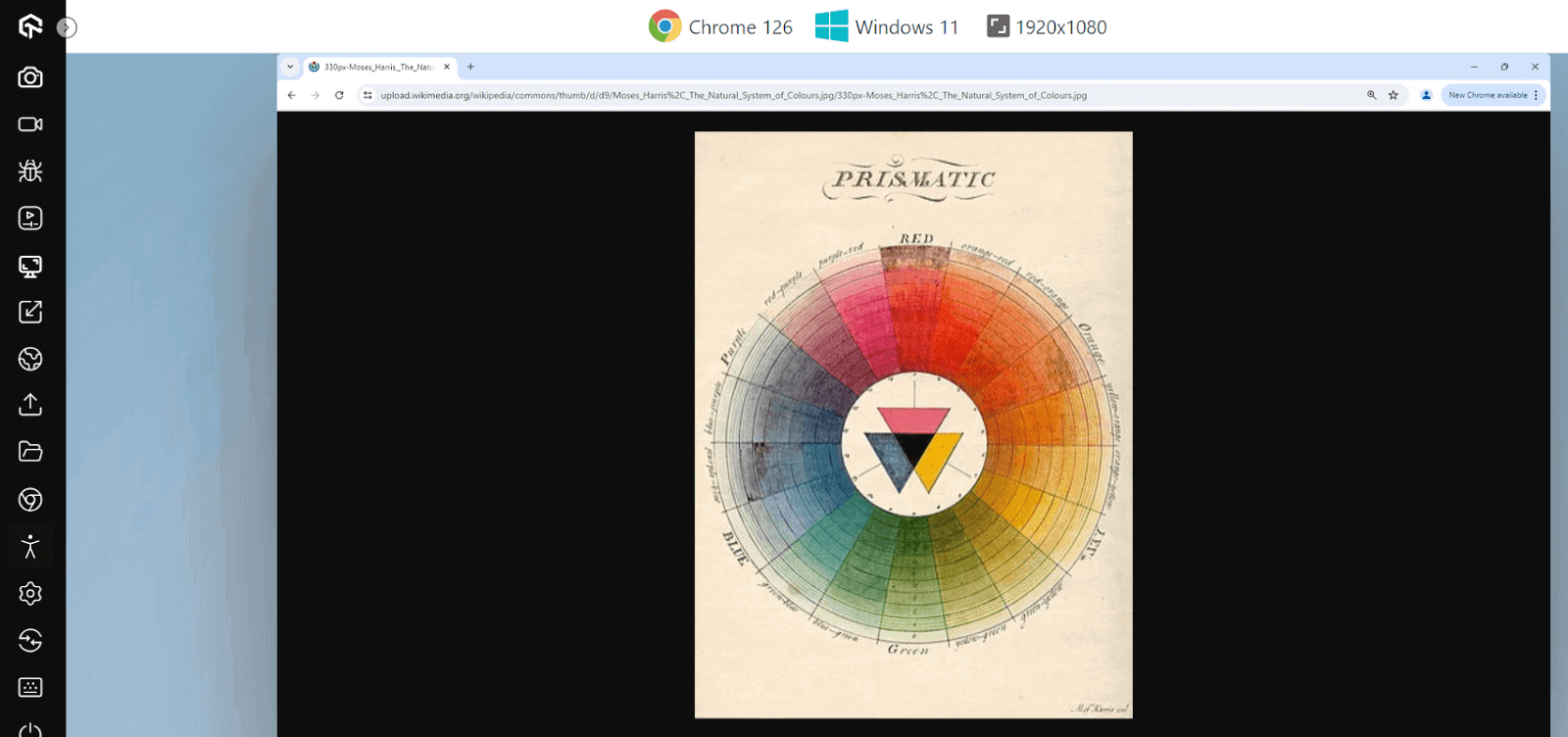
The color wheels are also available digitally to present the RGB, HSL, or HEX code for the specific color on which the user hovers the pointer. It helps save time and finalize the colors quickly.
Leverage Online Tools
Today, online tools are readily available to calculate the contrast ratio and provide the best suggestions based on color. For instance,
- WebAIM Contrast Checker takes a foreground and a background value and returns the ratio with a pass or fail against WCAG AA and AAA for normal text, large text and graphics.
- Colour Contrast Analyser from TPGi samples any pixel on screen with an eyedropper, so you can check a rendered page instead of retyping hex values.
- Adobe Color Contrast Checker is a more sophisticated tool that provides all the required elements for designing and developing a web page. For instance, in the following screenshot, the tool offers the contrast ratio, functionality to input colors, WCAG rating, some suggestions that yield the best contrast, and examples with the chosen background and text color for reference.
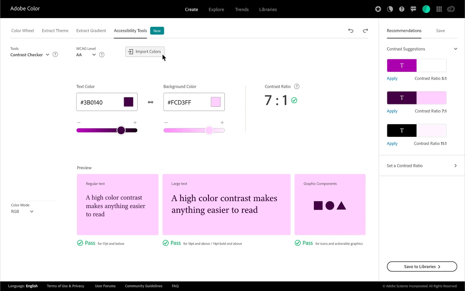
For the most efficient solution, it is recommended to use both methods in tandem. First, choose the first color with the second shade already in mind with the help of color wheel (or complementary colors) knowledge. Then, refine the same second color shade using expert tools like Adobe Color Contrast Checker. If each element is crafted carefully like this, the complete web page will automatically become color accessible.
Key Takeaway: Pick the second color from the color wheel first, then refine its shade in a contrast checker until the ratio clears WCAG Level AA.
How to Enhance the Accessibility Color of a Live Website?
A typical scenario in web development is to enhance the already live website and make it more accessible. Since redesign or redevelopment involves much cost and time, color accessibility is generally achieved on the pre-defined template.
The above scenarios considered can be used here as well with the following steps:
- Select a background color - Select the background color of the web page. This can be the existing background color or a new one as well. Using the existing background color is usually recommended, as contrast depends on two elements.
- Generate the list of colors used in elements - Generate a list of colors used in all the elements on the web page.
- Calculate contrast ratio - Calculate the contrast ratio for each color based on the background color.
- Generate a list of complementary colors - Generate a list of complementary colors by using online tools or studying the color wheel.
- Fill the elements with colors from the color wheel - Leave the existing elements with a healthy contrast ratio. The rest of the elements need to be filled with the colors picked from the color wheel. Ensure they look aesthetically good, and the designers should refine them using shades of these colors.
- Republish the website - Republish the color-accessible website once the colors are selected and applied. This way, you can broaden your audience by including the visually impaired audience.
No matter our color, we will still have to adjust other elements accordingly. Secondly, there are a lot of different properties that would have been adjusted purely based on the background color, such as the border color of a div box.
Moving a background color will mean adjusting all those properties again. However, if it comes to setting a new background color altogether, it is preferred to go for the extremes such as black and white (or their shades), as complementary colors are easier to find.
Key Takeaway: Fixing color on a live site starts with the background color, because every other contrast ratio on the page is measured against it.
Tools to Use for Accessibility Testing of Colors
The following tools will help developers and testers verify the color contrast of the website and whether or not it complies with WCAG guidelines.
- TestMu AI Accessibility DevTools - Powered by axe DevTools, Accessibility DevTools Chrome Extension by TestMu AI helps ensure website accessibility by enabling users to test, manage, and report accessibility issues.

2M+ Devs and QAs Rely on TestMu AI for Web & App Testing Across 3000 Real Devices
 Sign up with google
It offers features like full-page, partial-page, multi-page, and workflow scans to identify and resolve common accessibility errors, ensuring websites meet accessibility standards. This extension provides an accessible dashboard for monitoring and classifying issues, facilitating swift issue discovery and resolution to enhance user experience and compliance.

- Adobe Color Contrast Checker - The Adobe Color Contrast Checker is a tool that only provides information on contrast ratios. This tool ships with an advanced recommendation system to recommend the best colors that comply with WCAG. Adobe Color Contrast Checker takes input as colors or a screenshot of the webpage to analyze the colors by itself.
- WAVE - Web Accessibility Evaluation Tool or WAVE is a tool that takes a website URL as an input and produces accessibility errors in different areas. One of the areas is contrast errors, which concerns color accessibility on the page.
- Stark - Stark is an enterprise-level accessibility checker used by many big firms including ones falling in the Fortune 100 list. The reason for this high adoption is simple. Stark can connect to many tools that developers and designers use, giving accessibility insights at a very early stage without publishing the website.
- Accessi - Accessi scans the website and points out web accessibility errors. It is efficient in scanning the complete code of the website and categorizing the issues into three categories depending on their severity.
Other than Accessibility DevTools, TestMu AI platform also lets you automate accessibility checks for websites and web apps with automated testing frameworks like Selenium, Playwright, and Cypress. With the TestMu AI Accessibility Automation, you can easily customize your tests - pick WCAG versions, decide how issues are reported, and use tags to focus on specific areas you want to test.
To get started, head over to the guide on Accessibility Automation.
The user can then select the color from the list and get the contrast ratio, current, and recommended colors with a shade slider that eliminates the additional step of refining a particular shade.
It also comes as an extension for Chrome, Firefox, and Edge browsers. Once integrated, the tool can work on the current URL instead of putting down the URL address each time a run is required.
These tools include Figma, GitHub, Sketch, and the published website. Stark can take the code from tools like GitHub or designs from tools like Figma and provide real-time reports to the team with accessibility issues.
The tool also provides an option to download PDFs and suggest the best ways to eliminate the issues from the web application.
Key Takeaway: Browser extensions and automated scanners report contrast failures per element, which is faster than checking color pairs one at a time by hand.
How Do AI Tools Help Fix Accessibility Colors?
AI tools find contrast failures and propose replacement values, but they cannot decide whether a color is right. A contrast ratio is arithmetic on two luminance values, so detection was always deterministic.
What has changed is where that arithmetic runs and what happens after a failure is found. Three uses hold up in practice:
- Suggested remediation values - axe DevTools reports the failing ratio and a nearest passing foreground color, so the fix arrives with the defect instead of being worked out by hand.
- Coding agents in the editor - an assistant such as Claude Code or GitHub Copilot can run an axe-core scan, read the violation list, and open a pull request that changes the offending CSS custom properties.
- Design token audits - an agent can walk a token file, compute every foreground and background pairing, and flag the combinations that fall under 4.5:1 before any of them reach a component.
The limits are firm. Automated scanning catches only part of the WCAG success criteria, and contrast is one narrow slice of that. A model can raise a ratio to 4.5:1 and still break the brand palette, flatten a hover state, or create a pairing that clashes with the colors next to it.
AI also cannot judge the non-numeric rules. Whether color is the only carrier of meaning in a chart legend, or whether a red error message still reads as an error in grayscale, needs a person. Treat AI output as a first pass and confirm it against WCAG testing criteria.
Key Takeaway: AI tooling reliably detects contrast failures and proposes passing values, but a person still decides whether the replacement color is right for the design.
Best Practices to Follow for Accessibility Colors
Finally, before concluding this guide, let's skim through the best practices to incorporate in making the website color accessible.
- Follow WCAG guidelines - WCAG guidelines are the reference point to know whether the contrast ratio we are using is accessible (and how much through the grading system). Their values are based on extensive research and experiments. Therefore, we as developers should always stick to it and implement colors strictly within those boundaries, even without any marginal deviation.
- Use accessibility testing tools: Online accessibility tools or extensions can integrate into the actual flow of a website today and provide accessibility insights according to the WCAG.
- Ensure the text works with colors - It is important never to ignore the text color, especially when it is on an image. Moreover, it is also important to verify whether or not the text is readable with the new color scheme. Texts are as crucial as any other graphical element when it comes to the color accessibility of a web page.
- Graphic color is as important - A lot of web pages will contain graphical elements such as a product image or an object, etc. These elements are often isolated from others and may be overlooked by the developers.
- Use white and dark when required - Sometimes, there may be cases where two elements have a lower contrast ratio, and we are left with no choice but to use just those colors. In such cases, try to separate the elements and fill the space with white or dark colors depending on the colors of the elements. It will enhance the contrast ratio without changing any new colors.
- Select contrast - When users select a text on the web page, a highlighted color appears on the text. A lot of the websites customize it to give a good experience. However, they often need to check for color contrast in the background, text and highlighted color.
- Documentation - Finally, it is always a good practice to document everything for reference in the future and with new members. This includes the color shades used along with the contrast ratio achieved with them.
They can point out the issues and suggest remedies for them for quick implementation. Such tools should always be a part of your accessibility testing, along with the knowledge of complementary colors so that you can make fast and long-lasting decisions.
It is important to consider the elements' colors for color accessibility on the page. They are often the main subject of the page or something that defines the business and its objectives. All audiences must be comfortable viewing these elements along with other colored elements.
If the contrast is too low, the users will face difficulty reading the text, as in the above image. The above color can be lightened since the text is dark.
These best practices ensure that the team is not only doing things right but also doing them in the most efficient way possible. It saves time in maintenance, especially post-production, and minimizes the costs spent on the projects.
Key Takeaway: Documenting every approved color pair with its measured contrast ratio stops the same failing combination from being reintroduced later.
Conclusion
Check every text and background pair in your palette against 4.5:1, starting with brand buttons and body gray, then view the key screens in grayscale to find anything that depends on hue alone. For live pages, TestMu AI's accessibility testing suite flags contrast failures on every scan so a new brand color cannot slip below AA unnoticed.
Author

Harish Rajora
Blogs: 100


Harish Rajora is a software developer at TestMu AI with over 6 years of hands-on experience in Python and cross-platform application development across Windows, macOS, and Linux. He has authored 800+ technical articles and worked on large-scale projects, including GenAI applications and core engineering features used by millions. Harish has led DevOps initiatives building CI/CD pipelines with Jenkins, AWS, GitLab, and GitHub, and holds an M.Tech in Software Engineering from IIIT Allahabad.
Reviewer

Rahul Mishra
Reviewer
Rahul Mishra is a Lead Member of Technical Staff at TestMu AI (formerly LambdaTest), leading frontend engineering and accessibility testing across the quality engineering platform. He mentors frontend engineers, runs code reviews and sprint planning, optimizes React.js rendering performance, and makes product features accessible to users with disabilities through WCAG and ADA-compliant accessibility audits. He brings 10+ years of experience across React.js, VueJS, TypeScript, Swift, Objective-C, and AWS, with earlier work as a Technical Lead at VectoScalar Technologies. Rahul holds a B.E. in Information Technology.


Accessibility Colors FAQs
Did you find this page helpful?
More Related Blogs
TestMu AI forEnterprise
Get access to solutions built on Enterprise
grade security, privacy, & compliance
- Advanced access controls
- Advanced data retention rules
- Advanced Local Testing
- Premium Support options
- Early access to beta features
- Private Slack Channel
- Unlimited Manual Accessibility DevTools Tests