Next-Gen App & Browser Testing Cloud
Trusted by 2 Mn+ QAs & Devs to accelerate their release cycles

On This Page
- What is an HTML Select tag?
- What are the various select tag attributes
- Dropdowns vs. Select vs. Menu vs. Navigation
- How to construct a basic HTML Select field?
- How to create a custom dropdown menu with CSS Select
- What is web accessibility?
- How to make dropdowns accessible?
- How to test custom menus on multiple browsers?
How To Create Custom Menus with CSS Select
Read on to learn how to create custom menus with CSS select.
Adarsh M
January 10, 2026
When it comes to UI components, there are two versatile methods that we can use to build it for your website: either we can use prebuilt components from a well-known library or framework, or we can develop our UI components from scratch.
Developing unique CSS components is a better strategy because we have much more control over them as developers, and can change the values as and when required. As a front-end developer for more than three years, making custom select dropdown components for navigation, selecting an option from a list, or filtering the provided choice is one of the most common demands when building user interfaces.
There are several use cases for the < select > tag, like dropdowns, navigation menus, filtering lists of items based on the selected option, choosing an option from a given list of options in input forms, etc. There are numerous CSS frameworks and JavaScript libraries, including Bootstrap, Material UI, and Ant Design, and each of them has its own implementation of a custom CSS Select dropdown menu. They are extremely dependable and have demonstrated cross-browser functionality.
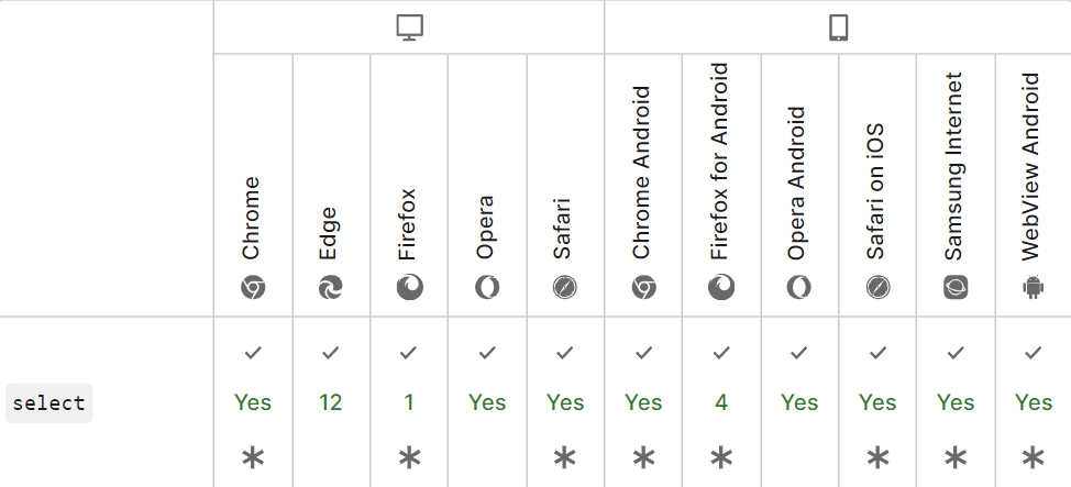
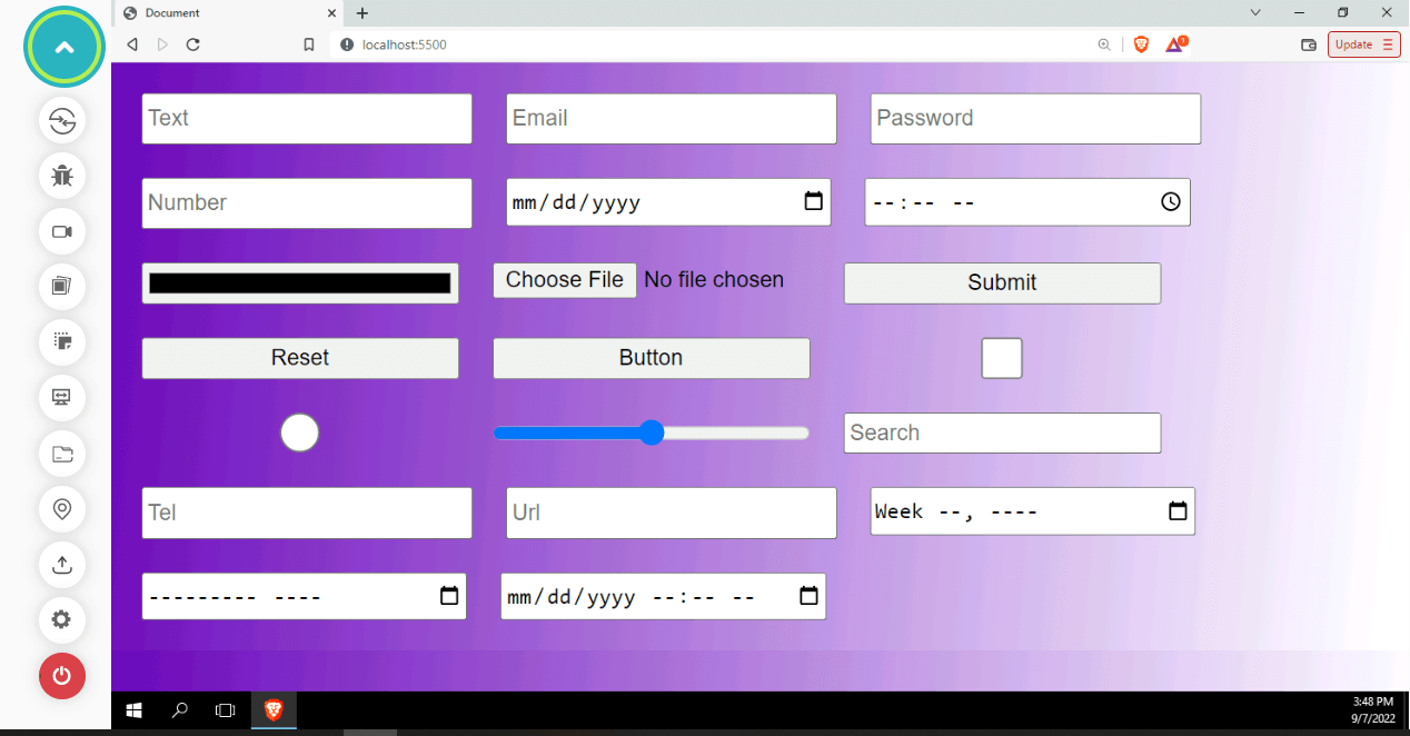
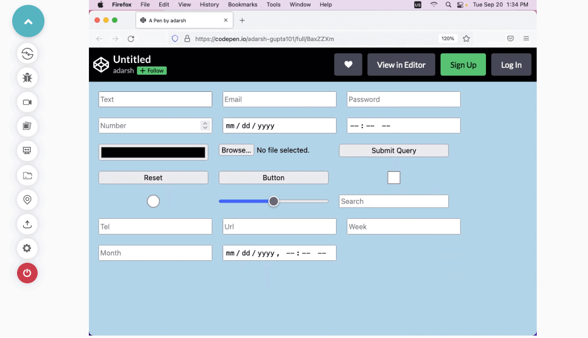
Cross-browser drop-down styling is very challenging. Designers always create attractive drop-down lists, but each browser renders them slightly differently. You can learn more about browser rendering from this blog on Browser Engines: The Crux Of Cross Browser Compatibility.
When thinking about cross-browser functionality, using a CSS framework or library is beneficial because they handle all the behind-the-scenes tasks involved in creating a specific component.
When using these CSS libraries and frameworks like Bootstrap or Tailwind CSS, cross-browser functionality is paramount because end users use different operating systems, browsers, and devices. If we want everyone to have the same experience, we should only use those libraries and frameworks that work well on all devices, operating systems, and browsers. Most modern frameworks consider the need for cross browser compatibility and maintain device-friendly styling.
In this in-depth blog on custom CSS Select menus, we will walk through the process of creating various custom CSS Select menus.
So, let’s get started!
What is an HTML Select tag?
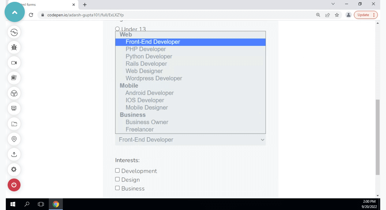
The HTML element < select > represents a control with a menu of choices. Usually, we use the select element to create a drop-down list. The < select > element is most frequently used in forms to gather user input.
Select tags incorporate several attributes that provide supplementary information about HTML elements. The omission of the name attribute results in the non-submission of data from the dropdown list. The id attribute plays a crucial role in linking the dropdown list with a label. Inside the select element, the option tags define the dropdown list’s options.
<select>
  <option>
  </option>
  ...
</select>
The < select > element is typically used when we ask for information about a user’s country in the website’s login form or navigation bar. To maintain the accessibility of the website, we often use the label tag to make it accessible and better for end users.
What are the various select tag attributes?
HTML attributes are unique keywords used within the opening tag to regulate the element’s behavior. HTML attributes are a type of modifier for an HTML element. The attributes provide additional information about HTML elements.
The select tag has various characteristics, including:
- Autofocus (Type – Boolean): The HTML
< select >autofocus attribute is used to specify that the dropdown should automatically get focused when the page loads or when the user reaches a certain viewport. - Required (Type – Boolean): The HTML
< input >required attribute indicates that the user must select a value before submitting the form. The required attribute is a boolean attribute. A variety of input types support the required attribute, including text, search, URL, tel, email, password, date pickers, numbers, checkboxes, radios, and files. - Multiple (Type – Boolean): The HTML multiple attributes specify that the user is allowed to select more than one option (or value) from the given list of options inside the
< select >element. Additionally, it can work with the< input >tag. - Disabled (Type – Boolean): To indicate that a select element is disabled, we use the disabled attribute. A drop-down list that is disabled cannot be used or clicked on. It is also a boolean attribute.
- Name (Type – String): The drop-down list’s name is specified using the name attribute. It can reference an element in JavaScript or the form data after submitting it.
These keywords’ primary benefits include accessibility, providing additional information for the HTML element, etc.
Let’s examine some use cases for these attributes with a few examples.
<img
      src="A Link to an image or any local image "
      alt="an alternative test if the browser can't display the image"
      width="104"
      height="142"  />
We can see a few of the < img > element’s attributes in this example. These attributes give additional information to the < img > element. There are more than 12 attributes for the < img > tag.
Here we have used attributes like src, which corresponds to the image’s source/link, alt, which provides a meaning-filled text description to increase accessibility, and height and width, which describe the image’s height and width.
<!-- input form with all attributes  -->
   <form>
    <label for="fname"> First name:</label><br />
    <input type="text" id="fname" name="fname" value="John" /><br />
    <label for="lname">Last name:</label><br />
    <input type="text" id="lname" name="lname" value="Doe" /><br /><br />
    <input type="submit" value="Submit" />
    <select name="Mobile" id="Mobiles">
      <option value="Samsung">Samsung</option>
      <option value="Apple">Apple</option>
      <option value="OnePlus">OnePlus</option>
      <option value="Xiaomi">Xiaomi</option>
      <option value="Oppo">Oppo</option>
      <option value="Vivo">Vivo</option>
    </select>
  </form>
The use of several HTML attributes can be seen in the examples above, including action, which specifies the action to be taken when the form is submitted, If the action attribute is omitted, then the default action will be set to the current page.
The name attribute corresponds to the name of the current element as defined by the user, id, which is a unique user-defined name, and value, which is used differently for various input types, such as text for buttons and the initial value for < input > elements.
Other attributes include style, class, and other global attributes that can be used with all HTML elements and some specific to certain HTML elements, such as href and defer.
We won’t go into great detail about HTML attributes because that is outside the scope of this blog on CSS Select, but it is crucial to take accessibility, providing meaningful descriptions via attributes, and following best practices into consideration.
Note: Test Custom Menus on the latest desktop and mobile browsers. Try TestMu AI Now!
Dropdowns vs. Select vs. Menu vs. Navigation
One common misunderstanding among novice developers is the names mentioned while discussing dropdowns. The most common of which are dropdown, select, and menu.
In this section of the CSS Select blog, let’s have a closer look at what they are.
Dropdown
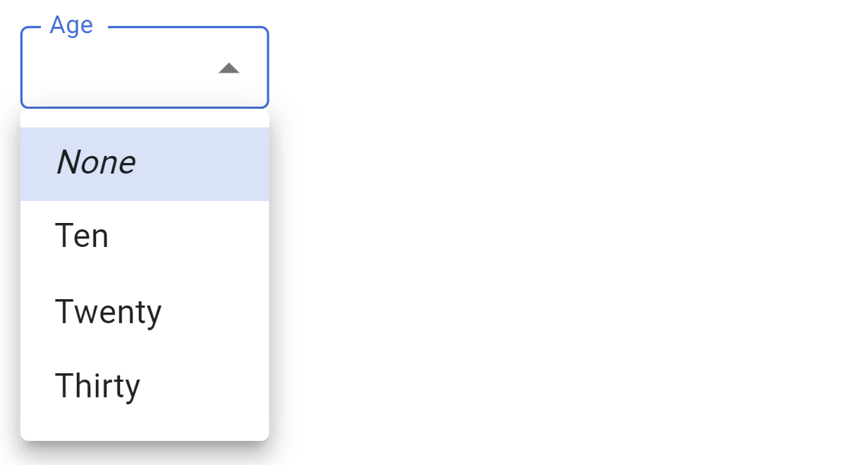
An interactive element made up of a button that, typically on mouse hover, click, or tap, reveals and conceals a list of items. Before the beginning of the interaction, the list is hidden by default.
A drop-down list only shows one value when it is not active. When the user interacts with the dropdown, a list of values is displayed for the user to choose from.
Material UI Dropdown
A form control that shows a list of choices on a form for the user to select a single item or multiple items.
To make a drop-down list, we use the HTML < select > element. The < select > element is most frequently used in forms for gathering user inputs.
How to construct a basic HTML Select field?
This section of this blog on CSS Select will discuss the basic aspects of web design involved in the HTML Select element and how to use CSS to style it.
First, the < select > tag is often used when we need to get user input, and the user is given various options to choose from. It may resemble selecting various states or nations, or it might even resemble using a dropdown to switch between pages.
Below is the source code for constructing a select section.
HTML:
<select name="Phone" id="Phone">
  <option value="Realme">Realme</option>
  <option value="Redmi">Redmi</option>
  <option value="Iphone">Iphone</option>
  <option value="Samsung">Samsung</option>
    <option value=”Pixels">Google Pexels</option>
</select>
Output:
The output of the code looks as follows:
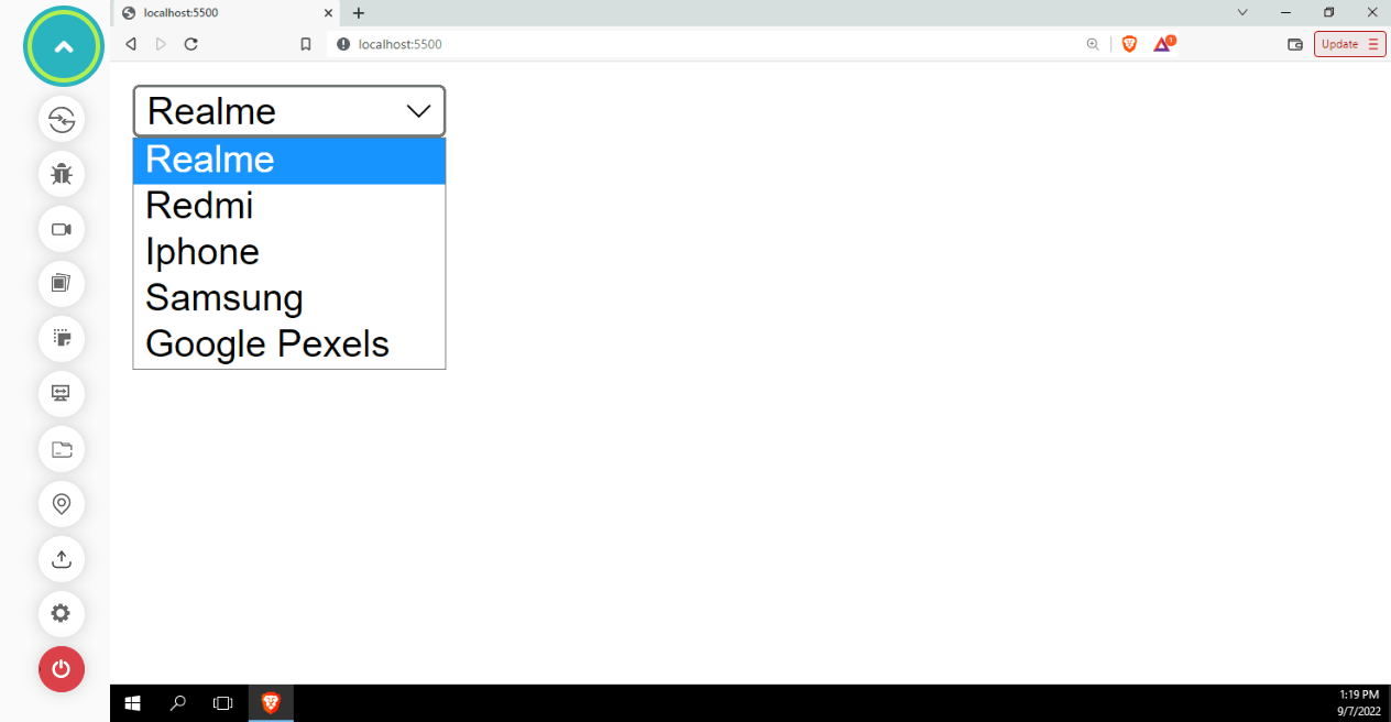
This is straightforward and is a good place to begin. Let’s now add custom CSS to make it look good as well as design friendly.
CSS:
select{
    width: 10%;
    height: 50px;
    border: 1px solid #ccc;
    border-radius: 5px;
    padding-left: 5px;
    padding: 10px;
    font-size: 18px;
    font-family: 'Open Sans', sans-serif;
    color: #555;
    background-color: rgb(255, 255, 255);
    background-image: none;
    border: 1px solid rgb(41, 18, 18);
}
select>option{
    font-size: 18px;
    font-family: 'Open Sans', sans-serif;
    color: #555;
    background-color: rgb(247, 247, 247);
    background-image: none;
    font-size: 18px;
    height: 50px;
    padding: 15px;
    border: 1px solid rgb(41, 18, 18);
}
Output:
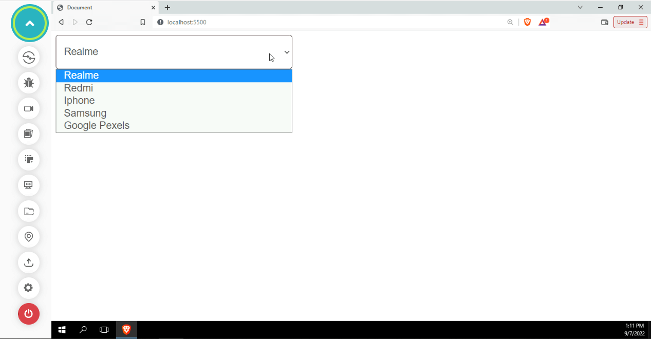
Despite having styles applied to it, the < select > tag’s styles hardly ever change. This is because they are not usual DOM elements, making them behave differently from others.
For developers, the < select > and < option > elements are the most frustrating form controls due to their lack of styling support. This is because they are rendered by the operating system, not HTML.There are only a few style attributes that can be applied to the < option >. Because of how much of a UX battle it is, we will look into other solutions.
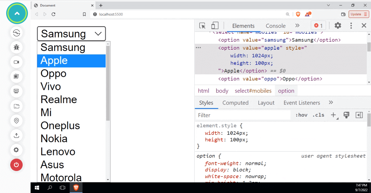
The above image makes it clear that applying styles to the < option > tag does not work as intended. The events like click or keypress on
A consistent way to mark up the functionality of a list of selectable options is provided by the < select > element. Nevertheless, the browser has complete control over how that list is displayed and can do so most effectively considering the operating system, browser, and current device.
Since we can never be certain how it will be presented, trying to style it in any way may not be effective. We can look into some examples where we test how select tags are presented for different browsers, operating systems, etc.
HTML:
<html>
  <body>
    <select name="Phone" id="Phone">
      <option value="Realme">Realme</option>
      <option value="Redmi">Redmi</option>
      <option value="Iphone">Iphone</option>
      <option value="Samsung">Samsung</option>
      <option value="OPPO">OPPO</option>
      <option value="Google Pexel">Google Pixel</option>
    </select>

    <select name="Phone" id="Phone">
      <option value="Chrome">Chrome</option>
      <option value="Firefox">Firefox</option>
      <option value="Safari">Safari</option>
      <option value="Edge">Edge</option>
    </select>
  </body>
</html>
Output (macOS):
We can see that the < select > tag is rendered differently. This can be an issue for users if we develop a web application that only considers a particular browser or operating system. We must consider all the major operating systems and browsers to ensure that our application is compatible with cross-browser.
We now comprehend the need for customized CSS Select menus, so let’s start creating those.
How to create a custom dropdown menu with CSS Select?
In this section, we will look at how to create dropdown menus using CSS Select.
There are numerous ways to create a dropdown menu. We can either use CSS to make custom dropdowns or the native select tag to create dropdown menus. All we have to do is to use appropriate HTML elements and then style them accordingly.
We can use CSS Select to its full potential to make custom drop-down elements. With drop-down menus, users can quickly access your site’s content without scrolling. Drop-down menus can save users time by allowing them to jump down a level or two to find the content they want.
A good example of dropdowns in use is in e-commerce websites, where users will see dropdown inputs during checkout. Let’s now create some custom dropdown menus.
Creating a custom dropdown with CSS Flexbox
To make the select menu more user-friendly, let’s now put our CSS skills to use by positioning the dropdown elements using different CSS properties like position and flexbox.
CSS Flexbox is a layout that simplifies the creation of flexible, responsive layout structures without using float or position properties. Flexbox handles layout in only one dimension at a time, either row or column. This makes Flexbox great for customized drop-downs with HTML divs and spans since we can set the flex-direction property to make it appear as a drop-down.
We are free to modify the dropdown so that it complements the design aspects of the website.
HTML:
<!DOCTYPE html>
<html lang="en">
  <head>
    <meta charset="UTF-8" />
    <meta http-equiv="X-UA-Compatible" content="IE=edge" />
    <meta name="viewport" content="width=device-width, initial-scale=1.0" />
    <title>Document</title>
    <link rel="stylesheet" href="index.css" />
  </head>
  <body>
    <div class="select" tabindex="1">
      <input class="selectopt" name="test" type="radio" id="option1" checked />
      <label for="option1" class="option">Youtube</label>
      <input class="selectopt" name="test" type="radio" id="option2" />
      <label for="option2" class="option">Twitch</label>
      <input class="selectopt" name="test" type="radio" id="option3" />
      <label for="option3" class="option">TikTok</label>
      <input class="selectopt" name="test" type="radio" id="option4" />
      <label for="option4" class="option">Instagram Reels</label>
      <input class="selectopt" name="test" type="radio" id="option5" />
      <label for="option5" class="option">Youtube Shorts</label>
    </div>
  </body>
</html>
CSS:
body {
  background:#ae15eb;
  display:flex;
  justify-content: center;
  align-items:center;
  flex-wrap:wrap;
  padding:0;
  margin:0;
  height:100vh;
  width:100vw;
  font-family: sans-serif;
  color:#FFF;
}
.select {
  display:flex;
  flex-direction: column;
  position:relative;
  width:350px;
  height:100px;
}
.option {
  padding:0 30px 0 10px;
  min-height:40px;
  display:flex;
  align-items:center;
  background:rgb(9, 184, 67);
  border-top:#222 solid 1px;
  position:absolute;
  top:0;
  width: 100%;
  pointer-events:none;
  order:2;
  z-index:1;
  transition:background .4s ease-in-out;
  box-sizing:border-box;
  overflow:hidden;
  white-space:nowrap;

}
.option:hover {
  background:rgb(8, 145, 26);
}

.select:focus .option {
  position:relative;
  pointer-events:all;
}

input {
  opacity:1;
  position:absolute;
  left:99px;
}

input:checked + label {
  order: 2;
  z-index:2;
  background:#666;
  border-top:none;
  position:relative;
}

input:checked + label:after {
  content:'';
  width: 0;
  height: 0;
  border-left: 5px solid transparent;
  border-right: 5px solid transparent;
  border-top: 5px solid white;
  position:absolute;
  right:10px;
  top:calc(50% - 2.5px);
  pointer-events:none;
  z-index:3;
}

input:checked + label:before {
  position:absolute;
  right:0;
  height: 40px;
  width: 40px;
  content: '';
  background:#666;
}

@media screen and (max-width: 600px) {
  .select {
    width:90%;
  }
Output:
Filtering options in a dropdown list with JavaScript
We can utilize the CSS properties like Flexbox and Grid to make the layout for our select menu.
Flexbox is a CSS layout that simplifies the creation of flexible, responsive layout structures without using float or position properties. Flexbox handles layout in only one dimension at a time, either row or column. This makes flexbox great for customized drop-downs with HTML divs and spans since we can set the flex-direction property to make it appear as a drop-down.
We make use of CSS Media Queries to make our dropdown responsive. We must consider standard device dimensions like 480 pixels, 640 pixels, 720 pixels, 1024 pixels, 1440 pixels, etc. The main objective of responsive websites is to ensure a seamless experience across different digital devices. The majority of today’s libraries and frameworks take this technique. Thus we should do the same while creating custom dropdowns.
We have created custom Select menus using a variety of CSS properties, such as Flexbox, Grid, and positioning, and now it is time to put our true creativity to work, creating custom select menus with CSS, also with the help of JavaScript.
JavaScript is being used in this case to create filterable options, which means that as the user types, the other options that are not similar to the given input in the options list are removed. The logic used here is plain and simple. We have an array of list items; whenever the user enters a specific character or group of characters, we iterate through the list and determine whether the entered input is present in the list of items. If it is not present, we remove those items from the dropdown list, giving the user a filtered and small list.
This is handy when users have to select from a long list like a list of countries, states, etc.
HTML:
<!DOCTYPE html>
<html lang="en">
<head>
  <meta charset="UTF-8">
  <meta http-equiv="X-UA-Compatible" content="IE=edge">
  <meta name="viewport" content="width=device-width, initial-scale=1.0">
  <title>Document</title>
  <link rel="stylesheet" href="index.css"/>
  <script src="inde.js" defer></script>

</head>
<body>
  <h1> <span>filterable</span> select dropdown</h1>
  <form>
    <input
      class="chosen-value"
      type="text"
      value=""
      placeholder="Type to filter"
    />
    <ul class="value-list">
      <!-- List of tech giants -->
      <li>Elon Musk</li>
      <li>Bill Gates</li>
      <li>Steve Jobs</li>
      <li>Mark Zuckerberg</li>
      <li>Larry Page</li>
      <li>Sergey Brin</li>
      <li>Larry Ellison</li>
      <li>Jack Dorsey</li>
      <li>Jeff Bezos</li>
      <li>Paul Allen</li>
      <li>Jack Ma</li>
      <li>Dan Abranoah</li>
      <li>Jordan Walkie</li>
      <li>Satya Nadella</li>
      <li>Kunal Shah</li>
<li> Asad Khan </li>
<li> Jay Singh </li>
    </ul>
  </form>


</body>
</html>


CSS:
** {
  margin: 0;
  padding: 0;
  box-sizing: border-box;
}
body {
  display: flex;
  flex-direction: column;
  width: 100%;
  height: 100vh;
  align-items: center;
  justify-content: flex-start;
  font-family: 'Ek Mukta';
  text-transform: uppercase;
  font-weight: 600;
  letter-spacing: 4px;
  background: #1D1F20;
}
h1 {
  margin-top: 10vh;
  font-size: 2.5rem;
  max-width: 500px;
  letter-spacing: 3px;
  text-align: center;
  line-height: 1.5;
  font-family: 'Open Sans';
  text-transform: capitalize;
  font-weight: 800;
  color: white;
}
h1 span {
  color: #0010f1;
}
form {
  position: relative;
  width: 25rem;
  margin-top: 12vh;
}
@media screen and (max-width: 768px) {
  form {
    width: 90%;
  }


}
.chosen-value, .value-list {
  position: absolute;
  top: 0;
  left: 0;
  width: 100%;
}
.chosen-value {
  font-family: 'Ek Mukta';
  text-transform: uppercase;
  font-weight: 600;
  letter-spacing: 4px;
  height: 4rem;
  font-size: 1.1rem;
  padding: 1rem;
  background-color: #FAFCFD;
  border: 3px solid transparent;
  transition: 0.3s ease-in-out;
}
.chosen-value::-webkit-input-placeholder {
  color: #333;
}
.chosen-value:hover {
  background-color: #0844eb;
  cursor: pointer;
}
.chosen-value:hover::-webkit-input-placeholder {
  color: #333;
}
.chosen-value:focus, .chosen-value.open {
  box-shadow: 0px 5px 8px 0px rgba(0, 0, 0, 0.2);
  outline: 0;
  background-color: #2912f7;
  color: #000;
}
.chosen-value:focus::-webkit-input-placeholder, .chosen-value.open::-webkit-input-placeholder {
  color: #000;
}
.value-list {
  list-style: none;
  margin-top: 4rem;
  box-shadow: 0px 5px 8px 0px rgba(0, 0, 0, 0.2);
  overflow: hidden;
  max-height: 0;
  transition: 0.3s ease-in-out;
}
.value-list.open {
  max-height: 320px;
  overflow: auto;
}
.value-list li {
  position: relative;
  height: 4rem;
  background-color: #FAFCFD;
  padding: 1rem;
  font-size: 1.1rem;
  display: flex;
  align-items: center;
  cursor: pointer;
  transition: background-color 0.3s;
  opacity: 1;
}
.value-list li:hover {
  background-color: #450ae9;
  color: white;
}
.value-list li.closed {
  max-height: 0;
  overflow: hidden;
  padding: 0;
  opacity: 0;
}
JavaScript:
const inputField = document.querySelector('.chosen-value');
const dropdown = document.querySelector('.value-list');
const dropdownArray = [... document.querySelectorAll('li')];

dropdown.classList.add('open');
inputField.focus();
let valueArray = [];
dropdownArray.forEach(item => {
  valueArray.push(item.textContent);
});


const closeDropdown = () => {
  dropdown.classList.remove('open');
}

inputField.addEventListener('input', () => {
  dropdown.classList.add('open');
  let inputValue = inputField.value.toLowerCase();
  let valueSubstring;
  if (inputValue.length > 0) {
    for (let j = 0; j < valueArray.length; j++) {
      if (!(inputValue.substring(0, inputValue.length) === valueArray[j].substring(0, inputValue.length).toLowerCase())) {
        dropdownArray[j].classList.add('closed');
      } else {
        dropdownArray[j].classList.remove('closed');
      }
    }
  } else {
    for (let i = 0; i < dropdownArray.length; i++) {
      dropdownArray[i].classList.remove('closed');
    }
  }
});

dropdownArray.forEach(item => {
  item.addEventListener('click', (evt) => {
    inputField.value = item.textContent;
    dropdownArray.forEach(dropdown => {
      dropdown.classList.add('closed');
    });
  });
})

inputField.addEventListener('focus', () => {
   inputField.placeholder = 'Type to filter';
   dropdown.classList.add('open');
   dropdownArray.forEach(dropdown => {
     dropdown.classList.remove('closed');
   });
});

inputField.addEventListener('blur', () => {
   inputField.placeholder = 'Select Favorite Techie';
  dropdown.classList.remove('open');
});


document.addEventListener('click', (evt) => {
  const isDropdown = dropdown.contains(evt.target);
  const isInput = inputField.contains(evt.target);
  if (!isDropdown && !isInput) {
    dropdown.classList.remove('open');
  }
});
Creating a fully custom dropdown list
Now that we’ve covered a variety of techniques for building custom Select menus using CSS and JavaScript to add interactivity, we can use both of these technologies and our creativity to create custom CSS Select options that are much more user-friendly.
Here, we’re going to create an interactive select menu where the user can choose the value more effectively based on his preferences.
HTML:
<!DOCTYPE html>
<html lang="en">
<head>
  <meta charset="UTF-8">
  <meta http-equiv="X-UA-Compatible" content="IE=edge">
  <meta name="viewport" content="width=device-width, initial-scale=1.0">
  <title>Document</title>
  <link rel="stylesheet" href="index.css"/>
  <script  src="index.js" defer>
  </script>

</head>
<div>
  <div class="wrapper typo">The best browser is
    <div class="list"><span class="placeholder">FireFox </span>
      <ul class="list__ul">
        <li><a href="#"> Chrome</a></li>
        <li><a href="#">Brave </a></li>
        <li><a href="#">Chromium </a></li>
        <li><a href="#">Safari</a></li>
        <li><a href="#">Opera Mini</a></li>
        <li><a href="#">UC Browser</a></li>
      </ul>
    </div>

  </div>
</div>
</body>
</html>

>
CSS:
@import url('https://fonts.googleapis.com/css?family=Poppins&display=swap');

 body{
   background: rgb(26, 23, 23);
 }

 .typo, .list a {
   font-size: 50px;
   font-weight: 700;
   font-family: 'Poppins', serif;
   color: #ffffff;
   text-decoration: none;
 }
 .typo option, .list a option {
   font-size: 30px;
 }
 .transition {
   transition: all 0.4s ease-in-out;
 }
 body {
   text-align: center;
   display: flex;
   align-items: center;
   justify-content: center;
   height: 100vh;
 }
 .wrapper {
   font-size: 60px;
   margin-top: -10%;
 }
 .list {
   display: inline-block;
   position: relative;
   margin-left: 6px;
 }
 .list ul {
   text-align: left;
   position: absolute;
   padding: 0;
   top: 0;
   left: 0;
   display: none;
 }
 .list ul .active {
   display: block;
 }
 .list li {
   list-style: none;
 }
 .list li:first-child a {
   color: #00eb0c;
 }
 .list a {
   transition: all 0.4s;
   color: #00ff40;
   position: relative;
 }
 .list a:after {
   position: absolute;
   content: '';
   height: 5px;
   width: 0;
   left: 0;
   background: #b066ff;
   bottom: 0;
   transition: all 0.4s ease-out;
 }
 .list a:hover {
   cursor: pointer;
   color: #b066ff;
 }
 .list a:hover:after {
   width: 100%;
 }
 select {
   display: inline;
   border: 0;
   width: auto;
   margin-left: 10px;
   outline: none;
   -webkit-appearance: none;
   -moz-appearance: none;
   border-bottom: 2px solid #555;
   color: #7b00ff;
   transition: all 0.4s ease-in-out;
 }
 select:hover {
   cursor: pointer;
 }
 select option {
   border: 0;
   border-bottom: 1px solid #555;
   padding: 10px;
   -webkit-appearance: none;
   -moz-appearance: none;
 }
 .placeholder {
   border-bottom: 4px solid;
   cursor: pointer;
 }
 .placeholder:hover {
   color: #888;
 }
JavaScript:
console.clear();


document.querySelector(".placeholder").onclick = function (e) {
  e.preventDefault();

  document.querySelector(".placeholder").style.opacity = "0.01";
  document.querySelector(".list__ul").style.display = "block";
};

document.querySelector(".list__ul a").addEventListener("click", function (ev) {
  ev.preventDefault();
  var index = document.querySelector(this).parent().index();
  document
    .querySelector(".placeholder")
    .text(document.querySelector(this).text())
    .css("opacity", "1");
  console.log(
    document.querySelector(".list__ul").querySelector("li").eq(index).html()
  );
  document
    .querySelector(".list__ul")
    .querySelector("li")
    .eq(index)
    .prependTo(".list__ul");
  document.querySelector(".list__ul").toggle();
});

  document.querySelectorAll(".list__ul a").forEach((q) => {
    q.addEventListener("click", function (ev) {
      ev.preventDefault();
      console.log(q.textContent);
      document.querySelector(".placeholder").textContent = q.textContent;
      document.querySelector(".placeholder").style.opacity = "1";
      document.querySelector(".list__ul").style.display = "none";
    });
  })
We’ve seen some good examples of custom dropdown menus, but one thing we should keep in mind is the website’s accessibility.
What is web accessibility?
Web accessibility is a set of practices that entails designing and developing websites and digital tools so that people who are differently abled can use them without difficulty.
As web applications become more complex and dynamic, a new set of accessibility features and issues emerged. HTML introduced many semantic elements like < main > and < section >. Semantic HTML adds essential meaning to the web page rather than just presentation. This allows web browsers, search engines, screen readers, RSS readers, and users to understand it better.
W3C’s Web Accessibility Initiative – Accessible Rich Internet Applications is a series of specifications that define a set of new HTML attributes that can be added to elements to give additional semantics and improve accessibility where needed. The Web Content Accessibility Guidelines (WCAG) documents describe how to improve the accessibility of web content for individuals with impairments.
People with temporary disabilities, such as someone who has broken an arm, or situational limitations, such as when a person cannot listen to audio due to a lot of background noise, are also impacted by web accessibility.
Almost all websites now follow best practices, semantic HTML, and the proper HTML attributes. It is widely believed that making websites accessible to all users requires significant time and work while benefiting a relatively small number of individuals. However, this is not entirely correct. We all will face some kind of temporary disability at some point. Hence we need to consider everyone for accessibility.
To learn more about accessibility testing, you can watch the following video on performing accessibility testing with the Cypress test automation framework.
How to make dropdowns accessible?
To make it easy for people to find what they are looking for on your website, dropdown menus must be accessible. If not, it may take them longer to see what they need, or they may miss parts of your website entirely.
The following are some of the best practices to keep in mind when dealing with dropdowns:
Good Semantics
A semantic element’s defining feature is that it conveys its meaning to both the developer and the browser. These elements define its content clearly. Whenever possible, use semantic HTML to make your menus accessible to screen readers and to make your code easier to understand.
Search engines and other user devices can use semantic HTML tags to determine the importance and context of web pages. Some of the HTML semantic tags are given below:
< article >:< article >tag is used to contain information that may be distributed independently from the rest of the site< aside >: The< aside >element denotes a portion of a page that contains content that is indirectly linked to but distinct from the content around the aside element.< figure >: The< figure >tag denotes self-contained information such as illustrations, diagrams, pictures, code listings, etc.< nav >: The HTML element< nav >denotes a page part whose function is to give navigation links, either within the current content or to other publications.< section >: A< section >is a semantic element used to create independent sections on a web page.
Structure the design
Structure the design so that everything is interconnected in some way so that the user has a roadmap for their journey. Structuring also entails placing headings, sections, navbar, headers, footers, etc., in the appropriate places. These semantic elements represent logical sections and provide a better way to structure the website.
A website with an accessible semantic structure, regardless of size or complexity, will be capable of providing accessibility. Without a solid semantic foundation, your website’s accessibility will degrade as it grows. Setting the proper structure early in development assists your website in remaining accessible as it grows.
Avoid keyboard pitfalls
On websites, keyboard accessibility issues arise when designers or developers employ approaches that violate basic keyboard functionality. Problems occur when a user can navigate through a menu’s items using the Tab key but cannot leave the menu, leaving them in a loop.
The following are some best practices for creating keyboard-accessible websites:
- All links and controls can be accessed using the Tab key on the keyboard.
- All the components in the UI should follow W3C’s WAI-ARIA practices.
- Apps, plugins, widgets, and JavaScript techniques that trap the keyboard should be avoided.
- Enhance the browser’s default focus indicator.
Implement a time delay between the mouse leaving the menu area and the menu closing. Visitors who can use a pointer but lack fine motor control require drop-down menus to be visible for a sufficient amount of time to be used. People should have a little bit of time to interact with the menu.
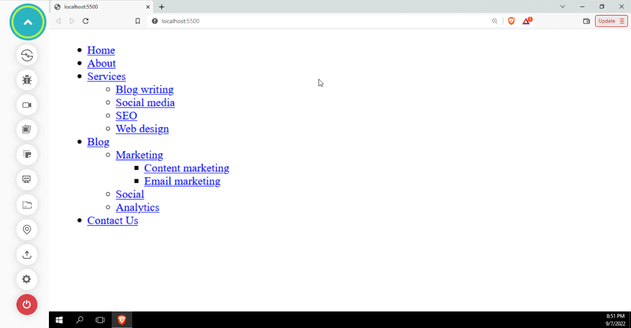
In the case of links as drop-down, the menu must be coded as an unordered list of links for assistive technologies used by blind users so that they can count the number of links in each drop-down menu or the main navigation. They also need to know which link takes them to the page they are currently on.
These are some of the most significant best practices for web accessibility. As we’ve seen, to make drop-down menus accessible, we need to consider the needs of different disabled user groups.
Creating the dropdown menu simple, straightforward, and understandable, giving them additional time to react to mouse movements, using the proper syntax for screen reader users, and ensuring your menus are compatible with the keyboard will eventually contribute toward better accessibility.
How to test custom menus on multiple browsers?
When creating a new menu for your website, how can you make sure that it is functional and works with all browsers? The answer is simple: Test the website on different browsers and operating system combinations.
However, the problem with testing your site’s custom menus on multiple browsers is that it can be time-consuming. You have to test every combination of operating systems and browsers, so you have to test your site on dozens or hundreds of combinations. This is a huge waste of time, especially when some combinations are irrelevant or superfluous.
There’s a good chance that there are significant differences between the way custom menus work in each browser, and you’ll need to test for these discrepancies. But rather than wasting all your time by going through the entire list of operating systems and browsers, you can use cloud testing tools like TestMu AI.
Cross browser testing platforms such as TestMu AI allow you to perform web testing and provide an online browser farm of more than 3000+ browsers and OS combinations.
Alternatively, you can use tools like LT Browser to check for responsive websites. LT Browser by TestMu AI is a mobile-friendly test tool with 50+ pre-installed viewports with multiple standard resolutions.
Subscribe to the TestMu AI YouTube channel for tutorials around Selenium testing, Playwright browser testing, Appium, and more.
Conclusion
Congratulations on reaching this far! You’re a fantastic reader!
In this detailed blog on creating custom Select menus with CSS, we have covered various ways to create the same with the help of HTML, CSS, and JavaScript. Not only did we experiment with creating dropdowns, but we also discussed various best practices and accessibility tips and tricks.
Now we know how to create your custom select menus most effectively and efficiently.
Happy Styling!
Austin Siewert
CEO, Vercel
Discovered @TestMu AI yesterday. Best browser testing tool I've found for my use case. Great pricing model for the limited testing I do 👏
2M+ Devs and QAs rely on TestMu AI
Deliver immersive digital experiences with Next-Generation Mobile Apps and Cross Browser Testing Cloud
Frequently asked questions
Did you find this page helpful?
More Related Hubs
TestMu AI forEnterprise
Get access to solutions built on Enterprise
grade security, privacy, & compliance
- Advanced access controls
- Advanced data retention rules
- Advanced Local Testing
- Premium Support options
- Early access to beta features
- Private Slack Channel
- Unlimited Manual Accessibility DevTools Tests
