Hero Background

Next-Gen App & Browser Testing Cloud

Trusted by 2 Mn+ QAs & Devs to accelerate their release cycles

Next-Gen App & Browser Testing Cloud
  • Home
  • /
  • Blog
  • /
  • How to Create a Website Using HTML: A Step-by-Step Guide
Web Development

How to Create a Website Using HTML: A Step-by-Step Guide

Learn how to create a website using HTML with step-by-step guidance on structure, styling, and frameworks like Bootstrap for a responsive, user-friendly site.

Author

Saniya Gazala

January 11, 2026

Building a website from scratch can feel overwhelming, but with the right guidance and modern tools, it’s simpler than ever. In this guide, you’ll learn how to create a website using HTML and CSS, step by step, and gain practical insights on structuring, styling, and deploying your site. HTML remains the backbone of web development, while CSS enables responsive, visually appealing designs that align with modern UX standards.

Overview

What Is HTML?

HTML is the backbone of a website that structures content into organized elements like headings, text, images, links, and forms. It defines the layout and sections of a page, allowing browsers to render content correctly, while CSS handles the styling and visual design.

Steps to Create a Website Using HTML:

  • Set Up Your Project: Create a project folder for HTML, CSS, and media files.
  • Create the HTML File: Use semantic tags like <header>, <main>, <section>, and <footer> for structure.
  • Add Content: Include headings, text, lists, images, and links for an interactive page.
  • Style with CSS: Enhance layout, typography, and responsiveness using CSS, Flexbox, or Grid.
  • Test and Refine: Preview in multiple browsers and devices; adjust for usability.
  • Optional Frameworks: Use Bootstrap for pre-designed components and responsive grids.

Best Practices:

  • Semantic HTML: Decide on your site type, blog, portfolio, or online store.
  • Clean Code: Pick a platform that’s easy to use on mobile.
  • Optimized Assets: Use mobile-responsive designs you can customize.
  • External CSS: Ensure fast load times and reliable hosting.
  • Descriptive Links: Look for tutorials, FAQs, or live chat help.

Pro Tip:

For mobile-friendly testing, use tools like LT Browser. It offers 53+ pre-installed device viewports, full-page screenshots, performance reports, and synchronized scrolling to verify responsive designs across multiple devices quickly and efficiently.

What Is HTML?

HTML (HyperText Markup Language) is the foundation of every website. It defines the structure and content of web pages, including headings, paragraphs, images, links, lists, forms, and multimedia. Learning how to create a website using HTML gives you control over your content and layout. HTML specifies what content appears on the page, but does not handle styling or layout; that’s where CSS comes in.

To see how CSS works alongside HTML to style your pages and bring a plain layout to life, follow this CSS3 tutorial and get deeper insights.

Basic HTML Tags:

  • Headings & Paragraphs: <h1> – <h6>, <p> for titles and text.
  • Lists: <ol>, <ul> for ordered and unordered items.
  • Links: <a> for navigation and external resources.
  • Media: <img>, <video>, <audio> for multimedia.
  • Forms and Input: <form>, <input>, <button> for user interaction.
  • Semantic Elements: <header>, <footer>, <section>, <article> for structure and accessibility.

Build responsive websites and test on 3000+ browsers and OS combinations. Try TestMu AI Now!

How to Create a Website Using HTML?

Creating your first HTML page is exciting because it gives you a hands-on understanding of how websites are built. Learning how to create a website using HTML no frameworks allows you to grasp the fundamentals of pure HTML and CSS.

Creating a Website Using HTML Without a Framework

You can create a fully functional HTML website using just a simple code editor and a web browser. This approach is perfect for beginners to understand the basics of HTML structure and styling before moving on to frameworks.

Prerequisites:

  • Code Editor: A code editor like VS Code, Sublime Text, or Notepad++ to write your HTML and CSS.
  • Web Browser: A modern browser like Chrome to preview and test your website.
  • HTML/CSS Knowledge: Basic understanding of HTML and CSS is helpful but not required.

Once you have the prerequisites in it’s place now you can get started with writing your first HTML code.

Steps to create a website using pure HTML and CSS:

  • Project Folder: Create a project folder on your computer (e.g., my-website) to organize all your website files.
  • HTML File: Create an HTML file inside the folder (e.g., index.html) to write your webpage content.
  • Open in Editor: Open the HTML file in your code editor to start writing HTML and CSS.

Let’s build a basic webpage with a header, some text, and a simple 3-column layout using only HTML and CSS.

Code Implementation:

<!DOCTYPE html>
<html lang="en">
<head>
  <meta charset="UTF-8">
  <meta name="viewport" content="width=device-width, initial-scale=1.0">
  <title>Simple HTML Site</title>
  <style>
    body { font-family: Arial, sans-serif; margin: 0; padding: 0; }
    header { background: #333; color: white; padding: 20px; text-align: center; }
    .container { display: flex; justify-content: space-around; margin: 20px; }
    .column { flex: 1; padding: 10px; margin: 5px; background: #f0f0f0; border: 1px solid #ccc; text-align: center; }
  </style>
</head>
<body>
  <header>
    <h1>Welcome to My Simple Website</h1>
  </header>
  <div class="container">
    <div class="column">Column 1</div>
    <div class="column">Column 2</div>
    <div class="column">Column 3</div>
  </div>
</body>
</html>

Code Walkthrough:

  • Header: The <header> tag adds a top section with a background color and centered text.
  • Container: The .container class uses display: flex to arrange child divs side by side.
  • Column: The .column class adds padding, margin, background, border, and centers the text inside each box.
  • Inline Styles: All CSS styles are written inside the <style> tag in the <head>, so no external CSS or libraries are needed.

Result:To view your results of your HTML, open the file in Chrome by double-clicking it or right-click > Open with > Chrome.

code-output-card

Creating a Website Using HTML With a Framework

When building websites, writing all CSS and JavaScript from scratch can be time-consuming. Frameworks like Bootstrap provide pre-written, ready-to-use components and styles that make development faster and more consistent.

They save you time, ensure your design is responsive, and follow modern best practices. Popular web development frameworks include Bootstrap, Tailwind CSS, and Foundation.

Frameworks like Bootstrap make building websites faster and easier by providing ready-made styles, responsive grids, components like buttons, navigation bars, forms, and even Bootstrap themes that help you create professional-looking layouts without starting from scratch.

Prerequisites: The requirements are the same as mentioned in the previous section.

For this demonstration, we’ll explore how to create a website using HTML with Bootstrap, so you can see how a framework simplifies layout, styling, and responsiveness.

Steps to create an HTML website using Bootstrap:

  • Create a project folder: Make a new folder on your computer (e.g., bootstrap-demo).
  • Create an HTML file: Inside the folder, create a file named index.html.
  • Include Bootstrap: Add Bootstrap using its CDN (Content Delivery Network) link. This lets you use Bootstrap without downloading anything.
  • Set up a structure: Add a <head> and <body> section to organize your webpage.

Let’s build a basic webpage with a navigation bar and a 3-column responsive grid using Bootstrap.

While CSS Grid allows precise layout control with pure CSS, Bootstrap’s grid system provides pre-built, responsive classes that make creating multi-column layouts faster and easier, especially for beginners or projects that need consistency across devices. Learn more about the difference between CSS Grid vs Bootstrap and get deeper insights.

Code Implementation:

<!DOCTYPE html>
<html lang="en">
<head>
  <meta charset="UTF-8">
  <meta name="viewport" content="width=device-width, initial-scale=1.0">
  <title>Bootstrap Demo</title>
  <!-- Include Bootstrap -->
  <link href="https://cdn.jsdelivr.net/npm/[email protected]/dist/css/bootstrap.min.css" rel="stylesheet">
</head>
<body>
  <!-- Navigation Bar -->
  <nav class="navbar navbar-expand-lg navbar-dark bg-dark">
    <div class="container-fluid">
      <a class="navbar-brand" href="#">My Website</a>
    </div>
  </nav>
  <!-- Page Content -->
  <div class="container mt-5">
    <h1 class="text-center">Welcome to Bootstrap!</h1>
    <p class="text-center">This is a simple responsive layout using Bootstrap framework.</p>


    <!-- Responsive Grid -->
    <div class="row">
      <div class="col-md-4 bg-light p-3 border">Column 1</div>
      <div class="col-md-4 bg-secondary text-white p-3 border">Column 2</div>
      <div class="col-md-4 bg-light p-3 border">Column 3</div>
    </div>
  </div>
  <!-- Bootstrap JS -->
  <script src="https://cdn.jsdelivr.net/npm/bootstrap@5.3.2/dist/js/bootstrap.bundle.min.js"></script>
</body>
</html>

Code Walkthrough:

  • Include Bootstrap: The <link> tag pulls in Bootstrap styles from a CDN.
  • Navbar (navbar): Creates a top navigation bar with branding.
  • Container (container): Adds margins and centers content.
  • Row + Columns (row + col-md-4): Creates a responsive 3-column layout.
  • Utility Classes (bg-light, p-3, border): Quickly style elements without writing CSS.

Result:

Lt-browser-output

After building your website, the next step is to ensure it works seamlessly across all devices before going live. Testing on various devices helps identify issues in functionality, UI, and responsiveness. According to StatCounter, most web traffic today comes from mobile devices, making a mobile-first approach essential.

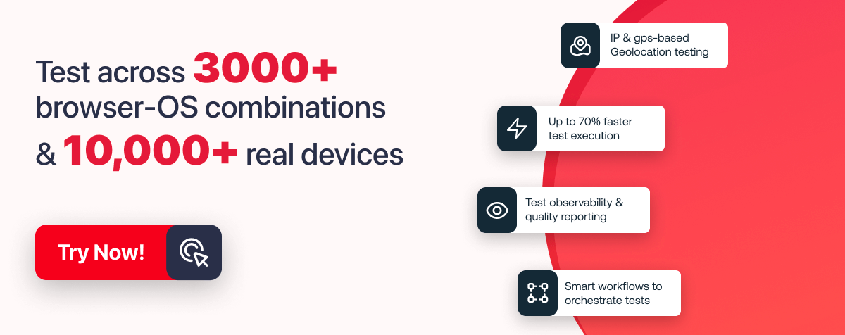
To showcase the results, I have used LT Browser by TestMu AI to simplify responsive testing. LT Browser makes mobile-friendly testing simple by providing over 53+ pre-installed viewports that cover a wide range of standard resolutions. It also includes powerful developer tools to enhance the testing process.

Some of the standout features include device sync, which lets you scroll two devices at the same time, and network throttling to simulate various internet speeds. You can capture full-page screenshots, generate performance reports powered by Google Lighthouse, and even record video sessions of your tests to share with your team.

If you wish to try LT Browser, click on the download link below:

download browser

With these capabilities, LT Browser helps you quickly identify layout or performance issues and ensure your HTML website is responsive, fast, and user-friendly across all devices.

How to Structure Your HTML Website for Better Usability?

When creating a website, having a clear and logical structure is crucial. A well-structured website improves usability, accessibility, and navigation, making it easier for users to find information and for search engines to index your pages.

A typical website is divided into three main parts: Header, Main Content, and Footer.

Main Content

The <main> section holds the primary content, like articles, images, videos, or interactive sections.

Example:

<main>
  <section>
    <h2>Exploring the Alps</h2>
    <p>Experience breathtaking landscapes and adventures.</p>
<img src="alps.jpg" alt="Alps" width="500" height="300">
  </section>
</main>

Code Explanation:

  • <main>: Marks the primary content area of your page.
  • <section>: Groups related content together, like a single blog post.
  • <h2>: Subheading inside the main content.
  • <p>: Paragraph text.
  • <img>: Displays an image; always use alt for accessibility.

Pro Tip: Use multiple <section> tags for different topics or articles. It keeps your content organized and easy to read.

Result:

image-src-output

How to Add Content to Your HTML Website?

Once your website structure is in place, the next step is adding content in a way that is organized, accessible, and visually clear. Content can include text, images, links, and lists, each with its own HTML element.

Text

Text is the most basic form of content and is displayed using paragraphs and headings.

  • Headings (<h1> to <h6>): Headings define the hierarchy of your content. <h1> is the main heading, usually used for the page title, while <h2> to <h6> are subheadings. Proper use of headings improves readability and SEO.

  • Paragraphs (<p>): Use <p> for regular text blocks. Each paragraph should contain a single idea or concept for better readability.

 <h1>Welcome to My Travel Blog</h1>
<h2>Top Destinations</h2>
<h3>Exploring the Alps</h3>
<p>The Alps are known for their breathtaking landscapes and exciting adventures.</p>

Pro Tip: Don’t skip headings; they help users and search engines understand your content structure.

Images

Images make your website visually appealing and engaging. Use the <img> tag to add images.

<img src="alps.jpg" alt="Snowy mountains in the Alps">

Code Explanation:

  • src: Specifies the path to the image file.
  • alt: Provides a text description for accessibility. Screen readers use this text for visually impaired users, and it also helps search engines understand your images.

Pro Tip: Always add descriptive alt text. For example, instead of alt=”image”, write alt=”Snowy mountains in the Alps”. This improves SEO and accessibility.

Lists

Lists are useful for grouping items in an organized way. There are two types:

  • Unordered List (<ul>): For items without a specific order.
 <ul>
  <li>Mountains</li>
  <li>Beaches</li>
  <li>Forests</li>
</ul>

Here, the <li> tag defines each list item.

  • Ordered List(<ol>): For items that follow a sequence..
 <ul>
  <li>Plan your trip</li>
  <li>Book accommodation</li>
  <li>Explore the destination</li>
</ul>

Here, the <li> tag defines each list item.

Pro Tip: Lists improve readability and help users scan content quickly.

Best Practices for Creating a Website Using HTML

Following best practices ensures your website is professional, accessible, and easy to maintain. If you are learning how to create a website using HTML, these tips will help you build a solid foundation:

  • Semantic HTML: Use tags like <header>, <main>, <section>, <article>, and <footer> to clearly define content areas. This improves accessibility and helps search engines understand your website structure.
  • Consistent Code Structure: Keep your HTML clean with proper indentation and consistent naming conventions. This makes your code easier to read, debug, and maintain.
  • Responsive Thinking: Even without frameworks, plan your layout with mobile-first in mind. Use flexible widths, percentages, and CSS techniques like Flexbox or Grid for adaptable designs.
  • Accessible Media: Always add descriptive alt text for images, captions for videos, and label form elements properly. This ensures your site is usable by all users, including those relying on assistive technologies.
  • Minimal Inline Styles: Avoid adding CSS directly inside HTML tags. Keep styles in a separate <style> block or an external stylesheet to maintain clean and manageable code.
  • Optimized Assets: Compress images, use modern formats (like WebP), and minimize unnecessary scripts to improve page load speed and performance.
  • Meaningful Links: Use clear, descriptive text for links rather than generic phrases like “click here.” This improves user experience and SEO.
  • Regular Testing: Preview your website in multiple browsers and devices (like with LT Browser) to ensure it displays and functions correctly everywhere.

By following these best practices, you’ll not only master how to create a website using HTML but also ensure it’s user-friendly, fast, and accessible across all devices.

Conclusion

Learning how to create a website using HTML gives you the foundation to build websites from scratch, control every aspect of your content, and understand how web pages are structured and styled. By combining HTML with CSS, you can create visually appealing, responsive, and accessible websites that work seamlessly across devices.

Starting with a simple code editor, structuring your site with semantic elements, adding meaningful content, and following best practices ensures your website is professional, user-friendly, and ready for further enhancements. Whether you choose to work with frameworks like Bootstrap or stick to pure HTML and CSS, mastering the basics empowers you to design websites confidently and efficiently.

With consistent practice, testing your site on tools like LT Browser, and keeping accessibility and responsiveness in mind, you’ll be well-equipped to create HTML websites that not only look great but also perform flawlessly for your users.

Author

Saniya Gazala is a Product Marketing Manager and Community Evangelist at TestMu AI with 2+ years of experience in software QA, manual testing, and automation adoption. She holds a B.Tech in Computer Science Engineering. At TestMu AI, she leads content strategy, community growth, and test automation initiatives, having managed a 5-member team and contributed to certification programs using Selenium, Cypress, Playwright, Appium, and KaneAI. Saniya has authored 15+ articles on QA and holds certifications in Automation Testing, Six Sigma Yellow Belt, Microsoft Power BI, and multiple automation tools. She also crafted hands-on problem statements for Appium and Espresso. Her work blends detailed execution with a strategic focus on impact, learning, and long-term community value.

Close

Summarize with AI

ChatGPT IconPerplexity IconClaude AI IconGrok IconGoogle AI Icon

Frequently asked questions

Did you find this page helpful?

More Related Hubs

TestMu AI forEnterprise

Get access to solutions built on Enterprise
grade security, privacy, & compliance

  • Advanced access controls
  • Advanced data retention rules
  • Advanced Local Testing
  • Premium Support options
  • Early access to beta features
  • Private Slack Channel
  • Unlimited Manual Accessibility DevTools Tests