
Next-Gen App & Browser Testing Cloud
Trusted by 2 Mn+ QAs & Devs to accelerate their release cycles

How To Use CSS Rotate Text To Create Engaging Web Design
Make your website stand out with CSS Rotate Text! Take your website's typography to the next level with our step-by-step guide on CSS Rotate Text and learn how to use it.

Mbaziira Ronald
January 10, 2026

The use of rotated text on website and application user interfaces has become a style shift that many companies like Zendesk and Red Collar have adapted and incorporated into their web designs. Given that the normal flow of text on websites is most times bland and dull, the rotated or rotating text is rather eye-catching.
People like IndieHackers and Solopreneurs have also added text rotation effects to their websites. This has proven to be a novel and efficient way to inject some originality and visual interest into their websites.
On the user experience side, there is further support by the Von-Restorff effect or the Isolation effect that predicts that “when multiple similar objects are present, the one that differs from the rest is most likely to be remembered.” It means that a website visitor will probably remember a website with rotated text more than one with a typical text flow.
CSS rotate text is a powerful property for creating visually appealing and engaging web designs. By changing the angle of text on a web page, designers can create unique and dynamic layouts that draw the eye and enhance the overall aesthetic.
In this article, we will explore the basics of using CSS rotate text to create engaging web designs and provide tips for optimizing this technique. By the end of this blog, you will learn how to rotate text on your website, resulting in eye-capturing and innovative designs.
Without ado, let’s dive deep in.
What is CSS Rotate Text Property?
The CSS rotate text property allows designers to rotate the text angle on a web page. This can be used to create visually exciting and dynamic designs and convey a sense of motion or directionality.
The property can be adjusted to different angles and combined with other CSS properties to create more complex effects. With CSS rotate text property, designers can create engaging web designs that stand out from the crowd. The trend of using rotated text has inspired UI/UX designers to create unique interfaces that capture users’ attention, resulting in continual visitor engagement on websites.
Examples – UI Designs with Text Rotation
- Attachments Design by Lukas Svarc
This UI design by Lukas uses the concept of rotation on the web page’s paragraphs, headings, and images. This creates a memorable experience for the user, as websites with such unique designs are few.
- Superbank Landing Page Exploration by Happy Tri Milliarta
In this design, Tri Milliarta uses the CSS rotate text property in the center of the website’s hero section to inform visitors that they are the best mobile banking app.
- ZenDesk Pricing Page
ZenDesk uses a combination of text rotation and background color to make the pricing of its Foundational Support Plan stand out. It is easily noticeable from other prices on the page due to being an odd man by being rotated. This increases the chances of users choosing this particular plan.

The CSS rotate text distinguishes itself from the rest of the text and makes the message stand out to the user. As it is one of the first messages seen, as a user, I would love to explore more and see what the website calling itself the best has to offer.


The popularity of using CSS rotate text property has risen as designers and developers find more of its use cases, such as Call-To-Action (CTA), transitions and animations, testimonials, and notifications. Furthermore, this has led to an exponential boost of developers sharing how powerful rotating text with CSS can be and what they have done with it.
One of my tweets showcases a rotating text effect on a website created using CSS rotate text property. The effect adds a visually dynamic element to the website’s design, drawing the eye and enhancing the user experience.
How To Perform Text Rotation Using CSS ↓
— Mbaziira Ronald (@MbaziiraRonn) March 27, 2023
Learn how to utilize CSS text rotation to create innovative and eye-capturing web design effects.
A thread ↓ 🧵 pic.twitter.com/WyvbVncjqU
Text rotation in CSS can be achieved through the CSS rotate text property or rotate CSS transform functions. Both the property and functions let you define the axis and angle at which you want to rotate the text.
You can specify three main axes through which you can rotate the text. These axes are:
- X-axis
- Y-axis,
- Z-axis.

When to Use CSS Rotate Text Property?
CSS rotate text is an incredibly versatile property used to create unique and visually stunning web designs. Whether you want to develop a sense of motion or add a dynamic element to your layout, CSS rotate text can help you achieve your design goals. In this section, we will explore the different scenarios in which the CSS rotate text property can be effectively used and provide tips for making the most out of this powerful tool.
Here are some methods where you would want to opt for CSS rotate text property.
Responsive Web Design Layouts
Responsive design refers to website layouts that adjust accordingly based on a device’s screen sizes and resolutions.
CSS text rotation can be used to achieve responsive web layouts by rotating text such as navigation links and call-to-actions at specified angles to make the overall website responsive.
As we continue with the blog, we will delve deeper into this and look at examples of its use.
Data Visualization
Data Visualization refers to the presentation of data through graphs, images, tables, diagrams, maps, animations, and other visual elements.
Presenting data through these mediums sometimes requires text to be rotated to bring out the intended picture and insight. This is commonly seen on labels of graphs and table columns.
Animations and Transitions
Web animations, particularly CSS animations, enable us to add dynamic movement to web page elements from one style to another, whereas transitions let us gradually change the CSS properties of a web page element smoothly.
If you want to encourage website visitors to take action, you can add CSS rotate text effects to the navigation links.
Now let’s discuss CSS rotate text property, and all rotate CSS functions in detail with use cases.
Rotate CSS Property
This CSS rotate text property defines the rotation of any element on a web page based on the axis and the angle defined. If no axis is declared, the rotate property will rotate the web page element on the Z-axis.
The rotate CSS property is usually complemented with the transition or animation properties to create unique and timely rotations of the web page element.
Syntax:
rotate = none | <angle> | [x | y | z | <number> {3}] && <angle>
This property takes in the following predefined values:
- None – specifies that no rotation should apply to the element.
- Angle – specifies the angle to rotate the element clockwise on the Z axis. The angle value can be in degrees (deg), gradians (grad), turns (turn), or radians (rad). When given a positive angle value, the element rotates in a clockwise direction and anti-clockwise when given a negative angle value.
- Axis name + Angle – specifies the axis (x, y, z) and the angle at which to rotate the element.
- Vector + Angle – specifies a three-number vector representing the x, y, and z axes, known as the origin-centered vector that defines a line around which to rotate the element and the angle to rotate the element.


The default or initial value of the rotate CSS property is none.
Syntax:
rotate = none | <angle> | [x | y | z | <number> {3}] && <code>< angle >
The above syntax for the rotate CSS property specifies that the values of the property can be of three forms.
- None – This value specifies that no rotation should be applied to the element.
- Angle – This value defines the rotation of the element to be rotated. The angle can be specified in any of the following four units:
- [x | y | z |
< number >{3}] &&< angle >– This value specifies that the element can be rotated on a combination of the three axes: X, Y, and Z, or by defining the three-number vector, which represents a point on all the three axes on which to rotate the element around. The && part of the syntax indicates that both the angle and axes or origin-centered vector must be present for the rotation to work.
| Degrees (deg) | Turns (turn) | Radians (rad) | Gradians (grad) |
|---|---|---|---|
| This is the most commonly used angle unit of the CSS rotate property. A full rotation is 360°. | A turn represents one full rotation. One turn is, therefore, equal to 360°. | A full rotation has 2π radians | A full circle has 400 gradians |
Let’s see how the CSS rotate text property works for a better understanding.
Example 1: Using the CSS rotate text property with only the angle value.
We will create a familiar date layout usually seen on calendars where the month’s name is rotated vertically.
HTML:
<!DOCTYPE html>
  <html lang="en">
   <head>
     <meta charset="UTF-8" />
     <meta http-equiv="X-UA-Compatible" content="IE=edge" />
     <meta name="viewport" content="width=device-width, initial-scale=1.0" />
     <title>RotateZ CSS Function</title>
   </head>
   <body>
     <section class="placeholder-date">
       <div class="day-and-month">
         <p>DAY</p>
         <p>MONTH</p>
       </div>
       <div class="year">
         <p>YEAR</p>
       </div>
     </section>
     <section class="actual-date">
       <div class="day-and-month">
         <p>22</p>
         <p>MARCH</p>
       </div>
       <div class="year">
         <p>2023</p>
       </div>
     </section>
   </body>
  </html>
CSS:
* {
     padding: 0;
     margin: 0;
     box-sizing: border-box;
  }


  body {
     height: 100vh;
     display: flex;
     justify-content: center;
     align-items: center;
     column-gap: 8rem;
  }


  .placeholder-date {
     display: flex;
     flex-direction: column;
  }


  .day-and-month {
     display: flex;
     align-items: center;
     justify-content: space-between;
  }


  .day-and-month p:nth-child(1) {
     font-size: 4rem;
  }


  .day-and-month p:nth-child(2) {
     font-size: 0.85rem;
     transform: rotate(-90deg);
     color: red;
  }


  .year p {
     font-size: 4rem;
  }
Output:

As seen in the image above, we have rotated the month’s name on a vertical angle of 90°.
Example 2: Using the CSS rotate text property with the axis name + angle.
In this first of two examples, we will create a rotate CSS hover effect on the navigation items of a website header. The nav items will tilt to a specified angle whenever you hover on them.
HTML:
<!DOCTYPE html>
  <html lang="en">
   <head>
     <meta charset="UTF-8" />
     <meta http-equiv="X-UA-Compatible" content="IE=edge" />
     <meta name="viewport" content="width=device-width, initial-scale=1.0" />
     <title>Rotating Nav Items on Hover</title>
   </head>
   <body>
     <header class="header">
       <h3 class="logo">LogoP2P</h3>
       <nav>
         <a href="#">Home</a>
         <a href="#">Product</a>
         <a href="#">Pricing</a>
         <a href="#">Testimonial</a>
       </nav>
       <div>
         <a href="#" class="call-to-action">Get Started</a>
       </div>
     </header>
   </body>
  </html>
CSS:
.header {
     display: flex;
     justify-content: space-between;
     align-items: center;
     padding: 2rem 5rem 0;
     font-family: sans-serif;
  }


  .logo {
     font-size: 1.525;
  }


  a {
     text-decoration: none;
     color: #000;
  }


  nav {
     display: flex;
     column-gap: 4rem;
  }


  nav a {
     font-weight: 600;
     color: #4b5563;
     transition: .2s ease all;
  }


  nav a:hover {
     rotate: z -20deg;
  }


  .call-to-action {
     color: #ffffff;
     background: #0ebac5;
     padding: 0.6rem 1rem;
     border-radius: 4px;
     font-size: 1.2rem
  }
Output:

In the above image, the pricing nav item rotates 20° anti-clockwise when you hover over it. The same rotation effect applies to all the other nav items.
Example 3: Using the CSS rotate text property with the axis name + angle.
In this example, we will create a side-by-side preview of the rotate property with each of the axes, X, Y, and Z.
HTML:
<!DOCTYPE html>
  <html lang="en">
   <head>
     <meta charset="UTF-8" />
     <meta http-equiv="X-UA-Compatible" content="IE=edge" />
     <meta name="viewport" content="width=device-width, initial-scale=1.0" />
     <title>CSS Rotate property</title>
   </head>
   <body>
     <div class="main-container">
       <section class="container-1">
         <p>I am rotating on the X axis</p>
         <p>I am rotating on the Y axis</p>
         <p>I am rotating on the Z axis</p>
       </section>
       <section class="container-2">
         <a href="#"> Create account </a>
         <a href="#"> Join the waitlist → </a>
         <a href="#"> Sign up for Free <span>🚀</span> </a>
       </section>
     </div>
   </body>
  </html>
CSS:
body {
     background: #0ebac5;
     height: 100vh;
     display: flex;
     justify-content: center;
     align-items: center;
     font-size: 1.8rem;
  }


  .main-container {
     display: flex;
     justify-content: center;
     align-items: center;
     column-gap: 8rem;
  }


  .container-1 {
     display: flex;
     flex-direction: column;
     gap: 4rem;
     color: #ffffff;
  }


  .container-1 p:nth-child(1):hover {
     transition: 0.4s linear;
     rotate: x 50deg;
     cursor: pointer;
  }


  .container-1 p:nth-child(2):hover {
     transition: 1s linear;
     rotate: y 1turn;
     cursor: pointer;
  }


  .container-1 p:nth-child(3):hover {
     transition: 1s linear;
     rotate: z 3.5rad;
     cursor: pointer;
  }


  .container-2 {
     display: flex;
     flex-direction: column;
     gap: 4rem;
  }


  a {
     text-decoration: none;
     padding: 1rem 3rem;
     color: #0ebac5;
     text-align: center;
  }


  a:nth-child(1) {
     background: #fff;
     border-radius: 40rem;
  }


  :is(a:nth-child(2), a:nth-child(3)) {
     color: #fff;
     border-bottom: 2px solid #fff;
  }


  a:nth-child(3) {
     border-radius: 40rem;
  }


  a > span {
     padding-left: 6px;
  }


  a:nth-child(1):hover {
     transition: 0.3s ease-in-out;
     rotate: x 45deg;
  }


  a:nth-child(2):hover {
     transition: 0.3s;
     rotate: y 45deg;
  }


  a:nth-child(3):hover {
     transition: 0.3s linear;
     rotate: z -15deg;
  }
Output:

The above image gives a side-by-side preview of how the rotate CSS property works with axes X, Y, and Z. The left-hand side shows the rotation effect of each axis on plain text, and the right-hand side shows how we can use the same on call-to-action links.
Rotate CSS function
The rotate CSS function, rotate(), is a transform function used to rotate an element on a web page in a 2D (2-Dimensional) plane without affecting the shape or form of the element. A CSS Transform function allows you to distort, manipulate or modify the position, size, and direction of web page elements in 2D or 3D space.
The function accepts a single parameter, an angle, which takes the same units as those of the rotate CSS property. The center of the element is the initial point of origin. However, you can also specify the point of origin to rotate the element using the transform-origin property.
The transform property utilizes the function, and it can be combined with other CSS transformation functions such as skew(), scale(), and translate().
The direction of rotation is clockwise for positive angle values and anti-clockwise for negative angle values.
Syntax:
rotate(angle)
The rotate CSS function accepts a single parameter (angle) which is the angle of rotation.
Let’s see the function in action for a better understanding.
In this demo of the rotate CSS function, we will create a simple web page and rotate its text using the function to get a real-world use case experience.
HTML:
<body>
   <header class="header">
     <a href="https://lambdatest.com" id="logo">
       <img
         class="logo"
         src="https://www.lambdatest.com/resources/images/logos/logo.svg"
         alt=""
       />
     </a>
     <nav>
       <a href="https://www.lambdatest.com/feature">Platform</a>
       <a href="https://www.lambdatest.com/enterprise">Enterprise</a>
       <a href="https://www.lambdatest.com/blog">Resources</a>
       <a href="https://www.lambdatest.com/pricing">Pricing</a>
     </nav>
     <div>
       <a href="#" class="call-to-action">Get Started</a>
     </div>
   </header>
   <section id="sections">
     <section>
       <img
         src="https://mbaziiraronald.github.io/LambdaTest_Images/LambdaTest_Image_5.jpeg"
         alt=""
       />
       <p>
         <strong>Runs on Linux containers, macOS and Windows</strong>
         <br />
         <br />
         HyperExecute platform comes with feature-packed hosted runners for every
         major OS including Windows, MacOS, and Linux containers. The runners
         come with pre-installed support for all major programming languages and
         frameworks including Java, Node.js, Python, PHP, GO, C#, Rust, and Ruby.
       </p>
     </section>
     <section>
       <img
        src="https://mbaziiraronald.github.io/LambdaTest_Images/LambdaTest_Image_6.jpeg"
         alt=""
       />
       <p>
         <strong> AI-Powered Test Orchestration </strong>
         <br />
         <br />
         Through a simple YAML file, HyperExecute allows you to group and
         distribute tests intelligently across runner environments. The
         AI-powered test orchestration takes into account past test run data, and
         automatically reorders the test runs to surface failures faster and cuts
         down developer feedback time.
       </p>
     </section>
     <section>
       <img
        src="https://mbaziiraronald.github.io/LambdaTest_Images/LambdaTest_Image_3.jpeg"
         alt=""
       />
       <p>
         <strong> Real Time Console and Execution Logs </strong>
         <br />
         <br />
         In legacy test clouds you get separate terminal and test execution logs,
         stitching them together is an ETL nightmare. With HyperExecute, you get
         a single automation dashboard view with both terminal logs of test
         commands and complete test execution logs. All test execution logs like
         terminal logs, test run video, network log, commands, exceptions, and
         more, all available in a single intuitive dashboard.
       </p>
     </section>
     <section>
       <img
        src="https://mbaziiraronald.github.io/LambdaTest_Images/LambdaTest_Image_2.jpeg"
         alt=""
       />
       <p>
         <strong>Automatic report generation</strong>
         <br />
         <br />
         With all test execution data available in a single place, HyperExecute
         enables developers and testers to truly analyze the quality of their
         builds on a single platform through AI-powered automatic reports
         generated for each build run. Eliminate the need of gathering data from
         multiple sources and building extensive reporting frameworks.
       </p>
     </section>
   </section>
  </body>
CSS:
body {
     height: 100vh;
     padding: 2rem 5rem 0;
     box-sizing: border-box;
     font-family: sans-serif;
  }


  .header {
     display: flex;
     justify-content: space-between;
     align-items: center;
  }


  .logo {
     height: 2rem;
  }


  a {
     text-decoration: none;
  }


  nav {
     display: flex;
     column-gap: 6rem;
     font-family: Inter, Arial, sans-serif;
  }


  nav a {
     font-weight: 600;
     color: #333;
     transition: 0.2s ease all;
  }


  nav a:hover {
     rotate: z -20deg;
  }


  .call-to-action {
     color: #ffffff;
     background: #0ebac5;
     padding: 0.6rem 1rem;
     border-radius: 4px;
     font-size: 1.2rem;
  }


  #sections {
     display: flex;
     flex-direction: column;
     padding: 4rem 8rem;
  }


  section:not(#sections) {
     display: flex;
     justify-content: center;
     align-items: center;
     column-gap: 5rem;
     padding: 3rem 0;
     line-height: 1.5;
  }


  section:not(#sections):nth-child(even) {
     flex-direction: row-reverse;
  }


  p {
     font-size: 1rem;
     text-align: left;
     transform: rotate(-3deg);
     color: #4b5563;
  }


  img:not(.logo) {
     aspect-ratio: 4/3;
     height: 300px;
     width: 600px;
  }
Output:

RotateX CSS function
The rotateX CSS function declares a transformation to rotate a web page element on the X-axis without distorting its shape. It is used with the transform property.
Syntax:
rotateX(angle)
The rotateX CSS function takes in a single parameter (angle) which is the angle of rotation.
Positive angle values rotate the element clockwise, and negative values are anti-clockwise.
We will use our date layout CodePen to show the rotation effect of the rotateX function on text.
HTML:
<!DOCTYPE html>
  <html lang="en">
   <head>
     <meta charset="UTF-8" />
     <meta http-equiv="X-UA-Compatible" content="IE=edge" />
     <meta name="viewport" content="width=device-width, initial-scale=1.0" />
     <title>RotateX CSS Function</title>
   </head>
   <body>
     <h1>Hover on the word <i>DAY</i> below</h1>
     <section class="placeholder-date">
       <div class="day-and-month">
         <p>DAY</p>
         <p>MONTH</p>
       </div>
       <div class="year">
         <p>YEAR</p>
       </div>
     </section>
   </body>
  </html>
CSS:
* {
     padding: 0;
     margin: 0;
     box-sizing: border-box;
  }


  body {
     height: 100vh;
     display: flex;
     flex-direction: column;
     justify-content: center;
     align-items: center;
     row-gap: 8rem;
  }


  h1 {
     font-weight: 400;
     text-decoration: underline;
  }


  .placeholder-date {
     display: flex;
     flex-direction: column;
  }


  .day-and-month {
     display: flex;
     align-items: center;
     justify-content: space-between;
  }


  .day-and-month p:nth-child(1) {
     font-size: 4rem;
     transitions: 2s;
     cursor: pointer;
  }


  .day-and-month p:nth-child(1):hover {
     transform: rotateX(180deg);
  }


  .day-and-month p:nth-child(2) {
     font-size: 0.85rem;
     transform: rotate(-90deg);
     color: red;
  }


  .year p {
     font-size: 4rem;
  }

The word DAY rotates 180° clockwise on the X-axis when you hover over it.
RotateY CSS function
This CSS transform function defines a transformation to rotate a web page element around the Y-axis without distorting its shape. It is used with the transform property.
Syntax:
rotateY(angle)
The rotateY CSS function takes in a single parameter (angle) which is the angle of rotation. Positive angle values define a clockwise rotation, while negative angle values define an anti-clockwise rotation for the element.
Let’s look at the rotateY CSS function in action for a better understanding.
To see the rotateY function in action, we will create an unorder with each list item containing a word. Whenever you hover over the list, each of the words in the list items will rotate on the Y-axis.
HTML:
<!DOCTYPE html>
  <html lang="en">
   <head>
     <meta charset="UTF-8" />
     <meta name="viewport" content="width=device-width, initial-scale=1.0" />
     <title>Rotate Sentence on y-axis</title>
   </head>
   <body>
     <ul>
       <li>How</li>
       <li>To</li>
       <li>Rotate</li>
       <li>Text</li>
       <li>Using</li>
       <li>CSS</li>
     </ul>
   </body>
  </html>
CSS:
body {
     margin: 0;
     padding: 0;
     height: 100vh;
     display: flex;
     justify-content: center;
     align-items: center;
  }


  ul {
     margin: 0;
     display: flex;
     column-gap: 1rem;
  }


  ul li {
     list-style: none;
     color: #0ebac5;
     cursor: pointer;
     font-size: 2rem;
     font-weight: 600;
     transition: 1s;
  }


  ul:hover li {
     transform: rotateY(360deg);
  }
Output:

We have given the unordered list a display of flex so that the words in the list items form a sentence. When you hover anywhere on the list of items, each word rotates 360° on the Y-axis.
rotateZ CSS function
The rotateZ CSS transform function defines a transformation to rotate a web page element around the Z-axis without distorting its shape. It is used with the transform property.
Syntax:
rotateZ(a)
The function takes in a single parameter (angle) which is the angle of rotation. The angle can either be positive or negative. Negative angles rotate the element anti-clockwise, whereas positive angles rotate it clockwise.
Let’s look at the usage of the rotateZ function:
As in the previous example for the rotateX function, we shall use the date layout method for this demo of the rotateZ function. In this case, we will be rotating the year on the Z-axis when you hover over it.
HTML:
<body>
   <h1>Hover on the <i>Year</i> below</h1>
   <section class="actual-date">
     <div class="day-and-month">
       <p>22</p>
       <p>MARCH</p>
     </div>
     <div class="year">
       <p>2023</p>
     </div>
   </section>
  </body>
CSS:
* {
     padding: 0;
     margin: 0;
     box-sizing: border-box;
  }


  body {
     height: 100vh;
     display: flex;
     flex-direction: column;
     justify-content: center;
     align-items: center;
     row-gap: 8rem;
  }


  h1 {
     font-weight: 400;
     text-decoration: underline;
  }


  .placeholder-date {
     display: flex;
     flex-direction: column;
  }


  .day-and-month {
     display: flex;
     align-items: center;
     justify-content: space-between;
  }


  .day-and-month p:nth-child(1) {
     font-size: 4rem;
  }


  .day-and-month p:nth-child(2) {
     font-size: 0.85rem;
     transform: rotate(-90deg);
     color: red;
  }


  .year p {
     font-size: 4rem;
     transitions: 1s;
     cursor: pointer;
  }


  .year p:hover {
     transform: rotateZ(180deg);
  }
Output:

The year 2023 rotates 180° when you hover on it.
The center of origin around which the element rotates can be defined with the transform-origin property for the above three functions of rotateX(), rotateY(), and rotateZ().
Positive angle values define a clockwise rotation, while negative angle values define an anti-clockwise rotation for the element for the rotateX(), rotateY(), and rotateZ() functions.
Rotate3d CSS function
The rotate3d() CSS function defines a transformation that rotates a web page element around a fixed axis in the 3D plane without deforming it. The axis of rotation is defined by [x, y, z] coordinates of the vector that marks it. It is used with the transform property.

Syntax:
rotate3d(x, y, z, angle)
Let’s get to know what each value in the rotate3d() function syntax represents:
- x: represents the x-coordinate of the vector marking the axis of rotation. It can either be a positive or negative number.
- y: represents the y-coordinate of the vector marking the axis of rotation. It can either be a positive or negative number.
- z: represents the z-coordinate of the vector marking the axis of rotation. It can either be a positive or negative number.
- angle: represents the angle of rotation, with a positive angle value defining clockwise rotation and a negative angle value defining anti-clockwise rotation.
Take a look at the function in action for a better understanding.
We will again use our date layout CodePen for this demo of the rotate3d function. We will put an animation on the month’s name so that it rotates in 3D.
HTML:
<!DOCTYPE html>
  <html lang="en">
   <head>
     <meta charset="UTF-8" />
     <meta http-equiv="X-UA-Compatible" content="IE=edge" />
     <meta name="viewport" content="width=device-width, initial-scale=1.0" />
     <title>Rotate3d CSS Function</title>
   </head>
   <body>
     <h1>Look at the word <i>MONTH</i> below</h1>
     <section class="placeholder-date">
       <div class="day-and-month">
         <p>DAY</p>
         <p>MONTH</p>
       </div>
       <div class="year">
         <p>YEAR</p>
       </div>
     </section>
   </body>
  </html>
CSS:
* {
     padding: 0;
     margin: 0;
     box-sizing: border-box;
  }


  body {
     height: 100vh;
     display: flex;
     flex-direction: column;
     justify-content: center;
     align-items: center;
     row-gap: 8rem;
  }


  h1 {
     font-weight: 400;
     text-decoration: underline;
  }


  .placeholder-date {
     display: flex;
     flex-direction: column;
  }


  .day-and-month {
     display: flex;
     align-items: center;
     justify-content: space-between;
  }


  .day-and-month p:nth-child(1) {
     font-size: 4rem;
  }


  .day-and-month p:nth-child(2) {
     font-size: 0.85rem;
     transform: rotate(-90deg);
     color: red;
     animation: rotate 4s ease-in-out infinite;
  }


  @keyframes rotate {
     to {
         transform: rotate3d(-5, 10, -25, 200deg);
     }
  }


  .year p {
     font-size: 4rem;
  }
Output:

The word MONTH rotates 200° in 3D at a point of origin specified by the three coordinates (-5, 10, -25) for the X, Y, and Z axes. For this demo, I have used a random point on each axis for the point of origin around which the word rotates. However, for real-world use cases, this might be different.
Let’s preview the rotateX, rotateY, rotateZ, and rotate3d functions side by side to get a clear picture of how they differ.
HTML:
<!DOCTYPE html>
  <html lang="en">
   <head>
     <meta charset="UTF-8" />
     <meta http-equiv="X-UA-Compatible" content="IE=edge" />
     <meta name="viewport" content="width=device-width, initial-scale=1.0" />
     <title>Document</title>
   </head>
   <body>
     <section>
       <div class="headings-container">
         <h3>Before rotation:</h3>
         <h3>After rotation:</h3>
       </div>
     </section>
     <section class="container main-container">
       <div class="container container-1">
         <p>rotateX</p>
         <p>rotateY</p>
         <p>rotateZ</p>
         <p>rotate3d()</p>
       </div>
       <div class="container container-2">
         <p>rotateX</p>
         <p>rotateY</p>
         <p>rotateZ</p>
         <p>rotate3d()</p>
       </div>
     </section>
   </body>
  </html>
CSS:
body {
     height: 100vh;
     padding-top: 40px;
  }


  h2 {
     text-align: center;
  }


  .headings-container {
     display: flex;
     justify-content: space-evenly;
     align-items: center;
     color: #0ebac5;
     font-size: 1.3rem;
     font-weight: 700;
  }


  .main-container {
     display: flex;
     justify-content: space-evenly;
  }


  .container-1 {
     display: flex;
     flex-direction: column;
     align-items: center;
     row-gap: 1rem;
  }


  .container-2 {
     display: flex;
     flex-direction: column;
     align-items: center;
     row-gap: 1rem;
  }


  p {
     font-size: 1.5rem;
  }


  /* Container-2 - After rotation */
  .container-2 p:nth-child(1) {
     transform: rotateX(49deg);
  }


  .container-2 p:nth-child(2) {
     transform: rotateY(310deg);
  }


  .container-2 p:nth-child(3) {
     transform: rotateZ(25deg);
  }


  .container-2 p:nth-child(4) {
     transform: rotate3d(1, 5, 12, 78deg);
  }
Output:

Use Cases for Text Rotation in CSS
Now that we have seen how we can rotate the text on our web pages using CSS, let’s get into the areas where we can use it and explore some real-world examples where it’s in use. There are numerous real-world examples where text rotation can be utilized to make websites more engaging and visually appealing.
In this section, we will explore some of the various use cases for text rotation, including designing logos, menus, headlines, and call-to-action buttons. We will also discuss how text rotation can be used to highlight important information and improve the overall user experience.
Animations and Transitions
Red Collar uses a cool animation effect on its navigation links where the text rotates, making it fun for users to watch. This creates a seamless digital experience that enhances user engagement and enjoyment while navigating the website.

Red Collar also implemented 3D CSS text rotations when you hover over the text headings. Such interactions with text in a way that creates a sense of satisfaction and is enjoyable.
Furthermore, this communicates better the brand’s message of creating an emotional user experience and eye-catching visuals to website visitors without creating more lines of text.
To access a website’s inspect page, simply right-click on any element on the web page and select “Inspect” or “Inspect Element” from the context menu, or use the keyboard shortcut “Ctrl+Shift+I” (Windows) or “Command+Option+I” (Mac).

And the CSS rotate text effects in no way do they affect website responsiveness.

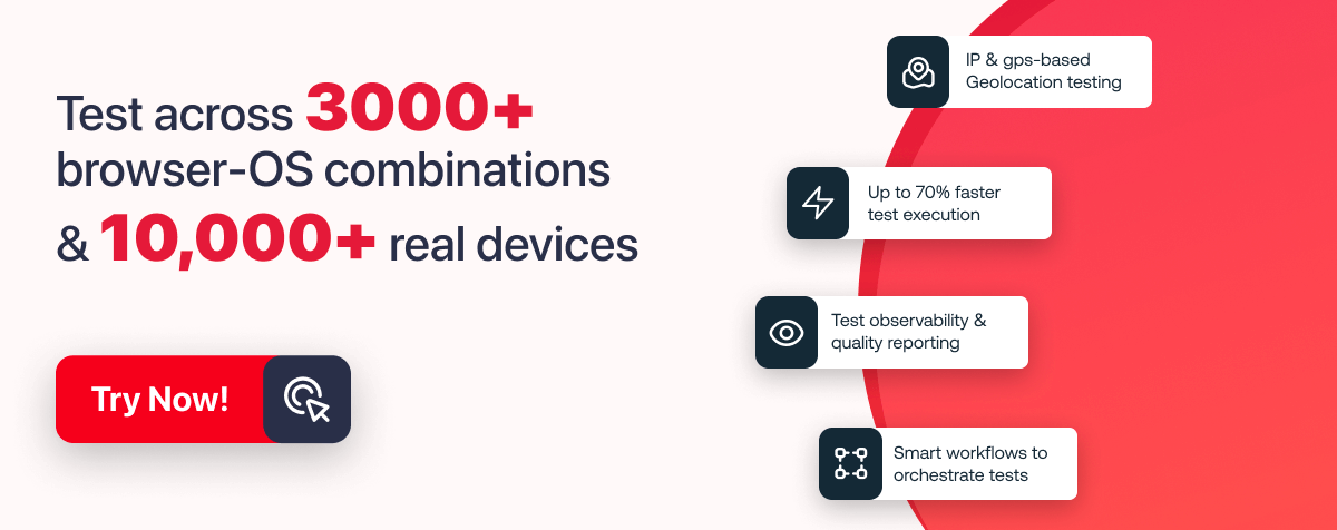
In the above mobile view of the text rotation hover effect, I have used LT Browser 2.0 to render the website. LT Browser 2.0 is a dev-friendly mobile next-generation browser built by TestMu AI, an intelligent cloud-based digital experience testing platform that enables developers and testers to perform manual and automation testing on their web and mobile applications over more than 3000+ browser and OS configurations.
LT Browser 2.0 allows you to perform responsive testing for your website on over 50+ device viewports, including mobile, tablet, laptop, and desktop.
Additional features offered by LT Browser 2.0 include side-by-side view, scroll sync, instant debugging, network throttling, hot reloading, etc. Using Google Lighthouse, it also generates performance reports.
Refer to our documentation to get started with LT Browser 2.0 to get started with the responsiveness test.
To learn more about software testing tutorials on Playwright, Appium, Selenium testing, and other topics, you can also subscribe to our TestMu AI YouTube Channel.
CSS Text Rotate usage in Tilted Headings and Text
The Hyatt website has rotated headings on its Thompson-hotels page. For anyone visiting the website, this gives it a feeling of liveliness and a memorable user experience.

To access a website’s inspect page, simply right-click on any element on the web page and select “Inspect” or “Inspect Element” from the context menu, or use the keyboard shortcut “Ctrl+Shift+I” (Windows) or “Command+Option+I” (Mac).

CSS Text Rotate usage in Pricing Section
Zendesk adds a text rotation effect to the price they want to stand out to website visitors. This captures any visitor’s attention and increases the chances of the user taking action and choosing this pricing plan more than any other.

To access a website’s inspect page, simply right-click on any element on the web page and select “Inspect” or “Inspect Element” from the context menu, or use the keyboard shortcut “Ctrl+Shift+I” (Windows) or “Command+Option+I” (Mac).

CSS Rotate Text usage in Vertical Navigation menus
MadeByShape makes use of the small and inadequate screen space available by using CSS rotate text to fit the navigation link Go up on the right side of the page and the call-to-action Email-Us on the left side of the page.

Area17 uses the same concept below for the navigation link INDEX.

Browser Support for CSS Rotate Text Effects
Thus far, we have seen what CSS rotate text is, how to do it and when, the use cases, and real-world examples of where it is in use.
We have earlier seen how rotating text using CSS on your web pages can increase the duration the website visitors spend on it. The duration visitors spend on your website can have a profound positive effect on the number of visits and conversions for the case of online businesses like eCommerce and SaaS websites.
However, before implementing any CSS text rotation effect, it is a good practice and safeguards to test which browsers support it. You can manually test browser compatibility, which is highly time-consuming given the many existing browsers and their versions, or you can use automated testing using cloud-based digital experience testing platforms like TestMu AI.
Testing your CSS text rotation effects for cross browser compatibility guarantees they render as intended on all targeted browsers because this can make the difference between retaining your website visitors and losing them. Research done by ScienceDirect, a world-leading source of technical and scientific research, shows that as websites render across multiple browsers, the speed at which they do so reduces, and this can also be a direct effect of elements on the website not being supported by a browser. This poor performance can cause users to leave such websites.
Below is a view of the browser support for the CSS rotate text property and rotates each function as covered in this blog.
- rotate CSS property
- rotate CSS function
- rotateX CSS function
- rotateY CSS function
- rotateZ CSS function
- rotate3d CSS function


You now know which browser supports which property or function you can use to implement your CSS text rotation effect.
However, you can take this to the next level by carrying out real-time on the cloud using TestMu AI. You can smartly and shortly detect any problems or issues that may occur, which helps you to work on them quicker and further improve the website’s visitors’ user experience since the website will render just as you would want it to, without any conflicts.
I am testing the CSS rotate text effects we used on our CodePen in Chrome version 111 on macOS Ventura. The test is being done on a cloud platform, TestMu AI. You’ll see a browser window once the load screen clears.

You can now run all your browser compatibility tests on the cloud. The panel on the left contains features like the debugger and recorder that you can use to execute the testing more efficiently.
Note: Perform cross browser compatibility testing on real browsers, and OS. Try TestMu AI Now!
Wrapping Up!
Rotating text in CSS is a great way to add visual interest to your website or application. Using the CSS rotate property, you can easily rotate text to your desired angle. The CSS rotate text property is simple to use, while the rotate() function allows for more complex transformations when combined with other transform functions.
It’s important to remember that text rotation can affect readability, so it should be used sparingly and only when necessary. Make sure to test your designs on various devices and screen sizes to ensure that the rotated text is still easily readable.
In this guide, you have learned ways of rotating text using CSS, when to use CSS rotate text property, its use cases, and how to test the browser compatibility of the text rotation effect you want to implement. If you have any questions or concerns about using the CSS rotate text property and use cases, please ask in the comments below. I’m always happy to help and provide further guidance.
Thank you for taking the time to read this blog on how to use CSS rotate text. We hope you found it informative and valuable for your web design and development needs. Don’t forget to follow us for more CSS tips and tricks and other web technologies.
Frequently asked questions
Did you find this page helpful?
More Related Hubs
TestMu AI forEnterprise
Get access to solutions built on Enterprise
grade security, privacy, & compliance
- Advanced access controls
- Advanced data retention rules
- Advanced Local Testing
- Premium Support options
- Early access to beta features
- Private Slack Channel
- Unlimited Manual Accessibility DevTools Tests