
Next-Gen App & Browser Testing Cloud
Trusted by 2 Mn+ QAs & Devs to accelerate their release cycles

24 Best CSS Frameworks To Look Forward In 2026
Explore the 24 best CSS frameworks of 2026 for frontend development. Elevate your web design and enhance user experiences with these best CSS frameworks.

Adarsh M
February 7, 2026
If you are into software development, one of the most common pieces of advice is to Don’t Repeat Yourself (DRY). This is the same case in front-end development, and there is no need to start everything from scratch when you develop the application.
Web applications are the doorway that leads users into the digital world. They serve as entry points that allow access to numerous services with just a click.
Users can interact with the content to access various services and technologies. They expect a seamless experience and don't want to waste time figuring out how to perform tasks.
Websites should have a user-centric design, making it easy for users to navigate and understand how to use them.
In today's digital era, visual appearance significantly impacts user engagement. Developers cannot afford to overlook the importance of a well-designed UI.
According to a survey, more than 50% of users believe web design is important to an organization's overall brand.
To ensure a positive user experience, developers can leverage the best CSS frameworks. These enable consistent styling and create visually appealing browser-compatible websites.
Many new CSS frameworks are emerging, focusing on accessibility, responsiveness, and performance. Each framework has pros and cons, so developers must choose based on their project's scope.

In this article, we will walk you through the best CSS frameworks in 2026 for frontend developers, exploring their features, and use cases along with hands-on examples.
So let’s get started!
What are CSS Frameworks?
CSS frameworks are pre-built libraries of CSS code and styles that streamline web design by providing standardized elements and reducing repetitive tasks.
When creating a web application, besides the content, ensuring a user-friendly display is crucial. However, as your application grows in content, styling all elements with raw CSS becomes time-consuming and may result in repetitive styling, causing code redundancy. To address this, you can explore CSS refactoring in greater detail in this blog.
CSS frameworks solve this problem by providing pre-built and ready-to-use sets of CSS rules and styles in a structured manner. Most online businesses use CSS frameworks for their websites because they offer several advantages that will help them develop and maintain their website.
Note: Test your CSS-based websites across 3000+ environments. Try TestMu AI Today!
What Are the Types of CSS Frameworks?
CSS frameworks include component-based, utility-first, modular, CSS-in-JS, and minimalist types, each offering unique styling approaches.
CSS frameworks work in different ways to style an element. For instance, some frameworks, like Bulma, Tachyons, etc., use a modular approach. In contrast, libraries like Bootstrap use a conventional approach as it gives a set of predefined styles and prebuilt components.
Some of the approaches used by CSS frameworks are:
- CSS-in-JS frameworks: CSS-in-JS is a popular approach that allows writing CSS properties for elements with JavaScript. Instead of having an external stylesheet, you can define certain JavaScript objects that, at runtime, get compiled into normal CSS.
- Component-based frameworks: Component-based frameworks in CSS provide reusable UI components, such as navbars, icons, sections, dropdowns, etc. It can speed up the development process because it is unnecessary to style your components from scratch. Some of the top component frameworks are Bootstrap, Primer, etc.
- Utility-first frameworks: Utility-first frameworks in CSS take a unique approach to styling by giving developers flexibility instead of providing pre-built CSS components. These frameworks offer pre-configured styles for specific classes, such as “m-10,” representing a margin of 2.2 rems in the Tailwind. Some of the most common utility frameworks are Tailwind CSS, Tachyons, etc.
- Modular frameworks: Modular frameworks are like a set of building blocks for CSS that can be mixed and matched to create unique designs. Instead of being limited to a pre-designed framework, developers can choose the specific pieces they need for their projects. This gives them more control and flexibility over their design choices. Tachyons is a modular framework.
- Minimalist framework: Minimalistic frameworks in CSS only provide you with limited styles and components to get started. They are like boilerplate setups and provide the necessary features and components to create a simple and elegant design without unnecessary bloat or complexity.
What Is the Purpose of CSS Frameworks?
CSS frameworks separate presentation from content, ensure consistency, improve accessibility, and enhance browser compatibility and maintainability.
The primary purpose of the CSS framework is:
- Separate presentation from content: This allows developers to keep a website’s presentation different from its HTML content, making it easier to maintain and modify.
- Consistency: Establish a consistent look and feel across all website pages.
- Accessibility: Provide ways to make websites accessible for users with impairments.
- Browser compatibility: Ensure that websites are displayed consistently across different browsers and devices.
- Maintainability: Make it easier to maintain and update the styling of a website over time.
- Performance optimization: Improve website performance by reducing the size and complexity of CSS files.
What Are the Benefits of CSS Frameworks?
CSS frameworks save time, ensure consistency, enable responsive design, improve cross-browser compatibility, and allow easy customization.
A CSS framework is used to provide a starting point for building websites. They offer fully prepared CSS and HTML files, which expedites and simplifies the process of building a website.
Here are some benefits of using CSS frameworks:
- Saves time: One of the main advantages of using a CSS framework is that it saves a lot of time. Developers are free to start from scratch with every style and component.
- Consistency: CSS frameworks offer predefined styles and components to ensure a consistent look and feel across many web pages or applications.
- Responsive design: Several CSS frameworks are meant to be responsive, meaning they can adapt to multiple screen sizes and devices. This might save developers a lot of time and effort in designing a responsive design from the start.
- Cross browser compatibility: To ensure cross browser compatibility, CSS frameworks are frequently tested on many platforms and browsers. This can let developers test their code across several platforms more quickly and efficiently.
- Easy customization: CSS frameworks offer pre-defined components and styles, but they are also made to be simple to modify. The framework is simple for developers to change and add their styles, allowing them more control over the project’s look.

What Are the Best CSS Frameworks for Front-End Developers in 2026?
Top CSS frameworks include Tailwind CSS, Bootstrap, Material-UI, Bulma, and Foundation, known for user-friendliness and mobile responsiveness.
Choosing the ideal CSS framework and component library for their application can be challenging. Here is a list of the best CSS frameworks widely known for their user-friendliness, mobile responsiveness, and accessibility.
So, let’s dive into it.
Tailwind CSS
If you are into web development, particularly frontend development, the first question you will hear from another frontend developer is, “You used Tailwind, right?”. Tailwind has gained massive popularity among the front-end community, and people are still adopting Tailwind CSS due to its simplicity.

Tailwind CSS is a utility-first CSS framework that offers a variety of predefined CSS class names that you can use to style the element without writing CSS. Tailwind CSS has over 8 million weekly downloads, according to npm trends. It also has a fast-growing community of developers actively working on the project. When writing this article, Tailwind CSS has 77.2k Star and 3.9 Fork on GitHub.

Tailwind CSS uses the mobile-first design approach, which means the default styles are designed for smaller screen dimensions, such as mobiles. This approach leads to creating responsive web applications that one can easily scale up to large screen sizes like laptops.
Let’s consider an example for a better understanding of how to use Tailwind CSS. You need to install the Tailwind CSS library, or you can simply use the Tailwind CSS CDN link.
<html lang="en">
<head>
    <meta charset="UTF-8">
    <meta http-equiv="X-UA-Compatible" content="IE=edge">
    <meta name="viewport" content="width=device-width, initial-scale=1.0">


    <script src="https://cdn.tailwindcss.com"></script>


</head>
<body>
 <div class="relative flex flex-col justify-center min-h-screen bg-gray-50 overflow-hidden py-6 sm:py-12">
        <img src="https://play.tailwindcss.com/img/beams.jpg" alt="" class="absolute top-1/2 left-1/2 -translate-x-1/2 -translate-y-1/2 max-w-none w-full h-auto" width="1308" />


        <div class="absolute w-full md:w-1/2 m-auto mt-16 md:mt-0 bg-white rounded-xl drop-shadow-2xl shadow-xl overflow-hidden mx-4 md:mx-64">
            <div class="flex flex-col justify-center items-center">
                <div class="md:flex-shrink-0">
                    <img class="h-48 w-full object-cover md:w-full" src="https://www.lambdatest.com/resources/images/real-time-browsers-index.png" alt="Avatar">
                </div>
                <div class="p-8">
                    <div class="uppercase tracking-wide text-sm text-indigo-500 font-semibold">Cross Browser Testing On Desktop And Mobile Browsers</div>
                    <p class="mt-2 text-gray-500">You can choose from a wide range of Windows and Mac operating systems, along with all legacy and latest browsers. Also test your website or web app on latest mobile browsers with Android and iOS mobile operating systems.</p>
                </div>
            </div>
        </div>
    </div>
</body>


</html>
Output:

Advantages of Tailwind CSS
- Highly customizable: Tailwind CSS is known for its customizability. It provides several variables and plugins to customize the look and feel of the website to match the design aspects of the website.
- Responsive design: It provides utility classes along with their variants, such as sm, md, lg, etc., which we can use to build adaptive user interfaces.
- Accelerated product development: Tailwind CSS can improve the overall productivity of developers as it eliminates the need to write custom CSS rules. The framework’s pre-defined utility classes make it easier and faster to build and style applications.
Shortcomings of Tailwind CSS
- Inline styling: Tailwind CSS uses inline styling to style an element. It can affect the code readability as we use more and more class names to style the element.
- Large HTML files: Tailwind CSS’s utility-first approach can lead to a larger number of classes in HTML, increasing the download size and potentially impacting website performance.
Pure CSS
Pure CSS is a lightweight and open-source CSS framework created by Yahoo. It offers a minimalist set of styles for HTML elements, making it easy for developers to create fast-loading and clean websites. Pure CSS is a minimal framework, with the entire set of modules under 3.5 KBs.

Pure CSS uses a mobile-first approach making it an excellent choice for projects focusing on mobile devices. Its modular design allows developers to select only the necessary styles for their projects, leading to faster load times and better performance.
Overall, Pure CSS is an excellent option for developers who prefer a minimalist and fast-loading framework for their web projects. It has around 162 weekly downloads, according to npm trends, and the project is well maintained with around 23.4k Star and 2.5k Fork on GitHub.

Let’s look at an example of using Pure CSS to create a simple layout.
<html>
  <head>
    <title>The PURE.CSS Containers</title>
    <meta name="viewport" content="width=device-width, initial-scale=1" />
    <link
      rel="stylesheet"
      href="https://unpkg.com/[email protected]/build/pure-min.css"
      integrity="sha384-nn4HPE8lTHyVtfCBi5yW9d20FjT8BJwUXyWZT9InLYax14RDjBj46LmSztkmNP9w"
      crossorigin="anonymous"
    />
    <style>
      .grids-example {
        background: rgb(250, 250, 250);
        margin: 2em auto;
        font-family: Consolas, "Liberation Mono", Courier, monospace;
        text-align: center;
      }
      .graybox {
        background: rgb(240, 240, 240);
        border: 1px solid red;
      }
    </style>
  </head>
  <body>
    <div class="grids-example">
      <div class="pure-g">
        <div class="pure-u-1-1">
          <div class="graybox">
            <p>
              These four columns should stack on small screens, should take up
              width: 50% on medium-sized screens, and should take up width: 25%
              on large screens.
            </p>
          </div>
        </div>


        <div class="pure-u-1 pure-u-md-1-2 pure-u-lg-1-4">
          <div class="graybox">
            <p>Java</p>
          </div>
        </div>


        <div class="pure-u-1 pure-u-md-1-2 pure-u-lg-1-4">
          <div class="graybox">
            <p>Python</p>
          </div>
        </div>


        <div class="pure-u-1 pure-u-md-1-2 pure-u-lg-1-4">
          <div class="graybox">
            <p>JavaScript</p>
          </div>
        </div>


        <div class="pure-u-1 pure-u-md-1-2 pure-u-lg-1-4">
          <div class="graybox">
            <p>C++</p>
          </div>
        </div>
      </div>
    </div>


    <div class="grids-example">
      <div class="pure-g">
        <div class="pure-u-1">
          <div class="graybox">
            <p>This column is to occupy the complete space of a row.</p>
          </div>
        </div>
      </div>
    </div>


    <div class="grids-example">
      <div class="pure-g">
        <div class="pure-u-2-5">
          <div class="graybox">
            <p>This column is to occupy the two-fifth of the space of a row.</p>
          </div>
        </div>
        <div class="pure-u-3-5">
          <div class="graybox">
            <p>
              This column is to occupy the three-fifth of the space of a row.
            </p>
          </div>
        </div>
      </div>
    </div>
  </body>
</html>
Output:

Advantages of Pure CSS
- Minimalistic: Pure is designed with a minimalist approach, providing only essential styles for web interface elements. This allows for easy customization and the creation of custom designs.
- Lightweight: Pure is a small library, and as mentioned, the entire set of modules clocks in at 3.5KB minified and gzipped.
Shortcomings of Pure CSS
- Limited pre-built components: While Pure CSS contains a variety of pre-built components, some developers might find that it lacks some components they require.
- Fewer resources: Pure CSS doesn’t have that many good resources and documentation. So, it may lead to a hard time for someone looking to get started.
Ant Design
Ant Design is one of the most widely used UI component libraries, and it is well known for its ease and simplicity. Ant Design is like a competitor to Material Design, and it is often used with front-end frameworks such as React and Vue.

Ant Design provides high quality components and they are easy to customize to meet specific needs of the design team. It also offers a powerful theming system that allows developers to customize the look and feel of their applications quickly. The library supports both light and dark themes, and the theming system can be customized using CSS Variables or JavaScript.
Ant Design has around 1.09 million downloads weekly, according to npm trends, and it is a well-maintained open-source project with around 89.7k Star and 44.9k Fork on GitHub.

Let’s take an example of using Ant Design to create a simple test report table.
<!DOCTYPE html>
<html>
  <head>
    <title>LambdaTest Test Report</title>
    <!-- Import Ant Design styles -->
    <link
      rel="stylesheet"
      href="https://cdn.bootcdn.net/ajax/libs/antd/4.16.2/antd.min.css"
    />
    <!-- ant design cdn and everything -->

    <style>
      .ant-table-bordered > thead > tr > th,
      .ant-table-bordered > tbody > tr > td {
        border: 1px solid #000000;
      }
      .ant-table td,
      .ant-table th {
        padding: 10px;
      }
    </style>
  </head>
  <body>
    <div style="max-width: 800px; margin: 0 auto; padding: 20px">
      <h1>LambdaTest Test Report</h1>
      <div style="margin-bottom: 20px;">
        <Input.Search placeholder="Search test report..." />
      </div>
      <table class="ant-table ant-table-middle ant-table-bordered ant-table-striped">
        <thead>
          <tr>
            <th>Test Name</th>
            <th>Browser</th>
            <th>Platform</th>
            <th>Status</th>
          </tr>
        </thead>
        <tbody>
          <tr>
            <td>Login Test</td>
            <td>Chrome</td>
            <td>Windows 10</td>
            <td><span class="ant-tag ant-tag-green">Passed</span></td>
          </tr>
          <tr>
            <td>Search Test</td>
            <td>Firefox</td>
            <td>macOS</td>
            <td><span class="ant-tag ant-tag-red">Failed</span></td>
          </tr>
          <tr>
            <td>Checkout Test</td>
            <td>Safari</td>
            <td>iOS</td>
            <td><span class="ant-tag ant-tag-yellow">Pending</span></td>
          </tr>
          <tr>
            <td>Payment Test</td>
            <td>Chrome</td>
            <td>Windows 10</td>
            <td><span class="ant-tag ant-tag-green ant-padd">Passed</span></td>
          </tr>
        </tbody>
      </table>


  </body>
</html>
Output:

Advantages of Ant Design
- Easy to use: Ant Design is well-documented and user-friendly, even for first-time users.
- Regular updates: The framework is actively maintained, ensuring compatibility with the latest web technologies and elements.
- High performance: Ant Design’s minimal design and high-performance components make for fast and responsive applications.
Shortcomings of Ant Design
- Over-engineering: Ant Design provides many built-in features, which can result in over-engineering or using unnecessary functionality.
This can lead to more complex code that is harder to maintain, such as with the Ant Design Form component, which may have features that aren’t needed for a simple form.
- Limited design flexibility: Ant Design’s components follow a specific visual design, which may not fit all applications. Developers who require more design flexibility may find the framework limiting.
Bulma
Bulma is a free and open-source CSS framework that provides a ready-to-use front-end component library to build responsive web applications. Bulma is created with the intention of mobile-first design, and it can easily make responsive web elements.

Bulma provides a variety of CSS classes that can be used to style the elements quickly. Bulma has gained massive popularity among developer communities. As of writing this blog, Bulma has around 48k Star on GitHub, along with 3.9k Fork.
According to npmtrends.com, Bulma has about 250k weekly downloads, and the project has almost 400 contributors, which shows that the project is popular and continuously evolving.

Let’s look at an example of how to use Bulma and create a blog section.
<!DOCTYPE html>
<html lang="en">
  <head>
    <meta charset="UTF-8" />
    <meta http-equiv="X-UA-Compatible" content="IE=edge" />
    <meta name="viewport" content="width=device-width, initial-scale=1.0" />
    <title>Document</title>
    <link
      rel="stylesheet"
      href="https://cdn.jsdelivr.net/npm/[email protected]/css/bulma.min.css"
    />
    <link
      rel="stylesheet"
      href="https://cdnjs.cloudflare.com/ajax/libs/font-awesome/5.15.3/css/all.min.css"
      crossorigin="anonymous"
      referrerpolicy="no-referrer"
    />
  </head>
  <body>
    <section class="section">
      <div class="container">
        <div class="columns box is-multiline mg-">
          <div class="column">
            <figure class="image is-16by9">
              <img
                src="https://www.lambdatest.com/blog/wp-content/uploads/2023/04/2320Best20CSS.png"
                alt="Example image"
              />
            </figure>
          </div>
          <div class="column">
            <h1 class="title is-3">
              23 Best CSS Frameworks For React In 2023: A Comprehensive Overview
            </h1>
            <p class="subtitle is-6 mt-4">
              <span class="icon">
                <i class="far fa-calendar"></i>
              </span>
              <span>April 25, 2023</span>
              <span class="icon">
                <i class="far fa-eye"></i>
              </span>
              <span>123645</span>
            </p>
            <p>
              When you first started learning how to code, one of the most
              common clichés you heard was, “Don’t reinvent the wheel.” This is
              the same case in web development, and there’s no need to start
              from scratch every time you build a website or web application.
            </p>
          </div>
        </div>


        <div class="columns box mt-1">
          <div class="column">
            <figure class="image is-16by9">
              <img
                src="https://www.lambdatest.com/blog/wp-content/uploads/2023/03/unnamed252520-2525202023-03-15T174705.891.png"
                alt="Example image"
              />
            </figure>
          </div>
          <div class="column">
            <h1 class="title is-3">A Complete Guide to CSS Refactoring</h1>
            <p class="subtitle is-6 mt-4">
              <span class="icon">
                <i class="far fa-calendar"></i>
              </span>
              <span>March 15, 2023</span>
              <span class="icon">
                <i class="far fa-eye"></i>
              </span>
              <span>143645</span>
            </p>
            <p class="">
              Being a front-end developer is like having the magical power to
              shape reality after it’s been created.
            </p>
          </div>
        </div>
      </div>
    </section>
  </body>
</html>
Output:

Advantages of Bulma
- Documentation: Bulma is well documented with visual examples and beginners can easily catch up with the flow of the library.
- Responsive design: It is designed to be fully responsive, so your website will look great on any device.
- Customizable: Bulma’s modular structure allows you to easily customize its components to fit your specific needs.
Shortcomings of Bulma
Lack of pre-built JavaScript functionality: Bulma does not have pre-built JavaScript functionality, unlike other frameworks like Bootstrap.
Less popular as other CSS frameworks: Bulma gained a lot of popularity when it was launched, but it is less commonly used than other established libraries like Tailwind CSS. This may result in a lack of resources for Bulma.
UIkit
UIkit is a user-friendly front-end CSS framework perfect for developers who want to build sleek and responsive web interfaces quickly. It can create stunning and fully-functional web applications with minimal effort, all while ensuring high performance and scalability.

UIkit is a cross-browser-supported UI framework that will work seamlessly on the latest versions of modern browsers like Firefox, Chrome, Safari, Opera, etc. UIkit has around 27k weekly downloads according to npm trends. It is one of the actively maintained projects on GitHub, with around 18.1k Star and 2.3k Fork on GitHub.

UIkit is modular, which allows developers to easily pick and choose which components and styles they want to use, making it highly customizable and adaptable to different project requirements. It also works well with popular front-end frameworks such as React, Angular, Vue, etc.
Here is an example of using UIkit to create a minimal dashboard.
<!DOCTYPE html>
<html>
  <head>
    <meta charset="UTF-8" />
    <title>LambdaTest Dashboard</title>
    <link
      rel="stylesheet"
      href="https://cdnjs.cloudflare.com/ajax/libs/uikit/3.6.22/css/uikit.min.css"
    />
    <script src="https://cdnjs.cloudflare.com/ajax/libs/uikit/3.6.22/js/uikit.min.js"></script>
    <script src="https://cdnjs.cloudflare.com/ajax/libs/uikit/3.6.22/js/uikit-icons.min.js"></script>
  </head>
  <body>
    <div class="uk-container uk-margin-top">
      <h1 class="uk-heading-medium">LambdaTest UI Testing Minimal Dashboard</h1>
      <div class="uk-child-width-1-2@m uk-grid-small uk-grid-match" uk-grid>
        <div>
          <div class="uk-card uk-card-default uk-card-body">
            <h3 class="uk-card-title">Recent Test Results</h3>
            <table class="uk-table uk-table-striped">
              <thead>
                <tr>
                  <th>Test Name</th>
                  <th>Status</th>
                  <th>Date</th>
                </tr>
              </thead>
              <tbody>
                <tr>
                  <td>Login Test</td>
                  <td><span class="uk-label uk-label-success">Passed</span></td>
                  <td>May 1, 2023</td>
                </tr>
                <tr>
                  <td>Signup Test</td>
                  <td><span class="uk-label uk-label-danger">Failed</span></td>
                  <td>April 30, 2023</td>
                </tr>
                <tr>
                  <td>Search Test</td>
                  <td>
                    <span class="uk-label uk-label-warning">Pending</span>
                  </td>
                  <td>April 29, 2023</td>
                </tr>
              </tbody>
            </table>
          </div>
        </div>
        <div>
          <div class="uk-card uk-card-default uk-card-body">
            <h3 class="uk-card-title">Active Tests</h3>
            <ul class="uk-list uk-list-divider">
              <li>Checkout Test</li>
              <li>Cart Test</li>
              <li>Payment Test</li>
            </ul>
          </div>
        </div>
        <div>
          <div class="uk-card uk-card-default uk-card-body">
            <h3 class="uk-card-title">Alerts and Issues</h3>
            <div class="uk-alert uk-alert-danger" uk-alert>
              <a class="uk-alert-close" uk-close></a>
              <p>
                There was an error with the latest test run. Please check your
                test configuration.
              </p>
            </div>
            <div class="uk-alert uk-alert-warning" uk-alert>
              <a class="uk-alert-close" uk-close></a>
              <p>
                One of your tests has been running for more than 24 hours.
                Please check its status.
              </p>
            </div>
          </div>
        </div>
      </div>
    </div>
  </body>
</html>
Output:

Advantages of UIkit
- Lightweight: UIkit is one of the lightweight CSS frameworks designed to reduce the file size of websites and applications, resulting in faster load times.
- Right-to-left support: UIkit can support right-to-left languages and enables you to switch the orientation of all design elements accordingly.
Shortcomings of UIkit
- Learning curve: UIkit provides you with various lengthy class names, and memorizing the names of classes can be difficult.
- Design limitations: UIkit-specific design aesthetic may limit its appeal to some developers who require more design flexibility.
Semantic UI
Semantic UI is a CSS framework that helps create responsive layouts with ease. It comes with some prebuilt components that you can use on your website. It can be easily integrated with most of the popular front-end libraries, including React, Angular, etc.

Semantic UI has around 51k Star and 5k Fork on GitHub. It enables developers to quickly build visually appealing websites using concise HTML, intuitive JavaScript, and simplified debugging processes. According to npm trends, it has around 4000 weekly downloads.

Let’s look at an example of using Semantic UI to build a simple call-to-action section.
<!DOCTYPE html>
<html lang="en">
  <head>
    <meta charset="UTF-8" />
    <meta name="viewport" content="width=device-width, initial-scale=1.0" />
    <link rel="preconnect" href="https://fonts.googleapis.com" />
    <link rel="preconnect" href="https://fonts.gstatic.com" crossorigin />
    <link
      href="https://fonts.googleapis.com/css2?family=Nunito:ital,wght@0,200;0,300;0,400;0,500;0,800;1,200;1,300;1,400&family=Poppins:wght@300&display=swap"
      rel="stylesheet"
    />


    <style>
      * {
        font-family: "Nunito", sans-serif;
      }
    </style>
    <title>AI-Powered Visual Regression Testing Cloud</title>
    <link
      rel="stylesheet"
      href="https://cdnjs.cloudflare.com/ajax/libs/semantic-ui/2.4.1/semantic.min.css"
    />
  </head>
  <body>
    <div class="ui container text center aligned" style="margin-top: 3em">
      <h1 class="ui header">AI-Powered Visual Regression Testing Cloud</h1>
      <p>
        AI-Powered Automated visual regression testing across 3000+ desktop and
        mobile environments. Deliver seamless digital experiences everytime.
      </p>
      <p>
        With <span>LambdaTest</span>, Run Selenium and Cypress tests across
        multiple languages, including Java, NodeJS, C#, Python and StoryBook and
        ship visually perfect applications on nearly any browser or device.
      </p>


      <div class="ui indicating progress">
        <div class="bar"></div>
        <div class="label">Loading</div>
      </div>


      <img
        class="ui centered rounded huge image"
        src="https://www.lambdatest.com/resources/images/main/visual-regression-testing.webp"
        alt="Placeholder Image"
      />
      <br />
      <br />
      <a class="ui huge primary button" href="#">Get Started</a>
    </div>
  </body>
</html>
Output:

Advantages of Semantic UI
- Minimal: Semantic UI is minimal compared to other libraries, and it is easy to start with it.
- Highly customizable: Semantic UI comes with a variety of theming and styling options that can be customized to meet your application’s branding.
Shortcomings of Semantic UI
- Limited documentation: It has limited documentation compared to other libraries. This can be a lot of hassle for someone starting to work with Semantic UI React for the first time.
- Not following HTML semantics: Although Semantic UI is a great library, under the hood, elements need to follow HTML semantics, which has brought some negative comments from the community.
- Limited ecosystem: Semantic UI has a smaller ecosystem than some other front-end frameworks. This means there may be fewer plugins, extensions, and integrations available for specific functionalities or third-party services.
Materialize
Materialize is a modern, responsive front-end framework based on the popular design language, Material Design. Material Design is a design system created by Google based on using paper and ink as a visual metaphor for user interface elements. This approach makes the design feel familiar and approachable as if the user is interacting with physical objects in the real world.

Materialize has around 38.9k Star and 4.7k Fork on GitHub, which shows the project’s popularity. It also has 43k weekly downloads, according to npm trends.
Materialize provides an extensive list of UI elements, including forms, buttons, icons, etc. Materialize makes it easy for developers to create beautiful and responsive web pages without having to write custom CSS from scratch.

Let’s look at an example of how to use Materialize to create a blogging site.
<!DOCTYPE html>
<html>
  <head>
    <title>Tachyons Example</title>
    <link
      rel="stylesheet"
      href="https://cdnjs.cloudflare.com/ajax/libs/tachyons/4.11.1/tachyons.css"
    />
    <!-- font family popins -->
    <link
      href="https://fonts.googleapis.com/css?family=Poppins:300,400,600,700"
      rel="stylesheet"
    />


    <!-- Compiled and minified CSS -->
    <link
      rel="stylesheet"
      href="https://cdnjs.cloudflare.com/ajax/libs/materialize/1.0.0/css/materialize.min.css"
    />


    <!-- Compiled and minified JavaScript -->
    <script src="https://cdnjs.cloudflare.com/ajax/libs/materialize/1.0.0/js/materialize.min.js"></script>


    <style>
      * {
        font-family: "poppins";
      }
    </style>
  </head>
  <body class="">
    <div class="row">
      <div class="col s12 m8 l9">
        <div class="card large w-100 h-70">
          <div class="card-image w-100">
            <img
              src="https://www.lambdatest.com/blog/wp-content/uploads/2022/08/How-To-Style-And-Write-CSS-In-Re-1.png"
              class="w-20"
            />


          </div>
          <div class="card-content">
            <p class="w-90">
              In this article, we will learn how to style and write CSS in
              React. We will also learn about the different ways to style
              components in React.
            </p>
          </div>
          <div class="card-action">
            <!-- <a href="#">Read More </a> -->
            <p class="chip">LambdaTest Blogs</p>
            <span class="right">Posted on Feb 8, 2023</span>
          </div>
        </div>
      </div>
      <div class="col s12 m4 l3">
        <div class="card">
          <div class="card-content">
            <span class="card-title">Categories</span>
            <ul>
              <li><a href="#">Web development</a></li>
              <li><a href="#">React</a></li>
              <li><a href="#">JavaScript 3</a></li>
              <li><a href="#">UI/UX </a></li>
            </ul>
          </div>
        </div>
        <div class="card">
          <div class="card-content">
            <span class="card-title">Tags</span>
            <div class="chip">React</div>
            <div class="chip">CSS</div>
          </div>
        </div>
      </div>
    </div>
  </body>
</html>
Output:

Advantages of Materialize
- Consistent styling: As Materialize is based on Material Design, there will be consistent styling throughout the website.
- Well documented: Materialize has provided detailed documentation as well as code examples to assist new users in getting started.
Shortcomings of Materialize
- Limited customization: Materialize has a predefined style that follows Google’s Material Design guidelines, which can limit customization options. Straying too far from Materialize style may result in inconsistent design.
- Learning curve: While Materialize is easy to use, its extensive documentation can make it overwhelming for beginners to navigate and understand all of its features.
Tachyons
Tachyons is a utility-first, functional CSS framework designed for building fast-loading, highly responsive web interfaces with minimal CSS. It is a lightweight CSS library that provides utility classes that serve a specific purpose.

One great thing about Tachyons is that it’s very easy to use, with a functional CSS approach that allows for efficient and maintainable styles. Tachyons also has pretty good documentation, and it can be used along with popular front-end frameworks like React.js, Vue.js, etc.
As of writing this article, Tachyons has around 11.6k Star and 682 Fork on GitHub. Even though the project is not active that much, developers still use Tachyons due to its ease of use. Tachyons has around 70k weekly downloads, according to npm trends.

Let’s look at an example of using Tachyons to create a simple Newsletter section.
<!DOCTYPE html>
<html>
  <head>
    <title>Tachyons Example</title>
    <link
      rel="stylesheet"
      href="https://cdnjs.cloudflare.com/ajax/libs/tachyons/4.11.1/tachyons.css"
    />
    <!-- font family popins -->
    <link
      href="https://fonts.googleapis.com/css?family=Poppins:300,400,600,700"
      rel="stylesheet"
    />
    <style>
      * {
        font-family: "poppins";
      }
    </style>
  </head>
  <body class="pa4">
    <div class="center mw7">
      <h1 class="tc">Weekly Testing Newsletter Testing News & Tips</h1>
      <p class="tc">Stay up-to-date with the latest news and updates</p>
      <form class="pa3" action="submit-form.php" method="post">
        <label class="db mb2">Name:</label>
        <input
          class="input-reset ba b--black-20 pa2 mb2 db w-100"
          type="text"
          name="name"
          required
        />
        <label class="db mb2">Email:</label>
        <input
          class="input-reset ba b--black-20 pa2 mb2 db w-100"
          type="email"
          name="email"
          required
        />
        <button
          class="f6 link dim br2 ph3 pv2 mb2 dib white bg-dark-green"
          type="submit"
        >
          Subscribe
        </button>
      </form>
      <p class="tc mt4">Thank you for subscribing to our newsletter!</p>
    </div>
  </body>
</html>
Output:

Advantages of Tachyons
- Responsive: Tachyons uses a mobile-first approach, and it can adapt well to smaller devices and be scaled to higher dimensions.
- Modular architecture: It is built with a modular architecture, allowing developers to include only the styles they require while reducing the size of their CSS files.
- Accessible: Tachyons provides several tools and methods for maximizing the accessibility of your website.
Shortcomings of Tachyons
- Code readability: Tachyons’ use of shorthand CSS classes can make the code harder to understand.
- Inline styling: Tachyons uses inline styling, which can make the HTML file look messy.
Bootstrap
Bootstrap is one of the most popular and in-demand CSS frameworks. It provides prebuilt HTML, CSS, and JavaScript components that you can use to build your web application. Bootstrap has a rock-solid community of developers working on the project, and it was developed by Twitter, and right now, developers across the globe maintain it.

Bootstrap has around 5.5 million weekly downloads, which shows the popularity of Bootstrap among developers. And also, as of writing this blog, Bootstrap has about 167k Star and 78.3k Fork on GitHub.

Bootstrap is a highly responsive framework, and it can adapt well to all the common display breakpoints. Bootstrap provides almost all the components we ever need for building our application from scratch, which is one of the main reasons Bootstrap has got this huge traction.
Let’s look at an example of how to use Bootstrap.
<!DOCTYPE html>
<html lang="en">
  <head>
    <meta charset="UTF-8" />
    <meta http-equiv="X-UA-Compatible" content="IE=edge" />
    <meta name="viewport" content="width=device-width, initial-scale=1.0" />
    <title>Document</title>
    <link
      href="https://cdn.jsdelivr.net/npm/[email protected]/dist/css/bootstrap.min.css"
      rel="stylesheet"
      integrity="sha384-KK94CHFLLe+nY2dmCWGMq91rCGa5gtU4mk92HdvYe+M/SXH301p5ILy+dN9+nJOZ"
      crossorigin="anonymous"
    />
  </head>
  <body>
    <section class="py-12 py-sm-24 py-md-32 bg-info-light p-3">
      <div class="container small">
        <div class="mw-3xl mx-auto text-center">
          <h3 class="mb-5">Performance Report</h3>
          <p class="mw-2xl mx-auto mb-16 fs-7 text-secondary">
            Along with testing the website's responsiveness, you can now test
            your website performance statistics across 50+ pre-installed device
            viewports using LT Browser.
          </p>
          <img
            src="https://www.lambdatest.com/support/assets/images/k11-1024x539-478e4c0f3b9999ffa996babd43095e07.webp"
            class="img-fluid"
            alt="..."
          />


          <div
            class="mw-sm mw-md-none mx-auto py-10 bg-white rounded-5 shadow-lg"
          >
            <div class="row position-relative p-3">
              <div
                class="d-none d-md-block p-0 bg-secondary-light opacity-50 position-absolute top-50 start-50 translate-middle"
                style="width: 1px; height: 56px"
              ></div>
              <div class="col-12 col-md-6">
                <div>
                  <span class="fw-bold text-primary">Total Devices</span>
                  <h6 class="h2 mt-4 mb-4">3,020</h6>
                  <span class="fs-9 text-secondary-dark"
                    >19% better than last month</span
                  >
                </div>
              </div>
              <div class="col-12 d-md-none py-12">
                <div
                  class="mx-auto bg-secondary-light opacity-50"
                  style="height: 1px; width: 56px"
                ></div>
              </div>
              <div class="col-12 col-md-6">
                <div>
                  <span class="fw-bold text-primary">Content Painting</span>
                  <h6 class="h2 mt-4 mb-4">0.90 ms</h6>
                  <span class="fs-9 text-secondary-dark"
                    >33% better than other websites</span
                  >
                </div>
              </div>
            </div>
          </div>
        </div>
      </div>
    </section>
  </body>
</html>
Output:

Advantages of Bootstrap
- Responsiveness: Bootstrap provides in-built support for responsive web design, and all the elements will resize themselves to suit the dimension of the screen.
- Vast design component library: Bootstrap has almost all the design elements needed for any website, ranging from simple navigation bars to advanced grid layouts.
- Easily customizable: Bootstrap makes it easy to customize all the core components; since it is open source, we can customize it to match a specific design system.
Shortcomings of Bootstrap
- Learning curve: Bootstrap makes it easy to style your application, but it takes considerable time to learn all the class names.
- Limited flexibility: Bootstrap provides a fixed set of pre-designed components, which may offer a different level of flexibility than some developers require for their projects.
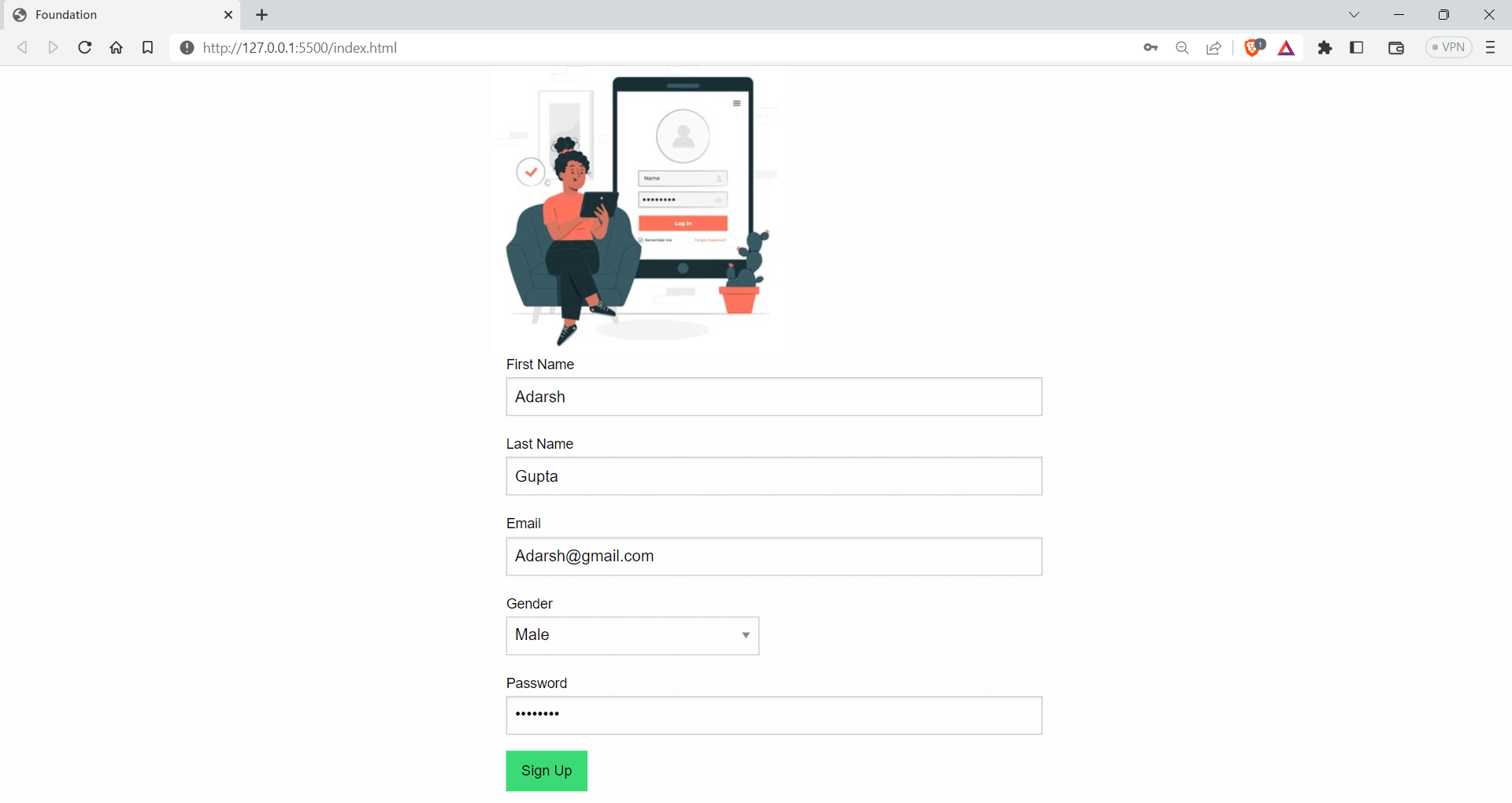
Foundation
Foundation is one of the most advanced UI frameworks, intending to create responsive websites and apps that look amazing on all devices. Foundation includes features like a flexible grid system, ready-made UI elements like buttons and forms, and templates to make it easy to create a cohesive look and feel for your site.

Foundation also has optional features that use JavaScript and extend the functionalities if you want to add more advanced features. A large community of developers are using the project, and it has around 29.6k Star and 5.5k Fork on GitHub. According to npm trends, it garners around 849 weekly downloads.

Let’s look at an example of how to use Foundation to create a login screen.
<!DOCTYPE html>
<html lang="en">
  <head>
    <meta charset="UTF-8" />
    <meta http-equiv="X-UA-Compatible" content="IE=edge" />
    <meta name="viewport" content="width=device-width, initial-scale=1.0" />
    <title>Foundation</title>
    <!-- foundation CDN -->
    <link
      rel="stylesheet"
      href="https://cdnjs.cloudflare.com/ajax/libs/foundation/6.6.3/css/foundation.min.css"
    />
  </head>
  <body>
    <div class="grid-container shadow border-1">
      <div class="grid-x grid-padding-x">
        <div class="medium-6 medium-offset-3 cell">
          <img
            src="https://img.freepik.com/free-vector/tablet-login-concept-illustration_114360-7863.jpg?w=300"
            alt="My Image"
          />
          <form>
            <div class="grid-container">
              <div class="grid-x grid-padding-x">
                <div class="medium-12 cell">
                  <label
                    >First Name
                    <input type="text" placeholder="John" />
                  </label>
                </div>
                <div class="medium-12 cell">
                  <label
                    >Last Name
                    <input type="text" placeholder="Doe" />
                  </label>
                </div>
                <div class="medium-12 cell">
                  <label
                    >Email
                    <input type="email" placeholder="johndoe@example.com" />
                  </label>
                </div>
                <div class="medium-6 cell">
                  <label
                    >Gender
                    <select>
                      <option value="">Select gender</option>
                      <option value="male">Male</option>
                      <option value="female">Female</option>
                      <option value="non-binary">Non-binary</option>
                      <option value="other">Other</option>
                    </select>
                  </label>
                </div>
                <div class="medium-12 cell">
                  <label
                    >Password
                    <input type="password" placeholder="Password" />
                  </label>
                </div>


                <div class="medium-12 cell">
                  <input class="button success" type="submit" value="Sign Up" />
                </div>
              </div>
            </div>
          </form>
        </div>
      </div>
    </div>
  </body>
</html>
Advantages of Foundation
- Mobile first design: Foundation uses a mobile-first approach, which makes Foundation responsive as we start building for small devices and scale them for higher dimensions.
- Customizable: Foundation provides a high level of customization, allowing developers to modify easily and overrides styles to meet their requirements.
Shortcomings of Foundation
- Overreliance on JavaScript: Foundation relies heavily on JavaScript to achieve certain styles and effects, which can lead to slower page load times.
- Compatibility limitations: As Foundation is written mobile-first, browsers that don’t support CSS media queries will display the mobile styles of the site.
UnoCSS
UnoCSS is an Atomic CSS engine that draws inspiration from popular frameworks like Windi CSS, Tailwind CSS, and Twind. Unlike traditional CSS frameworks, UnoCSS is not a predesigned set of styles and components but rather an engine that can be used to create custom frameworks tailored to specific needs.

UnoCSS offers a superset of the popular utility-first CSS frameworks and provides developers with a wide range of flexible and customizable options for creating responsive designs.
One of the key benefits of UnoCSS is its flexibility – it has no core utilities, and its functionalities are made available through several presets, making it easy to customize and extend as needed. As of now, UnoCSS has 15.1k Star and 742 Fork on GitHub.
As per npm trends, UnoCSS has weekly downloads of around 193k.

Let’s look at an example of how to use UnoCSS, along with Tailwind CSS.
<!DOCTYPE html>
<html lang="en">
  <head>
    <meta charset="UTF-8" />
    <title>UnoCSS Image Gallery Example</title>
    <link rel="stylesheet" href="https://unocss.com/unocss.min.css" />
    <script src="https://cdn.jsdelivr.net/npm/@unocss/runtime"></script>
    <link
      rel="stylesheet"
      href="https://cdn.jsdelivr.net/npm/@unocss/reset/normalize.min.css"
    />
    <!-- or -->
    <link
      rel="stylesheet"
      href="https://cdn.jsdelivr.net/npm/@unocss/reset/tailwind.min.css"
    />
  </head>
  <body class="bg-gray-700 p-6 w-11/12 m-auto">
    <div class="flex flex-wrap flex-row gap-8 justify-center items-center">
      <div
        class="relative overflow-hidden rounded-lg shadow-xl shadow-blue-300 w-full md:w-1/3"
      >
        <img
          src="https://www.lambdatest.com/resources/images/automation_testing_with_all_frameworks.png"
          alt="Image 1"
          class="w-full h-auto object-cover"
        />
        <div
          class="absolute inset-0 bg-gray-800 opacity-0 hover:opacity-80 transition duration-300"
        >
          <a
            href="#"
            class="absolute inset-0 flex items-center justify-center text-white font-bold text-2xl hover:text-gray-100"
            >View</a
          >
        </div>
      </div>
      <div
        class="relative overflow-hidden rounded-lg shadow-xl w-full md:w-1/3 shadow-pink-300"
      >
        <img
          src="https://www.lambdatest.com/resources/images/Seamlessly.svg"
          alt="Image 2"
          class="w-full h-auto"
        />
        <div
          class="absolute inset-0 bg-gray-800 opacity-0 hover:opacity-80 transition duration-300"
        >
          <a
            href="#"
            class="absolute inset-0 flex items-center justify-center text-white font-bold text-2xl hover:text-gray-100"
            >View</a
          >
        </div>
      </div>
      <div
        class="relative overflow-hidden rounded-lg shadow-xl shadow-green-300 w-full md:w-1/3"
      >
        <img
          src="https://www.lambdatest.com/resources/images/lambdatest-compliance.png"
          alt="Image 3"
          class="w-full h-auto"
        />
        <div
          class="absolute inset-0 bg-gray-800 opacity-0 hover:opacity-80 transition duration-300"
        >
          <a
            href="#"
            class="absolute inset-0 flex items-center justify-center text-white font-bold text-2xl hover:text-gray-100"
            >View</a
          >
        </div>
      </div>
    </div>
  </body>
</html>
Output:

Advantages of UnoCSS
- Integration with other tools: UnoCSS can be integrated with other tools like Webpack, PostCSS, Vite
- Lightweight: UnoCSS is a lightweight atomic engine, with bundle size of only 6KB
Shortcomings of UnoCSS
- Lack of pre-built components: Unlike some other CSS frameworks, UnoCSS does not come with readymade components, which means you need to create them from scratch or use third-party libraries.
- Learning curve: UnoCSS uses a different approach to styling than traditional CSS frameworks, this might make it hard for beginners.
Milligram
Milligram is a microframework that offers a concise and easy-to-use set of classes for styling your elements. Unlike other frameworks that can be overwhelming with endless options, Milligram provides a minimalistic approach to web development.

Milligram has classes that are picked out to help you start styling your website. These classes have their own style choices, but sometimes you might have to change them a bit to fit your website better. Even though this could mean extra work, it lets you make a design special to your project.
Milligram has around 10.1k Star and 756 Fork on GitHub, and it has around 3k weekly downloads, according to npmtrends.com.

Let’s see an example of using Milligram to create a simple landing page.
<!-- create a landing page with CTA for a testing wensite using milligram -->


<!DOCTYPE html>
<html lang="en">
  <head>
    <meta charset="UTF-8" />
    <title>Testing Website</title>
    <!-- use cdn for milligram-->
    <!-- <link rel="stylesheet" href="css/milligram.min.css"> -->


    <!-- Google Fonts -->
    <link
      rel="stylesheet"
      href="https://fonts.googleapis.com/css?family=Roboto:300,300italic,700,700italic"
    />


    <!-- CSS Reset -->
    <link
      rel="stylesheet"
      href="https://cdnjs.cloudflare.com/ajax/libs/normalize/8.0.1/normalize.css"
    />


    <!-- Milligram CSS -->
    <link
      rel="stylesheet"
      href="https://cdnjs.cloudflare.com/ajax/libs/milligram/1.4.1/milligram.css"
    />
  </head>
  <body>
    <div class="container">
      <div class="row">
        <div class="column column-60 column-offset-20">
          <h1>Run Selenium Tests in Parallel</h1>
          <p>
            A reliable, scalable, secure, and high performing test execution
            cloud that empowers development and testing teams to accelerate
            their release cycles. Test in parallel and cut down test execution
            by more than 10x.
          </p>
          <blockquote>
            <p><em>Yeah!! You need to test your Apps.</em></p>
          </blockquote>
          <p>
            <a href="test.php" class="button">LambdaTest your Apps</a>
          </p>
          <button class="button button-outline">
            Start parallel testing for free
          </button>
        </div>
      </div>
    </div>
  </body>
</html>
Advantages of Milligram
- Lightweight: Milligram is a minimal framework and has a bundle of less than 2 KB when minified.
- Modular: Milligram is a modular framework, and each part is separated into its own CSS file. This can speed up development.
Shortcomings of Milligram
- Limited pre-built components: Milligram offers fewer pre-built components. This means that developers may need to write their own code or use external libraries to add certain features to their websites.
- Smaller community: Milligram has a smaller community than some other frameworks, which may result in fewer third-party plugins and resources available for developers to use.
Spectre.css
Spectre.css is a lightweight and responsive modern framework that offers a range of basic styles for CSS Typography and elements, as well as a flexible, responsive layout system based on Flexbox. It also provides pure CSS components and utilities, all designed with best-practice coding and a consistent design language.

Spectre.css can help developers create beautiful and functional websites so fast and easily, with a focus on simplicity. It has around 11.3k Star and 801 Fork on GitHub and around 5k weekly downloads. Spectre.css is supported by almost all the major versions of modern browsers like Chrome, Firefox, and Safari.

Let’s see an example of using Spectre.css.
<!-- create a landing page with CTA for a testing website using milligram -->


<!DOCTYPE html>
<html lang="en">
  <head>
    <meta charset="UTF-8" />
    <title>Testing Website</title>
    <link
      rel="stylesheet"
      href="https://unpkg.com/spectre.css/dist/spectre.min.css"
    />
    <link
      rel="stylesheet"
      href="https://unpkg.com/spectre.css/dist/spectre-exp.min.css"
    />
    <link
      rel="stylesheet"
      href="https://unpkg.com/spectre.css/dist/spectre-icons.min.css"
    />
  </head>
  <body>
    <div class="modal active" id="modal-id">
      <a href="#close" class="modal-overlay" aria-label="Close"></a>
      <div class="modal-container">
        <div class="modal-header">
          <a
            href="#close"
            class="btn btn-clear float-right"
            aria-label="Close"
          ></a>
          <div class="modal-title h5">
            AI-Powered End-to-End Test Orchestration Cloud
          </div>
        </div>
        <div class="modal-body">
          <div class="content">
            <p>
              HyperExecute platform comes with feature-packed hosted runners for
              every major OS including Windows, MacOS, and Linux containers. The
              runners come with pre-installed support for all major programming
              languages and frameworks including Java, Node.js, Python, PHP, GO,
              C#, Rust, and Ruby.
            </p>
          </div>
        </div>
        <div class="modal-footer">#LambdaTestYourApps</div>
      </div>
    </div>
  </body>
</html>
Output:

Advantages of Spectre.css
- Highly customizable: Spectre.css is a highly customizable CSS framework that comes with an extensive range of basic styles and plugins.
- Well documented: It is well documented and has readymade examples for almost all the available components.
Shortcomings of Spectre.css
- Specific design aesthetic: Spectre.css has a specific design aesthetic that may not be suitable for all applications or projects, which may limit its appeal to some developers.
- Browser support: It is mainly designed for modern browsers, and older versions are not compatible.
Basscss
Basscss is a lightweight and modular CSS library that provides a set of simple and reusable CSS classes for styling HTML elements. It follows a functional CSS approach, which means that each class is designed to perform a specific task, such as setting margins or font sizes.

One of the advantages of using Basscss is its small size. It only takes up very little bundle size, only 2.2 KB in total. Basscss doesn’t come with readymade UI elements, which is great if you want to create a consistent user interface without having to remove existing styles.
Basscss has around 8k weekly downloads, according to npm trends. It also has 5.8k Star and 318 Fork on GitHub.

Let’s see an example of using Basscss.
<!DOCTYPE html>
<html lang="en">
  <head>
    <meta charset="UTF-8" />
    <title>Testing Website</title>
    <link
      href="https://unpkg.com/[email protected]/css/basscss.min.css"
      rel="stylesheet"
    />
  </head>
  <body>
    <!-- p with some contents about testing -->
    <p class="h1">TypoGraphy Example</h1>


    <p class="h1">Types of Testing</p>
    <p class="h2">Visual Regression Testing</p>
    <p class="h3">Functional Testing</p>
    <p class="h4">Integration Testing</p>
    <p class="h5">End to End Testing</p>
    <p class="h6">Unit Testing</p>
  </body>
</html>
Output:

Advantages of Basscss
- Composable: Basscss allows for reusable, interoperable styles that can be mixed and matched in any number of combinations, laying the foundation for any stylesheet.
- Flexibility: Basscss offers a good balance between being consistent and flexible, which makes it easier to create designs quickly and make changes easily in the browser.
Shortcomings of Basscss
- Not suited for large projects: The minimalist approach of Bass CSS may limit its usefulness for more complex projects.
- Not widely used: Basscss may not be as popular as some of its competitors, which could make resources and community support harder to find.
Fomantic UI
Fomantic UI is an open-source project created as the official community fork of Semantic UI. Fomantic UI is designed to be user-friendly and customizable, with a focus on using Semantic HTML.

The Fomantic UI team has made sure that the class names are easy to understand, which makes it a great choice for developers of all skill levels. It is an actively maintained project. It has around 3.5k Star and 325 Fork on GitHub.
Fomantic UI has around 14k weekly downloads, according to npm trends.

Let’s see an example of using Fomantic UI.
<!DOCTYPE html>
<html lang="en">
  <head>
    <meta charset="UTF-8" />
    <meta http-equiv="X-UA-Compatible" content="IE=edge" />
    <meta name="viewport" content="width=device-width, initial-scale=1.0" />
    <title>Document</title>
    <!-- cdn jqeury -->
    <script src="https://ajax.googleapis.com/ajax/libs/jquery/3.5.1/jquery.min.js"></script>
    <!-- You MUST include jQuery 3+ before Fomantic -->
    <script src="https://cdnjs.cloudflare.com/ajax/libs/jquery/3.6.3/jquery.min.js"></script>
    <link
      rel="stylesheet"
      type="text/css"
      href="https://cdnjs.cloudflare.com/ajax/libs/fomantic-ui/2.9.2/semantic.min.css"
    />
    <script src="https://cdnjs.cloudflare.com/ajax/libs/fomantic-ui/2.9.2/semantic.min.js"></script>
  </head>
  <body>
    <div class="ui attached stackable menu">
      <div class="ui container">
        <a class="item"> <i class="home icon"></i> Platform </a>
        <a class="item"> <i class="grid layout icon"></i> Enterprise </a>
        <a class="item"> <i class="mail icon"></i> Resources </a>
        <div class="ui simple dropdown item">
          Developers
          <i class="dropdown icon"></i>
          <div class="menu">
            <a class="item"><i class="edit icon"></i> Blog</a>
            <a class="item"><i class="globe icon"></i> Documentation</a>
            <a class="item"><i class="settings icon"></i> API</a>
          </div>
        </div>
        <div class="right item">
          <div class="ui input">
            <input type="text" placeholder="Search..." />
          </div>
        </div>
      </div>
    </div>
  </body>
</html>
Output:

Advantages of Fomantic UI
- Mobile-first approach: Fomantic uses a mobile-first approach, prioritizing mobile devices to ensure the best possible performance across all platforms.
- High level of theming: Fomantic provides an intuitive inheritance system and high-level theming variables that offer complete design freedom.
Shortcomings of Fomantic UI
- Less community support: Due to the growing community, it does not have as many resources, support, or plugins available for developers.
- Not widely used: The library may not be as popular as some of its competitors, which could result in fewer resources and community support.
Blaze UI
Blaze UI is an open-source CSS UI toolkit that provides a great structure for quickly creating web applications. It provides a set of components such as buttons, forms, tables, etc., and more utility helpers that you can easily integrate into your projects.
Besides, Blaze UI provides the components and styles required to create sleek and responsive web interfaces. By avoiding unnecessary elements, Blaze UI allows you to focus on what matters most: creating engaging visual elements.

Blaze UI has around 1.5k Star and 116 Fork on GitHub, and according to npm trends, it has around 761 weekly downloads.

Let’s see an example of using Blaze UI in a project.
<!DOCTYPE html>
<html lang="en">
  <head>
    <meta charset="UTF-8" />
    <meta http-equiv="X-UA-Compatible" content="IE=edge" />
    <meta name="viewport" content="width=device-width, initial-scale=1.0" />
    <title>Blaze UI</title>
    <link
      rel="stylesheet"
      href="https://unpkg.com/@blaze/[email protected]/dist/blaze/blaze.css"
    />
    <!-- poppins -->
    <link
      rel="stylesheet"
      href="https://fonts.googleapis.com/css?family=Poppins:300,400,500,600,700&display=swap"
    />
    <style>
      * {
        font-family: "Poppins", sans-serif;
      }
    </style>
  </head>
  <body>
    <form class="o-container o-container--xsmall c-card u-high">
      <header class="c-card__header">
        <h2 class="c-heading">
          Login
          <div class="c-heading__sub">Existing users</div>
        </h2>
      </header>
      <div class="c-card__body">
        <div class="o-form-element">
          <label class="c-label">
            Email:
            <input
              class="c-field c-field--label"
              type="email"
              placeholder="your@email.com"
            />
            <div role="tooltip" class="c-hint">
              The email used to register the account
            </div>
          </label>
        </div>
        <label class="o-form-element c-label">
          Password:
          <input class="c-field c-field--label" type="password" />
        </label>
        <div class="o-form-element">
          <label class="c-toggle c-toggle--success">
            Remember me?
            <input type="checkbox" checked />
            <div class="c-toggle__track">
              <div class="c-toggle__handle"></div>
            </div>
          </label>
        </div>
      </div>
      <footer class="c-card__footer">
        <button type="button" class="c-button c-button--brand c-button--block">
          Login
        </button>
      </footer>
    </form>
  </body>
</html>
Output:

Advantages of Blaze UI
- Framework-free: Blaze UI allows you to use any framework you want or no framework at all, giving you the flexibility to choose what works best for your project.
- Custom builds: With just three easy steps, you can have a custom build of Blaze UI using easy-to-use variables and mixins, making it easy to customize the framework to your needs.
Shortcomings of Blaze UI
- Limited community support: Smaller community than other popular UI frameworks.
- Fewer resources: Since Blaze UI is comparatively less used, it has limited resources compared to more established frameworks.
Material Design Lite
Material Design Lite (MDL) is a front-end development framework created by Google that implements the Material Design language in web applications. It’s a lightweight version of the Material Design components for the web. It provides a set of reusable UI elements and styles that developers can use to create consistent and beautiful web interfaces.

Material Design Lite components are a powerful combination of CSS, JavaScript, and HTML that enable you to create stunning web pages and applications that are visually appealing and highly functional.
Material Design Lite has around 55k weekly downloads and has 32.3k Star and 5.1k Fork on GitHub.

Let’s see an example of using Material Design Lite.
<!DOCTYPE >
<html lang="en">
<head>
<meta charset="UTF-8" />
<meta http-equiv="X-UA-Compatible" content="IE=edge" />
<meta name="viewport" content="width=device-width, initial-scale=1.0" />
<title>MD Lite</title>
<link
rel="stylesheet"
href="https://fonts.googleapis.com/icon?family=Material+Icons"
/>
<link
rel="stylesheet"
href="https://code.getmdl.io/1.3.0/material.indigo-pink.min.css"
/>
<script defer src="https://code.getmdl.io/1.3.0/material.min.js"></script>
</head>
<body>
<button id="show-dialog" type="button" class="mdl-button">
Open Dialog
</button>
<dialog class="mdl-dialog">
<h4 class="mdl-dialog__title">Allow Cookies?</h4>
<div class="mdl-dialog__content">
<p>Accepting Cookies will allow us to improve your user experience.</p>
</div>
<div class="mdl-dialog__actions">
<button type="button" class="mdl-button">Yes</button>
<button type="button" class="mdl-button close">No</button>
<button class="mdl-button --colored">Skip</button>
</div>
</dialog>
<script>
var dialog = document.querySelector("dialog");
var showDialogButton = document.querySelector("#show-dialog");
if (!dialog.showModal) {
dialogPolyfill.registerDialog(dialog);
}
showDialogButton.addEventListener("click", function () {
dialog.showModal();
});
dialog.querySelector(".close").addEventListener("click", function () {
dialog.close();
});
</script>
</body>
</html>
Output:

Advantages of Material Design Lite
- User-friendly: Material Design Lite provides a simple and clean looking interface with a variety of components that are easy to use. As it implements Material Design, it gives the aesthetic of it.
- Lightweight: It is lightweight, which makes it faster to load and easier to work with.
Shortcomings of Material Design Lite
- No active development: Material Design Lite is no longer under active development, which means it may not receive updates to keep up with the latest web technologies and security patches.
- Limited customization: Material Design Lite has a predefined visual style that may not be suitable for all projects or applications. You might need some additional CSS to match your design system.
Chota
Chota is a micro CSS framework, and it doesn’t come with all the fancy class names like Tailwind. It only provides a few class names and applies basic styles that follow the HTML semantics and markup.

The framework is so small that the entire library is just 3 KB in bundle size. It has around 1.3k Star and 97 Fork on GitHub and around 1.4k weekly downloads, according to npmtrends.com.

Here is an example project using Chota CSS.
<!DOCTYPE html>
<html lang="en">
<head>
<meta charset="UTF-8" />
<meta http-equiv="X-UA-Compatible" content="IE=edge" />
<meta name="viewport" content="width=device-width, initial-scale=1.0" />
<title>Chota</title>
<link rel="stylesheet" href="https://unpkg.com/chota@latest" />
</head>
<style>
a {
margin: 15px;
}
</style>
<body>
<a class="button">Default</a>
<a class="button primary">Primary</a>
<a class="button secondary">Secondary</a>
<a class="button dark">Dark</a>
<a class="button error">Error</a>
<a class="button success">Success</a>
<a class="button outline">Outline</a>
<a class="button outline primary">Primary outline</a>
<a class="button outline secondary">Secondary outline</a>
<a class="button outline dark">Dark outline</a>
<a class="button clear">Clear</a>
<button type="button" class="button primary icon">
New file
<img
src="https://icongr.am/feather/file.svg?size=16&color=ffffff"
alt="icon"
/>
</button>
<button class="button icon-only">
<img src="https://icongr.am/feather/search.svg?size=24" />
</button>
</body>
</html>
Output:

Advantages of Chota
- Lightweight: Chota is a small CSS framework, weighing in at only 3KB in size, making it quick to download and easy to use.
- Easy to learn: It has a simple syntax that makes it easy to learn and use, even for beginners.
Shortcomings of Chota
- Not suited for large projects: Chota is for small websites with two or three pages. It cannot be used on large scale projects due to its minimalism.
- Small community: Chota has a relatively small community compared to some of the more popular CSS frameworks, which means there may be limited resources available for troubleshooting and support
Halfmoon
Halfmoon is an excellent front-end framework that makes it easy to build beautiful and flexible user interfaces. It’s based on CSS and comes with a library of pre-designed elements and layouts to help you create consistent and adaptable designs for your website or application.
Halfmoon provides a wide range of elements, from basic ones like buttons, images, and links to advanced elements such as alerts, modals, dropdowns, and more. It has built-in dark mode features.
Halfmoon has around 3k Star and 110 Fork on GitHub and 553 weekly downloads, according to npmtrends.com.

Here is an example of using Halfmoon.
<!DOCTYPE html>
<html lang="en">
  <head>
    <!-- Meta tags -->
    <meta charset="utf-8" />
    <meta http-equiv="X-UA-Compatible" content="IE=edge,chrome=1" />
    <meta
      content="width=device-width, initial-scale=1.0, maximum-scale=1.0, user-scalable=0"
      name="viewport"
    />
    <meta name="viewport" content="width=device-width" />


    <!-- Favicon and title -->
    <link rel="icon" href="path/to/fav.png" />
    <title>Static Webpage | Halfmoon</title>


    <!-- Halfmoon CSS -->
    <link href="css/halfmoon-variables.min.css" rel="stylesheet" />
  </head>
  <body
    class="with-custom-webkit-scrollbars with-custom-css-scrollbars"
    style="margin: 75px"
    data-dm-shortcut-enabled="true"
    data-sidebar-shortcut-enabled="true"
    data-set-preferred-theme-onload="true"
  >
    <div id="home" class="card w-400 mw-full m-0 position-relative">
      <div class="position-absolute top-0 right-0 z-10 p-10">
        <button
          class="btn btn-square"
          type="button"
          onclick="{halfmoon.toggleDarkMode()}"
        >
          <i class="fa fa-moon-o" aria-hidden="true">🌙</i>
          <span class="sr-only">Toggle dark mode</span>
        </button>
      </div>


      <h2 class="card-title">Please fill up this form</h2>
      <form action="..." method="...">
        <div class="form-group">
          <label for="full-name" class="required"> Name </label>
          <input
            type="text"
            id="full-name"
            class="form-control"
            placeholder="Your full name"
            required="required"
          />
        </div>
        <div class="form-group">
          <label for="email" class="required"> Email </label>
          <input
            type="email"
            id="email"
            class="form-control"
            placeholder="Your email"
            required="required"
          />
        </div>
        <div class="form-group">
          <label for="password" class="required"> Password </label>
          <input
            type="password"
            id="password"
            class="form-control"
            placeholder="Your password"
            required="required"
          />
        </div>
        <div class="form-group">
          <label for="profession" class="required"> Profession </label>
          <input
            type="text"
            id="profession"
            class="form-control"
            placeholder="Your profession"
            required="required"
          />
        </div>
        <input class="btn btn-primary btn-block" type="submit" value="Submit" />
        <div class="text-right mt-10">
          <a href="#home">Need help?</a>
        </div>
      </form>
    </div>
    <script src="js/halfmoon.min.js"></script>
  </body>
</html>

Advantages of Halfmoon
- Highly customizable: Halfmoon provides a highly standardized look and feel to components, ensuring a consistent and professional design.
- Customizability:Halfmoon is highly customizable as it uses CSS variables, allowing for easy modification and adaptation of the design to specific needs.
Shortcomings of Halfmoon
- Less Known: As Halfmoon is a relatively less known framework, its community and available resources are smaller compared to more popular alternatives.
- Dependency on CSS Variables: While CSS variables provide flexibility, they may not be fully supported by older browsers, which can limit the compatibility of Halfmoon with certain user environments.
Note: Test your Halfmoon-based websites on real devices. Try TestMu AI Now!
MVP.css
MVP.css is a minimalist classless CSS stylesheet for HTML elements, providing simple and reusable components with a clean-looking design. It automatically styles your basic HTML components, saving you the trouble of using a separate CSS framework with its naming conventions. MVP.css is ideal for products or businesses that want to launch as fast as possible.

MVP.css has around 4.8k Star and 182 Fork on GitHub. According to npm trends, it has around 1.6k weekly downloads.

Let’s see an example of using the MVP.css framework.
<!-- MVP.css quickstart template: https://github.com/andybrewer/mvp/ -->
<!DOCTYPE html>
<html lang="en">
<head>
<link rel="icon" href="https://via.placeholder.com/70x70">
<link rel="stylesheet" href="https://unpkg.com/[email protected]/mvp.css"> </head>
<meta charset="utf-8">
<meta name="description" content="My description">
<meta name="viewport" content="width=device-width, initial-scale=1.0">
<title> LambdaTest</title>
</head>
<body>
<header>
<nav>
<ul>
<li>Home</li>
<li><a href="#">Pricing</a></li>
<li><a href="#">Developers</a>
<ul>
<li><a href="#">Documentation</a></li>
<li><a href="#">API Reference</a></li>
<li><a href="#">Support</a></li>
</ul>
</li>
</ul>
</nav>
<h1>Test your <i>Apps</i> with <u>#LambdaTest</u></h1>
<p>Let's <mark>#LambdaTestYourApps</mark></p>
<br>
<p><a href="#"><i>Test Now</i></a><a href="#"><b>See Features →</b></a></p>
</header>
<blockquote>No More Bugg-ing</blockquote>
<footer>
<hr>
<p>
<small>Contact info</small>
</p>
</footer>
</body>
</html>
Output:

Advantages of MVP.css
- Mobile friendly: MVP.css is designed with a default styling compatible with all browsers and devices, making it perfect for quick prototyping.
- Lightweight: The library is very small, which means it loads quickly and doesn’t slow down page performance.
Shortcomings of MVP.css
- Not suited for big projects: MVP.css is small and simple and can only be used for products/businesses that need a quick website.
- Lack of community support: Compared to other popular CSS libraries, MVP.css has a smaller user community and fewer resources available for troubleshooting and support.
Picnic CSS
Picnic CSS is a lightweight CSS library with a bundle size of around 7.2 KB. It offers a collection of basic UI elements like buttons, forms, tables, and typography styles. It also includes some responsive layout options and utility classes for CSS Spacing, CSS Colors, and text alignment.

Picnic CSS has around 3.8k Star and 225 Fork on GitHub. It also has around 582 weekly downloads, according to npm trends.

Let’s take an example of Picnic CSS.
<!-- MVP.css quickstart template: https://github.com/andybrewer/mvp/ -->


<!DOCTYPE html>
<html lang="en">
  <head>
    <link rel="icon" href="https://via.placeholder.com/70x70" />
    <link rel="stylesheet" href="https://cdn.jsdelivr.net/npm/picnic" />


    <meta charset="utf-8" />
    <meta name="description" content="My description" />
    <meta name="viewport" content="width=device-width, initial-scale=1.0" />


    <title>LT</title>
  </head>


  <body>
    <div class="tabs three">
      <input id="tab-1" type="radio" name="tabgroupB" checked />
      <label class="pseudo button toggle" for="tab-1"
        >Online Selenium Test</label
      >
      <input id="tab-2" type="radio" name="tabgroupB" />
      <label class="pseudo button toggle" for="tab-2">Real Device Cloude</label>
      <input id="tab-3" type="radio" name="tabgroupB" />
      <label class="pseudo button toggle" for="tab-3"
        >Cross Browser Testing</label
      >
      <div class="row">
        <div>
          <img
            src="https://www.lambdatest.com/resources/images/selenium-parallel-testing-index.png"
          />
        </div>


        <div>
          <img
            src="https://www.lambdatest.com/resources/images/mobile-app-testing.png"
          />
        </div>


        <div>
          <img
            src="https://www.lambdatest.com/resources/images/real-time-browsers-index.png"
          />
        </div>
      </div>
    </div>
  </body>
</html>

Output:

Advantages of Picnic CSS
- Lightweight: Easy to use, making it ideal for small and large projects.
- Easy to use: Picnic CSS has a simple and easy-to-use syntax, making it accessible for developers of all skill levels.
Shortcomings of Picnic CSS
- Less known: Picnic CSS is not popular as some other CSS frameworks, which could make it less appealing to some developers.
- Limited community support: Due to fewer updates and less usage, its community support is very low compared to other frameworks.
Skeleton
Skeleton is a lightweight framework that provides a basic set of CSS components to speed up website development.

Skeleton provides a set of styles and UI elements for building websites and web applications, like basic UI elements like buttons, forms, tables, and typography styles, as well as some grid and layout options.
One of the key features of Skeleton is its lightweight and fast-loading design. The entire library is only 400 lines of code, which means it can be quickly downloaded and used in projects without adding significant bloat to the page. Skeleton CSS has around 19k Star and 3.1 Fork on GitHub. The project is not actively maintained as the last release was in 2014.
It has downloads of 1.7k – npm trends.

Let’s take an example of the Skeleton CSS framework.
<!DOCTYPE html>
<html lang="en">
  <head>
    <link
      rel="stylesheet"
      href="https://cdnjs.cloudflare.com/ajax/libs/skeleton/2.0.4/skeleton.min.css"
    />


    <meta charset="utf-8" />
    <meta name="description" content="My description" />
    <meta name="viewport" content="width=device-width, initial-scale=1.0" />


    <title>LT</title>
  </head>


  <body>
    <h2>LambdaTest Test Results</h2>
    <table class="u-full-width">
      <thead>
        <tr>
          <th>Test Case ID</th>
          <th>Test Case Description</th>
          <th>Result</th>
          <th>Execution Time</th>
        </tr>
      </thead>
      <tbody>
        <tr>
          <td>TC001</td>
          <td>Login with valid credentials</td>
          <td>PASS</td>
          <td>4 seconds</td>
        </tr>
        <tr>
          <td>TC002</td>
          <td>Login with invalid credentials</td>
          <td>FAIL</td>
          <td>2 seconds</td>
        </tr>
        <tr>
          <td>TC003</td>
          <td>Submit a form with incomplete data</td>
          <td>FAIL</td>
          <td>3 seconds</td>
        </tr>
        <tr>
          <td>TC004</td>
          <td>Verify error messages for invalid inputs</td>
          <td>PASS</td>
          <td>5 seconds</td>
        </tr>
      </tbody>
    </table>
  </body>
</html>
Output:

Advantages of Skeleton
- Simple: Skeleton is a simple and minimalistic library, that can speed up your development process
- Responsive design: With Skeleton, you can easily create adaptive and flexible layouts that work seamlessly on all devices, thanks to its responsive grid system.
Shortcomings of Skeleton
- Limited styling: Skeleton provides a basic set of styles suitable for building simple websites.
- Less known: Skeleton is a less-known library among developer communities.
Primer
Primer is an open-source CSS design system developed by none other than GitHub. It provides a set of customizable, reusable UI components and utilities for building modern, responsive web interfaces.

Primer CSS is designed to make it easy for developers to keep a consistent look and feel across their websites. It ensures that all of the styles used on the website are the same, giving visitors a cohesive and enjoyable browsing experience. Primer can save time and effort by not having to create custom styles for each component on the website.
GitHub does not actively maintain it, but a community of developers is working on it. The latest version is v21.0.3. It has 12.4k Star and 1.2k Fork on GitHub, and around 56k people are using the project, as per npm trends.

Let’s take an example of the Primer CSS framework.
<!DOCTYPE html>
<html lang="en">
  <head>
    <link href="https://unpkg.com/@primer/css@^20.2.4/dist/primer.css" rel="stylesheet" />


    <meta charset="utf-8" />
    <meta name="description" content="My description" />
    <meta name="viewport" content="width=device-width, initial-scale=1.0" />


    <title>LT</title>
  </head>


  <body>
    <div class="p-1">
      <div class="Toast">
        <span class="Toast-icon">
          <!-- <%= octicon "info" %>-->
          <svg width="14" height="16" viewBox="0 0 14 16" class="octicon octicon-info" aria-hidden="true">
            <path
              fill-rule="evenodd"
              d="M6.3 5.69a.942.942 0 0 1-.28-.7c0-.28.09-.52.28-.7.19-.18.42-.28.7-.28.28 0 .52.09.7.28.18.19.28.42.28.7 0 .28-.09.52-.28.7a1 1 0 0 1-.7.3c-.28 0-.52-.11-.7-.3zM8 7.99c-.02-.25-.11-.48-.31-.69-.2-.19-.42-.3-.69-.31H6c-.27.02-.48.13-.69.31-.2.2-.3.44-.31.69h1v3c.02.27.11.5.31.69.2.2.42.31.69.31h1c.27 0 .48-.11.69-.31.2-.19.3-.42.31-.69H8V7.98v.01zM7 2.3c-3.14 0-5.7 2.54-5.7 5.68 0 3.14 2.56 5.7 5.7 5.7s5.7-2.55 5.7-5.7c0-3.15-2.56-5.69-5.7-5.69v.01zM7 .98c3.86 0 7 3.14 7 7s-3.14 7-7 7-7-3.12-7-7 3.14-7 7-7z"
            />
          </svg>
        </span>
        <span class="Toast-content">You are over using your API limits</span>
      </div>
    </div>
</html>
Output:

Advantages of Primer
- Color scheme: Color variables and utilities provide thematic styling options, and text and background colors come in accessible combinations for inclusive interfaces.
- Well documented: Primer has comprehensive documentation that covers everything from getting started with the framework.
Shortcomings of Primer
- Learning curve: It may take some time to understand how to use all of the features and components in Primer.
- Limited customization: While Primer is highly customizable, it may not be as flexible as creating custom CSS from scratch
Sakura
Sakura is a CSS framework/theme that is lightweight and easy to use. Sakura comes with a basic set of CSS styles for styling HTML elements like text, forms, and buttons. It prioritizes simplicity, so it’s perfect for developers who want a clean, minimalist look for their websites.

One cool feature of Sakura is its support for theming using variables, which makes it incredibly easy to create a duotone color scheme for your website. By using variables, developers can easily customize the color palette of their website without having to rewrite any CSS code. Sakura has around 4k Star and 179 Fork on GitHub.
As per npm trends, it has downloads of approximately 1.6k.

Let’s take an example of the Sakura CSS framework.
<!DOCTYPE html>
<html lang="en">
  <head>
    <link
      rel="stylesheet"
      href="https://unpkg.com/sakura.css/css/sakura.css"
      type="text/css"
    />


    <meta charset="utf-8" />
    <meta name="description" content="My description" />
    <meta name="viewport" content="width=device-width, initial-scale=1.0" />


    <title>LT</title>
  </head>


  <body>
    <h1>LambdaTest</h1>
    <blockquote>
      LambdaTest is a cloud-based, cross browser testing tool that helps in both
      manual and browser compatibility testing. Users can perform live
      interactive testing of their website or web app on a combination of 3000+
      different browsers and operating systems right from their own browser.
    </blockquote>
    <blockquote>
      LambdaTest provides 3000+ real browsers and browser versions for
      compatibility testing. Users can also perform visual regression testing
      and take automated full page screenshots across all 3000+ environments to
      quickly find out UI bugs and fix them before they affect their users.
    </blockquote>
  </body>
</html>
Output:

Advantages of Sakura
- Consistent styling: By building on top of Normalize.css, Sakura CSS ensures consistent styling across different browsers and devices.
- Lightweight: Sakura is a small CSS framework, which means faster loading times for your web pages.
Shortcomings of Sakura
- Limited features: Sakura CSS is a minimalistic framework, which means that it may not have all the features you need for more complex web projects.
- Limited community support: Compared to larger CSS frameworks, Sakura CSS may have limited community support and resources available for troubleshooting and problem-solving.
How to Choose the Right CSS Framework?
Consider page load speed, cross-browser compatibility, responsiveness, accessibility, documentation, and alignment with your project goals.
We have gone through 24 CSS frameworks and libraries, and now you will have an idea of how these frameworks work, their use cases, and so on. Every year, new frameworks emerge, and some may not even exist, making it difficult to choose the right one.
As a web developer, the first thing you need to consider is page load speed. If it takes too long, you could lose potential customers. You must be aware of the packages you are using, their size, and so on.
In this section, we will look at some factors to keep in mind when choosing CSS frameworks.
Page load speed
In today’s world, users have a shorter attention span, and if your website takes a significant amount of time to load, it can have a negative impact on your business.
According to PORTENT, almost 70% of users reported that web page speed impacts their willingness to buy from an online retailer. A CSS framework with a large bundle size can slow down your website and lead to a poor user experience. You should do the necessary research before choosing any CSS framework.
Cross Browser Compatibility
While choosing a CSS framework, it is important to ensure it is compatible with most browsers. Some frameworks, like Spectre.css, are mainly focused on modern browsers and don’t have support for older versions. This can result in compatibility issues for users who have older browsers. Therefore, it’s recommended to choose a CSS framework compatible with a wide range of browsers, including older versions. To ensure your CSS framework works on different devices and web browsers, you can use a cloud-based testing platform like TestMu AI. It lets you check if your CSS framework or library is compatible with popular browsers and devices, all in one place.
TestMu AI is a digital experience testing platform that allows you to check your CSS framework-based projects across desktop and mobile environments for cross browser compatibility. It lets you perform manual and automated testing on an online browser farm of 3000+ real browsers, devices, and operating systems combinations.
Shown below is an example of TestMu AI’s Real Time Testing that checks browser compatibility of The Verge website built using Tailwind CSS.

Skim the below tutorial to learn more about TestMu AI’s Real Time Testing.
Subscribe to TestMu AI YouTube Channel and get detailed tutorials around Selenium automation testing, Cypress testing, Appium, and more.
Responsiveness
When choosing a CSS library for your next project, it’s crucial to select one that adopts responsive development approaches, such as mobile-first design, breakpoints, and responsive layouts. These techniques ensure that your website is optimized for all screen sizes and devices, providing a seamless user experience.
You can perform responsive testing of your websites and web apps on different devices with LT Browser 2.0, which allows you to select multiple devices simultaneously and run tests on your web applications.
Here is the Tailwind CSS example.

You can also check the performance score using LT Browser 2.0 along with various web vital results.

Accessibility
When choosing CSS frameworks for your front end, it’s essential to prioritize accessibility. With an accessible UI library, you can create an inclusive app that gives a unified approach to everyone.
To ensure that your app is fully accessible, you should look for libraries that offer accessibility testing features, such as keyboard navigation and screen reader support. These features can help users with special abilities to navigate and interact with your app more easily.
It’s also important to choose a library that follows accessibility standards, such as WCAG. This can help ensure that your app meets accessibility regulations and laws. Some libraries, like Semantic UI, may have accessibility issues that make it hard for people with special abilities to use UI components.
The TestMu AI platform allows you to perform accessibility testing of websites across numerous browsers with Screen Reader and Speech Viewer using NVDA (Non-Visual Desktop Access) on Windows and macOS.

With that being said, when choosing a CSS framework, it’s important to consider your needs. Ensure the framework is responsive and accessible and that it aligns with your design goals and development abilities. Look at the framework’s documentation and community support, and check if it works well with your development tools and workflow.
Wrapping up
CSS frameworks are an essential tool for front-end developers, offering a variety of benefits, including improved design consistency, faster development times, and responsive design. Whether you’re building a small personal website or an extensive enterprise application, there’s likely a CSS framework that can help simplify and streamline your development process.
There is a range of CSS frameworks available, each with its unique features, benefits, and drawbacks, so it’s essential to choose the one that best fits the specific needs of your project.
In this article, we have covered the best CSS frameworks for front-end developers. We also discussed the key factors to consider while selecting the best CSS frameworks, such as features, accessibility, responsiveness, documentation, and community support.
Frequently asked questions
Did you find this page helpful?
More Related Hubs
TestMu AI forEnterprise
Get access to solutions built on Enterprise
grade security, privacy, & compliance
- Advanced access controls
- Advanced data retention rules
- Advanced Local Testing
- Premium Support options
- Early access to beta features
- Private Slack Channel
- Unlimited Manual Accessibility DevTools Tests