
Power Your Software Testing with AI Agents and Cloud
The Native AI-Agentic Cloud Platform to Supercharge Quality Engineering. Test Intelligently and Ship Faster.


- TestMu AI (Formerly LambdaTest)
- /
- Blog
- /
- CSS3 Tutorial: Features, Modules and Examples
CSS3 Tutorial: Features, Modules and Examples
Ready to create beautiful web designs? Discover the power of CSS3 with our comprehensive tutorial. Master the latest dynamic and responsive effects features that will wow your users.
Last Updated on:
CSS3 arrived in 1999 as the direct successor to CSS1 and CSS2, and it applies to HTML and XML documents to control layout, positioning, sizing, spacing, typography, icons, and media without touching the markup itself. Its modules carry their own version numbers as they improve, such as selector level 3 and color model level 5, rather than one numbered release.
CSS3, the latest CSS, is best referred to as just CSS. CSS3 has taken a different approach than versioning CSS with numbers (sometimes called levels). CSS3 now has modules that consist of each of the segments that make up CSS. Each module comes with a version number called level upon improvement, e.g., selector level 3 and color model level 5 are CSS modules.
In this CSS3 tutorial, before we dive deep into individual sections, let’s begin our discussion with what’s new in CSS3. So let’s get started.
TL;DR
- CSS3 is split into independent modules such as Flexbox, Grid, and Media Queries rather than one specification.
- Modules version separately, so browsers can ship Grid support without waiting for the rest of CSS3.
- CSS applies three ways: inline on the element, internal in a style tag, or an external stylesheet.
- Specificity decides which rule wins, ranking inline styles above IDs, then classes, then element selectors.
- Flexbox arranges items along one axis, while Grid handles rows and columns together.
- Media queries apply styles conditionally on viewport width, making a layout responsive without JavaScript.
What Is New In CSS3?
CSS3 (Cascading Style Sheets) is a stylesheet language for style web pages (HTML documents) and how it displays on the web. Stylesheet in CSS contains CSS rules that cascade down depending on the specificity of the selectors used to describe the CSS rules.
CSS3 provides many new features that we can use to make our web pages look friendly and functional. Things include CSS Flexbox, CSS Positioning, CSS Grid System, The Box model, Media Queries, Specificity, Inheritance, Cascade, and others. Since CSS3 is in models, many features are regularly added to the specifications.
To set up an environment, you just need to follow these simple instructions below;
- Create a folder and name it a ‘code sample’
- Drag and drop it into your text editor and open it through VS Code.
- Go to the VS Code menu, click on the file, and select a new one.
- Create the new file’s name as index.html and press enter.
- Click on Create a file from the dialog box to save it in your code sample folder.
- Create another file and name it style.css. This is where all our CSS code will go to. And as a general rule, all CSS files are saved with a .css file extension.
Your file structure should look like this.
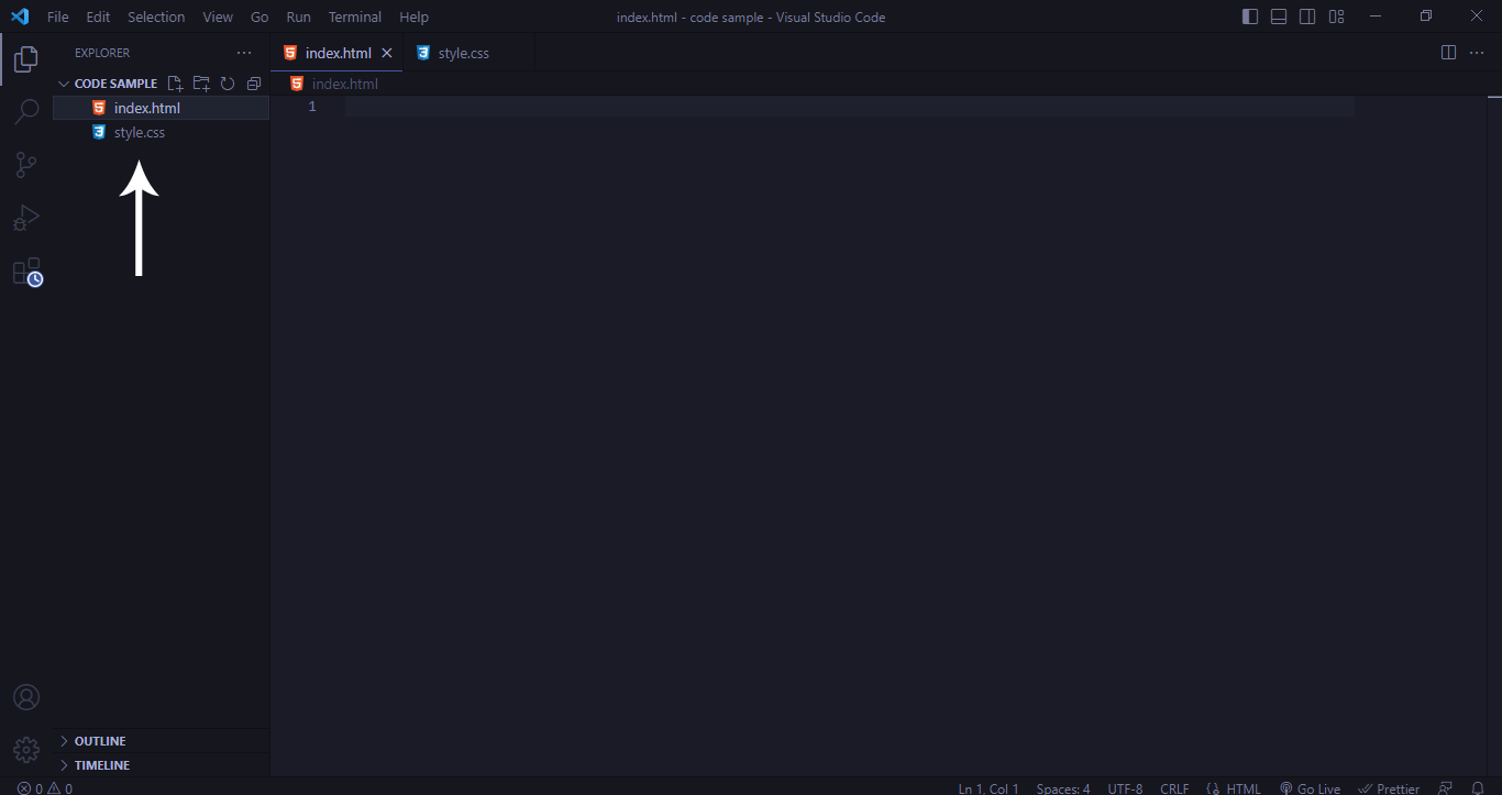
Now that we’ve set both the HTML and CSS file, let’s create some HTML tags and apply styling to them. Before starting HTML tags, note that CSS3 comes in three types.
Types of CSS3
The three kinds of CSS3 methods or ways we can use CSS to add styles to HTML tags. This is as follows; inline CSS, internal or embedded CSS, and external CSS.
Inline CSS
This is used when style rules are declared within the style attribute inside the HTML tag.
Syntax:
<p style="background-color: red;">This is an inline style</p>
Browser Output:
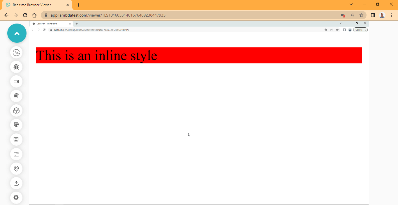
The above shown output of Inline CSS is rendered on the TestMu AI platform.
TestMu AI is a digital experience testing cloud that allows devs and QA to perform cross browser compatibility testing of websites and mobile applications across 3,000+ real browsers, devices, and OS combinations.
CodePen:
Advantages:
Both CSS and HTML code is in the same file, reducing the number of separate files you have to work with.
However, the inline CSS way of styling HTML tags is usually frowned upon and regarded as a bad practice among developers. This is due to the following reasons.
Disadvantages:
- HTML tags get clustered with style rules as the code grows.
- Debugging becomes difficult.
- When changes are made to a specific element, the same changes must be made to every other section or page where that particular tag appears. This makes development slow, especially when working with teams.
- Style rules can not be reused.
- Style rules are specific to each tag.
- CSS selectors can’t be used.
Internal or Embedded CSS
This is when style rules are declared within the < style > HTML tag. The < style > tag is usually placed or nested inside the < head > tag.
Syntax:
<!-- CSS BLOCK -->
    <style>
        p {
            background-color: red;
        }
    </style>
</head>

<body>
    <!-- HTML BLOCK -->
    <p>This is an internal style</p>
</body>
Browser Output:
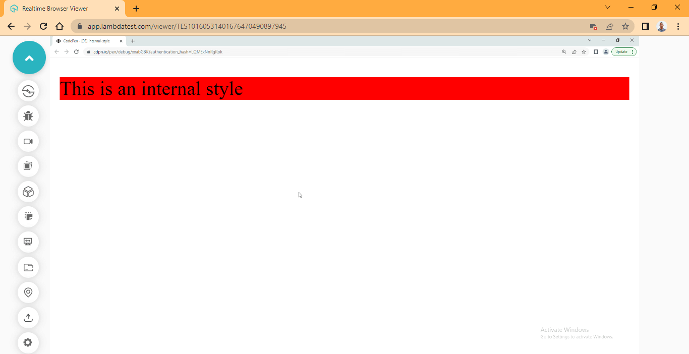
CodePen:
Advantages:
- Both CSS and HTML code is in the same file, reducing the number of separate files you have to work with.
- CSS selectors can be used.
The internal stylesheet is also not a common practice among developers. However, it can be helpful when all you need is a single-page application or website to display information.
When working on a large project, this method should not be used.
Disadvantages:
- HTML files become too busy when style rules and HTML tags are on the same file as the code grows larger.
- Debugging becomes difficult when working with multiple files.
- When changes are made to a specific style rule, the same changes must be made to every other file where that particular style rule exists. This makes development slow, especially when working with teams.
- Style rules can not be reused across multiple files.
External CSS
This is when style rules are declared in a separate file with a .css file extension. For this file to work with the HTML document, it has to be linked via the HTML < link > tag. The stylesheet file path is parsed into the href attribute as a value.
Consider the illustration below.

A simple HTML code below shows how to set up our HTML document with an external CSS stylesheet.
HTML:
<head>
    <link rel="stylesheet" href="style.css">
</head>

<body>
    <!-- HTML BLOCK -->
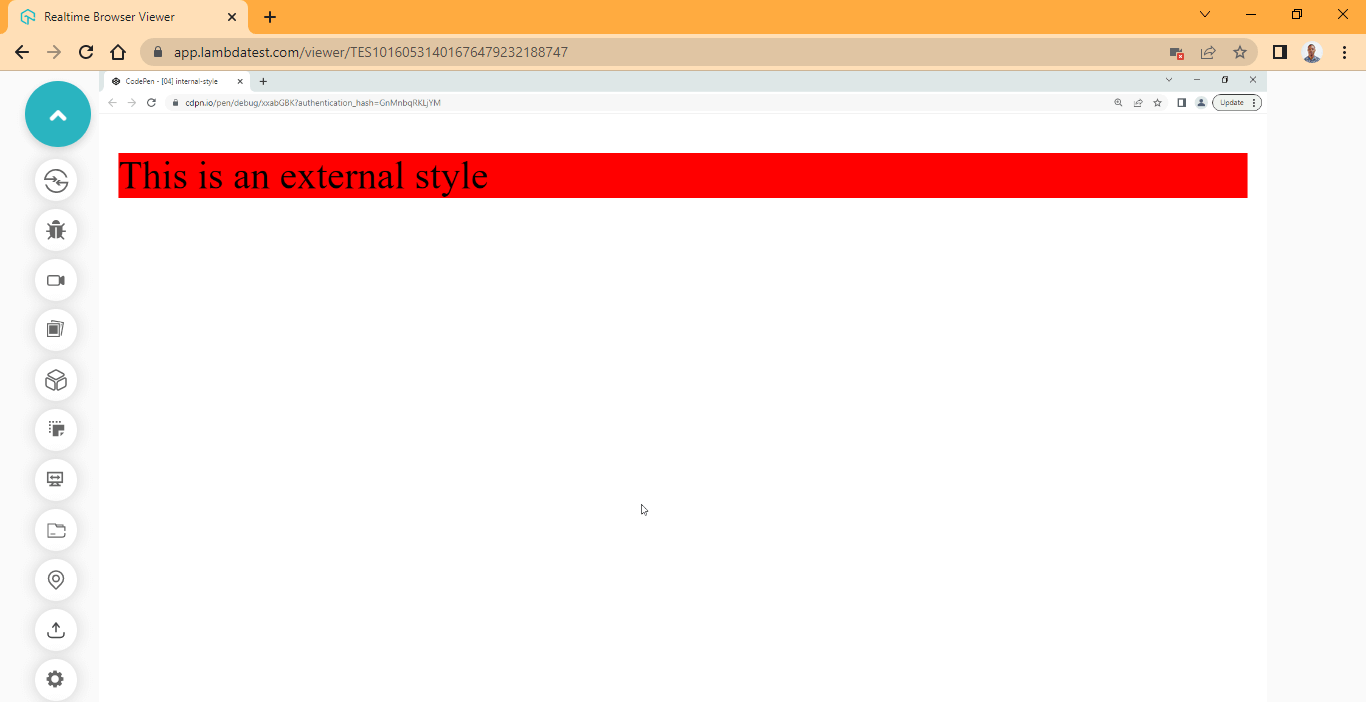
    <p>This is an External style</p>
</body>
From your VS Code text editor or any other editor you are using, click on the style.css file and type the CSS code below.
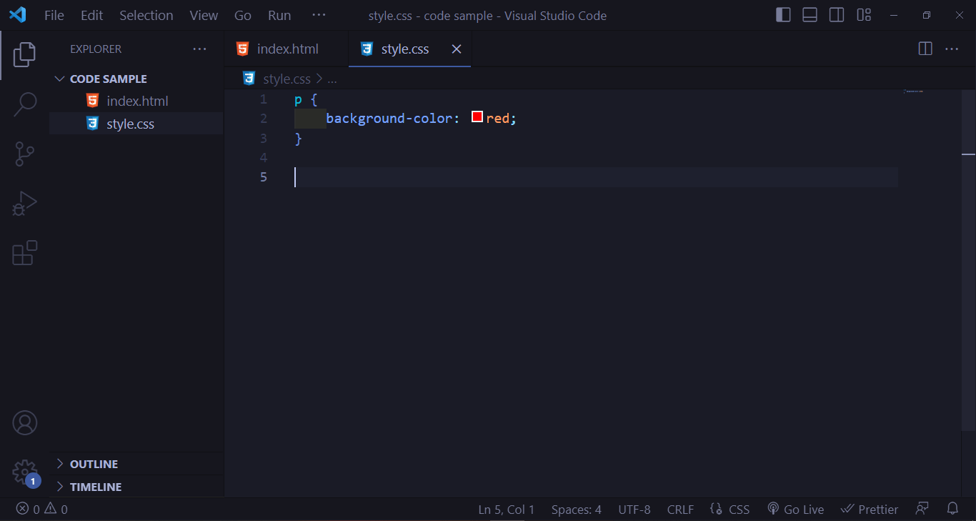
CSS:
p {
    background-color: red;
}
Browser Output:
CodePen:
Advantages:
- Files can be separated into smaller components as the codebase grows.
- Code is easier to debug compared to inline and internal style sheets.
- Style rules can be reused across multiple files.
- CSS selectors can be used.
- Working with CSS modules becomes easier as code blocks can be identified with comments within the stylesheet documents.
Disadvantages:
- Debugging can be complex when looking for bugs across multiple CSS files.
- Existing rules can easily be overwritten.
- Managing multiple files can cost time, especially when working with team members.
CSS3 Selectors
CSS Selectors are used to target HTML elements within a stylesheet document, which enables the stylesheet object to know which element matches the targeted CSS rule.
This CSS rule refers to the code block with the open and closed curly braces.
See the illustration below.
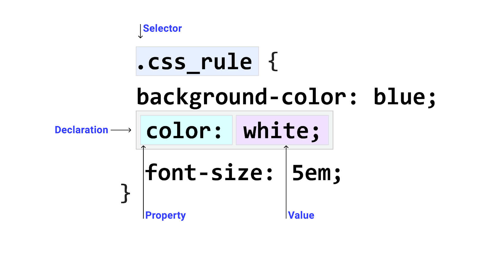
When working with HTML elements, you need to select the particular one or group of elements you want to style. To do this, we use selectors. We can use different types of selectors to target single or multiple elements, and we can also use selectors to target all elements within a page.
Types of CSS3 Selectors
- Universal Selectors
The universal selector (*) is used to match all elements within the body tag. The universal selector is also called a wildcard.
The asterisk is placed before the opening and closing curly braces to use the universal selector.
Syntax:
/* Universal Selector */
* {
    margin: 0;
}
HTML:
<!DOCTYPE html>
<html lang="en">
<head>
    <meta charset="UTF-8">
    <meta http-equiv="X-UA-Compatible" content="IE=edge">
    <meta name="viewport" content="width=device-width, initial-scale=1.0">
    <link rel="stylesheet" href="style.css">

</head>
<body>
    <main>
            <section>
                <h1>CSS Tutorials <span>new</span></h1>
                <div id="one" class="first paragraph">
                    <span class="date">Feb, 20th 2023</span>
                    <h1>Lorem ipsum dolor sit amet consectetur adipisicing elit.</h1>
                    <p>Minima earum nihil officia exercitationem deserunt fugiat quo asperiores ducimus consequatur
                        inventore, quia voluptate atque tenetur, dolores perspiciatis! Possimus similique cum, reprehenderit
                        totam inventore nulla.</p>

                    <a href="https://www.example.com">learn more</a>
                </div>


                <div id="two" class="second paragraph middle">
                    <span class="date">March, 6th 2023</span>
                    <h1>Lorem ipsum dolor sit amet consectetur adipisicing elit.</h1>
                    <p>Minima earum nihil officia exercitationem deserunt fugiat quo asperiores ducimus consequatur
                        inventore, quia voluptate atque tenetur, dolores perspiciatis! Possimus similique cum, reprehenderit
                        totam inventore nulla.</p>
                    <a href="https://www.example.net">learn more</a>
                </div>

                <div id="three" class="third paragraph">
                    <span class="date">April, 3rd 2023</span>
                    <h1>Lorem ipsum dolor sit amet consectetur adipisicing elit.</h1>
                    <p>Minima earum nihil officia exercitationem deserunt fugiat quo asperiores ducimus consequatur
                        inventore, quia voluptate atque tenetur, dolores perspiciatis! Possimus similique cum, reprehenderit
                        totam inventore nulla.</p>
                    <a href="https://www.example.dev">learn more</a>
                </div>
            </section>
        </main>
</body>
</html>
CSS:
* {
    background-color: hsl(0, 0%, 81%);
    font-family: calibri;
}
Browser Output:
CodePen:
See the Pen [05] Universal Selectors by Ocxigin (@ocxigin) on CodePen.
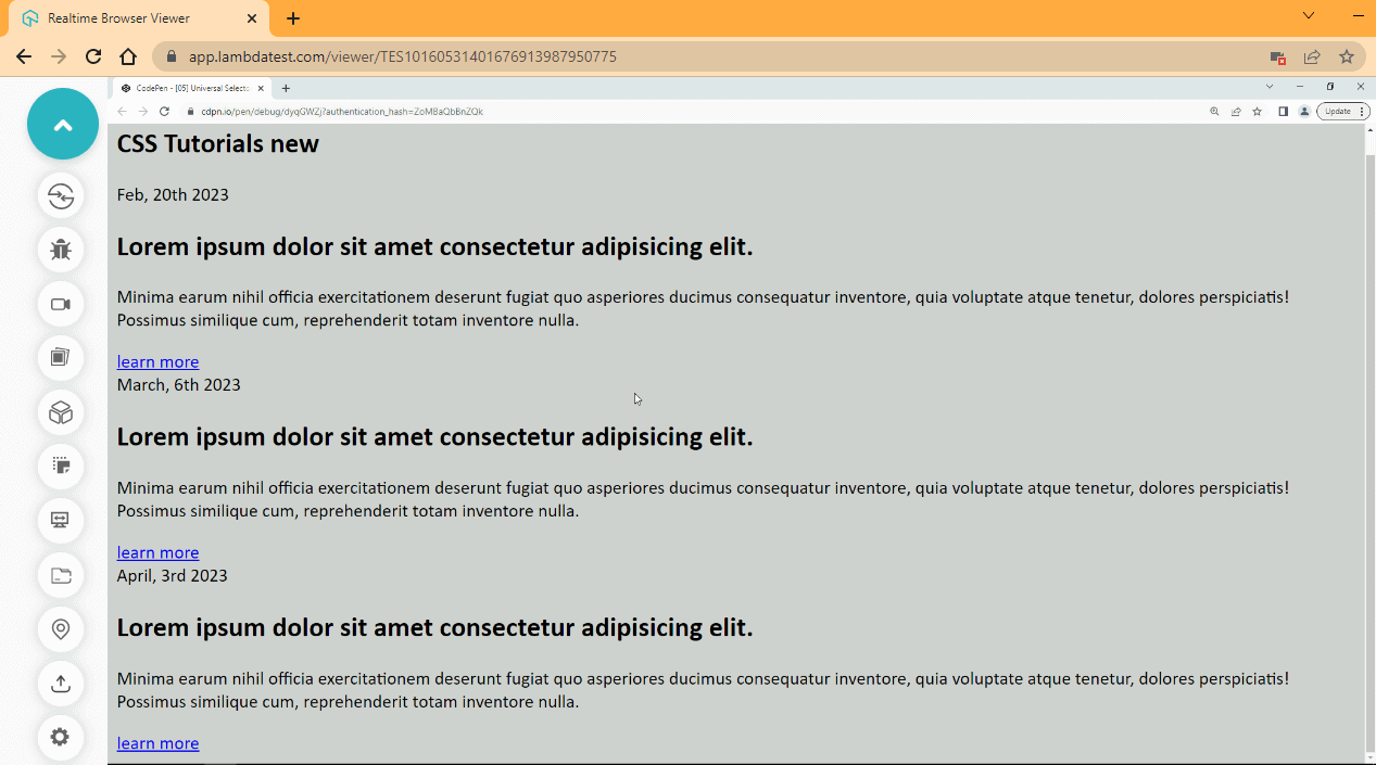
From the browser output, the universal selector changes the background color and font family. As you can see from the preview, every element on the page is affected.
The type selector matches all elements of the same node name. For example, if you specify a < p > tag and then apply a CSS rule to it, every < p > tag within the document gets selected.
Type Selector is sometimes referred to as Element Selector. To use the type selector, the targeted element is placed before the opening and closing curly braces.
Syntax:
/* Type Selector [Select all p tags]*/
p {
    color: orangered;
}
CSS:
body{
    background-color: hsl(0, 0%, 81%);
    font-family: calibri;
}

main {
    width: 60%;
    margin: 0 auto;
}

p {
    font-size: 1.1em;
}
Browser Output:
CodePen:
See the Pen [05]Type Selectors by Ocxigin (@ocxigin) on CodePen.
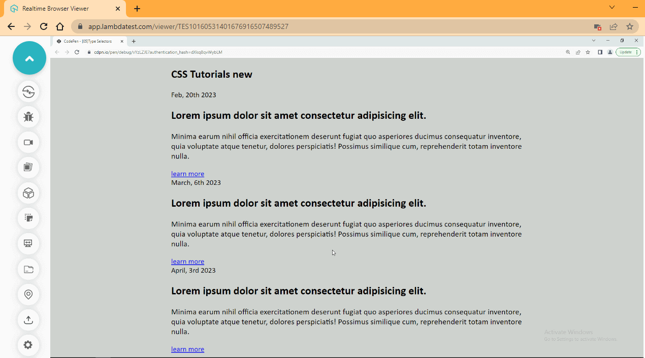
From the browser output, we move the entire content of the page to the middle by using the < main > element and also, we target the < p > to increase the font size of every text within the < p > element.
The class selector matches all elements with the same name with the specified class name. For example, you can create a class attribute with a class name for a specific element, and this class name enables the CSS rule to target the element with that class name.
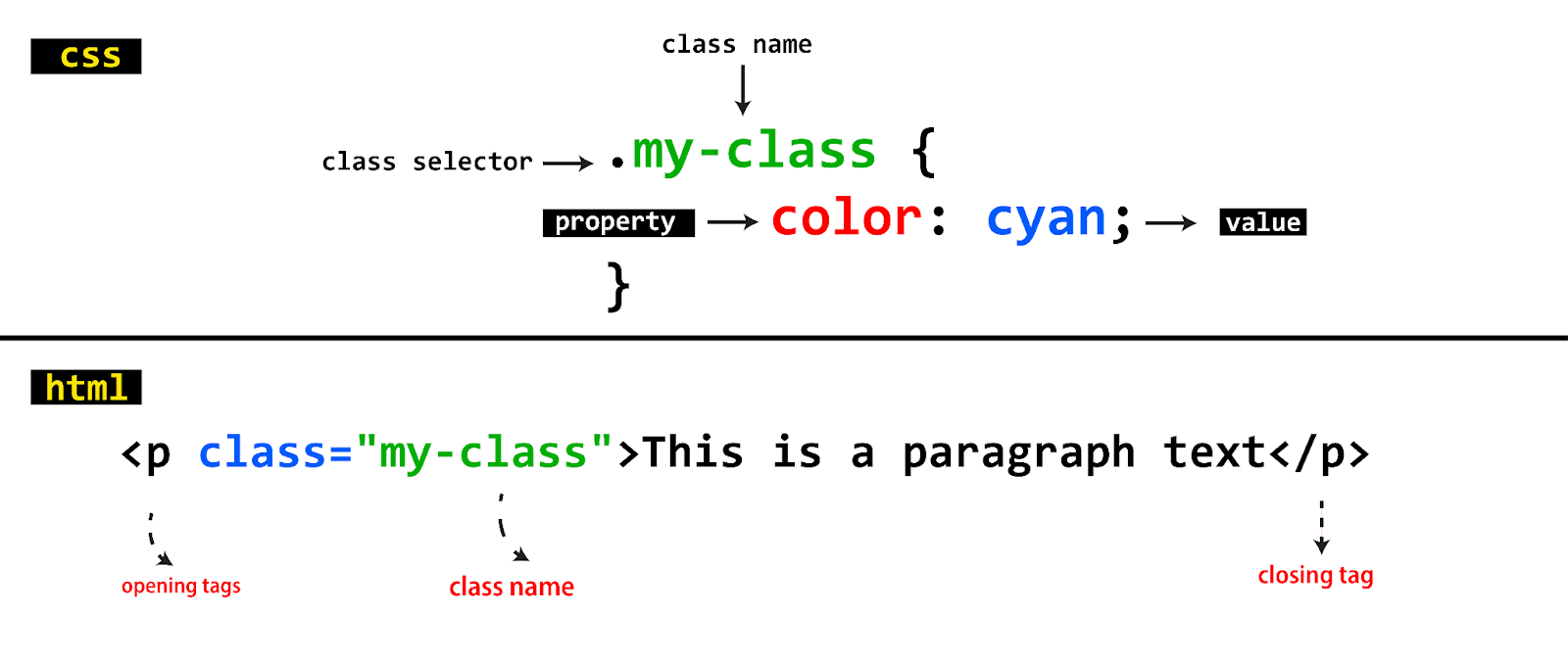
We can apply more than one class to single or multiple elements. To use the class selector, a period is placed before the class name.
Syntax:
/* Class Selector
    [Select all elements with my-class name]
*/
.my-class {
    color: cyan;
}
CSS:
.paragraph {
    background-color: hsl(0, 0%, 100%);
    padding: 1em 2em;
    border-radius: 10px;
    margin-top: 1em;
    box-shadow: 2px 2px 5px 2px rgba(0,0,0, .2);
}

.paragraph p {
    color: hsl(0, 1%, 25%);
}

.first {
    border: 2px solid hsl(0, 0%, 47%);
}
Browser Output:
CodePen:
See the Pen [05] Class Selectors by Ocxigin (@ocxigin) on CodePen.
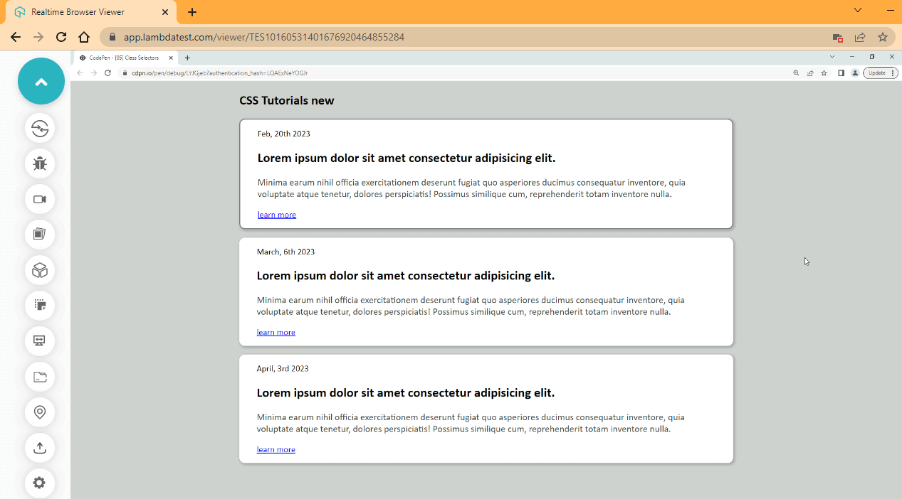
From the browser output, we use the class selector to solve three problems here, based on the class names provided on the elements. The first and third < div > tag has two class names, while the second < div > tag has three declared within the element mockup.
We use the paragraph class to style the three < div > tags with one CSS rule. This is because it is a common class name found among the three < div > tags, so any style we apply to the paragraph class will apply to every element with the class in its mockup.
However, the first, second, and third classes are common within a particular tag, so any style we apply to these tags will only affect the specific element they are found in. For example, we apply a border to only the first < div > tag from the first class present in the < div >.
ID selector is used to match an element from the value defined by the id attribute. The id attribute is a unique identifier. That is, two different elements should not use the same id name. To use the id selector, a hashtag (#) is placed before the name of the id.
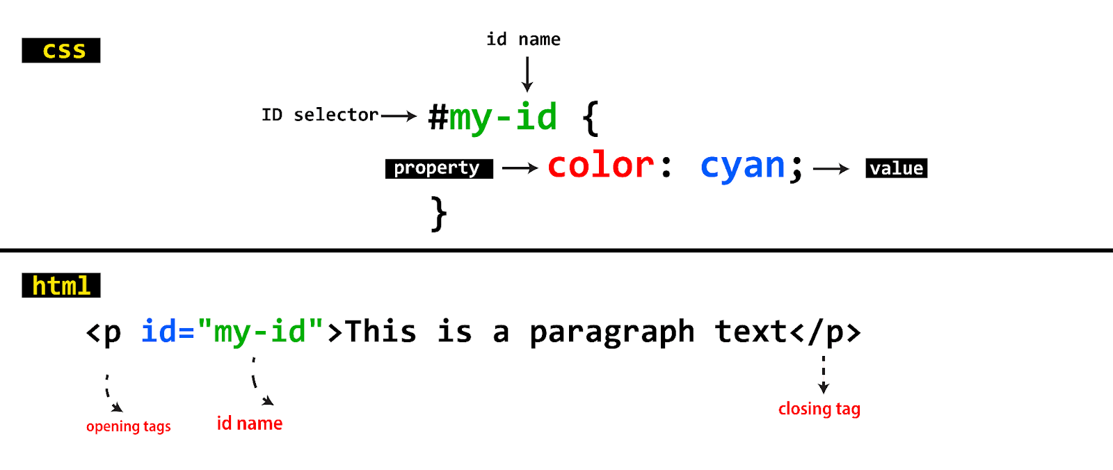
Syntax:
/* ID Selector
    [Select an element with id name]
*/
#my-id {
    color: cyan;
}
CSS:
#two {
    background-color: hsl(33, 75%, 85%);
}
Browser Output:
CodePen:
See the Pen [05] ID Selectors by Ocxigin (@ocxigin) on CodePen.
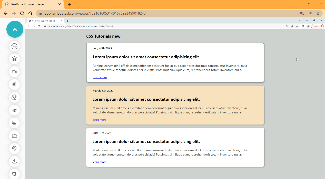
From the browser output, we set the second < div > element to a different color using the id attribute value of two.
The id attribute, as mentioned earlier, is unique. As you would have noticed from HTML tags, each id attribute has a different value from the previous or next one, and each id attribute doesn’t have more than one value compared to the class attribute.
The attribute selector matches elements from the attribute or attribute value defined within the elements. To use the attribute selector, the specified attribute or value should be placed inside a square bracket []. Sometimes to be more specific, the element tag is placed before the square bracket.
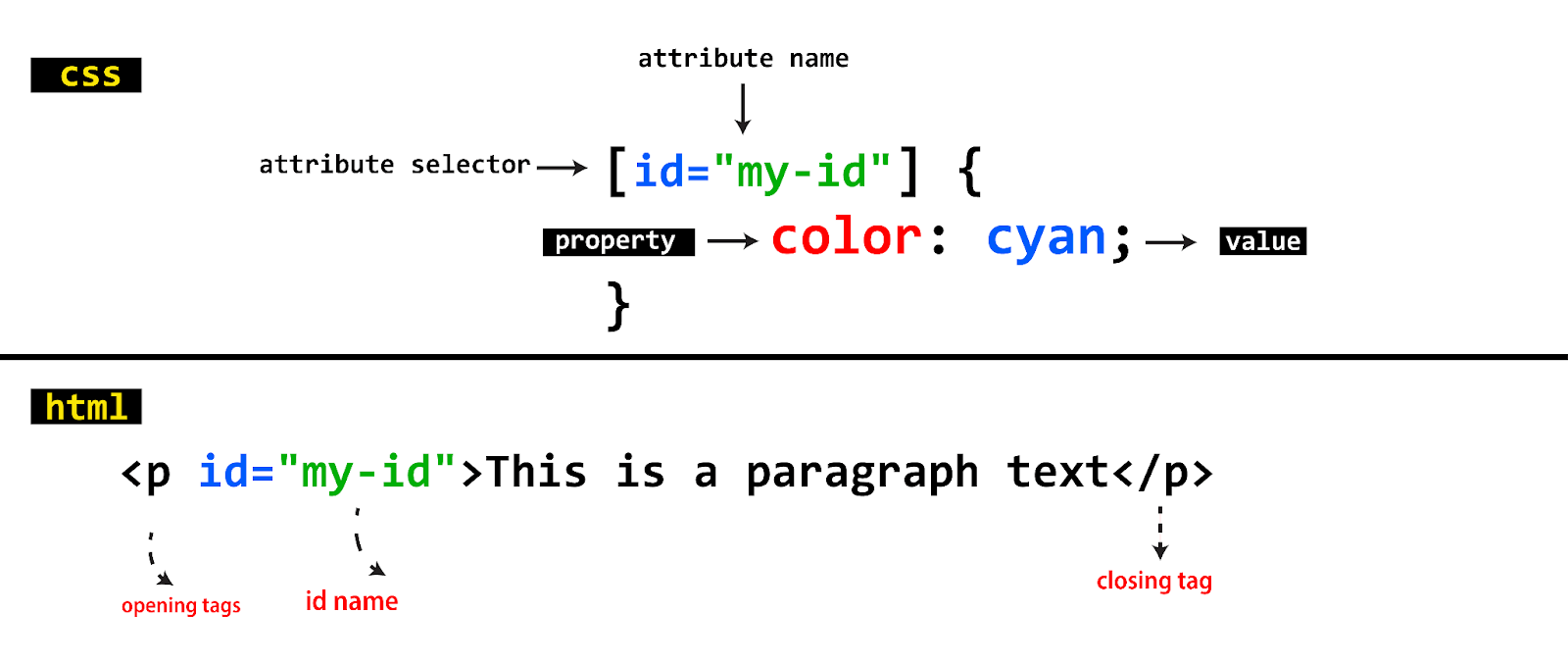
There are different ways we can use attribute selectors. Let’s look at some examples.
- Selecting an element with a specific Attribute
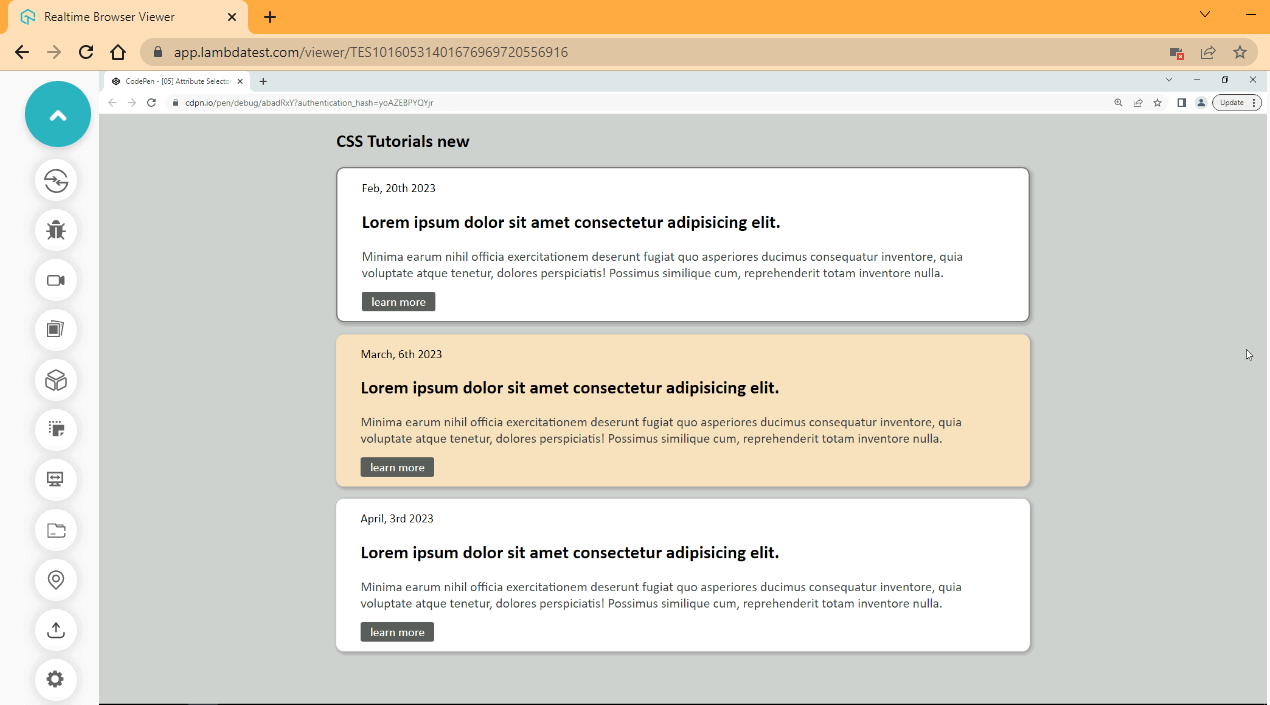
This method is used to select elements with a specified attribute. Regardless of the values assigned to the id.
Syntax:
/* Attribute Selector with P tag */
[id] {
    background-color: red;
}
When you use this method, every element with an id attribute will be selected.
CSS:
[href]{
    text-decoration: none;
    background-color: hsl(0, 1%, 37%);
    color: hsl(0, 0%, 100%);
    padding: .2em .8em;
    border-radius: 3px;
}
Browser Output:
CodePen:
See the Pen [05] Attribute Selector 01 by Ocxigin (@ocxigin) on CodePen.
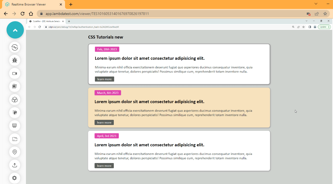
This method is used to select defined attributes with values. Irrespective of the element it is defined in.
Syntax:
/* Attribute Selector with value */
[id="myid"]{
    background-color: red;
}
When you use this method, every element with an id equal to myid will be selected.
CSS:
[class="date"]{
    background-color: hsl(320, 69%, 57%);
    color: hsl(0, 0%, 100%);
    padding: .2em .8em;
    border-radius: 3px;
}
Browser Output:
CodePen:
See the Pen [05] Attribute Selector 02 by Ocxigin (@ocxigin) on CodePen.
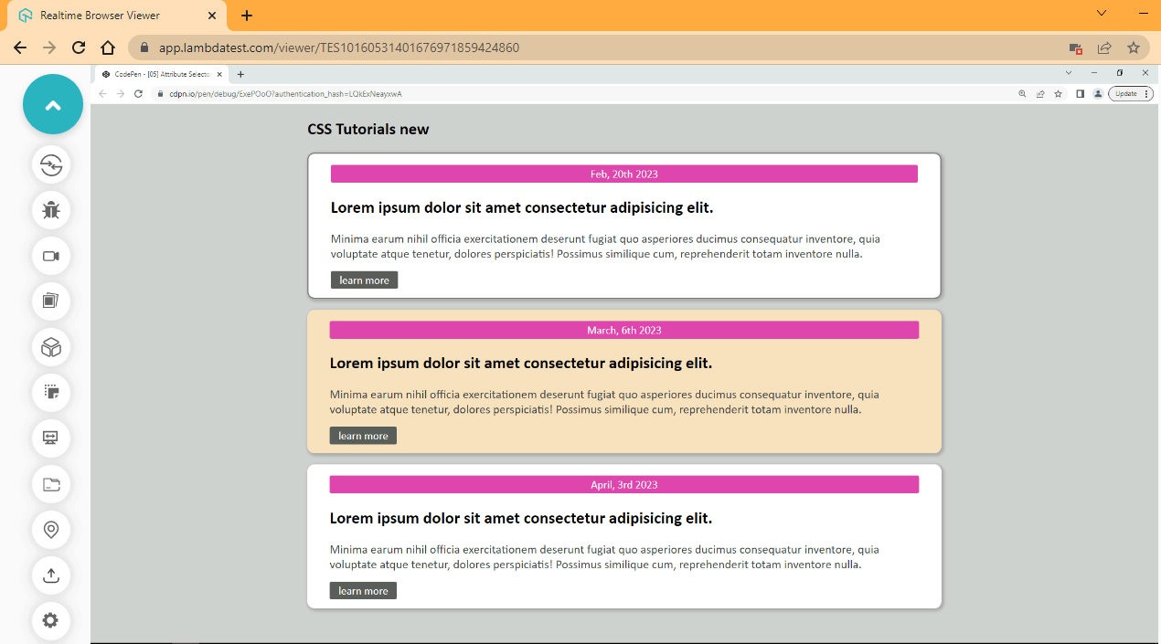
This method is used to select elements with a specified attribute and value.
Syntax:
/* Attribute Selector with P tag and value */
p[id="myid"] {
    background-color: red;
}
When you use this method, every < p > element with an id equal to myid will be selected.
CSS:
span[class="date"]{
    display: block;
    text-align: center;
}
Browser Output:
CodePen:
See the Pen [05] Attribute Selector 03 by Ocxigin (@ocxigin) on CodePen.
This method selects elements with a specified attribute and value that start with a particular string. This means; selecting every < p > element with an id that starts with myid.Syntax:
/* Attribute Selector with P tag and value */
p[id^="myid"] {
    background-color: red;
}
CSS:
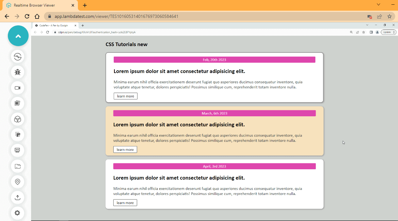
a[href^="https"]{
    background-color: hsl(0, 0%, 100%);
    border: 2px solid hsl(0, 0%, 47%);
    color: hsl(0, 0%, 0%);
}
CodePen:
See the Pen [05] Attribute Selector 04 by Ocxigin (@ocxigin) on CodePen.
This method selects elements with a specified attribute and value that end with a particular string. This means; selecting every < p > element with an id that ends with d.
Syntax:
/* Attribute Selector with P tag and value */
p[id$="d"] {
    background-color: red;
}
CSS:
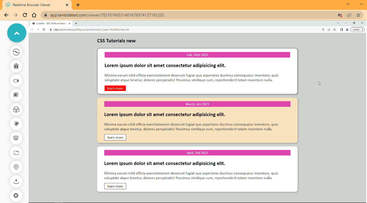
a[href$="com"] {
    background-color: hsl(0, 97%, 49%);
    color: hsl(0, 0%, 100%);
    border: none;
}
CodePen:
See the Pen [05] Attribute Selector 05 by Ocxigin (@ocxigin) on CodePen.
This method is used to select elements with a specified attribute and value with a specific string. This means; selecting every < p > element that contains yi in its attribute value.
Syntax:
/* Attribute Selector with P tag and value */
p[id*="yi"] {
    background-color: red;
}
This will only work when the yi are together and exist somewhere in the attribute value.
CSS:
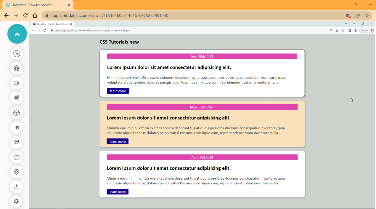
a[href*="www"] {
    background-color: hsl(251, 97%, 27%);
    color: hsl(0, 0%, 100%);
    border: none;
}
Browser Output:
CodePen:
See the Pen [05] Attribute Selector 06 by Ocxigin (@ocxigin) on CodePen.
CSS3 Properties, Values, and Units
CSS3 properties, values, and units are the building blocks of creating visually appealing and responsive web pages. Using these, developers and web designers can easily modify the layout and appearance of a webpage without changing the underlying HTML structure.
- CSS Properties: These define how HTML elements look on a webpage. They include options for font size, color, layout, and other factors.
- CSS Values: These specify the possibilities for CSS3 attributes, such as color or font size.
- CSS Units: These demonstrate the measurement methods for CSS3 values like pixels, ems, and percentages.
Let’s talk in detail about each of these components.
CSS3 Properties
CSS display properties are used to set the style or describe how a specific HTML element should look, behave, or size. CSS3 properties are responsible for everything we do with CSS, which could be, adding colors, sizing an element, positioning an element, layout, or working with typography, and the list goes on.
Examples of CSS3 properties include margin, padding, width, height, background, and color, just to maintain a few. Every CSS3 property comes with a value and a unit for length values.
Syntax:
.elements {
    /*  Color Mode Values In CSS */
        background-color: orangered;
        background-color: #ff4500;
        background-color: rgb(255, 69, 0);
        background-color: hsl(16, 100%, 50%);
        background-color: hwb(16 0% 0%);
        /* URLs */
        background: url(img.png);

    /* <length> values */
        width: 400px;
        width: 5em;
        width: 6rem;

        /* String, Number and Keyword */
        font-family: 'Courier New'; /*String*/
        font-family: monospace; /*Keyword*/
        font-weight: 800; /*Number*/

        /* Positive and Negative Integers*/
        opacity: 0.6; /*Floating Point Number*/
        z-index: -1; /*Negative Number*/
        z-index: 5; /*Positive Number*/


        /* <percentage>s of the width */
        width: 80%;

        /* Global values (CSS wide-values) */
        background: inherit;
        background: initial;
        background: revert;
        background: revert-layer;
        background: unset;
}
CSS3 Values
A single property in CSS3 contains a series of values that can be assigned to the said property. The type of property we decide to use determines the value the property will be set. These values can be a number, floating point number (1.05), keywords, percentages, strings, URLs, or CSS wide-values (global values).
For example, a background-color property takes in values of different types of colors depending on the color mode we decide to use. We can use hex code color values, RGB, RGBA, HWB, CMYK (for print media), HSL, or keyword values such as red. This property doesn’t require a unit such as px, em, or rem to function well, but it could take a percent (%) in the case of RGB, RGBA, HSL, HWB, or CMYK to determine the color percentage we want to assign to the element.
CSS3 Units
CSS3 units are additional characters or symbols added after length values. There are two types of CSS3 units: absolute length units and relative length units.
Absolute Length Units
Absolute length units are fixed CSS units. Absolute length units are the same across different media screens and print layouts. Absolute units are not best for screen sizes due to the multiple sizes available, and absolute units don’t adapt to fit the screen sizes being used. Instead, it is based on the original size assigned to it.
For example, a width of 400px for the desktop will remain at 400px for mobile even if the width is more significant than the device, causing the element to overflow for responsive design and accessibility for the screen. Absolute units are best avoided and should be used for prints with a specific size.

Note: Perform a responsive web design test with LT Browser 2.0. Download Now!
Example of Absolute Units
| Units | Description | Equivalent to |
|---|---|---|
| px | pixels | 1px = 1/96th of 1in |
| pc | picas | 1pc = 1/6th of 1in |
| pt | points | 1pt = 1/72nd of 1in |
| in | inches | 1in = 2.54cm = 96px |
| mm | millimeters | 1mm = 1/10th of 1cm |
| cm | centimeters | 1cm = 37.8px = 25.2/64in |
Let’s consider an example to understand better the working of absolute unit code:
HTML:
<!DOCTYPE html>
<html lang="en">
<head>
    <meta charset="UTF-8">
    <meta http-equiv="X-UA-Compatible" content="IE=edge">
    <meta name="viewport" content="width=device-width, initial-scale=1.0">
    <link rel="stylesheet" href="style.css">
</head>
<body>
    <main>
        <div class="middle">
            <div>
                <h1>Absolute Units</h1>
                <p>The following explains absolute units in Details</p>
            </div>
        </div>
    </main>
</body>
</html>
CSS:
* {
    padding: 0;
    margin: 0;
    box-sizing: border-box;
}
main {
    width: 1280px;
    height: 100vh;
    background-image: url("https://source.unsplash.com/C6oPXOatFD8");
    background-position: center;
    background-repeat: no-repeat;
    background-origin: content-box;
    background-size: cover;
    z-index: -1;
}

main::before {
    content: '';
    display: block;
    background: linear-gradient(247deg, rgba(255, 0, 0, .8), rgba(104, 9, 9, 0) 70.71%),
            linear-gradient(147deg, rgba(60, 167, 60, 0.8), rgba(30, 112, 30, 0) 70.71%),
            linear-gradient(326deg, rgba(34, 34, 73, 0.8), rgba(17, 17, 109, 0) 70.71%);;
    width: 100%;
    height: 100%;
    z-index: 1;
    opacity: .7;
}


.middle {
    display: flex;
    justify-content: center;
    align-items: center;
}

h1 {
    font-size: 80px;
    font-family: Georgia, 'Times New Roman', Times, serif;
    text-align: center;
    color: white;
    position: relative;

}

p {
    font-size: 32px;
    font-family: 'Courier New', Courier, monospace;
    color: white;
    text-align: center;
}

.middle div {
    position: absolute;
    z-index: 3;
    top: 12em;
}
Browser Output (Desktop View):
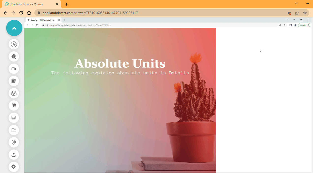
From the browser output, we used absolute units of 1280px, which is not up to the viewport width of our browser. As a result, the background image does not display completely, still leaving out extra white space on the browser.
Browser Output (Mobile View):
CodePen:
From the browser output, the mobile preview is not any better. As you can see, the display text is completely out of view.
Relative Length Units
Relative length units scale relative to the parent and root element or viewport of the page. This is very useful when working with different screen sizes and resolutions.
Example of Relative Units
| Units | Description |
|---|---|
| rem | Used to set the font size relative to the root element (2rem means 2 times the size of the root element, which is 32. Root font size is 16px) |
| em | Used to set the font size relative to the parent element. |
| vw | Used to set elements relative to the viewport width of the page. (1% of viewport width) |
| vh | Used to set elements relative to the viewport height of the page. (1% of viewport height) |
Let’s consider an example to understand better the working of relative unit code:
HTML:
<!DOCTYPE html>
<html lang="en">
<head>
    <meta charset="UTF-8">
    <meta http-equiv="X-UA-Compatible" content="IE=edge">
    <meta name="viewport" content="width=device-width, initial-scale=1.0">
    <link rel="stylesheet" href="style.css">
</head>
<body>
    <main>
        <div class="middle">
            <div>
                <h1>Relative Units</h1>
                <p>The following explains relative units in Details</p>
            </div>
        </div>
    </main>
</body>
</html>
CSS:
* {
    padding: 0;
    margin: 0;
    box-sizing: border-box;
}

main {
    width: 100vw;
    height: 100vh;
    background-image: url("https://source.unsplash.com/C6oPXOatFD8");
    background-position: center;
    background-repeat: no-repeat;
    background-origin: content-box;
    background-size: cover;
    z-index: -1;
}

main::before {
    content: '';
    display: block;
    background: linear-gradient(247deg, rgba(255, 0, 0, .8), rgba(104, 9, 9, 0) 70.71%),
            linear-gradient(147deg, rgba(60, 167, 60, 0.8), rgba(30, 112, 30, 0) 70.71%),
            linear-gradient(326deg, rgba(34, 34, 73, 0.8), rgba(17, 17, 109, 0) 70.71%);;
    width: 100%;
    height: 100%;
    z-index: 1;
    opacity: .7;
}


.middle {
    display: flex;
    justify-content: center;
    align-items: center;
}

h1 {
    font-size: 5em;
    font-family: Georgia, 'Times New Roman', Times, serif;
    text-align: center;
    color: white;
    position: relative;

}

p {
    font-size: 2em;
    font-family: 'Courier New', Courier, monospace;
    color: white;
    text-align: center;
}

.middle div {
    position: absolute;
    z-index: 3;
    top: 12em;
}
Browser Output (Desktop View):
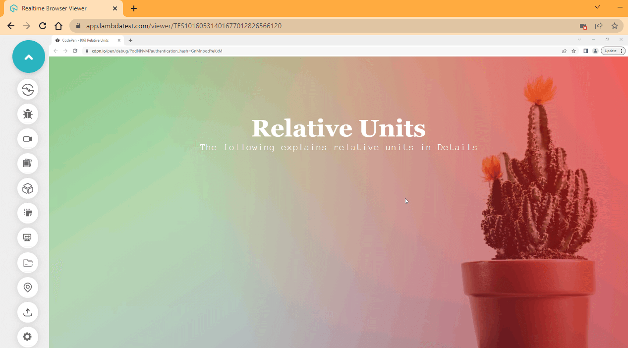
From the browser output, the background image occupies the entire viewport leaving no extra white space.
Browser Output (Mobile View):
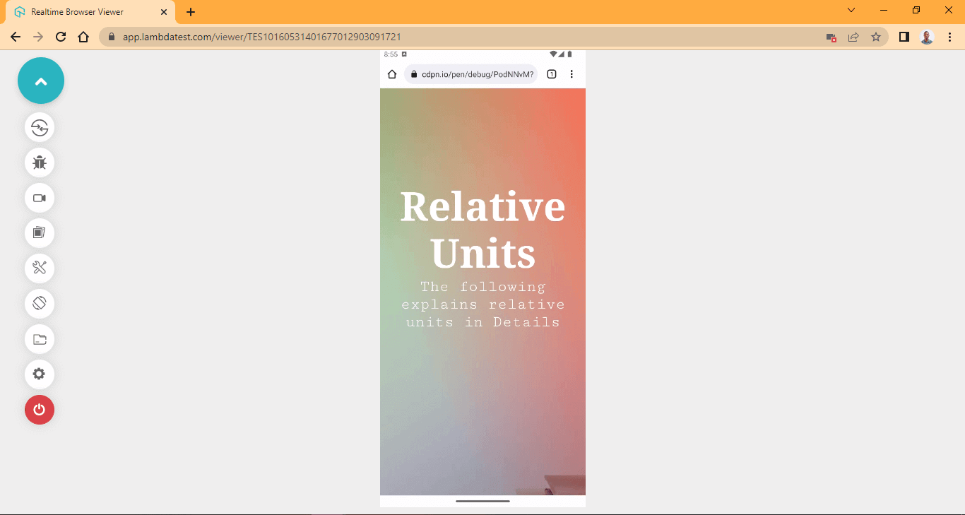
CodePen:
From the browser output, the display text fits appropriately to the middle of the page.
Absolute and Relative units are beneficial and should be used accordingly. For web projects involving CSS3, prioritize using relative units as they respond better on the web.
One of the benefits of using relative units over absolute units is that you don’t have to worry about the total length of the browser viewport width. All you have to do is use the 100vw to specify the current browser width you are working on, and when you load your website on another browser or smaller devices, the website renders based on the viewport width of the device browser. This improves accessibility and responsiveness when your website loads on multiple platforms.
Note: Perform accessibility testing of your website over 3,000+ environments. Start Accessibility Testing
CSS3 Layouts
At the heart of a very responsive website is the layout. The CSS layout is the cohesive arrangement of web elements. This is done by sizing the individual elements, applying space between two or more elements, and positioning elements to the appreciated sections of the page.
The end goal of every website is to be responsive, accessible, mobile-friendly, and to fit in across multiple browsers. Without layout, web elements will lack structure because, by default, elements are designed to stack on top of one another in the DOM, which makes it too difficult to navigate. For instance, trying to fill out a form on a website without proper form control can be very frustrating for users. The layout helps solve these problems.
However, CSS3 layout is not the only thing a website needs to function well, making it stand out and more accessible and responsive. So This section will be looking at some essential components of layout we need to put in place for our website to function well.
Sizing elements
To have a responsive web page, it is essential to have sizing elements in your layout. To apply proper sizing, we have to take note of the element we are sizing because all elements are not the same. The type of element you are working with determines what kind of sizing can be applied to it.
In HTML, there are three forms elements can take that determine how they appear on the web. These include;
- Block Level Elements,
- Inline Level Elements,
- Inline-Block Level Elements.
However, some elements are designed to have a particular level; for example, the < div >, < main >, and < p > tags (just to mention a few) are block-level elements, while other elements such as < span >, < a > and < input > tags are inline elements. These elements function differently and appear differently in the DOM.
| Elements | Properties |
|---|---|
| Block Level Elements | Block-level elements appear on a new line when created. This element takes up the full width of horizontal space, and a vertical height equals the element's content. However, when multiple block elements are created, they appear on one another by default, for example, a paragraph text or the div tag. A specific width and height are required to position the block-level element properly. |
| Inline Level Elements | This element does not appear in a new line as they follow the normal flow of text. The inline element width and height are set to auto by default. This prevents it from taking spaces around other elements. When an element is set to inline, width and height do not take effect. But we can define margin and padding across the element. |
| Inline-Block Level Elements | Inline-block level elements are the same thing as inline elements. The only difference is that by default, inline-block elements have a specific width and height equal to the element’s content. The inline-block element can be size, width, and height can be set, and also it does not appear on a new line even if given a size of width and height. |
To see how this works, let’s take some code examples.
HTML:
<!DOCTYPE html>
<html lang="en">
<head>
    <meta charset="UTF-8">
    <meta http-equiv="X-UA-Compatible" content="IE=edge">
    <meta name="viewport" content="width=device-width, initial-scale=1.0">
    <link rel="stylesheet" href="style.css">
</head>
<body>
   <p class="p p-one">This is a block level element, and <p class="p nested-block">This is a nested block level element</p> it appears on a new line</p>

   <p class="p p-two">This is another block level  element, <span class="inline"> This is inline level element </span> and it appears on a new line</p>

   <p class="p p-three">This is yet another block level element, <span class="inline">This is another inline level element </span> and it appears on a new line</p>

</body>
</html>
CSS:
.p, span {
    color: white;
    padding: 2em 0;
    font-size: 20px;
}

.p-one {
    background-color: purple;
}

.p-two {
    background-color: red;
}

.p-three {
    background-color: blue;
}

.nested-block {
    background-color: darkgreen;
}


.inline {
    background-color: yellow;
    color: black;
}
Browser Output:
CodePen:
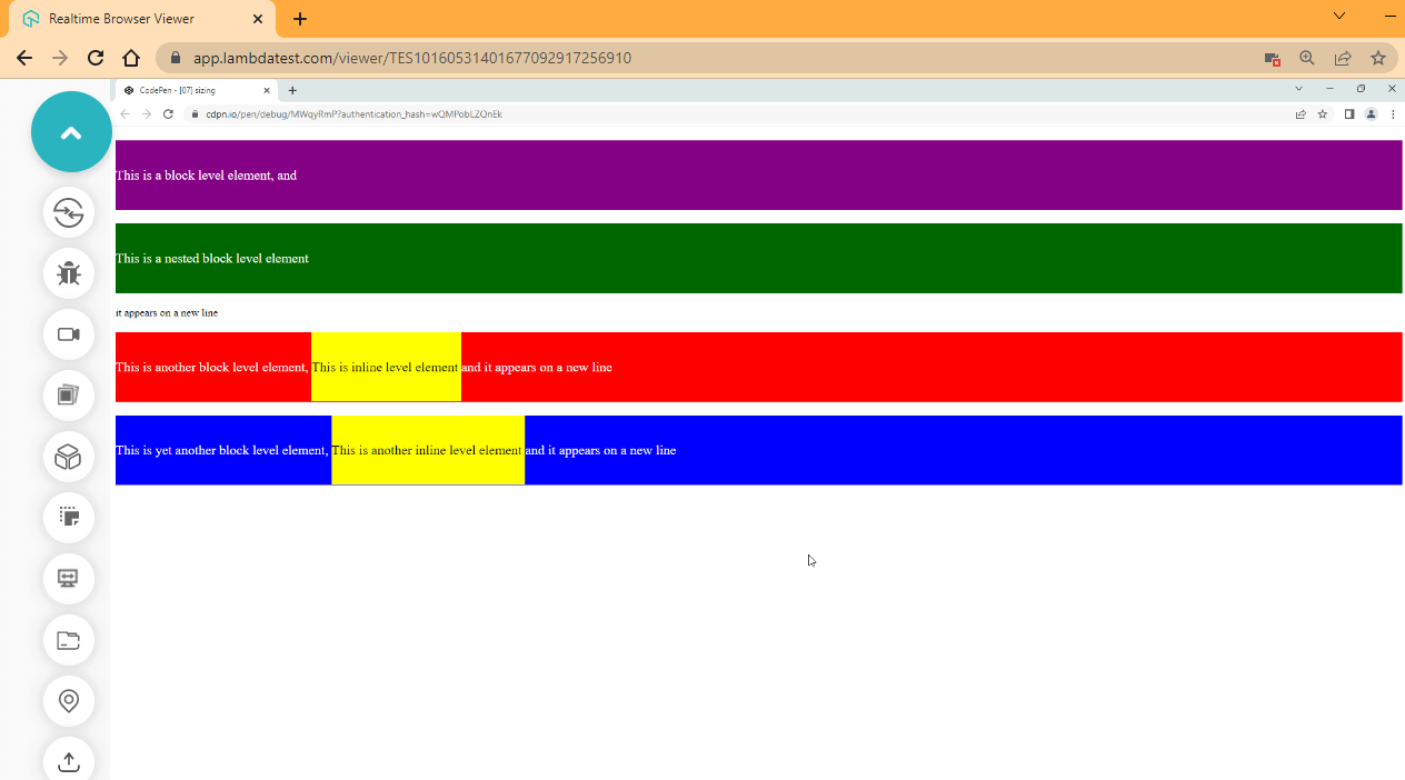
From the browser output, the yellow boxes are the span inline element. As you can see, these elements remain inside the containing paragraph tag. However, the green box is a block-level element that starts on a new line even after we nested it, just like the span inline element inside the paragraph tag.
The purple, green, red, and blue boxes are block elements. In this case, they appear on a new line.
Changing Element Levels
Every element in HTML has some defined properties set by the user-agent stylesheet by default that determines how each element behaves. This user-agent stylesheet assigns default values of the display block to block-level elements. It displays inline-to-inline elements and a display of inline-block to set elements to inline-block elements.
This is exactly why we have some elements as blocks while some as inline or inline-block. But this can be changed, and we can simply change a block element to inline and inline to block, block to inline-block.
This gives us the freedom to change the element level directly from CSS3 without changing the element in the HTML document. To do this, we use the display property, and the block, inline, and inline-block are keyword values of the display property.
HTML:
<!DOCTYPE html>
<html lang="en">
<head>
    <meta charset="UTF-8">
    <meta http-equiv="X-UA-Compatible" content="IE=edge">
    <meta name="viewport" content="width=device-width, initial-scale=1.0">
    <link rel="stylesheet" href="style.css">
</head>
<body>
    <p>This is a property of the following span tags
    <span class="block">This element is set to display block</span>
    <span class="inline">This element is set to display inline</span>
    <span class="inline-block">This element is set to display inline-block</span>
    </p>
</body>
</html>
CSS:
body {
    font-size: 20px;
}
.block {
    display: inline-block;
    background-color: blue;
    color: white;
    height: 50px;
}

.inline {
    display: block;
    background-color: green;
    color: white;
    height: 50px;
}

.inline-block {
    display: inline;
    background-color: red;
    color: white;
    height: 50px;
}
Browser Output:
CodePen:
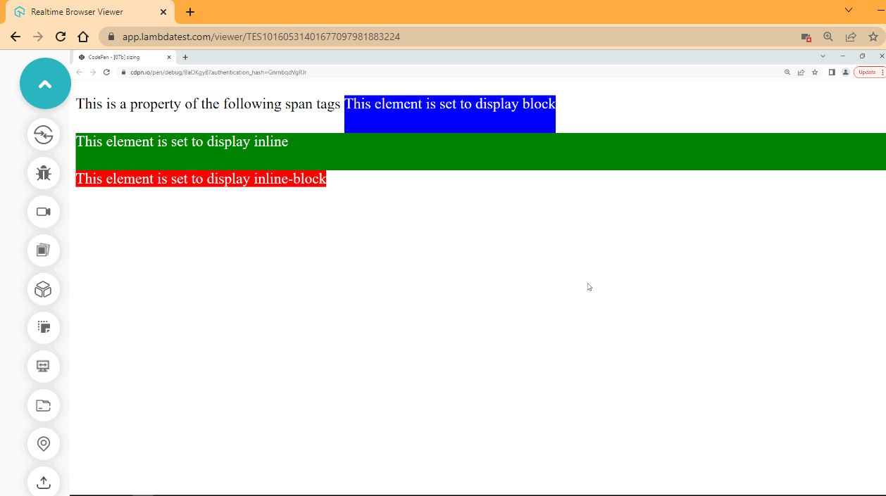
From the browser output, we have visually descriptive differences between the three levels; the blue box, which is the inline-block, has a defined height of 5px, but the width remains the same as the content of the element. The green box, which is a block-level element, takes a full width and a height of 5px while the red box, which is the inline-level element, takes the width of the element content. Still, the height of 5px has no effect.
CSS3 Layout Module
As web design and development evolve, new tools are constantly being developed to meet the new requirement of how things should be done and what needs to be introduced or phased out. Before now, CSS3 had a highly complex way of aligning elements, things like space distribution between and around elements, how elements should be aligned side by side, and aligning elements on a row or column was a difficult task.
Web authors used hacks such as HTML < table > and < center > tags to align elements, and CSS floats property was heavily used, but these methods were not meant to solve these problems. However, this has led to better CSS3 modules such as Flexible Box Module, Grid System, and the Position property to solve these problems.
CSS Flexbox
The Flexible Box Module, commonly called Flexbox, was designed to align elements between rows or columns while distributing equal amounts of space among elements.
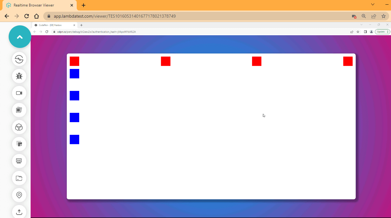
The CSS Flexbox model is a one-dimensional layout system, which means it can only handle one layout at a time. This can either be a row or a column. We can determine which axes to focus on by using the flex-direction property to set the axis with which flex-items are to follow.
Flex-items, in this case, refer to elements within a flex-container, and when we set flex to an element, it automatically becomes a flex container.
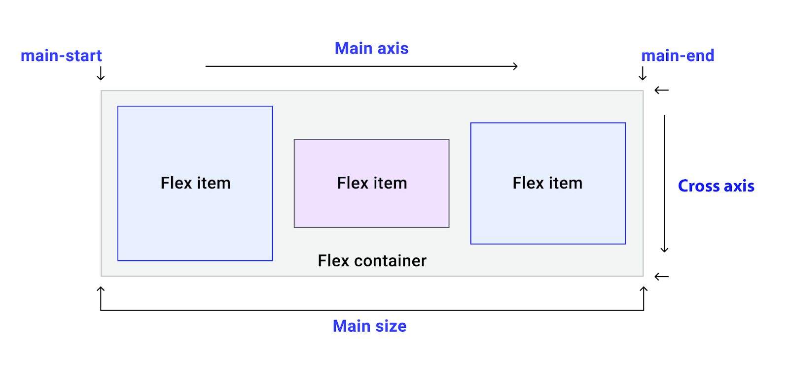
There are two axes: the main-axis and the cross-axis; for example, if we set the flex-direction to row, the row becomes the main axis while the cross-axis runs perpendicular to the main axis.
HTML:
<!DOCTYPE html>
<html lang="en">
<head>
    <meta charset="UTF-8">
    <meta http-equiv="X-UA-Compatible" content="IE=edge">
    <meta name="viewport" content="width=device-width, initial-scale=1.0">
    <link rel="stylesheet" href="style.css">
</head>
<body>
   <main>
        <section>
            <div class="row">
                <div class="one"></div>
                <div class="two"></div>
                <div class="three"></div>
                <div class="four"></div>
            </div>

            <div class="column">
                <div class="one"></div>
                <div class="two"></div>
                <div class="three"></div>
                <div class="four"></div>
            </div>
        </section>
   </main>
</body>
</html>
CSS:
body {
    margin: 0;
    padding: 0;
    box-sizing: border-box;
}

main {
    background: rgb(63, 192, 213);
        background: radial-gradient(circle, rgba(63, 192, 213, 1) 0%, rgba(49, 118, 207, 1) 38%, rgba(184, 24, 127, 1) 100%);

    width: 100vw;
    height: 100vh;

    display: flex;
    justify-content: center;
    align-items: center;
}

section {
    width: 80%;
    height: 80%;
    background-color: white;

    box-shadow: 8px 8px 9px 7px rgba(0, 0, 0, 0.3);
    border-radius: 10px;
}

.row {
    display: flex;
    flex-direction: row;
    justify-content: space-between;

    margin: 16px;
}

.row div {
    background-color: red;
    width: 50px;
    height: 50px;
}

.column {
    display: flex;
    flex-direction: column;
    justify-content: space-between;

    margin: 16px;
    height: 400px;
}

.column div {
    background-color: blue;
    width: 50px;
    height: 50px;
}
Browser Output:
CodePen:
CSS Grid
The CSS Grid Layout model is a two-dimensional layout system, which means it can handle two layouts at-a-time. With CSS Grid, we can set content to rows and columns, and we can also have a gap (gutter) between content; this helps to apply spacing between two content or elements.
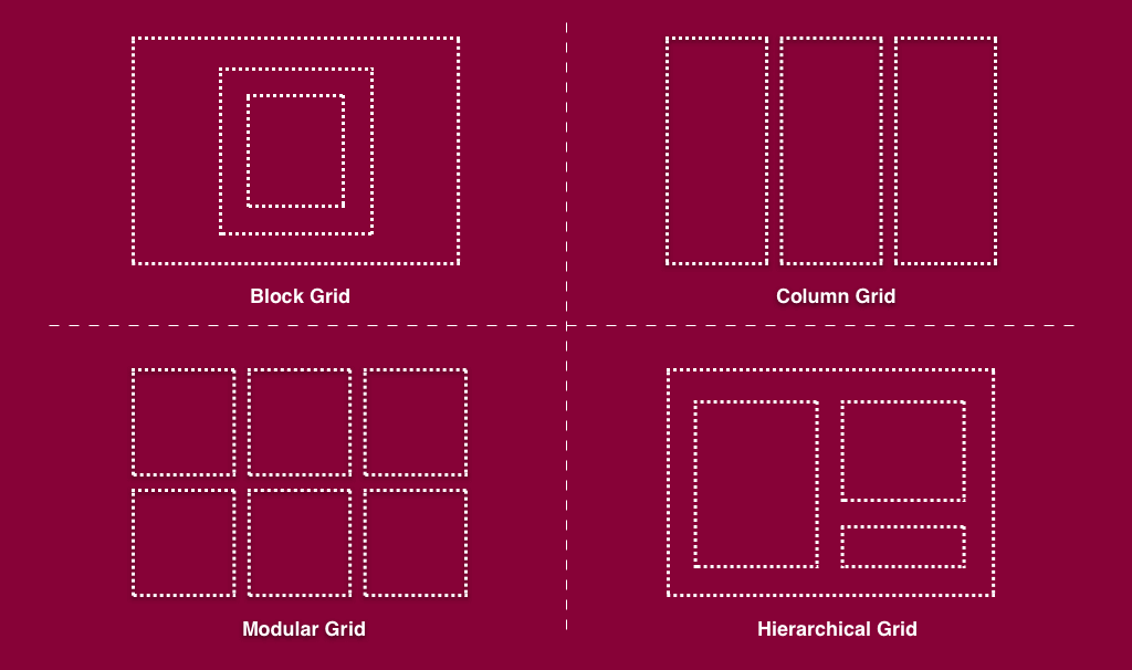
CSS Grid is very flexible and does not have regard to how elements are stacked originally in the DOM, i.e., we can simply re-arrange the stacking order with CSS Grid.
HTML:
<!DOCTYPE html>
<html lang="en">
<head>
    <meta charset="UTF-8">
    <meta http-equiv="X-UA-Compatible" content="IE=edge">
    <meta name="viewport" content="width=device-width, initial-scale=1.0">
    <link rel="stylesheet" href="style.css">
</head>
<body>
   <main>
        <section>
            <div class="one">one</div>
            <div class="two">two</div>
            <div class="three">three</div>
            <div class="four">four</div>
            <div class="five">five</div>
            <div class="six">six</div>
            <div class="seven">seven</div>
            <div class="eight">Eight</div>
            <div class="nine">Nine</div>
            <div class="ten">Ten</div>
        </section>
   </main>
</body>
</html>
CSS:
body {
    margin: 0;
    padding: 0;
    box-sizing: border-box;
    font-size: 2em;
    font-family: calibri;
    text-align: center;
    color: white;
}

section {
   display: grid;
   grid-template-columns: repeat(3, 1fr);
   grid-auto-rows: minmax(80px, auto);
   gap: 20px;
}

div {
    background-color: rgb(7, 126, 173);
}

.one {
    grid-column: 1/ 4;
    background-color: rgb(73, 12, 78);
}

.two {
    grid-column: 1/3;
    grid-row: 2/4;
}

.nine {
    grid-column: 2/4;
    background-color: rgb(140, 8, 228);
}
.ten {
    grid-column: 1/4;
    background-color: rgb(4, 158, 107);
}
Browser Output:
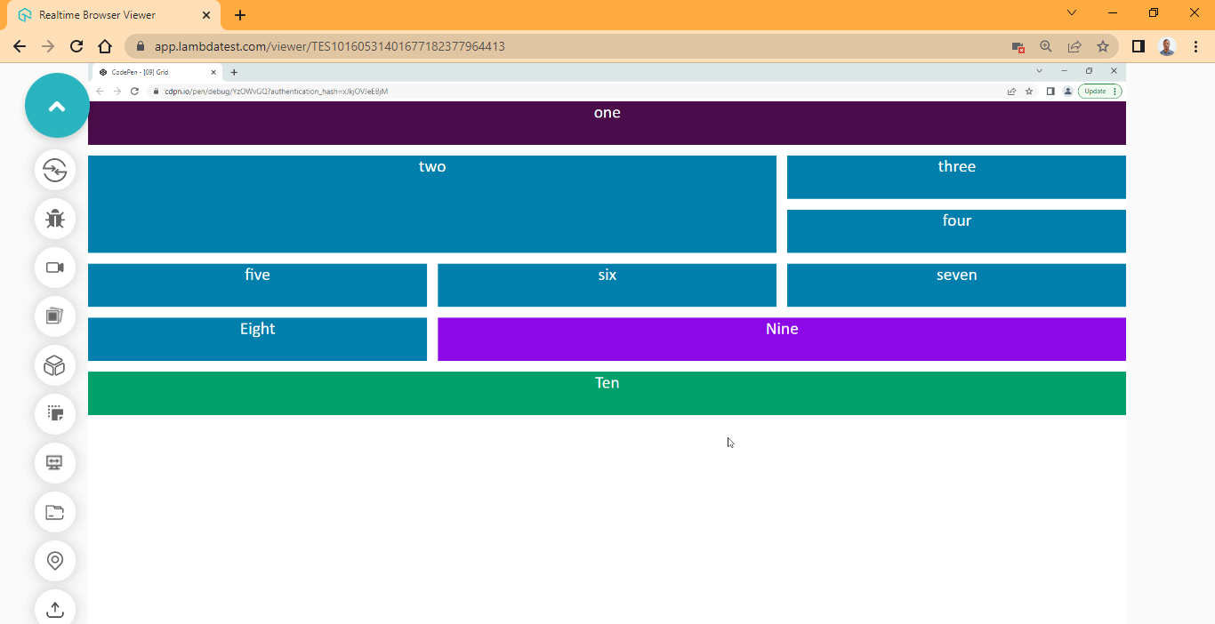
CodePen:
CSS Position Property
The CSS position property sets how elements can be positioned within the web page. This property has five values which include static, absolute, relative, sticky, and fixed that determine how a specified element responds to positioning and also four sub-property which are top, right, bottom, and left, that we can use to offset each element item based on the value provided by the position property.
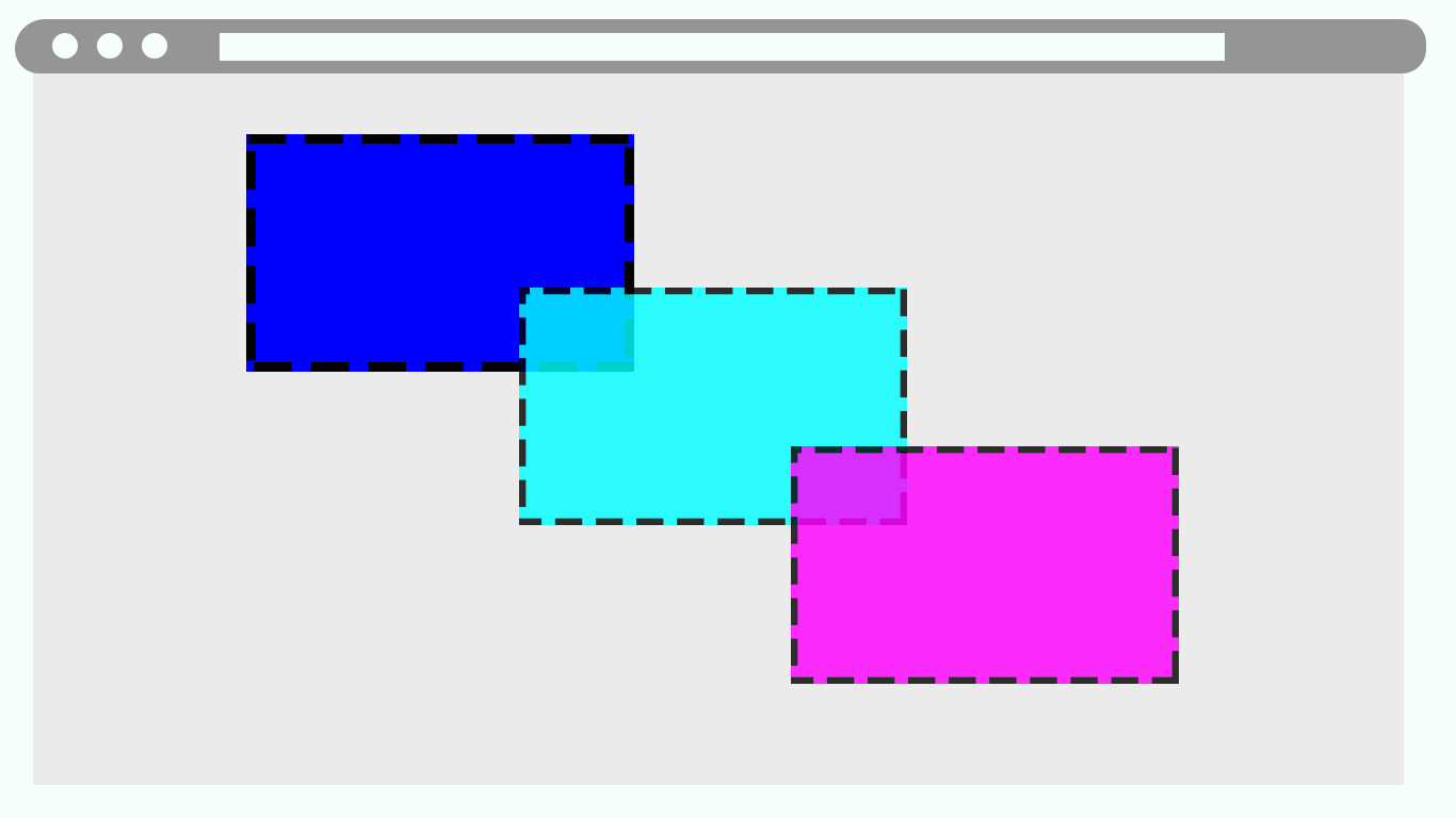
CSS Position property Values
- Static: Used to set an element to its default behavior.
- Relative: Element remains in the stacking order but can be positioned around the page using the position sub-properties.
- Absolute: Element is removed from the document flow and can be positioned around the page using the position sub-properties.
- Fixed: used to set an element to a particular fixed section of the page irrespective of what happens to the page.
- Sticky: Used to fix an element to the top of the page upon scroll.
CSS Position Sub-properties
- top: used to offset position elements to the bottom of the page from the top.
- right: used to offset position elements to the left of the page from the right.
- left: used to offset position elements to the right of the page from the left.
- bottom: used to offset position elements to the top of the page from the bottom.
HTML:
<!DOCTYPE html>
<html lang="en">
<head>
    <meta charset="UTF-8">
    <meta http-equiv="X-UA-Compatible" content="IE=edge">
    <meta name="viewport" content="width=device-width, initial-scale=1.0">
    <link rel="stylesheet" href="style.css">
</head>
<body>
   <main class="root">
        <section class="sub__root">
            <div class="wrapper" id="link-heading__one">
                <h1 class="heading heading__one">Stickey Postion: Heading One</h1>
                <p>
                    Lorem ipsum dolor sit amet, consectetur adipisicing elit. Libero voluptates molestias minus aperiam necessitatibus? Id porro officia rem amet, enim deserunt possimus totam impedit nemo quae. Accusamus eius commodi, consectetur itaque ex repellat? Eligendi eos, quo aliquid provident architecto perspiciatis! Perspiciatis aliquid nemo odio voluptates voluptatem non asperiores dolore exercitationem.
                </p>

                <p>
                    Lorem ipsum dolor sit amet, consectetur adipisicing elit. Libero voluptates molestias minus aperiam necessitatibus?
                    Id porro officia rem amet, enim deserunt possimus totam impedit nemo quae. Accusamus eius commodi, consectetur
                    itaque ex repellat? Eligendi eos, quo aliquid provident architecto perspiciatis! Perspiciatis aliquid nemo odio
                    voluptates voluptatem non asperiores dolore exercitationem.
                </p>

                <p>
                    Lorem ipsum dolor sit amet, consectetur adipisicing elit. Libero voluptates molestias minus aperiam necessitatibus?
                    Id porro officia rem amet, enim deserunt possimus totam impedit nemo quae. Accusamus eius commodi, consectetur
                    itaque ex repellat? Eligendi eos, quo aliquid provident architecto perspiciatis! Perspiciatis aliquid nemo odio
                    voluptates voluptatem non asperiores dolore exercitationem.
                </p>

                <a class="btn btn__one" href="#link-heading__two">fixed position: Go to Heading Two</a>
            </div>

            <div class="wrapper" id="link-heading__two">
                <h1 class="heading heading__two">Stickey Postion: Heading Two</h1>
                <p>
                    Lorem ipsum dolor sit amet, consectetur adipisicing elit. Libero voluptates molestias minus aperiam
                    necessitatibus? Id porro officia rem amet, enim deserunt possimus totam impedit nemo quae. Accusamus eius
                    commodi, consectetur itaque ex repellat? Eligendi eos, quo aliquid provident architecto perspiciatis!
                    Perspiciatis aliquid nemo odio voluptates voluptatem non asperiores dolore exercitationem.
                </p>

                <p>
                    Lorem ipsum dolor sit amet, consectetur adipisicing elit. Libero voluptates molestias minus aperiam
                    necessitatibus?
                    Id porro officia rem amet, enim deserunt possimus totam impedit nemo quae. Accusamus eius commodi, consectetur
                    itaque ex repellat? Eligendi eos, quo aliquid provident architecto perspiciatis! Perspiciatis aliquid nemo odio
                    voluptates voluptatem non asperiores dolore exercitationem.
                </p>

                <p>
                    Lorem ipsum dolor sit amet, consectetur adipisicing elit. Libero voluptates molestias minus aperiam
                    necessitatibus?
                    Id porro officia rem amet, enim deserunt possimus totam impedit nemo quae. Accusamus eius commodi, consectetur
                    itaque ex repellat? Eligendi eos, quo aliquid provident architecto perspiciatis! Perspiciatis aliquid nemo odio
                    voluptates voluptatem non asperiores dolore exercitationem.
                </p>

                <a class="btn btn__two" href="#link-heading__three">fixed position: Go to heading three</a>
            </div>

            <div class="wrapper" id="link-heading__three">
                <h1 class="heading heading__three">Stickey Postion: Heading Three</h1>
                <p>
                    Lorem ipsum dolor sit amet, consectetur adipisicing elit. Libero voluptates molestias minus aperiam
                    necessitatibus? Id porro officia rem amet, enim deserunt possimus totam impedit nemo quae. Accusamus eius
                    commodi, consectetur itaque ex repellat? Eligendi eos, quo aliquid provident architecto perspiciatis!
                    Perspiciatis aliquid nemo odio voluptates voluptatem non asperiores dolore exercitationem.
                </p>

                <p>
                    Lorem ipsum dolor sit amet, consectetur adipisicing elit. Libero voluptates molestias minus aperiam
                    necessitatibus?
                    Id porro officia rem amet, enim deserunt possimus totam impedit nemo quae. Accusamus eius commodi, consectetur
                    itaque ex repellat? Eligendi eos, quo aliquid provident architecto perspiciatis! Perspiciatis aliquid nemo odio
                    voluptates voluptatem non asperiores dolore exercitationem.
                </p>

                <p>
                    Lorem ipsum dolor sit amet, consectetur adipisicing elit. Libero voluptates molestias minus aperiam
                    necessitatibus?
                    Id porro officia rem amet, enim deserunt possimus totam impedit nemo quae. Accusamus eius commodi, consectetur
                    itaque ex repellat? Eligendi eos, quo aliquid provident architecto perspiciatis! Perspiciatis aliquid nemo odio
                    voluptates voluptatem non asperiores dolore exercitationem.
                </p>

                <a class="btn btn__three" href="#link-heading__four">fixed position: Go to heading Four</a>
            </div>

            <div class="wrapper" id="link-heading__four">
                <h1 class="heading heading__four">Stickey Postion: Heading Four</h1>
                <p>
                    Lorem ipsum dolor sit amet, consectetur adipisicing elit. Libero voluptates molestias minus aperiam
                    necessitatibus? Id porro officia rem amet, enim deserunt possimus totam impedit nemo quae. Accusamus eius
                    commodi, consectetur itaque ex repellat? Eligendi eos, quo aliquid provident architecto perspiciatis!
                    Perspiciatis aliquid nemo odio voluptates voluptatem non asperiores dolore exercitationem.
                </p>

                <p>
                    Lorem ipsum dolor sit amet, consectetur adipisicing elit. Libero voluptates molestias minus aperiam
                    necessitatibus?
                    Id porro officia rem amet, enim deserunt possimus totam impedit nemo quae. Accusamus eius commodi, consectetur
                    itaque ex repellat? Eligendi eos, quo aliquid provident architecto perspiciatis! Perspiciatis aliquid nemo odio
                    voluptates voluptatem non asperiores dolore exercitationem.
                </p>

                <p>
                    Lorem ipsum dolor sit amet, consectetur adipisicing elit. Libero voluptates molestias minus aperiam
                    necessitatibus?
                    Id porro officia rem amet, enim deserunt possimus totam impedit nemo quae. Accusamus eius commodi, consectetur
                    itaque ex repellat? Eligendi eos, quo aliquid provident architecto perspiciatis! Perspiciatis aliquid nemo odio
                    voluptates voluptatem non asperiores dolore exercitationem.
                </p>

                <a class="btn btn__four" href="#link-heading__one">fixed position: Got to Heading One</a>
            </div>
        </section>
   </main>
   <div class="aside__absolute_bar">Absolute position</div>
   <div class="aside__relative_bar">Relative position</div>
   <div class="white__space"></div>
</body>
</html>
CSS:
body {
    background-color: gainsboro;
    color: rgb(73, 73, 73);
    font-family: sans-serif;
    line-height: 1.5;
}

.white__space{
    height: 50vh;
}
.sub__root{
    width: 50%;
    margin: 0 auto;
    padding: 1em;
    background-color: white;
}

.heading {
    background-color: #0ebac5;
    position: sticky;
    top: 0;
    text-align: center;
    color: #fff;
    text-transform: uppercase;
}

.heading__two {
    background-color: #07646b;
}

.heading__three {
    background-color: #01181a;
}

.heading__four {
    background-color: #0ebac5;
}


.btn {
    position: fixed;
    left: 7em;

    display: inline-block;
    padding: 0.5em 1em;
    font-size: 0.8em;
    text-align: center;
    text-decoration: none;
    border: 1px solid;
    color: #0ebac5;
    background-color: white;
    transition: background 400ms ease-in-out;
    cursor: pointer;
}

.btn__one{
    top: 3em;
}

.btn__two {
    margin-top: 3em;
    top: 6em;
}

.btn__three {
    margin-top: 6em;
    top: 9em;
}

.btn__four {
    margin-top: 9em;
    top: 12em;
}

.aside__absolute_bar {
    position: absolute;
    top: 3em;
    right: 16em;
    height: 80vh;
    width: 20px;
    background-color: #01181a;
    text-align: center;
    color: #fff;
    writing-mode: vertical-rl;
}

.aside__relative_bar {
    position: relative;
    left: 22em;
    bottom: 1em;
    height: 25px;
    width: 45vw;
    background-color: #05b8c9;
    text-align: center;
    color: #fff;
}

.btn:hover {
    color: white;
    background-color: #0ebac5;
}
Browser Output:
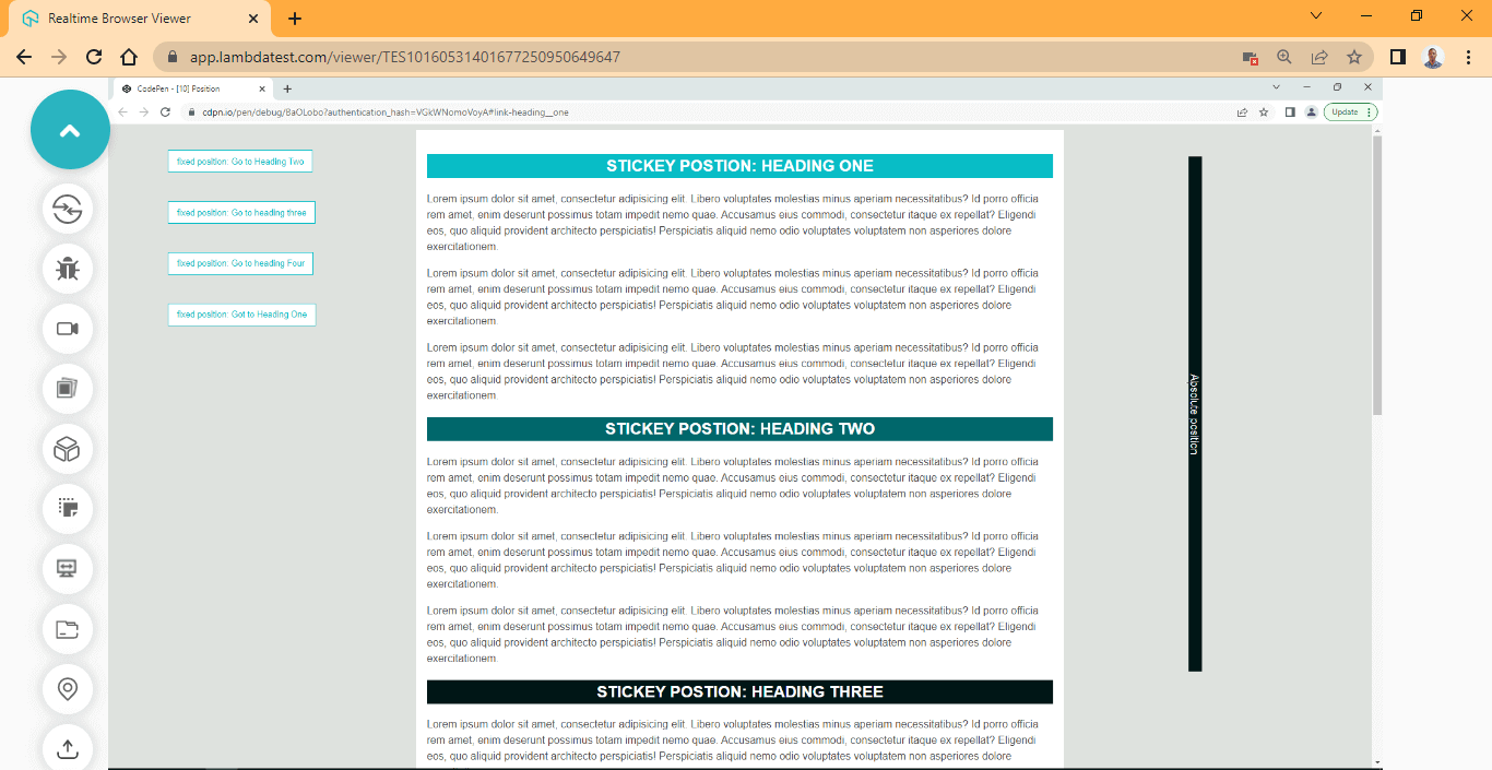
CodePen:
To see how the position property functions, use the scrollbar to scroll down and also click on the navbar on the left-hand side.
The CSS3 Box Model
In CSS3, every element renders as a box, that is, blocks, inline and inline-block elements. To understand how the box model works, we must first understand what makes up an element.
For example, if you create an element in an HTML document, the element is assigned content, padding, border, and margin as its default properties. When we set values to the properties, they compute together to form the box model.
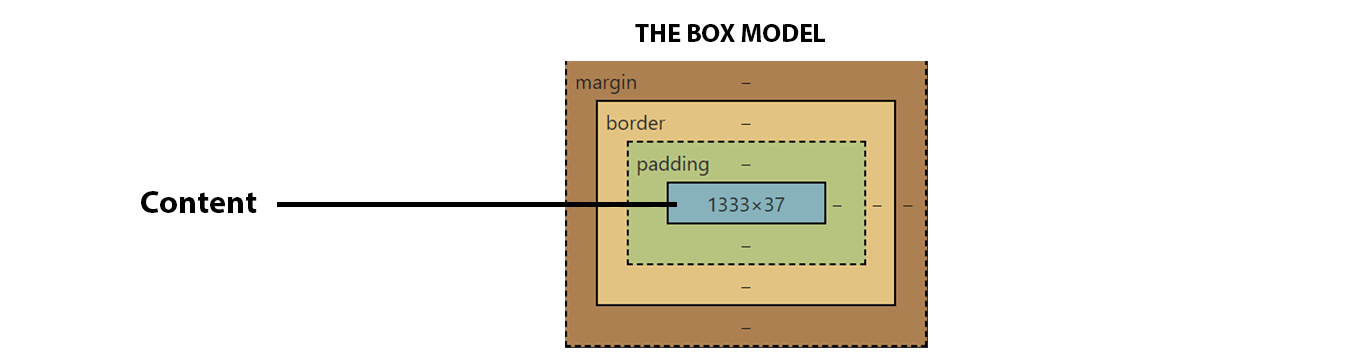
The Box Model is a crucial topic to understand in CSS3. This Box Model relies heavily on the display property as this will determine the level (block, inline, or inline-block) the element will render.
Based on the value set by the display property, the element will behave differently among other surrounding elements.
The Box Model Properties
- marginThe margin property is a shorthand property used to set white spaces outside of the box (The element). It helps to add white space between two elements. And it has the longhand properties of margin-top, margin-right, margin-bottom, and margin-left, respectively.
The margin property does not add to the size of the box; it just adds white spaces around it.
- BorderThe CSS border property is a shorthand property used to set a line within the box (The element). This property sits in between the margin and the padding property. And it has the longhand properties of border-width, border-color, border-styles, border-radius, and border-image, respectively. The border property size of the box. Depending on the size assigned to the border, the box model will increase.
- PaddingThe padding property is a shorthand property used to set white spaces between the border and the content within the box (the element). This property sits between the border property and the box’s content. And it has the longhand properties of padding-top, padding-right, padding-bottom, and padding-left, respectively.
- ContentThe content of the box model is not a property, and this refers to the content within the box, such as plain text (text-node) or image. When the box does not have a specific size set by width or height, the content size becomes the box’s size.
HTML:
<!DOCTYPE html>
<html lang="en">
<head>
    <meta charset="UTF-8">
    <meta http-equiv="X-UA-Compatible" content="IE=edge">
    <meta name="viewport" content="width=device-width, initial-scale=1.0">
    <link rel="stylesheet" href="style.css">
</head>
<body>
    <div class="content">This is a box model examples</div>
    <div class="box block">This is a box model examples</div>
    <div class="box"></div>
</body>
</html>
CSS:
.content {
    background-color: coral;
    color: white;
    font-size: 2em;
}

.box {
    font-size: 2em;
    font-family: calibri;
    color: #fff;
    background-color: coral;
    border: firebrick 3px solid;
    width: 160px;
    height: 160px;

    margin: 20px;
}
Browser Output:
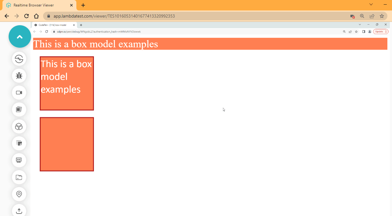
CodePen:
From the browser output, the three elements we have on the page are block level elements, the first element takes the width of the browser and the height of the text content. This happens to a block-level element when width and height are not specified, while the two elements below take the width and height of 160px defined.
To see how these elements take up space in the browser, we have to inspect them using the DevTools. To do this, right-click on the browser and select “Inspect.” This should open up your developer DevTools.
Browser Output:
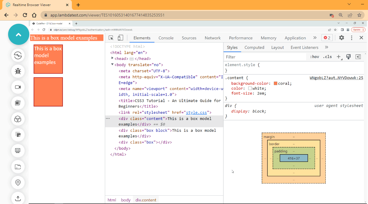
Select the element and click on the style tap.
Here is another illustration of how the first box without defined width and height compares to the second box with defined width and height.
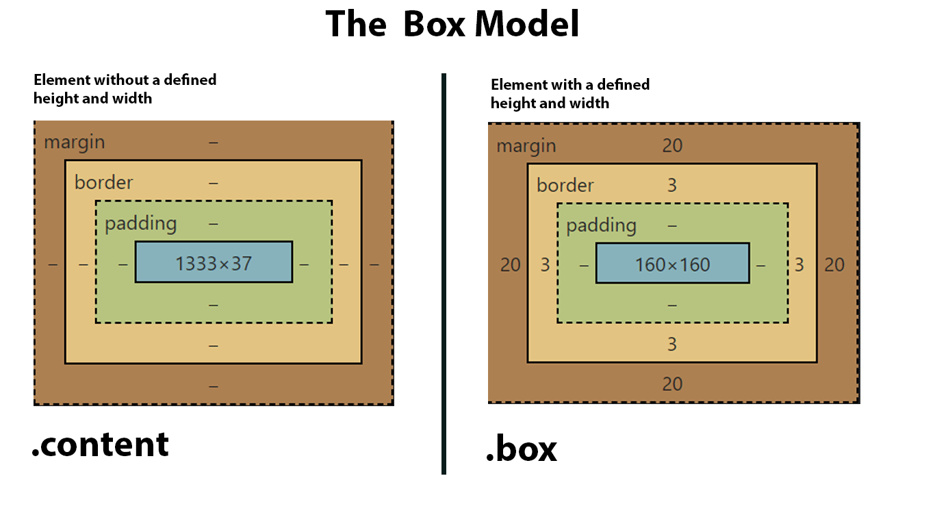
From the first box, you will see that the margin, border, and padding have no values, while in the second box, the margin and border have values. These values are the sizes we assigned to them. For example, the margin has a value of 20px across, corresponding to margin-top 20px, margin-right 20px, margin-bottom 20px, and margin-left 20px. The same is happening if we look at the border as shown, we have 3px across, but the padding has no value; this is because no value is set for padding yet.
Let’s take another example.
HTML:
<!DOCTYPE html>
<html lang="en">
<head>
    <meta charset="UTF-8">
    <meta http-equiv="X-UA-Compatible" content="IE=edge">
    <meta name="viewport" content="width=device-width, initial-scale=1.0">
    <link rel="stylesheet" href="style.css">
</head>
<body>
    <div class="parent">
        <div class="box block">This is a box model examples</div>
        <div class="box block-two">This is a box model examples</div>
        <div class="box empty"></div>
        <div class="box empty-two"></div>
    </div>

</body>
</html>
CSS:
.parent {
    display: flex;
}

.box {
    background-color: coral;
    width: 160px;
    height: 160px;
}

.block {
    font-family: calibri;
    border: firebrick 2em solid;
    padding: 1em;
    color: #fff;
    font-size: 2em;
    margin: 0 3em;
}

.block-two {
    font-family: calibri;
    border: firebrick 2em solid;
    padding: 1em;
    color: #fff;
}

.empty {
    padding: 1em;
    margin:0 2em;
}
Browser Output:
CodePen:
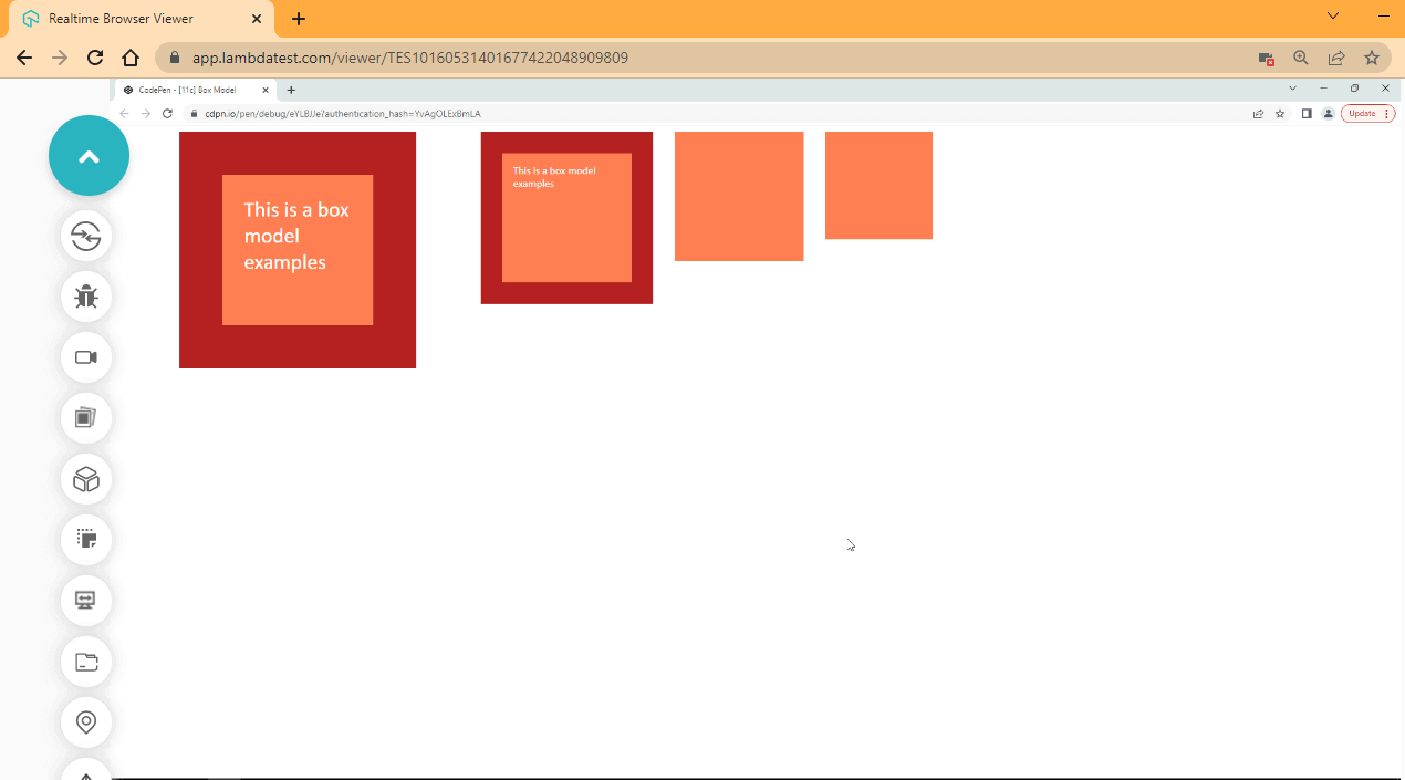
From the browser out, each element has the same size of width and height, but some elements are bigger than others. This is because when any property with a length value of size is applied to a box, the box grows in size. For example, block and block-two have the same size, width, height, and border, but the block has a font size of 2em, which helps increase the size of the box to be larger.
While the third and fourth elements are a difference of 1em of padding, which is applied to the third element making it larger than the fourth element.
- Box-sizing PropertyThe box-sizing property is used to calculate the total size applied to the element box. For the examples we’ve given so far, we talked about how every size applied to the box increases the overall size of the box.
By default, when a width and height value is set, it only affects the content area of the box model and not the overall box, and when a border or padding is added to the box, the sizing for border, padding, width, and height get calculated to equal the overall size of the box.
This can be very frustrating when working with elements because you must constantly calculate the width, height, border, and padding before you even assign a size to an element. However, there is a way to work around this using the border-box value. The box-sizing property has two keyword values, border-box, and content-box.
- border-box: This value tells the browser to minus the padding and border size from the width and height in such a way that the overall size of the element is equal to the width and height set.
- content-box: This is the default behavior of the element box.
HTML:
<!DOCTYPE html>
<html lang="en">
<head>
    <meta charset="UTF-8">
    <meta http-equiv="X-UA-Compatible" content="IE=edge">
    <meta name="viewport" content="width=device-width, initial-scale=1.0">
    <link rel="stylesheet" href="style.css">
</head>
<body>
    <div class="parent">
        <div class="box block">This is a box model examples</div>
        <div class="box block-two">This is a box model examples</div>
    </div>
</body>
</html>
CSS:
.parent {
    display: flex;
}

.box {
    background-color: coral;
    width: 160px;
    height: 160px;
    border: firebrick 10px solid;
    font-family: calibri;
    padding: 1em;
    color: #fff;
    font-size: 18px;
    margin: 0 3em;
}

.block {
    box-sizing: border-box;
}
Browser Output:
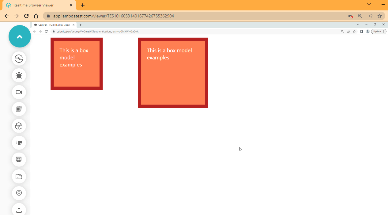
From the browser output, the first element is set to a box-sizing of border-box. This helps reduce the size of the box to fit in with the size of the content.
The box-sizing property is beneficial, and many developers use it. However, there are better ways it can be implemented, and most developers prefer to assign it to the root HTML element.
Syntax:
html {
    box-sizing: border-box;
}

*, *::after, *::before {
    box-sizing: inherit;
}
Responsive Web Design
Responsive Web Design (RWD) is an approach of how web pages should be designed with the responsibility of adapting to various devices and screen resolutions as if it was created for such devices or screen.
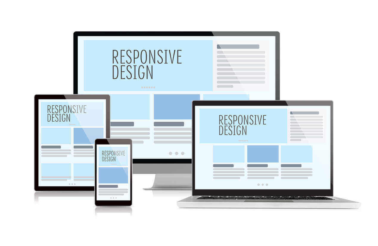
Source: irapture.com
Before responsive CSS design, most websites primarily built for desktops were rendered poorly on smaller devices such as mobile phones. For instance, when a website built for desktop is loaded on small devices such as mobile phones, the text becomes too large, images overflow out of the viewport, and users end up scrolling left to right, zooming in and out just to view content. This has led to a bad user experience.
With the constant advancement in technology and increase in different platforms with internet capability such as; Desktop, iPad, Tablets, iPhones, Android, SmartTV, and now foldable phones are everywhere. More companies are interested in reaching more users via these platforms and want their websites to run on multiple devices.
Imagine a situation where a company had to design for every platform just to reach a potential user, this will require much effort and sometimes impossible, and this is because there are just too many platforms out there to design for.
With a Responsive Web Design approach, problems like this can be fixed with various CSS techniques, such as Flexible box models, CSS Grids, and Media queries. However, Media Queries takes this even further by providing web authors the capability to create breakpoints using the @media rule to target different device widths (resolutions) and sizes.
To test your website or web app’s working or functionality on different devices and screen sizes, TestMu AI, a cloud-based digital experience testing platform, offers a dev-friendly tool named ‘LT Browser 2.0’ to run your website or web application over multiple device viewports simultaneously. It provides 50+ pre-installed viewports to perform responsive testing on your websites and web applications.
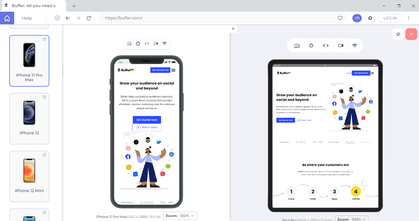
LT Browser 2.0 offers features like side-by-side view, scroll sync, instant debugging, website testing under various network conditions, and more that make mobile testing quicker and generating performance reports powered by Google Lighthouse, and much more. Additionally, by integrating with project management tools, LT Browser 2.0 enables you to work with your team to scale your development process.
If you are intrigued to know more about LT Browser 2.0, refer to our LT Browser 2.0 tutorial to get started with the responsiveness test right away.

However, you can also subscribe to our TestMu AI YouTube Channel for more information on software testing tools and tutorials around Selenium testing, Playwright, Appium, etc.
Media Queries
CSS media queries are used to set breakpoints for different devices’ widths (resolution), heights, and sizes. We can specify what happens when the content of our website is loaded on a smaller device or set how elements should render on a specific orientation, such as landscape or portrait.
This helps elements not to overflow on smaller devices or when a website loads on a different orientation because we can decide what happens to this element within media queries in our stylesheet.
To use media queries, we make use of the @media at-rule.
Syntax:
@media all and (max-width: 950px){
    body {
        Font-size: 16px;
    }
Type of CSS Media Queries
We can use media queries in the following ways.
- all: used to target all media types, such as screens, printers, and speech.
- screen: used to target screen devices, such as mobile phones, desktops, and laptops.
- print: used to set web pages for printers. That is how the document should be when printed.
- speech: used to set rules for screen readers.
This helps us to set how web pages respond on different mediums.
HTML:
<!DOCTYPE html>
<html lang="en">
<head>
    <meta charset="UTF-8">
    <meta http-equiv="X-UA-Compatible" content="IE=edge">
    <meta name="viewport" content="width=device-width, initial-scale=1.0">
    <link rel="stylesheet" href="style.css">
</head>
<body>
    <!-- The main tag -->
    <main class="root">
        <header>
            <!-- nav bar -->
            <nav>
                <div class="logo">
                    <h1>Responsive</h1>
                </div>

                <div class="nav__link">
                    <ul>
                        <li><a href="">Home</a></li>
                        <li><a href="">Contact</a></li>
                        <li><a href="">About</a></li>
                    </ul>
                </div>

                <div class="call__to__action">
                    <a href="">Get in Touch</a>
                </div>
            </nav>
        </header>

        <!-- Hero section -->
        <section class="hero">
            <section>
                <h1>This is A Responsive Design Example</h1>
                <p>With Responsive Design Website can perform well on multiple devices</p>

                <section class="btn__wrapper">
                    <button>Get in Touch</button>
                </section>
            </section>
        </section>
    </main>
</body>
</html>
CSS:
/*
    # White Space Remover presets
*/

html {
    box-sizing: border-box;
    padding: 0;
    margin: 0;
}

*, *::after, *::before {
    box-sizing: inherit;
    margin: inherit;
    padding: inherit;
}

/*
    # Navbar
*/

body {
    background-image: linear-gradient(to right top, #051937, #004d7a, #008793, #00bf72, #a8eb12);
    background-repeat: no-repeat;
    height: 100vh;
}

nav {
    display: flex;
    flex-direction: row;
    justify-content: space-around;

    margin-top: 10px;
}

.logo h1 {
    font-size: 1.5em;
    font-family: 'Trebuchet MS';
    color: #fff;
    cursor: pointer;
}

a, li {
    text-decoration: none;
    list-style: none;
}

.nav__link a {
    font-size: 1.2em;
    border-radius: 3px;
    padding: 1em 2em;
}

.nav__link a:hover {
    background-color: white;

}

.nav__link ul{
    display: flex;
    flex-direction: row;
    margin-left: 1em;
}

.call__to__action {
    display: flex;
}

.call__to__action a {
    font-family: calibri;
    font-size: 1.2em;
    background-color: #008793;
    padding: 0.3em 1em;
    color: white;
    border-radius: 5px;
    transition: all 600ms ease-in;
}

.call__to__action a:hover {
    background-color: white;
    color: #008793;
}

/*
    # Hero Section
*/

.hero {
    display: flex;
    justify-content: center;
    position: relative;
    top: 8em;
}

.hero h1 {
    font-family: 'Trebuchet MS';
    font-size: 2.5em;
    text-align: center;
    color: #fff;
    margin-bottom: 0.2em;
}

.hero p {
    font-family: calibri;
    font-size: 1.2em;
    text-align: center;
    color: #fff;
}

.btn__wrapper {
    display: flex;
    flex-direction: row;
    justify-content: center;

    margin-top: 2em;
}

button {
    font-family: calibri;
    font-size: 1.2em;
    background-color: #00bf72;
    padding: 0.3em 1em;
    color: white;
    border-radius: 5px;
    border: none;
    cursor: pointer;
    transition: all 600ms ease-in;
}

button:hover {
    background-color: white;
    color: #008793;
}

/* Media queries */
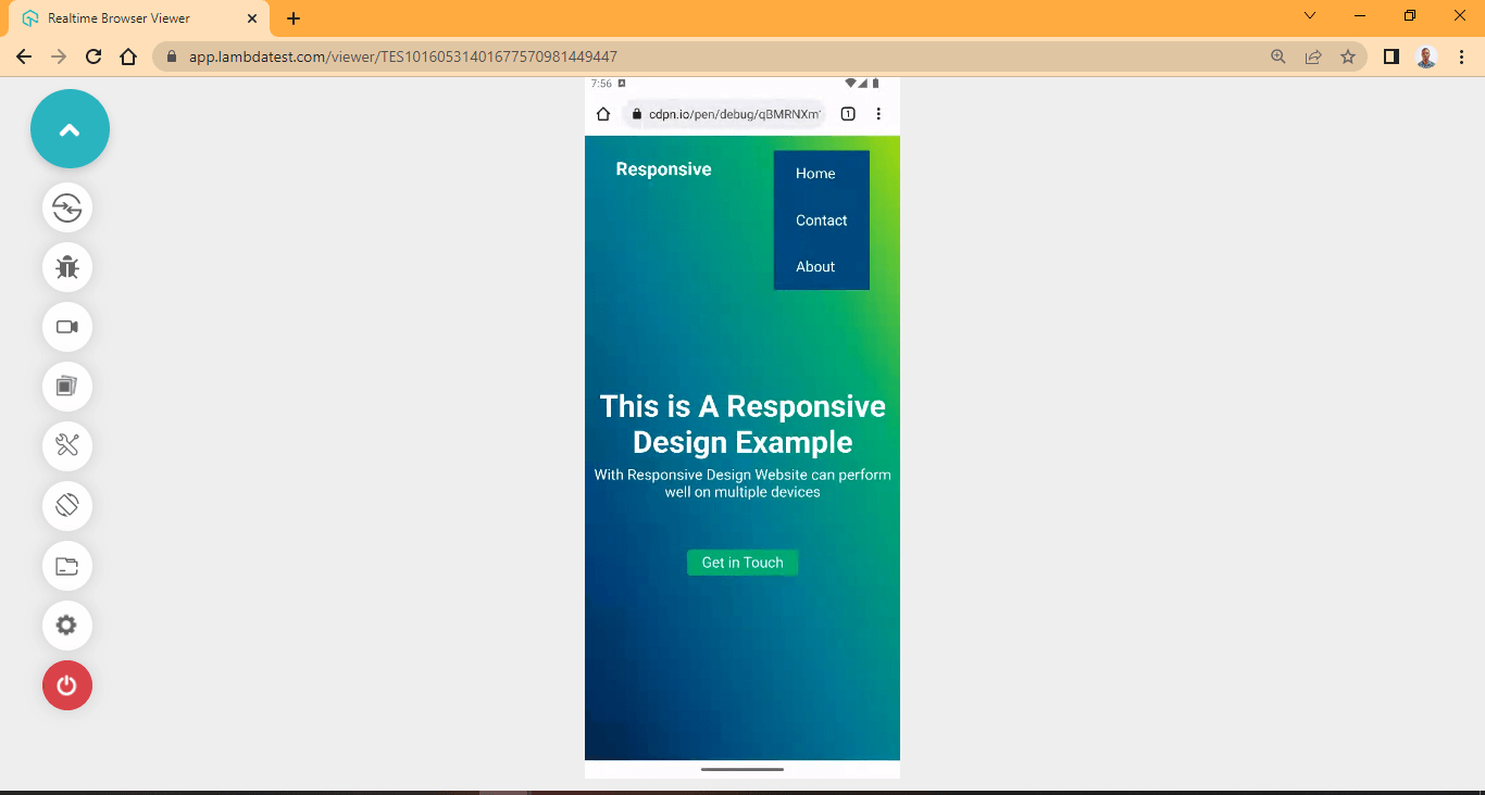
@media all and (max-width: 950px){
    .call__to__action {
        display: none;
    }

    .nav__link ul {
        display: flex;
        flex-direction: column;
        margin: 0;
        background: #004d7a;
    }

    .nav__link a {
        display: inline-block;
        font-size: 1.2em;
        border-radius: 0px;
        color: #fff;
        padding: 1em 1.5em;
        font-family: calibri;
        margin: 0;
        width: 100%;
        transition: background-color 0.5s ease;
    }

    .nav__link a:hover {
        background: #051937;
        color: #fff;
    }
}
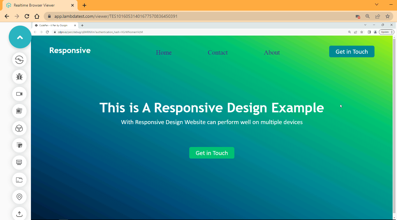
Browser Output (Desktop View):
Browser Output (Mobile View):
CSS Specificity
It refers to how a CSS rule with higher precedence supersedes another CSS rule with less precedence. In CSS3, the rule with higher precedence is said to have a higher specificity.
So how does specificity work? By default, browsers execute CSS code from top to bottom. That means the CSS rule at the top gets executed first, followed by the CSS rule that comes next.
HTML:
<p  id="coral" class="red blue purple">
        This is a simple example on specificity
</p>
CSS:
.red {
    background-color: red;
}

.blue {
    background-color: blue;
}
Browser Output:
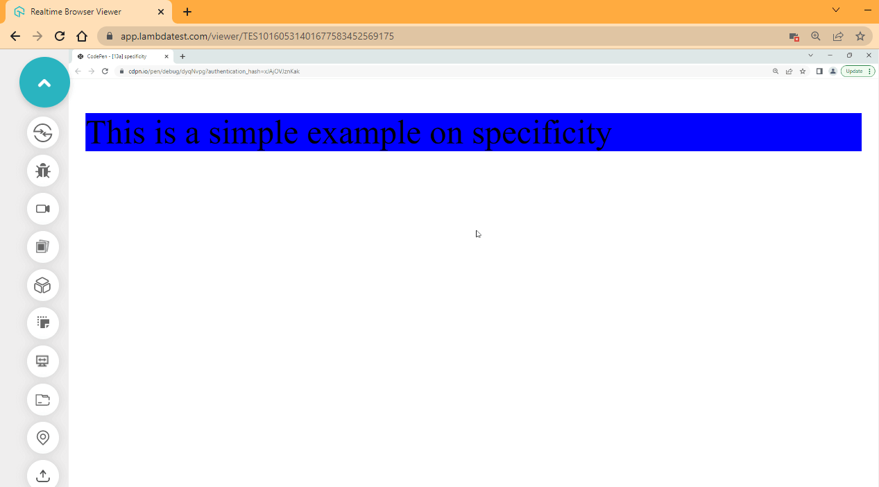
From the browser output, the second CSS rule of blue supersedes the first CSS rule of red. This is because when the browser executes the stylesheet, it executes the red CSS rule first and goes along and executes the next CSS rule, which is blue. Since the last rule refers to the same element, it supersedes the first one because it is the last rule that remembers that element.
HTML:
<p  id="coral" class="red blue purple">
        This is a simple example on specificity
 </p>
CSS:
#coral {
    background-color: coral;
}

.red {
    background-color: red;
}

.blue {
    background-color: blue;
}

p {
    background-color: brown;
}
Browser Output:
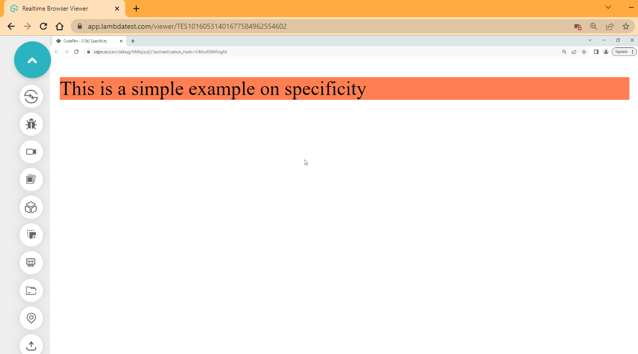
If we take a look at our code from the browser output, it seems things are not working as expected.
We defined four separate rules in CSS3, the first applied instead of the last one. This is because we are working with specificity, and the ID attribute selector has a higher specificity than the class attribute or the type selector. So, in this case, the background color of the coral got applied to the selected element.
Specificity by Selector
The browser scores specificity from the attribute you reference on the element, and an HTML element carries several attribute types:
- Style attribute
The style attribute is primarily responsible for styling HTML elements and, as a result, has the highest level of specificity. For example, if you define a CSS rule on a type, class, or Id attribute, if the style attribute has that same specific CSS rule, the CSS rule defined in the style attribute will supersede other attributes. So the style attribute is the first and most specific attribute with the highest specificity.
- Id attribute
The Id attribute is a unique identifier and the second most specific attribute with the highest specificity.
- Class attribute
The class attribute is a valid identifier for referencing elements in the stylesheet and the third most specific attribute with the highest specificity.
Type Selector
The type selector is a valid identifier for referencing elements in the stylesheet and the fourth most specific attribute with the lowest specificity.
HTML:
<p  id="coral" class="red blue purple" style="background-color: plum;">
        This is a simple example on specificity
 </p>
CSS:
Browser Output:
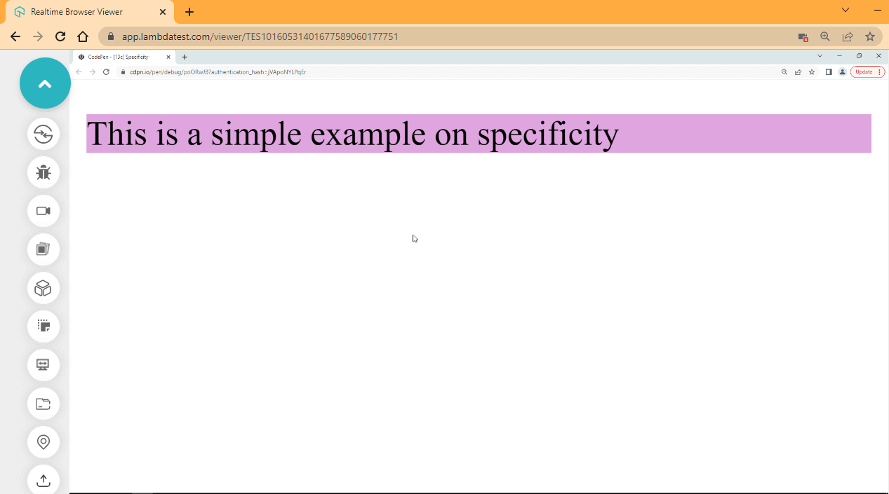
The style attribute supersedes other attributes and selectors defined in the stylesheet.
How is specificity calculated?
Specificity is represented with four zeros (0, 0, 0, 0), and each zero represents a particular HTML attribute or type.
See the table below.
| Attributes / Selectors | Specificity Value | Syntax |
|---|---|---|
| style (style attribute) | 1000 (1,0,0,0) | <p style=”background-color:plum;”> |
| id (id attribute selector) | 100 (0,1,0,0) | #id {background-color:coral;} |
| Class (class selector) | 10 (0,0,1,0) | .class {background-color:blue;} |
| <p> (p tag) Type selector | 1 (0,0,0,1) | p {background-color:brown;} |
It’s important to note that each value 1000, 100, 10, 1 does not mean specificity exist in base 10 numbering system, what this means, for example, the style attribute takes the first position of 1 out of the four zeros while the id attribute takes the third position of 1 in the four zeroes, and the list goes on.
CSS Inheritance
In CSS3, when a CSS rule is not yet applied to a specified element, it automatically gets the CSS rules applied to its parent, which is called inheritance.
However, there are some rules you must adhere to when working with inheritance.
- There are inheritable and non-inheritable properties.
- Child element will only inherit property values from its parent if the property is inheritable.
- The parent’s computed value is parsed to the child if the child element does not have that same property set yet.
- Non-inheritance properties can support inheritance through the Universal Inheritance properties values.
HTML:
<!DOCTYPE html>
<html lang="en">
<head>
    <meta charset="UTF-8">
    <meta http-equiv="X-UA-Compatible" content="IE=edge">
    <meta name="viewport" content="width=device-width, initial-scale=1.0">
    <link rel="stylesheet" href="style.css">
</head>
<body>
    <main class="root">
        <ul class="parent root-child">
            <li class="sibling child__one">List Items One</li>
            <li class="sibling child__two">List Items Two</li>
            <li class="sibling child__three">List Items Three</li>
        </ul>

        <p class="paragraph root-child">Lorem ipsum dolor sit amet consectetur adipisicing elit. Exercitationem eaque nesciunt excepturi, ipsum magni minus at labore praesentium veniam fugiat.</p>
    </main>
</body>
</html>
CSS:
.root {
    color: sienna;
    font-size: 2em;
    font-family: arial;
}
Browser Output:
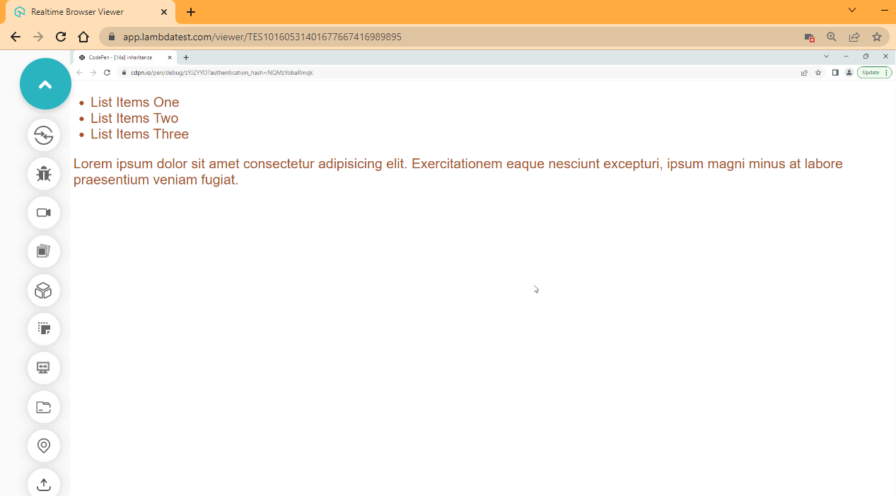
From the browser output, we specify a color, font-size and font-family to the root element, and all the children and grand-children inherit the color. This is because the color, font-size, and font-family are inheritable properties.
Inheritable Property
Inheritable properties are those properties that, when specified, the computed values of those properties are parsed to the child element if the child element does not have the same property set yet.
Some of these properties include;
- font-family,
- color,
- font-weight,
- letter-spacing,
- line-height,
- text-align,
- list-style-type,
- list-style,
- visibility
Non-inheritable Property
Non-inheritable properties are those properties that, when specified, the computed values of those properties are not parsed to the child element except if the child element is specified with the inherit keyword.
Some of these properties include;
- margin
- border
- padding
- height
- width
HTML:
CSS:
.root {
    border: 2px solid sienna;
    color: sienna;
    font-size: 2em;
    font-family: arial;
}
Browser Output:
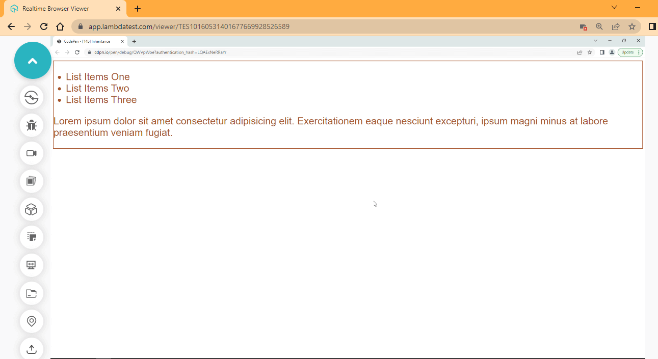
The border property is a non-inheritable property by default, so it only applies to the border of the root element where it is specified.
Now let’s take another example to see how we can change this.
HTML:
CSS:
.root {
    border: 2px solid sienna;
    color: sienna;
    font-size: 2em;
    font-family: arial;
}

.parent {
    border: inherit;
}
Browser Output:
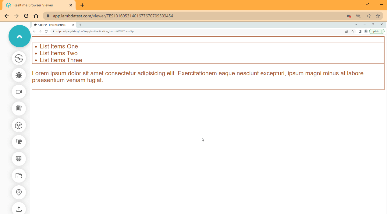
Now that we have inherit keyword specified on the parent element, we now have a border on the parent element of the list items. It’s also important to note that the inherit keyword will only work if the element we are inheriting from is the direct parent element.
How to control inheritance?
To control inheritance, we can use the universal property values in CSS.
- Inherit
The inherit keyword value is used to inherit the computed values of the direct parent element.
HTML:
<!DOCTYPE html>
<html lang="en">
<head>
    <meta charset="UTF-8">
    <meta http-equiv="X-UA-Compatible" content="IE=edge">
    <meta name="viewport" content="width=device-width, initial-scale=1.0">
    <link rel="stylesheet" href="style.css">
</head>
<body>
    <main class="root inherit">
        <ul class="parent root-child">
            <li class="sibling child__one">Pineapple</li>
            <li class="sibling child__two">Apple</li>
            <li class="sibling child__three">Orange</li>
        </ul>
    </main>
</body>
</html>
CSS:
.root {
    background-color: violet;
    border: 2px solid sienna;
    font-size: 2em;
    font-family: arial;
}
.parent {
    border: inherit;
}
Browser Output:
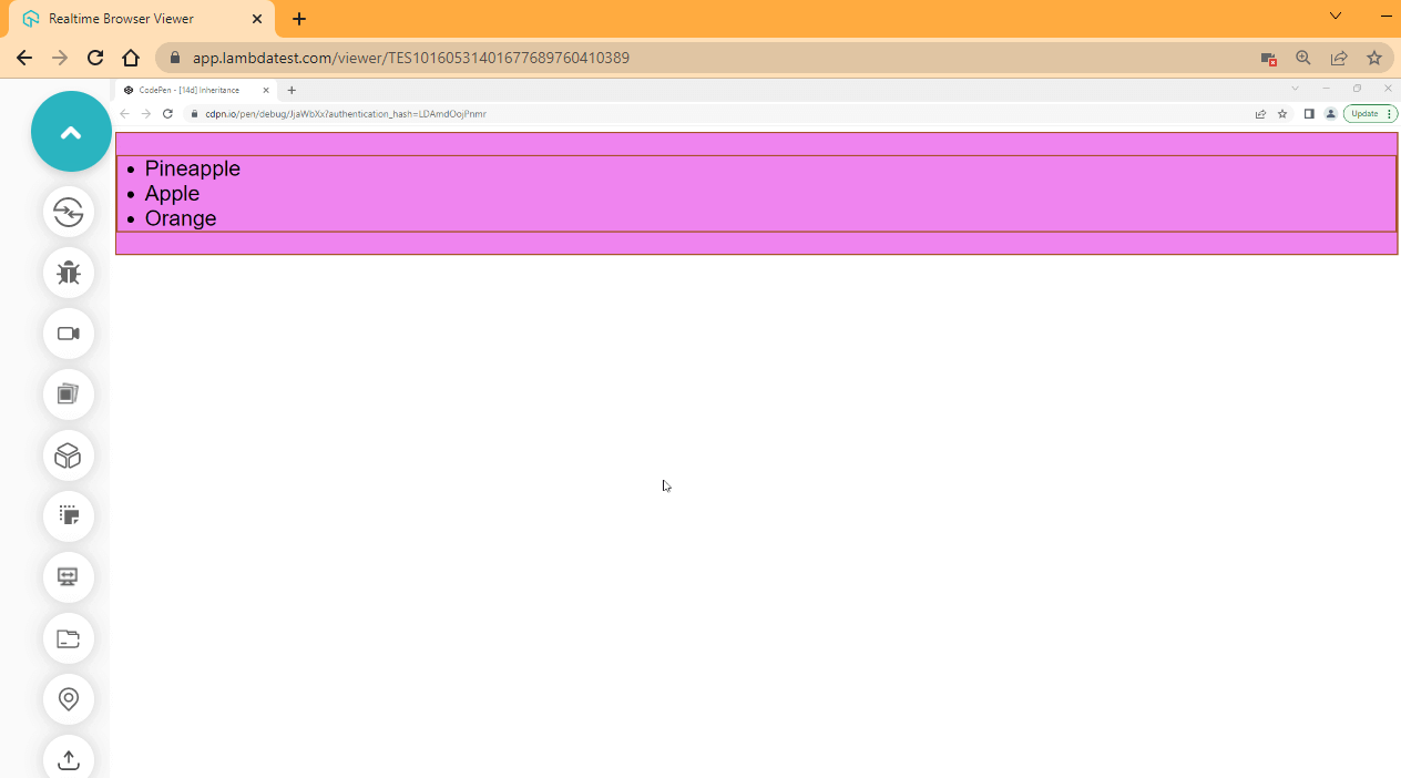
See the Pen [14d] Inheritance by Ocxigin (@ocxigin) on CodePen.
Initial
This initial keyword value is used to clear all CSS rules defined on an element. It sets the element back to its default format.
HTML:
CSS:
.root {
    background-color: violet;
    border: 2px solid sienna;
    font-size: 2em;
    font-family: arial;
}

.parent {
    border: inherit;
}

.root {
    all: initial;
}
Browser Output:
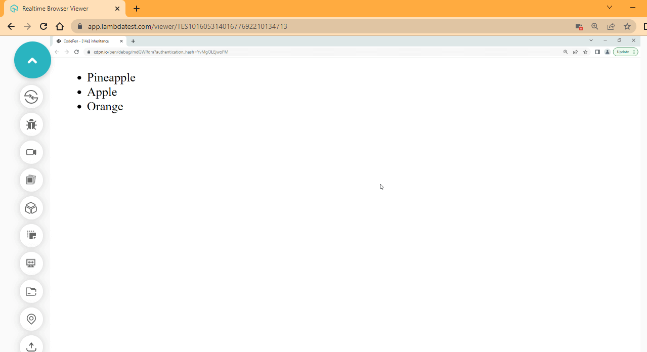
See the Pen [14e] inheritance by Ocxigin (@ocxigin) on CodePen.
Unset
The unset property is used to inherit the computed values from an inheritable property and set the non-inheritable element to its default rules (the user agent stylesheet). When we use unset on an inheritable element, the unset behaves like inherit, and when we use it on a non-heritable element, it behaves like the initial value.
HTML:
CSS:
.root {
    background-color: violet;
    border: 2px solid sienna;
    font-size: 2em;
    font-family: arial;
}

.parent {
    border: inherit;
    color: blueviolet;
}

.sibling {
    color: brown;
}

.child__one {
    color: unset;
}
.root {
    border: unset;
}
Browser Output:
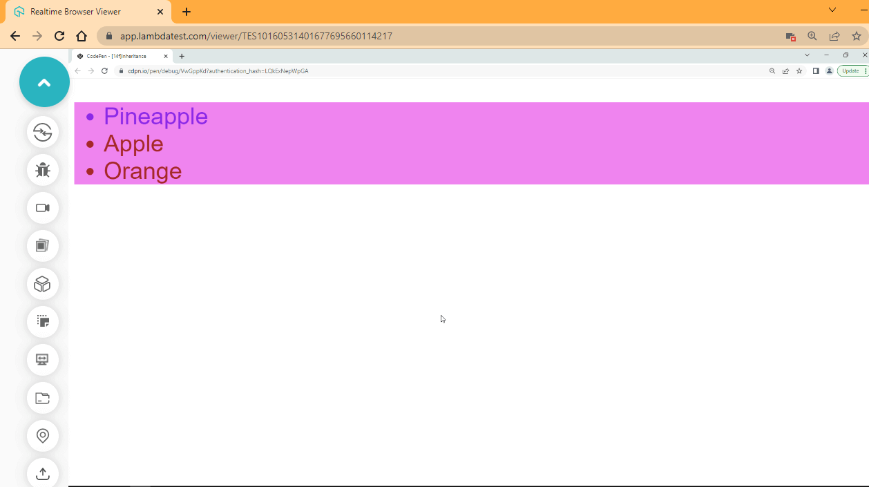
See the Pen [14f]inheritance by Ocxigin (@ocxigin) on CodePen.
The CSS Cascade
CSS rules are applied in ascending order; that is, the CSS rule at the top is first executed and then followed by the next CSS rule. So in a case where the same CSS rule is declared or repeated, the last rule is applied.
Cascade is the algorithm for solving naming conflicts. This is where two or more CSS rules of the same type are repeated, and the most specific rule is applied to the element.
HTML:
<!DOCTYPE html>
<html lang="en">
<head>
    <meta charset="UTF-8">
    <meta http-equiv="X-UA-Compatible" content="IE=edge">
    <meta name="viewport" content="width=device-width, initial-scale=1.0">
    <link rel="stylesheet" href="style.css">
</head>
<body>
    <main class="parent">
        <ol>
            <li class="item-one">Cascade</li>
        </ol>
    </main>
</body>
</html>
CSS:
.item-one {
    background-color: aqua;
}

.item-one {
    background-color: salmon;
}

.item-one {
    background-color: orangered;
}
Browser Output:
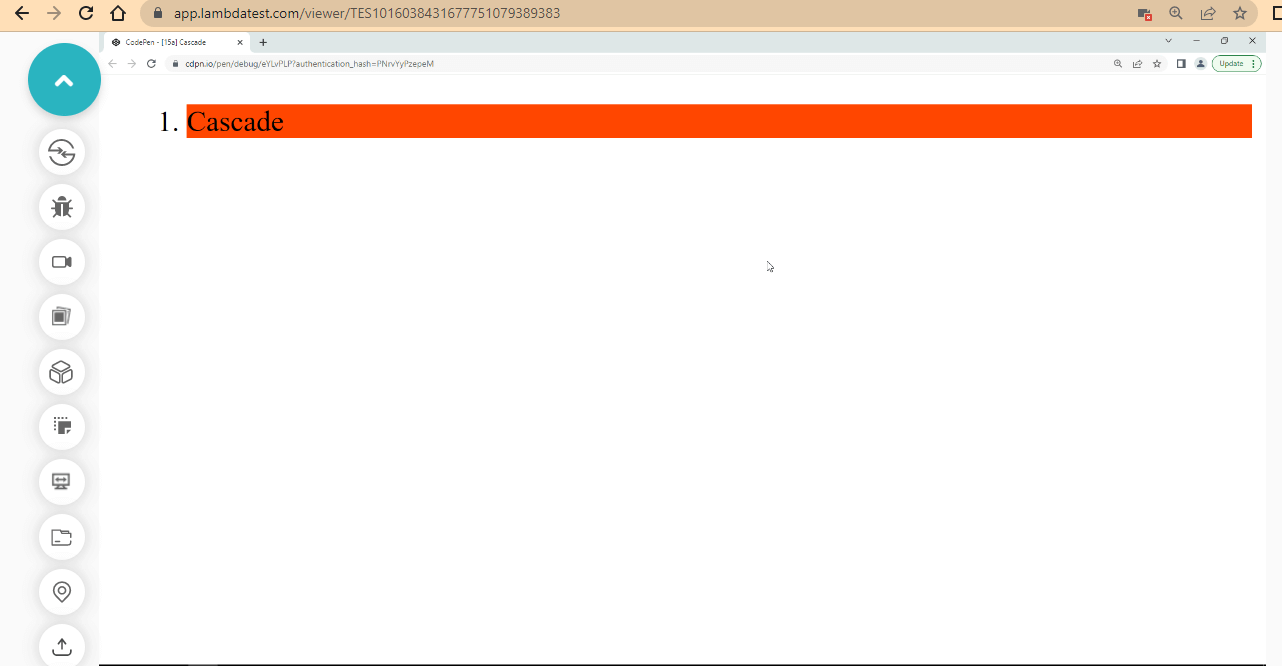
We have three CSS rules specified in our stylesheet, but from the browser output, the last style is applied to the element.
!important keyword
From the first example, we’ve seen what happens when we declare more than one CSS rule of the same type and how the CSS cascade is used to solve this problem. But at times, we want to be able to specify what CSS rule to apply, even when we declare more than one CSS rule of the same type.
In this case, the !important keyword is used to solve this problem. The important keyword is the most specific rule in CSS3. It’s even more specific than the style attribute.
HTML:
<!DOCTYPE html>
<html lang="en">
<head>
    <meta charset="UTF-8">
    <meta http-equiv="X-UA-Compatible" content="IE=edge">
    <meta name="viewport" content="width=device-width, initial-scale=1.0">
    <link rel="stylesheet" href="style.css">
</head>
<body>
    <main class="parent">
        <ol>
            <li class="item-one" style="background-color: brown;">Cascade</li>
        </ol>
    </main>
</body>
</html>
CSS:
.item-one {
    background-color: aqua;
}

.item-one {
    background-color: salmon !important;
}

.item-one {
    background-color: orangered;
}
Browser Output:
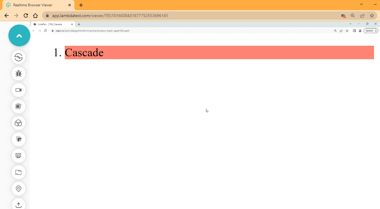
We used the !important keyword to select the second CSS rule.
Cascading inline, internal, and external CSS
We talked about inline, internal, and external CSS before, but it’s important to note that CSS3 cascades to the most specific rule and then applies that rule to the element.
The inline, internal, and external CSS exist in different levels, so if the same CSS rule of the same type is applied to a particular element from different levels of CSS3, such as inline, internal, and external CSS, the most specific level gets applied to the element.
HTML:
<!DOCTYPE html>
<html lang="en">
<head>
    <meta charset="UTF-8">
    <meta http-equiv="X-UA-Compatible" content="IE=edge">
    <meta name="viewport" content="width=device-width, initial-scale=1.0">
    <link rel="stylesheet" href="style.css">
</head>

<!-- Internal CSS -->
<style>
    .item-one {
    background-color: aqua;
    color: white;
}
</style>

<body>
    <main class="parent">
        <ol>
            <!-- Inline CSS -->
            <li class="item-one" style="background-color: brown; color: white;">Cascade</li>
        </ol>
    </main>
</body>
</html>
CSS:
/* External CSS */
.item-one {
    background-color: salmon;
    color: white;
}
Browser Output:
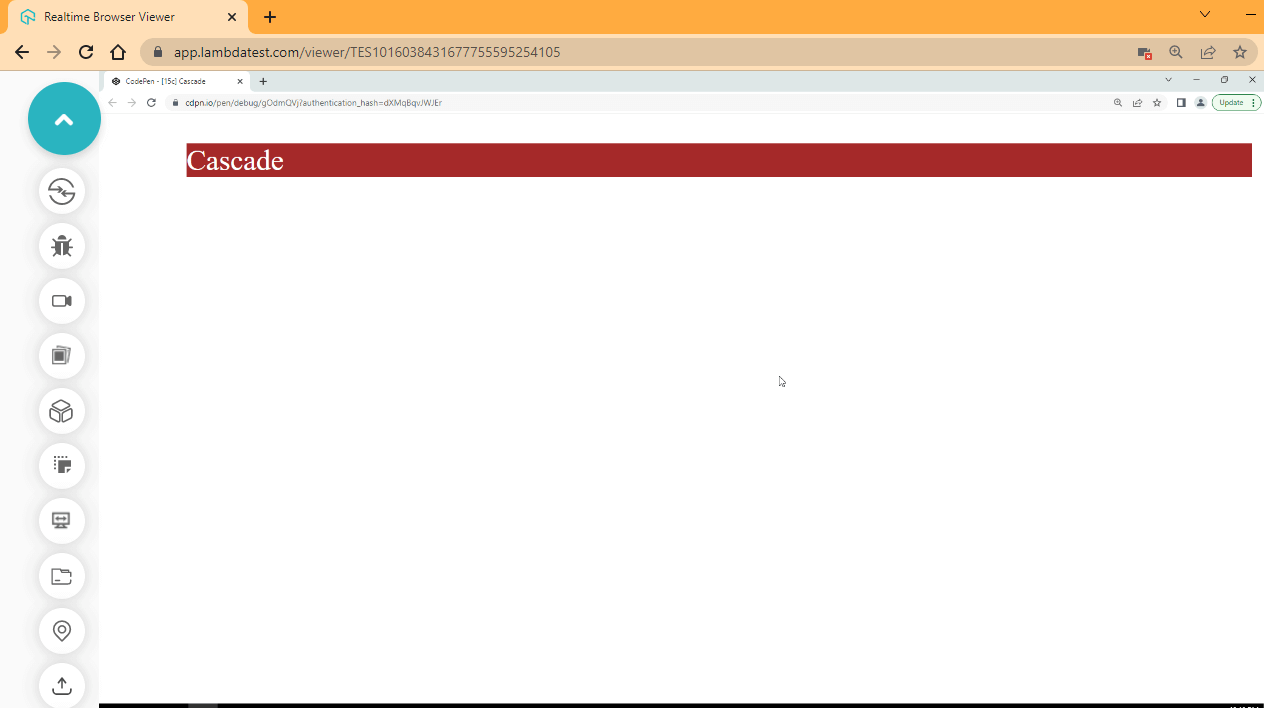
Without the !important keyword being used, the style attribute is the most specific CSS rule. The style attribute is found in the inline CSS.
Origin Types
CSS rules are determined or come from different sources or origin types, such as User Agent Stylesheets, Author Stylesheets, and User Stylesheets.
- User Agent Stylesheets
All web elements have some special CSS rules applied to them by default in the browser. We call these the User Agent Stylesheets.
When a plain HTML tag with text or image content is parsed and displayed by the browser without any CSS rule applied to it. The way the content is presented, the font-style, font-size, or font-family used is a result of the user stylesheet.
We can check what CSS rule is being applied to our element by the User Agent Stylesheet using the browser DevTools.
To open up your DevTools, right-click on the browser and select inspect or press F12.
HTML:
<p>User Stylesheet Examples</p>
DevTools:
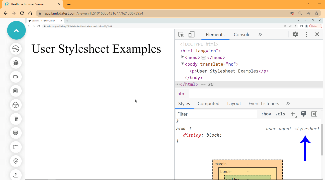
See the Pen [16a] User Agent Style by Ocxigin (@ocxigin) on CodePen.
We created a < p > tag, and from the DevTool you can see that the < p > has a display of block applied to it from the user agent stylesheet. The blue arrow indicates the User Agent Stylesheet.
The Author Stylesheets are the CSS rules written by web developers. This is meant to overwrite the user-agent stylesheets and provide a better-looking element that responds well on the browser.
HTML:
<p>Author Stylesheets Examples</p>
CSS:
p {
  background-color: blue;
  display: inline-block;
  color: white;
  font-family: calibri;
  font-size: 2em;
  padding: 1em 2em;
  cursor: pointer;
  box-shadow: 2px 5px 8px 3px rgba(0,0,0,0.4);
  transition: background 0.5s ease-in;
}

p:hover {
  background-color: purple;
}
The above CSS code we just created is what is called the Author Stylesheets. This style is meant to overwrite the User Agent Stylesheets.
Browser Output:
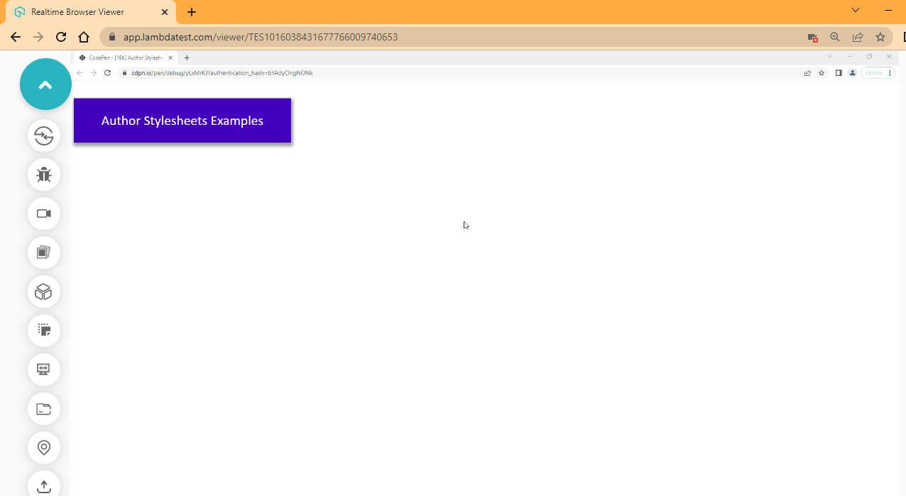
See the Pen [16b] Author Stylesheets by Ocxigin (@ocxigin) on CodePen.
The User Stylesheets are browser changes or settings that can be used to trigger Author Stylesheets. This is usually put in place by web browsers to give users/readers control of how some of their content is displayed in their browsers.
CSS white-space Property
When we talk about whitespace, we mean those spaces between two characters created by the spacebar, tabs, or enter key (Line Break). In this CSS3 tutorial, whitespaces are intentionally created for better readability and debugging of our code. The browser usually ignores whitespaces.
CSS Code without Whitespace:
p{background-color: blue; display: inline-block; color: white;font-family: calibri;font-size: 2em;padding:1em 2em;cursor: pointer;box-shadow: 2px 5px 8px 3px rgba(0, 0, 0, 0.4);transition: background 0.5s ease-in;}p:hover{background-color: purple;}
The above code will run just fine, but it is difficult to read and stop potential bugs.
CSS Code with Whitespaces:
The use of whitespace is usually called code indenting. It makes code easy to read and debug.
Best CSS Frameworks
CSS frameworks are ready-to-use CSS utilities or design components created to enable rapid UI (User Interfaces) development for websites and web apps. CSS has lots of frameworks; below are some of the most used.
Tailwind CSS
Tailwind CSS is a utility-first framework with class utilities such as flex bg-blue-100 rounded-xl p-4 that is used to build rapid modern websites and web applications.
Tailwind CSS by design does not give you a design template to follow or a specific design pattern compared to most frameworks, but it provides basic utility classes that do just one thing.
For example, the py-4 utility class in Tailwind will add padding-top of 16px and padding-bottom of 16px. The Tailwind CSS approach lets developers write less code directly in the HTML markup.
Bootstrap
Bootstrap is a CSS framework that provides pre-built themes with JavaScript plugins. When building with Bootstrap, developers can use its pre-built template in HTML, CSS, and JavaScript. For example, building a navigation bar in Bootstrap is very straightforward. All you have to do is copy and paste the already-made nav template.
This helps save time in deciding how your navbar should look. However, you can also create your navbar style or customize the existing one with CSS or Sass.
Materialize CSS
Materialize CSS Is based on the Google material design concept. This design concept focuses on the card or box concept that every element can be treated as a card or box. It provides good use of visual hierarchy, the transition of cards in various forms, animation, and a very responsive and fluid system. Google’s goal is to develop a system of design that allows for a unified user experience across all its products on any platform.
Foundation
Foundation is a CSS framework for developing responsive UI components, UI templates, and code snippets. Foundation lets you create components for web elements such as an alert, disable button, error prompt, forms, etc. Foundation also comes with JavaScript plugins that enhance its interactivity. Zurb maintains Foundation CSS, and sometimes it can be called Zurb Foundation.
Bulma
Bulma is a CSS framework that is designed for developing user interfaces. It provides read-to-use frontend components that you can combine to build responsive web interfaces.
UIkit
UIkit is a CSS framework for building UIkits (Components). With UIkit, you can build fast and powerful user interfaces for websites and web-application.
CSS3 Browser Support
Most web developers are strongly interested in browser support for every CSS property they use. This is because CSS3 is a fast-changing language. CSS properties and values get outdated and replaced with better ones that solve the problem in a nicer-looking way and have more functionalities.
Here are some reasons developers check for browser support of CSS properties and values.
- Outdated properties and value (deprecated)
Developers may check a property or value browser support to see if the property or value is still a valid syntax. Using an invalid or outdated property or value might introduce bugs into code in the future when major browsers have entirely discontinued the property or values.
- Experimental Mode Property or Value
New properties or values are usually put in experimental mode until it becomes standard and significant browsers begin to use them. Although the said property or value can still be very functional when you implement it in your project, it is usually advised not to be used on production because it might also fall out of favor and become deprecated. Sometimes official CSS sources can say it’s still in draft.

Conclusion
Alright! We’ve come to the end of this blog on CSS3 tutorial. To summarize, it is essential to master CSS3 to become a skilled web designer or developer. With the help of this guide on CSS3 tutorial, you can learn basic to advanced features in creating stunning, responsive web designs that are aesthetically pleasing and user-friendly.
I recommend starting with this ultimate beginner’s guide to CSS3 and taking your web design skills to the next level. Thanks for taking the time to read this article to completion. In case of any questions or doubts, please feel free to drop me a comment. I’ll gladly reply.
Happy Testing!
Author

Alex Anie
Blogs: 17


Alex Anie is a Community Contributor and Frontend Developer with 4 years of experience in crafting high-quality technical content. He specializes in frontend technologies like HTML, CSS, JavaScript, React.js, Vue.js, and Next.js, along with skills in TailwindCSS, Git/GitHub, and web testing. At TestMu AI, he has authored 20+ articles covering CSS, automation testing, cross-browser testing, Cypress, and software testing. Alex also publishes technical blogs on platforms like Hashnode, Dev.to, and Medium.
Reviewer

Shahzeb Hoda
Reviewer
Shahzeb Hoda is the Associate Director of Marketing and a Community Contributor at TestMu AI, leading strategic initiatives in developer marketing, content, and community growth. With 10+ years of experience in quality engineering, software testing, automation testing, and e-learning, he has authored and reviewed 70+ technical articles on software testing and automation. Shahzeb holds an M.Tech in Computer Science from BIT, Mesra, and is certified in Selenium, Cypress, Playwright, Appium, and KaneAI. He brings deep expertise in CI/CD pipeline automation, cross-browser testing, AI-driven testing practices, and framework documentation. On LinkedIn, he is followed by 3,700+ engineers, developers, DevOps professionals, tech leaders, and enthusiasts.


CSS3 FAQs
Did you find this page helpful?
More Related Blogs

TestMu AI forEnterprise
Get access to solutions built on Enterprise
grade security, privacy, & compliance
- Advanced access controls
- Advanced data retention rules
- Advanced Local Testing
- Premium Support options
- Early access to beta features
- Private Slack Channel
- Unlimited Manual Accessibility DevTools Tests