
Power Your Software Testing with AI Agents and Cloud
The Native AI-Agentic Cloud Platform to Supercharge Quality Engineering. Test Intelligently and Ship Faster.

- TestMu AI (Formerly LambdaTest)
- /
- Blog
- /
- Mastering CSS Responsive Media Queries For Optimal Responsive Design
Mastering CSS Responsive Media Queries For Optimal Responsive Design
Explore our blog on responsive media queries! Learn to adapt them for enhanced design, improved SEO rankings, and a better user experience.
Last Updated on:
CSS media queries let a stylesheet apply different rules based on a device's viewport width, height, or orientation, making responsive design possible.
The @media rule, introduced in the CSS2 specification and extended with range syntax in Media Queries Level 4, controls that behavior directly in the stylesheet without JavaScript.
This guide explains how to write media query syntax, apply feature and breakpoint rules, handle orientation and browser support, and use AI tools to test responsive layouts.
New to CSS Selectors? Check out this Ultimate CSS Selector cheat sheet to boost your web designing career.
Key Takeaways
- CSS media queries apply layout rules based on viewport width, height, or orientation without extra JavaScript.
- The @media rule became part of CSS in the CSS2 specification and gained range syntax in CSS Media Queries Level 4.
- Common breakpoints separate layouts for mobile, tablet, and desktop screens, but the right breakpoint depends on where a design's own content breaks, not a fixed device width.
- Logical connectors and, or, and not combine multiple conditions inside a single media query.
- A browser's responsive design mode lets a developer resize the viewport live and watch exactly where a layout breaks.
- AI-assisted code editors and visual testing tools now help write and verify media query breakpoints across many screen sizes at once.
What are CSS media queries?
The media queries in responsive CSS framework started with the CSS2 specification that incorporated the CSS media queries rule in its library. Media responsive CSS rules were introduced into the CSS after observing the different media devices that were flooding the market and were well received by the users.
For example, it was an exciting time when speech devices were introduced that could read the webpage for you. But unfortunately, even though media rules were so important, they failed to impress the developer community. A strong reason being that media devices were not ready for such transformation (at least till that point!).

So, moving ahead, responsive CSS developers thought about a modification in this property. Even though media responsive CSS rules were not working out in the community, they can introduce the CSS media queries that can analyze one media device and apply responsive CSS framework accordingly. These were called CSS responsive media queries.
As we know, media queries in CSS transformed how we develop a responsive web app today. Responsive CSS media query is the condition and queries that work perfectly in this age of hundreds of devices and browsers.
While media responsive CSS rules looked at a smartphone, media query CSS looked at the viewport, resolution, and orientation. These media queries in CSS gave a unique capability of rendering the content according to the device type or its orientation, bringing us to the next step in responsive web design. The change CSS responsive developers thought about was well received and became an integral part of web design with the help of responsive CSS media queries.

Do we really need CSS media queries?
The first thing that might come to your mind is, “Do we really need media queries in CSS considering the plethora of technologies and specifications coming up with each passing day”? It’s a genuine and common question for someone starting their journey with media queries in responsive CSS framework.
CSS responsiveness is now much more mature than it was when CSS 2 was introduced. We have so many advanced techniques in CSS now that a lot of the standard issues are covered by new concepts in CSS.
One such thing that comes to mind is CSS grids and subgrids. CSS grids are responsive and are often intended for large layouts. They require manual coding with responsive CSS media queries to shrink and expand the column size according to the device screen.
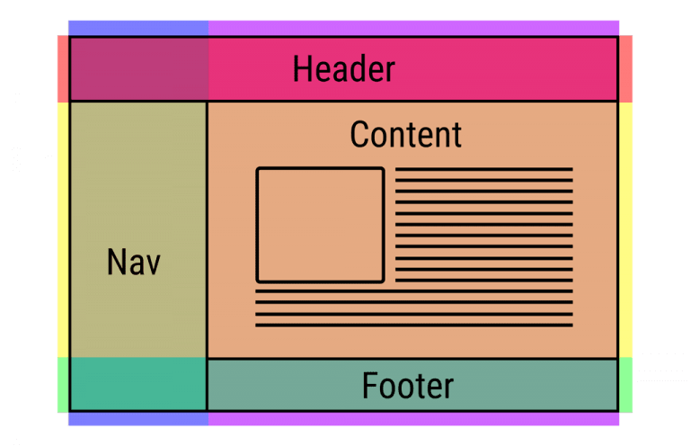
Another part of CSS grids is the CSS Flexbox, which is also responsive and most appropriate for small-scale layouts. You might also have your own set of highly responsive tools as a web developer. These tools bring down our efforts and save a lot of time, leaving us with this lingering question “Should we learn about the media queries in CSS”?
I believe there are two things to consider while answering this question, whether we still need CSS media queries today. Well, it is definitely true that new CSS tricks and elements give quicker and better results in terms of responsiveness. However, it is also true that as a web developer, I would recommend my fellow developers to use the new specs rather than focus on media queries.
But, the new specifications do not completely replace the control we get through media queries and are merely a solution to only standard issues in web development. For example, in the case of responsive design, media queries in CSS will provide more control and options to implement different use cases.
The responsive CSS specifications, on the other hand, are fixed. CSS grids will always work with the “grid” structure, but media queries can be used with many other options. It is good enough to use if your project requirements can be completed with the new specifications! However, media queries will come to your rescue to develop something new and creative.
Another perfect reason to learn CSS media queries today is to enhance the CSS specification and elements. While using a responsive CSS element such as CSS grids, you can use the media queries on top of it to enhance its functionalities and add some of your own: such as changing the color (a very basic example).
Therefore, even though it might seem as if media queries in CSS responsiveness is not being used when you start developing a project, you will find a lot of scenarios that require CSS media queries for their implementation. It is always best to learn and practice them to implement in a web development project.
How do you write media queries in CSS for Responsive design?
The syntax for responsive CSS media queries resembles TestNG annotations, which you will find a bit unique as a novice web developer.
The media query can be implemented by the word “media” as follows:
@media <media_type> connector ( <query> )
As an example:
@media only screen and (max-width: 480px) {
  /* CSS rules to apply /*
}
This media query will look for screens (“only screen” as written) with a max-width of 480px. If it finds one, the conditions will be executed, and the changes will be made to the HTML code.
For applying just the media type and not the media expressions (queries), the following values are accepted:
- all
- screen
- speech
@media print {
   .heading {
 	font-size: 12px
   }
}
The above query will make the content with the class name heading to a font-size of 12 pixels when the page needs to be printed.
Media Feature Rules
To achieve responsiveness through our web application, we must know the device size to render specific content. Media feature rules help us achieve that. We can identify our specific condition with media features and implement responsive CSS media queries accordingly. Although there are a lot of media feature rules, we will discuss just a few important of them for responsive design.
Width and Height Media Feature Rules
The first media feature rule to consider is to check the width and height of the viewport. Width operations can be checked with the “width” property, “max-width”, and “min-width” properties for bottleneck values.
Example of max-width media feature rule:
@media screen and (max-width: 840px){
  p {
 	color: red;
}
}
The complete code for achieving responsive design through media rules can be written as:
<!DOCTYPE html>
<html lang="en" dir="ltr">
  <head>
    <meta charset="utf-8">
    <style>
        @media screen and (max-width: 840px){
          p {
            color: red;
          }
        }

    </style>
  </head>
  <body>
    <center>
     	<p>Checking Media Rules</p>
    </center>
  </body>
</html>
For a screen having a width of more than 840px, the “p” tag will show the content in black color as follows:
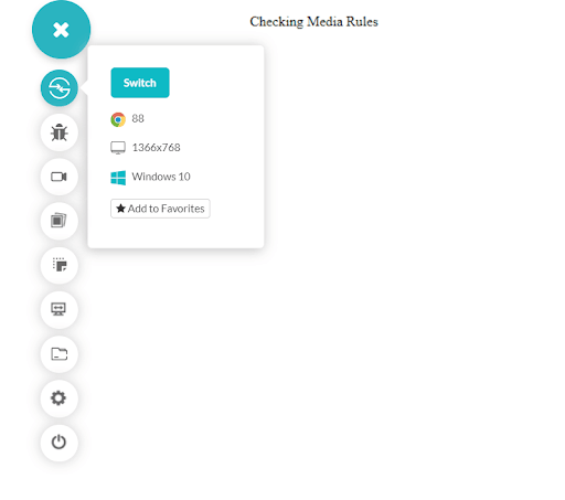
The above screenshot is taken on the TestMu AI platform.
On a screen of width lower than 840px, the media rule will change the content to the color red and font size as follows:
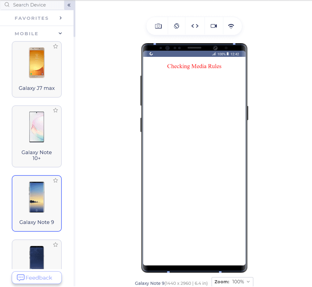
For a much clearer view, you can run the HTML code in your browser and start decreasing the viewport to see the effect.
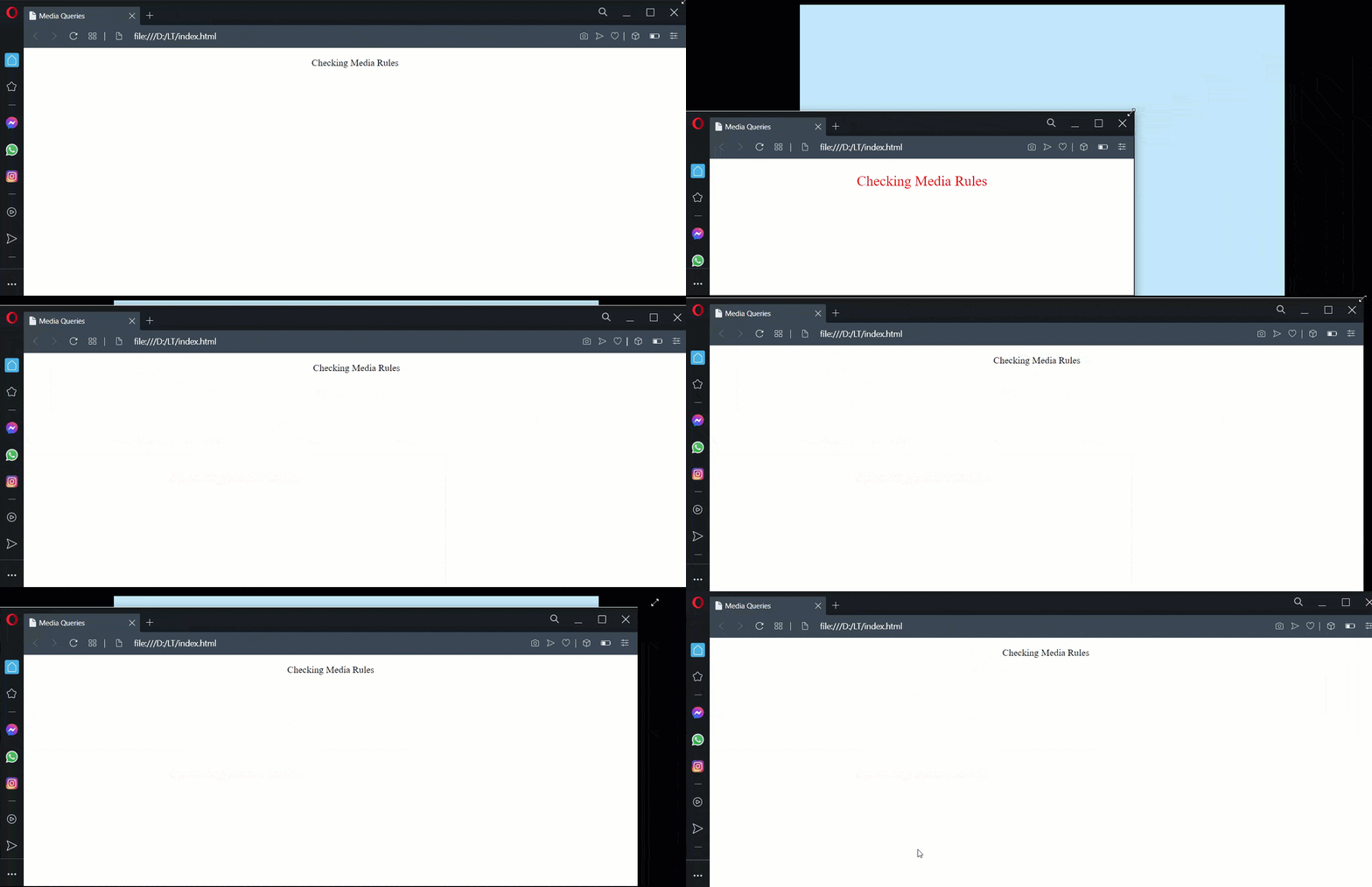
The above-used browser is Opera on Windows 10 platform. Similarly, you can make use of the height and width rule.
The code was rendered on a developer-friendly browser called LT Browser, which helps in responsive testing and development on 50+ screen resolutions. You can perform mobile website tests on LT Browser faster and easier using features like side-by-side view, scroll sync, instant debugging, test websites on different network conditions, and more. Furthermore, LT Browser allows you to collaborate with your team to scale your development process by integrating with project management tools.

Check out the below tutorial on getting started with LT Browser:
Subscribe to our TestMu AI YouTube Channel and stay updated with the latest tutorial around Selenium testing, Cypress E2E testing, Playwright testing, and more.
Orientation in CSS media queries
The orientation of a device is one of the major problems that break the responsiveness of your website. Responsiveness can never be achieved if the web application cannot understand the orientation and respond accordingly. As in media queries, knowing the device’s orientation can help us organize the content differently, resulting in more responsiveness.
The orientation media rule can be applied as the following example:
@media (orientation: landscape){
          p {
            color: red;
            font-size: 36px;
          }
        }
The above code will apply the media rules in the landscape orientation while the portrait orientation will work normally.
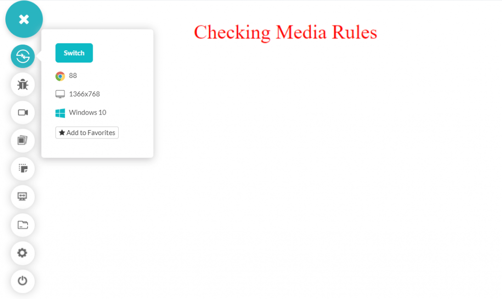
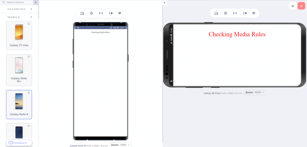
The above screenshot is taken from LT Browser, which can render two devices simultaneously for testing.
Connectors in Media Rules
A lot of the time, just one media rule is not enough for achieving responsiveness. What if we want to implement the media rule on specific devices and with specific conditions? For such requirements, we make use of connectors (logical) in media rules. The connectors take three values in a responsive CSS media query:
- and
- or
- not
These connectors have the same meaning as they do in the boolean expressions and programming languages. To apply “and” connector, the following code will help you:
@media (orientation: landscape) and (min-width: 1080px){
          p {
            color: red;
            font-size: 36px;
          }
        }
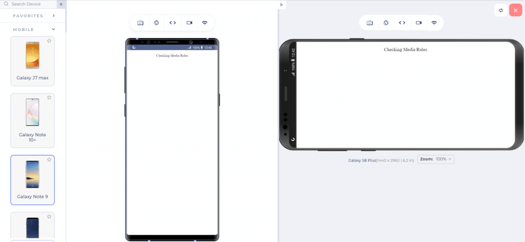
The above code only works when the minimum width of the screen is 1080px and the orientation is landscape. Since a mobile will not fall into this category, let’s see if the media rule works well in the landscape.
@media (orientation: landscape), (min-width: 1080px){
          p {
            color: red;
            font-size: 36px;
          }
        }
The above media rule will be applied if either the orientation is landscape or the min-width is 1080px. The following changes can be observed in the mobile devices:
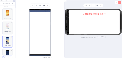
Since the landscape rule is satisfied, the media rules are applied accordingly. The same effect will be seen on a screen with a width greater than 1080px.
The “not” rule can be applied with the “not” keyword and would be good practice for the readers. Comment below with your unique media queries to help the community.
The above-demonstrated code was introduced in level 3 of the specification. With level 4, we get a little more flexibility in defining the numbers and the intervals without using the logical operators, i.e., the connectors. Level 4 specification in media rules introduces ranges into the queries. So, a query as follows:
(min-width: 640px) and (max-width:1080px)
Can be written with level 4 specification as follows:
(640px <= width <= 1080px)
Which is a bit better and clearer in defining the media rules. However, there are no restrictions on the developer; both can be used to achieve responsiveness.
You can also refer to the below tutorial on how to perform responsive testing on the TestMu AI platform.
Breakpoints and Its Methods
The post, until now, shows us how to achieve responsive web design using media queries in responsive CSS, rules, and expressions. It is fun to control elements and see them transform as per our wishes. But the problem is how to decide at which point we want those media rules to be applied to the elements? 640px or 1080px or something else? This number that works as a reflection point is called a breakpoint when the media queries get executed.
Selecting random breakpoints is a poor responsive design strategy and should never be applied without analysis. Please refer to our blog on CSS breakpoints for responsive design to know more about breakpoints.
The best way to analyze breakpoints is through the browser’s responsive panel. The responsive panel in the browser allows resizing the window (or selecting multiple resolutions), helping us select the bottlenecks quickly and precisely. To open the panel in Google Chrome, open a website (as TestMu AI opened in this demo).
- Right-click and select Inspect.
- Click the icon shown below after opening the Inspect panel.
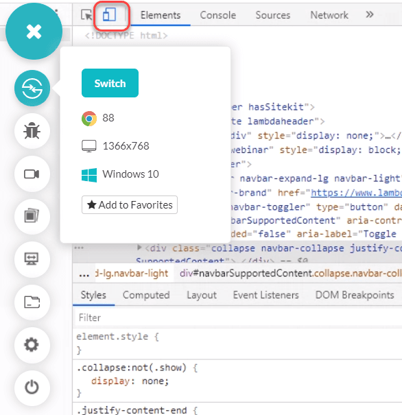
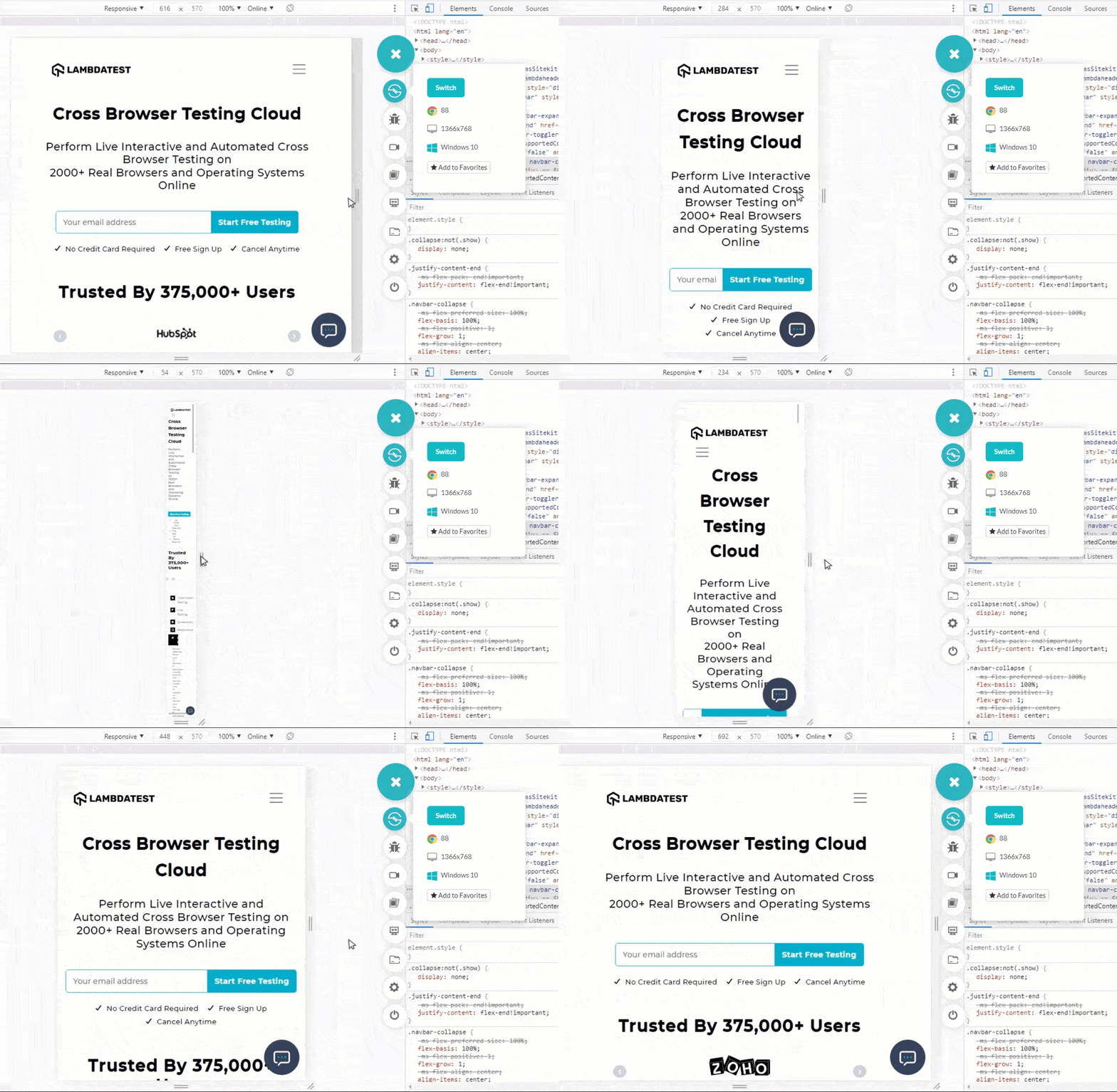
Notice how the resolution changes as the screen is shrunk/expanded (the top panel). This panel will help the developers see the breakpoints where the code is breaking out of the screen. The same can then be applied to the media rules.
Mobile browsers have become the primary choice for users all over the world. Regarding the design strategy, it is always recommended to go for a mobile-first design strategy in today’s time for perfect responsive design. Check our blog on how to perform mobile web browser testing.
As a developer, keeping mobile secondary on the list might irk your users. Start your development with the mobile devices and gradually move up the chain (or backward in time). Such a method always ensures that your mobile users are happy and the website you built is responsive. To verify your designs, a mobile-specific browser such as LT Browser is preferred to verify your designs as it provides more features, flexibility, and scalability.
Cross Browser Compatibility for CSS media queries

As seen in the image below, cross browser compatibility for media queries in CSS responsiveness is crucial. However, it does not support older versions of internet explorer and Mozilla Firefox.
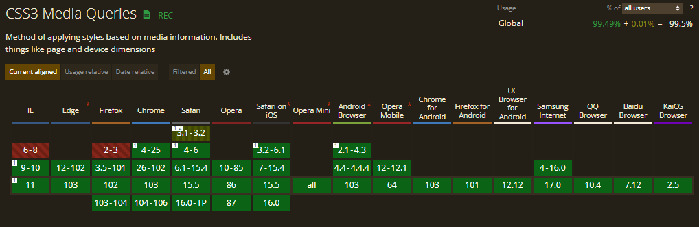
Again, browsers keep evolving, and there might be chances that these can change over a period of time. As of now, you do not need to worry about cross browser compatibility for media queries in the responsive CSS framework.
How Are AI Tools Changing Media Query Development?
AI coding assistants and AI-driven visual testing agents now write and check CSS media queries faster than a developer testing every breakpoint by hand.
- AI code completion: GitHub Copilot and Cursor suggest breakpoint values and @media syntax as a developer types, drawn from patterns already in the codebase, though the developer still has to confirm the value against the actual design.
- AI visual regression testing: Visual regression tools render a page at many viewport widths, run a pixel-level diff against the last approved version, and flag a layout break that a manual DevTools check would miss.
- Automated breakpoint sweeps: Agent-based testing platforms load a page at dozens of widths in a single run instead of a tester dragging the browser edge one size at a time, which matters as sites now support far more screen sizes than when CSS2 first introduced media queries.
These tools do not replace the @media rule or the judgment behind a breakpoint. They remove the repetitive work of checking every screen size by hand, so a developer spends that time on the layout decisions the tooling cannot make.
Wrapping It Up!
Media queries in CSS are a helpful friend in building up a responsive design and developing with more control and enhancement capabilities. Media queries in CSS although started rough, are used exhaustively today in projects and web applications. You can follow this CSS cheat sheet to brush up on your responsive CSS skills.
This post highlighted the main goals of media queries in CSS and how to achieve responsiveness with them using different rules and expressions. It amazes me to see such beautiful designs on Codepen and other websites that developers build with minimum library support.
Coming to the end of the post, we call for such designs in the comment sections and would love to include the best of them in this post. Hope to see some creative work!
Author

Harish Rajora
Blogs: 96


Harish Rajora is a software developer at TestMu AI with over 6 years of hands-on experience in Python and cross-platform application development across Windows, macOS, and Linux. He has authored 800+ technical articles and worked on large-scale projects, including GenAI applications and core engineering features used by millions. Harish has led DevOps initiatives building CI/CD pipelines with Jenkins, AWS, GitLab, and GitHub, and holds an M.Tech in Software Engineering from IIIT Allahabad.


CSS Media Queries FAQs
Did you find this page helpful?
More Related Blogs

TestMu AI forEnterprise
Get access to solutions built on Enterprise
grade security, privacy, & compliance
- Advanced access controls
- Advanced data retention rules
- Advanced Local Testing
- Premium Support options
- Early access to beta features
- Private Slack Channel
- Unlimited Manual Accessibility DevTools Tests