
Next-Gen App & Browser Testing Cloud
Trusted by 2 Mn+ QAs & Devs to accelerate their release cycles

- Home
- /
- Learning Hub
- /
- Mobile Experience Essentials: What Actually Works in 2026
Mobile Experience Essentials: What Actually Works in 2026
Learn about mobile experience, mobile-first design, personalization, real-device testing, and feedback strategies that improve usability, engagement, and performance.
December 28, 2025
Mobile experience has been the lifeblood of digital strategy since 2014. Mobile users became the online majority at that time. The numbers tell the story - 204 billion app downloads worldwide happened in 2019. This represented a 45% increase from 2016. Creating smooth mobile interactions matters more than ever.
The digital world today demands that mobile design and app strategy work for three main user scenarios: micro-tasking, local searches, and leisure browsing. Desktop interfaces don't work when they're just made smaller. 96% of people have smartphones. People prefer using their phones to shop and bank. Users have grown pickier about their apps. They avoid 3-star apps 50% of the time and stay away from 2-star-rated applications 85% of the time. This piece explores what makes mobile experiences successful and keeps users coming back repeatedly.
Overview
Mobile experience refers to how users interact with apps and websites on smartphones across moments of intent, context, and attention. In 2026, it’s critical because mobile is the primary digital touchpoint, shaping user trust, retention, and conversion within seconds.
What defines a successful mobile experience in 2026?
A successful mobile experience in 2026 is built around evolving user behavior, micro-moments, multitasking, and shrinking attention spans. Users check their phones up to 96 times a day, often for quick, intent-driven actions, making speed, relevance, and clarity essential for engagement and loyalty.
How does mobile-first design impact real user outcomes?
- Essential content prioritization: Mobile-first forces teams to surface only what users need most, reducing friction and decision fatigue.
- Thumb-friendly interactions: With 49% of users operating phones one-handed, placing actions in easy-reach zones with 44–48 pixel targets improves task completion.
- Accessibility by design: Clear hierarchy, readable text, and touch-friendly layouts make experiences usable across environments and abilities.
Why are personalization, testing, and feedback loops essential to mobile experience?
Real-time personalization driven by behavioral and contextual data increases engagement through adaptive interfaces and relevant content. Real-device testing uncovers battery, network, and performance issues simulators miss, while continuous feedback loops using NPS, reviews, and heatmaps ensure ongoing experience optimization based on real user insights.
Understanding the Mobile User in 2026
Here's what 12+ years of testing mobile experiences has taught me: today's users exist in perpetual connection mode, creating entirely new expectations for digital interactions. Skip understanding these behaviors, and your mobile experience fails before users even engage.
1. The rise of micro-moments and multitasking
Mobile usage has shifted to brief, intent-rich decision points scattered throughout each day. These "micro-moments" represent critical touchpoints where people instantly grab their devices to learn, do, discover, or buy something.
Google breaks these moments into four categories:
- I-want-to-know moments: Exploring or researching without purchase intent
- I-want-to-go moments: Seeking local businesses or nearby products
- I-want-to-do moments: Needing help completing tasks or trying new things
- I-want-to-buy moments: Ready to purchase but seeking guidance
Why should you care? According to Google, 91% of smartphone users turn to their devices for ideas while completing tasks. The average person checks their phone 96 times daily. These brief interactions have become the new battleground for user attention and loyalty.
2. Context-aware usage: location, time, and intent
Mobile usage patterns now demand contextual intelligence that goes far beyond basic location data. Users expect experiences that adapt based on multiple contextual dimensions, and they can tell when you're not paying attention.
A research paper on ContextPCA reveals that effective mobile experiences consider factors like work status (workday versus holiday), emotional state, device battery level, and nearby connectivity options. Users often choose music when happy but turn to social media when sad.
Intent patterns vary dramatically by age group. Adults 16-34 prioritize staying connected with friends and family over information-seeking, while users 55+ still focus primarily on finding information. These differences in intent show why tailored experiences work better than one-size-fits-all approaches.
.3. Shorter attention spans and higher expectations
Here's the reality check: according to American Psychological Association, attention spans have crashed from 2.5 minutes in 2004 to just 47 seconds today. The median attention span sits at 40 seconds, half of all users spend 40 seconds or less on a screen before switching.
Expectations have skyrocketed simultaneously. Two-thirds of Gen Z won't use slow or sluggish platforms. Meanwhile, 54% expect customer service responses within 10 minutes, and 45% abandon websites lacking predictive features.
The paradox? 62% of users will pay extra for services tailored to their preferences, despite shrinking attention spans. Modern mobile users demand increasingly personalized experiences delivered with unprecedented speed and efficiency.
This creates an interesting challenge: users want personalized experiences delivered quickly and efficiently.
Designing for Mobile-First Experiences

Image Source: Adjust
Creating effective mobile-first experiences requires a fundamental shift in design thinking. Traditional approaches start with desktop and scale down, but mobile-first design takes the opposite path - starting with the smallest screen and working outward.
Why does this matter? Recent data shows over 60% of web traffic comes from mobile devices. This makes mobile-first design not just an option, but a necessity to stay relevant. A mobile-first strategy pushes designers to zero in on what matters most, which creates experiences that shine on any device.
1. Prioritizing essential content and features
Mobile screens demand brutal content prioritization. Every pixel must earn its place:
- Core content first: Show your most critical information and actions above the fold
- Progressive enhancement: Start with mobile essentials, add features as screens grow
- Task-first approach: Design around primary user goals, not secondary features
Mobile users are often rushing and distracted. The quickest way to create successful mobile experiences starts by identifying users' genuine needs and cutting everything else. Design experts point out that this constraint-driven approach creates simpler, more direct interfaces that boost overall usability
2. Mobile-friendly UI patterns and gestures
Effective mobile interfaces rely on intuitive touch interactions. Key patterns that actually work:
- Simplified navigation: Hamburger menus, tab bars, and bottom navigation tame complex structures
- Gesture integration: Tap, scroll, swipe, and pinch help users navigate and manipulate content
- Visual feedback: Immediate responses confirm user actions and build confidence
Keep gesture interactions within the thumb's natural reach zone. Provide subtle visual cues for available gestures, users shouldn't need instructions to discover what's possible.
3. Tappability and thumb-friendly zones
49% of people hold smartphones with one hand, relying primarily on thumbs. This reality shapes every touch target decision:
- Size matters: Interactive elements need 44-48 pixels minimum
- Strategic spacing: Prevent accidental taps with adequate element separation
- Zone mapping: Place frequent actions in easy-reach areas, occasional ones in stretch zones
The thumb zone divides screens into three areas: easy-reach (bottom center), stretch zone (middle), and hard-to-reach (top corners). Smart placement puts primary navigation in the comfort zone while moving less critical actions to harder-to-reach areas.
4. Accessibility and inclusive design
Mobile-first design improves accessibility through simplification and clear hierarchy. Additional considerations ensure true inclusivity:
- Screen reader compatibility: Use descriptive alt text and proper heading structure
- Touch-friendly interfaces: Large, well-spaced elements help users with motor challenges
- Color contrast: Maintain 4.5:1 minimum ratios for text and interactive elements
- Adaptable text: Support resizing without breaking layouts
Mobile accessibility means designing for diverse contexts, bright sunlight, low connectivity, temporary limitations. An inclusive mobile experience benefits everyone, not just users with permanent disabilities.
Mobile-first isn't about smaller screens, it's about embracing constraints to create focused experiences that work for everyone.
Personalization That Actually Works
Generic mobile experiences are dead. 50% of consumers now report that personalized offers significantly enhance their shopping experience, and users expect every interaction to feel tailored specifically for them.
Here's the reality: effective personalization creates genuine individual attention that keeps users coming back. One-size-fits-all approaches get deleted faster than you can deploy them.
1. Using behavioral data for real-time customization
Real-time personalization reacts to what users do right now, not what they did last month. Your app needs to adapt as customers move through their journey with you:
- Unified customer profiles: Connect browsing history, past orders, demographics, and cross-channel behavior so recommendations actually make sense.
- Behavioral triggers: Respond instantly to key actions, task completions, usage milestones, cart abandonment, with relevant follow-ups.
- Contextual adaptations: Match content to time, location, and device type so it fits the user's current situation.
Start simple with clicks, views, and purchases. Build sophistication over time through user segments that matter. According to Braze, the most powerful real-time personalization connects every touchpoint, email, app,and websites, creating seamless experiences as users move between platforms.
2. Adaptive interfaces based on user preferences
Adaptive user interfaces learn from how people actually use your app, then reshape themselves accordingly. The results speak for themselves: 31% higher engagement rates and 22% better task completion.
These interfaces analyze which features users engage with most, then surface those elements more prominently. They consider device type, screen size, accessibility settings, even battery level to optimize the experience. Your mobile app feels perfectly calibrated to each user's unique environment.
Think of adaptive interfaces as quality engineering for user experience, they fail fast, learn faster, then continuously improve based on real usage patterns.
3. Hyper-personalized notifications and content
Hyper-personalization uses data, analytics, and automation to deliver the right message at the perfect moment:
- Location-based messaging: Trigger notifications when users are near relevant locations, click-through rates hit 45%
- Dynamic content blocks: Embed targeted, unobtrusive content streams that users can engage with at their own pace
- Personalized push notifications: Craft messages based on user behavior for 4X higher open rates than generic blasts
Here's how we solved this at scale: one fitness app adjusted push messaging to match user preferences and behavior, achieving click-through rates between 58.7% and 91.9%. The secret? Creating experiences that feel helpful rather than intrusive.
Effective mobile personalization balances relevance with respect for user privacy. Get this right, and your app becomes indispensable.
Testing and Optimization Across Devices
Your mobile experience is only as strong as its weakest device performance. What runs perfectly on your iPhone might crash spectacularly on an Android device with half the RAM. This reality makes comprehensive testing non-negotiable for mobile success.
Here's how we solve cross-device consistency at scale, proven strategies that catch issues before your users do.
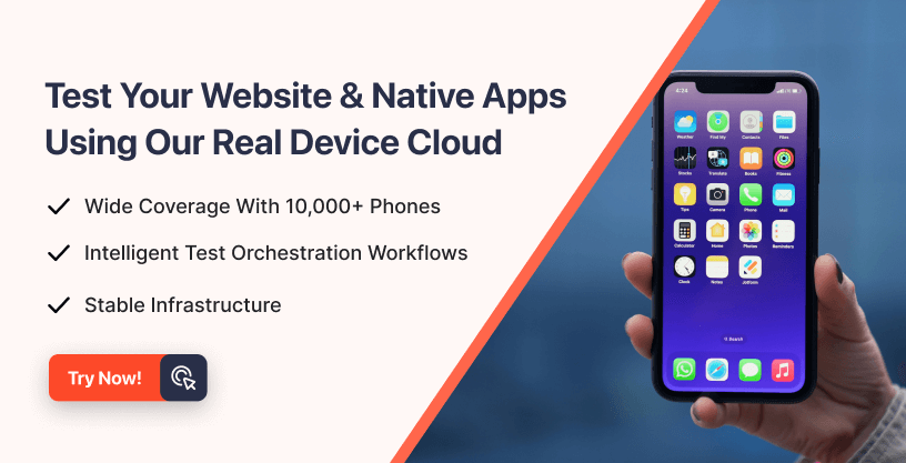
1. Cross-platform and cross-device testing
Start by building a testing matrix based on your actual user data, not industry averages. Your analytics reveal which device-platform combinations matter most to your audience. Factor in market share and strategic relevance, but prioritize where your users actually are.
Appium delivers the most reliable cross-platform testing framework we've used:
- Write test scripts once for iOS, Android, and Windows using a single API.
- Support native, hybrid, and web apps without switching tools
- Code in Java, JavaScript, Python, or Ruby, whatever your team prefers

2. Real-world testing vs. simulators
Simulators help during early development, but they lie about performance. We learned this lesson the hard way when our "perfectly tested" app crashed on real devices due to memory constraints that simulators ignored.
Physical devices reveal critical issues that virtual testing misses:
- Hardware limitations and actual sensor behavior
- Battery drain patterns under real usage
- Network fluctuations and connectivity drops
- Performance bottlenecks with genuine user interactions
Smart teams use both: emulators for rapid iteration, real devices for final validation. This approach catches issues early while ensuring real-world reliability.
3. Performance metrics to monitor
Track the metrics that actually impact user experience. Start free testing with these essential indicators:
- App load times across cold, warm, and hot starts
- Memory leaks and CPU/GPU spikes that cause crashes
- Response times for critical user actions
- Frame drops that make animations stutter
Monitor these continuously, waiting for user complaints means you're already behind.
4. Fixing bugs in real-time with live logs
Modern crash reporting transforms debugging from guesswork into precision targeting. Tools like Crashlytics group similar issues by user impact, helping you prioritize fixes that matter most.
Advanced monitoring platforms provide:
- Video replay showing exactly what users did before crashes
- Console logs and network traffic for deeper investigation
- Real-time alerts when new issues emerge
- Seamless integration with your development workflow
Quality engineering isn't about perfect code, it's about failing fast, learning faster, and fixing issues before they scale. Comprehensive device testing ensures your mobile experience works consistently, regardless of what device your users choose.
Feedback Loops and Continuous Improvement
Want to know the difference between apps that thrive and those that die? It comes down to one thing: listening to your users and acting on what they tell you. Collecting and responding to user feedback separates successful mobile experiences from the digital graveyard.
Here's how we build feedback systems that actually move the needle on user satisfaction.
1. In-app surveys and NPS tracking
Net Promoter Score (NPS) cuts through the noise to show you exactly how users feel about your app. This simple 0-10 scale survey asks one question: "How likely are you to recommend our product?"
Smart NPS implementation follows these rules:
- Time it right, survey users after they've completed meaningful actions, not randomly
- Segment your follow-ups based on scores (Detractors: 0-6, Passives: 7-8, Promoters: 9-10)
- Cross-reference NPS data with feature usage to spot patterns between satisfied and frustrated users
The magic happens when you connect survey responses to actual user behavior. Promoters might be heavy users of your newest feature, while Detractors could be struggling with onboarding flows.
2. Analyzing app store reviews and ratings
App store reviews hand you a goldmine of user insights, if you know how to mine them. With 77% of users checking reviews before downloading, fixing common complaints directly impacts your download rates.
Modern tools can process thousands of reviews to surface:
- Bug reports that keep appearing across different user segments
- Feature requests ranked by frequency and user impact
- Sentiment shifts that correlate with app updates or market changes
Stop reading reviews manually. Smart teams use AI-powered analysis to identify patterns human eyes would miss, then prioritize fixes based on user impact rather than loudest complaints.
3. Session tracking and heatmaps
Mobile heatmaps show you exactly where users tap, scroll, and get stuck, no guesswork required. Start free testing to see:
- Tap maps revealing dead zones where users expect interactions
- Scroll maps showing how far users actually read your content
- Rage tap patterns highlighting frustrating interface elements
These visual insights beat assumptions every time. When you see clusters of taps in unexpected places, you've found usability gaps that surveys might never catch.
4. Closing the feedback loop with updates
Nothing kills user trust faster than feedback that disappears into the void. Close the loop to build loyalty:
- Thank users immediately after they submit feedback
- Follow up on critical issues with personal responses when possible
- Announce feature updates that directly address user requests
- Mention specific user suggestions in your release notes
Users who see their feedback implemented become your strongest advocates. They'll forgive bugs and stick with your app through rough patches because they feel heard and valued.
Smart mobile teams treat feedback as their compass for continuous improvement, guiding every design decision and feature priority.
Conclusion
Mobile experiences shape every digital interaction your users have in 2026. The tactics that work aren't theoretical, they're battle-tested strategies that solve real problems at scale.
Mobile-first design isn't just a buzzword anymore. You need essential content prioritization, thumb-friendly interfaces, and accessibility baked into every decision. These constraints become your creative catalyst, forcing clarity where complexity once ruled.
Personalization delivers the biggest impact on user engagement. Behavioral data, adaptive interfaces, and contextual notifications create experiences that feel individually crafted. Users will pay extra for this level of customization, making it both a retention and revenue strategy.
Testing across real devices catches issues that simulators miss. Combine automated testing with physical device validation to ensure consistency across your entire user base. Performance monitoring helps you spot problems before they hit production.
Feedback loops close the circle on continuous improvement. NPS surveys, app store reviews, and session heatmaps tell you exactly what needs fixing and what's already working. Your most successful competitors iterate based on user insights, not internal assumptions.
Here's what's next: mobile experiences will keep evolving as user behaviors shift and new technologies emerge. The teams that win will stay connected to their users, embrace constraints as design opportunities, and keep solving real problems rather than chasing trends.
Your mobile experience is only as strong as your commitment to understanding what users actually need. Start there, test everything, and keep iterating based on what the data tells you.
Author
Frequently asked questions
Did you find this page helpful?
More Related Hubs
TestMu AI forEnterprise
Get access to solutions built on Enterprise
grade security, privacy, & compliance
- Advanced access controls
- Advanced data retention rules
- Advanced Local Testing
- Premium Support options
- Early access to beta features
- Private Slack Channel
- Unlimited Manual Accessibility DevTools Tests