Next-Gen App & Browser Testing Cloud
Trusted by 2 Mn+ QAs & Devs to accelerate their release cycles

On This Page
- What is CSS-in-JS?
- How Does CSS-in-JS Work?
- Key Principles of CSS-in-JS
- Building a Web Project With CSS-in-JS
- Real-World Applications of CSS-in-JavaScript
- Comparison: CSS vs. CSS-in-JS
- Benefits of CSS-in-JS over Traditional CSS
- Shortcomings of CSS-in-JS
- When to Choose CSS-in-JavaScript?
- Key Performance Techniques for CSS-in-JS
- Best Practices and Libraries for Efficient CSS-in-JS
- Conclusion
Styling Made Easy: Exploring the World of CSS in JS
Optimize your styling approach with CSS-in-JS. Unlock simplicity, scalability, and design prowess for your web projects.
Peter Junior Ejembi
December 30, 2025
In web development, making pixel-perfect websites has always been a challenge. Cascading Style Sheets, or CSS, is a way used by web designers to create eye-catching websites. However, as websites become more complex, CSS begins to show its limitations. Therefore, developers need a better solution.
For instance, let’s consider a scenario where styling your website is not only easy but also automatically adapts to changes in your code and says goodbye to issues like conflicting styles and maintenance.
That’s what CSS-in-JS is all about – a new way of styling websites that promises to be easy and fun. It suggests managing styles right where they are most needed, i.e., within website components. With CSS-in-JavaScript, styles are separate and well-organized, working closely with the code that runs your website. This not only simplifies the style but also solves many common challenges faced by developers.
In this article, we’ll explore how CSS and JavaScript work together to bring style to life. We’ll discover the benefits, explore the advantages, and navigate the ins and outs of CSS-in-JS.
Note: CSS-in-JS and CSS-in-JavaScript are used interchangeably throughout the course of this blog.
What is CSS-in-JS?
CSS-in-JavaScript, as its name suggests, represents a paradigm in modern web design. It combines the usually distinct CSS and JavaScript areas that enhance web styling.
Several popular organizations have adopted CSS-in-JS libraries to streamline their front-end development processes. Organizations like Airbnb, X (Formerly Twitter), GitHub, and Lyft have leveraged CSS-in-JavaScript libraries to achieve more maintainable and performant styling solutions in their applications.
GitHub

X (Formerly Twitter)

Lyft

How Does CSS-in-JS Work?
From the definition we gave earlier, you already know what CSS-in-JavaScript entails: generating and applying styles dynamically in response to our application’s needs.
Here is how CSS-in-JS works.
- Defining styles as JavaScript ObjectsCSS-in-JS styles are primarily written as JavaScript objects or functions. JavaScript object is a data type that allows us to store various related data all as a single entity.
We typically use this object to represent CSS properties and their values. For example, a simple JavaScript object might define the styles for a button component. Let’s consider this JavaScript object called buttonStyles.
const buttonStyles = {
backgroundColor: 'blue',
color: 'white',
padding: '10px 20px',
borderRadius: '5px',
};
At runtime, the CSS-in-JavaScript library dynamically generates a unique CSS class or ID for the component and injects the corresponding styles into the HTML document. This ensures the styles are scoped to the specific component, preventing global style conflicts.
- Component-Level StylesStyles in CSS-in-JavaScript are often defined at the component level. This implies that you define styles just for a specific component or element within your JavaScript code, making it more self-contained and easily manageable.
- Dynamic StylesThe ability of CSS-in-JavaScript to generate dynamic styles is one of its most potent features. This means you can apply styles conditionally depending on the component’s state, user interactions, and other factors by using JavaScript variables and logic in conjunction with CSS-in-JS.
For example, We can alter a button’s backgroundColor according to the user’s login status:
const buttonStyles = {
backgroundColor: isLoggedIn ? 'green' : 'red',
// Other style properties...
};
Server-Side Rendering (SSR) is compatible with several CSS-in-JS packages. For search engine optimization (SEO) and performance, this ensures that styles are implemented appropriately on the server side.
How this works is that, unlike client-side rendering, where the browser fetches a basic HTML file and then loads JavaScript to render the content dynamically, in server-side rendering, a fully formed HTML page is sent from the server to the browser.
This means that when a user requests a specific page, they receive a complete HTML document with all the content and styles already applied. This helps improve initial load times and enables search engines to crawl and index the content more effectively.
- Optimizations and Minification
Optimization capabilities to minimize the size of generated styles are frequently included in CSS-in-JavaScript frameworks. By eliminating unused portions, it streamlines performance and enhances efficiency. When it comes to styling components, this process ensures that only the necessary styles are included, reducing bloat and improving loading times.
Implementing dead code removal techniques not only declutters your project but also enhances its overall functionality and maintainability.
Key Principles of CSS-in-JavaScript
Some key principles make CSS-in-JavaScript a very efficient way of handling styles. Let’s discuss some of these principles.
- Encapsulation: This is one of the central principles of CSS-in-JS. As a result of this principle, styles defined for a specific component are scoped to that component. Encapsulation prevents unintended global style conflicts, ensuring that styles remain isolated and do not affect other application parts.
- Component-Level Styles: CSS-in-JavaScript encourages the definition of styles at the component level. Each component can define its own style, making it a self-contained and independent unit. This approach promotes the reusability and maintainability of components, as they can encapsulate their structure and styling.
- Performance Optimization: Many CSS-in-JS libraries, such as styled-components, Emotion, JSS, Radium, Linaria, and Fela, come with performance optimizations. For instance, they can perform dead code elimination, ensuring that only the styles used by a component are included in the final output. This optimization reduces the size of the generated CSS, resulting in smaller bundles and faster loading times.
- Tooling and Developer Experience: CSS-in-JS libraries often provide robust tooling and improved developer experiences. This includes syntax highlighting, autocompletion, and inline documentation, making it easier for developers to work with styles.
Additionally, these libraries facilitate using variables and theming for consistent and maintainable design systems.
- Maintainability: By co-locating styles with components, CSS-in-JavaScript promotes code maintainability. Developers can easily understand and modify the styles related to a specific component. With this, styles can be easily updated without worrying about any unusual side effects.
These key principles we just listed are also advantages of CSS-in-JavaScript. Embracing these principles can lead to more manageable, performant, and maintainable web applications.
Building a Web Project With CSS-in-JS
When building a web project with CSS-in-JS, the process is similar to building a regular web project. However, additional steps need to be taken to set up and implement CSS-in-JS. This section will cover the necessary steps for building a project with CSS-in-JavaScript.
Setting Up CSS-in-JS in a Web Project
The initial and crucial phase in creating a project using CSS-in-JS involves the setup process. We will use Visual Studio Code as the text editor and a Chrome browser to preview our results.
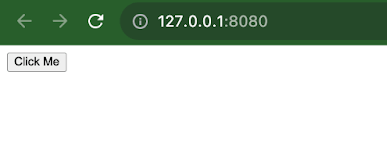
We will leverage the power of CSS-in-JavaScript to create a simple button, just as an example to show how the CSS-in-JS works. We will use vanilla HTML/CSS/JavaScript for this example.
So we start by creating the index.js file.
HTML:
<!DOCTYPE html>
<html lang="en">
 <head>
   <meta charset="UTF-8" />
   <title>CSS-in-JS Example</title>
   <style>
   </style>
 </head>
 <body>
   <div id="app">
     <button id="styledButton">Click Me</button>
   </div>
 </body>
</html>
Output:
Choose and Install the CSS-in-JS Library
Selecting a CSS-in-JS library that fits your project’s requirements is also essential. Several popular libraries are available, such as styled-components, Emotion, CSS Modules, and JSS (JavaScript Style Sheets).
Ensure that you consider elements such as the scale of your project, the expertise level of developers involved, and any particular features required. If you have identified the appropriate library for your project, utilize a package manager like npm or yarn to install the chosen CSS-in-JavaScript library.
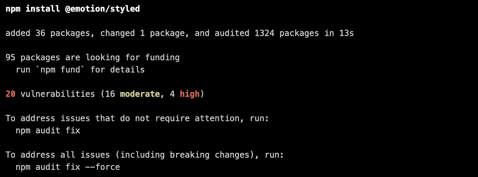
To illustrate the example, we will be using the Emotion library. Here is how to install it.
Using npm, run this command npm install @emotion/styled
Create and Apply Styles
Now, you can create and apply styles to your HTML elements using the styled-component library. Here’s an example of how we create a styled component and apply it to the element in our HTML.
Code:
<!DOCTYPE html>
<html lang="en">
 <head>
   <meta charset="UTF-8" />
   <title>CSS-in-JS Example</title>
   <style>
     /* Define a style tag where dynamic styles will be injected */
     #dynamic-styles {
       /* Styles added dynamically will be inserted here */
     }
   </style>
 </head>
 <body>
   <div id="app">
     <button id="styledButton">Click Me</button>
   </div>


   <script>
     // Function to create dynamic styles
     function createDynamicStyles() {
       const dynamicStyles = `
       #styledButton {
         background-color: blue;
         color: white;
         padding: 10px 20px;
         border: none;
         border-radius: 5px;
         cursor: pointer;
       }
       #styledButton:hover {
         background-color: navy;
       }
     `;


       // Create a style element
       const styleElement = document.createElement("style");
       styleElement.textContent = dynamicStyles;


       // Append the style element to the head of the document
       document.head.appendChild(styleElement);
     }


     // Call the function to create dynamic styles
     createDynamicStyles();
   </script>
 </body>
</html>
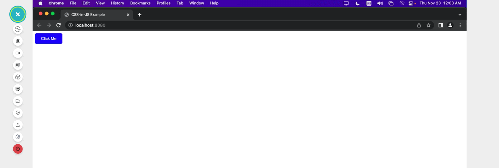
In this code, we created a styled component called styledButton and applied it to a dynamically created button element.
To render our code, we will leverage the Real Time Browser Testing feature offered by the TestMu AI platform. It is an AI-powered test orchestration and execution platform that lets you perform real-time testing (or manual testing) of websites and web applications on an online browser farm across different desktop and mobile environments.
With TestMu AI, you can easily perform browser testing to check if your website functions as intended on different web browsers in real-time. You can test on various mobile devices and browser versions, ensuring your website works flawlessly. This interactive testing helps you find and fix any errors, ensuring your websites or web apps work smoothly.
Output:
Real-World Applications of CSS-in-JS
In this section, we cover some real-world applications of CSS-in-JavaScript to get a feel for how it is implemented in our web projects, how it can be used, and its overall effect.
Mode Selector
A mode selector is a user interface component that switches between different display modes or themes in a web application. These modes include light and dark modes, color schemes, font sizes, and other display preferences.
Users can select their preferred mode or theme, and the application’s appearance changes accordingly. Here is how we can archive this functionality with CSS-in-JavaScript.
HTML:
<!DOCTYPE html>
<html lang="en">
<head>
<meta charset="UTF-8" />
<meta name="viewport" content="width=device-width, initial-scale=1.0" />
<title>Theming and Dark Mode Example</title>
<link rel="stylesheet" href="style.css" />
</head>
<body>
<nav>
<h3>
<a href="https://www.lambdatest.com/"
><img
class="logo"
src="https://www.lambdatest.com/resources/images/logos/logo.svg"
alt="logo"
/></a>
</h3>


<!-- Mode Toggler -->
<div id="theme-toggle" class="mode-selector">
<img
id="moon"
src="https://raw.githubusercontent.com/Jaypedev/LambdaTest/5af4bbf88b4e89880d0225c7f6c60a7a66d4d158/images/moon-stars-svgrepo-com.svg"
alt=""
/>
<img
id="sun"
src="https://raw.githubusercontent.com/Jaypedev/LambdaTest/5af4bbf88b4e89880d0225c7f6c60a7a66d4d158/images/sun-svgrepo-com.svg"
alt=""
/>
</div>


<!-- Nav bar -->
<ul class="nav-items">
<li><a href="https://www.lambdatest.com/feature">Platform</a></li>
<li><a href="https://www.lambdatest.com/enterprise">Enterprise</a></li>
<li><a href="https://www.lambdatest.com/blog/">Resources</a></li>
<li>
<a
href="https://www.lambdatest.com/support/docs/getting-started-with-lambdatest-automation/"
>Developers</a
>
</li>
<li><a href="https://www.lambdatest.com/pricing">Pricing</a></li>
</ul>


<img
class="hamburger"
src="https://www.lambdatest.com/blog/wp-content/themes/blog/images/sticky-humburger.png"
alt=""
/>
</nav>
<header class="background-container .container-contain">


</header>
<script src="./script.js"></script>
</body>
</html>


CSS:
body {
margin: 0;
padding: 0;
}
a {
color: rgb(0, 0, 0);
text-decoration: none;
}


/* Nav bar */
.logo {
width: 180px;
}
.mode-selector {
margin-left: auto;
}
.mode-selector img {
width: 40px;
}
.mode-selector #sun {
display: none;
}
nav {
display: flex;
justify-content: space-between;
align-items: center;
background-color: rgb(255, 255, 255);
padding: 0.5rem 1rem;
box-shadow: 2px 2px 10px rgb(103, 110, 111);
}
.nav-items {
list-style: none;
gap: 2rem;
font-size: 1.3rem;
display: flex;
}
.nav-items li:hover{
border-bottom: rgb(25, 173, 214) solid 2px;
}
.hamburger {
display: none;
margin-left: 1rem;
}


h1 {
color: #fff;
font-size: 3rem;
text-shadow: 2px 2px 6px rgba(0, 0, 0, 0.739);
}


/* CSS-in-JS styles */
/* Default theme (light) */
#theme-toggle {
cursor: pointer;
}


/* Dark theme */
.dark-theme {
background-color: #1e272e;
color: #ffffff;
}


/* Media Queries */
@media screen and (max-width: 1024px) {
.hamburger {
display: block;
}
.nav-items {
display: none;
}
}
Output:
JavaScript:
const themeToggleBtn = document.getElementById("theme-toggle");
const sun = document.getElementById("sun");
const moon = document.getElementById("moon");
const body = document.body;


// Function to toggle between light and dark themes
function toggleTheme() {
if (body.classList.contains("dark-theme")) {
body.classList.remove("dark-theme");
moon.style.display = "block"; // Show the moon icon
sun.style.display = "none"; // Hide the sun icon
} else {
body.classList.add("dark-theme");
moon.style.display = "none"; // Hide the moon icon
sun.style.display = "block"; // Show the sun icon
}
}


// Add click event listener to the theme toggle button
themeToggleBtn.addEventListener("click", toggleTheme);
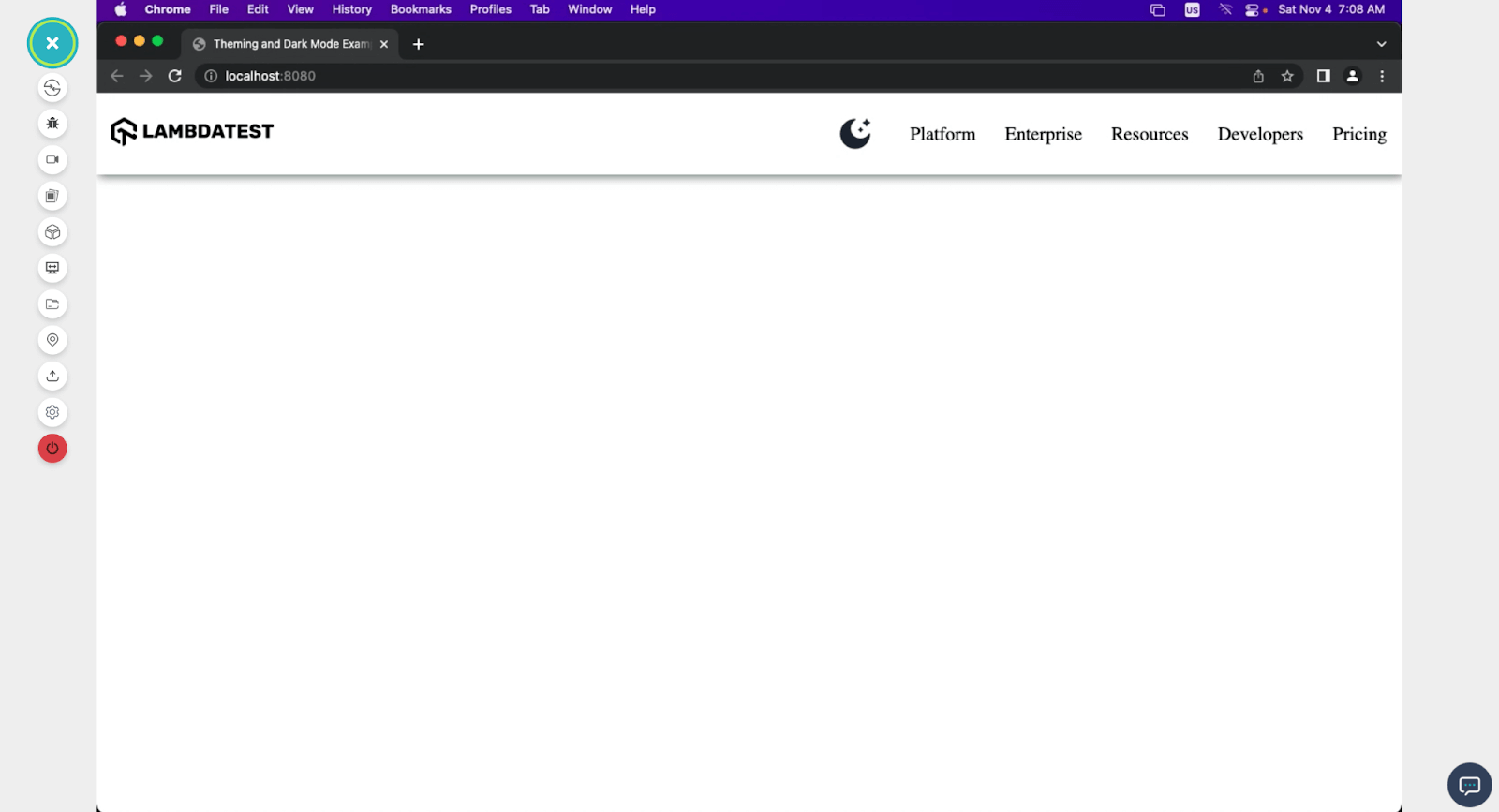
With CSS-in-JavaScript, we can set the styles to toggle between the moon and the sun icon, hiding and revealing them on click.
Here is a browser preview of our complete design, with CSS-in-JS active.
Modal Window
Modal window is often referred to as a modal dialog or simply a modal, and it is a graphical user interface element that appears as a child window or dialog box on top of the main application or webpage.
Modals are designed to capture the user’s attention and restrict interaction with the underlying content until the user interacts with the modal, such as closing it or filling out a form. They are commonly used for various purposes, including displaying alerts, confirmations, login forms, or displaying additional information without navigating away from the current page.
Let’s see how a simple modal window can be built while implementing CSS-in-JS.
HTML:
<!DOCTYPE html>
<html lang="en">
<head>
<meta charset="UTF-8" />
<meta name="viewport" content="width=device-width, initial-scale=1.0" />
<title>Modal Window</title>
<link rel="stylesheet" href="style.css" />
</head>
<body>
<nav>
<h3>
<a href="https://www.lambdatest.com/"
><img
class="logo"
src="https://www.lambdatest.com/resources/images/logos/logo.svg"
alt="logo"
/></a>
</h3>
<!-- Mode Toggler -->
<div id="theme-toggle" class="mode-selector">
<img
id="moon"
src="https://raw.githubusercontent.com/Jaypedev/Lamdatestblogs/033ae5066df2ea3be098397bdee6544468e8e42b/images/moon-stars-svgrepo-com.svg?token=BCIHQO4X6NZX2VYEMVD2DALFC4CPG"
alt=""
/>
<img
id="sun"
src="https://raw.githubusercontent.com/Jaypedev/Lamdatestblogs/033ae5066df2ea3be098397bdee6544468e8e42b/images/sun-svgrepo-com.svg?token=BCIHQO7LRPBNNGNQFCU5WF3FC4CTM"
alt=""
/>
<!-- <div "></div> -->
</div>
<ul class="nav-items">
<li><a href="https://www.lambdatest.com/feature">Platform</a></li>
<li><a href="https://www.lambdatest.com/enterprise">Enterprise</a></li>
<li><a href="https://www.lambdatest.com/blog/">Resources</a></li>
<li>
<a
href="https://www.lambdatest.com/support/docs/getting-started-with-lambdatest-automation/"
>Developers</a
>
</li>
<li><a href="https://www.lambdatest.com/pricing">Pricing</a></li>
</ul>
<img
class="hamburger"
src="https://www.lambdatest.com/blog/wp-content/themes/blog/images/sticky-humburger.png"
alt=""
/>
</nav>
<header id="header">
<h1>Seamless Collaboration</h1>
<p>
Integrate LambdaTest with your favorite tool and save yourself from
manually managing bugs and tasks. Also fits with your CI/CD pipeline.
</p>
<div class="companies">
<img
src="https://www.lambdatest.com/resources/images/collabs/bitbucket.svg"
alt=""
class="company"
/>
<img
src="https://www.lambdatest.com/resources/images/collabs/asana.svg"
alt=""
class="company"
/>
<img
src="https://www.lambdatest.com/resources/images/collabs/slack.svg"
alt=""
class="company"
/>
<img
src="https://www.lambdatest.com/resources/images/collabs/gitlab.svg"
alt=""
class="company"
/>
<img
src="https://www.lambdatest.com/resources/images/collabs/Trello.svg"
alt=""
class="company"
/>
<img
src="https://www.lambdatest.com/resources/images/collabs/Jenkins.svg"
alt=""
class="company"
/>
<img
src="https://www.lambdatest.com/resources/images/collabs/github.svg"
alt=""
class="company"
/>
<img
src="https://www.lambdatest.com/resources/images/collabs/CircleCI.svg"
alt=""
class="company"
/>
<img
src="https://www.lambdatest.com/resources/images/collabs/jira.svg"
alt=""
class="company"
/>
</div>
<p class="integrations">
<a href="">SEE ALL INTEGRATIONS →</a>
</p>
</header>
<div id="beautyModal" class="modal">
<div class="modal-content">
<span class="close" id="closeModalBtn">×</span>
<p>
LambdaTest is a cloud-based cross browser testing platform that allows
you to perform manual and automated testing of your website and mobile
apps across a wide range of browsers, operating systems, and devices.
</p>
<button id="cookieBtn">
<a href="https://www.lambdatest.com/"></a>Learn more
</button>
</div>
</div>
<script src="script.js"></script>
</body>
</html>
CSS:
@import url("https://fonts.googleapis.com/css2?family=Inter:wght@400;700&display=swap");
body {
margin: 0;
padding: 0;
font-family: "Inter", sans-serif;
background-color: #eef5fe;
}
a {
color: white;
text-decoration: none;
}
.logo {
filter: invert(180);
width: 15rem;
}


nav {
display: flex;
justify-content: space-between;
align-items: center;
background-color: black;
padding: 0.5rem 1rem;
}
.nav-items {
list-style: none;
gap: 2rem;
font-size: 1.2rem;
display: flex;
}
.nav-items li a:hover {
color: rgb(29, 179, 179);
}
.hamburger {
display: none;
margin-left: 1rem;
}
/* Header */
header {
max-width: 1300px;
margin: auto;
}
h1 {
margin-top: 10rem;
text-align: center;
font-size: 3.5rem;
}
header p {
text-align: center;
font-size: 1.5rem;
/* font-weight: bold; */
}
.companies {
text-align: center;
margin: 5rem;
}
.integrations a {
color: black;
font-weight: 700;
}


.modal {
display: none;
position: sticky;
bottom: 0rem;
margin: auto;
left: 0;
width: 75%;
line-height: 25px;
height: 100%;
z-index: 1;
justify-content: center;
align-items: center;
}


.modal-content {
background-color: #ffffff;
padding: 30px;
border-radius: 15px;
display: flex;
align-items: center;
gap: 3rem;
}
.modal-content a {
color: #000000;
text-decoration: underline;
cursor: pointer;
}
#cookieBtn {
text-wrap: nowrap;
padding: 12px 10px;
}
.close {
position: absolute;
top: 10px;
right: 10px;
font-size: 20px;
cursor: pointer;
}


button {
padding: 10px 20px;
background-color: #000000;
color: #fff;
border: none;
border-radius: 5px;
cursor: pointer;
font-size: 16px;
margin-top: 10px;
text-wrap: nowrap;
}


button:hover {
text-decoration: underline;
}


@media screen and (max-width: 1024px) {
.hamburger {
display: block;
}
.nav-items {
display: none;
}
.modal {
width: 95%;
gap: 1rem;
}
}
@media screen and (max-width: 500px) {
h1 {
font-size: 2rem;
margin-top: 5rem;
}
header p {
text-align: center;
font-size: 1rem;
/* font-weight: bold; */
}
.modal-content {
flex-direction: column;
font-size: 0.5rem;
line-height: 15px;
gap: 0rem;
}
}
JavaScript:
// Get the modal and buttons
const modal = document.getElementById('beautyModal');
const openModalBtn = document.getElementById("header")
const closeModalBtn = document.getElementById('closeModalBtn');
const cookieBtn = document.getElementById('cookieBtn');


// Function to open the modal
function openModal() {
modal.style.display = 'block';
}


// Function to close the modal
function closeModal() {
modal.style.display = 'none';
}


// Event listeners for opening and closing the modal
openModalBtn.addEventListener('click', openModal);
closeModalBtn.addEventListener('click', closeModal);
cookieBtn.addEventListener('click', closeModal);


// Close the modal when clicking outside the modal content
window.addEventListener('click', (event) => {
if (event.target === modal) {
closeModal();
}
});
The given code snippet is responsible for handling the functionality of a modal dialog box in a web application. It interacts with the Document Object Model (DOM) to identify specific elements and define behavior for opening, closing, and interacting with the modal.
Output:
Comparison: CSS vs. CSS-in-JS
CSS-in-JS and traditional CSS (or regular CSS) have their similarities and differences. Here is a table showing a direct comparison between CSS-in-JS and traditional JavaScript.
| Feature | Traditional CSS (or Regular CSS) | CSS-in-JS |
|---|---|---|
| Language | Separate styling language. | JavaScript-based styling language. |
| Syntax | CSS (selectors, properties). | JavaScript objects and functions. |
| Encapsulation | Global scope by default | Component-based encapsulation |
| Modularity | Rely on class and ID selectors | Component-level styling |
| Scoping | Limited scoping (e.g., BEM) | Styles are scoped to components |
| Dynamic Styling | Limited, requires JavaScript | Easily create dynamic styles |
| Class Names | Manual definition and usage | Generated or defined in JavaScript |
| Media Queries | Separate CSS files | Dynamic media queries in JS |
| Preprocessing | Possible with tools like SCSS | In JavaScript (e.g., template literals) |
| Selector Specificity | Specificity rules apply | Specific to components and properties |
| Dead Code Elimination | Not typically available | Can be optimized in build process |
| Tooling Integration | Limited tooling integration | Integrated with build tools |
| Developer Tools | Browser dev tools support | Library-specific dev tools |
| Performance | This may result in larger CSS files | Can optimize output for better performance |
| Dependencies | None for CSS | Requires CSS-in-JS library |
| Debugging | Requires checking CSS files | Debugging within the JavaScript environment |
The two primary styling approaches, traditional CSS and CSS-in-JS, each come with their own advantages and drawbacks. Traditional CSS provides familiarity and a clear division of responsibilities, separating styling from HTML and JavaScript. It optimizes performance through cached external files and facilitates the reuse of global styles across various tools and frameworks supported by a vast developer community.
The choice between these approaches hinges on tailoring your decision to suit your project’s specific needs and demands, considering factors like performance, maintainability, and ecosystem support.
However, challenges arise in CSS specificity, determining which styles precede amidst conflicting rules. Additionally, global scope issues and dead code elimination present hurdles, necessitating careful adherence to naming conventions such as Block Element Modifier (BEM).
Its limitations include the need for JavaScript for dynamic styling and the potential for CSS files to become complex over time, demanding maintenance efforts.
Benefits of CSS-in-JS over Traditional CSS
Now that we have looked into the shortcomings of traditional CSS, let’s dive deep into the major upsides of CSS-in-JS over regular CSS.
- Component-Based Styling: CSS-in-JavaScript promotes encapsulation by aligning styles with components, mitigating the risk of naming conflicts commonly found in traditional CSS.
This approach fosters a more modular and organized structure within applications, where each component encapsulates its styles, ensuring a clearer separation of concerns and easier maintenance.
- Scalability: Particularly beneficial for large-scale applications, CSS-in-JS offers improved scalability by providing a structured methodology for managing styles.
With components encapsulating their styles, navigating and maintaining a complex codebase becomes more manageable, facilitating collaboration among teams working on different components.
- Dynamic Styling: CSS-in-JavaScript enables the creation of dynamic styles based on component props or application state.
This dynamic nature allows for more flexibility in adjusting styles based on various conditions, resulting in more responsive and adaptable user interfaces.
- Scoped Styles: By default, CSS-in-JS scopes styles to the component level, significantly reducing the likelihood of global scope issues. This ensures that styles defined within a component stay isolated to that component, avoiding unintended style overrides and conflicts across the application.
- Elimination of Dead Code: CSS-in-JavaScript offers improved dead code elimination. Since styles are closely tied to components, unused styles associated with unused components are automatically eliminated, leading to cleaner and more optimized code.
- Server-Side Rendering (SSR): CSS-in-JS supports server-side rendering, injecting styles on the server before rendering the web page.
This facilitates faster initial load times and better search engine optimization (SEO) by ensuring that styles are applied before the client receives the webpage.
- Improved Developer Experience: CSS-in-JavaScript often provides integrated developer tools and debugging functionalities within the JavaScript environment. Integrated developer tools offer a range of capabilities, such as real-time styling updates, visual debugging interfaces, and component-specific inspection.
Integrated developer tools enable developers to inspect and modify styles directly within the development environment. This feature streamlines the styling process by allowing immediate feedback and adjustments, eliminating the need for external tools or browser extensions.
This simplifies the development process, allowing developers to inspect, modify, and debug styles alongside their JavaScript code efficiently, enhancing overall productivity and code quality.
In addition, you can also leverage online developer tools to streamline your overall web development process.
Shortcomings of CSS-in-JS
Here are some of the shortcomings that come with CSS-in-JavaScript.
- Learning Curve: For developers new to JavaScript-based styling, adapting to CSS-in-JavaScript may pose a challenge due to its different approach. It involves learning not just the styling syntax but also understanding how to integrate styling within JavaScript components. This shift in mindset might require additional time and effort for proficiency.
- Library Dependencies: CSS-in-JS requires incorporating a specific library, introducing an additional dependency to your project. This dependency adds to the project’s overall size and might require managing updates and compatibility with other libraries or frameworks used within the application.
- Delayed Rendering: In some cases, CSS-in-JavaScript might delay rendering. Since styles are injected dynamically into the DOM, there might be a brief delay before styles are applied, impacting initial rendering speed, especially in larger applications.
- Caching Problem: Dynamic styling can sometimes pose caching challenges. When styles are generated dynamically at runtime, caching becomes more complex. This might affect performance and caching strategies, mainly when caching styles are crucial.
- IDE Support: While some CSS-in-JavaScript libraries offer good IDE support, comprehensive integration might require extensions or plugins. This dependency on additional tools within the development environment could affect the overall workflow and require adjustments to existing setups.
- Performance Considerations: Improper use or overly complex implementations of CSS-in-JavaScript can impact performance. Generating styles dynamically or not optimizing how styles are generated and applied may lead to inefficiencies, affecting the overall application performance.
- Community: Although the CSS-in-JavaScript ecosystem is evolving, it might not yet have the same extensive range of tools, resources, or established best practices as traditional CSS. This could pose challenges in finding solutions to specific problems or accessing comprehensive documentation.
Note: Test your web apps using CSS-in-JS on the cloud. Try TestMu AI Today!
When to Choose CSS-in-JavaScript?
As I stated earlier, the choice between CSS-in-JS and traditional CSS (regular CSS) depends on your project’s specific needs and context.
Each approach has its strengths and weaknesses, and the decision should be based on factors such as project requirements, team familiarity, and the technology stack you are using. Nevertheless, here are some valuable tips that can guide you when choosing between CSS-in-JavaScript and traditional CSS.
Here are some points that need to be considered when opting for CSS-in-JS over traditional CSS:
- CSS-in-JS excels in encapsulating styles for individual components, ensuring isolation and flexibility while enabling dynamic styling based on component state or props within JavaScript.
- Especially beneficial for server-side rendering, it injects styles on the server to enhance initial load times and SEO.
- The developer experience is enriched with integrated debugging tools and efficient dead code elimination during the build process.
- It supports component reusability by bundling styles and allowing inline styling without traditional CSS files.
- CSS-in-JavaScript offers a versatile and comprehensive approach to styling within a component-centric architecture.
Key Performance Techniques for CSS-in-JS
Is CSS-In-JS a great pick when considering the performance of your application? Optimizing the performance of CSS-in-JS is crucial for ensuring the efficiency of your web applications.
Here are some key performance optimization techniques applicable to traditional CSS and CSS-in-JS:
- Minification: Minify your CSS-in-JavaScript code to remove unnecessary whitespace and reduce file size. Popular CSS-in-JS libraries often provide minification options as part of their toolset.
- Critical CSS: Implement critical CSS techniques to load essential styles for initial page rendering, reducing the amount of CSS that needs to be loaded asynchronously.
- Code Splitting: Split your CSS code into smaller, more manageable chunks to improve loading performance. This is particularly helpful for larger applications.
- Optimizing Runtime Performance: Implement memoization techniques to cache CSS-in-JavaScript generated styles. Memoization is a technique used to optimize the performance of functions by caching the results of expensive function calls and returning the cached result when the same inputs occur again. This can significantly improve runtime performance, especially when styles are generated frequently.
Also, be aware of excessive re-renders in your application, as each re-render may trigger style regeneration. Optimize your components to minimize unnecessary re-renders.
Lastly, use debouncing and throttling techniques when dynamically generating styles based on user interactions to control the rate at which new styles are generated.
Best Practices and Libraries for Efficient CSS-in-JS
In this article, we have looked at the basic libraries that aid the implementation of CSS-in-JavaScript. In this section, we will look at different tools and practices developers can adopt to use CSS-in-JS efficiently.
Best Practices:
- Code Splitting: This strategy significantly improves initial page load times and overall performance by loading only the necessary code for the current view or functionality. It’s particularly beneficial for larger applications where loading all code upfront may lead to slower user experiences.
- Dynamic Imports: Dynamic imports facilitate code splitting by dynamically allowing components or features to import their dependencies. In the context of CSS-in-JavaScript, dynamic imports for CSS files enable loading stylesheets on demand, optimizing resource utilization and improving performance by fetching CSS only when necessary, in alignment with the code splitting strategy.
- Performance Monitoring: Responsive testing tools like LT Browser are used to identify issues and generate performance reports powered by Google Lighthouse.
LT Browseris a mobile-friendly browser built on Chromium that helps developers and testers test and debug websites to ensure they adapt automatically to various device viewports. It provides a comprehensive,responsive testing environment with over 50 pre-installed device viewports, including mobile, tablet, desktop, and laptop.
To get tutorials on mobile app testing, automation testing, and more, subscribe to the LambdaTest YouTube Channel.
The performance report provides a comprehensive overview of your website or web app, offering actionable insights to enhance your mobile web experience. It includes scores for both desktop and mobile, performance metrics, and runtime settings. You can also share these performance reports with other stakeholders for deeper insights into website performance.
For instance, below are the performance reports generated by LT Browser for the GitHub website when displayed on the iPhone 12 mobile viewport.
Caching Strategies: Implementing effective caching strategies for CSS files is crucial for optimizing website performance. We can utilize browser caching by setting appropriate cache-control headers to instruct browsers to store CSS files locally.
Additionally, Content Delivery Networks (CDNs) can be leveraged to distribute CSS files across various servers globally, reducing latency and enhancing load times, especially for users accessing the website from different geographical locations.
Critical CSS Generation: Generating critical CSS specifically targets the above-the-fold content, which refers to the portion of a webpage visible to users without scrolling.
By delivering critical CSS inline or via a separate file, you ensure that essential styles for the visible portion of the webpage load quickly, optimizing the initial page rendering and enhancing the user experience.
Libraries:
- Styled-Components: Styled-components library provides features like automatic critical CSS rendering and efficient server-side rendering.
- Emotion: This library is known for its efficient runtime performance and provides tools for critical CSS extraction and style minification.
- Linaria: It focuses on delivering minimal runtime overhead and offers static extraction of critical CSS for efficient loading.
- Static Extraction: Many CSS-in-JavaScript libraries can statically extract critical CSS during the build process. This minimizes runtime overhead and ensures that only the necessary styles are loaded initially.
- Bundle Analysis: Bundle analysis tools like Webpack Bundle Analyzer are used to inspect the size and composition of your CSS bundles. This helps identify opportunities for optimization.
Conclusion
In this article, we’ve uncovered a new approach – CSS-in-JS, to style web applications, emphasizing its modularity, scalability, and dynamic styling for an improved developer experience.
We delved into practical integration steps, from creating interactive components like accordion menus and versatile modal windows to leveraging CSS-in-JavaScript for encapsulating styles, optimizing performance, and achieving advanced functionality.
Furthermore, we delved into performance optimization techniques and tools for efficient styling, emphasizing the importance of minimizing overhead and ensuring swift page loads.
Happy Styling!
Conclusion
Frequently asked questions
Did you find this page helpful?
More Related Hubs
TestMu AI forEnterprise
Get access to solutions built on Enterprise
grade security, privacy, & compliance
- Advanced access controls
- Advanced data retention rules
- Advanced Local Testing
- Premium Support options
- Early access to beta features
- Private Slack Channel
- Unlimited Manual Accessibility DevTools Tests

