
Next-Gen App & Browser Testing Cloud
Trusted by 2 Mn+ QAs & Devs to accelerate their release cycles

11 Best CSS Grid Layout Generators For 2026
Discover 11 top CSS grid layout generators to streamline front-end design and create responsive, structured web layouts effortlessly in 2026.

Rileena Sanyal
February 8, 2026
HTML5, CSS, and JavaScript are the foundation of modern web development. In the past, developers needed coding expertise to create responsive web designs. However, with evolving web development trends, tools like a CSS grid layout generator make it easier to build structured layouts without extensive coding.
A CSS grid layout generator helps create responsive grids that organize web pages into neatly structured sections. These grids enhance website responsiveness by adapting to different screen sizes while maintaining a polished design. You can access the entire collection here: Rileena’s Codepen.
This guide explores 11 top CSS grid layout generators to streamline front-end design and fast-track CSS layout prototyping in 2026.
Top CSS Grid Layout Generators
The following 11 CSS layout generators are the best grid layout tools available on the Internet.
1. Griddy
Griddy is a CSS grid layout generator that lets you design your boxes with considerable ease. It has a sidebar that enables you to add or delete rows and columns. It also allows you to align the components of the container as per your preferences. You can use the appropriate options to justify items and manipulate the grid gaps.
Pros:
- Overall, it is clean and gets the job done.
- It has a tidy interface, and the grid alignment can be manipulated conveniently.
- Griddy is also user-friendly.
Cons:
It only produces the CSS component, which might not be convenient for non-coders and beginners. Their team could work on this aspect.
.container {
    display: grid;
    grid-template-columns: 1fr 200px 1fr 1fr 1fr;
    grid-template-rows: 2fr 100px;
    grid-column-gap: 20px;
    grid-row-gap: 13px;
    justify-items: stretch;
    align-items: center;
 }
Given below is the image of how the grid looks on the Griddy website.

2. Layoutit
Layoutit is probably one of the best CSS layout generators on the Internet. The interface is user-friendly, with simple, easy-to-use options. But most importantly, Layoutit is a treat for the eyes! The visual elements are perfect and can be manipulated without touching either sidebar.
Pros:
- The website is neat, has colorful labeling options (it is almost like using post-its in school!)
- It produces an all-encompassing code for you to try later.
- Layoutit is also the only CSS grid layout generator in this list that allows the code to be exported to CodePen with one button. Brownie points for that.
Cons:
I loved Layoutit and have no complaints against this tool! I suggest our readers try using this CSS layout generator and let us know if they particularly like anything. We are always happy to explore unchartered domains!
Code:
HTML
<div class="container">
  <div class="A-Fun-Project!"></div>
  <div class="Hi!"></div>
  <div class="Coding-is-fun!"></div>
  <div class="Try-it-out,-may-be?"></div>
  <div class="Do-you-code?"></div>
  <div class="Bye!"></div>
  <div class="See-you-soon!"></div>
</div>
CSS
.container {
  display: grid;
  grid-template-columns: 1fr 1fr 1fr;
  grid-template-rows: 0.5fr 1.4fr 1.5fr 1.2fr 0.4fr;
  gap: 1em 0px;
  grid-auto-flow: row;
  grid-template-areas:
    "A-Fun-Project! A-Fun-Project! A-Fun-Project!"
    "Hi! Coding-is-fun! Coding-is-fun!"
    "Do-you-code? Try-it-out,-may-be? Try-it-out,-may-be?"
    "Bye! Try-it-out,-may-be? Try-it-out,-may-be?"
    "See-you-soon! See-you-soon! See-you-soon!";
}

.A-Fun-Project! { grid-area: A-Fun-Project!; }

.Hi! { grid-area: Hi!; }

.Coding-is-fun! { grid-area: Coding-is-fun!; }

.Try-it-out,-may-be? { grid-area: Try-it-out,-may-be?; }

.Do-you-code? { grid-area: Do-you-code?; }

.Bye! { grid-area: Bye!; }

.See-you-soon! { grid-area: See-you-soon!; }


html, body , .container {
  height: 100%;
  margin: 0;
}

.container * {
  border: 1px solid red;
  position: relative;
}

.container *:after {
  content:attr(class);
  position: absolute;
  top: 0;
  left: 0;
  width: 100%;
  height: 100%;
  display: grid;
  align-items: center;
  justify-content: center;
}
The image below shows the Layoutit interface.


3. Angry Tools
Angry Tools is user-friendly and helps you create designs without hassles. The visuals are pretty and let you mess around with colors a little. Angry Tools was a happy discovery, mainly because I had a lot of fun playing around with this tool.
Pros:
- It is convenient for beginners or non-coders as it allows you to work only with the pre-made grid outlines.
- For someone at a more advanced level, they have a navigation bar towards the top that helps you make better numerical choices.
- Towards the end of the page, the website lets you look at the comprehensive output without the shenanigans on the screen. (Both the outputs are attached below.)
Cons:
Yet again, they never produce the HTML version of the code, which could cause a problem for those not well acquainted with the same.
Code:
<style>
.angry-grid {
display: grid;
grid-template-rows: 1fr 1fr 1fr;
grid-template-columns: 1fr 1fr 1fr 1fr 1fr;
gap: 5px;
height: 100%;
}
#item-0 {
background-color: #ec091f;
grid-row-start: 1;
grid-column-start: 1;
grid-row-end: 2;
grid-column-end: 3;
}
#item-1 {
background-color: #5bd777;
grid-row-start: 1;
grid-column-start: 3;
grid-row-end: 3;
grid-column-end: 4;
}
#item-2 {
background-color: #2546b1;
grid-row-start: 2;
grid-column-start: 1;
grid-row-end: 3;
grid-column-end: 2;
}
#item-3 {
background-color: #21e441;
grid-row-start: 2;
grid-column-start: 2;
grid-row-end: 4;
grid-column-end: 3;
}
#item-4 {
background-color: #d84e13;
grid-row-start: 3;
grid-column-start: 1;
grid-row-end: 4;
grid-column-end: 2;
}
#item-5 {
background-color: #CD5779;
grid-row-start: 3;
grid-column-start: 3;
grid-row-end: 4;
grid-column-end: 6;
}
#item-6 {
background-color: #bb0ca4;
grid-row-start: 1;
grid-column-start: 4;
grid-row-end: 3;
grid-column-end: 6;
}
</style>
<div class="angry-grid">
<div id="item-0"> </div>
<div id="item-1"> </div>
<div id="item-2"> </div>
<div id="item-3"> </div>
<div id="item-4"> </div>
<div id="item-5"> </div>
<div id="item-6"> </div>
</div>
Output 1:

Output 2:

4. CSS Grid Layout Generator
CSS Grid Layout Generator is another top CSS layout generator by Dmitrii Bykov. Its interface was confusing at first, and it can be quite a challenge unless one follows the tutorial video. But once that is done, it is quite a neat tool.
Pros:
- It has a pre-made grid that you can manipulate and see the results just beside the same.
- The sidebar has multiple options that let you add, remove and manipulate items in the container.
Cons:
- The code, however, is not produced well.
- It might not be conducive for beginners looking to understand the generated code.
- If you are an intermediate or advanced HTML and CSS programmer, you will have to make hefty changes before the code produces desirable results outside of the website interface.
- On top of this, it is cumbersome to understand the tool without referring to their tutorial video first.
Code:
HTML:
<div class="container">
	<div class="item-2"></div>
	<div class="item-3"></div>
	<div class="item-4"></div>
	<div class="item-5"></div>
	<div class="item-6"></div>
	<div class="item-7"></div>
</div>
CSS:
.container {
	display: inline-grid;
	grid-template-columns: 1fr 1fr 1fr;
	grid-template-rows: 1fr 1fr 1fr 1fr;
	grid-gap: 0em 0em;
	justify-items: stretch;
}

.item-2 {
	grid-area: 1 / 1 / 2 / 3;
}

.item-3 {
	grid-area: 2 / 1 / 3 / 4;
}

.item-4 {
	grid-area: 1 / 3 / 2 / 4;
}

.item-5 {
	grid-area: 3 / 1 / 5 / 3;
}

.item-6 {
	grid-area: 3 / 3 / 5 / 4;
}

.item-7 {
	grid-area: 1 / 1 / 2 / 2;
}

5. CSS Grid Generator
CSS Grid Generator by Sarah Drasner is yet another popular choice among the crowd. With CSS Grid Generator, you will need to specify the number of rows, columns, and gaps across rows and columns. It will then generate a CSS class with a single button click.
Pros:
- It has a user-friendly interface.
- The grid looks clean and is easy to design.
- Every other option is neatly arranged on the screen.
Cons:
- The code is not well produced.
- The tool might not be suitable for beginners who don’t know much about CSS.
- This tool might not be a good choice for coders who want to embed the HTML and CSS code into their website.
- One might be required to make many more additional changes to work well.
Code:
HTML:
<div class="parent">
<div class="div1"> </div>
<div class="div2"> </div>
<div class="div3"> </div>
<div class="div4"> </div>
<div class="div5"> </div>
<div class="div6"> </div>
<div class="div7"> </div>
<div class="div8"> </div>
<div class="div9"> </div>
<div class="div10"> </div>
<div class="div11"> </div>
<div class="div12"> </div>
<div class="div13"> </div>
<div class="div14"> </div>
<div class="div15"> </div>
<div class="div16"> </div>
<div class="div17"> </div>
<div class="div18"> </div>
</div>
CSS:
.parent {
display: grid;
grid-template-columns: repeat(5, 1fr);
grid-template-rows: repeat(5, 1fr);
grid-column-gap: 0px;
grid-row-gap: 0px;
}

.div1 { grid-area: 1 / 1 / 2 / 2; }
.div2 { grid-area: 1 / 1 / 2 / 3; }
.div3 { grid-area: 1 / 3 / 2 / 4; }
.div4 { grid-area: 1 / 3 / 3 / 4; }
.div5 { grid-area: 2 / 3 / 3 / 4; }
.div6 { grid-area: 1 / 3 / 3 / 4; }
.div7 { grid-area: 1 / 4 / 2 / 5; }
.div8 { grid-area: 1 / 4 / 2 / 6; }
.div9 { grid-area: 5 / 4 / 6 / 5; }
.div10 { grid-area: 4 / 4 / 6 / 5; }
.div11 { grid-area: 3 / 2 / 5 / 4; }
.div12 { grid-area: 2 / 1 / 6 / 3; }
.div13 { grid-area: 5 / 3 / 6 / 4; }
.div14 { grid-area: 5 / 3 / 6 / 4; }
.div15 { grid-area: 3 / 4 / 4 / 6; }
.div16 { grid-area: 2 / 4 / 3 / 6; }
.div17 { grid-area: 4 / 5 / 5 / 6; }
.div18 { grid-area: 5 / 5 / 6 / 6; }
Output:

6. cssgr.id
Cssgr.id is another best CSS layout generator on this list due to its visually stunning and user-friendly interface. It hardly takes a minute to make a grid with different elements, and it does a marvelous job with the neat sidebar.
You can add text placeholders and choose from a checklist of pre-defined grids. Here, ‘Gallery’ was used and modified to look like the final result.
Pros:
- The code is a clean one too.
- Beginners can easily understand and implement the program.
- More advanced users can make desired changes to enhance the layout.
Cons:
The layout of the tool may not be to everyone’s taste as it is essentially minimal.
Overall, cssgr.id serves as a good experience for coders and non-coders alike.
Code:
HTML:
<div class="grid">
  <div class="span-col-2 span-row-2">Item 1</div>
  <div class="span-col-2">Item 2</div>
  <div class="span-row-3">Item 3</div>
  <div class="span-col-2 span-row-2">Item 4</div>
  <div>Item 5</div>
  <div>Item 6</div>
  <div class="span-row-3">Item 7</div>
  <div class="span-col-3 span-row-2">Item 8</div>
  <div class="span-col-2 span-row-2">Item 9</div>
  <div class="span-row-3">Item 10</div>
  <div>Item 11</div>
  <div>Item 12</div>
  <div>Item 13</div>
  <div>Item 14</div>
</div>
CSS:
.grid {
    display: grid;
    grid-template-columns: repeat(6, 1fr);
    grid-gap: 10px;
}
.span-col-2{grid-column: span 2 / auto;}

.span-col-3{grid-column: span 3 / auto;}

.span-row-2{grid-row: span 2 / auto;}

.span-row-3{grid-row: span 3 / auto;}

7. Flex Layout Attribute
Flex Layout Attribute is a lesser-known gem in the CSS community. It is based on the CSS flexbox standard and serves as a quick flexbox shorthand by utilizing two custom elements, ‘layout’ and self.
Pros:
- The minimal interface makes the website easy to use.
- The container for the grid is pre-defined to create a nice boundary area around your screen.
- It helps you adjust your grids holistically while designing your grid.
- Towards the bottom of the page are the controls that help you change the configurations of the boxes, as well as their alignments.
Cons:
The code here is only in HTML. There are no CSS components explicitly generated or could be seen by the user. This is a curious flaw that their team can further enhance the website.
Code:
<div layout="rows center-justify">
    <div self="size-x2 left">1</div>
    <div self="size-x1">2</div>
    <div self="size-x1">3</div>
    <div self="size-x1">4</div>
</div>
Output:

8. Vue Grid Generator
Vue Grid Generator is a modest CSS grid layout generator with an all-encompassing user interface that lets you customize your grid designs. There are also a few available formats under the ‘Presets’ tab that help you choose an initial layout to modify. Here, the ‘articleList’ option was used and then altered.
Pros:
- The interface is user-friendly.
- The design is simple and involves only the essential components.
- It is a good tool for beginners to start with.
- The preset options are helpful to create a basic design first before the chosen format is further modified to suit the user’s unique needs.
Cons:
A few more alignment options could be explicitly included to make things a tad easier.
Code:
HTML:
<div class="container">
  <div class="header">header</div>
  <div class="side-0-0">side-0-0</div>
  <div class="article-2">article-2</div>
  <div class="article-1">article-1</div>
  <div class="side-0-1">side-0-1</div>
  <div class="side-2">side-2</div>
  <div class="article-4">article-4</div>
  <div class="article-6">article-6</div>
  <div class="footer">footer</div>
</div>
CSS:
.container {
  display: grid;
  width: 100%;
  height: 100%;
  grid-template-areas: "header header header"
  "side-0-0 article-2 article-1"
  "side-0-1 article-2 article-1"
  "side-2 article-4 article-1"
  "side-2 article-6 article-1"
  "footer footer footer";
  grid-template-columns: 120px 1fr 1fr;
  grid-template-rows: 2fr 1fr 1fr 1fr 1fr 60px;
}
.container > div {
  border: 1px dashed #888;
}

.header {
  grid-area: header;
}
.side-0-0 {
  grid-area: side-0-0;
}
.article-2 {
  grid-area: article-2;
}
.article-1 {
  grid-area: article-1;
}
.side-0-1 {
  grid-area: side-0-1;
}
.side-2 {
  grid-area: side-2;
}
.article-4 {
  grid-area: article-4;
}
.article-6 {
  grid-area: article-6;
}
.footer {
  grid-area: footer;
}
Output:

9. Bootstrap 4 Interface Builder by Layoutit
Bootstrap 4 Interface Builder is another Layoutit product that outperforms many competitors.
Pros:
- The options are neatly organized in the sidebar.
- Users can easily add, remove and modify the grids with minimum numerical values directly from the sidebar.
- One can add headings and images to the structure itself, thus giving them a clear idea of what it will look like when they use it in their project.
Cons:
Here is another tool that I found no issues with. The interface was great to use and caused no hassles whatsoever. But if our readers face trouble, we will only be too happy to investigate the tool further!
Code:
Output:

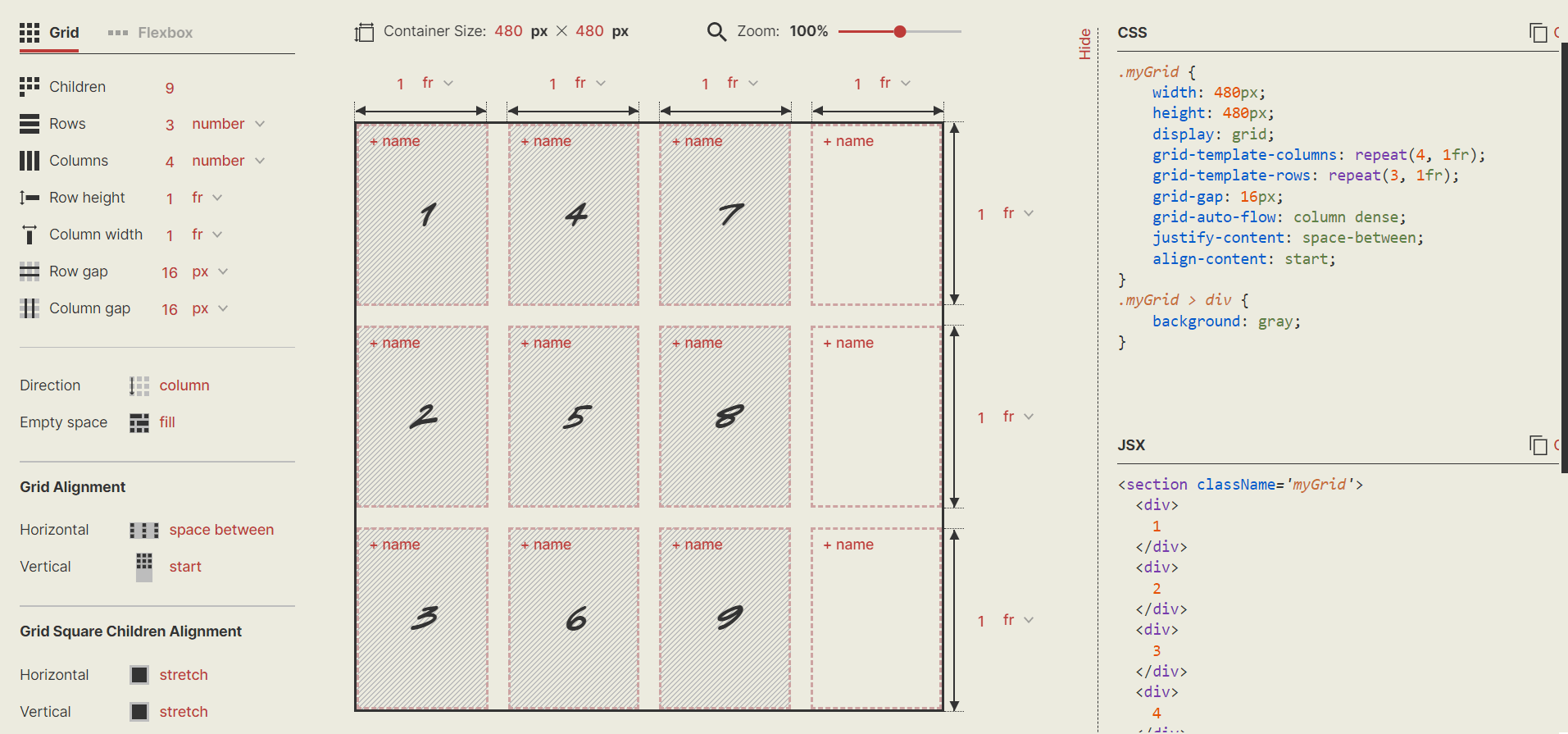
10. CSS Layout Generator
CSS layout generator by Braid Design System has a comprehensive arrangement of the options and the aesthetic vibes it gives off!
Pros:
- Designing your grid using this tool is simple and takes only a few minutes.
- The boxes are neatly marked to help you gauge the grid better.
Cons:
Too many options may confuse a beginner. You may require a thorough walkthrough to avoid mistakes.
Code:
HTML:
<section className="myGrid">
  <div>1</div>
  <div>2</div>
  <div>3</div>
  <div>4</div>
  <div>5</div>
  <div>6</div>
  <div>7</div>
  <div>8</div>
  <div>9</div>
</section>;
CSS:
.myGrid {
    width: 480px;
    height: 480px;
    display: grid;
    grid-template-columns: repeat(4, 1fr);
    grid-template-rows: repeat(3, 1fr);
    grid-gap: 16px;
    grid-auto-flow: column dense;
    justify-content: space-between;
    align-content: start;
}
.myGrid > div {
    background: gray;
}
Output:
11. Grid.Guide
Grid.Guide is a minimal CSS layout generator for creating pixel-perfect grids in your designs. You need to specify the requirements, and it will generate all the possible pixel combinations.
Pros:
The designs are easy to download and share.
Cons:
- It produces the grids in the form of a PNG file.
- It is not as user-friendly and has a confusing interface.
- It did not generate a code.
- Grid.Guide allows generic and minimum modifications. There is not much scope for your design using this website.

Browser Support For CSS Grid Layout Generators
CSS grid layout is unprefixed in Safari, Chrome, Opera, Firefox, and Edge, except in Internet Explorer. This is because all browsers support the properties and values of the CSS grid layout generator. It implies that if you develop Grid Layout code in Firefox, it should also work in Chrome.

After implementing CSS grid layout in websites and web apps, it is crucial to perform browser compatibility testing of CSS grid layout to ensure that they render correctly on major and legacy browsers and operating systems. Various AI-native test orchestration and execution platforms are available in the market, such as TestMu AI that provide cross browser testing. With TestMu AI, you can run browser compatibility tests online across 3000+ browsers and operating systems combinations without the hassle of maintaining an-in house infrastructure.
Austin Siewert
CEO, Vercel
Discovered @TestMu AI yesterday. Best browser testing tool I've found for my use case. Great pricing model for the limited testing I do 👏
2M+ Devs and QAs rely on TestMu AI
Deliver immersive digital experiences with Next-Generation Mobile Apps and Cross Browser Testing Cloud
Responsiveness Test Of CSS Grid Layout Generators
A responsive web design is crucial for an excellent online presence. Google prefers responsiveness for SEO since such web pages tend to increase user satisfaction. Hence, responsiveness tests of the website components are essential.
However, performing tests to check responsiveness can be cumbersome. It is nearly impossible to own devices of all sizes to see how a website performs on all of them unless there is enough support to set up that infrastructure. This is where LT Browser – a mobile-friendly checker tool by TestMu AI, comes into the picture with its 50+ pre-installed device viewports spanning across all the major operating systems. Moreover, LT Browser has advanced developer tools to help you with testing.
However, performing tests to check responsiveness can be cumbersome. Owning devices of all sizes to conduct a mobile-friendly test is nearly impossible without a proper setup. This is where LT Browser—a mobile-friendly checker tool by TestMu AI—comes into play. With 50+ pre-installed device viewports across major operating systems and advanced developer tools, LT Browser simplifies testing for responsiveness.
Some below are the top-notch features of LT Browser:
- Device sync feature to scroll on two devices simultaneously.
- Network throttling feature to test websites on different network conditions.
- Capture full-page screenshots of the web page.
- Generates performance reports powered by Google Lighthouse.
- Video recording of a running test session, and much more.

Here is a short tutorial on how to get started with LT Browser.
You can also go through the TestMu AI YouTube Channel to stay updated with more videos on Selenium mobile testing, and more.
Conclusion
CSS grid layout generators help create responsive, state-of-the-art websites. This CSS grid tutorial aims to give our readers an overview of tools that can make the website creation process easier, especially for beginners or non-coder.
You can leverage TestMu AI and LT Browser for browser compatibility and responsive testing needs for seamless user experience across different browsers, OS, and mobile devices.
I hope this CSS grid tutorial will help you select the best CSS grid layout generator for your project. Also, share your thoughts after using these CSS grid layout generators in the comment section below.
Did you find this page helpful?
More Related Hubs
TestMu AI forEnterprise
Get access to solutions built on Enterprise
grade security, privacy, & compliance
- Advanced access controls
- Advanced data retention rules
- Advanced Local Testing
- Premium Support options
- Early access to beta features
- Private Slack Channel
- Unlimited Manual Accessibility DevTools Tests