
Next-Gen App & Browser Testing Cloud
Trusted by 2 Mn+ QAs & Devs to accelerate their release cycles

On This Page
A Complete Guide to Infinite CSS Animation
Learn how to create smooth infinite CSS animations with keyframes, timing functions, performance tips, and real examples you can use in modern web design.

Ravi Kumar
January 10, 2026
In the modern digital landscape, achieving user engagement is crucial for the success of any website or mobile application. As a result, digital experience design has emerged as an essential component of web development.
The objective of a favorable digital experience is to deliver an engaging and seamless experience to the user, which can help in increased user engagement, higher conversion rates, and enhanced customer loyalty. When discussing user experience, stylesheet languages like CSS (Cascading Style Sheets) and front-end technologies like JavaScript have become pivotal in injecting interest and visual appeal into web pages.
As per one of the reports, an interactive web design can increase user retention by up to 60%. So, styling and performance are crucial for boosting a website’s key performance indicators. Using animations effectively can create a dynamic and engaging user experience.
One potent CSS property that can be used to enhance digital experience design is CSS animation.
CSS animation is an important aspect of web design as it allows for creating visually engaging websites. It goes beyond single motions or durations, allowing endless scrolls of product listings or continuous slideshows like Amazon.
The infinite animation in CSS property has unlocked new possibilities for designers and developers to craft more visually captivating and user-friendly websites or mobile apps.

Amazon Infinite Feature product slideshow
This blog delves deep into infinite animation in CSS property and its ideal use cases.
What is Infinite CSS Animation?
The infinite CSS animation property runs continuously and seamlessly without a definitive start or end. Unlike traditional CSS animations that play only once, these animations are often used to add a decorative or interactive element to a website, drawing the user’s attention and making the site more engaging.
This enables developers to create infinite animations in CSS, such as rotating carousels, constantly filling progress bars or scrolling backgrounds, and adding dynamic flair to websites and apps.
Infinite animation in CSS property allows developers to create their custom animations using CSS code, specifying the animation duration, timing function(specify the number of times an animation should repeat), and other properties of the animation.
How to Create Infinite Animations in CSS?
The key to creating an infinite animation in CSS is to use the animation-iteration-count property in CSS, which determines how many times the animation will play. By setting the value to infinite, the animation will continue to play indefinitely, creating a seamless and continuous effect.
Many types of infinite animations in CSS can be created with CSS, from simple effects like a spinning icon or a bouncing button to more complex animations like a moving background or a scrolling slideshow.
To create an infinite animation in CSS, first, we need to define the keyframes to specify the starting and ending points of the animation, as well as any intermediate steps or changes that occur during the animation. Once we have defined your keyframes, we can apply them to an element on the page using the animation property.
This example creates a simple animation that infinitely rotates a shade of greenish-blue square. In this example, a square with a width and height of 100 pixels is created using the .rotate class.
An animation is created using the @keyframes rule, which defines the rotate animation. It starts from 0 degrees and rotates 360 degrees over the the course of 2 seconds. The infinite keyword is used to make the animation repeat indefinitely.
By adding the animation property to the .rotate class, the animation is applied to the element and sets the animation-iteration-count property to infinite to make the animation loop continuously.
Above, we already discussed and recognized the existence of several types of infinite animations, each with unique use cases. Hence, let’s take an example and give it a look at some illustrative examples.
HTML:
<!DOCTYPE html>
<html lang="en">
  <head>
    <meta charset="UTF-8" />
    <meta http-equiv="X-UA-Compatible" content="IE=edge" />
    <meta name="viewport" content="width=device-width, initial-scale=1.0" />
    <title>Transition Property</title>
    <link rel="stylesheet" href="style.css" />
  </head>
  <body>
    <div class="navbar">
      <a href="https://www.lambdatest.com/?utm_source=urlredirect" target = "_blank"><span><img src="https://user-images.githubusercontent.com/39921508/243080828-b69e0006-87b5-45e6-9462-2d65f7ab8855.svg" ></span></a>
          <div class="dropdown">
        <button class="dropbtn">Platform
          <i class="fa fa-caret-down"></i>
        </button>
        <div class="dropdown-content">
          <a href="#">Real Time Testing</a>
          <a href="#">Real Devices Cloud</a>
          <a href="#">Test Intelligence</a>
          <a href="#">Native Mobile App Testing</a>
        </div>
      </div>
          <div class="dropdown">
        <button class="dropbtn">Enterprise
          <i class="fa fa-caret-down"></i>
        </button>
        <div class="dropdown-content">
          <a href="#">Digital Experience Testing</a>
          <a href="#">Enterprise Execution Environment</a>
         </div>
      </div>
      <div class="dropdown">
        <button class="dropbtn">Resources
          <i class="fa fa-caret-down"></i>
        </button>
        <div class="dropdown-content">
          <a href="#">Blog</a>
          <a href="#">Webinars</a>
          <a href="#">Videos</a>
          <a href="#">Documentation</a>
        </div>
      </div>
          <div class="dropdown">
        <button class="dropbtn">Developers
          <i class="fa fa-caret-down"></i>
        </button>
        <div class="dropdown-content">
          <a href="#">Mobile App Testing</a>
          <a href="#">Selenium</a>
          <a href="#">Cypress</a>
          <a href="#">Real Time Web Testing</a>
        </div>
      </div>

          <div class="dropdown">
        <button class="dropbtn">Resources
          <i class="fa fa-caret-down"></i>
        </button>
        <div class="dropdown-content">
          <a href="#">Online Browser</a>
          <a href="#">Selenium Testing</a>
          <a href="#">Cypress Testing</a>
          <a href="#">Playwright Testing</a>
        </div>
      </div>
    </div>

    <h2>Simple Infinite rotating effect</h2>
    <div class= "container">
    <div class="rotate"><img src="https://user-images.githubusercontent.com/39921508/243096581-47dedeef-8858-4370-8d2e-7782af4f76ac.jpg"></div>
    </div>
  </body>
</html>
CSS:
* {
  padding: 0;
  margin: 0;
}
body {
background-color: #b7eaee;
font-family: Arial, Helvetica, sans-serif;
}
.navbar {
overflow: hidden;
display: flex;


align-items: center;
}


.navbar a {
font-size: 16px;
color: black;
text-align: center;
text-decoration: none;
padding: 14px 8px; /* Adjusted padding */
}


.dropdown {
float: left;
overflow: hidden;
}


.dropdown .dropbtn {
font-size: 16px;
border: none;
outline: none;
color: black;
padding: 14px 16px;
background-color: inherit;
font-family: inherit;
margin: 0;
}


.navbar a:hover,
.dropdown:hover .dropbtn {
text-decoration: underline;
background-color:#26c1cb;
color: #000;
font-weight: bold;
border-radius: 5px;
}


.dropdown-content {
display: none;
position: absolute;
min-width: 160px;
box-shadow: 0px 8px 16px 0px rgba(0, 0, 0, 0.2);
z-index: 1;
}


.dropdown-content a {
float: none;
color: black;
padding: 12px 16px;
text-decoration: none;
display: block;
text-align: left;
}


.dropdown-content a:hover {
background-color: #7ddae0;
transform: scaleY(1.2);
}


.dropdown:hover .dropdown-content {
display: block;
}


.image_box {
/* animation properties */
animation-name: my-animation;
animation-duration: 3s;
animation-direction: alternate;
animation-iteration-count: infinite;
animation-timing-function: linear;


/* other properties */
width: 250px;
height: 250px;
border-radius: 10px;
position: absolute;
left: 0;
right: 0;
margin-top: 10%;
margin-left: auto;
margin-right: auto;
}


h2{
text-align: center;
margin-top: 18%;
}


.container {
display: flex;
justify-content: center;
align-items: center;


height: 50vh;
}


.rotate {
width: 100px;
height: 100px;
color: #b7eaee;
background-color:#087076;
animation-name: rotate;
animation-duration: 2s;
animation-iteration-count: infinite;
animation-timing-function: linear;
}


.container img {
width: 100%;
}


@keyframes rotate {
from {
  transform: rotate(0deg);
}
to {
  transform: rotate(360deg);
}
}


/* Media query for responsiveness */
@media (max-width: 768px) {
  .navbar {
    flex-direction: column;
    align-items: flex-start;
  }

  .navbar a {
    width: 100%;
    text-align: left;
    padding: 10px 16px;
  }

  .navbar li {
    margin: 10px 0;
  }
  }
Advantages of Infinite CSS Animations
Infinite CSS animations are important because they can help keep users engaged and interested in a website or mobile application. This can be especially useful for branding or marketing purposes, where creating a memorable and engaging experience is essential.
Additionally, infinite animations in CSS can be used to indicate that something is in progress, such as loading or processing, giving users a sense of feedback and reassurance. It is important for several reasons, including:
- Improve engagement: Adding animations to a website can make it more visually exciting and engaging for the user, leading to longer periods of user engagement on the website.
- Enhance interactivity: Infinite CSS animations can make a web page feel more interactive by responding to user input, such as hovering over an element or clicking a button.
- Boost user experience: When applied correctly, animations can enhance the user experience by making it more intuitive, responsive, and enjoyable.
- Improve usability: Animations can be used to improve usability, such as by showing the user the impact of their actions in real-time or guiding them through a multi-step process.
Use Cases of Infinite CSS Animations
There are many use cases for the infinite CSS animation property, which allows developers to create animations that run indefinitely. Some common use cases include:
Spinning Loading Indicator
Spinning loading indicators are a popular way to provide feedback to users that a website or application is in the process of loading. This type of loading animation is commonly used in websites and mobile apps.
The spinning loading indicator can come in various forms, such as a circle or a gear.
Visual feedback is necessary for users to assume that the mobile application or website is frozen, which can lead to confusion and ultimately result in users abandoning the application. Almost every organization, like Google, Facebook, Instagram, and Twitter, uses loading indicators in their web and mobile applications.
Let’s take an example of the spin loader.
HTML:
<!DOCTYPE html>
<html lang="en">
  <head>
    <meta charset="UTF-8" />
    <meta http-equiv="X-UA-Compatible" content="IE=edge" />
    <meta name="viewport" content="width=device-width, initial-scale=1.0" />
    <title>Transition Property</title>
    <link rel="stylesheet" href="style.css" />
  </head>
  <body>
    <div class="navbar">
      <a href="https://www.lambdatest.com/?utm_source=urlredirect" target = "_blank"><span><img src="https://user-images.githubusercontent.com/39921508/243080828-b69e0006-87b5-45e6-9462-2d65f7ab8855.svg" ></span></a>
          <div class="dropdown">
        <button class="dropbtn">Platform
          <i class="fa fa-caret-down"></i>
        </button>
        <div class="dropdown-content">
          <a href="#">Real Time Testing</a>
          <a href="#">Real Devices Cloud</a>
          <a href="#">Test Intelligence</a>
          <a href="#">Native Mobile App Testing</a>
        </div>
      </div>
          <div class="dropdown">
        <button class="dropbtn">Enterprise
          <i class="fa fa-caret-down"></i>
        </button>
        <div class="dropdown-content">
          <a href="#">Digital Experience Testing</a>
          <a href="#">Enterprise Execution Environment</a>
         </div>
      </div>
      <div class="dropdown">
        <button class="dropbtn">Resources
          <i class="fa fa-caret-down"></i>
        </button>
        <div class="dropdown-content">
          <a href="#">Blog</a>
          <a href="#">Webinars</a>
          <a href="#">Videos</a>
          <a href="#">Documentation</a>
        </div>
      </div>
          <div class="dropdown">
        <button class="dropbtn">Developers
          <i class="fa fa-caret-down"></i>
        </button>
        <div class="dropdown-content">
          <a href="#">Mobile App Testing</a>
          <a href="#">Selenium</a>
          <a href="#">Cypress</a>
          <a href="#">Real Time Web Testing</a>
        </div>
      </div>

          <div class="dropdown">
        <button class="dropbtn">Resources
          <i class="fa fa-caret-down"></i>
        </button>
        <div class="dropdown-content">
          <a href="#">Online Browser</a>
          <a href="#">Selenium Testing</a>
          <a href="#">Cypress Testing</a>
          <a href="#">Playwright Testing</a>
        </div>
      </div>
    </div>

    <div class="img">
          <img
            src="https://www.lambdatest.com/resources/images/logos/logo.svg"
            alt="Logo"
            width="147"
            height="26"
          />
        </div>

    <svg class="spinner" viewBox="0 0 50 50">
      <circle class="path" cx="25" cy="25" r="20" fill="none" stroke-width="5"></circle>
    </svg>
    </body>
</html>
CSS:
* {
  padding: 0;
  margin: 0;
}


html, body {
  height: 100%;
  background-color: #b7eaee;
  font-family: Arial, Helvetica, sans-serif;
  }

.navbar {
overflow: hidden;
display: flex;


align-items: center;
}


.navbar a {
font-size: 16px;
color: black;
text-align: center;
text-decoration: none;
padding: 14px 8px; /* Adjusted padding */
}


.dropdown {
float: left;
overflow: hidden;
}


.dropdown .dropbtn {
font-size: 16px;
border: none;
outline: none;
color: black;
padding: 14px 16px;
background-color: inherit;
font-family: inherit;
margin: 0;
}


.navbar a:hover,
.dropdown:hover .dropbtn {
text-decoration: underline;
background-color:#26c1cb;
color: #000;
font-weight: bold;
border-radius: 5px;
}


.dropdown-content {
display: none;
position: absolute;
min-width: 160px;
box-shadow: 0px 8px 16px 0px rgba(0, 0, 0, 0.2);
z-index: 1;
}


.dropdown-content a {
float: none;
color: black;
padding: 12px 16px;
text-decoration: none;
display: block;
text-align: left;
}


.dropdown-content a:hover {
background-color: #7ddae0;
transform: scaleY(1.2);
}


.dropdown:hover .dropdown-content {
display: block;
}


.image_box {
/* animation properties */
animation-name: my-animation;
animation-duration: 3s;
animation-direction: alternate;
animation-iteration-count: infinite;
animation-timing-function: linear;


/* other properties */
width: 250px;
height: 250px;
border-radius: 10px;
position: absolute;
left: 0;
right: 0;
margin-top: 10%;
margin-left: auto;
margin-right: auto;
}


.img {
position: absolute;
transform: translate(-50%, -50%);
top: 40%;
left: 50%;
}
.spinner {
animation: rotate 2s linear infinite;
z-index: 2;
position: absolute;
top: 50%;
left: 50%;
margin: -25px 0 0 -25px;
width: 50px;
height: 50px;


& .path {
  stroke: #087076;
  stroke-linecap: round;
  animation: dash 1.5s ease-in-out infinite;
}


}


@keyframes rotate {
100% {
  transform: rotate(360deg);
}
}


@keyframes dash {
0% {
  stroke-dasharray: 1, 150;
  stroke-dashoffset: 0;
}
50% {
  stroke-dasharray: 90, 150;
  stroke-dashoffset: -35;
}
100% {
  stroke-dasharray: 90, 150;
  stroke-dashoffset: -124;
}
}


/* Media query for responsiveness */
@media (max-width: 768px) {
  .navbar {
    flex-direction: column;
    align-items: flex-start;
  }

  .navbar a {
    width: 100%;
    text-align: left;
    padding: 10px 16px;
  }

  .navbar li {
    margin: 10px 0;
  }
  }
The above code includes spinning loader animation where an image and an SVG element containing a circle with a class of path is created.
The spinner animation uses two keyframes: one for rotating the entire element and another for animating the stroke-dasharray and stroke-dashoffset properties of the path element ( both strokes include how the stroke should be drawn over time). The & symbol is used to select the .path class within the .spinner class.
Dotted Loading Indicator
Dotted loaders are a type of loading indicator that consists of a series of dots that animate in an infinite loop, giving the impression that the content is loading. These loaders are a popular choice for web developers due to their simplicity and effectiveness.
The animation of a dotted loader is achieved using CSS animation properties, which allow the dots to be positioned and animated in a particular way. By controlling the timing, duration, and easing of the animation, a smooth and visually pleasing effect can be achieved.
One of the advantages of using a dotted loader is that it provides a clear visual cue to the user that the content is loading, which can improve user experience. Let’s take an example to get a better understanding of this loader.
HTML:
<!DOCTYPE html>
<html lang="en">
  <head>
    <meta charset="UTF-8" />
    <meta http-equiv="X-UA-Compatible" content="IE=edge" />
    <meta name="viewport" content="width=device-width, initial-scale=1.0" />
    <title>Transition Property</title>
    <link rel="stylesheet" href="style.css" />
  </head>
  <body>
    <div class="navbar">
      <a href="https://www.lambdatest.com/?utm_source=urlredirect" target = "_blank"><span><img src="https://user-images.githubusercontent.com/39921508/243080828-b69e0006-87b5-45e6-9462-2d65f7ab8855.svg" ></span></a>
          <div class="dropdown">
        <button class="dropbtn">Platform
          <i class="fa fa-caret-down"></i>
        </button>
        <div class="dropdown-content">
          <a href="#">Real Time Testing</a>
          <a href="#">Real Devices Cloud</a>
          <a href="#">Test Intelligence</a>
          <a href="#">Native Mobile App Testing</a>
        </div>
      </div>
          <div class="dropdown">
        <button class="dropbtn">Enterprise
          <i class="fa fa-caret-down"></i>
        </button>
        <div class="dropdown-content">
          <a href="#">Digital Experience Testing</a>
          <a href="#">Enterprise Execution Environment</a>
         </div>
      </div>
      <div class="dropdown">
        <button class="dropbtn">Resources
          <i class="fa fa-caret-down"></i>
        </button>
        <div class="dropdown-content">
          <a href="#">Blog</a>
          <a href="#">Webinars</a>
          <a href="#">Videos</a>
          <a href="#">Documentation</a>
        </div>
      </div>
          <div class="dropdown">
        <button class="dropbtn">Developers
          <i class="fa fa-caret-down"></i>
        </button>
        <div class="dropdown-content">
          <a href="#">Mobile App Testing</a>
          <a href="#">Selenium</a>
          <a href="#">Cypress</a>
          <a href="#">Real Time Web Testing</a>
        </div>
      </div>

          <div class="dropdown">
        <button class="dropbtn">Resources
          <i class="fa fa-caret-down"></i>
        </button>
        <div class="dropdown-content">
          <a href="#">Online Browser</a>
          <a href="#">Selenium Testing</a>
          <a href="#">Cypress Testing</a>
          <a href="#">Playwright Testing</a>
        </div>
      </div>
    </div>
    <div class="img">
          <img
            src="https://www.lambdatest.com/resources/images/logos/logo.svg"
            alt="Logo"
            width="147"
            height="26"
          />
        </div>
        <div class="loader">
          <span class="loader__element"></span>
          <span class="loader__element"></span>
          <span class="loader__element"></span>
        </div>
    </body>
</html>
CSS:
* {
  padding: 0;
  margin: 0;
box-sizing: border-box;
}


body {
background-color: #b7eaee;
font-family: Arial, Helvetica, sans-serif;
}


.navbar {
overflow: hidden;
display: flex;


align-items: center;
}


.navbar a {
font-size: 16px;
color: black;
text-align: center;
text-decoration: none;
padding: 14px 8px; /* Adjusted padding */
}


.dropdown {
float: left;
overflow: hidden;
}


.dropdown .dropbtn {
font-size: 16px;
border: none;
outline: none;
color: black;
padding: 14px 16px;
background-color: inherit;
font-family: inherit;
margin: 0;
}


.navbar a:hover,
.dropdown:hover .dropbtn {
text-decoration: underline;
background-color:#26c1cb;
color: #000;
font-weight: bold;
border-radius: 5px;
}


.dropdown-content {
display: none;
position: absolute;
min-width: 160px;
box-shadow: 0px 8px 16px 0px rgba(0, 0, 0, 0.2);
z-index: 1;
}


.dropdown-content a {
float: none;
color: black;
padding: 12px 16px;
text-decoration: none;
display: block;
text-align: left;
}


.dropdown-content a:hover {
background-color: #7ddae0;
transform: scaleY(1.2);
}


.dropdown:hover .dropdown-content {
display: block;
}


.image_box {
/* animation properties */
animation-name: my-animation;
animation-duration: 3s;
animation-direction: alternate;
animation-iteration-count: infinite;
animation-timing-function: linear;


/* other properties */
width: 250px;
height: 250px;
border-radius: 10px;
position: absolute;
left: 0;
right: 0;
margin-top: 10%;
margin-left: auto;
margin-right: auto;
}


.img {
position: absolute;
transform: translate(-50%, -50%);
top: 40%;
left: 50%;
}
.loader {
overflow: hidden;
width: 30%;
height: 30%;
position: fixed;
top: 50%;
left: 50%;
transform: translate(-50%, -50%);
display: flex;
align-items: center;
align-content: center;
justify-content: center;
z-index: 100000;
}


.loader__element {
border-radius: 100%;
border: 5px solid #087076;
margin: 10px;
}


.loader__element:nth-child(1) {
animation: preloader 0.6s ease-in-out alternate infinite;
}
.loader__element:nth-child(2) {
animation: preloader 0.6s ease-in-out alternate 0.2s infinite;
}


.loader__element:nth-child(3) {
animation: preloader 0.6s ease-in-out alternate 0.4s infinite;
}


@keyframes preloader {
100% {
  transform: scale(2);
}
}


/* Media query for responsiveness */
@media (max-width: 768px) {
  .navbar {
    flex-direction: column;
    align-items: flex-start;
  }

  .navbar a {
    width: 100%;
    text-align: left;
    padding: 10px 16px;
  }

  .navbar li {
    margin: 10px 0;
  }
  }
The code includes dotted loader animation. A div class called loader is created with three nested loader element classes. The loader animation uses a keyframe animation called a preloader that scales the dots to double their original size.
Continuous Progress Bar
The infinite animation in CSS property can also create a progress bar that runs indefinitely. Continuous progress bars are a common element in web and mobile applications that show the progress of an ongoing task. This is used by platforms like LinkedIn and Ubuntu and on the Brave browser’s download page.
Unlike traditional progress bars that show the progress of a specific task, continuous progress bars are designed to show the progress of an ongoing process with no clear end.
A continuous progress bar typically consists of a horizontal bar that fills up from left to right as the process continues. The progress bar can be animated to visually indicate to users that an activity is underway in the background, even if the specifics of this activity are not immediately apparent.
One benefit of using a continuous progress bar is that it can reassure the user that the application is still working and that progress is being made, even if it’s not visible.
HTML:
<!DOCTYPE html>
<html lang="en">
  <head>
    <meta charset="UTF-8" />
    <meta http-equiv="X-UA-Compatible" content="IE=edge" />
    <meta name="viewport" content="width=device-width, initial-scale=1.0" />
    <title>Transition Property</title>
    <link rel="stylesheet" href="style.css" />
  </head>
  <body>
    <div class="navbar">
      <a href="https://www.lambdatest.com/?utm_source=urlredirect" target = "_blank"><span><img src="https://user-images.githubusercontent.com/39921508/243080828-b69e0006-87b5-45e6-9462-2d65f7ab8855.svg" ></span></a>
          <div class="dropdown">
        <button class="dropbtn">Platform
          <i class="fa fa-caret-down"></i>
        </button>
        <div class="dropdown-content">
          <a href="#">Real Time Testing</a>
          <a href="#">Real Devices Cloud</a>
          <a href="#">Test Intelligence</a>
          <a href="#">Native Mobile App Testing</a>
        </div>
      </div>
          <div class="dropdown">
        <button class="dropbtn">Enterprise
          <i class="fa fa-caret-down"></i>
        </button>
        <div class="dropdown-content">
          <a href="#">Digital Experience Testing</a>
          <a href="#">Enterprise Execution Environment</a>
         </div>
      </div>
      <div class="dropdown">
        <button class="dropbtn">Resources
          <i class="fa fa-caret-down"></i>
        </button>
        <div class="dropdown-content">
          <a href="#">Blog</a>
          <a href="#">Webinars</a>
          <a href="#">Videos</a>
          <a href="#">Documentation</a>
        </div>
      </div>
          <div class="dropdown">
        <button class="dropbtn">Developers
          <i class="fa fa-caret-down"></i>
        </button>
        <div class="dropdown-content">
          <a href="#">Mobile App Testing</a>
          <a href="#">Selenium</a>
          <a href="#">Cypress</a>
          <a href="#">Real Time Web Testing</a>
        </div>
      </div>

          <div class="dropdown">
        <button class="dropbtn">Resources
          <i class="fa fa-caret-down"></i>
        </button>
        <div class="dropdown-content">
          <a href="#">Online Browser</a>
          <a href="#">Selenium Testing</a>
          <a href="#">Cypress Testing</a>
          <a href="#">Playwright Testing</a>
        </div>
      </div>
    </div>

    <body>
        <div class="img">
          <img
            src="https://user-images.githubusercontent.com/39921508/243080828-b69e0006-87b5-45e6-9462-2d65f7ab8855.svg"
            alt="Logo"
            width="147"
            height="26"
          />
        </div>

        <div class="progress">
          <div class="color"></div>
        </div>
      </body>
    </body>
</html>
CSS:
* {
  padding: 0;
  margin: 0;
}


body {
background-color: #b7eaee;
font-family: Arial, Helvetica, sans-serif;
}
.navbar {
overflow: hidden;
display: flex;


align-items: center;
}


.navbar a {
font-size: 16px;
color: black;
text-align: center;
text-decoration: none;
padding: 14px 8px; /* Adjusted padding */
}


.dropdown {
float: left;
overflow: hidden;
}


.dropdown .dropbtn {
font-size: 16px;
border: none;
outline: none;
color: black;
padding: 14px 16px;
background-color: inherit;
font-family: inherit;
margin: 0;
}


.navbar a:hover,
.dropdown:hover .dropbtn {
text-decoration: underline;
background-color:#26c1cb;
color: #000;
font-weight: bold;
border-radius: 5px;
}


.dropdown-content {
display: none;
position: absolute;
min-width: 160px;
box-shadow: 0px 8px 16px 0px rgba(0, 0, 0, 0.2);
z-index: 1;
}


.dropdown-content a {
float: none;
color: black;
padding: 12px 16px;
text-decoration: none;
display: block;
text-align: left;
}


.dropdown-content a:hover {
background-color: #7ddae0;
transform: scaleY(1.2);
}


.dropdown:hover .dropdown-content {
display: block;
}


.image_box {
/* animation properties */
animation-name: my-animation;
animation-duration: 3s;
animation-direction: alternate;
animation-iteration-count: infinite;
animation-timing-function: linear;


/* other properties */
width: 250px;
height: 250px;
border-radius: 10px;
position: absolute;
left: 0;
right: 0;
margin-top: 10%;
margin-left: auto;
margin-right: auto;
}


.img {
position: absolute;
transform: translate(-50%, -50%);
top: 40%;
left: 50%;
}
.progress {
position: absolute;
height: 10px;
width: 50%;
top: 50%;
left: 50%;
border: 10px solid #087076;
border-radius: 15px;
transform: translate(-50%, -50%);
}
.progress .color {
background-color: #42cbd5;
width: 0px;
height: 10px;
border-radius: 15px;
animation: progres 4s infinite linear;
}
@keyframes progres {
0% {
  width: 0%;
}
25% {
  width: 50%;
}
50% {
  width: 75%;
}
75% {
  width: 85%;
}
100% {
  width: 100%;
}
} ;


/* Media query for responsiveness */
@media (max-width: 768px) {
  .navbar {
    flex-direction: column;
    align-items: flex-start;
  }

  .navbar a {
    width: 100%;
    text-align: left;
    padding: 10px 16px;
  }

  .navbar li {
    margin: 10px 0;
  }
  }
The above code is an example of a progress bar with an animated color that fills the bar. The code contains an image and a div element with a class of progress that holds the progress bar.
The above code demonstrates a progress bar featuring an animated color fill. It includes an image and a div element labeled with the progress class, which encompasses the progress bar. The color of the progress bar is animated with the progress keyframe animation, which runs for 4 seconds and repeats infinitely. The animation varies the progress bar’s width at specified percentages, resulting in a visual effect of the bar progressively filling up.
Pulse Effect
The pulse effect is a CSS animation that creates a subtle pulsating animation on an element. It is achieved by changing the size or opacity of the element at regular intervals, creating the illusion of a breathing effect.
It is achieved by animating the scale of an element using the animation and transform properties.
The pulse effect can be used for various purposes, including highlighting important information on a website, drawing attention to a call-to-action button, or creating a visually exciting loading animation.
Many organizations use the pulse effect in their branding and design, including Apple, which uses a pulsing animation for the AirPods and Beats headphones icons in their marketing materials. Google also uses a pulsing animation in the Google Assistant icon, and Instagram uses a pulsing animation in the heart icon to indicate new activity on the platform.

Google Assistant Pulse effect
<!DOCTYPE html>
<html lang="en">
  <head>
    <meta charset="UTF-8" />
    <meta http-equiv="X-UA-Compatible" content="IE=edge" />
    <meta name="viewport" content="width=device-width, initial-scale=1.0" />
    <title>Transition Property</title>
    <link rel="stylesheet" href="style.css" />
  </head>
  <body>
    <div class="navbar">
      <a href="https://www.lambdatest.com/?utm_source=urlredirect" target = "_blank"><span><img src="https://user-images.githubusercontent.com/39921508/243080828-b69e0006-87b5-45e6-9462-2d65f7ab8855.svg" ></span></a>
          <div class="dropdown">
        <button class="dropbtn">Platform
          <i class="fa fa-caret-down"></i>
        </button>
        <div class="dropdown-content">
          <a href="#">Real Time Testing</a>
          <a href="#">Real Devices Cloud</a>
          <a href="#">Test Intelligence</a>
          <a href="#">Native Mobile App Testing</a>
        </div>
      </div>
          <div class="dropdown">
        <button class="dropbtn">Enterprise
          <i class="fa fa-caret-down"></i>
        </button>
        <div class="dropdown-content">
          <a href="#">Digital Experience Testing</a>
          <a href="#">Enterprise Execution Environment</a>
         </div>
      </div>
      <div class="dropdown">
        <button class="dropbtn">Resources
          <i class="fa fa-caret-down"></i>
        </button>
        <div class="dropdown-content">
          <a href="#">Blog</a>
          <a href="#">Webinars</a>
          <a href="#">Videos</a>
          <a href="#">Documentation</a>
        </div>
      </div>
          <div class="dropdown">
        <button class="dropbtn">Developers
          <i class="fa fa-caret-down"></i>
        </button>
        <div class="dropdown-content">
          <a href="#">Mobile App Testing</a>
          <a href="#">Selenium</a>
          <a href="#">Cypress</a>
          <a href="#">Real Time Web Testing</a>
        </div>
      </div>

          <div class="dropdown">
        <button class="dropbtn">Resources
          <i class="fa fa-caret-down"></i>
        </button>
        <div class="dropdown-content">
          <a href="#">Online Browser</a>
          <a href="#">Selenium Testing</a>
          <a href="#">Cypress Testing</a>
          <a href="#">Playwright Testing</a>
        </div>
      </div>
    </div>


    <div class="img">
          <img
            src="https://www.lambdatest.com/resources/images/logos/logo.svg"
            alt="Logo"
            width="147"
            height="26"
          />
        </div>

    <a href= "https://www.lambdatest.com/?utm_source=urlredirect" class="pulse-btn" target="_blank">Click me</a>

    </body>
</html>
CSS:
* {
  padding: 0;
  margin: 0;
}
body {
background-color: #b7eaee;
font-family: Arial, Helvetica, sans-serif;
}
.navbar {
overflow: hidden;
display: flex;


align-items: center;
}


.navbar a {
font-size: 16px;
color: black;
text-align: center;
text-decoration: none;
padding: 14px 8px; /* Adjusted padding */
}


.dropdown {
float: left;
overflow: hidden;
}


.dropdown .dropbtn {
font-size: 16px;
border: none;
outline: none;
color: black;
padding: 14px 16px;
background-color: inherit;
font-family: inherit;
margin: 0;
}


.navbar a:hover,
.dropdown:hover .dropbtn {
text-decoration: underline;
background-color:#26c1cb;
color: #000;
font-weight: bold;
border-radius: 5px;
}


.dropdown-content {
display: none;
position: absolute;
min-width: 160px;
box-shadow: 0px 8px 16px 0px rgba(0, 0, 0, 0.2);
z-index: 1;
}


.dropdown-content a {
float: none;
color: black;
padding: 12px 16px;
text-decoration: none;
display: block;
text-align: left;
}


.dropdown-content a:hover {
background-color: #7ddae0;
transform: scaleY(1.2);
}


.dropdown:hover .dropdown-content {
display: block;
}


.image_box {
/* animation properties */
animation-name: my-animation;
animation-duration: 3s;
animation-direction: alternate;
animation-iteration-count: infinite;
animation-timing-function: linear;


/* other properties */
width: 250px;
height: 250px;
border-radius: 10px;
position: absolute;
left: 0;
right: 0;
margin-top: 10%;
margin-left: auto;
margin-right: auto;
}


body {
background-color: #b7eaee;
color: #04383b;
}
.img {
position: absolute;
transform: translate(-50%, -50%);
top: 40%;
left: 50%;
}
.pulse-btn {
background-color: #087076;
font-size: 20px;
padding: 10px 20px;
border: none;
text-decoration: none;
color: #93e0e5;
border-radius: 5px;
cursor: pointer;
position: absolute;
top: 50%;
left: 45%;
transform: translate(-50%, -50%);
animation: pulse 2s infinite;
}


@keyframes pulse {
0% {
  transform: scale(1);
}
50% {
  transform: scale(1.2);
}
100% {
  transform: scale(1);
}
}


/* Media query for responsiveness */
@media (max-width: 768px) {
  .navbar {
    flex-direction: column;
    align-items: flex-start;
  }

  .navbar a {
    width: 100%;
    text-align: left;
    padding: 10px 16px;
  }

  .navbar li {
    margin: 10px 0;
  }
  }
The above code is an example of a simple animation that displays a logo and a button with a pulse effect. The HTML code contains a logo image and a button element with the class pulse-btn. It also defines a keyframe animation called pulse that scales the button element to make it appear as if it’s pulsating.
The animation is set to run continuously and is applied to the button element using the animation property. Nothing happens when the button is clicked, as no JavaScript code is associated with it.
The above code is a simple example of how CSS animations can be used to add visual effects to HTML elements, making them more interactive and engaging for users.
Product Slider
Infinite CSS animation in product refers to an animation technique used in web design where a product or products are displayed in an endless loop, creating the impression that the items are constantly refreshing and updating. This type of animation can be used to showcase a wide range of products on a website’s homepage or to draw attention to specific products or promotions.
The animation typically involves a continuous horizontal or vertical scrolling of product images, with new products appearing as the old ones move off the screen. The animation can also include other effects, such as fading or zooming in and out.
The infinite product slider is commonly used by eCommerce websites, such as Amazon and Etsy, to showcase their wide range of products and to entice users to explore more.
It creates a dynamic and engaging user experience and can be an effective tool for increasing sales and encouraging repeat visits to the website.
HTML:
<div class="img">
  <img
   src="https://www.lambdatest.com/resources/images/logos/logo.svg"
    alt="Logo"
    width="147"
    height="26"
  />
</div>


<div class="slider">
  <div class="slide-track">
    <div class="slide">
      <img
        src="https://user-images.githubusercontent.com/39921508/229065523-225d02e3-fa60-43b8-84cc-b5a19791cc22.png"
        alt=""
      />
    </div>
    <div class="slide">
      <img
        src="https://user-images.githubusercontent.com/39921508/229065894-015dd881-63dd-4f85-9964-bf7be9299383.png"
        alt=""
      />
    </div>
    <div class="slide">
      <img
        src="https://user-images.githubusercontent.com/39921508/229065548-c4733729-cffd-4560-ad61-c3af6cc7cef8.png"
        alt=""
      />
    </div>
    <div class="slide">
      <img
        src="https://user-images.githubusercontent.com/39921508/229065553-69b32ab2-0e67-4420-b8f4-03ed19041775.png"
        alt=""
      />
    </div>
    <div class="slide">
      <img
        src="https://user-images.githubusercontent.com/39921508/229065555-98cfb241-55f4-4217-a205-f8b0c47e68ee.png"
        alt=""
      />
    </div>
    <div class="slide">
      <img
        src=" https://user-images.githubusercontent.com/39921508/229065533-7c93ea25-07be-42eb-bc73-b3cb43136eb0.png"
        alt=""
      />
    </div>
    <div class="slide">
      <img
        src=" https://user-images.githubusercontent.com/39921508/229065536-36843abf-56dd-43c8-a8db-df5524ea632d.png"
        alt=""
      />
    </div>
    <div class="slide">
      <img
        src=" https://user-images.githubusercontent.com/39921508/229065544-fbc0a983-e9ca-4c44-89b3-1463f72290ef.png"
        alt=""
      />
    </div>
    <div class="slide">
      <img
        src=" https://user-images.githubusercontent.com/39921508/229067433-13fdb6e4-27bb-4919-8c0e-91a47f9d49a4.png"
        alt=""
      />
    </div>
    <div class="slide">
      <img
        src="https://user-images.githubusercontent.com/39921508/229065523-225d02e3-fa60-43b8-84cc-b5a19791cc22.png"
        alt=""
      />
    </div>
    <div class="slide">
      <img
        src="https://user-images.githubusercontent.com/39921508/229065894-015dd881-63dd-4f85-9964-bf7be9299383.png"
        alt=""
      />
    </div>
    <div class="slide">
      <img
        src="https://user-images.githubusercontent.com/39921508/229065548-c4733729-cffd-4560-ad61-c3af6cc7cef8.png"
        alt=""
      />
    </div>
    <div class="slide">
      <img
        src="https://user-images.githubusercontent.com/39921508/229065553-69b32ab2-0e67-4420-b8f4-03ed19041775.png"
        alt=""
      />
    </div>
    <div class="slide">
      <img
        src="https://user-images.githubusercontent.com/39921508/229065555-98cfb241-55f4-4217-a205-f8b0c47e68ee.png"
        alt=""
      />
    </div>
    <div class="slide">
      <img
        src=" https://user-images.githubusercontent.com/39921508/229065533-7c93ea25-07be-42eb-bc73-b3cb43136eb0.png"
        alt=""
      />
    </div>
    <div class="slide">
      <img
        src=" https://user-images.githubusercontent.com/39921508/229065536-36843abf-56dd-43c8-a8db-df5524ea632d.png"
        alt=""
      />
    </div>
    <div class="slide">
      <img
        src=" https://user-images.githubusercontent.com/39921508/229065544-fbc0a983-e9ca-4c44-89b3-1463f72290ef.png"
        alt=""
      />
    </div>
    <div class="slide">
      <img
        src=" https://user-images.githubusercontent.com/39921508/229067433-13fdb6e4-27bb-4919-8c0e-91a47f9d49a4.png"
        alt=""
      />
    </div>
  </div>
</div>
CSS:
body {
  min-height: 100vh;
  display: grid;
  place-items: center;
  background-color: #b7eaee;
}


img{
  margin: 30px;
}
.slider {
  height: 800px;
  margin: auto;
  margin-top: -100px;
  position: relative;
  width: 90%;
  display: grid;
  place-items: center;
  overflow: hidden;
}


.slide-track {
  display: flex;
  width: 14400px;
  animation: scroll 40s linear infinite;
}


.slide-track:hover {
  animation-play-state: paused;
}


@keyframes scroll {
  0% {
    transform: translateX(0);
  }
  100% {
    transform: translateX(calc(-800px * 9));
  }
}
.slide {
  height: 600px;
  width: 800px;
  align-items: center;
  padding: 15px;
  perspective: 300px;
}


img {
  width: 100%;
  transition: transform 1s;
}


img:hover {
  transform: translateZ(20px);

}
.slider::before,
.slider::after {

  content: "";
  height: 100%;
  position: absolute;
  width: 15%;
  z-index: 2;
}


.slider::before {
  left: 0;
  top: 0;
}


.slider::after {
  right: 0;
  top: 0;
  transform: rotateZ("180deg");
}
The above code is an example of a slideshow using a series of images. The images are contained within div elements with the class slide. The slideshow uses CSS transitions to animate the movement of the images.
The slide is the main container for the slider. Inside the slider, there is another div with the class slide-track. This is where the images will be displayed.
The images are displayed as divs with the class slide. Each slide has an image inside of it. The images are sourced from external URLs and have no alt text. There are a total of ten images, and they repeat in a loop so that the slider can continue indefinitely.
Browser Compatibility Testing of Infinite CSS Animations
As discussed earlier, it’s better to test infinite CSS animation for web pages on different browsers because it’s important to ensure they are cross-browser compatible. This means that the website must function correctly across different browsers and operating system combinations.
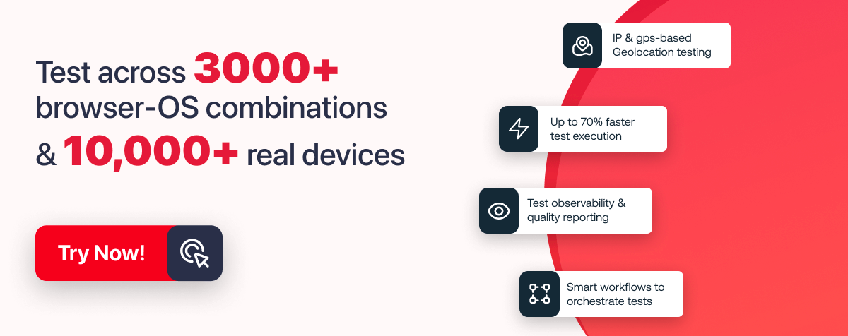
Building an in-house testing infrastructure can be both costly and time-consuming, so you need a platform. Here, TestMu AI comes into the picture, where you can manually or automatically test your websites or web applications on over 3000+ real browsers, devices, and OS combinations. Plus, you can use this platform to do accessibility testing of infinite CSS animation property.
Catch up with the latest tutorials on mobile app testing, real device testing, and more — Subscribe to the TestMu AI YouTube Channel.
TestMu AI provides a comprehensive testing environment and real-world browsing conditions, allowing developers to identify and rectify issues that could disrupt the user experience. This testing is crucial not only for ensuring visual consistency but also for maintaining the functional reliability of animations across different platforms.
Furthermore, TestMu AI’s capability for accessibility testing is particularly valuable. Ensuring that infinite CSS animations are accessible means they must be perceivable, operable, and understandable for all users, including those with impairments.
This aligns with modern web standards and legal requirements, making it an indispensable part of the development process. By leveraging such a platform, developers can save significant time and resources while ensuring their products meet the highest standards of compatibility and accessibility.
Note: Test browser compatibility across 3000+ real desktop and mobile browsers. Try TestMu AI Today!
Best Practices for Using Infinite CSS Animations
As discussed earlier, there are many advantages of infinite CSS animations, but sometimes inadequate usage of infinite CSS animations leads to bad performance of web pages.
So, let’s discuss some best practices to avoid those mistakes while working with infinite CSS animations.
Here are some best practices for using infinite CSS animations in web design:
- Keep the infinite CSS animations simple and subtle and only used to highlight important elements or provide visual feedback on user interactions.
- It’s important to prioritize the user’s experience and ensure that animations don’t cause distractions or delays in page loading or functionality.
- Infinite CSS animations should be used sparingly and strategically to avoid performance issues on older devices or slower internet connections.
- To ensure consistent performance and display, it’s important to test infinite CSS animations for cross-browser and cross-device compatibility.
- Appropriate easing functions should be used to make infinite CSS animations appear smooth and natural.
- Adding controls to allow users to pause, restart, or adjust the speed of infinite CSS animations can improve the user experience.
- Infinite CSS animations should not be the sole source of information or interaction on a page, and alternative methods for accessing content, and functionality should be provided.
- Documenting animation choices and the reasons behind them can be helpful for future reference and collaboration with other designers and developers.
- Continuous evaluation of the effectiveness of infinite CSS animations in achieving design goals is necessary, and changes and adjustments should be made as needed.
Guidelines to Choose the Right Type and Animation
When it comes to using animations in web design, it’s important to choose the right type and frequency of animation to enhance the user experience without overwhelming or distracting the user.
Here are some guidelines to follow when selecting and implementing animations:
- Use animations to guide the user’s attention and indicate interactivity: Animations can be used to direct the user’s focus to important content or interactive elements. For example, Mailchimp uses subtle animations to guide the user’s attention to important content and interactive elements, such as the sign-up form and the navigation menu.
- Choose animations that are appropriate for the content and purpose of the website: The type of animation used should match the tone and purpose of the website. For example, a playful animation might be appropriate for a children’s game website, while a more subtle animation might be better suited for a business website.
- Limit the frequency of infinite CSS animations: Too many infinite CSS animations can be overwhelming and distracting for the user. Limiting the frequency and duration of animations can help maintain a balance between engagement and usability.
- Ensure compatibility with different devices and browsers: Infinite CSS animations should be tested to ensure they work correctly on different devices and browsers.
- Keep animations simple: Animations should be kept simple and easy to understand. Complex animations can be confusing for users and may negatively affect the user experience.
For example, an eCommerce website like Amazon or Flipkart might use an animation to show a product’s features, but limiting the frequency to one animation per product can prevent overload.
For example, the website for the Google search engine uses animations that are optimized to work well on a variety of devices and browsers, ensuring a consistent user experience for all users.
For example, LinkedIn uses simple animations, such as the loading spinner, to indicate to the user that content is being loaded and to prevent confusion or frustration.
By following these guidelines, we can create effective and engaging animations that enhance the user experience and contribute to the overall success of your website.
Conclusion
In conclusion, infinite CSS animations can be a powerful tool for web designers to create engaging and visually appealing websites.
By following best practices, choosing the right types and frequencies of animations, and considering the compatibility of different devices and browsers, web designers can create effective and impactful infinite animations that enhance the overall user experience.
Frequently asked questions
Did you find this page helpful?
More Related Hubs
TestMu AI forEnterprise
Get access to solutions built on Enterprise
grade security, privacy, & compliance
- Advanced access controls
- Advanced data retention rules
- Advanced Local Testing
- Premium Support options
- Early access to beta features
- Private Slack Channel
- Unlimited Manual Accessibility DevTools Tests