Next-Gen App & Browser Testing Cloud
Trusted by 2 Mn+ QAs & Devs to accelerate their release cycles

Boosting Web Performance With CSS GPU Acceleration
In this blog, learn how to harness the power of the CSS GPU acceleration technique to create smooth web visual effects for more engaging web experiences.
Mbaziira Ronald
January 10, 2026
The look and feel of a website play an important role in having a great user experience, and this is where CSS becomes indispensable. CSS enables developers to create visually appealing websites through animations and transitions. Techniques like CSS animations and parallax scrolling make the experience more engaging but can slow things down by putting extra load on the CPU.
However, CSS GPU acceleration properties like transform and opacity can address this challenge by leveraging the GPU to handle graphics-heavy tasks, such as parallax scrolling effects.
In this blog, learn how to harness the power of CSS GPU acceleration to create smooth, performant web visual effects for more engaging web experiences.
What Is CSS GPU Acceleration?
GPU refers to the Graphics Processing Unit, a processor that performs intensive calculations simultaneously, particularly for rendering graphics and complex operations. Whereas, GPU acceleration refers to offloading computationally intensive operations from the CPU to the GPU, which speeds up the processing of videos, animations, and other operations.
Thus, CSS GPU acceleration involves using properties that trigger GPU acceleration, and these include:
- transform
- opacity
- filter
- will-change
- backface-visibility
Let’s explore practical implementations that demonstrate how to use the CSS GPU acceleration technique.
Examples of CSS GPU Acceleration
We’ll create two examples: a parallax scrolling effect and a toggleable sidebar menu.
We’ll also take a look at the will-change property, which, when well leveraged, can improve performance for frequent excessive DOM recalculations.
Parallax Scrolling Effect
In this example, we’ll explore parallax scrolling sections. Their background images move at different speeds relative to the foreground content, which can cause significant rendering performance challenges.
By using the CSS GPU acceleration technique, we can minimize browser rendering overhead and maintain a fluid scrolling experience.
Browser Output:
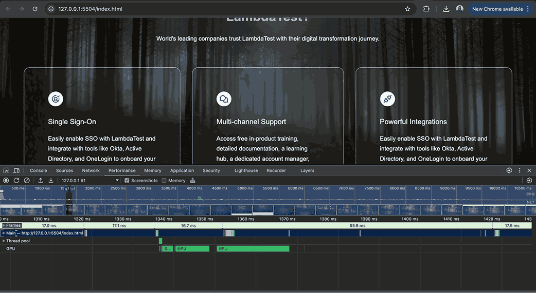
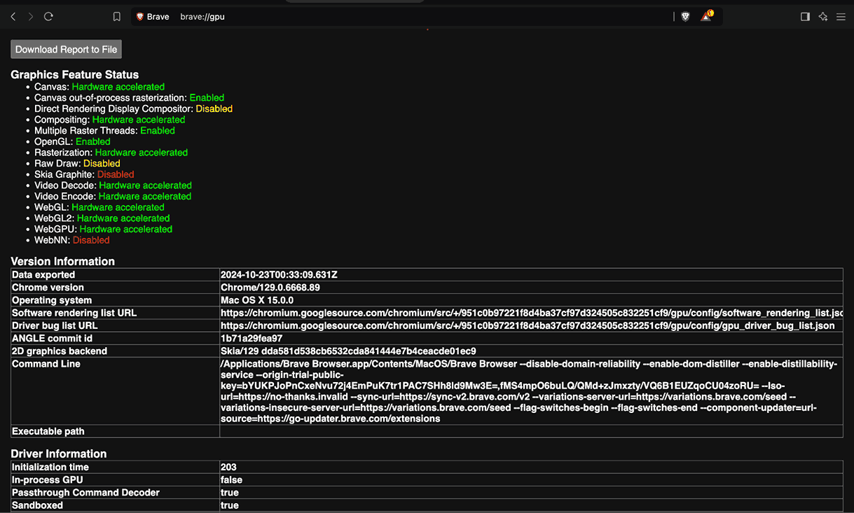
The performance screenshot above, taken while scrolling through the page, shows GPU utilization during the parallax scrolling. The parallax sections achieve fluid motion with minimal computational overhead on the CPU, resulting in a more visually seamless scrolling experience.
Role of the will-change Property
The will-change property tells the browser how an element will likely change, allowing it to set up appropriate optimizations. These optimizations aim to handle potentially computationally intensive work for the browser.
Syntax:
will-change: auto | scroll-position | contents | <custom-indent>;
This property is meant as a last resort for performance issues. Similar to 3D transforms, it triggers GPU acceleration. Thus, the browser creates a new layer for the element on which it is specified, as shown in the illustration below.
Below is what each property value references:
| Value | Reference |
|---|---|
| auto | It is the default value of the property, and it has no special behavior. The browser handles the element normally, like any other. |
| scroll-position | Shows that the element’s scroll position will change or be animated. |
| contents | Shows that the contents of the element will change or be animated. |
| <custom-indent> | Shows one or more properties whose values are expected to change such as transform or opacity. You can specify a number of properties separated by commas. |
When you give a shorthand property a value like margin, you are telling the browser that all individual properties it contains, such as margin-right, will likely change.
Common use cases for will-change particularly involve scenarios like complex animations, draggable elements and elements with frequent DOM updates. Once the expected changes are complete, it is recommended to remove the property to prevent more resource allocation.
Let’s take a look at the example below illustrating its use and how you can remove it once the changes are done.
In the below example, we add the animation to the form when either the
First name, Last name, and Email fields are empty at the point of submission. The browser, however, first receives a hint through the element’s will-change property with the value of transform. The value is reset to auto when the animation ends to free up resource allocation.
Browser Output:
Best Practices of will-change Property
When using the will-change property, follow best practices to maximize performance while avoiding pitfalls. While the property can be helpful, improper use can lead to excessive resource consumption and degraded performance.
By implementing these best practices, you can ensure a smoother user experience in your web applications:
- Use the Property as a Last Resort: For performance optimizations, it is recommended that the will-change property be used as a last resort. The tweet below provides insight into this.
- Apply the Property to a Few Elements: Browsers inherently strive to optimize performance, and excessive use of will-change property can be resource-intensive and lead to increased resource consumption.
- Remove the Property When Changes Are Done: The remove will-change property once the expected changes have occurred to prevent unnecessary resource allocation.
remember that CSS will-change is a last resort though 🙏 more often than not if your CSS animation is struggling, there may be a better way to solve it whether that be changing the approach, adjusting the DOM structure, properties used, or something else 🤙 https://t.co/pIcHnh4VFq — jhey ▲🐻🎈 (@jh3yy) October 13, 2024
The example below shows how Apple adds the will-change property to the carousel when it starts animating and removes it when it stops. Removing the property helps keep the browser’s memory usage optimized.
remember that CSS will-change is a last resort though 🙏
— jhey ▲🐻🎈 (@jh3yy) October 13, 2024
more often than not if your CSS animation is struggling, there may be a better way to solve it
whether that be changing the approach, adjusting the DOM structure, properties used, or something else 🤙 https://t.co/pIcHnh4VFq
Understanding the need for GPU acceleration using CSS properties like transform, opacity, and filter requires understanding how the browser’s rendering process works. We will now examine this process and how it calls for using the CSS GPU acceleration technique.
How Does CSS GPU Acceleration Work?
Many CSS properties, such as width, height, and top, can impede performance in heavy rendering tasks. These tasks run on the CPU and trigger reflow and repaints, which often results in lower frame rates. The CSS GPU acceleration technique alleviates these issues, enabling rendering at higher frame rates that significantly enhance the user experience.
To render elements on the screen, the browser follows the below processes:
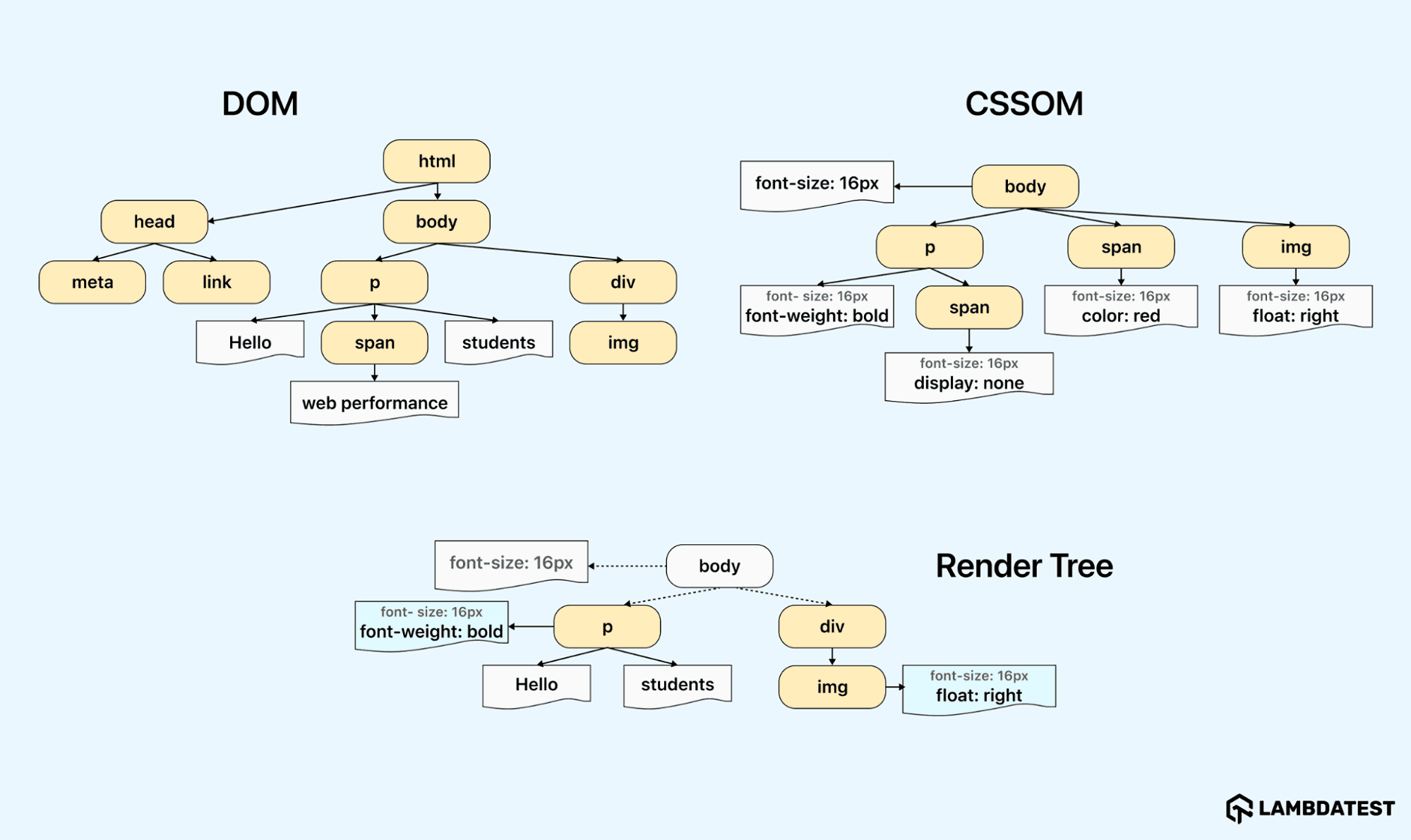
- Parsing HTML and CSS: The browser parses HTML into the Document Object Model (DOM), representing the Document’s HTML markup. It then parses the CSS next to create the CSS Object Model (CSSOM). The DOM and CSSOM trees are similar but independent structures.
- Render Tree Construction: The browser combines the DOM and CSSOM to form the render tree. Elements such as the <head> and <script>, and those whose display value is none, are not included in the render tree as they won’t appear on the screen. The output of the render tree thus contains only visible elements and their styles.
- Layout: This process determines the dimensions and locations of all nodes in the render tree by traversing it, starting at its root. Recalculating these dimensions and positions can be computationally intensive for the browser. However, using CSS GPU acceleration properties like transform can enable the browser to perform these calculations faster, as they don’t trigger reflow.
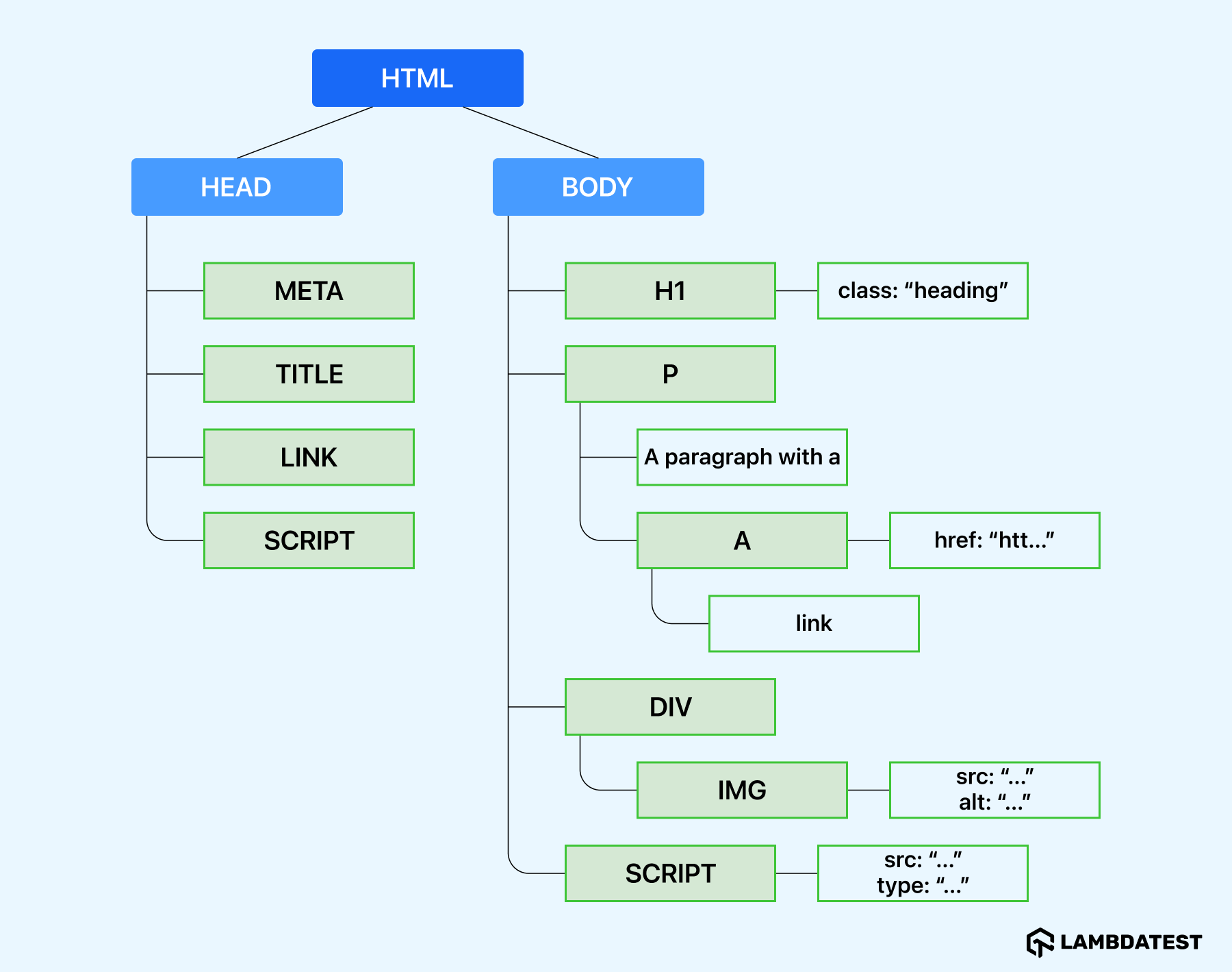
The image below shows what the DOM Tree generated from the parsed HTML looks like.
The next step is calculating the size and position of each node on the screen from the render tree, and this is where the layout phase comes in.
As almost every element on a web page is represented as a box, the browser calculates the sizes of all the boxes on the screen. It takes the viewport as a base and lays out the body, followed by its descendants, each with its CSS box model properties.
Layout is sometimes used interchangeably with reflow; however, there is a slight distinction between the two. Layout refers to the first time each node’s size and position is determined, whereas reflow refers to the succeeding layout recalculations.
The @keyframes code below shows an animation that uses the top and left properties. These properties trigger reflow as they affect the positions of elements.
@keyframes shake {
 0%,
 100% {
   top: 0;
   left: 0;
 }


 50% {
   top: 10px;
   left: -10px;
 }
}
You can replace the above @keyframes code with the code:
@keyframes shake {
 0%,
 100% {
   transform: translate(0, 0);
 }


 50% {
   transform: translate(-10px, 10px);
 }
}
It involves drawing every visible part of an element onto the screen, such as images, backgrounds, and text. Redrawing pixels on the screen can be a load-bearing process for the browser. Here again, using CSS GPU acceleration properties like opacity is a better choice performance-wise than using properties like color that trigger repainting.
The example shows code that uses properties such as background-color that trigger re-painting:
@keyframes change {
 0% {
   background-color: red;
   width: 100px;
   height: 100px;
 }
 50% {
   background-color: blue;
   width: 150px;
   height: 150px;
 }
 100% {
   background-color: green;
   width: 100px;
   height: 100px;
 }
}
The below @keyframes code works the same as the above:
@keyframes change {
 0% {
   transform: scale(1) rotate(0deg);
   filter: hue-rotate(0deg);
 }
 50% {
   transform: scale(1.5) rotate(180deg);
   filter: hue-rotate(180deg);
 }
 100% {
   transform: scale(1) rotate(360deg);
   filter: hue-rotate(360deg);
 }
}
However, to speed up this process, the browser performs some optimization, such as separating the screen into different layers. When this happens, the compositing stage begins.
By putting elements into their separate layers and tracking layers affected by any changes, the browser will redraw only those rather than re-render the entire page.
The preview below shows what these composited layers look like. The section under that of the layers shows more information about the layers.
Browsers using the Chromium engine, such as Brave, Edge and Opera, have similar compositing reasons. In other words, the determinants for creating a layer for these browsers are largely the same.
Here’s a tweet that offers a brief overview of Chrome’s Layers Panel. It includes instructions on how to check composited layers and understand why they are hardware-accelerated.
Chrome's layers panel:
— Mbaziira Ronald (@MbaziiraRonn) November 21, 2024
:one: → View document layers.
:two: → Inspect document layers.
:three: → View compositing reasons
:four: → Debug layering and overlapping issues
:five: → Verify hardware acceleration (GPU, etc)
:six: → Inspect layer memory usage, position, etc. pic.twitter.com/PXLi9HQnUG
The above rendering processes—parsing HTML and CSS, creating the render tree, layout, painting, and compositing—can occur repeatedly after the initial page load, depending on what triggers them. For example, a change in an element’s dimensions can cause a reflow, instantiating a repaint, which can cause a recomposite.
Also, when it comes to animations, an area where repaints and reflows occur repeatedly, there are four key performance metrics to consider, namely:
- Responsiveness: It refers to how quickly an animation or interactive element responds to user actions. It measures the time taken from a user’s interactions, such as clicks or hovers, to visible change on the screen.
- Frame Rate: It refers to the number of frames displayed per second during an animation. Common frame rates include 60fps, 30fps, and 24fps. Users perceive animations to be more fluid and normal at 60fps and higher. Frame rates below 30fps are considered sluggish and disruptive.
- Memory Usage: It refers to the amount of system memory consumed by the animation. Optimizing memory usage ensures that animations run smoothly without negatively impacting the performance of other applications and processes.
- Power Consumption: It refers to how much energy is used by the device to run the animation.
The CSS GPU acceleration technique can significantly improve the above areas, notably the frame rate and responsiveness.

Common Use Cases of CSS GPU Acceleration
Let’s look at some of the common use cases of the CSS GPU acceleration technique:
Best Practices for CSS GPU Acceleration
The CSS GPU acceleration technique can enhance performance, but following the guidelines will help you capitalize on GPU acceleration while avoiding inefficiencies.
- Mitigate High Memory Usage: Accelerating the CSS for animations often involves creating additional layers to manage them. Each layer needs memory, which can accumulate with complex or many animations, leading to higher overall memory consumption.
- Reduce Complexity in Debugging: Identifying and resolving rendering issues related to GPU acceleration can be challenging. The complexity arises because the GPU operates in a separate processing environment from the CPU, and issues may manifest in ways that are not immediately apparent through conventional debugging tools.
The increase in memory usage can become a concern on devices with limited GPU resources. Many layers can increase memory consumption, resulting in potential browser crashes when the available memory depletes.
To mitigate this, use the properties like will-change sparingly. Remove the property when animations are complete to allow browsers to free up resources.
GPU tasks are processed concurrently with CPU tasks, and when properly managed, they remain independent. This independence reduces the chances of complex debugging scenarios. However, for interdependent tasks, proper synchronization is required to avoid deadlock and race-condition scenarios with the CPU and GPU.
To address this complexity, developers can use debugging tools for GPU-accelerated content, such as browser-specific developer tools and GPU performance analyzers, such as VTune Profiler, Basemark GPU, and Nsight Systems.
Conclusion
Thanks for reaching this far. We have looked at the CSS GPU acceleration technique and how you can utilize it to significantly improve the performance and fluidity of your website’s interactive visual effects.
We have also looked at the best practices you can follow to mitigate issues regarding GPU acceleration to continue delivering a unique user experience to users. By understanding the merits and best practices of GPU-accelerated CSS, you can make informed decisions that can enrich your projects’ performance and usability across multiple platforms.
That’s it for now. See you soon in the next one!
Citations
- Chromium Code Search: https://source.chromium.org/
- Web Dev: https://web.dev
- MDN: https://developer.mozilla.org/
Frequently asked questions
Did you find this page helpful?
More Related Hubs
TestMu AI forEnterprise
Get access to solutions built on Enterprise
grade security, privacy, & compliance
- Advanced access controls
- Advanced data retention rules
- Advanced Local Testing
- Premium Support options
- Early access to beta features
- Private Slack Channel
- Unlimited Manual Accessibility DevTools Tests
