Test Manager Dashboard Widgets
TestMu AI Test Manager Dashboard widgets provide comprehensive insights into your test automation or manual efforts. These widgets help you optimize your testing efforts by providing detailed insights into your test execution, test case insights, and more.
The Test Manager Widgets module is currently in BETA. If you have any feedback or suggestions, please feel free to reach out to us at support@testmuai.com.
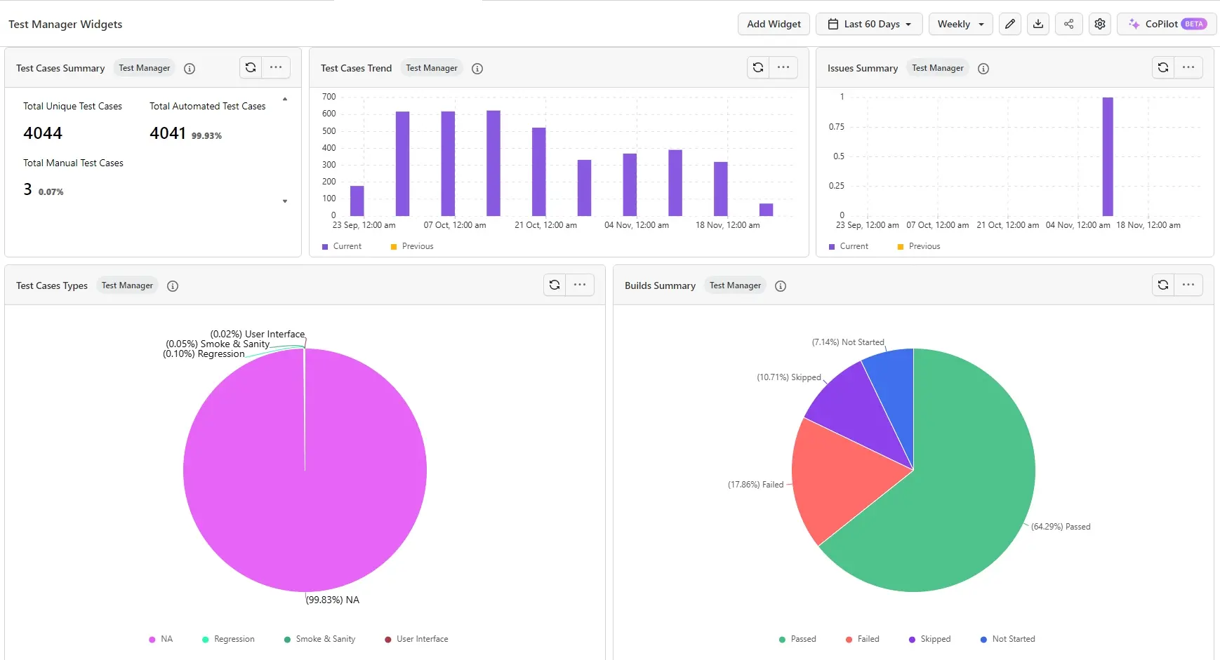
Every widget supports configurable filters. Click the three-dot menu on any widget to apply filters and narrow down the displayed results based on your specific criteria.
All widgets support drill-down. Click on any data point in a chart (such as a segment in a pie chart, a bar in a bar chart, or a status value) to view the underlying list of associated records (e.g., test cases, test runs, or issues) that make up that data point.
Test Cases Summary
The Test Cases Summary widget displays the total count of test cases and the split between Automated and Manual test cases. The classification is determined by the Automation Status field on each test case. If set to Automated, it is counted under Automated; all others fall into the Manual category.
How it works?
- View the total number of unique test cases created in your project.
- See the breakdown between Automated and Manual test cases based on the Automation Status field.
Value Proposition
This widget gives you a quick snapshot of your test case inventory and the balance between automated and manual coverage, helping you plan your testing strategy.
Test Cases Trend
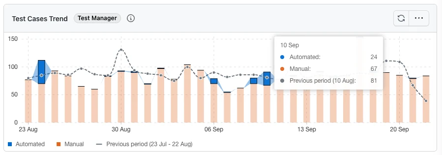
The Test Cases Trend widget tracks the number of test cases created over a period of time, split by Automation Status, helping you visualize how your test suite is growing and how much of it is automated.
How it works?
- Test cases created in the selected period are grouped into time buckets and stacked into Automated and Manual, using the same Automation Status classification as the Test Cases Summary widget above.
- Click the three-dot menu on the widget and select Configure Widget, then use the View group to switch between three presentations:
- Stacked Bar (default) - one bar per interval, segmented by Automation Status.
- Stacked Area - the same series drawn as areas, to emphasise the overall shape.
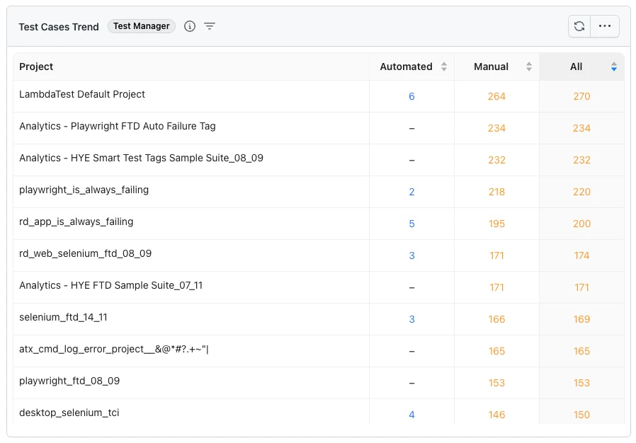
- Table - a per-project breakdown, with the counts sortable by column.
- A dashed line plots the equivalent total for the preceding period of the same length, so you can compare the current window against the one before it. The legend shows the dates that period covers. The line appears only when the preceding period contains at least two complete intervals, so a short date range viewed at a coarse interval - for example a single month of data viewed monthly - may not have enough history to draw it.
- Change the interval (Daily, Weekly, Monthly) to re-bucket the trend.
In the Table view, each row is a project, with Automated, Manual and All counts. Sort by any of the count columns to rank projects, and select a count to drill down into the test cases behind it. The table lists up to 50 projects, ordered by the number of test cases created - if your organization has more, the widget states how many of the total are being shown.
Value Proposition
This widget helps you track how your test suite evolves over time, identify periods of high or low activity, and see how much of your growth is automated versus manual. The table view turns the same data into a per-project comparison, so you can see which projects are contributing coverage and which are lagging.
Test Runs Summary
The Test Runs Summary widget provides an overall summary of your test runs, with the data split by test instance statuses and their counts.
How it works?
- Displays the total number of test runs and the breakdown of test instances by status (Not Started, Passed, Failed, Skipped, and custom statuses).
- Quickly identify test runs with the highest number of failed or pending instances.
Value Proposition
This widget gives you a high-level view of test run health across your project, helping you prioritize runs that need attention and track overall execution progress.
Milestone Trends
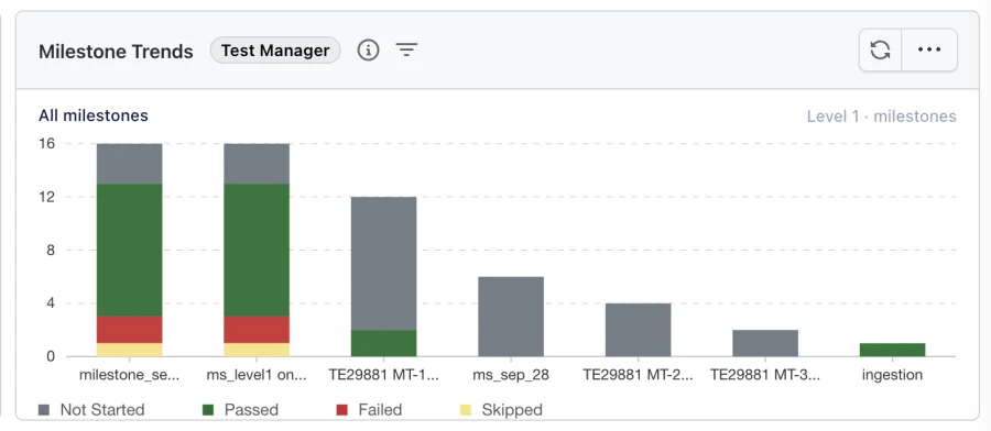
The Milestone Trends widget displays a stacked bar chart of milestones, with each bar broken down by test instance statuses from the associated test runs. You can drill into a milestone to see the results of individual test instances, or step down through your test run folders to find exactly which area of your suite is failing.
How it works?
- Each bar represents a milestone, with stacked segments showing the count of test instances by status.
- Supported statuses include Not Started, Passed, Failed, Skipped, as well as any custom statuses created for your manual test runs.
- Filter the data by date range to analyze milestone performance over specific time periods.
- Click a milestone bar to drill in. What opens depends on the Milestone Drill Down setting described below.
A test run that belongs to more than one milestone is counted in each of those milestones, so the milestone bars are not expected to add up to a single project total.
Choosing what a milestone opens
Open the three-dot menu on the widget, select Configure Widget, and use Display Options to set Milestone Drill Down. The choice is saved per widget, so two Milestone Trends widgets on the same dashboard can behave differently.
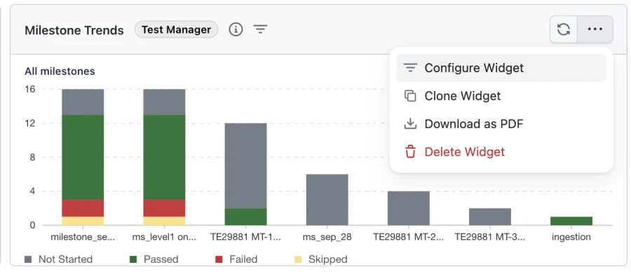

- Instance List (default) - clicking a milestone opens the list of test instances for that milestone.
- Test Run Folder Hierarchy - clicking a milestone opens its top-level test run folders as bars, which you can keep drilling into.
Drilling through test run folders
With Test Run Folder Hierarchy selected, each click takes you one level deeper into your folder structure:
- Every bar is a folder, and its value counts the test instances in that folder and in all of its subfolders.
- A folder that has no subfolders is the end of the trail. Clicking it opens the test instance list for that folder.
- The breadcrumb above the chart shows where you are, for example All milestones › Regression › Checkout. Select any entry in the trail to jump straight back to that level.
- The level indicator on the right of the breadcrumb shows how deep you are and how much further the deepest branch goes, for example Level 2 of 4 · folders.
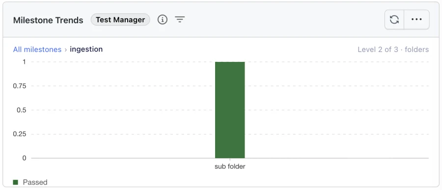
Individual test runs are not shown as bars. Drilling stops at the deepest folder, and the instance list opens from there.

Prefer to see instance results straight away? Switch Milestone Drill Down back to Instance List. This is also how you reach test runs that sit directly inside a folder that has subfolders of its own.
Filtering by test run folder
The Test Run Folder Name filter narrows the widget to one part of your folder structure. It is available in Configure Widget, and in the dashboard Filters drawer on any dashboard that contains a Milestone Trends widget.
- Selecting a folder matches that folder and everything beneath it, so you can scope the whole widget to a single area of your suite.
- If the same folder name is used in more than one place, all of them are matched. This lets you select a name such as
loginonce and review every folder that uses it together.
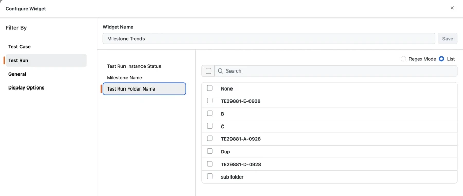
This mirrors the Test Case Folder Name filter used elsewhere in Test Manager widgets.
Value Proposition
This widget helps you quickly assess milestone health, identify milestones with high failure rates, and monitor release readiness. By tracking status trends across milestones, you can spot regressions early and make data-driven decisions about testing effort. Drilling through your test run folders narrows a failing milestone down to the specific area of your suite responsible, without leaving the dashboard.
Issue Summary
The Issue Summary widget shows the trend of issues and requirements linked to test cases or raised during test runs in Test Manager.
How it works?
- Tracks issues linked to test cases as well as issues raised directly within test runs.
- Visualize whether issues are increasing or decreasing over time.
Value Proposition
This widget helps you monitor the volume and trend of issues across your testing efforts, enabling you to identify patterns and prioritize resolution.
Test Cases Types
The Test Cases Types widget displays a pie chart of test cases split by their Type field (e.g., Regression, Smoke, Sanity, or any custom type defined in your project).
How it works?
- Each segment of the pie chart represents a test case type, based on the Type field of each test case.
- Quickly see the distribution of test case types across your project.
Value Proposition
This widget helps you understand the composition of your test suite and ensure the right balance of test types (Regression, Smoke, Sanity, etc.) for effective coverage.
Execution Progress
The Execution Progress widget displays overall test execution progress as a percentage on a visual gauge, alongside a breakdown of total, executed, and remaining test run instances.

How it works?
- The gauge shows the completion percentage, computed as (Total test run instances − Not Started instances) / Total test run instances.
- Any test instance in a status other than Not Started (such as Passed, Failed, Skipped, Blocked, or custom statuses) is counted under Executed.
- A side panel next to the gauge displays three counters:
- Total: the total number of test run instances in scope.
- Executed: instances that have moved out of the Not Started status.
- Remaining: instances still in the Not Started status.
- Apply filters from the three-dot menu to scope the widget to a specific test run, phase, or stage.
Value Proposition
This widget gives you a single at-a-glance metric for test execution progress, making it easy to track how close a release, milestone, or phase is to completion and to communicate status to stakeholders without drilling into individual runs.
Test Execution Burndown
The Test Execution Burndown widget tracks how remaining test executions trend down over the duration of a test run, and surfaces a rich footer strip of delivery metrics so you can forecast whether execution will complete on time.
How it works?
- The X-axis represents dates across the selected execution window, and the Y-axis represents the number of remaining test run instances (instances still in Not Started status).
- Three trend lines are plotted:
- Actual (solid blue): remaining Not Started instances per day, reflecting real execution progress up to today.
- Expected (dashed grey): an ideal linear burndown from the total instance count on Day 0 down to zero on the final day.
- Projected (dashed blue): a forward-looking extrapolation from today to the end date, based on your current velocity, so you can see where execution will land if the current pace holds.
- A Today marker highlights the current date on the chart, making it easy to see where the Actual line hands off to the Projected line relative to the Expected ideal.
- Hovering over any point on the chart opens a tooltip showing, for that day:
- Remaining: remaining instances on that date.
- Ideal: the expected remaining count for that date.
- Gap: how far ahead or behind the ideal line you are.
- Executed today: the number of instances executed on that day.
- 7-day avg: the trailing 7-day execution velocity.
- The footer strip below the chart summarises execution health at a glance: Total, Executed, Remaining, Complete (percentage), Status (ahead or behind by N instances), Velocity (instances/day), projected Finish date, and the Pace needed (instances/day required to hit the target).
- Use the date range picker in the widget header to change the execution window. Use the filter icon (next to the Test Manager badge) or the three-dot menu to filter by test run, phase, or stage.
Drill down into remaining instances
Clicking any point on the Actual line opens a drill-down modal titled Test Execution Burndown, which lists every test run instance that was still Remaining as of that date. From the modal you can:
- See the exact count of remaining instances for the selected date (e.g. Remaining as of Mar 14: 1000).
- Adjust the date range and apply additional filters: Project, Test Run Instance Name, and Milestone Name.
- Browse the paginated list of instances with their current status, project, and last-updated timestamp.
- Export the list for sharing or offline analysis.
Value Proposition
By comparing the actual burndown against the expected line and watching the footer metrics, you can quickly see whether execution is ahead, on track, or slipping, enabling early course correction, better capacity planning, and more reliable release predictions. The drill-down makes it easy to go from a high-level slip directly to the specific instances that are holding the run back.
Defects by Severity
The Defects by Severity widget displays a bar chart of Jira defects linked to your test cases and test runs, grouped by their Jira priority.
How it works?
- Each bar represents a priority from your Jira project's own priority scheme (for example Critical, High, Medium, and Low, or custom values such as Blocker, Major, and Minor) with its value showing the count of linked Jira defects at that priority.
- Only priorities present in the selected range are charted. Defects with no priority set are grouped under Unknown, shown last.
- Defects are sourced from Jira issues linked to test cases or raised during test runs in Test Manager.
- Click any bar to drill down into the underlying list of issues for that priority.
- Apply filters from the three-dot menu to scope the widget to a specific test run, phase, or stage.
Value Proposition
This widget helps you assess release risk at a glance by surfacing how many high-impact defects are outstanding. By focusing on your highest priority bars first, you can prioritize the issues most likely to block a release.
Tester Assignment
The Tester Assignment widget displays a horizontal stacked bar chart with one bar per assigned tester, showing the workload and execution progress of each tester side by side.
How it works?
- Each bar represents a tester, identified by their Display Name, and its length reflects the total number of test run instances assigned to them.
- Each bar is broken down into stacked segments by test instance status: Not Started, Passed, Failed, Skipped, as well as any custom statuses created for your manual test runs.
- Click any segment to drill down into the underlying list of test run instances for that tester and status.
- Apply filters from the three-dot menu to scope the widget to a specific test run, phase, or stage.
Value Proposition
This widget lets you compare workload and execution progress across testers at a glance, making it easy to spot uneven assignment, identify testers who are behind, and rebalance effort to keep a release on track.
 Chat with Us