Concurrency Usage Insights
The Concurrency Usage Insights module enables QA Managers to get an overview of TestMu AI resources being utilized by their teams. It provides widgets to monitor concurrency trends at different levels and track peak usage patterns.
Available Widgets
| Widget | Description |
|---|---|
| Concurrency Trends | Org-level view of concurrent sessions over time |
| Group Concurrency Trends | Group-level concurrency utilization |
| SubOrg Concurrency Trends | Sub-organization level concurrency utilization |
| Custom Concurrency Trends | Custom KPI-based concurrency with dimension breakdowns |
Concurrency Trends (Org Level)
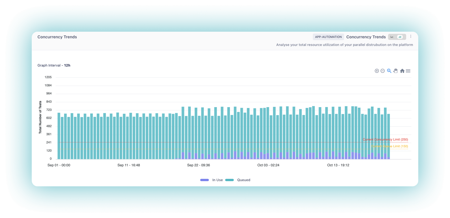
The Concurrency Trends widget provides a visual representation of your parallel test execution at the organization level on the TestMu AI platform. It allows you to monitor the number of concurrent sessions running over time, helping you optimize resource utilization and identify peak testing periods.
Chart Axes
- X-Axis: Represents the time intervals at which the concurrent sessions are measured
- Y-Axis: Represents the number of concurrent sessions, categorized into "Queued" and "In Use" sessions
How It Works
- The widget tracks the number of concurrent sessions running on the platform over a specified time period
- It presents the concurrency trends in a graph format, displaying the number of sessions in use and the number of sessions queued at each time interval
- You can hover over specific data points to view the exact number of sessions in use and queued at that particular time
Group Concurrency Trends
The Group Concurrency Trends widget provides concurrency utilization data segmented by groups within your organization. This helps you understand how different teams or groups are utilizing the parallel test execution capacity.
Key Insights
- View concurrency patterns for each group
- Compare resource utilization across different groups
- Identify which groups have higher queue times
SubOrg Concurrency Trends
The SubOrg Concurrency Trends widget provides concurrency utilization data at the sub-organization level. This is useful for organizations with multiple sub-organizations to track and compare resource usage.
Key Insights
- Monitor concurrency at sub-organization level
- Track queued vs in-use sessions per sub-organization
- Optimize resource allocation across sub-organizations
Custom Concurrency Trends
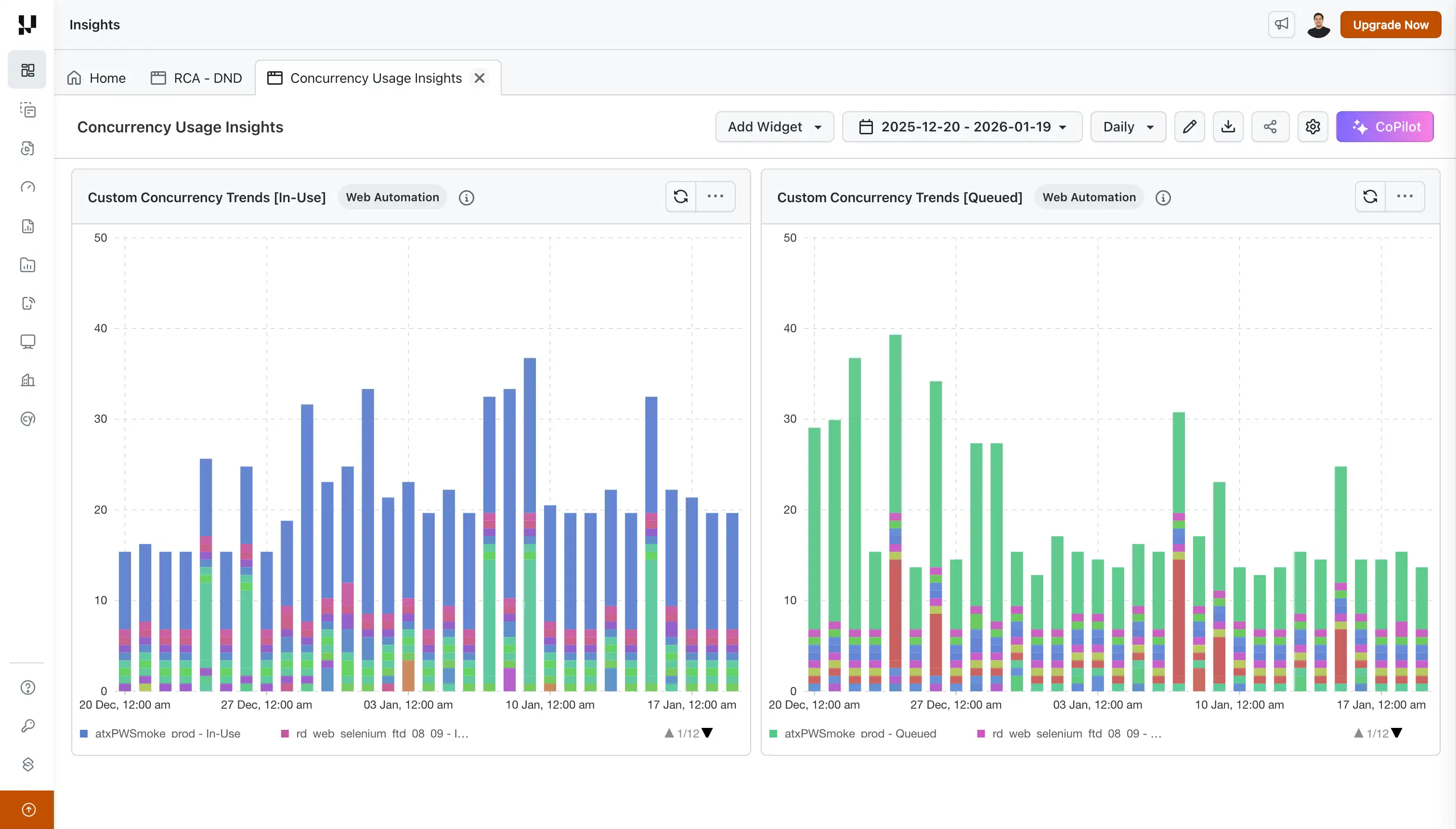
See when your work waited for a free slot, how much of it waited, and exactly which tasks or tests were stuck in the queue. The Custom Concurrency Trends widget shows queued and running concurrency over time for your whole organization, or broken down by project, browser, or OS, and lets you click any bar to see the work behind it.
What You Can Do
- Spot queue build-ups as they happen: every bar shows the peak of its interval, so short spikes are never averaged away.
- See the whole organization at a glance: set the KPI to None (whole org) for one Queued and one In-Use series across all your work.
- Find who is waiting: break the chart down by Project Name, Browser, or OS to see which teams or environments queue the most.
- Go from a spike to the exact work behind it: click a bar to list the tasks or tests that were queued or running at that moment.
- Read it like Concurrency Trends: in the Stacked Bar view, In Use sits at the bottom and Queued on top. Switch to Line in the display options if you prefer, and look across daily, weekly, or custom time ranges.
How Concurrency Is Counted
See exactly how much of your work waited for a slot, and for how long. On HyperExecute, each task is counted from the moment it is queued until it starts, then while it runs, so queue build-ups show up the moment they happen. On Web and App Automation, the same applies to individual tests.
| Product | What is counted | Queued | In Use |
|---|---|---|---|
| HyperExecute | Tasks | From when the task is created until it starts running (or until it ends, if it never started) | From when the task starts running until it ends |
| Web Automation, App Automation | Tests | From when the test is created until it starts | From when the test starts until it ends |
Good to know:
- HyperExecute reserves concurrency per task, which is why tasks are counted rather than tests.
- A HyperExecute task created up to 2 days before your selected time range is included if it is still queued or running within the range.
- HyperExecute counts every task, including cancelled and queue-timeout tasks, since those are often the ones that waited longest.
Each bar stacks the interval's peak In Use value and its peak Queued value. The two peaks can happen at different moments, so the full height of a bar is not the load at one instant. To see how many items were queued at the busiest moment, look at the Queued segment on its own, or hover over it.
Supported KPIs
| KPI | Web Automation | App Automation | HyperExecute |
|---|---|---|---|
| Project Name | Yes | Yes | Yes |
| Browser | Yes | No | No |
| OS | Yes | Yes | Yes |
| None (whole org) | Yes | Yes | Yes |
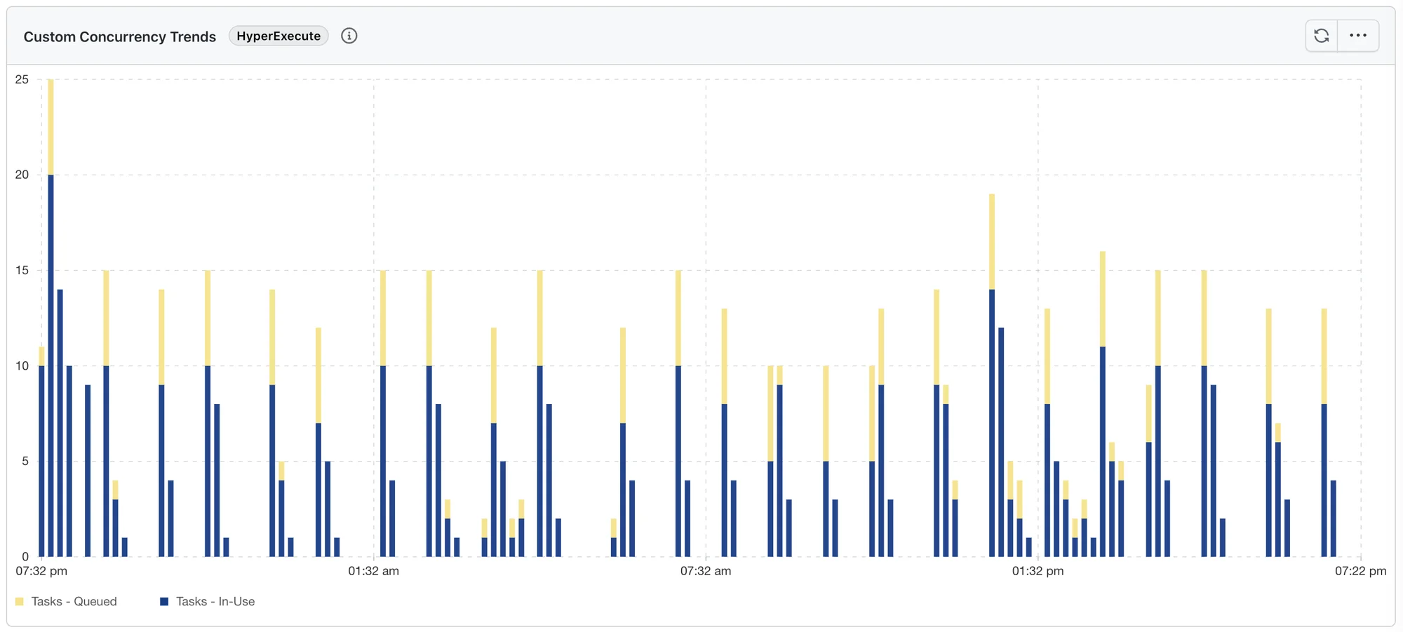
- None (whole org) gives you one Queued and one In-Use series for your entire organization: the quickest way to see whether you are hitting your concurrency limit. The legend reads Tasks - Queued and Tasks - In-Use on HyperExecute, and Tests - Queued and Tests - In-Use on Web and App Automation.
- With a KPI, each value gets its own pair of series, named after the value (for example, Checkout - Queued and Checkout - In-Use).
- HyperExecute does not offer Browser, because a single task can run tests on several browsers. A HyperExecute widget saved earlier with Browser shows the whole organization instead.
With None (whole org) on HyperExecute, the chart shows one Tasks - Queued and one Tasks - In-Use series:
How to Create a Dashboard with Custom Concurrency Trends
Step 1: Log in to your TestMu AI account and navigate to Insights from the left sidebar.
Step 2: Click on the + Create New button and select Pre-built Widgets.
Step 3: Select your product: Web Automation, App Automation, or HyperExecute.
Step 4: From the widget list, select Custom Concurrency Trends, enter a Dashboard Name, and click Create Dashboard.
Configure Widget
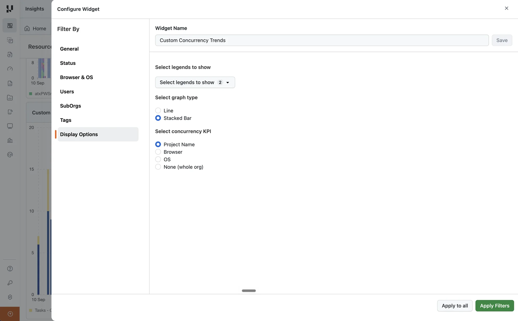
Click on the three-dot menu (⋯) on the widget and select Configure to customize the widget.
Supported Filters
| Filter Category | Filter Options |
|---|---|
| General | Project Names, Build Names, Test Names |
| Status | Test execution status. On HyperExecute, this is the task status. |
| Browser & OS | Browser, Operating System |
| Users | Users, Groups, Teams |
| SubOrgs | Sub-organizations |
| Tags | Build Tags, Test Tags |
Display Options
- Select legends to show: In Use, Queued (both selected by default)
- Select graph type: Line or Stacked Bar (default)
- Select concurrency KPI: Project Name (default), Browser, OS, or None (whole org). See Supported KPIs.
Recommended Usage
Viewing Multiple Dimensions (All Projects)
When visualizing concurrency trends across all dimensions (e.g., all projects at once), display either In-Use or Queued, not both simultaneously. This provides a cleaner view for comparing usage patterns across different projects. To see the organization's total queue instead, set Select concurrency KPI to None (whole org).
How to configure:
- Open Configure Widget > Display Options
- Under Select legends to show, uncheck either "In Use" or "Queued" to show only one metric
- Click Apply Filters
Viewing Single Dimension (Specific Project)
When focusing on a single dimension (e.g., one specific project), keep both In-Use and Queued visible. This gives you a complete picture of concurrency utilization for that specific project.
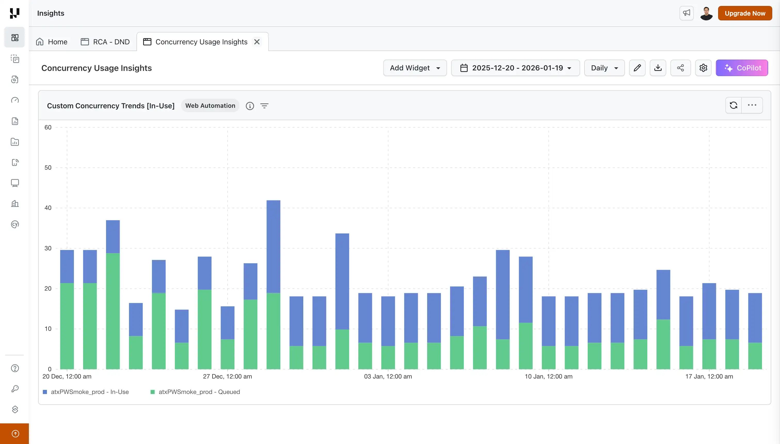
How to configure:
- Open Configure Widget > General
- Filter by the specific Project Name you want to analyze
- Under Display Options, ensure both "In Use" and "Queued" are selected in Select legends to show
- Click Apply Filters
Drilldown
Found a spike? Click it to see exactly what was waiting. In the Stacked Bar view, click the Queued or In-Use segment of any bar to list the HyperExecute tasks, or the Web and App Automation tests, behind it.
Choose the time window
Use the Show dropdown at the top of the drilldown:
- At peak (default): what was queued (or running) at the bar's busiest moment. The count matches the bar.
- Whole bucket: everything that was queued (or running) at any time during that interval.
- Selected range: appears when you pick a range in the date picker, and lists everything queued (or running) in that range. Ranges longer than 93 days keep their last 93 days.
Not sure which window you are looking at? Hover over the info icon next to the count, for example: "Tasks queued at 2026-09-10 16:09:59, the peak of this bucket."
HyperExecute: see each task
Each row tells you which task waited and for how long:
- Task: the task number exactly as HyperExecute shows it (for example, Task #6), or Global Pre Task, Discovery Task, or Global Post Task. Click it to open the task in HyperExecute.
- Job #: click to open the job in HyperExecute.
- Project, plus the browser, OS, resolution, and device of the task's tests.
- Queued: how long the task waited. Hover over it to see when it entered the queue and when it left (Queue started … · Queue ended …).
- Ran: how long the task ran. Hover over it to see when it started and ended.
- When the task was created, and its job labels.
Narrow the list with Status (task status), Project, Users, and Job Labels.
Web and App Automation: see each test
Each row looks just like the Test Summary drilldown: status, test name, build, browser or device, OS, resolution, duration, smart tags, user tags, and remarks, with Choose Test Failure Type and Generate RCA on failed tests. A Queued item shows how long the test waited; hover over it to see when it was created and when it started.
The header shows Avg Run Time and Max. Run Time. Narrow the list with Status, Test Name, Builds, Browsers, OS, and Project.
Filter, sort, and export
- Clicked a project's series? That project is already selected in the Project filter (likewise Browsers or OS on Web and App Automation). Every other value in the widget's date range is still listed, so you can widen, change, or reset the selection.
- On HyperExecute, a series grouped by OS has no OS filter; the list is limited to that OS for you.
- Sort by Date Ascending or Date Descending.
- Download what you see with Export As > CSV (up to 1,000 rows).
The drilldown lists up to the first 10,000 rows of a window. Drilldown is not available on shared dashboards.
When you apply a time filter of 1 day or less, the concurrency data is displayed at minute-level granularity. This is useful for pinpointing exact concurrency spikes, debugging queue buildups during specific test runs, or analyzing resource usage during dedicated time windows.
Value Proposition
By analyzing the concurrency trends, you can make informed decisions about scaling your testing infrastructure, ensuring efficient resource allocation, and minimizing queuing times. These widgets empower you to strike the right balance between test execution speed and cost-effectiveness.
John is a QA Manager, and his team runs more than 50,000 Jobs in a month across various TestMu AI products like Web Automation, App Automation, and HyperExecute.
John wants to know the duration of the tests kept in queue and the duration of tests put in running state. With the Concurrency Trends widgets he can easily track the duration and make a decision to optimize the TestMu AI plan currently subscribed by his team. Using Custom Concurrency Trends, he can further drill down into which projects are consuming the most concurrency and schedule test runs more efficiently.

 Chat with Us