Heatmap Widgets
Heatmap widgets in TestMu AI Insights provide a powerful way to visualize complex data relationships and identify patterns across multiple dimensions. By representing data density and relationships through color intensity, heatmaps help you quickly spot trends, anomalies, and correlations in your test execution data.
What is a Heatmap Widget?
A heatmap widget displays data as a grid where each cell's size and color convey different information:
- Box Size: Represents the total test count for that combination. Larger boxes indicate more tests executed for that browser-resolution or OS-browser combination.
- Color/Shade: Represents the pass rate percentage, using a color gradient from red (low pass rates) to green (high pass rates).
Currently, heatmap widgets use fixed metrics:
- Box Size: Always based on total test count (not configurable)
- Box Color: Always based on pass rate (not configurable)
Custom metric selection for box size and color Coming Soon, allowing you to choose different metrics for visualization.
This dual-encoding visualization is particularly effective for:
- Identifying patterns across two or more dimensions (e.g., browser × resolution)
- Spotting outliers and anomalies in test execution
- Comparing performance across different configurations
- Understanding data distribution at a glance
- Quickly identifying problematic combinations (small boxes with red colors) vs. well-tested successful combinations (large boxes with green colors)
Prerequisites
Before creating a heatmap widget, ensure you have completed the common prerequisites and setup steps for custom widgets.
Step-by-Step Guide to Creating a Heatmap Widget
For prerequisites and common setup steps (Navigate to Insights, Create Dashboard, Choose Product, Select Data Source, Configure Filters), see the Common Steps for Creating Custom Widgets section in the main Custom Widgets documentation.
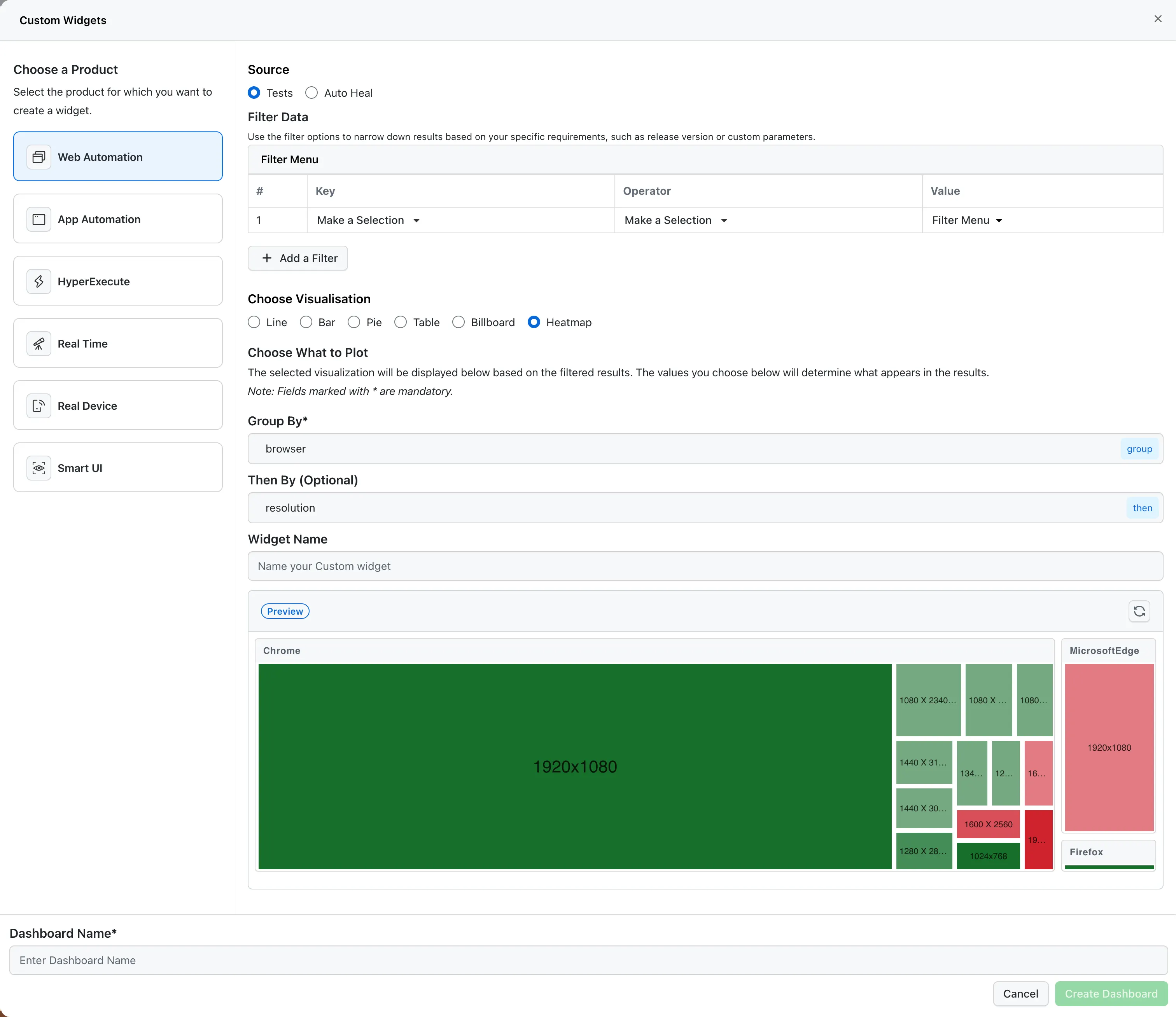
Step 6: Choose Heatmap Visualization
- In the Choose Visualisation section, select Heatmap from the available options (Line, Bar, Pie, Table, Billboard, Heatmap).
Step 7: Configure Grouping
This is the most critical step for creating meaningful heatmaps:
-
Group By* (Mandatory): Select the primary dimension for grouping your data. Common options include:
browser- Group by browser type (Web Automation, HyperExecute)resolution- Group by screen resolution (Web Automation, HyperExecute)os- Group by operating system (all products)os_version- Group by OS version (all products)device- Group by device type (App Automation, HyperExecute)build_name- Group by build name (all products)project_name- Group by project name (all products)- Custom data keys you've defined
tipFor a complete list of available keys for each product, see the Available Keys for Custom Widgets section in the main Custom Widgets documentation.
-
Then By (Optional): Select a secondary dimension for nested grouping. This creates a two-dimensional heatmap showing relationships between the two dimensions.
Example: Group by
browserfirst, then byresolutionto see which browser-resolution combinations have the most test activity.
The combination of Group By and Then By creates the axes of your heatmap.
Step 8: Name Your Widget
- Enter a descriptive name in the Widget Name field (e.g., "Browser × Resolution Test Distribution").
- Use clear, descriptive names that indicate what the heatmap shows.
Step 9: Preview Your Heatmap
- Click the Preview button to see how your heatmap will look with the current configuration.
- Review the visualization to ensure it displays the data as expected.
- Use the refresh icon to update the preview if you make changes.
Step 10: Create the Dashboard
- Enter a Dashboard Name in the bottom section.
- Click Create Dashboard to save your heatmap widget.
- Your heatmap will be added to the dashboard and ready for analysis.
How Heatmaps Work
Understanding how heatmaps encode information is crucial for effective analysis:
Box Size: Total Test Count
The size of each box in the heatmap represents the total number of tests executed for that specific combination (e.g., Chrome × 1920x1080).
- Larger boxes = More tests executed for that combination
- Smaller boxes = Fewer tests executed for that combination
- No box = No tests executed for that combination
Currently, box size is always determined by the total test count. This metric is not configurable at the moment, but custom metric selection for box size Coming Soon.
This helps you quickly identify:
- Which combinations have the most test coverage
- Which combinations may need more testing
- Testing activity distribution across different configurations
Color: Pass Rate
The color of each box represents the pass rate percentage for that combination, using a color gradient from red (low pass rates) to green (high pass rates).
| Pass Rate Range | Color | Interpretation |
|---|---|---|
| 0-20% | Dark Red | Critical issues - very low pass rate, needs immediate attention |
| 20-40% | Medium Red | Significant problems - low pass rate, requires investigation |
| 40-50% | Light Red | Below average - pass rate needs improvement |
| 50-60% | Light Green | Average performance - acceptable but could be better |
| 60-80% | Medium Green | Good performance - solid pass rate |
| 80-100% | Dark Green | Excellent performance - high pass rate, well-tested |
Currently, box color is always determined by the pass rate percentage. This metric is not configurable at the moment, but custom metric selection for box color Coming Soon.
Combining Size and Color
The combination of box size and color provides powerful insights:
- Large Dark Green Box: High test count with excellent pass rate - well-tested and stable combination
- Large Dark Red Box: High test count with very low pass rate - critical issue affecting many tests
- Small Dark Red Box: Low test count with very low pass rate - may need more testing or investigation
- Small Dark Green Box: Low test count with high pass rate - limited testing but good results so far
Generating Meaningful Insights from Heatmaps
Heatmaps excel at revealing patterns that might be hidden in tabular data. Here's how to interpret and extract insights:
Understanding the Visualization
Heatmaps use size and color to encode information. Refer to the How Heatmaps Work section above for detailed explanations of box size and color encoding.
Key Insights to Look For
-
High-Activity Combinations: Identify which browser-resolution or OS-browser combinations have the most test activity (large boxes). This helps prioritize testing efforts and understand where most of your testing is focused.
-
Failure Patterns: Red-colored boxes (especially dark red) indicate problematic combinations with low pass rates that need immediate attention. Large red boxes are particularly concerning as they affect many tests.
-
Success Patterns: Green-colored boxes (especially dark green) indicate well-performing combinations. Large green boxes show stable, well-tested configurations.
-
Coverage Gaps: Missing or very small boxes reveal combinations that haven't been tested, helping you identify coverage gaps in your testing strategy.
-
Anomalies: Unexpected combinations (e.g., large red boxes where you expect green, or small boxes in critical configurations) can indicate issues or opportunities for optimization.
-
Trends Across Dimensions: Observe how box sizes and colors change as you move across one dimension while keeping another constant. This reveals patterns like "Chrome performs well across all resolutions" or "1920x1080 has issues across multiple browsers."
-
Priority Issues: Focus on large red boxes first - these represent combinations with high test volume but poor pass rates, indicating critical problems affecting many tests.
Interacting with Heatmaps
- Hover: Hover over boxes to see detailed metrics including total test count, pass rate percentage, total passed/failed tests, and other relevant metrics
- Click: Some heatmaps allow drilling down into specific combinations for more detailed analysis
- Filter: Apply additional filters to focus on specific subsets of data
- Color Legend: Refer to the color scale to understand what each shade represents in terms of pass rate ranges
Use Cases for Heatmap Widgets
1. Browser and Resolution Analysis
Use Case: Identify which browser-resolution combinations are most commonly used and which have the highest failure rates.
Configuration:
- Group By:
browser - Then By:
resolution - Source: Tests
Insight: Helps prioritize browser-resolution combinations for testing and identify problematic configurations. Large boxes indicate high test activity, red boxes highlight low pass rates, and green boxes show well-performing combinations.
2. OS and Browser Compatibility Testing
Use Case: Understand test distribution and performance across different OS-browser combinations.
Configuration:
- Group By:
os - Then By:
browser - Source: Tests
Insight: Ensures comprehensive cross-platform testing coverage and identifies compatibility issues.
3. Device and OS Version Analysis (App Automation)
Use Case: Analyze test execution patterns across different devices and OS versions.
Configuration:
- Group By:
device - Then By:
osoros_version - Source: Tests
Insight: Optimizes device testing strategy and identifies devices/OS versions that need more attention.
4. Custom Data Dimension Analysis
Use Case: Visualize test patterns based on custom attributes like release version, feature flags, or environment.
Configuration:
- Group By: Custom key (e.g.,
release_version) - Then By:
browseroros - Source: Tests
- Filters: Apply custom data filters
Insight: Track how different releases or configurations perform across different environments.
5. Auto Heal Effectiveness Analysis
Use Case: Visualize Auto Heal performance across different browser-OS combinations.
Configuration:
- Group By:
browser - Then By:
os - Source: Auto Heal
Insight: Identify which combinations benefit most from Auto Heal and where improvements are needed. Note: Custom metrics like Auto Heal Success Rate Coming Soon for box color selection.
6. Test Coverage Visualization
Use Case: Ensure comprehensive test coverage across all browser-OS combinations.
Configuration:
- Group By:
browser - Then By:
os - Source: Tests
Insight: Identify gaps in test coverage and ensure all critical combinations are tested.
Available Keys for Heatmap Widgets
For a complete list of available keys that can be used in the Group By and Then By fields when configuring your heatmap, see the Available Keys for Custom Widgets section in the main Custom Widgets documentation.
For heatmaps, choose keys that represent categorical dimensions (like browser, OS, project name) rather than numeric or date values for best visualization results.
Common Metrics for Heatmaps
Currently, heatmap widgets use fixed metrics (see How Heatmaps Work section above). Custom metric selection for box size and color Coming Soon, allowing you to choose different metrics like failure rate, total passed/failed tests, average duration, and Auto Heal success rate.
Best Practices for Heatmap Widgets
1. Choose Meaningful Dimensions
- Select dimensions that have a clear relationship or that you want to compare
- Avoid dimensions with too many unique values (this can make the heatmap cluttered)
- Use filters to focus on relevant subsets of data
2. Combine Dimensions Strategically
Choose dimensions that create meaningful cross-sections. Common effective combinations include Browser × Resolution, OS × Browser, Device × OS Version, and Custom Key × Browser/OS.
3. Use Filters Effectively
- Use custom data filters to analyze specific releases, features, or environments
- Apply filters based on available keys (browser, OS, project, etc.)
- Combine multiple filters to create highly targeted heatmaps
4. Name Widgets Clearly
Use descriptive names that indicate what the heatmap shows, including the dimensions being visualized (e.g., "Browser × Resolution Test Distribution").
5. Regular Review and Updates
- Review heatmaps regularly to identify new patterns or issues
- Update filters and dimensions as your testing strategy evolves
- Create multiple heatmaps with different configurations to explore various aspects
6. Share Insights
- Share heatmap dashboards with team members and stakeholders
- Use heatmaps in reports and presentations to communicate findings
- Create multiple heatmaps for different audiences (QA, Dev, Product)
Troubleshooting
Heatmap Shows No Data
- Check Filters: Ensure filters aren't too restrictive
- Verify Data Source: Confirm you have test data for the selected product
- Check Dimensions: Ensure the selected grouping keys have data in your test executions
Heatmap is Too Cluttered
- Use Filters: Narrow down the data using filters
- Choose Fewer Dimensions: Consider using only one grouping dimension
- Focus on Specific Values: Filter to specific browsers, OS, or other dimensions
Colors Don't Show Clear Patterns
- Check Metric: Ensure you're visualizing a meaningful metric
- Review Data Range: Verify you have sufficient data points
- Adjust Filters: Try different filter combinations
Next Steps
After creating your heatmap widget:
- Add to Dashboard: Combine heatmaps with other widgets for comprehensive analysis
- Share Dashboard: Share your dashboard with team members for collaborative insights
- Create Variations: Create multiple heatmaps with different dimensions to explore various aspects
- Review Regularly: Use insights from heatmaps to identify areas needing attention and track improvements
Support
If you have any questions or need assistance with creating heatmap widgets, please reach out to our 24/7 customer support or visit our Support Center.

 Chat with Us