App Profiling Insights
Overview
The App Profiling dashboard aggregates performance telemetry from Appium tests run with the appProfiling capability and surfaces it as cross-test, cross-device analytics. Use it to compare CPU, memory, frame rate, battery, network and startup behaviour across devices, app builds and page transitions, with org-level SLA thresholds rendered directly on each chart.
The data on this dashboard comes from the App Profiling capability on Appium tests. To enable App Profiling on your test runs and review per-session metrics, see App Performance Analytics.
App Profiling Insights is available for Appium tests on iOS and Android (version 9+). Set appProfiling: true and resignApp: true in your capabilities. Battery Utilization and Battery Temperature widgets are populated for Android sessions only.
How to access
- Open the Insights section from the left sidebar of the TestMu AI dashboard.
- Select App Profiling. The landing page lists every test that has App Profiling data.
- Click a test name to open its dashboard.
The page is always scoped to the test you opened. Use the Test Name filter to add more tests to the comparison without leaving the dashboard.
The dashboard opens on two tabs:
- Trends — the aggregated view described on this page: KPI cards, trend widgets and the device matrix, averaged across every session in the filtered scope.
- Comparison — an overlay view that plots individual test sessions against one another, run by run. See App Profiling Comparison.
Filter bar
The filter bar at the top of the dashboard applies to every widget on the page.
| Filter | Values | Default |
|---|---|---|
| Test Name | Multi-select, up to 25 tests | The test you opened (pre-selected) |
| OS | Android, iOS | All |
| Device | Specific device models recorded across the selected tests | All |
| App Build Version | Build versions captured during the sessions | All |
| Page Label | Page transition labels recorded by the test | All |
| Date Range | Preset windows or a custom range with a time-of-day picker | Last 30 days |
Each filter is a searchable multi-select; changes take effect when you click Apply, and Reset clears that single filter. The OS, Device, App Build Version and Page Label dropdowns only list values present in the currently selected Test Name(s), so you never see options that would return no data.
Clearing the Test Name filter and clicking Apply restores the test you opened — the dashboard is never scoped to zero tests.
Saved filters New
Your filter selections, the selected date range, and the widget layout — including any widgets you resize — are auto-saved at the organisation level. There is no Save button: when you refresh the page or return to the dashboard later, it reopens with your last-used filters, date range and layout already applied. Use the Clear All Filters button to reset everything back to the defaults. The KPI and Compare selections made inside individual widgets are not persisted.
Average and p90 views New
An Average / p90 toggle in the top bar of the Trends tab switches its widgets between two aggregations:
- Average — the mean value of each metric across the sessions in scope.
- p90 — the 90th-percentile value: the level at or below which 90% of sessions fall.
Switching to p90 re-renders the Performance Overview cards, Performance Trends, the per-metric trend widgets and the Device Performance Matrix using the 90th-percentile value for every metric. The same p90 values are also available through the App Profiling API.
Which one to read
Average answers "what does a typical run cost?". p90 answers "how bad does it get for the unlucky one run in ten?". They are complementary, and a metric can look healthy on one and fail on the other.
| Read | When you are |
|---|---|
| Average | Tracking a trend over time, comparing builds or devices at a glance, or reporting a headline number |
| p90 | Investigating a regression, sizing an SLA, or explaining complaints that the dashboard's averages don't reflect |
Averages hide spikes. A build whose CPU averages 12% but reaches 45% on every tenth run will look green on Average and breach on p90 — and it is the p90 run your users notice. The reverse is also informative: if Average and p90 sit close together, the metric is stable and the average is trustworthy.
p90 is computed per session at ingestion and then averaged across the sessions in scope — it is the mean of each session's own 90th percentile, not the 90th percentile of the whole window. Metrics with no pre-computed p90 — cold and hot startup, and the crash and ANR counts — are dropped in p90 mode and render as —. Frozen and janky frame counts stay on their average, because they are companion counts to the frame-rate series rather than percentile-able metrics in their own right.
p90 and the Comparison view
The toggle applies to this view only. The Comparison view has no Average / p90 toggle — it reports Avg, Min, Max and P90 side by side for every selected session instead.
Performance Overview
A strip of KPI cards summarising the headline metrics over the selected window.
- Avg CPU (%) — application CPU usage averaged across sessions in scope.
- Avg Memory (MB) — application memory usage averaged across sessions in scope.
- Avg FPS — frames per second averaged across sessions in scope.
- Avg Cold Startup (ms) — cold-start duration averaged across sessions in scope.
When sessions in the selected scope record crashes or ANRs, two additional cards surface:
- Avg Crashes per Crashed Session —
avg(crash_count)over sessions that reported at least one crash. This is the mean crash count among already-crashed sessions, not a crash rate. - Avg ANRs per ANR Session — equivalent for Application Not Responding events.
Cards are hidden automatically when the underlying metric reports zero for the filtered scope.
Performance Trends
A single time-series chart that overlays selected metrics on dual Y-axes. The KPIs selector in the widget header controls which series are visible — CPU, FPS, Memory, Temperature, Battery, Network Upload, Network Download, Disk Read and Disk Write are available; CPU and Memory are on by default. Each visible KPI gets a Min / Max / Avg row in the stats panel below the chart.
Disk Read and Disk Write report the total data the application read from and wrote to disk during a session, giving visibility into storage-heavy workflows. Like every other metric, they honour the Average / p90 toggle.
The X-axis bucket size is derived from the selected date range — sub-day windows render at 5-minute or 15-minute buckets, multi-week windows aggregate to hours, and multi-month windows aggregate to days.
Device Performance Matrix
A table comparing performance metrics across the devices that ran in the filtered scope. One row per device.
| Column | Description |
|---|---|
| Device | Device model |
| CPU App (%) | Application CPU usage, colour-coded against the configured SLA threshold |
| CPU System (%) | System-level CPU usage |
| Memory App (MB) | Application memory, colour-coded against the configured SLA threshold |
| Memory System (MB) | System-level memory |
| FPS | Frame rate, colour-coded against the configured SLA threshold |
| Sessions | Session count for that device in the filtered scope |
Click any column header to sort. The dashboard-level Device filter intentionally does not narrow this widget — the matrix is itself the device breakdown.
Label Page Load Time
Duration per page transition label, captured from the label events recorded inside the test. The widget shows the top labels by session count by default; use the label selector inside the widget to add or remove labels from the chart.
A horizontal SLA reference line is drawn at the configured threshold. The stats panel below the chart reports Min / Max / Avg duration per visible label.
Per-metric trend widgets
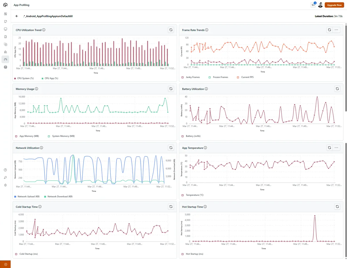
Each of the eight per-metric widgets renders a time series over the selected window with the SLA threshold drawn as a coloured band, and reports Min / Max / Avg for the primary metric in the stats panel below the chart.
| Widget | Metrics | Notes |
|---|---|---|
| CPU Utilization Trend | CPU App (%), CPU System (%) | — |
| Frame Rate Trends | Current FPS, Janky Frames, Frozen Frames | — |
| Memory Usage | App Memory (MB), System Memory (MB) | — |
| Battery Utilization | Battery drain (mAh) | Android only |
| Network Utilization | Network Upload (KB), Network Download (KB) | Separate SLA thresholds for upload and download |
| Battery Temperature | Temperature (°C) | Android only |
| Cold Startup Time | Cold Startup (ms) | — |
| Hot Startup Time | Hot Startup (ms) | — |
Compare mode
Each per-metric trend widget and Label Page Load Time supports Compare mode. Click Compare in the widget header, pick a dimension, then select up to five values to overlay on the chart.
Compare dimensions:
- OS — Android vs iOS
- Device — for example Galaxy S23 vs Pixel 8 vs iPhone 15 Pro
- App Build Version — for build-over-build comparisons
- Label — for page-transition-level breakdowns
Compare mode overlays a dimension on a single widget. It is a different feature from the App Profiling Comparison view, which overlays whole test sessions across every metric at once.
Compare is scoped to the widget — enabling it on one chart does not affect others. Performance Overview, Performance Trends and Device Performance Matrix do not expose Compare: the first two are summary widgets (use filters to change the data scope instead), and the matrix already breaks data down per device.
SLA thresholds
SLA thresholds are configured at the organisation level by an admin. Once set, the same threshold is applied everywhere a metric is rendered — Performance Overview cards, Performance Trends overlays, Device Performance Matrix cells, Label Page Load Time, and the per-metric trend widgets.
Default thresholds:
| Metric | Green | Amber | Red |
|---|---|---|---|
| CPU (App) | < 15% | 15–30% | > 30% |
| Memory (App) | < 300 MB | 300–400 MB | > 400 MB |
| FPS | > 50 | 30–50 | < 30 |
| Cold Startup | < 2000 ms | 2000–3000 ms | > 3000 ms |
| Hot Startup | < 500 ms | 500–1000 ms | > 1000 ms |
| Battery Temperature | < 40 °C | 40–45 °C | > 45 °C |
| Label Page Load | < 2.5 s | 2.5–3.0 s | > 3.0 s |
Thresholds render as:
- Horizontal reference lines on trend charts.
- Coloured background bands behind the chart area.
- Cell-level heatmap colouring on Device Performance Matrix.
- Coloured value text on Performance Overview cards.
Battery Utilization (mAh drain) is rendered without a threshold by default — drain varies widely by device hardware and there is no industry-standard band.
Admins can override the defaults at the organisation level. Regular users see the configured thresholds applied but cannot modify them.
Threshold breach alerts New
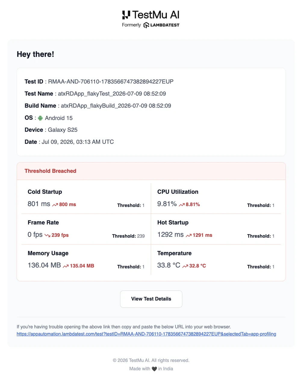
When a session breaches a configured App Profiling threshold, TestMu AI automatically notifies your team over email and Slack — so you can catch performance regressions without opening the dashboard after every run.
Each alert identifies the run (Test ID, Test Name, Build Name, OS, Device and date) and lists every breached metric with its observed value against the configured threshold, along with a View Test Details link that opens the run's App Profiling tab. Metrics that can trigger an alert include Cold Startup, Hot Startup, CPU Utilization, Frame Rate, Memory Usage, Temperature and per-label Page Load.
The Slack notification carries the same details:
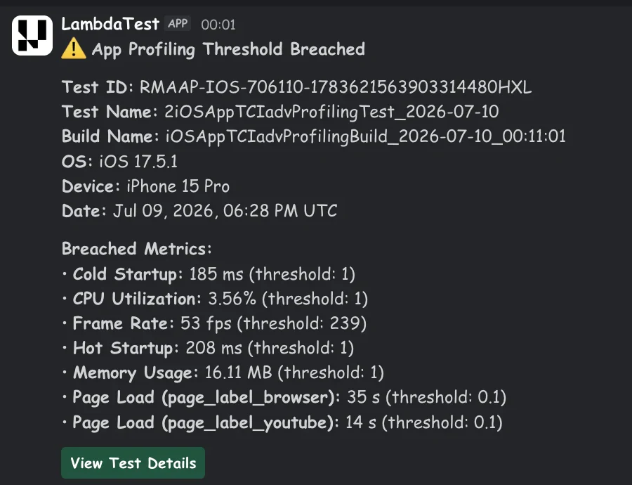
Alerts fire against the same SLA thresholds described above, which are configured at the organisation level by an admin.
Sharing a dashboard
The URL of the dashboard preserves the test it was opened against, and which of the two tabs you are on — a link copied from the Comparison tab reopens on Comparison. To share a specific view with a teammate, apply the filters you want and copy the URL — the shared dashboard opens with the same test in scope. Filter selections beyond Test Name are not round-tripped through the URL; they are restored from your own saved filters instead.
Related
- App Profiling Comparison — compare individual test sessions run by run against a baseline.
- App Performance Analytics — how to enable App Profiling on Appium tests and review per-session metrics.
- Analytics Overview — the broader Insights module.

 Chat with Us