App Profiling Comparison
Overview
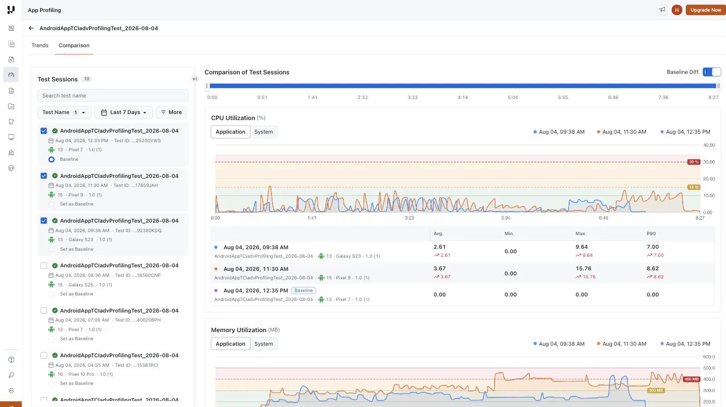
The Comparison view plots individual test sessions against one another instead of averaging them. Use it to answer run-level questions the App Profiling Trends view cannot: whether a build regressed against the run before it, whether one device is slower than another on the same app, or why a single run behaved differently from the rest.
Where Trends charts a metric over calendar time, Comparison charts it over elapsed time within each run — every session starts at 0:00, so runs of different lengths and different start times line up and can be read against each other.
Comparison is a different feature from Compare mode on the Trends widgets. Compare mode overlays a dimension — OS, device, build or label — on a single widget. Comparison overlays whole test sessions across every metric at once. See Compare mode.
How to access
- Open the Insights section from the left sidebar of the TestMu AI dashboard.
- Select App Profiling, then click a test name to open its dashboard.
- Switch to the Comparison tab.
Complete flow
- The most recent run of the test is selected automatically and becomes the baseline — note that this is the newest run, not necessarily the specific run you opened the dashboard from.
- Narrow the Test Sessions rail on the left with the search box and filters until you can see the runs you care about.
- Tick the checkbox on each session you want to overlay — up to five at a time.
- Pick which run everything is measured against with Set as Baseline.
- Read the charts and the per-metric stats tables. Leave Baseline Diff. on to see each session's delta against the baseline.
- Drag on the timeline at the top to zoom into a slice of the run; every chart follows.
Test Sessions rail
The rail lists every session that matches the current filters, with a running count in the header. Sessions you have selected for comparison are pinned to the top so they stay visible as you filter; everything else follows, newest first. Each card shows the pass/fail status, the test name, when it ran, a truncated Test ID, and the OS version, device and app build version it ran on.
| Control | What it does |
|---|---|
| Search test name | Free-text filter over the listed session names |
| Test Name | Multi-select of test names. At least one must stay selected — Apply is disabled otherwise |
| Date range | The same picker the Trends view uses, with presets and a custom range including a time-of-day picker |
| More | OS, App Build Version, Device and Status multi-selects |
| Clear Filters | Resets the filters back to the opened test and the comparison back to that test's most recent run. The date range is deliberately preserved — it belongs to the shared picker, not to this filter set |
| Checkbox | Adds or removes that session from the comparison |
| Set as Baseline | Makes that session the reference every other session is measured against |
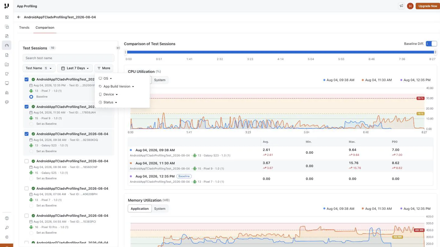
You can compare up to five sessions at once — deselect one to add another — and at least one session must stay selected, so the charts are never left empty.
How the graphs are drawn
Each metric renders as its own card, in this order: CPU Utilization, Memory Utilization, Frame Rate, Disk, Network, and Startup Time.
- One series per selected session, coloured consistently across every card — a session keeps its colour everywhere, so you can follow one run down the page.
- A shared elapsed-time X-axis. Dragging on the Comparison of Test Sessions timeline at the top zooms every chart to the same window at once, which is what makes a spike in one metric comparable against another.
- Legend toggles. Click a session in a card's legend to hide or show that series in that card. The last visible series cannot be hidden.
- Variant toggles where a metric has more than one dimension: Application / System on CPU and Memory, Read / Write on Disk, Upload / Download on Network, and Startup Time / Load Time on the startup card.
- SLA bands and threshold lines are drawn from the same org-level thresholds used everywhere else on the dashboard. See SLA thresholds.
- A stats table under every chart with Avg, Min, Max and P90 per session.
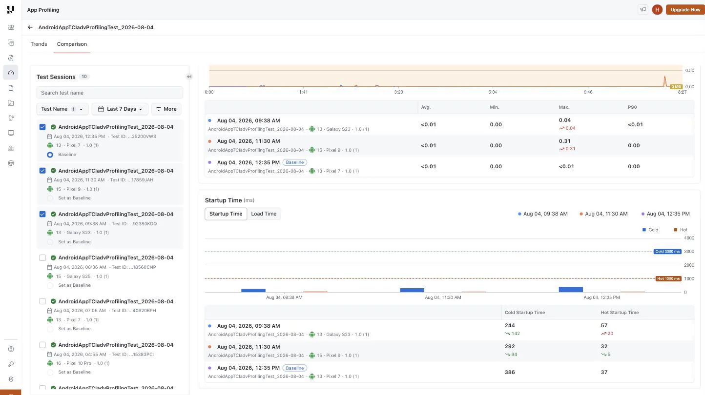
Startup Time is a grouped bar chart rather than a line — it reports one Cold and one Hot value per run, with the Cold and Hot SLA lines drawn across it. Its Load Time variant switches to per-page-label load times, plotted by label instead of by elapsed time.
Avg, Min, Max and P90
Every stats table reports all four aggregations side by side, always, for each selected session.
There is no Average / p90 toggle on this view. The Average and p90 views toggle on the Trends view does not carry across, and switching between the two will not change what Comparison shows — it does not need to, because Comparison already shows you every aggregation at once for the handful of runs you have selected. That is the more useful shape when you are looking at individual runs rather than a population.
Baseline and Baseline Diff
One session is always the baseline, marked with a Baseline chip in the rail and in every stats table.
With Baseline Diff. enabled — it is on by default — every other session's stats show a coloured delta against the baseline: green where the session is better, red where it is worse. The direction that counts as "better" follows the metric, so a lower CPU figure and a higher frame rate are both green. In the Startup Time screenshot above, the two non-baseline runs start 142 ms and 94 ms faster than the baseline's cold start.
Turn Baseline Diff. off to read raw values with no deltas.
Saved comparisons New
Your Comparison setup is auto-saved per test at the organisation level, the same way the Trends view saves its filters and layout. There is no Save button. Reopening the view restores:
- the rail filters — test names, OS, device, status and app build version,
- which sessions were selected for comparison,
- which session was the baseline,
- the Baseline Diff. toggle,
- any series you hid from a card's legend.
The date range is not part of the saved comparison — it is owned by the page's date picker and shared with the Trends view, so both always report over the same window.
Sharing a comparison
The URL preserves the test and the active view, so a link copied from Comparison reopens on Comparison. Filter and session selections are not round-tripped through the URL — they are restored from your own saved comparison instead.
Related
- App Profiling Trends — the aggregated view, its filters, widgets, SLA thresholds and breach alerts.
- App Performance Analytics — how to enable App Profiling on Appium tests and review per-session metrics.

 Chat with Us